Boothbay Gray HC-165 by Benjamin Moore
Effortless Elegance with a Classic Touch
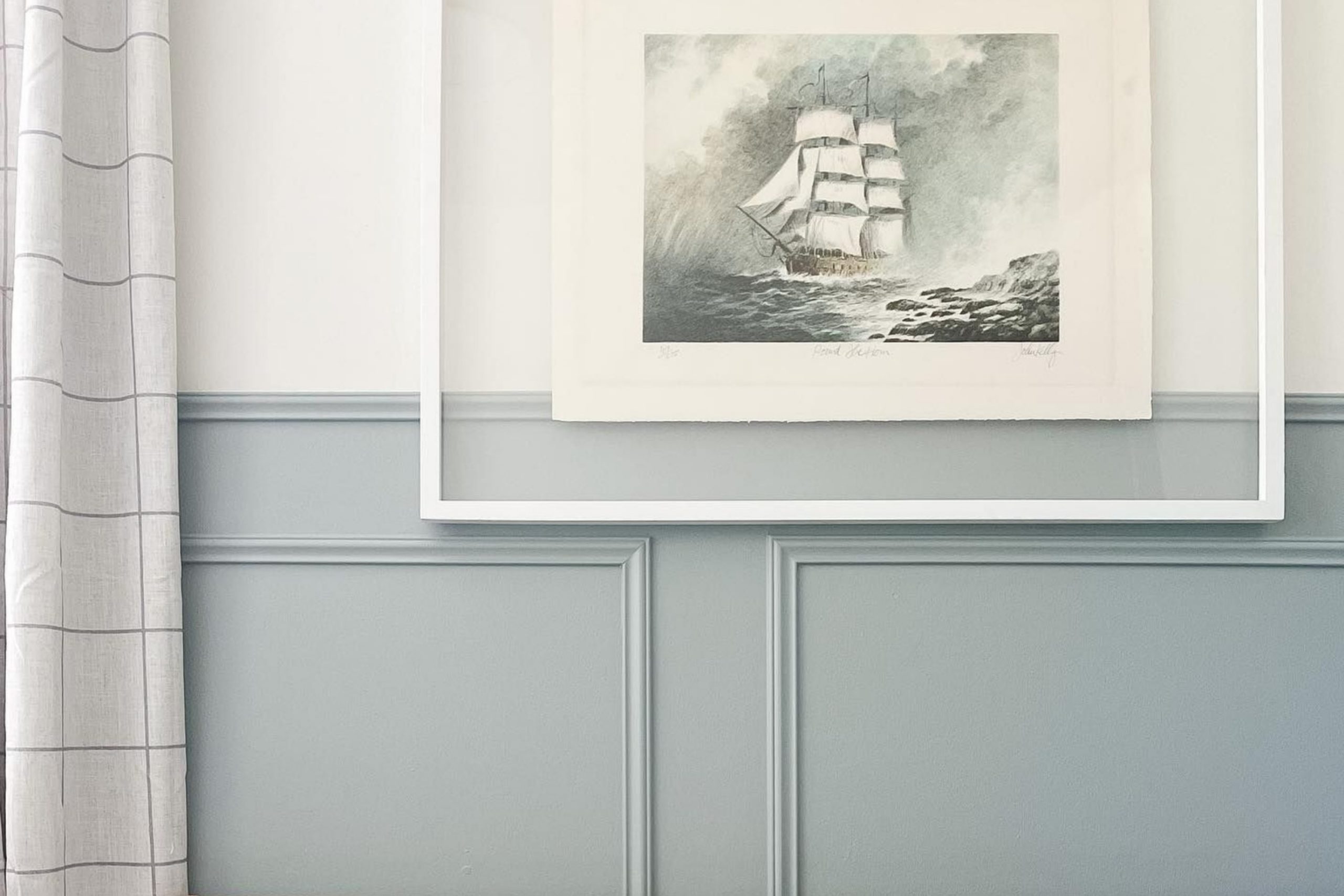
What about walking into a room that instantly makes you feel calm and relaxed. Boothbay Gray by Benjamin Moore is a paint color that can do just that. With its soft blend of gray and blue undertones, Boothbay Gray provides a serene atmosphere in any space. It’s perfect for creating an environment that feels both welcoming and soothing.
As you paint your walls with this color, you’ll notice how it slightly changes throughout the day, adding an element of interest without being overpowering. This makes it ideal for a living room, bedroom, or even a cozy reading nook. Boothbay Gray is like a breath of fresh air, bringing a sense of ease and comfort to your home.
Not only does Boothbay Gray make your space feel more inviting, but it also pairs wonderfully with a variety of decor styles. Whether your home is modern, traditional, or somewhere in between, this color adds a touch of elegance that ties everything together effortlessly.
It’s a versatile backdrop for pops of color, neutral tones, or lush greenery.
Consider Boothbay Gray for your next project if you’re dreaming of a space that exudes peace and sophistication. It’s a beautiful choice that can transform a simple room into a personal sanctuary.
via blacksburgbelle.com
What Color Is Boothbay Gray HC-165 by Benjamin Moore?
Table of Contents
Boothbay Gray HC-165 by Benjamin Moore is a versatile and sophisticated shade. It balances gray and blue, offering a subdued, calming presence. This gentle color can change slightly depending on lighting, appearing more blue or gray at different times.
Boothbay Gray fits well in various interior styles, making it an excellent choice for many homes. In traditional settings, it adds an elegant touch, pairing nicely with classic wooden furniture.
In modern interiors, it provides a cool, sleek backdrop that contrasts beautifully with bold shapes and metallic accents. Coastal or nautical themes benefit from its hint of blue, evoking a subtle reminder of the sea.
This color pairs especially well with natural materials. Think of soft, plush textiles like wool or linen for a cozy feel. It also complements wooden pieces, whether light oak or rich walnut. Combining Boothbay Gray with white trim or cabinetry brightens spaces and creates a crisp look.
Against exposed brick or concrete, it adds warmth and texture. For those who love metals, incorporating brushed nickel or matte black fixtures creates a harmonious look. Overall, Boothbay Gray is a flexible choice, enhancing various design elements and bringing a cohesive look to interiors.
housekeepingbay.com
Is Boothbay Gray HC-165 by Benjamin Moore Warm or Cool color?
Boothbay Gray HC-165 by Benjamin Moore is a versatile paint color that combines gray with slight blue undertones. It works well in homes by creating a calming and relaxed atmosphere, making it ideal for living rooms, bedrooms, and bathrooms. Boothbay Gray pairs beautifully with both light and dark furniture pieces, allowing for flexibility in interior design.
This color has the ability to look both modern and timeless, adapting to various styles from traditional to contemporary. In rooms with plenty of natural light, it tends to reveal its blue hues more prominently, adding a refreshing feel.
In spaces with less light, it takes on a cozy, warm gray tone, providing a sense of comfort.
Additionally, Boothbay Gray can work as a neutral backdrop, allowing bold colored artwork or décor to stand out. Its balanced nature makes it a favorite choice for those seeking a soothing environment.
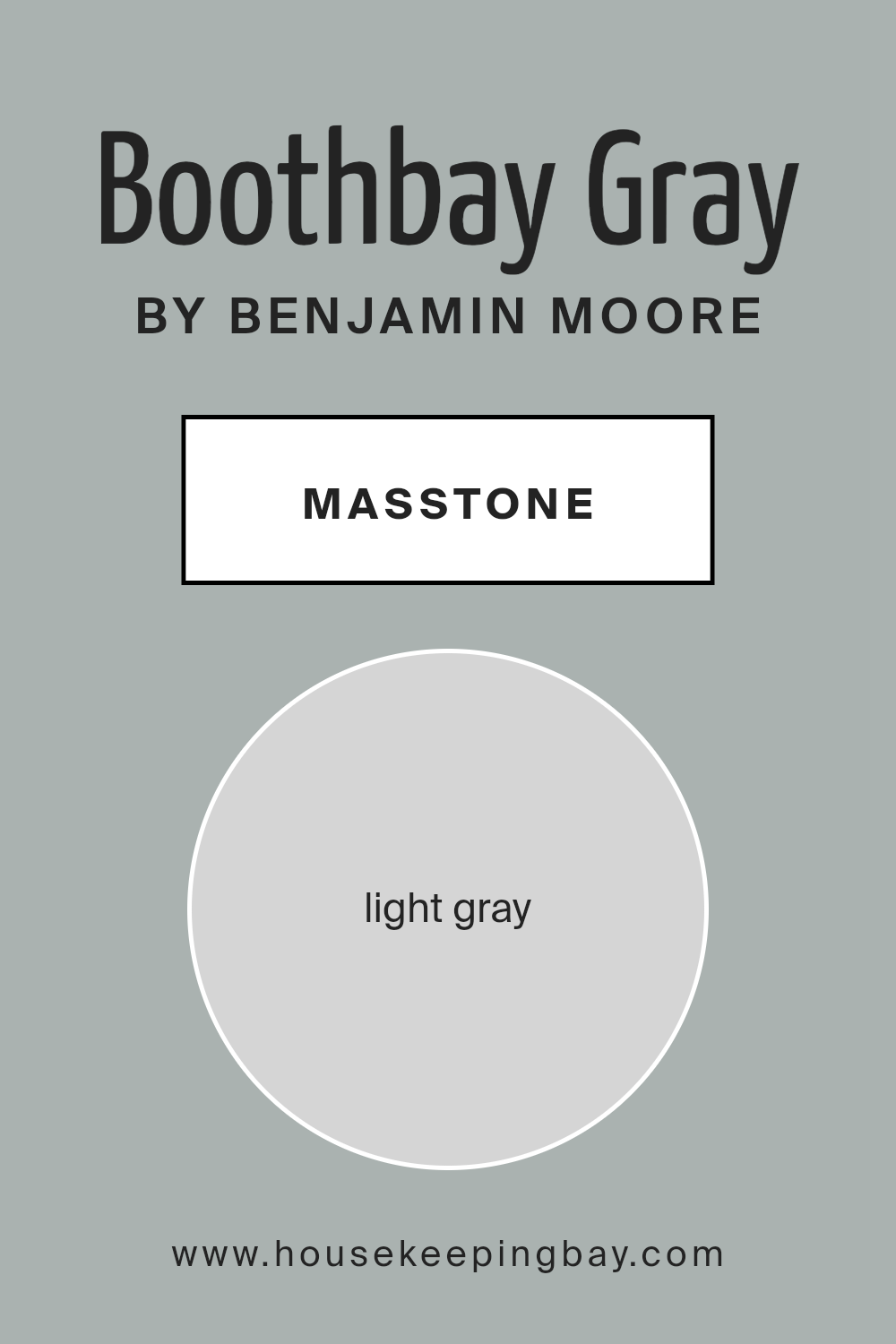
What is the Masstone of the Boothbay Gray HC-165 by Benjamin Moore?
Boothbay Gray HC-165 by Benjamin Moore, specifically in its masstone, showcases a light gray hue (#D5D5D5). This shade brings a sense of calm and balance into any space. It is versatile and works well with various styles, from modern to traditional. Light gray has a natural ability to make rooms feel more open and airy. Its softness allows it to complement other colors without overpowering them.
In living rooms, Boothbay Gray creates a cozy yet sophisticated atmosphere. In kitchens, it pairs well with both stainless steel appliances and rustic wood accents, providing a timeless look. In bedrooms, this light gray encourages rest and relaxation, promoting better sleep.
The color’s neutrality also means it can match different furniture pieces and decor, making it easier for homeowners to update their spaces without needing major overhauls. Overall, Boothbay Gray is an excellent choice for creating harmonious and comfortable environments.
housekeepingbay.com
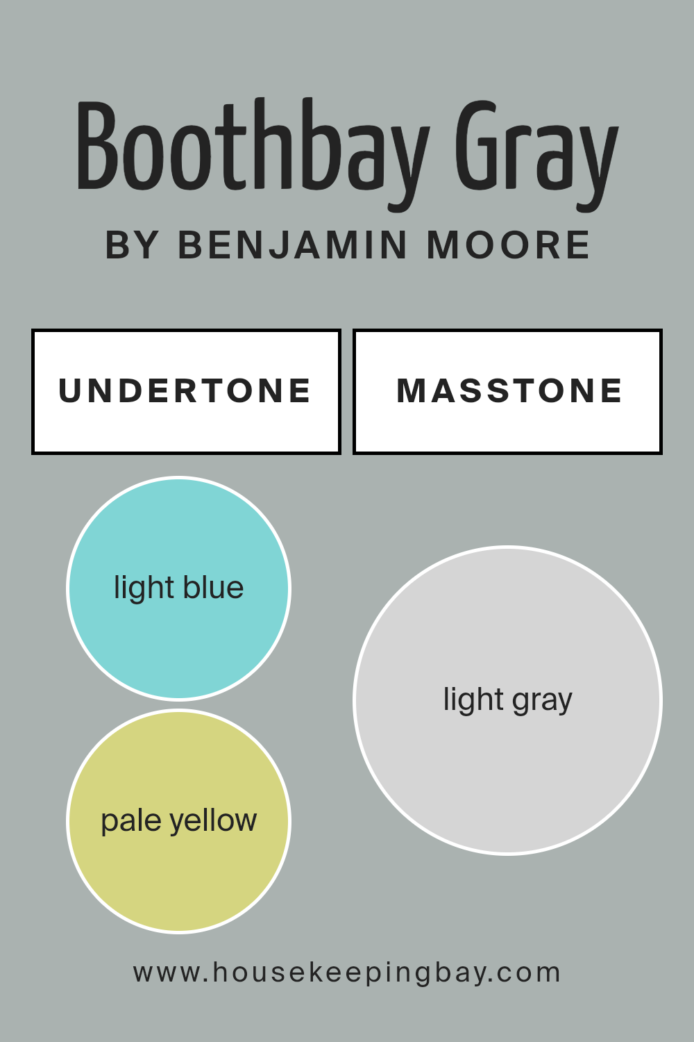
Undertones of Boothbay Gray HC-165 by Benjamin Moore
Boothbay Gray HC-165 by Benjamin Moore is a complex color with various undertones that affect its appearance on walls. The undertones include light blue, pale yellow, mint, light purple, lilac, gray, and pale pink. These subtle hues can change how we perceive the main color.
Undertones impact our view of color by adding depth and richness. They can make a color appear warmer or cooler, brighter or softer, depending on the lighting and surroundings.
For Boothbay Gray, this means the room color may look different throughout the day as daylight shifts from morning to evening.
The light blue and gray undertones give Boothbay Gray a cool, calming feel, making spaces feel open and airy. Pale yellow and mint bring slight warmth, balancing the coolness with a touch of freshness. Lilac, light purple, and pale pink add a gentle softness, offering an inviting and cozy atmosphere.
On interior walls, Boothbay Gray adapts well in various lighting, changing subtly to highlight different room features. It pairs effectively with both neutral colors and bold shades, providing versatility.
Whether in a living room or bedroom, Boothbay Gray promotes a peaceful setting, influenced by its unique blend of undertones.
housekeepingbay.com
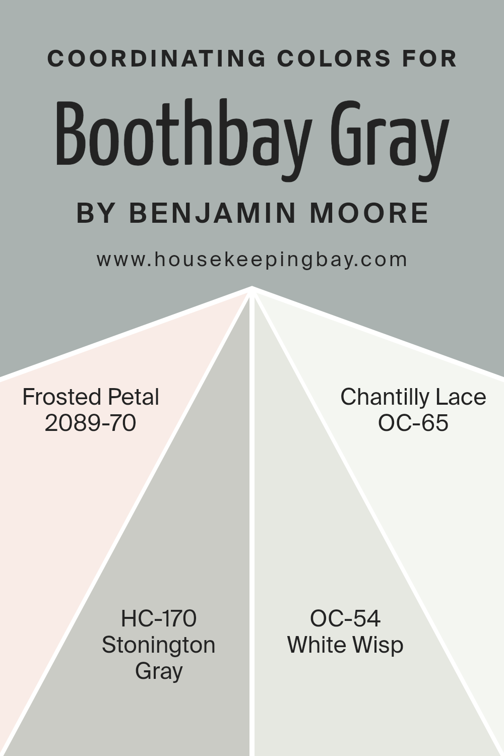
Coordinating Colors of Boothbay Gray HC-165 by Benjamin Moore
Coordinating colors are colors that work well together to create a harmonious look in a space. They complement each other and enhance the overall vibe of a room without clashing or overpowering the main color. When thinking about Boothbay Gray HC-165 by Benjamin Moore, you want colors that will pair well with its soft, muted blue-gray tone to create a balanced and cohesive environment.
This is where Frosted Petal, Stonington Gray, White Wisp, and Chantilly Lace come in as coordinating colors.
Frosted Petal (2089-70) is a delicate and gentle pink that adds a touch of warmth and softness. It pairs beautifully with Boothbay Gray, offering a subtle contrast without overwhelming the space. Stonington Gray (HC-170) is another sophisticated shade of gray with a hint of blue, making it an excellent partner to Boothbay Gray by reinforcing the cooling, calming effect.
White Wisp (OC- 54), on the other hand, provides an off-white option with just a whisper of gray-green, perfect for adding lightness and an airy feel to a room.
Lastly, Chantilly Lace (OC-65) is a pure, crisp white that offers a bright and clean look, perfect for trim or ceilings to create a sharp contrast with the softer gray tones.
Together, these colors form a cohesive palette that enhances the beauty of Boothbay Gray.
You can see recommended paint colors below:
- 2089-70 Frosted Petal
- HC-170 Stonington Gray
- OC-54 White Wisp
- OC-65 Chantilly Lace
housekeepingbay.com
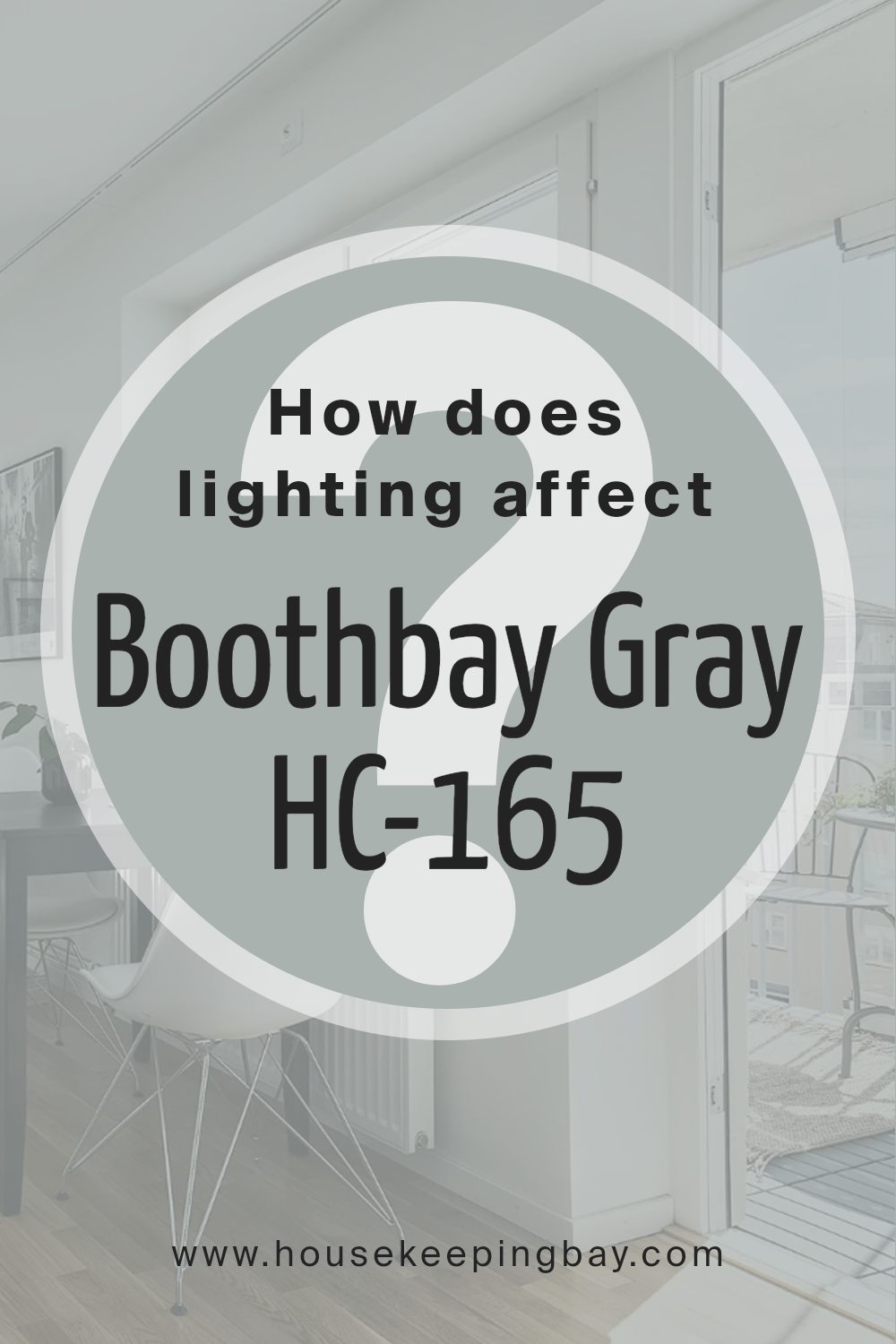
How Does Lighting Affect Boothbay Gray HC-165 by Benjamin Moore?
Lighting greatly affects how we see colors. Boothbay Gray HC-165 by Benjamin Moore is a versatile gray with blue undertones. The appearance of this color changes based on lighting conditions, making it important to consider the type of light in a room.
In natural light, Boothbay Gray can look different throughout the day. During the morning, when the light is soft and gentle, it can appear cooler and more muted. As the day progresses and the sun moves, the color may seem warmer or take on more blue, depending on the angle and intensity of the sunlight.
In artificial light, the type of bulb used can influence the color. Warm white bulbs might bring out more gray and reduce the blue undertone, giving the space a cozier feel. Cool white bulbs could enhance the blue, creating a crisper look. LED bulbs, with their range of temperatures, allow flexibility in how this color is perceived.
In north-facing rooms, the light is softer and cooler, often making Boothbay Gray appear more blue and muted. These rooms never get direct sunlight, so the color stays consistent throughout the day but leans towards a cool tone.
In south-facing rooms, where sunlight is abundant, the color turns warmer and more vibrant. The natural light can bring out a balance between the gray and blue, making the room feel bright and welcoming.
East-facing rooms get direct sunlight in the morning, which makes the color appear fresher and cooler at the start of the day. In the afternoon, the room becomes cooler as the light fades, again enhancing the gray undertones.
West-facing rooms have the opposite effect. They start the day cool and then get warmer as the sun sets. In the evening, Boothbay Gray can become richer and cozier, with the warm sun bringing out depth in the color.
Understanding these shifts helps when choosing the right spot for this paint, ensuring the desired look is achieved.
housekeepingbay.com
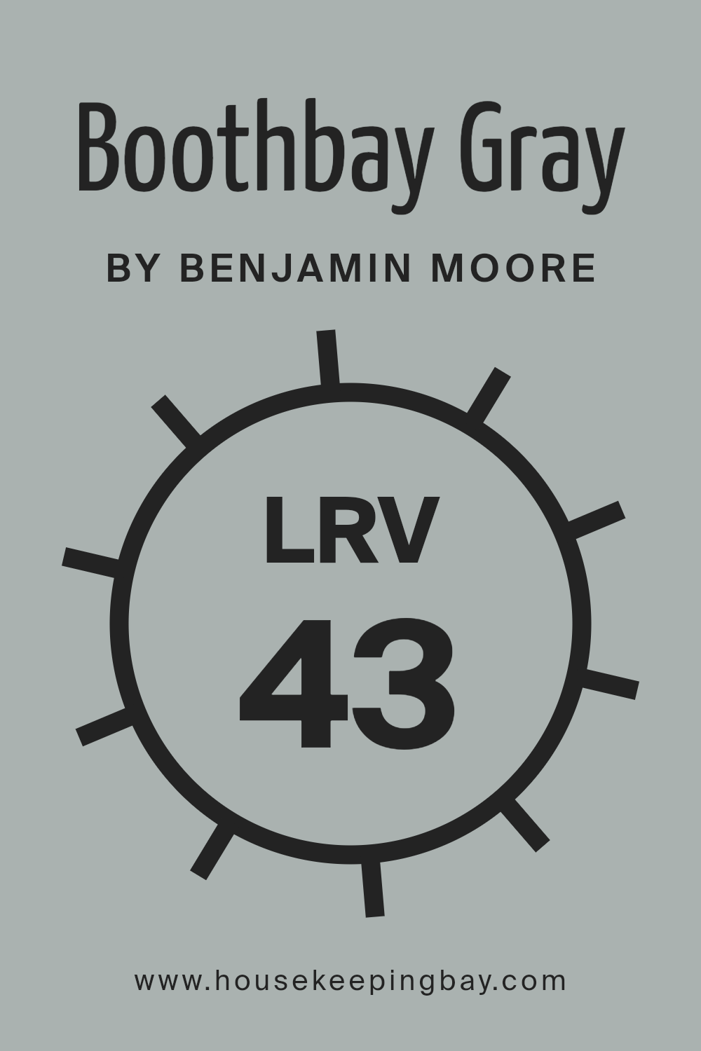
What is the LRV of Boothbay Gray HC-165 by Benjamin Moore?
LRV, or Light Reflectance Value, measures the percentage of light a paint color reflects. It is a numerical scale ranging from 0 to 100, where 0 means no light is reflected (absolute black) and 100 means all light is reflected (pure white). The LRV of a color can affect how bright or dark a color appears in different lighting conditions.
A higher LRV means a color will reflect more light and typically appear brighter on walls, making a space feel larger and more open. Conversely, a lower LRV indicates a color absorbs more light, often making a room feel cozier but potentially smaller.
Knowing the LRV helps in understanding how a color will interact with light in any given space, which is crucial when choosing paint for your home.
Boothbay Gray HC-165 has an LRV of 43.26, placing it in the medium range. This means it reflects a moderate amount of light, allowing it to look neither too bright nor too dark.
In a well-lit room, Boothbay Gray can come across as a soft, muted gray, offering a balanced appearance that isn’t overwhelming.
The medium LRV ensures it maintains its presence without overpowering the room, working well in various settings, from living rooms to bedrooms. In spaces with lower natural light, Boothbay Gray might appear a bit darker, but its tone will still add depth and character.
This makes it a versatile choice for those wanting a color that adapts to different lighting, providing a calm but notable backdrop to any decor.
housekeepingbay.com
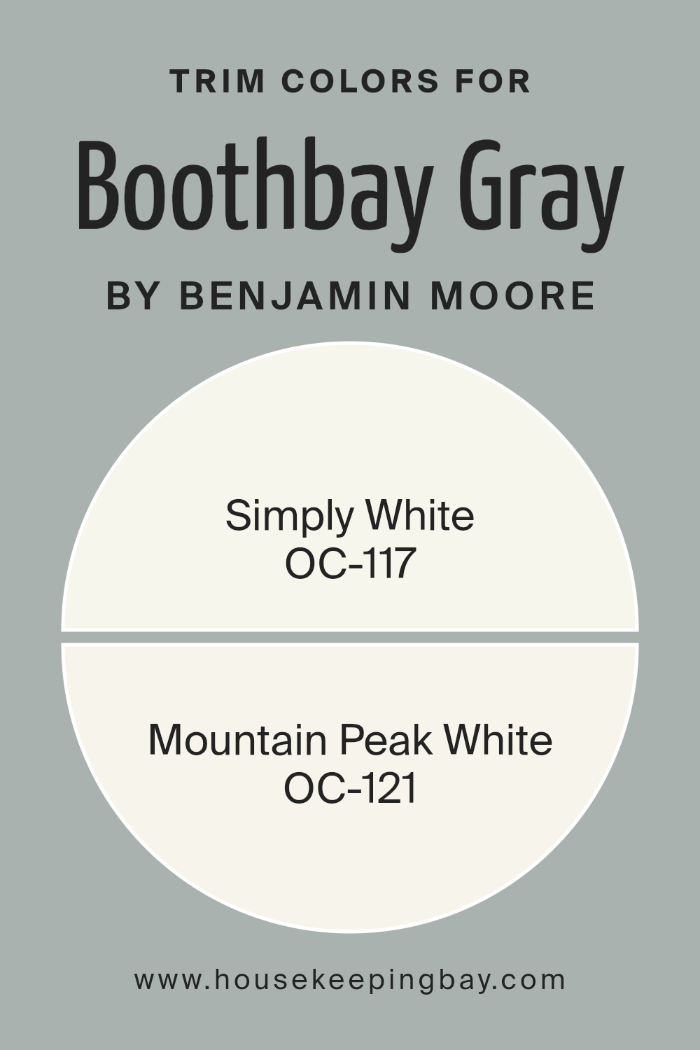
What are the Trim colors of Boothbay Gray HC-165 by Benjamin Moore?
Trim colors are the shades used to paint the moldings, window frames, doors, and other architectural details in a room. These colors help define spaces and add contrast or harmony to the main wall color. For Boothbay Gray HC-165 by Benjamin Moore, choosing the right trim colors is essential because it’s a medium-tone gray with subtle blue undertones.
The right trim can enhance its elegance and give it a cleaner, more defined appearance. Trim colors serve as the finishing touches that tie the room together. By setting a distinct boundary between walls and other features, they can make a space feel more sophisticated and intentional.
Simply White OC-117 is a warm, soft white that complements many colors, including grays like Boothbay Gray. It brings a sense of freshness and brightens up spaces, making it a perfect choice for trim when paired with cool-colored walls.
Mountain Peak White OC-121, on the other hand, is a creamy white with a hint of warmth and richness. Its subtle warmth works well with Boothbay Gray, adding a cozy feel without overwhelming the space. Both trim colors not only highlight architectural details but also add a layer of depth and character to any room with Boothbay Gray.
You can see recommended paint colors below:
- OC-117 Simply White
- OC-121 Mountain Peak White
housekeepingbay.com
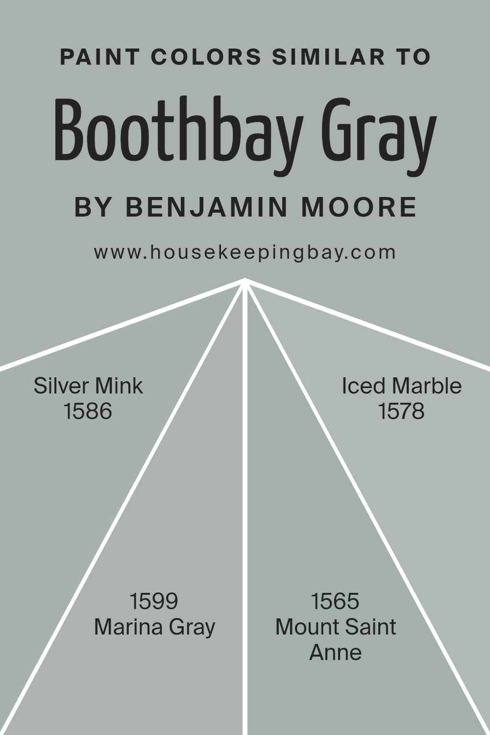
Colors Similar to Boothbay Gray HC-165 by Benjamin Moore
Similar colors play an important role in design because they create harmony and cohesion within a space. Choosing colors that are closely related to Boothbay Gray HC-165 by Benjamin Moore, such as Silver Mink 1586, Marina Gray 1599, Mount Saint Anne 1565, and Iced Marble 1578, can provide a seamless and balanced aesthetic.
These colors share a cool undertone, making them interlink well with one another and with Boothbay Gray, enhancing a room’s overall look and feel. When these colors are used together, they create a relaxing and welcoming atmosphere, as the subtle differences between each shade allow for variety without overwhelming the senses.
Silver Mink 1586 has a soft, muted quality, offering a gentle balance that complements more dominant hues. Marina Gray 1599 adds a slightly warmer grey tone, bringing a sense of depth and coziness. Mount Saint Anne 1565 introduces a hint of blue, giving rooms a touch of serenity and peacefulness.
Meanwhile, Iced Marble 1578 brings a frostier, lighter note that brightens spaces and adds an airy feel. Together, these colors provide a palette that supports elegant transitions between areas while maintaining visual interest and harmony.
They ensure that the space feels thoughtfully put together and visually cohesive.
You can see recommended paint colors below:
- 1586 Silver Mink
- 1599 Marina Gray
- 1565 Mount Saint Anne
- 1578 Iced Marble
housekeepingbay.com
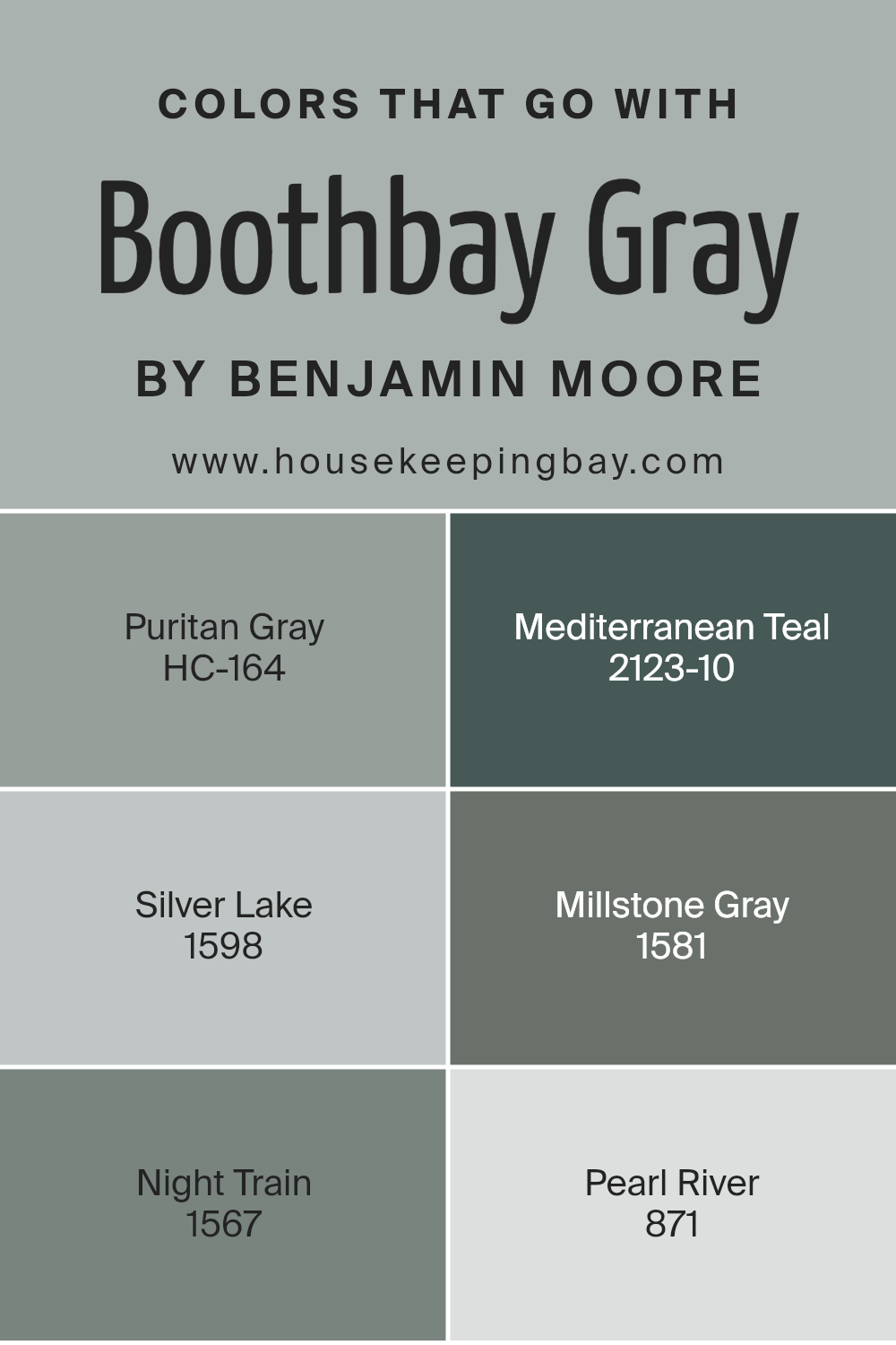
Colors that Go With Boothbay Gray HC-165 by Benjamin Moore
Boothbay Gray HC-165 by Benjamin Moore is a versatile shade that pairs well with a variety of complementary colors, creating a balanced and harmonious atmosphere in any space. Puritan Gray HC-164, a slightly warmer gray, adds depth and warmth, making a room feel cozy without being overwhelming.
On the other hand, Mediterranean Teal 2123-10 offers a bold pop of color that contrasts beautifully with Boothbay Gray, bringing a touch of lively energy to the decor.
Silver Lake 1598 is a lighter gray that complements Boothbay Gray’s subtle tone, creating a serene and calming environment perfect for relaxation. Millstone Gray 1581 introduces a subdued beige undertone that softens the overall look, ensuring the decor feels inviting and comfortable.
Night Train 1567, a deeper, muted gray, can anchor a room with its rich undertones, providing a sophisticated backdrop. Lastly, Pearl River 871, a delicate, light gray, offers a gentle brightness that can open up space, adding lightness without feeling stark.
Together, these colors work seamlessly to create a cohesive and aesthetically pleasing palette, enhancing Boothbay Gray’s natural charm while allowing each shade to contribute uniquely to the overall design.
You can see recommended paint colors below:
- HC-164 Puritan Gray
- 2123-10 Mediterranean Teal
- 1598 Silver Lake
- 1581 Millstone Gray
- 1567 Night Train
- 871 Pearl River
housekeepingbay.com
How to Use Boothbay Gray HC-165 by Benjamin Moore In Your Home?
Boothbay Gray HC-165 by Benjamin Moore is a calming gray with blue undertones. It brings a sense of comfort and simplicity to any room. This color works well in living rooms or bedrooms, providing a cozy atmosphere. Its neutral quality allows it to blend well with other colors, making it easy to match with furniture and decor.
In the kitchen, Boothbay Gray can create a modern look when painted on cabinets or walls. It’s a great choice for those who want a soft touch that isn’t too overpowering. In a bathroom, this shade adds a sense of relaxation, working well with white tiles and fixtures.
For an inviting front door or exterior, Boothbay Gray provides a subtle yet sophisticated touch that enhances curb appeal. Using this paint indoors or outdoors can add a consistent and pleasing theme throughout the home, creating a perfect backdrop for both classic and contemporary styles.
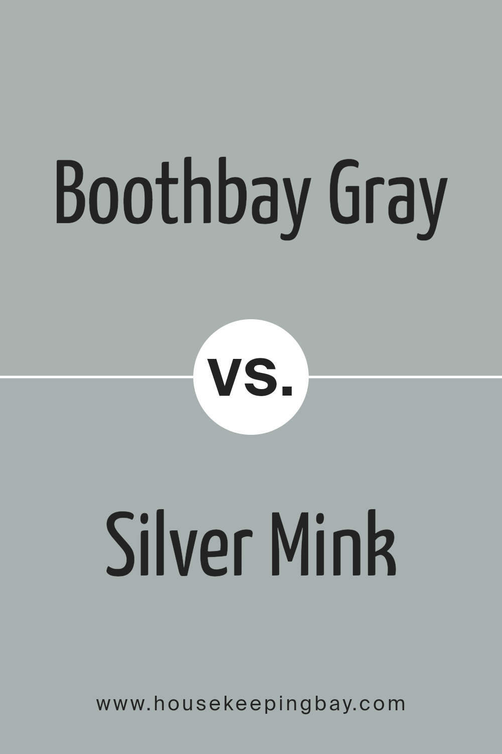
Boothbay Gray HC-165 by Benjamin Moore vs Silver Mink 1586 by Benjamin Moore
Boothbay Gray HC-165 by Benjamin Moore and Silver Mink 1586 by Benjamin Moore are two elegant shades of gray, each with a unique feel. Boothbay Gray is a medium-toned gray with cool undertones, giving it a soft, sophisticated appearance.
This shade combines blue and gray in a balanced way, offering a calm backdrop suitable for various living spaces. Silver Mink, meanwhile, has a lighter, silvery tone. It appears slightly warmer than Boothbay Gray, though still rooted in the gray family.
Silver Mink conveys an airy, open vibe and works well in spaces where a subtle gray is preferred. While Boothbay Gray can create a cozy, grounded atmosphere, Silver Mink brightens up a room with its lighter hue. Both colors fit well in modern, minimalist designs, but their different undertones offer distinct options for personalizing a space. Use them to enhance various room elements, from walls to accents.
You can see recommended paint color below:
- 1586 Silver Mink
housekeepingbay.com
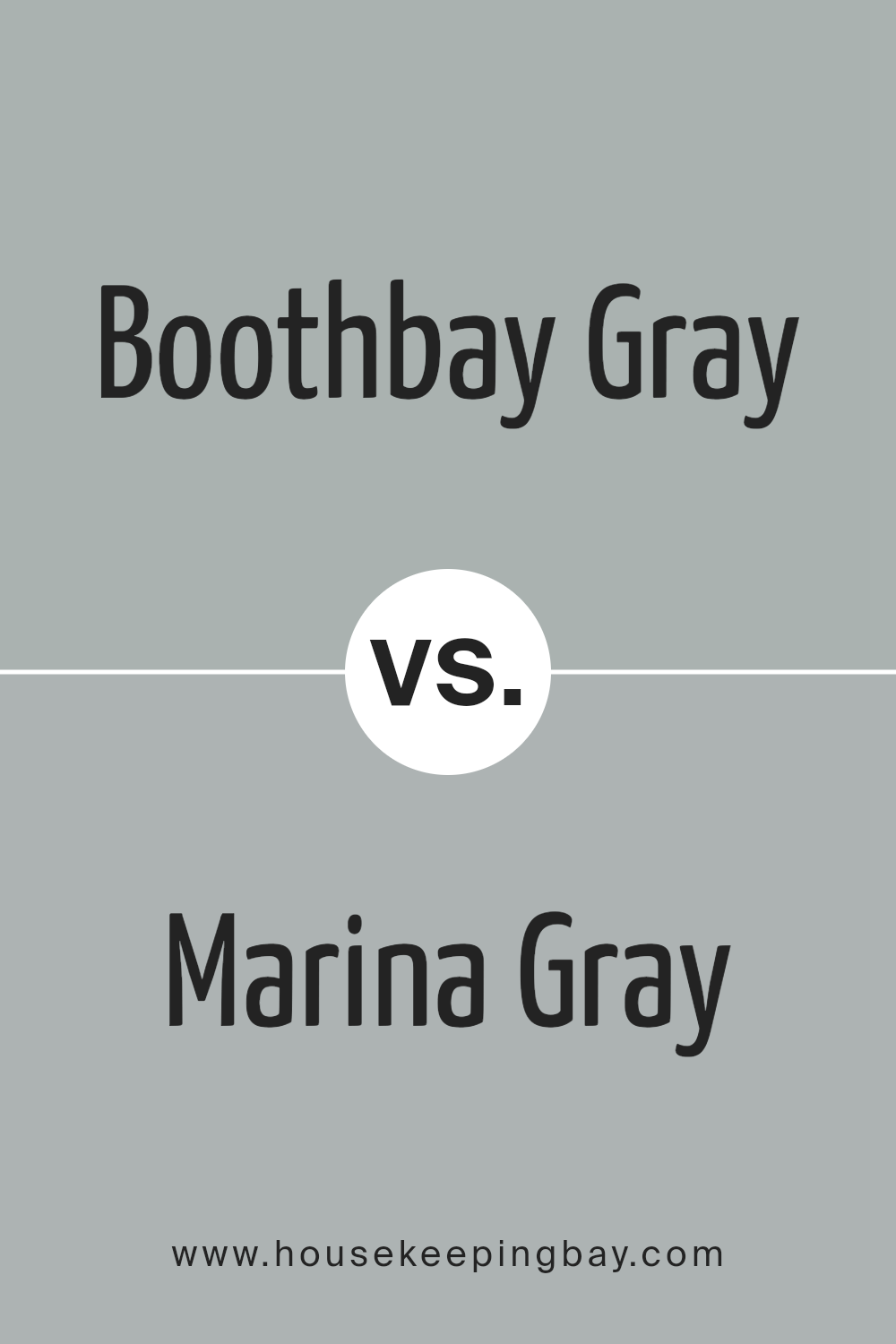
Boothbay Gray HC-165 by Benjamin Moore vs Marina Gray 1599 by Benjamin Moore
Boothbay Gray HC-165 by Benjamin Moore presents a sophisticated blend of gray and blue, offering a balanced, serene feel. This shade works well in a variety of spaces, providing a versatile backdrop that complements both classic and modern decor. Its subtle warmth makes it a cozy choice, ideal for living rooms or bedrooms where a calming atmosphere is desired.
Marina Gray 1599, also by Benjamin Moore, leans more towards a true gray with cooler undertones. This gives it a slightly more modern and crisp appearance. It suits contemporary spaces, adding a clean, polished look. Its neutrality allows it to pair effortlessly with bold accents or vibrant furnishings.
Both colors excel in flexibility, yet Boothbay Gray infuses a hint of blue warmth, while Marina Gray maintains a straightforward, cooler expression. Choosing between them depends on whether you prefer a subtle hint of warmth or a decisively cool, neutral finish.
You can see recommended paint color below:
housekeepingbay.com
Boothbay Gray HC-165 by Benjamin Moore vs Mount Saint Anne 1565 by Benjamin Moore
Boothbay Gray HC-165 by Benjamin Moore offers a muted, sophisticated gray with subtle blue undertones, creating a calm ambiance perfect for versatile spaces. This shade works well in both modern and traditional settings, providing a neutral yet stylish backdrop that complements various accent colors and materials.
Mount Saint Anne 1565 by Benjamin Moore, meanwhile, leans more into blue than gray, offering a soft, dusty blue hue. This shade evokes a soothing, airy feeling, ideal for bedrooms or areas where relaxation is key. It’s a bit brighter than Boothbay Gray and can introduce a gentle pop of color without overwhelming.
While Boothbay Gray offers a more neutral, balanced tone that fits easily into diverse styles, Mount Saint Anne brings a touch of lightness with its stronger blue presence.
Both colors can enhance a room’s mood, yet Boothbay Gray tends toward the understated, while Mount Saint Anne provides a delicate, more vibrant touch.
You can see recommended paint color below:
- 1565 Mount Saint Anne
housekeepingbay.com
Boothbay Gray HC-165 by Benjamin Moore vs Iced Marble 1578 by Benjamin Moore
Boothbay Gray HC-165 and Iced Marble 1578 by Benjamin Moore differ subtly yet significantly in character and application. Boothbay Gray, a soft and muted gray with a touch of blue, brings a calm and sophisticated vibe to any space. It works well in rooms where you want to create a serene and refined atmosphere.
Its muted hue easily complements various design styles, offering versatility in both modern and traditional settings.
Iced Marble 1578, by contrast, offers a cooler and crisper look with its light gray tone. This color provides a clean, refreshing feel to interiors, making spaces seem open and light. It’s an excellent choice for areas where you want to brighten the room without using white.
While Boothbay Gray provides warmth and depth, Iced Marble brings clarity and brightness, making it ideal for places where a lighter ambiance is preferred. Both colors blend nicely with other palettes but serve different moods.
You can see recommended paint color below:
- 1578 Iced Marble
housekeepingbay.com
Conclusion
This shade of gray offers a balanced mix of warmth and coolness, making it suitable for various settings and styles.
Whether used on interior walls, cabinetry, or exterior siding, Boothbay Gray effortlessly enhances the elegance of any space.
I appreciate its ability to function as a neutral backdrop, allowing other design elements to stand out without overshadowing them. The gray’s subtle undertones mean it pairs well with a wide range of colors, from soft pastels to bold, vibrant shades. Its chameleon-like nature adapts seamlessly to different lighting conditions, adding depth and dimension to a room throughout the day.
Personally, I find Boothbay Gray to be a calming presence, perfect for creating a soothing environment at home or in the office.
It provides a sense of sophistication without feeling too cold or industrial, inviting a quiet sense of comfort. In varying lights, this hue subtly shifts, offering a fresh look and perspective.
Incorporating HC-165 Boothbay Gray into any design scheme can inspire creativity and foster a harmonious atmosphere.
With its timeless appeal, this color remains a favorite choice for those seeking a reliable and refined aesthetic.
housekeepingbay.com
Ever wished paint sampling was as easy as sticking a sticker? Guess what? Now it is! Discover Samplize's unique Peel & Stick samples. Get started now and say goodbye to the old messy way!
Get paint samples


