27 Best Neutral Living Room Paint Colors That Never Go Out of Style
Timeless Neutrals Classic and Cozy
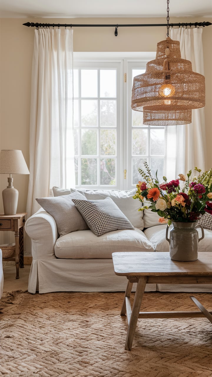
Choosing the right neutral paint color can transform any room, adding a timeless quality that goes beyond trends. I’ve experimented with numerous shades from Sherwin Williams and Benjamin Moore, trying everything from warm whites to moody grays, and have discovered which colors remain favorites in any lighting, season, or decor style. In this guide, I’ll walk you through my top 27 choices—grouped by color family—so you can find your ideal shade to suit your space.
Whether you’re aiming for a crisp white, a cozy beige, or a bold gray, this curated list will help you create a neutral palette that you’ll love for years to come.
Neutral Paint Colors Brief Overview
- Color Family: Includes shades of white, beige, greige, taupe, and soft gray
- Complementary Colors: Pairs well with virtually all colors due to its neutral base
- Best for: Living rooms, bedrooms, dining rooms, offices, and hallways
- Mood: Calm and versatile, adaptable to any decor style
- Where to Use: Ideal for creating a timeless backdrop throughout the home
housekeepingbay.com
Classic Whites and Off-Whites
Table of Contents
Neutral whites are a timeless foundation for any home, whether you’re refreshing an old space or styling a new one. I find whites with subtle undertones are the trick to achieving warmth or coolness, depending on the lighting and style.
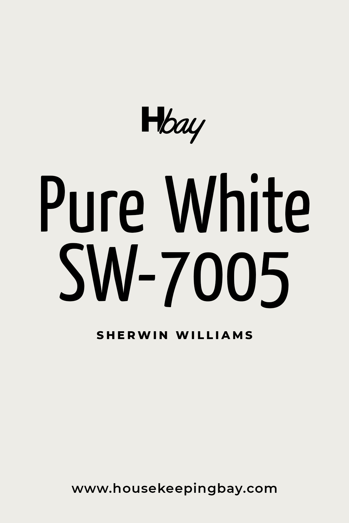
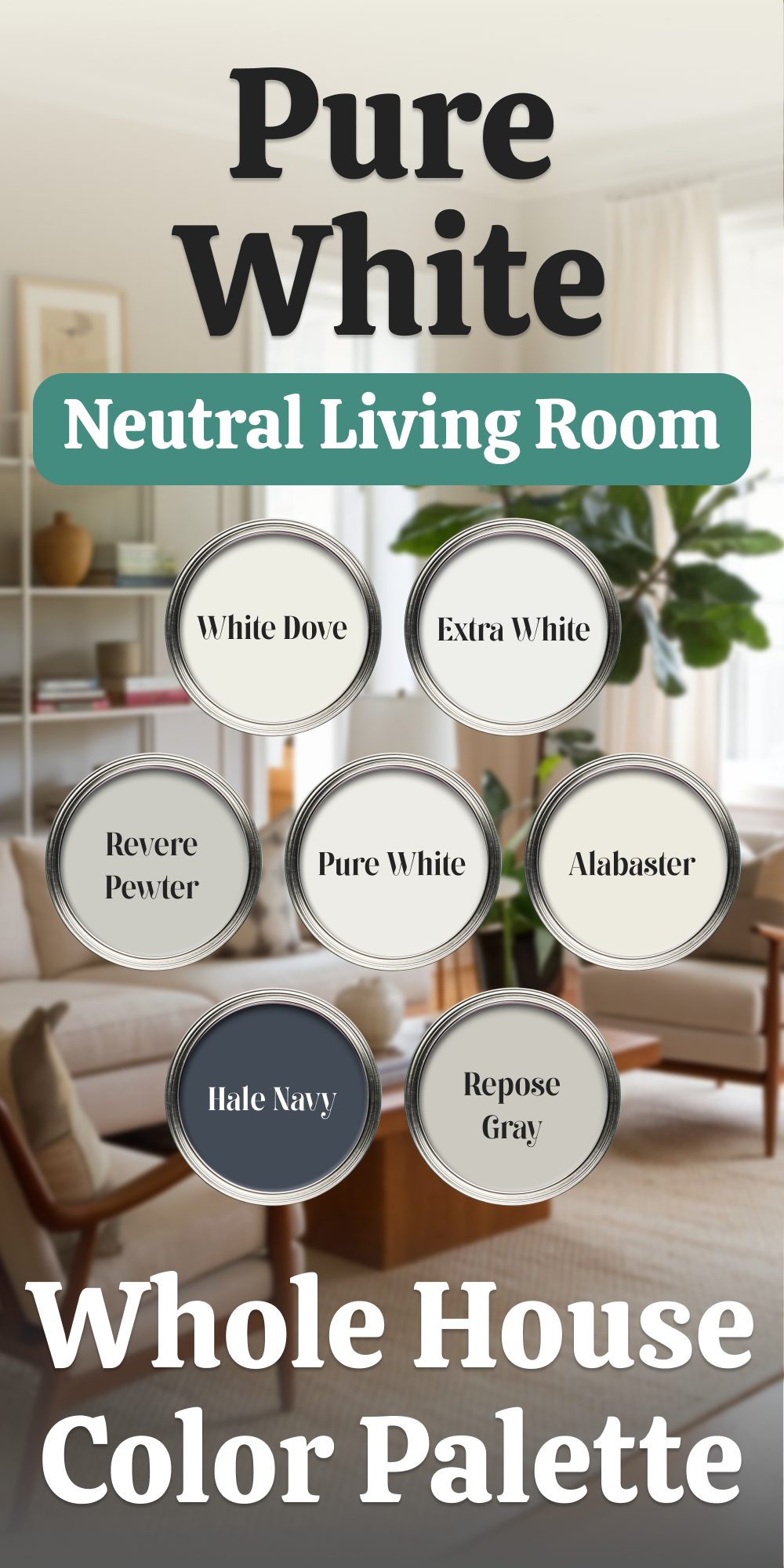
Sherwin Williams Pure White
Sherwin Williams Pure White is the versatile white I reach for when I need a soft, true white without any starkness. Its subtle gray undertones make it flexible, keeping it from appearing too cool or too warm, which works beautifully in both modern and traditional designs. I often find Pure White helps create a balanced, clean look, ideal for walls, trims, and even cabinets in open-concept spaces. Its soft quality blends effortlessly with other neutrals, making it a reliable choice if you’re aiming for a classic, understated palette.
👉Check the full guide about this color HERE👈
Housekeepingbay.com
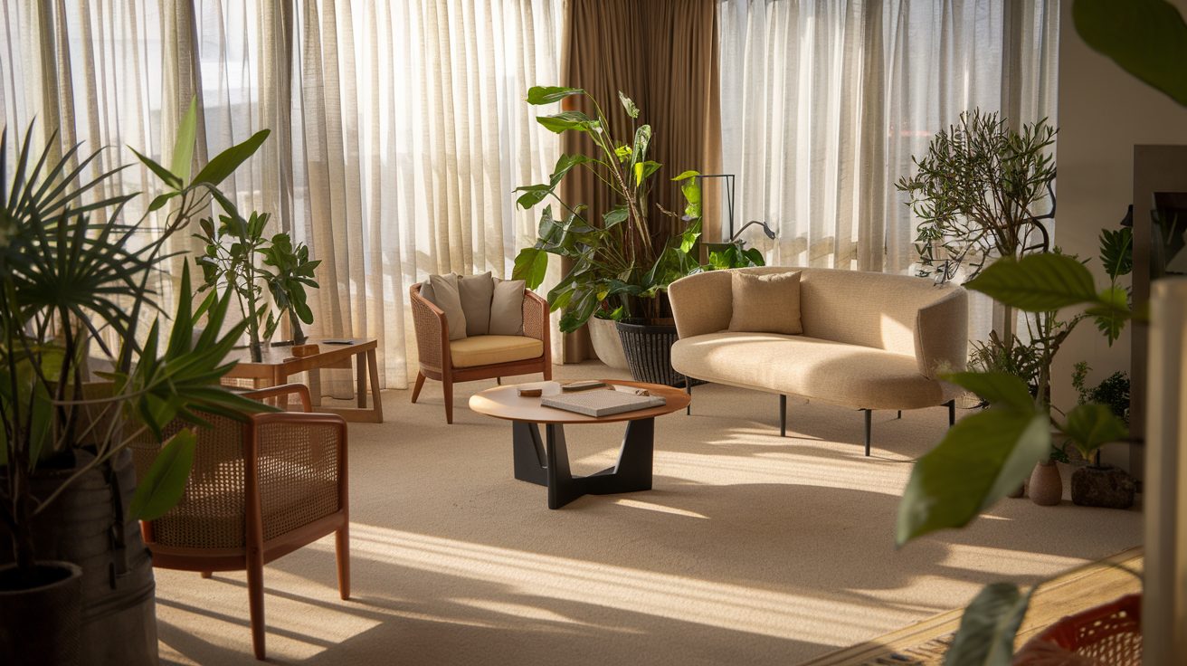
Neutral Living Room Palette based on Pure White for the Whole Home
housekeepingbay.com
Benjamin Moore White Dove
Benjamin Moore White Dove is my top choice for achieving warmth without going overly creamy. With its slight greige undertones, White Dove gives off a soft warmth that’s especially effective in north-facing rooms, where cooler light can sometimes make other whites look cold.
It’s also highly flexible, pairing well with warmer decor accents. This color creates an inviting and cozy feel that’s subtle enough not to overpower a room, which makes it perfect for both walls and trim.
👉Check the full guide about this color HERE👈

housekeepingbay.com
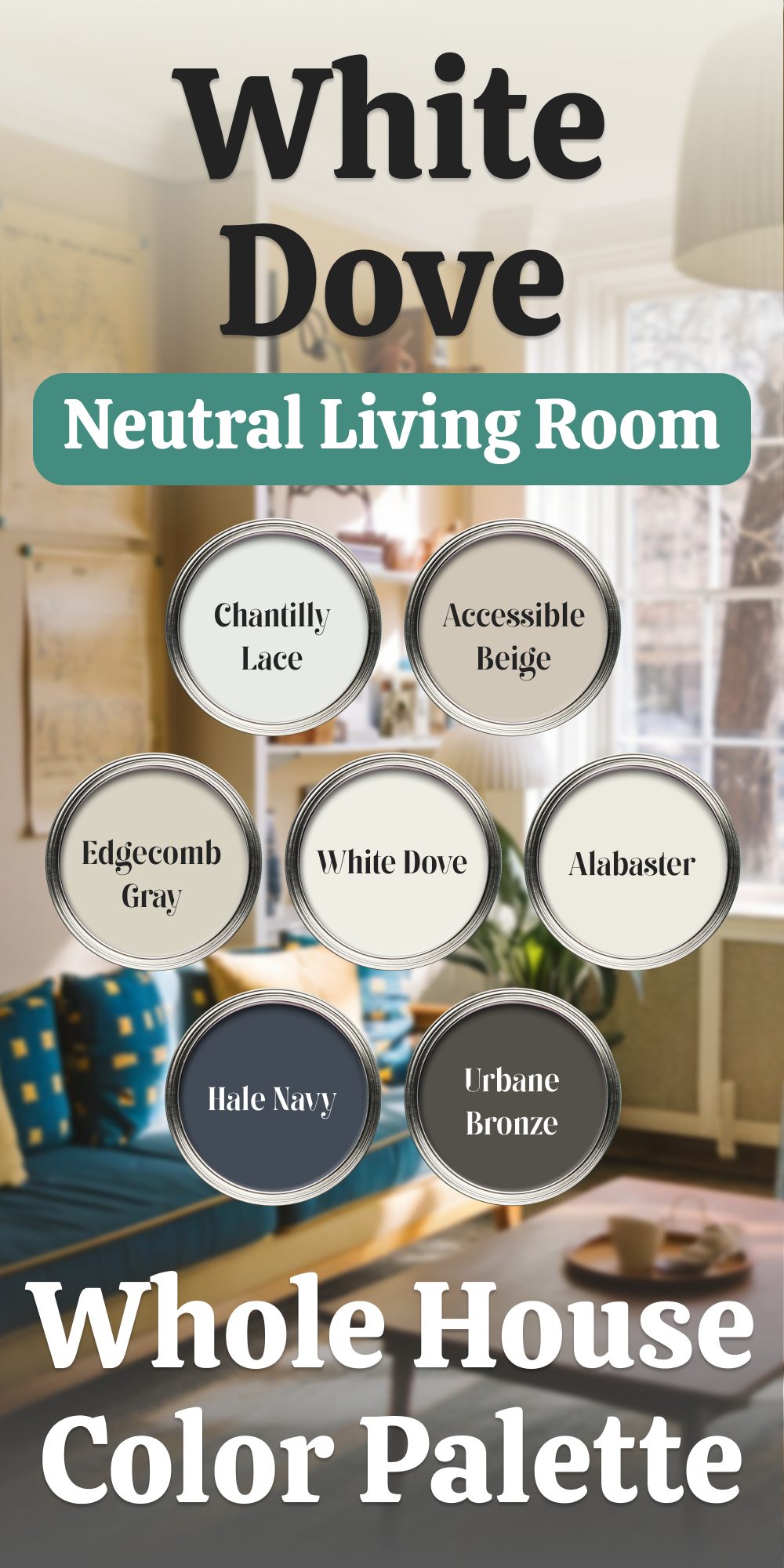
Neutral Living Room Palette based on White Dove for the Whole House
Benjamin Moore White Dove is a soft, welcoming white with a creamy undertone that adds warmth without veering too yellow. This versatile shade creates a tranquil backdrop that harmonizes with a variety of colors and textures, making it an ideal base for a whole-home palette. Here’s how to layer complementary shades for a seamless flow between rooms:
Pairing Benjamin Moore White Dove with Complementary Shades
- Benjamin Moore Chantilly Lace (OC-65)
Use Chantilly Lace for ceilings and trim to frame White Dove walls with a clean, crisp contrast. Its cooler, brighter quality amplifies light, creating a polished look. This pairing is perfect for spaces requiring a heightened sense of openness and airiness. - Benjamin Moore Edgecomb Gray (HC-173)
As a subtle greige, Edgecomb Gray provides a neutral contrast to White Dove. It’s a great choice for adjoining rooms or accent walls, offering warmth and sophistication without overshadowing the main color. - Benjamin Moore Hale Navy (HC-154)
For bold accents, Hale Navy introduces rich depth and drama. Use it sparingly on furniture, built-ins, or as a statement color for doors or feature walls. This pairing elevates White Dove’s softness while anchoring the design with visual interest. - Sherwin-Williams Alabaster (SW 7008)
Alabaster’s creamy undertones make it a close cousin to White Dove, suitable for spaces that need additional warmth, like bedrooms or dens. Pairing these two shades ensures continuity while adding a touch of subtle variation. - Sherwin-Williams Accessible Beige (SW 7036)
Accessible Beige complements White Dove with its warm, taupe undertones. This shade works well in larger areas like living rooms or hallways, where its grounding presence can balance White Dove’s lightness. - Sherwin-Williams Urbane Bronze (SW 7048)
For striking accents, Urbane Bronze brings a rich, moody contrast. This deep brown-gray is ideal for cabinetry, fireplaces, or focal walls, adding sophistication and grounding the lighter tones in the palette.
Designing a Seamless Transition Between Spaces
Start with White Dove as the dominant color for walls, creating a neutral foundation. Incorporate Chantilly Lace for trims, ceilings, and moldings to emphasize architectural details. Use Accessible Beige or Edgecomb Gray in transitional areas like hallways or foyers to provide a gentle shift between spaces.Introduce depth with Hale Navy or Urbane Bronze in specific rooms or as accents to highlight features like built-ins, kitchen islands, or door frames. Alabaster can serve as a complementary wall color in cozy spaces, maintaining a warm and inviting atmosphere.
This curated palette builds harmony across your home, allowing each color to shine while enhancing the overall flow. Benjamin Moore White Dove anchors the design with its warmth and versatility, letting each shade contribute its unique charm.
housekeepingbay.com
Sherwin Williams Snowbound
Sherwin Williams Snowbound has a unique appeal, combining soft warmth with subtle pink-gray undertones. Snowbound shifts slightly based on lighting, giving it a dynamic quality I love. While it remains neutral, the hint of warmth gives it a welcoming feel without veering into stark or clinical territory. I find it works especially well in rooms that receive moderate to warm light, as it complements natural light beautifully, enhancing the room’s character.
👉Check the full guide about this color HERE👈

Housekeepingbay.com
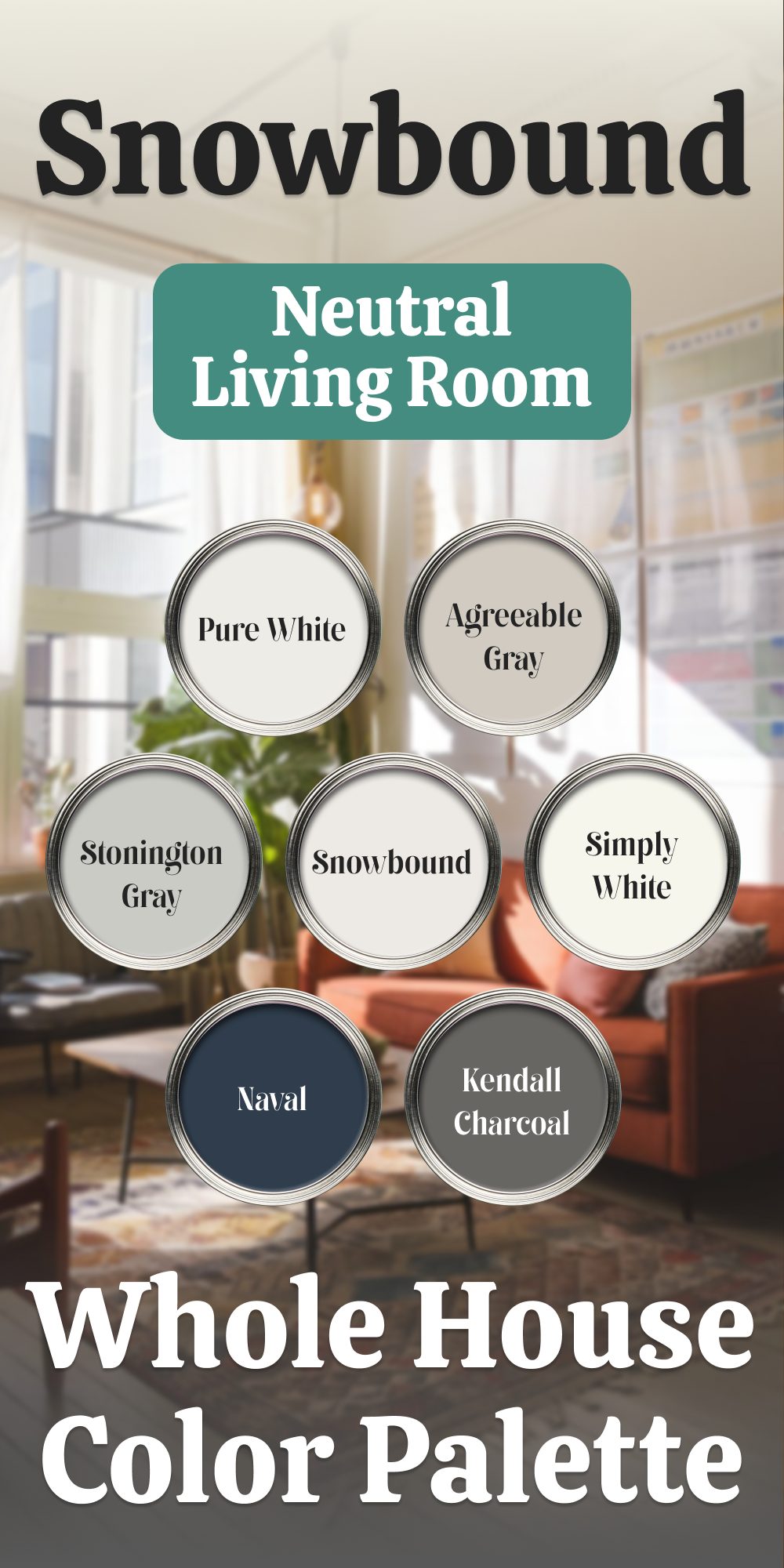
Neutral Living Room Palette based on Snowbound for the Whole House
Sherwin-Williams Snowbound, with its soft warmth and subtle gray undertones, creates a sophisticated foundation for a cohesive home. Its adaptability ensures that every room feels connected while allowing for creative pairings with complementary colors.
Here’s how to integrate Snowbound with a curated selection of hues for a polished, balanced interior:
Coordinating Colors for a Thoughtful Palette
- Sherwin-Williams Pure White (SW 7005)
For a seamless transition, Pure White is the perfect choice for trim, ceilings, and cabinetry. Its brightness highlights Snowbound’s subtle warmth without overpowering it. This pairing enhances clean lines and architectural details, creating a fresh, cohesive look. - Sherwin-Williams Agreeable Gray (SW 7029)
A soft greige, Agreeable Gray works beautifully with Snowbound to add depth while maintaining a neutral aesthetic. Use it in adjoining rooms or as an accent to create visual interest without disrupting the overall harmony. - Sherwin-Williams Naval (SW 6244)
For bold contrasts, Naval offers a striking deep blue that pairs elegantly with Snowbound. It’s an excellent choice for accent walls, built-ins, or kitchen islands, adding richness to the palette. - Benjamin Moore Simply White (OC-117)
Simply White introduces a creamy undertone that complements Snowbound’s softness. Use it in areas where you want a touch of warmth, such as furniture finishes or smaller rooms that benefit from a cozy ambiance. - Benjamin Moore Stonington Gray (HC-170)
This cool gray creates a gentle contrast with Snowbound’s warmer undertones. It’s a refined choice for bedrooms or living spaces, adding a touch of modern elegance while keeping the palette cohesive. - Benjamin Moore Kendall Charcoal (HC-166)
For dramatic accents, Kendall Charcoal adds a grounded, sophisticated depth. Perfect for front doors, accent walls, or furniture, it complements Snowbound’s softness with a bold yet balanced touch.
Creating Flow and Balance
Start with Snowbound as the dominant color on walls throughout your home to anchor the palette. Pair it with Pure White for trim and ceilings, ensuring a bright, clean frame for each space. Introduce Agreeable Gray in living areas or hallways for subtle variation, keeping the look serene and cohesive.
For more dramatic rooms, such as a home office or dining area, Naval or Kendall Charcoal can take center stage as statement colors, balanced by Snowbound on surrounding surfaces. Stonington Gray adds a contemporary edge to bedrooms or bathrooms, offering a crisp contrast that feels modern and tailored.
In kitchens, consider Snowbound for the walls and cabinetry, with Pure White on trim and ceilings. Add depth with a Naval-painted island or Kendall Charcoal accents on cabinetry hardware or open shelving.
This palette, built around the versatility of Sherwin-Williams Snowbound, creates a home that feels unified yet dynamic, balancing light and dark tones with an effortlessly cohesive flow.
housekeepingbay.com
Benjamin Moore Simply White
Benjamin Moore Simply White brings a gentle, inviting warmth to any space with its soft yellow undertones. I often use it in rooms where I want a bright, sunny feel without an overly stark effect. Simply White’s warmth makes it especially harmonious with wood tones or warmer accents, creating a cozy, light-filled ambiance that doesn’t look cold. This shade works well in both modern and traditional settings, making it a flexible choice for any room needing a bit of extra brightness.
👉Check the full guide about this color HERE👈

housekeepingbay.com
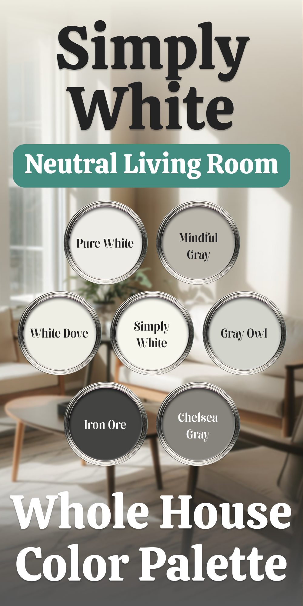
Benjamin Moore Simply White A Bright and Versatile Base for the Whole Home
Benjamin Moore Simply White is a luminous and soft white that creates a bright yet welcoming foundation for any space. Its subtle yellow undertone provides warmth without feeling overpowering, making it an ideal choice for a cohesive home color palette. Paired with complementary shades, Simply White ensures every room transitions smoothly while offering flexibility in design.
Pairing Colors for a Balanced Home Palette
- Benjamin Moore White Dove (OC-17)
White Dove offers a creamy warmth that blends effortlessly with Simply White. It’s a perfect trim or cabinetry color when paired with Simply White walls, providing a slight contrast that highlights architectural features. - Benjamin Moore Gray Owl (OC-52)
For a soft, cool contrast, Gray Owl delivers a light gray with subtle green undertones. Use it in bedrooms, offices, or bathrooms for a calming touch that pairs beautifully with Simply White’s brightness. - Benjamin Moore Chelsea Gray (HC-168)
A rich, warm gray, Chelsea Gray adds depth and sophistication. It’s perfect for accent walls, built-ins, or even kitchen islands. This shade anchors the lightness of Simply White without feeling heavy. - Sherwin-Williams Pure White (SW 7005)
For trim, ceilings, and doors, Pure White is an excellent match. Its slightly gray undertone ensures a clean and crisp transition, complementing Simply White’s soft warmth. - Sherwin-Williams Mindful Gray (SW 7016)
Mindful Gray provides a balanced greige tone that works well in transitional spaces like hallways or open-plan living areas. Its subtle depth contrasts nicely with Simply White, offering a seamless flow between rooms. - Sherwin-Williams Iron Ore (SW 7069)
For bold accents, Iron Ore’s deep charcoal gray makes a striking statement. Use it for front doors, cabinetry, or dramatic feature walls to create visual impact while maintaining harmony with the lighter tones.
Designing a Unified Look
Start with Simply White as the dominant wall color across your home, ensuring an open and cohesive feel. Pair it with Pure White on trim and ceilings for a clean, polished look. Introduce Gray Owl in bedrooms or bathrooms to add a soft, soothing contrast.
For communal spaces like the living room or dining area, use Mindful Gray to create depth and balance. Chelsea Gray can serve as a bold accent for furniture, built-ins, or a feature wall. In kitchens, consider Simply White for cabinetry and walls, with Chelsea Gray or Iron Ore for the island or lower cabinets to ground the space.For exterior applications, Simply White offers a fresh and timeless appearance. Pair it with Iron Ore on shutters or the front door for a striking contrast, and use White Dove or Pure White for trim to complete the look.
This palette centers on the adaptability of Benjamin Moore Simply White, allowing for creative yet harmonious combinations that enhance the character of each space. Whether subtle or bold, the supporting colors provide the versatility needed for a beautifully balanced home.
housekeepingbay.com
Sherwin Williams Alabaster
Sherwin Williams Alabaster is my go-to for a creamy, warm white that doesn’t feel heavy or dark. It adds a natural coziness to rooms with lower light, making it a perfect choice for spaces like bedrooms or reading nooks. Its warmth is subtle yet effective, giving the space an organic, comfortable feel. Alabaster pairs wonderfully with natural textures like wood and stone, making it a timeless choice that complements both traditional and contemporary decor.
👉Check the full guide about this color HERE👈
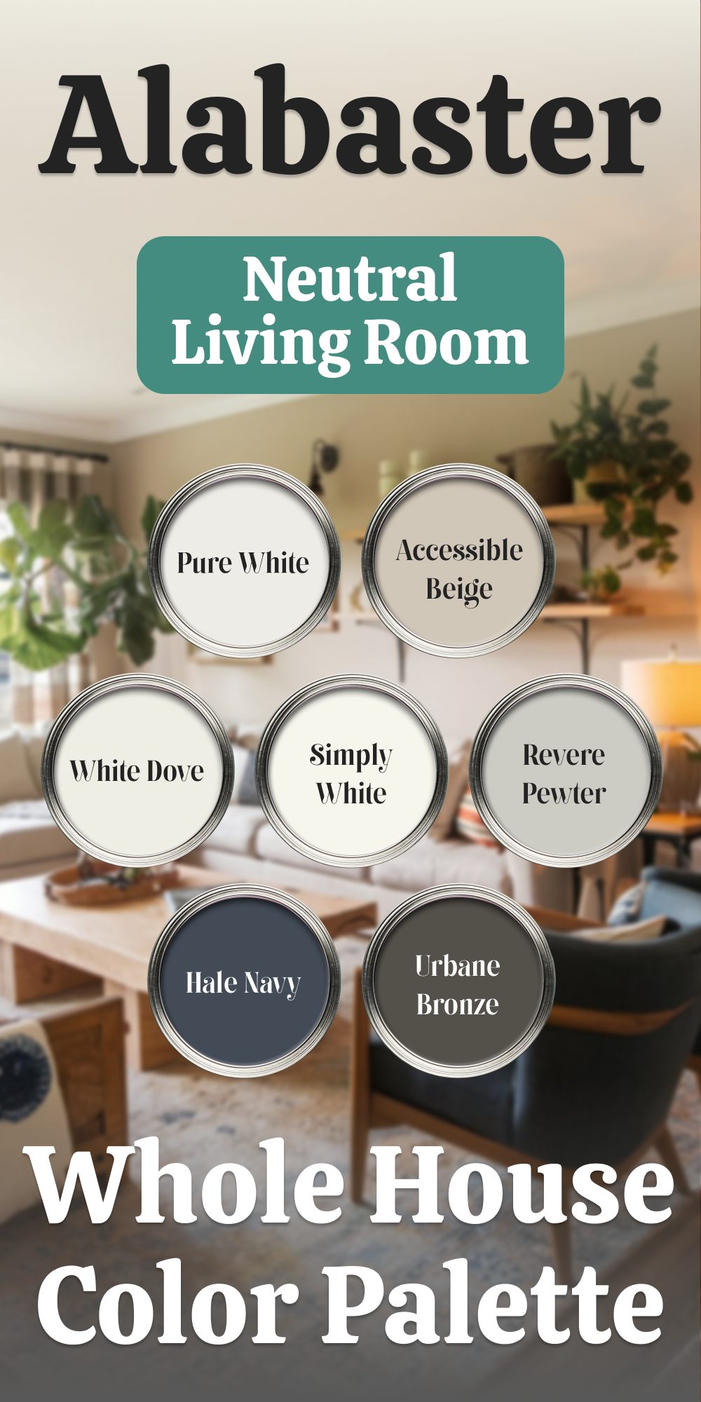
Sherwin-Williams Alabaster – Perfect Warm White for a Harmonious Home
Sherwin-Williams Alabaster, with its creamy warmth and neutral undertones, is a timeless choice for creating a cohesive and inviting atmosphere throughout your home. This versatile white pairs effortlessly with a range of colors, offering flexibility while maintaining a serene and balanced feel.
Here’s how to incorporate Alabaster with complementary hues for a thoughtfully curated palette:
Pairing Colors with Sherwin-Williams Alabaster
- Sherwin-Williams Pure White (SW 7005)
For trim, ceilings, and cabinetry, Pure White brings a clean, bright contrast to Alabaster’s softer warmth. This combination ensures clarity in architectural details and adds a refined crispness to the overall palette. - Sherwin-Williams Accessible Beige (SW 7036)
Accessible Beige enhances Alabaster’s warmth while providing a subtle greige contrast. Use it in living rooms, hallways, or secondary bedrooms for a seamless and understated flow that feels cohesive yet layered. - Sherwin-Williams Urbane Bronze (SW 7048)
For dramatic accents, Urbane Bronze offers a rich, moody depth that pairs beautifully with Alabaster’s softness. Consider it for feature walls, built-ins, or statement furniture to add a bold, grounded element to your spaces. - Benjamin Moore White Dove (OC-17)
Slightly creamier than Pure White, White Dove harmonizes with Alabaster for areas needing a softer transition. It’s an ideal choice for cabinetry, smaller rooms, or spaces where warmth is a priority. - Benjamin Moore Revere Pewter (HC-172)
Revere Pewter introduces an earthy, muted contrast that pairs seamlessly with Alabaster. Use it in dining rooms, home offices, or as an accent in open-plan spaces to provide depth without overwhelming the lightness of Alabaster. - Benjamin Moore Hale Navy (HC-154)
For a bold yet classic pairing, Hale Navy delivers rich contrast against Alabaster’s warmth. It’s perfect for kitchen islands, front doors, or accent walls, offering a dramatic yet balanced focal point.
Designing with Alabaster for a Cohesive Look
Begin with Alabaster as the primary wall color throughout your home, creating a warm and inviting canvas. Pair it with Pure White for trim and ceilings to maintain a clean and polished look. Accessible Beige can be introduced in living spaces or secondary rooms, adding subtle contrast without disrupting the flow.In high-impact areas like a dining room or office, Urbane Bronze or Hale Navy can be used for an accent wall or built-ins, grounded by Alabaster on surrounding surfaces. For spaces that need extra warmth, White Dove offers a gentle contrast, especially on cabinetry or smaller walls.Revere Pewter complements Alabaster’s warmth with its greige undertones, making it ideal for transitional spaces like hallways or as a soft contrast in larger living areas.For kitchens, Alabaster on cabinetry paired with a Hale Navy island or Urbane Bronze hardware creates a refined and cohesive look. Use Pure White for ceilings and trim to frame the space with a clean finish.
Sherwin-Williams Alabaster, paired with this versatile palette, creates a home that feels both unified and dynamic, effortlessly balancing light and depth for a timeless design.
housekeepingbay.com
Benjamin Moore Chantilly Lace
Benjamin Moore Chantilly Lace is ideal for bright, well-lit rooms where you want a clean, neutral white. It has a slight coolness to it but maintains an overall balance, which makes it highly versatile. Chantilly Lace doesn’t lean too warm or too cool, so it’s perfect for creating a crisp, refreshing ambiance. I love using this shade in kitchens and bathrooms, where it provides a fresh backdrop that pairs effortlessly with both warm wood tones and cool metals.
👉Check the full guide about this color HERE👈

housekeepingbay.com
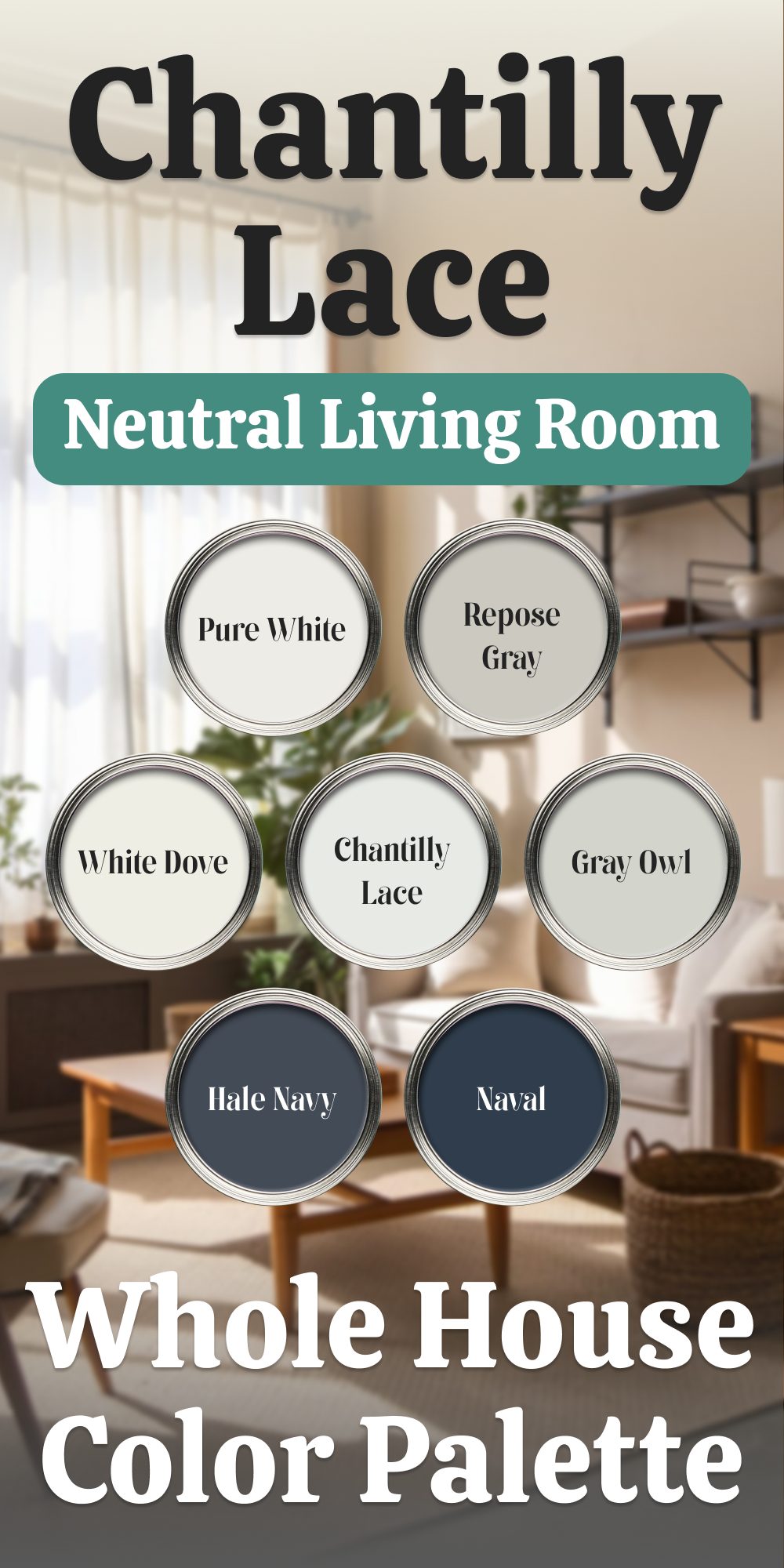
Neutral Living Room Palette based on Chantilly Lace for the Whole Home
Choosing the right colors for your home involves striking a balance between timeless neutrals and bold accents. This curated palette features a mix of soft whites, versatile grays, and deep, moody shades, providing endless opportunities to create a cohesive and stylish interior.
The Colors That Define Your Space
- Benjamin Moore Chantilly Lace (OC-65)
This bright, clean white acts as the ultimate crisp foundation. With its high reflectivity, Chantilly Lace is ideal for ceilings, trims, or any area requiring a fresh, sharp contrast against other shades in this palette. - Benjamin Moore White Dove (OC-17)
A warmer white, White Dove introduces softness without veering into creaminess. Use it for cabinetry, woodwork, or even entire rooms where you want a serene backdrop with a subtle touch of warmth. - Benjamin Moore Gray Owl (OC-52)
Light and airy, Gray Owl adds a sophisticated gray tone with a hint of green undertone, making it perfect for open-concept spaces. It pairs beautifully with White Dove for a layered, neutral look. - Benjamin Moore Hale Navy (HC-154)
This rich navy creates depth and contrast. Consider it for accent walls, built-ins, or even statement furniture pieces. Paired with White Dove or Chantilly Lace, Hale Navy becomes the focal point while maintaining balance. - Sherwin-Williams Pure White (SW 7005)
Pure White’s flexibility makes it a favorite for walls, ceilings, and trims. Its subtle warmth and neutral undertones allow it to work harmoniously with both cool and warm shades in this palette. - Sherwin-Williams Repose Gray (SW 7015)
As a mid-tone gray with balanced warmth and coolness, Repose Gray is a seamless choice for living areas or bedrooms. Its versatility complements both white and dark accents, anchoring the palette. - Sherwin-Williams Naval (SW 6244)
A deep, bold blue, Naval brings sophistication and drama. Use it on doors, cabinetry, or as an accent to inject personality into your space while coordinating with the lighter tones in the palette.
Creating a Flow Through Your Home
Start with Chantilly Lace or Pure White as the unifying element for walls, ceilings, and trims, establishing a bright and neutral base. Add depth by introducing Gray Owl or Repose Gray in living rooms or hallways. For a touch of coziness, consider White Dove in kitchens and bedrooms, especially when paired with natural wood finishes.
Accent with the bold confidence of Hale Navy or Naval on kitchen islands, interior doors, or a dramatic focal wall in a dining or office space. These shades ground the palette while adding a refined edge.
Versatile Combinations
- Chantilly Lace and Hale Navy: A crisp pairing perfect for modern spaces.
- White Dove and Repose Gray: A warm, inviting combo suited for bedrooms or living areas.
- Gray Owl and Naval: A striking contrast with a contemporary touch.
- Pure White and Hale Navy: Timeless and bold, ideal for kitchens or exterior accents.
This thoughtfully crafted palette offers balance and flexibility, allowing each room to complement the next while standing out with its unique character. From airy neutrals to grounding blues, your home will reflect a cohesive yet dynamic design.
housekeepingbay.com
Sherwin Williams Extra White
Sherwin Williams Extra White is a cooler white with a subtle, icy undertone that keeps it bright without warmth. It’s my top choice for spaces where a clean, clear white is essential, like contemporary living rooms or sleek kitchens. Extra White maintains its true color in various lighting conditions, which is great for achieving a minimalist, open feel. Its cool undertone also makes it a good match for spaces with modern design elements, where clean lines and bright whites are essential.
👉Check the full guide about this color HERE👈

housekeepingbay.com
Neutral Living Room Palette based on Extra White for the Whole House
When designing a cohesive interior palette, whites and neutrals create an enduring foundation. Each shade brings unique undertones and characteristics, offering flexibility for pairing with various styles and spaces. This guide explores how to combine and utilize these seven versatile paint colors for a harmonious and balanced home.
- Sherwin-Williams Extra White (SW 7006) – Extra White is a bright, clean white with a high light reflectance value (LRV), making it a go-to for trim, ceilings, and modern spaces. Its cool undertones offer a crisp finish, perfect for contrasting with deeper colors like Edgecomb Gray or Classic Gray. Ideal Pairing: Use Extra White with walls painted in Benjamin Moore Classic Gray for a soft contrast, or pair it with Sherwin-Williams Pure White walls to create an airy and open effect.
- Sherwin-Williams Alabaster (SW 7008) – Alabaster provides a warmer, creamy white that feels inviting and soft. Its beige undertones add warmth to spaces, making it an excellent choice for living areas or bedrooms. Ideal Pairing: Pair Alabaster with Benjamin Moore Edgecomb Gray for a neutral yet rich combination that maintains a soft flow throughout the home. Use it as a trim color alongside walls in Chantilly Lace for a harmonious balance of warm and cool whites.
- Sherwin-Williams Pure White (SW 7005) – Pure White strikes a balance with subtle warmth and a hint of gray. Its versatility makes it suitable for walls, trims, and even cabinetry. Ideal Pairing: Combine Pure White with Benjamin Moore Classic Gray for understated elegance or contrast it with Hale Navy for bold accents in kitchens or feature walls.
- Sherwin-Williams Snowbound (SW 7004) – Snowbound offers a soft white with slight gray undertones, lending an almost pastel-like quality. It works well in spaces with ample natural light, creating a cozy yet refined ambiance. Ideal Pairing: Match Snowbound with Benjamin Moore Edgecomb Gray for a soothing palette, or pair it with Extra White on trim for a subtle but effective contrast.
- Benjamin Moore Chantilly Lace (OC-65) – Known for its brilliant brightness, Chantilly Lace is a clean, crisp white without prominent undertones. It pairs effortlessly with cooler or warmer shades, adding a fresh and timeless touch to interiors. Ideal Pairing: Use Chantilly Lace with Sherwin-Williams Alabaster for soft sophistication or with Benjamin Moore Edgecomb Gray for a subtle but striking tonal variation.
- Benjamin Moore Classic Gray (OC-23) – A light gray with warm undertones, Classic Gray is a versatile neutral that pairs beautifully with whites and richer hues alike. Its understated elegance works well in contemporary and traditional settings. Ideal Pairing: Match Classic Gray with Pure White for walls and trim, or with Sherwin-Williams Snowbound to create depth in open-concept layouts.
- Benjamin Moore Edgecomb Gray (HC-173) –Edgecomb Gray offers a greige tone that feels grounded and cozy. Its warmth allows it to complement whites like Extra White or Chantilly Lace seamlessly. Ideal Pairing: Use Edgecomb Gray as a wall color with Chantilly Lace trim for a modern contrast or combine it with Alabaster for a palette rooted in soft neutrals.
Designing a Cohesive Palette
Start by selecting a dominant color—Pure White or Snowbound for walls provides a neutral canvas. Layer with complementary whites and grays on trim, cabinetry, and accent walls. Add variety with textures like wood, stone, or metals to enhance the palette’s depth.
This curated mix of whites and neutrals offers flexibility to suit various interiors while ensuring a polished and cohesive look across your home.

housekeepingbay.com
Benjamin Moore Cloud White
Benjamin Moore Cloud White has a soft, creamy warmth that I find particularly suited to traditional interiors. With its slightly warm undertones, it’s inviting and classic, making it perfect for spaces where you want a warm, welcoming feel. Cloud White pairs well with antique furnishings and warmer decor styles, giving the room an established, cozy look. This shade also works beautifully for trim, as it provides a subtle contrast to other colors without feeling too bright.
👉Check the full guide about this color HERE👈

housekeepingbay.com
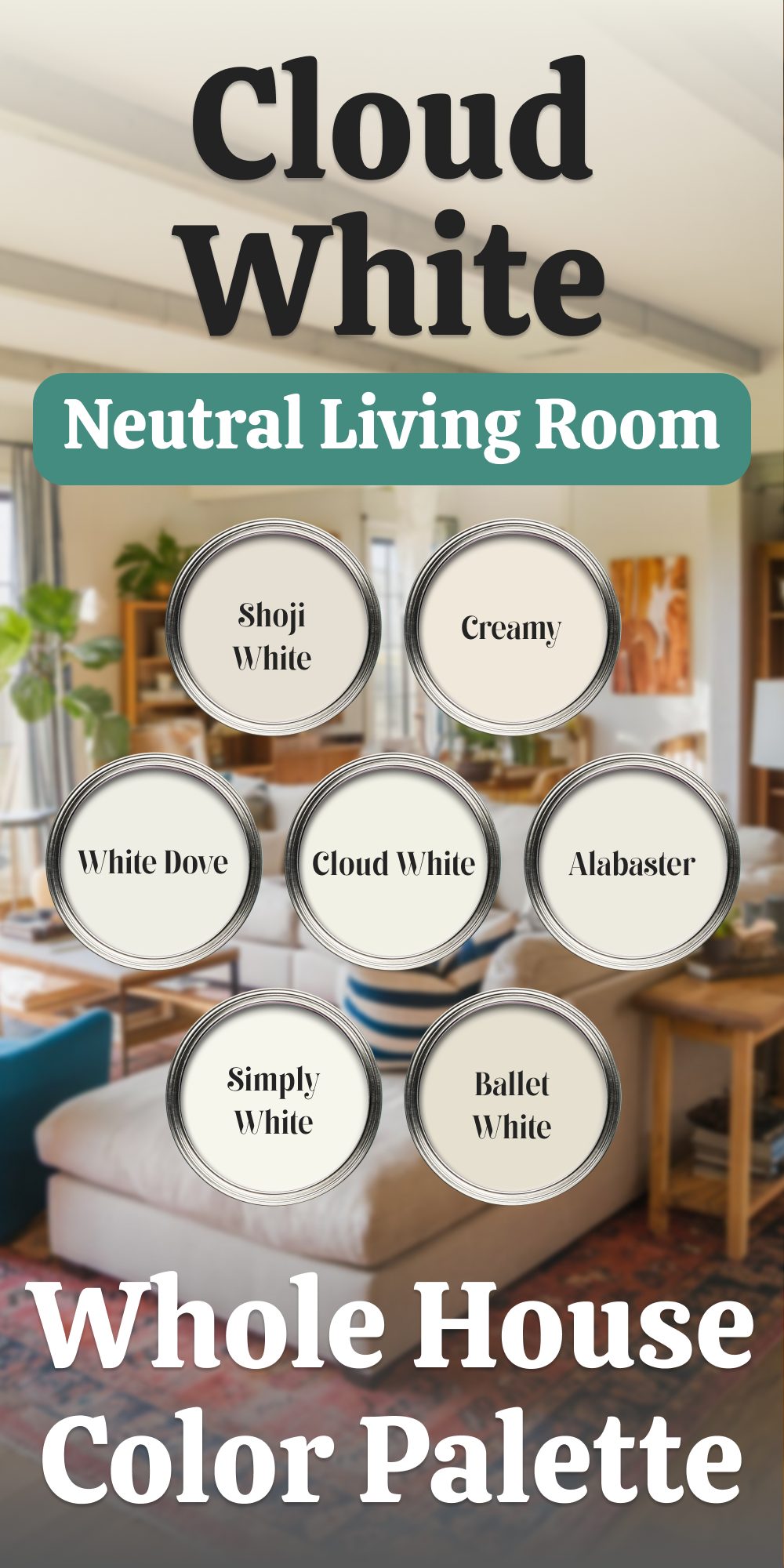
Neutral Living Room Palette based on Cloud White for the Whole Home
Benjamin Moore Cloud White offers the perfect foundation for a home color scheme, bringing warmth and brightness that adapts effortlessly to different spaces. With its soft undertones, this shade establishes a welcoming ambiance, particularly suited for a living room—the heart of the home. From this starting point, you can build a harmonious palette by layering complementary shades throughout your interiors.
The Living Room as the Anchor
With Cloud White on the walls, the living room sets a tranquil yet inviting tone. This versatile white has a creamy base that avoids feeling stark, making it ideal for a central gathering space. Its adaptability ensures seamless coordination with adjacent rooms, even as you vary the secondary colors for added interest.
Complementary Colors for the Whole Home
- Benjamin Moore White Dove (OC-17)
White Dove, with its balanced creaminess, pairs seamlessly with Cloud White. Use it on trim, baseboards, or ceilings to subtly frame walls, enhancing the airy effect. In spaces like kitchens or bathrooms, White Dove can extend to cabinetry, adding a polished finish. - Benjamin Moore Simply White (OC-117)
For areas that benefit from brighter tones, Simply White introduces a crisp, clean option. Its faint yellow undertones provide warmth without competing with Cloud White’s softness. Consider this for hallways or spaces needing a touch of light enhancement. - Benjamin Moore Ballet White (OC-9)
Ballet White’s beige-gray undertones add depth, making it a strong choice for bedrooms or dining areas. This shade complements Cloud White’s warmth while providing a gentle contrast that adds dimension to the overall palette. - Sherwin-Williams Alabaster (SW 7008)
Alabaster’s subtle warmth aligns beautifully with Cloud White, creating a cozy, cohesive atmosphere. Use this shade for bedrooms or family rooms where a soft, calming feel is desired. It also works well on furniture or accent pieces to tie together different elements. - Sherwin-Williams Creamy (SW 7012)
Creamy leans more towards a buttery softness, making it a great choice for nursery walls or playrooms. Paired with Cloud White, it creates a nurturing and relaxed vibe while maintaining consistency in the color story. - Sherwin-Williams Shoji White (SW 7042)
Shoji White’s greige undertones introduce a modern edge, perfect for home offices or entryways. Its slight gray tint adds sophistication, complementing the warmer Cloud White backdrop while ensuring each space feels distinct yet connected.
Transitioning Between Spaces
A whole house palette needs to flow effortlessly. Begin with Cloud White in the living room as the dominant color. For connecting areas like hallways and staircases, extend Cloud White or opt for the slightly crisper Simply White to maintain lightness.Use richer tones like Ballet White or Shoji White in less trafficked spaces to create subtle pockets of contrast. For ceilings and trim throughout, White Dove provides continuity without overpowering the main color.
Creating Harmony with Accents
Integrate natural textures—wood, stone, or woven materials—to complement the softness of this palette. Furniture and décor in muted shades, such as taupe or navy, can add layers of interest without disrupting the calm backdrop.By anchoring the home in Cloud White, each space connects beautifully to the next while allowing individual rooms to shine in their own right. This balanced palette blends comfort and cohesion with timeless appeal.
housekeepingbay.com
Sherwin Williams High Reflective White
Sherwin Williams High Reflective White is the brightest, purest white I’ve used, making it perfect for modern, minimalist aesthetics. It’s a true, no-undertone white that stays clear and sharp, making it excellent for spaces where you want a pristine, clean look. I find High Reflective White best for contemporary spaces or architectural details, where you want the color to recede and let other design elements take center stage. This shade truly enhances the look of clean lines and creates a crisp, airy atmosphere.
👉Check the full guide about this color HERE👈

housekeepingbay.com
Neutral Living Room Palette based on High Reflective White for the Whole House
Choosing a cohesive color palette starts with the main space. If your living room is painted in Sherwin-Williams High Reflective White—a crisp, bright white with an unparalleled clarity—you already have a stunning centerpiece for your home. With its high LRV (light reflectance value), this shade reflects light beautifully, making it ideal for spaces where brightness and neutrality are key.
Here’s how to expand on this foundation by incorporating complementary shades for a unified look throughout your home.
Complementary Whites and Neutrals for a Seamless Flow
- Sherwin-Williams Extra White (SW 7006)
Use Extra White for ceilings and trim to create clean, defined lines. Its slightly cooler undertone contrasts perfectly with the warmer, neutral nature of High Reflective White, making it a versatile choice for finishing details across the house. - Sherwin-Williams Pure White (SW 7005)
As a softer, slightly warmer white, Pure White transitions beautifully into secondary spaces like bedrooms or hallways. It provides warmth and depth while maintaining the clean look established in the living room. - Sherwin-Williams Snowbound (SW 7004)
With its soft, muted gray undertones, Snowbound works well in areas like home offices or bathrooms. Its subtle warmth adds character without competing with the brightness of High Reflective White in the main space. - Benjamin Moore Super White (OC-152)
A rich, bright white, Super White can be used for cabinets, built-ins, or furniture accents. It offers a touch of softness, complementing the high clarity of High Reflective White while adding depth through its faint undertone. - Benjamin Moore Chantilly Lace (OC-65)
Chantilly Lace, with its cool, crisp undertones, pairs effortlessly in areas requiring a modern, clean aesthetic. Consider it for kitchen walls, trim, or even as an exterior shade that ties the home’s interior and exterior together. - Benjamin Moore Decorator’s White (OC-149)
With its subtle gray undertone, Decorator’s White adds a sophisticated edge to spaces like dining rooms or bedrooms. It creates a quiet contrast with High Reflective White while remaining part of the cohesive palette.
Designing a Flowing Home Palette
- Kitchen and Bathrooms: Opt for Benjamin Moore Super White on cabinetry, paired with Snowbound walls for a soft yet tailored finish.
- Bedrooms and Hallways: Sherwin-Williams Pure White creates a calming backdrop while maintaining continuity with the brighter living room.
- Trim and Ceilings: Extra White ensures crisp, clean edges that frame each space and enhance the visual connection between rooms.
- Feature Walls or Accents: Use Benjamin Moore Chantilly Lace in spaces like a study or library for a slightly cooler, standout finish.
Layering Texture and Lighting
This palette thrives on a balance of light and shadow, enhanced by natural lighting and material choices. High Reflective White sets a neutral foundation, while the accompanying shades provide subtle shifts in tone and texture to create depth. By combining these shades thoughtfully, your home will exude a harmonious and polished aesthetic.

housekeepingbay.com
Soft Beiges and Warm Greiges
Soft beiges and greiges bring warmth and subtle depth to a room, perfect for creating a comfortable yet elegant backdrop that harmonizes with any decor.
Sherwin Williams Accessible Beige
Sherwin Williams Accessible Beige strikes the ideal balance between beige and gray, providing a warm, inviting backdrop that doesn’t dominate the room. Its hint of gray adds a subtle modern touch, making it a versatile choice in rooms with abundant natural light. I find that it works especially well in living areas, where it can enhance the light without appearing overly warm. Accessible Beige pairs beautifully with both soft neutrals and deeper colors, offering a versatile option for spaces with various decor styles.
👉Check the full guide about this color HERE👈

Housekeepingbay.com

housekeepingbay.com
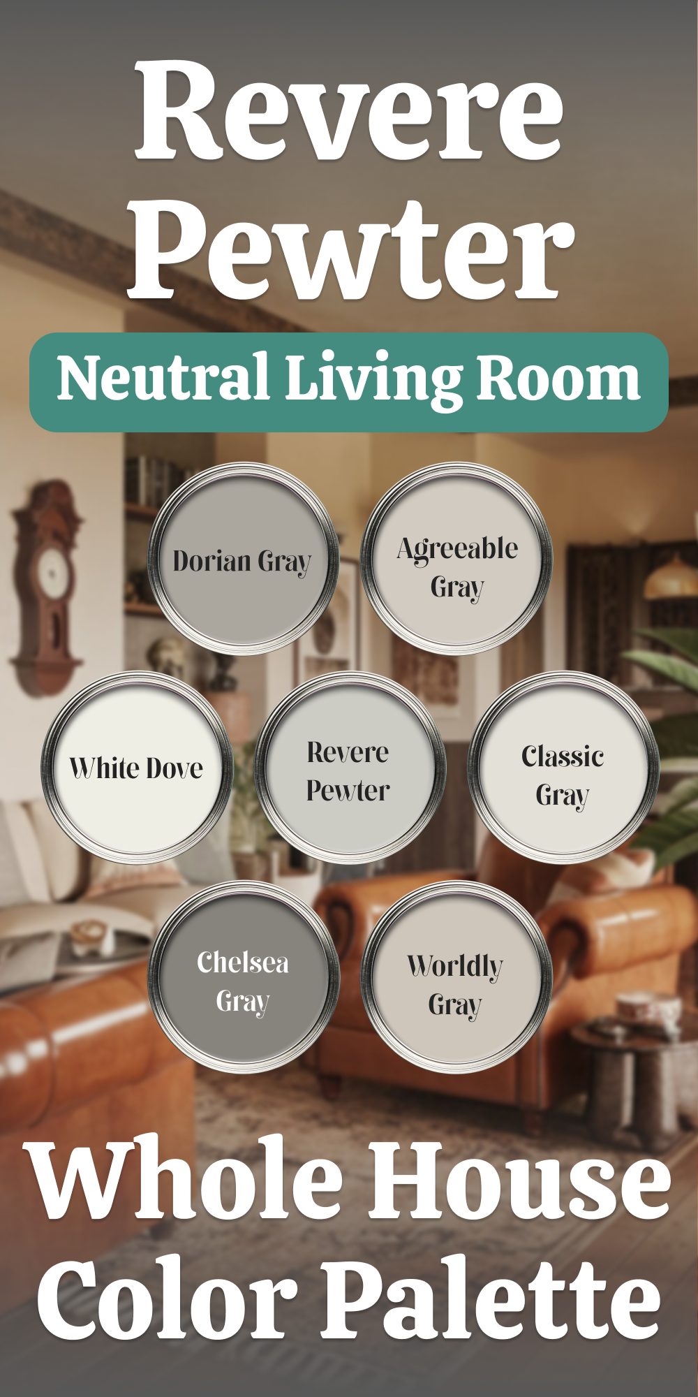
Benjamin Moore Revere Pewter
Benjamin Moore Revere Pewter is a classic, adaptable greige that shifts seamlessly between beige and gray based on the light.
This quality makes it a fantastic choice for open-plan areas, as it can harmonize effortlessly with different lighting sources throughout the day. Its warm undertone gives it a welcoming feel, perfect for creating a cohesive look across multiple rooms.
I often use Revere Pewter to achieve a balanced, sophisticated look, as it complements a wide range of furnishings and color palettes.
👉Check the full guide about this color HERE👈

housekeepingbay
housekeepingbay.com
Sherwin Williams Agreeable Gray
Sherwin Williams Agreeable Gray is a wonderfully balanced neutral that combines beige and gray in perfect harmony. It brings a refined, subtle depth to any room without overwhelming the space, making it an ideal choice for areas where you want a sophisticated yet understated look. I find that Agreeable Gray works beautifully in both traditional and contemporary settings, adding warmth that pairs effortlessly with various accent colors. It’s one of those colors that adapts easily, enhancing the surrounding decor without competing for attention.
👉Check the full guide about this color HERE👈

housekeepingbay
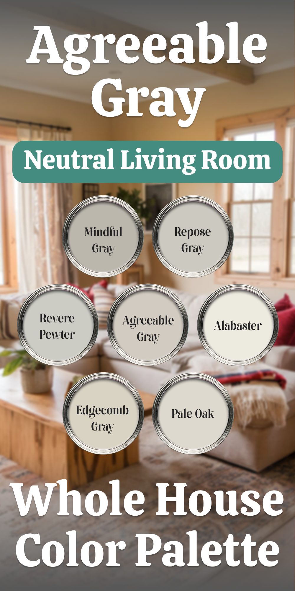
Sherwin-Williams Agreeable Gray A Whole House Palette Rooted in Elegance
When your living room serves as the foundation for a cohesive color palette, Sherwin-Williams Agreeable Gray shines as a versatile and welcoming main color. Its soft greige undertones provide the perfect balance between warmth and coolness, making it an adaptable choice for a range of styles and lighting conditions. Building your whole house palette around this color ensures smooth transitions and a unified aesthetic.
How to Build Your Palette Around Agreeable Gray
- Sherwin-Williams Alabaster (SW 7008)
Alabaster’s creamy warmth beautifully complements Agreeable Gray. Use it for trim, ceilings, or even adjacent spaces like bedrooms, where its inviting tone softens the transition from the main living areas. - Sherwin-Williams Repose Gray (SW 7015)
A slightly cooler counterpart to Agreeable Gray, Repose Gray is ideal for creating depth in adjoining rooms such as hallways or offices. Its subtle gray undertones maintain cohesion without overpowering. - Sherwin-Williams Mindful Gray (SW 7016)
For spaces needing a bit more depth, Mindful Gray steps in as a slightly darker option. Consider it for accent walls, built-ins, or powder rooms where you want a touch of contrast without straying too far from the main color. - Benjamin Moore Revere Pewter (HC-172)
Revere Pewter’s earthy undertones pair seamlessly with Agreeable Gray. Its richness makes it a great choice for dining rooms or cozy spaces, adding warmth and elegance to the overall palette. - Benjamin Moore Edgecomb Gray (HC-173)
Edgecomb Gray leans lighter and softer, making it perfect for secondary spaces like guest bedrooms or nurseries. Its gentle beige undertones ensure a harmonious flow when paired with Agreeable Gray. - Benjamin Moore Pale Oak (OC-20)
For a light, airy feel in areas like kitchens or bathrooms, Pale Oak delivers subtle warmth with a delicate touch. Its understated elegance adds brightness without starkness, perfectly balancing Agreeable Gray’s tone.
Creating Continuity and Contrast
Start with Agreeable Gray in the living room, allowing it to establish the tone for your home. Use it as the primary wall color in open spaces, anchoring your palette. Transition seamlessly by incorporating complementary colors like Repose Gray or Mindful Gray in connecting spaces, while lighter tones such as Alabaster and Pale Oak create contrast and brightness.
For added depth, Revere Pewter and Edgecomb Gray can bring variety without disrupting the flow. Introduce these in spaces where warmth and character are desired, such as dining rooms, studies, or smaller accent areas.
This palette, centered around Sherwin-Williams Agreeable Gray, delivers versatility and balance. Pair with natural materials, warm woods, and metal finishes to enhance its neutral appeal. With these colors, your home will exude comfort and refinement, room by room.
housekeepingbay.com
Benjamin Moore Balboa Mist
Benjamin Moore Balboa Mist is a soft, gentle greige that brings a sense of calm to spaces that transition between warm and cool lighting. Its light, airy quality helps create a peaceful ambiance, making it a lovely choice for bedrooms, hallways, or transitional spaces. I love using Balboa Mist as a neutral foundation, as it allows other colors to shine while adding a subtle warmth that softens the overall look of the room. It’s a versatile shade that feels inviting without drawing too much attention.
👉Check the full guide about this color HERE👈
housekeepingbay
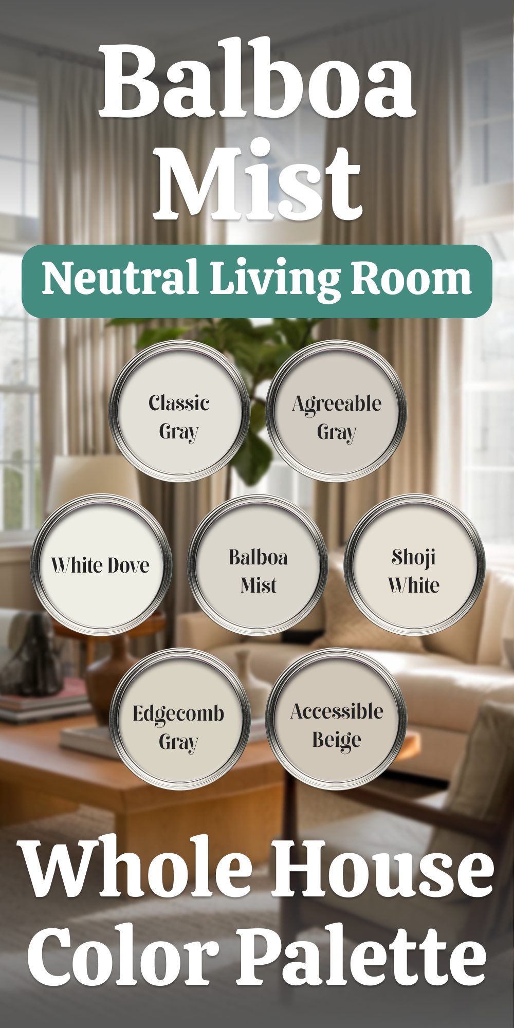
Benjamin Moore Balboa Mist A Whole House Color Palette Starting with the Living Room
When selecting a color palette for the entire home, starting with a living room painted in a thoughtful, versatile hue is key. Benjamin Moore Balboa Mist, with its subtle gray undertones and soft warmth, acts as the perfect foundation. Its neutral nature creates a calm and welcoming atmosphere, allowing other complementary shades to flow effortlessly from room to room.
Here’s how to incorporate Balboa Mist as the main color in your living room and pair it with other tones to unify your home’s design:
Balboa Mist as the Heart of the Home
Benjamin Moore Balboa Mist (OC-27) is a light gray with a hint of warmth, making it a flexible choice for various lighting situations and room styles. As the main color in your living room, it serves as the perfect backdrop for both modern and traditional furnishings. Its soft tone pairs well with a range of materials, from wood accents to metals, making it the ideal starting point for your whole-house color palette.
Coordinating Colors for the Entire Home
- Benjamin Moore White Dove (OC-17)
White Dove is an off-white with subtle gray undertones that enhances the softness of Balboa Mist. It works beautifully on trim, ceilings, and cabinetry, offering a clean and bright contrast while maintaining the gentle warmth of the overall palette. Use White Dove to create crisp, defined edges around windows, doors, and baseboards. - Benjamin Moore Classic Gray (OC-23)
For adjoining rooms or spaces where you want to introduce just a touch more depth, Classic Gray is a lighter alternative to Balboa Mist. This soft, muted gray adds just enough contrast while staying in the same family, maintaining a seamless flow from one room to the next. It’s ideal for hallways or entryways, where you want subtle differentiation without straying too far from the main living area’s tone. - Benjamin Moore Edgecomb Gray (HC-173)
Edgecomb Gray brings a bit more warmth and depth to the palette, making it perfect for rooms that need to feel more grounded, like bedrooms or dining rooms. With its earthy undertones, it complements Balboa Mist beautifully while adding a layer of richness. Use Edgecomb Gray on feature walls or accent areas, allowing the color to enhance the space without overwhelming it. - Sherwin-Williams Agreeable Gray (SW 7029)
A classic light gray, Agreeable Gray offers a perfect balance between warm and cool tones. It sits comfortably between Balboa Mist and other grays in the palette, helping to maintain visual continuity. Use it in bedrooms or home offices, where you want a tranquil, neutral environment with just enough color to keep the room interesting. - Sherwin-Williams Accessible Beige (SW 7036)
For a subtle shift towards beige, Accessible Beige adds warmth and depth to the mix without clashing with the cooler tones of Balboa Mist. It works wonderfully in areas like kitchens and bathrooms, where soft neutrals are a natural fit. Its slight warmth contrasts nicely with the cooler tones in the palette, creating a balanced, inviting feel. - Sherwin-Williams Shoji White (SW 7040)
Shoji White is a warm, creamy neutral with a hint of gray that pairs beautifully with Balboa Mist. It adds a soft, light touch to spaces like hallways or bathrooms, where you want a subtle contrast to the living room’s main color. Its understated warmth complements the rest of the palette, ensuring that the flow of tones feels cohesive yet varied.
Creating Flow and Harmony
The key to a well-balanced home is ensuring that the color transitions between rooms feel natural. With Balboa Mist as the anchor, these complementary colors maintain a harmonious flow throughout the house.
For instance, pairing White Dove with Balboa Mist on trim and ceilings helps define spaces and brighten areas, while the warmer tones of Edgecomb Gray and Accessible Beige add richness without disrupting the neutral palette. In bedrooms or more intimate spaces, you can lean into Classic Gray and Shoji White for variation, allowing each room to feel unique yet unified within the overall theme. The result is a cohesive and inviting atmosphere that doesn’t feel one-dimensional. The colors work together to create depth and texture, ensuring that each space feels carefully considered and visually connected to the next.
By starting with Balboa Mist in your living room, you set the stage for a neutral yet dynamic home color palette. The shades here provide the perfect balance of light, warmth, and depth, making your home feel expansive and inviting while maintaining a sense of continuity and calm throughout every room.
housekeepingbay.com
Sherwin Williams Drift of Mist
Sherwin Williams Drift of Mist is a pale beige with a whisper of green, which adds a natural, earthy quality to the space. This color has an organic feel that I find especially grounding, bringing a serene, calming effect to any room. Drift of Mist is a great choice for creating a soft, inviting space, particularly in rooms where you want a sense of connection to nature. It pairs well with natural elements like wood or stone, enhancing the room’s texture and depth without overpowering it.
👉Check the full guide about this color HERE👈

housekeepingbay.com
Benjamin Moore Edgecomb Gray
Benjamin Moore Edgecomb Gray is a warm yet neutral shade that offers a soft, understated backdrop for both warm and cool accents. It’s versatile and flexible, balancing seamlessly with various design styles. Edgecomb Gray is especially suited for creating a cohesive look in open-concept spaces, as it maintains its warmth while adapting well to both natural and artificial light. I often use this shade as a neutral canvas that allows other design elements to stand out while providing a warm, welcoming feel that works in nearly any room.
👉Check the full guide about this color HERE👈
Earthy Taupes and Soft Grays
Earthy taupes and grays add subtle richness, offering depth without the heaviness of darker neutrals. These shades are particularly versatile, pairing well with a range of finishes and textures.
Sherwin Williams Repose Gray
Sherwin Williams Repose Gray is a warm gray that adapts effortlessly to a range of decor styles, making it one of my go-to choices for creating a cohesive look. Its subtle warmth and gentle depth bring dimension to a room without drawing focus away from other design elements. I particularly love using Repose Gray in open-plan living spaces, where it provides a sophisticated, unifying backdrop that works beautifully with both light and dark accents.
👉Check the full guide about this color HERE👈

housekeepingbay
Sherwin Williams Anew Gray
Sherwin Williams Anew Gray is a deeper, more robust neutral that brings a grounded feel to spaces in need of warmth and depth. It’s a mid-tone gray with subtle beige undertones, making it a bit bolder than some lighter neutrals, which I find ideal for areas where you want more presence without overwhelming the decor. Anew Gray works well in living rooms or dining areas where a bit of richness enhances the room’s overall warmth and character.
👉Check the full guide about this color HERE👈

housekeepingbay.com
Sherwin Williams Colonnade Gray
Sherwin Williams Colonnade Gray is a highly adaptable shade with beige undertones that harmonize beautifully with both warm and cool decor elements. It’s a versatile choice that can anchor a room while still allowing for design flexibility, making it perfect for areas where you want a consistent, reliable backdrop. Colonnade Gray works wonderfully in spaces like kitchens and family rooms, where its subtle warmth brings a welcoming feel without overwhelming the room’s other colors and textures.
👉Check the full guide about this color HERE👈
housekeepingbay
Deep Neutrals and Muted Shades
For those looking to make a bold yet neutral statement, deeper grays and muted shades add drama and sophistication. These colors offer depth without overwhelming, ideal for accents or focal walls.
Sherwin Williams Mindful Gray
Sherwin Williams Mindful Gray is a medium-toned, warm gray that I find perfect for adding gentle contrast in larger rooms. It has a soft warmth that keeps it from feeling too stark, making it an excellent choice for areas where lighter neutrals might appear washed out. I often use Mindful Gray in open living areas or dining rooms to add a bit of sophistication without overwhelming the space. Its depth provides just enough distinction to highlight architectural features or furniture.
👉Check the full guide about this color HERE👈

housekeepingbay
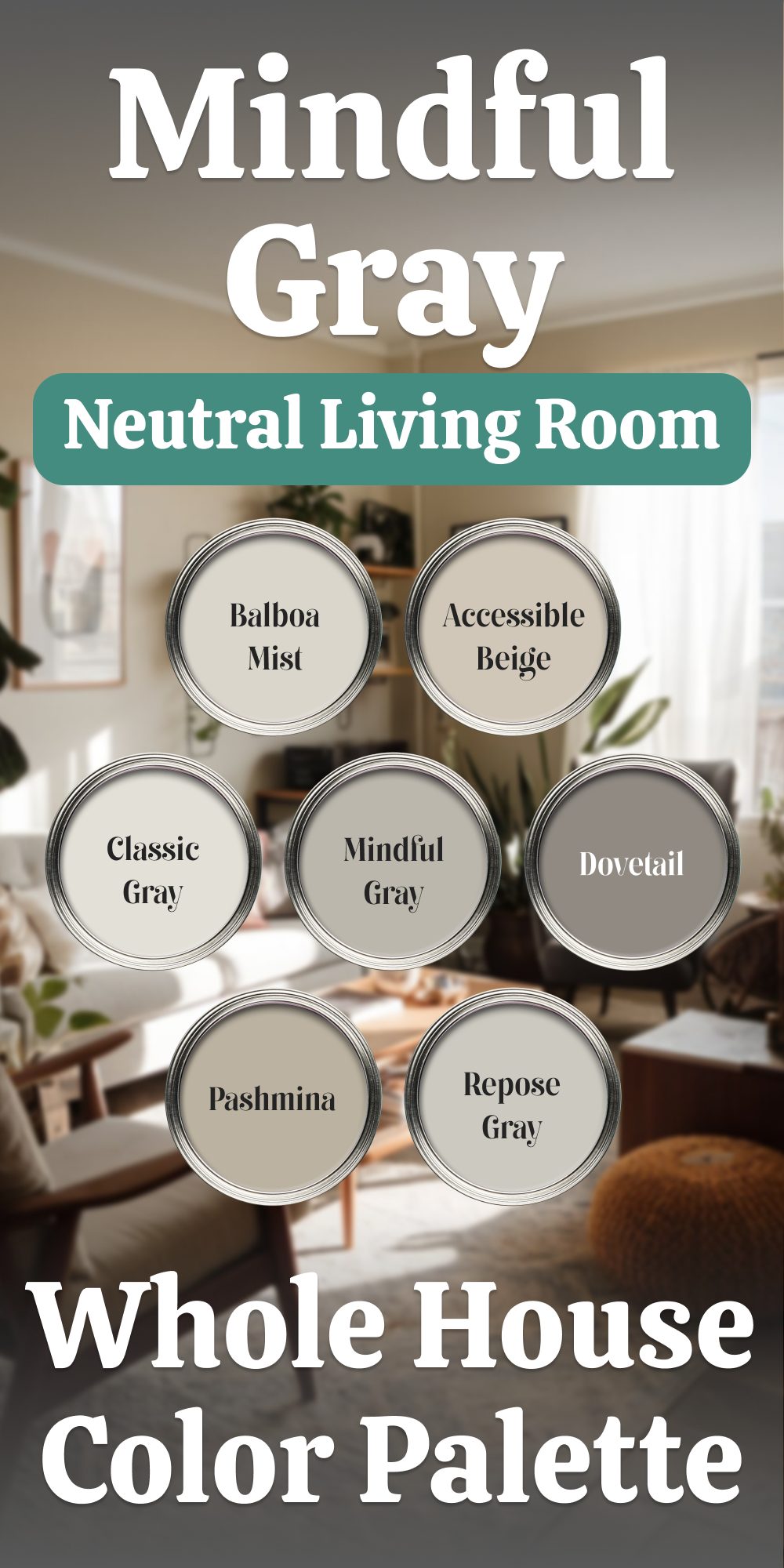
Sherwin-Williams Mindful Gray A Whole House Palette
Designing a whole house color palette starts with anchoring your scheme to a standout color for your primary space. In this case, Sherwin-Williams Mindful Gray sets the tone in the living room—a balanced medium gray with warm undertones that creates an inviting yet modern atmosphere. From there, complementary shades ensure smooth transitions throughout your home while maintaining an elegant, cohesive look.
How to Build Your Palette Around Mindful Gray
- Sherwin-Williams Repose Gray (SW 7015)
Slightly lighter than Mindful Gray, Repose Gray is an excellent choice for adjoining spaces like hallways or open kitchens. It carries a similar warmth, ensuring a natural flow without creating stark contrasts. - Sherwin-Williams Dovetail (SW 7018)
For bold accents or smaller spaces like an office or powder room, Dovetail offers a deeper, richer take on gray. Use it to ground the palette, adding sophistication to cabinets, doors, or feature walls. - Sherwin-Williams Accessible Beige (SW 7036)
To introduce warmth, Accessible Beige is a versatile neutral that complements the subtle warmth in Mindful Gray. It works beautifully in bedrooms, blending seamlessly into a soft, restful environment. - Benjamin Moore Balboa Mist (OC-27)
A soft greige, Balboa Mist is perfect for spaces like bathrooms or guest rooms, offering a fresh yet understated contrast to Mindful Gray. Its lightness adds airiness without competing with the deeper tones in the palette. - Benjamin Moore Classic Gray (OC-23)
A whisper-light gray, Classic Gray can be used in spaces where brightness is key, such as laundry rooms or smaller nooks. Its delicate tone complements Mindful Gray’s depth while subtly brightening the space. - Benjamin Moore Pashmina (AF-100)
For a moody yet refined addition, Pashmina’s taupe undertones provide a rich warmth that pairs well with Mindful Gray. Use it in dining areas or as an accent for furniture, bringing texture and coziness to the palette.
Transitioning the Palette Across Your Home
Start with Mindful Gray in the living room as your anchor, setting the mood for the rest of the house. Extend its presence to open-plan areas or other central spaces to create continuity.
- Bedrooms: Use Accessible Beige for its soothing qualities, adding Classic Gray on trim or ceilings for contrast.
- Bathrooms: Balboa Mist shines in these smaller spaces, complemented by accents in Repose Gray or Classic Gray for a layered effect.
- Kitchens: Pair Dovetail on cabinetry with Mindful Gray or Repose Gray walls for an elegant and cohesive look.
- Dining Rooms: Add drama with Pashmina, paired with lighter trims in Classic Gray to balance the richness.
This palette, anchored by Sherwin-Williams Mindful Gray, weaves together a warm, versatile scheme perfect for any home. Each shade enhances the others, creating a sophisticated harmony across rooms while allowing for individual character.
housekeepingbay.com
Benjamin Moore Chelsea Gray
Benjamin Moore Chelsea Gray brings a rich, elegant quality that’s ideal for accent walls or spaces needing a refined, sophisticated touch. With its deep gray tone, Chelsea Gray works well to add dimension without feeling overly dark. I love using this color to create a focal point in rooms—especially in offices, entryways, or even kitchen islands—where a bit of formality and contrast can elevate the design. It pairs beautifully with lighter neutrals, adding balance to the room.
👉Check the full guide about this color HERE👈
Housekeepingbay.com
housekeepingbay.com
Sherwin Williams Gauntlet Gray
Sherwin Williams Gauntlet Gray is a bold, charcoal gray with subtle warmth that brings an inviting, dramatic feel to spaces. I particularly enjoy using Gauntlet Gray in living rooms or dining areas, where its depth adds richness and warmth, especially under evening light. Its slightly warm undertones make it more approachable than a cooler charcoal, allowing it to blend beautifully with both warm and cool decor. This shade is perfect for creating a cozy, intimate environment.
👉Check the full guide about this color HERE👈
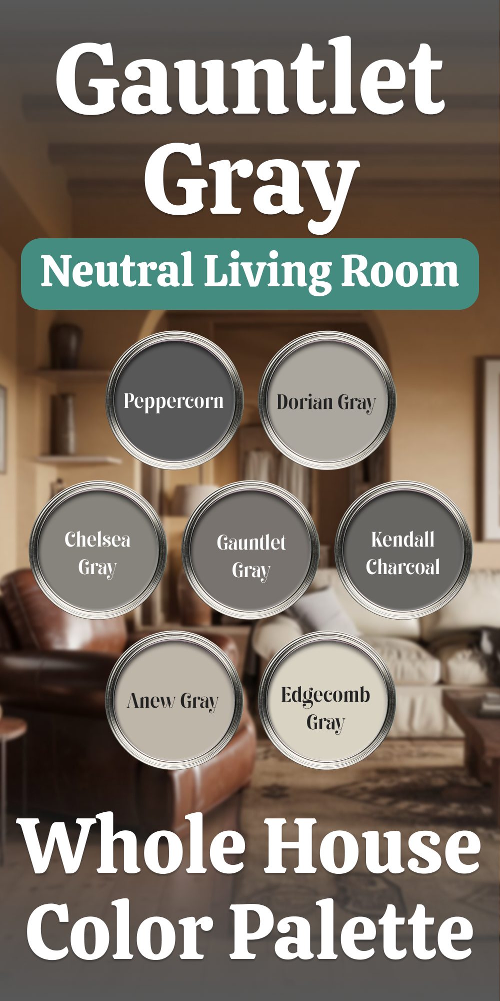
Sherwin-Williams Gauntlet Gray A Whole House Palette Grounded in Bold Elegance
Designing a cohesive color scheme for your home starts with a powerful anchor. In this case, the living room takes center stage with Sherwin-Williams Gauntlet Gray—a deep, rich gray that exudes confidence and character. The rest of the home draws inspiration from this bold centerpiece, creating a palette that flows effortlessly from room to room.
Living Room: Sherwin-Williams Gauntlet Gray (SW 7019)
Gauntlet Gray sets the tone with its balanced depth. With a mix of warm and cool undertones, it grounds the space while remaining versatile enough to pair with a range of complementary shades. It’s perfect for large walls or as a backdrop to lighter furnishings and metallic accents.
Complementary Colors for the Rest of the Home
- Sherwin-Williams Dorian Gray (SW 7017)
A lighter, neutral gray that provides subtle contrast, Dorian Gray is ideal for hallways or adjacent rooms. Its soft warmth ties seamlessly with Gauntlet Gray, offering a smooth transition that keeps spaces cohesive without feeling monotonous. - Sherwin-Williams Peppercorn (SW 7674)
For dramatic accents, Peppercorn introduces depth and sophistication. Use it on statement walls, interior doors, or even built-ins to add striking contrast without overwhelming the overall scheme. - Sherwin-Williams Anew Gray (SW 7030)
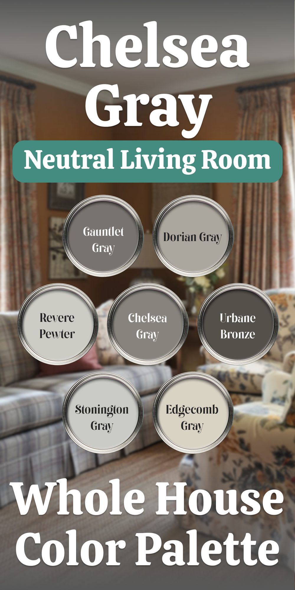
Anew Gray offers a greige option that leans slightly warmer, making it a perfect choice for bedrooms or bathrooms. Its understated elegance balances the boldness of Gauntlet Gray while maintaining a cohesive flow. - Benjamin Moore Kendall Charcoal (HC-166)
Similar in depth to Gauntlet Gray but with a slightly cooler undertone, Kendall Charcoal creates a sophisticated option for home offices or dining rooms. It pairs beautifully with lighter wood tones and crisp white trim. - Benjamin Moore Chelsea Gray (HC-168)
Chelsea Gray delivers a mid-tone option that bridges the gap between lighter and darker spaces. This versatile shade works well in kitchens, particularly for cabinetry or islands, creating a tailored yet approachable atmosphere. - Benjamin Moore Edgecomb Gray (HC-173)
For a soft and airy touch, Edgecomb Gray serves as the lightest neutral in the palette. Use it for ceilings, trim, or smaller rooms like laundry areas to provide contrast and brighten the overall look.
Creating Harmony Across Spaces
The beauty of this palette lies in its adaptability. Gauntlet Gray anchors the living room while the supporting colors build depth and texture throughout the home. Pair these shades with natural elements like warm woods, leather, or brushed metals to enhance their character.
- In open floor plans, transition from Gauntlet Gray to Dorian Gray for subtle shifts in tone that maintain visual flow.
- For smaller spaces, lighter tones like Edgecomb Gray or Anew Gray keep things open while complementing the richness of the main color.
- Accents in Peppercorn or Kendall Charcoal add depth where needed, making a statement on doors or architectural details.
This palette offers the perfect mix of boldness and balance, creating a home that feels both cohesive and dynamic. Each shade serves its purpose, tying back to the st
housekeepingbay.com
Benjamin Moore Kendall Charcoal
Benjamin Moore Kendall Charcoal is a sophisticated, dark taupe-gray that’s ideal for adding depth and contrast without dominating the space. It’s dark enough to create interest but warm enough to remain inviting, which I find works wonderfully in spaces where you want a grounding neutral. Kendall Charcoal pairs particularly well with lighter neutrals, adding structure and a sense of balance to living rooms or libraries where a cozy yet formal vibe is desired.
👉Check the full guide about this color HERE👈
Housekeepingbay.com
Benjamin Moore Kendall Charcoal A Bold, Balanced Palette for Every Room
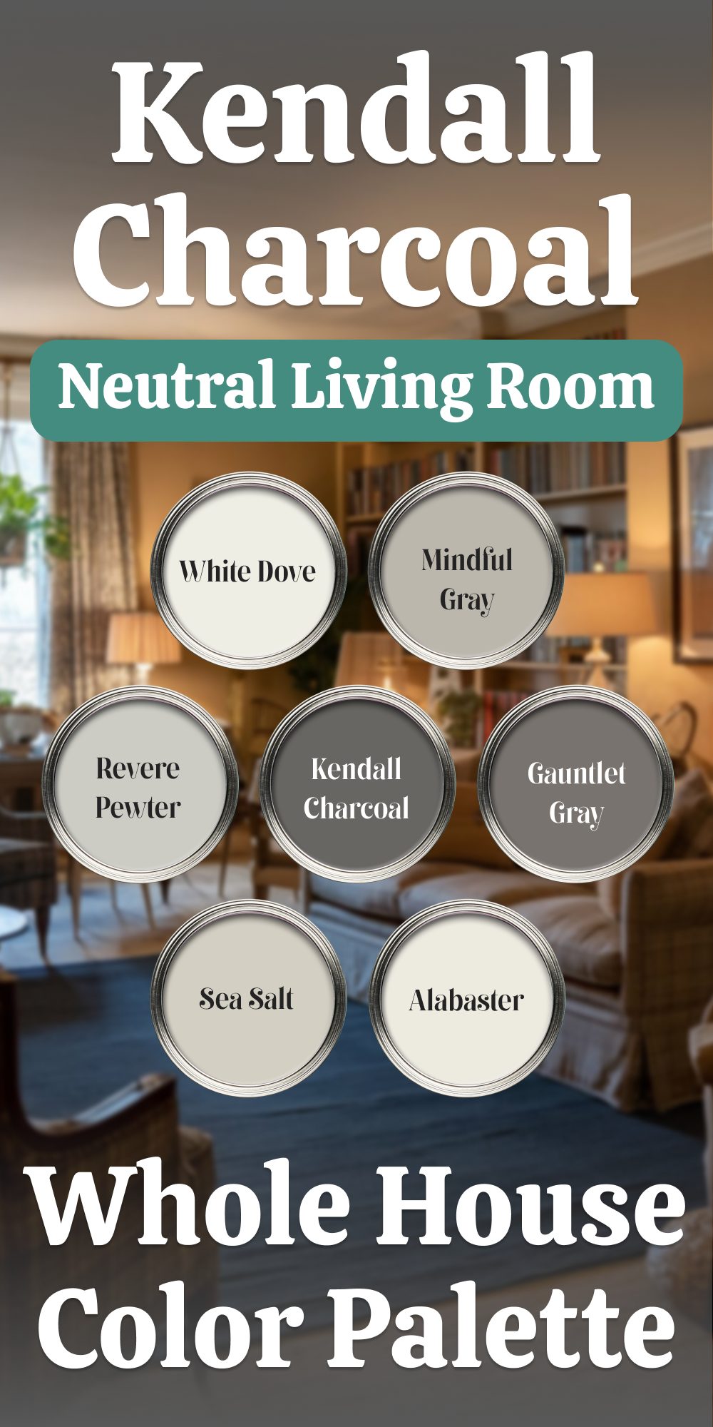
Benjamin Moore Kendall Charcoal, with its deep, sophisticated gray tones, offers a striking foundation for any home. It’s a color that commands attention while remaining versatile, pairing effortlessly with both warm and cool accents. By integrating this powerful hue with complementary shades, you can create spaces that are both inviting and impactful. Here’s how to build a cohesive color palette around Kendall Charcoal.
Building Your Palette Around Kendall Charcoal
- Benjamin Moore Revere Pewter (HC-172)
Revere Pewter is a warm, greige color that pairs seamlessly with Kendall Charcoal, adding a soft contrast while maintaining harmony. Use Revere Pewter on walls or trim to balance the intensity of Kendall Charcoal. It works especially well in living rooms and dining rooms where a more neutral backdrop is needed. - Benjamin Moore White Dove (OC-17)
For a light, airy touch, White Dove can be used on trim, ceilings, or cabinetry. Its warm, soft white creates a gentle contrast with the darker Kendall Charcoal, helping to brighten spaces while keeping the overall mood grounded. Consider White Dove in kitchens, bathrooms, or areas where you want a subtle, light touch next to the bold gray. - Benjamin Moore Sea Salt (OC-140)
Sea Salt is a cool, muted green-blue that offers a refreshing contrast to the richness of Kendall Charcoal. Its soft, pastel undertones bring a serene quality to rooms, balancing the intensity of the deeper gray. Use Sea Salt for bedrooms or bathrooms to introduce a calm, nature-inspired element. - Sherwin-Williams Gauntlet Gray (SW 7019)
Gauntlet Gray is a warm, earthy gray that pairs beautifully with Kendall Charcoal for a more dramatic, layered look. It works well in larger spaces where you want to play with depth without straying too far from the gray tones. Use Gauntlet Gray on accent walls or as a secondary color in an open-plan area. - Sherwin-Williams Mindful Gray (SW 7010)
Mindful Gray offers a softer, more neutral gray compared to Kendall Charcoal, but it still adds depth and sophistication. Use this as an alternative to lighter grays like Revere Pewter, creating a middle ground between Kendall Charcoal and lighter hues. Mindful Gray works well on walls in hallways or as a complement to trim and accents in living areas. - Sherwin-Williams Alabaster (SW 7008)
For a subtle but effective contrast, Alabaster offers a warm, off-white tone that pairs effortlessly with the darker Kendall Charcoal. Alabaster brings a sense of brightness and balance, helping prevent rooms from feeling too heavy. It’s ideal for ceilings, trim, or cabinetry, especially in spaces with lots of natural light.
Designing with Kendall Charcoal
Kendall Charcoal is bold but adaptable, making it an excellent choice for both dramatic and serene rooms. By incorporating lighter shades like Revere Pewter and White Dove, you soften the intensity while allowing the deeper gray to stand out. For accent walls, try Sea Salt or Gauntlet Gray to introduce color without overwhelming the overall palette.In open-concept areas, maintaining a consistent flow from room to room is key. Use Kendall Charcoal on feature walls or cabinetry, and keep lighter, neutral colors like White Dove on trim or ceilings to ensure the rooms feel cohesive. This palette is perfect for creating a balanced environment that is both rich and welcoming.
With this collection of shades, Kendall Charcoal becomes a powerful yet adaptable base that can be dressed up or down, depending on the feel you want to create. Whether you are designing a modern living room or a calm bedroom retreat, this color palette offers the flexibility to suit every mood and function of your home.
housekeepingbay.com
Sherwin Williams Dorian Gray
Sherwin Williams Dorian Gray has a balanced richness with beige undertones, which keeps it from feeling too heavy. This shade is excellent for spaces where you want understated elegance with a bit of depth, such as family rooms or transitional spaces. Dorian Gray is a wonderful option if you want something bolder than a light neutral but not as intense as a charcoal. It pairs seamlessly with both muted and vibrant colors, adding a polished, cohesive look to the room.
👉Check the full guide about this color HERE👈

housekeepingbay
Sherwin-Williams Dorian Gray A Rich and Versatile Gray Palette for Your Home
When creating a cohesive and inviting atmosphere, the right shades of gray can provide the perfect backdrop. Sherwin-Williams Dorian Gray, with its deep, sophisticated undertones, offers a versatile starting point for a palette that can seamlessly flow throughout your home. This gray has a subtle warmth that keeps it from feeling too cold, making it an ideal choice for both modern and traditional spaces.
Here’s how to combine Dorian Gray with other complementary grays and neutrals to build a rich and harmonious design.
Pairing Dorian Gray with Complementary Shades
- Sherwin-Williams Repose Gray (SW 7015)
A lighter, softer gray, Repose Gray brings a touch of warmth with its balanced undertones of both green and brown. It pairs effortlessly with Dorian Gray for a layered look, especially in spaces like living rooms or hallways where a subtle contrast can add depth without clashing. - Sherwin-Williams Gauntlet Gray (SW 7019)
If you’re looking for a richer, more dramatic hue, Gauntlet Gray provides just that. This deep charcoal gray enhances Dorian Gray’s warm tones, creating a sophisticated and grounded atmosphere. Use Gauntlet Gray for accent walls, cabinetry, or even an office space to add personality and elegance. - Sherwin-Williams Mindful Gray (SW 7016)
Mindful Gray is another excellent partner to Dorian Gray, offering a balanced and slightly lighter feel. The soft taupe undertones bring warmth without the heaviness of darker grays, making it an ideal choice for bedrooms or living areas where you want the richness of gray without overwhelming the space. - Benjamin Moore Chelsea Gray (HC-168)
For a refined, almost velvety touch, Chelsea Gray adds an air of sophistication that complements Dorian Gray beautifully. The deep, cool undertones of Chelsea Gray work especially well in formal dining rooms or powder rooms, creating an inviting and luxurious ambiance that stands out. - Benjamin Moore Edgecomb Gray (HC-173)
A lighter gray with warm undertones, Edgecomb Gray pairs effortlessly with Dorian Gray to bring a more neutral, soft contrast to the palette. It’s perfect for living rooms, kitchens, or hallways, where a more subtle gray tone will tie everything together without feeling too stark or cold. - Benjamin Moore Balboa Mist (OC-27)
A light, muted gray with a touch of beige, Balboa Mist offers a softer, more airy counterpart to the deeper tones of Dorian Gray. It’s an excellent choice for larger spaces like open-plan living areas or kitchens, where you want to create a fresh, inviting feel that still carries the warmth of grays throughout.
Designing Flow Between Rooms
Using Dorian Gray as a base color throughout your home provides a solid and elegant foundation. Layering other grays and neutrals such as Repose Gray or Edgecomb Gray will create seamless transitions from room to room, allowing each area to feel connected while maintaining its own unique character. For instance, consider using Dorian Gray on the walls of a living or dining area, then accenting with Gauntlet Gray on a feature wall or cabinetry. In bedrooms, Mindful Gray’s soft, balanced hue offers a more restful alternative, while Balboa Mist in larger spaces can help to open up the room with its lighter, fresher tone.
By incorporating these complementary colors, you can craft a dynamic, yet cohesive palette that flows effortlessly from one room to another. Whether your style leans modern, traditional, or somewhere in between, Dorian Gray offers the flexibility to create a well-balanced, inviting home that feels grounded and warm.
housekeepingbay.com
Dorian Gray A Versatile Whole House Palette Neutral with a Rich Foundation
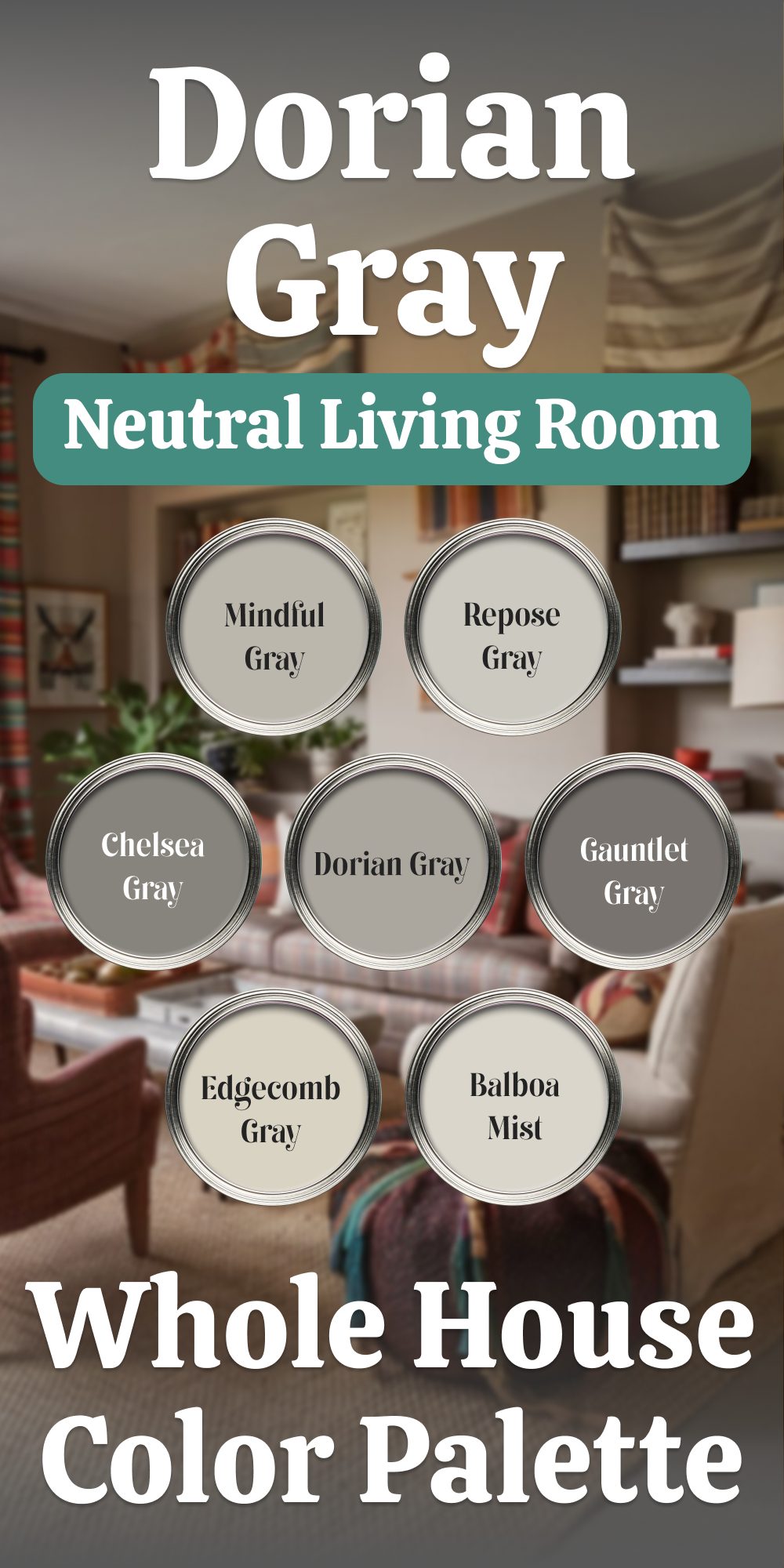
Sherwin-Williams Dorian Gray strikes the perfect balance between depth and neutrality, making it a staple for modern interiors. With its medium depth and warm undertones, this color complements a wide array of shades, from light neutrals to bold contrasts. Below, I’ll walk you through pairing Dorian Gray with other popular colors to achieve a cohesive and sophisticated palette.
Pairing Ideas for a Balanced Palette
- Sherwin-Williams Repose Gray (SW 7015)
Repose Gray, a light greige with subtle warmth, softens the richness of Dorian Gray. This pairing works well for spaces where you want to maintain brightness while incorporating depth—ideal for open-concept living or adjacent hallways. - Sherwin-Williams Gauntlet Gray (SW 7019)
For a dramatic contrast, Gauntlet Gray brings a darker, bolder feel to a palette anchored by Dorian Gray. This combination is striking for feature walls, built-ins, or cabinetry, particularly in living rooms or studies. - Sherwin-Williams Mindful Gray (SW 7016)
Slightly lighter and cooler than Dorian Gray, Mindful Gray creates a harmonious flow when used in adjacent spaces. Consider Mindful Gray for ceilings or trim to subtly frame Dorian Gray walls without stark contrasts. - Benjamin Moore Chelsea Gray (HC-168)
Chelsea Gray, with its deep and moody character, pairs beautifully with Dorian Gray for an upscale, tailored look. Use Chelsea Gray for accents like furniture or interior doors against Dorian Gray walls. - Benjamin Moore Edgecomb Gray (HC-173)
Edgecomb Gray’s soft, warm greige offers a gentle contrast to Dorian Gray, adding a sense of airiness. This pairing shines in dining areas or bedrooms, where a lighter neutral enhances the room’s warmth. - Benjamin Moore Balboa Mist (OC-27)
Balboa Mist is a light, warm gray with a delicate softness, making it an excellent companion to Dorian Gray. Use it for ceilings, trim, or adjoining walls to maintain an inviting and cohesive feel throughout the home.
How to Use Dorian Gray in Your Home
- Living Spaces: Pair Dorian Gray walls with Repose Gray on ceilings or trim for a balanced and polished look. Add texture through rugs or wood tones to complement the warm undertones.
- Kitchens: Use Dorian Gray on lower cabinets or an island, with Balboa Mist on upper cabinets and walls. Gauntlet Gray can add contrast to accent pieces like shelving or hardware.
- Bathrooms: Dorian Gray’s richness makes it perfect for vanities, balanced by Mindful Gray or Edgecomb Gray on walls. Incorporate Chelsea Gray for small details like mirror frames or shelving.
- Bedrooms: For a calm retreat, use Dorian Gray on accent walls and Balboa Mist for the remaining walls. Introduce Edgecomb Gray in bedding or curtains to complete the look.
- Entryways: Dorian Gray sets a welcoming tone in entryways, paired with Repose Gray for trim and Gauntlet Gray for interior doors.
Dorian Gray’s versatility ensures it fits seamlessly into any design style, from contemporary to traditional. Whether paired with light neutrals like Edgecomb Gray or bold accents like Chelsea Gray, it creates depth and sophistication in every corner of your home.

housekeepingbay.com
Benjamin Moore Sea Salt
Benjamin Moore Sea Salt is a soft gray-green with a soothing, calming vibe, making it ideal for creating a spa-like atmosphere in bathrooms or bedrooms. The subtle green undertones lend a gentle tranquility that’s incredibly relaxing, and I find it works especially well in spaces where you want to introduce a hint of color without overwhelming the room. Sea Salt pairs well with other soft neutrals, adding a serene, fresh feel to any interior.
👉Check the full guide about this color HERE👈

Housekeepingbay.com
Benjamin Moore Sea Salt A Soft and Versatile Hue for Modern Homes
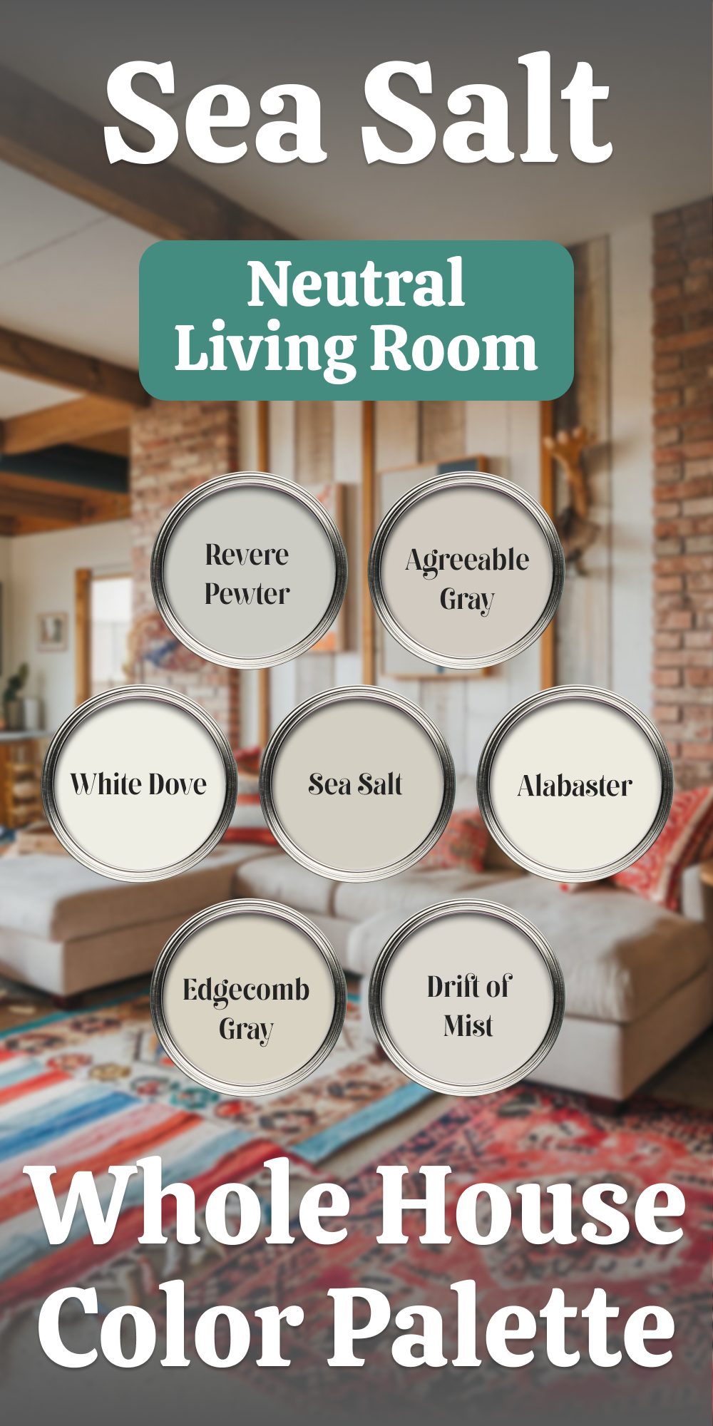
Benjamin Moore Sea Salt is a soothing, muted green with a hint of gray, making it an adaptable choice for creating tranquil yet dynamic spaces. Its subdued tones complement a variety of colors, allowing for endless combinations to suit any design style. Below, I’ll guide you through pairing Sea Salt with other timeless shades to create a cohesive and inviting palette.
Pairing Ideas for a Balanced and Calming Home
- Benjamin Moore White Dove (OC-17)
White Dove is a creamy, warm white that pairs seamlessly with Sea Salt, balancing its subtle green tones with softness. Use White Dove for trim, ceilings, or cabinetry to frame the gentle hues of Sea Salt on walls. This duo works beautifully in living areas or bedrooms where comfort is key. - Benjamin Moore Edgecomb Gray (HC-173)
A light greige with warm undertones, Edgecomb Gray harmonizes with Sea Salt to create an organic, neutral palette. Consider this pairing for open-plan areas, where walls painted in Sea Salt transition gracefully into Edgecomb Gray in adjoining rooms. - Benjamin Moore Revere Pewter (HC-172)
Revere Pewter, a classic greige with depth, provides a sophisticated contrast to Sea Salt’s softness. This pairing is ideal for spaces requiring a grounded, earthy feel, such as dining rooms or entryways. - Sherwin-Williams Alabaster (SW 7008)
For a creamy complement, Alabaster offers warmth without overpowering Sea Salt’s delicate presence. Use it on cabinetry, trim, or adjoining walls to keep spaces bright while maintaining an inviting ambiance. - Sherwin-Williams Drift of Mist (SW 9166)
Drift of Mist is a light, warm gray with subtle green undertones, making it a natural partner for Sea Salt. This combination works wonderfully in kitchens or bathrooms, adding depth and dimension while keeping the look understated. - Sherwin-Williams Agreeable Gray (SW 7029)
A universally loved greige, Agreeable Gray balances Sea Salt with its neutral warmth. Use Agreeable Gray in large open spaces or hallways to tie together areas painted in Sea Salt, creating a seamless flow throughout the home.
Designing Spaces with Sea Salt
- Living Areas: Pair Sea Salt walls with White Dove trim and Alabaster furniture for an airy, welcoming vibe. Incorporate natural textures like woven rugs or wooden furniture for added warmth.
- Kitchens: Use Sea Salt on cabinets or walls, complemented by Drift of Mist or Agreeable Gray on adjoining walls. Alabaster ceilings or trim complete the look.
- Bathrooms: Sea Salt’s soothing green works beautifully with Revere Pewter on vanities and White Dove for trim and accents. Add brushed nickel or matte black hardware for a clean, modern finish.
- Bedrooms: Let Sea Salt shine on walls, contrasted with Edgecomb Gray for an accent wall or Revere Pewter for built-ins. White Dove bedding or curtains enhance the serene atmosphere.
Benjamin Moore Sea Salt thrives in environments that embrace softness and balance. Its muted tone provides a versatile foundation that works harmoniously with a range of neutrals and warm whites. With thoughtful pairings, Sea Salt transforms any room into a sanctuary of calm.
housekeepingbay.com
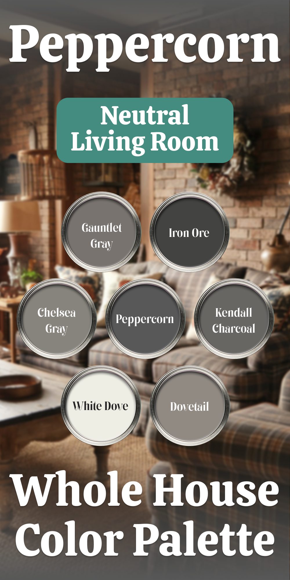
Sherwin Williams Peppercorn
Sherwin Williams Peppercorn is a deep charcoal with an elegant, understated edge that’s perfect for making a bold statement in accent areas. I often use Peppercorn on feature walls, cabinetry, or trim to add definition without feeling overpowering. Its rich depth brings sophistication and contrast, creating an eye-catching element that enhances the room’s architecture. This shade works beautifully in both modern and traditional settings, where a bit of boldness can add character and visual interest.
👉Check the full guide about this color HERE👈

housekeepingbay
Sherwin-Williams Peppercorn A Bold and Versatile Neutral
Sherwin-Williams Peppercorn brings drama and depth to any room with its rich, dark gray tones. Perfect as a statement wall, cabinetry finish, or exterior color, it commands attention without overpowering a space. Pairing it with other complementary shades ensures a harmonious balance between boldness and subtle elegance.
Perfect Pairings with Peppercorn
- Sherwin-Williams Gauntlet Gray (SW 7019)
A slightly lighter gray with warm undertones, Gauntlet Gray complements Peppercorn beautifully. Use it on adjacent walls or furniture to create a layered, tonal look. Together, they add dimension without stark contrasts. - Sherwin-Williams Dovetail (SW 7018)
For a touch of softness, Dovetail works as an excellent bridge between darker Peppercorn and lighter neutrals. Its warm gray undertones make it ideal for spaces needing a cozy yet sophisticated feel. - Sherwin-Williams Iron Ore (SW 7069)
If you’re looking for more depth, Iron Ore offers a near-black finish with subtle gray tones. Use it sparingly for accents like doors, window frames, or built-ins to enhance Peppercorn’s boldness without creating monotony. - Benjamin Moore Kendall Charcoal (HC-166)
Kendall Charcoal brings a balance of warmth and neutrality, making it a great option for spaces that need a softer counterpart to Peppercorn’s intensity. It’s versatile enough for larger walls or trim work. - Benjamin Moore Chelsea Gray (HC-168)
A refined medium gray, Chelsea Gray bridges the gap between lighter tones and Peppercorn’s dark richness. Its slight green undertone complements natural materials like wood or stone, making it a versatile pairing. - Benjamin Moore White Dove (OC-17)
To lighten the mood and add contrast, White Dove provides the perfect crisp, warm white. Whether it’s on ceilings, trim, or cabinetry, it allows Peppercorn to shine while keeping the overall palette grounded and inviting.
How to Use Peppercorn in Your Home
- Living Rooms and Dining Areas: Create a statement by painting an accent wall in Peppercorn. Pair with Dovetail or Gauntlet Gray for adjacent walls and add White Dove trim for a polished finish.
- Kitchens and Bathrooms: Peppercorn cabinets paired with Chelsea Gray or Kendall Charcoal walls exude sophistication. Incorporate Iron Ore hardware or fixtures for subtle yet striking detail.
- Exteriors: Peppercorn makes an impactful choice for siding or shutters. Pair with White Dove trim and Kendall Charcoal accents for a balanced and elegant facade.
Sherwin-Williams Peppercorn anchors a palette that combines strength and flexibility, making it suitable for both modern and traditional designs. With the right pairings, it transitions seamlessly between bold statements and understated elegance, offering endless possibilities for your home.
housekeepingbay.com
Conclusion
After experimenting with these shades in various rooms and lighting conditions, I’ve found these colors from Sherwin Williams and Benjamin Moore to be the most reliable choices for a timeless, neutral look. Each color brings its unique quality, whether you’re aiming for a clean, bright feel or a deep, dramatic effect.
From versatile whites to grounded taupes and bold grays, these shades work beautifully together and adapt to evolving styles and furnishings. With these trusted neutrals, you can create a living space that feels fresh, sophisticated, and enduringly stylish.
