Agreeable Gray by Sherwin Williams: 94 Real Life Photos and Paint Color Comparisons
Perfect blend of gray and beige with real-life photos and expert color pairings.
Agreeable Gray by Sherwin Williams (SW 7029) is a beloved neutral paint color that has found its way into countless homes. This versatile greige is praised for its perfect balance of gray and beige, offering a soft, warm hue that fits almost any space. Whether you’re looking to refresh your living room, bedroom, or kitchen, Agreeable Gray provides a serene and inviting backdrop.
The beauty of Agreeable Gray lies in its ability to complement a wide range of styles and other colors. It’s no wonder this shade has become a go-to for interior designers and homeowners alike. Let’s explore the nuances of this popular color, its coordinating and accent shades, and see how it pairs with other stunning colors for a cohesive and stylish look.
Color Description
Undertones: Agreeable Gray features subtle undertones of beige and gray, making it a versatile choice that can lean warmer or cooler depending on the lighting and surrounding decor.
Trim Colors: For a crisp, clean look, pair Agreeable Gray with Sherwin Williams Pure White (SW 7005). This bright white trim color creates a striking contrast that highlights the elegance of Agreeable Gray.
Coordinating and Accent Colors: Agreeable Gray works beautifully with soft blues, greens, and darker accent colors like navy and bronze. It’s also complemented by wood tones and metallic accents, adding depth and interest to any room.
Detailed color description you can find here in our Ultimate Agreeable Gray Guide
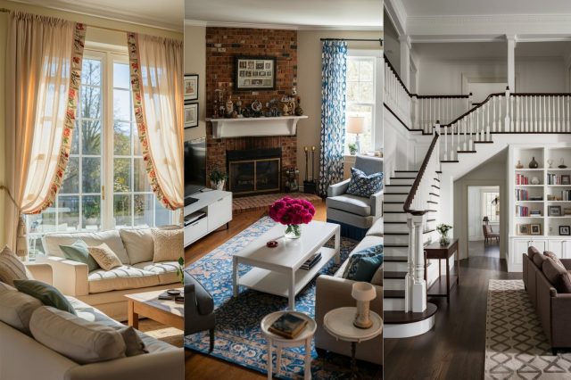
via inst@doctordoiturself
Paint Color Comparisons with Agreeable Gray
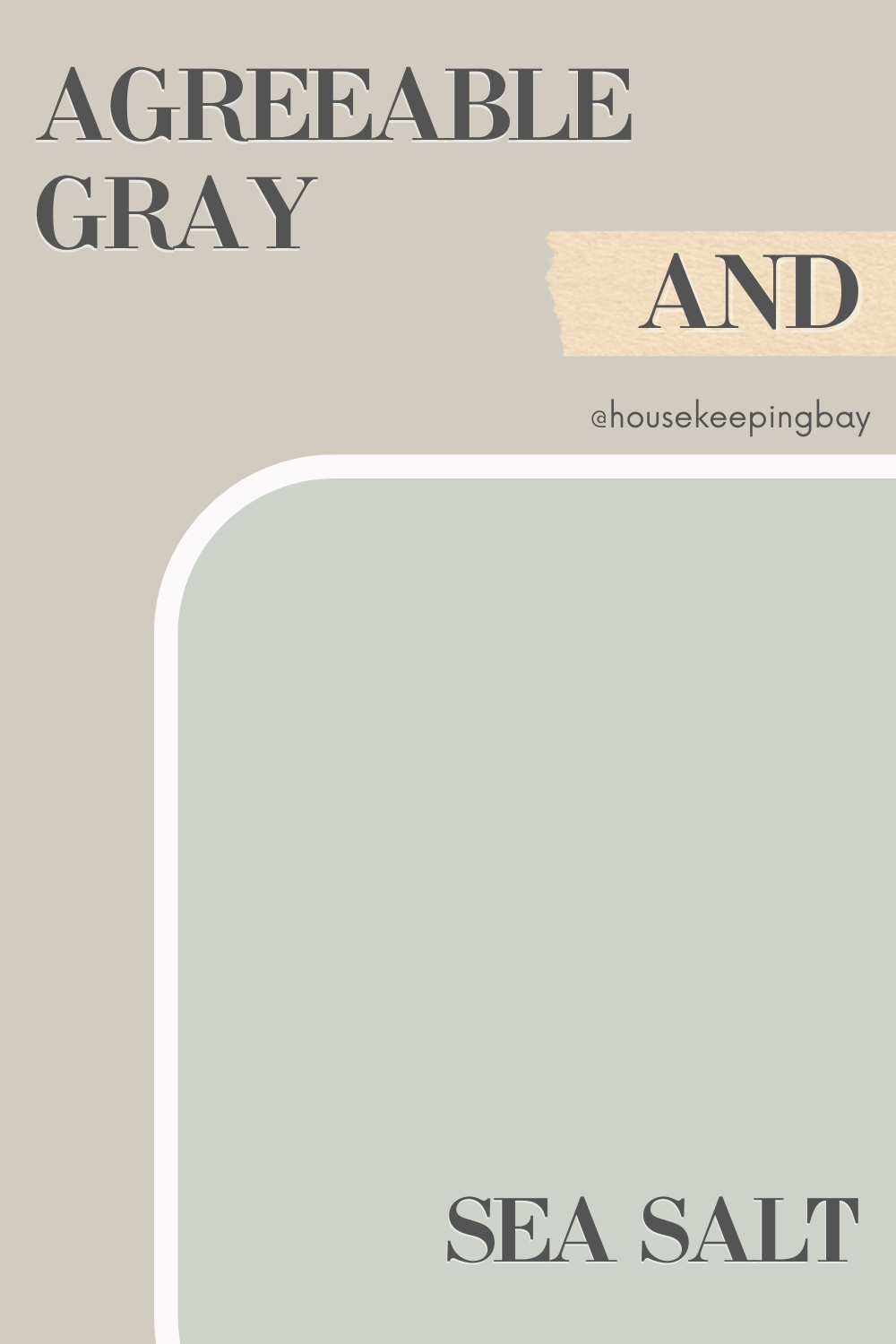
Agreeable Gray and Sea Salt
Agreeable Gray and Sea Salt (SW 6204) create a harmonious and serene palette. Sea Salt’s muted green tones bring a refreshing, coastal vibe, perfect for bathrooms and bedrooms. This combination offers a tranquil retreat-like atmosphere, ideal for spaces where you want to unwind. The soft, calming effect of Sea Salt enhances the warmth of Agreeable Gray, making these two colors a match made in heaven for creating a peaceful and inviting space.
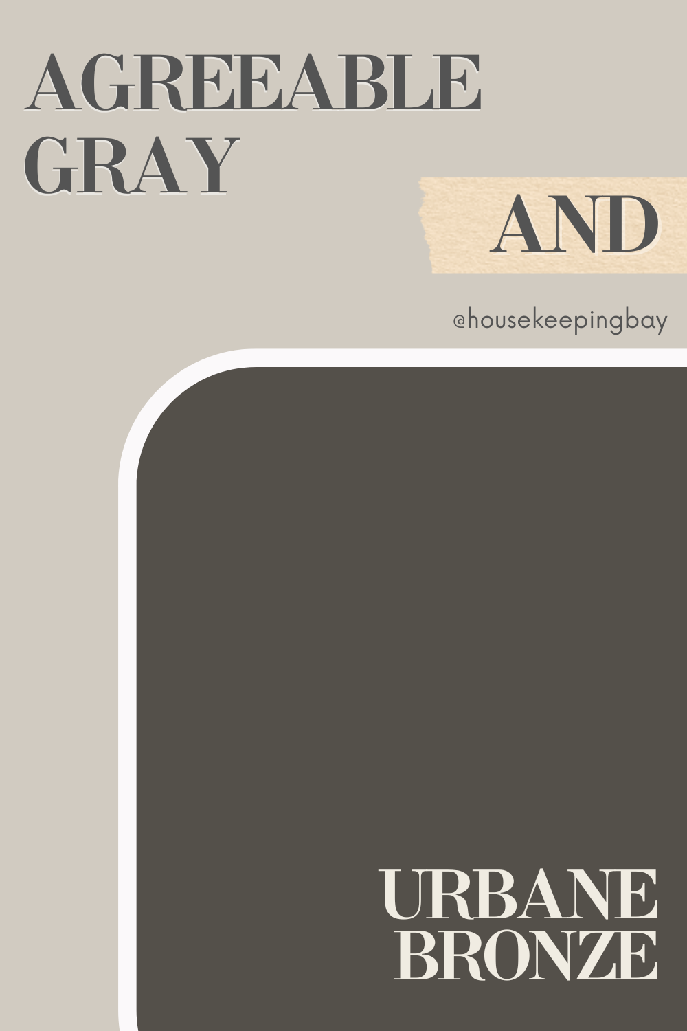
Agreeable Gray and Urbane Bronze
Pairing Agreeable Gray with Urbane Bronze (SW 7048) results in a sophisticated, moody look. Urbane Bronze, a rich, dark brown with subtle gray undertones, serves as an excellent accent for feature walls or cabinetry.
This duo adds depth and elegance, making it perfect for living rooms and offices. The contrast between the lightness of Agreeable Gray and the dark, dramatic Urbane Bronze brings a sense of balance and refinement to any room, creating a timeless and stylish aesthetic.
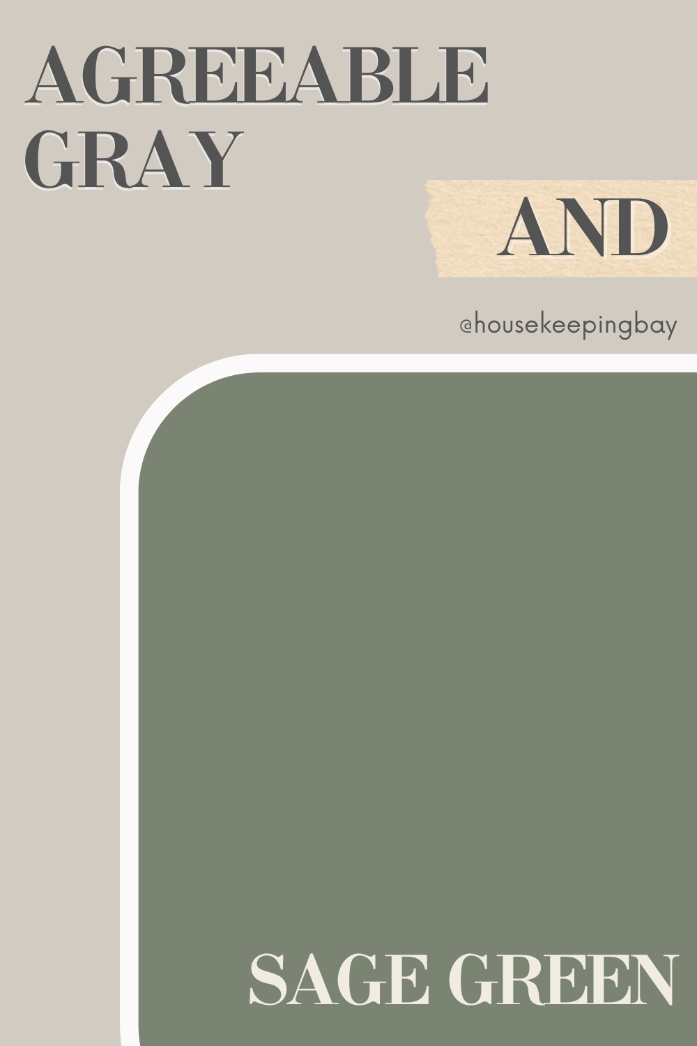
Agreeable Gray and Sage Green
The earthy, calming vibe of Sage Green (SW 2860) pairs wonderfully with Agreeable Gray. This combination creates a fresh, organic feel, perfect for kitchens and dining areas. The subtle green undertones in Sage Green complement the warmth of Agreeable Gray, resulting in a cohesive and inviting space. The blend of these two colors brings a touch of nature indoors, making it ideal for spaces where you want to feel connected to the outdoors while maintaining a cozy, homey atmosphere.
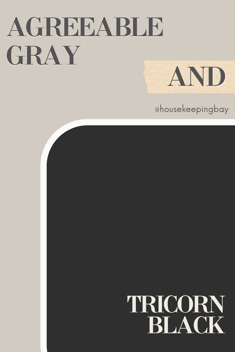
Agreeable Gray and Tricorn Black
Agreeable Gray and Tricorn Black (SW 6258) make a bold and dramatic pairing. Tricorn Black, a true black, offers a striking contrast that can be used for trim, doors, or accent walls. This high-contrast combination is ideal for modern and minimalist interiors, providing a sleek and stylish look. The stark difference between the light, neutral Agreeable Gray and the deep, intense Tricorn Black creates a visually stunning effect that can add a contemporary edge to any room.
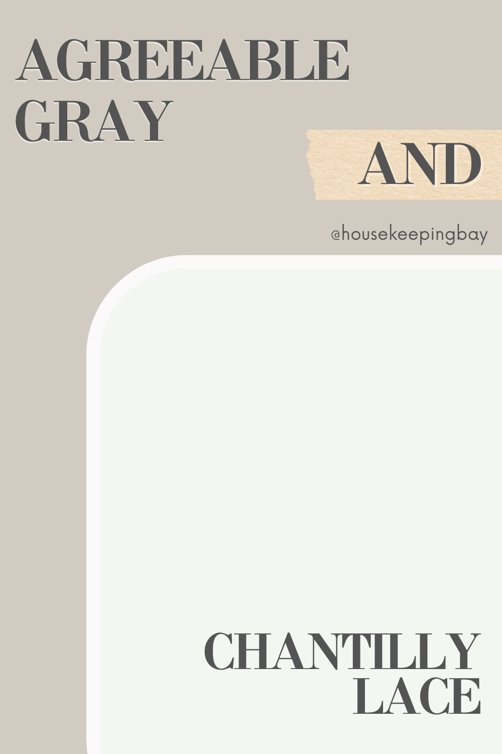
Agreeable Gray and Chantilly Lace
Combining Agreeable Gray with Benjamin Moore Chantilly Lace (OC-65) creates a soft, airy palette. Chantilly Lace, a bright, crisp white, enhances the warmth of Agreeable Gray, making spaces feel light and open. This pairing is perfect for open-concept living areas and spaces where you want to maximize natural light. The fresh, clean look of Chantilly Lace against the subtle warmth of Agreeable Gray results in an elegant and inviting atmosphere, perfect for creating a serene and welcoming home.
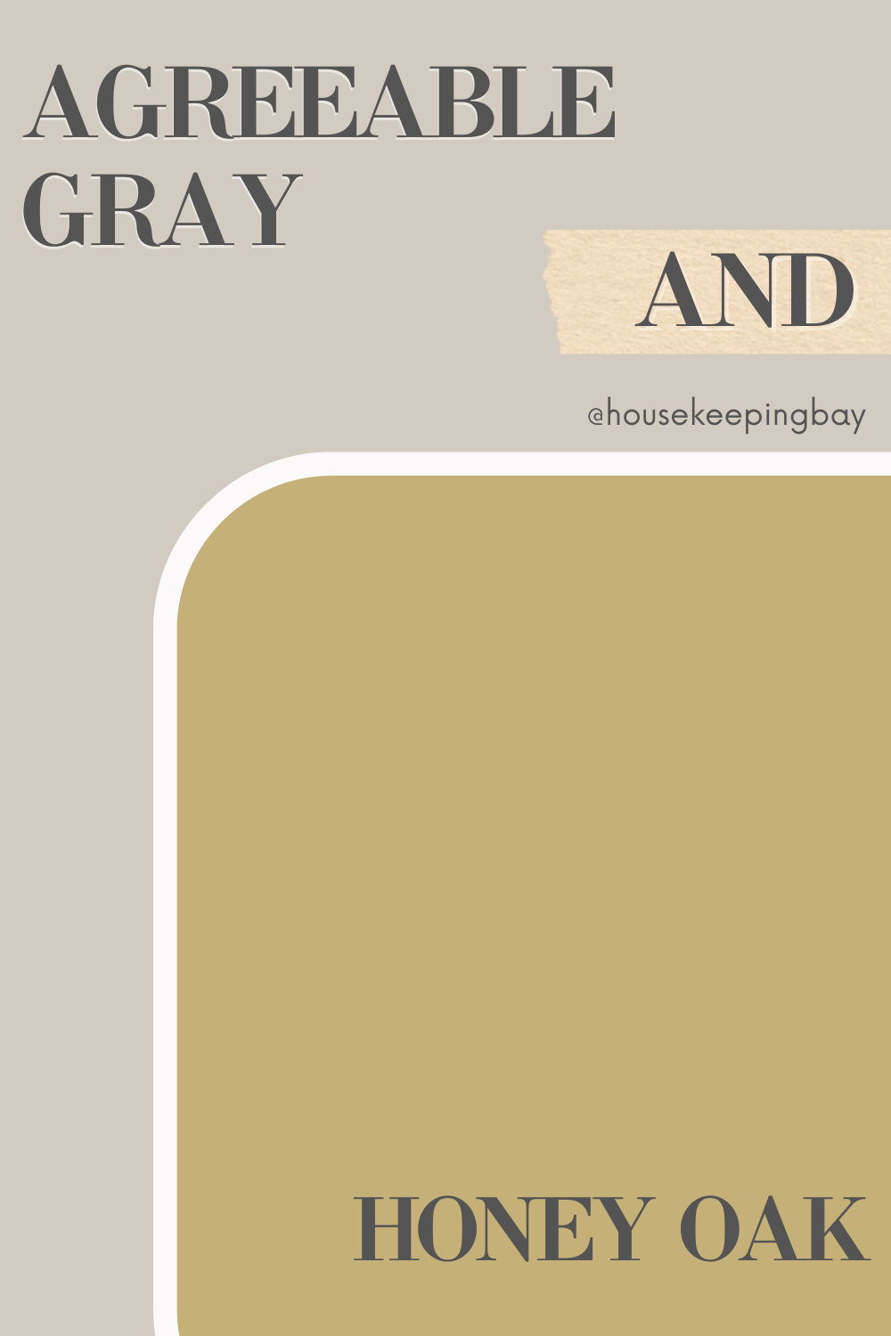
Agreeable Gray and Honey Oak
Agreeable Gray pairs beautifully with Honey Oak, highlighting the warm, golden tones of the wood. This combination is perfect for traditional and transitional spaces, bringing out the best in both the paint and the wood. The neutral backdrop of Agreeable Gray allows the natural beauty of Honey Oak to shine. This duo creates a cozy and timeless look, making it ideal for spaces where you want to celebrate the charm and character of natural wood elements.
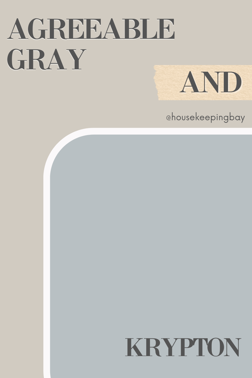
Agreeable Gray and Krypton
The cool, crisp blue-gray of Krypton (SW 6247) complements the warmth of Agreeable Gray, creating a balanced and soothing palette. This pairing is ideal for bedrooms and bathrooms, offering a relaxing and serene environment. The subtle contrast between the two colors adds depth without overwhelming the space. The soft, muted tones of Krypton against the warm neutrality of Agreeable Gray create a peaceful and calming atmosphere, perfect for restful and rejuvenating spaces.
Detailed color description you can find here in our Ultimate Agreeable Gray Guide
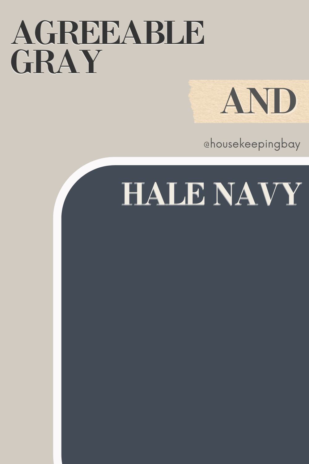
Agreeable Gray and Hale Navy
Agreeable Gray and Hale Navy (HC-154) by Benjamin Moore form a timeless and elegant combination. Hale Navy’s deep, rich blue serves as a striking accent against the soft neutrality of Agreeable Gray. This pairing is perfect for creating a classic look in dining rooms, bedrooms, or any space where you want a touch of sophistication. The boldness of Hale Navy adds a sense of depth and richness, while Agreeable Gray keeps the overall look grounded and balanced.
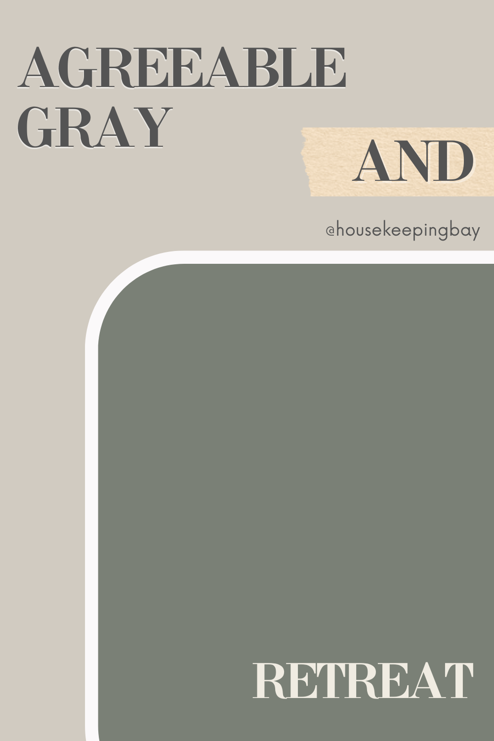
Agreeable Gray and Retreat
Agreeable Gray and Retreat (SW 6207) combine to create a calm, inviting palette. Retreat’s muted green with gray undertones adds a touch of nature and tranquility, making it perfect for living rooms and cozy reading nooks. The two colors together provide a balanced and serene atmosphere. The subtle warmth of Agreeable Gray complements the cool, earthy tones of Retreat, resulting in a harmonious and relaxing space that feels both cozy and refreshing.
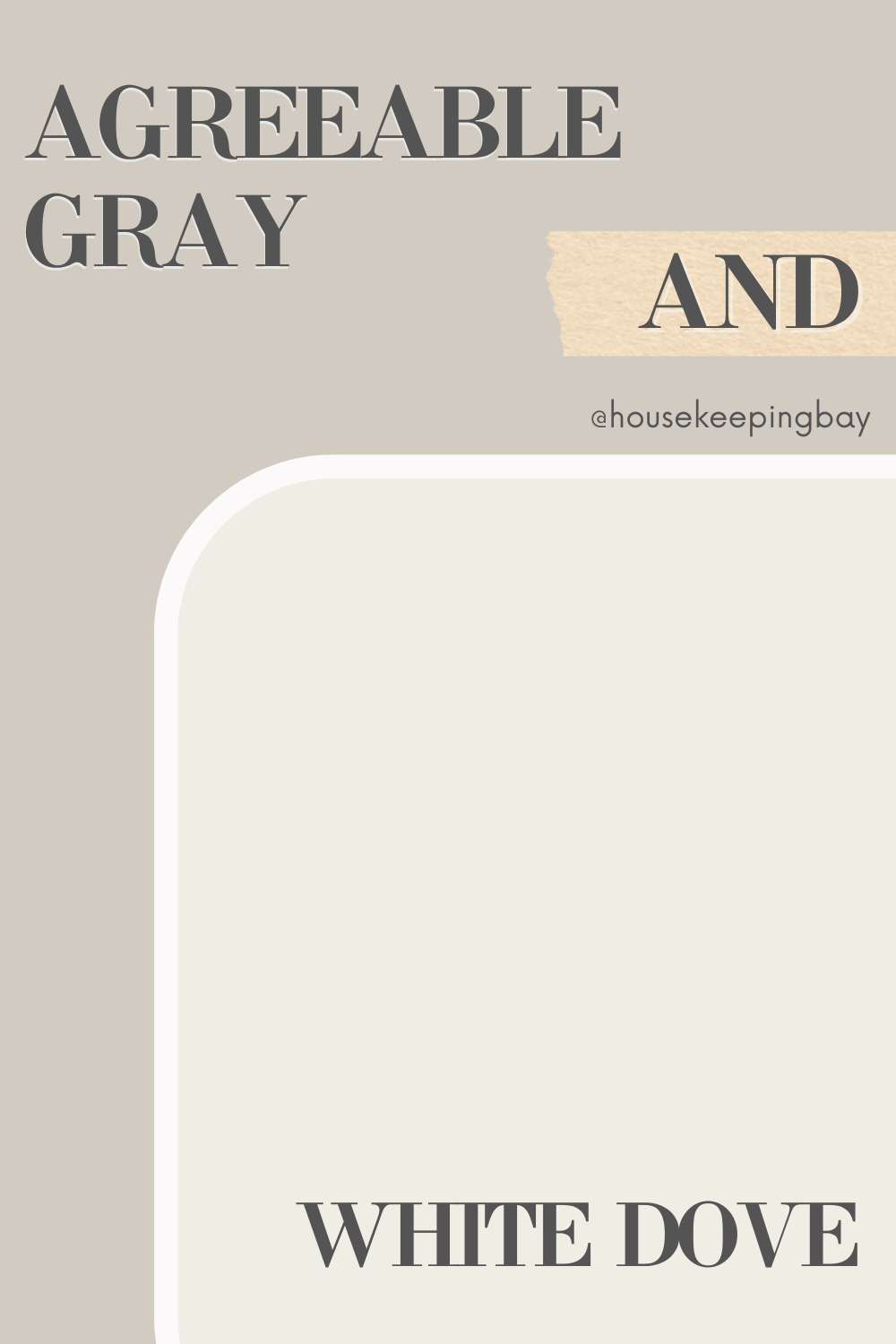
Agreeable Gray and White Dove
Pairing Agreeable Gray with Benjamin Moore White Dove (OC-17) offers a soft and sophisticated look. White Dove, a warm white, complements the beige undertones of Agreeable Gray, creating a harmonious and elegant palette. This combination is perfect for any room where you want a timeless and inviting feel.
The gentle warmth of White Dove enhances the neutral beauty of Agreeable Gray, making this duo ideal for creating a serene and welcoming environment in any space.
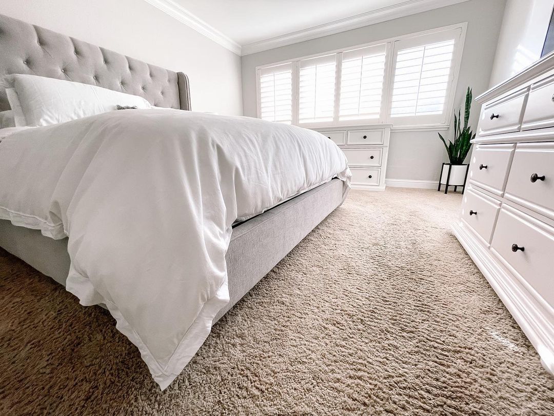
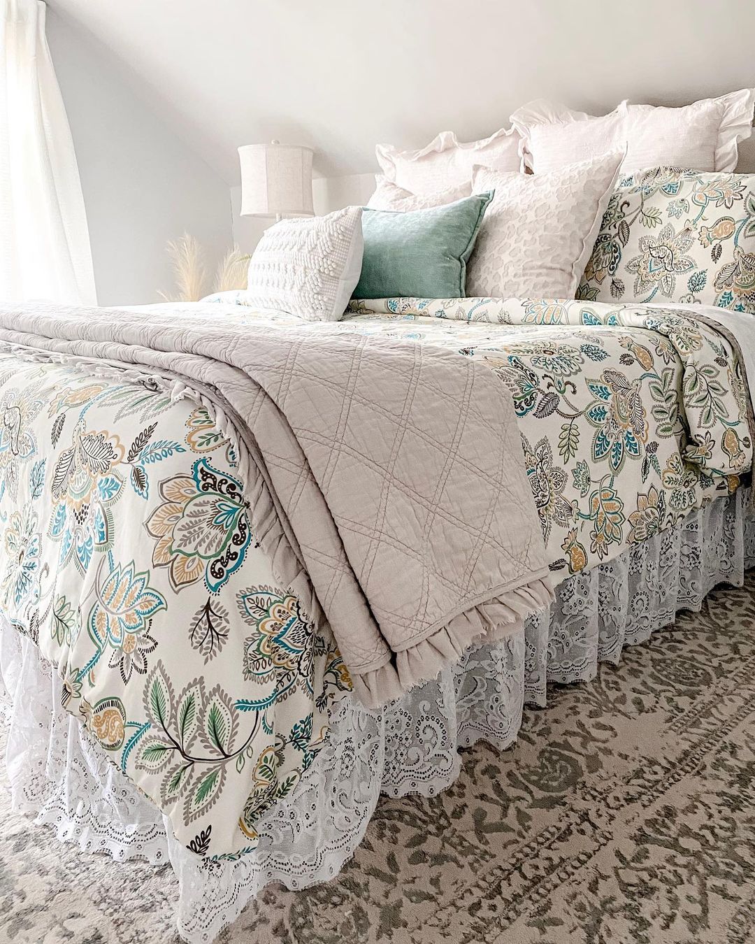
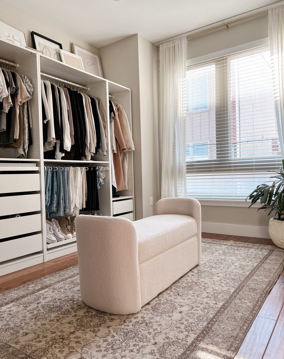
Agreeable Gray in Different Spaces and Rooms
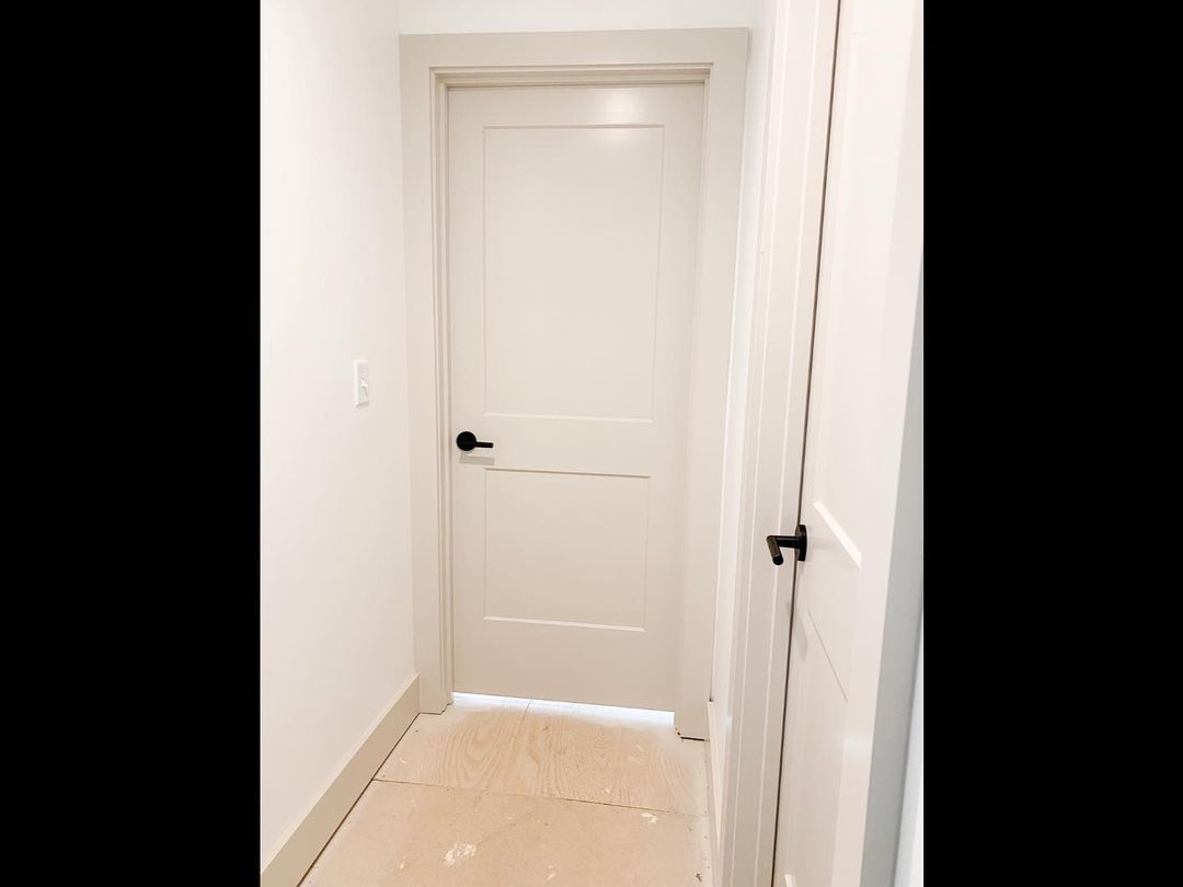
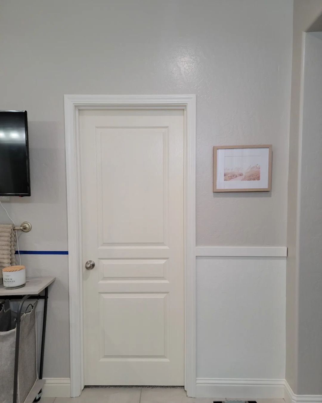
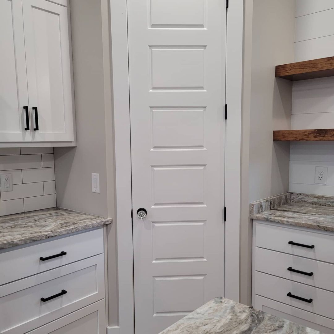
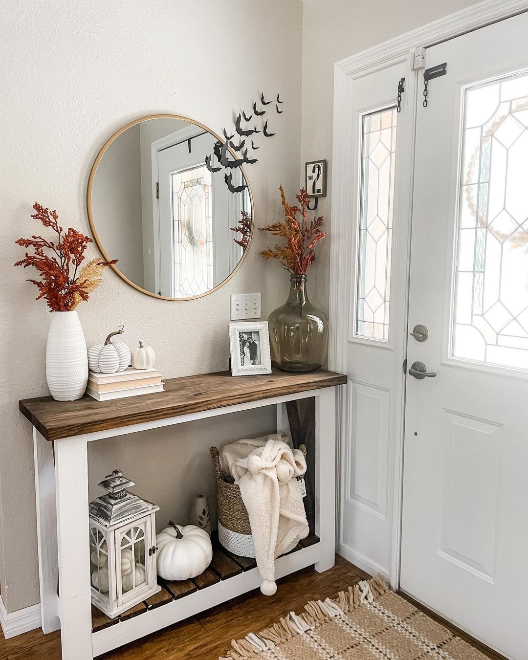
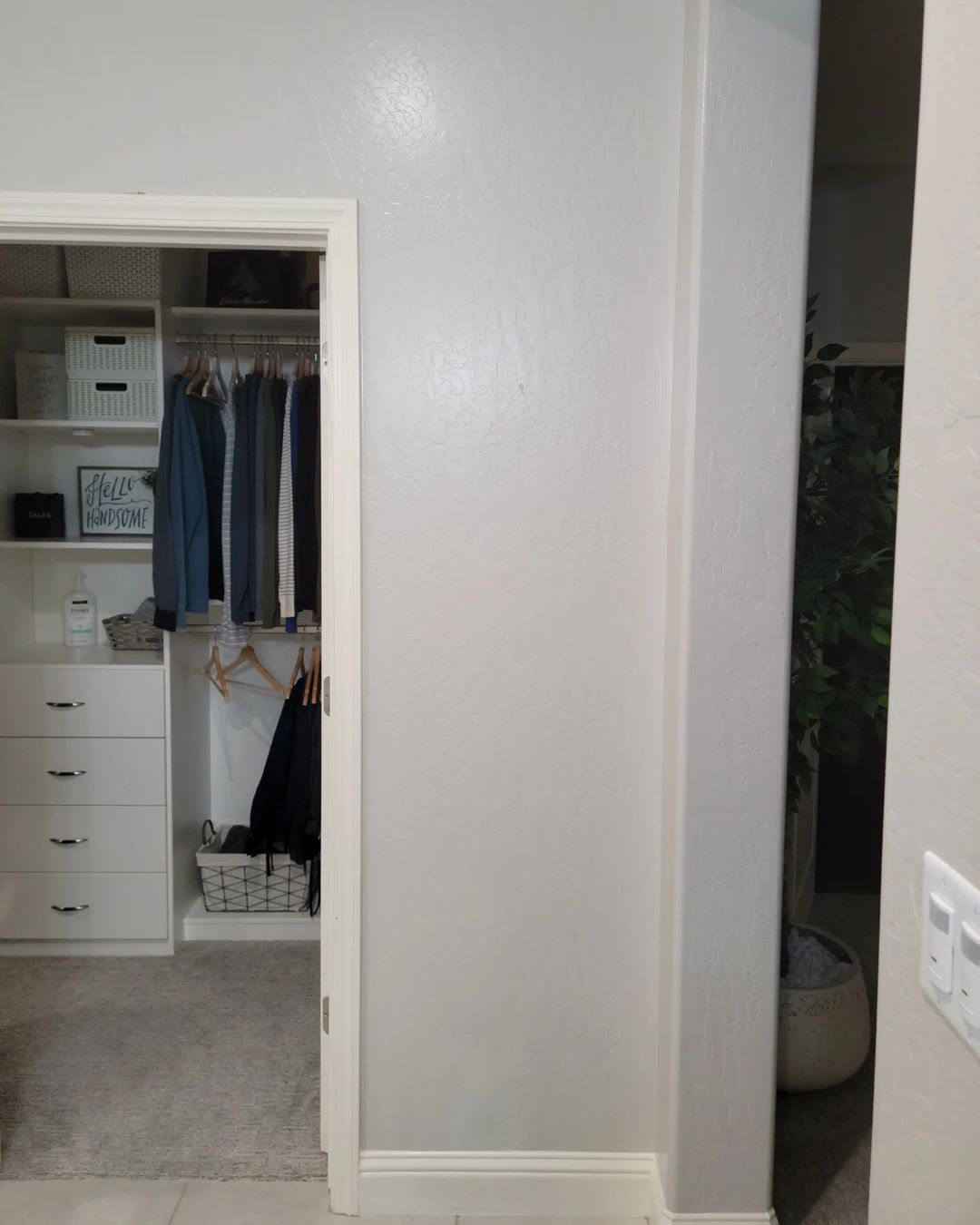
Agreeable Gray Doors. Is It a Good Idea?
Painting your doors Agreeable Gray can bring a subtle elegance and a cohesive look to your home’s interior. The soft, warm undertones of this versatile greige add a touch of sophistication to any space. Agreeable Gray is an excellent choice for doors, providing a neutral backdrop that complements a variety of styles and color schemes.
Using Agreeable Gray on doors can create a seamless transition between rooms. Whether your home has a modern, traditional, or transitional decor, this color works well, enhancing the overall aesthetic while adding a touch of class and continuity.
via inst @follow.us.home
via inst @silo.hill
via inst @revealmydiy
via inst @atidytouch
via int@revealmydiy
via inst @helms_homestead
via inst @infarmhousefashion
via inst @atidytouch
via inst @walkerhomesgc
Detailed color description you can find here in our Ultimate Agreeable Gray Guide
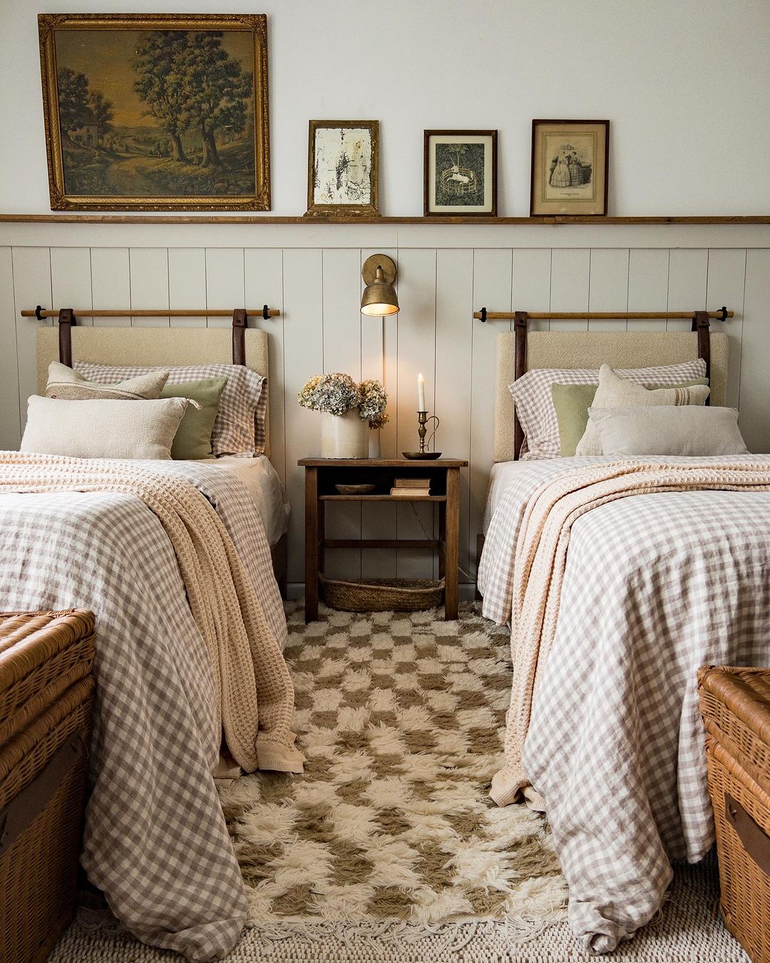
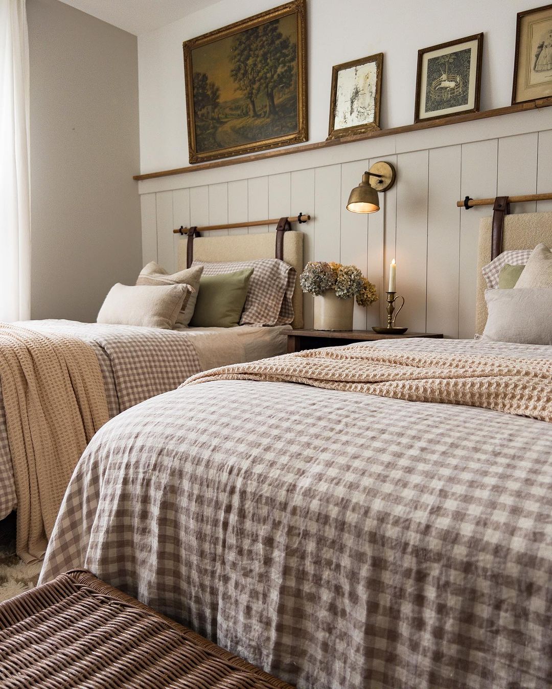
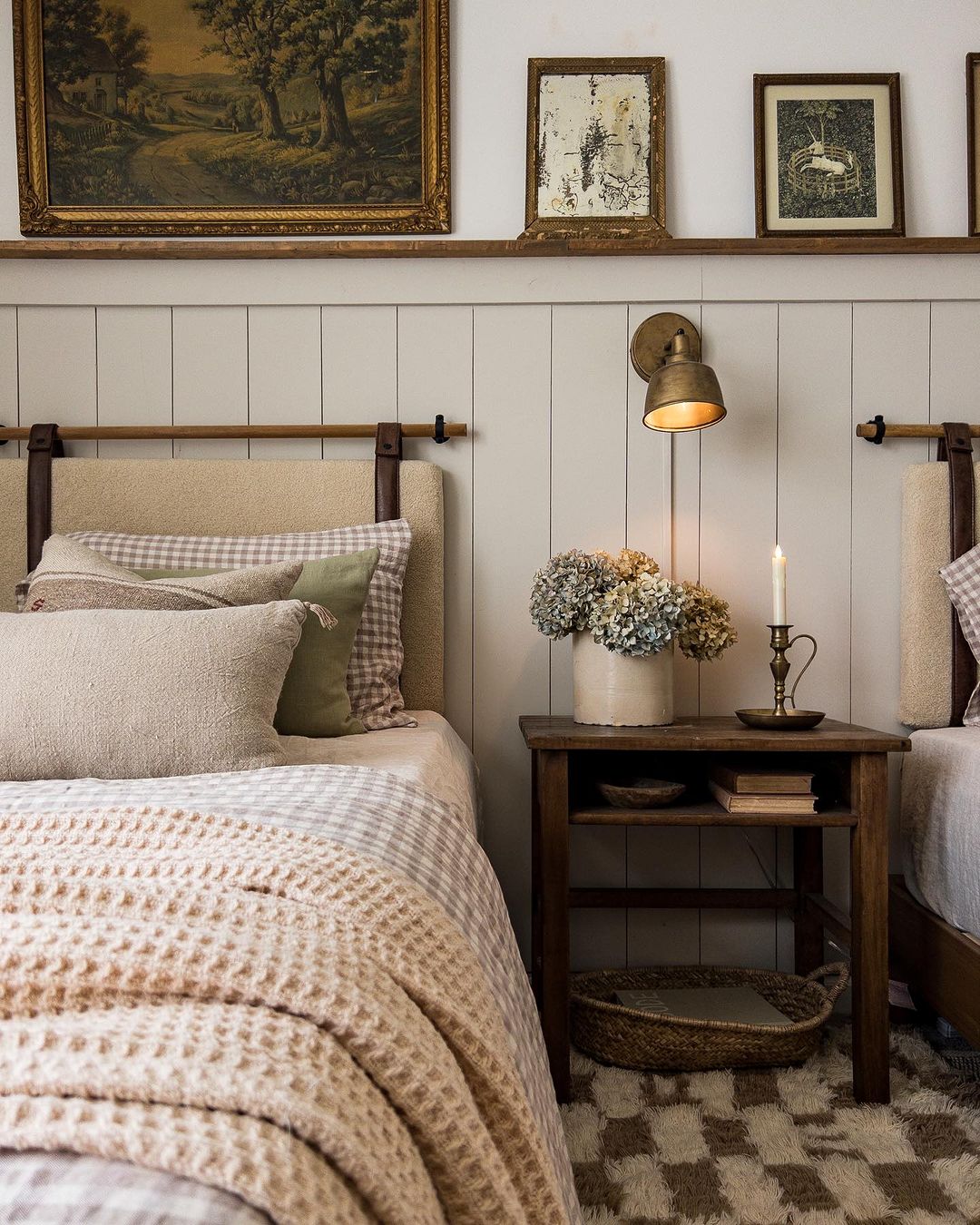
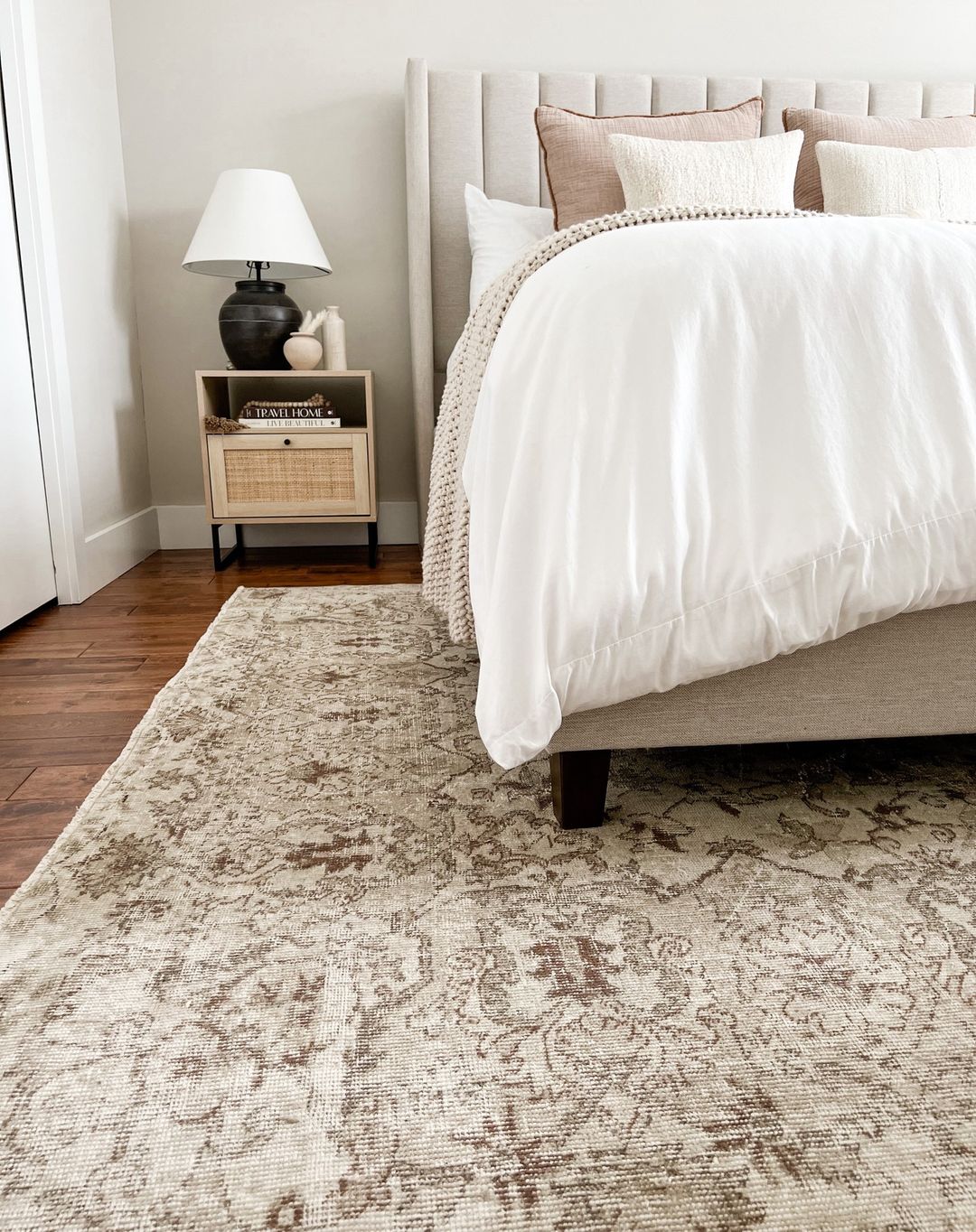
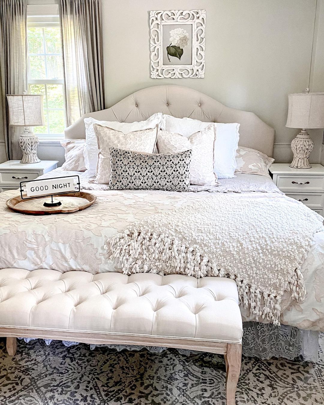
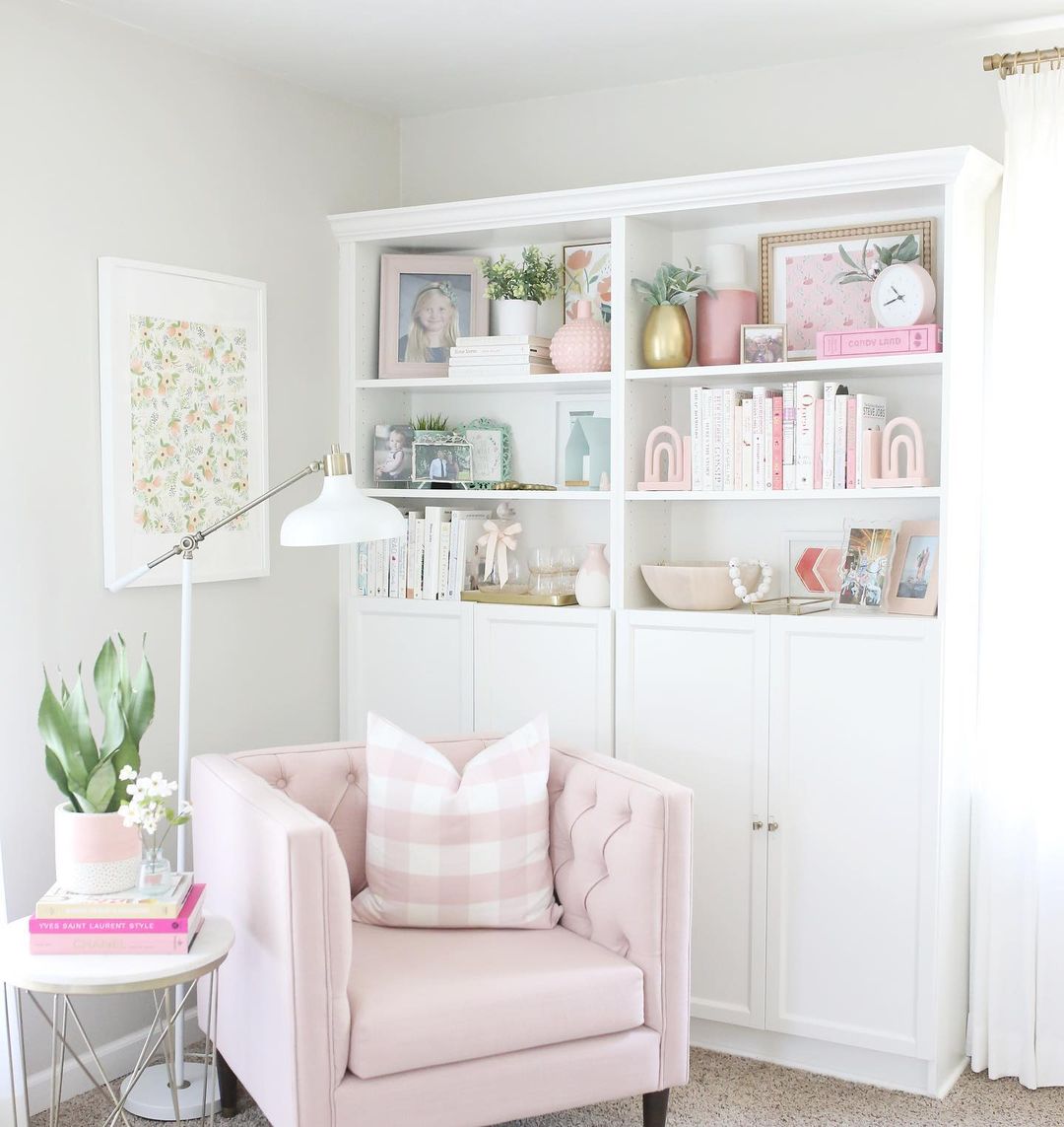
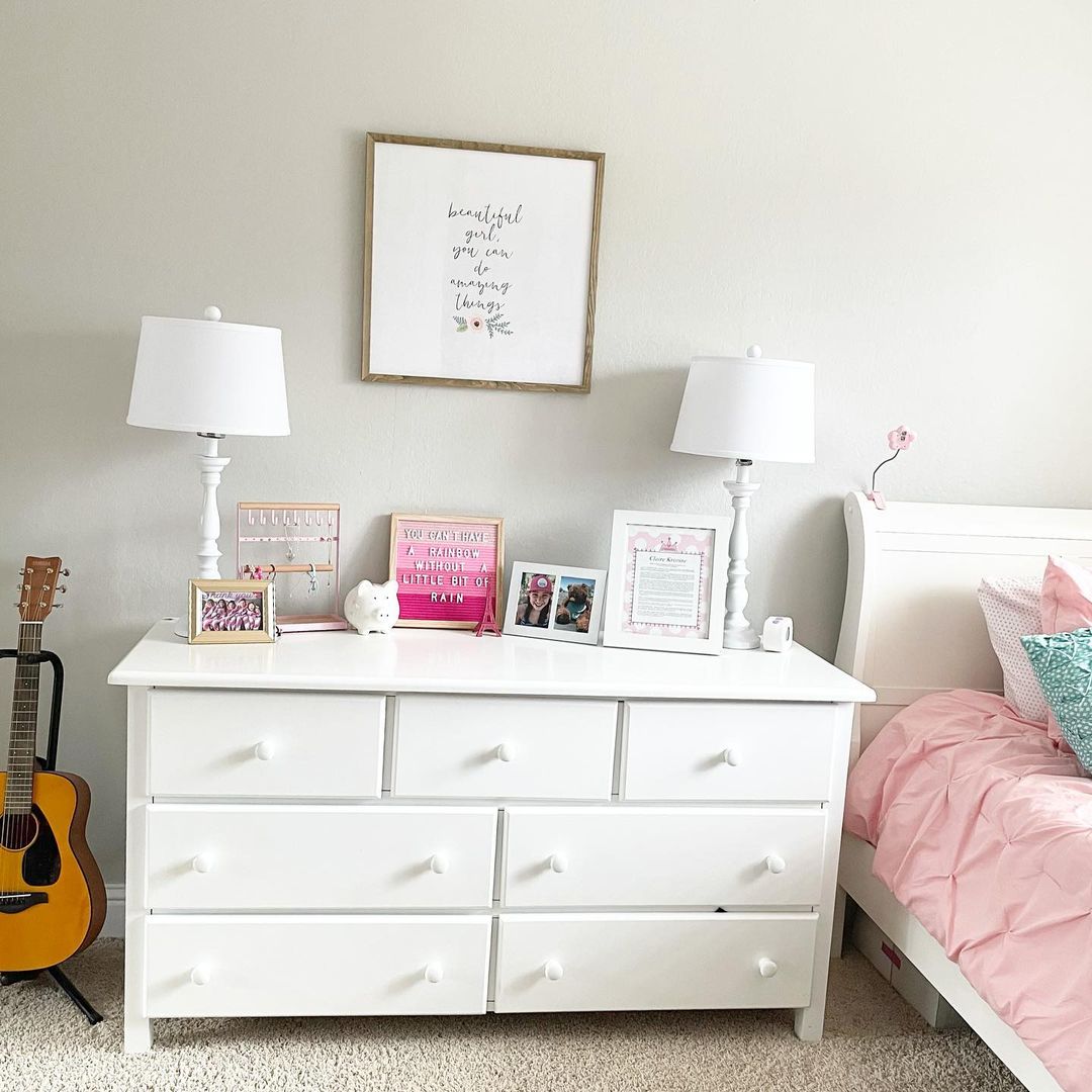
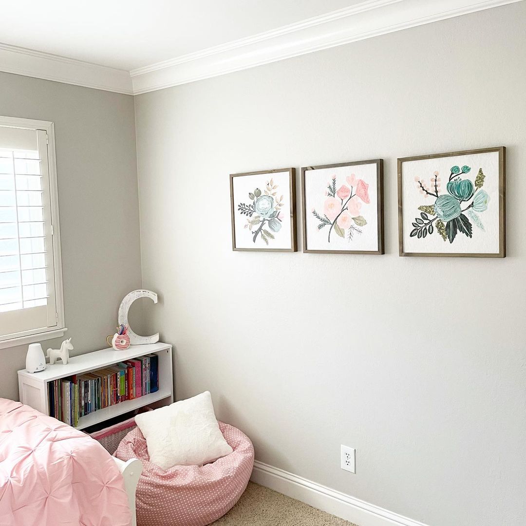
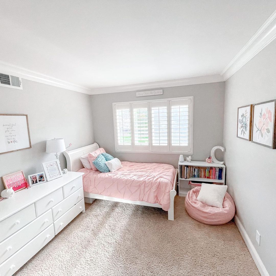
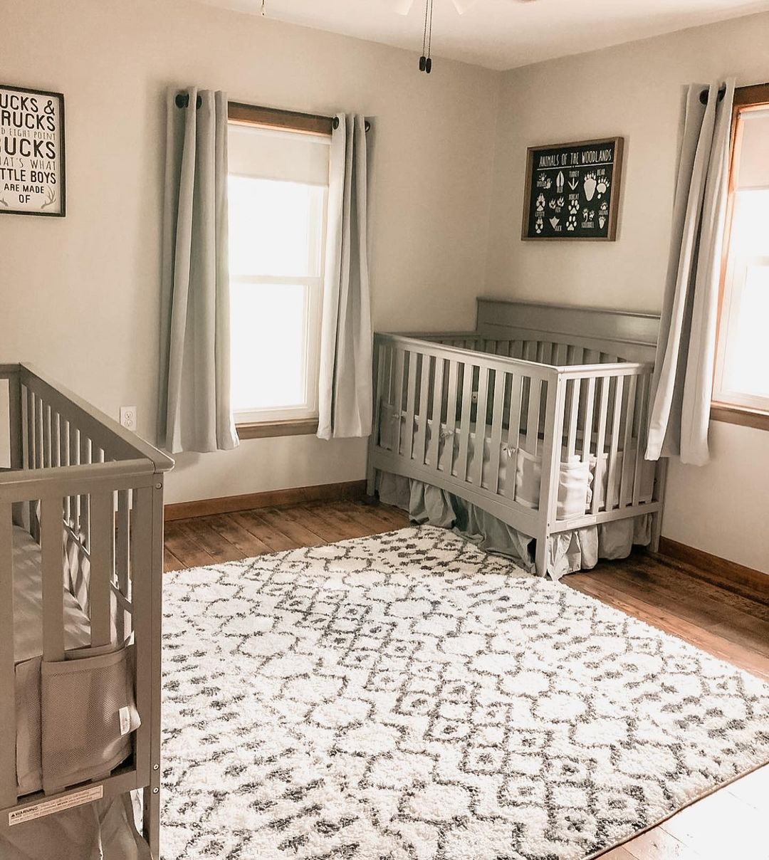
Agreeable Gray for a Girl’s Bedroom: What Are the Best Combinations?
Agreeable Gray is a fantastic option for a girl’s bedroom, offering a neutral base that can easily be paired with a wide range of accent colors. The soft, inviting nature of Agreeable Gray makes it perfect for creating a cozy and calming space. Pair it with pastel pinks, lavenders, or even bold, bright colors to personalize the room according to your child’s taste.
In addition to its versatility, Agreeable Gray provides a timeless look that can grow with your child. This adaptable shade can easily be updated with new accessories and decor as her tastes change, making it a practical choice for a long-lasting design.
via inst @vanessapiot
via inst @vanessapiot
via inst @house_of_7feathers
via inst @house_of_7feathers
via inst @house_of_7feathers
via inst @bymeghang
via inst @fernandfarmhouse
via inst@fernandfarmhouse
via inst @homesweetpink
via inst @mel_larson
via inst @mel_larson
via inst @mel_larson
via inst @mel_larson ww
via inst @fernandfarmhouse
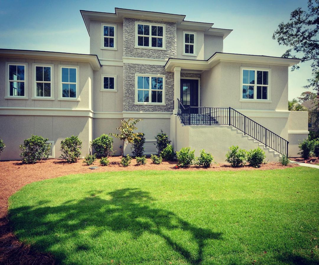
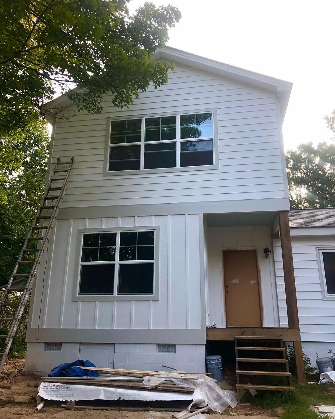
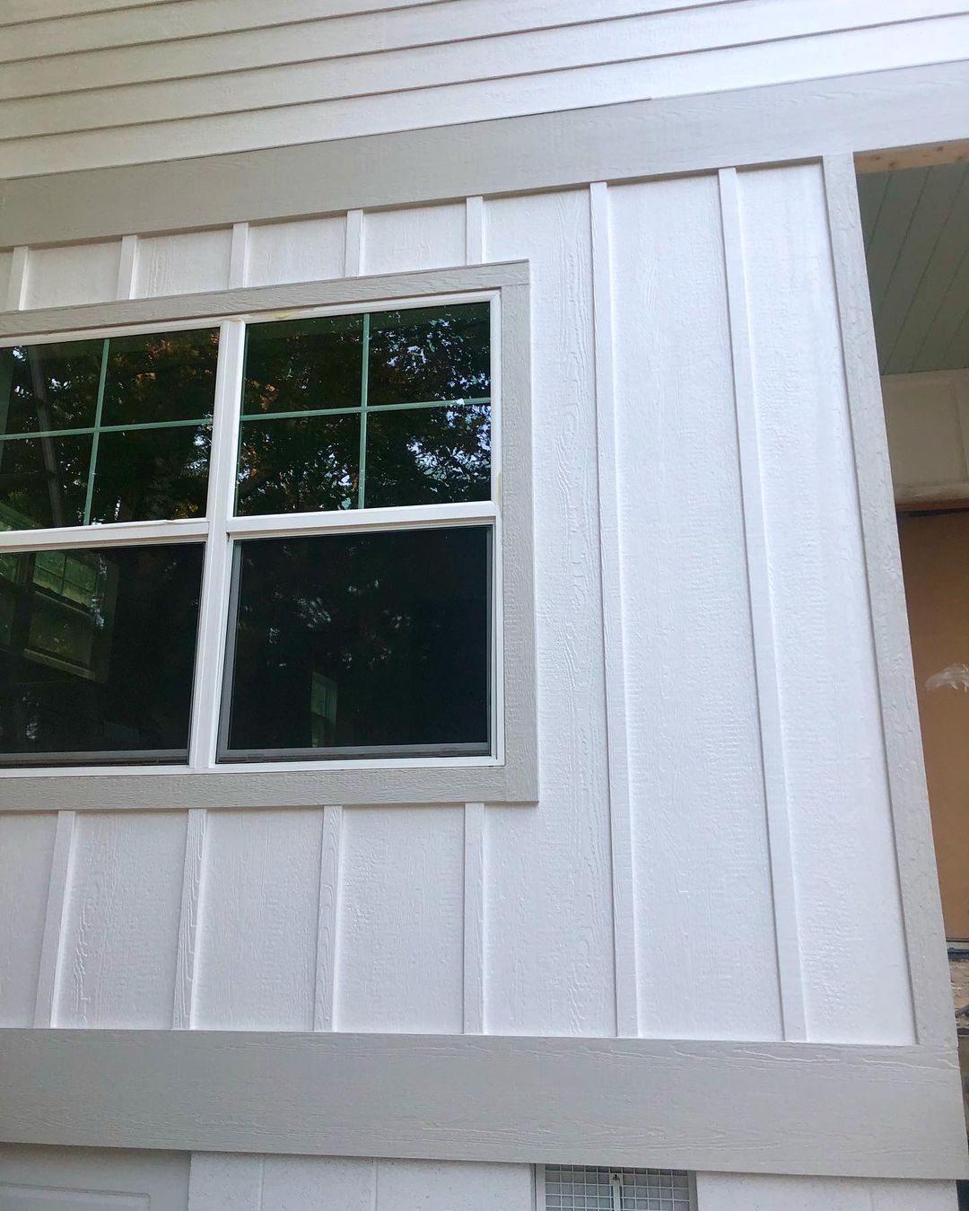
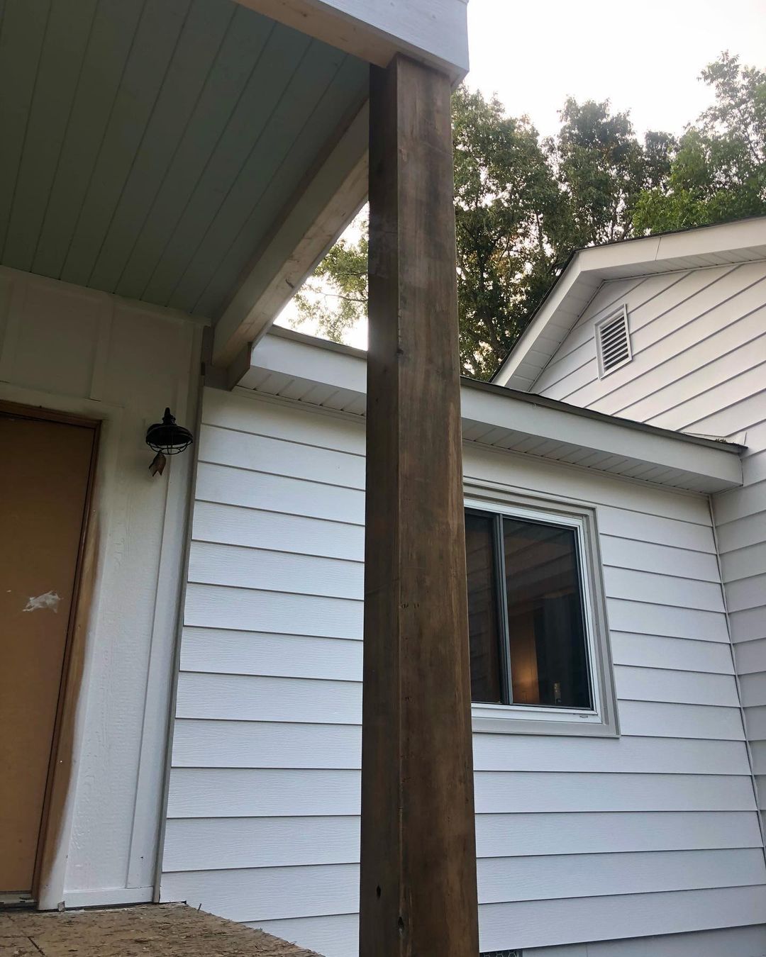
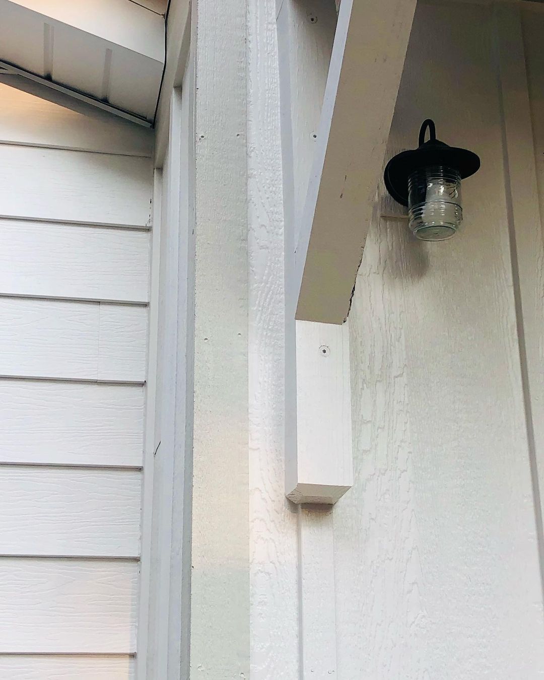
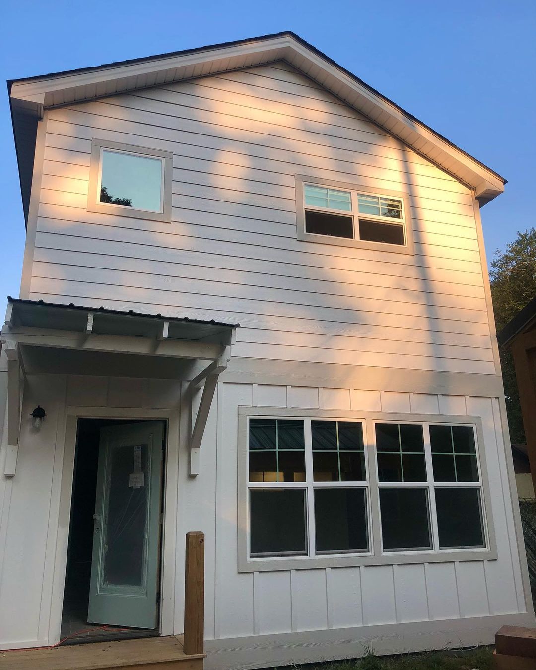
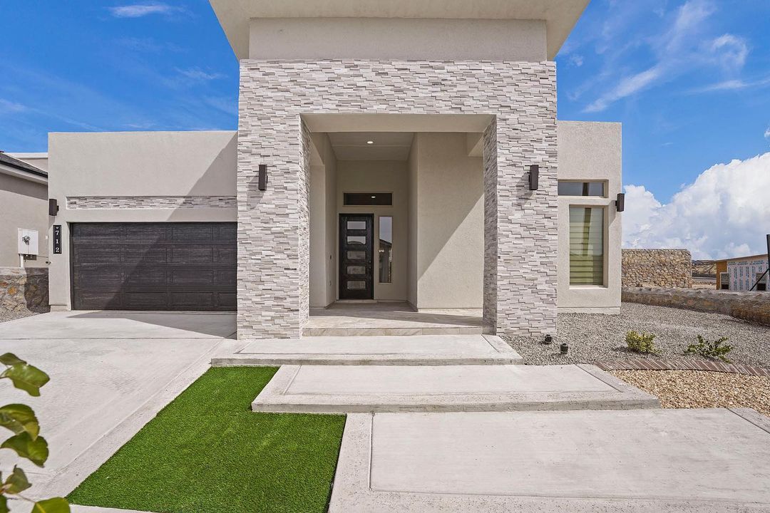
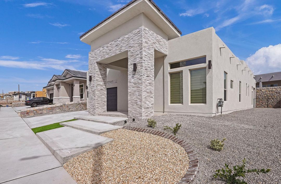
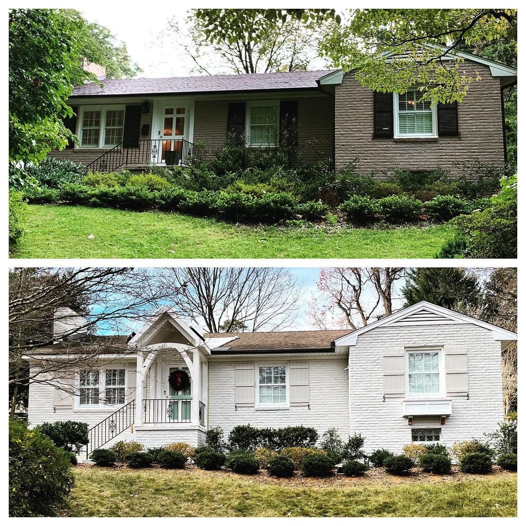
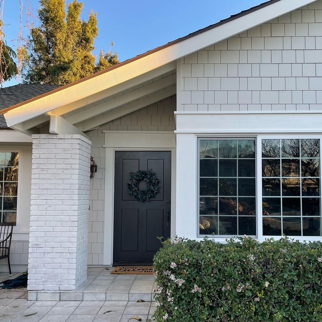
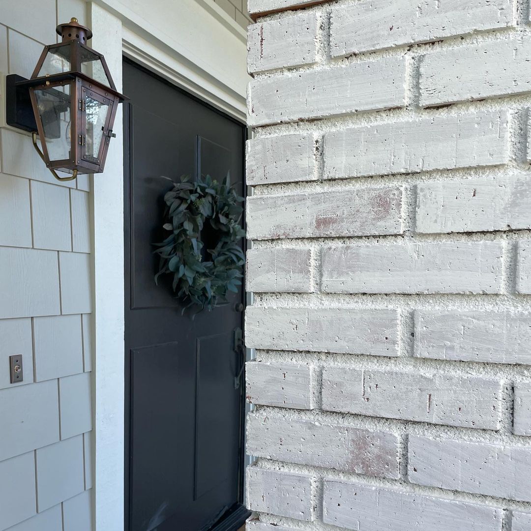
Agreeable Gray House Exterior: Is It the Right Choice?
Using Agreeable Gray on the exterior of your house can give it a modern, sophisticated look. This neutral color works well with various architectural styles, from traditional to contemporary, providing a fresh and elegant appearance. Agreeable Gray’s warm undertones can complement natural materials like stone and wood, enhancing your home’s curb appeal.
In addition to its aesthetic appeal, Agreeable Gray is a practical choice for exteriors because of its ability to withstand different lighting conditions. It maintains its inviting warmth in both bright sunlight and shaded areas, ensuring your home looks beautiful throughout the day.
via inst @jacobyandsonsbuilders
via inst @thewritingscott
via inst @thewritingscott
via inst @thewritingscott
via inst @thewritingscott
via inst @thewritingscott

via inst @silver_saddle_tx

via inst @silver_saddle_tx
via inst @dreamworkrealty
via inst @dreamworkrealty
via inst @freshpaintnc
via inst @jcmcbuff
via inst @jcmcbuff
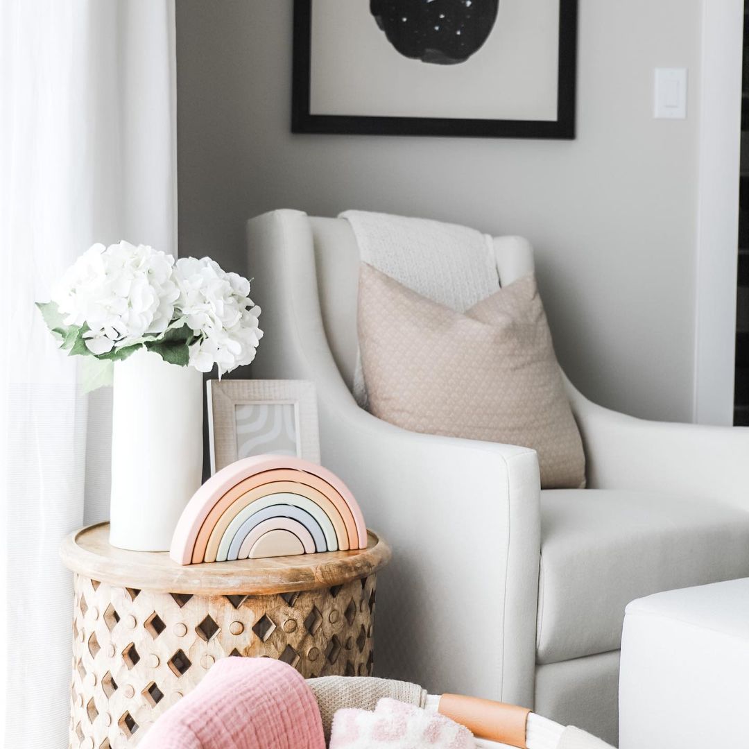
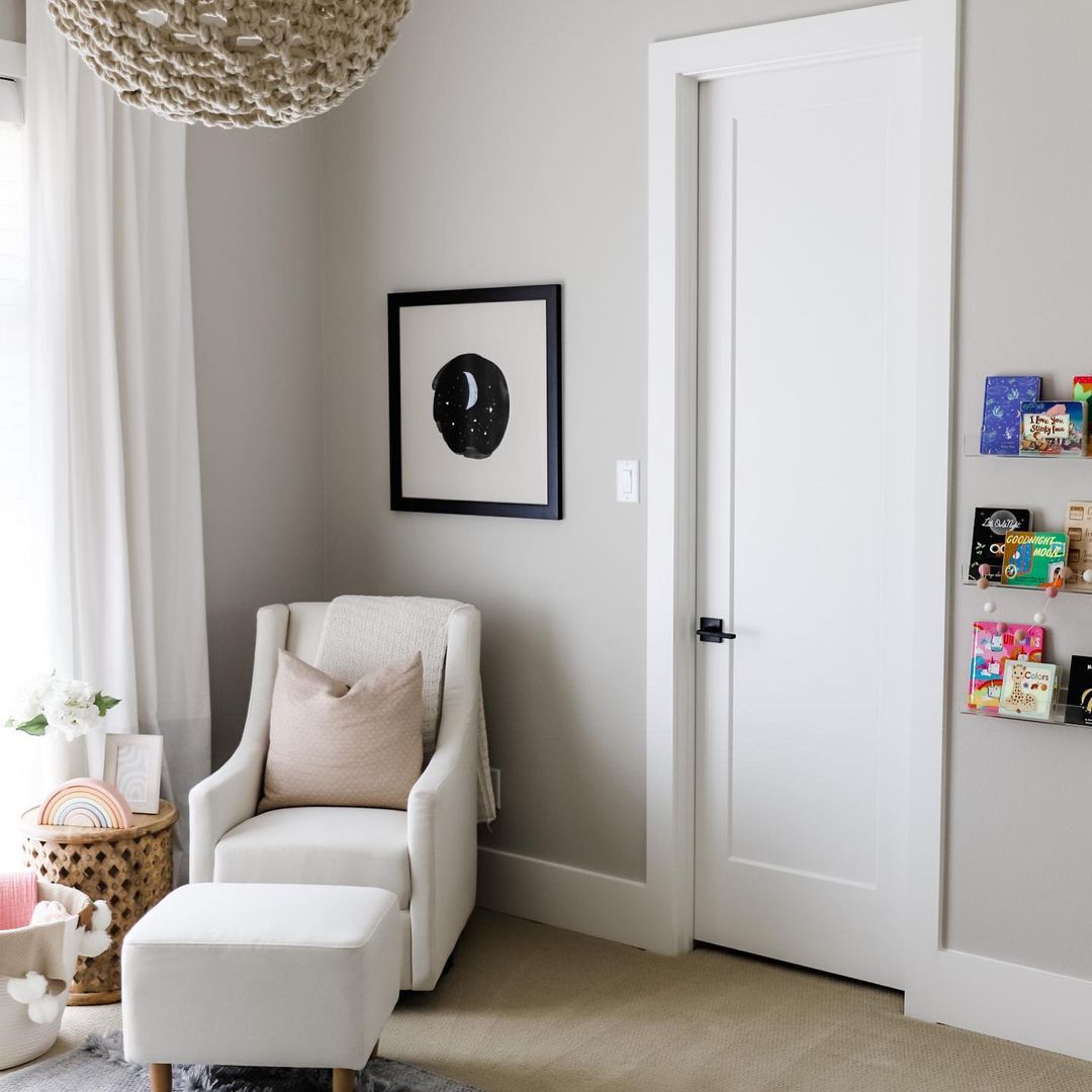
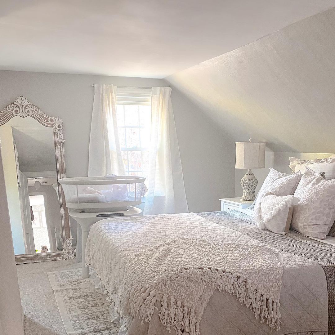
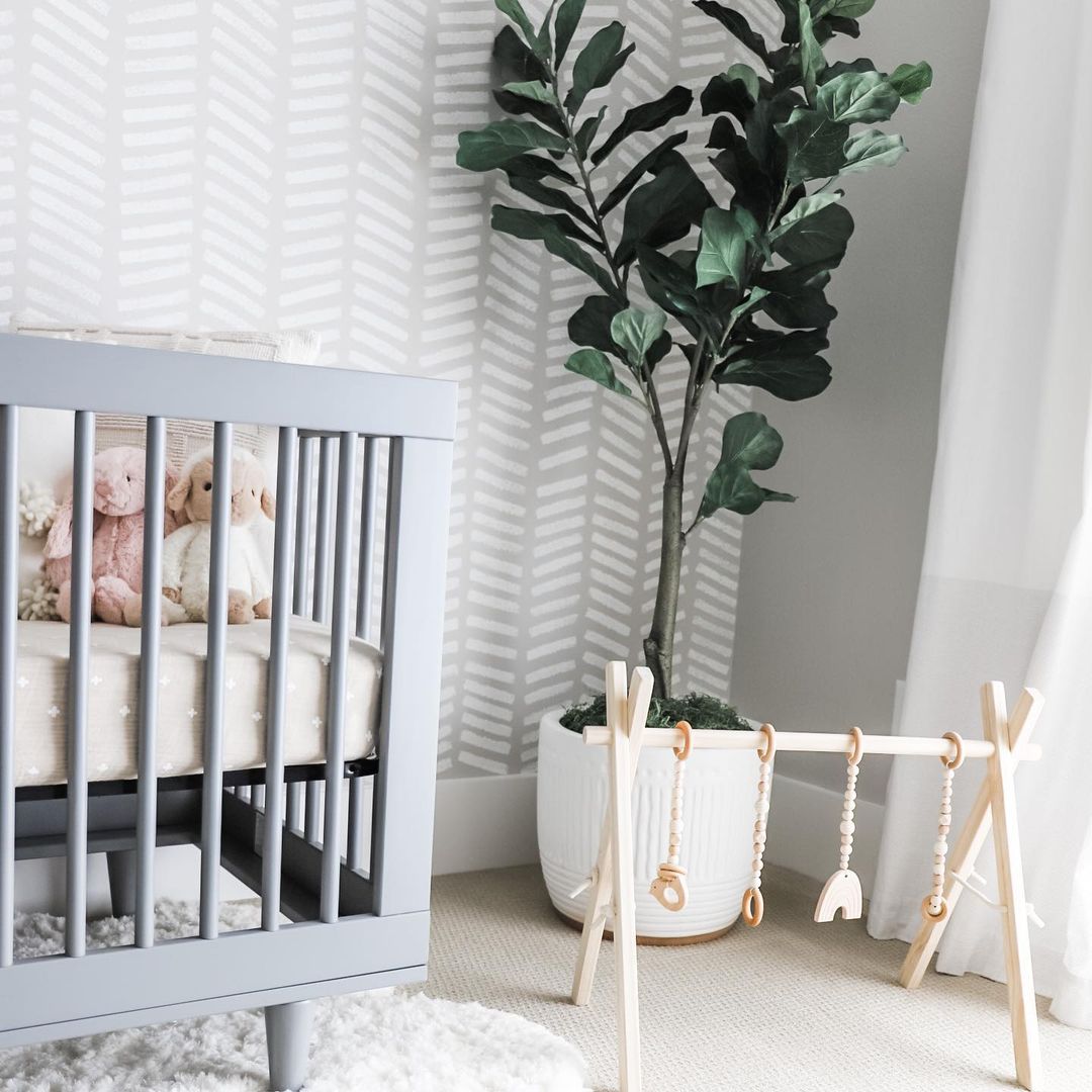
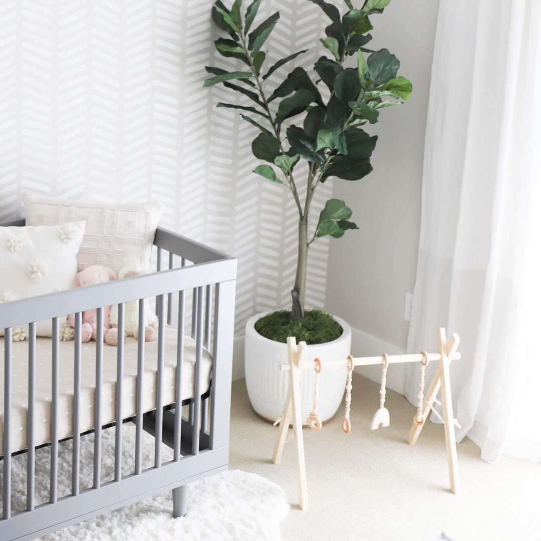
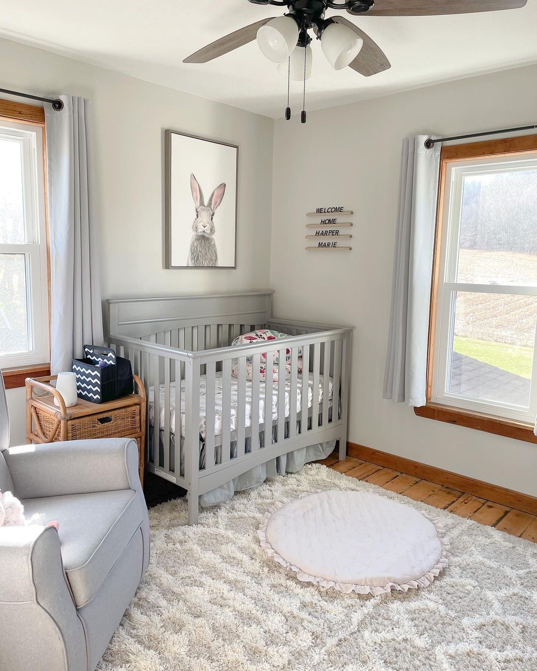
Agreeable Gray Nursery how to Create a Calm and Cozy Space.
Agreeable Gray is an excellent choice for a nursery, creating a serene and soothing environment for your baby. This neutral hue provides a calm backdrop that can be easily paired with soft pastels or vibrant colors to personalize the space. The versatility of Agreeable Gray makes it easy to update the room as your child grows, allowing for endless decorating possibilities.
In a nursery, Agreeable Gray can be paired with white furniture and soft textiles to create a peaceful, dreamy atmosphere. Adding accents like colorful wall art or playful accessories can bring warmth and personality to the room, making it a delightful space for both baby and parents.
via inst @vanessapiot
via inst @vanessapiot
via inst @homesweetpink
via inst @sycamorehomestead
via inst @sycamorehomestead
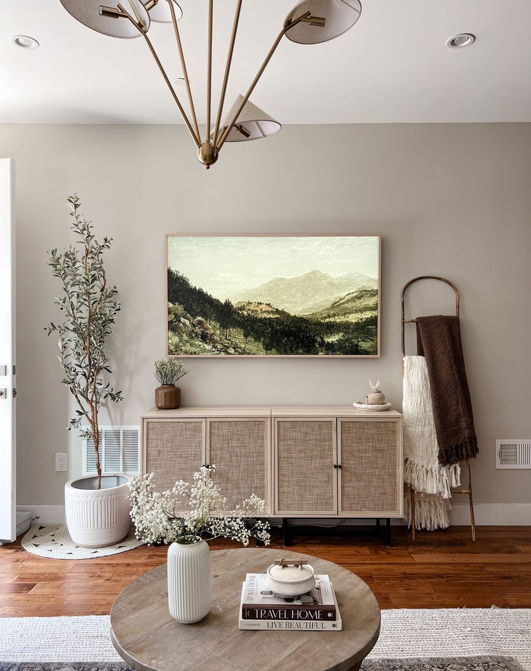
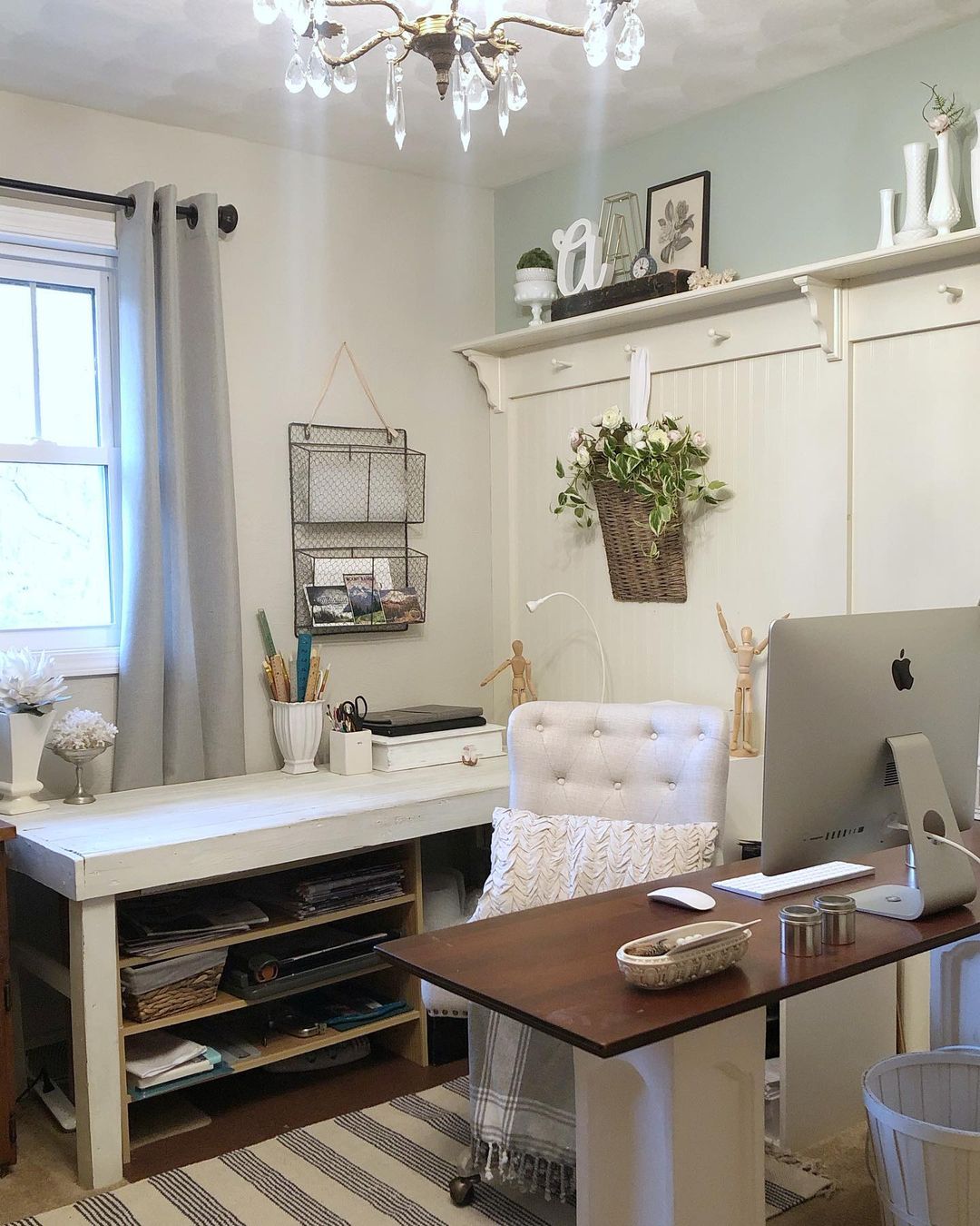
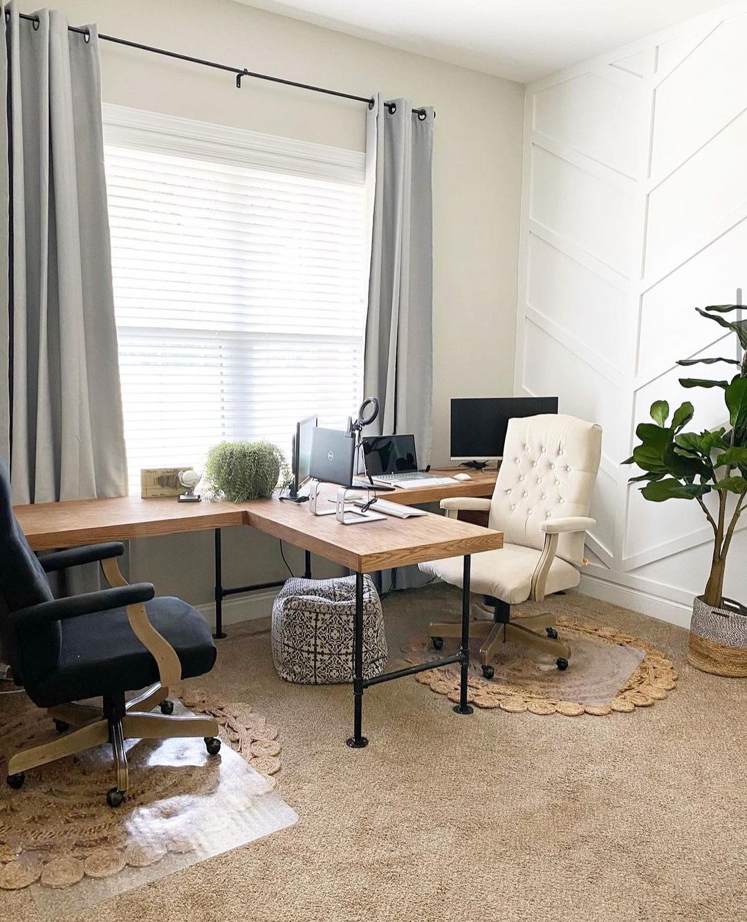
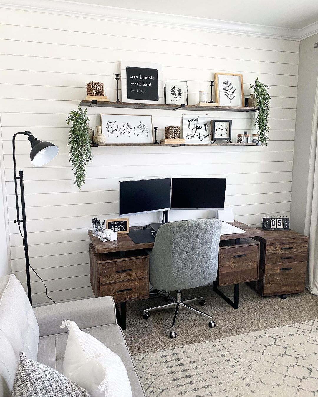
Agreeable Gray Office how to Boost Productivity and Style
Using Agreeable Gray in your office can create a productive and stylish environment. This neutral color promotes focus and calmness, making it ideal for a workspace. The soft undertones of Agreeable Gray provide a sophisticated backdrop that complements various office decor styles, from modern to classic.
Agreeable Gray’s versatility allows it to pair well with different accent colors, such as navy blue, green, or even metallics, adding a touch of elegance to your office. Incorporating this color into your workspace can help create a professional yet inviting atmosphere, enhancing both aesthetics and functionality.
via inst @bymeghang
via inst @pattirobertsdesignco
via inst @lostandfoundcottage
via inst @lostandfoundcottage
via inst@creeksidefarmhouse
via inst@visionswithvic
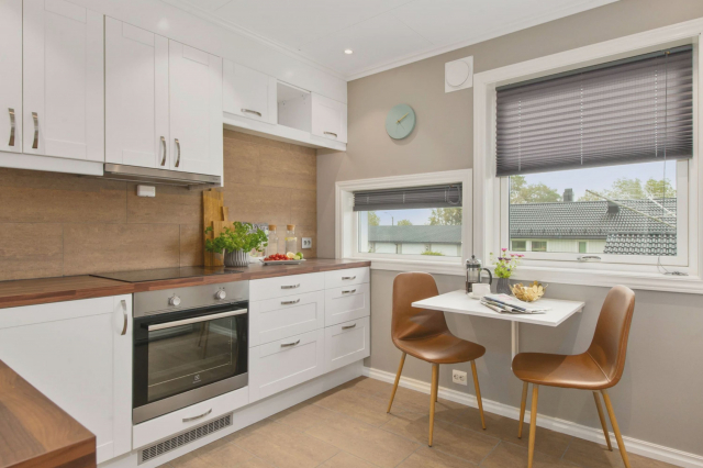
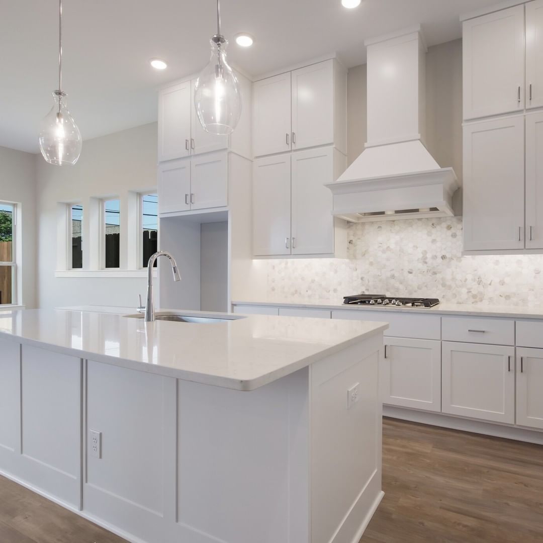
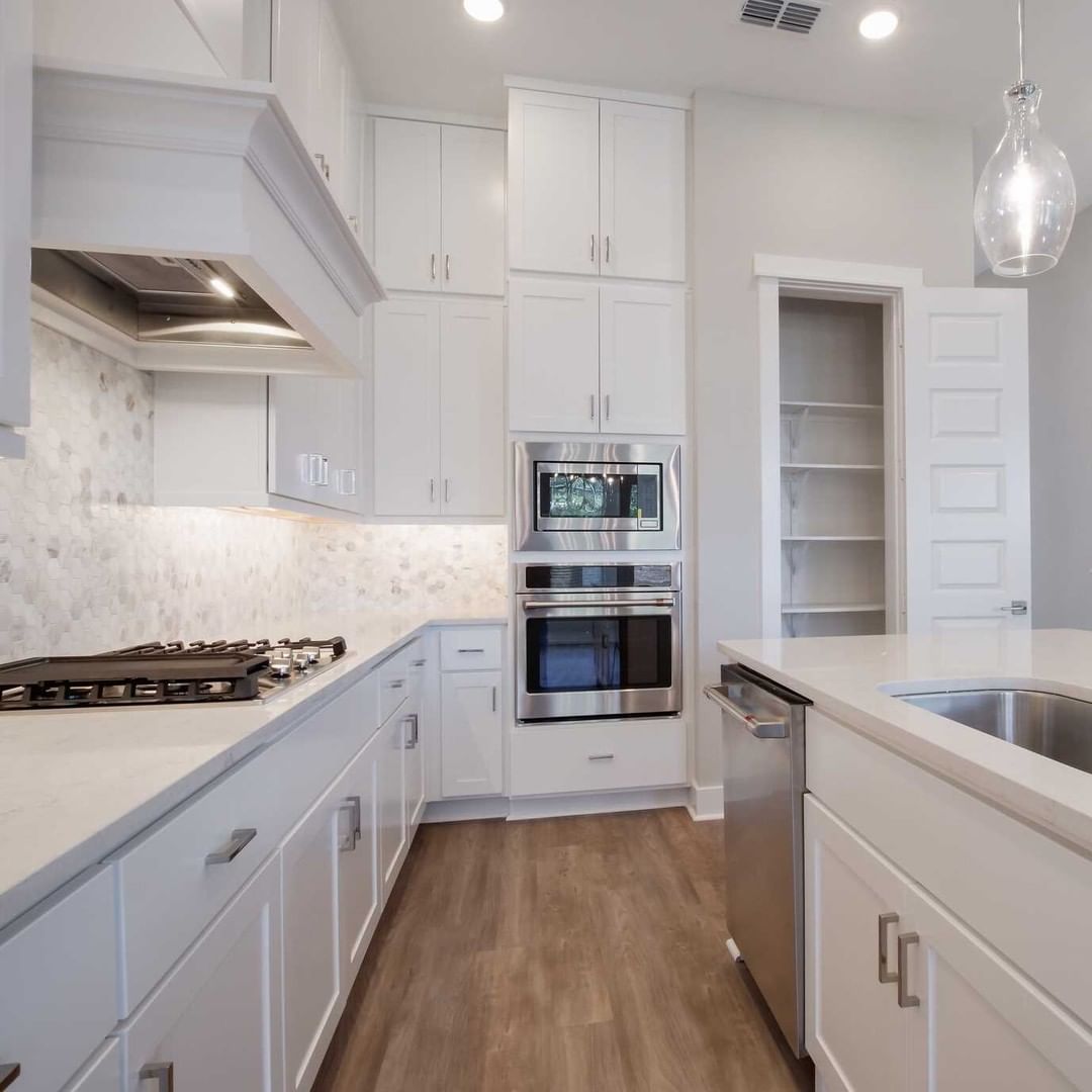
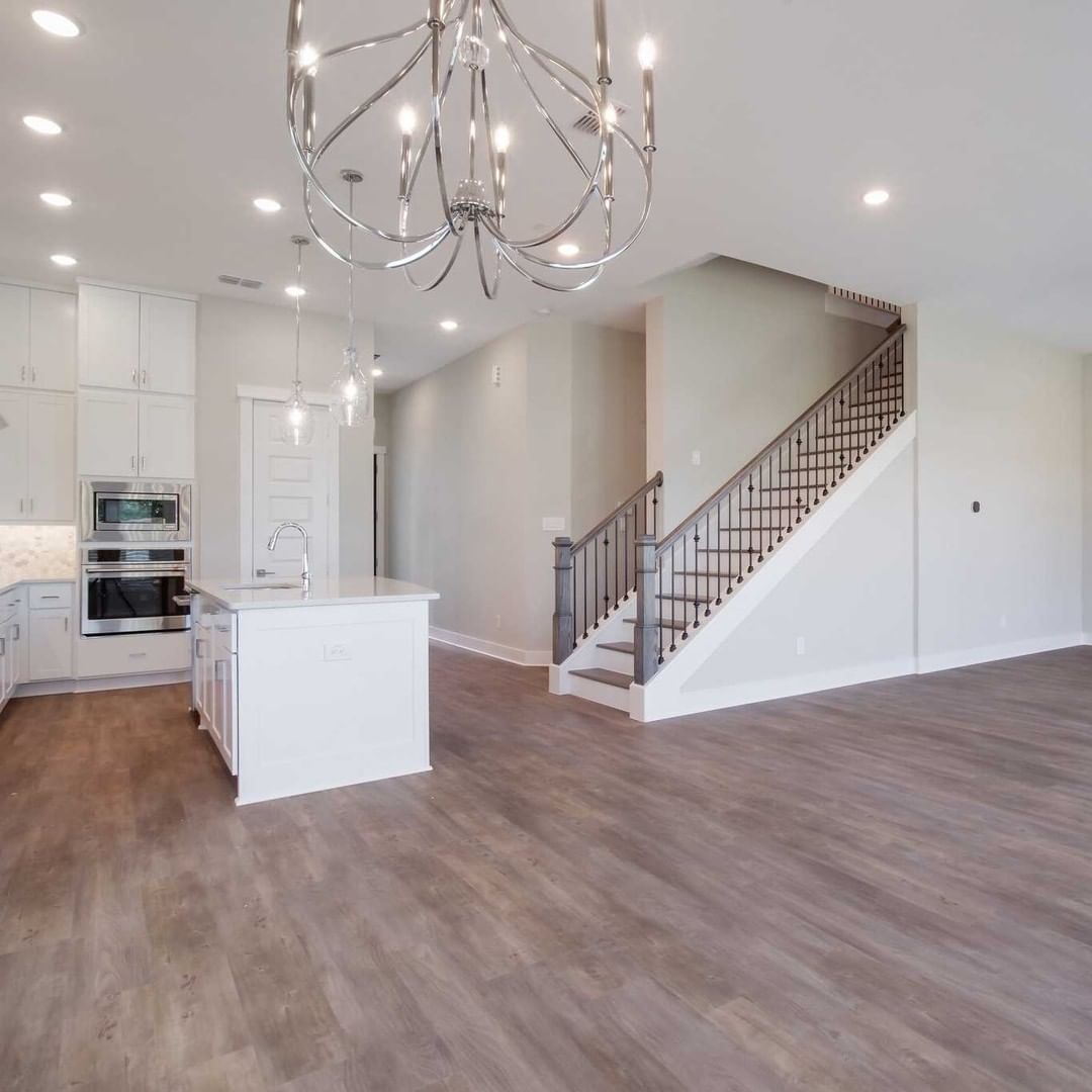
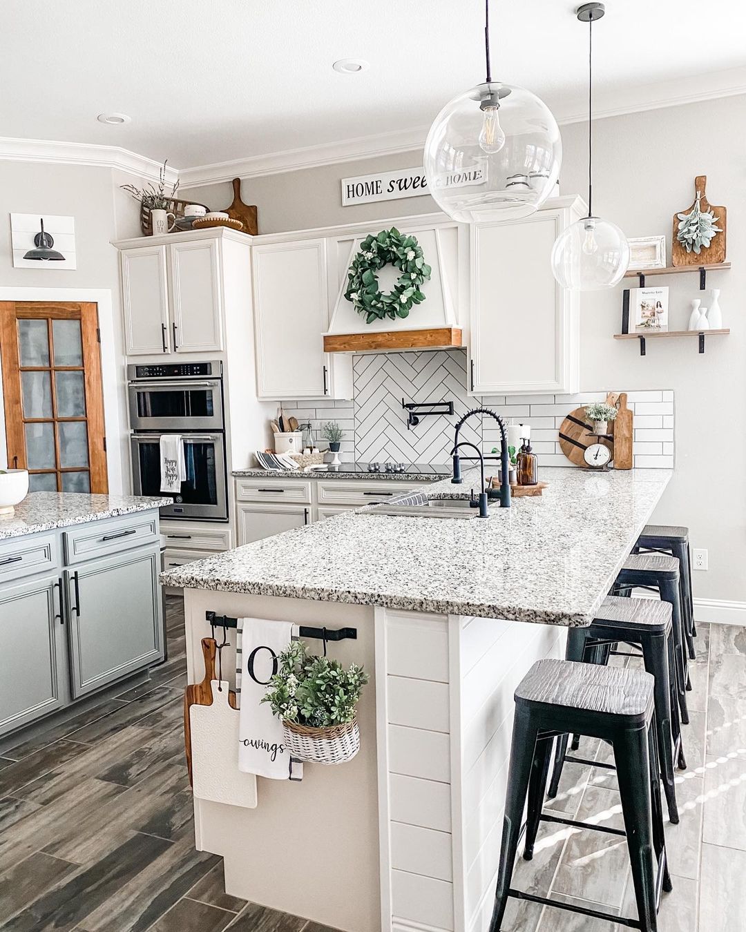
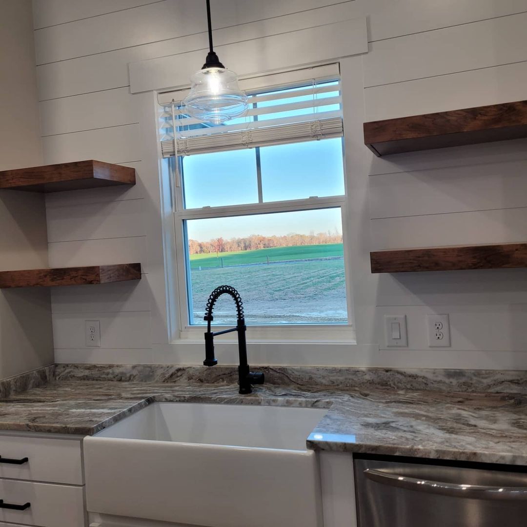
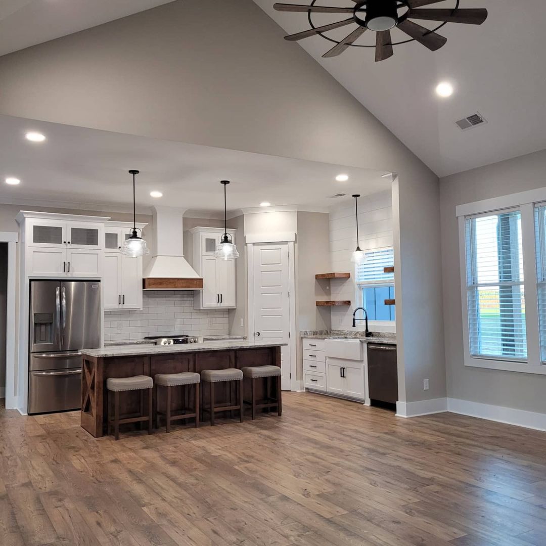
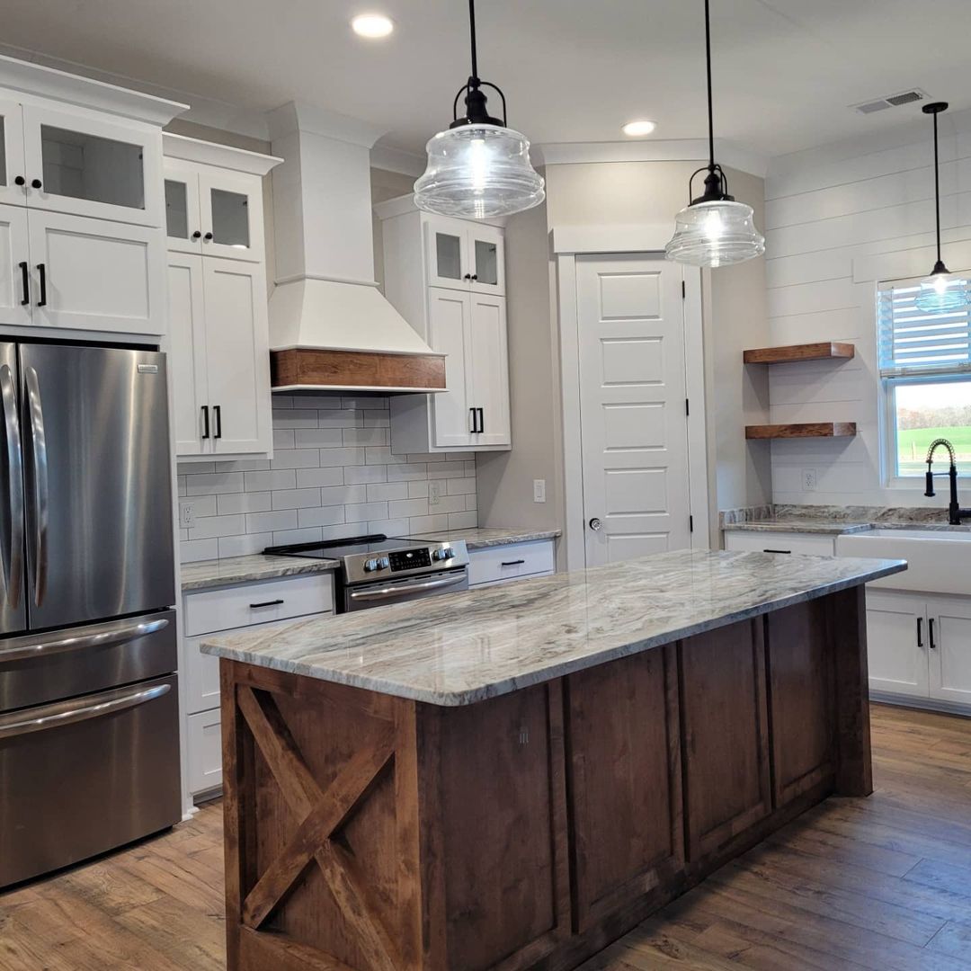
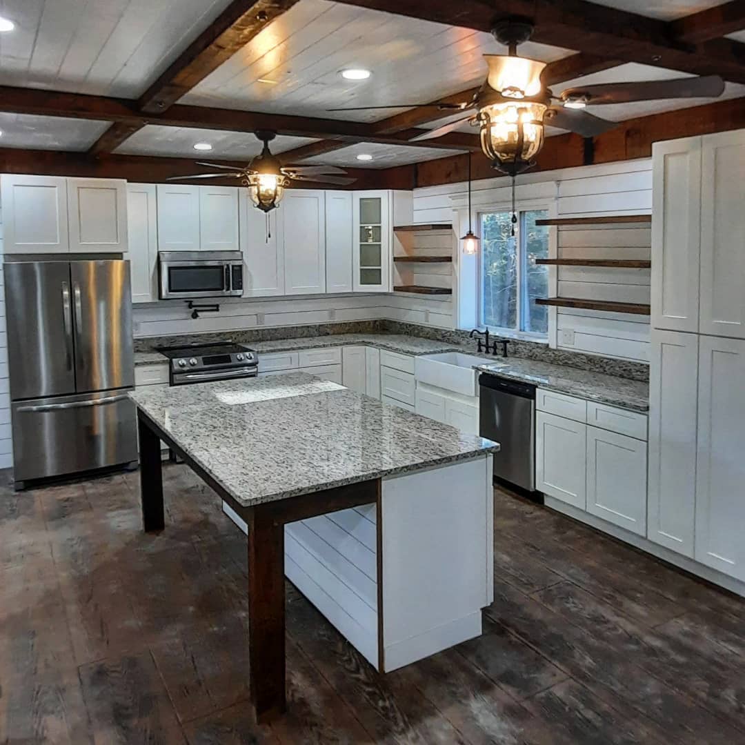
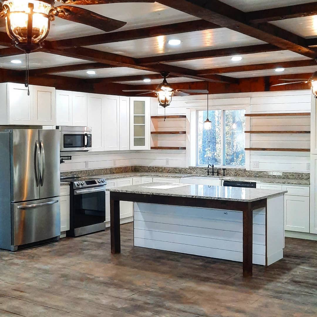
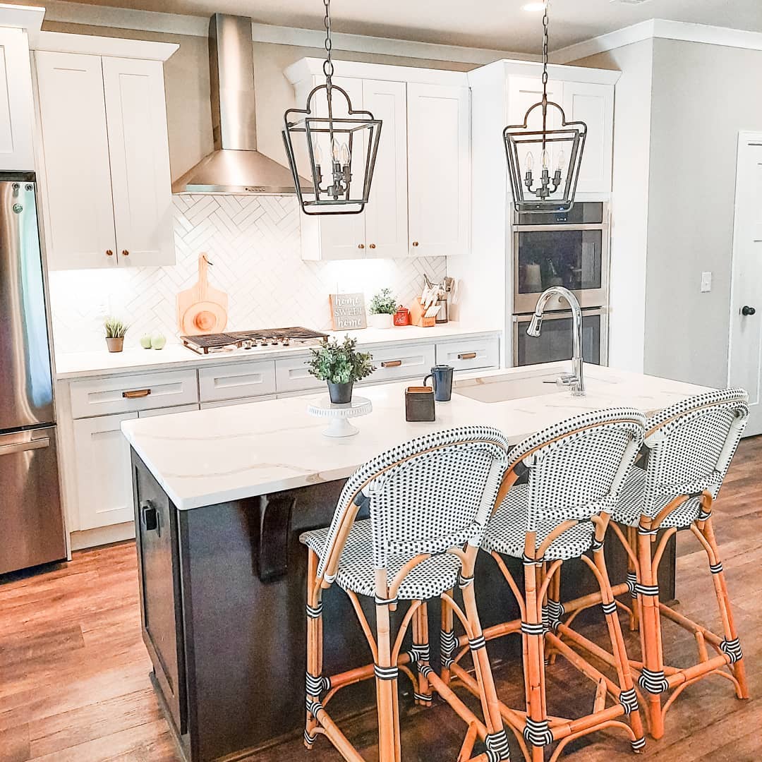
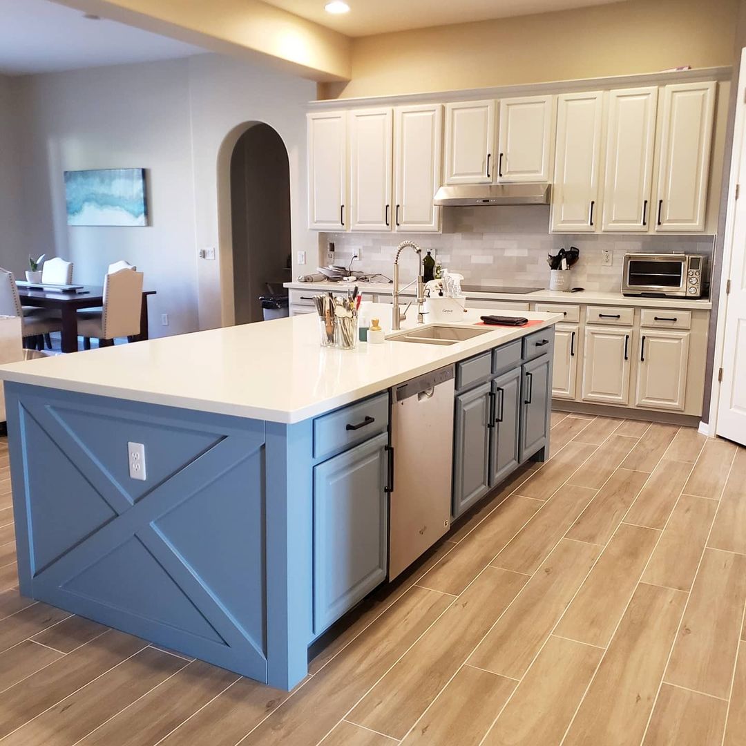
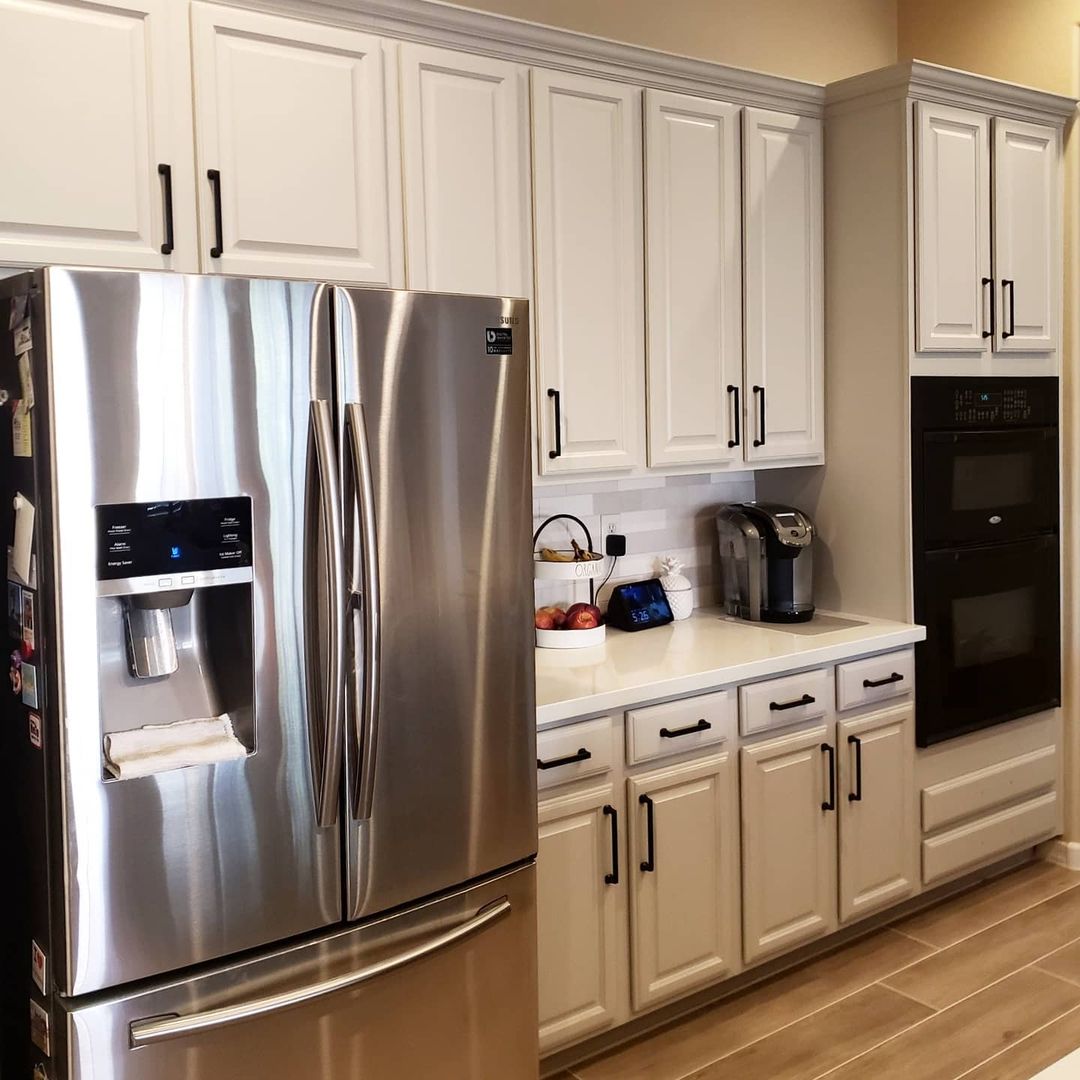
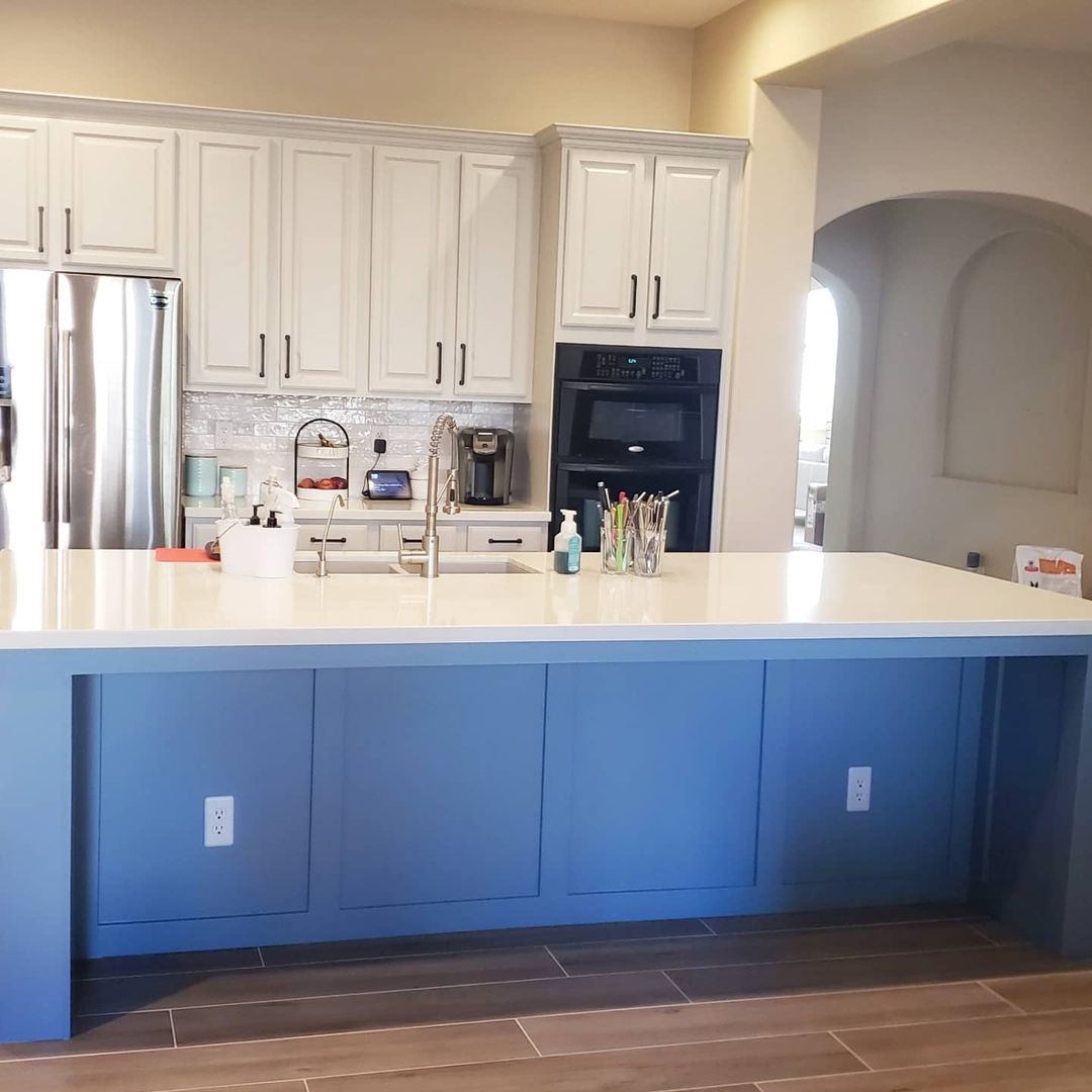
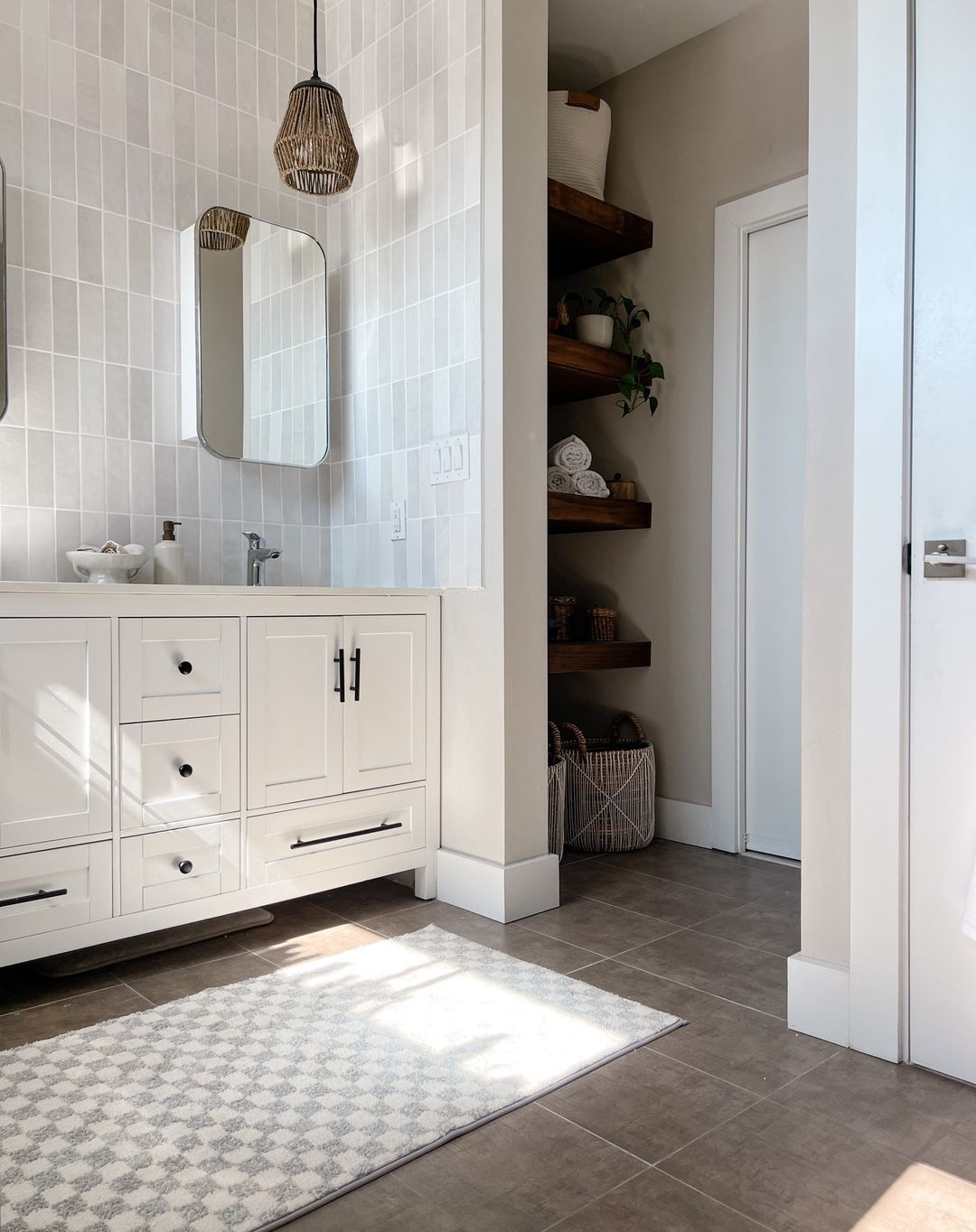
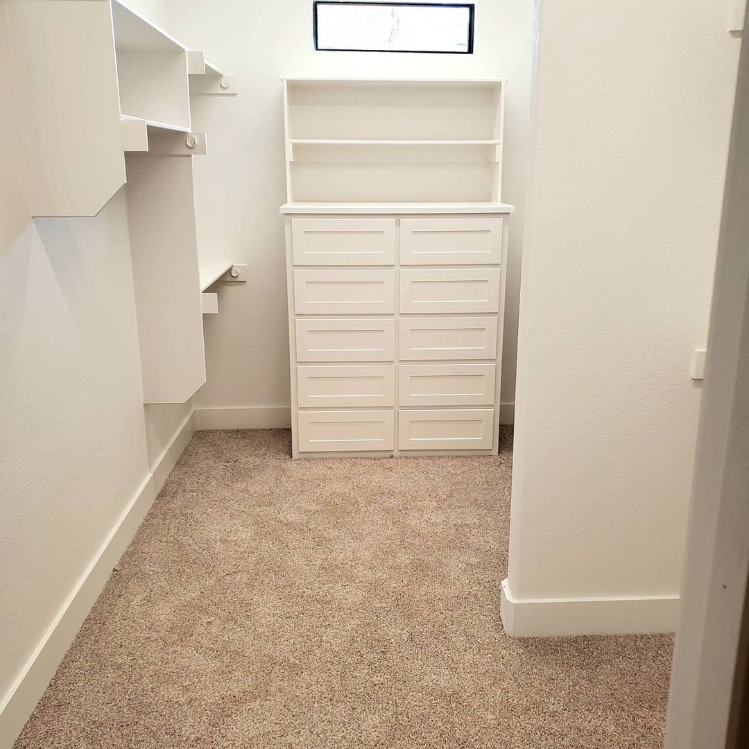
Agreeable Gray in the Kitchen
Agreeable Gray is a fantastic choice for kitchens, offering a clean and contemporary look. This neutral hue can create a sophisticated backdrop for your kitchen cabinets, countertops, and appliances. Its warm undertones work well with a variety of materials, such as stainless steel, wood, and marble, allowing for a cohesive and stylish kitchen design.
Using Agreeable Gray in the kitchen also provides a versatile base that can be easily updated with new accessories and decor. Whether you prefer a modern, traditional, or transitional kitchen style, this color can adapt to your design preferences, making it a practical and timeless choice.
via inst@davidweekleyhomes
via inst@davidweekleyhomes
via inst@davidweekleyhomes
via inst@cozyoncottoncreek
via inst@helms_homestead
via inst@helms_homestead
via inst@helms_homestead
via inst@shenski_construction
via inst@shenski_construction
via inst@shenski_construction
via inst@doctordoiturself
via inst@restyle.junkie
via inst@restyle.junkie
via inst@restyle.junkie
via inst@walkerhomesgc
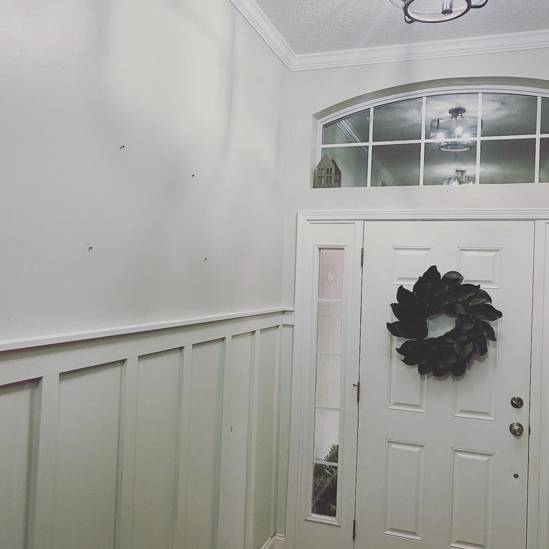
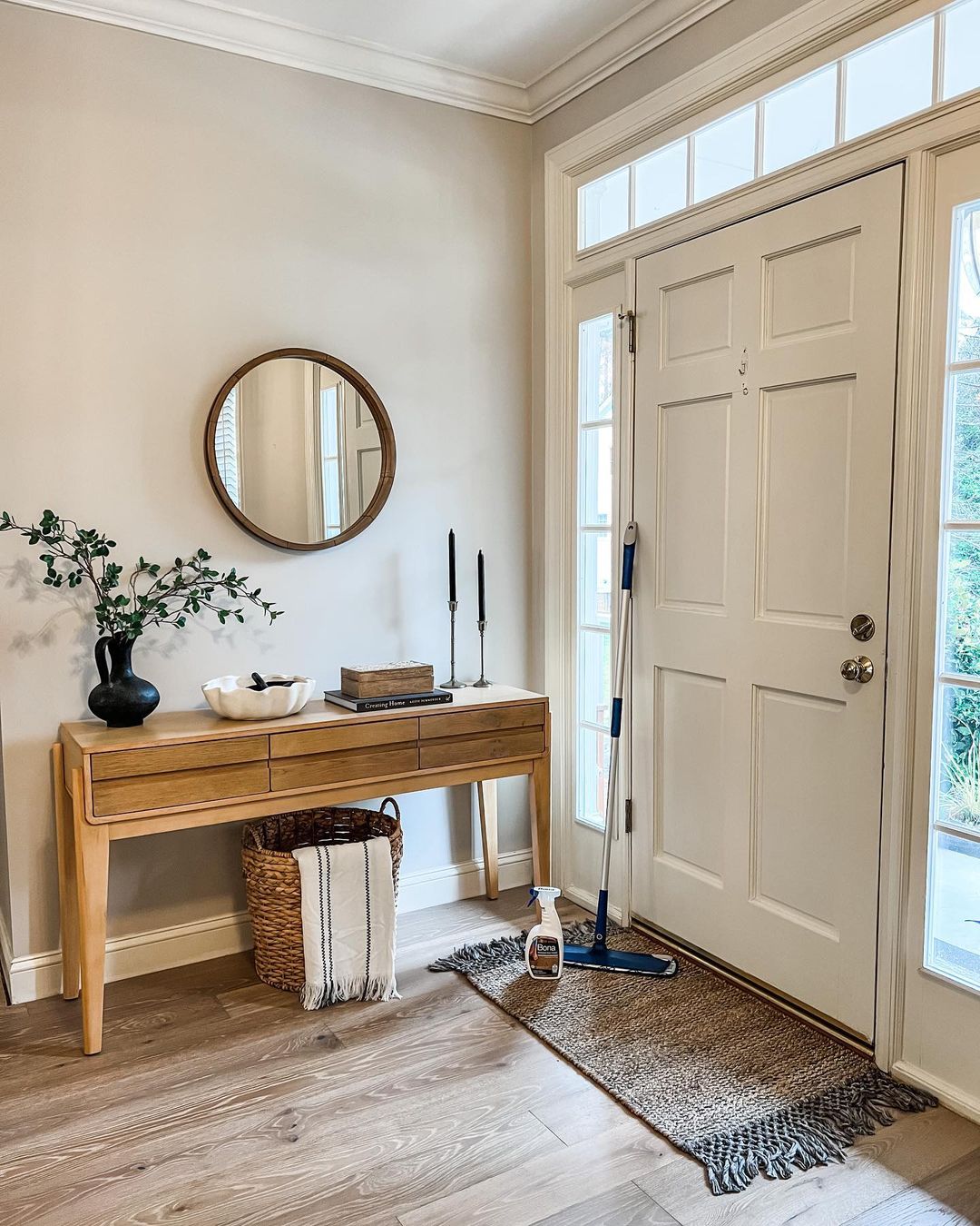
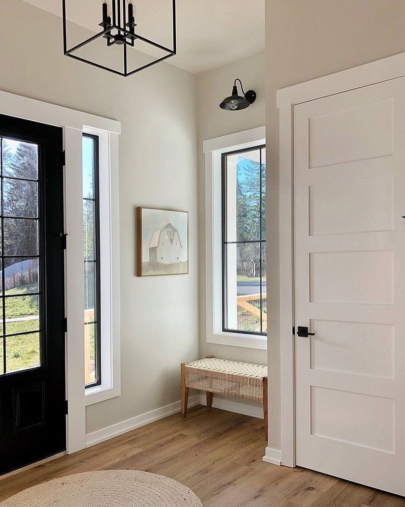
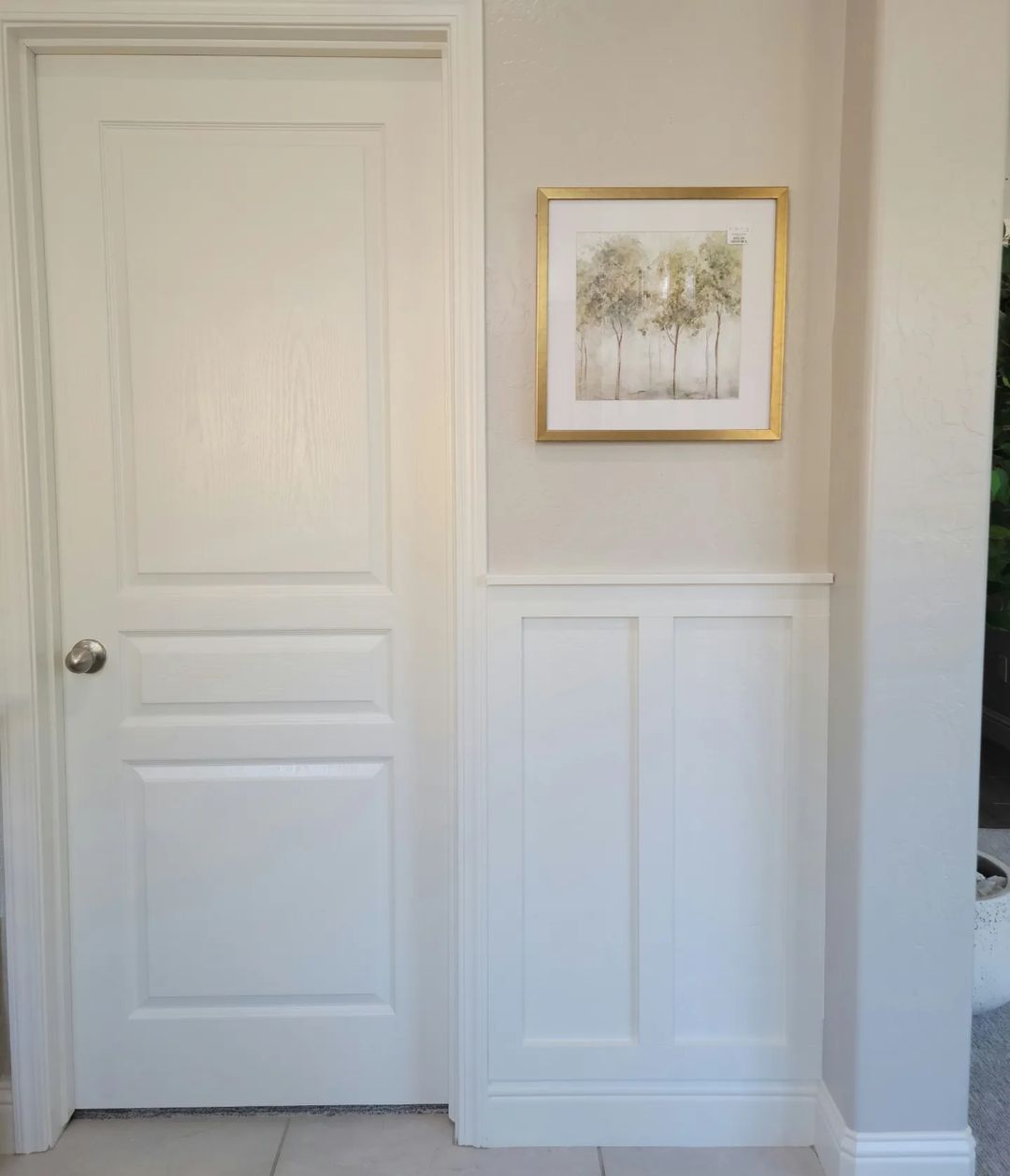
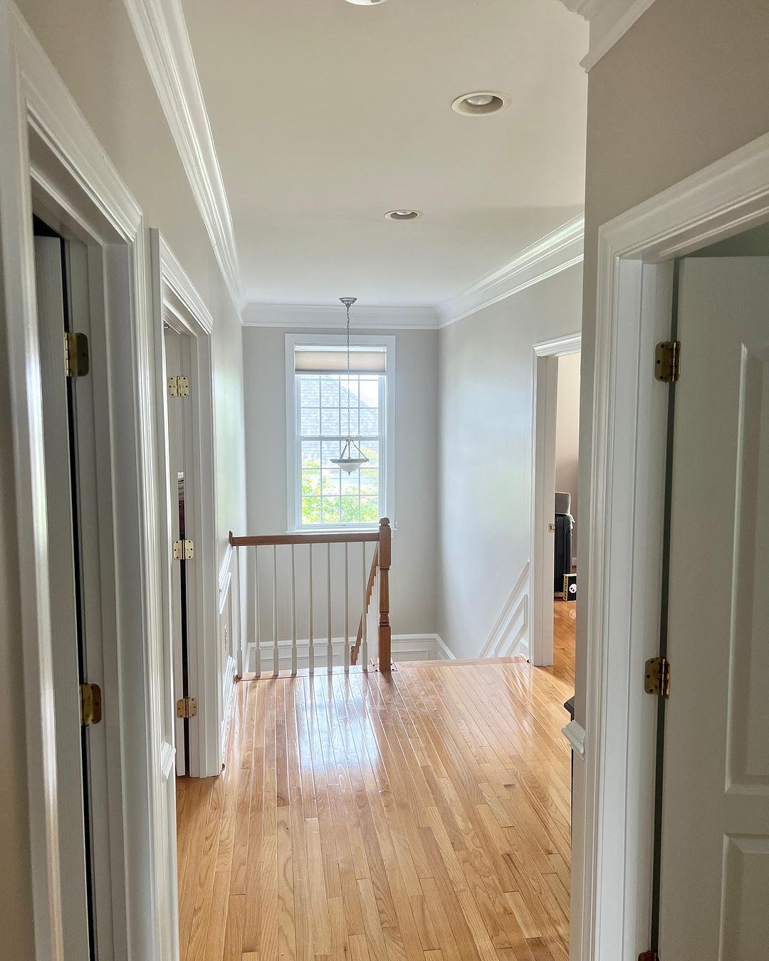
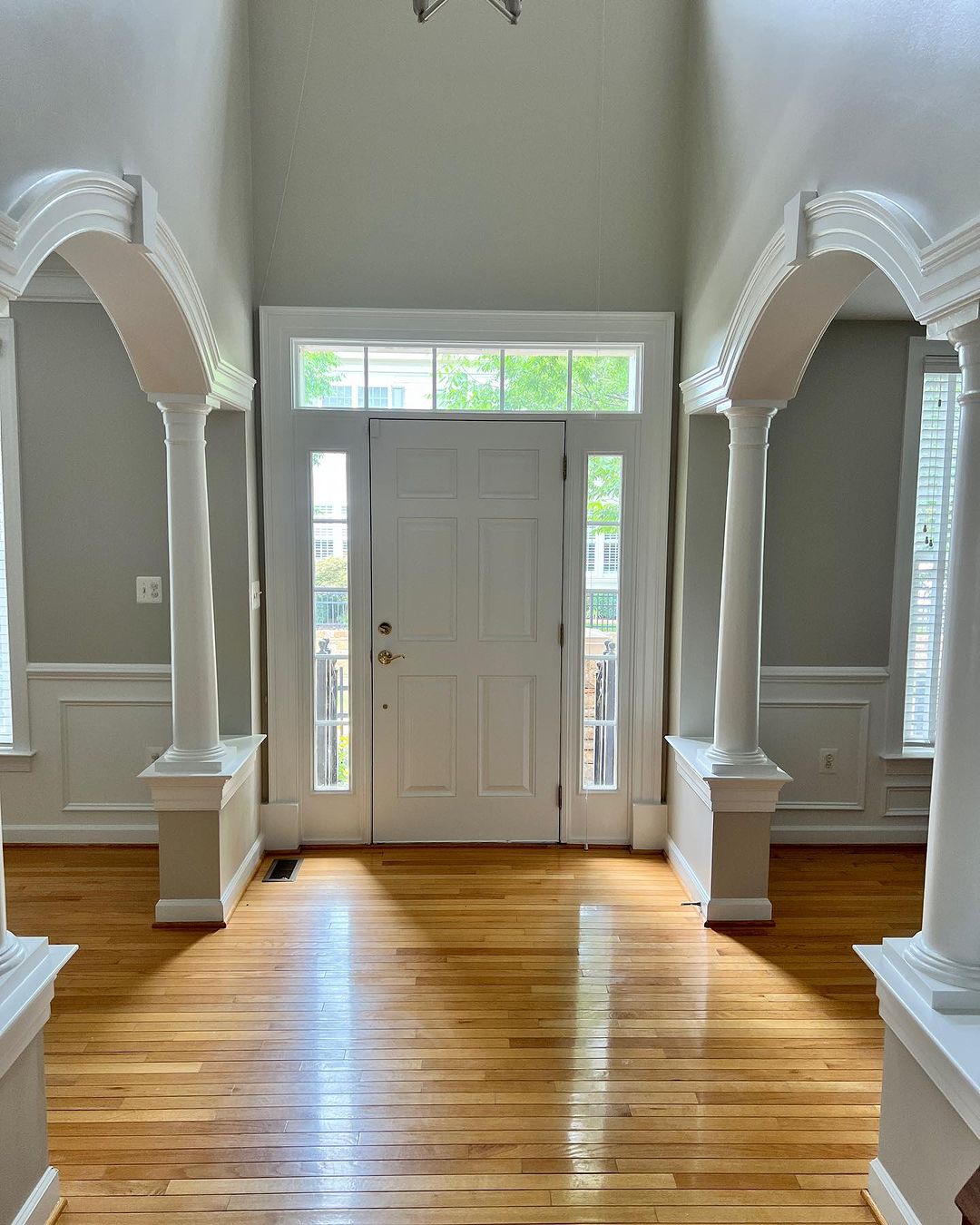
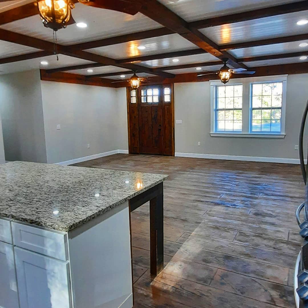
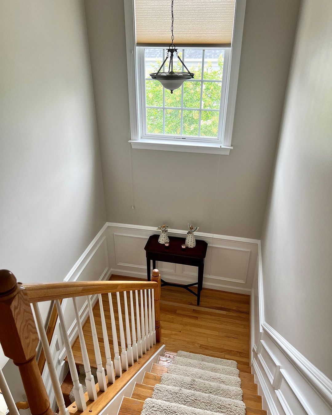
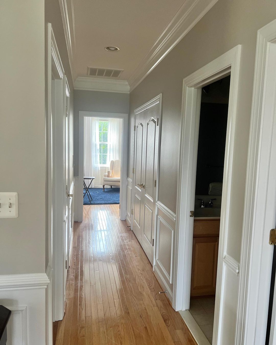
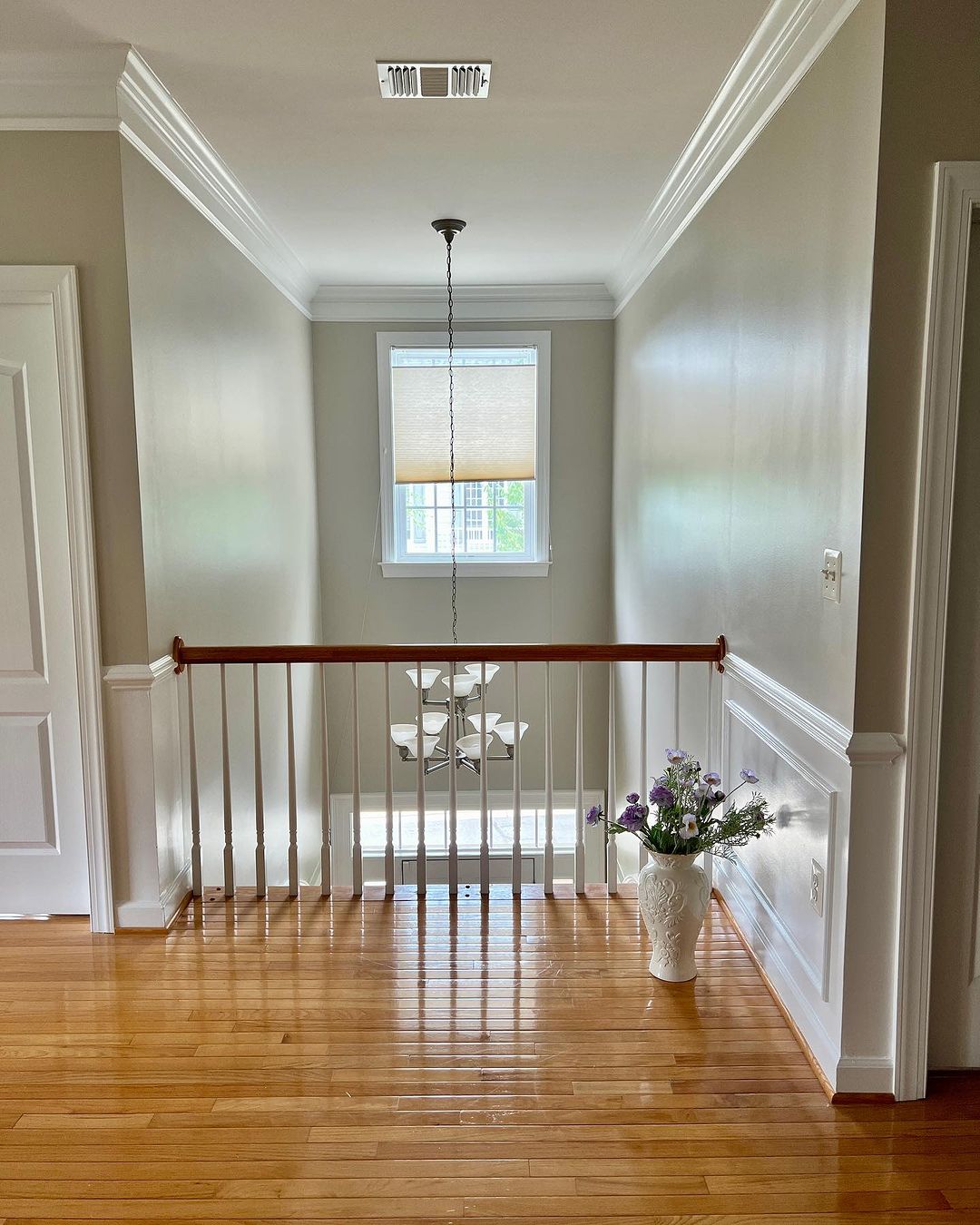
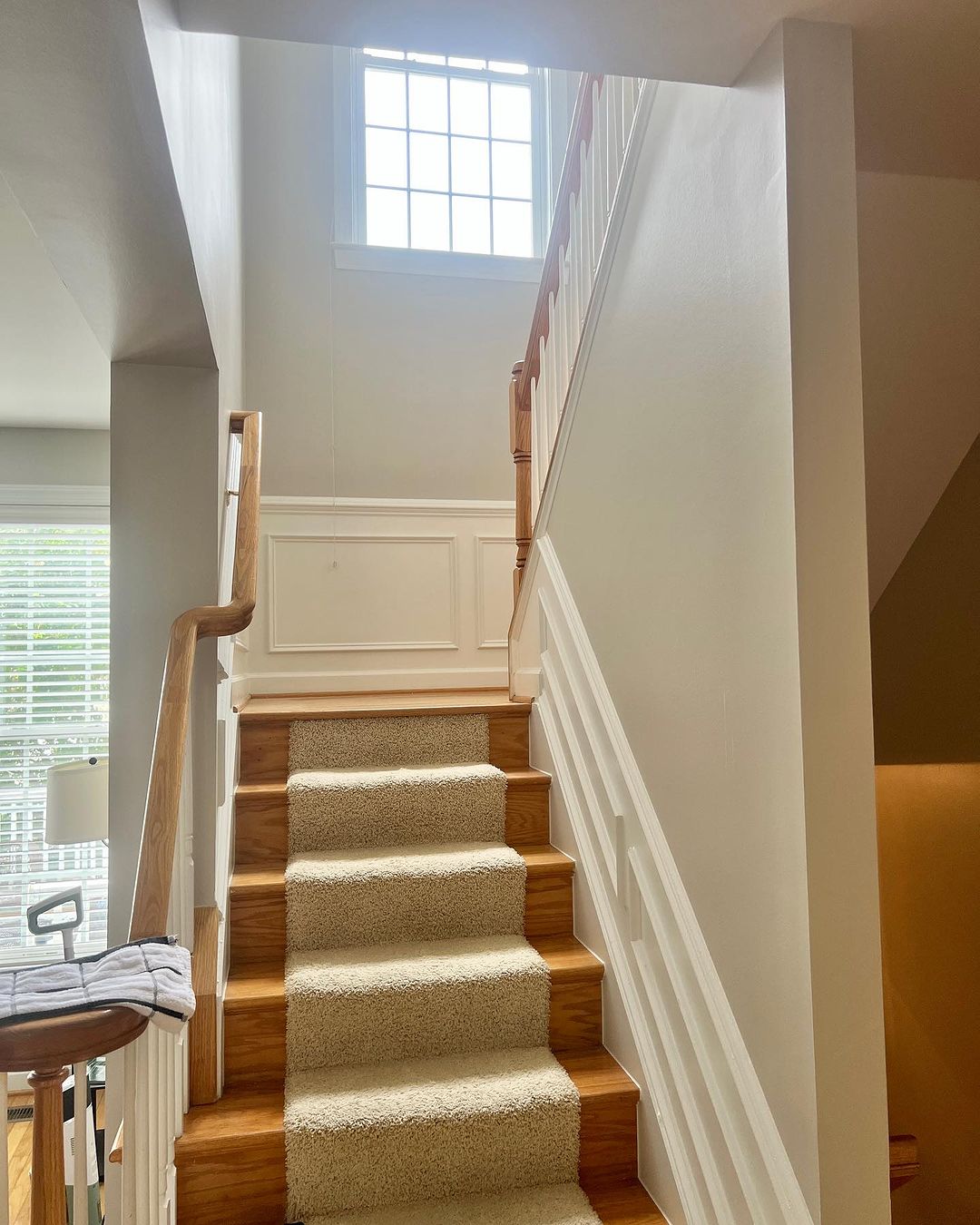
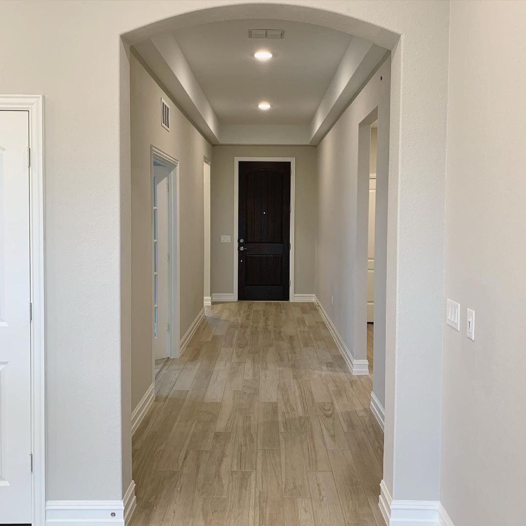
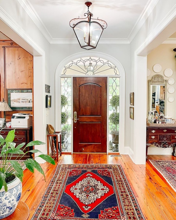
Agreeable Gray Hallway: How to Create a Welcoming Space
Agreeable Gray is an excellent choice for hallways, creating a welcoming and cohesive look throughout your home. This versatile color provides a neutral backdrop that works well with various decor styles and color schemes. The warm undertones of Agreeable Gray add a touch of elegance to hallways, making them feel more inviting and connected to the rest of your home.
Using Agreeable Gray in hallways also allows for easy transitions between rooms with different color palettes. This neutral hue acts as a bridge, harmonizing various spaces and creating a smooth flow throughout your home. Adding artwork, mirrors, or accent lighting can further enhance the beauty of an Agreeable Gray hallway.
via inst@walkerhomesgc
via inst@walkerhomesgc
via inst@walkerhomesgc
via inst@walkerhomesgc
via inst@walkerhomesgc
via inst@our_home_memories
via inst@davidweekleyhomes

via inst@upthehill_house
via inst @revealmydiy
via inst @walkerhomesgc
via inst@oursouthernhome
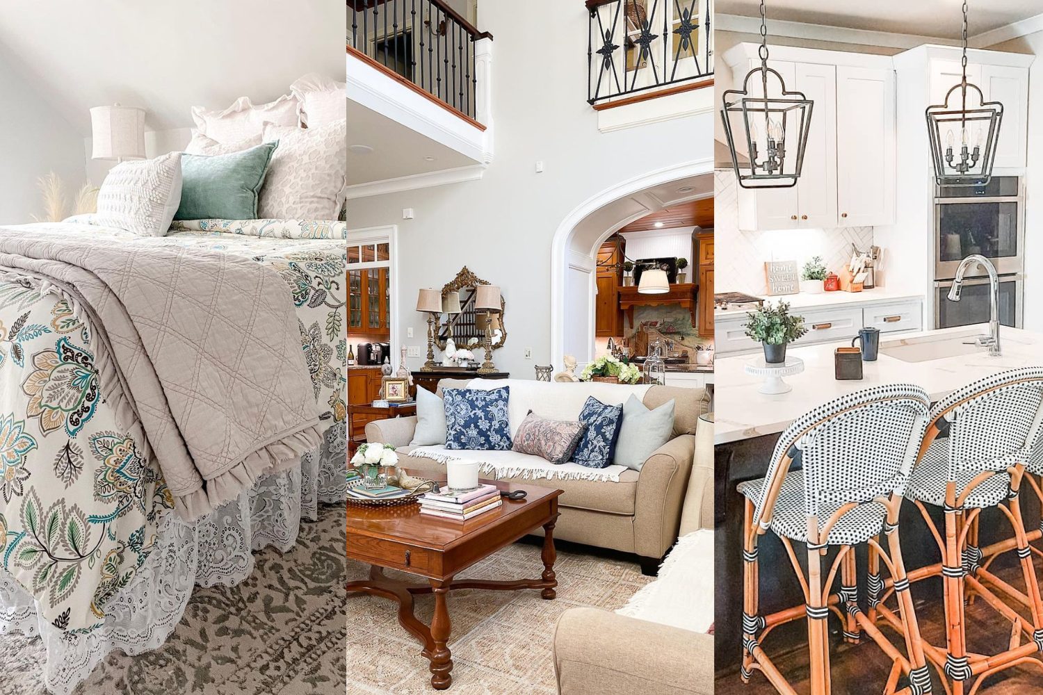
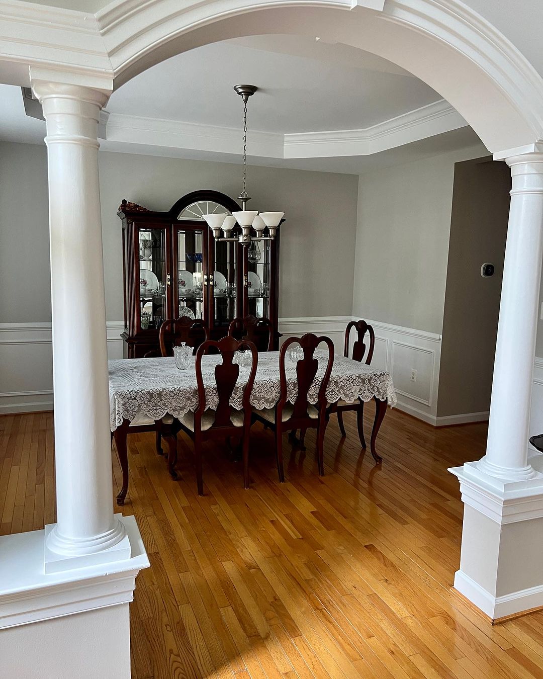
Agreeable Gray Compared: How It Stacks Up Against Other Popular Neutrals
Agreeable Gray by Sherwin Williams is a versatile and beloved neutral that often serves as a benchmark in color comparisons. When stacked against other popular neutrals like Kilim Beige, Intellectual Gray, Heritage Gray, Gossamer Veil, French Gray, Classic Gray, Jogging Path, and Repose Gray, Agreeable Gray consistently shines due to its perfect balance of gray and beige.
This balance allows it to adapt to various lighting conditions and styles, making it a reliable and sophisticated choice for any room in the house.
Whether you prefer the warmth of Kilim Beige or the cool elegance of French Gray, Agreeable Gray’s unique undertones offer a middle ground that complements a wide range of decor styles.
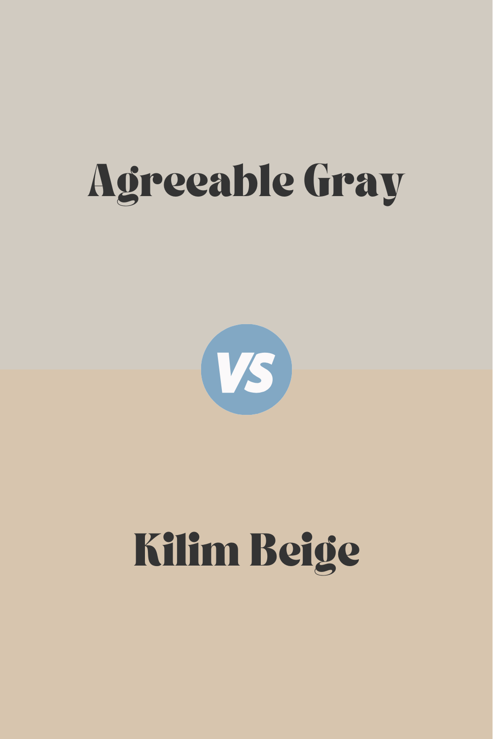
Agreeable Gray vs. Kilim Beige
When comparing Agreeable Gray and Kilim Beige (SW 6106), you’ll notice that Kilim Beige leans more towards a true beige with warm, earthy undertones. Kilim Beige brings a cozy, welcoming vibe, ideal for spaces where you want to create a warm and inviting atmosphere. This color pairs beautifully with other warm tones and natural elements like wood and stone.
Agreeable Gray, on the other hand, offers a balanced mix of gray and beige, making it a versatile choice that can adapt to various lighting conditions and decor styles. While Kilim Beige is excellent for traditional and rustic interiors, Agreeable Gray’s neutrality makes it a better fit for modern and transitional spaces.
housekeepingbay.com
Detailed color description you can find here in our Ultimate Agreeable Gray Guide
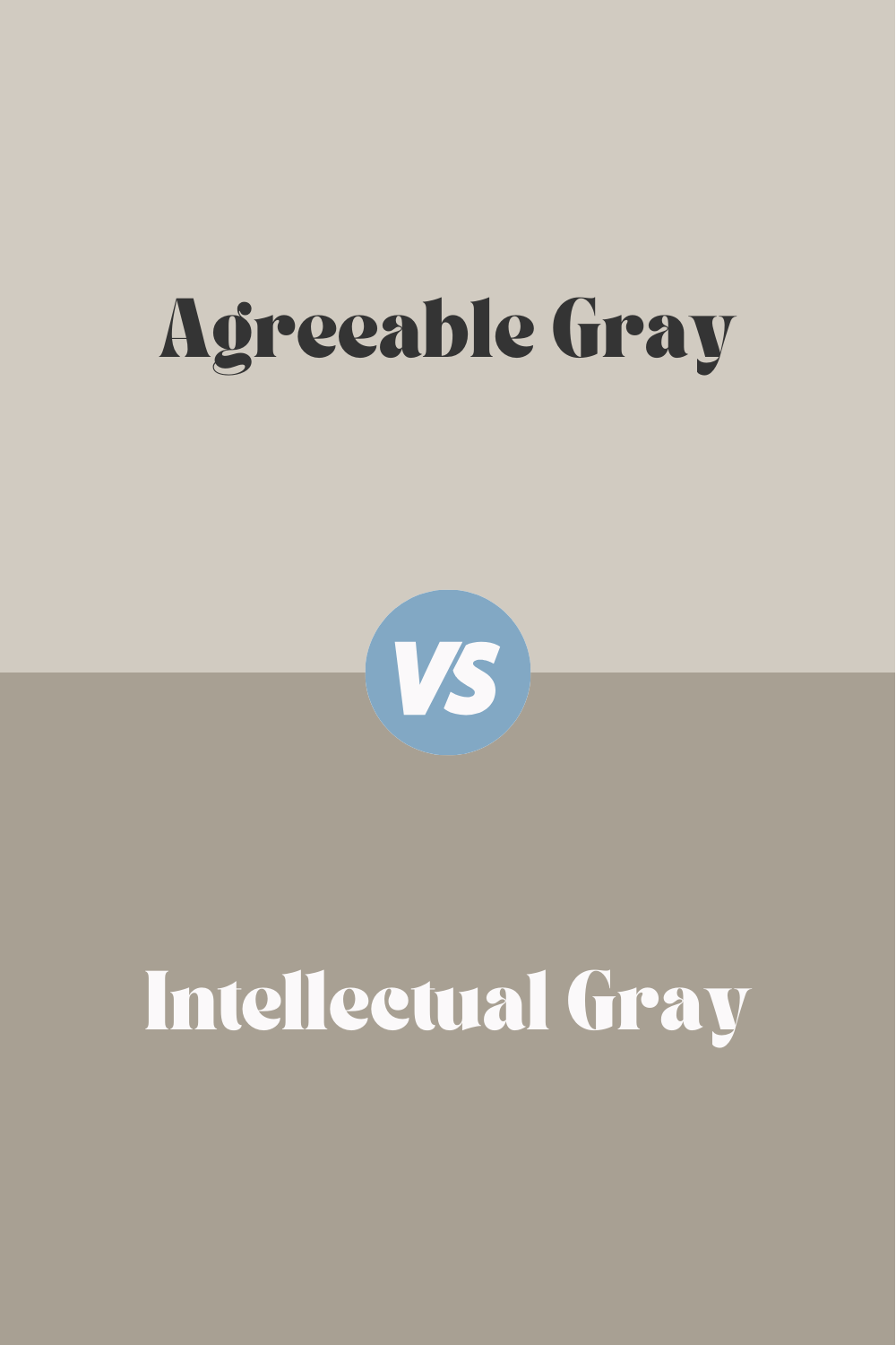
Agreeable Gray vs. Intellectual Gray
Intellectual Gray (SW 7045) is another contender in the world of neutrals, offering a deeper, richer gray with a slight green undertone. This color can add depth and sophistication to a room, making it an excellent choice for accent walls or rooms where you want to create a more intimate, moody atmosphere.
In contrast, Agreeable Gray is lighter and more versatile, making it suitable for whole-house color schemes. While Intellectual Gray works well in spaces where you want to introduce a bit of drama, Agreeable Gray is perfect for creating a soft, welcoming backdrop throughout your home.
housekeepingbay.com
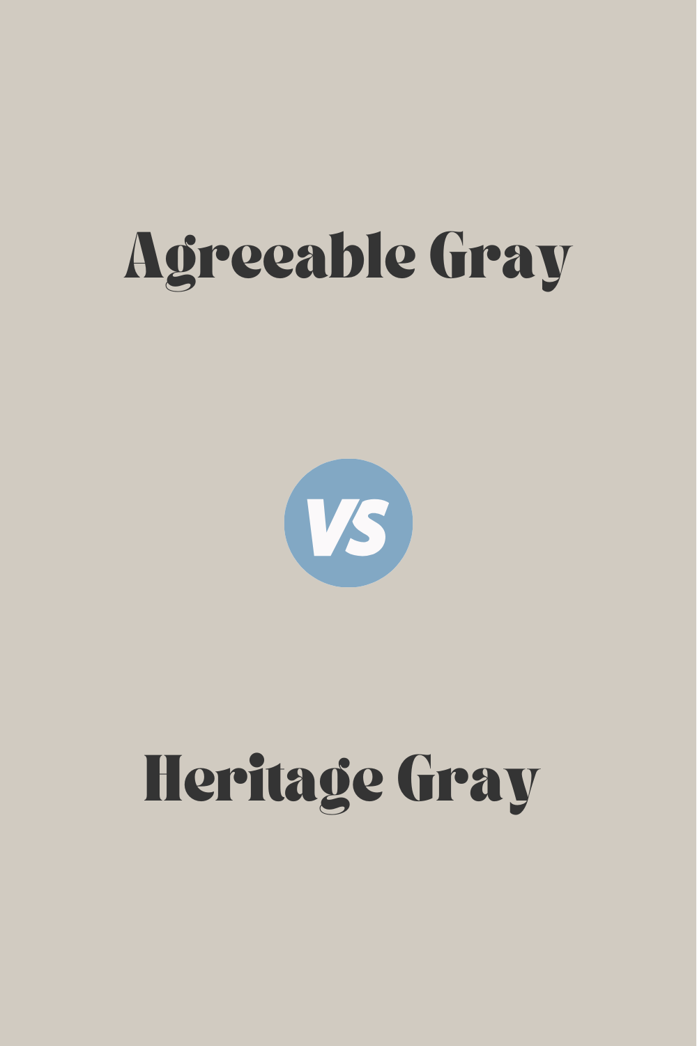
Heritage Gray vs. Agreeable Gray
Heritage Gray 7007-24 by Valspar is a soft, muted gray with subtle undertones of beige and green. This color exudes a calm, sophisticated vibe, perfect for creating a tranquil atmosphere in living rooms and bedrooms. Heritage Gray pairs well with both warm and cool accents, making it a versatile choice for various design styles.
Agreeable Gray, while similar in its balanced undertone, is slightly warmer and more beige. This makes it a bit more adaptable to different lighting conditions and a variety of decor styles, from modern to traditional. Both colors are excellent choices, but Agreeable Gray may offer a bit more flexibility in diverse settings.
housekeepingbay.com
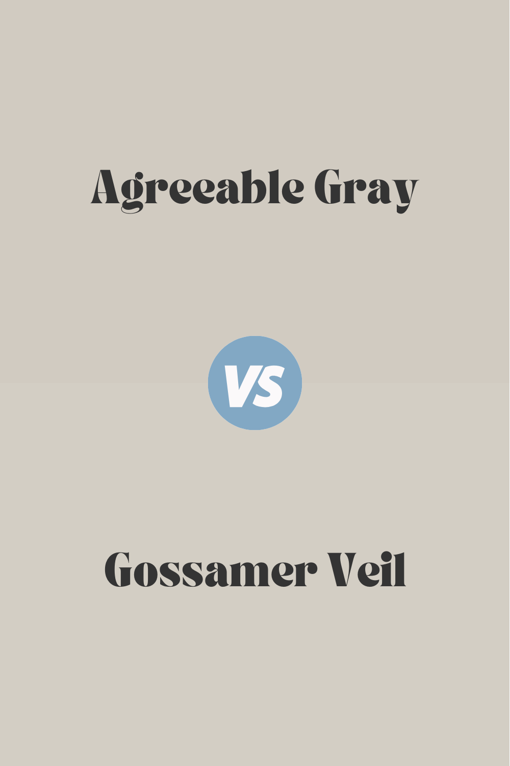
Agreeable Gray vs. Gossamer Veil
Gossamer Veil (SW 9165) is a light, airy gray with a slight hint of warmth, making it a fantastic choice for creating a soft, serene environment. This color works beautifully in spaces where you want to maximize light and openness, such as living rooms and open-concept areas.
Agreeable Gray, with its balanced greige tones, provides a slightly warmer feel. It is versatile and can work in both well-lit and dim spaces, maintaining its inviting quality. While Gossamer Veil is ideal for bright, airy spaces, Agreeable Gray’s flexibility makes it suitable for a broader range of applications.
housekeepingbay.com
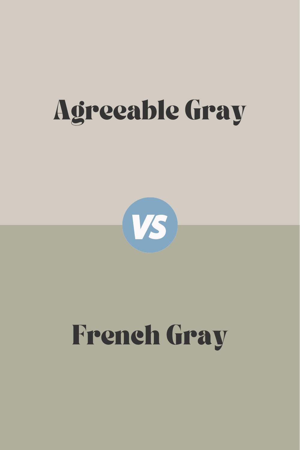
Agreeable Gray vs. French Gray
French Gray (N-18) by Farrow Ball is a soft, muted gray with cool undertones, often evoking a sense of elegance and calm. This color is perfect for creating a serene, classic look in bedrooms, bathrooms, and living spaces. It pairs well with other cool tones and white trim for a timeless appearance.
Agreeable Gray, in contrast, has warmer undertones, making it a more versatile and inviting choice for various decor styles. While French Gray excels in creating a calm, cool ambiance, Agreeable Gray’s warmth makes it suitable for spaces where you want a bit more comfort and flexibility in pairing with different colors.
housekeepingbay.com
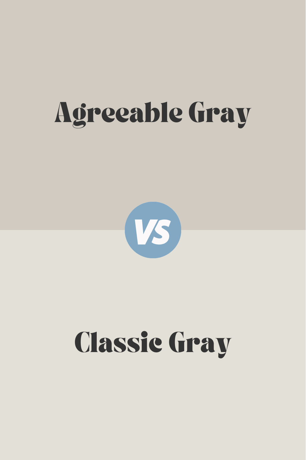
Agreeable Gray vs. Classic Gray
Classic Gray (OC-23) by Benjamin Moore is a light, neutral gray with subtle warmth, perfect for creating a bright, clean backdrop. This color is ideal for spaces where you want a soft, understated look that doesn’t overpower the decor. Classic Gray works beautifully in minimalist and contemporary interiors.
Agreeable Gray offers a bit more depth and warmth with its greige undertones, making it a more versatile option for various lighting conditions and decor styles. While Classic Gray provides a crisp, clean look, Agreeable Gray’s added warmth makes it a more inviting choice for family rooms and living spaces.
housekeepingbay.com
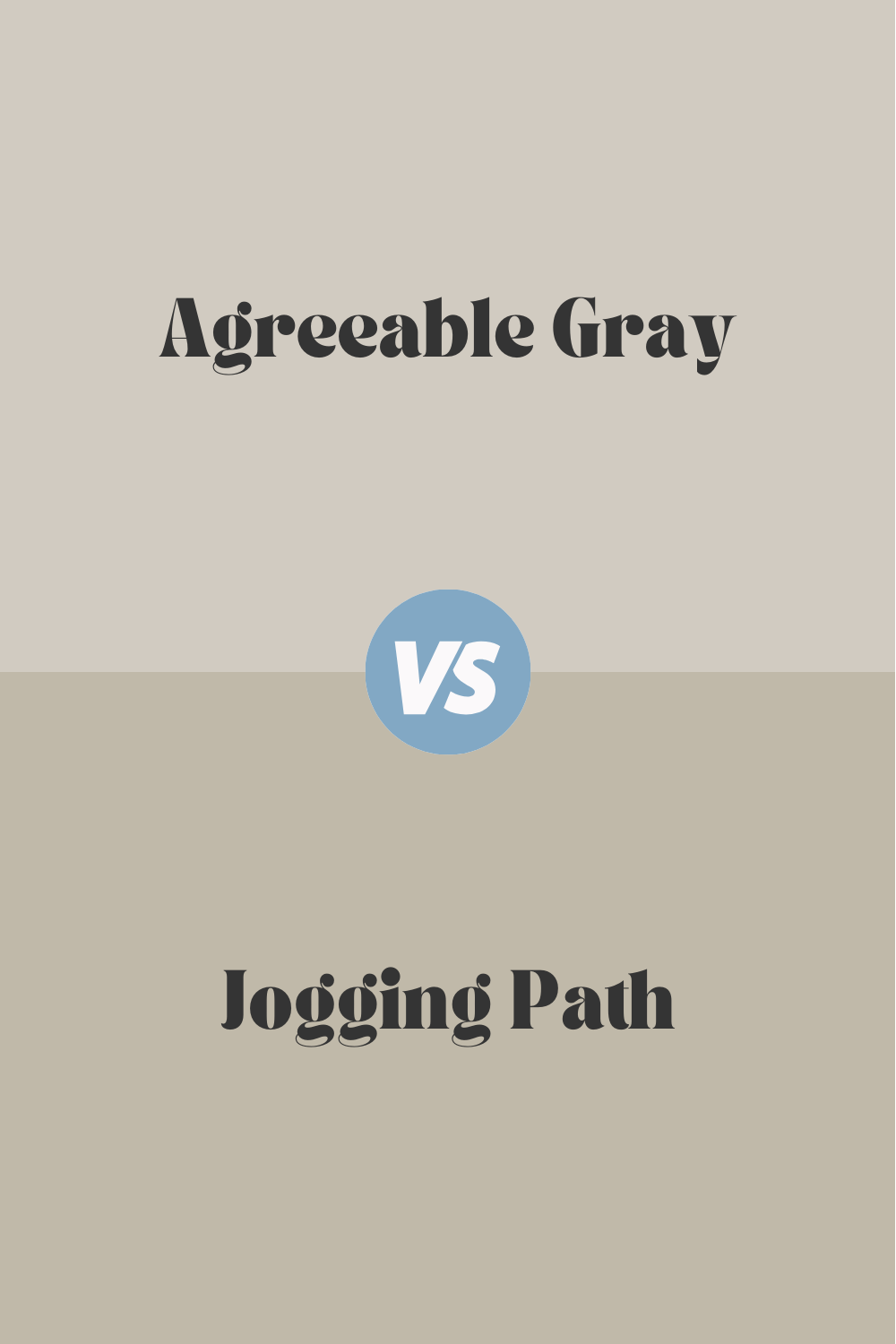
Jogging Path vs. Agreeable Gray
Jogging Path (SW 7638) is a deeper, more saturated gray with green undertones, creating a rich, earthy feel. This color is excellent for accent walls, offices, and spaces where you want to introduce a bit of nature-inspired depth and sophistication.
Agreeable Gray, with its balanced greige tone, offers more versatility and a lighter, more neutral backdrop. While Jogging Path is great for adding character and depth, Agreeable Gray is better suited for creating a cohesive, versatile palette throughout the home.
housekeepingbay.com
Agreeable Gray vs. Repose Gray
Repose Gray (SW 7015) is another popular neutral from Sherwin Williams, featuring a light gray tone with subtle warm undertones and a hint of coolness. This color is known for its versatility and ability to work in various lighting conditions, making it a favorite for many homeowners.
Agreeable Gray shares similar versatility but leans slightly warmer with its beige undertones. While Repose Gray offers a clean, slightly cool backdrop, Agreeable Gray provides a touch more warmth, making it a cozier option for living spaces and bedrooms.
housekeepingbay.com
Conclusion
Agreeable Gray by Sherwin Williams stands out as a versatile and popular choice for a wide range of interior and exterior applications. Its perfect balance of gray and beige makes it adaptable to various lighting conditions and decor styles, from modern to traditional.
Whether you’re considering it for doors, bedrooms, exteriors, nurseries, offices, kitchens, garage doors, or hallways, Agreeable Gray proves to be a reliable and elegant choice.
By comparing Agreeable Gray with other similar shades, you can see how its unique undertones and versatility make it a standout option. Whether you prefer the slightly cooler tones of Repose Gray or the earthy depth of Jogging Path, Agreeable Gray’s balanced warmth ensures it can complement and enhance any space. With its ability to coordinate with a variety of accent colors and finishes, Agreeable Gray is sure to bring a touch of sophistication and comfort to your home.