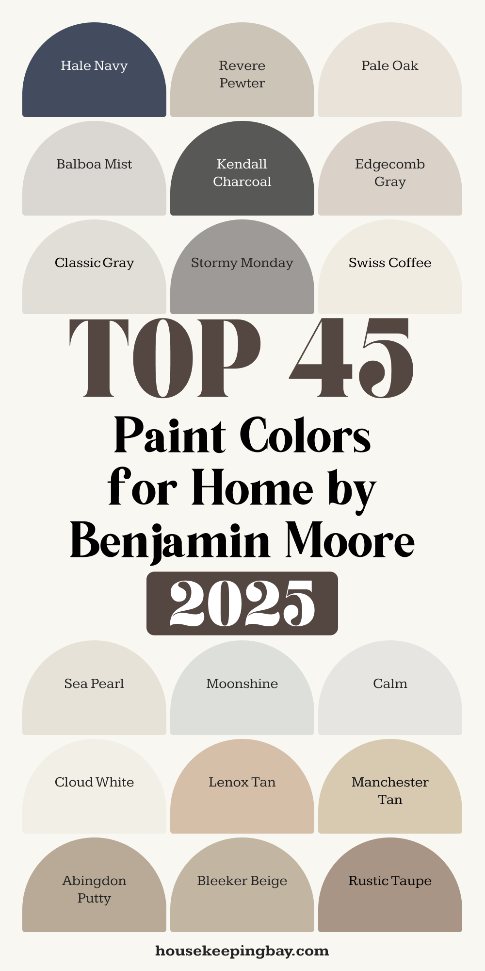
45 Benjamin Moore Paint Colors Trendy in 2025
Paint Can Change Everything
I’ve worked in a lot of homes — big ones, small ones, city apartments, family houses, even vacation spots. And the same question always comes up:
“Which paint color should I use?”
It’s not just about the look. Color changes how a room feels. It can make a space feel calmer, cleaner, warmer, or even more expensive — without changing the furniture.
But with hundreds of options, Benjamin Moore’s color catalog can feel like a rabbit hole. That’s why I made this list of 68 Benjamin Moore colors I trust again and again. These are colors that actually look good on real walls, in real lighting, in real homes — not just in a fan deck or Pinterest post.
I didn’t pick these because they’re trendy this year. I picked them because they work. And I’ve used many of them in my own home and for clients who still thank me years later.
housekeepingbay.com
Why Benjamin Moore?
There’s a reason I reach for Benjamin Moore more than any other brand — and it’s not just habit.
It’s reliable.
When I pick a color from their fan deck, I know exactly what I’m going to get. Their formulas are consistent. The colors look deep and rich, not flat or chalky. And they hold up — whether it’s in a sunny kitchen, a kid’s bedroom, or a bathroom with steamy showers.
Here’s what makes them stand out for me:
Color Accuracy
The color you choose is the color you see on your walls. That might sound basic, but not all brands are that predictable. Benjamin Moore uses their Gennex Color Technology, which means zero VOCs and consistent results even across different finishes.
“We design our own colorants and base paints to work together perfectly. This helps us deliver gorgeous color and unmatched durability.” — Benjamin Moore official site
Quality That Lasts
Aura, Regal Select, and Ben lines are all solid. My go-to for high-traffic areas is Aura, especially in matte or eggshell — it’s scrub-resistant and doesn’t lose its depth even after cleaning.
According to Consumer Reports, Benjamin Moore’s Aura line ranks highest in stain resistance, hiding, and finish quality.
So Many Great Colors
They don’t just have 10 nice grays and 3 blues. They have good versions of almost every tone — from soft whites to bold purples — without weird undertones. That’s huge.
My All-Time Top 10 Benjamin Moore Colors
These are the paints I’ve used again and again — for kitchens, bedrooms, hallways, and even furniture. I trust how they look in real homes, in real light. Clients love them, and I always keep samples of these in my bag.
1. White Dove (OC-17)
White Dove is the one I reach for when someone wants a white that’s not too bright and not too yellow. It’s soft, calm, and warm without feeling beige. I use it on trim, cabinets, ceilings, and sometimes even walls when we want a fresh, clean backdrop.
2. Hale Navy (HC-154)
Hale Navy has this deep, classic feel. It’s bold but not loud. I’ve used it in dining rooms, offices, and even on front doors. If a client wants to make a room feel more grounded, this is my go-to.
3. Revere Pewter (HC-172)
Revere Pewter is a light greige (gray + beige) that works almost everywhere. It’s warm enough to feel cozy but neutral enough to match any style. This is the color I use when clients don’t want gray, but still kind of do.
4. Pale Oak (OC-20)
Pale Oak is soft and quiet. It’s great for bedrooms or hallways where we want a little warmth without going full beige. It also works beautifully with wood floors and white trim.
5. Balboa Mist (OC-27)
Balboa Mist is like Revere Pewter’s slightly cooler cousin. I use it in living rooms and open-plan areas. It pairs well with both modern and traditional furniture — super flexible.
6. Kendall Charcoal (HC-166)
Kendall Charcoal is rich and dramatic. I love using it on cabinetry or accent walls. It has just enough brown in it to feel earthy, not industrial.
7. Chantilly Lace (OC-65)
Chantilly Lace is Benjamin Moore’s cleanest, brightest white. I use it when I want a true white with no yellow or blue undertones. Great for modern spaces or as contrast with darker wall colors.
8. Edgecomb Gray (HC-173)
Edgecomb Gray is a soft, creamy gray that leans warm. It’s lovely in bedrooms or anywhere you want a neutral base that doesn’t feel cold or gray.
9. Classic Gray (OC-23)
Classic Gray is almost off-white, but with a whisper of gray. I like it in spaces with lots of natural light. It feels fresh without being stark.
10. Stormy Monday (2112-50)
Stormy Monday is an underrated favorite. It’s a medium gray with a hint of purple, and I use it when I want something moody without going dark. Gorgeous in bedrooms and powder rooms.
Best Benjamin Moore Colors by Mood and Room
Bright & Airy — Perfect for Small Rooms or Dark Corners
These colors help bounce light and make a room feel open, even when it’s short on windows.
1. Swiss Coffee (OC-45)
Swiss Coffee has a soft creaminess that warms up a space without looking yellow. I love using it in tiny bedrooms or narrow hallways.
2. Sea Pearl (OC-19)
Sea Pearl is a muted white with just enough gray to tone it down. Great for apartments or any room where too much white would feel cold.
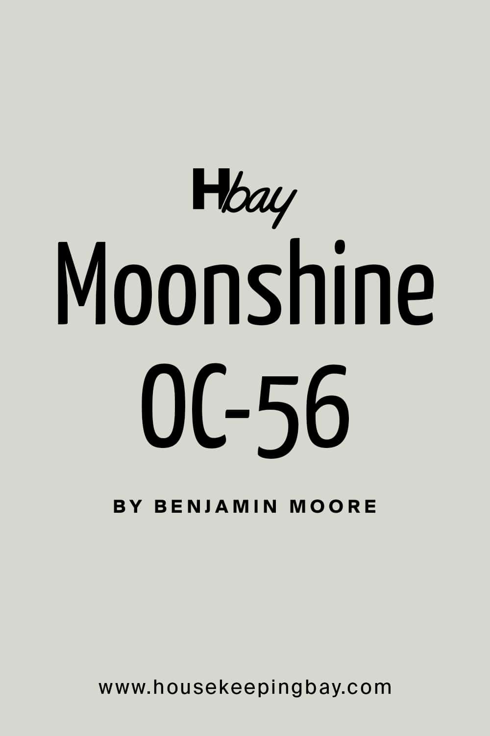
3. Moonshine (2140-60)
Moonshine is a pale gray with cool undertones. It keeps rooms feeling open but not too sterile — nice for guest baths or laundry rooms.
housekeepingbay.com
4. Calm (OC-22)
Calm is soft and delicate with a touch of lavender. It reads like a peaceful neutral and works well in bedrooms or nurseries.
5. Cloud White (OC-130)
Cloud White is warm and gentle, not blinding. I like it for ceilings when you want a soft edge between walls and trim.
Warm & Cozy — Ideal for Living Rooms and Family Spaces
These make the room feel comfortable, like a hug.
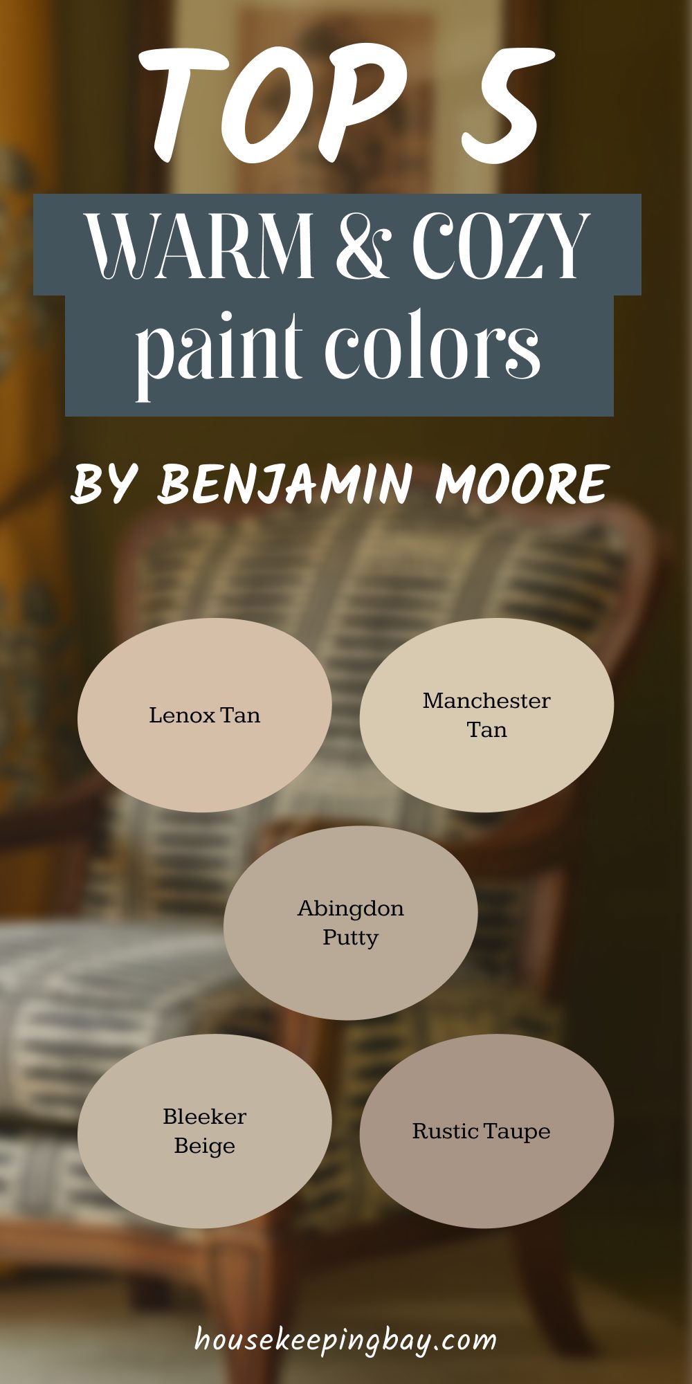
6. Lenox Tan (HC-44)
Lenox Tan is golden without going too orange. It’s warm and solid — good for large living rooms or dens.
7. Manchester Tan (HC-81)
Manchester Tan is soft, easygoing, and earthy. I’ve used it in family rooms where people hang out and relax together.
8. Abingdon Putty (HC-99)
Abingdon Putty leans toward olive and taupe. It’s great with wood trim and works especially well in older homes.
9. Bleeker Beige (HC-80)
Bleeker Beige is creamy with a slight gray edge. It’s a reliable choice for making a space feel grounded without being too dark.
10. Rustic Taupe (999)
Rustic Taupe has a soft red base that adds warmth. I use it when a room needs a little depth without going full brown.
Moody & Dramatic — For Statement Walls and Bold Rooms
These aren’t for everyone, but they can completely change how a room feels.
11. Raccoon Fur (2126-20)
Raccoon Fur is a deep charcoal with navy undertones. I love using it in dining rooms with white trim — it feels strong, not gloomy.
12. Wrought Iron (2124-10)
Wrought Iron is almost-black, but softer than true black. I use it on interior doors or kitchen islands for contrast.
13. Hunter Green (2041-10)
Hunter Green is bold and rich. When a client wants something timeless and confident, this is a winner — especially with brass or gold accents.

Housekeepingbay.com
14. Newburyport Blue (HC-155)
Newburyport Blue has strength and history. It looks amazing in studies or on built-in bookshelves.
15. Temptation (1609)
Temptation is a stormy gray-blue. I’ve used it in bedrooms where someone wanted a “hotel-like” calm without boring gray.
Kid-Friendly & Cheerful — Playful Colors That Still Look Grown-Up
Because color can be fun and tasteful.
16. Windmill Wings (2067-60)
Windmill Wings is a soft sky blue. It’s happy, but not cartoonish — perfect for playrooms.
17. Spring Lilac (1388)
Spring Lilac is fresh and light. I’ve used it in little girls’ rooms where we wanted color without going full bubblegum.
18. Sweet Bluette (813)
Sweet Bluette is peaceful but still has life. Nice for nurseries or shared kids’ spaces.
19. Yellow Highlighter (2021-40)
Yellow Highlighter is bright but not blinding. It works on one wall, a bookshelf, or even inside a closet for a pop of fun.
20. Icy Morn (457)
Icy Morn is minty and refreshing. I once used it for a playroom ceiling, and the kids loved it.
Benjamin Moore Colors by Color Family
Whites & Neutrals
These are the most-used colors in any home — for walls, ceilings, trim, and built-ins. Picking the right white or neutral sets the tone for the whole space.
21. Decorator’s White (CC-20)
Decorator’s White has a hint of cool gray, making it great for modern homes. I use it a lot on trim and cabinets.
22. Simply White (OC-117)
Simply White is soft and cheerful. It has a warm glow without looking creamy. It’s one of Benjamin Moore’s most popular whites — and for good reason.
23. Navajo White (947)
Navajo White is old-school but still useful. It brings in a lot of warmth. I use it in homes with vintage character.
housekeepingbay.com
24. Natural Cream (OC-14)
Natural Cream is calm and gentle. It’s a good whole-house neutral for people who want something softer than gray.
25. Collingwood (OC-28)
Collingwood is a cool taupe that balances warm and gray tones — I like it for bedrooms and large open floor plans.
Blues
Blues are calming, classic, and easy to love — perfect for bedrooms, bathrooms, and even kitchen cabinets.
26. Van Courtland Blue (HC-145)
Van Courtland Blue has a slight gray to it, making it feel more grown-up. I love it in bathrooms.
27. Gentleman’s Gray (2062-20)
Gentleman’s Gray is rich and bold — more blue than gray, despite the name. I’ve used it on front doors and accent walls.
28. Iceberg (2122-50)
Iceberg is a very light blue with a crisp edge. Great for bedrooms that need brightness and calm at the same time.
29. Beacon Gray (2128-60)
Beacon Gray leans toward lavender-gray in some lighting. It works beautifully in quiet sitting rooms or cozy libraries.
30. Blue Note (2129-30)
Blue Note is moody and deep — amazing on kitchen cabinets or a wall behind a bed.
Greens
Green brings life and balance. It’s great in kitchens, offices, or anywhere you want a peaceful feel with a touch of nature.
31. October Mist (1495)
October Mist was Color of the Year 2022. It’s a dusty sage — soft and calming. Looks great in bedrooms or studies.
Housekeepingbay.com
32. Saybrook Sage (HC-114)
Saybrook Sage has a little more warmth than October Mist. I like it in kitchens, especially with cream-colored cabinets.
33. High Park (467)
High Park is earthy and solid. It feels like an old English study. It’s fantastic in masculine spaces or dens.
34. Soft Fern (2144-40)
Soft Fern is light, breezy, and very livable. I once used it in a guest room and the homeowner loved it so much she redid the whole house in it.
35. Backwoods (469)
Backwoods is a deep, woodsy green. I love it on accent walls, built-ins, or even powder rooms.
Yellows & Golds
These bring energy and warmth. They can brighten up darker homes or add a cheerful mood to kitchens and breakfast areas.
36. Hawthorne Yellow (HC-4)
Hawthorne Yellow is soft and golden. It’s a grown-up yellow — not too loud, not too pale.
37. Windham Cream (HC-6)
Windham Cream is cozy and mellow. I use it in older homes or kitchens with a cottage feel.
38. Straw (2154-50)
Straw is soft and friendly. Great for rooms that don’t get a lot of natural light.
39. Mannequin Cream (2152-60)
Mannequin Cream is a soft yellow-tan. I’ve used it in dining rooms where we wanted light, but not white.
40. Cork (2154-40)
Cork leans golden-brown. It works nicely with terracotta, wood, and natural textures.
Pinks & Reds
These aren’t just for nurseries or Valentine’s Day. The right pink or red can add style, warmth, and character to a room — or even just a piece of furniture.
41. First Light (2102-70)
First Light is a pale, rosy blush. It was Color of the Year 2020. I’ve used it in guest rooms, powder rooms, and even kitchens for a soft glow.
42. Proposal (AF-260)
Proposal is muted and warm. It reads as neutral pink. Beautiful with brass hardware or natural woods.
43. Pink Damask (887)
Pink Damask is very light and subtle. It works great in spaces with white trim and soft fabrics — like a girl’s bedroom or a home office.
44. Dinner Party (AF-300)
Dinner Party is a deep, rich red that’s sultry and dramatic. I’ve used it in dining rooms paired with candlelight — it feels like velvet on the walls.
45. Raspberry Blush (2008-30)
Raspberry Blush is punchy and bold. It was Benjamin Moore’s Color of the Year 2023. Great as an accent or in creative spaces.
Mistakes People Make When Choosing Paint Colors
Even the best color on the planet can look wrong if it’s used the wrong way. These are the most common things I warn my clients about — and how I help them avoid those “what was I thinking?” moments.
1. Skipping the Sample Test
Skipping the sample step is the biggest reason people end up hating their paint. I always say: “You have to see it on your wall, at home, in your lighting.”
What looks soft and creamy in the store might turn yellow or green once it’s up in your room.
📌 Tip: Paint two coats of a sample on a big piece of poster board and move it around the room at different times of day.
2. Choosing Based on Tiny Chips
Choosing from a paint chip the size of a gum wrapper is like picking a wedding dress from a postage stamp. That little piece can’t show you the full color.
📌 Tip: Ask the paint store to give you a larger swatch or use peel-and-stick samples from sites like Samplize.
3. Not Considering the Room’s Lighting
Not considering the lighting is a major mistake. Natural light, LED, warm bulbs — they all change how a color looks.
📌 Cool light (north-facing rooms) can make colors feel gray or dull. Warm light (south-facing) can make everything look yellow.
4. Ignoring Furniture and Finishes
Ignoring your sofa, flooring, or even countertop color can throw everything off. A gray wall might look green next to beige tiles.
📌 Tip: Always hold samples next to your existing finishes — not just in the middle of a blank wall.
5. Going Too Trendy
Going too trendy without thinking about whether you’ll still like it next year is risky. Just because everyone’s using sage green or terracotta doesn’t mean it’s right for your home.
📌 I tell clients: “Pick colors you’d wear or live with, not just what’s hot on Instagram.”
6. Using the Same Color in Every Room
Using the same color everywhere can feel flat. Even if it’s a great neutral, different lighting in each room can make it look totally different.
📌 Tip: Stick to the same family, but shift tones — like using Pale Oak in the hallway and Edgecomb Gray in the bedroom.
Color That Just Works
I’ve walked into a lot of homes where the paint was “fine” — but nothing felt quite right. And I’ve also seen rooms completely change with just a gallon of the right color.
You don’t need a perfect house, perfect furniture, or perfect lighting. But if you get the color right — the one that makes you feel calm, energized, cozy, or clean — it really does make everything feel pulled together.
If you’re still stuck, start with one room. Pick something safe like White Dove or Edgecomb Gray, and just live with it for a while. See how it feels. Trust how you react to it, not just what the internet says.
And remember: paint is the least expensive way to change how your home feels. Mistakes are easy to fix. Confidence comes with practice. And if you’re still nervous? Test more colors.
You’ll know when it’s right — your eyes and your gut will tell you.