Van Courtland Blue HC-145 by Benjamin Moore
Soft and Elegant, Always in Style
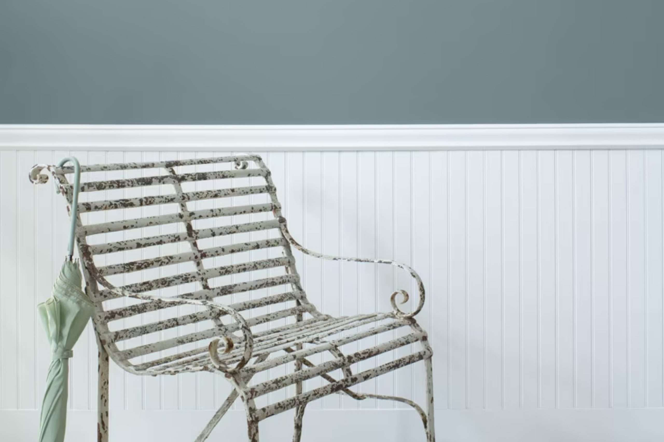
Choosing the right paint color can shape the mood and feel of any room. HC-145 Van Courtland Blue by Benjamin Moore stands out as a refreshing option. This gentle, historical blue brings a sense of calmness and balance to your space. Its soft, muted tone provides a soothing backdrop, making it an ideal choice for both traditional and modern settings.
You might find that Van Courtland Blue has a subtlety that allows it to work well in various spaces. Use it in a bedroom for a serene atmosphere, or in a living room to add a touch of elegance.
The color’s versatility means it pairs wonderfully with a range of other colors, whether you’re going for a light and airy feel or something more grounded and cozy.
With Van Courtland Blue, your walls can tell a story. Picture this hue bringing a gentle wave of tranquility into your home, perhaps reminding you of a calm sea or an open sky.
As you consider paint colors, think about how this timeless blue could harmoniously blend with your decor, reflecting your personal style while creating a welcoming environment.
Whether you plan to paint an accent wall or an entire room, HC-145 Van Courtland Blue offers a beautiful and timeless option that can fit a range of styles and moods.
via benjaminmoore.com
What Color Is Van Courtland Blue HC-145 by Benjamin Moore?
Van Courtland Blue HC-145 by Benjamin Moore is a soft, muted blue with a hint of gray. It offers a serene and balanced look, perfect for adding a touch of calm to any space. This color mimics the subtle hues found in nature, such as overcast skies or quiet lakes, making it ideal for creating a soothing environment.
Van Courtland Blue works beautifully in a variety of interior styles. In a traditional home, it can enhance classic architectural features, adding a refined and elegant touch. For coastal or beach-inspired rooms, this blue provides a breezy, relaxing ambiance.
It also complements farmhouse designs, offering a gentle backdrop that pairs well with rustic elements.
When it comes to materials and textures, Van Courtland Blue complements natural wood tones, whether light or dark. It pairs well with crisp white trims and moldings, emphasizing its refined aspect. Soft textiles like linen and cotton enhance its comfort appeal, while metallic accents in silver or brushed nickel provide a modern twist.
Adding accessories in warm neutrals or soft pastels can further highlight this versatile color. Whether in a bedroom, living room, or kitchen, Van Courtland Blue provides a timeless and adaptable choice.
housekeepingbay.com
Is Van Courtland Blue HC-145 by Benjamin Moore Warm or Cool color?
Van Courtland Blue HC-145 by Benjamin Moore is a soft, muted blue with a hint of gray, making it both calming and sophisticated. This color works beautifully in various spaces within homes. In a living room, it brings a sense of relaxation, encouraging comfort while still acting as a versatile backdrop for furniture and décor.
When used in a bedroom, this blue creates an atmosphere of peace, conducive to rest and quiet moments.
In areas like kitchens or bathrooms, Van Courtland Blue adds a touch of elegance without overwhelming the space. This gentle hue can brighten a room when paired with white accents or add depth when combined with darker shades. Its neutrality makes it suitable for both traditional and modern styles.
Natural light enhances its soothing qualities, while artificial light can bring out its rich, complex undertones. Overall, Van Courtland Blue adds a timeless quality to home interiors, effortlessly harmonizing with varied design elements.
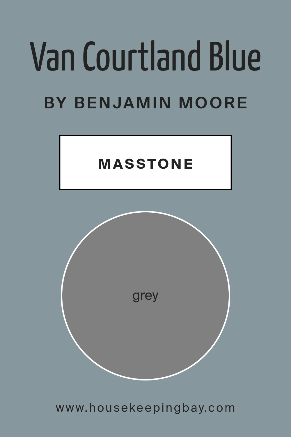
What is the Masstone of the Van Courtland Blue HC-145 by Benjamin Moore?
Van Courtland Blue HC-145 by Benjamin Moore is a rich and sophisticated color. This shade combines elements of blue and grey, creating a color that feels serene and steady. The masstone, which is grey (#808080), adds depth to the blue, making it versatile and timeless.
In homes, Van Courtland Blue works well in many settings. It is a calming choice for bedrooms or bathrooms, where you want a peaceful atmosphere. The grey undertones ensure that the blue never feels too overpowering, allowing it to blend seamlessly with other colors and textures.
This makes it easy to pair with both neutral and bold accents.
Living rooms painted in Van Courtland Blue can offer a welcoming feel, as the color creates an inviting environment.
It’s a great option for those looking to add a hint of color without overwhelming the space. Overall, Van Courtland Blue is a balanced and adaptable color choice for any home.
housekeepingbay.com
Undertones of Van Courtland Blue HC-145 by Benjamin Moore
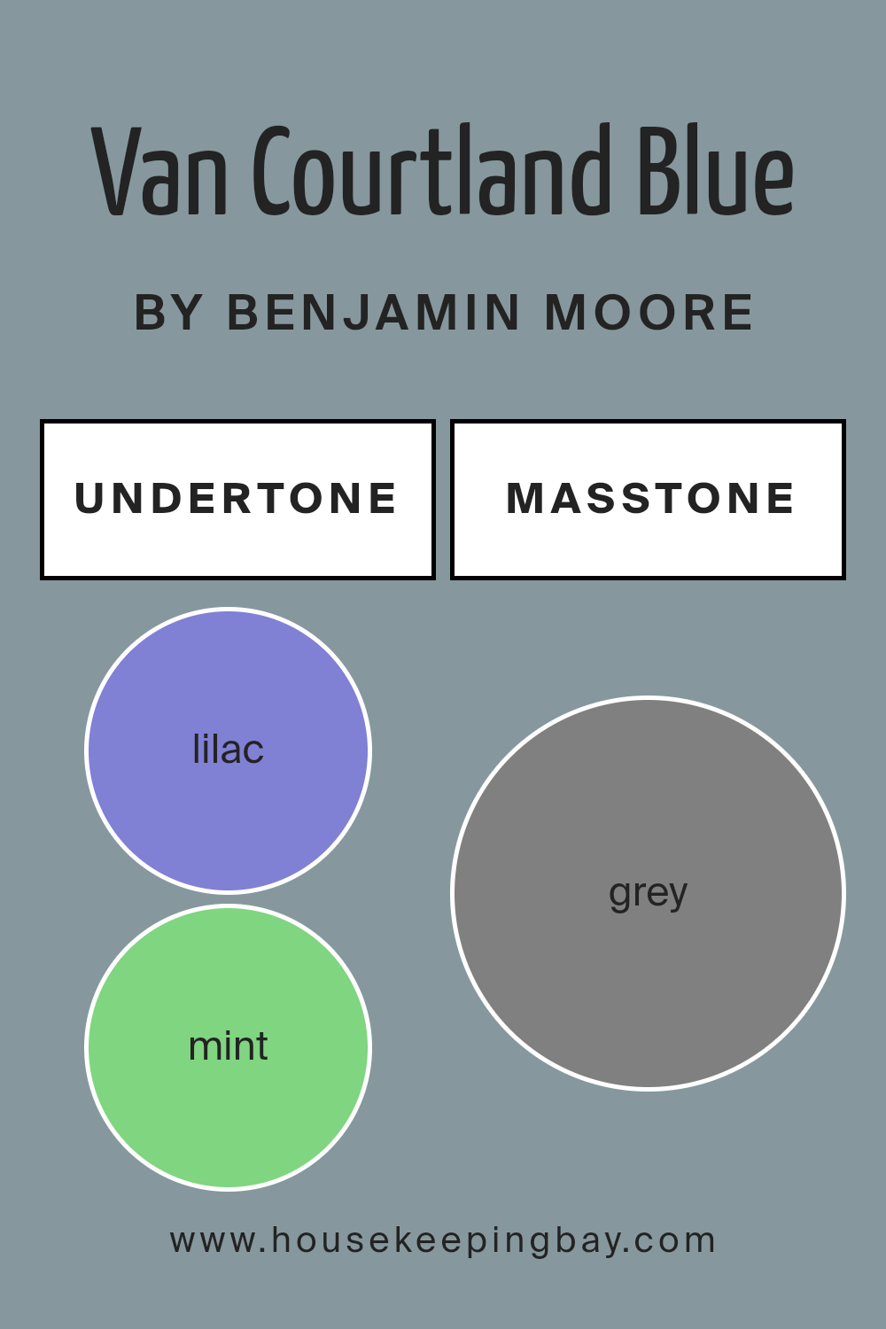
Van Courtland Blue HC-145 by Benjamin Moore features a mix of undertones that affects how the color appears in different spaces. Undertones are subtle shades mixed into the primary color and can influence the color’s overall feel and look.
In Van Courtland Blue, these undertones include hints of lilac, mint, light blue, pale pink, olive, and others. This means that while the paint is primarily a blue shade, it can shift slightly depending on lighting and surrounding elements.
In a room, the lilac and light purple undertones can add a soft, calming effect, giving the blue a pleasant coolness. The hint of mint and light green can bring a fresh, natural touch, making the space feel airy. Meanwhile, the presence of olive or dark turquoise can add depth, making the blue appear richer and more grounded.
On interior walls, these undertones can make Van Courtland Blue feel versatile. It might look cooler and more soothing in natural daylight, where the blue and green tones are highlighted. Under artificial light, some of the warmer undertones like pale pink or pale yellow can come forward, giving the room a cozier atmosphere.
Overall, the mix of undertones ensures this color adapts beautifully to different environments, enhancing any space.
housekeepingbay.com
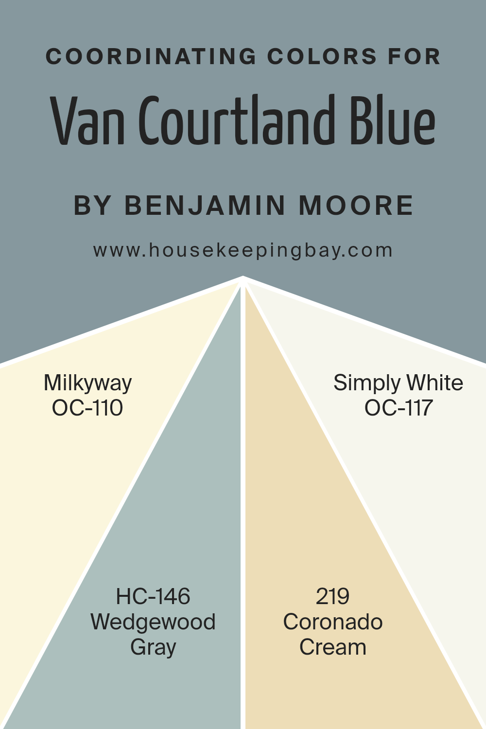
Coordinating Colors of Van Courtland Blue HC-145 by Benjamin Moore
Coordinating colors are hues that complement each other and create a harmonious look in a space. They help tie together different elements of a room, such as walls, furniture, and decor. Van Courtland Blue HC-145 by Benjamin Moore is a versatile color that can be paired with several shades to achieve a cohesive aesthetic.
Its coordinating colors are chosen to ensure visual balance and a pleasing atmosphere. Milkyway OC-110 is a soft, understated shade that adds warmth and coziness, evoking a sense of comfort in any room. Wedgewood Gray HC-146 carries a gentle gray-blue tone, offering a serene backdrop while maintaining a sophisticated feel.
Coronado Cream 219 brings a touch of sunshine into a space with its light, creamy yellow hue, adding cheerfulness without overpowering. Simply White OC-117 is a clean, crisp white that creates a fresh, airy feel, serving as a versatile neutral against which more vibrant colors like Van Courtland Blue stand out.
When these colors are used together, they create spaces that feel connected and thoughtfully designed. Such combinations allow for subtle contrasts and blends, enhancing the overall aesthetic. Each color, while unique on its own, contributes to a unified and harmonious palette.
You can see recommended paint colors below:
- OC-110 Milkyway
- HC-146 Wedgewood Gray
- 219 Coronado Cream
- OC-117 Simply White
housekeepingbay.com
How Does Lighting Affect Van Courtland Blue HC-145 by Benjamin Moore?
Lighting plays a crucial role in how we perceive colors. The same color can look different depending on the type and amount of light it receives. Van Cortlandt Blue HC-145 by Benjamin Moore, a soft blue with green undertones, is no exception.
In natural light, Van Cortlandt Blue can change throughout the day. In a north-facing room, which gets less direct sunlight, the color tends to appear cooler and slightly muted. The gray tones might be more noticeable, giving the room a calm and subdued feel. This makes it a good choice for spaces where you want a quiet, restful atmosphere.
In a south-facing room, Van Cortlandt Blue comes to life with warmer, brighter sunlight. The green undertones may be enhanced, and the color can appear more vibrant. This light can create a welcoming and cheerful space, perfect for living areas or kitchens.
In an east-facing room, the morning light is bright and clear, which can make Van Cortlandt Blue look crisp and fresh. As the day progresses, the light becomes softer, potentially bringing out more of the color’s depth by afternoon.
Conversely, in a west-facing room, the morning light is dimmer, so the color might initially appear more subdued. However, as the afternoon light strengthens and becomes warmer, Van Cortlandt Blue can seem richer and more dynamic, especially in the late afternoon and early evening.
Artificial lighting also impacts this color. Under warm incandescent light, the color may appear warmer and more greenish. LED lights with cooler temperatures, on the other hand, could make it look slightly more muted or gray.
Choosing Van Cortlandt Blue means understanding how different lighting conditions can alter its appearance throughout the day. Each direction offers a unique play of light that can affect mood and aesthetic.
housekeepingbay.com
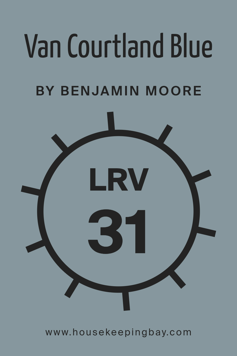
What is the LRV of Van Courtland Blue HC-145 by Benjamin Moore?
LRV, or Light Reflectance Value, is a measure that indicates how much light a color reflects. It ranges from 0 to 100, with 0 being absolute black, reflecting no light, and 100 being pure white, reflecting the most light. Colors with higher LRV values will make a room feel brighter and more spacious by reflecting more light back into the space.
Conversely, colors with lower LRV values absorb more light, making a room feel cozier or more intimate. Understanding LRV is important when selecting paint colors, as it helps predict how colors will look once applied to walls, and how they might affect the mood or perceived size of a room.
Van Courtland Blue HC-145, with an LRV of 31.47, is considered to be a medium to dark shade. This LRV suggests that while the color has some depth, it still reflects a moderate amount of light, preventing it from making a room too dark. On walls, it will provide a sense of coziness and could create a calming atmosphere, given its blue hue.
However, it’s important to balance it with adequate lighting, especially in smaller rooms, to ensure it does not make the space feel too enclosed.
The color’s LRV also means it can offer a nice contrast when paired with lighter colors, helping certain features in a room stand out while maintaining an overall balanced look.
housekeepingbay.com
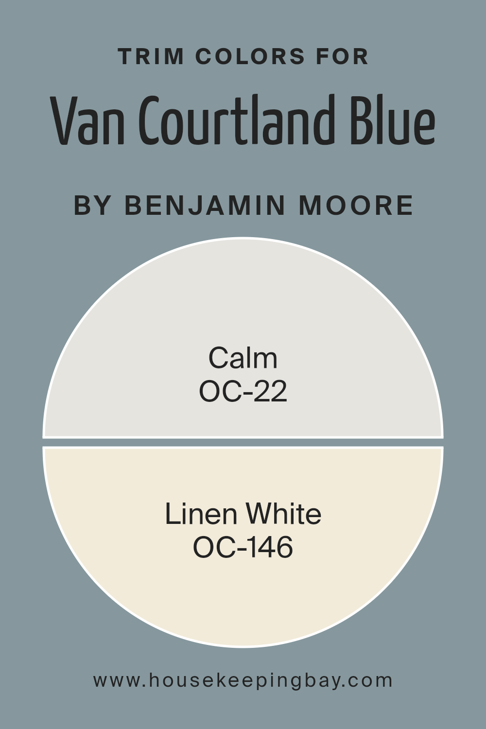
What are the Trim colors of Van Courtland Blue HC-145 by Benjamin Moore?
Trim colors are the shades used on the edges and borders of walls, doors, windows, and baseboards to complement or contrast the primary wall color. They are crucial because they frame the rooms and enhance architectural features, giving the space a polished and cohesive look.
Van Courtland Blue HC-145 by Benjamin Moore is a muted blue with green and gray undertones, creating a classic and soothing atmosphere.
By choosing the right trim colors, Van Courtland Blue can really stand out and define the room’s overall design. OC-22, Calm, and OC-146, Linen White, are excellent trim choices that offer versatility and refinement.
Calm OC-22 is a soft, gentle gray with a slight hint of warmth. It provides a subtle contrast to Van Courtland Blue without being too bold. Meanwhile, Linen White OC-146 is a warm, light cream. It adds a touch of brightness and elegance, creating a light and airy feel, beautifully complementing the blue.
Using these trim colors, the depth and richness of Van Courtland Blue can be highlighted, making them important elements in a well-balanced and inviting space.
You can see recommended paint colors below:
- OC-22 Calm
- OC-146 Linen White
housekeepingbay.com
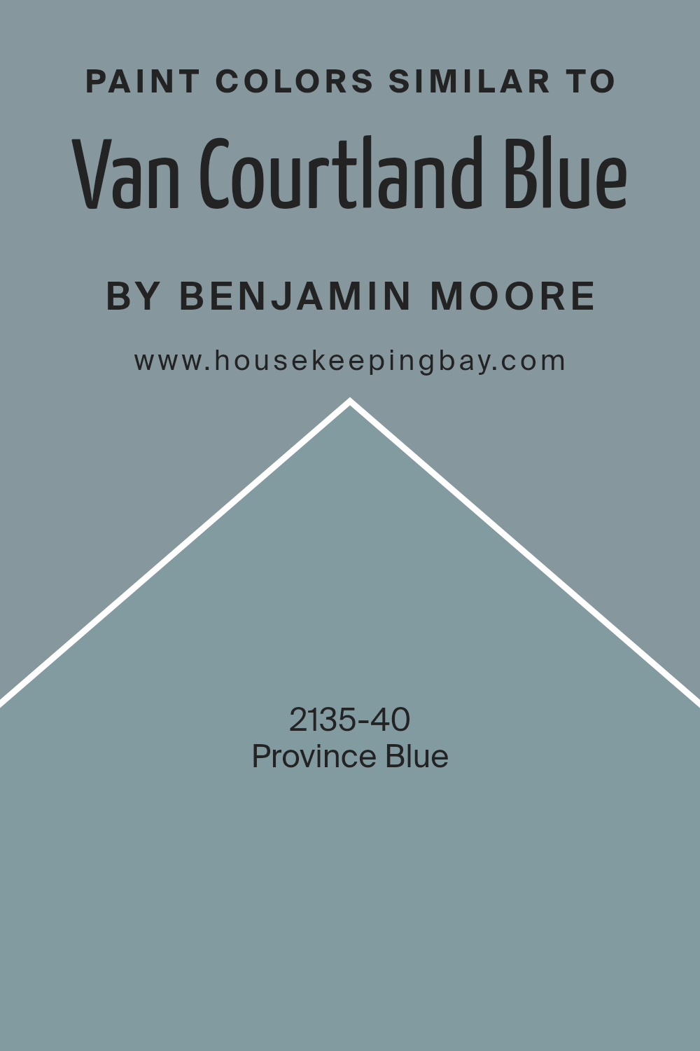
Colors Similar to Van Courtland Blue HC-145 by Benjamin Moore
Similar colors are important in design because they create harmony and balance. By using colors that are close to each other on the color wheel, spaces can feel more cohesive and put together. When working with Van Courtland Blue HC-145, choosing similar shades like Province Blue 2135-40 helps maintain this visual harmony.
These colors complement each other and can give a room a sense of unity. When different elements in a space share similar hues, the eye finds it easy to move smoothly from one area to another, creating a pleasing and connected environment.
Van Courtland Blue HC-145 is a soft blue with a hint of gray, giving it a classic and timeless appeal. It’s versatile and can suit a variety of spaces, providing a gentle, calm backdrop. Province Blue 2135-40, on the other hand, is a deeper, more intense blue. It carries a strong presence without being overwhelming, adding depth and sophistication.
Both colors work well together because they share similar tones and can enhance each other. Using such similar colors can ensure that a space feels calm and well-balanced, making the environment feel cohesive and inviting.
You can see recommended paint color below:
- 2135-40 Province Blue
housekeepingbay.com
How to Use Van Courtland Blue HC-145 by Benjamin Moore In Your Home?
Van Courtland Blue HC-145 by Benjamin Moore offers a gentle and soothing shade of blue that works well in any home setting. With its soft undertones, this color can create a calm and relaxing atmosphere in living spaces. Use it in a bedroom to promote restful sleep or in a bathroom to give it a refreshing feel.
Its versatility means it pairs nicely with white trim for a crisp, clean look or with warm wood tones for a cozy, welcoming vibe. In a living room, Van Courtland Blue can add a touch of sophistication while still feeling pleasant and inviting. Consider using it on accent walls or furniture to bring a subtle yet impactful touch of color to the space.
This shade also works beautifully in kitchens and dining areas, offering a timeless style that feels both modern and classic. Van Courtland Blue is a great choice for adding a gentle, pleasing color to your home.
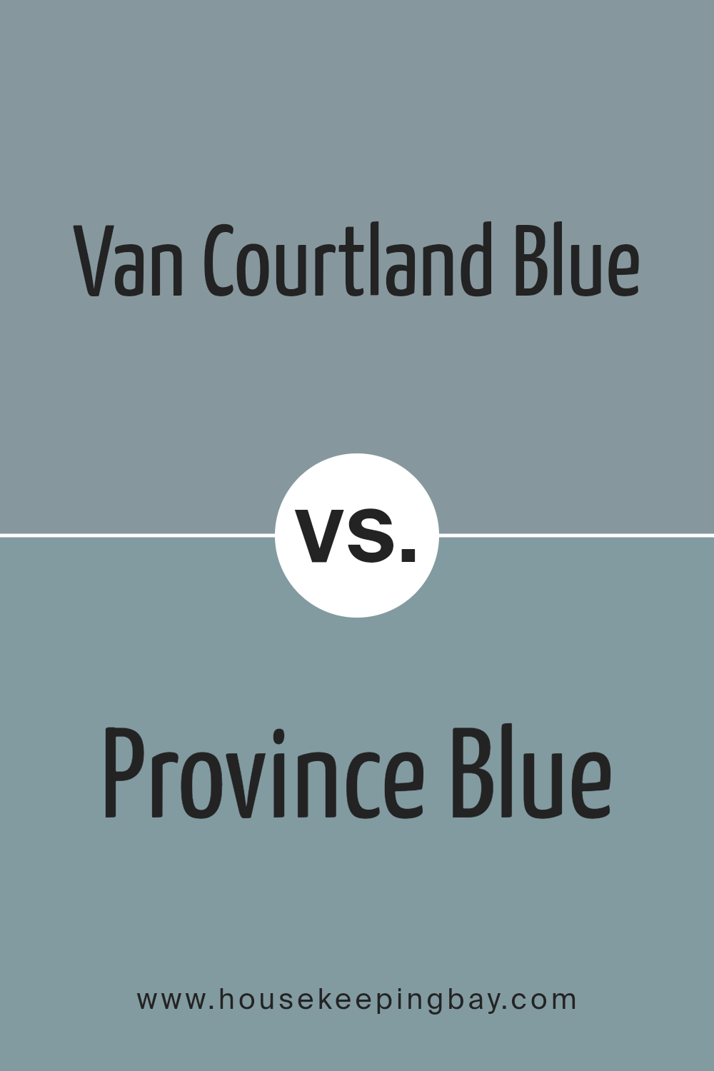
Van Courtland Blue HC-145 by Benjamin Moore vs Province Blue 2135-40 by Benjamin Moore
Van Courtland Blue HC-145 and Province Blue 2135-40, both by Benjamin Moore, offer distinct experiences. Van Courtland Blue is a soft, muted blue-green with hints of gray, giving rooms a calm, classic feel. It pairs beautifully with whites and neutrals, adding a gentle touch of color without overwhelming a space. This shade works well in traditional and modern settings, bringing a sense of elegance.
Province Blue, however, presents itself as a richer and more saturated blue. This color has a stronger presence, making it ideal for people seeking a bold statement.
It can energize spaces when contrasted with lighter tones or create a cozy, enveloping environment with darker accents.
Together, these colors can suit a range of moods and styles. Van Courtland Blue is perfect for understated grace, whereas Province Blue offers a more vigorous and vibrant vibe. Both colors enhance interiors uniquely, enabling varied design possibilities.
You can see recommended paint color below:
- 2135-40 Province Blue
housekeepingbay.com
Conclusion
The gentle blue-green hue offers a comforting atmosphere that works well in living rooms, bedrooms, or bathrooms. It evokes a sense of peace without overpowering a room.
The color pairs beautifully with both neutral and bold accents, giving one the ability to craft a personalized style that suits individual tastes. Its classic elegance feels timeless yet modern, making it a choice that will remain stylish for years.
From my perspective, using Van Courtland Blue can add character while maintaining sophistication.
For anyone considering a fresh look for their interior spaces, HC-145 Van Courtland Blue stands as a reliable option. It doesn’t just paint a wall; it adds a layer of personality and emotion to a room. With its pleasing appearance, it’s no surprise many would find it to be an excellent color for creating a welcoming and serene environment.
Whether it’s a feature wall or an entire room, this color has the ability to enhance one’s living area gracefully.
housekeepingbay.com
Ever wished paint sampling was as easy as sticking a sticker? Guess what? Now it is! Discover Samplize's unique Peel & Stick samples. Get started now and say goodbye to the old messy way!
Get paint samples


