First Light 2102-70 Paint Color by Benjamin Moore
Every color has a story, a character, and an ambiance.
Every color has a story, a character, and an ambiance. The allure of colors lies not just in their beauty, but in their depth, undertones, and the emotion they evoke. Benjamin Moore’s First Light 2102-70 is no exception. Let’s dive into the intriguing world of this hue.
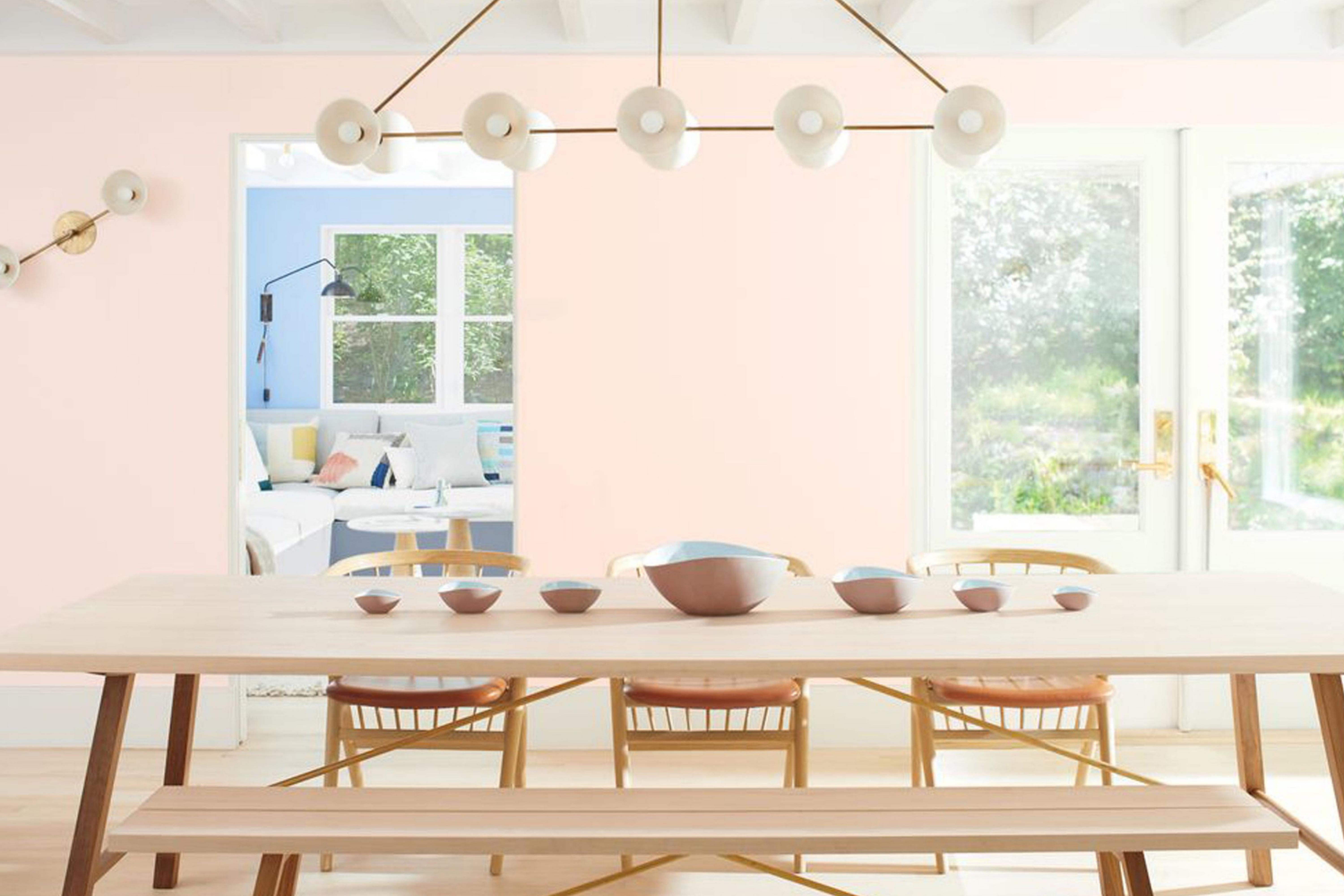
via plan home
What Color Is First Light 2102-70?
First Light 2102-70 by Benjamin Moore is a gentle blush pink that exudes softness and serenity. It possesses a calming quality that is both refreshing and invigorating. Ideal for contemporary and classic interiors, this shade complements natural materials like wood and stone, while pairing seamlessly with rich textures like velvet and silk.
housekeepingbay.com
Table of Contents
Is It a Warm Or Cool Color?
First Light 2102-70 leans towards the warmer side of the spectrum, though it maintains a neutral balance. This warmth makes it inviting and comforting, perfect for homes seeking a restful ambiance. Being on the warmer side, it adds a cozy feel to spaces, especially in living and bedroom areas.
Undertones of First Light 2102-70
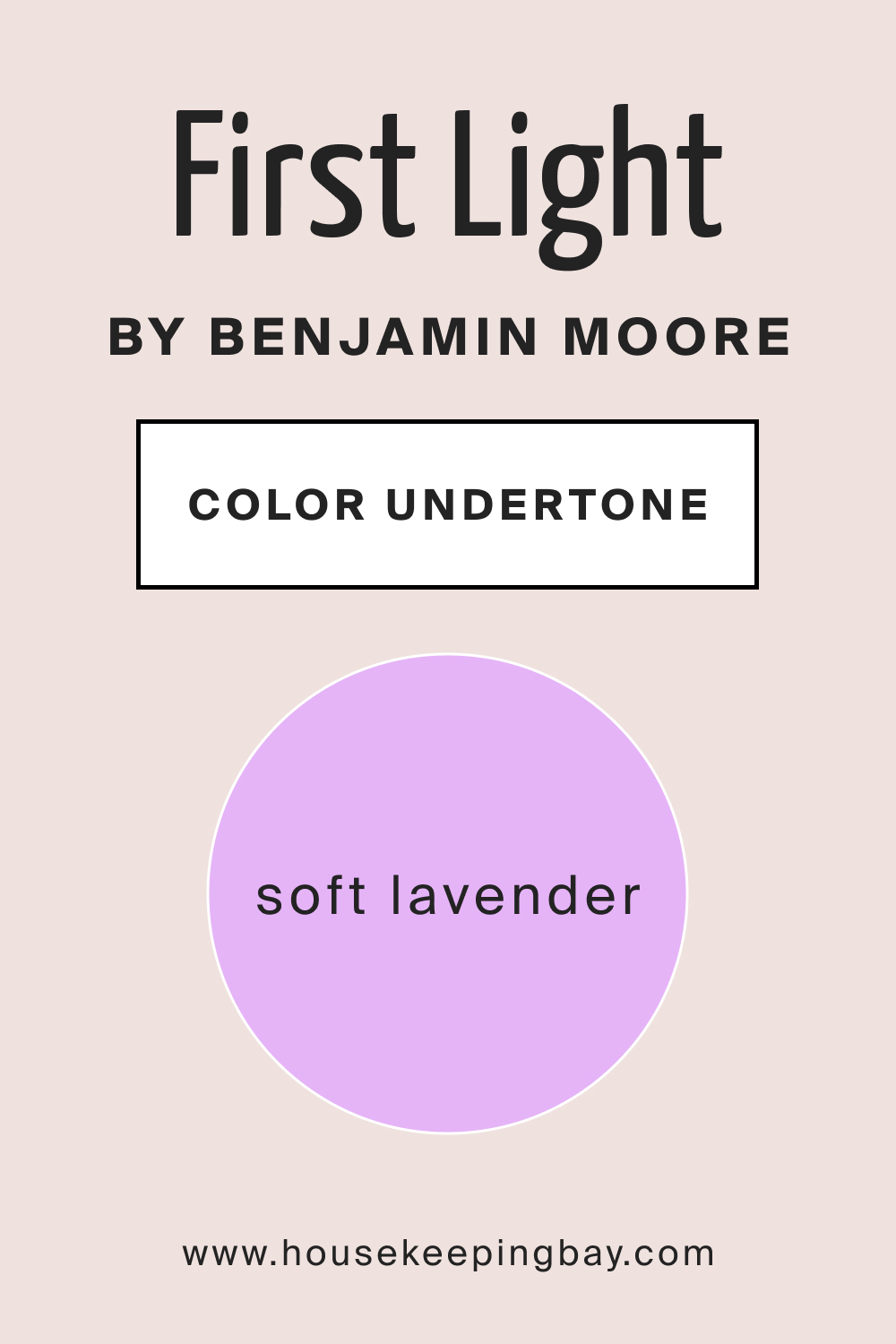
All colors have undertones—subtle hues that influence the main color. First Light 2102-70 carries a soft lavender undertone, which gives it depth and dimension. This undertone is key in how First Light 2102-70 interacts with other shades and elements in a room. On interior walls, this undertone can emerge stronger in certain lighting, impacting the room’s overall vibe.
housekeepingbay.com
Coordinating Colors of First Light 2102-70
Coordinating colors enhance and balance the main hue. For First Light 2102-70, shades of muted lavender, subdued greys, and soft creams can be ideal counterparts.
- Muted Lavender (BM 1452 After the Rain ): A touch of purple with subdued pink.
- Subdued Greys (BM 2107-50 Sandlot Gray ): Neutral, balancing the warmth of First Light.
- Soft Cream (BM 2154-70 Vanilla Ice Cream ): Enhancing the brightness and lightness.
Additional coordinating colors include delicate peach, understated coral, and light taupe.
How Does Lighting Affect First Light 2102-70?
Lighting plays a crucial role in how we perceive colors. In natural light, First Light 2102-70 appears brighter, enhancing its liveliness. Artificial light, depending on its warmth, can either amplify its pinkness or bring out its lavender undertones. In north-facing rooms, it can seem cooler, giving off a serene feel.
South-facing rooms drench it in warmth, making it feel cozier. East-facing rooms offer it a gentle morning glow, while west-facing rooms can bring out its depth during sunset.
housekeepingbay.com
LRV of First Light 2102-70
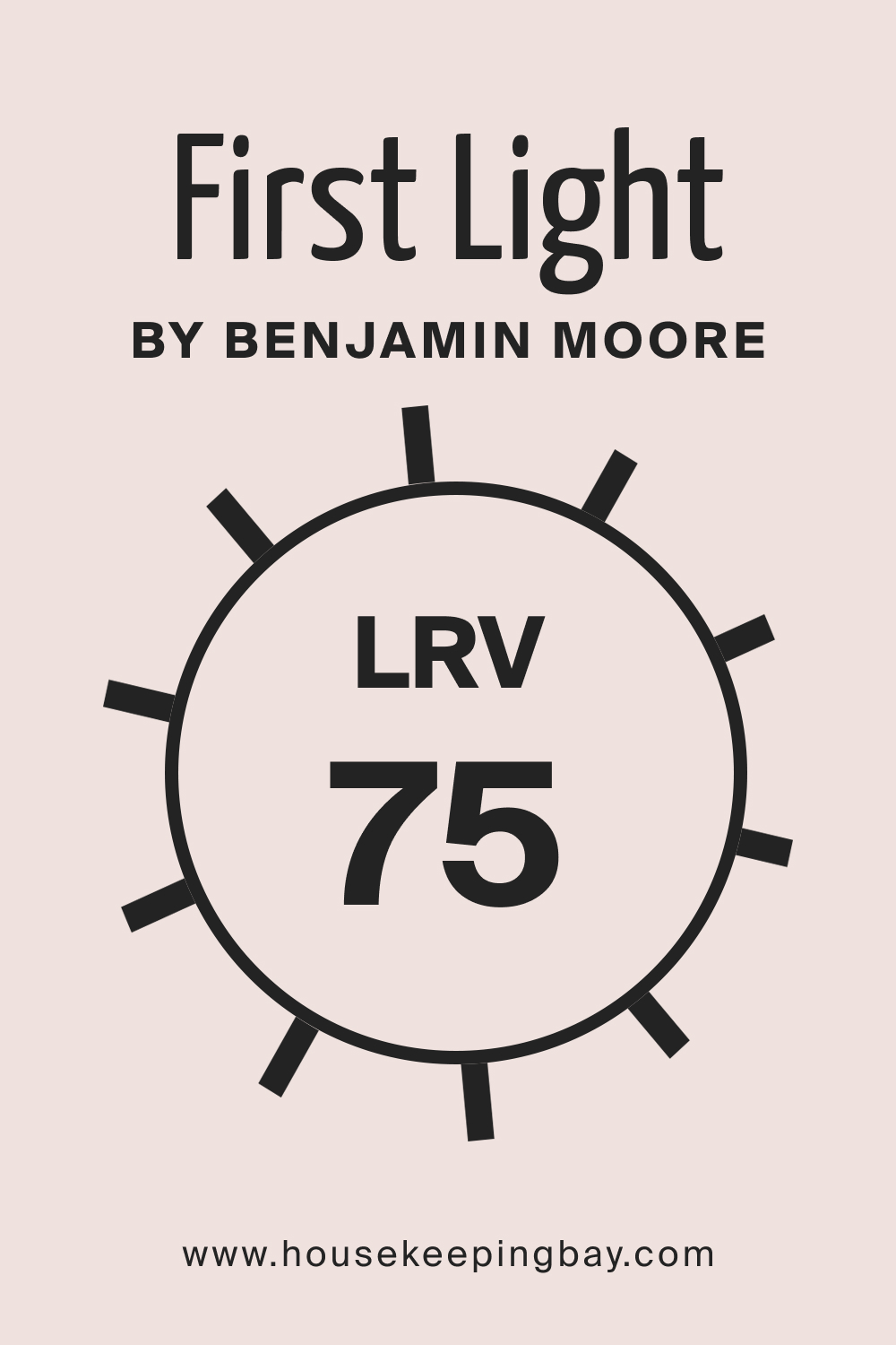
The Light Reflectance Value (LRV) measures the percentage of light a paint color reflects. With an LRV of 75, First Light 2102-70 is quite reflective, making spaces feel more open and airy. A higher LRV means the color can make a room feel larger, which is true for this shade, giving it versatility in both spacious and compact interiors.
housekeepingbay.com
What is LRV? Read It Before You Choose Your Ideal Paint Color
Trim Colors of First Light 2102-70
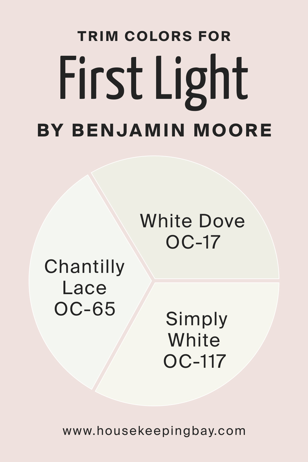
Trim colors define and highlight architectural features. For First Light 2102-70, shades of white from Benjamin Moore like White Dove, Simply White, and Chantilly Lace are ideal choices, offering a crisp contrast and enhancing its warmth.
housekeepingbay.com
Colors Similar to First Light 2102-70
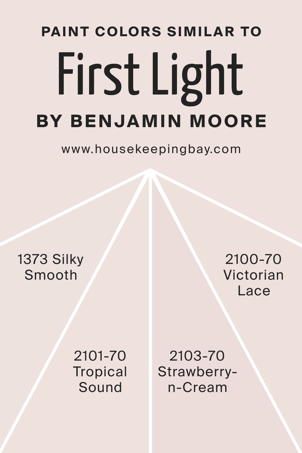
Recognizing similar colors helps in variations and choices.
- BM 2101-70 Tropical Sound : A creamy pastel with a hint of peach.
- BM 1373 Silky Smooth : A plush pink with a beige undertone.
- BM 2103-70 Strawberry-n-Cream : A delectable pale rose.
- BM 2100-70 Victorian Lace : A delicate off-white with pinkish hues.
housekeepingbay.com
Colors That Go With First Light 2102-70
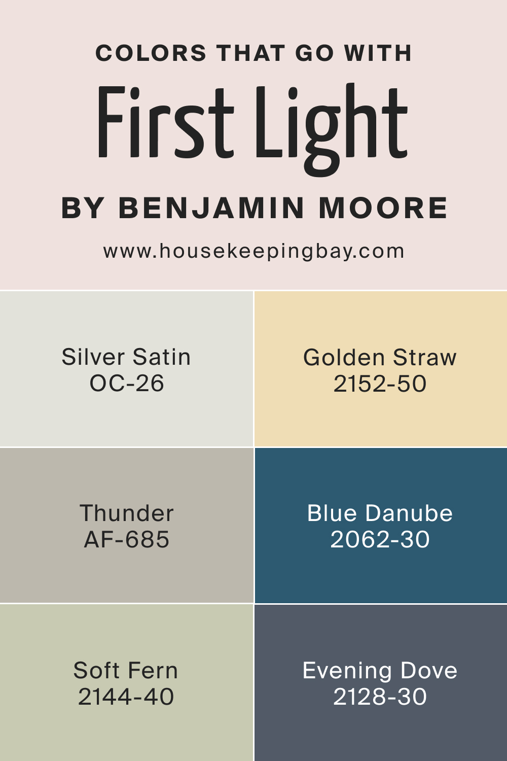
Harmonizing colors create a cohesive interior. Pairing First Light 2102-70 with shades like OC-57 White Heron brings brightness, BM 2129-40 Normandy adds depth, AF-685 Thunder lends contrast, BM 2152-50 Golden Straw offers warmth, BM 2062-30 Blue Danube provies coolness, and HC-125 Cushing Green adds freshness. Additional complements are Silver Satin, Soft Fern, and Evening Dove, each adding a unique dimension to the palette.
In conclusion, First Light 2102-70 isn’t just a color; it’s an experience, a backdrop for memories, and an embodiment of tranquility.
housekeepingbay.com
How to Use First Light 2102-70 In Your Home?
First Light 2102-70 is a versatile hue suitable for various rooms and styles. Ideal for bedrooms and living spaces, it creates a tranquil ambiance. In bathrooms and kitchens, it adds a touch of modern elegance.
This color fits seamlessly into contemporary, Scandinavian, and farmhouse designs while also complementing more traditional or vintage spaces.
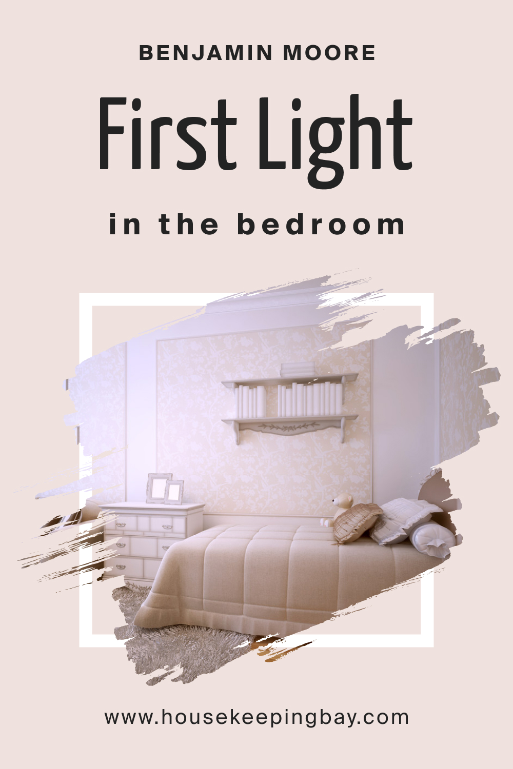
How to Use First Light 2102-70 in the Bedroom?
This delicate blush pink invokes feelings of serenity and calm, making it an exceptional choice for bedrooms. First Light promotes restfulness, making it an oasis of relaxation. Complement with neutral linens and soft textures for a dreamy, ethereal space that feels both contemporary and timeless.
housekeepingbay.com
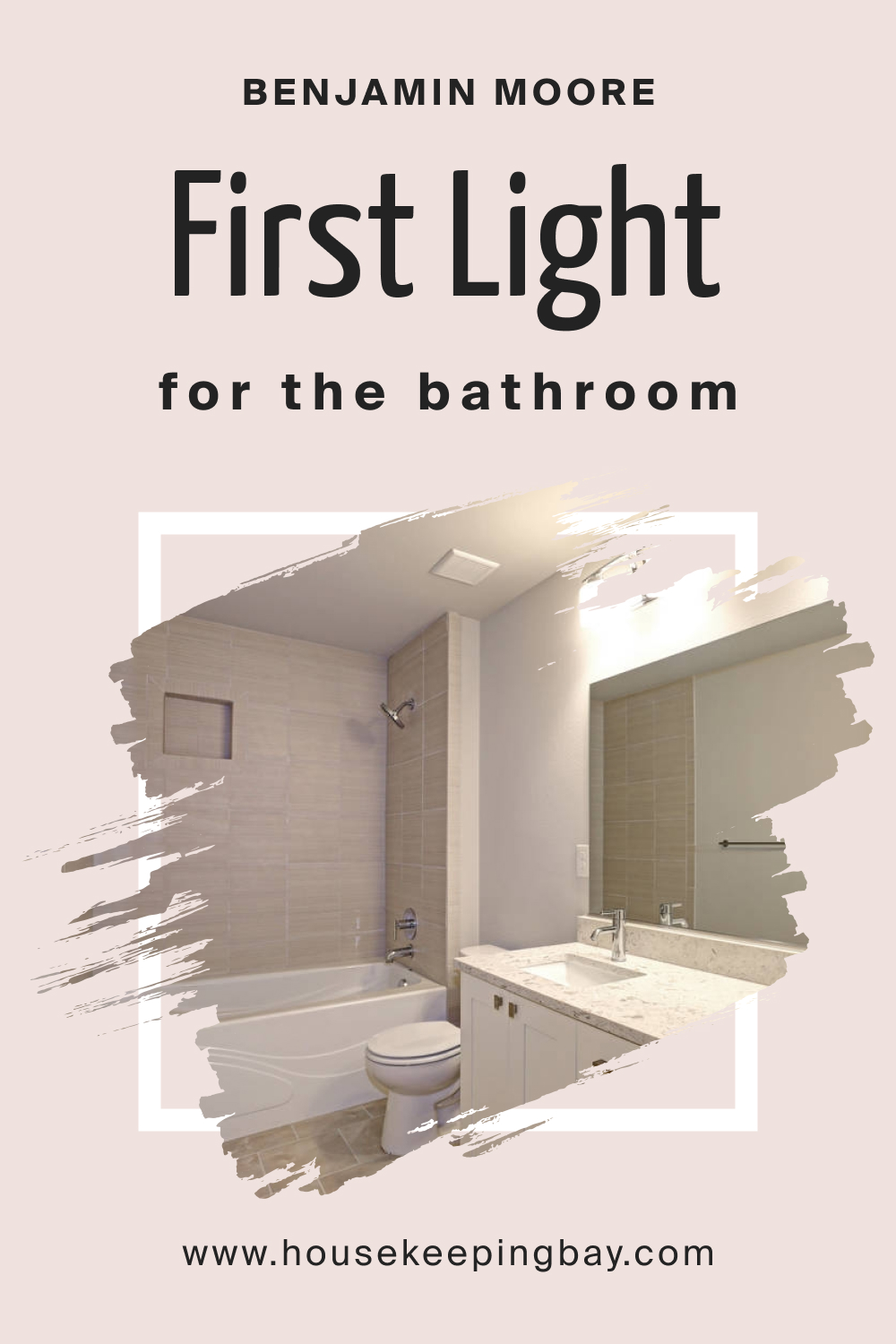
How to Use First Light 2102-70 in the Bathroom?
In bathrooms, First Light 2102-70 acts as a refreshing, spa-like backdrop. It pairs beautifully with white fixtures and marble or tiled surfaces. Add brushed gold or silver accents to enhance the elegance, giving your bathroom a chic yet calming vibe.
housekeepingbay.com
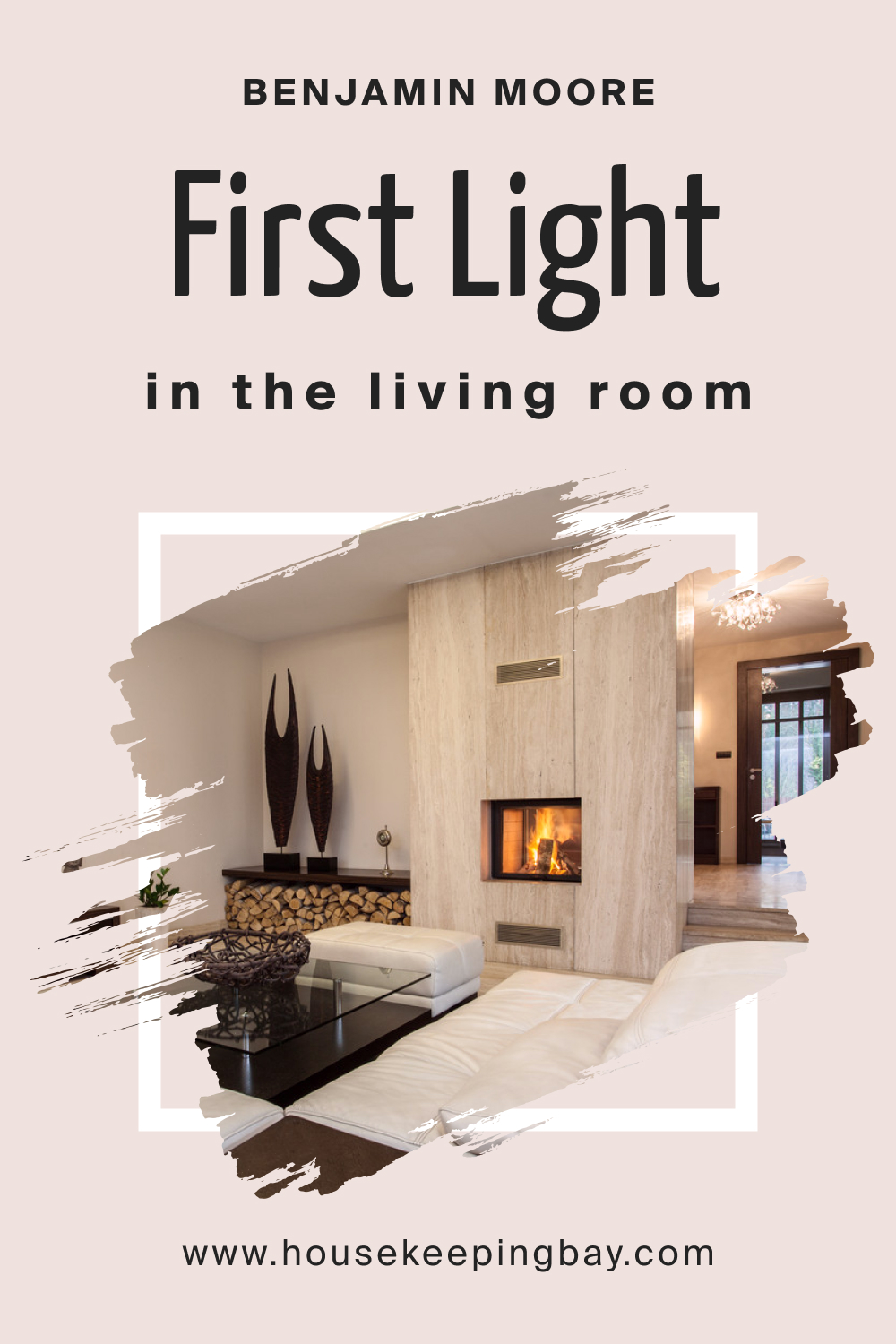
How to Use First Light 2102-70 in the Living Room?
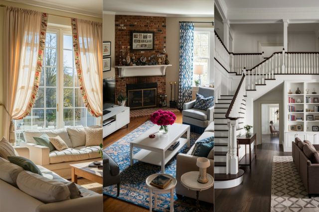
First Light 2102-70 shines in living areas, establishing a cozy yet refined atmosphere. Perfect for socializing or unwinding, the hue complements wooden floors, plush sofas, and eclectic décor. Pair with soft creams, muted grays, and gentle pastels for a harmonious palette that beckons guests to relax and converse.
housekeepingbay.com
How to Use First Light 2102-70 for an Exterior?
First Light 2102-70 can add a contemporary touch to home exteriors. Especially suited for cottage or coastal styles, it radiates warmth and charm. Paired with white trims and natural stone or wood details, it offers a perfect balance between modern elegance and timeless appeal.

housekeepingbay.com
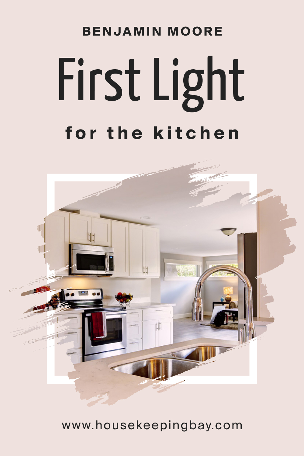
How to Use First Light 2102-70 in the Kitchen?
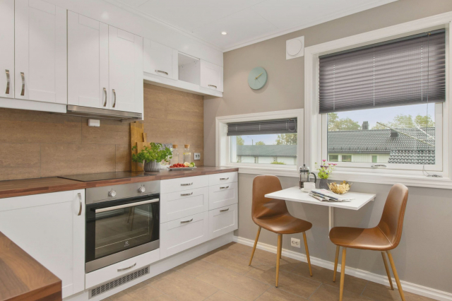
For kitchens, First Light 2102-70 offers a clean, bright backdrop. Against this hue, stainless steel appliances gleam, and wooden countertops shine. Consider pairing with open shelving to display dishware, adding a touch of hominess and warmth to your culinary space.
housekeepingbay.com
How to Use First Light 2102-70 for the Kitchen Cabinets?
Transform your kitchen cabinets with First Light 2102-70 for an updated, sophisticated look. This shade on cabinetry pairs brilliantly with both marble and wood countertops, bridging the gap between modern design and rustic charm. Gold or silver hardware will accentuate its elegance, making your kitchen both inviting and chic.
Comparing First Light 2102-70 With Other Colors
Color comparison is pivotal in interior design. It helps discern undertones, brightness, and mood-setting capabilities of hues, ensuring the ideal choice for a space. As each shade invokes distinct feelings and atmospheres, contrasting them aids in achieving a precise visual and emotional ambiance.
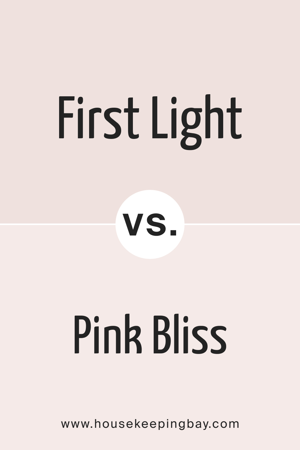
First Light 2102-70 vs. BM 2093-70 Pink Bliss
While both belong to the pink family, First Light 2102-70 is a softer, more muted blush. Pink Bliss is more vibrant, offering a youthful, energetic vibe. First Light, in contrast, provides a serene and calming atmosphere, ideal for relaxation.
housekeepingbay.com
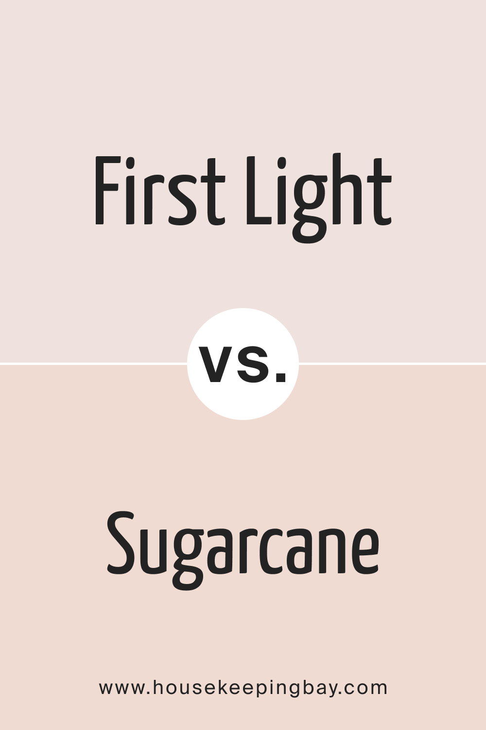
First Light 2102-70 vs. BM 1185 Sugarcane
Sugarcane leans towards a beige-pink, offering a neutral yet warm backdrop. First Light 2102-70 is slightly cooler with a touch of lavender undertone, making it versatile and less earthy compared to Sugarcane.
housekeepingbay.com
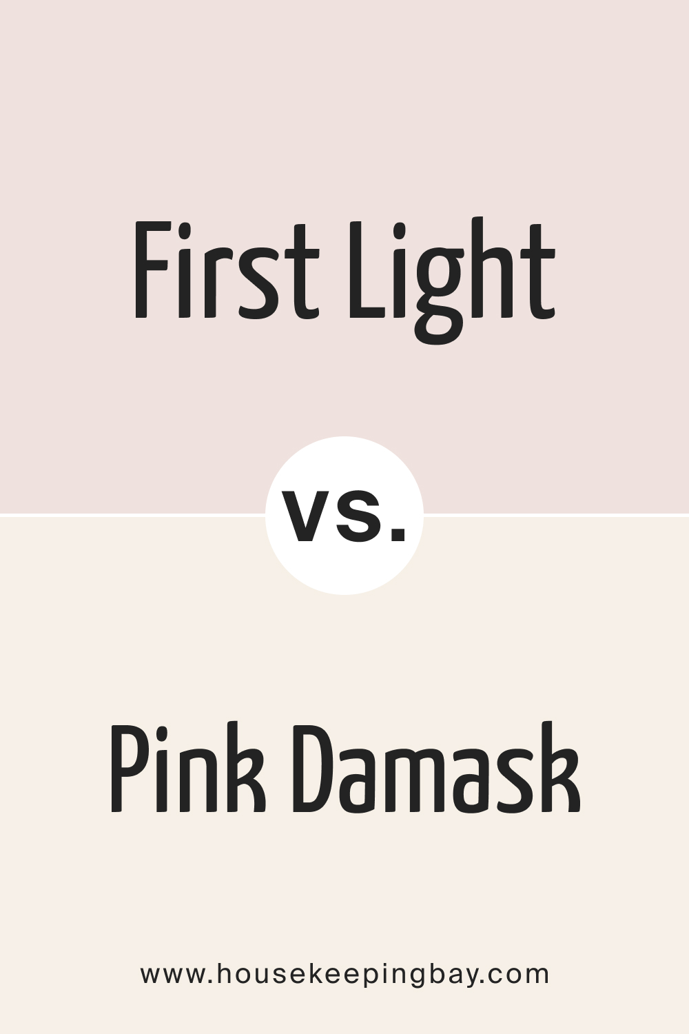
First Light 2102-70 vs. OC-72 Pink Damask
Pink Damask offers a classic, old-world charm. It’s a more traditional pink, reminiscent of vintage aesthetics. First Light 2102-70 is modern and fresh, ideal for contemporary settings while Pink Damask suits classical interiors.
housekeepingbay.com
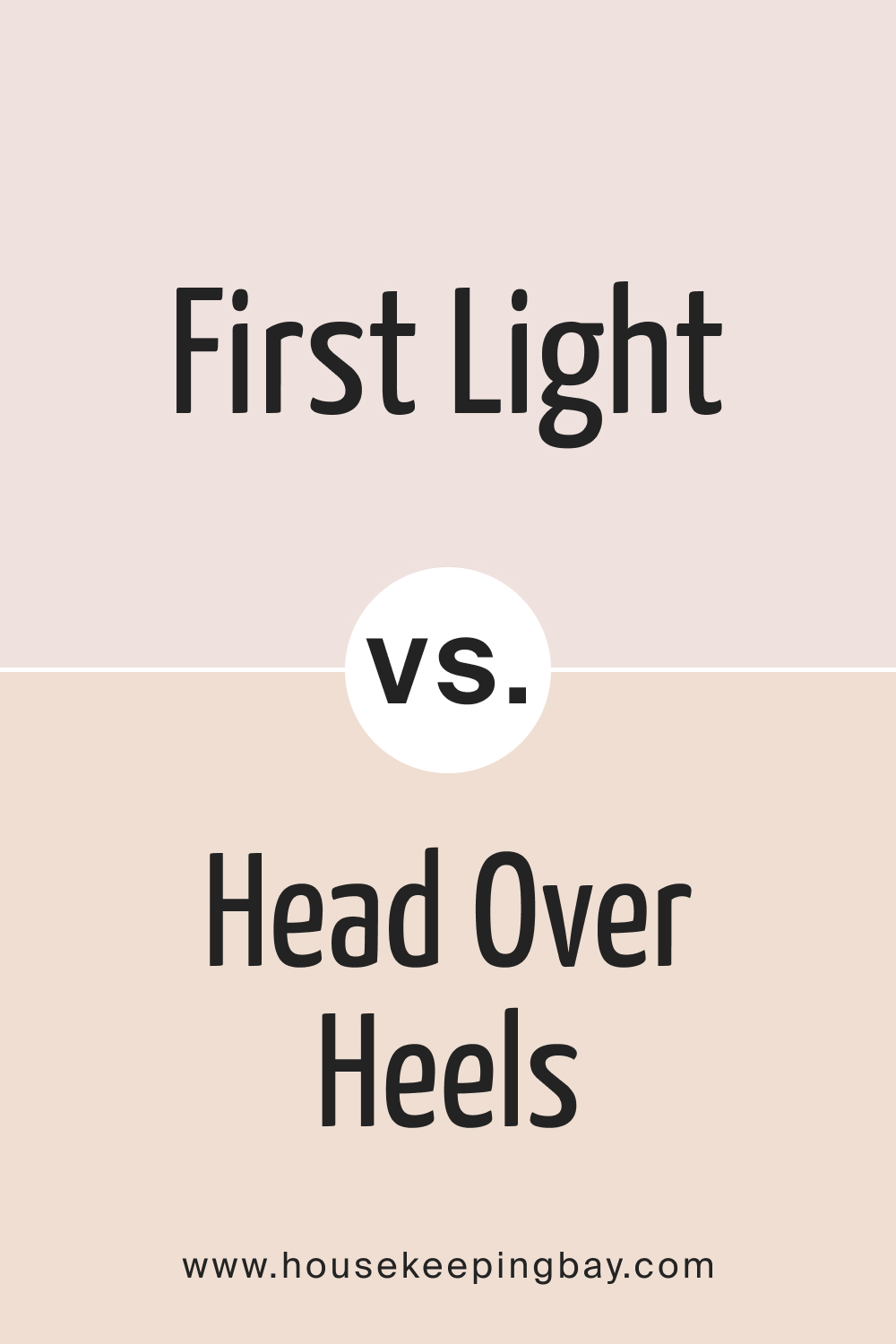
First Light 2102-70 vs. AF-250 Head Over Heels
Head Over Heels is a bolder shade, infusing spaces with character and drama. First Light 2102-70, on the other hand, is understated, creating a tranquil and subtle environment, making them contrasts in terms of mood enhancement.
housekeepingbay.com
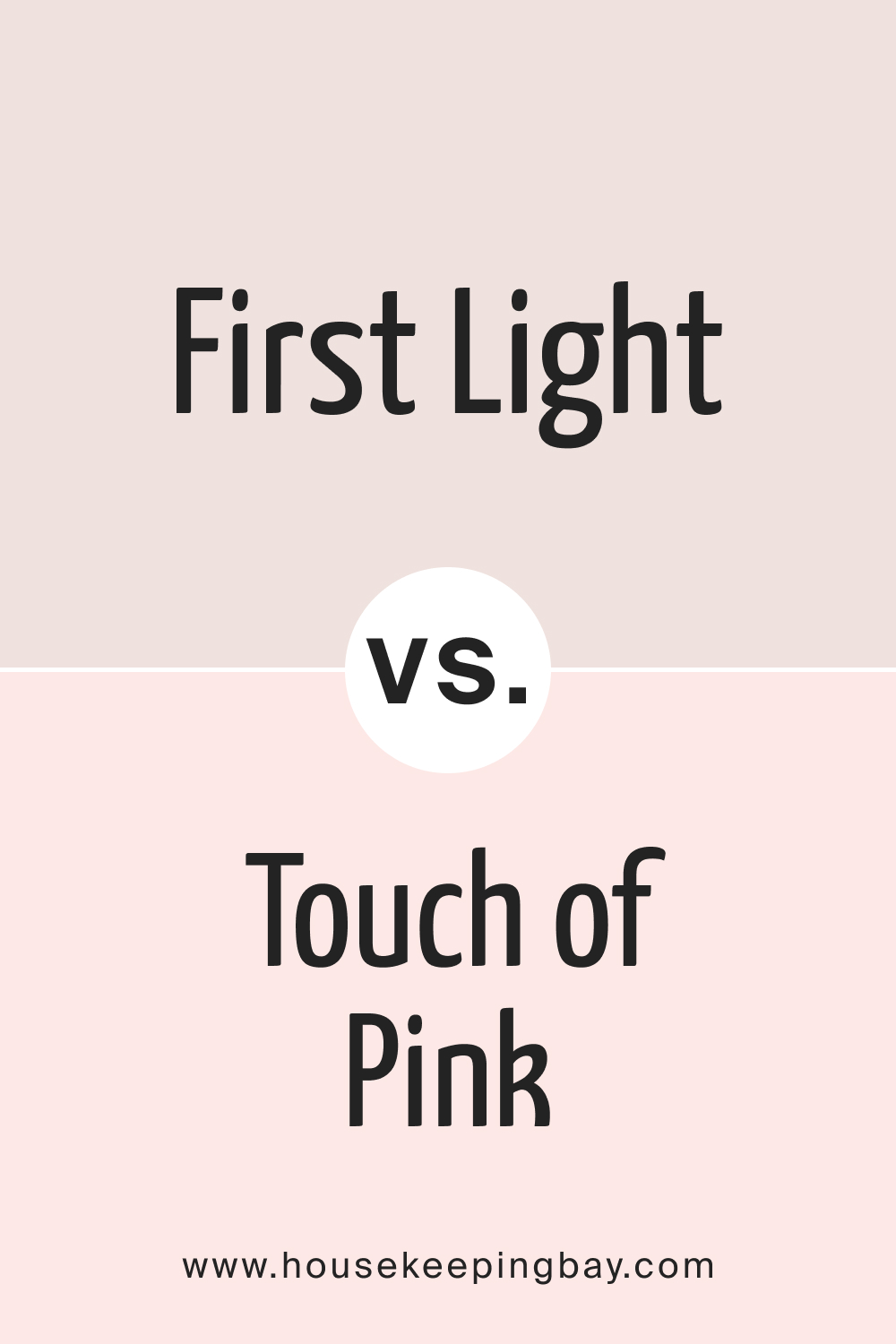
First Light 2102-70 vs. BM 2008-70 Touch of Pink
Touch of Pink is just that—a gentle hint of pink. It’s almost neutral with its subtleness. First Light 2102-70 is more pronounced, while still remaining muted, adding a more discernible color presence in a room.
housekeepingbay.com
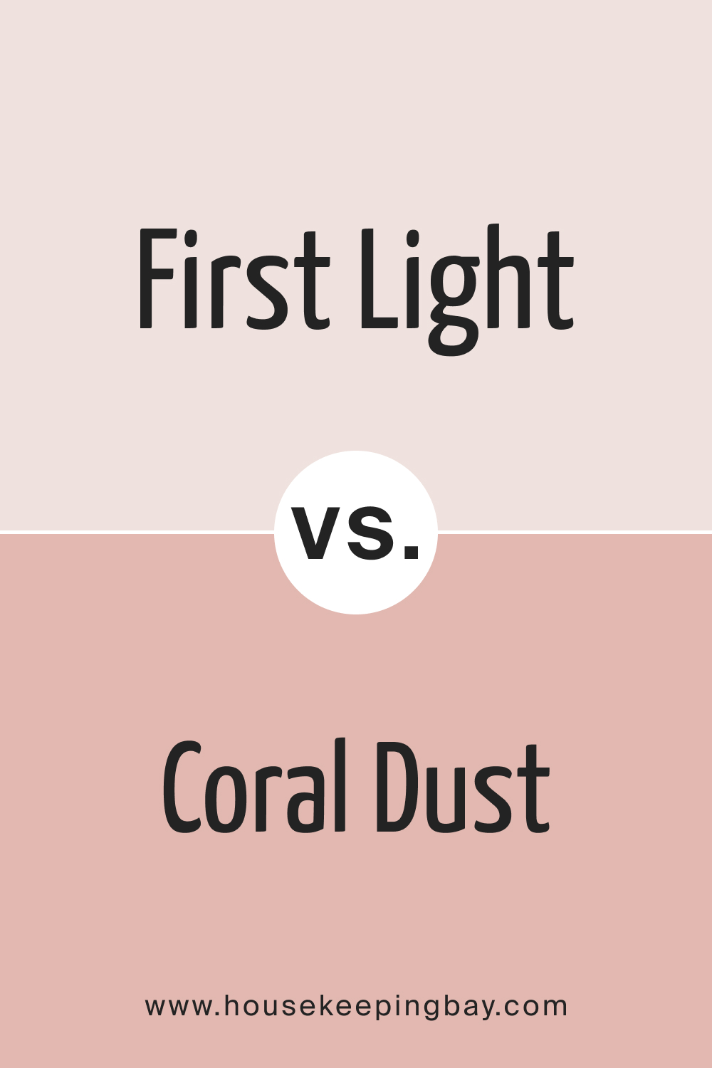
First Light 2102-70 vs. BM 2173-50 Coral Dust
Coral Dust is warmer with a slight orange undertone, reminiscent of sunsets. It’s vibrant and lively compared to the calmness of First Light 2102-70, offering a more spirited atmosphere.
housekeepingbay.com
Conclusion
First Light 2102-70 is a unique blend of subtleness and emotion. Comparing it with other shades accentuates its versatility and universal appeal, proving its adaptability across various design preferences and moods.
housekeepingbay.com
Ever wished paint sampling was as easy as sticking a sticker? Guess what? Now it is! Discover Samplize's unique Peel & Stick samples. Get started now and say goodbye to the old messy way!
Get paint samples





What ceiling color would you recommend with this?
With First Light 2102-70, a soft white or a very light gray on the ceiling can create a seamless transition and enhance the room’s spaciousness.
I have blue curtains. Will they match with this paint?
Yes, Sara! First Light 2102-70 pairs beautifully with blues, creating a soft and harmonious palette.
Is this color suitable for a modern kitchen?
Absolutely, Alex. First Light 2102-70 can bring a touch of modern elegance to kitchens, especially when paired with sleek fixtures and finishes.
How does this compare to white shades?
First Light 2102-70, while light and airy, offers more warmth and character than many stark white shades. It can give a room depth without overwhelming it
Definitely, Kevin! First Light 2102-70 can provide a refreshing and calming backdrop, which can be conducive to a productive work environment.
I’m thinking of this for my office. Good idea?
Definitely, Kevin! First Light 2102-70 can provide a refreshing and calming backdrop, which can be conducive to a productive work environment.
I’m thinking of this for my office. Good idea?
Can I pair this with dark gray accents?
Yes! The subtle pink of First Light 2102-70 can create a stunning contrast with dark gray, offering a contemporary and chic aesthetic.
Is this color too feminine for a shared space?
Not at all, Mark. While it has a soft pink undertone, First Light 2102-70 is versatile enough to be both sophisticated and neutral, making it suitable for any shared space.
I’ve got oak furniture. Will this color complement it?
Absolutely, Jane! First Light 2102-70’s soft undertones can beautifully complement the warmth of oak, creating a balanced and harmonious look.