TOP 48 Paint Colors for Home in 2025
What Paint Color Really Means in a Home
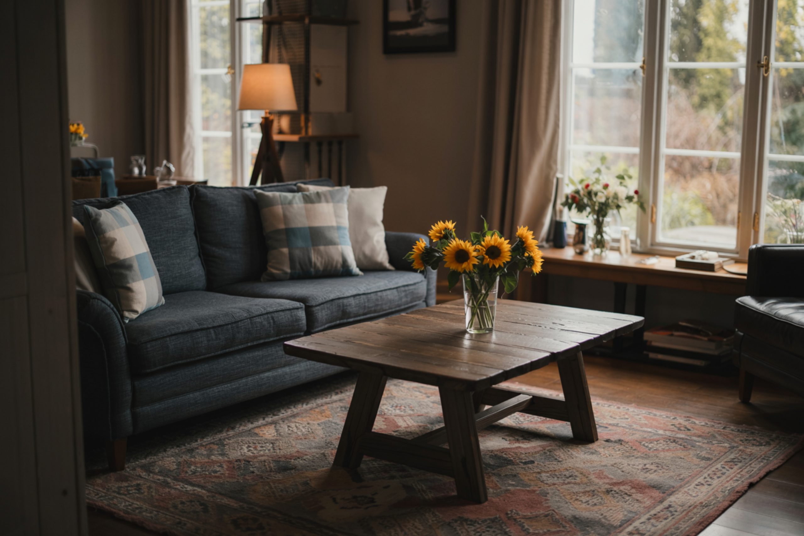
When I walk into someone’s house for the first time, I always notice the colors before anything else. Even before I look at the furniture or the layout — it’s the walls that speak the loudest. The truth is, paint color sets the mood of the whole room.
I’ve had clients tell me they feel “off” in their own living rooms, or that their kitchen just feels cold. Most of the time, it’s not the layout or even the lighting. It’s the color on the walls.
In 2025, I’m seeing a clear pattern: people want calm, grounded tones that feel safe — but they also want some personality.
Whites aren’t just flat whites anymore, and grays now lean warm or cool depending on the feeling they want to create.
Some want something bold in a powder room. Others need their bedroom to feel like a hug. Color helps you do that.
And it doesn’t have to be complicated. If you’ve ever stood in front of 200 color chips at the paint store and walked out more confused than when you came in — this list is for you.
Let’s start with what’s getting the most love this year.
via housekeepingbay.com
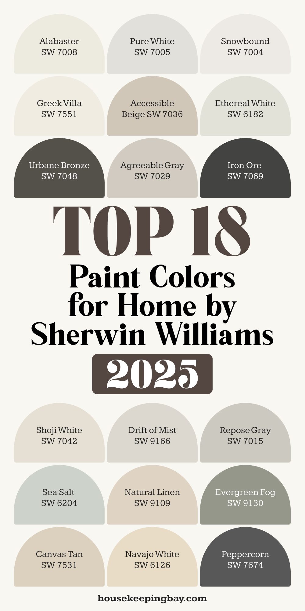
Top 18 Paint Colors for Home by Sherwin Williams (2025)
Table of Contents
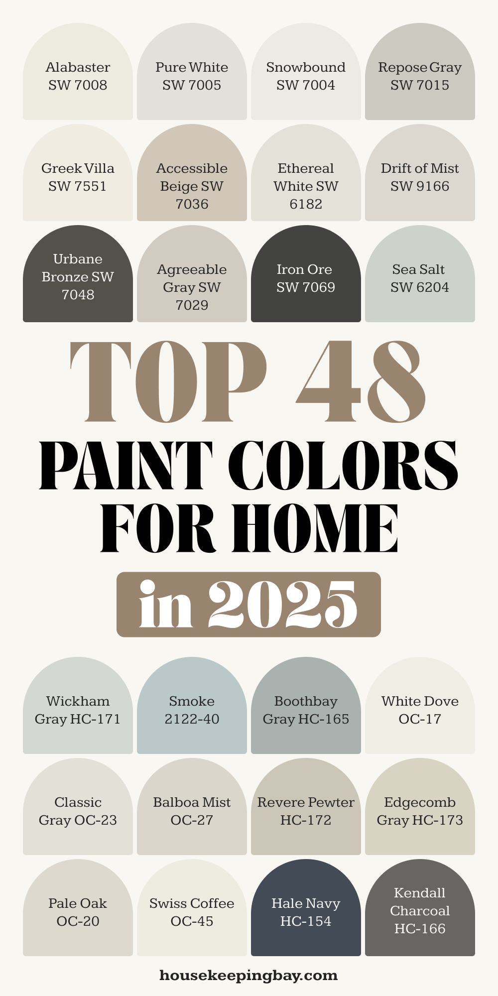
Sherwin-Williams has always been a go-to for me. Their colors are reliable, tested, and have a depth that works well in real homes with real light. These are the 18 shades I keep reaching for again and again in 2025:
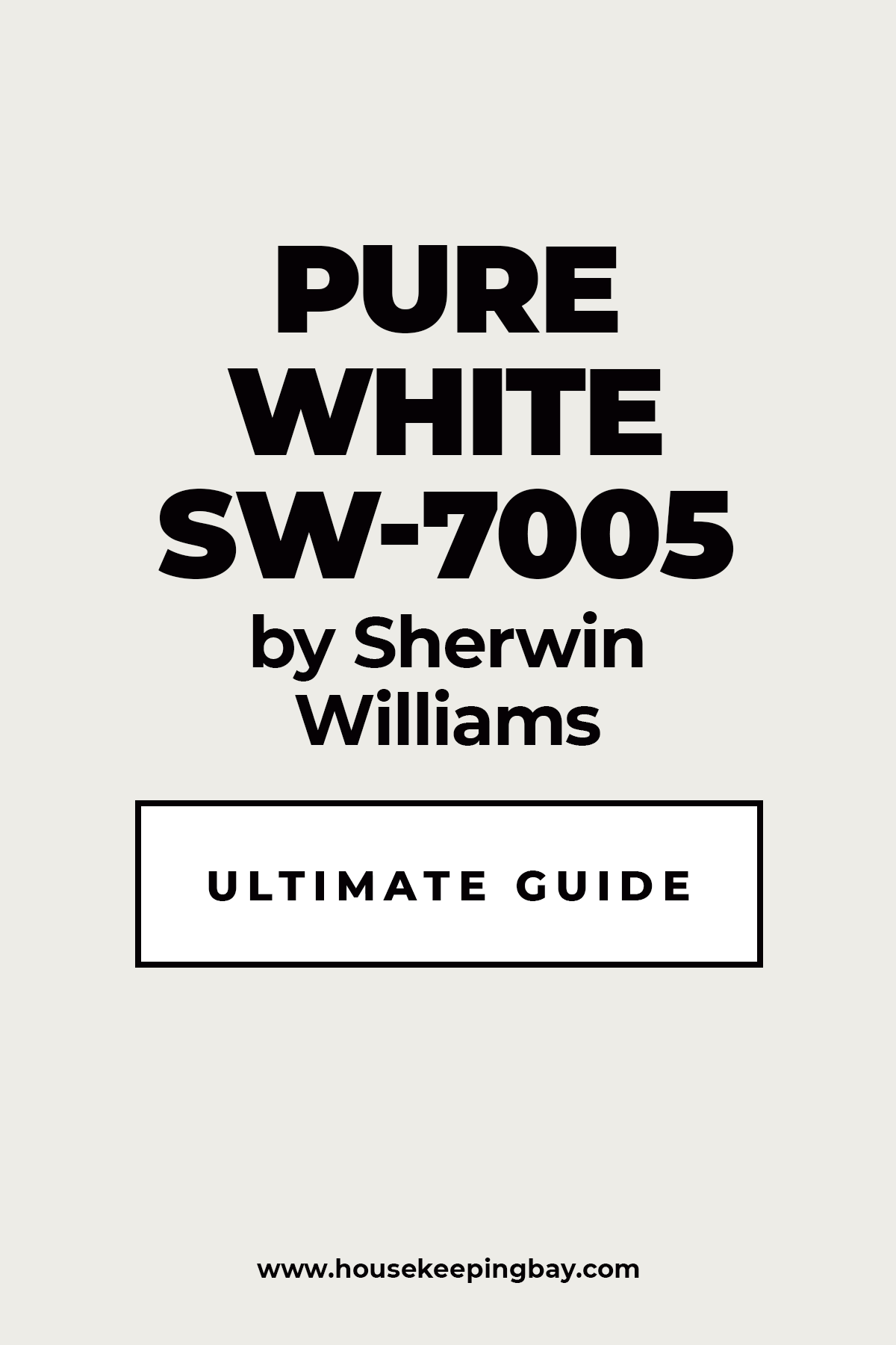
Pure White – SW 7005
My personal favorite for trim and ceilings. It’s crisp without feeling cold.
Housekeepingbay.com
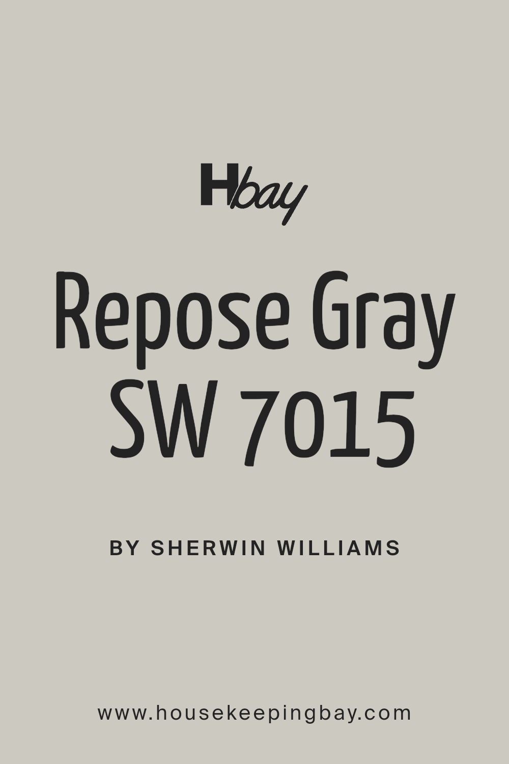
Repose Gray – SW 7015
soft gray with just enough warmth. I love it in living rooms or open layouts.
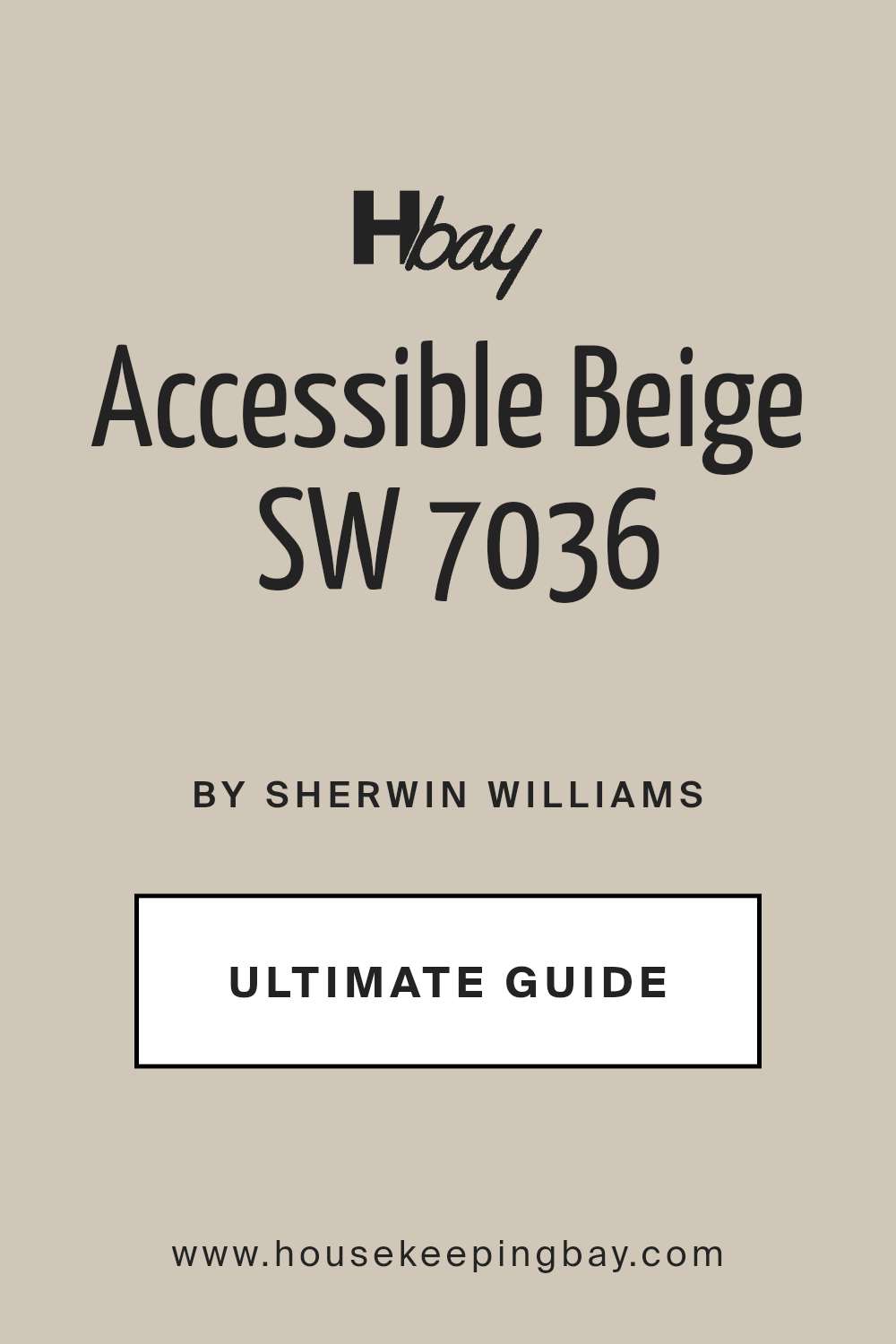
Accessible Beige – SW 7036
Not your typical beige. It has a subtle gray base that makes it feel current.
Ethereal White – SW 6182
Light and quiet. I’ve used this in nurseries and peaceful home offices.
Alabaster – SW 7008
A client favorite. It’s warm, but not yellow. Works anywhere.
Housekeepingbay.com
Drift of Mist – SW 9166
Very light gray that feels refined. I recently used it in a coastal home.
housekeepingbay.com
Urbane Bronze – SW 7048
Still going strong from 2021. It’s bold, moody, and adds weight to a room. Great for vanities or fireplace walls.

housekeepingbay.com
Agreeable Gray – SW 7029
It really lives up to its name. Works with almost anything, in any light.
housekeepingbay
Shoji White – SW 7042
A warm, creamy neutral. I like pairing it with brushed brass and wood.
housekeepingbay.com
Sea Salt – SW 6204
A soft mix of green and blue. Lovely in bathrooms or laundry rooms.
Housekeepingbay.com
Greek Villa – SW 7551
Clean with a hint of warmth. I use this in homes with dark floors and lots of natural light.
housekeepingbay.com
Natural Linen – SW 9109
Earthy and soft. I recommend this for bedrooms where comfort matters.
Iron Ore – SW 7069
Charcoal without feeling black. It’s striking on kitchen islands or exteriors.

Snowbound – SW 7004
A cooler white. Perfect if you have gray tile or marble in a bathroom or kitchen.

Housekeepingbay.com
Evergreen Fog – SW 9130
Dusty sage with warmth. I used this in a cozy breakfast nook and it completely changed the feel.
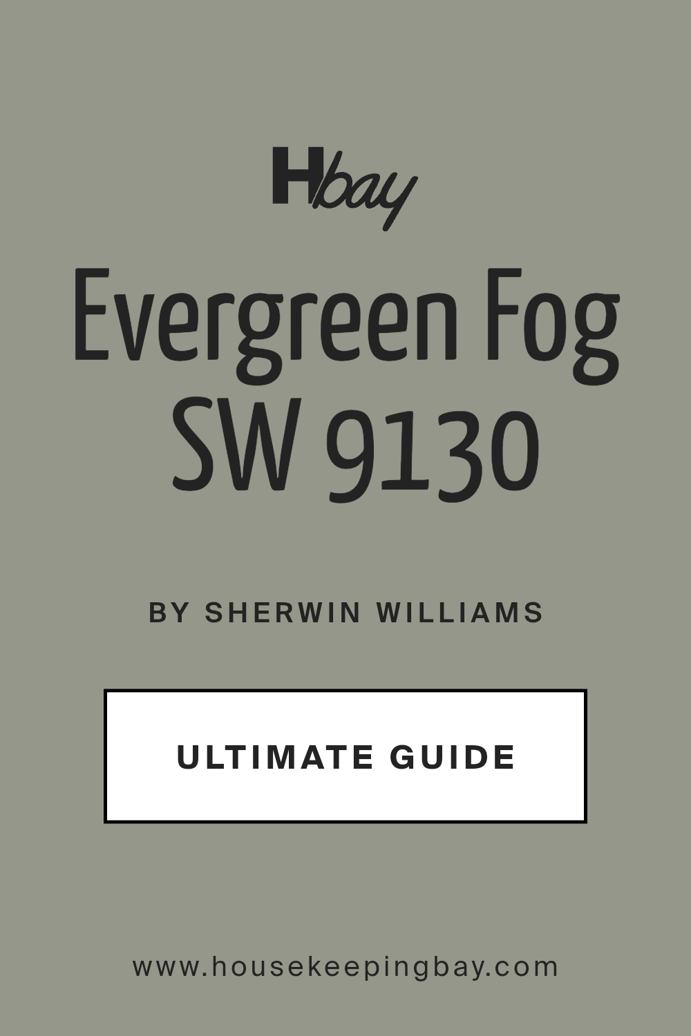
housekeepingbay.com
Peppercorn – SW 7674
A deep, smoky gray. I love using this on a feature wall in home offices.
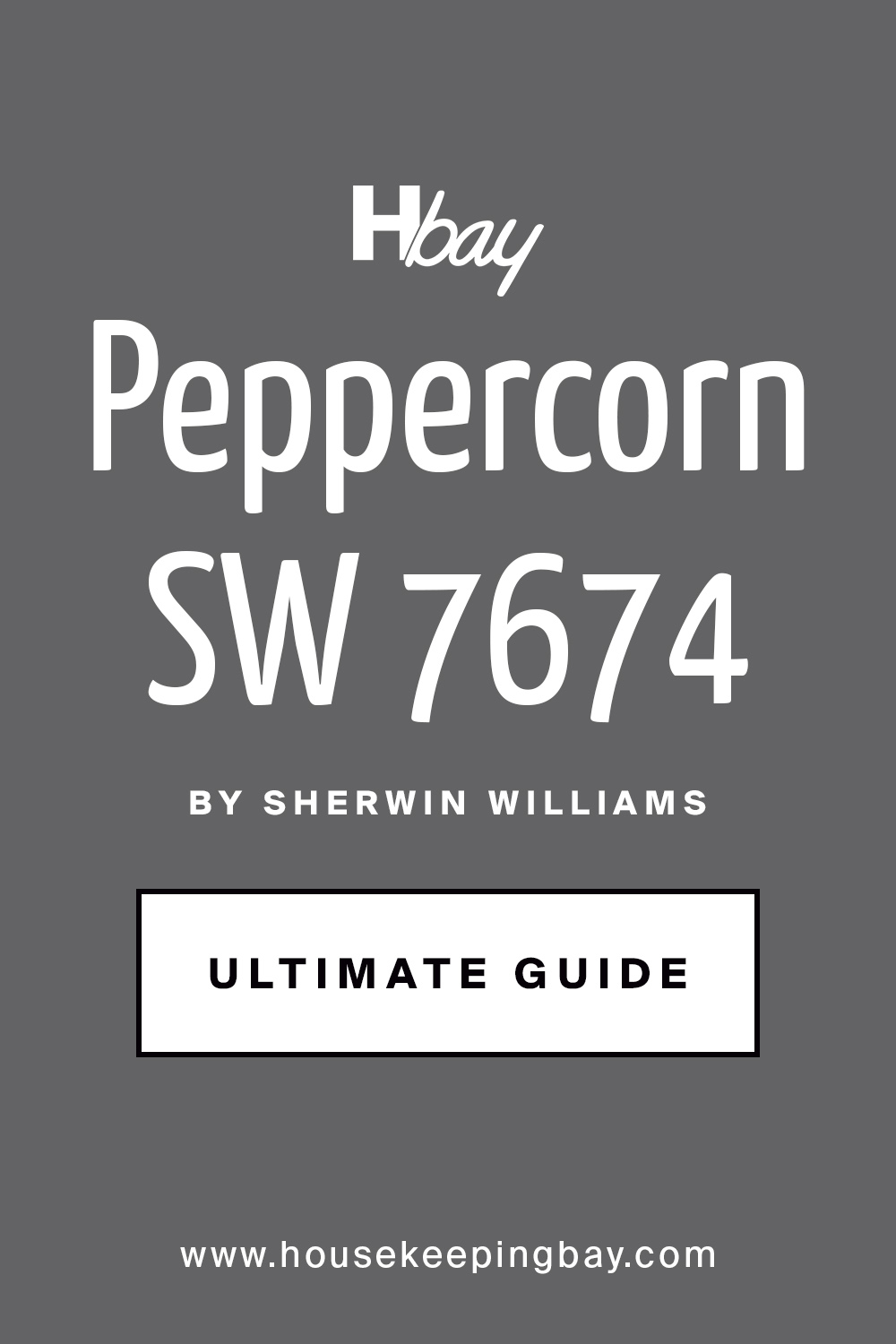
housekeepingbay
Navajo White – SW 6126
Classic, soft, and warm. Works beautifully in traditional homes with rich wood furniture.
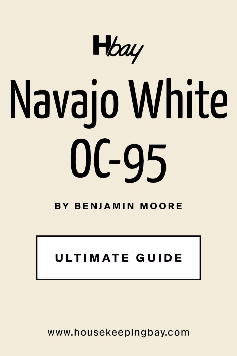
housekeepingbay.com
Canvas Tan – SW 7531
Neutral and calm. I like it for hallways or connecting rooms that need to stay quiet.
via housekeepingbay.com
Benjamin Moore’s Best Paint Colors for 2025
I’ve worked with Benjamin Moore paints for years, and I still find myself turning to them when I want colors that feel soft, lived-in, and easy to work with. Their whites and neutrals, especially, are some of the most requested shades I hear about from clients — whether it’s for a full repaint or just a refresh before listing a home.
These are the ones I’m loving (and using) the most right now:
Chantilly Lace – OC-65
Bright and clean. It doesn’t lean blue or yellow. I use this one when I need a true white. Perfect for trim, cabinetry, or modern homes.

housekeepingbay.com
White Dove – OC-17
Probably the most popular white I use. It’s warm, soft, and incredibly flexible. Looks beautiful on walls and ceilings.

housekeepingbay.com
Classic Gray – OC-23
A pale gray that reads warm and gentle. This one’s great if you want a bit of color, but nothing too noticeable.
Balboa Mist – OC-27
Soft and a little warmer than Classic Gray. It works really well in north-facing rooms that tend to feel cold.
Housekeepingbay.com
Pale Oak – OC-20
Somewhere between beige and gray, with a slightly pink undertone in some lights. I love this for bedrooms and sitting rooms.
Housekeepingbay.com
Revere Pewter – HC-172
This one used to be everywhere, and it still works. It has more depth than other grays and pairs really well with white trim and darker floors.
housekeepingbay
Edgecomb Gray – HC-173
If Revere Pewter ever felt too heavy, try this instead. It’s lighter, and it has a calming effect in any space.
housekeepingbay
Swiss Coffee – OC-45
This one can look a little creamy, but in the right light it’s stunning. I always sample it first — but when it works, it really works.
housekeepingbay
Hale Navy – HC-154
A rich, deep navy that feels classic. I’ve used it on kitchen cabinets, dining rooms, and even front doors.

Kendall Charcoal – HC-166
Dark and moody without being harsh. Looks amazing on exteriors or as a feature wall in modern spaces.
housekeepingbay
Smoke – 2122-40
This is a blue-gray that reads very soft. It looks amazing in a nursery or a peaceful guest room.
Wickham Gray – HC-171
Almost icy in some light, but beautiful when paired with bright whites and chrome fixtures.
Boothbay Gray – HC-165
A gray with soft blue undertones. This one feels cozy but fresh, and it’s stunning on cabinetry.
October Mist – 1495
Benjamin Moore’s Color of the Year for 2022 — and still going strong. It’s a gentle green that feels very calming.
Housekeepingbay.com
I know that was a lot — but paint color is personal. The right shade can make your home feel warmer, cleaner, or more inviting.
via housekeepingbay.com
Most-Loved Neutrals for Every Room
Neutral paint colors are the real workhorses in a home. They create a quiet background, let your furniture shine, and help the whole house feel more put together. But not all neutrals work in every room. Some are better in bright areas, some in cozy spaces.
Here’s how I usually break it down, room by room:
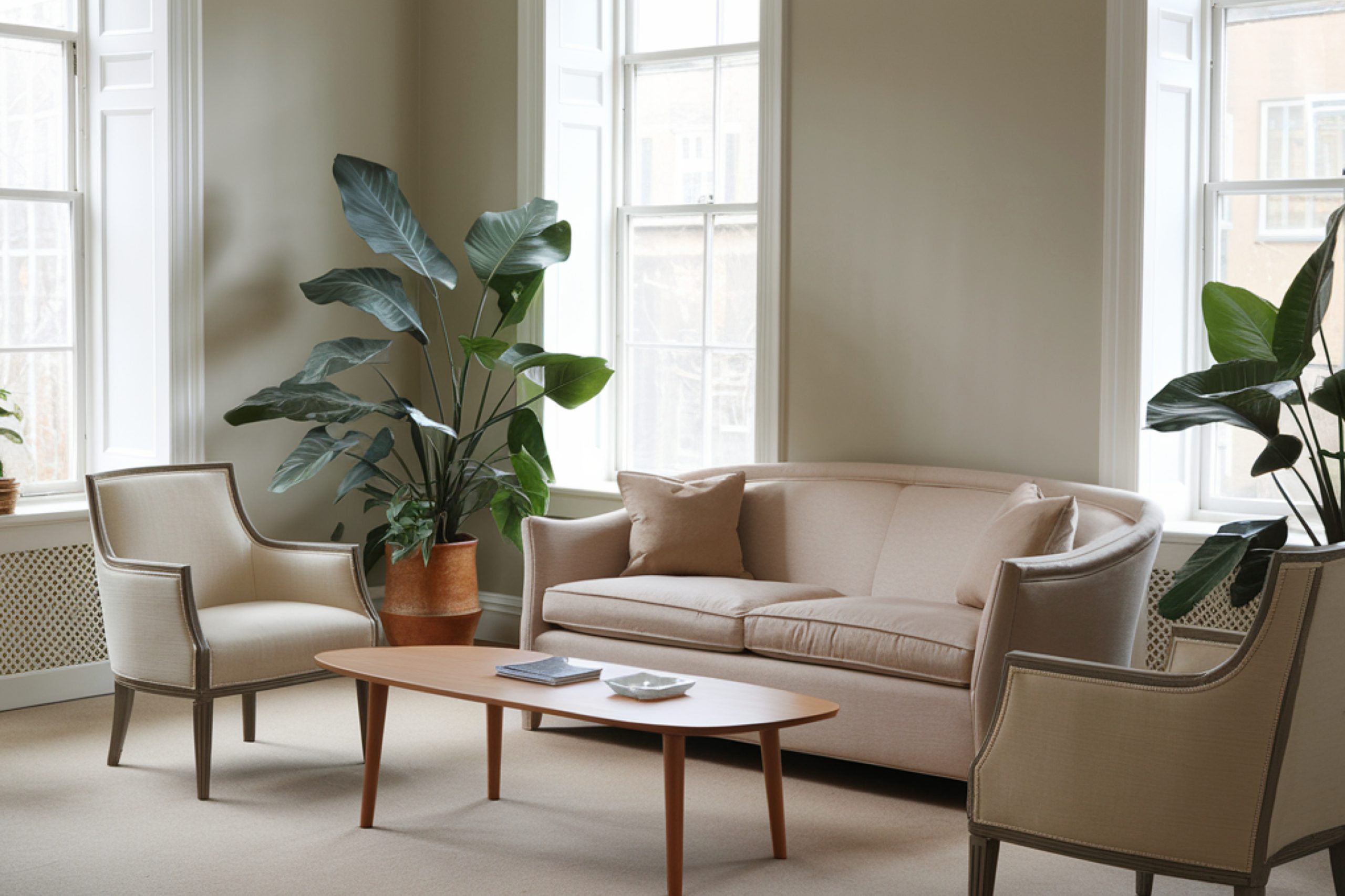
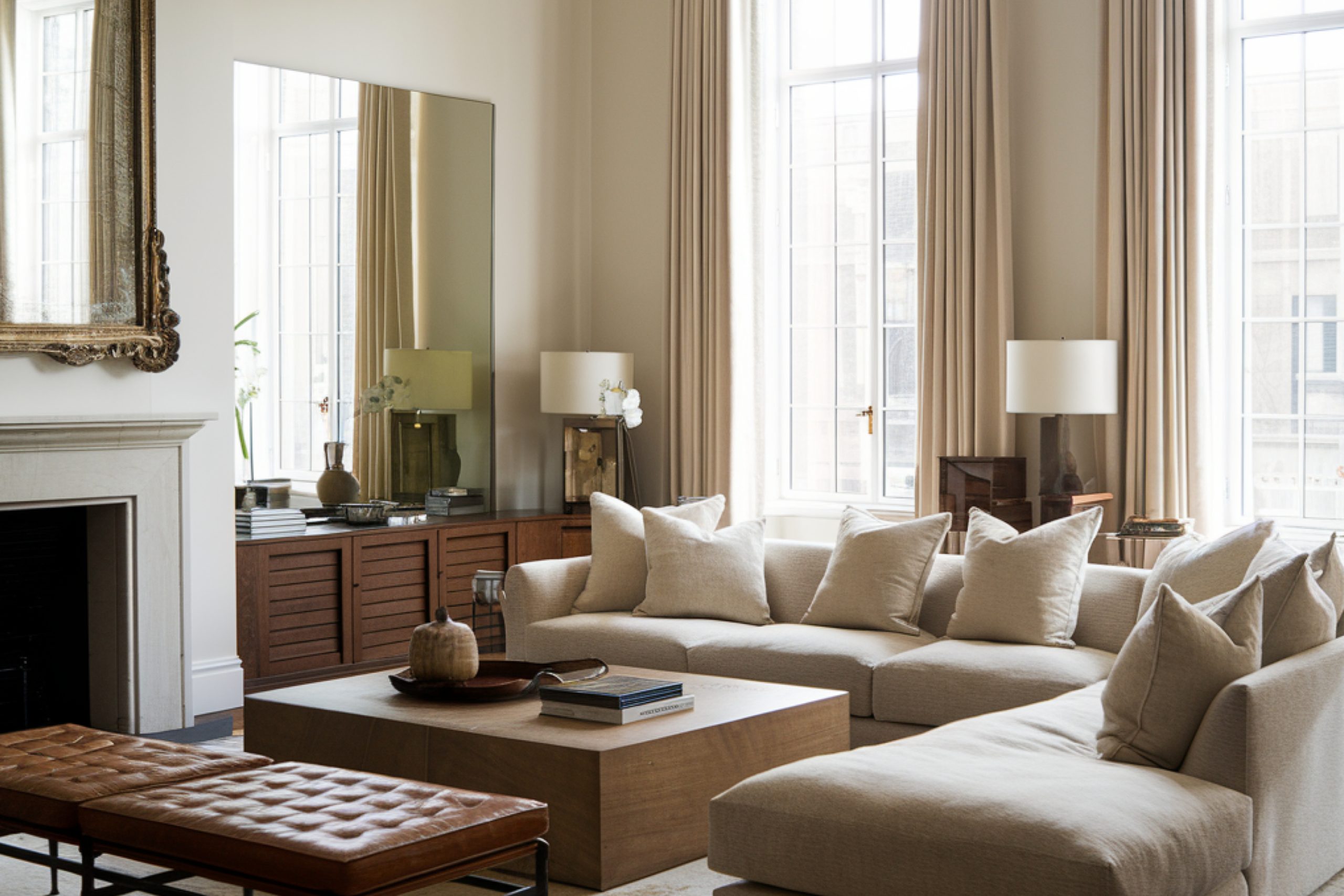
Living Room
This is where people gather, so the color has to feel welcoming.
Soft and balanced, it goes with everything — especially wood tones.
Warm but not beige. Looks great with light floors or layered neutrals.
A classic. Doesn’t feel dated. Still one of my go-tos for big family rooms.
Kitchen
In kitchens, I lean toward clean and bright — especially if the cabinets are darker or there’s a lot of stainless steel.
Sharp, clean white. Makes everything else feel crisp.
Not too warm, not too cool. It works beautifully with white or wood cabinets.
Especially nice with gray veining in marble or quartz counters.
Bedroom
Bedrooms should feel calm and soft. I go for shades that are relaxing but still have personality.
One of the prettiest wall colors for bedrooms, in my opinion. Gentle and airy.
Feels warm without being dark. I like it with layered bedding and warm wood tones.
Subtle and easy. Good if you don’t want a white wall, but still want things light.
Bathroom
Bathrooms can handle cooler neutrals or something with a touch of color. It makes the room feel clean and fresh.
A client favorite. That greenish tint works beautifully with white tile and light woods.
Soft gray with warmth. Looks great even in small bathrooms with little light.
If you want a bathroom to feel clean but not sterile — this is it.
Hallways & Connecting Spaces
These areas often need to be simple and smooth to transition between bolder rooms.
If I could only pick one whole-house color, this might be it.
Warm, soft, and easy on the eyes. I love this for long hallways.
Creamy white that helps small spaces feel a little brighter
Fun stat: According to a Zillow study, homes with light gray or greige living rooms sold for up to $1,104 more than expected — source. That’s a small upgrade with real impact.
via housekeepingbay.com
Bold Colors That Are Making a Statement in 2025
Not every room needs to be quiet. Some of my favorite projects lately have involved a deeper tone in just one spot — an accent wall, a powder room, a mudroom cabinet. It brings character without overwhelming the house.
Here are the rich, bold colors I’ve been using the most this year:
Still a favorite. Looks amazing on vanities, built-ins, or even bedroom walls if the rest of the space is light.
So classic. It works in modern homes and traditional ones. I’ve used it on dining room walls with brass lighting — stunning.
Deeper than charcoal, but not quite black. This is the one I turn to when someone wants drama without going full gothic.
I’ve used this on office walls and even a laundry room. It’s dark but has a softness that makes it feel smart, not heavy.
This soft green adds color without shouting. Works well in kitchens, breakfast nooks, or even a front door.
Gentle and green, but still brings something interesting into a room. Try it in a reading nook or hallway.
- Smoke – 2122-40 (BM)
Has that cozy, stormy feel. I’ve used it in a guest room with white trim, and it completely changed the vibe.
Just the right amount of blue. I’ve painted mudroom cabinets in this, and it brought so much charm to a basic space.
A good bold color doesn’t need to go everywhere. Sometimes, one wall is enough. The key is pairing it with the right lighting and keeping the rest of the room grounded — light flooring, clean trim, or simple furniture.
What I Always Tell My Clients
When people ask me, “What’s the best paint color for my house?” — I always say:
There’s no one answer. It depends on the light, the feeling you want, and how you live in the space.
But starting with trusted shades — the ones I’ve seen work again and again — takes the pressure off.
So take your time. Buy the samples. Paint a swatch. Live with it for a few days.
And remember, paint is one of the easiest things to change — but it can make the biggest difference.
If you ever feel stuck, just pick one room. One wall. One color.
That’s usually how it starts.
via housekeepingbay.com
