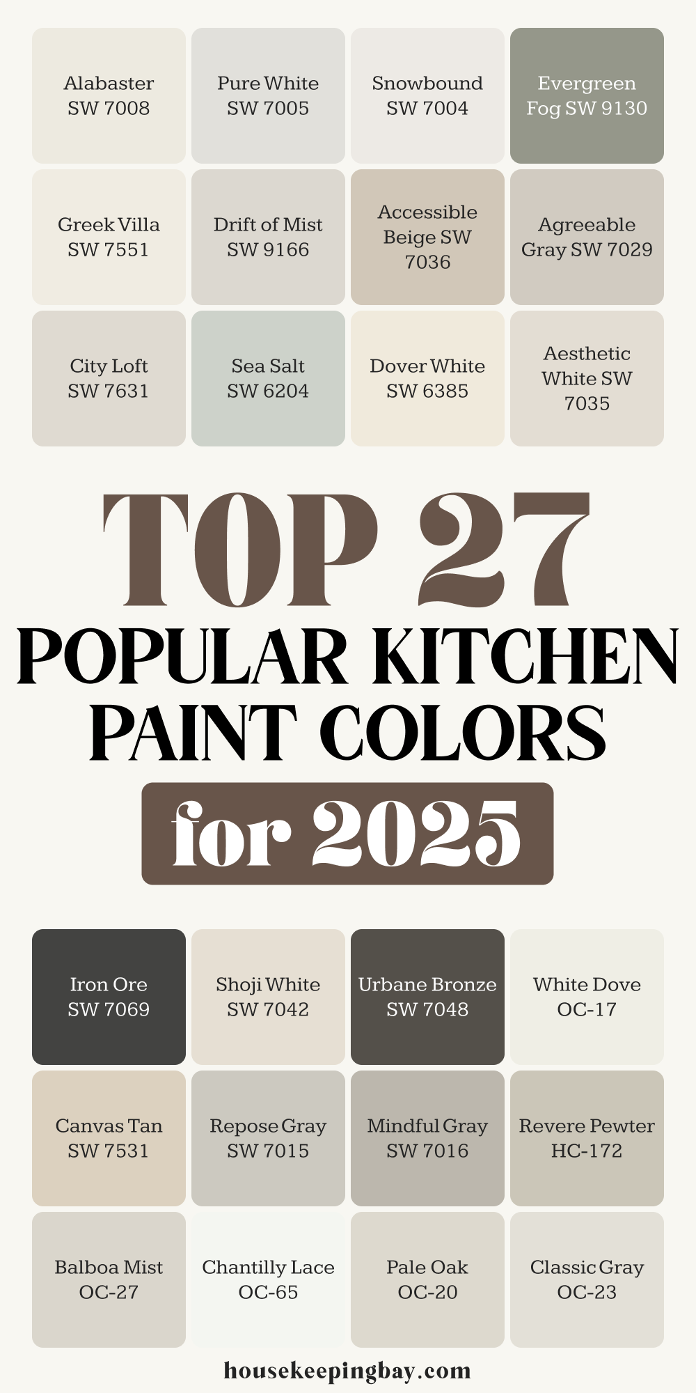
Top 27 Popular Kitchen Paint Colors for 2025
Fresh Neutrals, Modern Warmth & Soft Hues Designers Can't Stop Using This Year
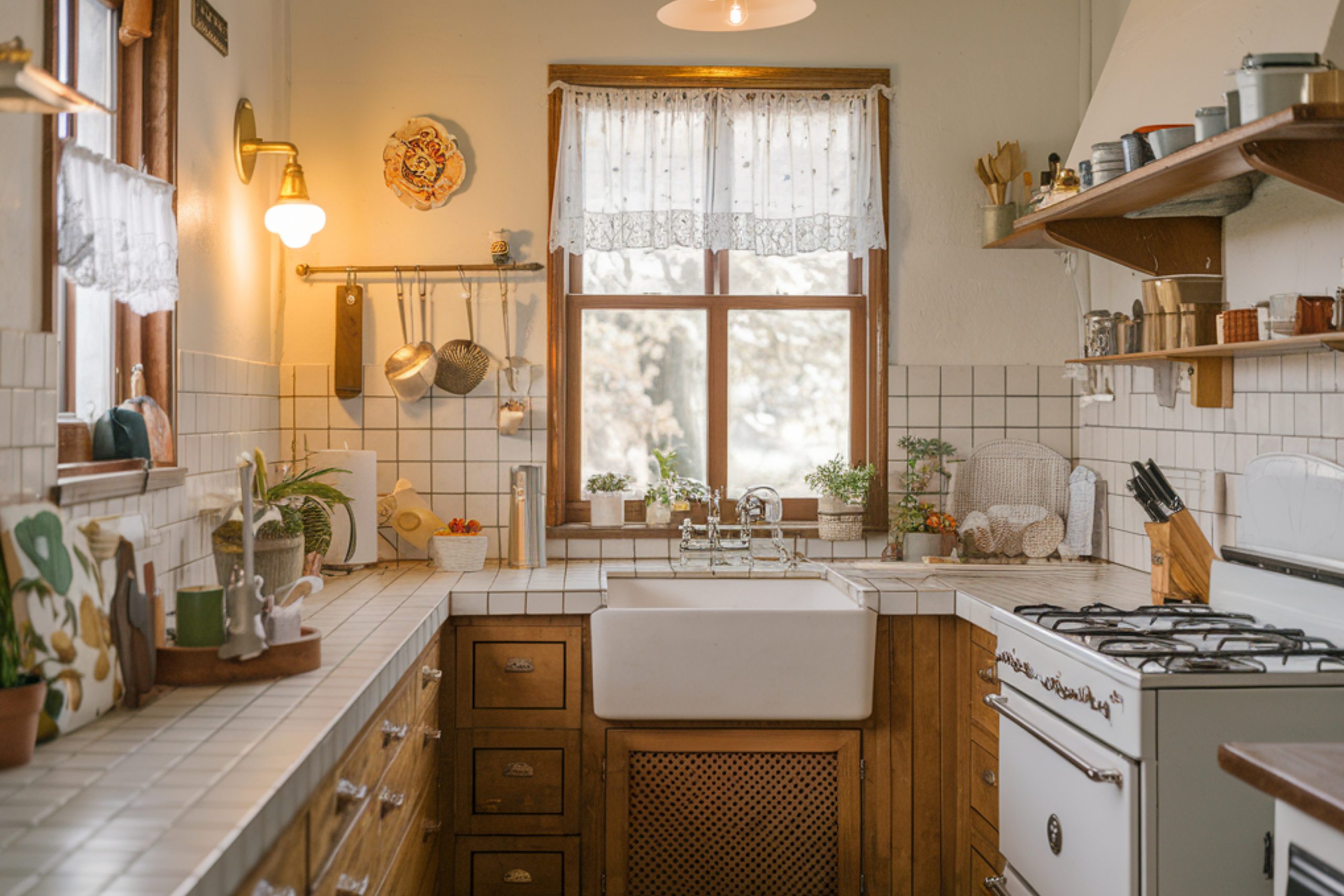
I always say—the kitchen isn’t just where we cook. It’s where we wake up with coffee, where our kids sit with homework, and where conversations somehow always happen when guests come over. It’s the heart of the house. And in 2025, the heart needs to feel just right.
Picking the right paint color for a kitchen isn’t just about trends. It’s about making your home feel like you. The right shade can make a room feel brighter, warmer, cleaner—even bigger.
And these days, buyers pay a lot of attention to kitchens. According to Zillow, homes with well-styled kitchens can sell for up to $23,000 more than expected.
Over the past year, I’ve worked in all kinds of kitchens—city condos, country homes, tiny apartments. And no matter the size or budget, these 27 paint colors have been my go-to favorites. They’re timeless without feeling old, warm without being yellow, and soft without going flat.
In this guide, I’ll walk you through each one. But I’ll also explain why I use them, how I pair them, and what works where.
This isn’t just about color swatches—it’s about what actually looks good in real homes.
Let’s get into it.
via housekeepingbay.com
Why Kitchen Paint Colors Matter in 2025
Table of Contents
When people ask me what’s changing in home design lately, I always say: it’s not just about style—it’s about feeling. And in 2025, that’s more true than ever. We’re all spending more time at home.
We want things to feel calm, clean, and welcoming. That starts with color.
A Shift Toward Calm Neutrals
Gone are the days of high-contrast cabinets and flashy accent walls in the kitchen. This year, I’m seeing a big move toward soft whites, warm grays, and earthy greens—colors that don’t fight with the rest of your home, but pull it all together. They don’t scream for attention, but they quietly make everything look better.
According to a recent Sherwin-Williams trend report, 2025 color choices are about “comfort, familiarity, and natural balance.”
These paint colors help a kitchen feel:
- Brighter in rooms without a lot of natural light
- Cleaner and more fresh (even if the cabinets are older)
- More open and spacious—especially in smaller homes
- Balanced with wood tones, metals, tile, and stone
via housekeepingbay.com
Kitchens Still Rule Resale
If you’re even thinking about selling your home in the next few years, color matters more than you’d expect. A study from HomeLight shows that a freshly painted kitchen can give a 107% return on investment.
I’ve seen buyers walk into homes and make decisions based on the kitchen alone. And when the walls are painted in colors that feel modern but cozy?
That’s what sticks with them.
My Top Picks – 27 Kitchen Colors That Work Every Time
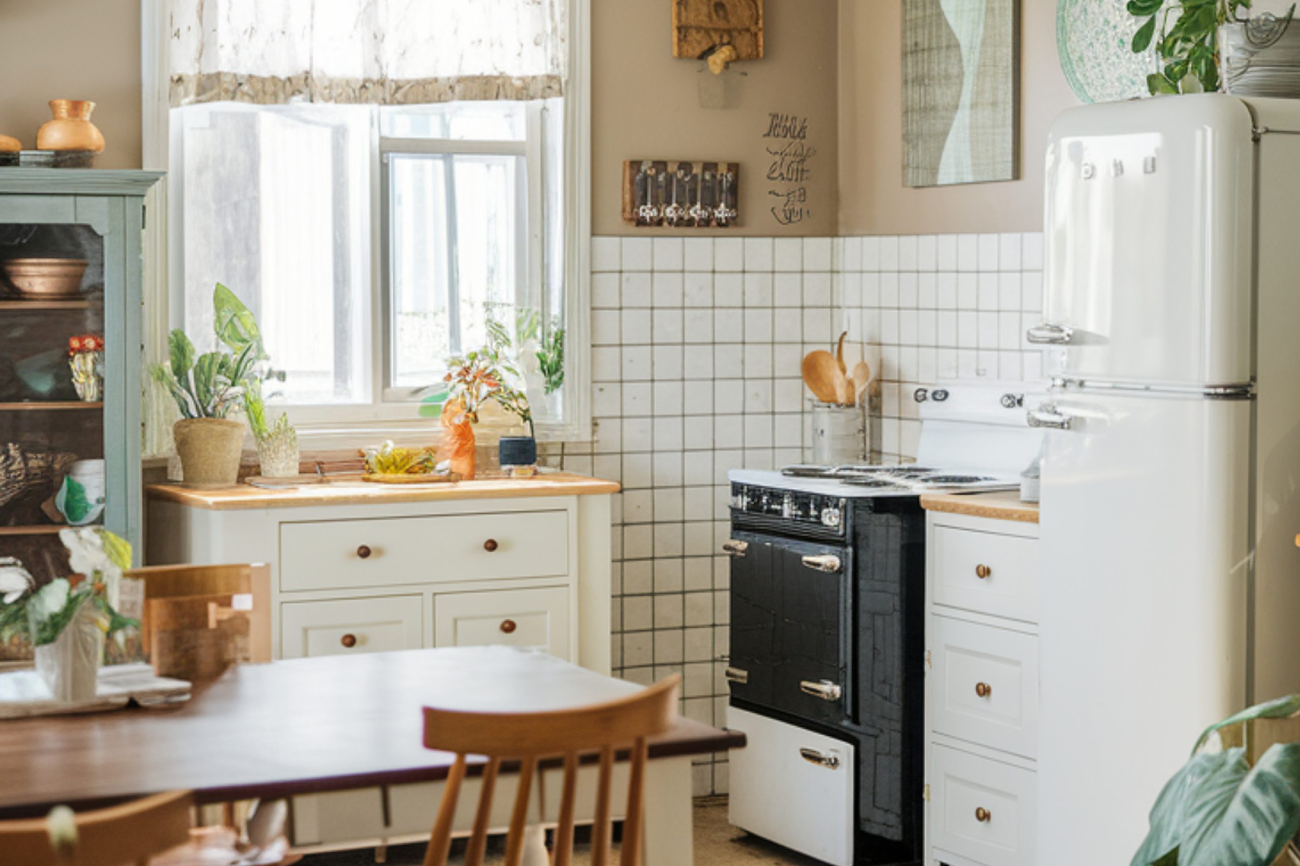
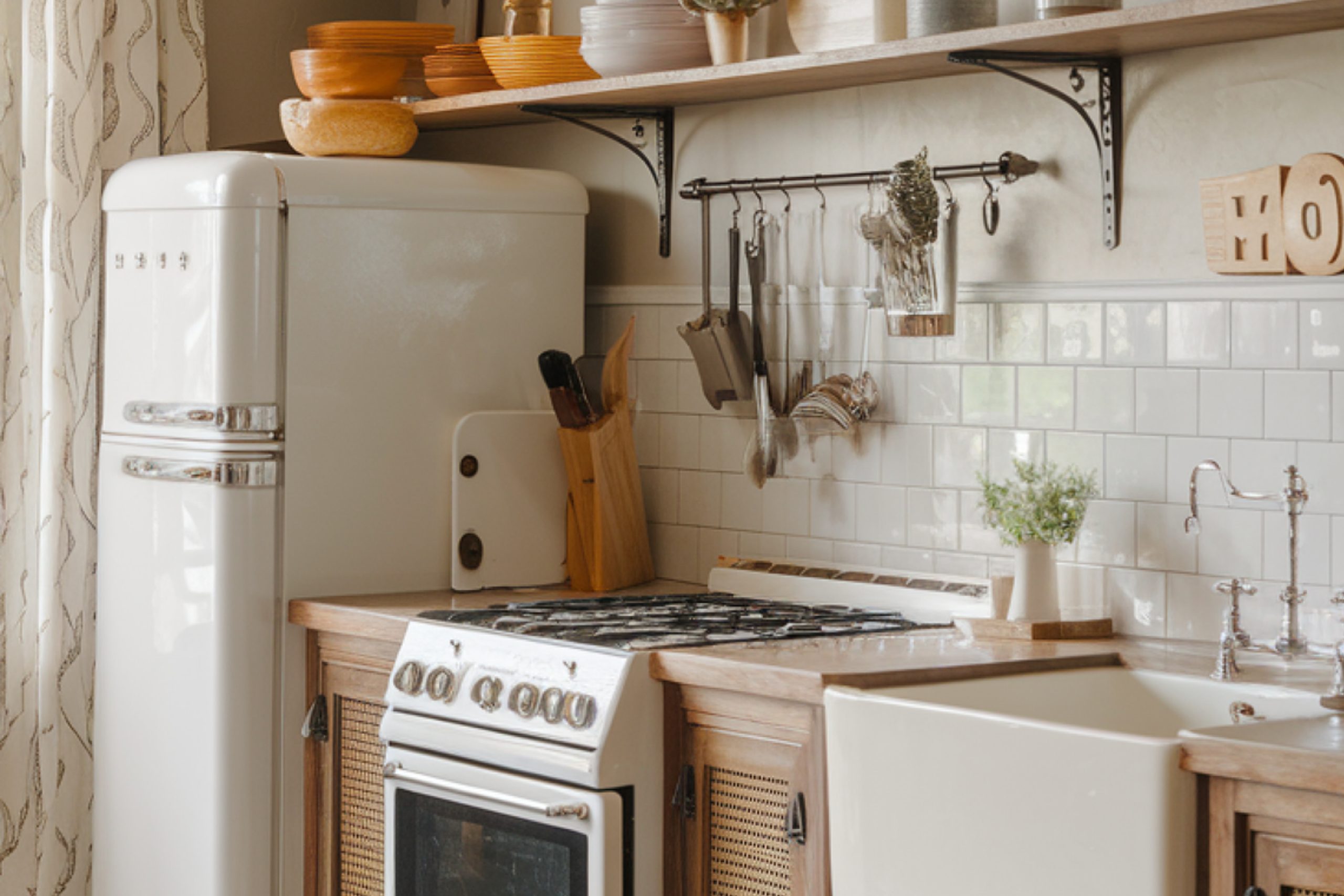
I’ve worked in a lot of kitchens—some with beautiful sunlight, others stuck in the dark. Some with white shaker cabinets, others with dark walnut or flat-panel modern styles. No matter the setup, these colors have never let me down.
To make it easier, I’ve grouped them into color families. That way, you can focus on the feel you want: crisp and clean, soft and cozy, or bold but grounded.
Crisp & Clean Whites
These are the whites I grab when I want the kitchen to feel fresh, bright, and polished—but not sterile. They work beautifully with brass, black, or stainless hardware.
1. Alabaster SW 7008
Warm, soft, and not too yellow. Joanna Gaines uses this one a lot. It makes older cabinets feel updated without looking stark.
2. Pure White SW 7005
A cleaner white with a slightly cool undertone. Great with marble countertops and chrome fixtures.
3. Greek Villa SW 7551
This one’s warmer than Pure White, but still feels light. I use it in kitchens with oak floors—it balances the tone perfectly.
4. Snowbound SW 7004
If your kitchen gets a lot of natural light, Snowbound is perfect. It reflects just enough brightness without looking blue.
5. White Dove OC-17
This one’s from Benjamin Moore, and it’s a classic for a reason. It’s soft, creamy, and forgiving. Probably my most-used white for cabinets.
6. Chantilly Lace OC-65
Brightest white on this list—almost a true white. I save it for modern kitchens with high-gloss finishes or flat slab doors.
7. Dover White SW 6385
Creamier and warmer. I love using this in traditional or farmhouse-style kitchens with open shelving and vintage details.
Soft Warm Neutrals
These colors are warm without being beige-y. They’re great when you want the kitchen to feel cozy and grounded.
8. Shoji White SW 7042
Leans a little taupe with gray undertones. I’ve used this with black counters, and it looked so rich.
9. Accessible Beige SW 7036
Don’t let the word “beige” fool you—this one has depth. Works great in open floor plans.
10. Aesthetic White SW 7035
Very pale greige, super soft. I’ve used it with green-gray cabinetry and natural stone—it looked amazing.
11. Canvas Tan SW 7531
A classic tan, but not dated. Looks beautiful with oil-rubbed bronze fixtures.
12. Pale Oak OC-20
It walks the line between off-white and greige. Very designer-friendly. Pairs well with both cool and warm tones.
13. Classic Gray OC-23
I use this one when I want things to feel light but still have a bit of character.
14. Edgecomb Gray HC-173
The most balanced greige I’ve ever used. It always works.
via housekeepingbay.com
Greige & Light Grays
These shades are your best friend if you don’t want stark white, but still want things light and airy.
15. Agreeable Gray SW 7029
The name says it all—it just works. One of Sherwin-Williams’ most popular colors for a reason.
16. City Loft SW 7631
Light gray with a hint of warmth. I used this in a mid-century remodel with walnut accents—it was perfect.
17. Drift of Mist SW 9166
One of those colors that shifts depending on the light. It keeps things soft and clean.
18. Revere Pewter HC-172
An old favorite. It’s more taupe than gray, but that’s what makes it special. Looks great with natural stone or butcher block counters.
19. Balboa Mist OC-27
Another designer favorite. Soft and subtle. Great in kitchens with open shelves and lots of dishes on display.
20. Repose Gray SW 7015
Cooler than Agreeable Gray, but still livable. Works really well in more modern kitchens.
21. Mindful Gray SW 7016
A bit deeper than Repose Gray. Looks amazing on lower cabinets or islands.
22. Coventry Gray HC-169
Has a little blue in it—clean and calm. One of my favorite picks for east-facing kitchens.
Bolder & Deeper Statements
These aren’t bright or loud. They’re grounded, rich colors that give the kitchen personality without being too much.
23. Iron Ore SW 7069
Almost black, but not flat. I love using this on lower cabinets or the island. Makes everything feel grounded.
24. Urbane Bronze SW 7048
Warm dark brown-gray. It’s moody but still very natural. The 2021 Color of the Year from Sherwin-Williams.
25. Evergreen Fog SW 9130
A soft, dusty green. Perfect for cottage-style kitchens or anywhere you want a touch of nature.
26. Sea Salt SW 6204
This color shifts with the light—sometimes blue, sometimes green. It’s clean, calm, and airy.
27. Stormy Sky 1616
A dramatic, slate blue-gray. Not for the faint of heart, but wow when done right. I’ve used this with brass hardware and it looked amazing.
How I Choose the Right One for Each Kitchen
People often think picking paint is about picking a favorite color. But honestly? It’s not. It’s about how that color looks in your kitchen, with your light, your cabinets, and everything else going on around it.
I never choose a color straight from a swatch without checking a few things first. Here’s exactly how I do it:

via housekeepingbay.com
1. Light Comes First
Light changes everything. A color that looks creamy and calm in a bright room can suddenly feel gray or even pink in a darker space.
Here’s what I always look at:
- North-facing kitchens = cooler light → I go with warmer whites like Alabaster or Pale Oak
- South-facing kitchens = warmer light → cooler tones like Drift of Mist or Sea Salt hold up better
- Little to no natural light? I usually avoid anything too gray—Greek Villa or White Dove helps keep things light
💡 Tip: Always test swatches on multiple walls. Morning and evening light are completely different.
2. Cabinet and Counter Color
You could pick the prettiest wall color—but if it clashes with your cabinets, it’s not going to feel right.
- With white cabinets: I use soft contrast like Revere Pewter or Aesthetic White
- With dark wood: warm tones like Shoji White or Accessible Beige soften the look
- With gray cabinets: try Balboa Mist or Mindful Gray to keep it cohesive
- With green or blue cabinets: I lean neutral—Classic Gray or Canvas Tan works well
3. The Home’s Style
A modern condo needs something different than a 1920s craftsman. I always think about how the kitchen connects to the rest of the house.
- Modern homes: Iron Ore or Chantilly Lace for contrast and sharpness
- Farmhouse or cottage styles: Dover White or Sea Salt feel warm and familiar
- Traditional homes: Edgecomb Gray or Urbane Bronze look timeless but still fresh
4. Real Example from a Recent Project
I worked on a kitchen last fall in a small brick bungalow. The client had oak cabinets, beige tile, and no natural light. They were thinking of going white, but every white looked gray and cold.
I tested Shoji White, and it completely changed the room. It pulled warmth from the tile, softened the wood tones, and made the kitchen feel brighter—even without sunlight.
The client told me it looked “clean but cozy”, which is exactly what we were going for.
A Few Last Thoughts Before You Pick Up That Paintbrush
If you’ve made it this far, I’m guessing you’re someone who wants their kitchen to feel right — not just look pretty for Instagram. And that’s the best kind of design decision.
Picking the right paint color isn’t about following every trend. It’s about knowing what makes you feel good in the space where your life happens.
Where you make pancakes on a Sunday, or heat up leftovers after a long day, or talk through homework while loading the dishwasher. That’s real life. And the colors around you matter more than you think.
My best advice? Don’t rush. Test a few swatches. Look at them in the morning and again at night. Trust how the room feels. And if something doesn’t feel quite right — don’t settle.
These 27 colors have helped me shape some of the best kitchens I’ve ever worked on. And I hope they help you shape one that feels like home.
via housekeepingbay.com
