Coventry Gray HC-169 by Benjamin Moore
The Perfect Shade of Sophistication for Every Space
When you’re looking to give your space a fresh, modern update, HC-169 Coventry Gray by Benjamin Moore is a stellar choice. This shade of gray is not your average color—it strikes the perfect balance between cool and warm tones, making it incredibly versatile for any room in your home. Whether you’re updating your living room, bedroom, or kitchen, Coventry Gray has a unique way of bringing a contemporary and sophisticated vibe to your space.
One of the best things about Coventry Gray is how well it plays with other colors. Whether you pair it with crisp whites for a clean, minimalist look or with bold hues for a more dramatic effect, it always seems to enhance the space. And it’s not just about looks—this color has a calming effect, creating a serene atmosphere that’s perfect for unwinding after a long day.
If you’re considering giving your walls a makeover, Coventry Gray offers a timeless appeal that can transform any room into a chic, inviting space. Its adaptability to different styles and settings means you’re investing in a color that will stay in vogue for years to come, making it an excellent choice for your next painting project.
By choosing HC-169 Coventry Gray, you’re on your way to creating a home that feels both modern and homely. So, why not give your walls the love they deserve with this stunning shade of gray?
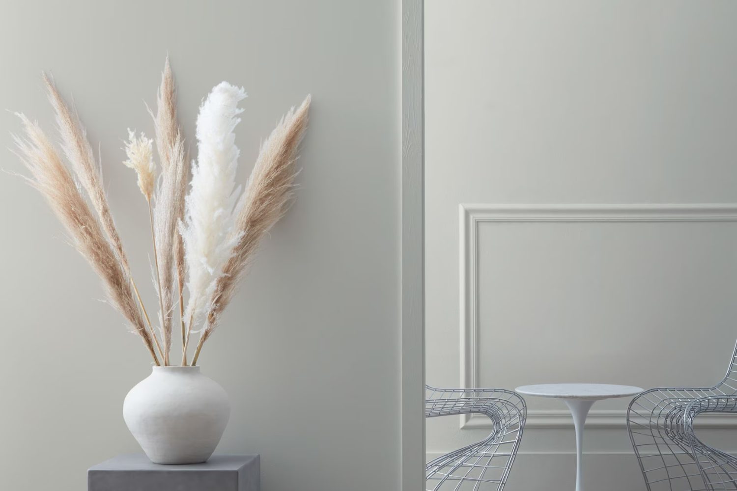
by Benjamin Moore
What Color Is Coventry Gray HC-169 by Benjamin Moore?
Coventry Gray HC-169 by Benjamin Moore is a versatile and elegant gray paint color that brings a sense of sophistication into any space. This color is a part of the Benjamin Moore Historical Collection, which is inspired by America’s historic landmarks. Coventry Gray is a balanced, medium-light gray with cool undertones. It’s not too dark or too light, making it a perfect choice for those who want a classic gray that’s easy on the eyes.
Coventry Gray works exceptionally well in a variety of interior styles, including modern, minimalist, traditional, and even coastal settings. Its timeless quality means you can use it in living rooms, kitchens, bedrooms, and home offices alike, creating a serene and inviting atmosphere.
When it comes to pairing materials and textures, Coventry Gray is remarkably accommodating. It looks stunning with natural wood, creating a warm contrast against the coolness of the gray. Metallic finishes like brushed nickel or chrome add a touch of sophistication, making the room feel more modern. For a softer approach, pairing Coventry Gray with textured fabrics like wool or linen in neutral colors can add depth and interest to the space without overwhelming it. Whether you’re combining it with sleek surfaces or soft textiles, Coventry Gray is a timeless choice that elevates the aesthetic of any room.
housekeepingbay.com
Is Coventry Gray HC-169 by Benjamin Moore Warm or Cool color?
Coventry Gray HC-169 by Benjamin Moore is a versatile and elegant paint color. It’s a light to medium gray that has a balance of warm and cool undertones. This makes it a fantastic choice for almost any room in a home. Its neutrality means it can work beautifully with a wide range of other colors. Whether you have bold furniture that you want to stand out, or you’re aiming for a more minimalist vibe, Coventry Gray can fit seamlessly into your design.
One of the best things about this color is its adaptability. In spaces with lots of natural light, it tends to look a bit lighter and can bring a fresh, airy feel to the room. In rooms with less light, it might appear slightly more profound, providing a cozy warmth without darkening the space too much. This flexibility makes it easy for homeowners to use across different rooms, maintaining a cohesive look throughout the house. Coventry Gray is especially good in living spaces, bedrooms, and kitchens, where its calming effect can be fully appreciated.
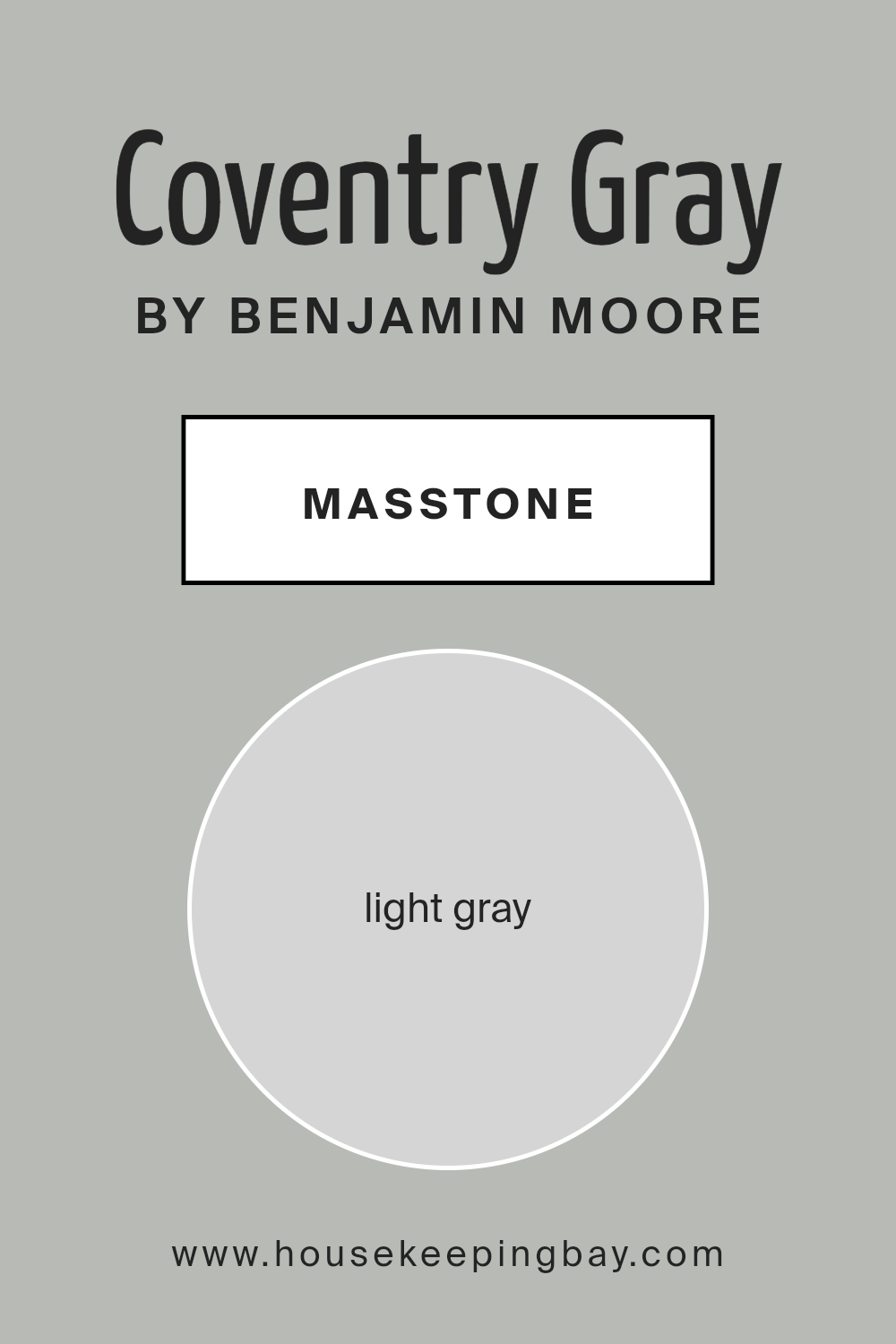
What is the Masstone of the Coventry Gray HC-169 by Benjamin Moore?
Coventry Gray HC-169 by Benjamin Moore is a beautiful shade of light gray that looks like a soft, gentle cloud. Its main color is what we call “masstone,” which here is a light gray that’s not too bright but also not too dark, kind of like the color of a cute bunny. This special shade is great for homes because it makes spaces feel open, airy, and peaceful. Since it’s a light color, it can help small rooms look a bit bigger and more inviting.
Coventry Gray works well with many other colors. Whether you have furniture in bright colors or more muted tones, this gray will support them without fighting for attention. It’s like the perfect background that lets other colors shine. Plus, this light gray can make your home feel modern and stylish but also cozy and warm at the same time. It’s a flexible color that can make many different rooms and styles look amazing.
housekeepingbay.com
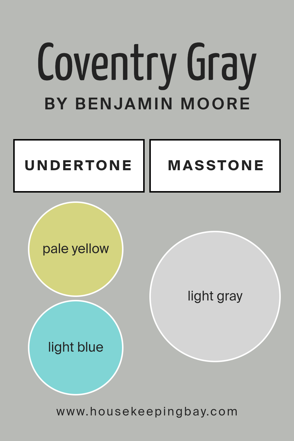
Undertones of Coventry Gray HC-169 by Benjamin Moore
Coventry Gray HC-169 by Benjamin Moore is a versatile color that balances between cool and warm tones, making it a popular choice for interior walls. The secret behind its appeal lies in its complex undertones, which include pale yellow, light blue, light purple, mint, pale pink, lilac, and grey. These undertones are like hidden colors that can influence the main shade of gray in different ways depending on the light and surrounding colors.
In general, undertones can make a significant difference in how we perceive a color. They can shift a color to appear cooler or warmer, and even change how it feels in a room. For example, a gray with blue undertones might look more refreshing and crisp, while one with yellow undertones could feel warmer and more inviting.
When it comes to Coventry Gray HC-169, its mix of undertones allows it to adapt to various settings and lighting conditions. The pale yellow and mint bring a subtle warmth, making a room feel cozier. Light blue and lilac add a calming effect, perfect for creating a serene space. The touch of pale pink can add a soft, almost playful feel. Finally, the inclusion of grey ensures that the color maintains its grounded, neutral base.
On interior walls, Coventry Gray HC-169 can transform a space due to its rich blend of undertones. It can pair well with a wide range of decor, from modern to traditional. Depending on the room’s light and accent colors, this gray can look vibrant and lively or calm and soothing. Its ability to shift in different lights and settings makes it a go-to choice for designers and homeowners looking to create spaces that are both beautiful and flexible.
housekeepingbay.com
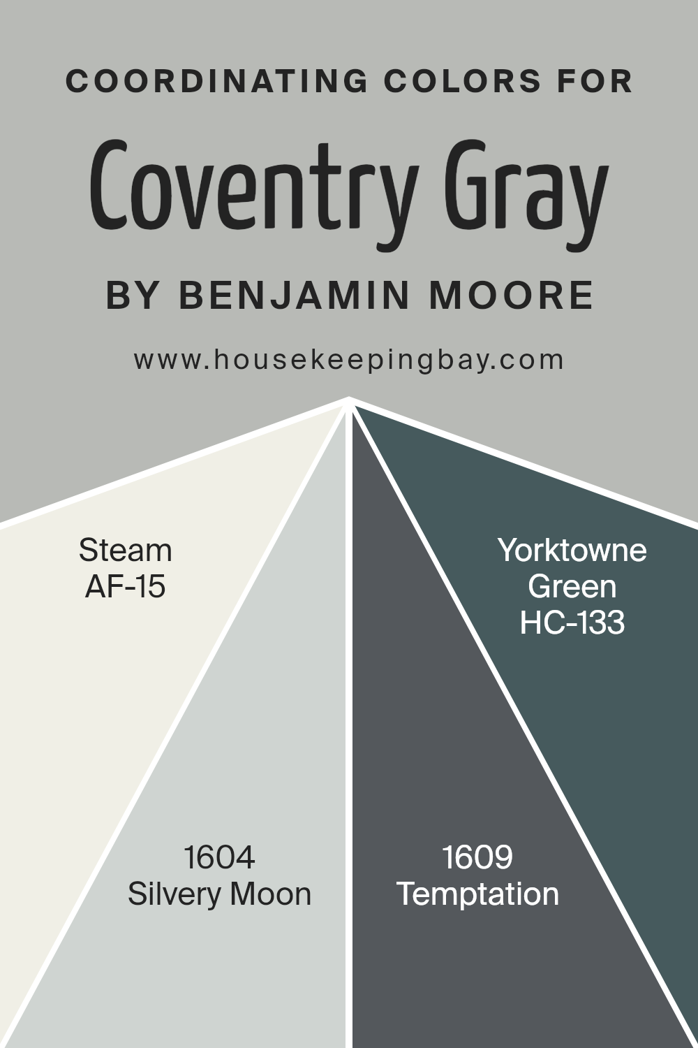
Coordinating Colors of Coventry Gray HC-169 by Benjamin Moore
Coordinating colors are hues that complement each other beautifully when used together in any space. They have a harmonious relationship, balancing out the ambiance without overwhelming it. For example, Coventry Gray HC-169 by Benjamin Moore serves as a sophisticated neutral base. It’s a versatile color that pairs well with a variety of accent colors to create a cohesive look. When choosing coordinating colors for Coventry Gray, it’s essential to consider colors that will enhance its elegance and versatility.
AF-15 – Steam is a soft, off-white that mirrors the calm and clarity of early morning mist. Its light touch adds brightness to spaces, making it a perfect match for Coventry Gray, creating a subtle and inviting atmosphere. Silvery Moon 1604, on the other hand, is a gentle gray with a hint of luminosity.
It reflects light beautifully, providing a serene backdrop that complements the deeper tones of Coventry Gray. Temptation 1609 shifts the dynamic slightly with its deeper, more pronounced shade. This color adds depth and interest, offering a striking contrast that highlights the sophisticated edge of Coventry Gray. Lastly, HC-133 – Yorktowne Green, brings in a natural, earthy element. Its rich, organic feel introduces a refreshing contrast against the cooler tones of Coventry Gray, rounding out the palette with a touch of vibrant, natural color. Together, these colors work seamlessly to create environments that are both welcoming and stylish.
You can see recommended paint colors below:
- AF-15 Steam
- 1604 Silvery Moon
- 1609 Temptation
- HC-133 Yorktowne Green
housekeepingbay.com
How Does Lighting Affect Coventry Gray HC-169 by Benjamin Moore?
Lighting plays a crucial role in how we perceive colors. The same paint, like Coventry Gray HC-169 by Benjamin Moore, can look very different under various light sources. This color, a sophisticated and versatile gray, can transform based on the type of light and direction it comes from.
- In artificial light, Coventry Gray HC-169’s appearance depends on the bulb’s color temperature. Warm lights, like those from incandescent bulbs, can make it appear softer and slightly more beige, adding a cozy feel to a room. Cooler lights, like LED or fluorescent bulbs that mimic daylight, can make the color appear sharper and more true to its cool gray nature, giving a more modern and crisp look.
- In natural light, Coventry Gray shows its true diversity. The amount of sunlight and the room’s orientation significantly affect its appearance. North-facing rooms receive less direct sunlight and can make Coventry Gray look cooler and more shadowy, enhancing its gray qualities without becoming too dark. This creates a calm, serene ambiance perfect for bedrooms and offices.
- South-facing rooms are filled with warm, direct light for most of the day, which can make Coventry Gray appear lighter and slightly warmer. This adds a bright, inviting feel to the space, making it ideal for living rooms and kitchens.
- East-facing rooms get bright morning light, making Coventry Gray look bright and airy early in the day, then cooler and more muted as the day progresses. This makes east-facing rooms versatile and dynamic.
- West-facing rooms experience the opposite effect, with the color appearing muted in the morning and then warming up in the afternoon and evening as the sunlight gets stronger. This creates a welcoming and cozy atmosphere in the afternoon, perfect for relaxation.
Overall, Coventry Gray HC-169 by Benjamin Moore is a flexible color that adapts to its lighting, providing various moods and atmospheres in different settings.
housekeepingbay.com
What is the LRV of Coventry Gray HC-169 by Benjamin Moore?
With an LRV of 48.18, Coventry GrayHC-169 by Benjamin Moore is right in the middle of the scale. This means it has a balanced light reflectance, making it versatile for use in various lighting situations. In rooms with plenty of natural light, Coventry Gray will appear lighter and more airy, while in spaces with less light, it will present a slightly darker, more muted look.
Its neutral LRV makes it a flexible choice for many different spaces, offering enough reflectance to brighten a room without the risk of overwhelming it with brightness. This makes Coventry Gray a good option for creating a peaceful and sophisticated atmosphere in your home.

housekeepingbay.com
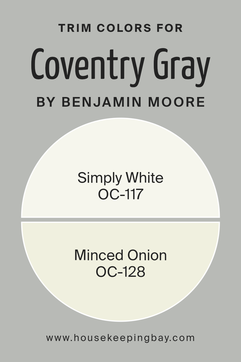
What are the Trim colors of Coventry Gray HC-169 by Benjamin Moore?
Trim colors are the hues selected for the architectural elements of a room or exterior, like door frames, window sills, skirtings, and moldings. These colors play a crucial role in defining the overall look of a space, adding contrast, depth, or harmony to the main color palette. For a sophisticated shade like Coventry Gray HC-169 by Benjamin Moore, choosing the right trim color can enhance its elegant and timeless appeal. The trim color can act as a subtle frame, highlighting the walls’ color, or it can introduce a soft dialogue between the wall and the trim, depending on the chosen shade.
Simply White OC-117 is a clean, bright, and versatile white with a slightly warm undertone, making it an excellent choice for trims with Coventry Gray walls. It brings a crispness that can make the gray pop, creating a fresh and inviting ambiance. On the other hand, Minced Onion OC-128 offers a softer approach with its light, airy feel, infused with just a hint of warmth. This color adds a subtle depth to the room, ensuring the transition between the wall color and the trim is smooth and pleasing to the eye. Both of these colors support Coventry Gray in making the space feel cohesive and well-thought-out, showcasing the beauty of the architecture and the thoughtful combination of colors.
You can see recommended paint colors below:
- OC-117 Simply White
- OC-128 Minced Onion
housekeepingbay.com
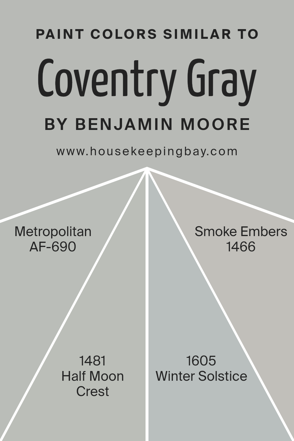
Colors Similar to Coventry Gray HC-169 by Benjamin Moore
Choosing similar colors can play a critical role in achieving a cohesive and harmonious look in any space. Colors that share a similar hue, like Coventry Gray HC-169 by Benjamin Moore and its analogous counterparts, create a subtle yet effective visual flow, making a room feel well put together. The reason behind this is quite simple: similar colors have close ties in their color properties, allowing them to blend seamlessly with one another while still adding depth and interest to a design scheme. Instead of competing for attention, they support and enhance each other, creating a serene and inviting atmosphere.
For example, Metropolitan AF-690 is a sophisticated shade that lends an air of quiet refinement to any room, echoing the understated elegance of Coventry Gray but with a touch of warmth. Half Moon Crest 1481, on the other hand, introduces a slightly deeper and more nuanced expression, adding a layer of complexity and richness to spaces without overwhelming them. Then there’s Winter Solstice 1605, a lighter, ethereal variant that brings a breath of freshness, mimicking the crisp feel of early dawn. Smoke Embers 1466 rounds out the selection with its subtle blend of gray and taupe, offering a balancing act that grounds the space in tranquility. Together, these colors weave a visual narrative that is both coherent and captivating, demonstrating how closely linked hues can elevate a design from simple to extraordinary.
You can see recommended paint colors below:
- AF-690 Metropolitan
- 1481 Half Moon Crest
- 1605 Winter Solstice
- 1466 Smoke Embers
housekeepingbay.com
Colors that Go With Coventry Gray HC-169 by Benjamin Moore
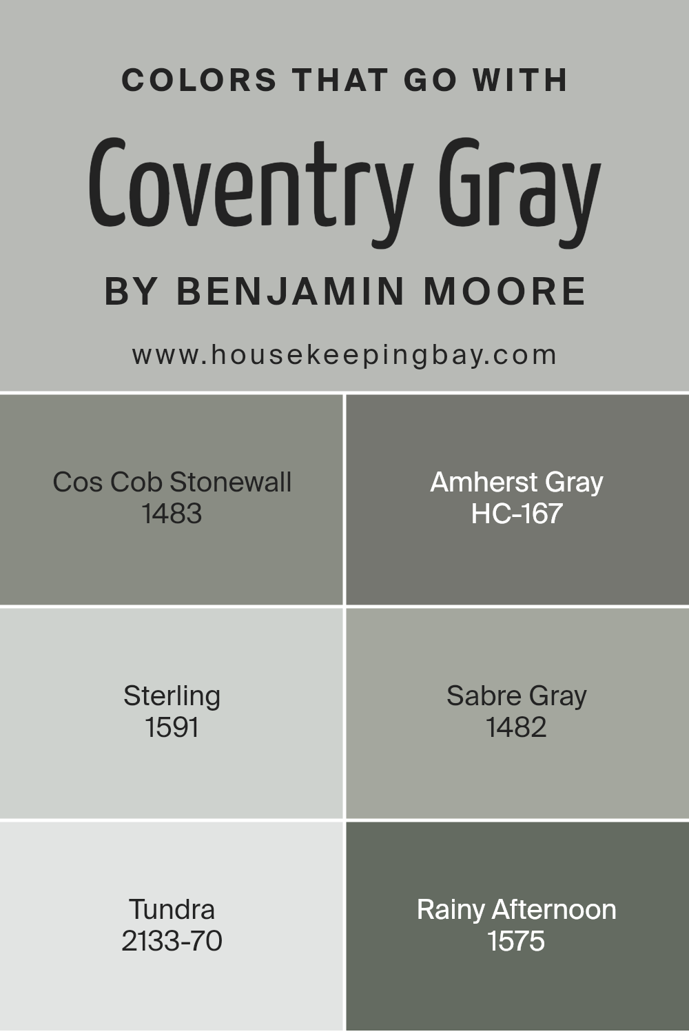
Choosing the right colors to complement Coventry Gray HC-169 by Benjamin Moore is essential for creating a harmonious and appealing aesthetic in any space. When paired wisely, these colors enhance Coventry Gray’s versatile and sophisticated nature, allowing it to fit seamlessly into a variety of design styles, from modern to traditional. The selected colors work together by either offering a striking contrast that adds visual interest or by providing a subtle transition that unifies the room’s look.
Cos Cob Stonewall 1483 is a warm, earthy hue that brings a sense of calmness and grounding when paired with Coventry Gray, reminding one of a sturdy stone wall amidst a tranquil landscape. Amherst Gray HC-167, on the other hand, is a deeper shade that adds depth and definition to spaces, creating a sophisticated backdrop when combined with the lighter Coventry Gray. Sterling 1591 is a gentle, silvery shade that injects a fresh, airy feel into interiors, working with Coventry Gray to produce a serene and inviting atmosphere.
Sabre Gray 1482 offers a muted, soft alternative for those looking to achieve a refined and elegant décor, blending beautifully with Coventry Gray to evoke a sense of understated elegance. Tundra 2133-70 introduces a subtle, creamy undertone that contrasts with Coventry Gray, offering a lightness that can make spaces feel more expansive and welcoming.
Lastly, Rainy Afternoon 1575 provides a depth similar to that of a stormy sky, creating a cozy and enveloping feel that complements the cooler tones of Coventry Gray, perfect for creating a retreat-like ambiance in any room. Together, these colors form a palette that enhances the adaptability and beauty of Coventry Gray, allowing it to become the foundation of diverse aesthetic themes.
You can see recommended paint colors below:
- 1483 Cos Cob Stonewall
- HC-167 Amherst Gray
- 1591 Sterling
- 1482 Sabre Gray
- 2133-70 Tundra
- 1575 Rainy Afternoon
housekeepingbay.com
How to Use Coventry Gray HC-169 by Benjamin Moore In Your Home?
Coventry Gray HC-169 by Benjamin Moore is a timeless and versatile color that can add a touch of elegance to any home. Its unique shade is a perfect balance between gray and blue, making it an ideal choice for those looking to introduce a serene and sophisticated vibe into their living spaces. This color works wonders in rooms that get a lot of natural light, as it can change its tone slightly throughout the day, adding depth and interest to your walls.
You can use Coventry Gray in various ways around your home. It’s great for living rooms or bedrooms where a calming atmosphere is desired, helping to create a peaceful retreat from the busyness of everyday life. In bathrooms or kitchens, Coventry Gray pairs beautifully with white cabinets or tiles, offering a clean and modern look. For an extra touch of elegance, consider using it alongside bold or deep-colored accents like navy or burgundy. Whether you decide to paint an entire room or just an accent wall, Coventry Gray HC-169 offers a stylish and refined backdrop that enhances any decor style.
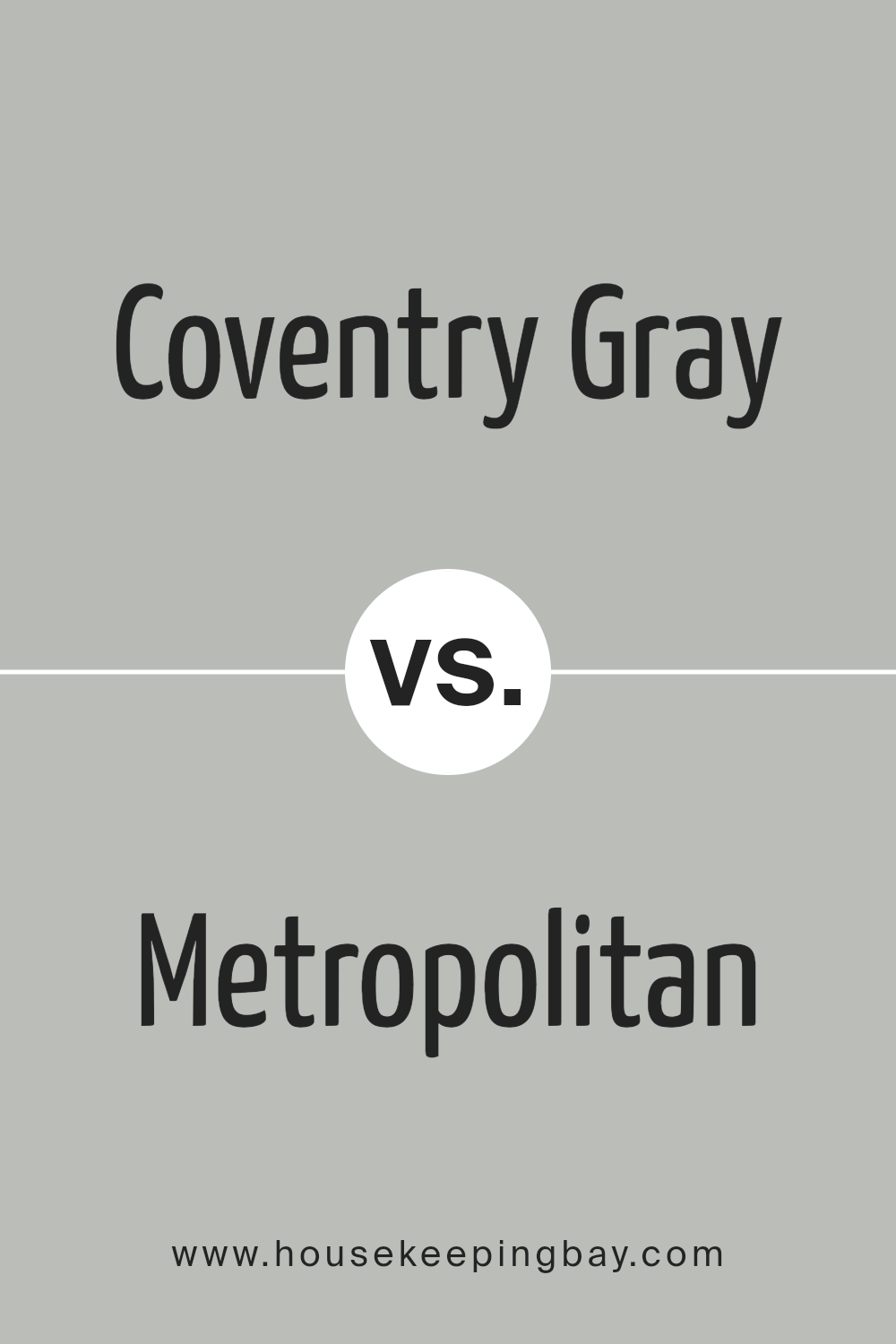
Coventry Gray HC-169 by Benjamin Moore vs Metropolitan AF-690 by Benjamin Moore
Coventry Gray HC-169 and Metropolitan AF-690, both by Benjamin Moore, are popular colors that offer unique shades for any room. Coventry Gray is a true, balanced gray. It’s like a cloudy sky, providing a soft, neutral backdrop that works well in various spaces. On the other hand, Metropolitan AF-690 is a bit more complex. It leans towards a soft, sophisticated gray with subtle blue undertones, giving a calm and serene feeling to any space it graces.
While Coventry Gray offers a straightforward approach to gray, giving a steady and classic feel, Metropolitan carries a slight hint of color that adds a touch of elegance without being too bold. Whether you’re looking for a pure gray to complement a range of designs or a gray with a hint of blue to add depth and interest, these two colors have something to offer. Both are versatile, but the choice between them depends on the specific mood or style you aim to achieve in your space.
You can see recommended paint color below:
- AF-690 Metropolitan
housekeepingbay.com
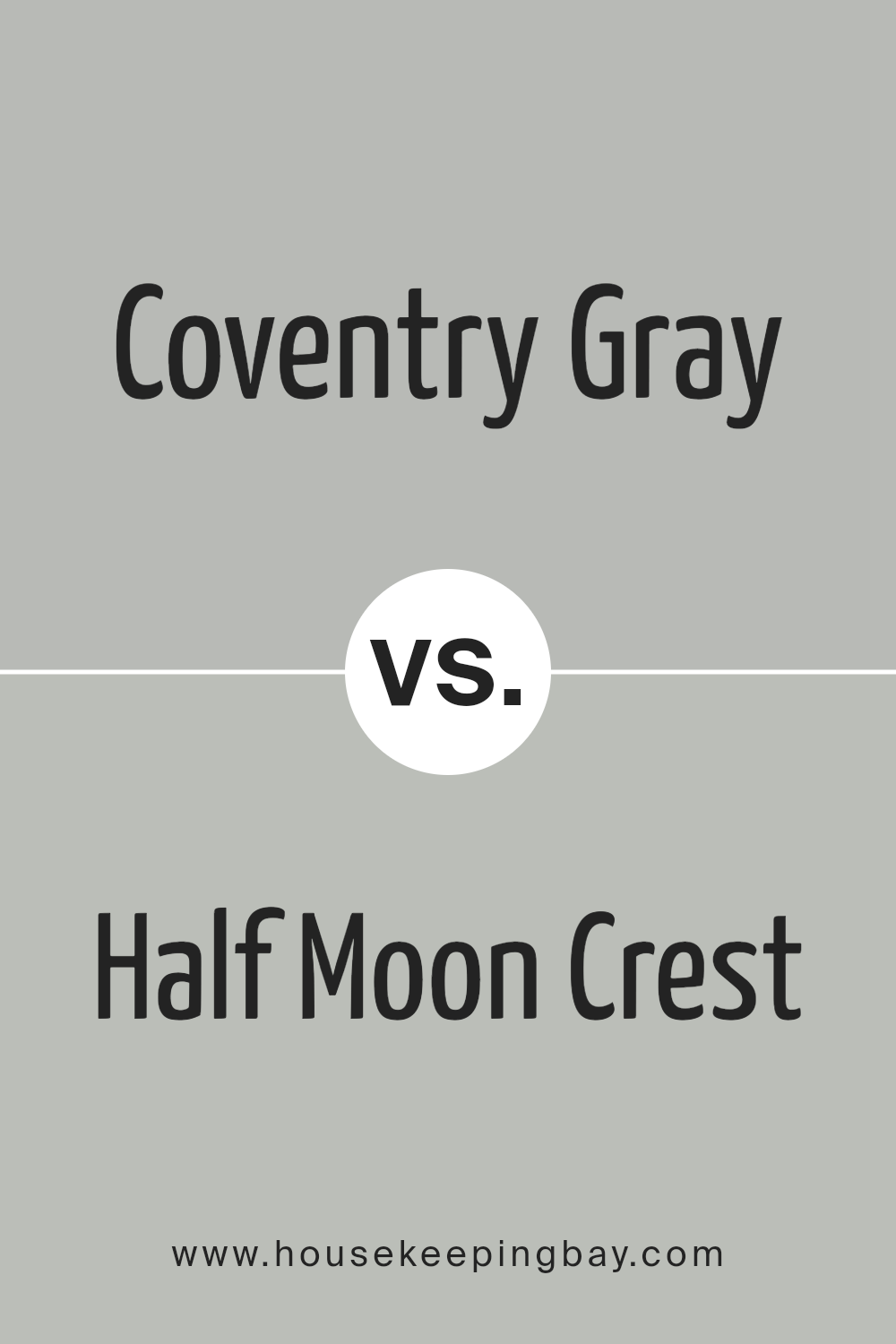
Coventry Gray HC-169 by Benjamin Moore vs Half Moon Crest 1481 by Benjamin Moore
Coventry Gray HC-169 by Benjamin Moore and Half Moon Crest 1481, also by Benjamin Moore, are two unique colors that bring their own special feels to spaces. Coventry Gray is a true, balanced gray. It’s not too dark, but also not too light, making it a versatile choice for many rooms. It has a cool undertone, giving it a fresh, crisp look, perfect for modern and minimalist designs.
On the other hand, Half Moon Crest 1481 leans towards a softer, warmer gray with a hint of lavender under certain lighting. This subtle nuance adds a cozy, inviting feel to spaces, making it great for bedrooms or living areas where comfort is key.
While both colors share a gray base, Coventry Gray offers a more classic, straightforward gray look. In contrast, Half Moon Crest brings a subtle warmth and complexity with its slight lavender tint. Depending on the room’s mood and the furnishings, each color has its charm, with Coventry Gray fitting sleek, contemporary spaces and Half Moon Crest complementing cozy, intimate settings.
You can see recommended paint color below:
- 1481 Half Moon Crest
housekeepingbay.com
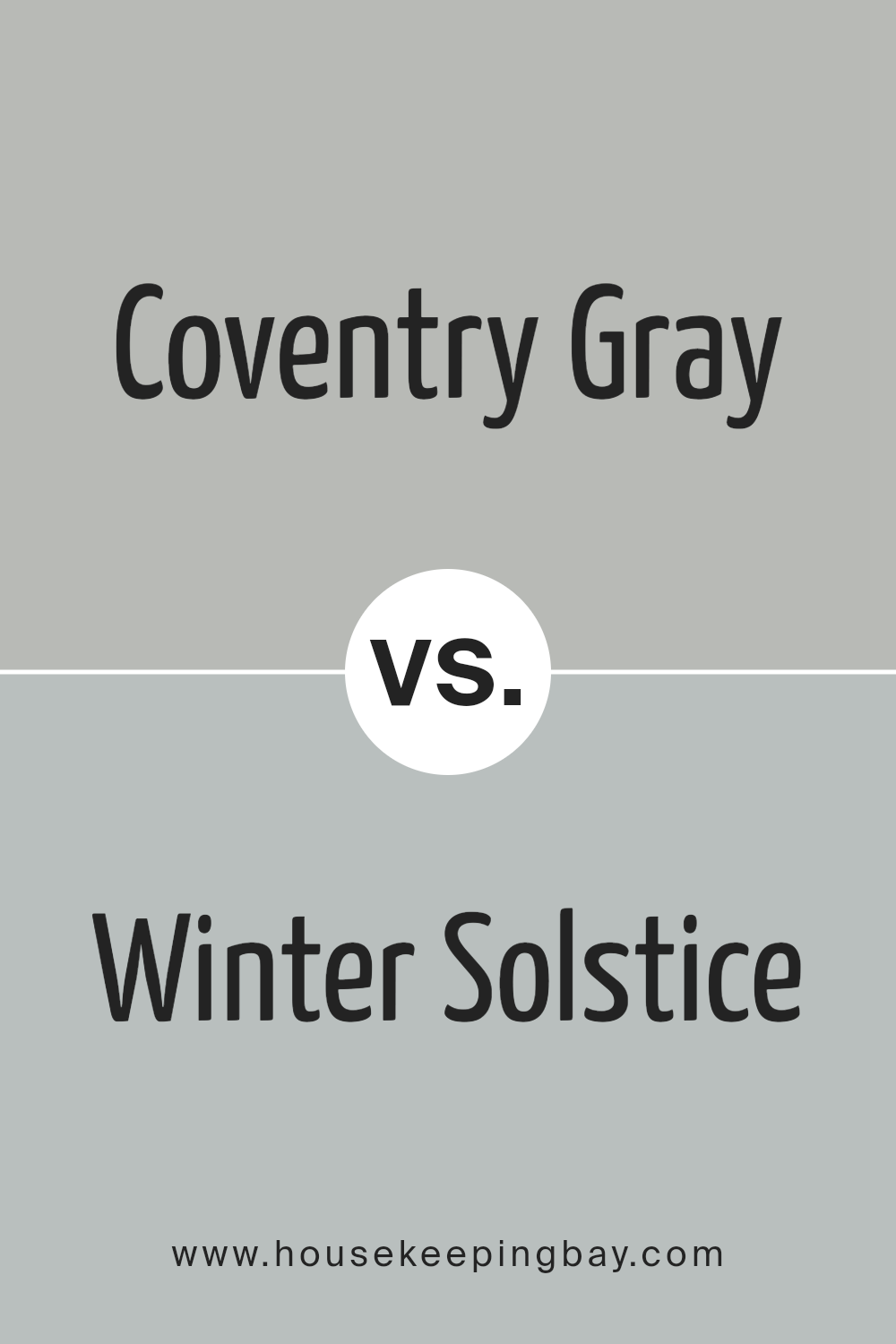
Coventry Gray HC-169 by Benjamin Moore vs Winter Solstice 1605 by Benjamin Moore
Coventry Gray HC-169 by Benjamin Moore is a versatile, mid-tone gray that carries a cool undertone. It’s a balanced gray, neither too dark nor too light, making it a fantastic choice for various spaces, whether it’s a living room, a bedroom, or an office. This color offers a sophisticated look without feeling too heavy or overwhelming.
On the other hand, Winter Solstice 1605 by Benjamin Moore leans towards the softer side of the color spectrum. It’s a gentle, light gray that almost whispers its presence in a room. With its subtle warmth, Winter Solstice creates a serene and inviting ambiance, perfect for areas where calm and peace are desired, like bedrooms or studies.
While both colors share the basic essence of gray, their impact on a room’s mood and feel is distinct. Coventry Gray brings a solid, classic foundation, suitable for dynamic, stylish spaces. In contrast, Winter Solstice offers a lighter, airier feel, promoting tranquility and restfulness. Together, they cater to different tastes and room functions, each bringing its own unique gray shade to enhance home decor.
You can see recommended paint color below:
- 1605 Winter Solstice
housekeepingbay.com
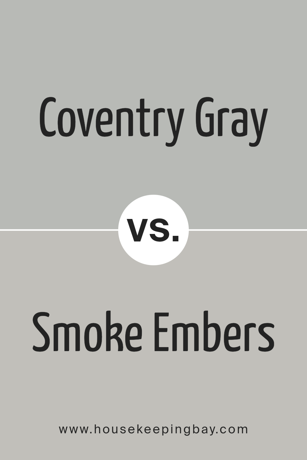
Coventry Gray HC-169 by Benjamin Moore vs Smoke Embers 1466 by Benjamin Moore
Coventry Gray HC-169 by Benjamin Moore and Smoke Embers 1466 are both unique, yet they share a subtle elegance. Coventry Gray is a soft, soothing gray that has a hint of blue. This color is light enough to make a room feel airy and spacious but has enough depth to add character and sophistication. On the other hand, Smoke Embers is a warmer gray with hints of brown. It’s a cozy color, perfect for creating a welcoming and comfortable atmosphere in any room.
While Coventry Gray leans towards a cooler palette, making spaces feel more open and calm, Smoke Embers brings warmth into a room, making it feel more intimate and snug. Both colors are versatile and can complement various decor styles, but their distinct undertones can dramatically influence the mood and aesthetic of a space. Whether you prefer the cool serenity of Coventry Gray or the warm embrace of Smoke Embers, both colors offer a beautiful backdrop for any interior.
You can see recommended paint color below:
- 1466 Smoke Embers
housekeepingbay.com
Conclusion
In conclusion, HC-169 Coventry Gray by Benjamin Moore is a standout choice if you’re looking to refresh your space with a touch of elegance and sophistication. This particular shade of gray offers a perfect balance, neither too dark nor too light, making it versatile enough to fit into a wide range of interior designs and styles. Whether you’re aiming to create a serene and inviting living room, a crisp and professional home office, or even a peaceful and relaxing bedroom, Coventry Gray has got you covered.
Its adaptability also means it pairs beautifully with both modern and traditional decor, bridging the gap between different tastes and preferences. You can easily match it with bold colors for a striking contrast or keep things subtle with soft, neutral tones. The quality of Benjamin Moore paint ensures that whatever project you decide to undertake, the results will be durable and long-lasting, helping your walls look fantastic for years to come.
So, if you’re pondering a makeover for your home or simply want to refresh a specific room, Coventry Gray is an excellent choice to consider. Its timeless appeal guarantees that you’ll enjoy your space’s new look now and in the future, making it a wise and stylish investment for any home makeover plan.
housekeepingbay.com
Ever wished paint sampling was as easy as sticking a sticker? Guess what? Now it is! Discover Samplize's unique Peel & Stick samples. Get started now and say goodbye to the old messy way!
Get paint samples
