Top 25 Most Popular Paint Colors for the Living Room in 2025
Best-Selling Neutrals Designers Trust This Year
Choosing the right paint color for the living room can feel like a lot. I’ve been in so many homes where just changing the wall color made everything feel fresh and calm. In 2025, I’ve seen some clear favorites from Sherwin-Williams that clients keep asking for—whether they’re redecorating or staging to sell.
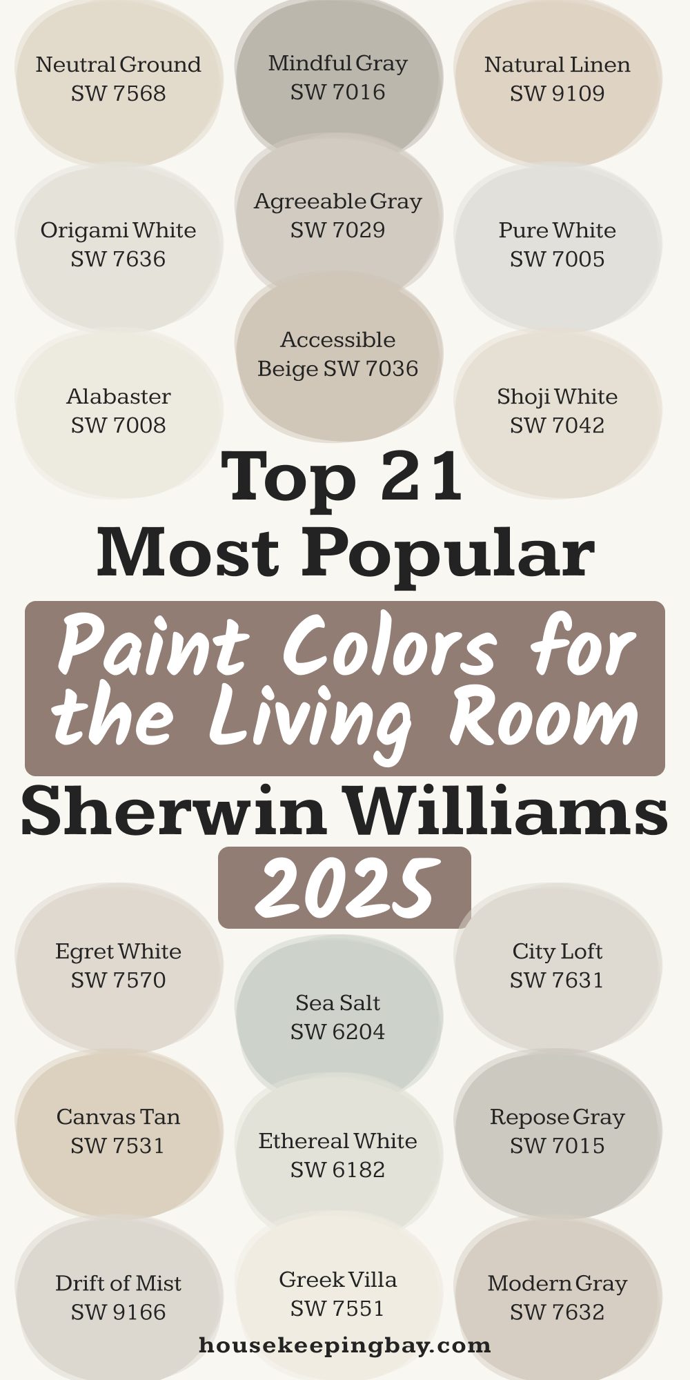
Here are the top 21 shades that are showing up everywhere this year.
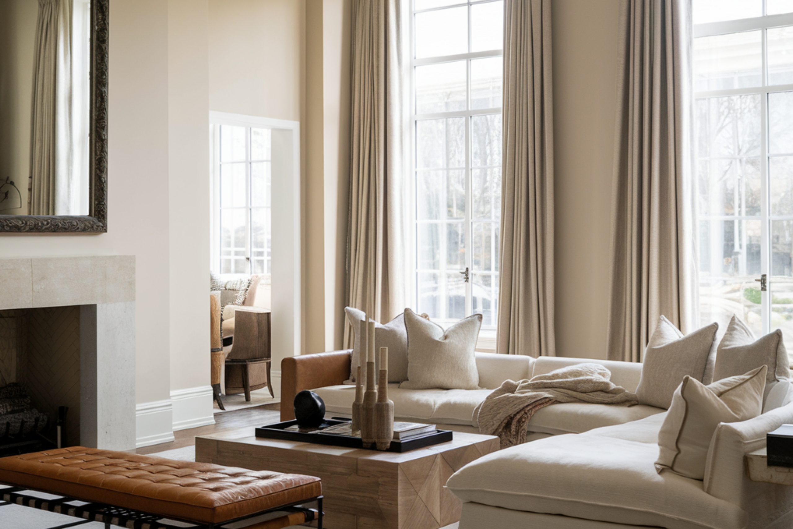
via housekeepingbay.com
1. Agreeable Gray SW 7029
Table of Contents
Soft, calm, and not too cool or too warm. This is the shade I use when someone says, “I just want something neutral that goes with everything.” It’s a true crowd-pleaser.
Great for: Homes with mixed tones (gray and beige furniture)
My tip: Looks amazing with white trim and black accent pieces
Stat: According to Zillow, homes with light gray walls sold for $3,500 more on average in 2023
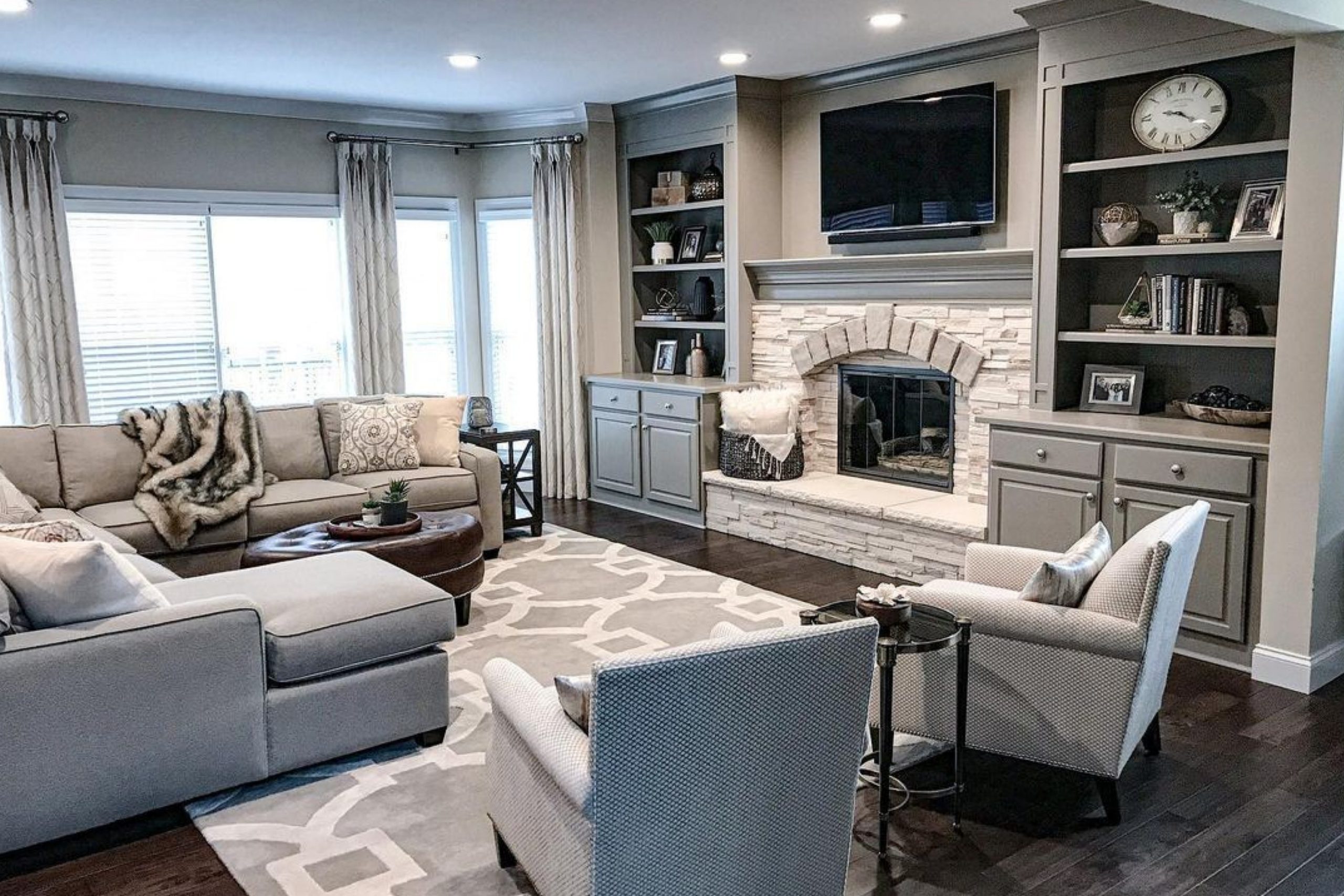
2. Accessible Beige SW 7036
This one has a warmer touch than Agreeable Gray. It’s great in rooms with lots of natural light.
Great for: Family rooms with warm wood tones
My tip: I like to pair it with navy or forest green accents
Who loves it: People who want beige but not the old-school yellowy kind
via blacksburgbelle.com
3. Alabaster SW 7008
A soft white with a creamy warmth. I love it when someone wants white walls, but not a cold, stark look.
Great for: Smaller living rooms to make them feel bigger
My tip: Combine with linen curtains and rattan furniture for a light, cozy vibe
Quote: Joanna Gaines once called Alabaster “the perfect white”
4. Shoji White SW 7042
This one’s soft and a little warm, but not beige. Think of it like a neutral hug on your walls.
Great for: Neutral decor with layered textures
My tip: Looks beautiful with oak floors and matte black hardware
5. Origami White SW 7636
Cleaner than Shoji White, but still gentle. It’s great if you want your walls to feel quiet but crisp.
Great for: Modern or Scandinavian-style rooms
My tip: Works best with cooler toned accessories
6. Pure White SW 7005
This is my go-to for a clean white that still feels soft—not sterile.
Great for: Homes with minimal or modern decor
My tip: Perfect for pairing with bold art or colorful rugs
7. Natural Linen SW 9109
Warm and earthy, like a cozy blanket on the wall.
Great for: Rustic or farmhouse styles
My tip: Try it with leather furniture and soft lighting
8. Neutral Ground SW 7568
This beige feels light and open. I recommend it to people who want something safe but not boring.
Great for: Homes with mixed metal finishes (gold and black)
My tip: Pair with deep greens or rust accents for a modern touch
9. Egret White SW 7570
A soft mix of gray and beige—very subtle and calm.
Great for: Open floor plans
My tip: Blends well with both cool and warm color palettes
10. Canvas Tan SW 7531
This one has an old-school feel but works beautifully with modern decor when done right.
Great for: Traditional homes or historic properties
My tip: Use it with dark wood and white trim for balance
11. Drift of Mist SW 9166
A super soft gray with just a whisper of warmth.
Great for: Rooms that don’t get a lot of sunlight
My tip: Use with chrome or brushed nickel fixtures
12. Ethereal White SW 6182
Despite the name, this color reads more like a muted off-white with a tiny greenish base.
Great for: Calming rooms or wellness-inspired decor
My tip: Best with plants and natural materials like jute
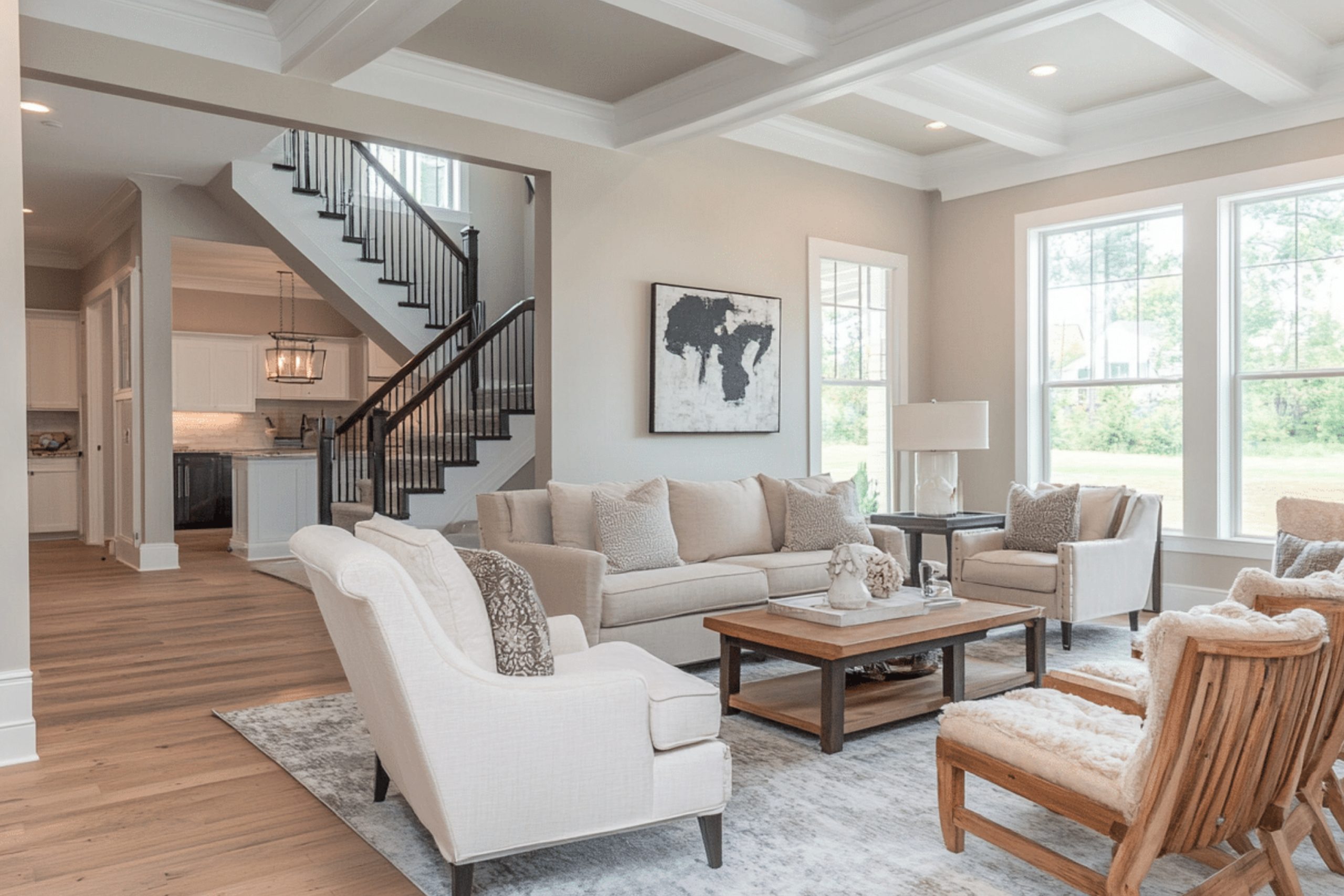
13. City Loft SW 7631
Gray with a soft brownish tone. Subtle but full of personality.
Great for: Apartments or condos with urban style
My tip: Use warm lighting to bring out its depth
via enthrallinggumption.com
14. Repose Gray SW 7015
A cool neutral that’s very popular in newer builds. It feels clean without feeling cold.
Great for: People who like gray but don’t want it too icy
My tip: Mix with white furniture and soft textiles
15. Greek Villa SW 7551
A creamy white with a little warmth. Elegant but simple.
Great for: All-white rooms with texture (not just color)
My tip: I love it with gold or brass lighting
16. Modern Gray SW 7632
More taupe than gray. This one feels safe but stylish.
Great for: First-time homeowners
My tip: Add greenery or dark wood to make it pop
17. Sea Salt SW 6204
A muted greenish-gray that feels fresh but not loud.
Great for: Coastal or cottage-style living rooms
My tip: Use white trim and soft blue pillows for a relaxed feel
Stat: Sherwin-Williams named Sea Salt one of their top 5 calming colors

via homedit.com
18. Mindful Gray SW 7016
Deeper than Repose Gray but still soft enough for everyday use.
Great for: Living rooms with darker furniture
My tip: Pair with lighter art and warm wood tones
19. Worldly Gray SW 7043
This is a warmer gray that feels grounded but modern.
Great for: Homes with travertine or beige tile
My tip: Great backdrop for neutral layered decor
20. Dover White SW 6385
A creamy white that’s soft and welcoming.
Great for: Family spaces or rooms with lots of kids’ stuff
My tip: I love this with blush or light blue accessories
21. Urban Putty SW 7532
Very beige, very classic. It’s not trendy, but sometimes that’s the point.
Great for: Traditional homes or rentals
My tip: Pair with deep navy or burgundy for contrast
via housekeepingbay.com
Top 4 Living Room Paint Colors by Benjamin Moore (2025)
Sherwin-Williams may have more shades people ask for, but these four from Benjamin Moore? They’re the ones I hear about when someone says, “I saw this on Pinterest and I need it.” Each one is soft, flexible, and works in almost any living room.
22. Revere Pewter HC-172
This has been a classic for over a decade, and it’s still going strong in 2025. It’s a warm gray, or “greige,” that works for almost every style.
Great for: Transitional spaces or older homes
My tip: It looks best in rooms with natural light
Quote: Architectural Digest called it “a gateway neutral” for good reason
23. Pale Oak OC-20
This color has a soft beige-pink undertone that feels warm without being yellow. It’s a personal favorite when I’m staging a house with soft finishes.
Great for: Cozy living rooms with cream or taupe furniture
My tip: Looks stunning with sheer curtains and soft leather seating
24. Balboa Mist OC-27
This one walks the line between gray and taupe. It’s clean, calm, and never too dark.
Great for: Apartments or smaller homes
My tip: Try it with matte black picture frames or hardware for contrast
Stat: It was one of Benjamin Moore’s most-used colors in living rooms in 2023
25. White Dove OC-17
If someone asks me, “What’s a soft white that’s not too yellow and not too gray?”—this is the one.
Great for: Classic, timeless homes (think built-ins and crown molding)
My tip: I love this paired with deep wood tones and soft rugs
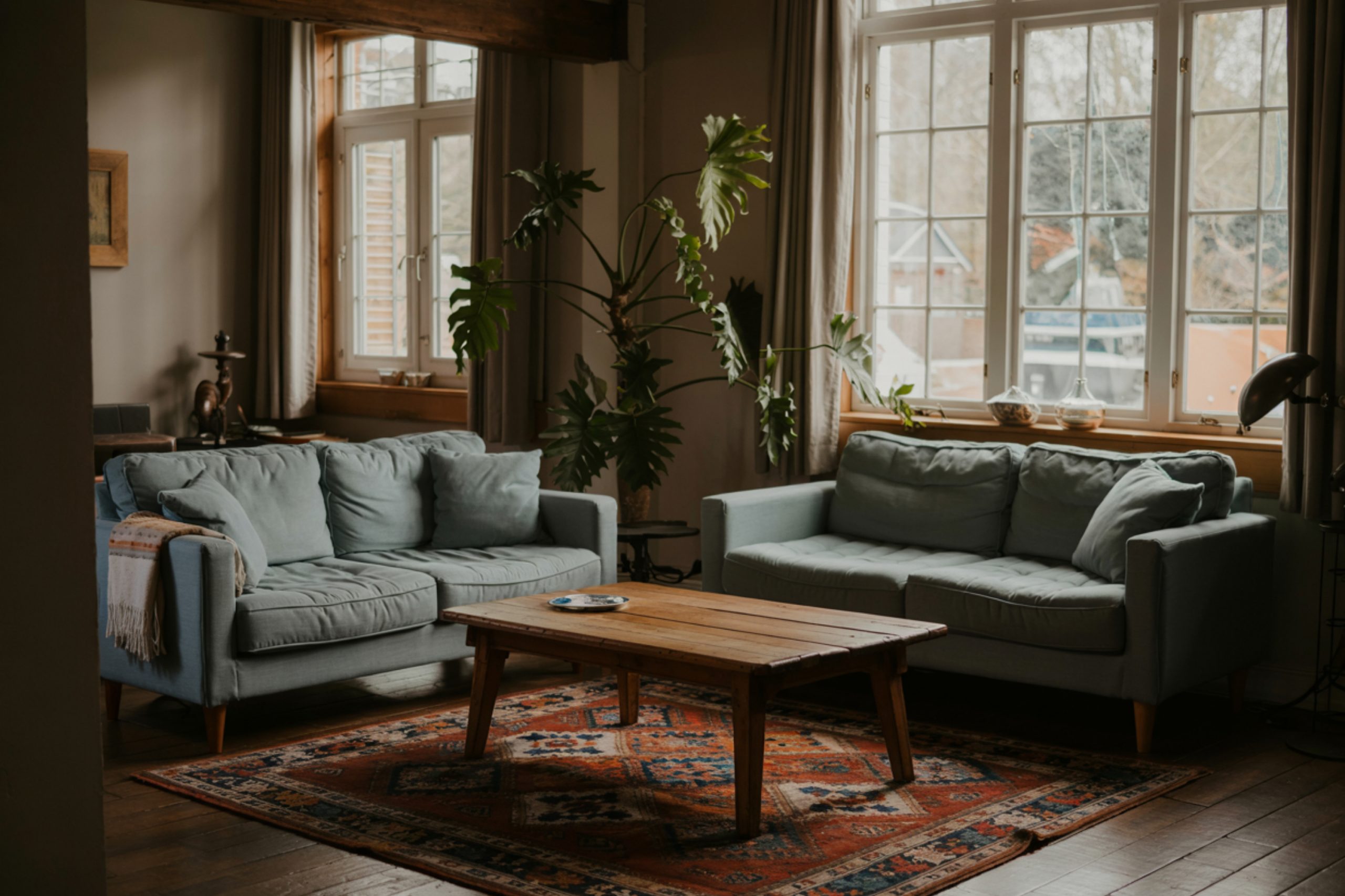
via housekeepingbay.com
Tips for Choosing the Right Living Room Paint Color
I’ve walked into so many living rooms where the wrong paint color just made everything feel off—even when the furniture was beautiful. It’s not just about picking a pretty shade. It’s about how it feels in your home.
Here’s what I always tell my clients:
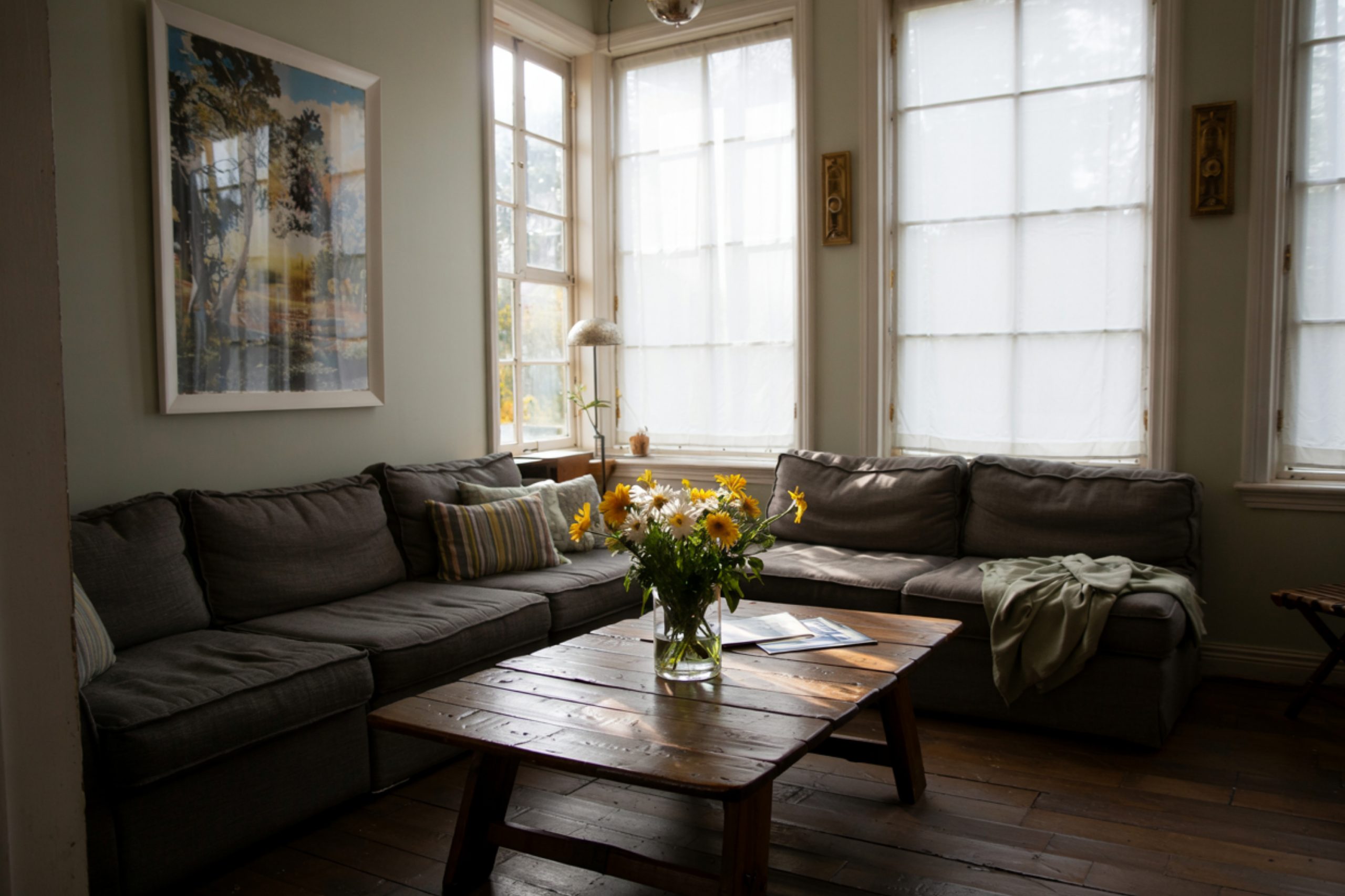
via housekeepingbay.com
1. Test in Your Own Light
What looks soft and warm in one house can look flat or yellow in another. Always try a sample on your own wall before deciding.
Try it on at least two walls (one near the window, one farther away)
Check it in daylight and at night
Don’t trust how it looks online—it’s never the same
2. Think About Your Floors and Furniture
Your paint needs to work with the stuff you already have. Beige walls can clash with gray sofas. Cool whites can make warm woods look orange.
If your furniture is mostly gray or black, stick to cooler neutrals like Repose Gray or Balboa Mist
If you have warm wood floors or beige couches, look at Accessible Beige or Natural Linen
3. Don’t Go Too Dark Unless You’re Sure
I love a moody room, but in a living room, dark colors can suck the light right out—especially if you don’t have big windows.
If you want contrast, do it with pillows, rugs, or frames
Keep the walls light and airy—it helps the whole house feel bigger
4. Keep It Simple
Honestly, the best paint colors are usually the quiet ones. You don’t need a bold “statement color” on the walls. Save that for artwork, pillows, or one accent wall if you really want it.
Most of the homes that sell fast, or feel most welcoming, have neutral walls that let everything else shine.
5. Pick a White Trim That Works With Your Wall Color
This part gets ignored a lot, but it makes a huge difference. If your wall color is warm, your white trim should be warm too.
- Warm walls? Use Alabaster or Dover White for trim
- Cool walls? Try Pure White or Origami White
- Even mixing up the wrong white can make the whole room feel a little… off.
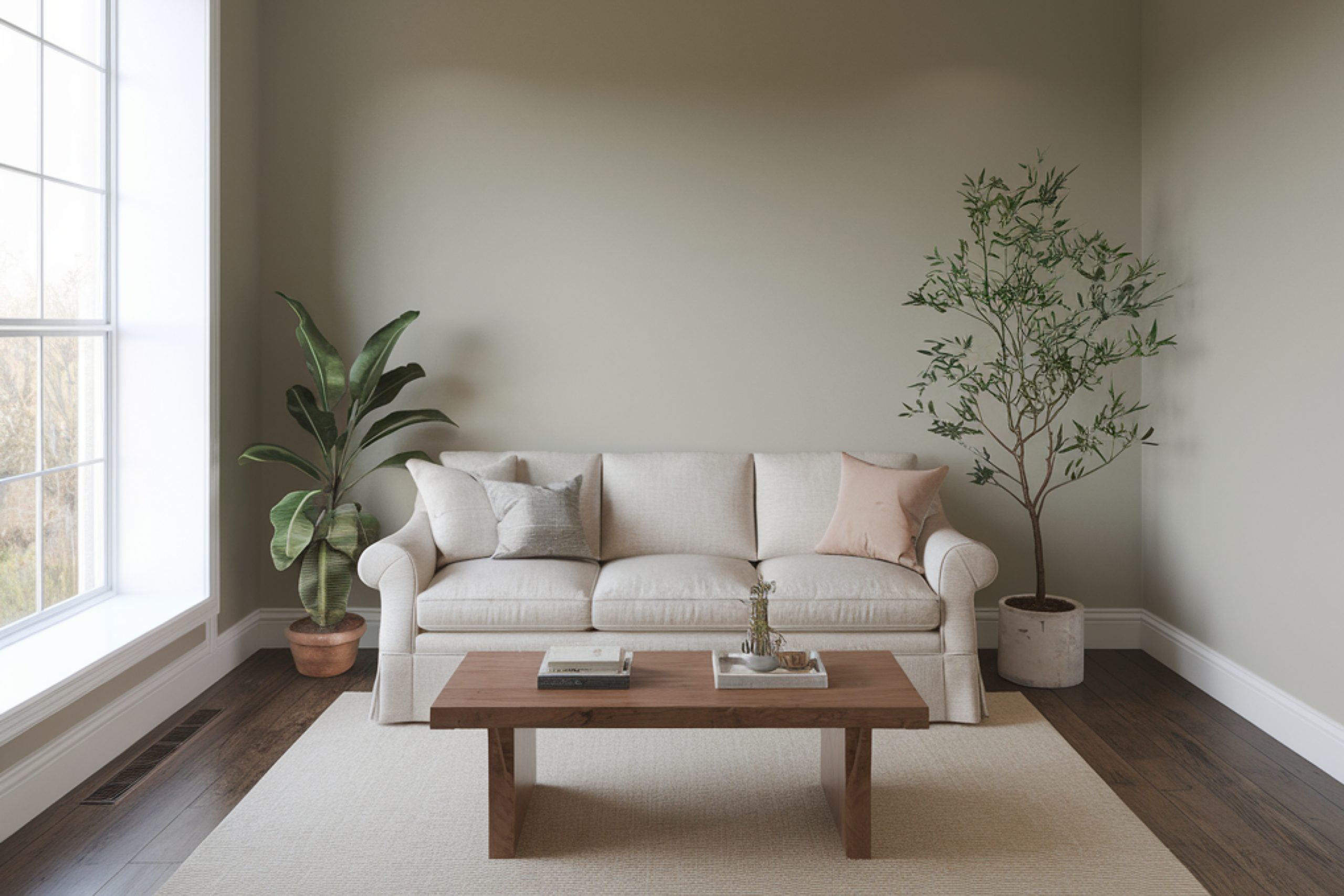
via housekeepingbay.com
Before You Grab the Paint Brush…
Paint is one of the cheapest ways to change how your living room feels—but it’s also one of the most stressful decisions for a lot of people. I’ve seen clients second-guess themselves for weeks, standing in paint aisles, scrolling through Pinterest, texting me pictures of swatches taped to their walls.
Here’s what I always say: you don’t have to get it perfect.
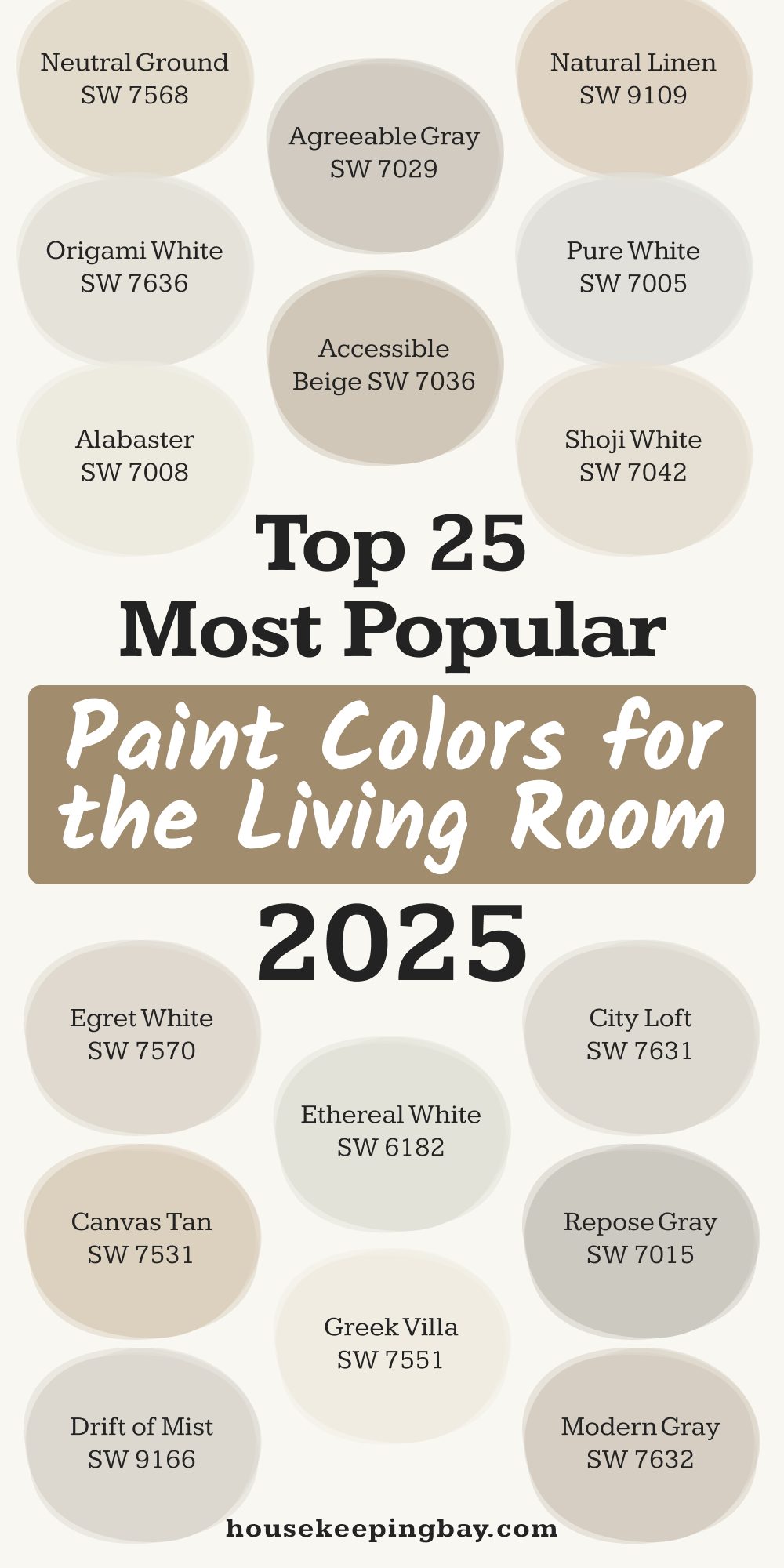
Any of the 25 colors I listed above are safe, modern, and loved for a reason. They work in all kinds of homes, with all kinds of light. If you keep your furniture, flooring, and natural light in mind, you’ll be just fine.
Pick something that feels calm, that doesn’t fight with your stuff, and that you won’t get tired of in six months.
Trust your eyes, and trust how it makes your room feel when you walk in.And if you’re ever unsure, stick with something like Agreeable Gray, Alabaster, or Pale Oak—they’ve never let me down.
via housekeepingbay.com
