Say Goodbye to Creative Block: 10 Designers Who Will Inspire Your Process
Top Emerging Interior Designers to Follow
Welcome to our curated list of Instagram and Facebook profiles that will fill your feed with creativity, innovation, and stunning design visuals.
We’ve carefully selected 10 emerging designers and color consultants who are gaining traction for their unique and compelling design aesthetics.
Their feeds are brimming with design inspiration, color play, and a wealth of ideas that you can incorporate into your own space.
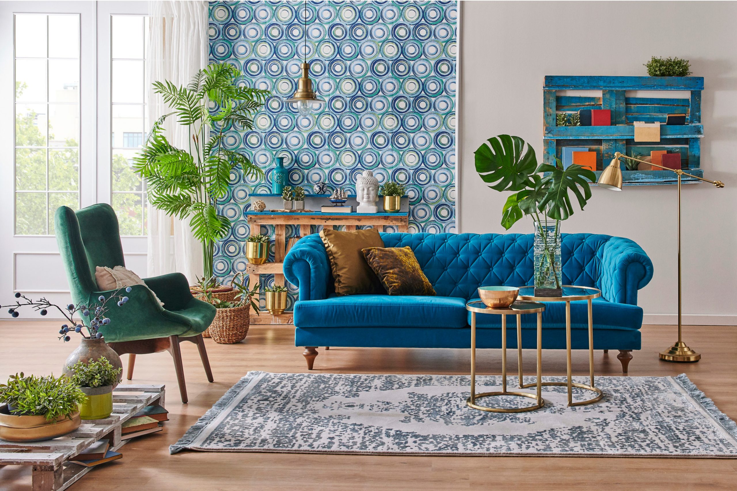
Credits: Vista Create
Table of Contents
Modern-day Rococo Flair with Rachael Petrie
Rachel Petrie’s Instagram feed is a testament to her skill in weaving color and texture into spaces that tell a story. She seamlessly fuses traditional and contemporary styles, using a palette that whispers of nature with splashes of vibrant book covers adding depth.
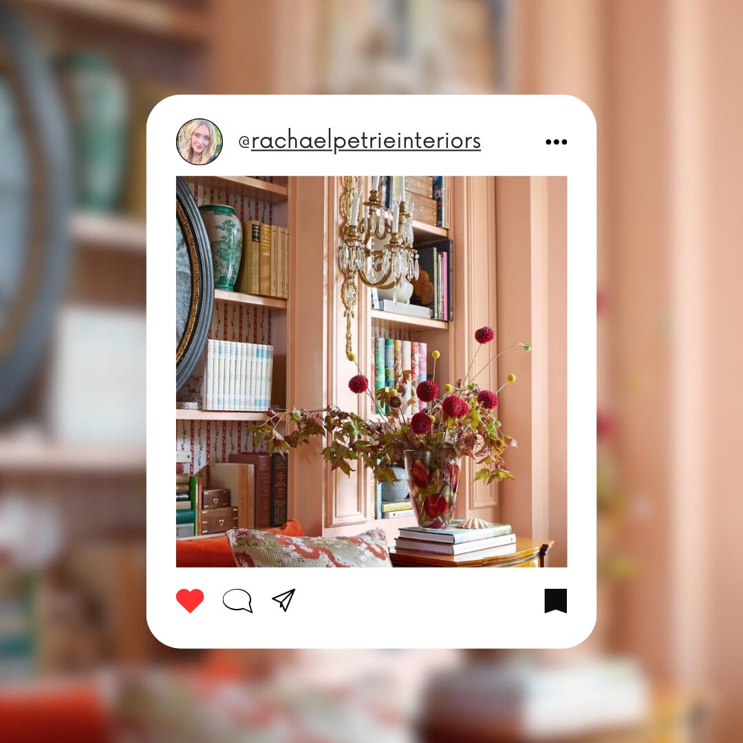
rachaelpetrieinteriors via instagram
Her interiors reflect a modern-day Rococo flair, with salmon walls and crystal chandeliers creating a warm, dramatic atmosphere.
Each design choice, from rustic light fixtures to a curated bookshelf, exemplifies her knack for creating unity and expression. Petrie’s photos are a source of inspiration, showcasing how deliberate color choices can breathe life into a room.
For home inspiration, the designer’s vision proves that mindful details can elevate a space from simple to sublime.
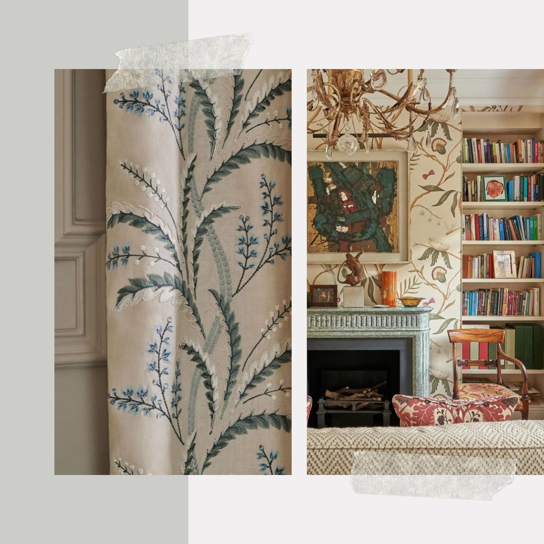
rachaelpetrieinteriors via instagram
Sherwin Williams Palette
- Accessible Beige SW 7036
- Dark Brown SW 7520
- Copper Mountain (SW 6356)
Benjamin Moore Palette
- White Dove OC-17
- Espresso Bean CSP-30
- Shaker Beige HC-45
Avant-Garde Touch by Brandi Katherine Herrera
Brandi Katherine Herrera stands as a beacon of inspiration for those daring to embrace bold hues and maximalist trends in interior design. Her curated spaces are a testament to the harmonious interplay between color and form. We can admire a confident use of a coral tone, which infuses the room with warmth and vitality.
Her work’s vibrant and playful approach to color and design illustrates an avant-garde blend of modern and eclectic styles.
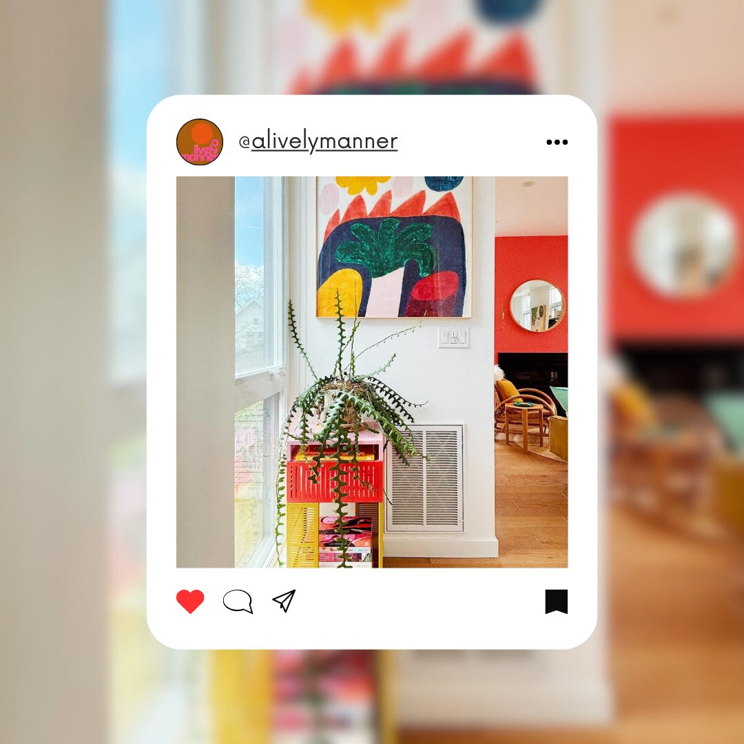
alivelymanner via instagram
An abstract painting serves as a visual anchor, its earthy and robust colors mirrored by the lively yet sophisticated locker beneath.
These interiors, rich with character and flair, remind us that our living spaces can be canvases for our most imaginative designs.
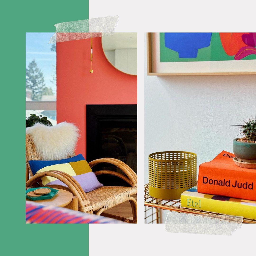
alivelymanner via instagram
Sherwin Williams Palette
- Extra White SW 7006
- Regatta SW 6517
- Lemon Twist SW 6909
- Heartthrob SW 6866
Benjamin Moore Palette
- Coral Gables BM 2010-40
- Chantilly Lace OC-65
- Santorini Blue BM 1634
- Sundance 2022-50
Classic Elegance by Jennifer Davenport
Jennifer Davenport’s interior designs are a delightful interplay of light and texture, highlighted by clean lines. A touch of rustic charm and layered lighting, from the natural light spilling through the windows to the chic pendant lamps, creates a bright and inviting atmosphere.
Jennifer Davenport’s designs are showcased with a harmonious blend of classic elegance and contemporary flair.
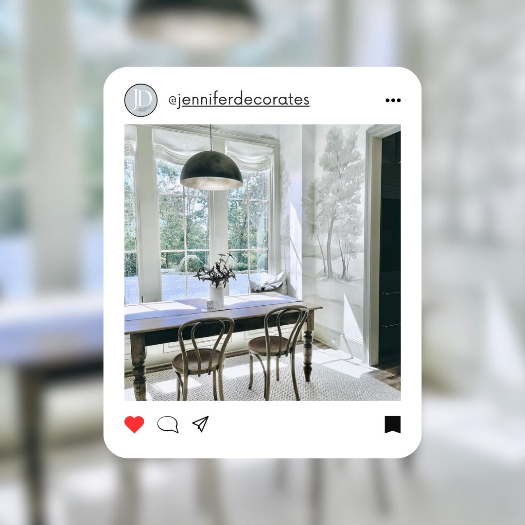
jdsallabouthome via facebook
Jennifer’s approach to interior design celebrates subtlety and sophistication, with a keen eye for detail that transforms spaces into picturesque vignettes of lived-in luxury.
Her use of gentle patterns, soft textures, and muted yet rich color palettes encapsulates a style that is both timeless and refreshingly modern.
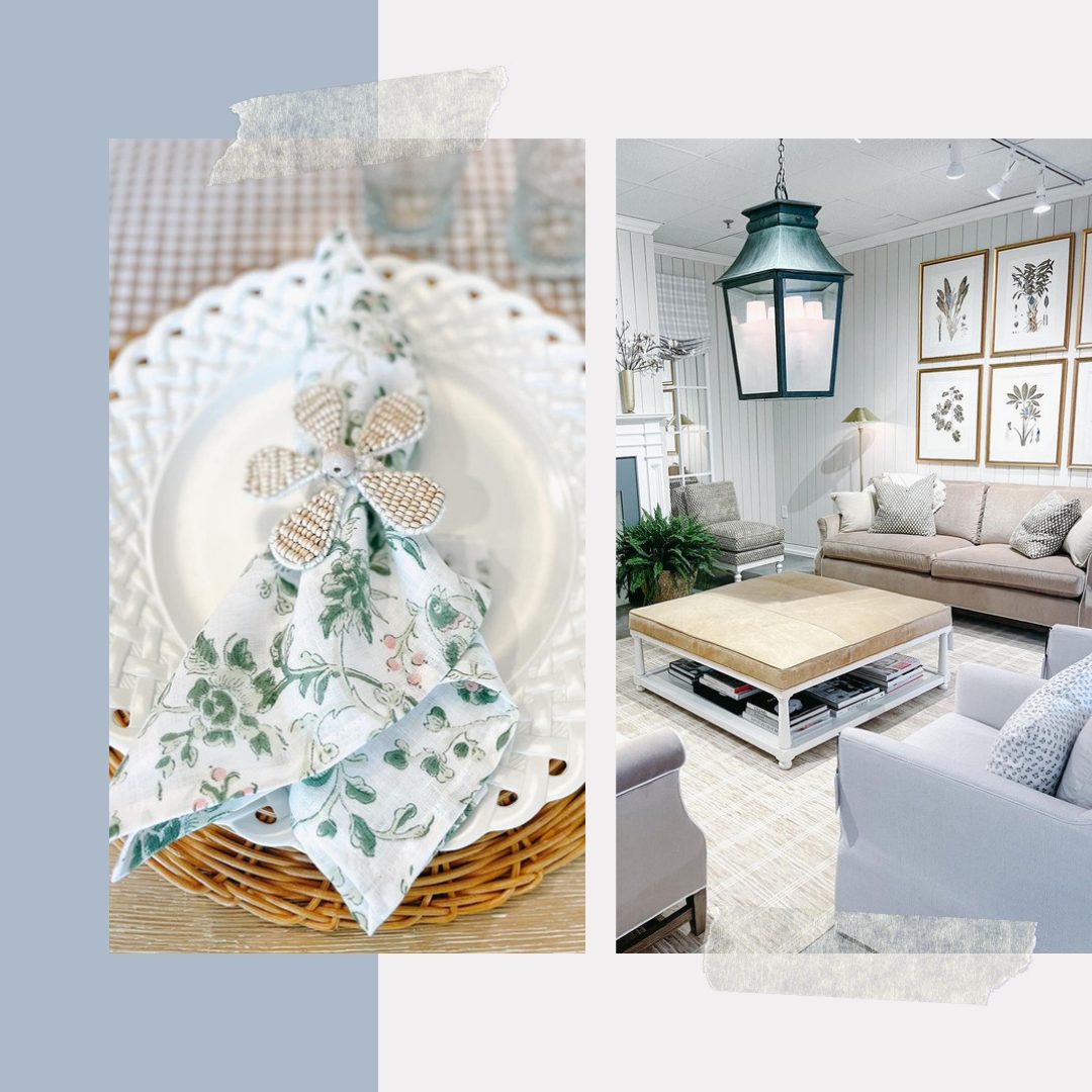
jdsallabouthome via facebook
Sherwin Williams Palette
- Site White SW 7070
- Smoky Azurite SW 9148
- North Star SW 6246
Benjamin Moore Palette
- White Opulence OC-69
- Sea Reflections 1664
- Early Frost CSP-590
Masterclass in Balance by Noor Charchafchi
Noor Charchafchi’s design radiates warmth, with a moody palette emphasizing deep wood tones and rich amber, juxtaposed against the soft whites of florals and frames. These designs are a masterclass in balance: organic forms are set against abstract art, and the tactile grain of wood meets the smoothness of metal hardware.
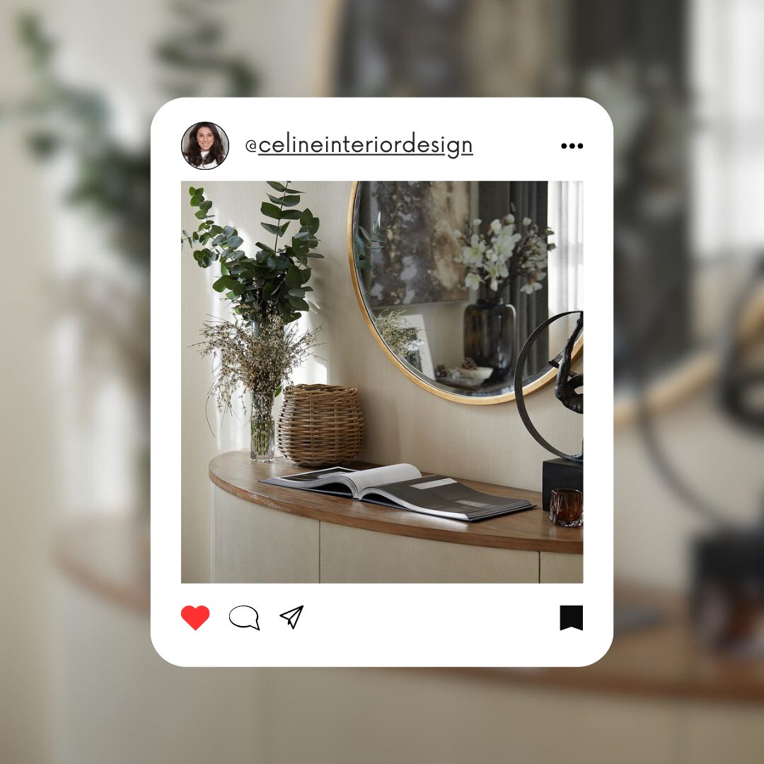
celineinteriordesign via instagram
Charchafchi’s work is a tribute to the timeless beauty of neutral tones, proving that a whisper can often speak louder than a shout, perfect for creating serene and sophisticated interiors.
A standout aspect of Charchafchi’s work is her tribute to the timeless beauty of neutral tones.
This philosophy is perfect for creating serene and sophisticated interiors, making Charchafchi’s designs a go-to choice for those seeking to create a tranquil and elegant living space.
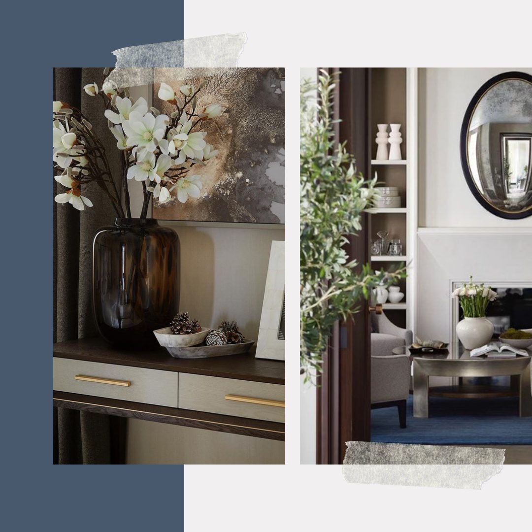
celineinteriordesign via instagram
Sherwin Williams Palette
- Guild Grey SW 9561
- Naval SW-6244
- Felted Wool SW 9171
Benjamin Moore Palette
- Barren Plain 2111-60
- North Sea Green 2053-30
- Cathedral Gray CSP-205
Ode to the Classic by Nicole Arnold Interiors
Nicole Arnold’s interior design approach combines classic elegance with contemporary clarity. Her color choices are restrained yet expressive, predominantly using a blend of white and gray as a backdrop with colorful accents, reminiscent of a crescendo in a musical symphony.
This palette evokes modern sophistication, with gold accents hinting at understated opulence.
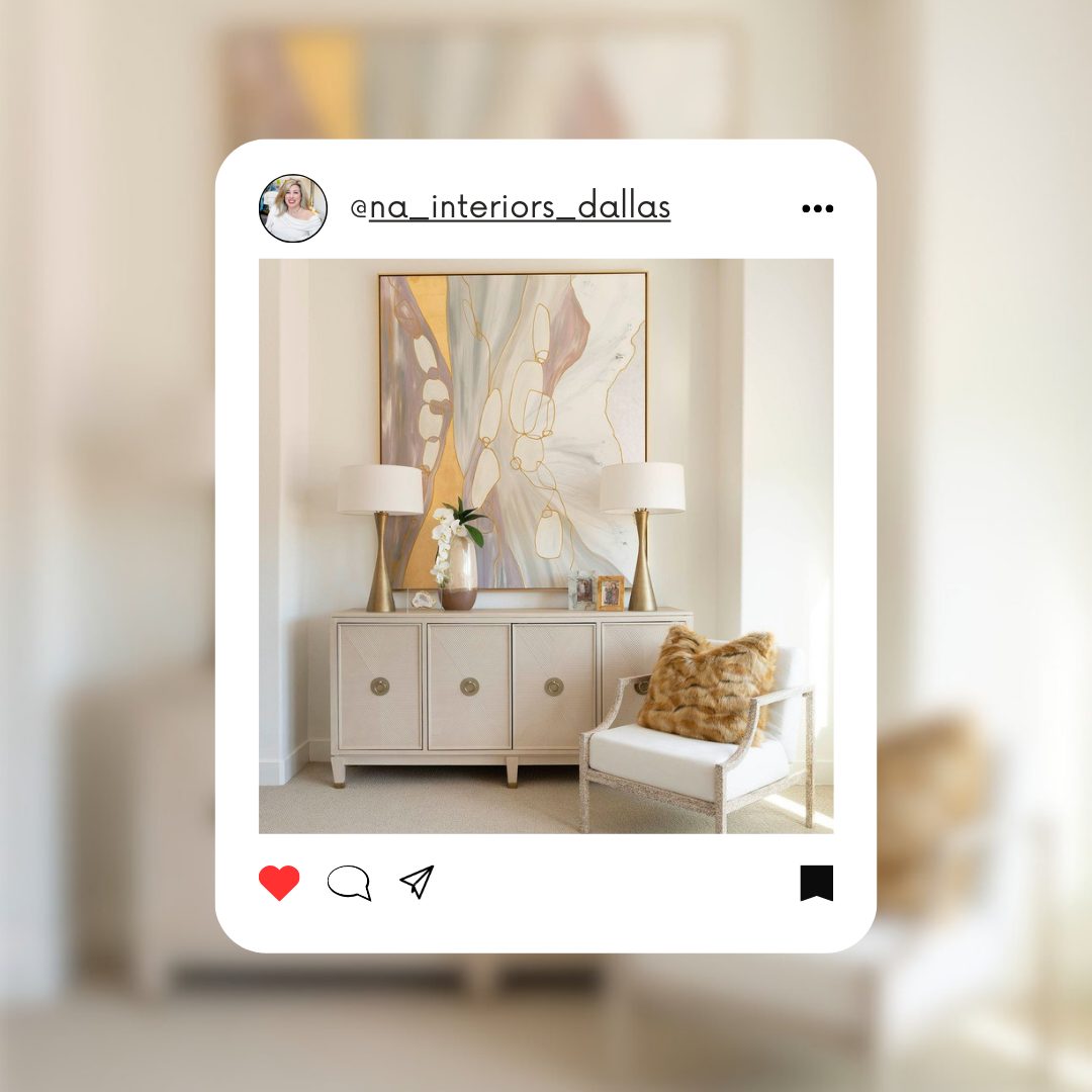
NicoleArnoldInteriors via facebook
Nicole creates an atmosphere shift to serene elegance with pastel hues—creamy whites, soft grays, gentle golds—mingling with strokes of delicate lavender.
This resonates with calm fluidity, embodying the ‘less is more’ interior design philosophy.
Her skillful use of color and texture creates spaces that are both innovative and timeless, demonstrating the transformative power of interior design.
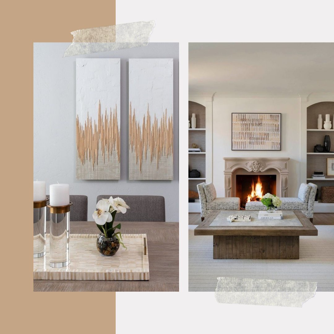
NicoleArnoldInteriors via facebook
Sherwin Williams Palette
- Natural Tan SW-7567
- Modern Lavender SW 9688
- Bagel SW 6114
Benjamin Moore Palette
- Cedar Key 982
- Excalibur Gray 2118-50
- Lingerie AF-200
Exterior Renewal by Amy Wax
If you need inspiration for exterior renovation, Amy Wax’s designs are worth considering. She presents a compelling perspective on how color can transform home exteriors.
The ‘before’ photo presents a traditional Victorian home cloaked in historical earth tones, which, while dignified, left the architecture feeling subdued.
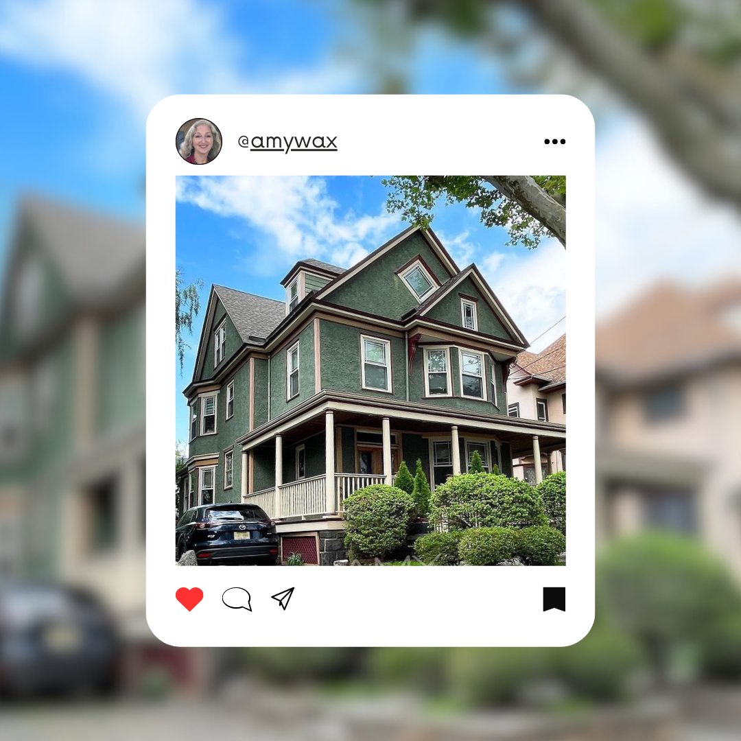
amywax via instagram
Wax’s intervention is a triumph of color choice—a creamy, light exterior that reinvigorates the structure without stripping it of its classic identity.
The sharp contrast between the new paint and the dark accents of the shutters and roof lines infuses the home with a modern yet timeless appeal. The result is a harmonious blend of past and present—proof that color is not just an aesthetic choice but a renewal of character for any home.
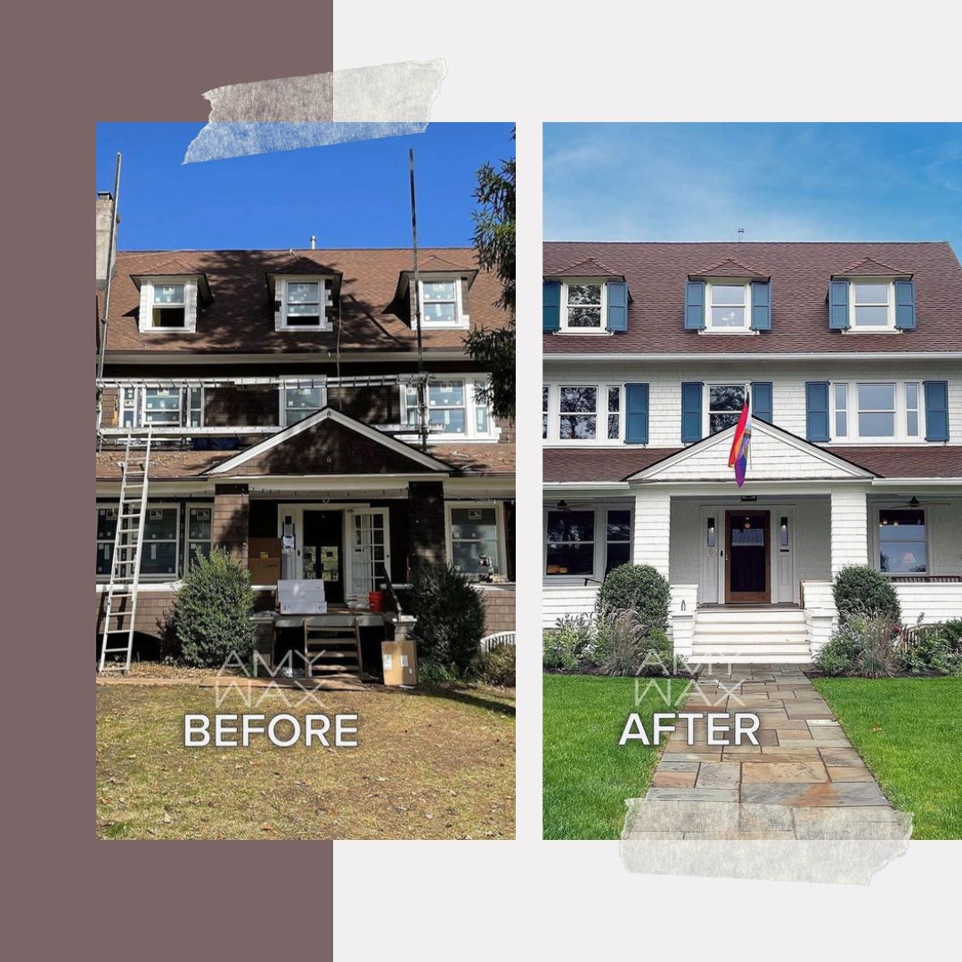
amywax via instagram
Sherwin Williams Palette
- SW 2811 Rookwood Blue Green
- Paperwhite SW 7105
Benjamin Moore Palette
- Lush AF-475
- Butter Pecan OC-89
Timeless Elegance by Lucinda Sanford Design
Lucinda Sanford Design’s interiors tell a story of bold elegance, where color and pattern converge to create a luxurious atmosphere. Charming blue floral patterns, perfectly aligned with the soft blue—each detail is thoughtfully curated, showcasing Sanford’s flair for injecting warmth into classic design.
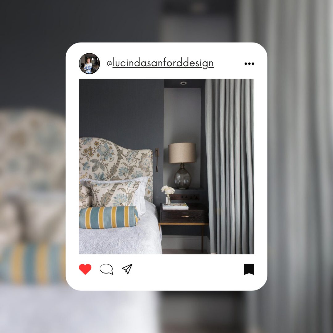
wildflowerhomeblog via facebook
The blending of old and new, underscored by a sophisticated color scheme, exemplifies Sanford’s expertise in creating inviting, stylish spaces.
Lucinda Sanford Design’s work, rich in character and thoughtful in palette, provides an excellent source of inspiration for those looking to infuse their spaces with a blend of classic and contemporary design.
Through her Instagram profile, Sanford offers a visual feast that speaks to the transformative power of color and pattern in creating spaces that are not just seen, but felt.
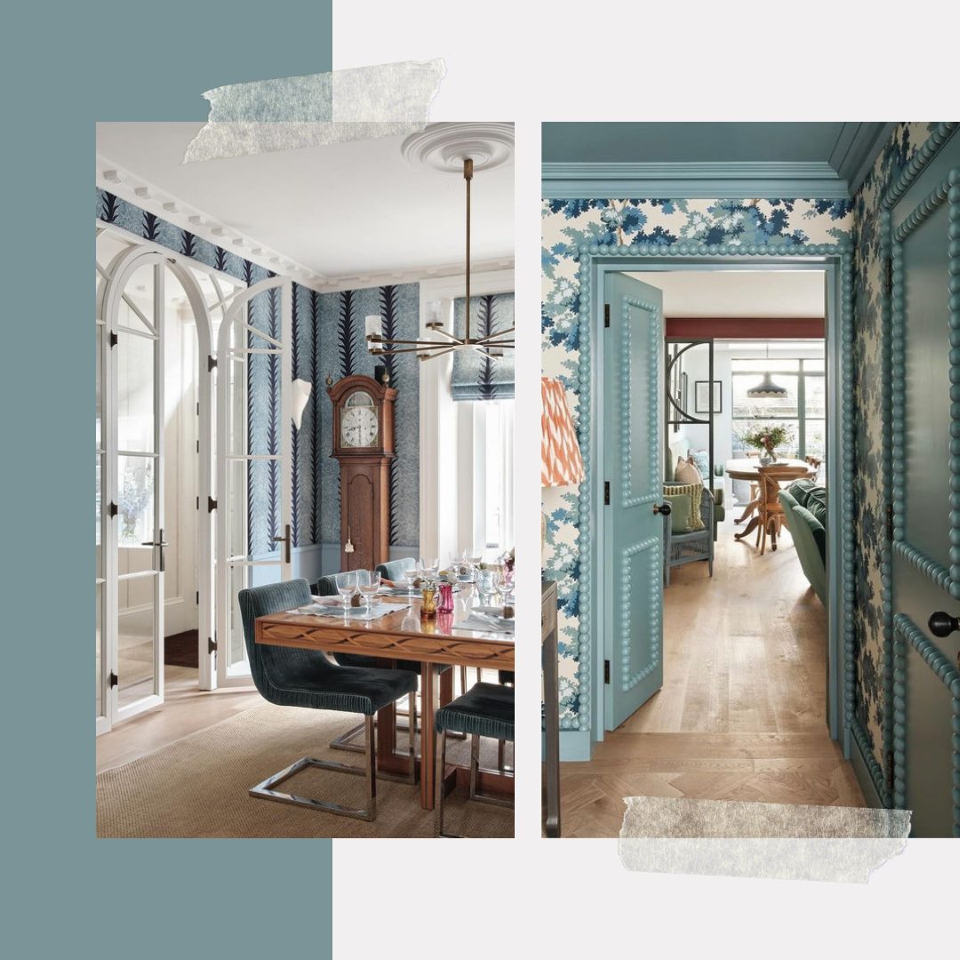
wildflowerhomeblog via facebook
Sherwin Williams Palette
- Westchester Gray SW 2849
- Drizzle SW 6479
- Nebulous White SW 7063
Benjamin Moore Palette
- Steel Wool 2121-20
- Covington Blue HC-138
- Seapearl OC-19
Classic Charm by Jennifer Kizze
Jennifer Kizzee Design showcases a refined blend of classic charm and contemporary cool. In a bathroom setting, the vanity area is accented with twin arched mirrors framed in dark wood, echoing the cabinetry’s rich tones. A deep blue adds depth and contrast, while clean white countertops and simple black fixtures speak to a minimalist taste.
In the bedroom retreat, the wood grains of the bed and side table add warmth, while the tactile pleasure of the chunky knit throw invites a sense of comfort.
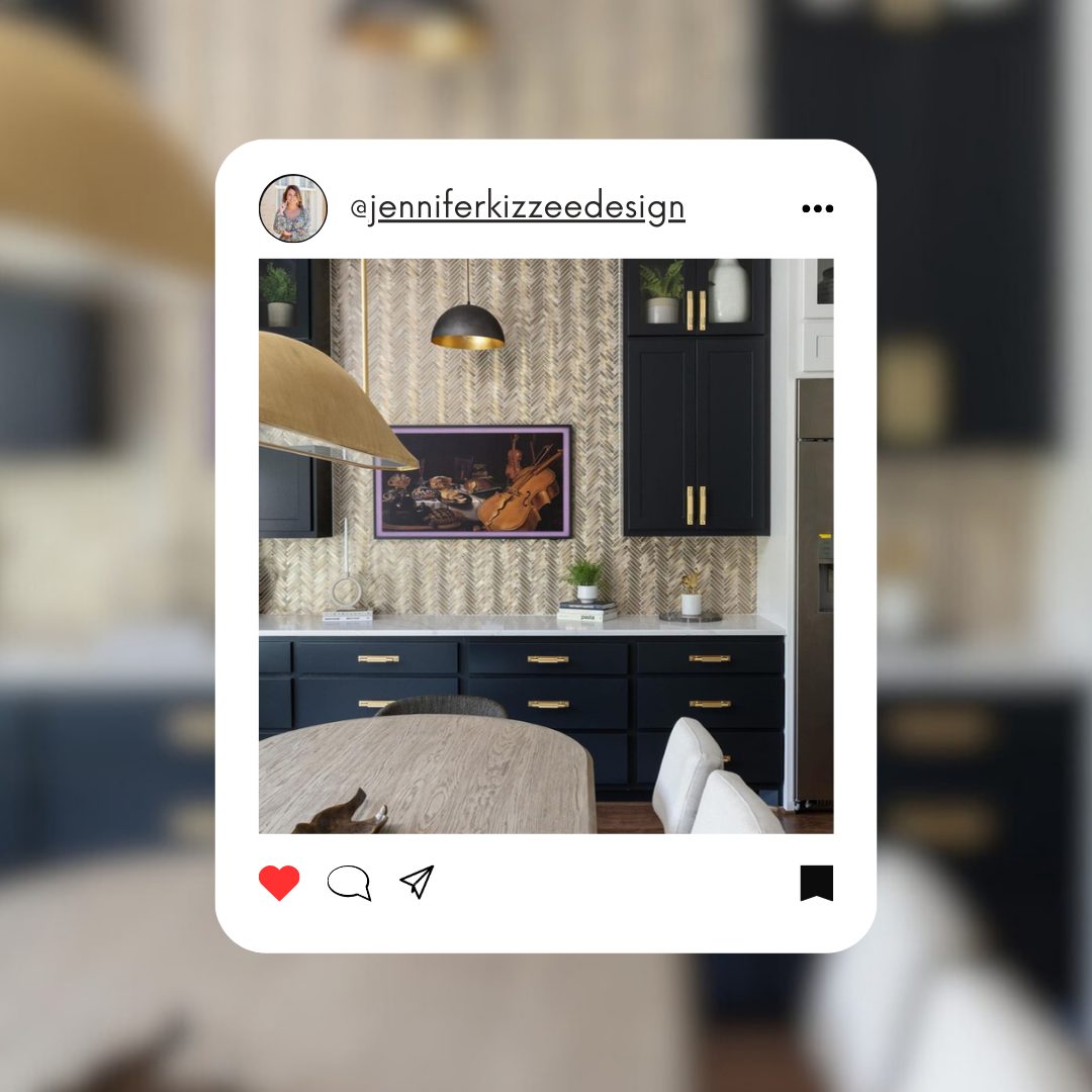
jenniferkizzeedesign via facebook
The room is a testament to Kizzee’s ability to create a serene yet engaging environment that combines tactile richness with visual calm.
Jennifer Kizzee’s design work serves as a visual guide to creating spaces that marry functionality with aesthetic allure.
Her deliberate selection of hues and textural elements is ideal for anyone aiming to instill their living spaces with serene sophistication and modern appeal.
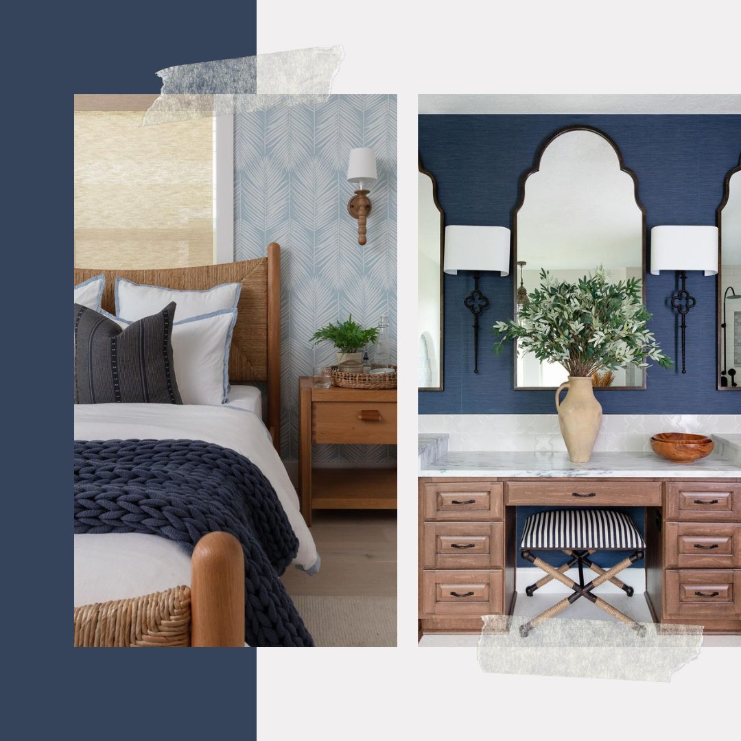
jenniferkizzeedesign via facebook
Sherwin Williams Palette
- Dignified SW 6538
- White Snow SW 9541
- Morning at Sea SW 9634
Benjamin Moore Palette
- Wizard CC-966
- Gardenia AF-10
- Gray Timber Wolf 2126-50
Refined Tenderness by Francesca Morgan Interiors
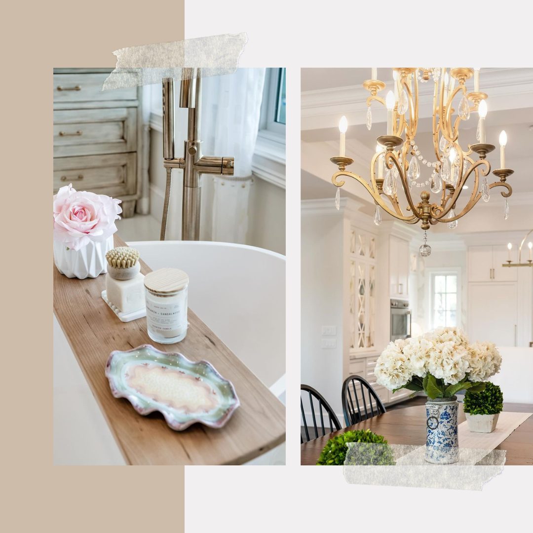
In the first shot, the dining area breathes new life into the classic style, where a stately dark wooden table serves as a canvas for the simplicity and purity of white hydrangeas.
Francesca Morgan Interiors crafts spaces that marry traditional charm with contemporary flair.
The backdrop is a delicate dance of art and light—crystal droplets of a chandelier cascade golden light, enhancing the soft pastels of the wall art, reminiscent of impressionist strokes that capture the fleeting beauty of light and color.
FMInteriors via facebook
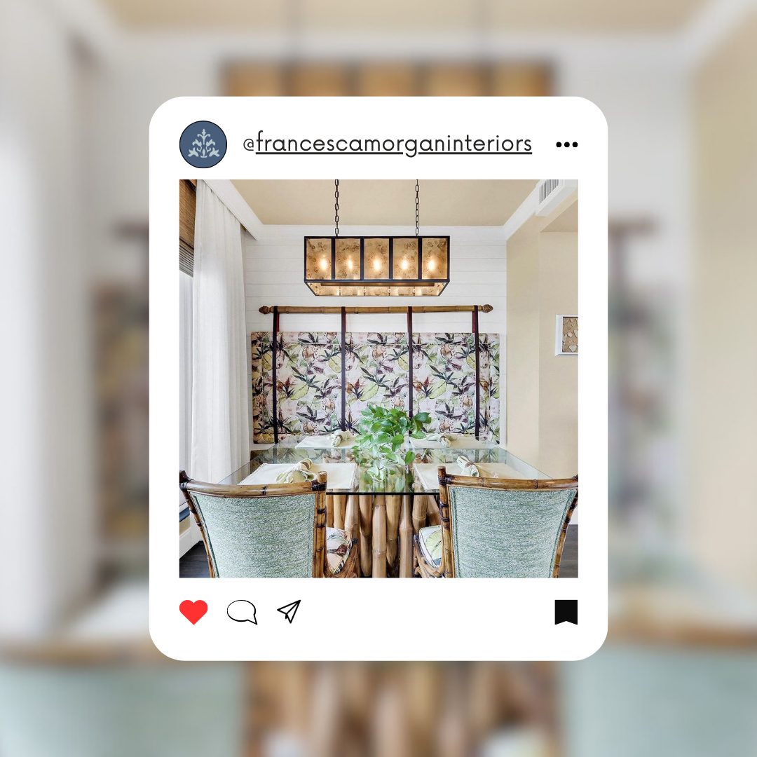
In the breakfast nook, Morgan introduces a vibrant tropical motif, with fabric that depicts a botanical scene reminiscent of a vintage botanical print, bringing an element of the outdoors into a cozy corner.
Morgan’s designs are not just about color or furniture placement; they’re about evoking a lifestyle.
FMInteriors via facebook
Sherwin Williams Palette
- Dreamy White SW 6021
- Agreeable Gray SW 7029
- Rain SW 6219
Benjamin Moore Palette
- Pampas Grass 2110-60
- Collingwood 859
- Oil Cloth CSP-760
Glamorous Appeal by Missy Stewart Designs
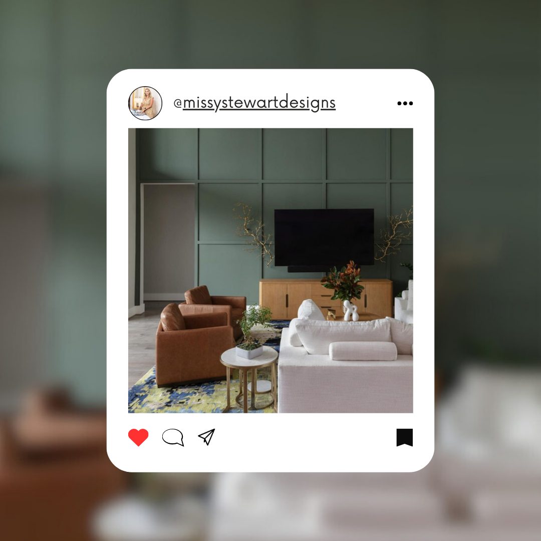
Missy Stewart’s design aesthetic paints a canvas of bold sophistication and contemporary elegance. In her living room design, Stewart plays with a palette that speaks to nature’s verdancy, opting for an accent wall in a rich, sage green.
The geometric precision of the wall panels adds a touch of modernity, crafting a space that feels current yet timeless.
MissyStewartDesigns via facebook
Accents like the marble and brass side table, along with a boldly patterned rug, introduce a play of luxury and eclectic charm.
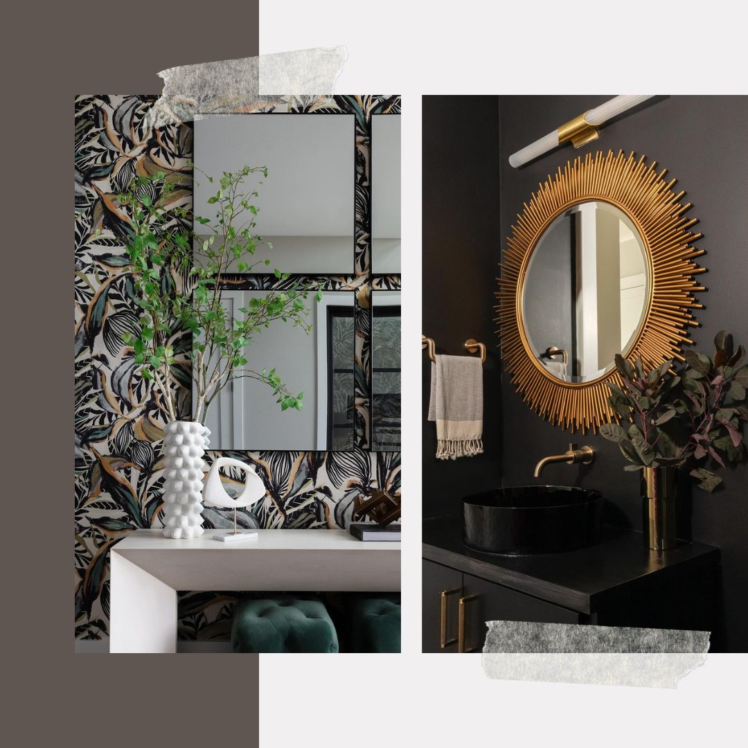
The bathroom vignette showcases a dramatic flair for the theatrical with its deep, moody walls. Here, Stewart leans into a more glamorous and edgy style.
Stewart’s design approach brings together the best of various design philosophies, from modern simplicity to glamor, always with an eye for how colors and shapes create a cohesive whole.
MissyStewartDesigns via facebook
Sherwin Williams Palette
- Portsmouth SW 9644
- Site White SW 7070
- Metropolis SW 9575
Benjamin Moore Palette
- Apollo Blue CW-645
- Pearl River 871
- Silhouette AF-655
To wrap things up, there’s a whole world of design inspiration waiting for you to discover from these gifted designers and color gurus!
For more ideas and the latest trends, follow us on Facebook!
