Gardenia AF-10 Paint Color by Benjamin Moore
A Deep Dive into Its Color and Compatibility
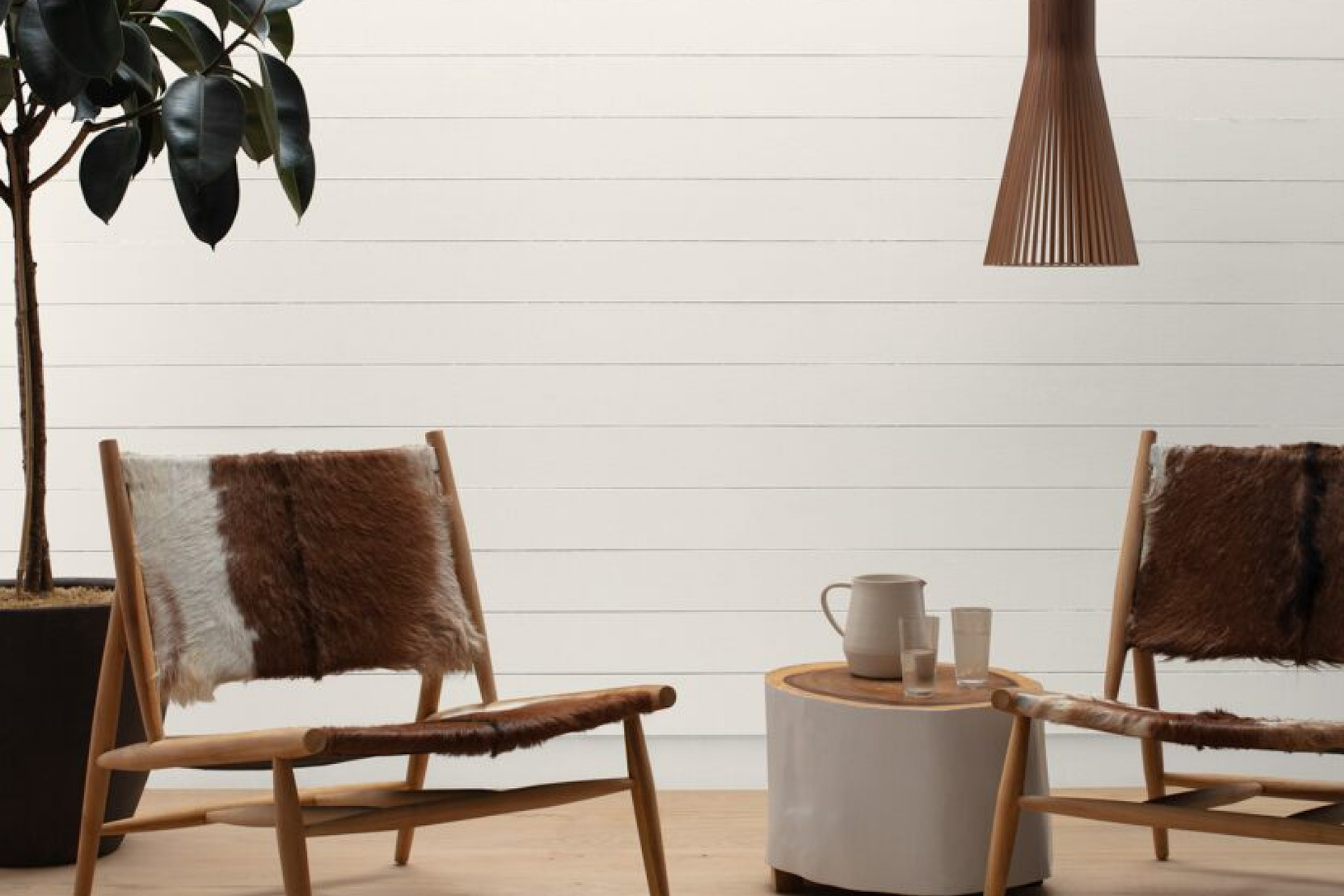
Colors in the realm of interior design speak volumes about space, mood, and functionality. In particular, Gardenia AF-10 has emerged as a color that not only beautifies walls but also brings in versatility. This article illuminates the attributes, undertones, and compatibility of Gardenia AF-10, offering a comprehensive look at this hue.
via benjamin moore
What Color Is Gardenia AF-10?
Enveloped in a gentle charm, Gardenia AF-10 takes on a soft, delicate neutral hue reminiscent of the petals of its namesake flower. Being a subdued shade, it effortlessly integrates into various interior styles, especially in modern, minimalist, Scandinavian, and traditional designs.
Whether paired with rugged wood or smooth satin, its elegance remains undiminished, harmonizing beautifully with an array of materials and textures.
housekeepingbay.com
Table of Contents
Is It a Warm Or Cool Color?
Gardenia AF-10 occupies a space that is somewhere between warm and cool. It has an undertone that gently leans towards the warmer spectrum but remains neutral enough to be considered versatile.
In home settings, this slightly warm leaning allows it to emit a comforting ambiance while still retaining a fresh edge, making spaces feel both cozy and invigorating.
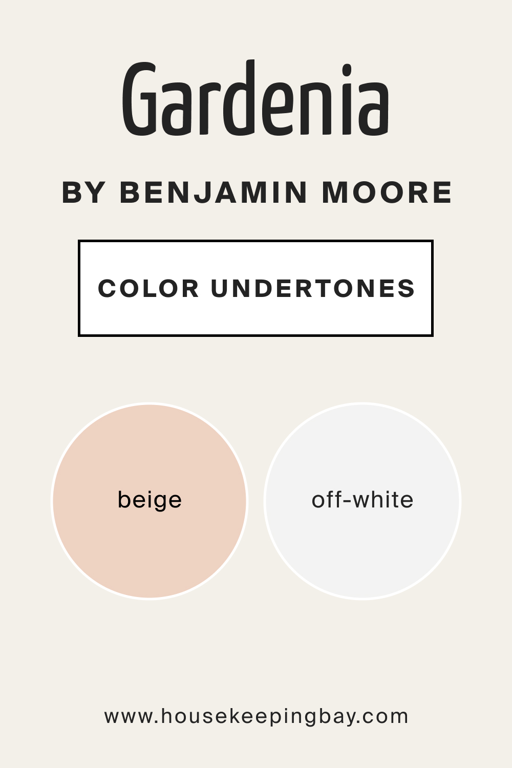
Undertones of Gardenia AF-10
Peeling back its layers, Gardenia AF-10 reveals subtle undertones that are a mix of beige and off-white. Undertones play a pivotal role in the perception of colors. They can subtly influence how the primary color is viewed, especially in varying lights. In the case of Gardenia AF-10, its understated undertones add depth and character to the shade.
housekeepingbay.com
Coordinating Colors of Gardenia AF-10
Coordinating colors are those that sit harmoniously alongside a primary color, enhancing its aesthetic appeal. For Gardenia AF-10, the compatible shades include:
- AF-655 Solhouette : A profound, mysterious black.
- AF-675 Fusion : A muted blend of gray and beige.
- BM Winterwood 1486 : A soft, comforting green.
Additional coordinating colors include:
- BM Whispering Wind 1511 : A pale, airy blue.
- BM Shadow Gray 2125-40 : A deep, grounding gray.
- AF-630 Templeton Gray : A harmonious, balanced gray.
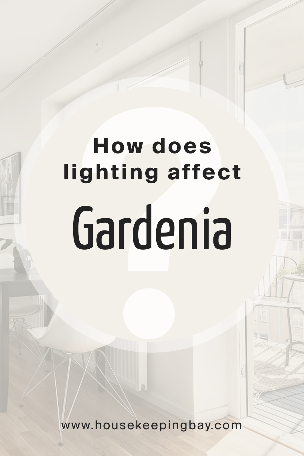
How Does Lighting Affect Gardenia AF-10?
Lighting is the unsung hero of color perception. In artificial light, Gardenia AF-10 can appear slightly warmer, giving rooms a cozy feel. Under natural light, its nuances come alive, with its undertones more pronounced. In north-faced rooms, it takes on a cooler demeanor, while south-faced rooms accentuate its warmth.
East-facing rooms in the morning light add a delicate brightness, and in west-facing rooms, it mellows down during sunset, exuding a serene aura.
housekeepingbay.com
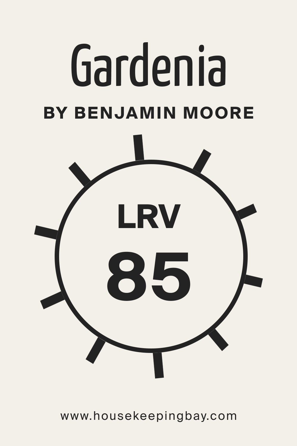
LRV of Gardenia AF-10
Light Reflectance Value (LRV) measures the amount of light a color reflects. An LRV of 85 indicates that Gardenia AF-10 reflects a significant portion of light, making spaces appear more spacious and airy.
For this shade, the high LRV means that it can effectively brighten up spaces, proving ideal for smaller rooms or areas with limited natural light.
housekeepingbay.com
What is LRV? Detailed Guide
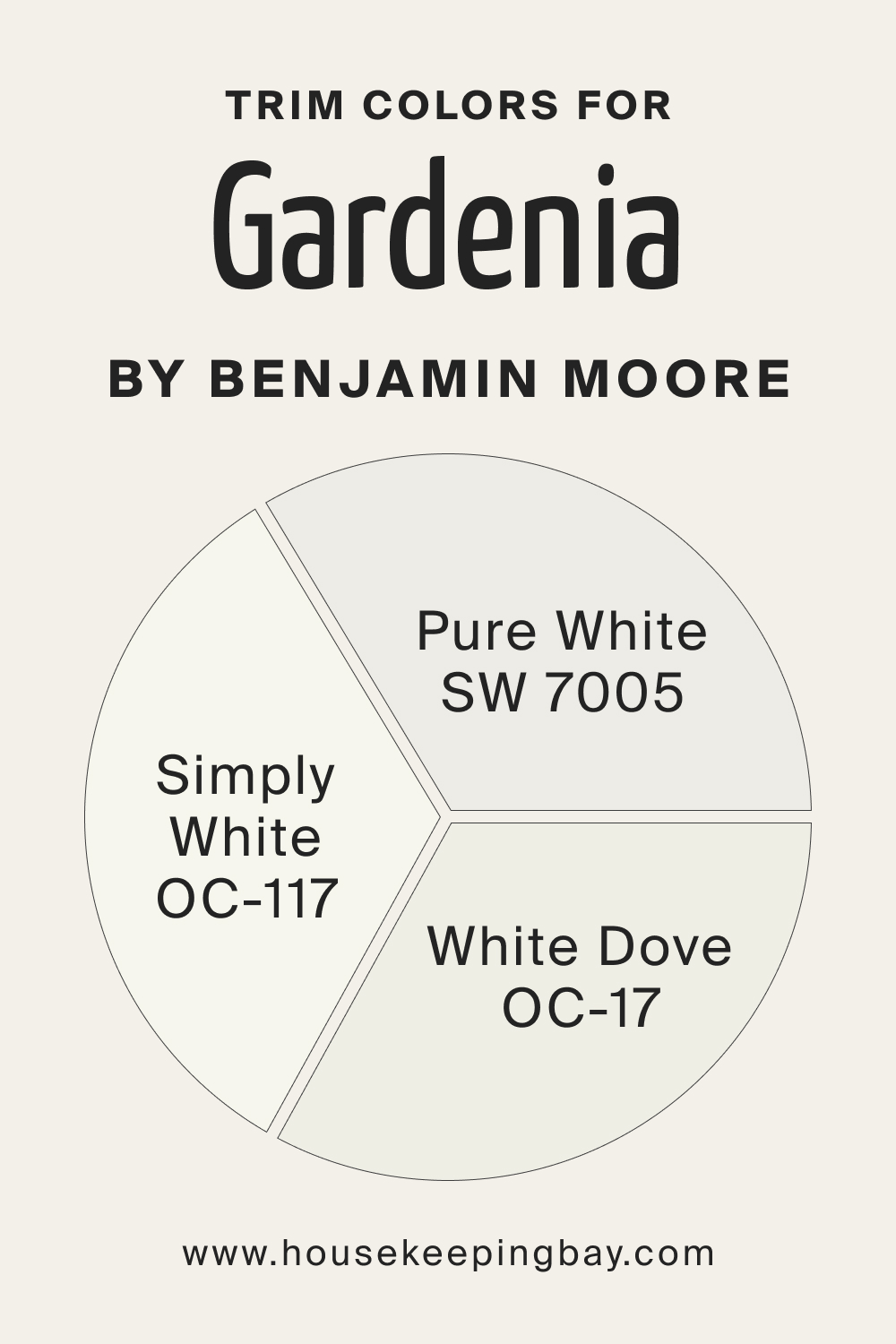
Trim Colors of Gardenia AF-10
Trim colors accentuate the main wall color. For Gardenia AF-10, shades of white from the same brand offer a crisp delineation. Consider:
- Pure White : A stark, clean contrast.
- White Dove : Soft with a hint of warmth.
- Simply White : Bright yet balanced.
housekeepingbay.com
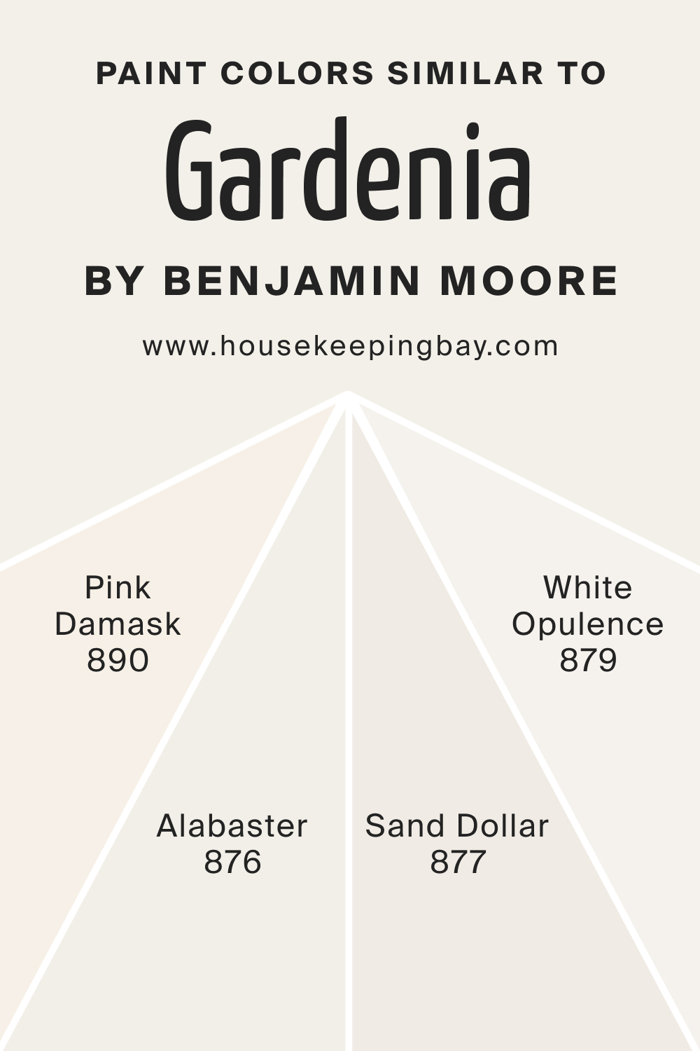
Colors Similar to Gardenia AF-10
Recognizing similar colors assists in finding the perfect fit. Resembling Gardenia AF-10 are:
- BM Alabaster 876 : Creamy and versatile.
- BM White Opulence 079 : A sparkling white with subtle undertones.
- BM Sand Dollar : Beige with a touch of grace.
- BM Pink Damask : A gentle rose-infused white.
housekeepingbay.com
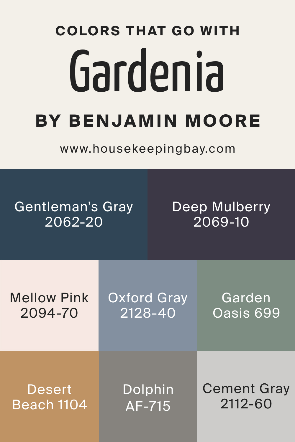
Colors That Go With Gardenia AF-10
Creating a cohesive palette enhances room aesthetics. Colors that pair well with Gardenia AF-10 include:
- BM Mellow Pink 2094-70 : A soft, pastel pink.
- BM Oxford Gray 2128-40 : Deep, moody blue-gray.
- BM Garden Oasis 699 : Lush, botanical green.
- BM Desert Beach 1104 : Earthy, warm beige.
- BM Deep Mulberry 2069-10 : Intense, regal purple.
- AF-715 Dolphin : Subdued, elegant gray.
- BM Cement Gray 2112-60 : Neutral, timeless gray.
- BM Gentleman’s Gray 2062-20: Navy with depth.
Together, they create a symphony of colors, amplifying the allure of any space.
housekeepingbay.com
How to Use Gardenia AF-10 In Your Home?
Gardenia AF-10 exudes a neutral charm that gracefully complements various spaces. Its subtle hue makes it ideal for rooms seeking a soothing ambiance, such as bedrooms and living rooms.
This color fits seamlessly into diverse interior styles, from contemporary minimalism to rustic chic, Scandinavian simplicity, and classic elegance. It pairs wonderfully with both vibrant hues and muted tones, allowing flexibility in design choices.
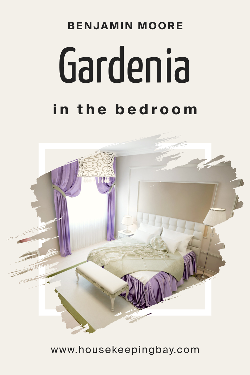
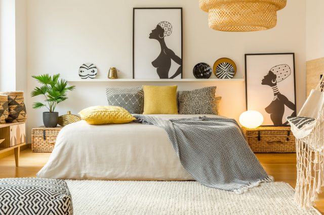
How to Use Gardenia AF-10 in the Bedroom?
In bedrooms, Gardenia AF-10 acts as a serene backdrop, promoting restful sleep. Its tranquil presence sets a calming mood, making it perfect for walls, ceilings, or even as an accent. Complement it with soft pastel bedding and natural wood furniture for a harmonious look.
housekeepingbay.com
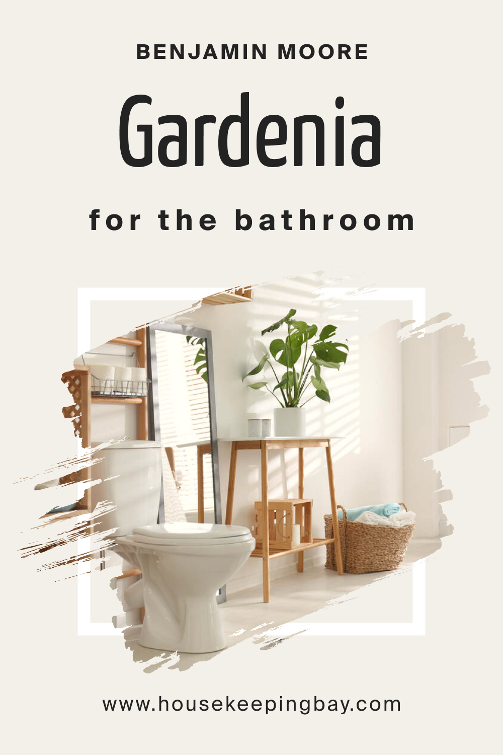
How to Use Gardenia AF-10 in the Bathroom?
For bathrooms, Gardenia AF-10 provides a spa-like elegance. Its muted tone offers a refreshing contrast against chrome fittings or marble countertops. The color enhances the bathroom’s ambiance, making it appear spacious and serene.
housekeepingbay.com
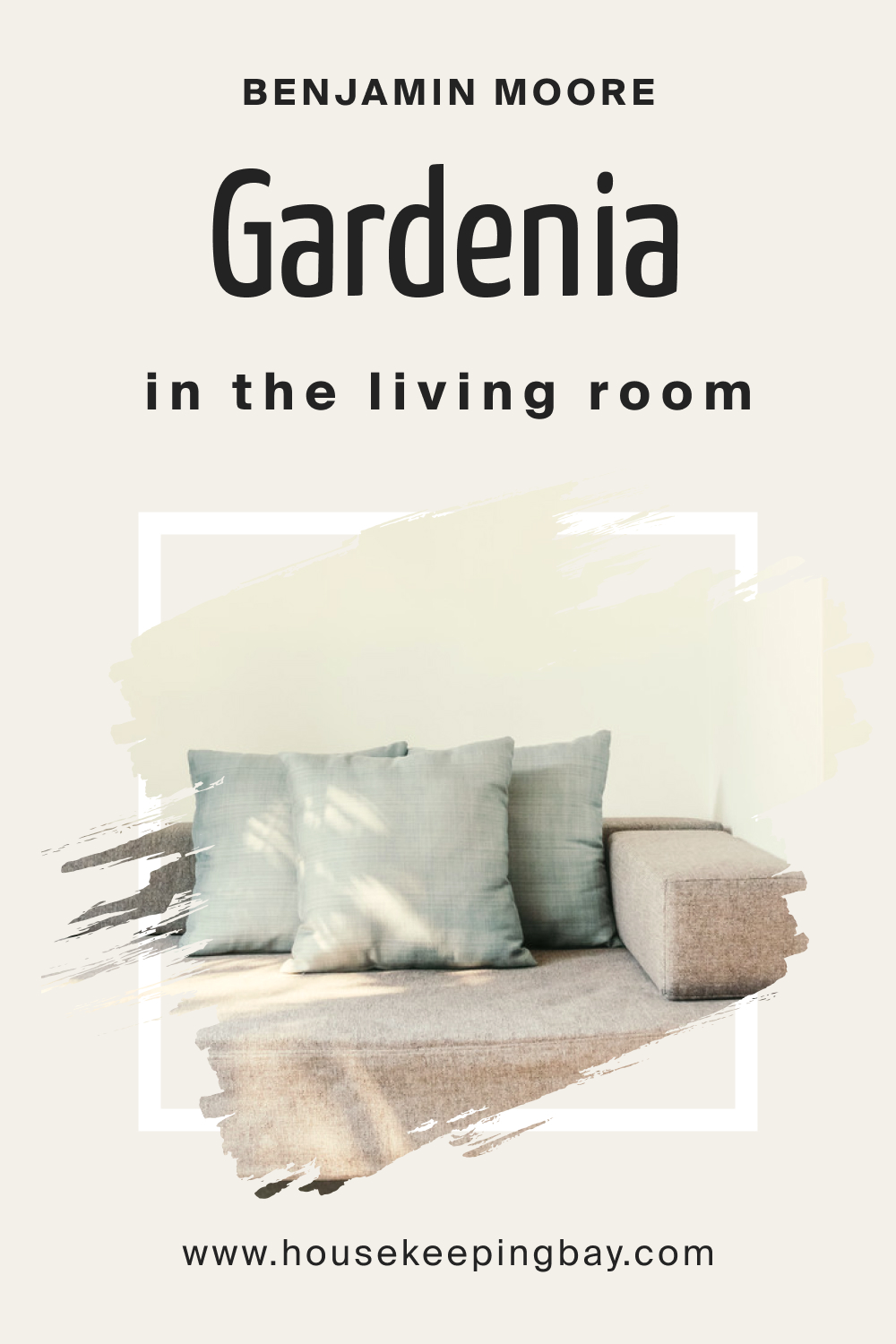
How to Use Gardenia AF-10 in the Living Room?
In the living room, Gardenia AF-10 creates a soothing environment, perfect for relaxation and conversation. It’s versatile enough to be the main shade or play a complementary role alongside bolder colors. Pair it with plush textiles, metallic accents, and wood finishes for a balanced aesthetic.
housekeepingbay.com
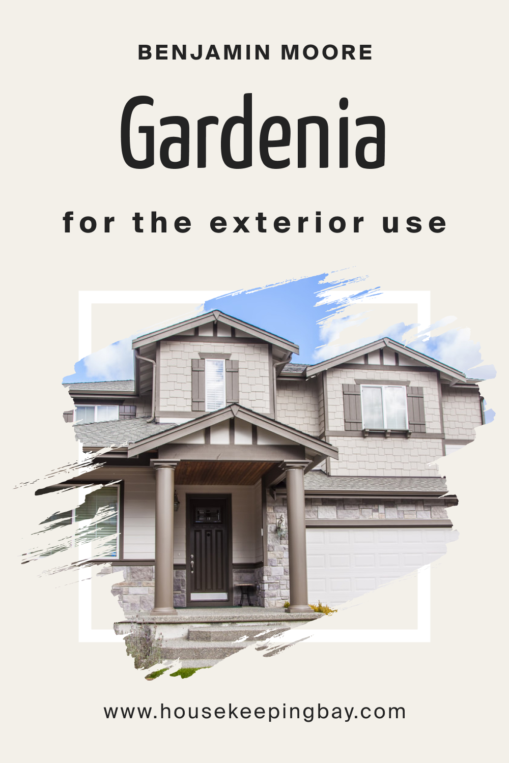
How to Use Gardenia AF-10 for an Exterior?
Externally, Gardenia AF-10 imparts a sophisticated touch. It reflects sunlight beautifully, rendering a warm and inviting facade. Whether on the main exterior walls, trims, or shutters, this color offers a timeless appeal that complements natural landscaping.
housekeepingbay.com
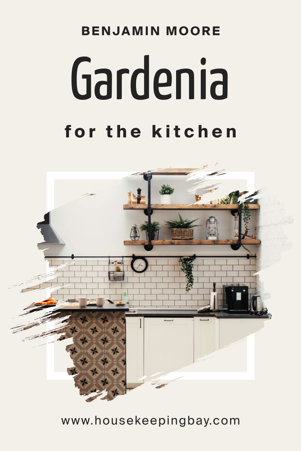
How to Use Gardenia AF-10 in the Kitchen?
In the kitchen, Gardenia AF-10 stands out as a neutral canvas. It complements stainless steel appliances, wooden countertops, and colorful backsplashes. The color radiates a clean ambiance, ensuring the kitchen remains a vibrant space of culinary creativity.
housekeepingbay.com
Comparing Gardenia AF-10 With Other Colors
Comparing paint colors like Gardenia AF-10 with others is essential to truly understand their distinct undertones, depth, and how they can transform within varied lighting and settings. Every shade evokes different emotions and atmospheres, affecting the aesthetics and mood of spaces.
Comparisons offer insights into the versatility, coordination possibilities, and nuances between similar-seeming shades, assisting homeowners and designers in making informed decisions.
Gardenia AF-10 vs. BM Natural Wicker 960
While both exude a neutral charm, Natural Wicker leans towards a richer beige undertone. Gardenia AF-10 is lighter and offers a fresher ambiance, whereas Natural Wicker brings a warmer earthiness to spaces.
housekeepingbay.com
Gardenia AF-10 vs. BM White Sand 964
BM White Sand veers towards a creamy off-white palette. In contrast, Gardenia AF-10, with its gentle beige undertones, strikes a balance between warmth and brightness, making spaces feel both cozy and luminous.
housekeepingbay.com
Gardenia AF-10 vs. HC-80 Bleeker Beige
BM Bleeker Beige showcases a pronounced beige depth. In comparison, Gardenia AF-10 provides a more subtle and airy elegance, making it versatile for diverse interior styles.
housekeepingbay.com
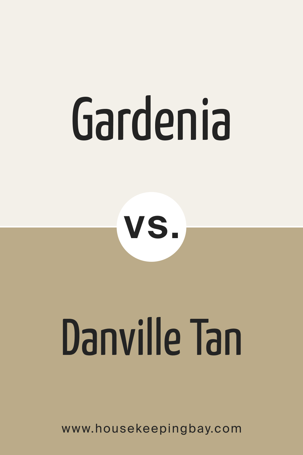
Gardenia AF-10 vs. HC-91 Danville Tan
BM Danville Tan exudes a deep, traditional beige hue. Meanwhile, Gardenia AF-10 carries a contemporary touch with its understated warmth, making it apt for modern interior settings.
housekeepingbay.com
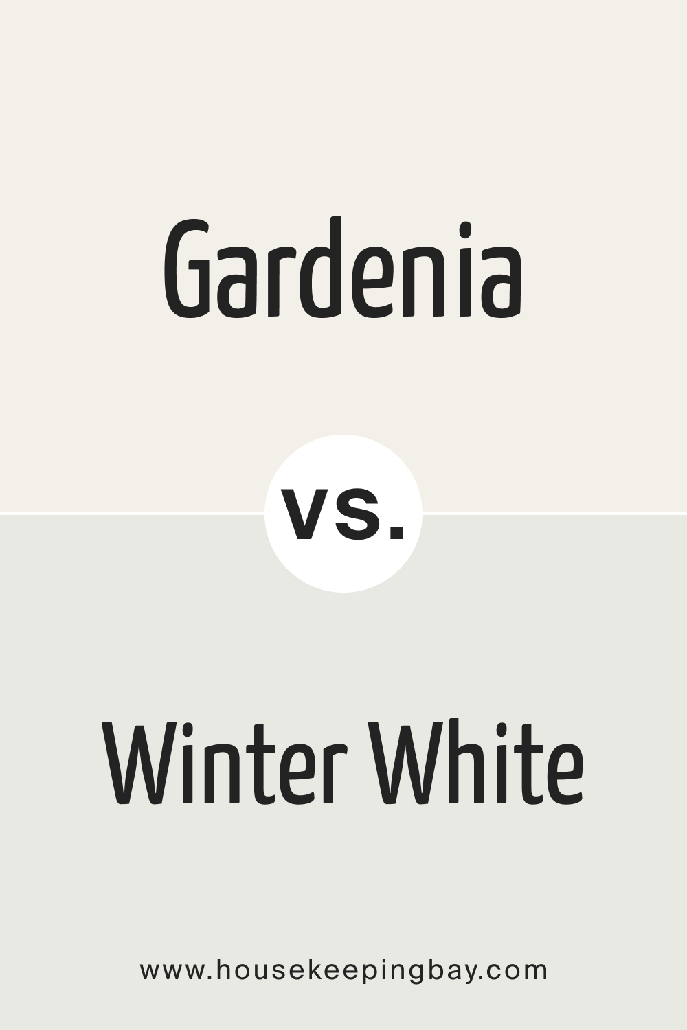
Gardenia AF-10 vs. BM Winter White 2140-70
BM Winter White portrays a pristine cool-toned aura. Conversely, Gardenia AF-10 balances warm undertones, offering a cozy warmth that isn’t overpowering.
housekeepingbay.com
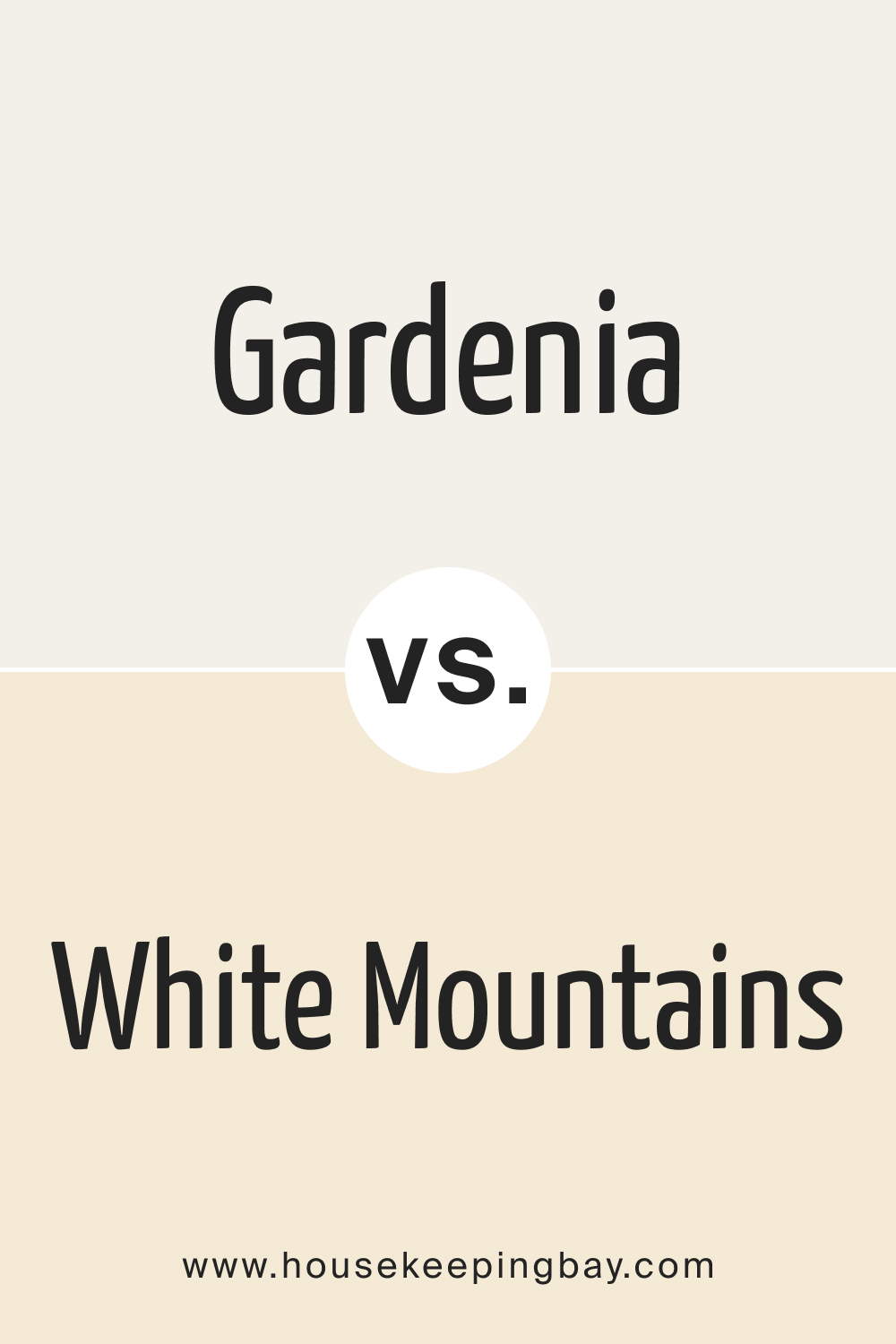
Gardenia AF-10 vs. BM White Mountains 906
BM White Mountains leans towards cooler undertones, radiating an open and airy ambiance. Gardenia AF-10, slightly warmer, evokes a snug and inviting atmosphere.
housekeepingbay.com
Conclusion
Comparative analysis emphasizes the uniqueness of Gardenia AF-10, accentuating its versatility and charm. It stands out with its subtle elegance, fitting seamlessly into varied decor styles and spaces.
housekeepingbay.com
Ever wished paint sampling was as easy as sticking a sticker? Guess what? Now it is! Discover Samplize's unique Peel & Stick samples. Get started now and say goodbye to the old messy way!
Get paint samples


Frequently Asked Questions
⭐Is Gardenia AF-10 more beige or white?
Gardenia AF-10 is a neutral hue with subtle beige undertones, making it warmer than stark white.
⭐How does Gardenia AF-10 compare to regular white shades?
Unlike pure whites, Gardenia AF-10 has a hint of beige, lending warmth and a sophisticated touch to interiors.
⭐Can Gardenia AF-10 be used in both modern and traditional settings?
Yes, its neutral charm and subtle undertones make it adaptable to both contemporary and classic designs.
⭐How does lighting affect the appearance of Gardenia AF-10?
Lighting can either enhance its warmth or bring out its brightness. In natural light, it feels fresh, while artificial light makes it cozier.
⭐What colors pair well with Gardenia AF-10 for trims and accents?
Lighter shades of white or contrasting deep tones, like navy or charcoal, accentuate Gardenia AF-10's beauty.
17 thoughts on “Gardenia AF-10 Paint Color by Benjamin Moore”
Leave a Reply


I’m considering this for my office. Is it a good choice?
Absolutely. Gardenia AF-10 sets a calming and focused atmosphere, ideal for workspaces and offices. Its neutral shade minimizes distractions, fostering productivity
Would this color be too pale for a room with a lot of sunlight?
Not at all. In sunlit rooms, Gardenia AF-10 radiates a fresh and vibrant ambiance, making spaces feel luminous and open.
While both shades exude warmth, Gardenia AF-10 has a subtle beige undertone, making it slightly warmer and cozier than White Sand 964.
How does it compare to BM White Sand 964 in terms of warmth?
Can I use Gardenia AF-10 for the exterior of my cottage?
Gardenia AF-10 is a brilliant choice for cottage exteriors. It complements natural surroundings and provides a welcoming aura, perfect for a cozy retreat.
Is Gardenia AF-10 easy to match with wooden furniture?
Certainly! Its neutral palette harmonizes beautifully with wooden textures, whether it’s dark mahogany or light pine, enhancing the wood’s natural charm.
Would this color work for a nursery?
Yes, Gardenia AF-10’s soft warmth is ideal for creating a serene and comforting nursery environment. Pair it with pastel accessories for a delightful touch.
How does Gardenia AF-10 look in larger spaces like open-concept living areas?
I think it could do well in large, open well lit spaces – it will be creamy and rather bright but still soft. Shadowed corners may bring out the neutral/pinky undertone more, providing some more dimension and cozy vibes.
In expansive areas, Gardenia AF-10 offers a cohesive feel, enhancing the spaciousness with its airy and gentle hue. It’s versatile enough to unify different sections of an open concept without feeling monotonous.
Can Gardenia AF-10 work for a minimalistic room design?
Absolutely! Gardenia AF-10’s neutral undertone is perfect for minimalist designs. Its subtle warmth provides a calming backdrop without overpowering the space, complementing minimalist aesthetics effortlessly.