Paperwhite SW 7105 by Sherwin Williams
Illuminating Spaces & The Versatile Charm
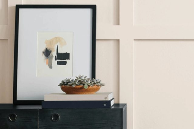
Nestled within Sherwin Williams’ vast palette of colors lies the subtly elegant and infinitely versatile SW 7105 Paperwhite. This shade embodies the essence of understated sophistication, making it an ideal choice for those looking to infuse their spaces with a serene and welcoming atmosphere.
Paperwhite distinguishes itself with its beautifully balanced tone, straddling the fine line between warmth and coolness, a characteristic that allows it to adapt seamlessly to various lighting conditions and design aesthetics. As part of Sherwin Williams’ collection, SW 7105 not only reflects the brand’s commitment to quality but also its keen understanding of the emotive power of color.
This article aims to delve into the nuance of Paperwhite, exploring its potential to transform and elevate interiors. From its inspirations and complementary color schemes to practical applications in different rooms, we will guide you through everything you need to know about making the most of this tranquil hue in your decorating endeavors.
vis sherwin-williams.com
What Color Is Paperwhite SW 7105 by Sherwin Williams?
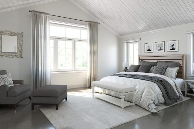
Sherwin Williams’ Paperwhite SW 7105 is a delicate and serene hue, encapsulating a harmonious blend of soft white with subtle grey undertones. This nuanced color exudes a sense of tranquility and light, making any space feel more open and airy.
Its understated elegance allows it to stand alone or serve as a graceful backdrop, making it incredibly versatile for various interior styles.
Perfectly suited for minimalist and Scandinavian designs, Paperwhite adds depth and warmth without overwhelming the senses, maintaining a clean and inviting atmosphere.
Its subtle neutrality makes it an excellent choice for contemporary and modern interiors as well, providing a sleek and sophisticated canvas that enhances the architectural details and simplicity of such spaces.
Paperwhite pairs wonderfully with a wide range of materials and textures, enriching the aesthetic appeal of any room. In spaces with natural wood elements, it highlights the organic beauty and texture of the wood, creating a cozy and grounded environment.
When combined with metals such as brushed nickel or matte black, it offers a contemporary vibe, striking a balance between warmth and modernity. With textiles, Paperwhite harmonizes with both bold and pastel colors, allowing fabrics to stand out or blend in, depending on the desired effect.
Its versatility extends to pairing well with natural stone and ceramics, enhancing their textures and colors, and providing a serene backdrop that complements their inherent beauty.
Through its adaptable nature, Paperwhite SW 7105 by Sherwin Williams not only elevates the aesthetic of any space but also creates a timeless interior that transcends trends, making it a top choice for various design projects.
housekeepingbay.com
Table of Contents
Is Paperwhite SW 7105 by Sherwin Williams Warm or Cool color?
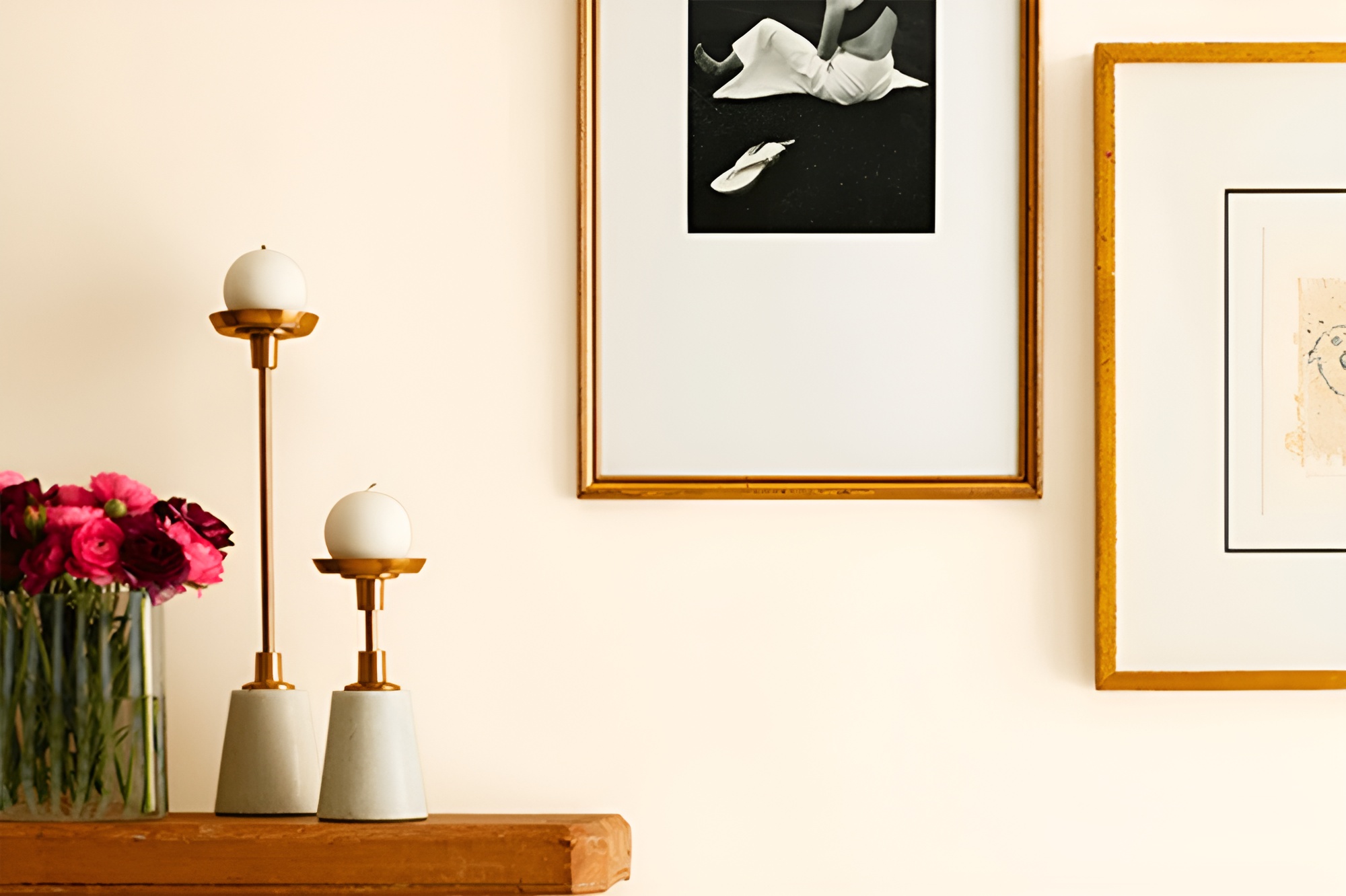
Paperwhite SW 7105 by Sherwin Williams is a captivating hue that embodies a serene and inviting atmosphere in any home setting. This subtle color, part of the Sherwin-Williams palette, is not just white; it carries a soft, warm undertone that makes spaces feel cozy and welcoming.
Its creamy essence ensures it pairs beautifully with a wide range of decor elements, from modern to traditional, making it a versatile choice for homeowners seeking a refined look without the starkness often associated with pure white paints.
In terms of its effect on home interiors, Paperwhite SW 7105 has an exceptional ability to reflect light, thereby enhancing the brightness and perceived size of a room. This quality is particularly beneficial in spaces that receive limited natural light, as it can help to create an illusion of spaciousness and airiness.
Moreover, its warm undertones help in cultivating a relaxed environment, making it an ideal backdrop for living areas and bedrooms where comfort is paramount. Whether used as a dominant color scheme or as an accent, Paperwhite brings a sense of sophistication and a unifying base that allows design elements to stand out, truly transforming houses into homes.
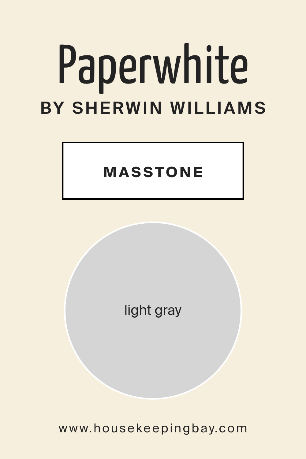
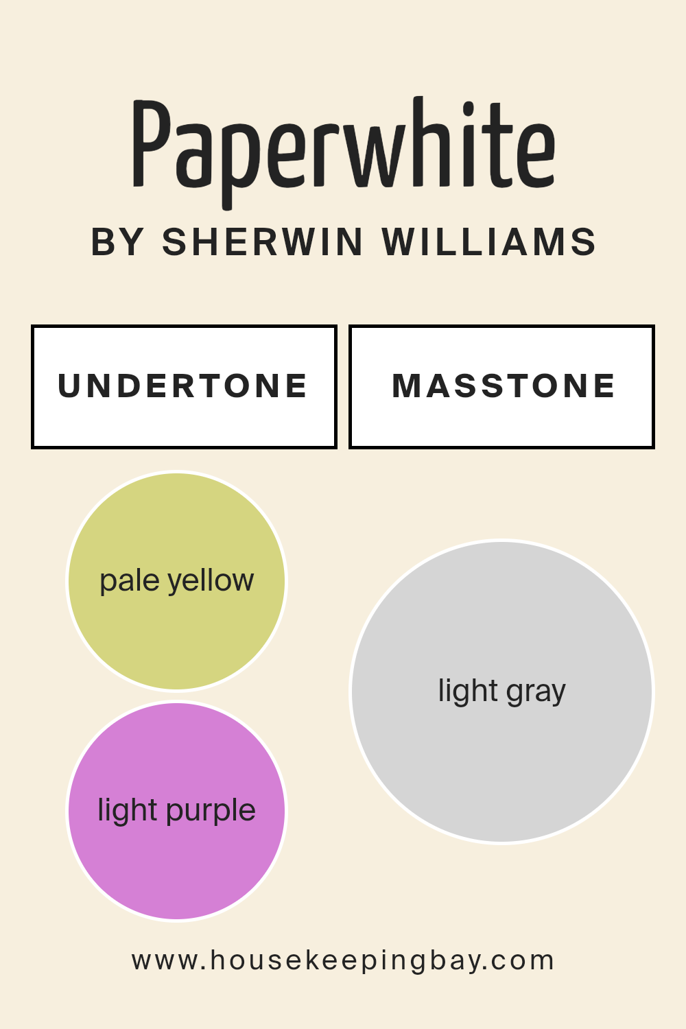
What is the Masstone of the Paperwhite SW 7105 by Sherwin Williams?
Paperwhite SW 7105 by Sherwin Williams, with its masstone of light gray (noted as #D5D5D5 in the color code), offers a versatile and sophisticated choice for homes. This particular shade of gray presents a soft, nearly ethereal quality that works beautifully in a myriad of environments, from traditional to contemporary settings.
The beauty of this light gray lies in its balanced undertone; it doesn’t skew too warm or too cool, thereby providing a neutral backdrop that is calming and unobtrusive.
In the context of home interiors, Paperwhite SW 7105 acts as a subtle canvas that highlights and complements a wide range of décor elements. Whether it’s bold artwork, colorful furniture, or rich textile patterns, this light gray backdrop ensures that other colors pop without overwhelming the space.
Furthermore, it enhances natural light, making rooms appear brighter and more spacious. For smaller or darker rooms, this can create an illusion of openness and airiness.
Its adaptability also means that it transitions smoothly between different lighting conditions throughout the day, maintaining its serene and inviting quality. This makes Paperwhite SW 7105 an excellent choice for main living areas, bedrooms, and even home offices, where a peaceful ambiance is often desired.
Overall, this masstone embodies modern elegance, offering a timeless appeal that works harmoniously within a home’s interior.
housekeepingbay.com
Undertones of Paperwhite SW 7105 by Sherwin Williams
Paperwhite SW 7105 by Sherwin Williams is a captivating color choice for interior walls, offering a unique blend of subtlety and depth that can transform any space.
At a glance, Paperwhite may appear as a straightforward white, but its beauty and complexity are revealed through its undertones: pale yellow (#D5D580) and light purple (#D580D5).
These undertones play a critical role in influencing how we perceive the color, often swaying its appearance under different lighting conditions and altering its interaction with surrounding colors.
The pale yellow undertone imbues Paperwhite with a warm, inviting quality, making spaces feel more open and illuminated. This is particularly beneficial in rooms that receive limited natural light, as the yellowish hue can simulate the effect of sunlight, thereby creating a cozy, welcoming environment.
On the other hand, the light purple undertone introduces a touch of sophistication and depth, adding an element of surprise that prevents the color from being perceived as flat or sterile. This subtle nuance can elevate the elegance of a room, providing a delicate balance between warmth and coolness.
When applied to interior walls, Paperwhite SW 7105 takes on a chameleon-like quality, beautifully adapting to various styles and settings. Its undertones can either be amplified or subdued depending on the colors of the furniture, décor, and even the light quality in the room, ranging from natural daylight to artificial lighting.
his versatility makes Paperwhite an excellent choice for those seeking a color that offers both adaptability and character, capable of creating a serene backdrop that supports a wide array of design aesthetics. Ultimately, the unique undertones of Paperwhite SW 7105 by Sherwin Williams ensure that it stands out as a sophisticated, multifaceted white that can breathe life and elegance into any interior space.
housekeepingbay.com
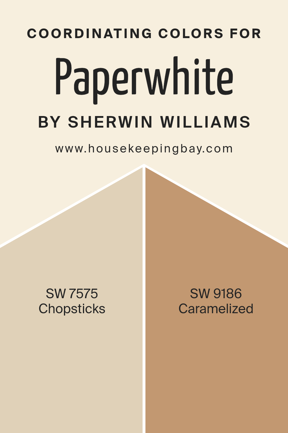
Coordinating Colors of Paperwhite SW 7105 by Sherwin Williams
Coordinating colors play a crucial role in designing a space, bringing visual harmony and a balanced aesthetic appeal. They are the hues that complement each other and work together to enhance the overall look of a room.
When using Paperwhite SW 7105 by Sherwin-Williams, a serene and soft white that exudes simplicity and brightness, finding the right coordinating colors is key to achieving a cohesive design. This particular shade serves as a versatile backdrop, opening up a plethora of color pairing opportunities that can either soothe or contrast beautifully against its calm demeanor.
Among the hues that coordinate well with Paperwhite SW 7105, Chopsticks SW 7575 presents itself as a warm, inviting neutral. This color, with its earthy, beige tones, offers a subtle depth that enriches the space without overwhelming it, creating a seamless flow when paired with Paperwhite.
It evokes a sense of comfort and understated elegance, making it an ideal choice for areas seeking a touch of warmth. On the other hand, Caramelized SW 9186 stands out as a rich, golden hue that injects a cheerful burst of color into any room.
This coordinating color adds a layer of sophistication and warmth, creating an inviting and cozy atmosphere. Its vibrant character beautifully complements Paperwhite’s calm base, offering a stunning contrast that highlights the best features of both colors.
Together, these coordinating colors transform a space into a harmonious haven, balancing neutral subtlety with enticing warmth.
You can see recommended paint colors below:
- SW 7575 Chopsticks
- SW 9186 Caramelized
housekeepingbay.com
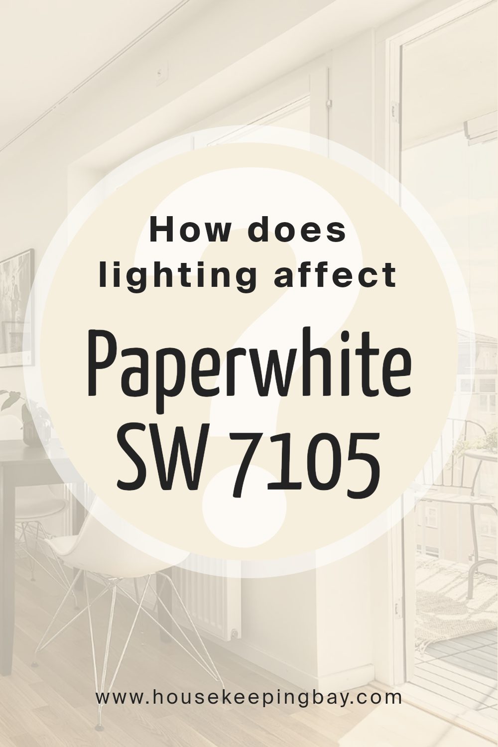
How Does Lighting Affect Paperwhite SW 7105 by Sherwin Williams?
Lighting plays a crucial role in how we perceive colors, significantly impacting their appearance and the mood they evoke in a space. Whether under natural or artificial light, the same color can look different, sometimes subtly and sometimes quite dramatically.
This is an essential consideration in interior design and decoration, where choosing the right paint color can change the feel of a room. A fascinating example of this is Paperwhite SW 7105 by Sherwin Williams, a color that can transform under different lighting conditions.
In artificial light, the type of bulb used (LED, incandescent, fluorescent) can alter the appearance of Paperwhite SW 7105. Warmer lights tend to enhance the creamy aspects of the color, making it more inviting and cozy, while cooler lights can make it appear brighter and lean towards a more pristine, neutral appearance.
This versatility makes Paperwhite a go-to choice for many designers, as it can adapt well to different settings and preferences in lighting.
Under natural light, Paperwhite SW 7105 showcases its chameleon-like quality. The color’s perception can change throughout the day as the sun’s position changes.
Morning light in east-facing rooms is cooler, which can make Paperwhite look more crisp and lively. In contrast, west-facing rooms receive warmer afternoon light, highlighting the color’s warmer, softer side.
North-faced rooms receive less direct sunlight, often resulting in cooler, softer light. In these rooms, Paperwhite can appear more muted and subtle, maintaining a clean, calming appearance throughout the day.
South-facing rooms, bathed in abundant daylight, can cause Paperwhite to reveal its brightness, creating a vibrant, airy space that feels welcoming and warm.
In conclusion, the interaction between lighting and colors such as Paperwhite SW 7105 by Sherwin Williams is a complex dance that can dramatically affect the mood and functionality of a space.
Understanding this relationship is key in creating environments that are both beautiful and adaptable to the changing light conditions throughout the day and year.
housekeepingbay.com
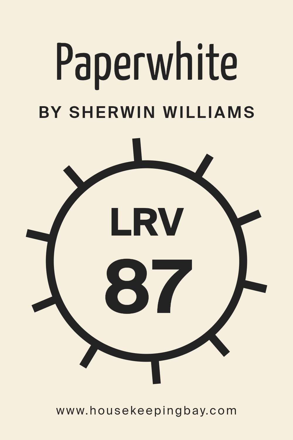
What is the LRV of Paperwhite SW 7105 by Sherwin Williams?
Light Reflectance Value (LRV) is a measure of the percentage of light a paint color reflects back into a room, on a scale from 0 to 100. A value of 0 implies that the color absorbs all light, appearing as true black, while a value of 100 reflects all light, appearing as a true white.
This measurement is critical in design and architectural contexts as it affects the brightness and ambiance of a space. Colors with higher LRV make a room feel more open and airy, as they reflect more light. Conversely, colors with lower LRV absorb more light, which can make a room feel smaller and cozier.
The LRV can also influence the temperature of the room, with higher LRV values potentially making the room feel cooler due to the reflection of light, and lower LRV values making it feel warmer.
Regarding the color Paperwhite (SW 7105) by Sherwin Williams, with an LRV of 86.702, it is on the higher end of the light reflectance spectrum. This means it has a great ability to reflect light, making spaces appear brighter and more spacious.
The high LRV of Paperwhite makes it an excellent choice for smaller rooms or spaces with limited natural light, as it can maximize the perception of light, creating an inviting and uplifting environment. Moreover, with such a high reflectance value, Paperwhite can act as a versatile backdrop, enhancing the visibility and vibrancy of furnishings and art.
Its ability to reflect the majority of light can also contribute to energy efficiency by reducing the need for artificial lighting during the day. However, the perception of its color can vary dramatically depending on the light sources in the room, appearing differently under natural light compared to artificial light.
housekeepingbay.com
What is LRV? Read It Before You Choose Your Ideal Paint Color
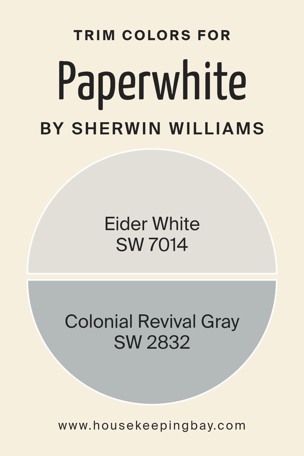
What are the Trim colors of Paperwhite SW 7105 by Sherwin Williams
Trim colors play an essential role in defining the aesthetic and mood of a room, particularly when combined with a nuanced wall color like Paperwhite SW 7105 by Sherwin Williams. By carefully selecting trim colors, one can accentuate architectural details, create visual coherence, and enhance the overall appeal of a space.
The contrast or complement that trim colors provide can either subtly frame a room, drawing attention to the wall color, or stand out on their own as a decorative statement. They are crucial in achieving a finished look that feels thoughtfully designed and visually pleasing.
Choosing Eider White SW 7014 and Colonial Revival Gray SW 2832 as trim colors for walls painted with Paperwhite SW 7105 introduces a sophisticated palette that can adapt across various styles, from modern to traditional.
Eider White offers a softer approach to white, presenting a slightly warm and inviting undertone that can make spaces feel more intimate and harmonious when paired with the crispness of Paperwhite. On the other hand, Colonial Revival Gray provides a deeper contrast, a shade that balances cool and warm tones, capable of adding depth and definition to edges and corners without overwhelming the room’s primary color.
This interplay of light and shadow, warmth and depth, enriches the room’s character, demonstrating the powerful role trim colors have in interior design.
You can see recommended paint colors below:
- SW 7014 Eider White
- SW 2832 Colonial Revival Gray
housekeepingbay.com
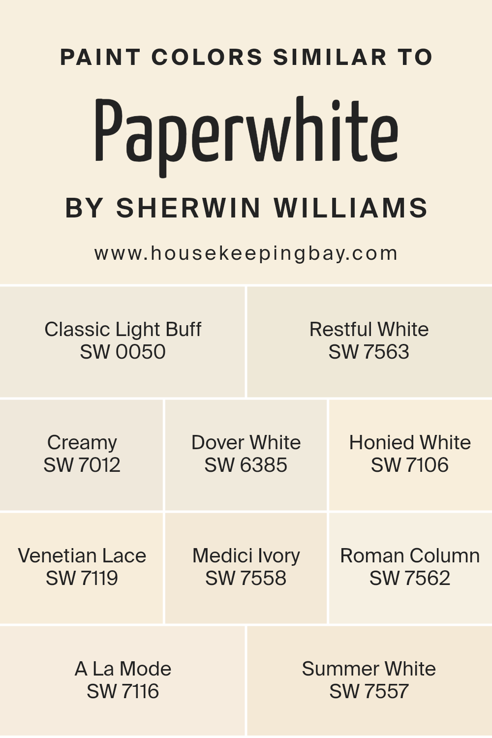
Colors Similar to Paperwhite SW 7105 by Sherwin Williams
Similar colors play a pivotal role in designing and decorating spaces, creating an atmosphere that’s cohesive, calming, and visually appealing. These hues, aligned with the likeness of Paperwhite SW 7105 by Sherwin Williams, offer a spectrum of possibilities that seamlessly blend together, evoking a sense of fluidity and unity in interiors.
Colors such as Classic Light Buff, Restful White, and Creamy pave the way for a soft, neutral base, allowing for versatile design choices. They bring warmth and subtle elegance, serving as perfect backdrops for various decor elements.
Dover White and Honied White further accentuate this warmth, introducing a hint of brightness without overwhelming the senses, making spaces feel inviting and serene.
Venetian Lace and Medici Ivory suggest a slightly richer tone, adding depth and character to rooms without straying too far from the overarching neutral theme. This slight variation in hue helps to create layers and texture, important for adding visual interest to any space.
Roman Column, A La Mode, and Summer White echo this sentiment, each contributing to the narrative of nuanced, harmonious elegance. These colors, while similar, possess unique undertones and intensities, allowing them to stand alone or work together in symphony, amplifying the beauty of interior spaces with grace and subtlety. Such a palette fosters a timeless aesthetic, versatile enough to support a range of design styles from minimalist to classic.
You can see recommended paint colors below:
- SW 0050 Classic Light Buff
- SW 7563 Restful White
- SW 7012 Creamy
- SW 6385 Dover White
- SW 7106 Honied White
- SW 7119 Venetian Lace
- SW 7558 Medici Ivory
- SW 7562 Roman Column
- SW 7116 A La Mode
- SW 7557 Summer White
housekeepingbay.com
How to Use Paperwhite SW 7105 by Sherwin Williams In Your Home?
Paperwhite SW 7105 by Sherwin Williams is a calm and versatile shade of white that carries a subtle hint of warmth, making it an ideal choice for creating a serene and inviting atmosphere within a home. Unlike stark whites, its soft undertones bring a cozy and comfortable feel to spaces, allowing for a wide range of decorating styles from modern minimalism to rustic chic.
This makes Paperwhite exceptionally user-friendly, as it can adapt to various settings and preferences, ensuring that personal tastes are easily reflected through interior decoration.
Homeowners can use Paperwhite SW 7105 in multiple ways to enhance their living spaces. For walls, it serves as a perfect backdrop, allowing art pieces, furniture, and textiles to stand out, while also making rooms appear larger and more luminous.
Its adaptability extends to trim and ceilings, where it adds a subtle contrast to colored walls, providing a refined finish to every room. Moreover, its neutrality supports a seamless flow between spaces, promoting a cohesive look throughout the home.
Whether aiming for a bright and airy kitchen, a tranquil bedroom, or a welcoming living room, Paperwhite SW 7105 embodies a balance of warmth and simplicity, enabling homeowners to craft their ideal ambiance.
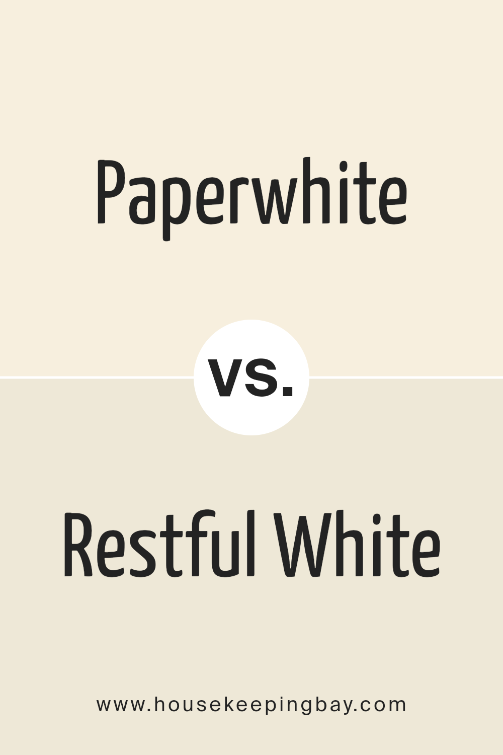
Paperwhite SW 7105 by Sherwin Williams vs Restful White SW 7563 by Sherwin Williams
Paperwhite SW 7105 and Restful White SW 7563 by Sherwin Williams epitomize the subtle yet profound impact that different white shades can have on interior spaces. Paperwhite, with its pure, bright essence, reflects a significant amount of light, making spaces feel open and vibrant.
This color works exceptionally well in areas that aim to capture a fresh, clean look, enhancing natural light to create an airy ambiance.
In contrast, Restful White SW 7563 leans towards a softer, warmer spectrum of white. It encapsulates a serene and calming quality, making it ideal for creating a cozy and tranquil environment.
Restful White is more forgiving in spaces with less natural light or where a more intimate atmosphere is desired, as it brings a comforting warmth to interiors without overwhelming the senses.
While both colors share a foundation in white, Paperwhite SW 7105 presents a crisper, more illuminating quality, whereas Restful White SW 7563 offers a soothing, gentle presence.
Choosing between them depends largely on the desired mood and lighting of a room, with Paperwhite best suited for energizing spaces and Restful White for crafting a restful retreat.
You can see recommended paint color below:
housekeepingbay.com
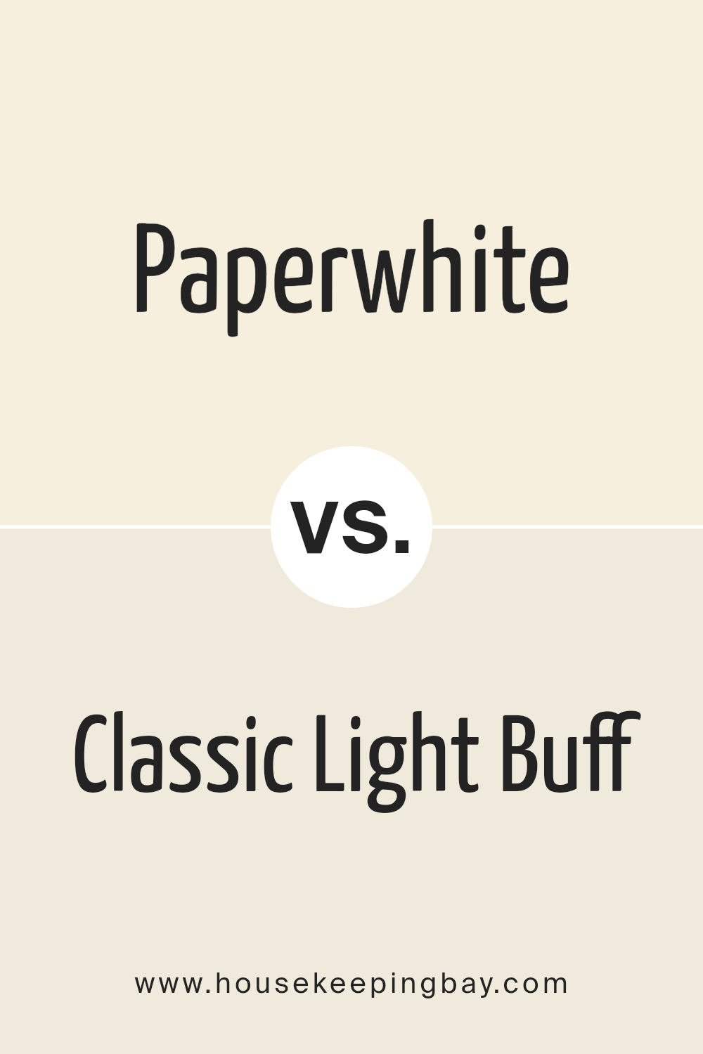
Paperwhite SW 7105 by Sherwin Williams vs Classic Light Buff SW 0050 by Sherwin Williams
Paperwhite SW 7105 and Classic Light Buff SW 0050 by Sherwin Williams are two neutral colors that, while appearing similar at first glance, possess distinct undertones and atmospheres they bring to a space.
Paperwhite, as its name suggests, has a clean, crisp quality mimicking that of a fresh sheet of paper. This color leans towards a cool palette, offering a bright and refreshing feel, which can make small spaces appear larger and more illuminated. Its subtle undertones can effortlessly complement a wide range of decor styles, making it a versatile choice for any room.
On the other hand, Classic Light Buff is a warmer hue, evoking an earthy, inviting atmosphere. This color has a creamy, soft presence, adding a touch of warmth to the interiors without overwhelming the senses. It’s particularly suited for creating cozy environments, enhancing wood finishes, and pairing harmoniously with both vibrant and subdued color schemes.
Ultimately, choosing between Paperwhite and Classic Light Buff depends on the desired ambiance; Paperwhite is ideal for a bright, airy feel, while Classic Light Buff is perfect for a snug, warm setting.
You can see recommended paint color below:
housekeepingbay.com
Paperwhite SW 7105 by Sherwin Williams vs Creamy SW 7012 by Sherwin Williams
Paperwhite SW 7105 by Sherwin Williams and Creamy SW 7012 by Sherwin Williams are both warm-toned paint colors that imbue spaces with a comforting ambiance, yet each offers a distinctly different palette for interior decorators to work with.
Paperwhite stands out as a soft, pure white with a slight warmth that stops it from becoming stark or cold. This color is excellent for creating a bright, airy feel in a room, reflecting natural light beautifully and enhancing the sense of space.
On the other hand, Creamy SW 7012 is a richer, more buttery hue. True to its name, it offers a more pronounced creamy tone that can add depth and coziness to spaces without overwhelming them with color.
While still in the neutral zone, it brings a comforting, enveloping warmth to rooms, making it perfect for areas where a more inviting, snug atmosphere is desired.
In summary, while Paperwhite provides a crisp, clean canvas that maximizes light and space, Creamy leans into warmth and comfort, offering a soft, nurturing backdrop that’s rich in character. Each color serves distinct aesthetic and emotional purposes within interior spaces, catering to different tastes and styles.
You can see recommended paint color below:
housekeepingbay.com
Paperwhite SW 7105 by Sherwin Williams vs Summer White SW 7557 by Sherwin Williams
Paperwhite SW 7105 and Summer White SW 7557 by Sherwin-Williams are both elegant shades of white, each bringing its unique ambiance to a space. Paperwhite leans towards a clean, crisp white with a subtle hint of cool undertones, making it an excellent choice for creating a bright, airy feel in a room.
It reflects light beautifully, enhancing natural daylight in a space, and pairs well with modern and minimalist decor, providing a fresh, invigorating atmosphere.
On the other hand, Summer White SW 7557 has a warmer tone, imbued with soft, creamy undertones. This warmth makes it an ideal selection for spaces where a cozy, inviting feel is desired.
It complements natural materials like wood and stone, enriching traditional or rustic styles. Summer White can create a soothing environment, perfect for living areas or bedrooms where a welcoming, relaxed ambiance is key.
Though both shades are versatile, the choice between Paperwhite and Summer White ultimately depends on the desired mood and decor style, with Paperwhite favoring cooler, contemporary spaces, and Summer White enriching warm, comforting settings.
You can see recommended paint color below:
housekeepingbay.com
Paperwhite SW 7105 by Sherwin Williams vs Honied White SW 7106 by Sherwin Williams
Paperwhite SW 7105 and Honied White SW 7106 by Sherwin Williams are two subtly distinct shades that exemplify the nuanced approach of interior design and decoration. Paperwhite, as its name suggests, leans towards a pure, crisp, almost pristine quality akin to a freshly pressed sheet of paper.
This color embodies a sense of cleanliness and simplicity, making it an excellent choice for creating a bright, airy feel in a space. It reflects light beautifully, enhancing the sense of openness and freshness within a room.
In contrast, Honied White SW 7106 introduces a warm, comforting undertone reminiscent of the mild sweetness of honey. This color is slightly deeper, wrapping spaces in a cozy, welcoming glow. Its warm undertones make it particularly suitable for spaces intended to relax and gather, adding a layer of warmth that enriches the environment.
While both shades are grounded in white, Paperwhite offers a cooler, stark simplicity, and Honied White brings forth a gentle, warming presence. Their subtle differences underscore the importance of color undertones in interior design, illustrating how slight variations can shift the mood and feel of a room.
You can see recommended paint color below:
housekeepingbay.com
Paperwhite SW 7105 by Sherwin Williams vs Venetian Lace SW 7119 by Sherwin Williams
Paperwhite SW 7105 and Venetian Lace SW 7119, both from Sherwin Williams, embody subtle elegance but contrast in their color characteristics. Paperwhite leans towards a crisp, bright atmosphere, reminiscent of the natural whiteness of paper under daylight.
It offers a clean backdrop for any space, promoting a sense of openness and clarity. This color is perfect for areas that aim to evoke freshness and a minimalist aesthetic, making space appear larger and more inviting.
Venetian Lace SW 7119, on the other hand, introduces a softer, more nuanced approach to color. It whispers of warmth with its subtle beige tones, bringing a cozy, inviting feel to interiors.
Venetian Lace envelops a room in a gentle embrace, making it ideal for spaces that aim for a serene, understated elegance. It pairs beautifully with a wide range of colors and textures, adding depth and warmth without overwhelming the senses.
Together, Paperwhite and Venetian Lace offer a versatile palette for designers and homeowners alike, bridging the gap between stark modernism and traditional warmth. Whether seeking brilliance and simplicity or a touch of warmth and sophistication, these colors cater to diverse aesthetic preferences while maintaining a harmonious balance.
You can see recommended paint color below:
- SW 7119 Venetian Lace
housekeepingbay.com
Paperwhite SW 7105 by Sherwin Williams vs Medici Ivory SW 7558 by Sherwin Williams
Paperwhite SW 7105 and Medici Ivory SW 7558 by Sherwin-Williams are two neutral colors that both present a subtle, elegant backdrop for interiors, but they have distinct undertones and visual impacts.
Paperwhite, as its name suggests, evokes the crispness and brightness of white paper. It is a clean, almost pure white with just a hint of warmth, making it versatile for use in various lighting conditions and design aesthetics. It reflects light beautifully, amplifying the sense of space and purity in a room.
On the other hand, Medici Ivory SW 7558 leans more towards a creamy, warm ivory tone. It embodies a more pronounced warmth than Paperwhite, offering a cozy, inviting ambiance.
This color is reminiscent of the natural warmth found in aged parchment or antique linen, providing a sense of comfort and elegance. Medici Ivory can soften the edges of a space, making it ideal for creating a more intimate and serene environment.
Together, Paperwhite and Medici Ivory can complement each other beautifully, with Paperwhite bringing a bright, expansive feel and Medici Ivory adding depth and warmth. Both colors work well in various settings, from modern to traditional, depending on the accompanying decor and natural light.
You can see recommended paint color below:
housekeepingbay.com
Paperwhite SW 7105 by Sherwin Williams vs Dover White SW 6385 by Sherwin Williams
Paperwhite SW 7105 and Dover White SW 6385, both from Sherwin Williams, are nuanced shades of white that cater to different aesthetic preferences and design needs. Paperwhite, with its crisp and slightly cooler undertone, offers a clean and almost ethereal backdrop, ideal for spaces seeking a modern and minimalistic feel.
It reflects light beautifully, making it a great choice for areas where a sense of openness and purity is desired. Its subtle coolness can help balance out spaces with abundant natural light or complement cooler color palettes.
On the other hand, Dover White SW 6385 leans towards a warmer spectrum, imbuing spaces with a cozy and welcoming vibe. This color has a gentle creaminess, making it perfect for environments where a softer, more inviting ambiance is preferred.
Dover White pairs wonderfully with rich woods, natural textures, and earthy tones, providing a comforting and seamless blend between contemporary and traditional styles.
When comparing the two, the primary distinction lies in their undertones and the resulting atmosphere they create. Paperwhite will give a space a sharper, more defined look, while Dover White offers a softer, more harmonious feel.
You can see recommended paint color below:
housekeepingbay.com
Paperwhite SW 7105 by Sherwin Williams vs Roman Column SW 7562 by Sherwin Williams
Paperwhite SW 7105 and Roman Column SW 7562, both by Sherwin Williams, offer subtle yet distinctly different hues that cater to a variety of design needs. Paperwhite is a serene, crisp white that embodies the brightness and purity of its namesake.
It’s a color that reflects light beautifully, making spaces appear larger and more open. Its neutral quality allows it to serve as an excellent backdrop for bold colors and designs, as well as creating a calm, clean look when used on its own.
Roman Column, on the other hand, introduces a warmer, creamier tone. This color suggests a soft, inviting atmosphere, leaning towards a traditional aesthetic with its understated elegance.
Roman Column is ideal for those looking to infuse their space with warmth without overwhelming it with strong color. It pairs wonderfully with natural materials like wood and stone, enhancing the cozy, welcoming vibe of any room.
In essence, while Paperwhite offers a fresh, vibrant base that amplifies light and space, Roman Column brings a subtle warmth and sophistication, making both colors versatile in their own right. Whether seeking the crisp freshness of a modern design with Paperwhite or the soft, traditional elegance of Roman Column, designers can achieve a wide range of moods and styles.
You can see recommended paint color below:
housekeepingbay.com
Paperwhite SW 7105 by Sherwin Williams vs A La Mode SW 7116 by Sherwin Williams
Paperwhite SW 7105 and A La Mode SW 7116, both by Sherwin Williams, are distinctive yet elegant colors that lend themselves to a variety of decor styles. Paperwhite leans towards a classic, pure white with a slight warmth that prevents it from feeling stark or cold.
Ideal for spaces seeking a bright, refreshing lift, it can make rooms appear larger and more inviting, working well in both natural and artificial light.
On the other hand, A La Mode presents a soothing, soft gray with subtle beige undertones, giving it a warmer presence than a typical gray. This color embodies sophistication and versatility, easily complementing both modern and traditional settings.
Its muted hue offers a serene backdrop that can enhance artworks and colorful decor without overpowering.
When comparing the two, Paperwhite offers a crispness that can refresh any space, making it a go-to for ceilings or trim work. In contrast, A La Mode provides a more nuanced palette that supports a range of color schemes, acting as a perfect neutral wall color that warms up the space subtly.
Together, they could harmonize well within a home, with Paperwhite brightening trim and ceilings, while A La Mode serves as a calming wall color, creating a cohesive yet diverse interior atmosphere.
You can see recommended paint color below:
- SW 7116 A La Mode
housekeepingbay.com
Conclusion
In conclusion, Sherwin Williams’ Paperwhite SW 7105 emerges as an exceptionally versatile and elegant paint color that seamlessly adapts to a variety of interior spaces. Its soft, nuanced hue embodies a delicate blend of warmth and neutrality, making it an ideal choice for those seeking to create a serene and welcoming atmosphere.
The color’s adaptability ensures it can complement an array of decor styles, from contemporary to traditional, enhancing the aesthetic appeal of any room. Its ability to reflect light beautifully enriches spaces, making them appear more spacious and open, a characteristic appreciated by homeowners and designers alike.
Furthermore, Paperwhite SW 7105 underscores Sherwin Williams’ commitment to offering high-quality, trend-forward paint options that cater to the evolving tastes of consumers. Its understated elegance underscores a minimalist beauty, proving that simplicity can indeed make a bold statement.
Whether used as a primary shade or an accent, this color offers a timeless appeal that transcends fleeting trends, promising to remain relevant and adored in interior design for years to come. Through its harmonious balance of warmth and neutrality, Paperwhite SW 7105 stands out as a quintessential choice for those looking to infuse their spaces with a subtle, sophisticated touch.
housekeepingbay.com
Ever wished paint sampling was as easy as sticking a sticker? Guess what? Now it is! Discover Samplize's unique Peel & Stick samples. Get started now and say goodbye to the old messy way!
Get paint samples