Dreamy White SW 6021 by Sherwin Williams
Where Serenity Meets Style
Welcome to our overview of Sherwin Williams SW 6021 Dreamy White, a beautiful paint color that’s been a favorite among homeowners and interior designers alike. If you’re thinking about giving your space a refresh, SW 6021 Dreamy White might just be the perfect choice for you. This color is known for its soft and airy feel, making rooms look bigger and brighter. Ideal for any room that needs a touch of calmness and clarity, Dreamy White brings a peaceful ambiance that’s hard to beat.
Not only does Dreamy White work wonders in creating serene spaces, but it’s also incredibly versatile. Whether you’re going for a modern, minimalist look or aiming for a cozy, rustic vibe, this color can adapt to your style. It pairs beautifully with a wide range of decor items and other colors, making it a solid choice for walls, trim, or even cabinets.
In this article, we’ll explore why Dreamy White by Sherwin Williams has gained such popularity. We’ll look at the best ways to use this color in your home and offer some tips to get the most out of its timeless charm.
So whether you’re planning a complete makeover or just looking to update a few elements, keep reading to see how Dreamy White can transform your space into a refreshing and stylish haven.
via sherwin-williams.com
What Color Is Dreamy White SW 6021 by Sherwin Williams?
Dreamy White SW 6021 by Sherwin Williams is a soft, inviting shade that effortlessly creates a serene and light-filled ambiance in any room. This color carries the subtlest hint of warmth, making it a versatile choice for a variety of decorating schemes. Unlike stark whites, Dreamy White adds a cozy, gentle touch to walls, making spaces feel welcoming and lived-in.
This gentle hue works wonders in interior styles that prioritize comfort and tranquility, such as Scandinavian, minimalist, and shabby chic. It provides a clean, uncluttered backdrop that allows your furniture and decor to shine.
In a modern farmhouse setting, Dreamy White can enhance the rustic elements with a fresh, contemporary twist. It pairs beautifully with natural materials, bringing out the rich textures of wood, wicker, and linen, and complements the sleekness of metals like brass and copper, adding a touch of warmth to industrial elements.
When it comes to fabrics, Dreamy White complements both the softness of plush velvets and the rustic charm of burlap, creating a balanced aesthetic that feels both sophisticated and homey. It’s particularly striking when used in well-lit spaces, where its subtle warmth is most visible, making the room feel bright yet cozy. Whether your home is filled with natural light or relies on well-placed fixtures, Dreamy White adapts, reflecting light beautifully to make spaces appear larger and more inviting.

housekeepingbay.com
Table of Contents
Is Dreamy White SW 6021 by Sherwin Williams Warm or Cool color?
Dreamy WhiteSW 6021 by Sherwin Williams is a light and airy paint color that can make any room in your home feel more spacious and calm. Its soft, subtle tone works well in a variety of spaces, whether you’re looking to create a soothing bedroom environment or make a small bathroom appear larger. Because of its neutral base, Dreamy White pairs beautifully with almost any decor, from modern and minimalist to cozy and rustic.
This color has the power to brighten up a space by reflecting natural light, which can help your home feel more open and welcoming. It’s especially useful in rooms that don’t get a lot of sunlight, providing a lift that can make the space feel warmer and more inviting.
Additionally, Dreamy White acts as a perfect backdrop for artwork, furniture, and accent colors, allowing them to stand out without competition. It’s a versatile color choice that adapts to your style, making it easy to update your space without having to repaint.
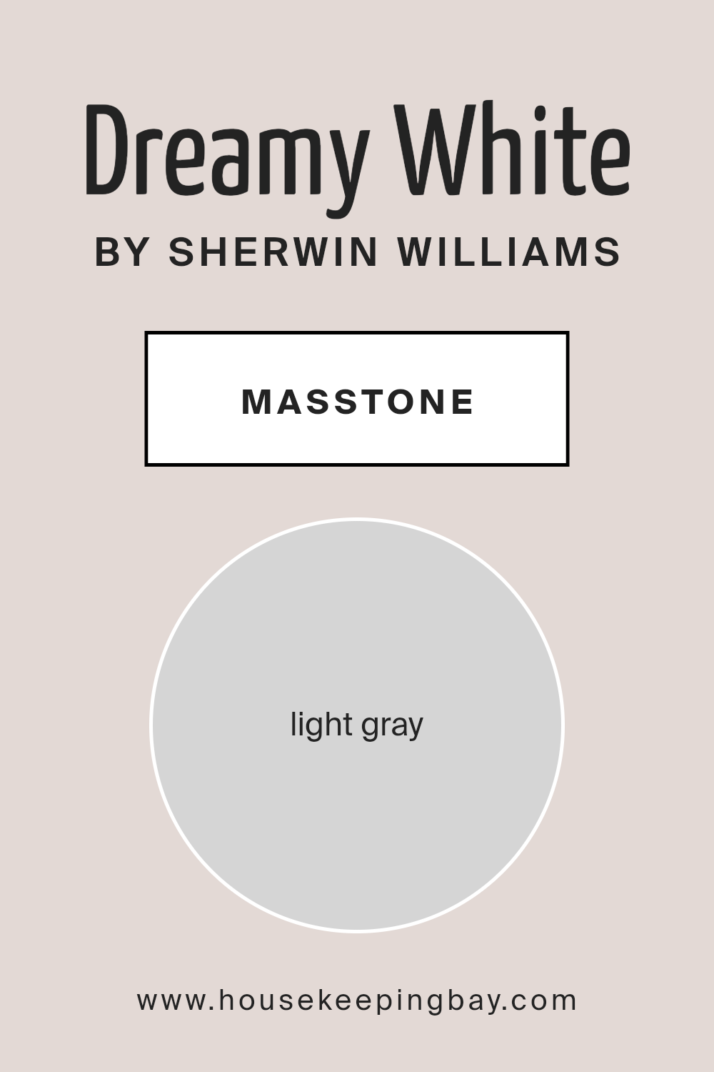
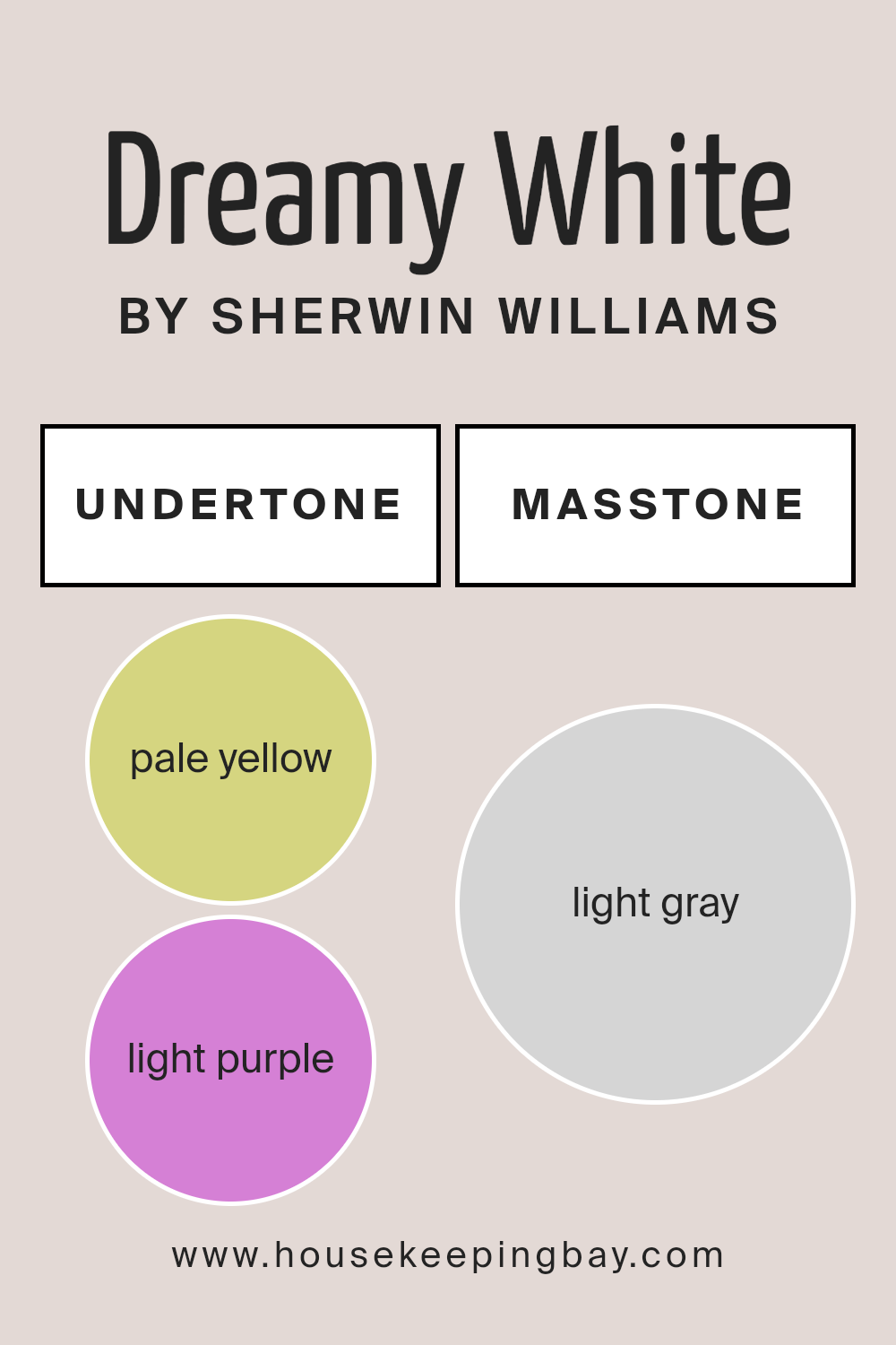
What is the Masstone of the Dreamy White SW 6021 by Sherwin Williams?
Dreamy White SW 6021 by Sherwin Williams is a special shade that looks light gray (#D5D5D5) when you see a lot of it together, kind of like the color of soft clouds on a sunny day. This color is super versatile, which means it can work really well in lots of different homes and spaces. Because of its light gray tone, it brings a calm and cozy feel to any room, making spaces feel more open and airy. This is perfect for living rooms, bedrooms, and even bathrooms where you want a peaceful vibe.
Since Dreamy White is not too stark or bright, it’s great for matching with other colors. Whether you have dark wood furniture, colorful art, or bright curtains, this shade of gray acts as a gentle backdrop that lets other colors shine without clashing. It’s like a quiet friend that makes everyone else look good. This makes Dreamy White an excellent choice for anyone looking to refresh their home in a way that feels both elegant and welcoming.
housekeepingbay.com
Undertones of Dreamy White SW 6021 by Sherwin Williams
Dreamy White SW 6021 by Sherwin Williams is a unique color that looks simple at first glance but has complex undertones that make it stand out. The main undertones in this paint are pale yellow and light purple. These undertones aren’t always easy to spot right away, but they play a big role in how the color looks under different lighting conditions and when paired with various decor elements.
Undertones influence our perception of color more than we might realize. They can make a color appear warmer or cooler and affect how it feels in a space. For Dreamy White SW 6021, the pale yellow undertone adds a subtle warmth to the color, making spaces feel cozy and inviting. This warmth can make rooms feel more welcoming, especially in natural light where the yellow can become more noticeable.
The light purple undertone adds a hint of sophistication and depth. It’s not in-your-face, but it’s there, bringing an added layer that makes the color more interesting. In artificial light or during the evening, this undertone might become more apparent, adding a slight, cool contrast to the warmth of the yellow.
On interior walls, Dreamy White SW 6021 transforms the space based on these undertones. The balance of warm and cool means it can fit in a variety of settings, from bedrooms to living spaces. The paint can make rooms feel brighter and larger while still adding a touch of personality thanks to its unique blend of undertones.
The overall effect is a versatile backdrop that adapts to different styles and preferences, making Dreamy White SW 6021 a great choice for those looking to create a welcoming yet subtly dynamic interior.
housekeepingbay.com
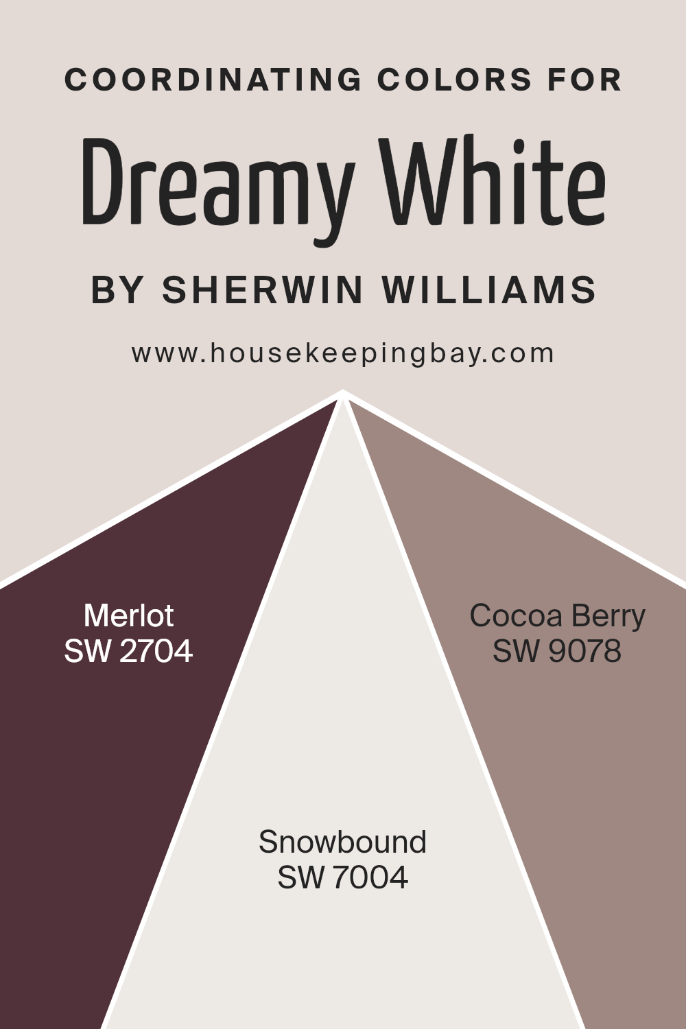
Coordinating Colors of Dreamy White SW 6021 by Sherwin Williams
In the realm of interior design and painting, coordinating colors refer to a palette of hues that harmoniously complement each other, enhancing the overall aesthetic of a space. When you have a base color like Dreamy White SW 6021 by Sherwin Williams, which is a soft, serene shade, finding the right coordinating colors can make all the difference in achieving a balanced and visually pleasing environment.
These colors work together to create a cohesive look, either by contrasting with or accentuating the primary color, thus offering a variety of design options that can cater to different tastes and styles.
One coordinating color for Dreamy White SW 6021 is Merlot SW 2704, a deep, rich red that provides a bold contrast, adding warmth and depth to rooms. It’s perfect for creating a focal point or for adding a touch of sophistication. Another great pair is Snowbound SW 7004, a crisp and clean white with subtle undertones, which delivers a seamless transition between spaces, promoting a light and airy atmosphere.
Lastly, Cocoa Berry SW 9078 is a cozy and inviting hue, with its warm undertones it acts as a perfect complement to Dreamy White, ensuring spaces feel grounded yet expansive. These coordinating colors, when used thoughtfully, can bring out the best features of a room, making it feel more welcoming and put together.
You can see recommended paint colors below:
- SW 2704 Merlot
- SW 7004 Snowbound
- SW 9078 Cocoa Berry
housekeepingbay.com
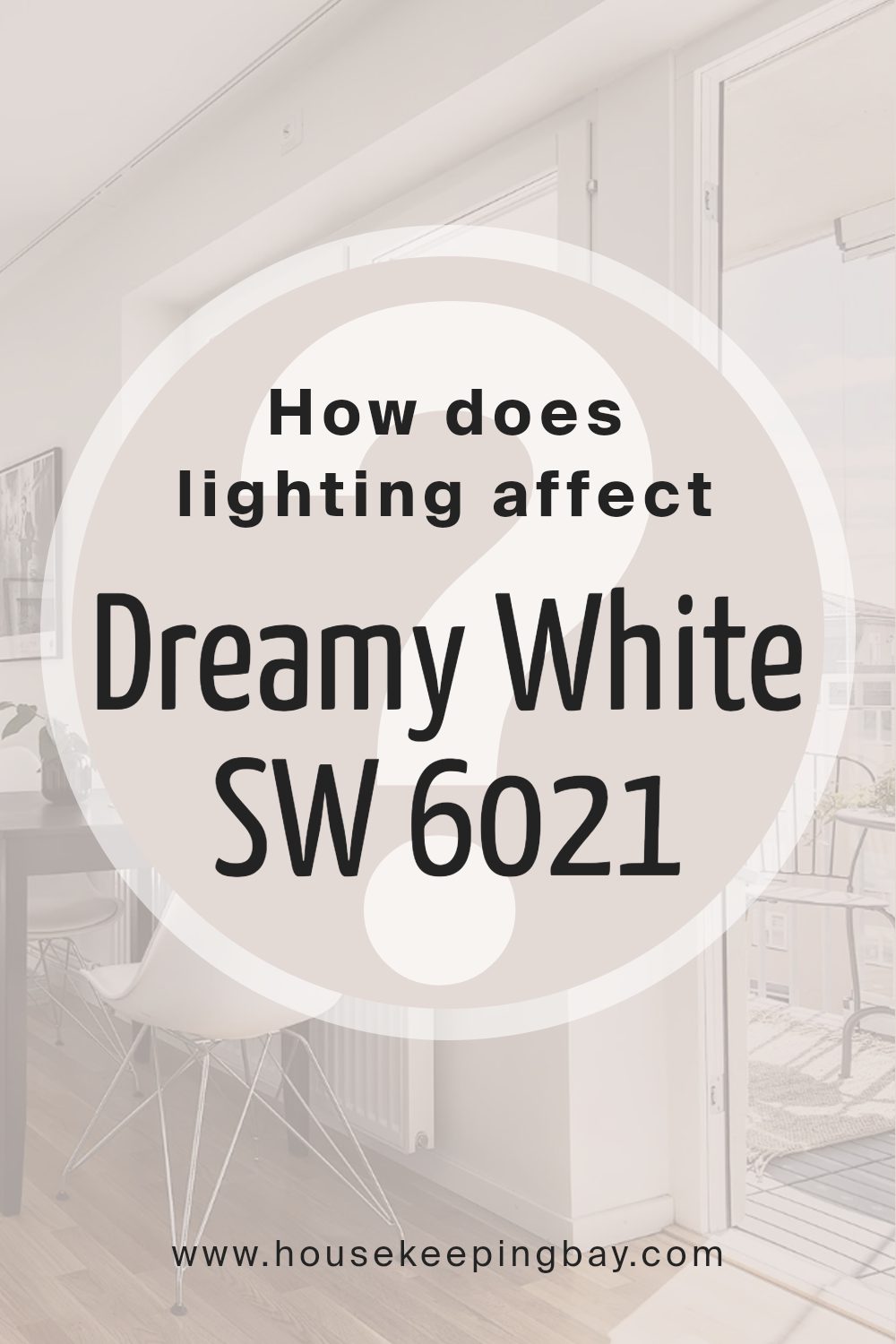
How Does Lighting Affect Dreamy White SW 6021 by Sherwin Williams?
Lighting plays a crucial role in how we see colors. Basically, colors can look different under various types of light. When you pick a paint color like Dreamy White SW 6021 by Sherwin Williams, lighting should be a key consideration.
In artificial light, Dreamy White can look different depending on the type of bulb used. LED or fluorescent lights can make it appear cooler, bringing out its subtle undertones. In warm, incandescent light, Dreamy White tends to look softer and creamier. That means, in your home at night, the feel of the room can change based on the bulbs you use.
Natural light, on the other hand, changes throughout the day and affects how Dreamy White looks. In the morning and late afternoon, when the sunlight is warmer, Dreamy White may have a gentle, warm glow. Around noon, when sunlight is brightest and closest to white, Dreamy White shows its truest color.
The direction your room faces also impacts how Dreamy White looks. North-faced rooms get less direct sunlight, so they tend to have cooler, softer light. In such rooms, Dreamy White might look a little more shadowed and muted. South-faced rooms get plenty of sunlight, making Dreamy White look brighter and even more inviting.
East-faced rooms catch the morning sun, which means Dreamy White can appear very warm and welcoming in the morning but could turn cooler as the day goes on. West-faced rooms get the evening light, which means Dreamy White can feel cooler in the morning but gets a warm, golden hue in the late afternoon and evening.
So, when you choose to paint a room with Dreamy White SW 6021, think about the light. Whether it’s cozy and warm or fresh and bright, the lighting can significantly influence the mood and feel created by this color.
housekeepingbay.com
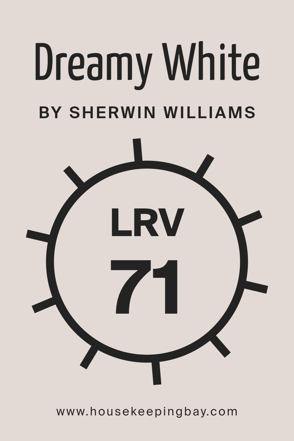
What is the LRV of Dreamy White SW 6021 by Sherwin Williams?
LRV stands for Light Reflectance Value, which is a number that tells you how much light a color reflects or absorbs. This number can range from 0 to 100, with 0 being a completely black surface that absorbs all light and 100 being a perfectly white surface that reflects all light back.
The higher the LRV, the lighter the color will appear because it reflects more light back into the room. This is an important factor when choosing paint colors for your walls, as it can significantly affect the brightness and feel of the space. A color with a high LRV will make a room feel more open and airy, while a color with a low LRV can make a room feel more intimate or cozy.
With an LRV of 70.889, Dreamy White SW 6021 by Sherwin Williams is on the lighter side, meaning it will reflect a good amount of light, making spaces feel more luminous and spacious. This particular value indicates that Dreamy White is a great option for rooms that you want to appear bright and inviting without being overwhelmingly white. It’s a soft shade that will gently illuminate the room, taking advantage of any natural or artificial light sources. This makes it an excellent choice for spaces that could use a lift or for rooms that are naturally darker and need a bit of brightness to feel more welcoming.
housekeepingbay.com
What is LRV? Read It Before You Choose Your Ideal Paint Color
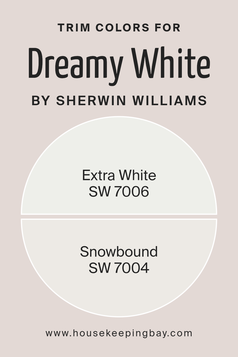
What are the Trim colors of Dreamy White SW 6021 by Sherwin Williams?
Trim colors are essentially the shades used on the accents of a home’s interior or exterior, such as door frames, window frames, skirting boards, and moldings. They play an essential role in defining the architectural details and enhancing the overall aesthetic of a space.
For a color like Dreamy White SW 6021 by Sherwin Williams, choosing the right trim color is crucial because it can either subtly complement and lift the main color or create a striking contrast that adds depth and character to a room. Trim colors help in framing the main wall color, making it appear more crisp and finished.
For Dreamy White SW 6021, using SW 7006 – Extra White as a trim color offers a clean, bright, and slightly cooler contrast that will make the walls appear fresh and vibrant. Extra White is a pure, stark white that brings a sense of clarity and openness to any space, making it appear more expansive.
On the other hand, SW 7004 – Snowbound is a softer, warm-toned white with a slight greyness to it. This color provides a subtle contrast to Dreamy White, softening the overall look with a cozy and inviting feel. Snowbound works wonderfully in spaces aiming for a serene and warm atmosphere, harmonizing well with Dreamy White SW 6021 to create a gentle and welcoming vibe.
You can see recommended paint colors below:
housekeepingbay.com
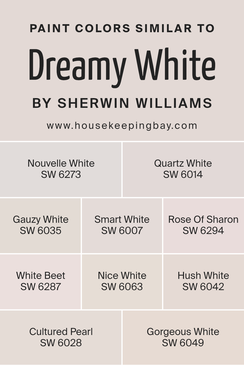
Colors Similar to Dreamy White SW 6021 by Sherwin Williams
Choosing similar colors to Dreamy White SW 6021 by Sherwin Williams is essential when aiming for a cohesive and harmonious color scheme in your space. Similar colors like Nouvelle White, Quartz White, Gauzy White, and Smart White provide subtle variations in hue that can enhance the depth and interest of your interiors without overwhelming the senses.
These slight differences allow for flexibility in decor, enabling a seamless flow from one room to another while maintaining a unified look. Colors such as Rose Of Sharon and White Beet introduce gentle whispers of color, bringing a soft, almost imperceptible warmth or coolness to a space, which can be perfect for creating a nuanced and inviting atmosphere.
Nice White, Hush White, Cultured Pearl, and Gorgeous White further extend the palette, offering delicate undertones that can complement a variety of textures and materials in a room, from soft fabrics to sleek surfaces. Each of these colors, while maintaining a close relationship with Dreamy White, brings its own unique quality to an interior, allowing for a design that feels both coordinated and individualized. Whether aiming for a bright and airy feel or a more grounded ambiance, selecting from these similar colors can help achieve a desired aesthetic with grace and ease. Their ability to work together yet stand alone makes them versatile choices for any decorating project.
You can see recommended paint colors below:
- SW 6273 Nouvelle White
- SW 6014 Quartz White
- SW 6035 Gauzy White
- SW 6007 Smart White
- SW 6294 Rose Of Sharon
- SW 6287 White Beet
- SW 6063 Nice White
- SW 6042 Hush White
- SW 6028 Cultured Pearl
- SW 6049 Gorgeous White
housekeepingbay.com
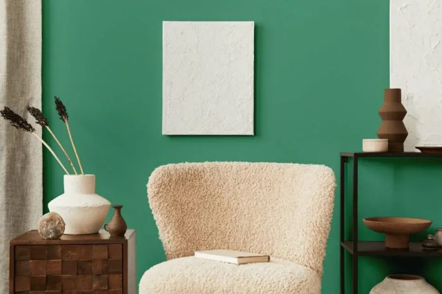
How to Use Dreamy White SW 6021 by Sherwin Williams In Your Home?
Dreamy White SW 6021 by Sherwin Williams is a soft and airy color that brings a sense of calm and simplicity to any room. It’s perfect for anyone looking to refresh their space with a clean and inviting look. This light shade of white can make small rooms appear larger and brighter by reflecting light, creating an illusion of more space. It works wonderfully in bedrooms for a peaceful and restful environment, or in living rooms to create a serene backdrop for relaxing and entertaining.
Using Dreamy White on your walls can be a game changer. It pairs well with almost any color, allowing you to introduce vibrant accents through furniture and decor for a personalized touch. If you’re aiming for a minimalist design, sticking to this shade and using different textures can add depth without overwhelming the space.
For those updating their kitchen or bathroom, Dreamy White can help achieve a clean and timeless look. Cabinets and walls painted in this color can make these spaces feel fresh and modern. It’s also an excellent choice for trim and ceilings to give a cohesive look throughout your home.
In short, Dreamy White SW 6021 by Sherwin Williams is a versatile color that can breathe new life into your home, making it feel more open, bright, and tranquil.
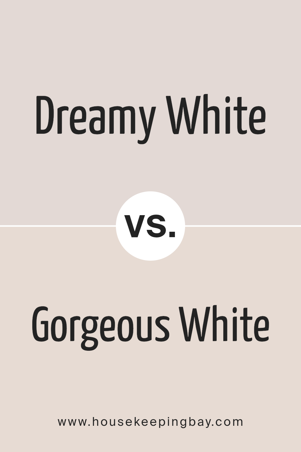
Dreamy White SW 6021 by Sherwin Williams vs Gorgeous White SW 6049 by Sherwin Williams
Dreamy White SW 6021 by Sherwin Williams and Gorgeous White SW 6049 are two beautiful shades that, despite both being white, offer unique vibes to any space. Dreamy White leans towards a soft, serene feel. It’s like looking at a cloud, providing a peaceful and gentle environment.
This color is perfect for people wanting a calm and soothing atmosphere in their rooms. On the other hand, Gorgeous White is a bit more dynamic. While it still keeps that clean, crisp white essence, there’s an underlying warmth to it. It offers a welcoming and comfortable feeling, making spaces feel inviting. Gorgeous White is ideal for those looking to add a touch of coziness to their modern or traditional decor. Both colors are versatile and can complement various decor styles, but the choice between them depends on the desired mood and feel of the room.
You can see recommended paint color below:
- SW 6049 Gorgeous White
housekeepingbay.com
Dreamy White SW 6021 by Sherwin Williams vs Nouvelle White SW 6273 by Sherwin Williams
Dreamy White SW 6021 and Nouvelle White SW 6273 by Sherwin-Williams are two lovely shades of white, each with its unique charm. Dreamy White leans more towards a soft, airy feeling, giving rooms a fresh and peaceful vibe. It’s the kind of color that makes a space feel more open and light, perfect for creating a soothing atmosphere.
On the other hand, Nouvelle White steps in with a slightly different tone. It carries a warmer undertone, making it ideal for those who want their rooms to feel cozy and welcoming. This color can add a gentle warmth to spaces, making it excellent for areas where you want to relax and feel comfortable.
Choosing between them depends on what mood you want to set for your room. If you’re aiming for a bright and refreshing look, Dreamy White is your go-to. But if you prefer a space that feels more intimate and snug, Nouvelle White will do the trick. Both colors offer a beautiful backdrop for any room, allowing you to accessorize with other colors easily.
You can see recommended paint color below:
- SW 6273 Nouvelle White
housekeepingbay.com
Dreamy White SW 6021 by Sherwin Williams vs Quartz White SW 6014 by Sherwin Williams
Dreamy White SW 6021 by Sherwin Williams and Quartz White SW 6014 also by Sherwin Williams are both lovely shades, but they have their own unique tones. Dreamy White leans a bit warmer, giving off a cozy and soft feeling, which can make a room feel inviting. It’s perfect for those who want their space to have a gentle touch of warmth without overwhelming with color.
On the other hand, Quartz White has a cooler tone, making it appear slightly more crisp and clean. This color is great for spaces that aim to have a modern and fresh look. It reflects light beautifully, making it a good choice for areas that could use a bit of brightness.
Both colors are versatile and can be used in various settings, from living rooms to bedrooms, depending on the atmosphere you want to create. Whether you prefer the warmer, subtle ambiance of Dreamy White or the cleaner, sharper feel of Quartz White, both options are excellent for creating a beautiful and tranquil space.
You can see recommended paint color below:
- SW 6014 Quartz White
housekeepingbay.com
Dreamy White SW 6021 by Sherwin Williams vs Gauzy White SW 6035 by Sherwin Williams
Dreamy White SW 6021 and Gauzy White SW 6035 by Sherwin Williams are two soft, subtle shades, but they have their differences. Dreamy White has a hint of creaminess, which gives a warm, cozy feel to any room. It’s like the soft glow of morning light filtering through a window, gentle and inviting. This makes it perfect for creating a snug atmosphere in living spaces or bedrooms.
On the other hand, Gauzy White SW 6035 leans a bit more towards a neutral, pure white with just a touch of gray. This slight gray tone brings a modern and clean look to spaces, making it an excellent choice for a crisp, fresh vibe. It’s like a light, airy curtain blowing in a gentle breeze, offering a sense of openness and simplicity.
Both colors are great for making small rooms appear larger and brighter. However, Dreamy White adds warmth, suitable for a cozy setting, while Gauzy White offers a cooler, more straightforward elegance, ideal for a sleek, modern look.
You can see recommended paint color below:
housekeepingbay.com
Dreamy White SW 6021 by Sherwin Williams vs Rose Of Sharon SW 6294 by Sherwin Williams
Dreamy White SW 6021 by Sherwin Williams and Rose of Sharon SW 6294 also by Sherwin Williams are two different colors that serve unique purposes in home decor. Dreamy White is a soft, serene color. It has a light and airy feel, making it perfect for creating a relaxed and peaceful atmosphere in a room. It’s the kind of white that can brighten up a space without feeling too stark or cold.
On the other hand, Rose of Sharon is a vibrant color with a much bolder personality. It’s a shade of pink that leans towards the warmer side, bringing warmth and energy to any space. This color is ideal for adding a pop of interest and cheerfulness to a room. It can work beautifully as an accent wall or in decorative accessories to liven up a neutral palette.
In essence, Dreamy White is about calm and clarity, making spaces feel open and light. Rose of Sharon, however, invokes warmth and vibrancy, great for creating focal points or adding a touch of playfulness. Depending on the mood you want to set for your room, each color has its charm and application.
You can see recommended paint color below:
- SW 6294 Rose Of Sharon
housekeepingbay.com
Dreamy White SW 6021 by Sherwin Williams vs White Beet SW 6287 by Sherwin Williams
Dreamy White SW 6021 by Sherwin Williams and White Beet SW 6287 are two interesting shades that offer different vibes for your spaces. Dreamy White is like a soft blanket of snow, providing a clean and airy feel. It’s the kind of white that lights up a room, making it seem larger and more open. On the other hand, White Beet has a unique touch. It leans a bit towards a subtle, creamy side, adding warmth to any area. Imagine the soft glow of morning light; that’s the kind of warmth White Beet brings. It’s perfect for someone looking for a white that’s not too stark but has a cozy, inviting feel.
While Dreamy White offers a crisp, fresh start, perfect for a modern or minimalist look, White Beet brings in a hint of warmth, making spaces feel more grounded and homely. Both colors have their charm, whether you’re aiming for a sleek, clean design or a soft, welcoming atmosphere.
You can see recommended paint color below:
- SW 6287 White Beet
housekeepingbay.com
Dreamy White SW 6021 by Sherwin Williams vs Cultured Pearl SW 6028 by Sherwin Williams
Dreamy White SW 6021 and Cultured Pearl SW 6028 by Sherwin Williams are two beautiful shades that have their own unique qualities. Dreamy White is a soft, serene color that brings a light and airy feeling to any room. It’s like a gentle whisper, creating a peaceful atmosphere that’s perfect for spaces where you want to relax and unwind.
On the other hand, Cultured Pearl is a bit deeper and richer than Dreamy White. It has a subtle elegance to it, offering a touch of sophistication without being too bold or overpowering. While both colors are relatively neutral, Cultured Pearl leans towards a slightly warmer tone, making it ideal for adding a cozy vibe to a space.
Whether you’re looking for a fresh, clean look with Dreamy White or a more inviting, warm ambiance with Cultured Pearl, both colors offer a fantastic backdrop for any decor style without being too flashy or demanding attention.
You can see recommended paint color below:
housekeepingbay.com
Dreamy White SW 6021 by Sherwin Williams vs Hush White SW 6042 by Sherwin Williams
Dreamy White SW 6021 by Sherwin Williams and Hush White SW 6042 by Sherwin Williams are both lovely shades of white, but they have some differences. Dreamy White is a soft, warm white. It has a cozy feel to it, making it perfect for creating a welcoming space. It’s the kind of white that brings a gentle brightness to a room, adding warmth without overwhelming it with starkness.
On the other hand, Hush White is a bit cooler and more neutral. This color gives a clean and calm look, making it great for spaces where you want a fresh and serene vibe. It’s the kind of white that works well in modern and minimalist designs because it offers a subtle hint of color without drawing too much attention.
Both colors can make a room look bigger and brighter, but Dreamy White brings warmth, while Hush White offers a crisp, calm atmosphere. Depending on the mood you want to set in your space, you might choose the cozy warmth of Dreamy White or the serene neutrality of Hush White.
You can see recommended paint color below:
housekeepingbay.com
Dreamy White SW 6021 by Sherwin Williams vs Smart White SW 6007 by Sherwin Williams
Dreamy White SW 6021 and Smart White SW 6007, both by Sherwin Williams, are unique shades of white that serve different purposes in home decor. Dreamy White has a soft, airy quality that brings a sense of calm and relaxation to a space. It’s perfect for creating a serene, peaceful atmosphere that makes your home feel like a cozy escape.
On the other hand, Smart White is a brighter, crisper white. It has a more energizing effect, making it ideal for spaces that you want to feel fresh, clean, and vibrant. This color can help make a room feel more spacious and bright, which is great for areas that don’t get a lot of natural light.
While both colors are white, Dreamy White adds warmth and a hint of coziness, whereas Smart White offers clarity and a sense of freshness. Depending on the mood you want to set in your room, either shade could be the perfect choice.
You can see recommended paint color below:
- SW 6007 Smart White
housekeepingbay.com
Dreamy White SW 6021 by Sherwin Williams vs Nice White SW 6063 by Sherwin Williams
Dreamy White SW 6021 and Nice White SW 6063 are two colors by Sherwin Williams that share some similarities but also have distinct differences. Dreamy White has a soft, gentle feel to it, making it perfect for creating a cozy and inviting atmosphere in a room.
It’s a great choice if you’re looking for a white that’s not too stark but still feels fresh and airy. On the other hand, Nice White SW 6063 is a tad warmer in tone. This warmth makes it ideal for spaces where a friendly, welcoming vibe is desired. It can make a room feel more intimate and homely.
While both colors are within the white spectrum, Dreamy White leans towards a neutral-cool undertone, offering a serene backdrop. Nice White, with its slightly warmer hues, brings a touch of softness that can help soften the edges of modern decor or add light to a traditional space. Choosing between them depends on the mood you’re aiming for: Dreamy White for a crisp, clean look or Nice White for a warmer, more inviting space.
You can see recommended paint color below:
housekeepingbay.com
Conclusion
Dreamy White SW 6021 by Sherwin Williams is a versatile and fresh color that brings a sense of calm and light to any space. Its subtle warmth makes it perfect for creating a cozy atmosphere in a variety of settings, from living rooms to bedrooms. This shade effortlessly complements a wide range of decor styles and works beautifully with both natural light and artificial lighting, enhancing the feeling of spaciousness and tranquility.
Opting for Dreamy White SW 6021 is a smart choice for anyone looking to refresh their home with a timeless and elegant hue. It acts as a superb backdrop for art, furniture, and accent pieces, allowing personal tastes to stand out.
Whether aiming for a minimalist look or a more layered aesthetic, Dreamy White offers a clean canvas that invites creativity and personalization. This color not only brightens up spaces but also adds a refined touch that is both inviting and chic.

housekeepingbay.com
Ever wished paint sampling was as easy as sticking a sticker? Guess what? Now it is! Discover Samplize's unique Peel & Stick samples. Get started now and say goodbye to the old messy way!
Get paint samples