Top 26 White Kitchen Paint Colors for 2025
My Favorite Whites to Warm Up Any Kitchen This Year
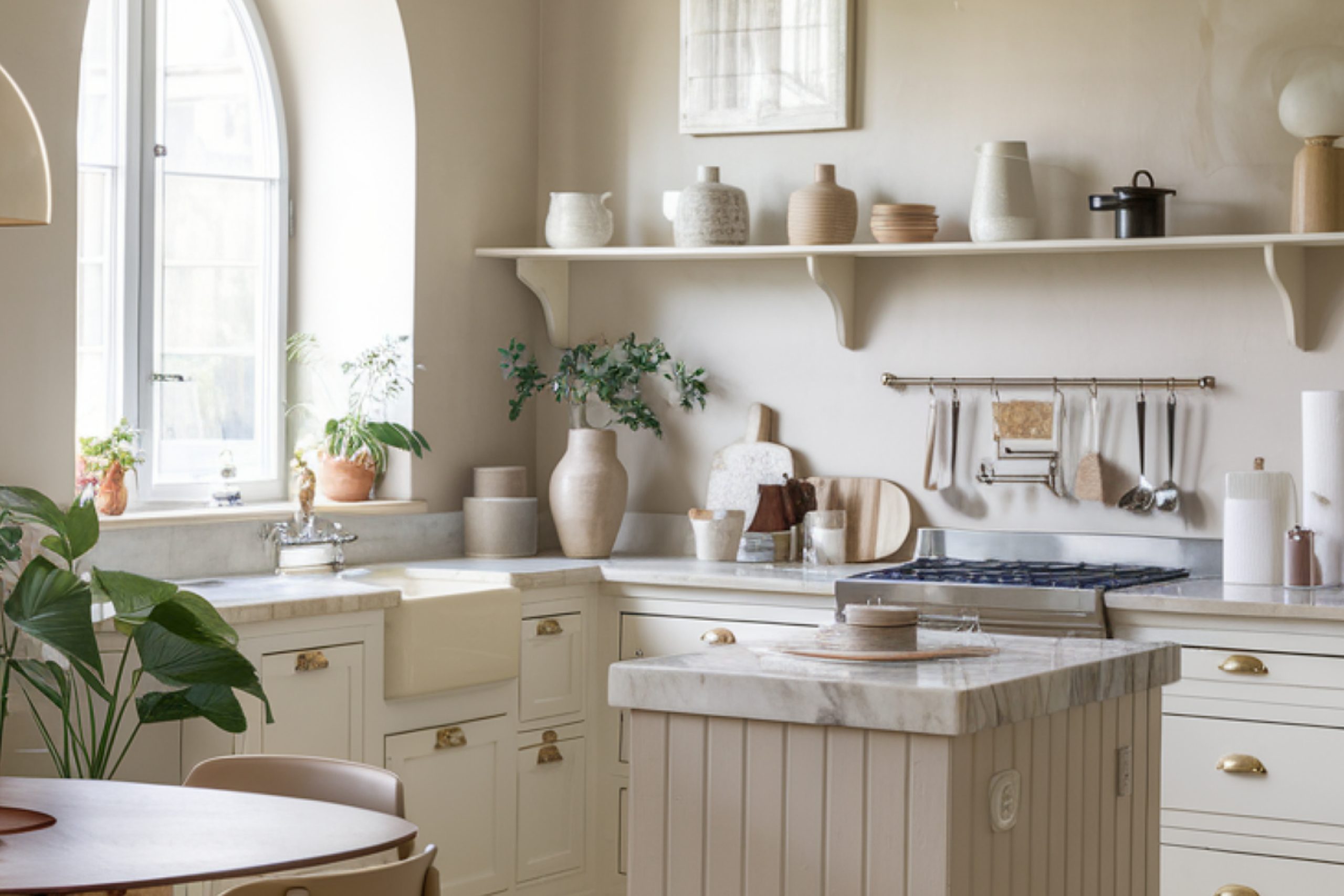
I still remember the first kitchen I ever staged with white paint. The cabinets were old oak, the counters were laminate, and honestly? The whole thing felt a little tired. But once we painted the walls Alabaster and added some soft lighting, it suddenly looked twice as big, twice as fresh, and the house sold in four days.
That was years ago, and since then, I’ve learned something very real: white isn’t plain — it’s powerful. It’s the color that can open up a small kitchen, calm down a busy one, or pull together all your finishes when nothing else quite fits.
In 2025, white kitchens aren’t going anywhere. But the right white?
That’s the trick. There are dozens of options out there — some with a touch of gray, others a whisper of cream or blush. And choosing the wrong one can make your cabinets look yellow, or your backsplash seem dirty.
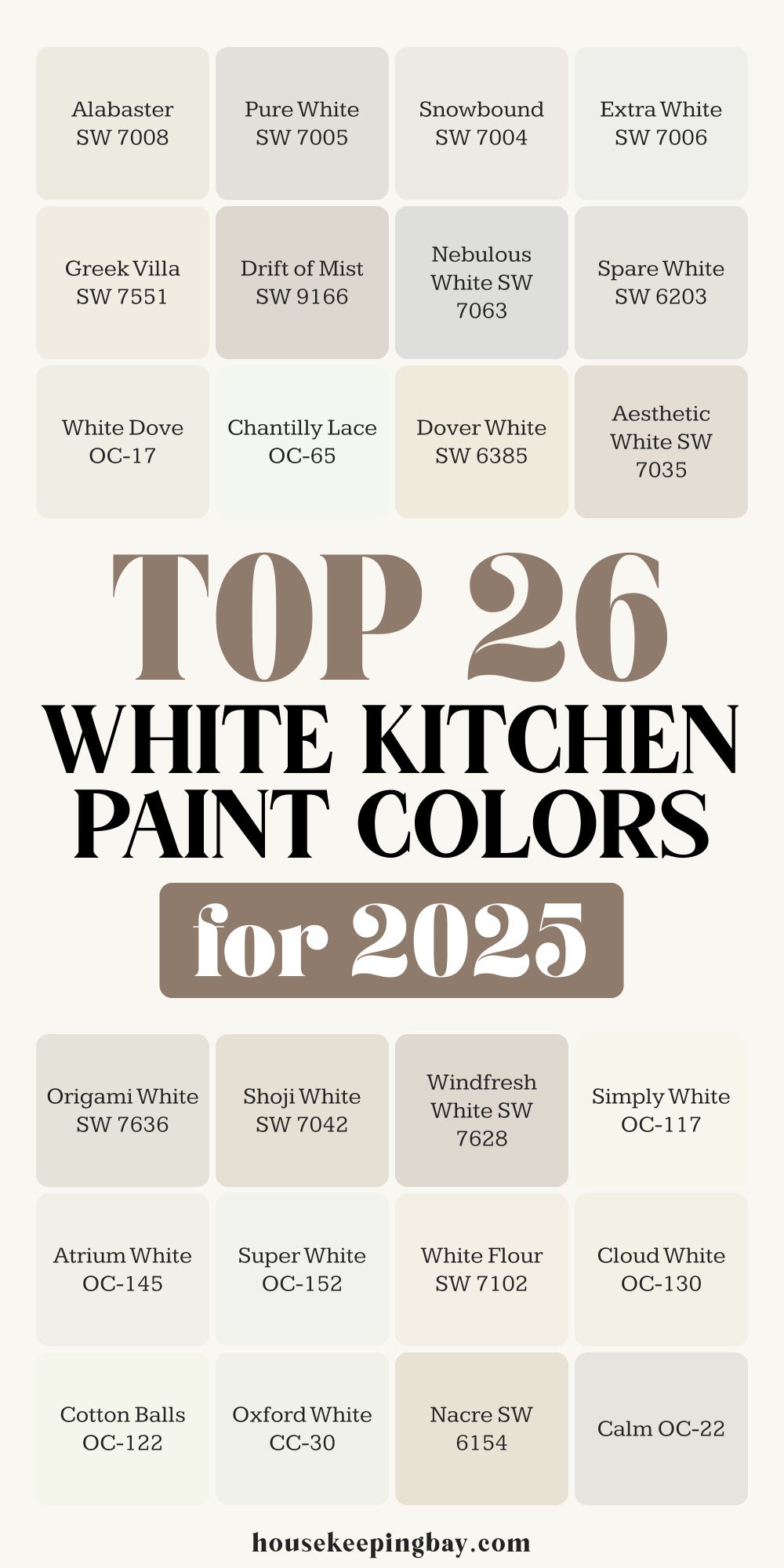
This guide has my 26 favorite white kitchen paint colors for this year — all ones I’ve used, tested, or recommended to clients.
I’ll walk you through what makes each shade special, which ones feel cozy or crisp, and how to make sure you’re picking the right white for your kitchen, not just the one you saw on Pinterest.
Ready?
Let’s get you that perfect kitchen glow.
via housekeepingbay.com
Why Choosing the Right White Matters
Table of Contents
When clients tell me they want a “white kitchen,” I always ask: what kind of white? Because there’s no such thing as just white. Every white has a personality — and it speaks loudly once it’s up on the walls.
White Paint Sets the Mood
The kitchen is where we spend so much time — not just cooking, but having coffee, talking, doing homework, even crying sometimes. The color on those walls matters. A soft white like Shoji White can make a kitchen feel warm and peaceful.
Something cleaner, like Chantilly Lace, feels bright and modern. And a too-stark white in a low-light room? That can feel cold and kind of sad.
Undertones Change Everything
Every white paint has an undertone — that little hint of color underneath the surface. Some lean yellow, some pink, some gray, some green. You might not notice it on a tiny swatch, but once it’s on four big walls? It’s clear.
For example:
- Snowbound has a subtle pink-violet tone, which can clash with cool gray counters.
- White Dove has a creamy softness that works beautifully with gold hardware.
- Extra White is crisp and almost icy — great for a very modern look.
That’s why it’s so important to test white paints in your kitchen, not just choose one from a photo or a store wall.
Lighting Makes a Big Difference
A white that looks amazing in a sunny kitchen might feel dull in a north-facing one. Natural light, overhead bulbs, under-cabinet LEDs — they all change how the paint looks throughout the day.
Quick story: I had a client fall in love with Pure White in the morning… and hate it by 5 PM.
We switched to Drift of Mist — a little warmer — and she said it felt “like her kitchen was hugging her.” (That one made me tear up a little.)
White is simple, but choosing the right one takes care, attention, and honestly — a little patience. But once you get it right? You’ll feel it every time you walk in the room.
Warm Whites for Cozy Kitchens
These whites have soft yellow or beige undertones that make kitchens feel calm, inviting, and lived-in. They work beautifully with wood, brass, and warm lighting.
via housekeepingbay.com
Top Picks:
Alabaster SW 7008
A creamy classic. Soft, warm, and super popular for a reason — works in almost any kitchen.
🗨 “Alabaster softens any room.” — Joanna Gaines
Shoji White SW 7042
A cozy greige-white. Perfect with warm woods and earth tones. It feels grounded without being dark.
Greek Villa SW 7551
Elegant and creamy. Pairs beautifully with gold hardware and walnut tones.
Dover White SW 6385
Has a traditional, homey feel. A favorite for older homes with warm finishes.
📊 One of Sherwin-Williams’ top-selling whites — Sherwin-Williams
White Flour SW 7102
Subtle and soft. Think gentle and clean, like fresh bread — great under warm lighting.
Aesthetic White SW 7035
A whisper of greige. Looks white on the wall, but adds depth. A go-to for nervous first-timers.
Drift of Mist SW 9166
Warm with a slight gray touch. Balances cozy and clean nicely.
Swiss Coffee OC-45
Designer favorite — warm, creamy, and very flattering.
🗨 “It flatters every room.” — Shea McGee
Cotton Balls OC-122
Bright but soft. Great for farmhouse or relaxed beach-style kitchens.
My Advice:
✔ Use satin or matte finish for warmth
✔ Always test next to your cabinets and counters — never just on a blank wall!
Crisp & Clean — Cool and Bright Whites
These whites have cool or neutral undertones. They’re great for modern kitchens, high-contrast designs, or when you want that fresh, bright feeling — without going harsh.
Top Picks:
Extra White SW 7006
Bright, cool, and sharp. Ideal for a modern kitchen with black hardware or steel appliances.
Pure White SW 7005
Neutral, clean, and super flexible. No strong undertones — my go-to when everything else feels “off.”
Snowbound SW 7004
Has a subtle violet-pink undertone. Looks clean, but can shift in different lighting — test it first!
Spare White SW 6203
Soft cool white with a light green-gray base. Works well with marble or silver finishes.
Origami White SW 7636
Balanced and gentle — a cool white that doesn’t go too stark. Easy to live with.
Nebulous White SW 7063
Cool, airy, and a little cloudy. Looks white on the wall but brings a hint of softness.
Windfresh White SW 7628
Feels clean but calming. I love it with natural woods and matte black handles.
Super White OC-152
One of Benjamin Moore’s brightest whites. Very sharp — I only use this in kitchens with tons of natural light.
Steam AF-15
Cool and smooth. Works best in ultra-modern or minimalist homes.
Oxford White CC-30
Crisp but not harsh. Slight blue-gray undertone that works with concrete or tile backsplashes.
Personal Advice:
- Balance these whites with warm lighting, wood floors, or textured fabrics
- Avoid cool whites in low-light kitchens — they can feel flat or sterile
Soft Neutrals & Muted Beauties
These whites have subtle warmth or gray undertones, making them feel quiet and calm without going too cold. They’re perfect when you want your kitchen to feel peaceful, natural, and not too “white.”
via housekeepingbay.com
Top Picks:
Nacre SW 6154
A soft, pearly white with a beige undertone. Gentle and natural — works beautifully with taupe or stone.
Chantilly Lace OC-65
One of the most loved whites by designers. Bright, clean, and slightly cool — but still soft on the eyes.
Simply White OC-117
This one has a hint of yellow, making it cheerful and warm. Great for kitchens with a lot of daylight.
White Dove OC-17
Smooth and balanced. Not too creamy, not too gray — probably the most forgiving white of all.
Cloud White OC-130
Slightly warmer than White Dove, but still very neutral. A favorite for traditional kitchens.
Atrium White OC-145
Has a very faint pink tone. I use this when I want a white that feels soft but happy — not dull.
Calm OC-22
As the name says, this one is soothing. A pale white with a hint of lavender-gray — nice in kitchens with natural light and pale wood.
Pro Tips to Make White Paint Work in Your Kitchen
Over the years, I’ve made a list of little things that make a big difference when working with white paint. Here are the ones I always share with my clients:
1. Light Changes Everything
White looks different in morning sun, evening shadows, and under your kitchen bulbs. Always test your top 2–3 colors on the actual wall, not just on paper.
✔ Tip: Paint large swatches near your cabinets and check them at different times of day.
2. Don’t Match Cabinets and Walls Exactly
It might seem safer to use the same white on everything — but usually, that makes the room feel flat. Use a slightly different shade or sheen for cabinets vs walls for more depth.
✔ Example: Pure White on cabinets + Alabaster on walls = soft contrast that still looks seamless.
3. Finish Matters
Use satin or semi-gloss on cabinets (easy to clean), and matte or eggshell on walls (more forgiving). High-gloss often feels too shiny in kitchens.
4. Always Sample Next to Hard Finishes
That means your countertops, tile, backsplash, flooring — everything. White reflects the colors around it, so test it in the actual kitchen, not just a blank wall.
Designers Agree: White Kitchens Still Rule
White kitchens continue to lead design trends. In fact, 75% of real estate agents say buyers still prefer white kitchens over dark ones, especially in resale homes.
And design legends like Suzanne Kasler and Amber Lewis continue to lean on soft, layered whites in their kitchens for that timeless, livable feel.
via housekeepingbay.com
My Personal Paint Rules for 2025
Let’s keep it simple. If you remember anything from this list, let it be these:
- ✅ Test at least 2–3 whites before you commit
- ✅ Don’t trust just the chip — test it in your light
- ✅ Pair warm whites with warm materials
- ✅ Use cool whites only if you have enough sunlight
- ✅ Don’t paint everything the same white
- ✅ Pick a finish that fits how you live (kids, pets, cooking messes)
If I Had to Choose Just One…
If I could only pick one white for kitchens in 2025?
Alabaster SW 7008.
It’s cozy but clean, soft without going yellow, and works with just about anything.
via housekeepingbay.com
