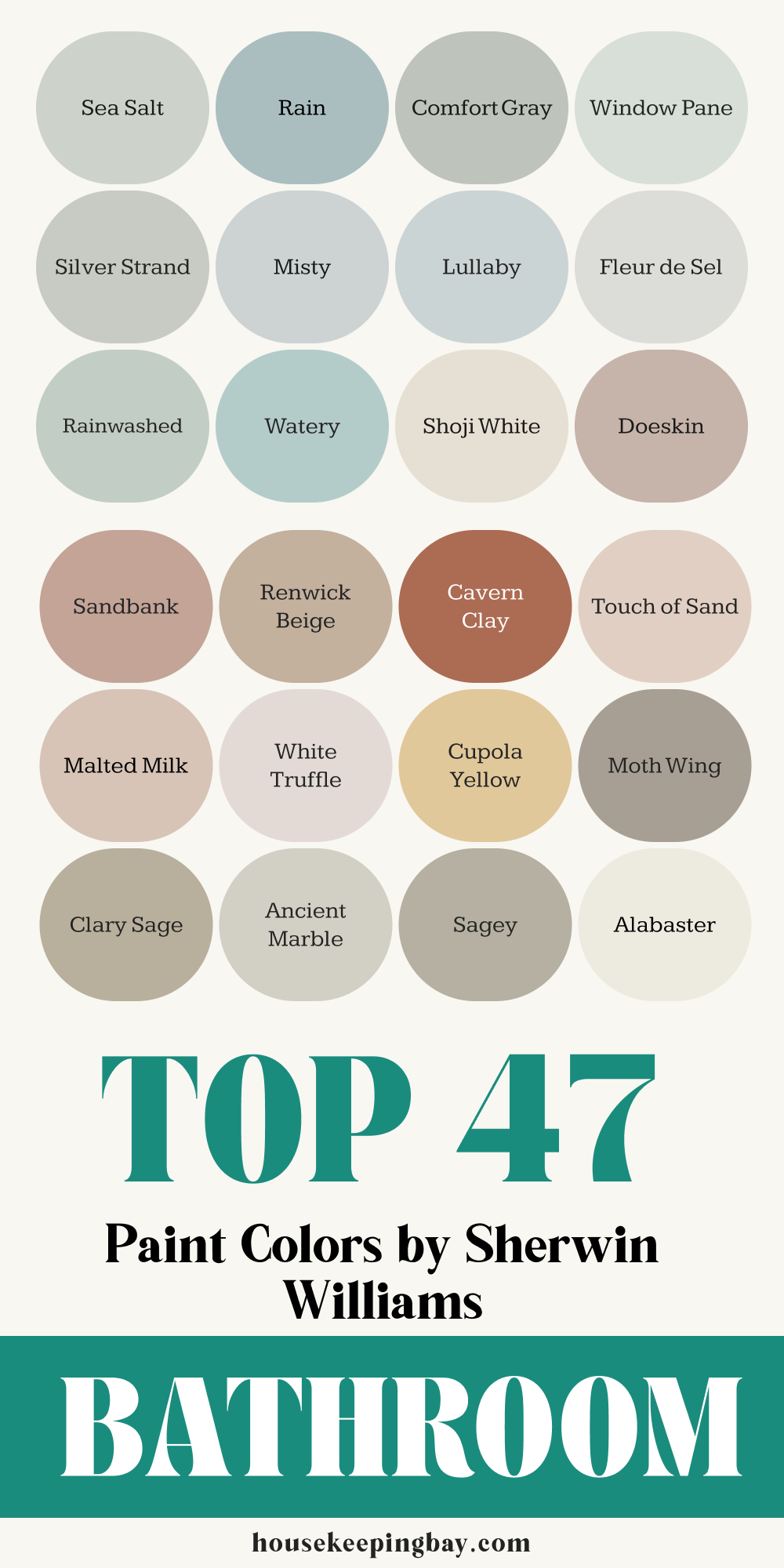
47 Best Bathroom Paint Color Ideas by Sherwin Williams
Why Color Changes Everything in a Bathroom
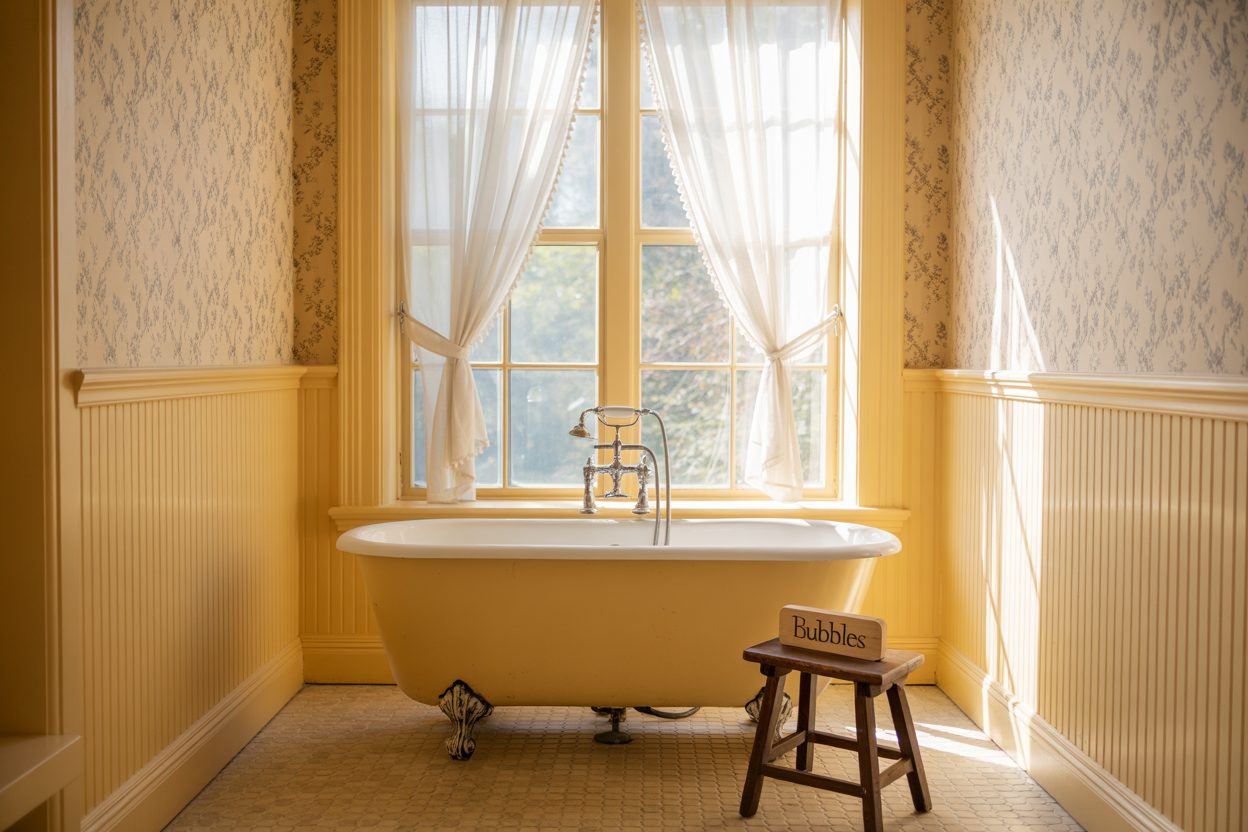
I’ve worked on enough bathrooms to know one thing for sure—the color on the walls can make or break how you feel in there. Some bathrooms feel cold no matter what, others feel too tight, or just boring. And a lot of times, it’s not the tiles or the lighting. It’s the paint.
Bathrooms are small, yes. But that also means color shows up in a big way. It bounces off the mirror, reflects in the tub water, and sets the mood the moment you step in.
This article isn’t about rules—it’s a list of 47 Sherwin-Williams paint colors I recommend, based on what I’ve used, tested, or seen in real homes. Some are soft and calming. Others are bold and stylish. Each one gives the bathroom a different kind of feeling, and I’ll help you pick what fits yours.
No need to scroll Pinterest for hours. I’ve got you.
housekeepingbay.com
Cool Colors for Calm Bathrooms
These are the shades I reach for when someone tells me, “I want my bathroom to feel clean and peaceful.” Think soft greens, light blues, misty grays—colors that almost whisper.
They work best in bathrooms with natural light, but I’ve used them in windowless ones too. Just make sure to test with your light bulbs before painting.
1. Sea Salt
Sea Salt is one of those colors that walks the line between green and gray. It changes slightly depending on the light, which makes it more interesting. In a bathroom, it feels gentle and cool—almost like a spa day at home.
2. Rain
Rain is a medium blue-gray that has a quiet, cloudy tone. I used this in a client’s guest bathroom, and everyone kept asking what it was. It doesn’t feel too icy or too dark—it’s right in the middle.
3. Comfort Gray
Comfort Gray leans green, but still has that misty gray base. It’s great if you want something more grounded than Sea Salt. This one works especially well with white or marble countertops.
4. Window Pane
Window Pane is a soft, pale aqua. I’ve used it in a kid’s bathroom, and it gave the room a fresh, happy mood without being sugary. It looks amazing with brushed nickel fixtures.
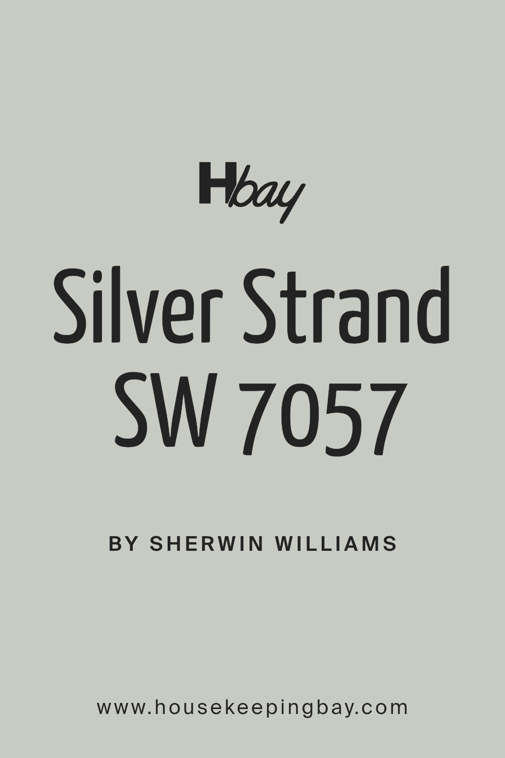
5. Silver Strand
Silver Strand is a cool, silvery gray with a touch of blue-green. It’s one of those colors that feels grown-up but still soft. I like this one in modern bathrooms with matte black accents.
6. Misty
Misty is light gray with a subtle blue hint. It’s a safe pick if you’re nervous about too much color. It plays well with natural wood vanities and white tile.
7. Lullaby
Lullaby is a gentle baby blue, but not childish. It’s great for brightening up small bathrooms or powder rooms. Pair it with crisp white trim to keep it fresh.
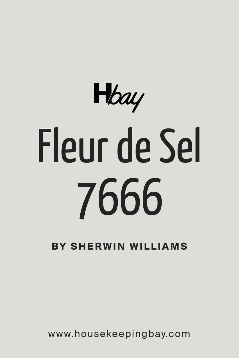
8. Fleur de Sel
Fleur de Sel is a very pale green-gray. It almost looks like soft cement in low light, which I love. If you want just a touch of color, this one’s perfect.
housekeepingbay.com
9. Rainwashed
Rainwashed is a true favorite of mine. It’s a mix of soft green and blue with a little gray thrown in. Clients love this one in master baths—especially with big windows.
10. Watery
Watery is a more vibrant teal-based blue. It brings energy but still feels cool. I usually use this in beach homes or where there’s lots of white to balance it out.
Warm & Cozy Bathroom Colors
These shades are for bathrooms that should feel inviting, not chilly. When someone tells me “I want it to feel soft and homey,” I think of these. They work really well in homes with warmer light, wood cabinets, or brass fixtures.
If you’ve got beige or cream tile, these colors can tie everything together without clashing.
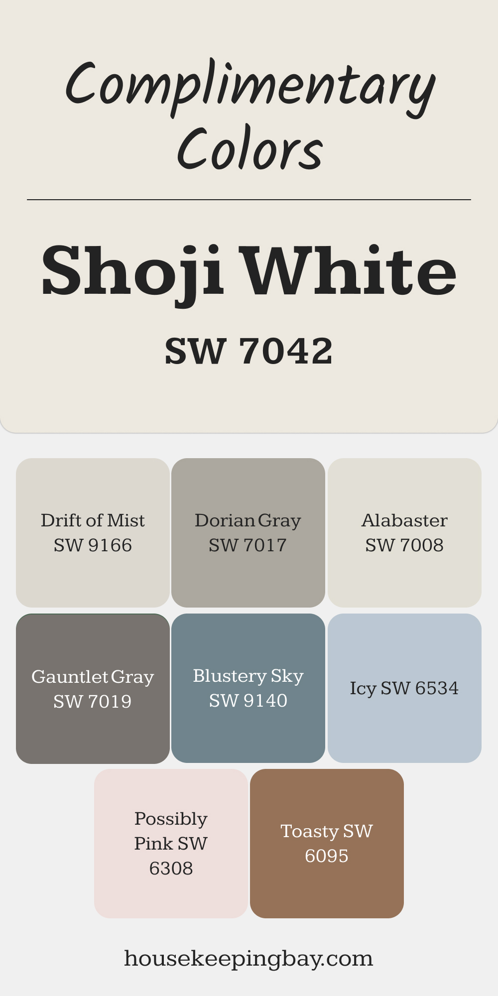
11. Shoji White
Shoji White is not your typical white—it has a subtle beige warmth that makes the bathroom feel cozy instead of stark. I use this when someone wants white walls that don’t feel cold.
12. Doeskin
Doeskin is a light taupe with just enough depth to warm up a bathroom. It works great if you have tile that leans brown or tan. It makes the room feel more blended.
13. Sandbank
Sandbank gives off a buttery tone that feels comforting, almost like a soft throw blanket. I love pairing it with white tile and antique gold mirrors.
14. Renwick Beige
Renwick Beige has some historical charm. It’s deep, rich, and pairs beautifully with dark wood or classic black-and-white tile. It’s one of those colors that makes the room feel solid.
15. Cavern Clay
Cavern Clay is bold, earthy, and warm. I used this in a Southwestern-style powder room once with a patterned sink—it was stunning. It’s not shy, but it’s still cozy.
16. Touch of Sand
Touch of Sand is a pale peach-beige that gives a soft glow. It’s nice in small bathrooms where you want a little warmth without making the walls feel “pink.”
17. Malted Milk
Malted Milk is a gentle tan, very neutral but still warm. It’s one of those shades that works with nearly any material—tile, stone, even wallpaper.
18. White Truffle
White Truffle is a soft greige with rosy undertones. I often suggest this for homes with warmer flooring or creamy countertops.
19. Cupola Yellow
Cupola Yellow brings just a hint of golden warmth. It’s a cheerful pick for powder rooms or bathrooms that don’t get a lot of light.
20. Moth Wing
Moth Wing is darker and moodier, but still warm. It looks rich when paired with white trim or marble, and gives the bathroom more character without going cold.

Best White & Off-White Bathroom Colors
Whites can be tricky. Some feel too bright, others too yellow. I always test them in the actual bathroom light—especially because light bulbs can change how they look.
These are the Sherwin-Williams whites that have never let me down.
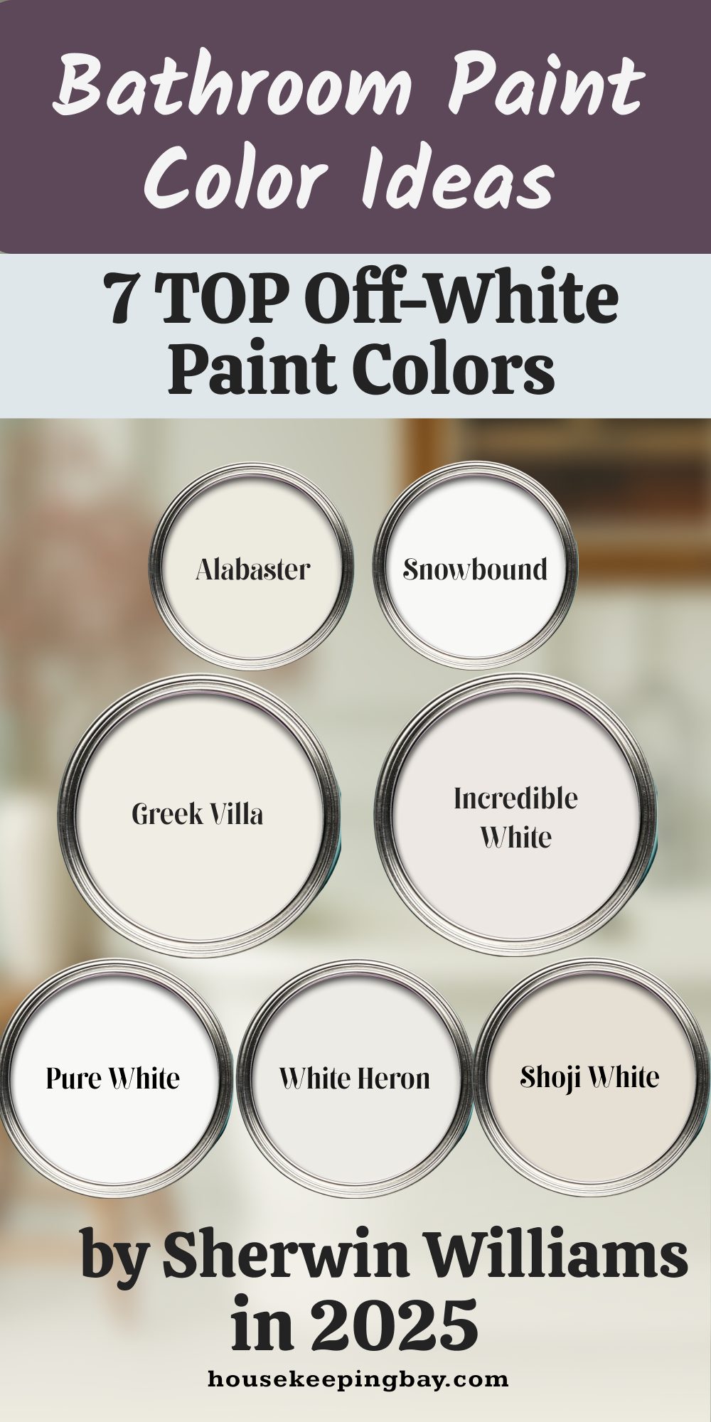
21. Alabaster
Alabaster is warm without being yellow. It has this softness that makes the room feel clean and calm. It’s one of my top picks for both modern and farmhouse-style bathrooms.
(Fun fact: Alabaster was named Sherwin-Williams’ Color of the Year in 2016 and is still one of their best-sellers.)
22. Snowbound
Snowbound leans cooler but still feels soft. I like this one in homes with chrome or black finishes. It’s a good way to make everything feel fresh without turning sterile.
23. Greek Villa
Greek Villa is creamy, but not too beige. If your bathroom has natural light, it glows just enough. It looks lovely with brass hardware and warm stone.
24. Pure White
Pure White is super clean and crisp. It has just a tiny touch of warmth to keep it from feeling stark. I usually use this when we want a gallery-style white backdrop.
25. Incredible White
Incredible White is very pale greige. It’s technically white, but with enough pigment to feel interesting. It works well with both warm and cool accents.
26. White Heron
White Heron feels light and airy. It leans just slightly cool, which is great if you have a bathroom with warm floors or cabinets and you want contrast.
27. Shoji White (yes, again)
Shoji White also works in this group. Like I said earlier, it’s a soft, almost creamy white that still feels bright. It’s that one paint you can use when you don’t want “too white.”
Bold & Moody Bathroom Colors
These shades need a little confidence, but the payoff is worth it. They create that “wow” feeling, especially when paired with light counters, mirrors, or metallic fixtures.
28. Naval
Naval is a classic deep navy. It brings elegance and calmness at the same time. I’ve used it behind a white vanity with brass sconces—it looked rich but not heavy. It was Color of the Year in 2020 for a reason.
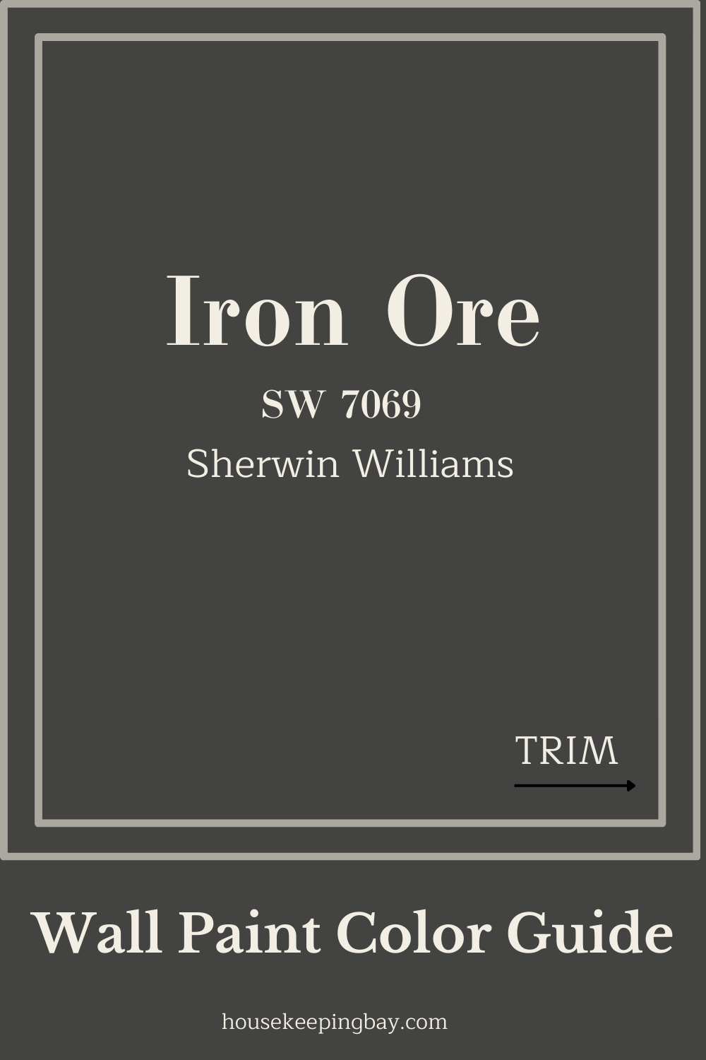
29. Iron Ore
Iron Ore is a soft black with a warm base. I call it “the friendlier black.” I love using it in smaller bathrooms with high contrast—white tiles, oak vanities, or gold faucets.
housekeepingbay.com
30. Tricorn Black
Tricorn Black is a true, deep black. If you want something dramatic, this is it. I usually use it for one accent wall or vanity—too much can feel heavy unless there’s lots of light.
31. Peppercorn
Peppercorn is a smoky gray with hints of brown. It’s strong but not cold. It’s perfect in bathrooms with industrial or modern farmhouse styles.
32. Urbane Bronze
Urbane Bronze is earthy and deep. It was Sherwin-Williams Color of the Year in 2021. I love it in masculine bathrooms or paired with wood and stone.
“People want to feel grounded and calm. Urbane Bronze brings that sense of stability.” —Sue Wadden, Director of Color Marketing, Sherwin-Williams
33. Caviar
Caviar is a rich black with a tiny warm undertone. It looks amazing in high-contrast spaces—white subway tile, black walls, gold mirrors. It’s one of those colors people don’t forget.
34. Cyberspace
Cyberspace is a deep charcoal-blue that works beautifully in modern bathrooms. It’s cool, sleek, and stylish—especially when used with marble and stainless steel.
35. Greenblack
Greenblack is moody with a twist. It’s a dark black-green, which makes it feel unique without shouting. I’ve used it in powder rooms with dark wallpaper and wood mirrors. It’s stunning.
Earthy & Nature-Inspired Bathroom Colors
If you like cozy, rustic, or natural looks—or just want a bathroom that doesn’t feel cold—these colors are for you.
36. Sagey
Sagey is soft, muted green with a hint of gray. It feels calming and very natural, like fresh herbs. I often use this in bathrooms with wood tones and linen textures.
37. Ancient Marble
Ancient Marble is a neutral green-gray that works with just about anything. It’s earthy but light, and a good alternative to beige or white if you want a little more personality.
38. Clary Sage
Clary Sage is a muted olive green. It has warmth and calmness at the same time. I love it paired with terracotta tile or antique brass fixtures.
39. Retreat
Retreat is a slightly darker sage tone. It has depth, so it works well on all four walls—even in a small space. I’ve used this with natural stone sinks and woven baskets for a spa feel.
40. Cavern Clay (repeated from earlier)
Cavern Clay belongs here too—it’s inspired by desert tones, clay, and raw earth. I often use it in adobe-style or rustic bathrooms.
41. Svelte Sage
Svelte Sage has a greige base with an earthy green overlay. It’s cozy and subtle. If you want to stay neutral but not boring, this one fits.
42. Studio Clay
Studio Clay is a soft brown with a rose undertone. It feels warm and artistic. I used this in a client’s boho-inspired bathroom with hand-painted tiles.
43. Oyster Bay
Oyster Bay is a green-gray that feels clean but still grounded. It’s less airy than Sea Salt, and has more body. I like it in bathrooms with both wood and white elements.
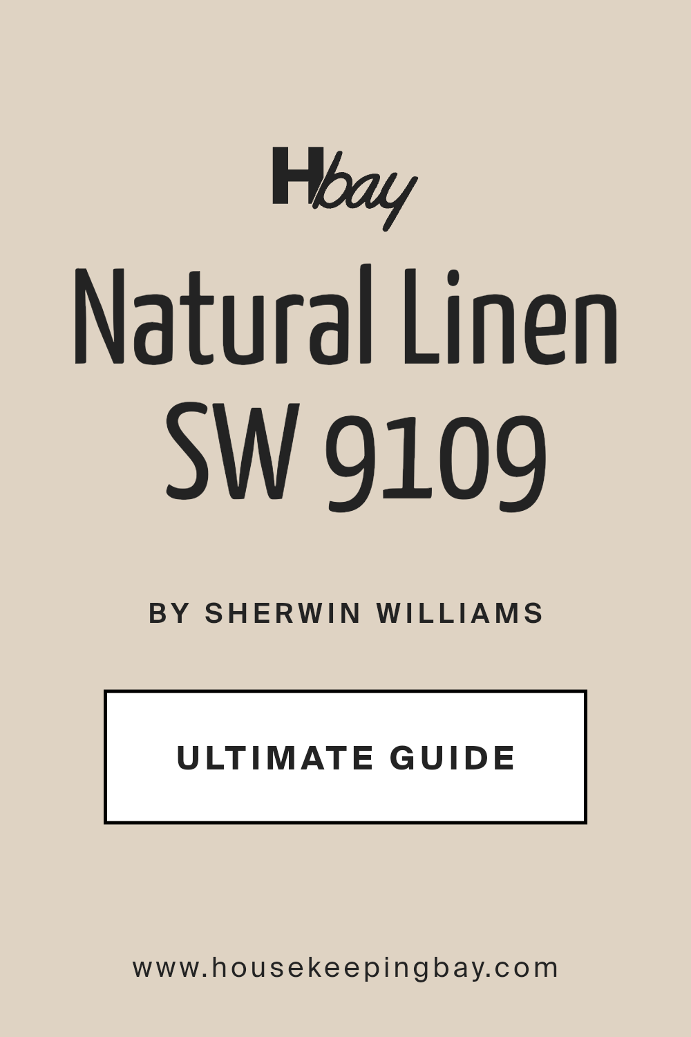
44. Natural Linen
Natural Linen is a warm neutral with a soft tan-pink base. It adds warmth to bathrooms without calling attention to itself. It’s perfect for calming, minimal spaces.
Tips for Testing Paint Colors in Bathrooms
Even the best paint choice can feel wrong if the lighting throws it off. Here’s how I make sure we get it right:
Test It On All Walls
Paint a large swatch on every wall—not just one. Light hits each wall differently. What looks creamy on one might look gray on another.
Check at Different Times of Day
Look at the color in the morning, afternoon, and night. Natural light, overhead bulbs, and even mirror reflections all change how paint shows up.
Bathroom lighting is often warmer (yellow) or cooler (blue), and some colors shift a lot.
Use Real Lighting
Turn on your bathroom lights when testing. This is especially important in windowless bathrooms. You want to see how the paint looks under your real conditions, not just daylight from the hallway.
I usually tape up samples (or even paint poster boards) and leave them for a few days. That way, my clients can live with the color before committing.
Before You Pick Up the Paintbrush…
You’ve got 47 ideas now. But let me tell you—don’t let that number overwhelm you. Picking a bathroom color isn’t about doing it “right.” It’s about how you want to feel in that room.
Color is personal. What feels calming to me might feel boring to you. And that’s okay.
I’ve seen clients light up when they see Sea Salt on the wall—and others who fall in love with the bold look of Iron Ore. I’ve had people change their minds after seeing a color in the morning light, or after standing in the bathroom at night with the lights on. That’s all part of it.
So here’s what I’d suggest:
- Start with 3–5 colors that feel right
- Get sample pots—don’t skip this step
- Live with the color for a few days
- Trust what your eyes and heart tell you
“Color does not add a pleasant quality to design—it reinforces it.” —Pierre Bonnard, painter
And if it helps, remember—it’s just paint. You can always change it. But when you get it right, it changes everything.