Svelte Sage SW 6164 by Sherwin Williams
Freshen Up Your Space with a Soothing Green Touch
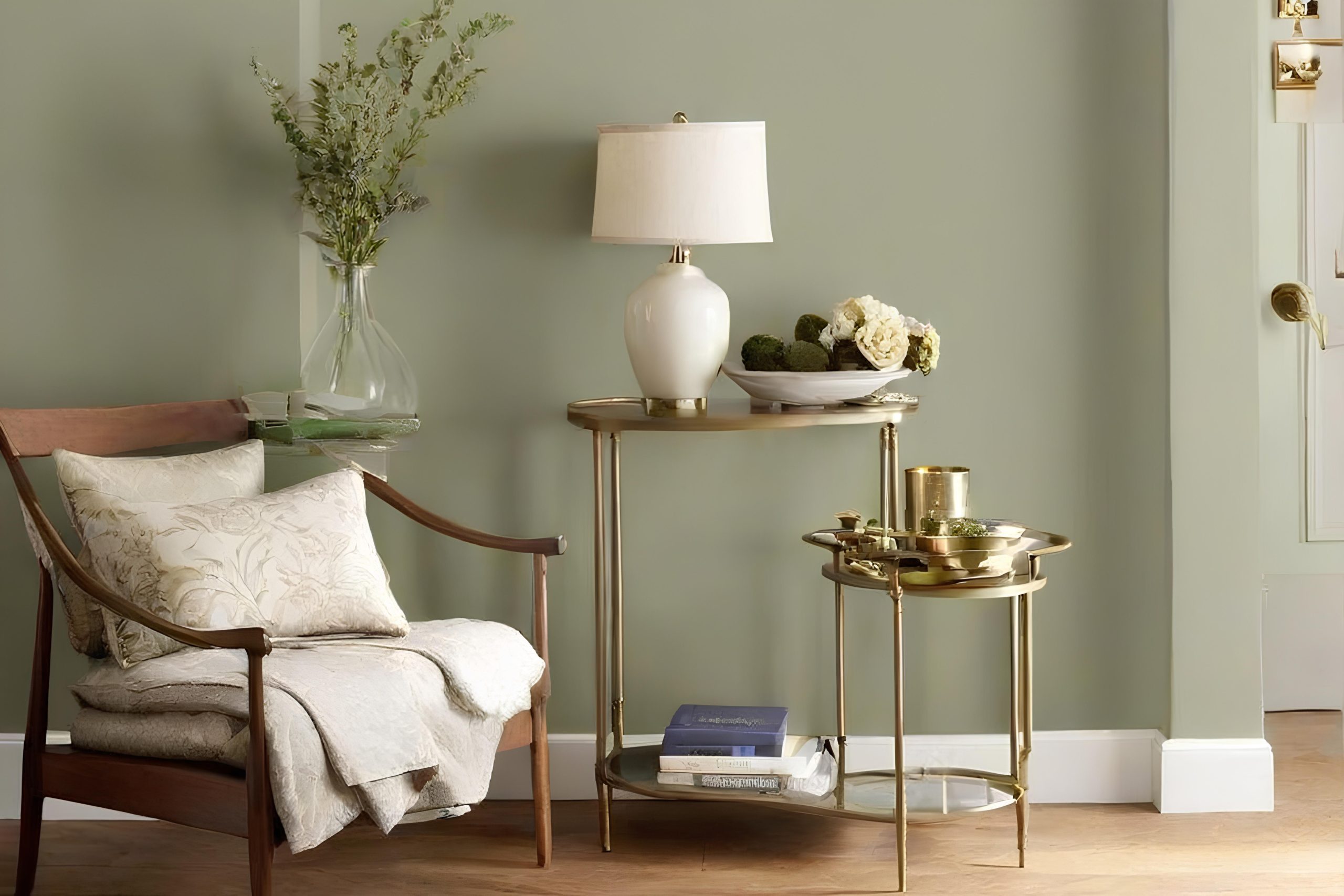
If you’re considering a fresh paint color for your space, you might want to consider SW 6164 Svelte Sage by Sherwin Williams. This soft, soothing green shade has a subtle, earthy vibe that can make any room feel more grounded and calm. It’s a great choice if you’re aiming for a natural feel in your spaces, blending well with both modern and traditional decor.
Whether you’re planning to refresh your living room, bedroom, or kitchen, Svelte Sage offers a gentle touch of color that’s not overwhelming but still adds a distinct charm to walls.
It pairs beautifully with a wide range of colors from neutrals like whites and beiges to darker hues like browns and blues, giving you plenty of design flexibility. If you’re keen to see how this color could enhance your home, a sample test on your walls is a smart move.
You’ll see how it looks with your lighting and how it complements your existing furnishings.
via medium.com
What Color Is Svelte Sage SW 6164 by Sherwin Williams?
Table of Contents
Svelte Sage SW 6164 by Sherwin Williams is a gentle, soft green shade, bordering on gray. This neutral yet soothing color brings warmth to any space without overwhelming it. It strikes a fine balance, making it versatile for various decorating styles, particularly in settings that aim for a serene and inviting atmosphere.
Ideal for modern farmhouse, rustic, and Scandinavian interior styles, Svelte Sage can also blend smoothly into more traditional settings. This color works well in living rooms, kitchens, and bedrooms, providing a subtle backdrop that complements natural light.
When pairing with materials, Svelte Sage goes beautifully with exposed wood, from pine to oak, enhancing the organic feel of the space. Natural textures such as linen, wool, and burlap also harmonize with this color, adding depth and interest. For a sleeker look, incorporating elements like brushed steel or polished glass can create a nice contrast without clashing.
This sage hue is excellent for those seeking a fresh yet understated look in their home. It supports a range of color palettes, blending seamlessly with creams, browns, and soft blues, or can act as a neutral foundation for bolder hues. Overall, Svelte Sage provides a timeless quality that adapts well to evolving tastes and trends.
housekeepingbay.com
Is Svelte Sage SW 6164 by Sherwin Williams Warm or Cool color?
Svelte Sage SW 6164 by Sherwin Williams is a versatile and soothing paint color. This soft gray-green shade offers a subtle hint of natural hues, which makes any room feel more serene and balanced. It pairs well with both modern and traditional décor, making it a convenient choice for any home update. Svelte Sage is especially suitable for places where you want to create a calm and relaxing atmosphere, such as bedrooms or living areas.
In well-lit rooms, Svelte Sage looks lighter and more vibrant, enhancing the space’s overall airiness. In spaces with less natural light, it brings depth and warmth, ensuring the room feels cozy but not cramped.
This paint color coordinates beautifully with soft whites, rich browns, and even subtle blues, allowing for a wide range of design options.
Overall, Svelte Sage SW 6164 helps in achieving a balanced and harmonious home environment without overwhelming the senses.
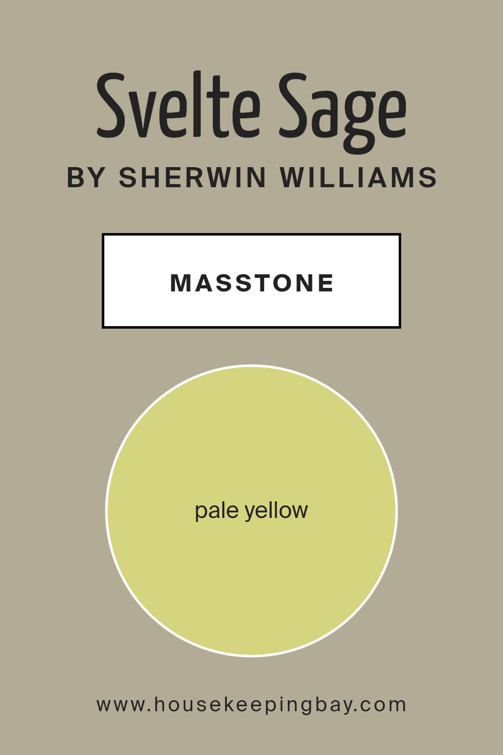
What is the Masstone of the Svelte Sage SW 6164 by Sherwin Williams?
Svelte Sage SW 6164 by Sherwin Williams is a unique color; its masstone shows as a pale yellow (#D5D580), adding a subtle, soothing presence in any space. This soft, neutral tone is perfect for those wanting to create a calming atmosphere in their home without using traditional pale colors like white or beige.
Its gentle yellow hue gives off a warm and inviting vibe that works well in areas where relaxation or concentration is needed, such as bedrooms, living rooms, and home offices. Since it’s not a bold color, Svelte Sage can easily blend with various decor styles and other colors, making it incredibly versatile.
Using this color can help light up a dim room or make a small space feel bigger because its light shade naturally reflects light.
This flexibility makes Svelte Sage a practical choice for many homes, facilitating a peaceful, yet cheerful, living environment.
housekeepingbay.com
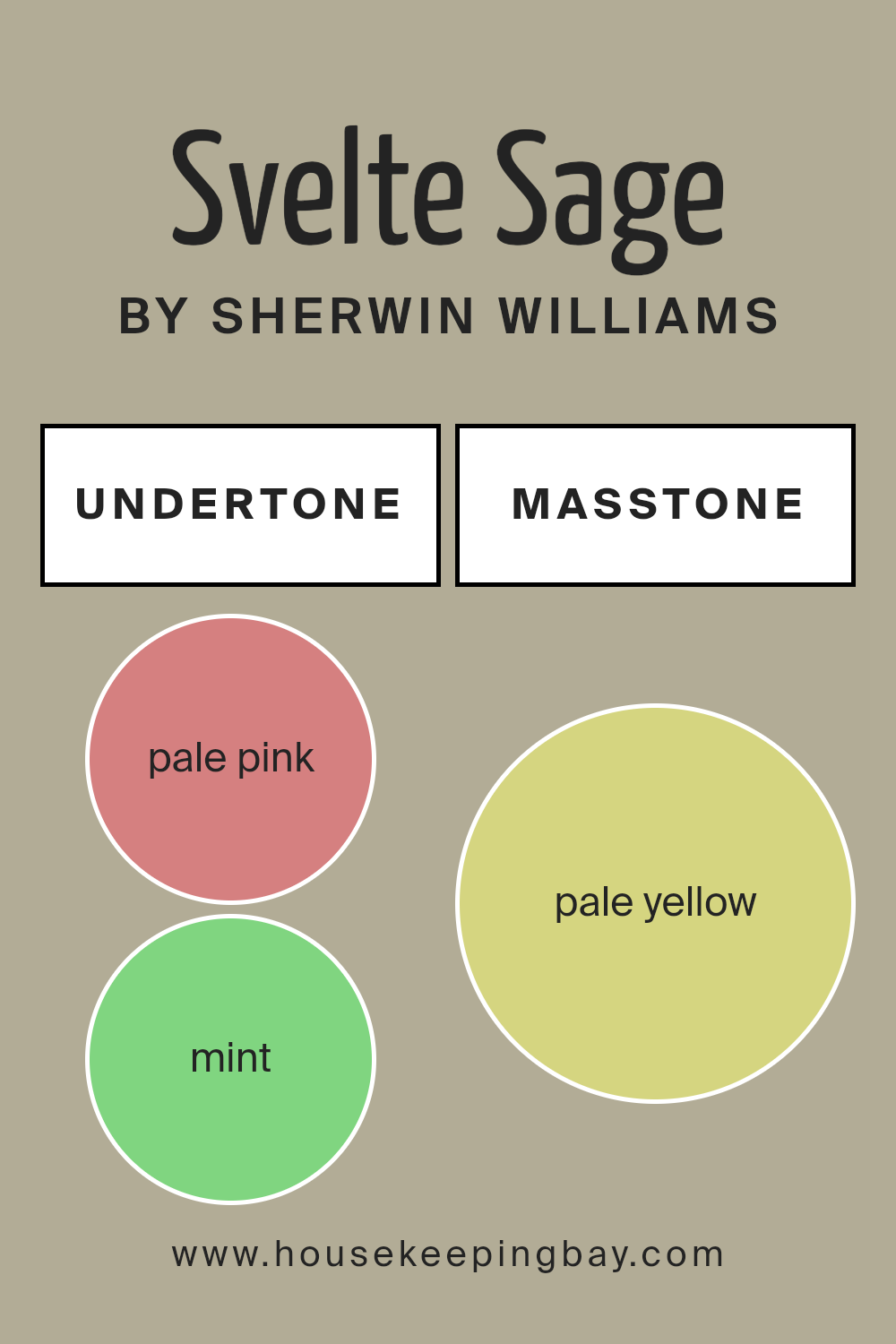
Undertones of Svelte Sage SW 6164 by Sherwin Williams
Svelte Sage SW 6164 by Sherwin Williams is a versatile color that brings a subtle depth to any space. This color is primarily a soft and muted green, but the way it presents itself can change depending on various undertones hidden within its composition.
These undertones include a spectrum of shades such as pale pink, mint, several grays, light purple, light blue, lilac, yellow, orange, light green, and olive. Each of these colors subtly influences the main shade of green, affecting how we perceive the color.
For instance, the presence of pale pink and light purple undertones can soften the green, giving it a more welcoming feel. Mint and light blue can inject a fresh and airy quality, making the color feel more rejuvenating. Grays, particularly light gray, can stabilize the vibrancy of green, making it more subdued and sophisticated.
When Svelte Sage is used on interior walls, these undertones contribute to the color’s adaptability in different lighting conditions and surroundings. In a room with plenty of natural light, the cooler undertones like light blue and mint might become more apparent, giving the room a crisp appearance.
In artificial or dim lighting, the warmer tones like pale pink and orange could make the space feel cozier.
Understanding these undertones can be key in deciding on complementary colors for decor, furniture, and textiles. Since undertones subtly influence the primary color, they are pivotal in achieving the desired ambiance in any room painted with Svelte Sage. The result is a dynamic yet harmonious space that feels balanced and pleasant to the eye.
housekeepingbay.com
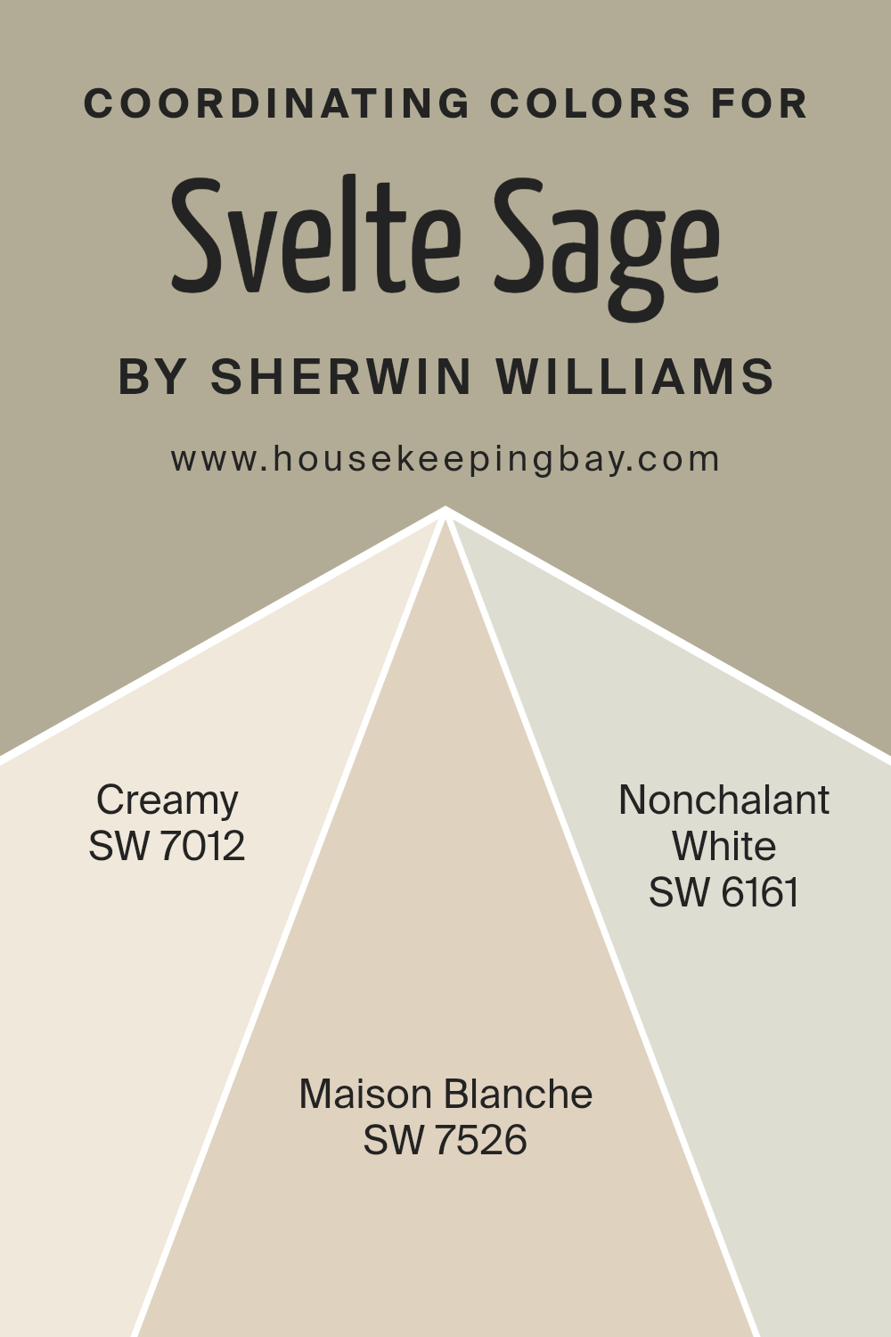
Coordinating Colors of Svelte Sage SW 6164 by Sherwin Williams
Coordinating colors are hues selected to work harmoniously with a primary color, enhancing the overall aesthetic of a space. When used in conjunction with Svelte Sage SW 6164 by Sherwin Williams, colors like SW 7012 – Creamy, SW 7526 – Maison Blanche, and SW 6161 – Nonchalant White, can create a cohesive and inviting atmosphere.
These colors share undertones that complement the muted, earthy qualities of Svelte Sage, ensuring the space feels balanced and visually appealing.
SW 7012 – Creamy is a soft, warm white that adds a gentle brightness to rooms, making it a wonderful counterbalance to the deeper tones of Svelte Sage. It adds light without overwhelming the subtler green, providing a fresh and airy feel. SW 7526 – Maison Blanche is another neutral, but with a slightly earthier feel compared to Creamy.
It echoes the natural elements that inspire Svelte Sage, making it perfect for a look that feels grounded and serene. SW 6161 – Nonchalant White offers a cooler, more subdued alternative, giving spaces a modern and sophisticated edge.
The muted quality of Nonchalant White makes it ideal for contemporary settings where you want to maintain a calm and collected ambiance.
You can see recommended paint colors below:
- SW 7012 Creamy
- SW 7526 Maison Blanche
- SW 6161 Nonchalant White
housekeepingbay.com
How Does Lighting Affect Svelte Sage SW 6164 by Sherwin Williams?
Lighting plays a crucial role in how colors are perceived in different settings. The color Svelte Sage SW 6164 by Sherwin Williams, a gentle gray-green, is a great example to illustrate this. Depending on the type of light—whether artificial or natural—this shade can appear differently.
In artificial light, such as LED or incandescent bulbs, Svelte Sage tends to have a warmer, cozier feel. The yellow or warm white tones in artificial bulbs enhance the green undertones of the paint, making rooms feel inviting. Under fluorescent lighting, which typically emits a cooler tone, Svelte Sage might lean more towards its gray components, giving it a more neutral appearance.
Natural light, influenced by the direction a room faces and the time of day, also significantly impacts how Svelte Sage looks. In north-facing rooms, which receive less direct sunlight and have a cooler light, the color may appear more muted and subdued, emphasizing its gray qualities. This can give the room a calm and serene atmosphere but might feel a bit cooler.
In south-facing rooms, abundant in bright, warm light throughout the day, Svelte Sage will look lighter and brighter. Its green undertones come to life under this sunny exposure, making the room feel fresh and lively.
East-facing rooms get bright morning light, which is generally warm. Early in the day, Svelte Sage will display more vividly, making the room feel welcoming. As the day progresses and the natural light diminishes, the color may appear softer and more subdued.
West-facing rooms have the reverse effect of east-facing rooms. Mornings will show Svelte Sage in a more neutral tone, while the intense evening sunlight can make the color appear bolder and more dynamic in the late afternoon.
Understanding how lighting affects colors like Svelte Sage SW 6164 can help in making informed decisions about paint choices based on room orientation and the type of light fixtures used. This ensures that the color aligns with the desired mood and functionality of each space.
housekeepingbay.com
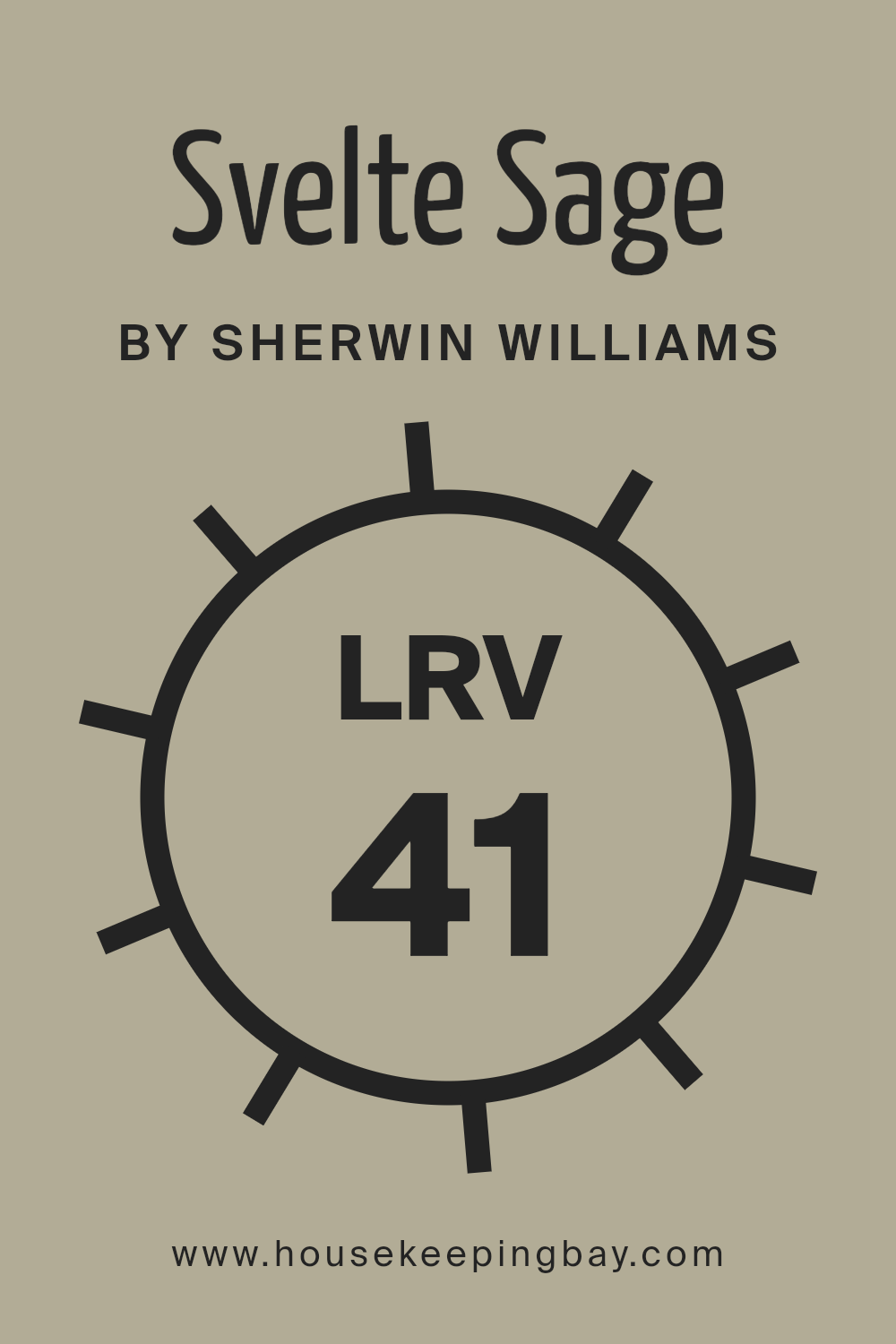
What is the LRV of Svelte Sage SW 6164 by Sherwin Williams?
LRV stands for Light Reflectance Value, a measure that indicates the amount of visible and usable light that a color reflects or absorbs. Measured on a scale from 0 to 100, where 0 absorbs all light (pure black) and 100 reflects all light (pure white), LRV helps in choosing paint colors based on how light or dark you want a space to feel. Considering LRV is crucial when designing rooms, as it affects the level of brightness and can make a room feel more open or more cozy depending on the value chosen.
With an LRV of 41.328, Svelte Sage SW 6164 by Sherwin Williams is a mid-tone color. This moderate LRV means it does not reflect light as much as lighter colors would, nor does it absorb light like darker colors. It is versatile enough to offer a soothing feel without making a room feel too dense or heavy.
Ideal for spaces where a balance of warmth and light is needed, Svelte Sage can work well in a variety of lighting situations, helping maintain a neutral and welcoming ambiance.
housekeepingbay.com
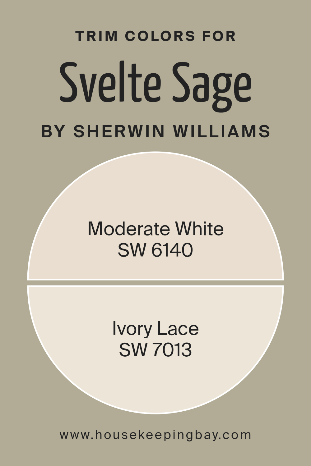
What are the Trim colors of Svelte Sage SW 6164 by Sherwin Williams?
Trim colors, such as SW 6140 – Moderate White and SW 7013 – Ivory Lace by Sherwin Williams, play a vital role in defining the aesthetic and visual appeal of a room painted with Svelte Sage SW 6164. These colors are typically used for detailing elements like door frames, moldings, window sills, and baseboards.
The choice of trim colors can subtly complement or boldly contrast the main wall color, thereby enhancing architectural details and creating a cohesive look. By carefully selecting trim colors, homeowners can highlight the architectural features of their space, adding depth and interest to the overall design.
SW 6140 – Moderate White is a soft, soothing white that provides a fresh and clean look. It pairs beautifully with the earthy tones of Svelte Sage SW 6164, ensuring that the space feels airy and well-coordinated.
On the other hand, SW 7013 – Ivory Lace is a warmer, creamier shade that offers a gentle contrast, adding a touch of warmth to the surroundings without overwhelming the gentle ambiance of Svelte Sage.
Both colors support the main hue without overpowering it, creating a balanced and harmonious environment.
You can see recommended paint colors below:
housekeepingbay.com
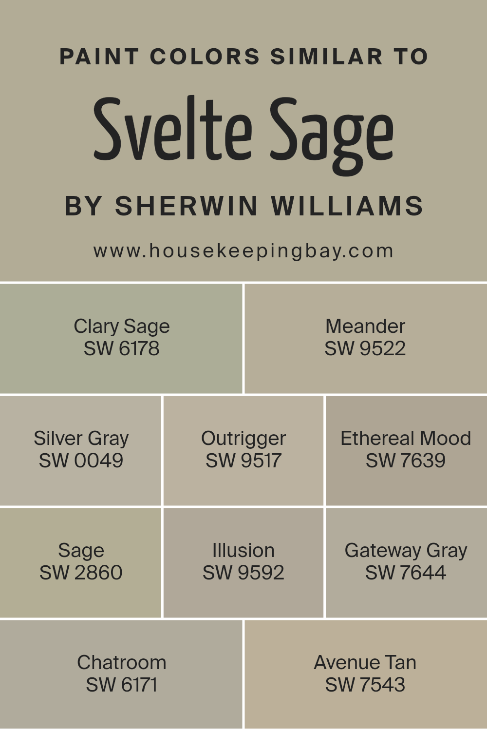
Colors Similar to Svelte Sage SW 6164 by Sherwin Williams
Similar colors are essential in interior design because they create a cohesive and harmonious atmosphere. By carefully selecting colors that complement each other, such as the variations similar to Svelte Sage SW 6164 by Sherwin Williams, designers and homeowners can achieve a balanced and visually appealing space.
These subtle tones share common undertones which allow for a smooth transition from one shade to another, enhancing the overall aesthetic without overwhelming the senses. Furthermore, using similar colors can make the decorating process simpler as these colors naturally work well together, reducing the risk of clashing elements.
SW 6178 – Clary Sage is a more pronounced, herb-like green that provides a touch of nature indoors. SW 9522 – Meander offers a subtle gray-green hue that mimics the softness of early morning mist. SW 0049 – Silver Gray, on the other hand, introduces a light, airy gray that can brighten spaces while maintaining a sense of calm.
SW 9517 – Outrigger is a darker gray that gives depth and sophistication to any room. SW 7639 – Ethereal Mood brings a muted, moody quality, ideal for creating a serene environment. SW 2860 – Sage is a true green that draws its inspiration from garden foliage and brings a fresh vibe to interiors.
SW 9592 – Illusion presents a faint green that’s almost neutral, offering versatility in design options. SW 7644 – Gateway Gray is a robust gray that stands out for its strong, yet understated presence. SW 6171 – Chatroom is a darker, smoky hue that adds a modern twist to any space.
Lastly, SW 7543 – Avenue Tan introduces a warmer, beige tone that pairs effortlessly with versatile sage shades, offering a comforting warmth to any palette.
Together, these colors provide a range of options that can suit varied aesthetic desires while maintaining visual flow throughout a space.
You can see recommended paint colors below:
- SW 6178 Clary Sage
- SW 9522 Meander
- SW 0049 Silver Gray
- SW 9517 Outrigger
- SW 7639 Ethereal Mood
- SW 2860 Sage
- SW 9592 Illusion
- SW 7644 Gateway Gray
- SW 6171 Chatroom
- SW 7543 Avenue Tan
housekeepingbay.com
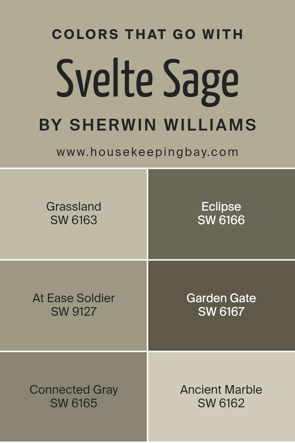
Colors that Go With Svelte Sage SW 6164 by Sherwin Williams
Choosing the right colors that complement Svelte Sage SW 6164 by Sherwin-Williams is crucial in achieving a harmonious and balanced look in your home. Svelte Sage is a soft, muted green that gives a serene and cozy feel, making it a versatile backdrop for various design aesthetics.
Pairing it with the right colors enhances its natural beauty and creates a pleasing flow throughout the space.
Grassland SW 6163 is a slightly darker green that shares the same earthy qualities as Svelte Sage, providing a gentle contrast that is both soothing and grounding. Eclipse SW 6166, on the other hand, is a deep, mysterious gray with a hint of blue, adding a touch of sophistication and depth to spaces that feature Svelte Sage.
At Ease Soldier SW 9127 offers a muted, military green that works well with Svelte Sage for a cohesive natural palette, infusing a calm and collected vibe. Garden Gate SW 6167 is a darker, more robust shade that can add a striking yet harmonious contrast to the softer Svelte Sage, ideal for creating focal points or accent walls.
Connected Gray SW 6165 is a neutral gray that blends seamlessly with Svelte Sage, ensuring a smooth transition between color spaces. Lastly, Ancient Marble SW 6162 presents a lighter, breezier green that enhances the airy feel when used with Svelte Sage, perfect for creating a refreshing and light atmosphere. These companion colors ensure that Svelte Sage acts as a perfect base for a variety of themes and preferences, allowing the room’s design to come alive.
You can see recommended paint colors below:
- SW 6163 Grassland
- SW 6166 Eclipse
- SW 9127 At Ease Soldier
- SW 6167 Garden Gate
- SW 6165 Connected Gray
- SW 6162 Ancient Marble
housekeepingbay.com
How to Use Svelte Sage SW 6164 by Sherwin Williams In Your Home?
Svelte Sage SW 6164 by Sherwin Williams is a soothing, gentle green paint color that brings a touch of nature into your home. Its subtle, earthy tones make it versatile for use in various spaces, such as living rooms, kitchens, or bedrooms. This color pairs well with natural elements like wood or stone, enhancing the cozy and calm feel of your home.
To use Svelte Sage in your home, you might consider painting an accent wall in your living room to create a focal point while maintaining a relaxed atmosphere. In a bedroom, using Svelte Sage on the walls can help establish a serene setting, ideal for rest and relaxation.
For kitchens, this color can complement wooden cabinets or contrast nicely with white countertops for a fresh, clean look.
Additionally, Svelte Sage works well with both modern and traditional decor, making it a flexible choice that can fit various styles and tastes. Whether used as the main color scheme or as a subtle background hue, Svelte Sage provides a pleasant and inviting atmosphere that enhances the overall aesthetics of your home.
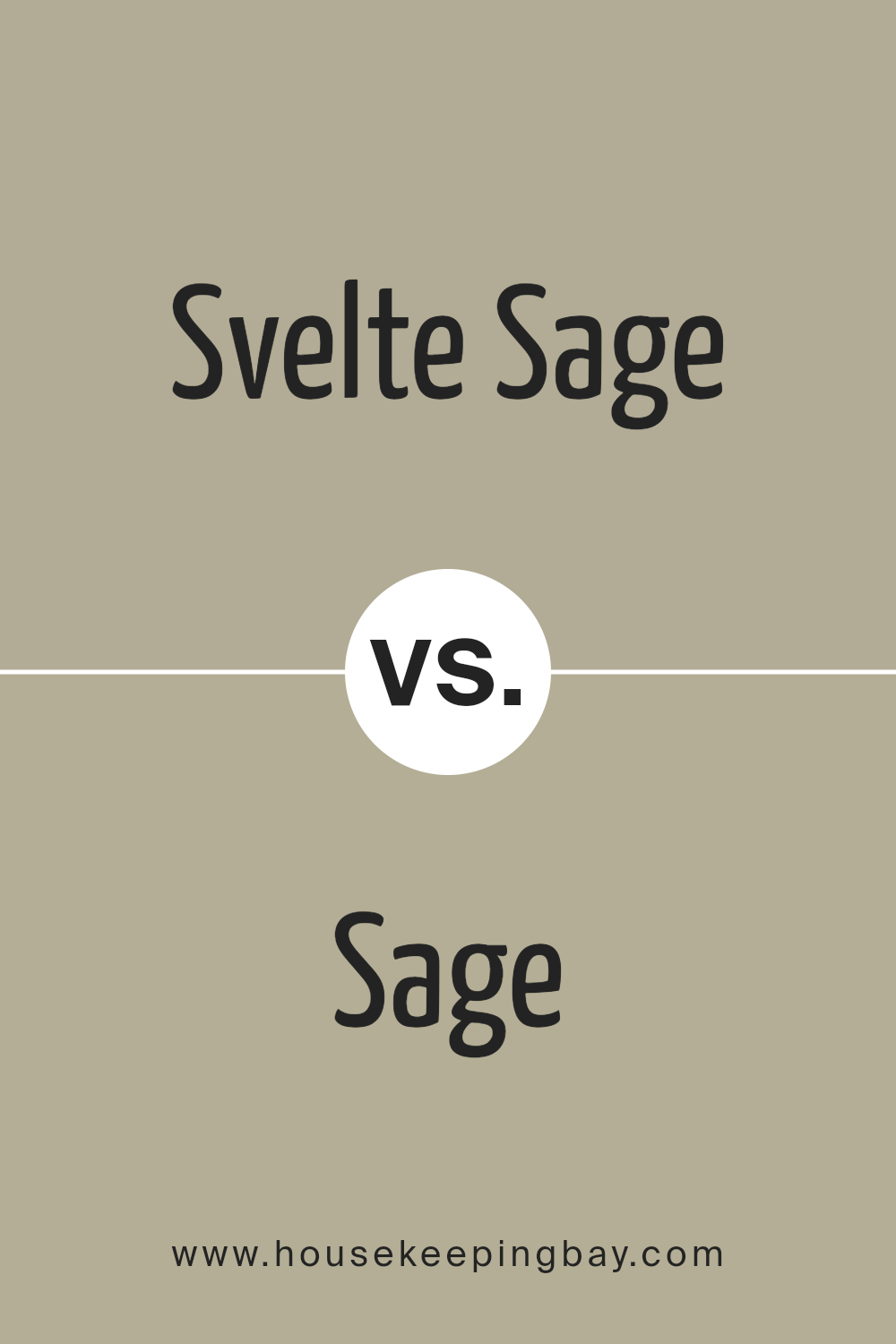
Svelte Sage SW 6164 by Sherwin Williams vs Sage SW 2860 by Sherwin Williams
Svelte Sage SW 6164 and Sage SW 2860, both by Sherwin Williams, offer subtle variations in the realm of sage green paint colors. Svelte Sage is a soft, muted green with gray undertones, making it an excellent choice for a calming ambiance in spaces such as bedrooms or living rooms. It pairs well with both light and dark furniture, offering flexibility in interior design.
In contrast, Sage SW 2860 is a deeper, more traditional sage green. This color has a more pronounced green hue, making it slightly bolder and more vibrant than Svelte Sage. It works well in areas that benefit from a natural touch, such as kitchens or dining rooms.
While Sage makes a strong statement by itself, Svelte Sage tends to blend more seamlessly into various decor styles. Both colors reflect a natural aesthetic, but the choice between them depends on the desired impact and the specific characteristics of the space being painted.
You can see recommended paint color below:
- SW 2860 Sage
housekeepingbay.com
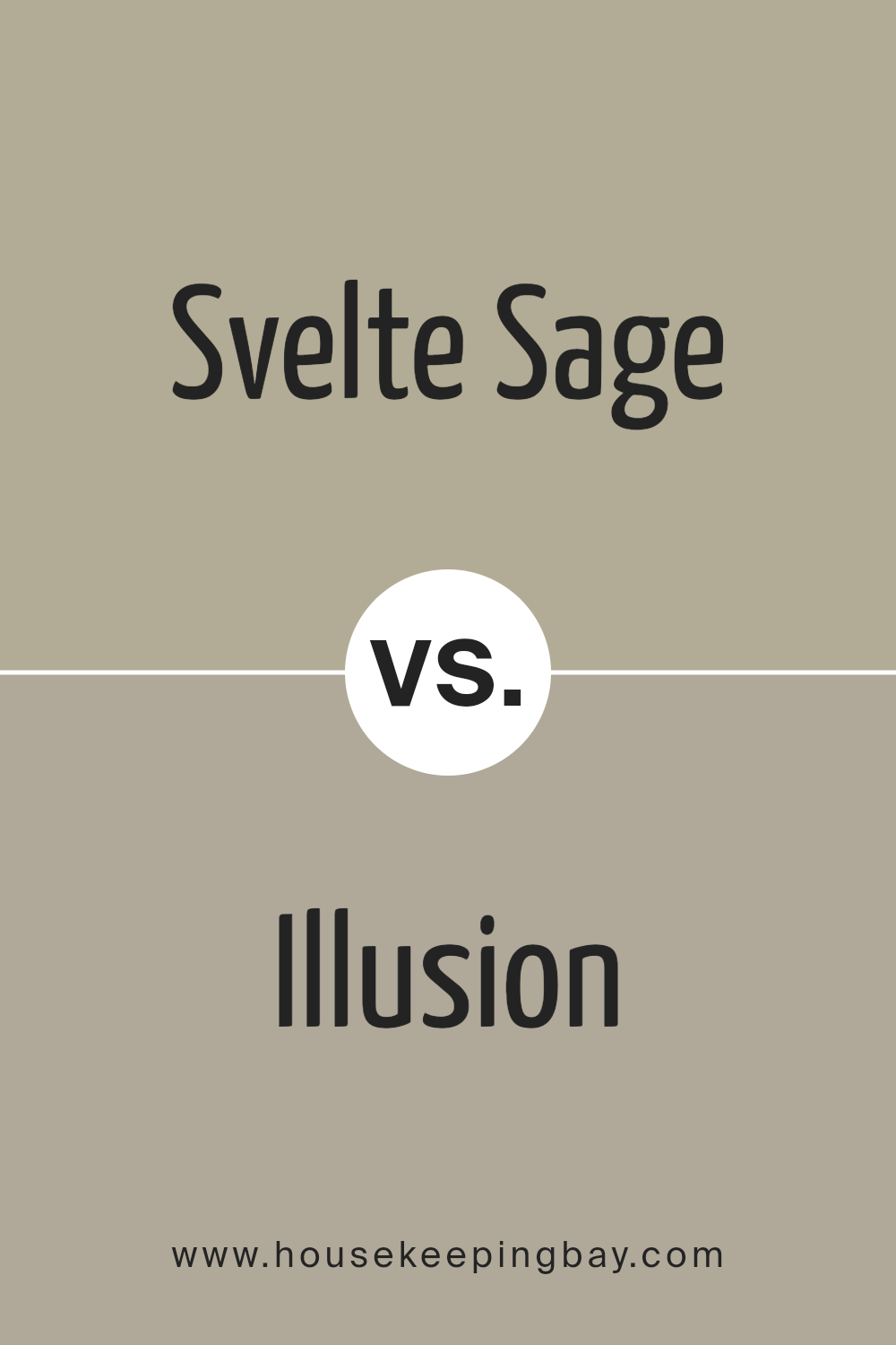
Svelte Sage SW 6164 by Sherwin Williams vs Illusion SW 9592 by Sherwin Williams
Svelte Sage SW 6164 and Illusion SW 9592 by Sherwin Williams are two distinctive colors that come together beautifully in a palette. Svelte Sage is a soft, muted green with a hint of gray, making it a versatile neutral that pairs well with both warm and cool tones. It gives a room a soothing and inviting feel, perfect for spaces meant to relax and unwind.
In contrast, Illusion SW 9592 is a darker, more atmospheric color. It is a deep gray with a slightly purple tint, adding a touch of sophistication and depth to spaces.
While Svelte Sage brings lightness and a breath of fresh air, Illusion sets a moodier tone, ideal for creating dramatic and intimate settings. Together, these colors can complement each other, with Svelte Sage brightening spaces and Illusion adding a rich backdrop, thus offering a balanced and harmonious color scheme.
You can see recommended paint color below:
housekeepingbay.com
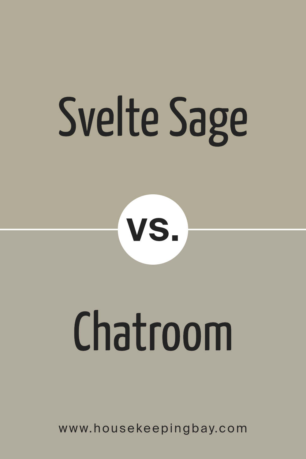
Svelte Sage SW 6164 by Sherwin Williams vs Chatroom SW 6171 by Sherwin Williams
Svelte Sage SW 6164 and Chatroom SW 6171, both from Sherwin Williams, offer subtle yet distinct tones for decorating. Svelte Sage is a soothing, mild green with gray undertones, providing a calm and soft ambiance to any room. This makes it ideal for spaces intended for relaxation and unwinding.
In contrast, Chatroom is a darker, moodier gray with hints of green, presenting a more grounded and cozy feel. Due to its deeper tone, Chatroom works well in areas that benefit from a sophisticated and snug atmosphere, such as studies or dens.
When comparing these colors, Svelte Sage reflects more light, making a room feel larger and more open, while Chatroom, being darker, can make a space feel smaller but more inviting and intimate. Both colors can be versatile in their use but cater to different aesthetic and spatial needs.
You can see recommended paint color below:
housekeepingbay.com
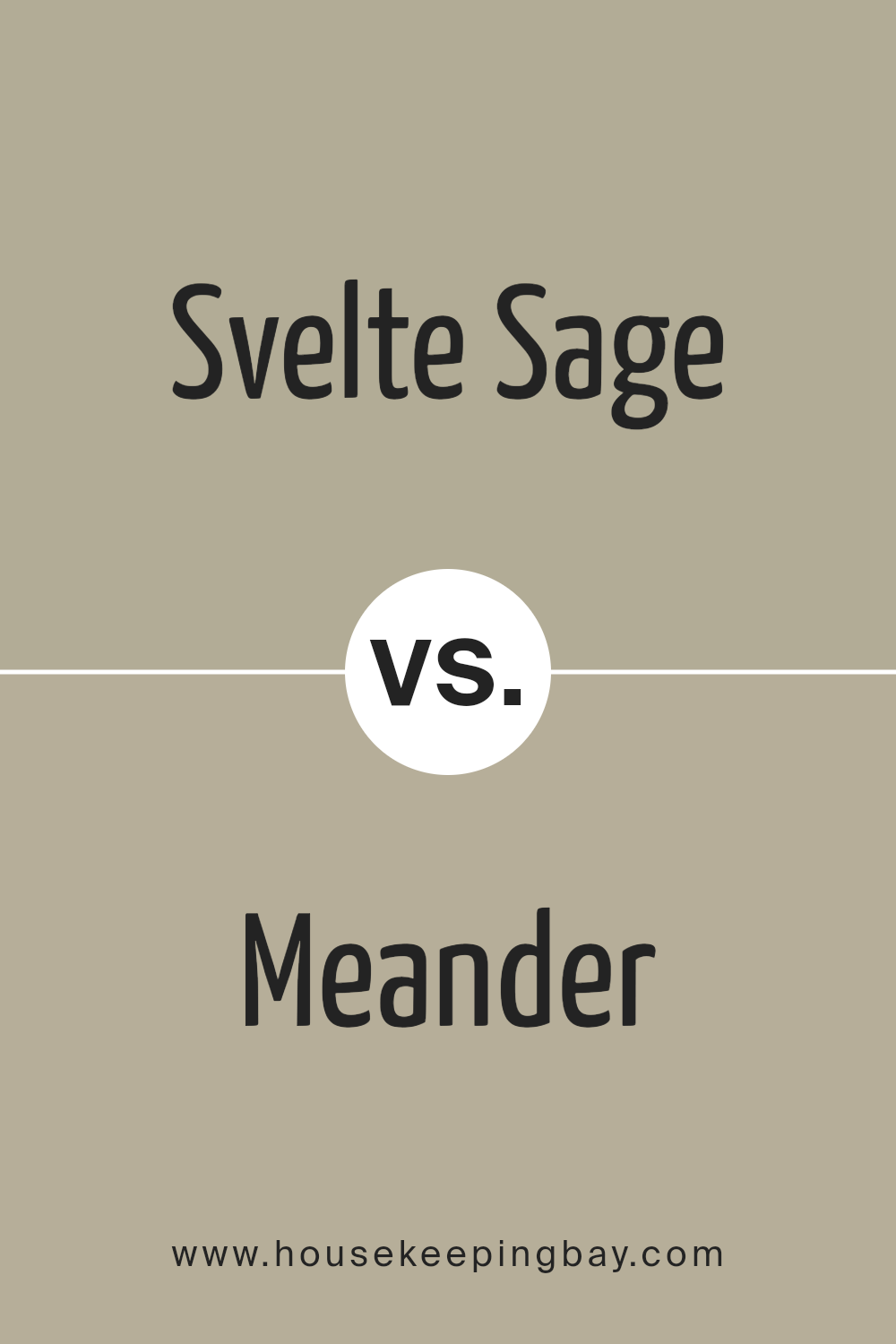
Svelte Sage SW 6164 by Sherwin Williams vs Meander SW 9522 by Sherwin Williams
Svelte Sage SW 6164 by Sherwin Williams is a soft, earthy green with gray undertones, giving it a natural and subtle look that’s perfect for creating a serene and calming environment. It pairs well with natural materials like wood and stone, making it a great choice for living rooms or bedrooms where a soothing atmosphere is desired.
Meander SW 9522, also by Sherwin Williams, is a deeper, more saturated blue-green hue. This color has a distinctly vibrant yet soothing quality, suitable for spaces where a touch of sophistication combined with a relaxed vibe is needed. Its richer tone stands out more than Svelte Sage, making it ideal for accent walls or decorative elements in a space.
Both colors offer unique aesthetic appeals and can be used effectively in various home decor styles. While Svelte Sage leans towards a muted, neutral palette, Meander introduces a splash of color, maintaining a calming effect but with a bolder approach.
You can see recommended paint color below:
housekeepingbay.com
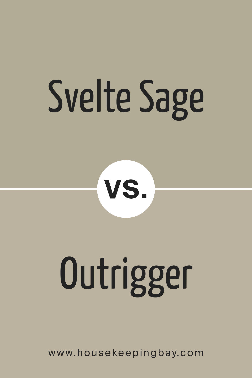
Svelte Sage SW 6164 by Sherwin Williams vs Outrigger SW 9517 by Sherwin Williams
Svelte Sage SW 6164 by Sherwin Williams is a soothing, muted green with a gray undertone, which gives it a neutral and versatile appeal. It creates a serene environment, appropriate for rooms where calm and focus are desired, such as bedrooms or home offices. This color pairs well with both light and dark woods, adding to its flexibility in various decor styles.
Outrigger SW 9517, on the contrary, is a much deeper, navy blue. This color adds a bold touch to spaces, making it great for accent walls or furniture pieces. It tends to bring a dramatic flair to an interior, contrasting sharply with lighter shades, which can help in defining space and creating focal points.
While Svelte Sage provides a subtle, earth-toned base that aims to keep things light and airy, Outrigger stands out with its rich darkness, perfect for adding weight and a touch of sophistication. Both colors can contribute significantly to a room’s atmosphere depending on what mood or style one aims to achieve.
You can see recommended paint color below:
housekeepingbay.com
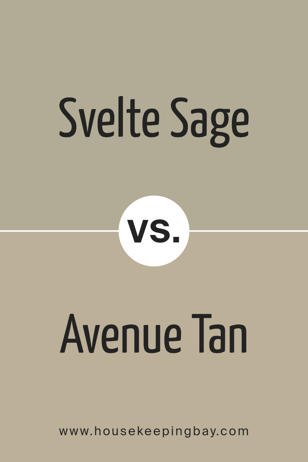
Svelte Sage SW 6164 by Sherwin Williams vs Avenue Tan SW 7543 by Sherwin Williams
Svelte Sage SW 6164 and Avenue Tan SW 7543, both by Sherwin Williams, offer subtle yet distinct tones for home decor. Svelte Sage is a soft, muted green with a hint of gray, creating a calming, serene atmosphere. It works well in spaces aiming for a natural, understated look. This color pairs beautifully with both light and dark woods, adding to its versatility.
Avenue Tan, a warmer tan shade, leans towards a comforting, welcoming vibe. It contains more beige and brown, making it ideal for cozy areas like living rooms or bedrooms. Avenue Tan also complements a wide range of furnishings, from modern to classic styles.
While both colors provide a soothing backdrop, Svelte Sage brings a cooler, fresher feel, whereas Avenue Tan introduces warmth and coziness. These characteristics allow them to suit different moods and settings, depending on the desired ambiance.
You can see recommended paint color below:
- SW 7543 Avenue Tan
housekeepingbay.com
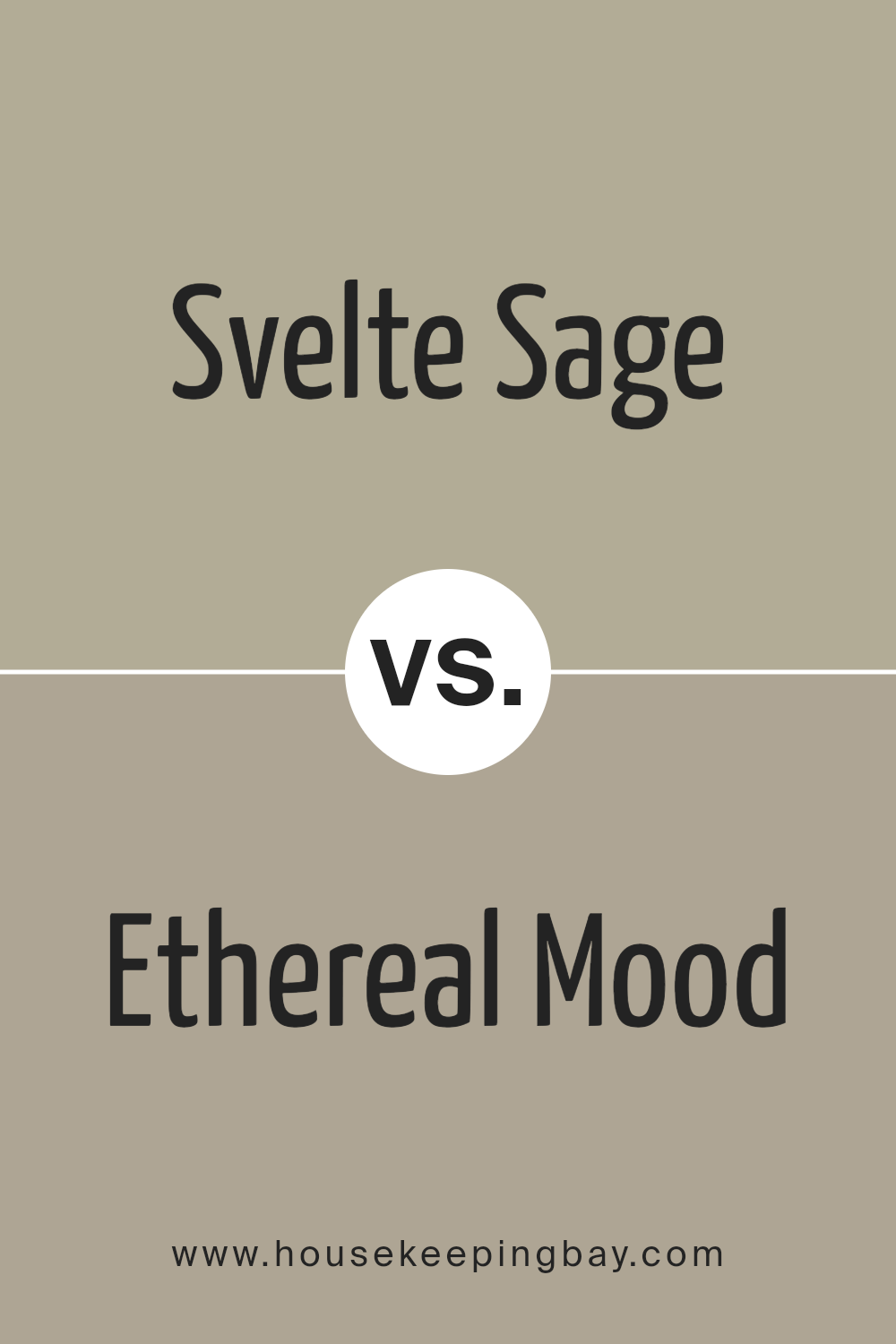
Svelte Sage SW 6164 by Sherwin Williams vs Ethereal Mood SW 7639 by Sherwin Williams
Svelte Sage SW 6164 by Sherwin Williams is a soft, muted green with a gray undertone, giving it a soothing and natural feel. This color works well in spaces where a calm, serene environment is desired, such as bedrooms and living rooms. It pairs beautifully with both bright accents and neutral tones, making it highly versatile for various decor styles.
Ethereal Mood SW 7639, on the other hand, is a deeper, moodier gray that also contains hints of green, but with a cooler, more shadowy appearance. This color lends a sophisticated and refined look, suitable for modern and traditional settings alike. It’s an excellent choice for creating a dramatic backdrop or when a more impactful, yet still understated, atmosphere is needed.
Both colors reflect elegance and are ideal for those looking to bring a touch of nature indoors while maintaining a chic aesthetic. However, Svelte Sage leans towards a lighter, airier vibe, while Ethereal Mood offers a more profound, intimate ambiance.
You can see recommended paint color below:
housekeepingbay.com
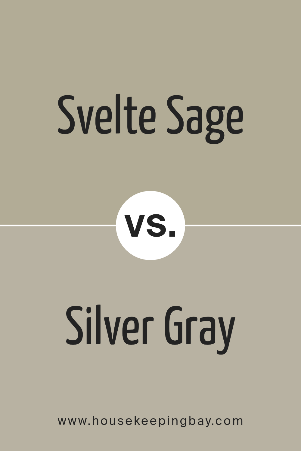
Svelte Sage SW 6164 by Sherwin Williams vs Silver Gray SW 0049 by Sherwin Williams
The main color, Svelte Sage SW 6164 by Sherwin Williams, is a muted green with gray undertones, offering a soothing and earthy feel, suitable for spaces where calmness and relaxation are desired. It pairs well with natural materials like wood and stone, making it a great choice for living rooms or bedrooms looking to achieve a serene ambiance.
On a different note, Silver Gray SW 0049 by Sherwin Williams is a light gray color that leans towards a cool tone. This shade is versatile and acts as a neutral backdrop, making it perfect for modern and minimalist interiors. It reflects more light, thus can help make a small room appear larger and more open.
Both colors provide a subtle and sophisticated look, but Svelte Sage brings a touch of nature and warmth, while Silver Gray offers a crisp and clean appearance, ideal for a more contemporary space.
You can see recommended paint color below:
housekeepingbay.com
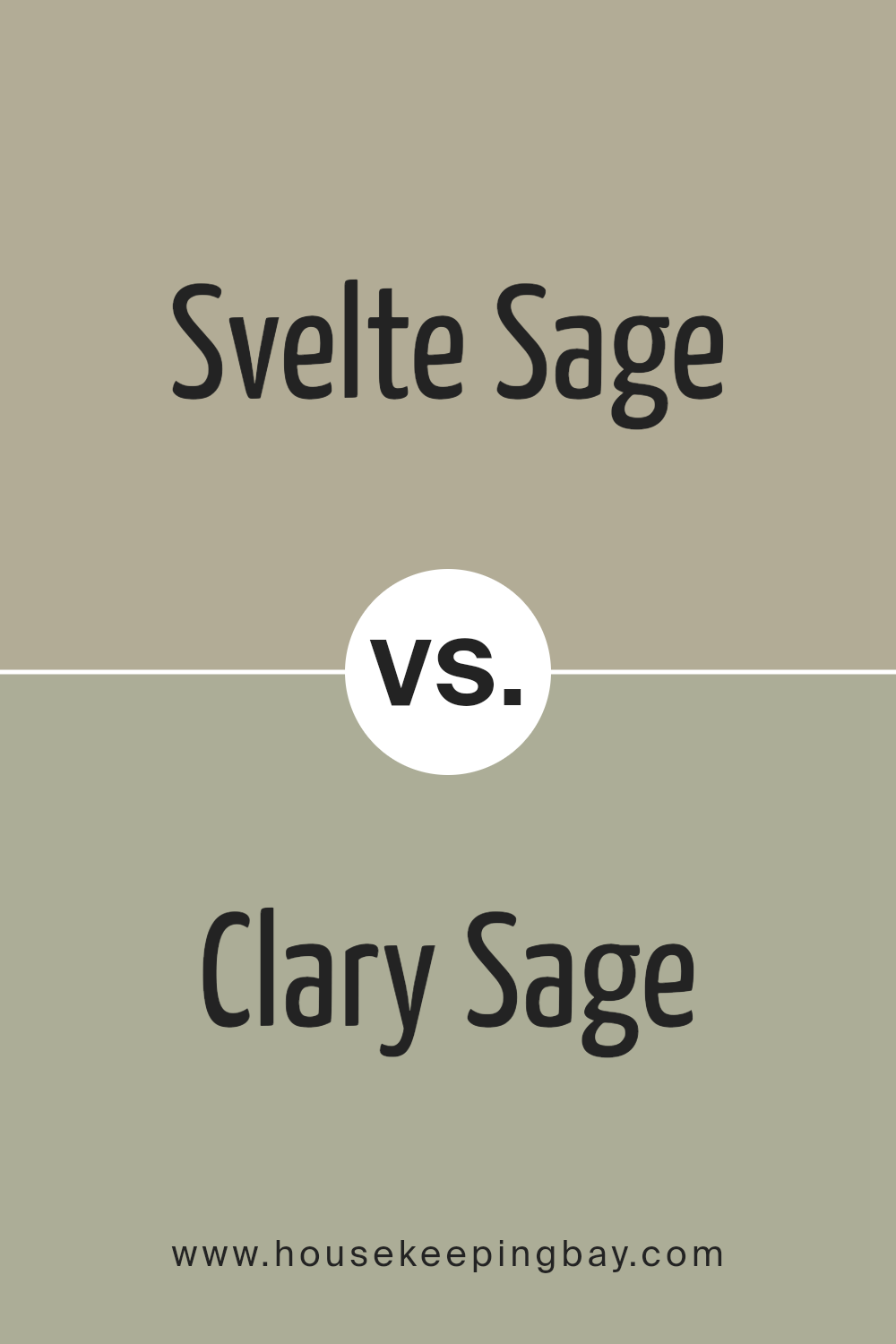
Svelte Sage SW 6164 by Sherwin Williams vs Clary Sage SW 6178 by Sherwin Williams
Svelte Sage SW 6164 and Clary Sage SW 6178 by Sherwin Williams are both green hues, but they have distinct tones and effects. Svelte Sage is a muted, soft green with a hint of gray, making it versatile for any space seeking a calm, soothing atmosphere. Its subtlety works well in places where you want a neutral backdrop that still offers a touch of color.
Clary Sage, in contrast, is a darker green that leans slightly towards an olive tone. This shade is richer and can create a feeling of coziness and warmth, ideal for making a room feel more enclosed and intimate.
Svelte Sage is better suited for smaller, brighter rooms or spaces where you want to maintain a light, airy feel. Clary Sage works well in larger spaces or areas where a more grounded, earthy feeling is desirable. Both colors promote a natural aesthetic, but the choice between them depends on the specific mood and style you aim to achieve in a room.
You can see recommended paint color below:
housekeepingbay.com
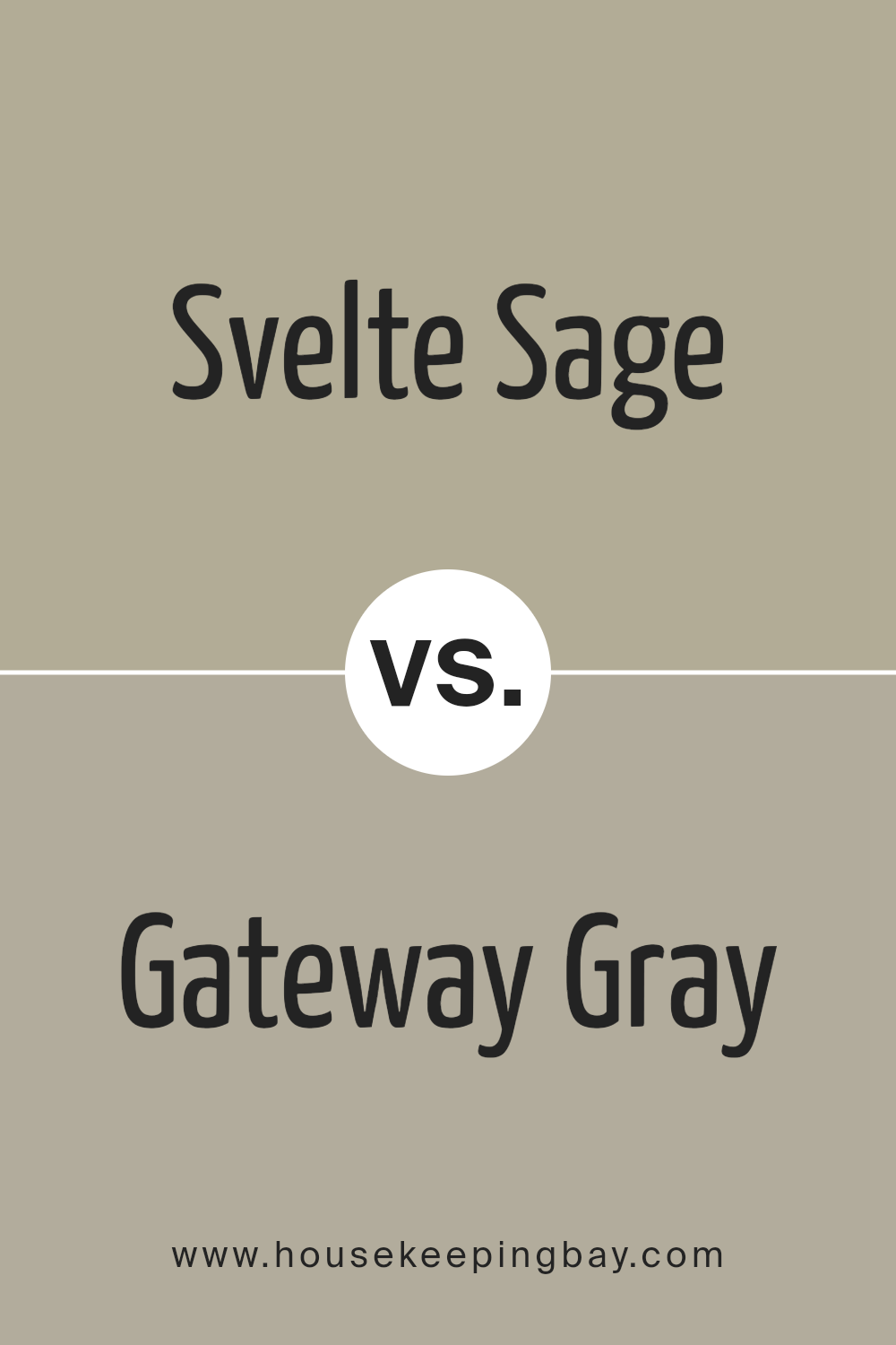
Svelte Sage SW 6164 by Sherwin Williams vs Gateway Gray SW 7644 by Sherwin Williams
Svelte Sage SW 6164 by Sherwin Williams is a soft, soothing green-gray shade that imparts a gentle, earthy ambiance to spaces. It’s reminiscent of natural elements like moss and sage, making it perfect for creating a calming, nature-inspired environment. Its light saturation works well in small or large areas, enhancing rooms with a subtle hint of color while maintaining a neutral backdrop.
Gateway Gray SW 7644, also by Sherwin Williams, is a darker, more assertive color. As a mid-tone gray, it carries a hint of brown, exuding a warm and cozy feel. This makes it ideal for spaces where a more embracing, secure atmosphere is desired.
Gateway Gray can serve as a robust foundation color that pairs easily with brighter accents or furniture.
While both colors are rooted in natural tones, Svelte Sage leans towards a lighter, fresher vibe, ideal for promoting relaxation and serenity. Gateway Gray, with its deeper and warmer hue, offers a feeling of stability and comfort. Each can uniquely define space depending on the intended aesthetic and functional needs.
You can see recommended paint color below:
- SW 7644 Gateway Gray
housekeepingbay.com
Conclusion
After reviewing SW 6164 Svelte Sage by Sherwin Williams, I’ve found that it truly exemplifies what a versatile and timeless color can bring to any space. This shade of green provides a subtle, soft backdrop that complements a wide range of décor styles, from modern minimalist to rustic farmhouse. The calming nature of Svelte Sage allows it to work beautifully in living areas and bedrooms, where creating a serene atmosphere is often desired.
Moreover, its adaptability extends to various settings in a home. In a kitchen, it pairs well with both wood and white cabinetry, lending an earthy, yet fresh look. For exteriors, Svelte Sage serves as a charming option that enhances curb appeal while seamlessly blending with natural surroundings.
The paint itself, typical of Sherwin Williams products, is of high quality, offering excellent coverage and durability. It’s easy to apply, maintaining its color integrity over time, which is crucial for homeowners looking for longevity.
Overall, Svelte Sage is more than just a color choice; it’s a smart investment for anyone looking to refresh their home with a hue that will remain relevant and appealing for years to come. Paired with the right accents and décor, this color can help achieve a balanced and inviting space.
housekeepingbay.com
Ever wished paint sampling was as easy as sticking a sticker? Guess what? Now it is! Discover Samplize's unique Peel & Stick samples. Get started now and say goodbye to the old messy way!
Get paint samples


