White Heron SW 7627 by Sherwin Williams
Elevating Spaces with Timeless Elegance
In the vast palette of colors offered by Sherwin Williams, SW 7627 White Heron stands out as a quintessential shade that encapsulates the essence of serenity and simplicity. This color profile is a part of Sherwin Williams’ collection, renowned for its ability to bring a fresh, clean look to any space.
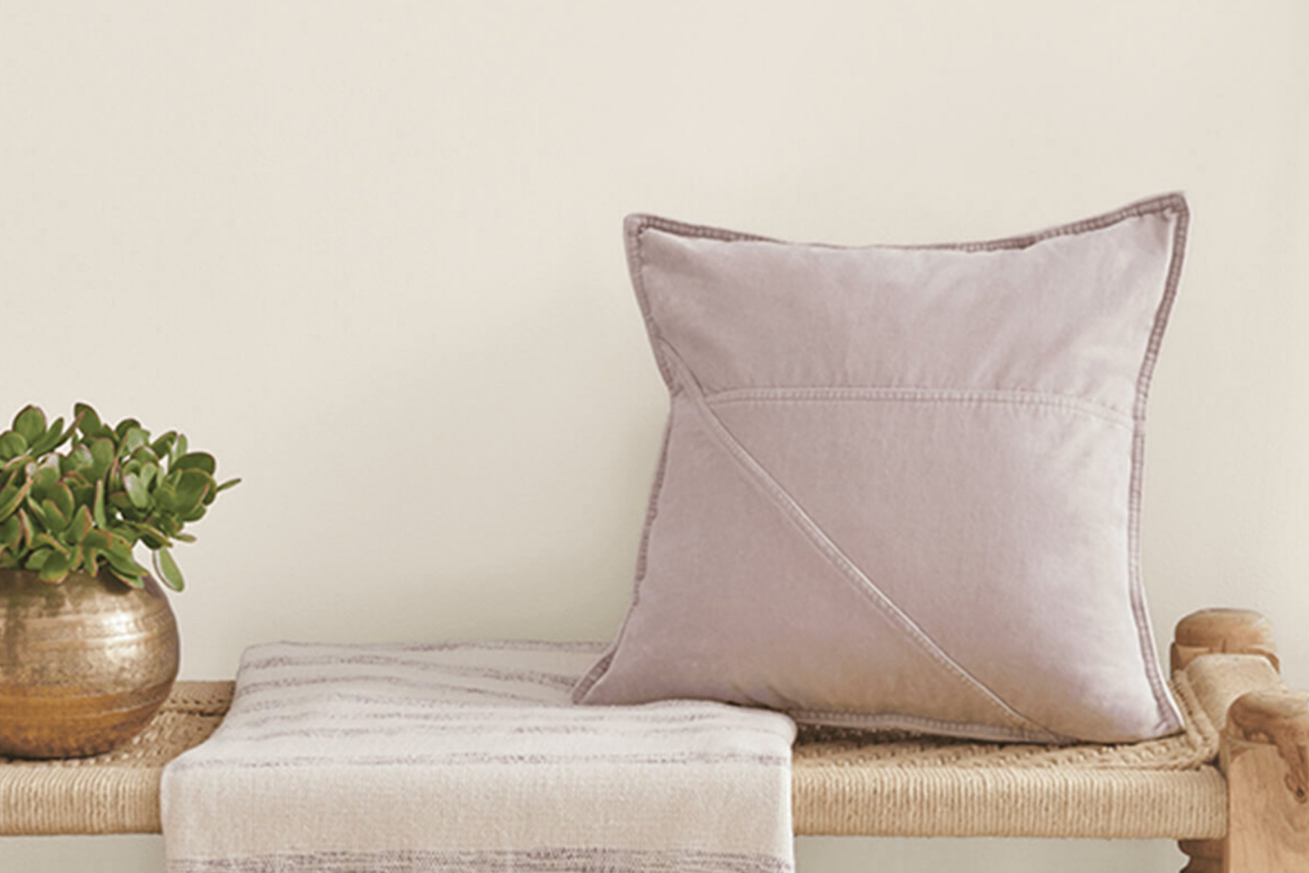
White Heron is a nuanced white that exudes an understated elegance, making it a versatile choice for designers and homeowners alike who are looking to create airy and bright spaces.As a shade that straddles the line between pure white and a soft, light gray, White Heron offers a contemporary take on a classic color.
It’s this delicate balance that makes it ideal for a variety of design schemes, from modern minimalist to cozy coastal and even traditional spaces. Its luminosity enhances natural light, making rooms feel more spacious and welcoming, while its subtle undertones provide depth and warmth, avoiding the starkness associated with pure white.
In this article, we will delve into the characteristics of SW 7627 White Heron by Sherwin Williams, exploring how it behaves in different lighting situations, its complementary colors, and its application in various settings.
Whether you are contemplating a complete home makeover or a simple room refresh, understanding the dynamics of White Heron can help you achieve your desired ambiance with sophistication and style.
vis sherwin-williams
What Color Is White Heron SW 7627 by Sherwin Williams?
Table of Contents
White Heron SW 7627 by Sherwin Williams is a serene and pristine shade of white that embodies simplicity and elegance. This color manages to strike a perfect balance between warm and cool tones, making it incredibly versatile and adaptable to various lighting conditions and design aesthetics. Its understated sophistication allows it to serve as either a harmonious background or a standalone statement, depending on the context of its application.
White Heron boasts an impressive ability to enhance the sense of space and light in a room, making it an ideal choice for creating airy and open environments. Its pure and clean nature introduces a sense of calm and tranquility, making it particularly suitable for bedrooms, living rooms, and bathrooms where a peaceful atmosphere is desired.
This shade harmonizes beautifully with a wide range of interior styles including minimalist, Scandinavian, coastal, and modern farmhouse designs. Its neutral character makes it an excellent companion for natural materials such as wood, stone, and linen, enhancing their textures and adding depth to the overall design. Metal accents in silver, gold, or black can also complement White Heron, adding a touch of sophistication and contrast.
Furthermore, White Heron pairs elegantly with a spectrum of other colors, from soft pastels to bold hues, allowing for flexible color schemes that can evolve with changing tastes and trends. Its adaptability and timeless charm make White Heron SW 7627 an enduring choice for those seeking to infuse their spaces with a sense of clarity and refinement.
housekeepingbay.com
Is White Heron SW 7627 by Sherwin Williams Warm or Cool color?
White Heron SW 7627 by Sherwin-Williams is an exquisite, softly nuanced white that brings a luminous and airy quality to any space it graces. This particular shade of white carries a subtle warmth that prevents it from feeling sterile or cold, making it exceptionally versatile for usage in various home settings. It works harmoniously with a wide range of decor styles, from minimalist and modern to cozy and traditional, seamlessly adapting and enhancing the aesthetic of each.
The magic of White Heron lies in its ability to act as both a serene backdrop and a standalone hue capable of subtly defining spaces without overwhelming them. In well-lit rooms, it basks in the natural light, reflecting and amplifying it, thus making the space appear larger and more inviting.
In rooms with less natural light, its inherent warmth helps to soften shadows and corners, promoting a sense of comfort and openness. Its adaptability extends to pairing beautifully with a spectrum of colors, from bold and vibrant to soft and muted, allowing for a creative expression that can evolve over time.
Incorporating White Heron into a home not only enhances the aesthetic value but also contributes to an ambiance that is both tranquil and dynamic. It supports a variety of textures and materials, from rustic woods to sleek metals, showcasing its ability to bridge elements within a space for a cohesive and inviting atmosphere.
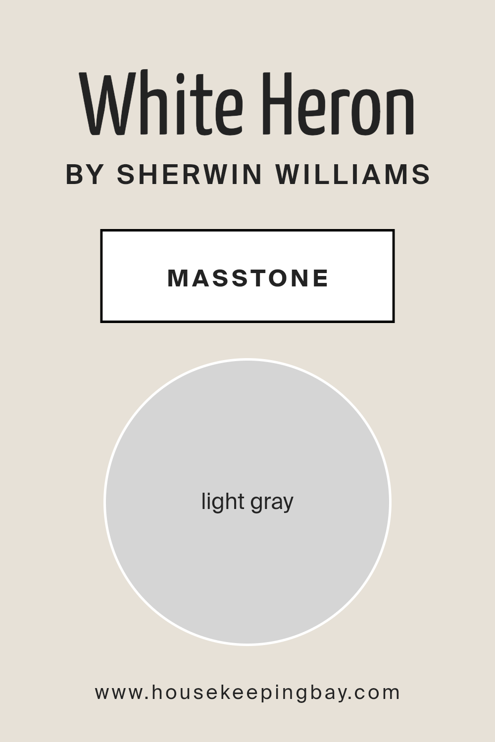
What is the Masstone of the White Heron SW 7627 by Sherwin Williams?
White Heron SW 7627 by Sherwin Williams, with a masstone of light gray (#D5D5D5), introduces an effortlessly serene and sophisticated ambiance to any space it adorns. This particular shade embodies the quintessential balance between warmth and coolness, making it an incredibly versatile backdrop for homes.
Its light gray essence allows it to act as a subtle, neutral foundation that can harmonize with a wide range of color palettes, materials, and interior styles. From minimalist to eclectic, White Heron serves as a blank canvas that enhances furnishings and artwork without overpowering them.
The beauty of this color lies in its ability to diffuse natural light, creating an airy and spacious feel in rooms of any size. It evokes a sense of calm and neutrality, making spaces feel more open, clean, and inviting. In environments where relaxation and focus are paramount, such as bedrooms and home offices, White Heron offers a gentle, visual reprieve.
Additionally, its light gray masstone provides an elegant solution to softening architectural details and minimizing imperfections, proving that this hue is not only aesthetically pleasing but also practical for home applications.
housekeepingbay.com
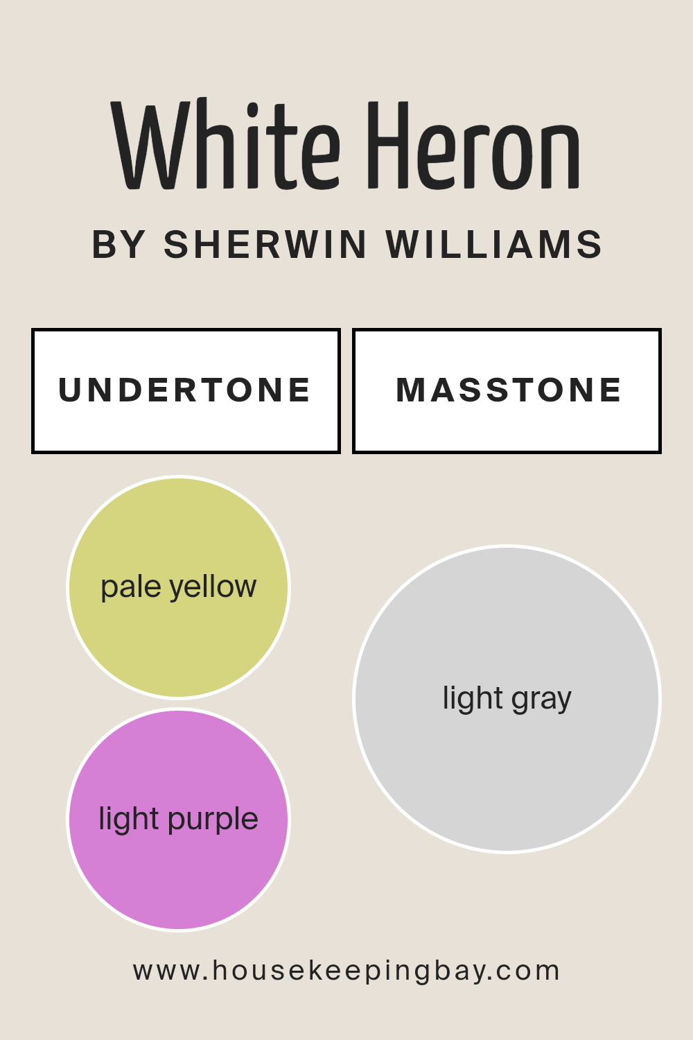
Undertones of White Heron SW 7627 by Sherwin Williams
White Heron SW 7627 by Sherwin Williams is a captivating color choice for interior walls, embodying a sense of serenity and purity. This color, however, is not just a simple white; it is imbued with subtle undertones that add depth and complexity to its appearance. Specifically, White Heron possesses pale yellow (#D5D580) and light purple (#D580D5) undertones, which significantly influence how this color is perceived and how it interacts with its environment.
Undertones play a crucial role in the way we see colors. They can warm up or cool down a hue, affect its brightness, and even influence how well it pairs with other colors. For White Heron, the pale yellow undertone adds a hint of warmth, making spaces feel more inviting, while the light purple undertone introduces a touch of coolness and refinement.
This balance between warmth and coolness allows White Heron to adapt to various lighting conditions and design aesthetics, from minimal and contemporary to cozy and traditional.
When applied to interior walls, White Heron SW 7627 creates a versatile backdrop that enhances natural light during the day and transitions gracefully under artificial lighting. The pale yellow undertone helps in radiating a subtle, warm glow, fostering an atmosphere of comfort and positivity.
Concurrently, the light purple undertone adds a layer of sophistication and depth, ensuring the space remains visually interesting and preventing it from feeling stark or sterile. Together, these undertones allow White Heron to complement a wide range of decor styles and color palettes, making it an exceptional choice for creating inviting, dynamic, and harmonious spaces.
housekeepingbay.com
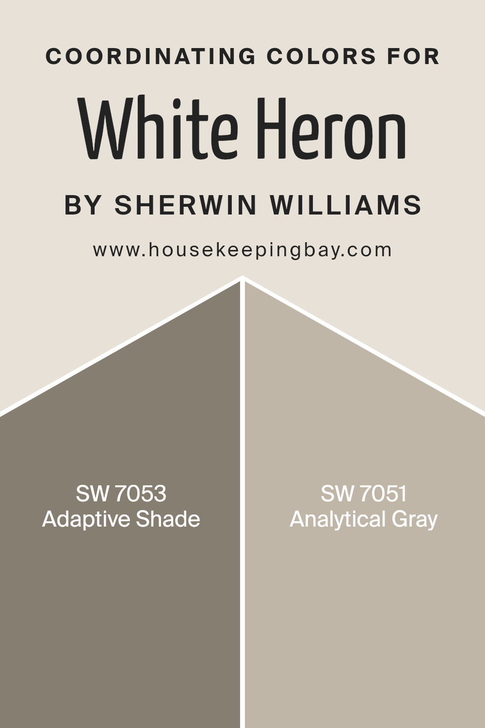
Coordinating Colors of White Heron SW 7627 by Sherwin Williams
Coordinating colors are hues that harmoniously blend with a primary color, enhancing the aesthetic appeal of a space. They often stem from the same color palette, ensuring a cohesive look that’s pleasing to the eye. The concept revolves around the use of colors that, when combined, create a balanced and unified appearance.
By selecting colors that coordinate well with a primary color, in this case, White Heron SW 7627 by Sherwin-Williams, one can achieve a sophisticated and well-thought-out design scheme. White Heron serves as a versatile base, offering a clean, serene backdrop that pairs effortlessly with a wide range of hues, enabling interior spaces to radiate with a calm and inviting ambiance.
Incorporating coordinating colors such as SW 7053 – Adaptive Shade and SW 7051 – Analytical Gray enhances the elegance of White Heron. Adaptive Shade is a muted gray with subtle undertones that bring depth and complexity to spaces, promoting a sense of tranquility and understated sophistication. This color complements White Heron by adding a layer of richness without overwhelming the senses. On the other hand, Analytical Gray is a warm, welcoming shade that bridges the gap between beige and gray.
It offers a perfect balance, imbuing spaces with warmth and a natural sense of comfort. When paired with White Heron, it creates a harmonious, subtle contrast, adding to the room’s dimensional quality while remaining grounded in neutrality.
Together, these coordinating colors work seamlessly to achieve an environment that is both visually appealing and emotionally resonant.
You can see recommended paint colors below:
- SW 7053 Adaptive Shade
- SW 7051 Analytical Gray
housekeepingbay.com
How Does Lighting Affect White Heron SW 7627 by Sherwin Williams?
Lighting plays a pivotal role in how we perceive colors, essentially shaping our experience of spaces and objects around us. Colors don’t inherently possess a hue; they reflect and absorb light, leading us to see them as specific shades or tones. This fact becomes fascinating when applied to paint colors in interiors, such as the color White Heron SW 7627 by Sherwin Williams.
White Heron is a versatile and neutral shade that can subtly shift in appearance under different lighting conditions. In artificial light, depending on the type of bulb used (warm or cool), White Heron can either emit a warmer, cozier feel or a cooler, crisper appearance. For instance, warm LED lights can bring out a gentle creaminess in it, while cooler LEDs can make it look more pristine and sharp.
In natural light, the interaction is even more dynamic due to the sun’s changing position and the varying quality of light throughout the day. North-faced rooms receive less direct sunlight, which can cause White Heron to appear slightly more shadowed and subdued, potentially drawing out any cooler undertones in the paint. This makes the color perfect for creating a serene and stable ambiance in spaces without the overwhelming brightness.
South-faced rooms, basked in abundant sunlight, showcase White Heron in its most vibrant, true-to-sample state. The natural light enhances its brightness and can make spaces appear larger and more inviting.
East-faced rooms are lit with warm, soft light in the mornings, making White Heron look especially welcoming and peaceful during this time. As the day progresses and the direct sunlight moves away, the color can transition to a cooler, neutral tone by the afternoon and evening.
Conversely, in west-faced rooms, the color spends most of the day in a cooler, neutral state, only warming up in the late afternoon to evening as the sun sets, casting warm light that brings out a soft glow in the paint.
Understanding these nuances can drastically impact interior design choices, enabling designers and homeowners to select colors like White Heron SW 7627 by Sherwin Williams with intention, ensuring that the hues complement the room’s exposure and the desired ambiance.
housekeepingbay.com
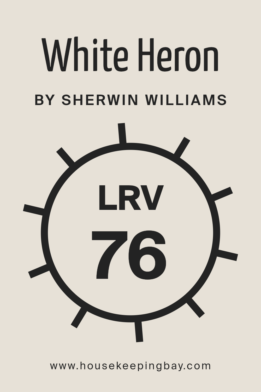
What is the LRV of White Heron SW 7627 by Sherwin Williams?
Light Reflectance Value (LRV) refers to a measure of the percentage of light a paint color reflects back into a room, ranging from 0% (absolute black, absorbing all light) to 100% (pure white, reflecting all light). It’s an essential tool for designers and homeowners to understand how light or dark a color will appear once applied to walls. LRV plays a pivotal role in enhancing the visual dynamics of a space by influencing how colors respond to both natural and artificial lighting conditions.
Colors with higher LRVs make rooms feel more open and airy as they reflect more light, while those with lower LRVs create a more intimate and cozy ambiance by absorbing light. It’s a critical factor in color selection, especially in rooms with less natural light, where a higher LRV can help compensate for the lack of luminance.
The White Heron SW 7627 by Sherwin Williams, with an LRV of 76.041, falls into the category of colors with high light reflectance, making it an excellent choice for making spaces appear brighter, larger, or more inviting. This particular LRV indicates that White Heron is capable of reflecting a substantial amount of light, hence it won’t darken a room but instead contribute to a luminous and open atmosphere.
This characteristic makes it especially suitable for spaces intended to feel serene and spacious, or for areas that receive limited natural light, where it can help maximize the available light.
The relatively high LRV of White Heron means it can also act as a versatile backdrop, enhancing the overall aesthetic and complementing various design elements and furniture within a space, making it both a practical and aesthetically flexible option for a wide range of interior styles.
housekeepingbay.com
What is LRV? Read It Before You Choose Your Ideal Paint Color
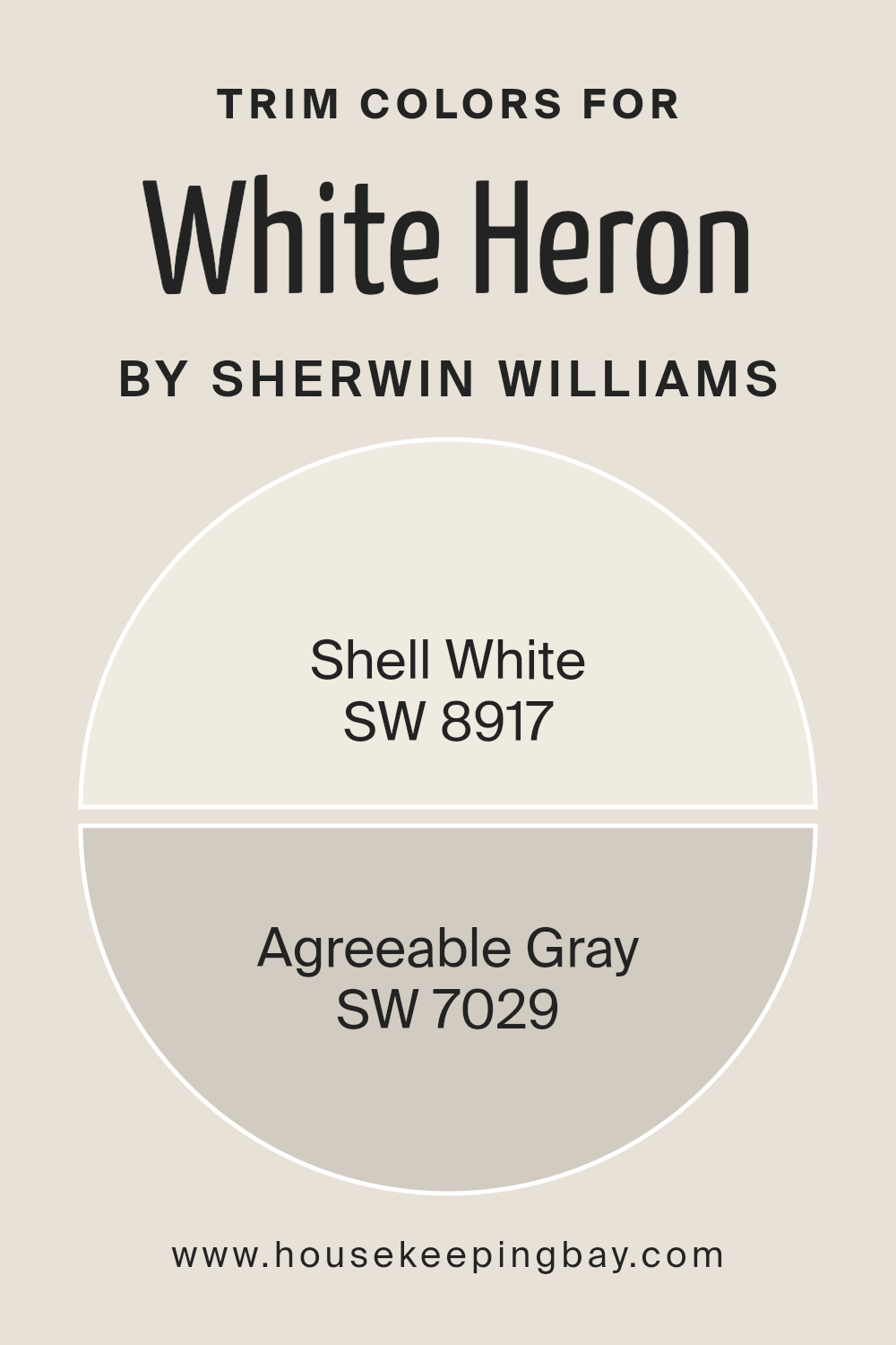
What are the Trim colors of White Heron SW 7627 by Sherwin Williams?
Trim colors are vital components in the world of interior and exterior design, serving as the defining lines that accentuate and compliment the main color palette of a space. In the case of White Heron SW 7627 by Sherwin Williams, an elegant, pristine white with a slightly cool undertone, the selection of the right trim color can greatly enhance its aesthetic appeal and overall ambiance.
When this understated yet versatile shade is paired with thoughtfully chosen trim colors, it creates a harmonious balance, highlighting architectural details, and adding depth and character to the living spaces.
Choosing SW 8917 Shell White, a soft and warm white, as a trim color adds a subtle contrast to White Heron, softening the transitions between walls and trimmings to produce a cohesive look that is soothing to the eyes. This gentle pairing brings a polished and seamless finish, ideal for creating a serene and inviting atmosphere.
On the other hand, SW 7029 Agreeable Gray offers a slightly bolder contrast, with its warm greige tone that bridges the gap between gray and beige. This versatile shade enlivens the coolness of White Heron, introducing a dynamic layer to the space while maintaining a sophisticated and timeless aesthetic.
Together, these trim colors not only accent White Heron but also contribute significantly to the overall mood and style of the room.
You can see recommended paint colors below:
housekeepingbay.com
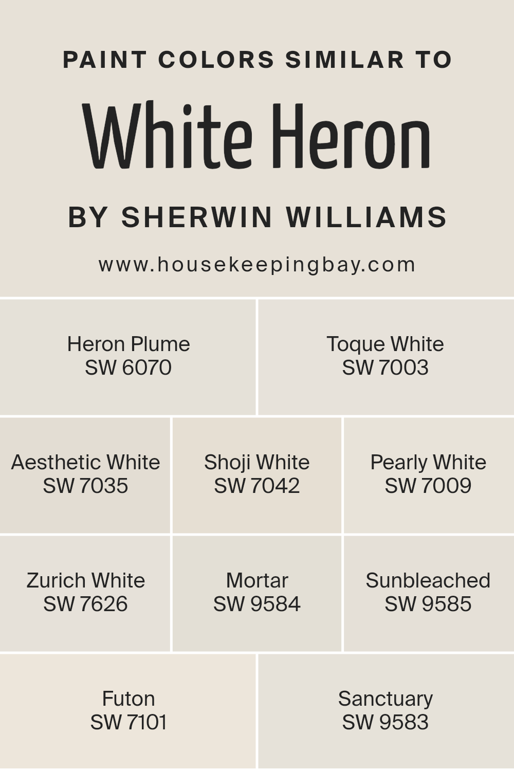
Colors Similar to White Heron SW 7627 by Sherwin Williams
Similar colors play an integral role in interior design and aesthetics, creating a cohesive and harmonious look by blending shades that share a common hue, saturation, or brightness level. When considering the color White Heron SW 7627 by Sherwin Williams, incorporating similar colors like Heron Plume, Toque White, Aesthetic White, Shoji White, Pearly White, Zurich White, Mortar, Sunbleached, Futon, and Sanctuary can enhance the overall feel of a space without dramatic contrasts.
These colors work together to provide subtle variations that add depth and complexity, making a room feel thoughtfully curated and visually balanced.
Heron Plume is a soft, subtle shade that carries a hint of warmth, making spaces feel inviting. Toque White adds a touch of understated elegance, perfect for creating a serene and tranquil atmosphere. Aesthetic White brings a nuanced vibrancy, offering a backdrop that feels both dynamic and comforting.
Shoji White emanates a soft, diffused light, casting a gentle glow that enriches textures and surfaces. Pearly White has a luminous quality, infusing spaces with a sense of airiness and light. Zurich White bridges the gap between warm and cool tones, providing versatility.
Mortar introduces a solid, grounded feel, anchoring spaces with its robust presence. Sunbleached offers a whisper of color, reminiscent of time-worn surfaces basking in soft light. Futon embraces a warmer spectrum, crafting a cozy and enveloping ambiance.
Lastly, Sanctuary serves as a retreat, a hue that imparts a sense of peace and calm with its subtle, muted tone. Together, these colors complement White Heron in a way that allows for creativity and personalization in decorating, ensuring spaces are both beautiful and harmoniously balanced.
You can see recommended paint colors below:
- SW 6070 Heron Plume
- SW 7003 Toque White
- SW 7035 Aesthetic White
- SW 7042 Shoji White
- SW 7009 Pearly White
- SW 7626 Zurich White
- SW 9584 Mortar
- SW 9585 Sunbleached
- SW 7101 Futon
- SW 9583 Sanctuary
housekeepingbay.com
How to Use White Heron SW 7627 by Sherwin Williams In Your Home?
White Heron SW 7627 by Sherwin Williams is a pristine and harmonious paint color that evokes a sense of calm and cleanliness. This classic shade of white, with its subtle warm undertones, offers a versatile backdrop that can easily adapt to any interior space, making it an excellent choice for those seeking to introduce a fresh and airy feel to their homes.
Its capacity to reflect light enhances the sense of space, making rooms appear larger and more open—ideal for small apartments or darker areas lacking in natural light.
Homeowners can employ White Heron in various applications throughout the home. It works exceptionally well in living rooms, kitchens, or bedrooms, providing a neutral canvas that allows furniture, artwork, and textiles to stand out. For a modern and cohesive look, consider painting walls and trim in White Heron, creating a seamless transition that amplifies the sense of continuity and space.
Moreover, White Heron can serve as a base for layering textures and colors, offering an understated elegance to any design style, from minimalistic to eclectic. By incorporating this color, one can achieve a timeless aesthetic that remains adaptive to changing trends and personal tastes over time.
Its universal appeal and flexibility make White Heron SW 7627 by Sherwin Williams a smart choice for those looking to refresh their homes with a touch of simplicity and sophistication.
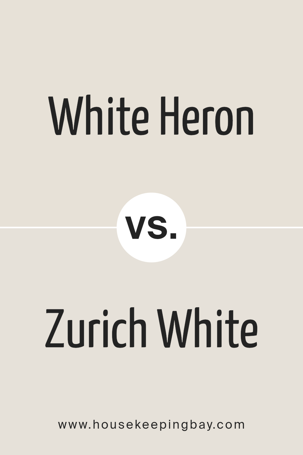
White Heron SW 7627 by Sherwin Williams vs Zurich White SW 7626 by Sherwin Williams
White Heron SW 7627 and Zurich White SW 7626 by Sherwin Williams are two nuanced shades that, while similar at first glance, offer subtle distinctions that cater to different design preferences. White Heron stands out for its bright, clean essence, embodying a slightly cooler tone when compared against the warmer, softer backdrop of Zurich White. This makes White Heron an excellent choice for spaces aiming for a crisp, fresh atmosphere, as it reflects light beautifully, enhancing the sense of openness and purity in a room.
On the other hand, Zurich White, with its warm undertones, brings a cozy, inviting warmth to interiors, making it ideal for spaces where a comfortable, serene ambiance is desired. It pairs exceptionally well with soft textiles and natural materials, promoting a sense of calm and relaxation.
Despite their differences, both colors maintain a level of versatility, easily complementing a wide range of decor styles and color palettes. Whether aiming for the sharp clarity of White Heron or the gentle warmth of Zurich White, both shades offer the opportunity to create refined and harmonious spaces.
You can see recommended paint color below:
housekeepingbay.com
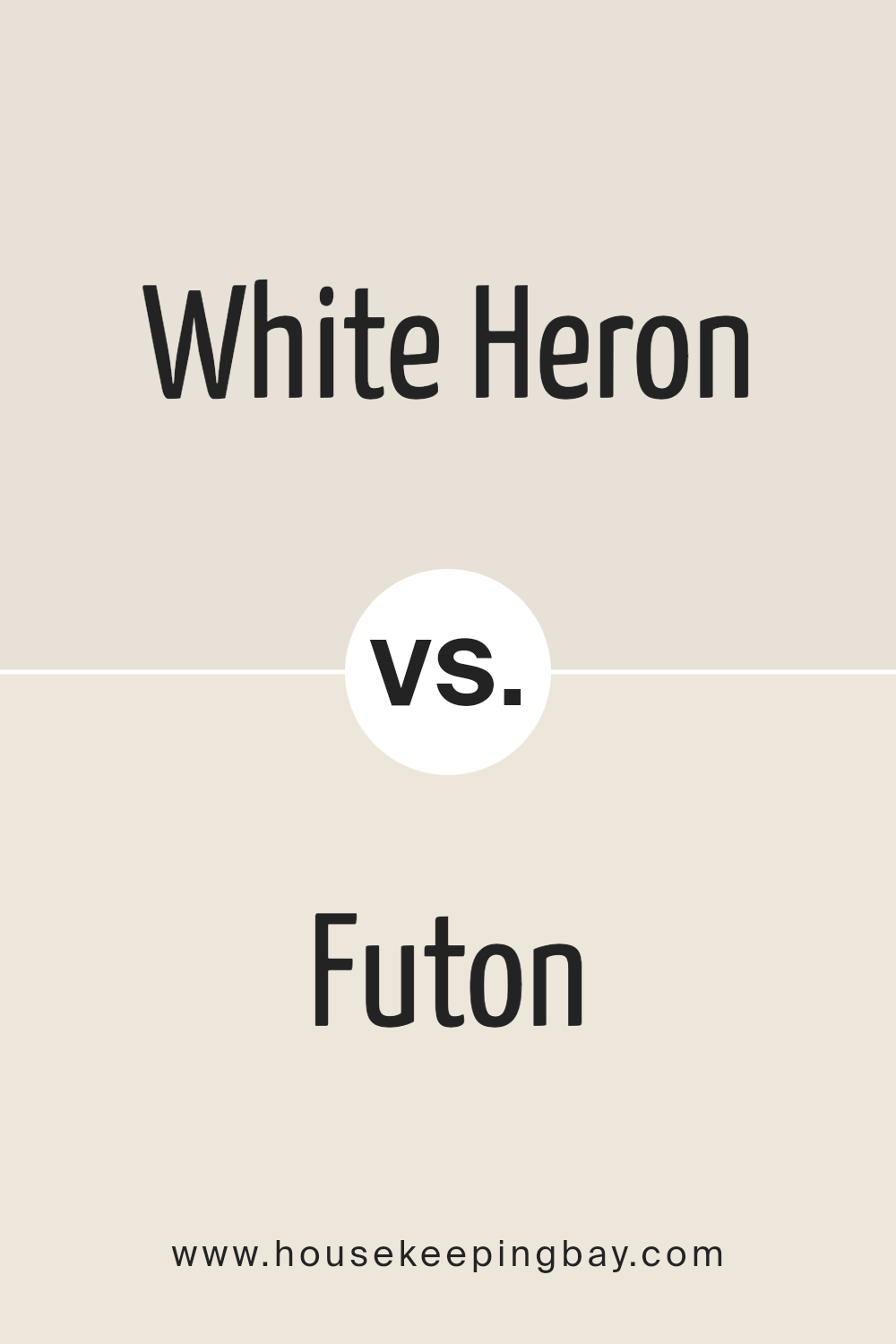
White Heron SW 7627 by Sherwin Williams vs Futon SW 7101 by Sherwin Williams
White Heron SW 7627 and Futon SW 7101 by Sherwin Williams are both neutral tones, but they cater to different aesthetic needs and atmospheres within interior spaces. White Heron, as its name suggests, is a brighter, cleaner white with a slight warmth that makes it versatile for use in various lighting conditions. It reflects more light, making spaces appear larger and more open, ideal for creating a fresh, airy feel in a room.
On the other hand, Futon is a deeper, warm neutral with a beige or light taupe character, offering a cozy and inviting ambiance. This color is perfect for spaces where a more intimate and comfortable atmosphere is desired, as it brings warmth to the room while still maintaining neutrality.
While White Heron may serve well in modern, minimalist designs or to accentuate spaces with abundant natural light, Futon is suitable for creating a soft, sophisticated backdrop that complements a wide range of decors, including rustic and contemporary. The choice between them depends on the desired mood and design aesthetic, as well as how the space is used and lit.
You can see recommended paint color below:
housekeepingbay.com
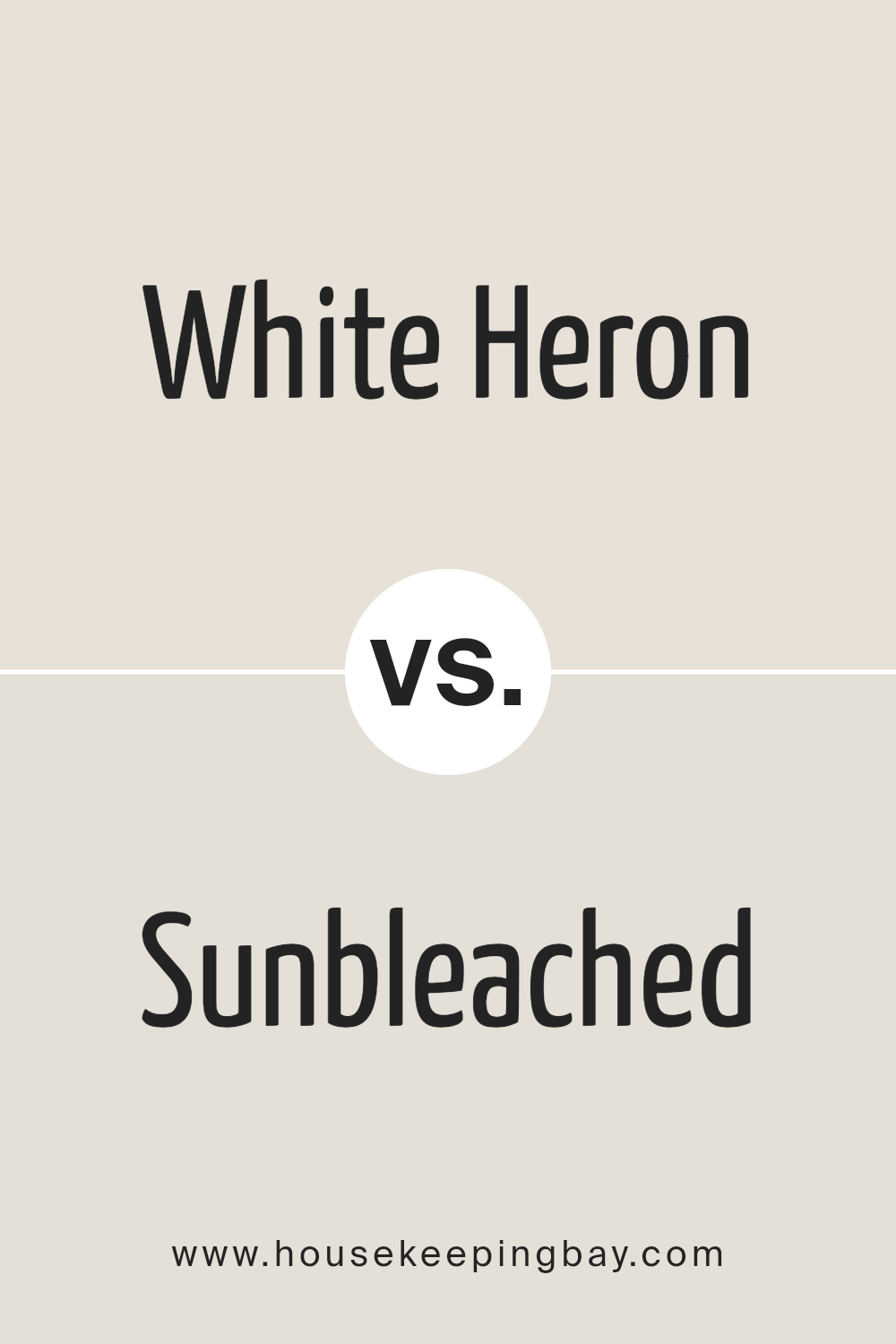
White Heron SW 7627 by Sherwin Williams vs Sunbleached SW 9585 by Sherwin Williams
White Heron SW 7627 and Sunbleached SW 9585 by Sherwin-Williams are both sophisticated, neutral colors, yet they have distinct personalities that cater to different design preferences. White Heron stands as a pure, bright neutral with a slightly warm undertone, making it perfect for spaces that aim to be airy and light-filled. It offers an elegant backdrop, enhancing natural light and creating a sense of spaciousness. This versatility allows it to pair well with both vivid tones for contrast and soft pastels for a harmonious palette.
On the other hand, Sunbleached SW 9585 offers a more muted, earthy approach. With its subtle, warm undertones, it evokes the natural patina of sun-kissed wood, creating an ambiance of warmth and rustic charm. This hue is ideal for spaces aiming for a cozy, inviting atmosphere, blending seamlessly with natural materials and textures.
While White Heron brings an element of crisp, clean modernity, Sunbleached leans towards a softer, more organic aesthetic. The choice between them hinges on the desired vibe of the space — be it bright and uplifting with White Heron, or warm and grounded with Sunbleached.
You can see recommended paint color below:
housekeepingbay.com
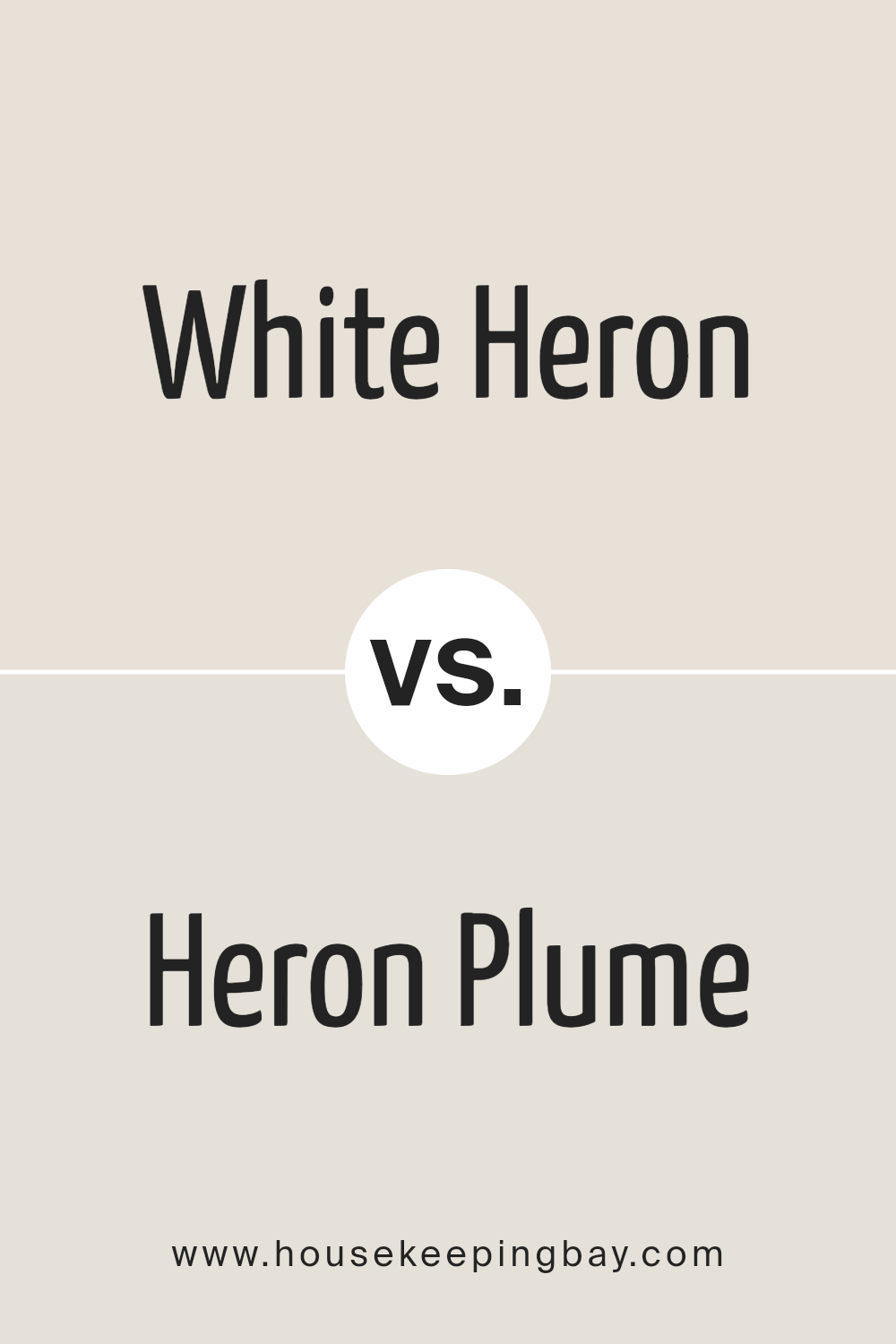
White Heron SW 7627 by Sherwin Williams vs Heron Plume SW 6070 by Sherwin Williams
White Heron SW 7627 and Heron Plume SW 6070 by Sherwin Williams are two distinct hues that share a sophisticated and versatile nature, suitable for various spaces. White Heron is a pure, bright white that offers a crisp and clean look. It reflects a significant amount of light, making it an excellent choice for creating an open, airy, and inviting space. Its luminosity provides a perfect backdrop for both bold and soft color palettes, allowing furniture and art to stand out beautifully.
On the other hand, Heron Plume is a soft, warm grey with a subtle beige undertone, offering a more nuanced and cozy feel compared to the stark brightness of White Heron. This color evokes a sense of tranquility and elegance, making spaces feel more intimate and welcoming. While still versatile, Heron Plume adds warmth to a room and pairs well with a wide range of decor, from modern to traditional.
Together, White Heron and Heron Plume embody flexibility in design with their neutral tones. White Heron’s clean brightness can enlarge a space, while Heron Plume’s soothing warmth can create a comforting and sophisticated atmosphere.
You can see recommended paint color below:
housekeepingbay.com
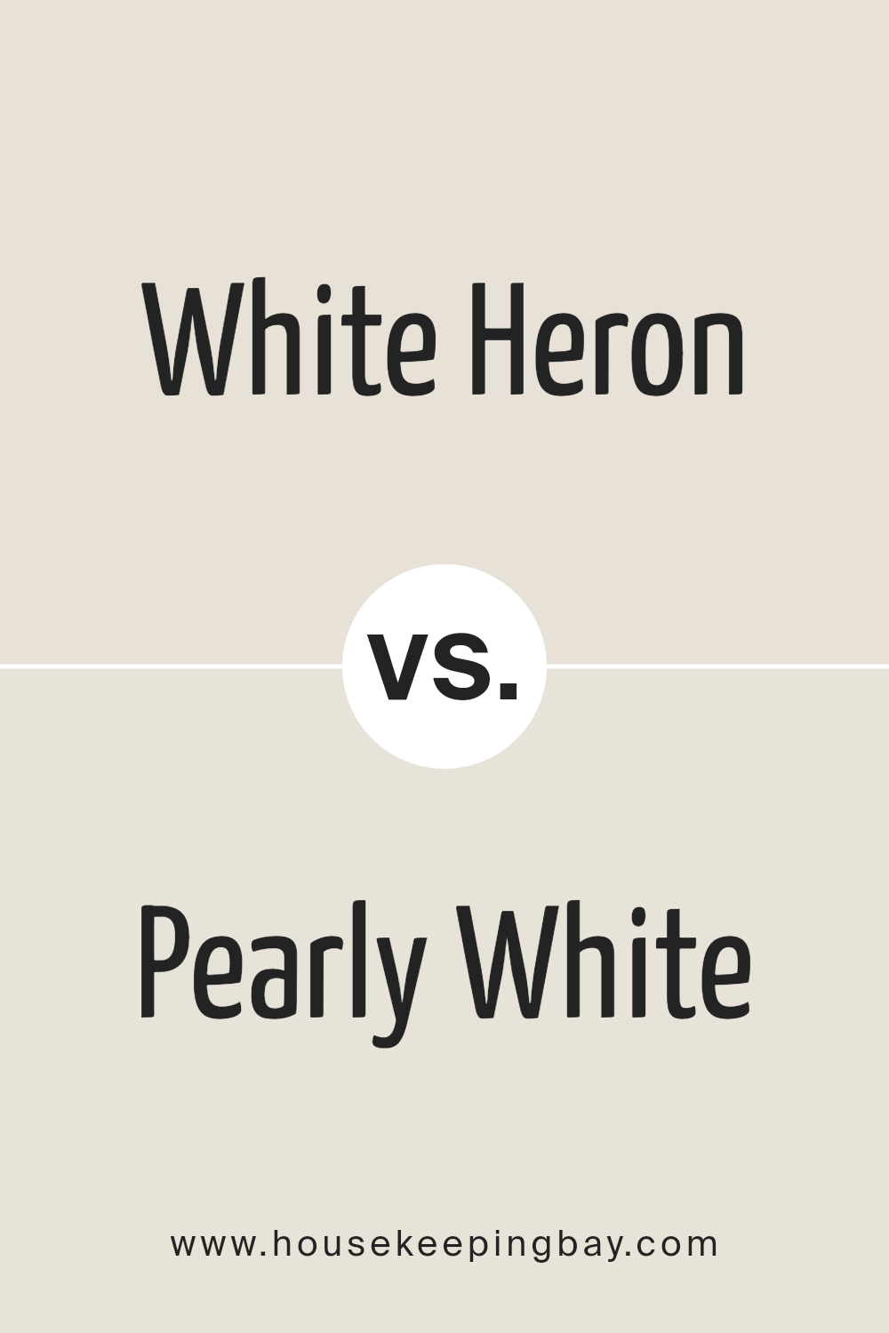
White Heron SW 7627 by Sherwin Williams vs Pearly White SW 7009 by Sherwin Williams
White Heron SW 7627 and Pearly White SW 7009 by Sherwin Williams are two subtle shades of white that offer distinct nuances for interior spaces. White Heron presents as a clean, bright white with a slight airy quality, making it an excellent choice for creating a feeling of spaciousness and purity in a room. It reflects light beautifully, enhancing the sense of openness and freshness. This color works well in modern and minimalist designs, providing a crisp backdrop that complements various decor styles.
On the other hand, Pearly White SW 7009 has a warmer undertone, lending a cozy, inviting atmosphere to any space. The “pearly” aspect of its name suggests a soft, almost luminous quality, making it ideal for rooms that aim for a serene, comforting ambiance. It pairs well with both contemporary and traditional furnishings, adding a touch of elegance without overwhelming the senses.
In essence, while White Heron leans towards a stark, clean simplicity, Pearly White offers warmth and a subtle glow, making each suitable for different aesthetic preferences and atmospheres within a home.
You can see recommended paint color below:
housekeepingbay.com
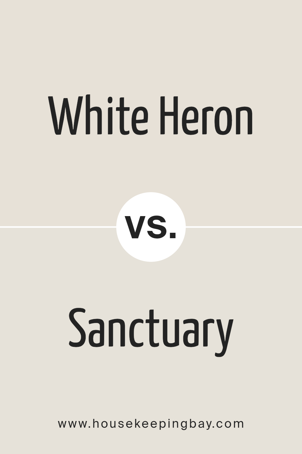
White Heron SW 7627 by Sherwin Williams vs Sanctuary SW 9583 by Sherwin Williams
White Heron SW 7627 and Sanctuary SW 9583 by Sherwin-Williams offer distinctly unique visual experiences, though both find their essence in a subtle, sophisticated palette. White Heron embodies a pure, bright essence, its tone is reminiscent of the first snowfall—crisp, clean, and illuminating. It serves as a perfect backdrop, offering a sense of openness and serenity, making spaces feel more expansive and inviting. This color is incredibly versatile, able to complement a wide range of decor styles and color schemes with its neutral, unassuming character.
In contrast, Sanctuary, living up to its name, introduces a deeper, more enveloping sense of comfort and calm. It’s a muted, earthy green that draws inspiration from natural elements, creating a feeling of tranquility and restfulness. Ideal for those looking to bring the outdoors in, Sanctuary imbues spaces with a grounded, cozy ambiance. Its color suggests a nurturing environment, making it a superb choice for bedrooms, reading nooks, or any space meant for relaxation and reflection.
Together, White Heron and Sanctuary could coexist harmoniously, with the former offering a bright, uplifting canvas and the latter providing contrasting depth and warmth, enriching the spatial experience without overwhelming the senses.
You can see recommended paint color below:
housekeepingbay.com
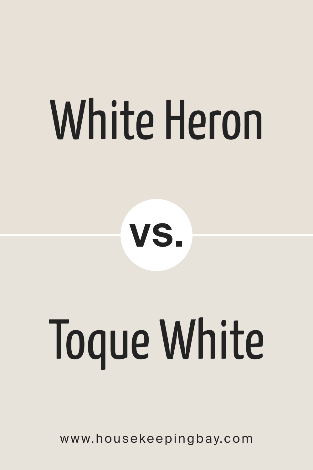
White Heron SW 7627 by Sherwin Williams vs Toque White SW 7003 by Sherwin Williams
White Heron SW 7627 by Sherwin Williams and Toque White SW 7003 by Sherwin Williams, though both belonging to neutral territories, have distinct essences that cater to different aesthetic sensibilities and functional applications. White Heron exudes a crisp, clean vitality, characteristic of a pure, almost stark white. It is capable of illuminating spaces, creating an expansive atmosphere that feels both invigorating and serene. This makes it an excellent choice for areas where natural light is abundant, allowing the space to feel airy and vibrant.
On the other hand, Toque White leans towards a softer, more muted palette, embodying a gentle warmth and sophisticated nuance. Its understated elegance is attributed to its slight gray undertones, which lend it a versatile, adaptive quality, making it ideal for creating cozy, inviting spaces.
Toque White serves as a tranquil backdrop, complementing a wide array of designs, from contemporary to traditional, without overwhelming the senses.
In comparison, while both colors maintain a sense of purity and neutrality, White Heron offers a brighter, more reflective quality, whereas Toque White embraces a subtler, comforting warmth. The choice between them depends on the desired ambiance, lighting, and overall design intent of the space.
You can see recommended paint color below:
housekeepingbay.com
White Heron SW 7627 by Sherwin Williams vs Mortar SW 9584 by Sherwin Williams
White Heron SW 7627 and Mortar SW 9584, both from Sherwin Williams, offer distinct moods and applications in the spectrum of home and design palettes. White Heron stands out as a warm, pure white with slight undertones that give it a soft, inviting ambiance. This color evokes freshness and cleanliness, making it an ideal choice for creating a bright, airy space. It reflects light beautifully, thus maximizing the perception of space in smaller rooms or areas.
Mortar SW 9584, on the other hand, presents a deep, rich tone that belongs to the neutral family but adds a weighty, grounding effect wherever it is applied. This color has the ability to add sophistication and depth to spaces, providing a stark contrast to the light and effervescence of White Heron. While White Heron expands a space visually, Mortar pulls it in, creating a cozy, enveloping feel.
Together, White Heron and Mortar can create a balanced, dynamic interplay between light and dark, openness and intimacy. Their contrast can be used to highlight architectural features or define spaces within a home, making them complementary choices for a contemporary palette with a blend of freshness and sophistication.
You can see recommended paint color below:
housekeepingbay.com
White Heron SW 7627 by Sherwin Williams vs Shoji White SW 7042 by Sherwin Williams
White Heron SW 7627 and Shoji White SW 7042 by Sherwin-Williams are subtle, sophisticated colors that serve as elegant backdrops in any space. White Heron is a clean, crisp white with a slightly cool undertone that gives it a refreshing clarity. It’s perfect for creating a bright, airy feel in a room, reflecting natural light beautifully and making spaces appear larger. It carries a minimalist charm, suited for contemporary to modern interiors but versatile enough to blend with traditional aesthetics.
Shoji White SW 7042, on the other hand, is a warmer hue with a beige undertone, offering a softer, more inviting feel. It exudes comfort and calmness, creating a cozy atmosphere.
Shoji White has a natural, organic vibe to it, making it ideal for spaces where a serene, nurturing ambiance is desired. It’s excellent for living rooms, bedrooms, and any area where relaxation is key.
While both colors are embodiments of elegance and sophistication, White Heron provides a stark canvas, illuminating spaces with its cool brightness.
Shoji White, meanwhile, wraps a room in warmth, thanks to its earthier base. Deciding between them depends on the mood one wishes to create: White Heron for a crisp, vibrant feel, or Shoji White for a soft, welcoming touch.
You can see recommended paint color below:
housekeepingbay.com
White Heron SW 7627 by Sherwin Williams vs Aesthetic White SW 7035 by Sherwin Williams
White Heron SW 7627 and Aesthetic White SW 7035 by Sherwin Williams both belong to a palette that elegantly straddles the line between warm and cool tones, making them highly versatile and adaptable for various spaces. The primary distinction lies in their undertones and the depth of the color itself.
White Heron presents a crisp, vibrant feel with a slightly cool undertone that brings a refreshing brightness to spaces. Its purity and clarity make it an excellent choice for creating a sharp, clean look, effectively reflecting natural light and enhancing the sense of space.
Aesthetic White, on the other hand, leans towards a warmer, softer approach with subtle beige and gray undertones. This nuanced balance prevents it from becoming too stark or cold, making it a perfect backdrop for a cozy, welcoming environment. It pairs beautifully with a wide range of colors, adding depth and sophistication without overwhelming the senses.
Both colors offer unique advantages, with White Heron favoring bright, airy spaces and Aesthetic White suiting those looking for warmth and subtle elegance. Their differences underline Sherwin Williams’ ability to cater to diverse aesthetic needs, ensuring there is a shade for every style and setting.
You can see recommended paint color below:
housekeepingbay.com
Conclusion
The elegance and versatility of Sherwin Williams’ White Heron SW 7627 have been thoroughly explored in this article, highlighting the color’s ability to bring a soothing and sophisticated atmosphere to any space. White Heron, with its subtle undertones and soft, airy quality, has proven itself as a go-to choice for designers and homeowners alike, seeking to create environments that feel both welcoming and expansive. Its adaptability across various styles and settings, from modern minimalism to cozy traditional, underscores its popularity in contemporary interior design.
Conclusively, White Heron SW 7627 by Sherwin Williams stands out as a timeless and adaptable hue that effortlessly enhances the aesthetic appeal and luminosity of interiors. Its capacity to reflect natural light while maintaining a sense of warmth makes it ideal for creating spaces that are both inviting and serene.
Whether applied as a dominant color scheme or as an accent, White Heron’s understated elegance makes it a formidable choice for those striving to achieve a refined and cohesive look in their living or working environments.

housekeepingbay.com
Ever wished paint sampling was as easy as sticking a sticker? Guess what? Now it is! Discover Samplize's unique Peel & Stick samples. Get started now and say goodbye to the old messy way!
Get paint samples


