Studio Clay SW 9172 by Sherwin Williams
Unleashing Warmth in Your Creative Space
SW 9172 Studio Clay by Sherwin Williams is like a breath of fresh air for your home. Imagine transforming your space with a paint color that brings a sense of calmness and creativity. SW 9172 Studio Clay does just that. It’s a unique shade that sits perfectly between the warmth of the earth and the depth of a gray sky before a summer rain.
This color can be your secret weapon in creating a cozy, inviting atmosphere that makes you and your guests feel right at home.
Choosing the right color for your interior isn’t just about following trends; it’s about discovering what makes you feel good and creating a space that reflects that. Studio Clay is versatile – it works beautifully in a minimalist setting, adding a touch of sophistication without overpowering your decor. Yet, it’s also strong enough to stand as a focal point in a room filled with bold and vibrant accessories.
You can use this color in your living room, bedroom, or even your kitchen, and it will help tie all your design elements together. Whether you’re looking to refresh a single room or planning a bigger renovation project, Studio Clay can be your foundation or the finishing touch that you’ve been looking for.
It’s time to give your home the look and feel that you’ve always wanted, and SW 9172 Studio Clay by Sherwin Williams is a perfect choice to start with.
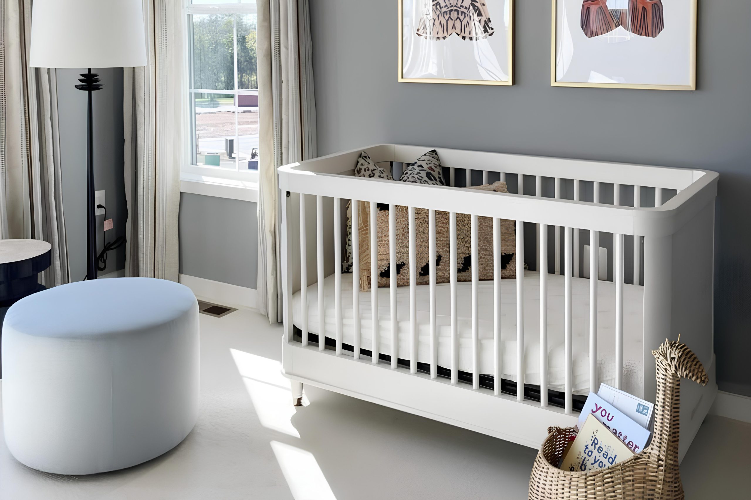
via sherwin-williams.com
What Color Is Studio Clay SW 9172 by Sherwin Williams?
Studio Clay SW 9172 by Sherwin Williams is a unique and versatile color that brings warmth and sophistication to any space it graces. This cozy hue has a strong foundation of earthy brown with subtle gray undertones, making it a perfect balance between warm and cool. It’s this richness that gives Studio Clay its ability to work beautifully in a variety of interior styles, especially those that lean towards the cozy, rustic, modern farmhouse, and even industrial.
Studio Clay pairs wonderfully with a range of materials and textures. When combined with natural wood, whether it be polished, distressed, or raw, it accentuates the organic warmth, creating a welcoming and comfortable atmosphere. Metal accents, particularly in black or brushed nickel, add a modern contrast, bringing a level of sophistication and edge.
Textiles in leather or chunky knits in neutral colors work seamlessly with Studio Clay, enhancing the depth and texture of the space.
In lighter, airy spaces, Studio Clay acts as a grounding element when used on accent walls or in decor, providing depth without overwhelming. In darker, cozier rooms, it can envelop the space, making it feel secure and intimate.
Its versatility in pairing with various materials, from glass and metals to wood and fabrics, means it can adapt to and elevate almost any interior style, making it a go-to choice for those looking to add a touch of refined warmth to their home.

housekeepingbay.com
Is Studio Clay SW 9172 by Sherwin Williams Warm or Cool color?
Studio Clay SW 9172 by Sherwin Williams is a unique and versatile color that can truly transform any space in a home. Its special quality lies in its warm, earthy tones that create a cozy and inviting atmosphere. This color has a gentle strength, which makes it perfect for blending with both modern and traditional styles.
Whether you’re painting a bedroom to achieve a restful space or adding a touch of calm to a busy kitchen, Studio Clay has the ability to bring rooms together in harmony.
What’s great about this color is how it works with different lighting. In natural light, it radiates warmth, making spaces feel more open and welcoming. Under artificial lighting, it maintains its depth, adding character and sophistication.
Pairing Studio Clay with soft whites or bold colors can also highlight its versatility, allowing homeowners to personalize their space without overwhelming it. Simply put, Studio Clay SW 9172 by Sherwin Williams offers a timeless appeal that can make any house feel more like a home.
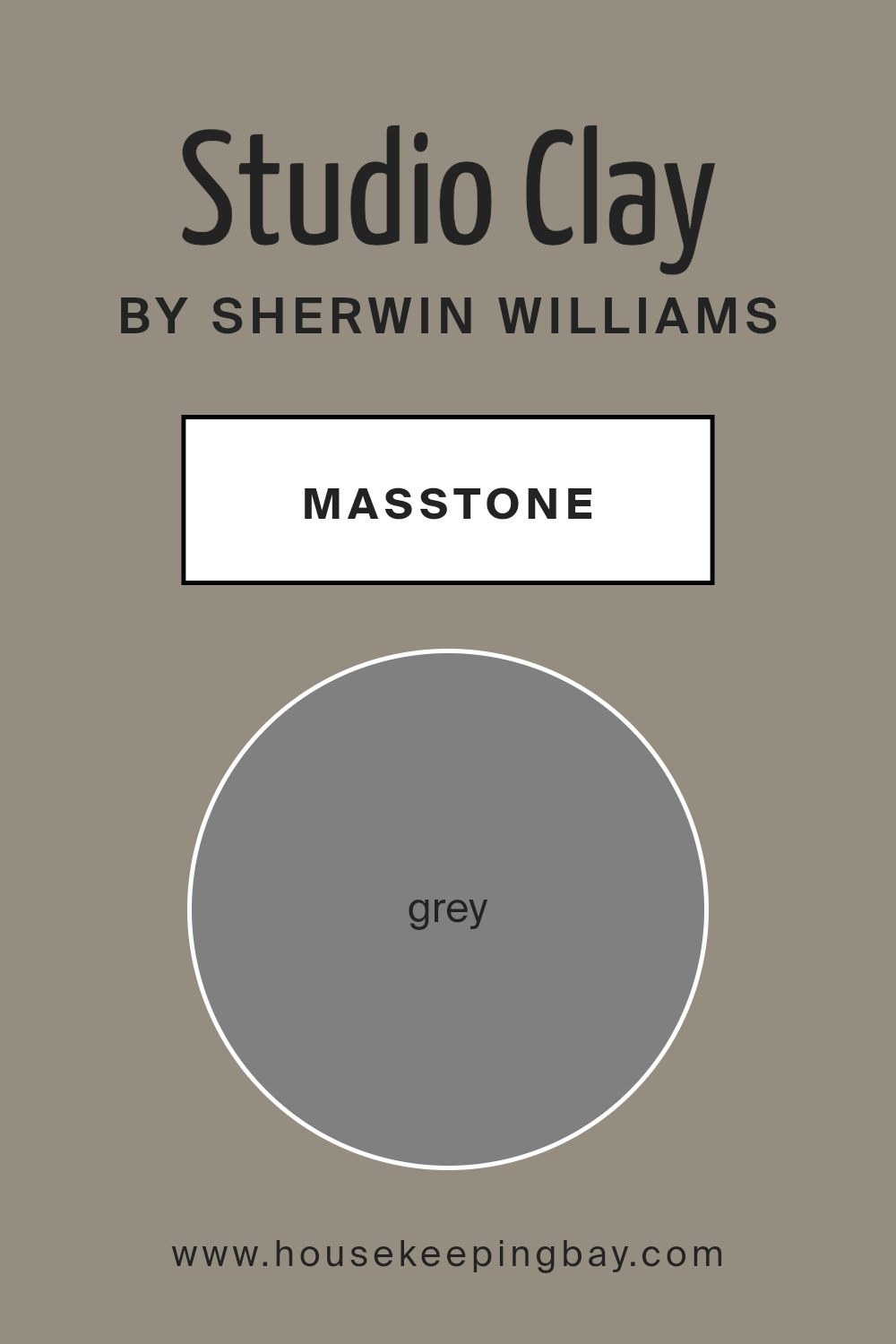
What is the Masstone of the Studio Clay SW 9172 by Sherwin Williams?
Studio Clay SW 9172 by Sherwin Williams is a unique paint color that adds a subtle but striking touch to any home. Its masstone, or main color, is grey, specifically the kind you might see in the hashtag #808080. This specific shade of grey blends perfectly into various home styles, making it a versatile choice for homeowners.
Using Studio Clay SW 9172 in your home means you’re picking a color that works well in different lighting conditions. During the day, it can look soft and inviting, and at night, it adds a sense of coziness to the room. This grey is not too dark or too light, striking a perfect balance that can make small rooms feel more spacious and large rooms feel more connected.
The beauty of this grey is in its simplicity and flexibility. It pairs wonderfully with brighter colors for a pop, or with other neutrals for a serene and timeless look. Whether you’re updating your living room, bedroom, or even your kitchen, Studio Clay SW 9172 offers a solid foundation that can enhance your home’s appeal without overwhelming it.
It’s a color that quietly stands out, making your space feel modern and welcoming.
housekeepingbay.com
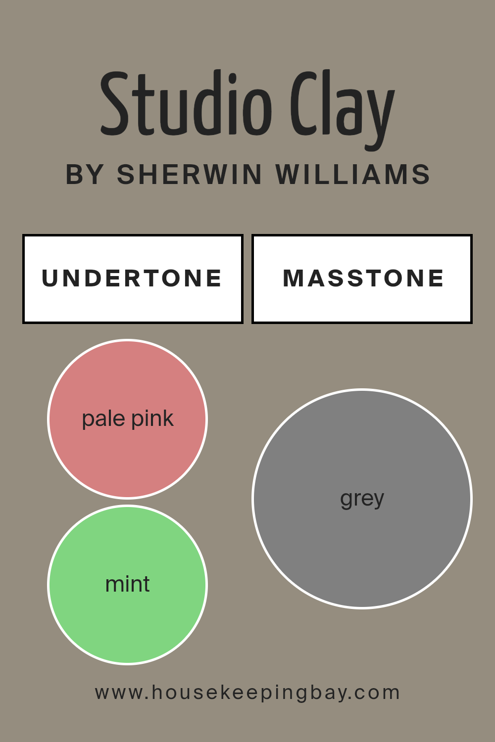
Undertones of Studio Clay SW 9172 by Sherwin Williams
Studio Clay SW 9172 by Sherwin Williams is a unique color with a mix of shades that add depth and character. Let’s break down its undertones and see how they influence our perception of this color.
Undertones like pale pink, mint, and lilac bring a subtle warmth and softness to Studio Clay, making it feel welcoming. These lighter tones can help small spaces feel a bit more open and airy. On the other hand, darker undertones such as olive, dark turquoise, and brown lend a grounded, earthy vibe to the color.
This makes Studio Clay a versatile choice for rooms, fitting both cozy, intimate settings and more vibrant, lively spaces.
When you apply Studio Clay on interior walls, the lighting and surrounding colors can really play up these undertones. In natural daylight, lighter undertones like pale yellow and light blue might become more noticeable, giving the room a cheerful, sunny aspect. In artificial light, deeper undertones such as purple, dark green, and navy might stand out, creating a more sophisticated, moody look.
The wide range of undertones, from light turquoise to dark grey, means that Studio Clay can easily complement various decor styles and color palettes. Whether you’re aiming for a calm, serene bedroom or a bold, dramatic living room, this color can adapt based on its undertones.
In summary, the undertones in Studio Clay SW 9172 add complexity and versatility, impacting how this color is perceived in interior spaces. They allow for flexibility in design, making it suitable for different rooms and lighting conditions, ensuring that Studio Clay feels aligned with your unique style and vision.
housekeepingbay.com
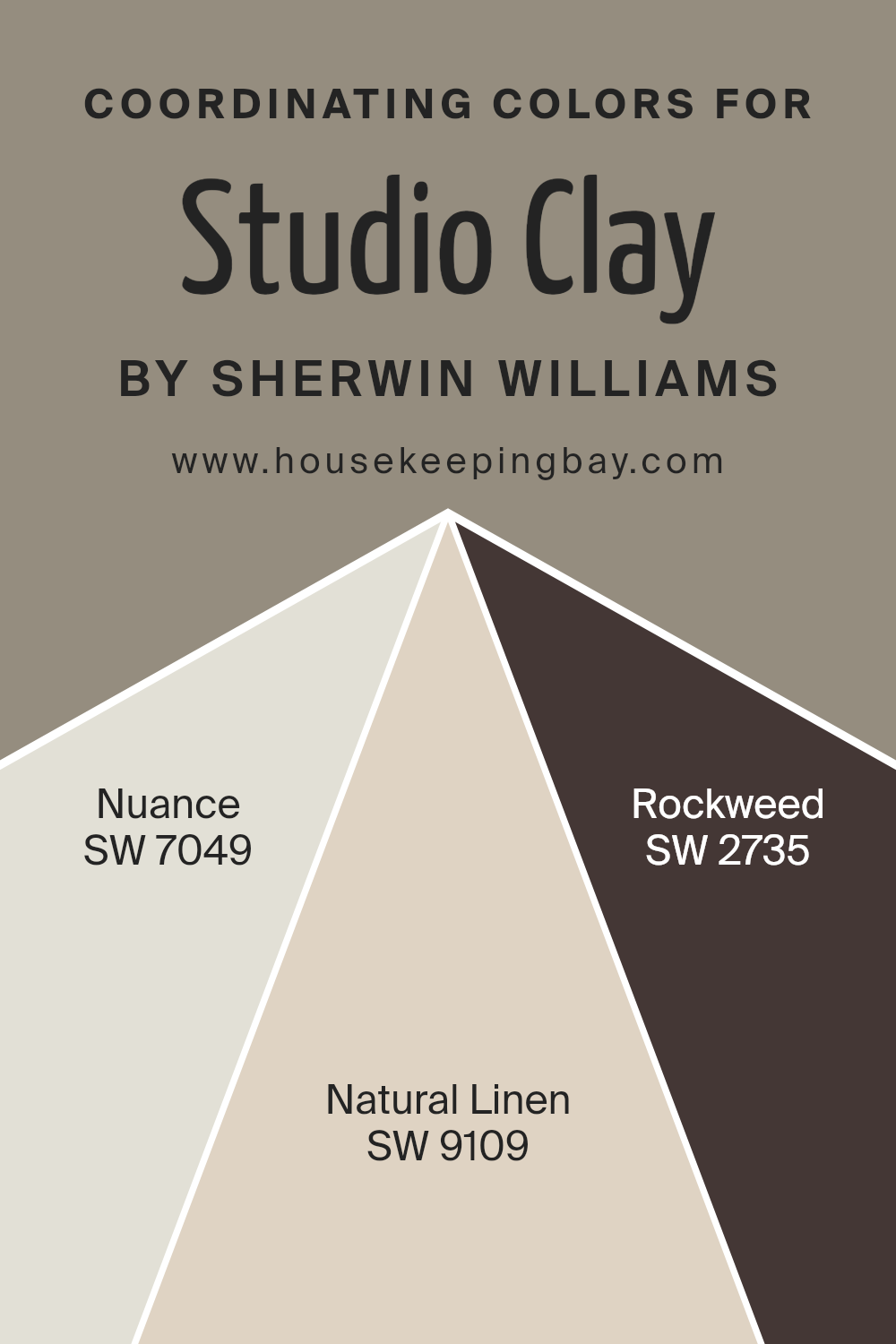
Coordinating Colors of Studio Clay SW 9172 by Sherwin Williams
Coordinating colors are hues that complement each other on your color palette, ensuring that your space looks cohesive and well-thought-out. When used correctly, these colors add depth and harmony to your interior or exterior decor.
For instance, when we look at the color Studio Clay SW 9172 by Sherwin Williams, it offers a robust starting point for a palette. The key to coordinating colors effectively is to select shades that share a similar tone or intensity, making sure they support rather than compete with the main color.
In this specific color scheme, SW 7049 – Nuance serves as a subtle backdrop, a light grey that effortlessly complements the depth of Studio Clay, offering a calm and soothing canvas. This color works well in spaces meant for relaxation or concentration, gently wrapping the room in serenity. SW 9109 – Natural Linen, on the other hand, introduces a soft, earthy beige into the mix.
It’s a warm and inviting color that adds a touch of natural elegance, perfect for creating a cozy and welcoming atmosphere. Lastly, SW 2735 – Rockweed steps in with a darker, more defined presence. This greenish-brown hue grounds the palette, adding weight and sophistication.
It’s particularly effective in areas where you want to establish a strong sense of stability and calm. Together, these coordinating colors create a balanced and harmonious look that enhances the beauty of Studio Clay SW 9172, ensuring the space feels put together and stylish.
You can see recommended paint colors below:
- SW 7049 Nuance
- SW 9109 Natural Linen
- SW 2735 Rockweed
housekeepingbay.com
How Does Lighting Affect Studio Clay SW 9172 by Sherwin Williams?
Lighting has a big impact on how we see colors. The type of light and its direction can change the way a color looks in a room. Let’s take the color Studio Clay SW 9172 by Sherwin Williams as an example to understand how different lighting conditions affect its appearance.
First off, artificial light varies in type – some bulbs give off a warm, yellowish light, while others provide a cooler, bluish tone. In artificial light, Studio Clay SW 9172, which is a warm, earthy color, might look richer and more intense under warm lighting, giving a cozy feel to the room. Under cooler light, however, this same color could appear slightly muted, losing some of its warmth.
Natural light changes throughout the day and depends on the direction your room faces. In north-facing rooms, light is cooler and more consistent throughout the day. Here, Studio Clay might look a bit more subdued, with its earthy tones becoming more understated. This doesn’t mean the color looks dull; it simply takes on a softer, more gentle appearance.
In south-facing rooms, the story changes. These rooms get a lot of warm, bright sunlight throughout the day. Studio Clay will likely look warmer and more vivid here, enhancing its natural depth and richness. The color can truly shine in south-facing rooms, creating a welcoming and lively space.
East-facing rooms receive bright light in the morning, which then fades to cooler, softer light as the day progresses. In the morning, Studio Clay will appear warmer and more vibrant, perfect for starting the day. As the light changes, the color can transition to a cooler, more neutral version of itself, maintaining a nice balance throughout the day.
West-facing rooms get the opposite effect, with softer light in the morning, leading to intense, warm light in the afternoon and evening. Studio Clay will start the day looking more neutral and gradually warm up, becoming more pronounced and dynamic later in the day.
In summary, Studio Clay SW 9172’s appearance can vary significantly depending on the light, offering a range of experiences from soft and subdued to warm and vibrant, making it a versatile choice for different spaces and lighting conditions.

housekeepingbay.com
What is the LRV of Studio Clay SW 9172 by Sherwin Williams?
LRV stands for Light Reflectance Value, which is a measure of how much light a color reflects back into a room. Imagine if you had a scale from 0 to 100, where 0 is completely black, absorbing all the light, and 100 is pure white, reflecting all the light that hits it.
Most colors fall somewhere in between these two points. The LRV helps people decide how light or dark a color will look on their walls by telling them how much light that color will send back into the room. This is important because the amount of light reflected can really affect the mood and feel of the space, making it feel larger and lighter or more cozy and intimate.
The LRV of Studio Clay SW 9172 by Sherwin Williams is 27.132, which means it’s on the darker side, reflecting only a bit more than a quarter of the light that hits it. This doesn’t mean it will make your room feel like a dark cave, but it does suggest a richer, deeper color that can add a lot of character and warmth.
In rooms with plenty of natural light, this color could look stunning, offering a sense of depth and sophistication. However, in a dimly lit room, it might make the space feel smaller or more enclosed. Understanding the LRV of Studio Clay helps in choosing the right lighting and accompanying colors to balance the ambiance of the room effectively.

housekeepingbay.com
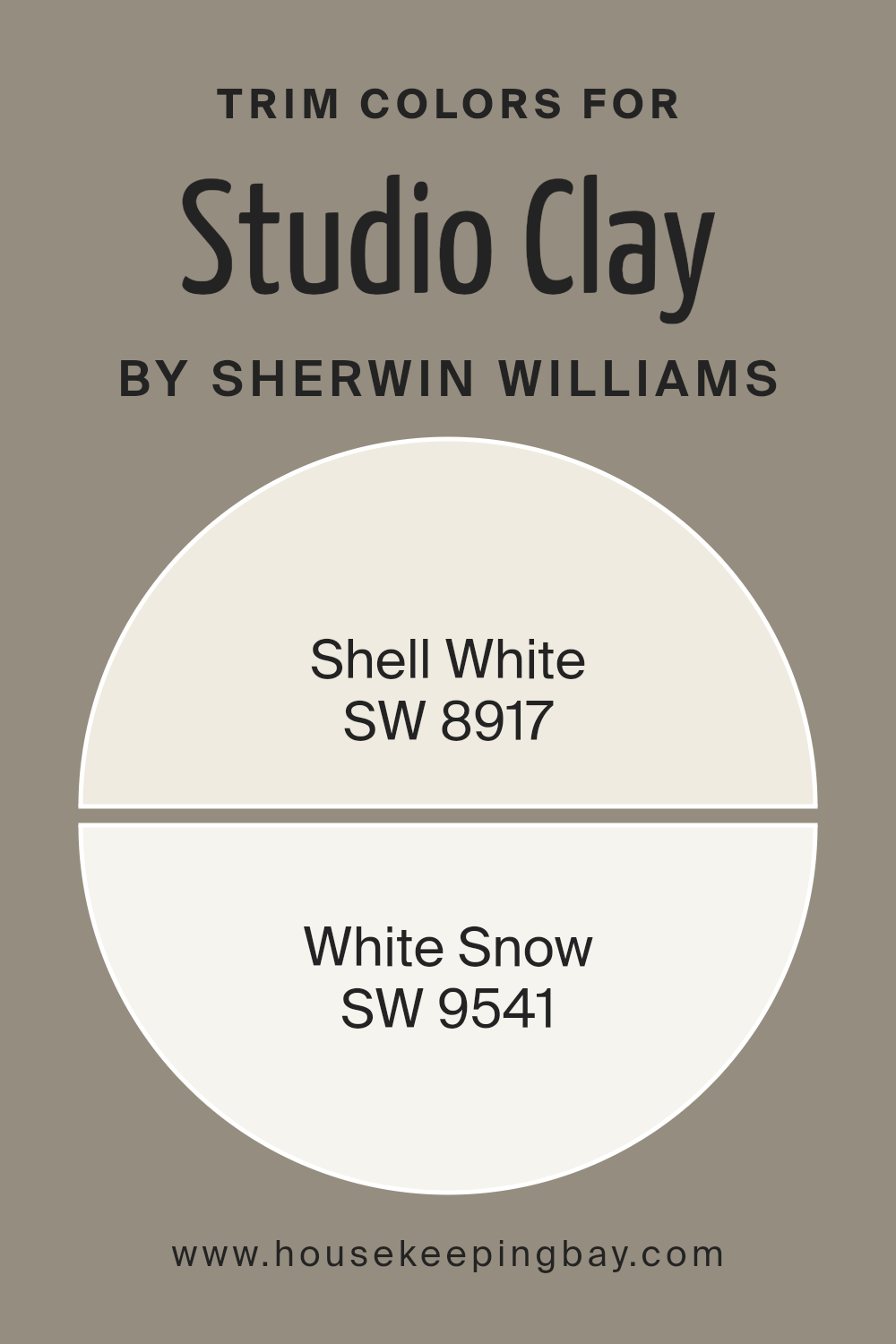
What are the Trim colors of Studio Clay SW 9172 by Sherwin Williams?
Trim colors, such as those used in conjunction with Studio Clay SW 9172 by Sherwin Williams, play a crucial role in defining the aesthetic and mood of a space. These colors are applied to elements like door frames, skirtings, window sills, and even crown moldings, essentially serving as a visual frame for the wall colors.
They have the power to subtly highlight and complement the main color palette, enhancing the architectural details of a room. Choosing the right trim color can significantly affect the overall look and feel of a space, making it appear more cohesive, balanced, and pleasing to the eye.
For the earthy and warm tones of Studio Clay SW 9172, two ideal trim colors are Shell White SW 8917 and White Snow SW 9541. Shell White is a soft, warm white with a hint of coziness, making it the perfect backdrop for the rich depth of Studio Clay, adding a gentle contrast without overpowering the room’s warmth.
On the other hand, White Snow is a crisp, bright white with a refreshing purity. It offers a sharper contrast to Studio Clay, bringing forth a vibrant yet balanced energy that can make the main color pop and the architectural details stand out more distinctly. Both colors provide versatile options for creating a harmonious interior space that feels both inviting and well-composed.
You can see recommended paint colors below:
housekeepingbay.com
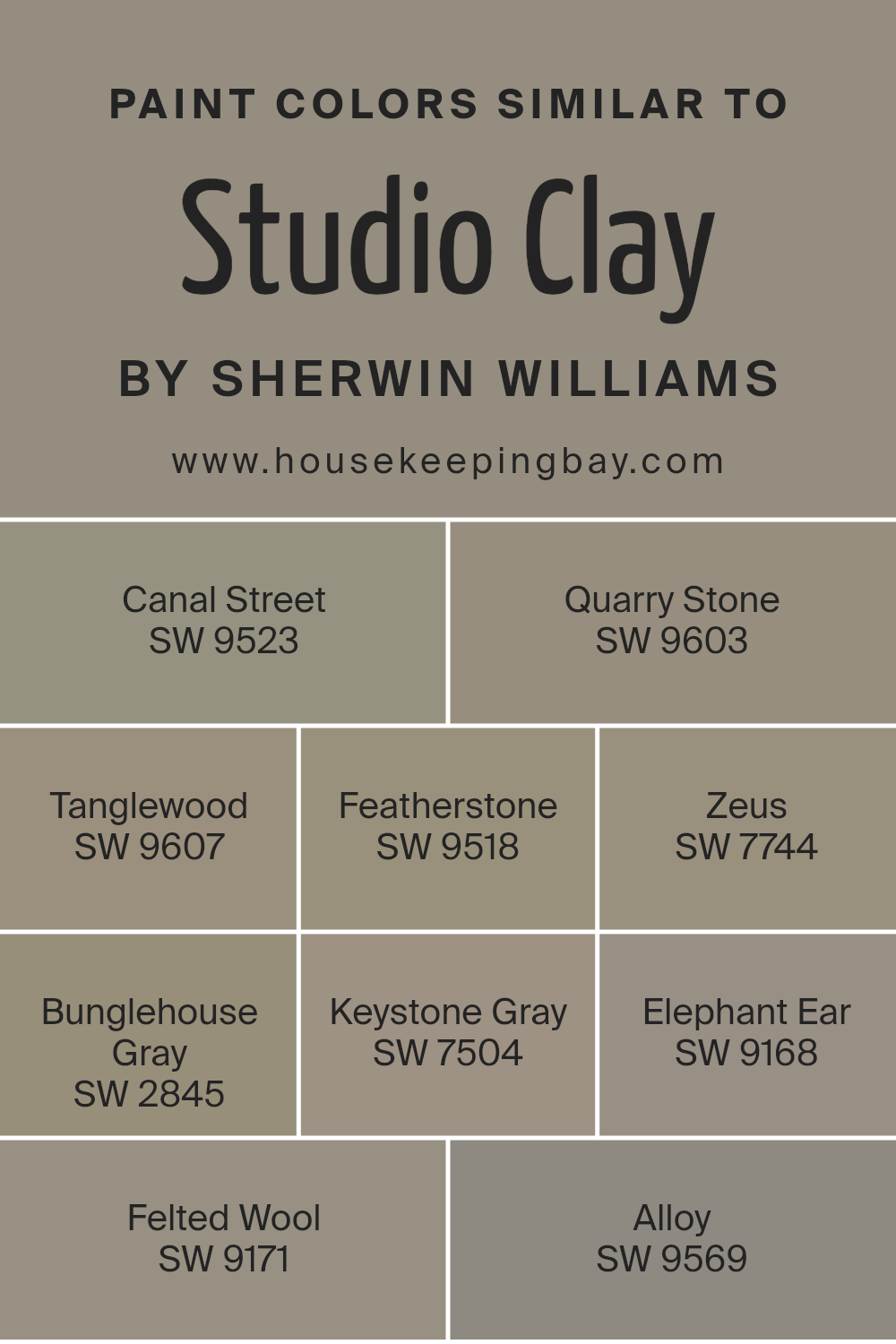
Colors Similar to Studio Clay SW 9172 by Sherwin Williams
Choosing similar colors to Studio Clay SW 9172 by Sherwin Williams is essential for creating a cohesive and harmonious look in your space. These similar shades work together by sharing common undertones or intensities, ensuring that no single color stands out too much or clashes with the rest.
This approach is perfect for those aiming for a subtle yet sophisticated ambiance where colors flow effortlessly from one to the other, enhancing the overall aesthetic and mood of a room. Whether you’re designing a serene retreat or a cozy living space, selecting colors that complement each other is key to achieving a well-balanced and visually appealing design.
Among the similar colors to Studio Clay SW 9172, Canal Street SW 9523 offers a grounding, earthy vibe with its muted tones, blending seamlessly into spaces that seek a touch of understated elegance. Quarry Stone SW 9603, on the other hand, brings a slightly cooler but equally calming effect, ideal for areas where tranquility is the goal. Tanglewood SW 9607 introduces a hint of warmth, reminiscent of sun-kissed wood, perfect for inviting spaces.
Featherstone SW 9518 is lighter, offering a breath of fresh air and a sense of spaciousness. Zeus SW 7744 provides depth with its dark, brooding character, great for creating contrast or accentuating architectural features.
Bunglehouse Gray SW 2845 is a charismatic choice that strikes a balance between warmth and coolness, lending itself well to a variety of decor styles. Keystone Gray SW 7504 strikes a middle ground with its versatile, muted hue, perfect for any setting.
Elephant Ear SW 9168 hints at the natural world, bringing an organic feel into homes. Felted Wool SW 9171 wraps spaces in a cozy, enveloping warmth, while Alloy SW 9569 introduces a chic, modern edge with its sleek, contemporary vibe. Together, these shades weave a palette that beautifully complements Studio Clay SW 9172, offering endless possibilities for creating atmospheres that are both unique and interconnected.
You can see recommended paint colors below:
- SW 9523 Canal Street
- SW 9603 Quarry Stone
- SW 9607 Tanglewood
- SW 9518 Featherstone
- SW 7744 Zeus
- SW 2845 Bunglehouse Gray
- SW 7504 Keystone Gray
- SW 9168 Elephant Ear
- SW 9171 Felted Wool
- SW 9569 Alloy
housekeepingbay.com
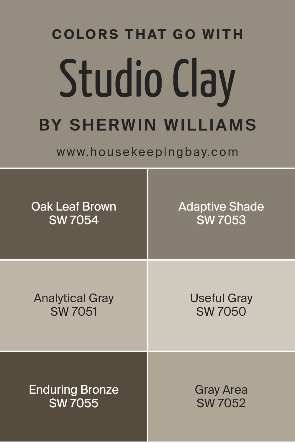
Colors that Go With Studio Clay SW 9172 by Sherwin Williams
Choosing the right colors that complement Studio Clay SW 9172 by Sherwin Williams is crucial because it helps create a harmonious and aesthetically pleasing environment. Studio Clay is a unique color that serves as a fantastic base for a wide range of color schemes, offering flexibility in design choices.
When you pair it with colors like Oak Leaf Brown, Adaptive Shade, Analytical Gray, Useful Gray, Enduring Bronze, and Gray Area, you unveil a palette that can transform any space into an inviting and cohesive area. These companion colors work by enhancing the warmth and depth of Studio Clay, providing a balanced backdrop that can suit various decor styles and preferences.
Oak Leaf Brown adds a rich, earthy touch that grounds the space, creating a sense of stability and warmth. Adaptive Shade is a versatile grey with a subtle hint of green, giving rooms a contemporary but serene feel. Analytical Gray is lighter, offering a soft, elegant backdrop that allows other elements in the room to stand out beautifully.
Useful Gray has a minimalistic charm that complements the warmth of Studio Clay, providing a clean, modern look.
Enduring Bronze brings a robust, deep tone into the mix, adding sophistication and a hint of drama. Gray Area, with its balanced blend of gray tones, acts as a connector among the colors, ensuring smooth transitions and a cohesive look. Together, these colors support and enhance the beauty of Studio Clay, making any space more welcoming and lively.
You can see recommended paint colors below:
- SW 7054 Oak Leaf Brown
- SW 7053 Adaptive Shade
- SW 7051 Analytical Gray
- SW 7050 Useful Gray
- SW 7055 Enduring Bronze
- SW 7052 Gray Area
housekeepingbay.com
How to Use Studio Clay SW 9172 by Sherwin Williams In Your Home?
Studio Clay SW 9172 by Sherwin Williams is a unique paint color that can really make a difference in your home. It’s a warm, inviting shade that sits somewhere between beige and gray. This means it’s super flexible and can fit in almost any room, whether you want to freshen up your living room, bedroom, or kitchen. Its neutral tone serves as a perfect backdrop; it can help other colors in your room stand out, or just keep things calm and soothing.
Using Studio Clay in your home can be as simple as painting an accent wall to add a bit of depth and interest to a room. Or, you could paint an entire room with it for a cozy, unified look. It works really well with white trim or cabinets, creating a clean, modern contrast.
Plus, it’s a great color for matching with various furnishings and decor, making it easy for you to style and restyle your space over time. Whether you have a lot of natural light or rely more on lamps and overhead lighting, Studio Clay can warm up the space nicely.
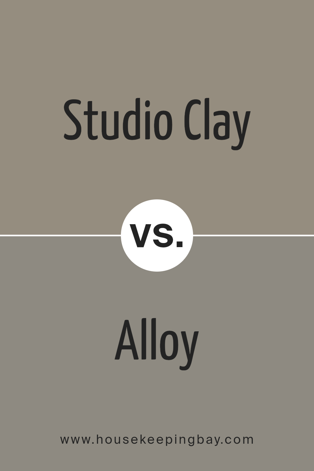
Studio Clay SW 9172 by Sherwin Williams vs Alloy SW 9569 by Sherwin Williams
Studio Clay SW 9172 by Sherwin Williams and Alloy SW 9569 are two distinct colors with unique qualities. Studio Clay has a warm, earthy tone that brings a cozy and inviting feel to any space. It’s a versatile color that blends well with a range of decor styles, adding a touch of warmth to the environment.
Alloy SW 9569, in contrast, presents a cooler, metallic shade that offers a modern and sleek look. This color is perfect for creating a contemporary vibe, adding a bit of edginess and sophistication. While Studio Clay adds a homely and comforting atmosphere, Alloy leans towards a chic and cutting-edge appeal.
Both colors serve different purposes and moods, making them suitable for a variety of spaces depending on the desired effect. Whether looking for warmth and earthiness or cool modernity, either of these colors would make a strong statement in a design scheme.
You can see recommended paint color below:
- SW 9569 Alloy
housekeepingbay.com
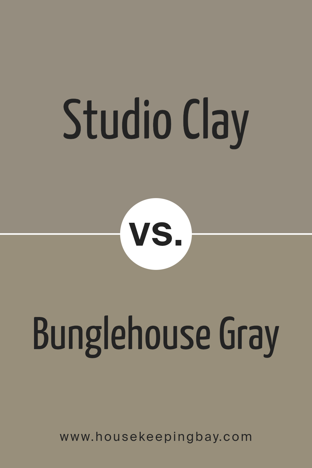
Studio Clay SW 9172 by Sherwin Williams vs Bunglehouse Gray SW 2845 by Sherwin Williams
The color Studio Clay SW 9172 by Sherwin Williams is a warm and cozy shade, reminding you of a soft, earthy clay pot that sits in the afternoon sun. It’s a color that feels like a gentle hug, making any room feel welcoming and homely.
In comparison, Bunglehouse Gray SW 2845 by Sherwin Williams is a cool, moody gray with hints of blue. It’s like looking at the ocean on a cloudy day. This color has a serene and calming effect, perfect for creating a peaceful and sophisticated space.
While Studio Clay wraps you up in warmth, Bunglehouse Gray offers a refreshing coolness. Studio Clay is best in spaces where you want warmth and an inviting atmosphere, like living rooms or bedrooms. Bunglehouse Gray, however, is great for creating a tranquil retreat, ideal for bathrooms or study areas. Both colors bring their unique vibes to a space, one cozy and earthy, the other cool and refined.
You can see recommended paint color below:
- SW 2845 Bunglehouse Gray
housekeepingbay.com
Studio Clay SW 9172 by Sherwin Williams vs Quarry Stone SW 9603 by Sherwin Williams
Studio Clay SW 9172 and Quarry Stone SW 9603 are both colors by Sherwin Williams. Studio Clay leans towards a warm, inviting beige that has a soft and subtle presence. It’s a color that can easily blend with various decor styles, making spaces feel cozy and grounded.
On the flip side, Quarry Stone offers a darker, grayer tone. This color brings a sense of solidity and strength, offering a bold but neutral backdrop that can anchor any room. While both colors provide a neutral palette, Studio Clay is lighter and warmer, making rooms feel more open and airy.
Quarry Stone, with its deeper and cooler undertone, adds drama and depth, creating a more striking visual impact. Whether aiming for a gentle, soothing vibe with Studio Clay or a more pronounced, character-filled atmosphere with Quarry Stone, each color offers unique possibilities for transforming spaces.
You can see recommended paint color below:
- SW 9603 Quarry Stone

housekeepingbay.com
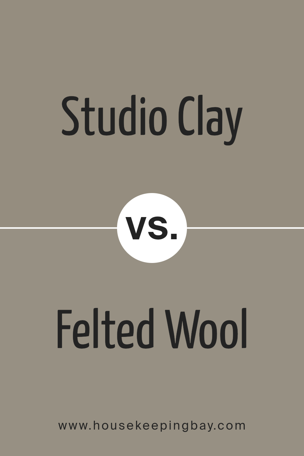
Studio Clay SW 9172 by Sherwin Williams vs Felted Wool SW 9171 by Sherwin Williams
Studio Clay SW 9172 by Sherwin Williams is a warm, inviting color that brings a cozy feel to any space. Its earthy tones remind you of natural clay, creating a sense of comfort and groundedness. This color works great in spaces where you want to add a touch of warmth without overwhelming the room with too dark a shade.
Felted Wool SW 9171, also by Sherwin Williams, is slightly lighter and has a more neutral tone compared to Studio Clay. It resembles the soft, subtle shade of wool, providing a calm and soothing atmosphere. This color is perfect for creating a serene environment, making it ideal for bedrooms or living areas where relaxation is key.
Both colors offer a sense of earthiness and warmth, but Studio Clay leans towards a warmer, richer hue, while Felted Wool offers a softer, more understated vibe. Depending on the mood you want to create, either color can add a lovely touch to your home’s palette.
You can see recommended paint color below:
- SW 9171 Felted Wool
housekeepingbay.com
Studio Clay SW 9172 by Sherwin Williams vs Elephant Ear SW 9168 by Sherwin Williams
Studio Clay SW 9172 and Elephant Ear SW 9168, both by Sherwin Williams, are unique but there are some differences. Studio Clay is lighter, offering a soft, cozy feel that can make rooms brighter and more inviting. It’s great for spaces where you want a touch of warmth without overwhelming the area. Think of it as a gentle hug from a room, creating a calm and relaxing atmosphere.
Elephant Ear, on the other hand, is darker. This color provides a strong presence, adding depth and character to spaces. It’s ideal for making bold statements or accenting areas that need a bit of drama. Imagine it as a backdrop that can make furniture or artwork pop, giving rooms a more defined look.
In summary, while both colors share a neutral palette suitable for various decorating styles, Studio Clay leans towards a lighter, airier feel, while Elephant Ear offers depth and boldness, ideal for creating contrast or focusing attention in a room.
You can see recommended paint color below:
- SW 9168 Elephant Ear

housekeepingbay.com
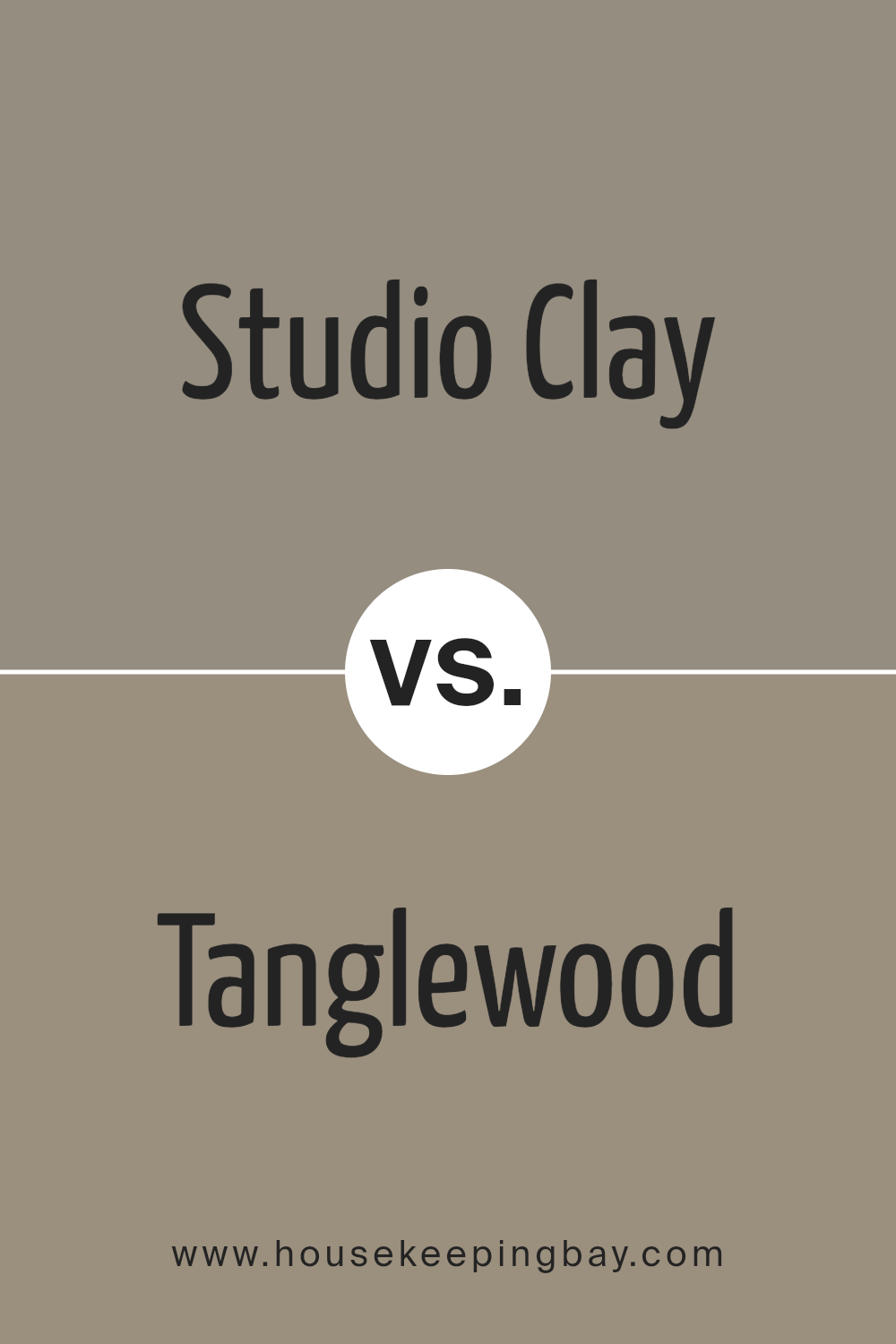
Studio Clay SW 9172 by Sherwin Williams vs Tanglewood SW 9607 by Sherwin Williams
Studio Clay SW 9172 by Sherwin Williams is a warm, earthy color that gives a cozy and inviting feeling to any space. It’s a kind of color that seems to wrap the room in a subtle, comforting embrace, perfect for creating a relaxed and welcoming atmosphere. It leans more towards a brown with a deep and rich tone, making it great for someone who wants to add some warmth to their décor without it being too bold or overwhelming.
On the flip side, Tanglewood SW 9607 by Sherwin Williams is lighter and carries a more neutral tone. It’s a soft beige that brightens up spaces and adds a touch of elegance. The color is versatile, blending well with various decor styles and color schemes. It has the magic to make small rooms appear larger and airy, thanks to its capability to reflect light beautifully.
Both Studio Clay and Tanglewood offer unique vibes – Studio Clay is all about depth and warmth, while Tanglewood speaks of lightness and sophistication. Depending on the atmosphere you want to create, either color can be a fantastic choice for your home.
You can see recommended paint color below:
- SW 9607 Tanglewood
housekeepingbay.com
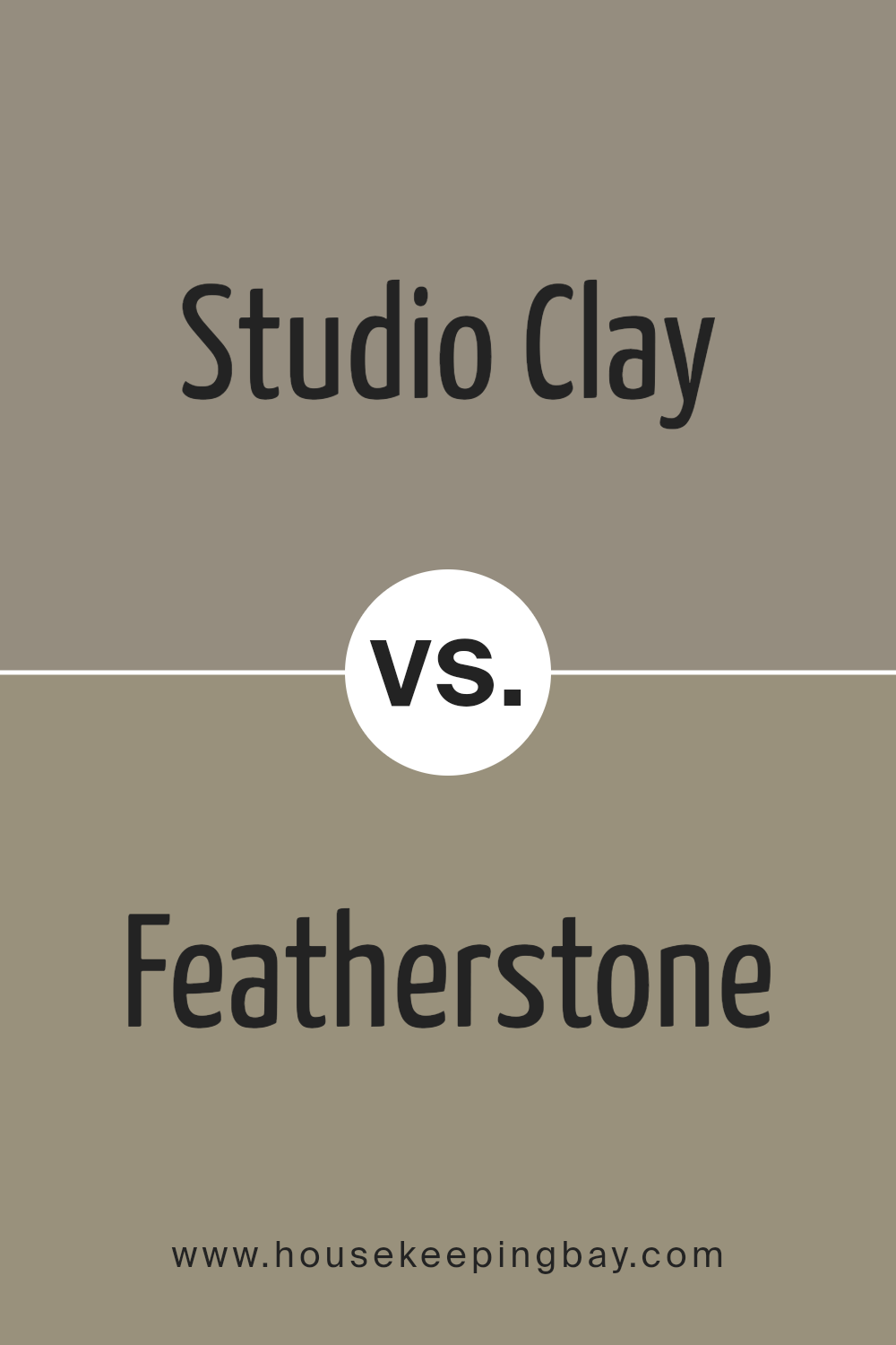
Studio Clay SW 9172 by Sherwin Williams vs Featherstone SW 9518 by Sherwin Williams
Studio Clay SW 9172 by Sherwin Williams is a warm, cozy shade that feels like a hug from your favorite sweater. It’s a deep, welcoming color that makes any room feel more like home. This color is perfect if you’re looking for something with a bit of depth and richness to create a snug, inviting atmosphere.
Featherstone SW 9518, on the contrary, is a much lighter and airier color. It’s like the first breath of fresh air on a crisp morning. This shade carries a soft, delicate vibe, making spaces look open and bright. It’s a great pick if you want to freshen up a room and give it a serene, peaceful feel.
When comparing the two, Studio Clay brings warmth and depth, ideal for cozy, intimate settings. Featherstone offers brightness and a sense of calm, perfect for creating a relaxed, open space. Both colors serve different moods and settings, with Studio Clay enveloping you in warmth and Featherstone lifting the ambiance with its lightness.
You can see recommended paint color below:
- SW 9518 Featherstone
housekeepingbay.com
Studio Clay SW 9172 by Sherwin Williams vs Canal Street SW 9523 by Sherwin Williams
Studio Clay SW 9172 by Sherwin Williams and Canal Street SW 9523 by Sherwin Williams are both unique colors, but they have different vibes. Studio Clay is a warm, earthy color. It reminds you of a cozy, serene space where you can relax. It’s like the feeling of being in a room that’s soaked in soft sunlight during the afternoon. This color brings a subtle yet comforting presence to any room, making it feel welcoming and homely.
In contrast, Canal Street is a cooler, more vibrant tone. It’s a fresh color that feels lively and energetic. This shade is perfect for spaces that aim to inspire creativity and brightness. It has a modern feel to it, unlike the timeless warmth of Studio Clay.
While both colors are beautiful, Studio Clay offers warmth and coziness, making spaces feel like a snug retreat. Canal Street, however, adds a splash of energy and modern flair, ideal for more dynamic and inspiring spaces. Each color has its charm, depending on the mood and atmosphere you want to create.
You can see recommended paint color below:
- SW 9523 Canal Street

housekeepingbay.com
Studio Clay SW 9172 by Sherwin Williams vs Keystone Gray SW 7504 by Sherwin Williams
Studio Clay SW 9172 by Sherwin-Williams and Keystone Gray SW 7504 also by Sherwin-Williams are both unique colors, but they have different vibes. Studio Clay has a warmer tone that can make a space feel cozy and welcoming. It’s like a soft hug for your walls, bringing a sense of calm and comfort. This color works well in rooms where you want to relax and feel at peace, like a bedroom or living room.
Keystone Gray, in contrast, is cooler and more neutral. It’s a versatile shade that fits perfectly in modern and minimalist designs. It’s the kind of color that can make a statement without being too loud. Keystone Gray is great for spaces that you want to feel contemporary and sleek, like an office or a modern kitchen.
Both colors are beautiful and can create different moods in a space. It all depends on what feeling you want to bring into your room. Whether it’s the warm and cozy vibe of Studio Clay or the cool, sophisticated look of Keystone Gray, both colors offer a great way to enhance your home’s aesthetic.
You can see recommended paint color below:
- SW 7504 Keystone Gray
housekeepingbay.com
Studio Clay SW 9172 by Sherwin Williams vs Zeus SW 7744 by Sherwin Williams
Studio Clay SW 9172 and Zeus SW 7744, both from Sherwin Williams, offer unique vibes for any space. Studio Clay has a warm, welcoming feel, perfect for creating cozy environments. It’s like a soft, comforting hug in color form, excellent for living rooms or bedrooms where relaxation is key. Its warmth makes it versatile, able to blend with various decor styles from modern to rustic.
Zeus, meanwhile, stands out with its cooler, darker tone. It’s a bold choice, great for making statements. Imagine it in a home office or an accent wall, where its strength can really shine. Zeus has a certain depth that can make spaces feel more grounded or sophisticated.
While both colors bring their own charm, their differences are clear. Studio Clay lights up a room with warmth and coziness, whereas Zeus adds depth and boldness, offering a more dramatic flair. This makes them suitable for different moods and settings, depending on what you’re aiming to achieve in your space.
You can see recommended paint color below:
- SW 7744 Zeus
housekeepingbay.com
Conclusion
In summing up, SW 9172 Studio Clay by Sherwin Williams is an excellent choice if you’re looking to refresh the look of your space with a touch of elegance and warmth. This unique color strikes a perfect balance by bringing a cozy yet sophisticated atmosphere into any room. Whether you’re considering a complete makeover or just wanting to add a new vibe to your existing decor, Studio Clay has the versatility to blend beautifully with various styles and accessories.
The beauty of Studio Clay lies in its ability to transform your space into a welcoming retreat, making it ideal for living rooms, bedrooms, or even home offices. Its adaptability extends to pairing wonderfully with both modern and traditional furnishings, ensuring that you can achieve your desired aesthetic without hassle.
Choosing SW 9172 Studio Clay is more than just picking a paint color; it’s about creating a backdrop that enhances your daily living experience. It’s a choice that promises to refresh your walls with a chic and serene ambiance. So, if you’re looking to give your home a fresh, new look, Studio Clay is a color that won’t disappoint.
With its combination of style and tranquility, it’s sure to make your home feel more inviting and comfortable.

housekeepingbay.com
Ever wished paint sampling was as easy as sticking a sticker? Guess what? Now it is! Discover Samplize's unique Peel & Stick samples. Get started now and say goodbye to the old messy way!
Get paint samples


