41 Mushroom Paint Color Trendy this Year
Why Mushroom Paint Is the Mood of 2025
I’ve walked into hundreds of homes over the years. Some felt cold even with the best furniture, and some felt peaceful even before we added a single piece of art. What made the difference? More often than not—it was the wall color.
This year, mushroom paint tones are showing up everywhere. And there’s a reason. They sit right between beige and gray, but they don’t feel dull or cold. They feel… safe. In a good way. Like something steady in a world that’s moving too fast.
People want calm. They want their homes to feel like a break, not a showroom. Mushroom colors give that. They ground a room without making it feel heavy. And they’re not trendy in the way some colors come and go. They’re dependable.
I started using them in entryways, then living rooms, and now—clients are asking for them in bedrooms, kitchens, even bathrooms. One of my recent staging clients told me, “I didn’t even want to sell anymore after you painted the dining room.” That’s the kind of feeling we’re after.
I’ll show you exactly what mushroom paint colors are, why they’re trending in 2025, and 41 shades I’ve used (and loved) in real homes. But first—let’s clear up what this color actually is.
housekeepingbay.com
What Is Mushroom Paint Color, Really?
Let’s be honest—”mushroom” isn’t the most glamorous name for a paint color. But once you see it on a wall, it makes sense. It’s that soft, earthy tone that isn’t quite gray, isn’t quite beige. It’s somewhere in between.
I describe it to clients as the color of a fresh mushroom cap—muted, natural, with just a touch of warmth or coolness depending on the light. It doesn’t scream for attention, but it quietly makes everything around it look better.
Unlike pure gray, which can feel icy, or beige, which can sometimes lean yellow or dull, mushroom colors have depth. They’re subtle but rich. And they work with just about anything—wood, brass, black, white, even bold art.
Here’s the cool part: according to a color psychology study published by the University of Minnesota, earth tones like mushroom can make people feel more relaxed and secure in a space. That’s exactly what I hear from clients all the time.
So yes, it’s a trendy color in 2025—but it also just feels right. And that’s a big deal when you’re living in it every day.
Why Mushroom Is Trending in 2025
I’ve seen color trends come and go—fast. One year it’s millennial pink, the next it’s forest green. But mushroom shades? They’re holding strong, and in 2025, they’re everywhere. And that’s not just my opinion.
According to a 2025 trend report from Sherwin-Williams, neutral colors with earthy undertones are dominating interiors this year, with mushroom tones being one of the most requested palettes from homeowners and designers alike.
So why now?
- People want homes that feel calm.
After everything in the world feels unpredictable, a soft, natural paint color can feel like a sigh of relief. - Mushroom tones are flexible.
They fit just as well in a farmhouse-style kitchen as they do in a modern city apartment. I’ve used the same shade in a downtown loft and a suburban family home—and it worked beautifully in both. - They’re perfect for staging.
As someone who stages homes for sale, I can tell you—buyers connect with mushroom tones. They see it as move-in ready, not a “we’ll have to paint this” situation. And according to Zillow, homes with neutral wall colors sell for an average of $1,500 more than those with bright or dated hues (source).
Clients tell me they feel “safe” choosing it. That it won’t go out of style next year. That it feels like them—not a showroom or an Instagram trend.
Now that you know why it’s taking over, let me show you 41 real mushroom paint colors that I trust—and where I love using them.
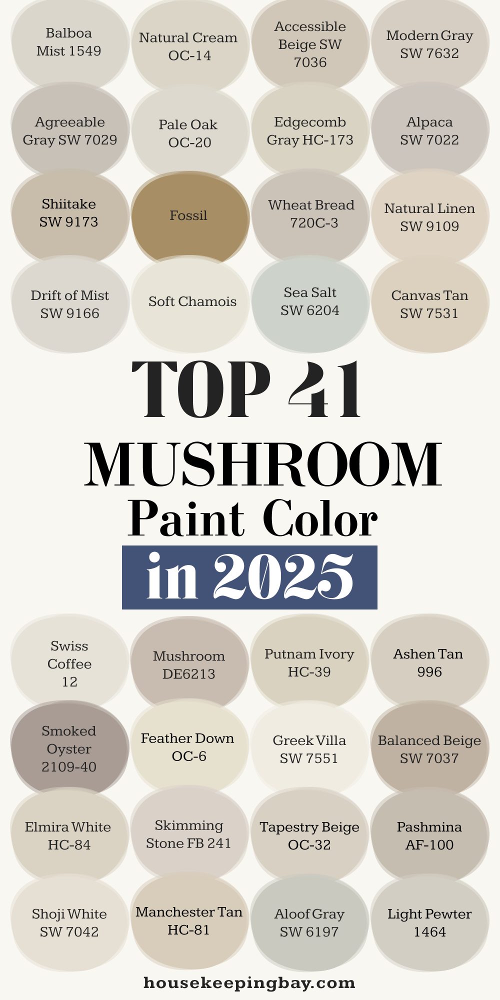
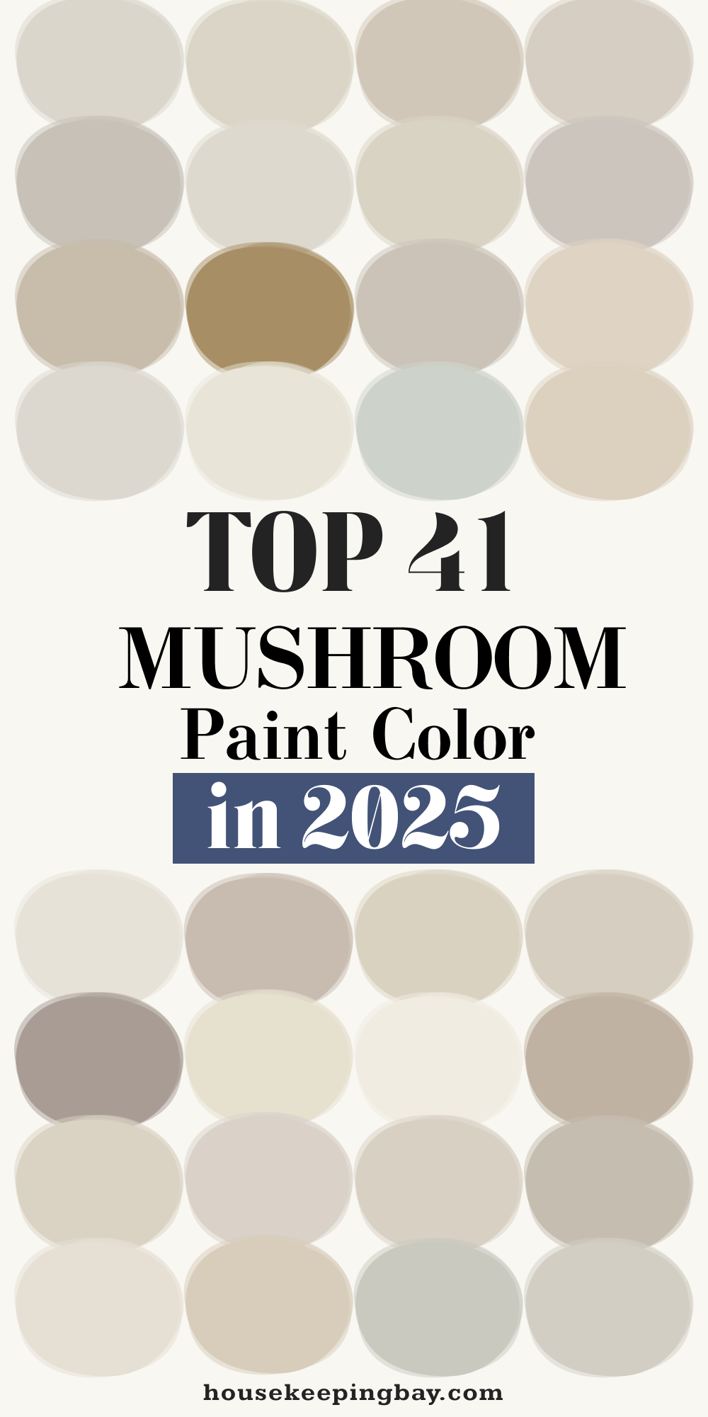
41 Mushroom Paint Colors That Work in Real Homes
I’ve tried more mushroom paint colors than I can count. Some looked amazing on a swatch and awful on a wall. Others surprised me—in the best way. These 41 shades are the real deal. I’ve used them in living rooms, bathrooms, kitchens, and even hallways. And yes, I have favorites.
Let’s break them down by feel and use. That’ll make it easier to find the one that fits your home.
Warm Mushroom Shades
These have a soft, golden undertone. Cozy, friendly, and perfect for living areas.
- Accessible Beige – Sherwin-Williams
- Balboa Mist – Benjamin Moore
- Natural Cream – Benjamin Moore
- Pale Oak – Benjamin Moore
- Edgecomb Gray – Benjamin Moore
- Shiitake – Sherwin-Williams
- Fossil – Behr
- Wheat Bread – Behr
- Drift of Mist – Sherwin-Williams
- Soft Chamois – Benjamin Moore
Cool Mushroom Shades
These lean a little grayer, great for modern or minimal homes.
- Classic Gray – Benjamin Moore
- Repose Gray – Sherwin-Williams
- Agreeable Gray – Sherwin-Williams
- Gray Owl – Benjamin Moore
- Dorian Gray – Sherwin-Williams
- Mindful Gray – Sherwin-Williams
- Pediment – Sherwin-Williams
- Modern Gray – Sherwin-Williams
- Nimbus – Benjamin Moore
- Alpaca – Sherwin-Williams
Neutral and Balanced Mushroom Shades
These work in any room and don’t lean too warm or too cool.
- Swiss Coffee – Behr (not too yellow)
- Mushroom – Dunn-Edwards
- Putnam Ivory – Benjamin Moore
- Ashen Tan – Benjamin Moore
- Smoked Oyster – Benjamin Moore
- Eider White – Sherwin-Williams
- Feather Down – Benjamin Moore
- Oyster White – Sherwin-Williams
- Elmira White – Benjamin Moore
- Skimming Stone – Farrow & Ball
Bold Mushroom Tints
A little deeper, more character. Great for dramatic, cozy rooms.
- Worldly Gray – Sherwin-Williams
- French Gray – Farrow & Ball
- Tapestry Beige – Benjamin Moore
- Bruton White – Farrow & Ball
- Pashmina – Benjamin Moore
- Manchester Tan – Benjamin Moore
- Kilim Beige – Sherwin-Williams
- Light Pewter – Benjamin Moore
- Saddle Soap – Behr
- Grant Beige – Benjamin Moore
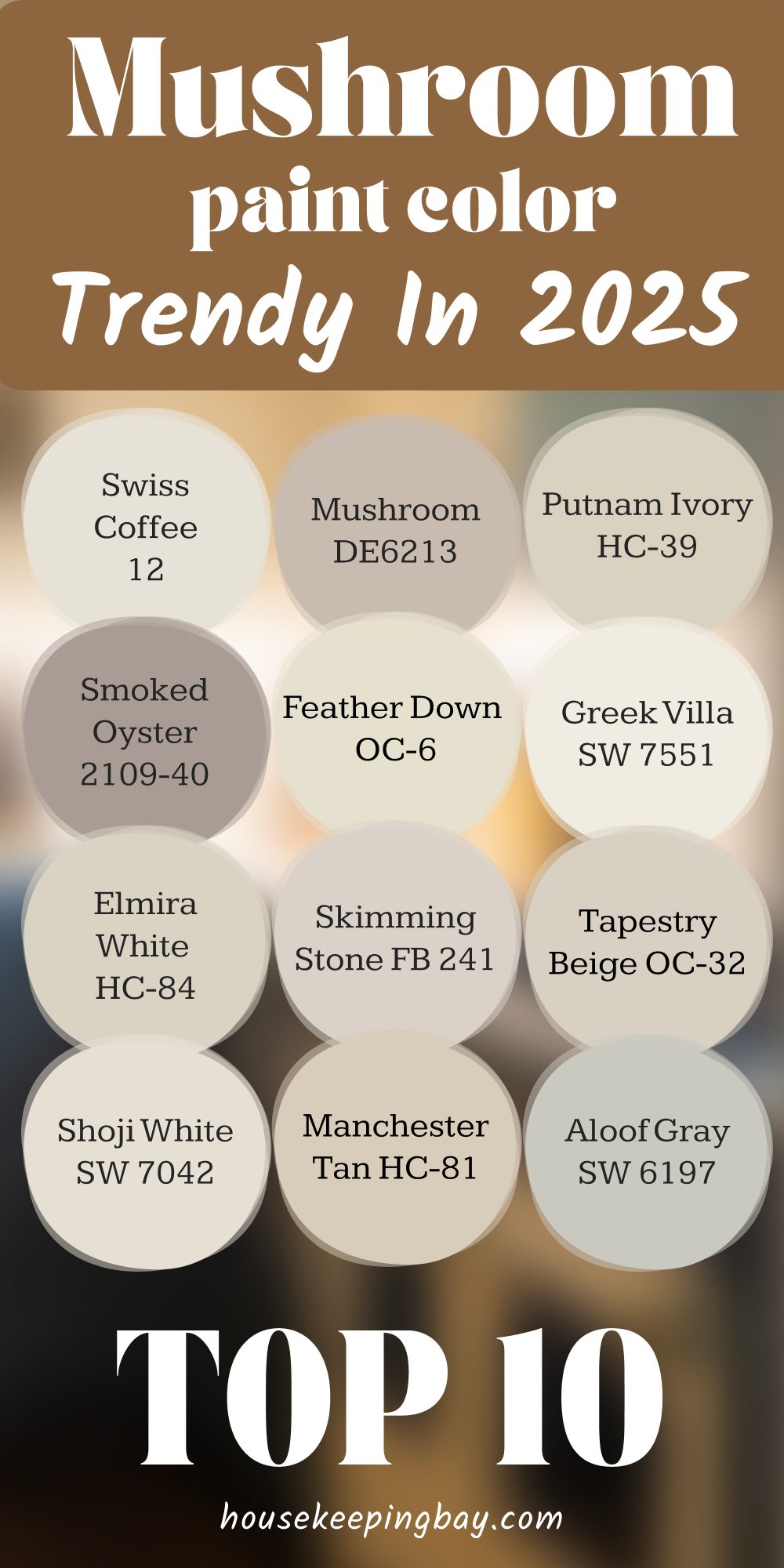
My 10 Go-To Mushroom Paints
These are the ones I trust again and again—not because a chart told me, but because they’ve never failed in real homes, with real people.
- Pale Oak – Benjamin Moore
Soft, warm, but not yellow. It works everywhere—bedrooms, dining rooms, even cabinets. My most-used color by far. - Edgecomb Gray – Benjamin Moore
This one’s a chameleon. It reads warm or cool depending on the light. Ideal for open floor plans. - Shiitake – Sherwin-Williams
Has that true mushroom tone. Cozy, earthy, and looks amazing with natural wood. - Agreeable Gray – Sherwin-Williams
A little cooler, more modern. It’s the one I pick when clients want a “safe gray” that doesn’t feel icy. - Balboa Mist – Benjamin Moore
Elegant without trying too hard. I’ve used it in home offices and entryways—it always works. - Repose Gray – Sherwin-Williams
Another gray-mushroom crossover. Great in rooms with less natural light. - Feather Down – Benjamin Moore
Light and creamy but not flat. I like it in bedrooms with gold or bronze accents. - Natural Cream – Benjamin Moore
It reads calm and rich at the same time. I’ve used this in high-end staging projects—it feels expensive. - Modern Gray – Sherwin-Williams
Very subtle, very clean. I’ve used this one in kitchens and paired it with white oak flooring—beautiful match. - Oyster White – Sherwin-Williams
Almost off-white but with a grounding effect. It’s great for ceilings if you want to warm up the whole room.
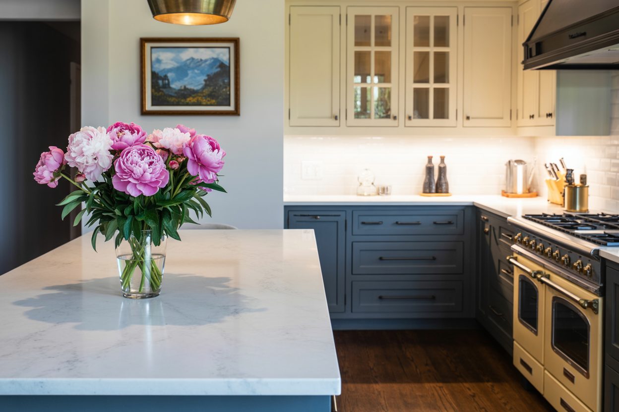
Where to Use Mushroom Paint (And Where Not To)
Over the years, I’ve tested mushroom paint in every room. Some spaces love it. Others… not so much. Here’s my rulebook based on real-life results.
Best Places to Use Mushroom Colors
- Living Rooms
They bring comfort without overpowering the space. Clients always comment on how cozy the room feels once the walls are done. - Bedrooms
Soft, calm, and gentle. It creates the perfect setting for winding down. - Entryways and Hallways
These spots often get ignored, but mushroom tones add a polished look without needing decor. - Dining Rooms
Pair it with candlelight and natural textures—magic. - Home Offices
It helps reduce visual noise. Clients say they feel more focused and less distracted. - Cabinetry and Built-ins
Don’t be afraid to use it on furniture. I’ve painted kitchen islands and bathroom vanities in mushroom tones—they turned out stunning.
Where I Don’t Recommend It
- Tiny, windowless bathrooms
Mushroom can look muddy in very low light. These rooms usually need something brighter. - Ultra-modern or high-contrast spaces
If your vibe is sharp black-and-white with high gloss finishes, mushroom might feel too soft. - Outdoor trim
It fades easily in direct sun and doesn’t pop like brighter neutrals or deep browns.
What to Pair With Mushroom Walls
Getting the paint right is only half the story. What surrounds it can make or break the whole feel of the room. I’ve tested combos with every finish you can think of, and these are the ones that truly work.
Best Furniture and Finishes
- Natural wood tones (like oak, walnut, or pine)
Mushroom walls love organic textures. Wood brings out the warmth and depth in the color. - Brass, bronze, or matte black hardware
These metals look intentional—not random—against mushroom shades. - Creams and off-whites
I use these a lot for trim, ceilings, or fabrics. They keep things light without clashing. - Deep greens, muted blues, or terracotta accents
These rich tones pop beautifully next to mushroom, especially in pillows, rugs, or artwork.
Flooring Matches Well With Mushroom
- White oak – My go-to. Light but not cold.
- Warm gray or greige tile – For kitchens or bathrooms.
- Medium-tone hardwood – Adds richness without making things feel heavy.
A Note on Light
Always test your mushroom color in your light. North-facing rooms pull cooler. South-facing ones bring out warmth. A shade that looks perfect in a showroom can read totally different at home.
As designer Amber Lewis says,
“Lighting changes everything. A paint color isn’t just a color—it’s a mood”From Me to You: Why I Keep Recommending Mushroom Colors
I’ll be honest—there was a time I didn’t think much of mushroom tones. They seemed… boring. But then I started noticing something. People relaxed in mushroom-colored rooms. They stayed longer. They smiled more. They told me things like, “It just feels good in here.”
That’s when I realized: good design isn’t always loud. Sometimes it’s about quiet strength. Mushroom colors don’t show off—they hold things together. They let the rest of your home shine.
So if you’re stuck choosing a color for your walls, your cabinets, or even your doors… try a mushroom tone. Test a swatch. See how it feels. You might be surprised how much you love it.
And if you ever need a nudge, just come back to this list. These shades have never let me—or my clients—down.