16 Paint Colors that Go with Gray Floors
My Favorite Wall Colors That Make Gray Floors Feel Cozy, Clean, and Complete
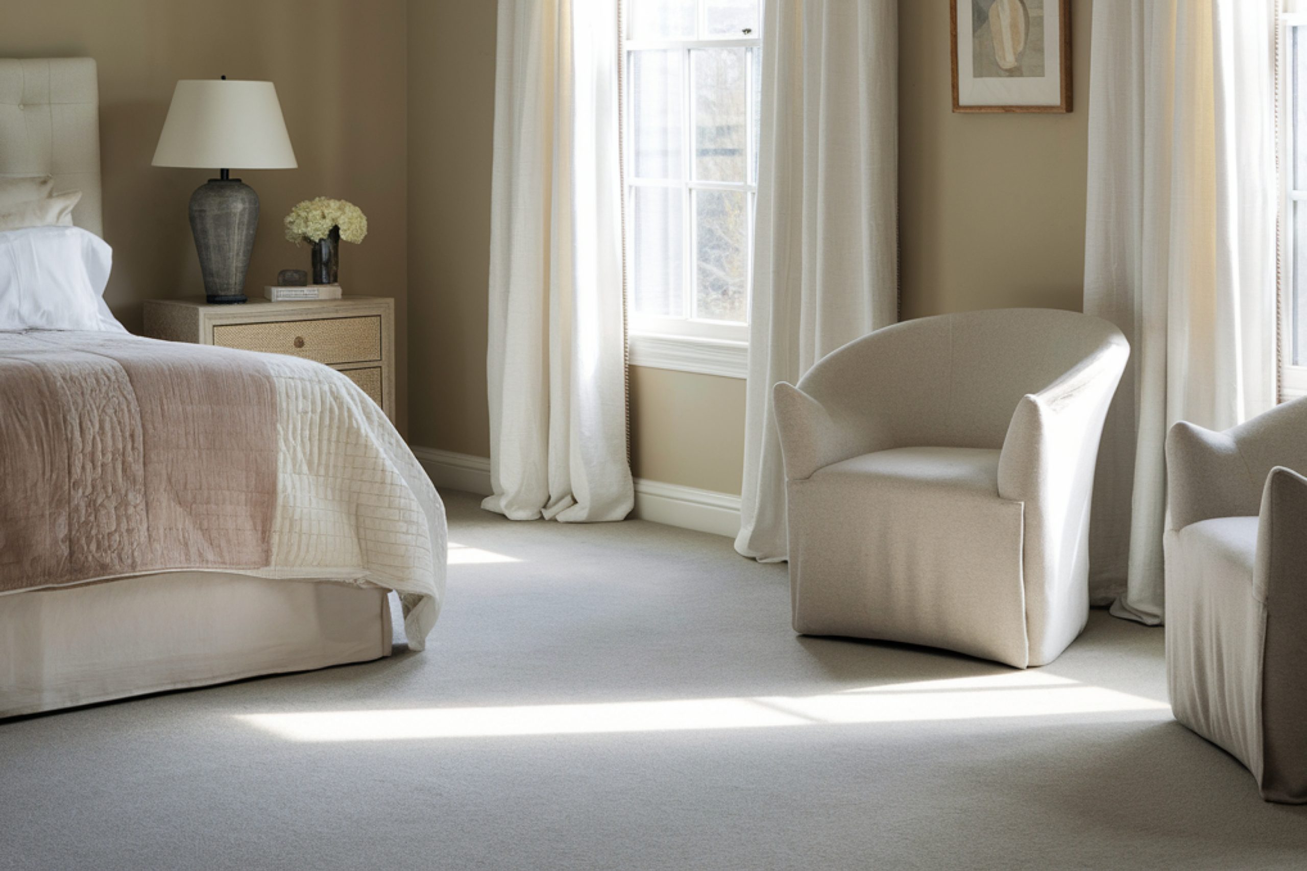
When I first started working with gray floors, I made a big mistake. I thought they were neutral enough to match anything. But the truth? Gray floors can be really picky.
Sometimes they look cold. Sometimes they turn muddy next to the wrong wall color.
And if you choose paint that clashes with the floor’s undertone, the whole room can feel off — even if everything else is perfect.
Over the years, I’ve walked through hundreds of homes, styled everything from small condos to high-end flips, and here’s what I’ve learned: the right wall color can make your gray floors feel clean, cozy, and calm.
The wrong one? It’ll make your whole space feel disconnected.
This guide is for you if:
- You’ve already got gray floors (laminate, wood, tile — doesn’t matter)
- You’re tired of staring at paint chips that all look the same
- You want an expert’s short list of wall colors that actually work in real rooms
I’m going to walk you through 16 of my favorite paint colors — ones I’ve used again and again with gray flooring in all kinds of homes. These aren’t just trendy.
They’re tested, balanced, and beginner-friendly.
Before we jump into color names, let me share two quick things I always look at before choosing any paint color. These will help you understand why some colors work better than others.
via housekeepingbay.com
What to Know Before Picking a Color
Table of Contents
Before I ever open a paint deck or grab a sample, I stop and ask two things:
What’s the undertone of the floor? And what kind of light does this room get?
These two things change everything.
Undertones Matter More Than You Think
Not all grays are the same. Some are warm, some are cool, and some sit right in the middle.
- Warm gray floors often have beige, brown, or taupe hints underneath.
- Cool gray floors might have a slight blue, green, or even purple tint.
Here’s what happens if you ignore this:
If you pair a cool gray floor with a warm creamy wall, the whole room can feel mismatched. Same thing if you use a cold bluish-gray wall with a warm greige floor — suddenly it feels sterile and dull.
Tip from me: Look at your floor next to a plain sheet of white paper. Do you see any color peeking through the gray? That’s your undertone.
via housekeepingbay.com
Lighting Changes Everything
The same paint can look completely different in a sunny room than it does in a darker hallway.
- North-facing rooms bring in cooler light — paint will look bluer or grayer.
- South-facing rooms have warm light that can soften colors and bring out yellows.
- East and west-facing rooms shift a lot during the day — morning vs afternoon light totally changes the feel.
So if a color looks too dark or too creamy in your room, it might not be the paint’s fault — it could just be the light.
What I always do:
I paint a few large swatches on the wall and look at them in morning, noon, and evening light.
And I always use two coats — one coat is too light to judge.
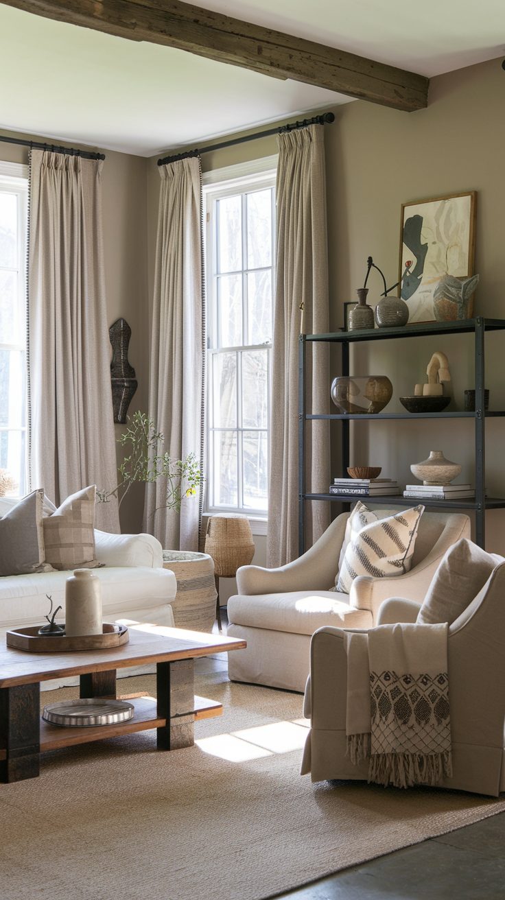
Soft and Warm Neutrals
These are the colors I grab when I want to warm up gray floors without making things feel yellow or beige-heavy. They’re clean, light, and work especially well in family rooms, kitchens, or any spot where you want comfort.
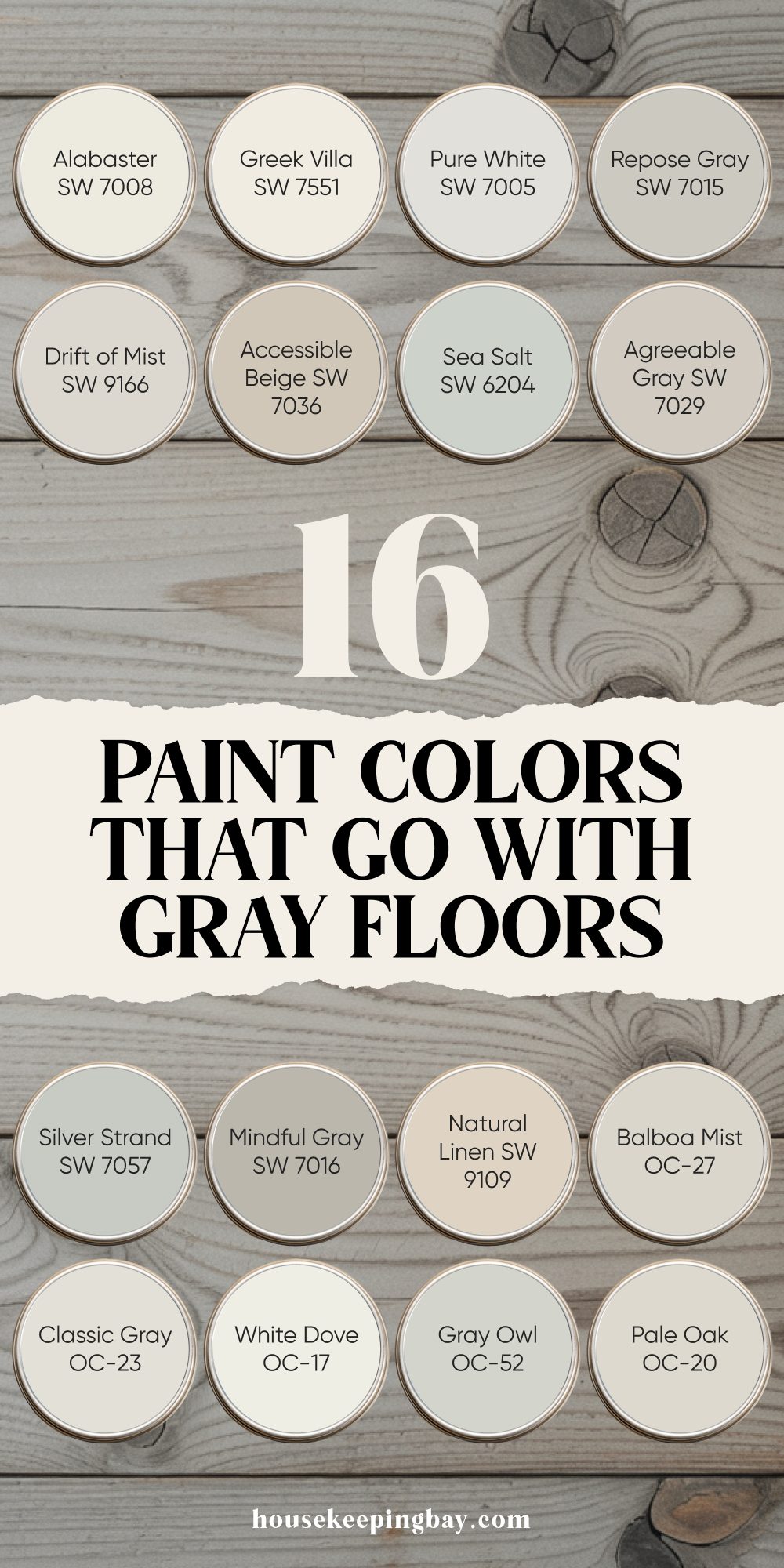
1. Alabaster SW 7008
This is one of Sherwin-Williams’ most popular whites — and for good reason. It’s warm but not too creamy, soft but still bright.
Why I love it:
It takes the chill off gray floors without turning things yellow. In open-plan homes, it creates flow. I’ve used this in kitchens and bedrooms and it always feels gentle.
🗨 “Alabaster… brings a softness and warmth without feeling yellowed or antique.” — Sherwin-Williams Color Marketing Manager
2. Greek Villa SW 7551
Greek Villa is a touch creamier than Alabaster, but still light and breathable. If your floors have a cooler gray tone, this adds balance.
Where I use it:
Living rooms and entryways with lots of natural light. It softens the edges without making the room feel smaller.
3. Pure White SW 7005
Despite its name, this one’s not stark white — it has the tiniest hint of warmth. That’s why it works so well with cool gray floors.
Why it works:
It gives a crisp, clean backdrop, especially if you like modern or minimal looks. Great for walls or trim if you want tone-on-tone contrast.
4. Accessible Beige SW 7036
This color walks a fine line between beige and gray (which is why some call it “greige”). It plays well with both warm and cool flooring.
My tip:
Use this in homes with slightly warmer gray floors — it brings a soft earthy touch without going brown.
📊 Fun fact: Accessible Beige was part of Sherwin-Williams’ Top 50 most popular paint colors in 2023.
5. Natural Linen SW 9109
This one is warm and muted — not beige, not tan, but just enough color to cozy things up.
Where it shines:
Bedrooms and dens. It adds comfort without darkening the space.
via housekeepingbay.com
Gray-on-Gray That Works Beautifully
Layering gray tones can look so polished — but only if they complement each other. These five paints work with gray floors, not against them. They let the flooring stand out without stealing the show.
6. Repose Gray SW 7015
This is probably my most-used gray — seriously. It’s soft, subtle, and has a little bit of warmth so it never feels cold.
Why I reach for it:
It works in almost any room, no matter the floor tone. I’ve used it in small hallways and large living rooms — and it always looks elegant.
7. Mindful Gray SW 7016
A little deeper than Repose Gray, this one has more richness without going too dark.
My go-to when:
I want contrast but still want the room to feel calm. Pairs beautifully with mid-tone gray wood or tile floors.
Design tip:
Add white trim (like Pure White or White Dove) for balance. That contrast keeps the room from feeling heavy.
8. Agreeable Gray SW 7029
This one leans warm, with some beige undertones. It’s what I pick for family rooms, especially when I want the whole room to feel relaxed.
Why it works:
It’s not too trendy, not too plain — just right in the middle.
📊 It’s also one of Sherwin-Williams’ best-selling colors for the last 5 years.
9. Drift of Mist SW 9166
This is a very light, soft gray with a little warmth. It’s more subtle than the others — sometimes it almost looks off-white.
I love it for:
Bathrooms, laundry rooms, or any space where you want a light gray that doesn’t feel icy.
10. Balboa Mist OC-27
Favorite from Benjamin Moore. It’s a warm gray with just enough pigment to stand out without overwhelming a room.
Where it shines:
Bedrooms, entryways, or homes with lots of natural wood accents. It plays well with both gray and beige tones.
🗨 “Balboa Mist is a beautiful bridge between traditional and modern spaces.” — Benjamin Moore
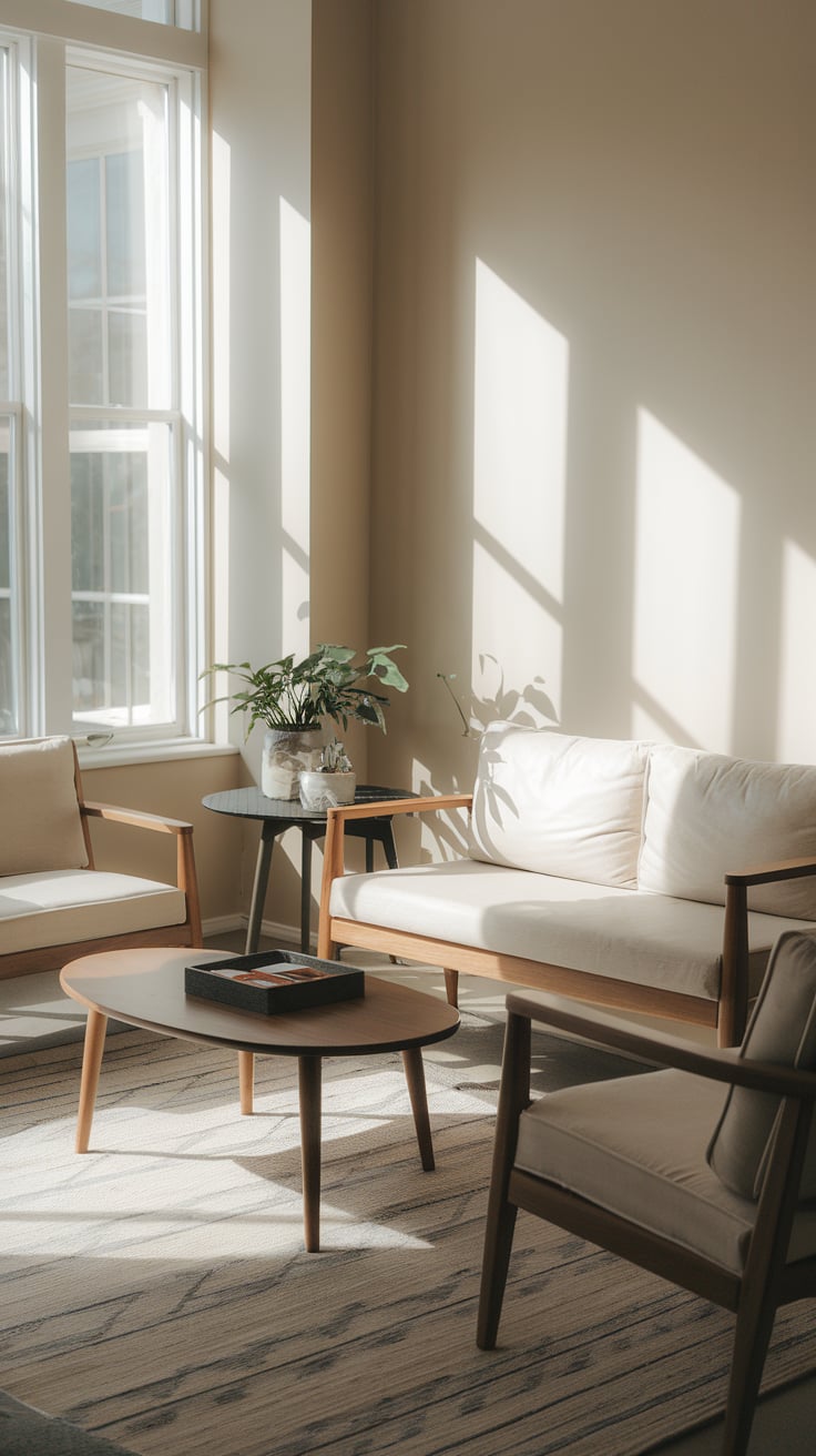
Here we go — this next group is all about keeping things light and breathable.
These paints work especially well in smaller rooms, homes that don’t get a lot of natural light, or if you’re just after that crisp, clean look without making things feel cold.
via housekeepingbay.com
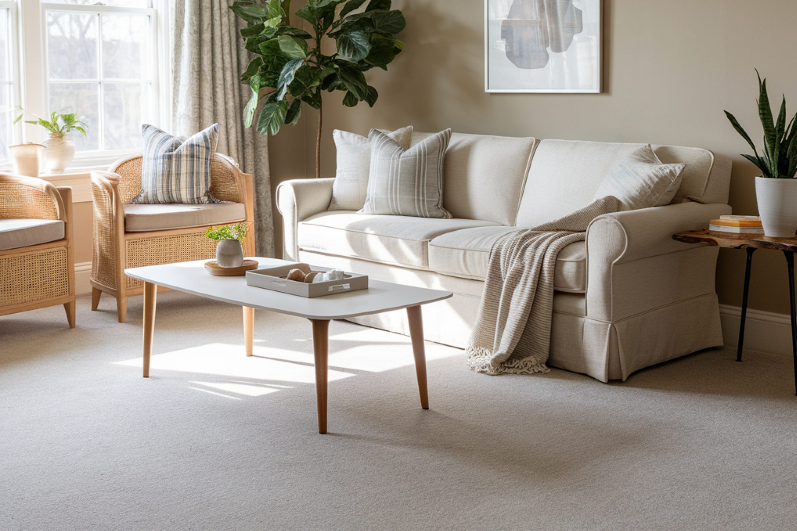
Light, Bright, and Fresh Choices
These shades are soft, subtle, and make gray floors feel polished without being too formal. I use these when I want to brighten up a space without washing it out.
11. White Dove OC-17
This is a classic for a reason. White Dove has warmth — but it’s still bright and neutral enough to look clean.
Where I use it:
Trim, ceilings, and sometimes full walls. Especially in traditional homes or flips where I want a fresh feel that’s not too sharp.
Why it works:
It brings softness next to gray floors, especially cooler-toned ones. It never feels stark.
🗨 “White Dove is light and luminous without being stark or cold.” — Benjamin Moore
12. Classic Gray OC-23
Don’t let the name fool you — this is more of an off-white with a kiss of gray. It’s super gentle.
My favorite use:
North-facing rooms. It keeps them from feeling chilly without going beige.
Design tip:
Pair with deeper gray floors and white trim for that high-end, layered look.
13. Pale Oak OC-20
Somewhere between cream and gray, this one shifts with the light. In the morning it might look warm and creamy, and by evening it feels cooler.
Where it shines:
Bedrooms, hallways, and places you want a soft background that still has personality.
Bonus:
It’s forgiving — even if your floor has a weird undertone, Pale Oak tends to work.
14. Gray Owl OC-52
This one leans cooler — a pale gray with hints of green or blue, depending on the light. It’s crisp but not harsh.
I use it when:
I want a fresher, more modern vibe. It looks great with stainless appliances and simple furniture.
Heads up:
In a dark room, it can read a bit blue. So test it well before committing.
Now we’ve got just two colors left — the Cool and Calming Tones I love to use when someone says, “I want something different, but still relaxing.”
Let’s bring it home! These last two colors have a little more personality, but they’re still soft and calm — perfect for giving gray floors a touch of color without overwhelming the room.
Cool and Calming Tones
Sometimes, you want just a little something different — a whisper of color that makes people stop and say, “What color is that?” These two paints do exactly that. They still work with gray floors, but bring in a bit more character.
15. Silver Strand SW 7057
This color is a muted silvery-gray with a soft green-blue undertone. It’s subtle but interesting.
Where I use it:
Bathrooms, guest rooms, or peaceful reading corners. It brings calm energy and looks amazing with silver or brushed nickel hardware.
Design note:
If your gray floor has cool tones, Silver Strand makes the whole space feel cohesive.
16. Sea Salt SW 6204
This is the most colorful one on the list — a soft, muted green-blue that almost feels like a faded sea glass.
Why I love it:
It looks beautiful next to gray flooring and white trim. Especially in bathrooms or laundry rooms where you want a little life.
📊 Sea Salt has been one of Sherwin-Williams’ top-selling coastal shades for years — and it’s still going strong.
One Last Thought Before You Paint
Gray floors can be tricky — but they’re also one of the most flexible backdrops you can work with. The right wall color makes them feel warmer, brighter, and more “finished.”
If you’re not sure where to start, here are three of my personal favorites:
- Repose Gray – foolproof, balanced, and calm
- Pale Oak – perfect for soft light and subtle contrast
- Alabaster – always warm, clean, and welcoming
Remember: paint looks different in every home.
Always sample first. Look at it in every kind of light — and live with it for a couple days if you can.
And when in doubt? Keep it simple.
Paint isn’t permanent, but how a room feels… that matters every day.
via housekeepingbay.com
