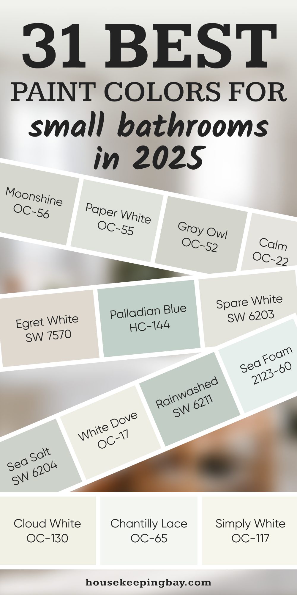
31 Best paint colors for small bathrooms in 2025
Light, Clean Colors That Make Small Bathrooms Feel Bigger in 2025
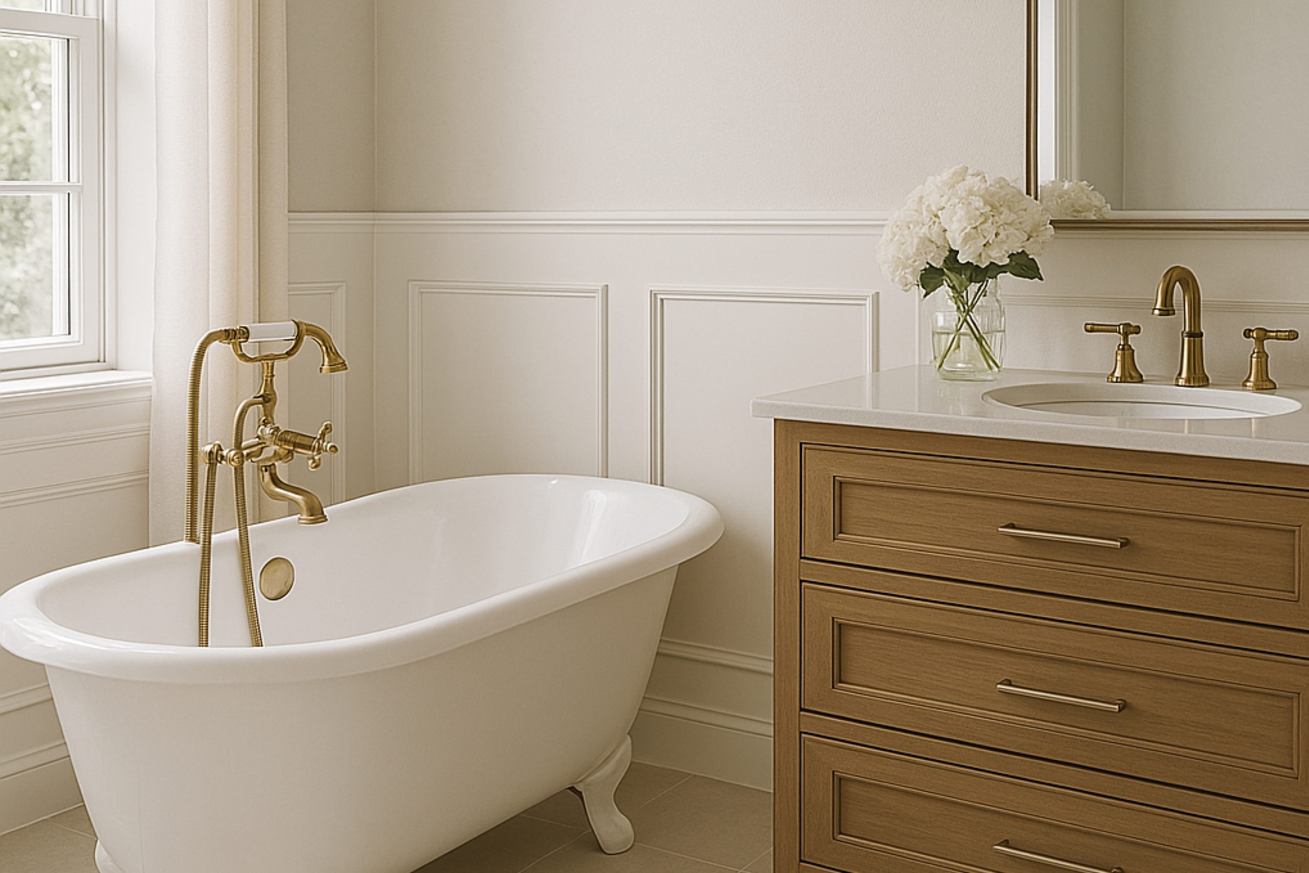
Small bathrooms can be tricky. There’s not a lot of room to work with, and every decision — from tile to towel hooks — can make a difference. But one of the biggest things that changes how a bathroom feels? The paint color.
When I walk into a tiny bathroom, I don’t just look at the size. I think about how the light moves, what mood the space gives off, and how people will feel in there every single day.
Paint is one of the fastest (and least expensive) ways to make a small bathroom feel more open, more relaxed, or even more charming — without knocking down a single wall.
But not all colors work in small spaces. Some shades can make the walls feel like they’re closing in. Others can make everything feel cold or too harsh.
That’s why I’m sharing my top 31 paint colors that actually work in small bathrooms for 2025 — and I’m only focusing on real winners from Sherwin-Williams and Benjamin Moore.
These are colors I’ve used, loved, and seen work in real homes.
I’ve broken them down by mood and purpose, so whether you want something fresh and clean or soft and peaceful, you’ll find something that fits. And of course, I’ll share how I choose the right shade for each space — and my personal favorites for this year.
Ready? Let’s get into what really works in small bathrooms.
via housekeepingbay.com
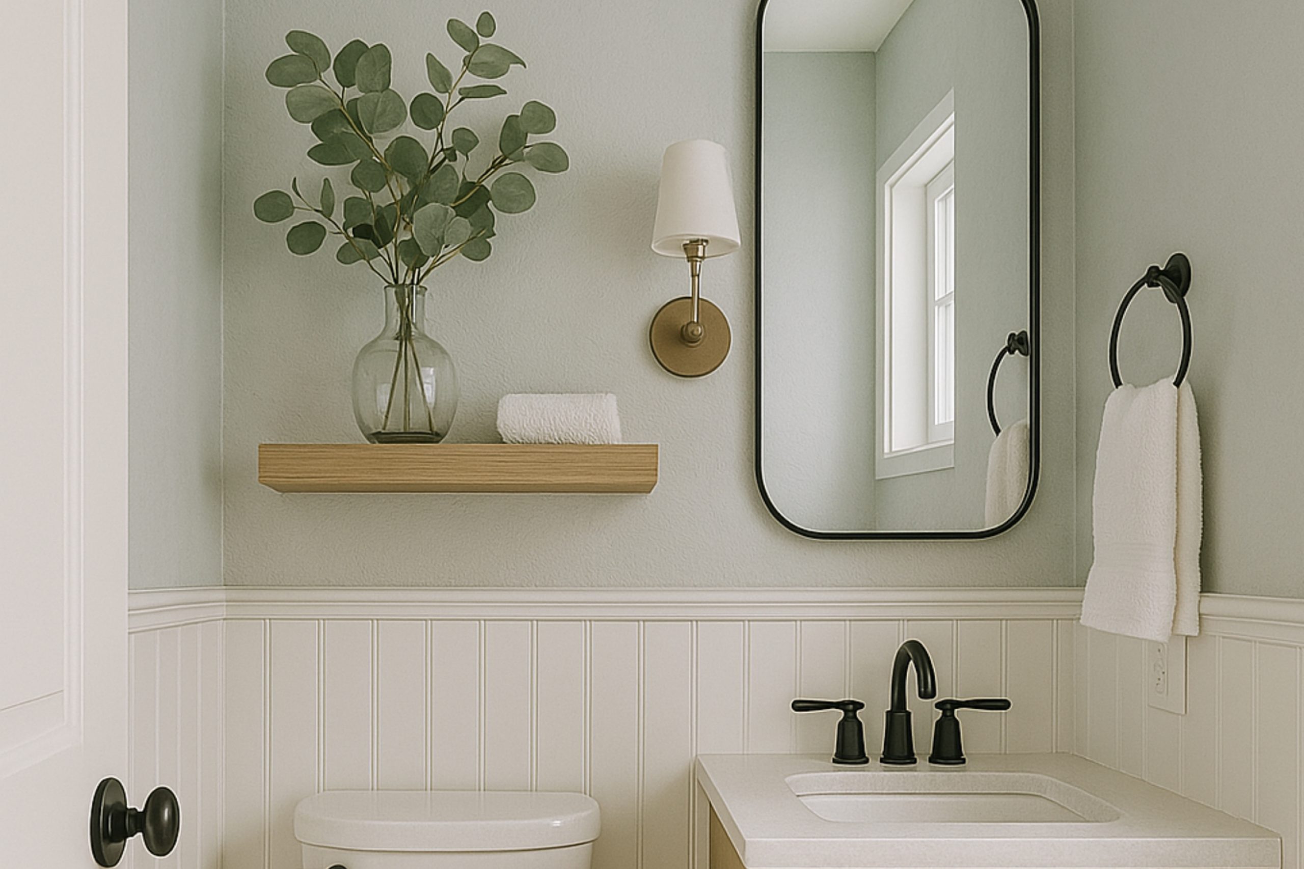
What Actually Works in Small Bathrooms
Table of Contents
When I’m working with small bathrooms, I always say this: don’t fight the size — work with it. Paint can make a room feel lighter, taller, wider, or just more peaceful. But it has to be the right kind of color.
Here’s what I always keep in mind:
1. Lighter Colors Help Walls “Disappear”
Dark colors can be beautiful, but in a small bathroom, they often make the room feel smaller than it is. Lighter shades reflect more light, so walls seem to fall back — not close in. Think soft whites, light grays, muted greens, or even gentle blushes. These colors don’t overwhelm the eye. They feel easy. Natural.
According to a study by Zillow, homes with light blue or soft gray bathrooms sold for more money on average — about $2,786 more. That’s not just about style — that’s about feeling.
2. Lighting Changes Everything
This is one of the biggest things homeowners forget: paint looks different in different light.
- If you have no window, you’ll need a paint color that looks good in artificial light — not too gray, not too dull.
- If you have morning light, cooler tones like soft greens and blues feel calm.
- If you have afternoon light, whites with a warm base won’t feel too bright or stark.
Tip from me: Always test samples at different times of day. A color that looks lovely in the store might feel cold and flat at home under a ceiling light.
3. Warm vs Cool — It’s About Balance
Cool tones (like seafoam, pale blue, soft gray) can make a bathroom feel fresh and clean. Warm tones (like creamy whites, soft peach, dusty pink) bring in comfort and softness.
In very small bathrooms, I usually go for cool tones if the space feels stuffy, and warm tones if it feels sterile. Sometimes a white with a beige or peach undertone changes everything.
4. Finish Matters
Even though this article is about color, I have to say this: the paint finish can change the whole look. In bathrooms, you want a finish that’s easy to clean — usually eggshell, satin, or semi-gloss.
- Flat or matte: Looks beautiful, but not ideal in a humid bathroom.
- Satin: My personal go-to — smooth, has a soft glow, and it’s wipeable.
- Semi-gloss: More reflective, great for trim or if the bathroom has no light at all.
Now that you know what I look for when choosing paint, we can move on to the colors themselves.
Top Picks from Sherwin-Williams
Whites & Soft Neutrals — Clean, Gentle, and Bright
These are the shades I go for when I want a bathroom to feel open, airy, and fresh. They work with almost any tile or fixture, which makes them super safe but never boring.
1. Alabaster SW 7008
This one has a soft warmth that doesn’t feel yellow or gray. It’s my go-to when I want white but not hospital white. It was even named Color of the Year by Sherwin-Williams back in 2016, and it still holds up today.
“Alabaster provides an oasis of calmness, spirituality, and simplicity,” — Jackie Jordan, Sherwin-Williams Director of Color Marketing
2. Snowbound SW 7004
Cooler than Alabaster, but still soft. If your bathroom gets bright sunlight, this will look clean without turning icy.
3. Pure White SW 7005
A very true, simple white. It’s not too warm or cool. I like using it with white tiles or chrome fixtures — it’s crisp but not too sharp.
4. Spare White SW 6203
Very subtle gray undertone. If your floor tile leans gray, this is a great match. It still feels light but has just enough depth to give character.
5. Shoji White SW 7042
A creamy white with a tiny hint of beige. I use this when a client wants warmth, but still wants the walls to feel light and neutral.
6. Egret White SW 7570
Soft and gray-ish, but with a gentle warm. I’ve used it in windowless bathrooms, and it adds just enough color to feel cozy.
7. Drift of Mist SW 9166
This is what I call a “chameleon” color. Sometimes it looks gray, sometimes greige. It reacts beautifully to different light sources.
via housekeepingbay.com
Fresh Greens & Blues — Calm, Cool, and Relaxing
These work great in small bathrooms because they feel clean, spa-like, and help soften hard surfaces like tile or mirrors.
8. Sea Salt SW 6204
Hands down one of my most-used shades. It’s soft green with a hint of blue. Works perfectly in any size bathroom, but especially lovely in smaller ones.
9. Rainwashed SW 6211
More blue than Sea Salt, but still very soft. It reminds me of gentle watercolors. Great with white trim and marble countertops.
10. Opaline SW 6189
A super soft aqua tone. If your bathroom feels a bit dull, this color can give it life without being loud.
11. Tidewater SW 6477
Cool and beachy. If you want that crisp coastal feel, Tidewater does it. I usually pair it with white towels and light wood.
12. Lullaby SW 9136
A soft baby blue, but not childish. I’ve used this in guest bathrooms and small powder rooms to make them feel friendly and fresh.
13. Silver Strand SW 7057
Light gray with a blue-green tint. This one adds elegance without trying too hard. I like it with brushed nickel finishes.
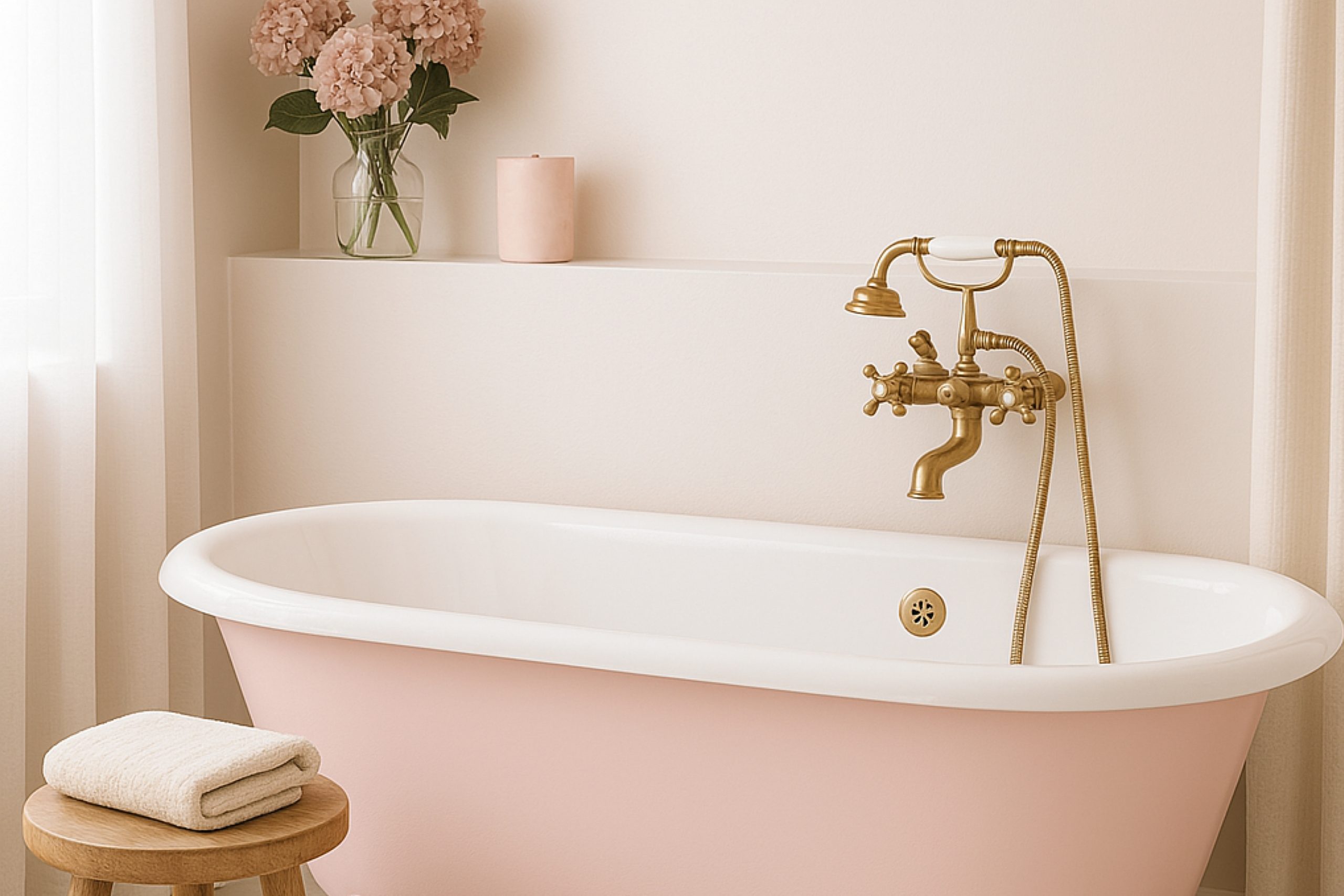
Soft Pinks & Purples — Warm, Cozy, and a Little Romantic
These might sound bold, but the right pink or blush can warm up a cold bathroom and make it feel more inviting.
via housekeepingbay.com
14. White Dogwood SW 6315
A gentle pink with just enough white mixed in. It’s not sugary or too cute — just soft and beautiful.
15. Demure SW 6295
Very pale lavender. I used it once in a vintage-style bathroom with gold fixtures, and it turned out stunning.
16. Misty SW 6232
A cool gray with a blue base. One of my top choices for clients who want color but nothing too “out there.”
17. Fleur de Sel SW 7666
Almost white, but with a tiny green-gray touch. If white feels boring, but color feels scary, this one is your safe zone.
18. Romance SW 6323
Soft and rosy — but muted. Beautiful in a bathroom with warmer lighting or brass hardware.
Top Picks from Benjamin Moore
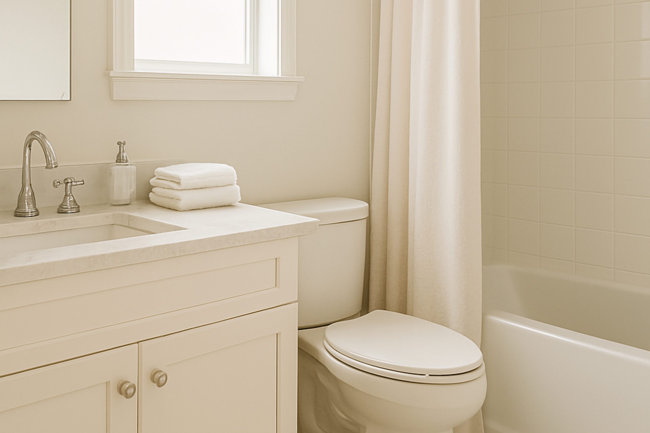
Soft Whites — Clean Without Feeling Cold
These whites aren’t sterile. They have a soft base that makes them feel warm, gentle, and polished — perfect for small bathrooms where you want light but not starkness.
19. Chantilly Lace OC-65
One of the purest whites out there. Crisp, clean, and modern — but still feels soft enough for a bathroom. I’ve used this in bathrooms with black and brass fixtures for a classic high-contrast look.
20. Simply White OC-117
A soft, sunny white with a hint of warmth. This was Benjamin Moore’s Color of the Year in 2016 and it’s still one of my favorites. If your bathroom has beige or wood accents, this white will tie everything together.
21. Cloud White OC-130
Creamier than Chantilly Lace. It brings warmth without turning yellow. I often choose this when a space feels too cold or shadowy.
20. White Dove OC-17
This is the white I recommend most often. It works with everything — tile, wood, stone — and it never feels too stark. It’s slightly warmer than Cloud White, and one of the most popular whites among designers.
“White Dove is a go-to for its softness and flexibility,” – Shea McGee
23. Soft Chamois OC-13
A warm white with a whisper of cream. It’s very calming and pairs beautifully with soft pinks or natural woods.
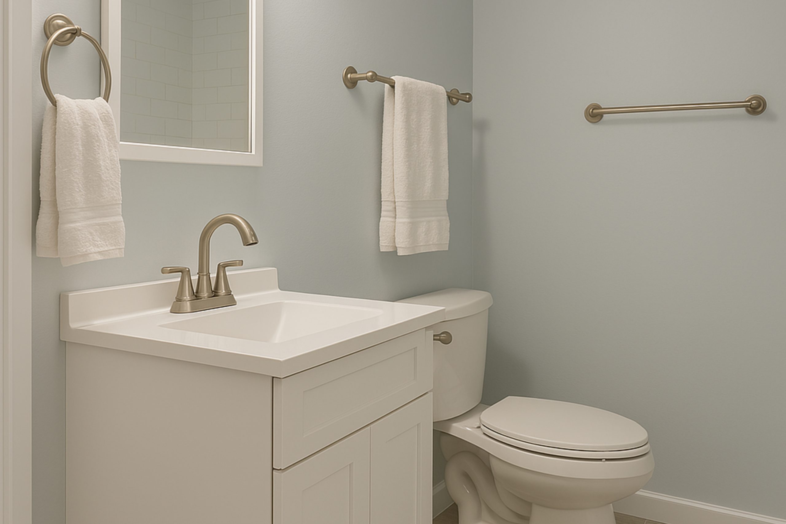
Grays & Light Blue-Grays — Cool, Clean, and Timeless
These colors are ideal when you want a little more definition than white, but still want a light and open feel.
via housekeepingbay.com
24. Calm OC-22
This one does exactly what it says — it calms the room down. It’s a soft greige that reads gray in daylight and warm in the evening.
25. Gray Owl OC-52
A very popular cool gray. I use it when I want a fresh, clean look that’s not too blue. It works well with both silver and black hardware.
26. Paper White OC-55
Not quite white, not quite gray. This one is perfect if you want something light but with a touch more presence than a plain white.
27. Moonshine OC-56
A light gray with a green undertone. It’s great in bathrooms that get lots of natural light, because it balances out the brightness.
Watery Colors — Soft and Breezy
These are for you if you want your bathroom to feel relaxing, beachy, or like a morning breeze. They work especially well in tight spaces where you want to add color without darkening the room.
28. Sea Foam 2123-60
Very light green-blue, almost pastel. It makes a small bathroom feel gentle and refreshing. I like it with light oak or rattan accents.
29. Palladian Blue HC-144
This color has a huge fan base — and for good reason. It shifts between blue and green depending on the light. It feels peaceful without being too pale.
30. Beach Glass 1564
A cooler, moodier green-blue. A little more grown-up than Sea Foam, but still soft enough for small rooms.
A Gentle Accent — Still Light, But With a Bit More Mood
31. Proposal AF-260
A soft blush-lavender tone that adds warmth and charm. I love this for a powder room or a feminine guest bath — especially paired with gold accents and warm lighting.
That wraps up the full list of 31 paint colors from Sherwin-Williams and Benjamin Moore. These are the ones I’ve seen again and again — in real homes, with real clients — and they never disappoint.
How I Pick the Right Color for Each Bathroom
Paint can look completely different once it’s up on the wall. I never choose a color just from the chip. Never. Here’s the step-by-step method I use in my own work, and what I recommend for anyone picking paint — especially in a small space.
via housekeepingbay.com
1. Always Use Real Samples on the Wall
Tape doesn’t tell the truth. And screens lie. I always buy small paint samples and brush them right on the wall — in at least two spots. Usually:
One near the mirror or vanity light
One on the wall across from the door or window
Why?
Because colors change depending on the light, angles, and even what’s around them (like tile or a shower curtain). What looks gray in the can might read blue next to your floor.
🛑 Tip: Don’t test samples side by side. That tricks your eyes. Leave a little space between them so you’re not comparing — just looking.
2. Watch How It Looks at Different Times of Day
This is huge. A color can feel perfect in the morning and totally off in the evening. I always tell clients to live with samples for at least two days and check them:
- Morning (natural light)
- Afternoon (warmer sun or shadows)
- Night (with bathroom lights on)
You’ll notice some shades go darker or more yellow at night. That might be okay — or not — depending on the feeling you want.
3. Match the Color to What’s Already in the Room
Paint is easy to change — tile and flooring, not so much. That’s why I start by looking at what’s already in the room:
- Cool marble or gray tile? Go for cooler tones (like Gray Owl, Sea Salt, Paper White).
- Beige or tan floors? Stick to warmer whites (like Alabaster or White Dove).
- Modern finishes (chrome, black)? Cleaner whites and pale grays work best.
- Brass or gold finishes? I like creamy whites or soft blush tones.
4. Think About the Feeling You Want
This is always a personal question I ask: “What do you want to feel when you walk in?”
- Want it to feel clean and open? → Whites like Chantilly Lace or Pure White.
- Want it to feel relaxing? → Greens and blues like Sea Salt or Palladian Blue.
- Want it to feel warm and cozy? → Blush tones like Romance or Soft Chamois.
You don’t need to follow trends. You need to follow what makes you feel good — especially in a space you use every single day.
5. Use the Right Finish for the Paint
I said this earlier, but I’ll say it again: Finish matters. Bathrooms deal with humidity, steam, and splashes.
- Satin – My #1 choice. Easy to clean, not shiny.
- Eggshell – A little flatter than satin, still holds up okay in powder rooms.
- Semi-gloss – Best for trim or if there’s zero natural light (adds brightness).
- Flat/Matte – I avoid this in bathrooms. It shows every water mark.
Now that you know how I pick and test colors, I’ll wrap things up with the most common questions people ask me — and my personal top 5 favorites for 2025.
My Favorite Picks for 2025
After years of working in bathrooms of every shape and size, I’ve learned which colors are beautiful and reliable. Some paints look great in photos but fall flat in real life. These ones never do. They’re the shades I trust most — and the ones I’ll be reaching for all through 2025.
My Top 5 Small Bathroom Colors This Year
1. Sea Salt SW 6204 – Sherwin-Williams
If I could only use one color for the rest of the year, this would be it. It has the perfect balance of soft green and blue, and it always makes the bathroom feel peaceful but fresh. Works great with white, gray, or wood.
2. White Dove OC-17 – Benjamin Moore
My no-fail white. It’s soft, not stark. Warm, not yellow. It fits with modern, traditional, or rustic bathrooms — and it makes everything around it look better.
3. Gray Owl OC-52 – Benjamin Moore
A light, cool gray that feels clean and modern. If your bathroom has marble, silver finishes, or cooler tile, this is a match made in heaven.
4. Alabaster SW 7008 – Sherwin-Williams
I call this one the “gentle white.” It adds just enough warmth to make a small bathroom feel calm and cozy, especially if there’s not much natural light.
5. Beach Glass 1564 – Benjamin Moore
For clients who want color but not boldness, this muted green-blue is magic. It’s elegant, calming, and plays well with both silver and brass hardware.
Final Thought
Choosing paint for a small bathroom isn’t just about trends — it’s about feeling. You want to walk in and feel good. Comfortable. Relaxed. Whether that’s a fresh white, a calming green, or a soft blush, the right color makes even the tiniest bathroom feel like a place you want to be in.
So don’t rush it. Test the samples, pay attention to the light, and trust what feels right — not just what looks nice in a photo. Your bathroom deserves a color that works for you.
And if you’re still stuck, go with Sea Salt. I haven’t met a bathroom it didn’t love.
via housekeepingbay.com
