Proposal AF-260 by Benjamin Moore
Vibrant Hues Redefine Artistry
Choosing the right paint color can significantly change the feel of your space. If you’re considering an option that offers both elegance and sophistication, the AF-260 Proposal by Benjamin Moore might be what you need. This shade strikes a balance between a warm, inviting atmosphere and a modern, chic look.
Whether you’re updating a single room or planning a whole-home refresh, this color brings a fresh vibe that suits different styles and moods.
Imagine your living room walls adorned with this beautiful shade—it can create a cozy yet stylish ambiance perfect for relaxing or entertaining guests. Or picture it in your bedroom, offering a soothing retreat after a long day. AF-260 Proposal fits well in various settings, providing flexibility in design choices.
Its understated charm could complement both traditional furnishings and modern accents.
Choosing AF-260 Proposal means opting for a timeless shade that adapts to your changing tastes over the years. Its subtle undertone adds depth without overpowering, making it an excellent choice for those who appreciate understated elegance. Let this color bring new life into your surroundings, enhancing the way you experience your home.
via benjaminmoore.com
What Color Is Proposal AF-260 by Benjamin Moore?
Proposal AF-260 by Benjamin Moore is a gentle and refined shade of taupe that exudes warmth and sophistication. This color sits comfortably between a soft brown and a muted gray, offering a versatile option for various interiors. Its understated elegance makes it an ideal choice for those seeking a timeless and calming atmosphere in their living spaces.
Proposal AF-260 works beautifully in traditional, contemporary, or transitional interior styles. In a traditional setting, it can complement classic furniture pieces and inherited antiques. Within a contemporary space, it provides a neutral backdrop that pairs well with sleek lines and modern décor.
When considering materials and textures, Proposal AF-260 harmonizes well with natural elements such as wood and stone. Wooden floors or furniture in lighter shades enhance its warmth, while stone accents add an earthy touch. Soft textiles like linen or cotton blend seamlessly, offering comfort and inviting coziness. Metallic accents in bronze or brushed nickel can add depth and interest without overwhelming the subtlety of this color.
In a bedroom, living room, or hallway, Proposal AF-260 offers a subtle and soothing tone. It allows personal belongings and decorative items to stand out, creating a balanced and inviting environment perfect for relaxation and comfort.
housekeepingbay.com
Is Proposal AF-260 by Benjamin Moore Warm or Cool color?
Proposal AF-260 by Benjamin Moore is a rich, warm neutral paint color that brings a cozy and comforting vibe to spaces within a home. Its subtle blend of taupe and gray tones provides a versatile backdrop that complements various styles, from modern to traditional decor.
In living rooms, Proposal AF-260 creates a welcoming atmosphere, making it an ideal choice for gathering areas. Its muted elegance allows furniture, artwork, and accessories to stand out without overwhelming the space.
In bedrooms, this color promotes relaxation and restfulness, providing a serene setting for winding down after a long day.
Kitchen walls painted in this shade achieve a balanced look, pairing well with natural wood cabinets or sleek metallic finishes. Its adaptability helps tie together different elements in open-concept spaces, ensuring a cohesive look.
Overall, Proposal AF-260 enhances any home design, offering a timeless and enduring quality that harmonizes with a wide range of colors and materials.
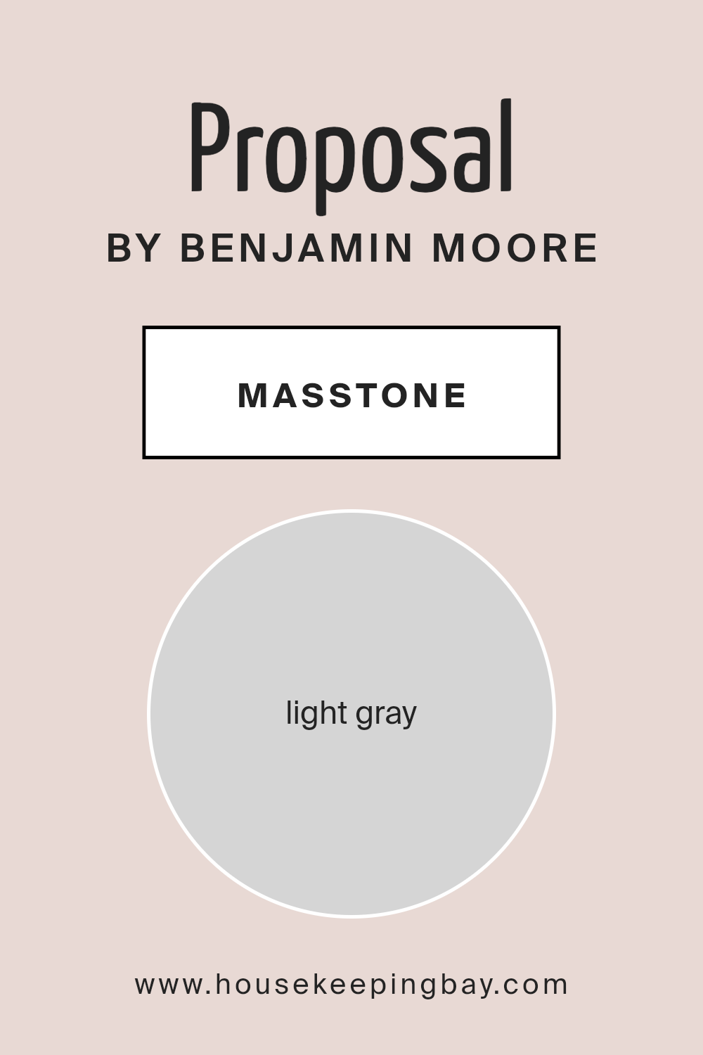
What is the Masstone of the Proposal AF-260 by Benjamin Moore?
ProposalAF-260 by Benjamin Moore is a light gray color, and its masstone is a soft shade of gray with the hex code #D5D5D5. This color offers a versatile option for homes due to its neutral yet sophisticated appearance. Light gray works well in various spaces because it reflects light softly, making rooms feel airy and spacious.
When used on walls, it creates a calm and peaceful atmosphere, ideal for living rooms, bedrooms, and even kitchens. The subtle nature of light gray allows it to pair effortlessly with other colors, whether they are bold, bright, or muted.
It acts as a perfect backdrop that highlights furniture, artwork, and decor without overshadowing them.
Additionally, this color complements both modern and traditional styles, giving homeowners the flexibility to refresh their spaces without major changes. Overall, the light gray of ProposalAF-260 offers a timeless and elegant solution that suits a wide range of design preferences.
housekeepingbay.com
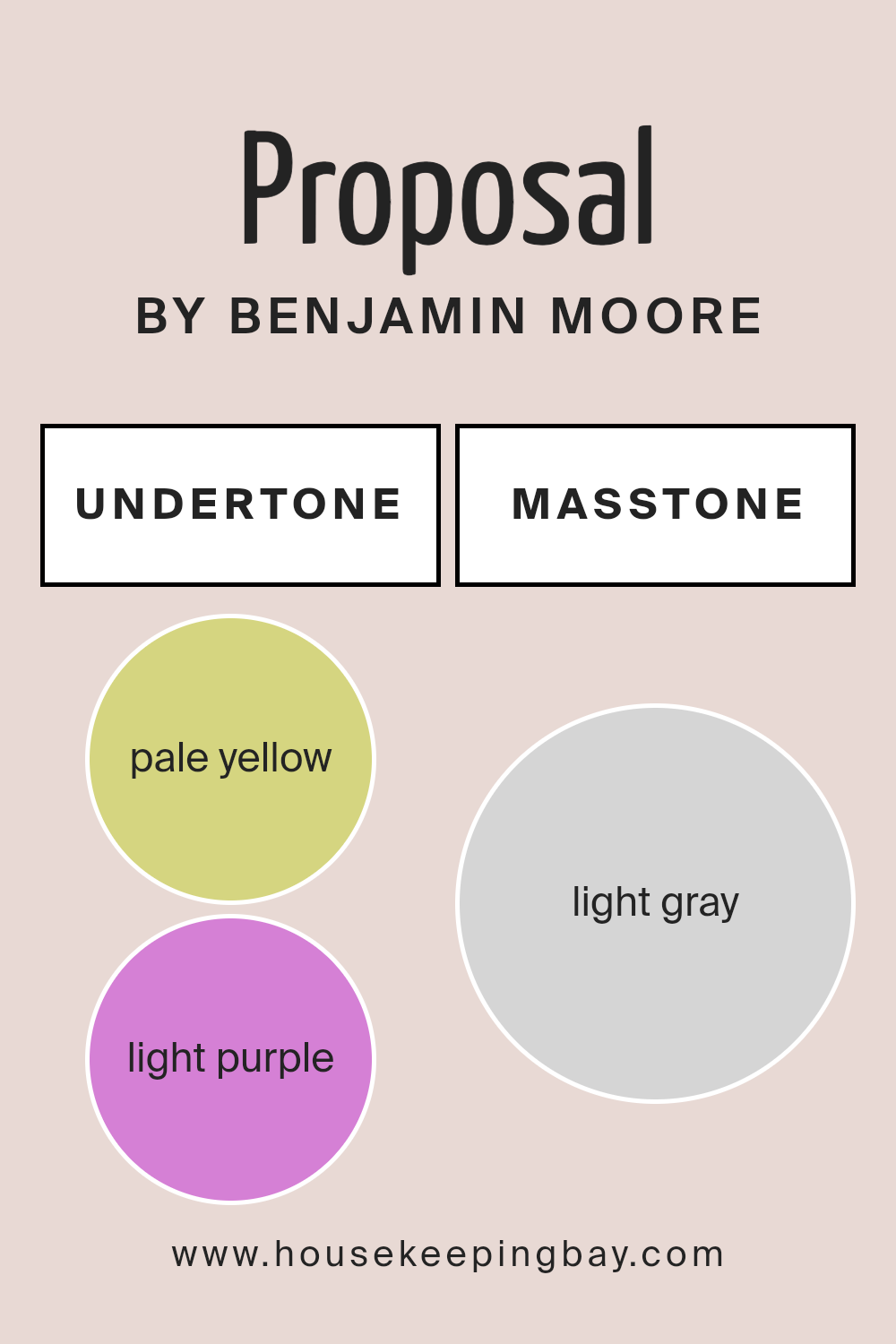
Undertones of Proposal AF-260 by Benjamin Moore
Proposal AF-260 by Benjamin Moore is a unique color that contains a mix of subtle undertones, influencing how we perceive it. The visible effect of these undertones shifts depending on light conditions and surrounding colors.
Undertones refer to the subtle hints of color found beneath the main color. They are not always obvious at first glance but can significantly affect how a color looks in different settings.
For Proposal AF-260, the deliberate combination of pale yellow, light purple, light blue, pale pink, mint, lilac, and grey undertones creates a dynamic and mutable appearance.
On interior walls, these undertones can change with different lighting. In bright natural light, pale yellow and mint might appear more prominently, giving the space a warm, fresh feel. In dim or artificial lighting, the grey or lilac undertones might come forward, offering a more muted, calming vibe.
Rooms with lots of natural light will highlight cooler undertones, while shadows may reveal warmer hues, changing the space’s mood.
Thus, Proposal AF-260 is quite versatile. The shifting undertones provide an adaptable backdrop for various decor styles, from modern to traditional. Choosing this color can result in a fluid and lively ambiance, as its tones interact with furniture, decor, and lighting within a room.
housekeepingbay.com
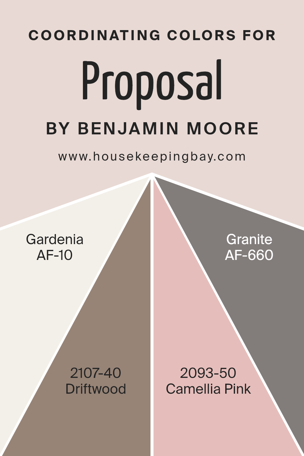
Coordinating Colors of Proposal AF-260 by Benjamin Moore
Coordinating colors are hues that complement each other and create a cohesive look when used together in a space. They work by balancing and enhancing one another, leading to a visually appealing design. For instance, Proposal AF-260 by Benjamin Moore can be beautifully paired with a selection of coordinating shades to enhance its presence.
Gardenia AF-10 is a soft, creamy white that offers a gentle and inviting backdrop, perfect for a refreshing and airy ambiance. It provides a neutral canvas that works harmoniously with other tones.
Driftwood 2107-40 is a warm, earthy brown with subtle gray undertones, bringing a sense of stability and warmth to any setting. It pairs well with both lighter and bolder colors, adding depth without overwhelming the space.
On the other hand, Camellia Pink 2093-50 introduces a playful and lively atmosphere with its warm, rosy hue—a great choice for adding a touch of color that feels welcoming and cheerful.
Lastly, Granite AF-660 is a deep, sophisticated gray, creating an elegant and modern look while effortlessly anchoring lighter or more vibrant hues.
Together, these coordinating colors create a harmonious and versatile palette, suitable for a variety of design preferences.
You can see recommended paint colors below:
- AF-10 Gardenia
- 2107-40 Driftwood
- 2093-50 Camellia Pink
- AF-660 Granite
housekeepingbay.com
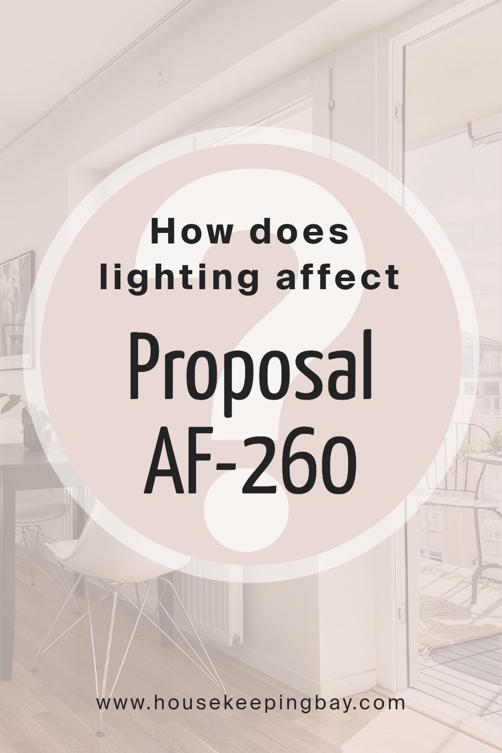
How Does Lighting Affect Proposal AF-260 by Benjamin Moore?
Lighting plays a crucial role in how we perceive colors. Natural and artificial lights have different effects on how colors appear. For example, natural light changes throughout the day, affecting the color’s appearance.
Benjamin Moore’s color Proposal AF-260 is an intriguing color choice, offering unique characteristics under varying lighting conditions. In natural light, especially daylight, colors appear closer to their true shade.
Artificial light, on the other hand, can affect how colors are perceived, often adding warmth or coolness.
In north-facing rooms, light tends to be cooler and more diffused. Colors like Proposal AF-260 can appear more muted, with a slight grayish undertone. This is because the indirect light limits warmth, causing colors to appear more subdued.
North-facing rooms provide a calm and constant light throughout the day, which is great for creating a relaxing atmosphere.
South-facing rooms receive a lot of direct sunlight, especially during midday. The intense, warm light can make Proposal AF-260 appear much brighter and warmer. This can enhance the richness of colors, making this shade feel more vibrant. In the evening, south-facing rooms maintain a warm glow, adding a cozy element to the space.
East-facing rooms receive warm, direct sunlight in the morning, then cooler light in the afternoon. In the morning, Proposal AF-260 may appear brighter and more vivid, while later in the day, it might take on softer tones as the natural light recedes.
This variation creates an interesting dynamic, as the room changes character throughout the day.
West-facing rooms get direct sunlight in the late afternoon and evening. In these rooms, Proposal AF-260 remains cooler in the morning and warms up as the day goes on. The color can become quite rich and full in the late afternoon sun, providing a warm and inviting atmosphere as the day ends.
In conclusion, the lighting in a room significantly impacts how Proposal AF-260 looks. Each orientation offers a different interaction, revealing diverse aspects of this versatile color.
housekeepingbay.com
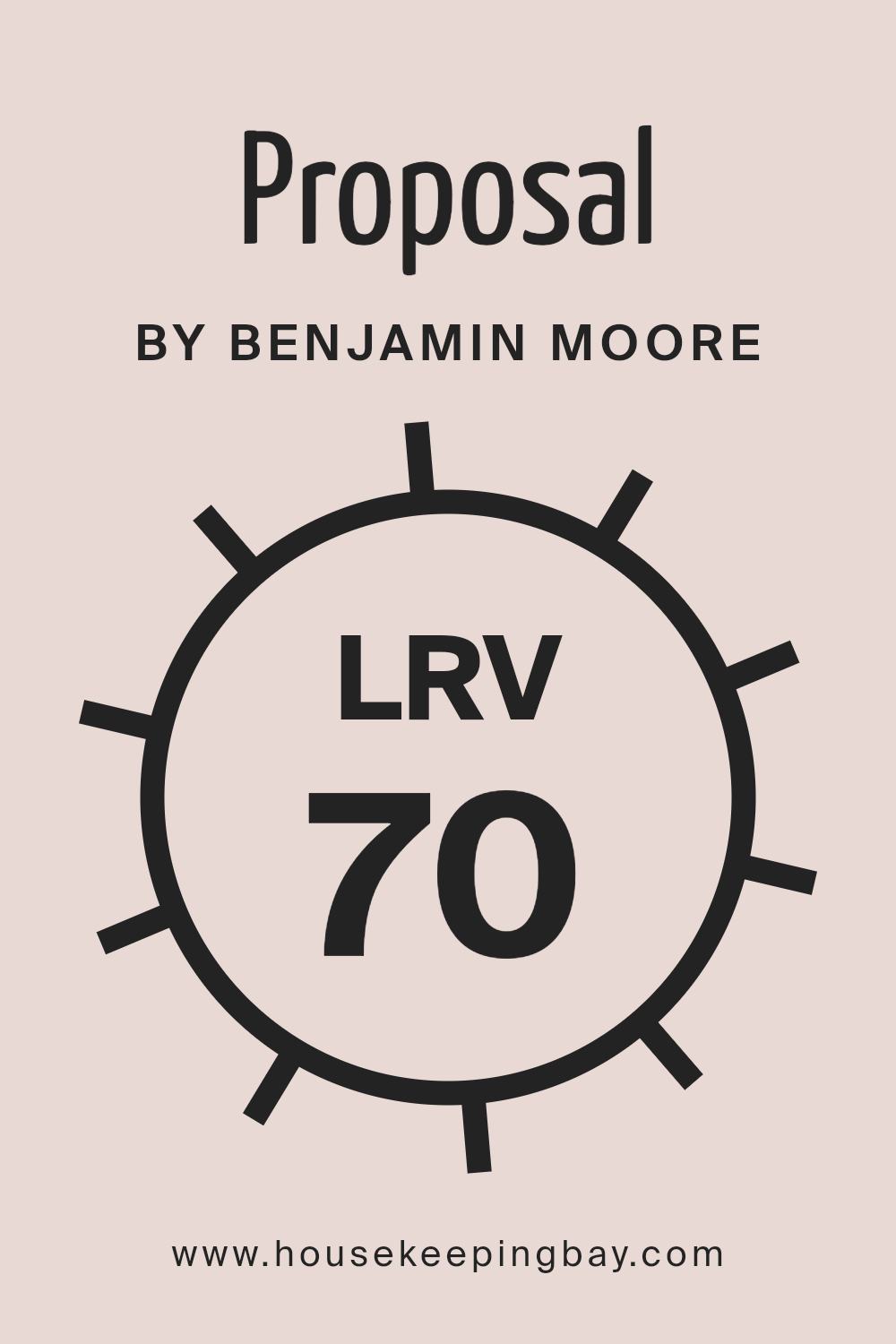
What is the LRV of Proposal AF-260 by Benjamin Moore?
LRV stands for Light Reflectance Value, which shows how much light a color reflects or absorbs. It is measured on a scale from 0 to 100, where 0 means the color absorbs all light (like deep black) and 100 means it reflects all light (like pure white). The higher the LRV, the more light the color reflects.
A high LRV can make a room appear brighter and more spacious because it bounces light around the space. Conversely, a low LRV can make a room feel cozier and more intimate but also dimmer because it absorbs more light.
Proposal AF-260 by Benjamin Moore has an LRV of 70.47, indicating it reflects a good amount of light. This means the color will brighten up spaces, making them feel more open. Because it reflects light so well, this shade can make rooms look light-filled and airy. It is an ideal choice for spaces where you want to maximize brightness without using a pure white.
The LRV of 70.47 also means it maintains a warm atmosphere while ensuring the room doesn’t feel too stark. This balance makes it versatile for both large and small rooms, as it can enhance natural and artificial lighting effectively.
housekeepingbay.com
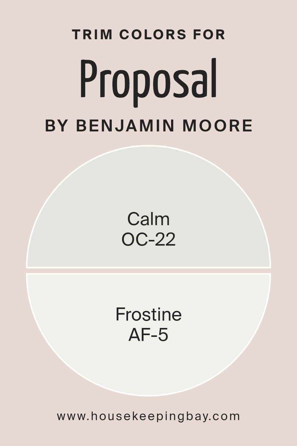
What are the Trim colors of Proposal AF-260 by Benjamin Moore?
Trim colors refer to the paint colors used for the edges and borders in a room, such as baseboards, moldings, and window or door frames. These colors can influence the overall look of a space by highlighting or framing the walls and adding contrast or harmony.
For the ProposalAF-260 by Benjamin Moore, choosing the right trim colors is crucial as they set the tone of the environment and enhance the primary wall colors used in the design plan.
The trim colors Calm (OC-22) and Frostine (AF-5) can bring both cohesion and distinction to this proposal, affecting its aesthetic appeal and functional balance.
Calm (OC-22) is a soft and gentle beige with a warm undertone that can create a welcoming and comforting atmosphere. It works well as a trim color because it subtly defines spaces without overpowering. Frostine (AF-5), on the other hand, is a crisp, cool white with a slightly bluish tint, offering a fresh and clean look.
Using Frostine as a trim color can provide a striking contrast to more saturated wall colors, enhancing architectural details and adding a modern touch.
Both colors together can play beautifully in a space, offering a delicate yet noticeable distinction, while contributing to an overall cohesive design by balancing warmth and coolness.
You can see recommended paint colors below:
- OC-22 Calm
- AF-5 Frostine
housekeepingbay.com
Colors Similar to Proposal AF-260 by Benjamin Moore
Using similar colors has a special impact in design and decor, creating harmony and bringing a cohesive feel to a space. When colors like Benjamin Moore’s Proposal AF-260 are used alongside similar shades, they weave an environment that feels seamless and connected.
The shade 2104-70, known as Strawberry Yogurt, offers a soft, muted pink that is gentle and comforting. It creates a calm atmosphere, perfect for spaces where a sense of ease is desired.
Colors akin to Strawberry Yogurt can enhance the design by adding layers of depth. These similar hues introduce subtle variations that complement without clashing. Imagine a palette where each color echoes a gentle whisper of the last, forming an inviting and relaxing ambiance.
These similarities in tone mean that when they are paired together, the result is a smooth and continual flow throughout the room. The beauty of using such a palette lies in its ability to soothe and please the eye, offering a sensation of unity and completeness.
Whether for a living room that invites warmth or a bedroom that cradles restfulness, similar colors work in harmony to shape a beautifully unified space.
You can see recommended paint color below:
- 2104-70 Strawberry Yogurt
housekeepingbay.com
How to Use Proposal AF-260 by Benjamin Moore In Your Home?
Proposal AF-260 by Benjamin Moore is a versatile paint color that can easily fit into various home settings. With its warm, neutral tone, this shade offers a welcoming and soothing atmosphere. Use it in living rooms to create a cozy and comfortable space where family and friends can gather. It’s also an excellent choice for bedrooms, providing a calming backdrop that promotes relaxation and restful sleep.
For those looking to refresh kitchens or dining areas, Proposal AF-260 lends a timeless look that pairs well with a variety of cabinet and countertop styles. In home offices or study spaces, this color can foster focus and concentration, thanks to its subtle, unobtrusive hue.
The beauty of Proposal AF-260 lies in its ability to adapt to different lighting conditions, appearing slightly different throughout the day. This gives each room a unique feel without the need for a bold color commitment.
Proposal AF-260 by Benjamin Moore vs Strawberry Yogurt 2104-70 by Benjamin Moore
Proposal AF-260 by Benjamin Moore is a soft, muted gray with a touch of warmth, creating a calming and versatile feel. This neutral shade works well in various settings, bringing a sense of sophistication and balance. It pairs beautifully with both bright and muted accents, enhancing the overall look of a room without overpowering it.
Strawberry Yogurt 2104-70 by Benjamin Moore, in contrast, offers a gentle pink hue. This color brings a hint of sweetness and a lighthearted vibe, adding warmth and charm to any space. Ideal for brightening up rooms, Strawberry Yogurt creates a cozy and inviting atmosphere.
While Proposal provides a backdrop that’s understated and adaptable, Strawberry Yogurt injects a bit more personality and softness. Both colors offer unique qualities: Proposal is more grounded and versatile, while Strawberry Yogurt is playful and uplifting. Together, they can create a beautifully balanced and lively environment.
You can see recommended paint color below:
- 2104-70 Strawberry Yogurt
housekeepingbay.com
Conclusion
It’s neither too bold nor too subdued, making it versatile for different spaces. Its neutral undertone complements a range of design styles, whether modern or traditional.
The AF-260 can create a cozy and inviting atmosphere, perfect for both living spaces and work environments. I appreciate how it can enhance natural light, adding warmth without feeling overwhelming.
Its adaptability means it pairs well with various accent colors, allowing for personal expression without clashing.
In terms of practical application, the quality of Benjamin Moore’s paint products ensures durability and rich pigment that retains its appearance over time. This makes it an excellent investment for those considering a long-term update to their homes or offices.
Overall, I find the AF-260 Proposal a solid choice for anyone looking to refresh their space with a color that offers both style and comfort. It provides an excellent backdrop for creativity while maintaining an elegant simplicity. I recommend this color for its ability to harmonize and bring out the best in any room or setting.
housekeepingbay.com
Ever wished paint sampling was as easy as sticking a sticker? Guess what? Now it is! Discover Samplize's unique Peel & Stick samples. Get started now and say goodbye to the old messy way!
Get paint samples


