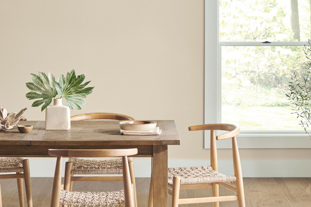
Paper White OC-55 by Benjamin Moore
A Timeless Hue for Modern Spaces
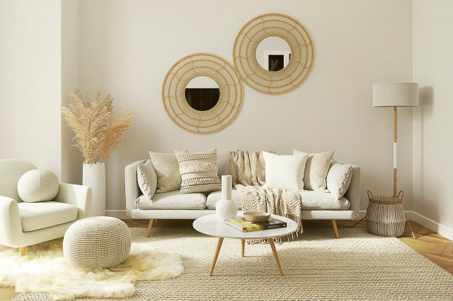
OC-55 Paper White by Benjamin Moore is a versatile paint color that has gained popularity for its unique ability to blend well with a wide range of decor styles. This shade of white isn’t just any ordinary white.
It has a soft, subtle undertone that makes it stand out. Whether you’re looking to freshen up a room, add brightness to a dim space, or create a serene and calming atmosphere, Paper White can help you achieve that goal.
The beauty of OC-55 Paper White lies in its adaptability. It works beautifully in both modern and traditional settings, making it a go-to choice for homeowners and interior designers alike.
This color can brighten up a small space, making it appear more open and airy, or add a touch of elegance to larger rooms.
Its unique shade can complement various furnishings and decor, from bold and contemporary pieces to more subdued, classic styles.
Choosing the right paint color can dramatically change the look and feel of a room. If you’re considering giving your space a makeover, OC-55 Paper White by Benjamin Moore is definitely worth considering.
It’s not just about creating a beautiful space; it’s about creating a vibe that makes you feel at home the moment you step into the room.
via benjaminmoore.com
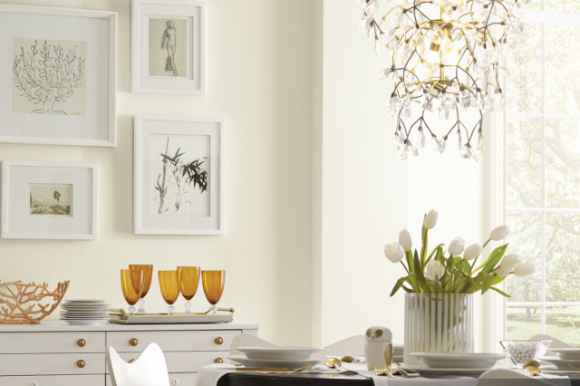
What Color Is Paper White OC-55 by Benjamin Moore?
Paper White OC-55 by Benjamin Moore is a soft, off-white shade that brings a subtle, airy feel to any space it’s used in.
It’s a versatile color that has just the right balance between warm and cool tones, making it easy to pair with various styles and elements in interior decor.
This color leans towards a modern, minimalist look but it’s flexible enough to fit into traditional or even rustic themes, mainly because of its understated elegance.
Paper White works great in interior styles that focus on simplicity and light. It’s perfect for Scandinavian, contemporary, and coastal designs, among others. This color has a way of opening up spaces, making rooms feel larger and more inviting.
It also serves as a fantastic backdrop for artwork and bold accent pieces, as its neutral tone does not compete for attention.
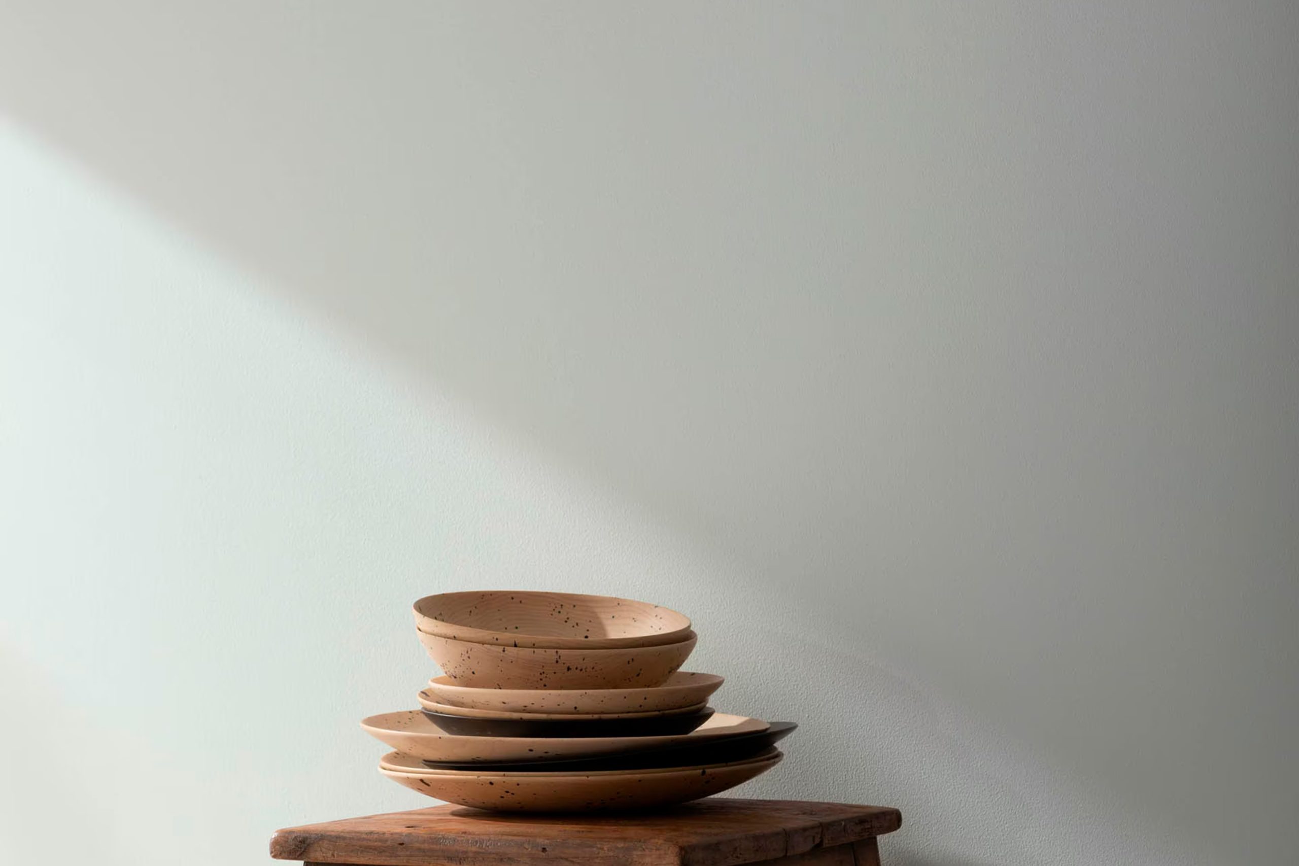
When considering materials and textures to pair with Paper White, think natural wood, metals, and woven fabrics. The contrast between the softness of this color and the texture of wood or the sleekness of metal creates a harmonious balance.
Linen drapes or woolen throws also complement Paper White beautifully, adding layers of texture while keeping the overall feel cosy and welcoming.
This color is an excellent choice for those looking to create a serene, clutter-free space that feels both modern and timeless.
housekeepingbay.com
Table of Contents
Is Paper White OC-55 by Benjamin Moore Warm or Cool color?
Paper WhiteOC-55 by Benjamin Moore is a soft, gentle color that brings a light and airy feel to any room. It’s like the color of fluffy clouds on a sunny day, making spaces feel bigger and more open.
In homes, this color is great for creating a peaceful and calm environment. It works really well in bedrooms and living rooms where comfort is key.
Because Paper WhiteOC-55 is such a neutral shade, it pairs well with almost any other color. This makes it super easy for homeowners to add their own personal touches through furniture and decorations without worrying about clashing colors.
Whether you like bold and bright accents or prefer softer, earthy tones, Paper White acts as the perfect backdrop.
This color also does an excellent job of reflecting natural light. In rooms that get plenty of sunlight, Paper White can help make the space feel even brighter and more welcoming.
In dimmer spaces, it can help in making the area feel less cramped and more inviting. Overall, Paper WhiteOC-55 is a great choice for making homes feel more relaxed, spacious, and personalized.
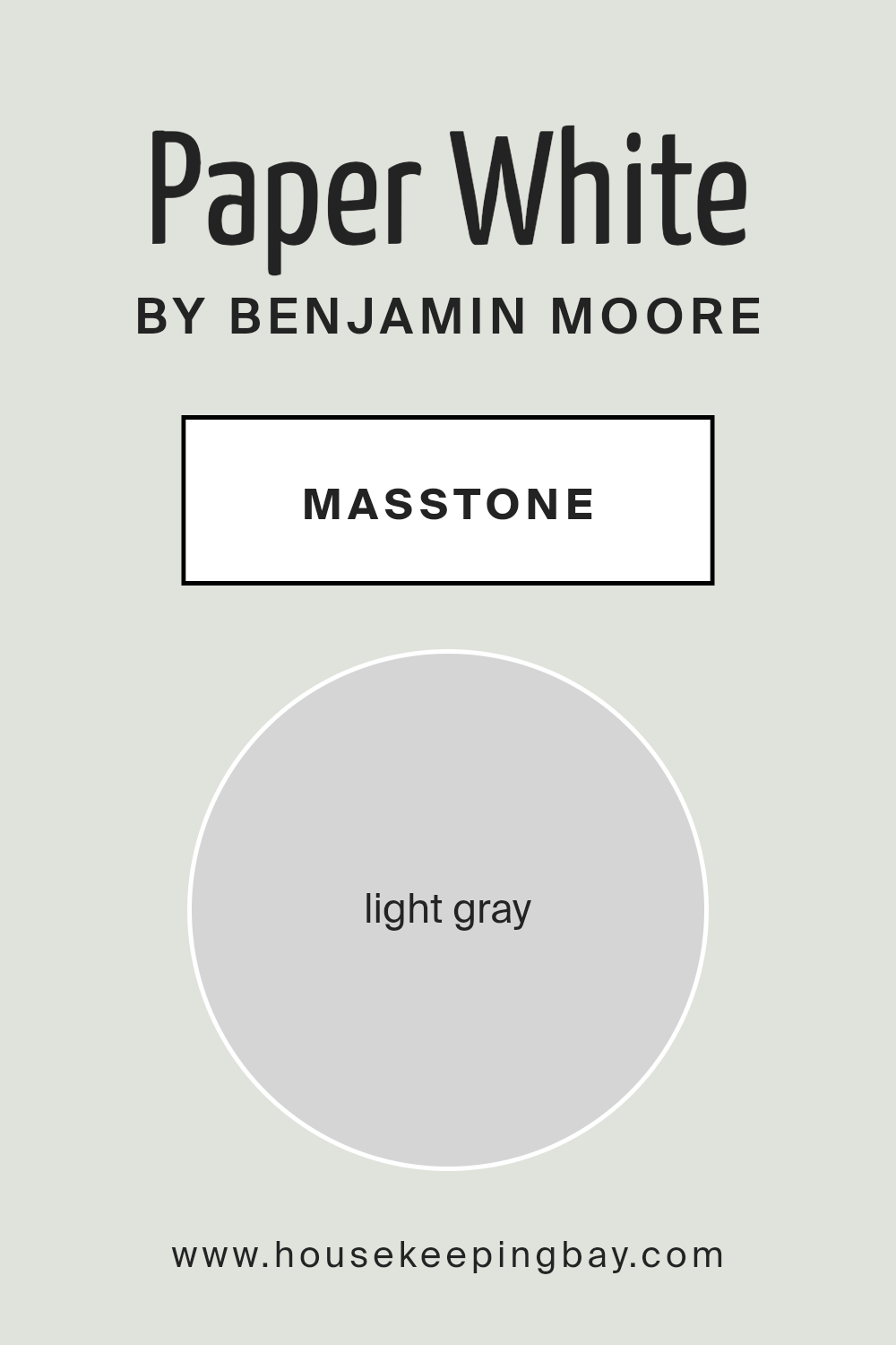
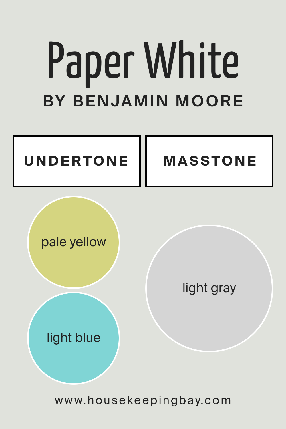
What is the Masstone of the Paper White OC-55 by Benjamin Moore?
Paper White OC-55 by Benjamin Moore has a masstone, or main color, that’s light gray, with the exact shade being #D5D5D5. This soft and gentle gray brings a calm and soothing atmosphere to any room it’s used in.
Since it’s not too dark or too bright, Paper White works wonderfully in homes, making spaces feel larger, airier, and more open.
Its neutrality means it can fit in with almost any style or color scheme, making it a versatile choice for walls, trim, or even cabinets.
Because of its light gray tone, Paper White is great at reflecting natural light, helping to brighten rooms even on cloudy days. This can make your home feel more welcoming and comfortable.
It’s particularly useful in smaller rooms or areas without a lot of natural light, as it can help make these spaces feel less cramped.
Whether you’re updating a cozy corner or giving your entire home a fresh look, Paper White OC-55 offers a simple yet effective way to bring a sense of calm and spaciousness into your living spaces.
housekeepingbay.com
Undertones of Paper White OC-55 by Benjamin Moore
Paper White OC-55 by Benjamin Moore is a popular paint color known for its versatility and beauty. This paint has subtle undertones of pale yellow and light blue, which greatly influence how the color appears in different settings.
Undertones are basically hidden hues that aren’t immediately noticeable but affect the overall perception of the color. They can make a color look cooler or warmer, depending on the lighting and surrounding colors.
The pale yellow undertone in Paper White adds a touch of warmth, making spaces feel cozy and inviting. This warmth can make a room feel more welcoming, especially in natural light where the yellow hues can come forward, giving a soft glow to the walls.
On the other hand, the light blue undertone introduces a hint of coolness, which can make the color appear fresher and more serene.
This cool aspect is particularly noticeable in artificial light or in rooms with less direct sunlight, providing a calming and peaceful ambiance.
When applied to interior walls, the unique combination of these undertones in Paper White OC-55 means the color can change subtly throughout the day.
Morning light might make walls look brighter and slightly warmer, while in the evening, they can shift to a cooler, more tranquil tone.
This dynamic quality makes Paper White OC-55 a fantastic choice for those looking to bring a sophisticated yet adaptable backdrop to their home’s interior.
Understanding these undertones can help in selecting decor and accents that enhance the room’s overall mood, whether you’re aiming for a warm, comforting space or a cool, restful haven.
housekeepingbay.com
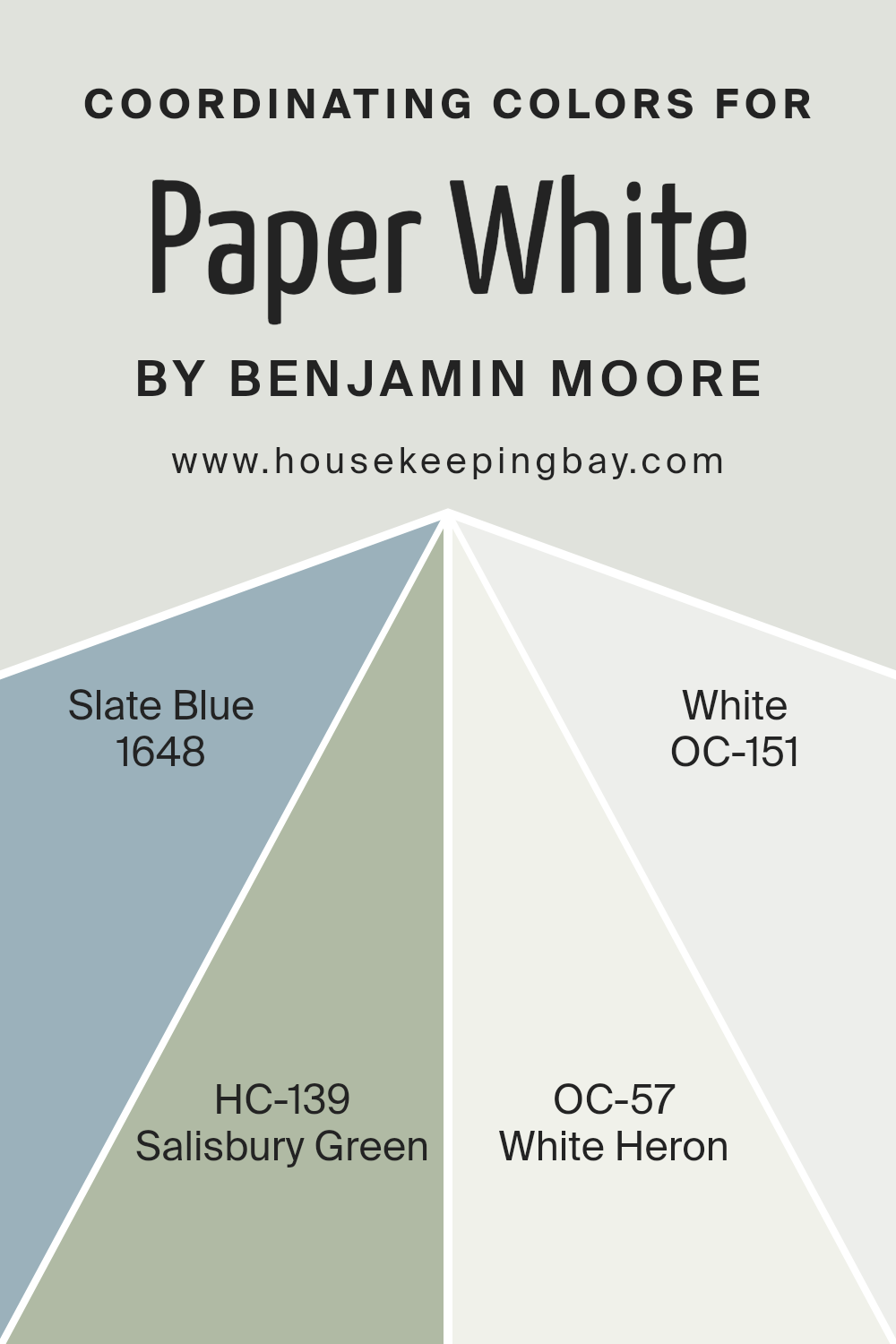
Coordinating Colors of Paper White OC-55 by Benjamin Moore
Coordinating colors are hues that complement each other on the color wheel, promising an aesthetically pleasing palette when paired together. These colors work in harmony, enhancing the overall look and feel of a space without overpowering it.
When selecting coordinating colors for Benjamin Moore’s Paper White OC-55, a delicate and airy hue, it’s crucial to pick shades that accentuate its pristine quality while adding depth and character to the environment.
Slate Blue 1648 offers a gentle nod to the serenity of the sky at dusk, bringing a calm and reflective mood into any space. Its soft undertones seamlessly blend with the neutrality of Paper White OC-55, creating a soothing retreat.
Salisbury Green HC-139, with its earthy and rich tone, introduces a grounded energy, perfect for spaces that aim to balance tranquility with a touch of nature’s vibrancy.
White Heron OC-57, a whisper of light with a hint of warmth, softly mirrors the lightness of Paper White while adding a layer of subtle complexity.
Lastly, White OC-151 acts as a crisp, clean slate, echoing the pure essence of Paper White OC-55. It provides a fresh backdrop, amplifying the room’s brightness and openness.
Together, these coordinating colors form a palette that speaks to comfort and sophistication, allowing Paper White OC-55 to stand out in a harmonious ensemble.
You can see recommended paint colors below:
- 1648 Slate Blue
- HC-139 Salisbury Green
- OC-57 White Heron
- OC-151 White
housekeepingbay.com
How Does Lighting Affect Paper White OC-55 by Benjamin Moore?
Lighting plays a crucial role in how we perceive colors in our environment. The same color can appear differently under various lighting conditions, which is why the impact of lighting should always be considered when choosing paint colors for any space.
Let’s take the color Paper White OC-55 by Benjamin Moore as an example to explore this concept further.
In artificial light, like that from LED bulbs or fluorescent lamps, Paper White OC-55 can take on different hues based on the color temperature of the light.
Under warm lighting, this shade might appear softer and slightly more beige, adding a cozy feel to a room. In cooler, more bluish light, Paper White can look crisper and brighter, making a space feel more refreshing and clean.
In natural light, the appearance of Paper White OC-55 changes throughout the day and depends on the direction the room faces.
In north-faced rooms, which receive less direct sunlight and tend to have a cooler, more even light, Paper White can seem more muted and neutral, providing a calm and serene ambiance.
This makes it an excellent choice for creating a peaceful and timeless look.
In south-faced rooms, where sunlight is abundant and warmer, Paper White can appear brighter and more vibrant.
The abundant light can highlight the color’s clean and fresh undertones, making the space feel lively and inviting, perfect for living areas or kitchens where you want a crisp, uplifting atmosphere.
East-faced rooms get plenty of morning light, which is softer and warmer.
Here, Paper White can help reflect the natural light, creating a soft, welcoming glow in the morning that transitions to a cooler, more balanced look as the day goes on. It’s ideal for bedrooms or breakfast nooks where a gentle start to the day is cherished.
West-faced rooms experience the opposite, with softer light in the morning transitioning to warmer, more intense light in the afternoon and evening.
In these rooms, Paper White can offer a cool balance during the warm light of sunset, making spaces feel more comfortable and less overwhelmed by the intense light.
In conclusion, the impact of lighting on colors like Paper White OC-55 by Benjamin Moore is significant.
Whether under artificial light or natural light, and depending on the room’s orientation, this color can transform and adapt, offering versatile options for any space.
housekeepingbay.com
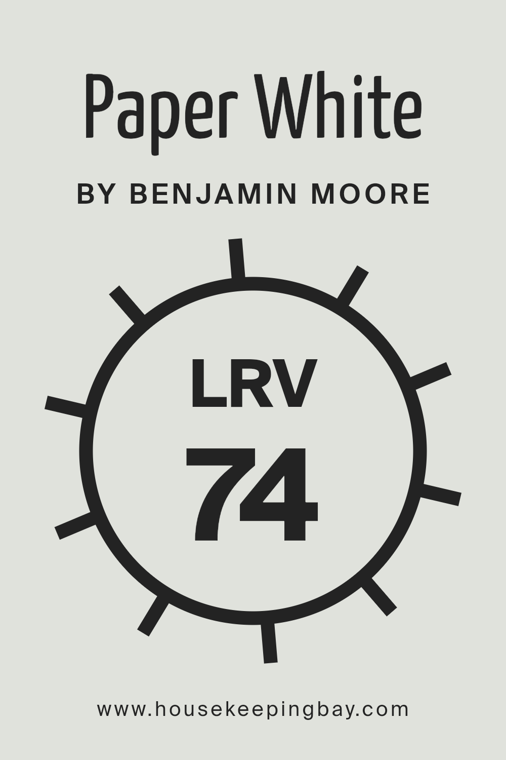
What is the LRV of Paper White OC-55 by Benjamin Moore?
LRV, or Light Reflectance Value, is a scale that helps us understand how light or dark a color will look when it’s painted on a wall. It goes from 0, which is totally black, absorbing all light, to 100, which is pure white, reflecting all light back.
This value is super handy because it tells you how much light a color can bounce back into a room.
So, when you’re choosing paint, knowing the LRV can help you figure out if a room will feel cozy and intimate or bright and airy with the color you’re considering.
For the color Paper White OC-55 by Benjamin Moore, which has an LRV of 74.41, it means this color is on the lighter end of the scale. It’s going to reflect a good amount of light, making spaces feel more open and larger.
In rooms with lots of natural light, Paper White will look vibrant and can enhance the light, airy feel. In spaces with less natural light, it can help make the room appear brighter than it actually is.
This particular LRV value makes Paper White a versatile color, good for creating a fresh, clean look in a variety of spaces.
housekeepingbay.com
What is LRV? Read It Before You Choose Your Ideal Paint Color
What are the Trim colors of Paper White OC-55 by Benjamin Moore?
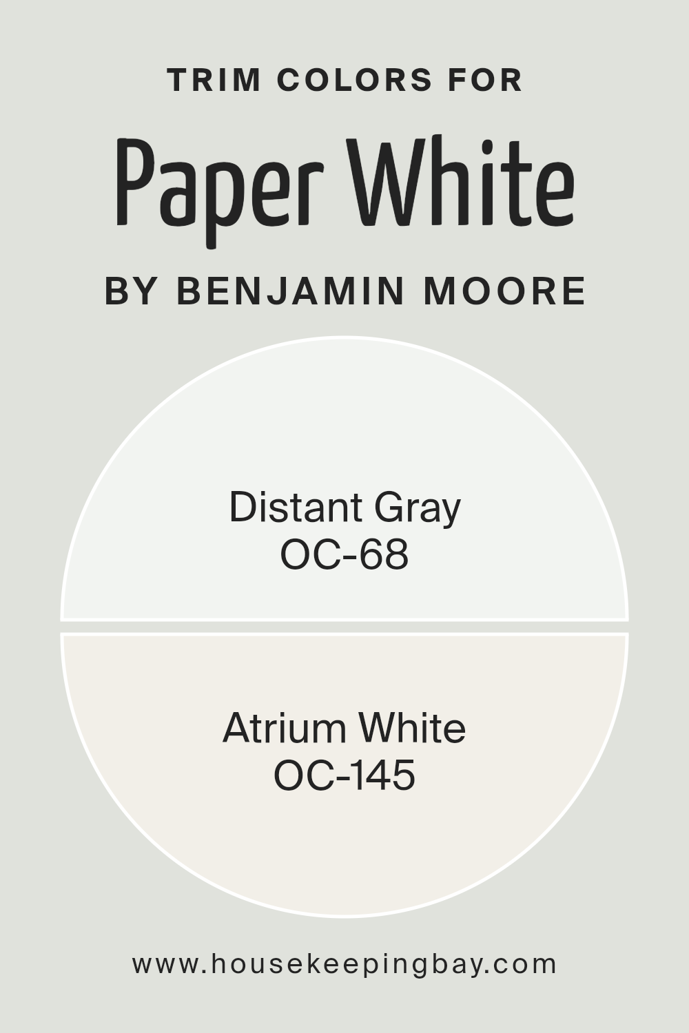
Trim colors are specific shades selected to complement or contrast the main color on a wall, enhancing the overall aesthetic appeal of a room.
In the case of Paper White OC-55 by Benjamin Moore, choosing the right trim colors is crucial because it can accentuate the subtle tones within Paper White, drawing attention to architectural details or creating smooth transitions between spaces.
By selecting appropriate trim colors, homeowners can add depth and character to their rooms, making the space feel more designed and cohesive.
The general idea is to pick trim colors that either harmonize with your wall color for a subtle effect or to create a striking contrast for more visual impact.
OC-68 Distant Gray is a light, almost ethereal gray that offers a hint of color while remaining close to a pure white in most lighting conditions.
This color is excellent as a trim for Paper White OC-55, as it provides a gentle contrast, underlining the crispness of Paper White without overwhelming it.
On the other hand, OC-145 Atrium White is a warmer shade, imbued with a soft, creamy quality that can soften the edges of a more stark white without clashing with its cooler undertones.
It’s an ideal choice for those wanting to add a touch of warmth to their trim, enhancing the welcoming feel of a space painted with Paper White OC-55.
Both options stand out for their ability to complement rather than compete with the main wall color, ensuring a sophisticated and harmonious look.
You can see recommended paint colors below:
- OC-68 Distant Gray
- OC-145 Atrium White
housekeepingbay.com
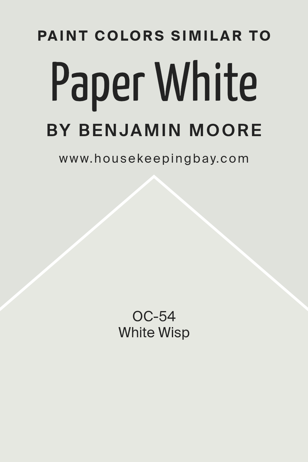
Colors Similar to Paper White OC-55 by Benjamin Moore
Choosing colors that share similar shades, like Paper White OC-55 by Benjamin Moore and its close relative, White Wisp OC-54, can significantly affect the atmosphere and visual appeal of a space.
Having a palette of similar colors allows for a cohesive and harmonious look, making the environment feel more unified and soothing.
These colors work well together because they share a base tone but have subtle differences that add depth and interest without overwhelming the senses.
Using similar shades can also make small spaces seem larger and more inviting, as the colors gently flow into one another, creating a seamless transition across walls and decor elements.
Paper White OC-55 is a soft, airy hue that brings a sense of calmness and clarity to any space. It has a hint of grey that keeps it cool and sophisticated, making it versatile for various settings, from modern to traditional.
On the other hand, White Wisp OC-54 is slightly brighter and carries a touch of blue undertone, giving it a fresher, crisp feel. It’s ideal for creating a light, uplifting ambiance that also feels cozy and warm.
Both colors, with their subtle nuances, offer endless possibilities for creating spaces that feel both expansive and intimate, demonstrating the power of careful color selection in interior design.
You can see recommended paint color below:
- OC-54 White Wisp
housekeepingbay.com
How to Use Paper White OC-55 by Benjamin Moore In Your Home?
Paper White OC-55 by Benjamin Moore is a popular paint color known for its soft, clean look. Its subtle gray undertones make it more than just a simple white, giving any room a serene and airy feel.
Think of it as the perfect backdrop for your home, allowing your furniture and decor to really stand out.
Whether you’re painting a cozy bedroom, a bright living room, or even updating your kitchen cabinets, Paper White can refresh your space without overwhelming it.
Using Paper White in your home can make small rooms look bigger and brighter. Its light-reflecting properties help to bounce natural light around the room, creating a more open and welcoming atmosphere.
It’s also versatile enough to work in various lighting conditions, looking consistently beautiful both in rooms flooded with sunlight and those relying on artificial lighting.
For those wanting a modern, minimalist look, or simply aiming to freshen up their home with a clean and timeless color, Paper White OC-55 is a fantastic choice.
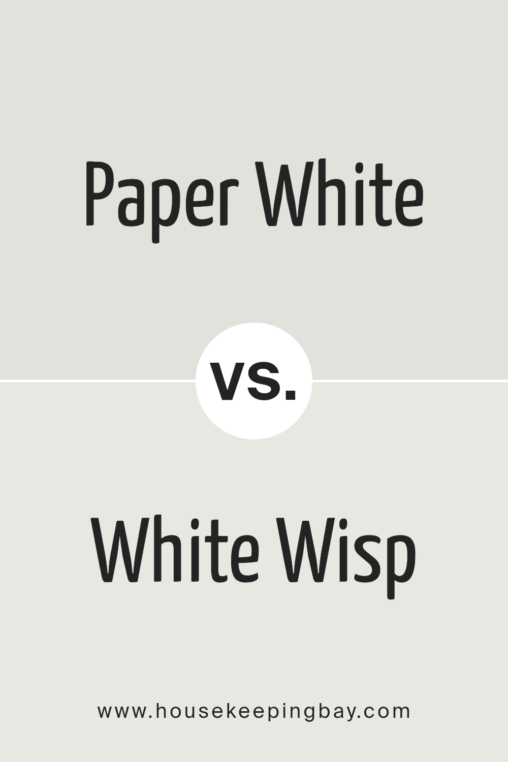
Paper White OC-55 by Benjamin Moore vs White Wisp OC-54 by Benjamin Moore
Paper White OC-55 by Benjamin Moore and White Wisp OC-54 from the same brand are both popular choices for those looking for a clean, fresh look. But they have subtle differences.
Paper White is a soft, white shade that carries a hint of gray. This makes it a cool tone, which can give a room a calm and modern feel. It’s great for spaces where you want a hint of color without overwhelming the senses.
On the other hand, White Wisp is closer to a true white but with a very slight blue undertone.
This gives it a serene and slightly airy feel, making spaces feel open and light. It’s perfect for creating a peaceful and welcoming atmosphere.
In summary, if you’re leaning towards a cooler, slightly grayish hue, Paper White is a fantastic choice.
But if you prefer your white with a subtle breath of blue for a crisp, clean feel, White Wisp is the way to go.
You can see recommended paint color below:
- OC-54 White Wisp
housekeepingbay.com
Conclusion
In summary, the article discusses the unique qualities and applications of Benjamin Moore’s Paper White OC-55, highlighting its versatility and appeal in various interior spaces.
This particular shade of white is celebrated for its subtle nuances that can both illuminate a room and create a serene, sophisticated atmosphere.
It’s noted for being an excellent choice for those looking to achieve a crisp, clean look without the starkness associated with some pure whites.
The article suggests that Paper White OC-55 has the ability to adapt to different lighting conditions, making it a practical choice for any room, whether it has natural light or relies on artificial sources.
Furthermore, the article provides insights on how to best utilize Paper White OC-55 in home decor, suggesting it works well in combination with a broad range of colors and materials.
This adaptability makes it a go-to option for designers and homeowners aiming for a modern, yet timeless aesthetic.
The paint’s understated elegance is emphasized as a key reason for its popularity, offering a backdrop that allows furnishings and artwork to stand out.
Overall, Paper White OC-55 by Benjamin Moore is portrayed as a sophisticated, flexible color choice that effortlessly enhances the beauty and ambiance of interior spaces.
housekeepingbay.com
Ever wished paint sampling was as easy as sticking a sticker? Guess what? Now it is! Discover Samplize's unique Peel & Stick samples. Get started now and say goodbye to the old messy way!
Get paint samples