Beach Glass 1564 by Benjamin Moore
Where Serenity Meets Coastal Charm
This color, a cool and soft blue-green, evokes a serene coastal atmosphere without needing to be near the beach. When you apply 1564 Beach Glass to your walls, it offers a soothing backdrop that pairs beautifully with both contemporary and traditional decor. You might find it works perfectly in a living room for a light, breezy effect or in a bedroom where relaxation is key.
Its subtle hue adapts well to different lighting, giving you a gentle tone that can brighten any room during the day and provide a cozy feel in the evening.
If your goal is to create a calm and lightened-up setting, 1564 Beach Glass offers that sense of peace. It effortlessly matches with neutral tones and natural materials like wood or stone, enhancing their beauty without overpowering them.
Whether you’re thinking of a major room overhaul or adding a highlight to existing décor, the calming presence of 1564 Beach Glass can suit your needs beautifully. So, bring a piece of that serene coastline right into your home.
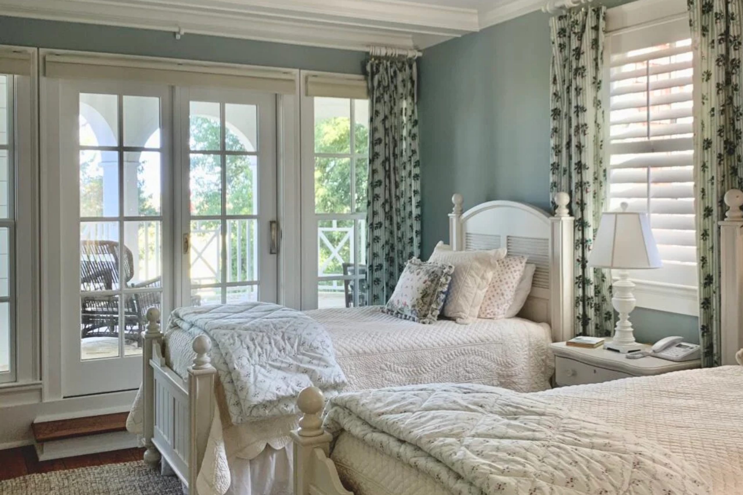
via heatherednest.com
What Color Is Beach Glass 1564 by Benjamin Moore?
Beach Glass 1564 by Benjamin Moore is a soothing color, with gentle hints of gray and blue that almost mimic the serenity of the ocean. This color has a calming effect, perfect for creating relaxed environments. It’s subtle yet has enough character to keep things interesting.
Beach Glass fits nicely within coastal styles, enhancing spaces with a breezy, seaside charm. It’s equally at home in modern or minimalist interiors, where its understated elegance can stand out. Traditional setups can also benefit, as it brings a soft modern twist to classic furniture and decor.
When thinking about materials and textures, Beach Glass pairs beautifully with natural elements like driftwood, rattan, and sisal. These elements enhance the organic feel of the color. In terms of fabrics, linens and cottons in soft neutrals or whites complement its cool tones perfectly, creating a fresh and inviting space.
For accents, think about incorporating glass or reflective surfaces, which echo the light and airy quality of this hue. Metals like brushed nickel or soft gold can add a touch of warmth and contrast.
Overall, Beach Glass 1564 brings a versatile yet peaceful vibe, easily enhancing varied spaces with its gentle elegance.

housekeepingbay.com
Is Beach Glass 1564 by Benjamin Moore Warm or Cool color?
Beach Glass1564 by Benjamin Moore is a gentle color that blends blue, green, and gray. This combination creates a soft, calming atmosphere in any room. It reminds many of the sea and sky, bringing a touch of nature indoors.
When used in living rooms, this color provides a soothing backdrop that works well with both modern and traditional furniture. In bedrooms, Beach Glass1564 offers a peaceful vibe, making it easier to relax and unwind after a busy day.
This color is versatile and pairs nicely with whites and creams, adding warmth. It also complements darker colors, like deep blues or charcoal grays, creating a balanced look. In kitchens or bathrooms, Beach Glass1564 gives a fresh, airy feel, especially when matched with natural wood or sleek metal fixtures.
Overall, Beach Glass1564 by Benjamin Moore offers a way to create calm, refreshing spaces in homes, making everyday living feel more serene and comfortable.
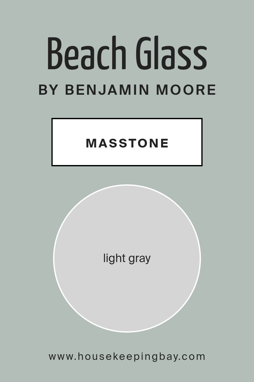
What is the Masstone of the Beach Glass 1564 by Benjamin Moore?
Beach Glass1564 by Benjamin Moore is a gentle light gray color. Its masstone, or main hue, is a soft gray (#D5D5D5). This makes it an excellent choice for creating calm, peaceful spaces at home.
The light gray shade has a neutral undertone, meaning it is neither too warm nor too cool. This balance makes it suitable for many room types and styles. It can reflect ambient light, making rooms feel brighter and more open.
In living rooms or bedrooms, Beach Glass evokes a sense of serenity. It pairs well with other soft colors like pale blues, creamy whites, or light greens. This color can also complement bold accents, allowing them to pop without overwhelming the space.
Beach Glass1564 works well on walls, furniture, or trim, giving your living space a fresh, modern look that feels cozy and inviting. It is a versatile choice that blends effortlessly into various home designs.
housekeepingbay.com
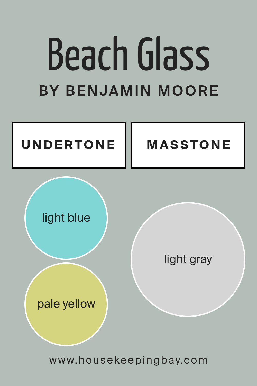
Undertones of Beach Glass 1564 by Benjamin Moore
Beach Glass 1564 by Benjamin Moore is a complex paint color, with subtle undertones that influence how it looks on walls. Undertones are the subtle hues beneath the main color that can change its appearance depending on lighting or surrounding colors. In general, these undertones can make a paint color appear warmer or cooler, brighter or more muted.
Beach Glass 1564 has a range of undertones: light blue, pale yellow, light purple, mint, lilac, pale pink, and grey. The light blue and mint give it a cool, refreshing feel, often ideal for creating a serene atmosphere. Meanwhile, the pale yellow and pale pink add a touch of warmth, balancing the coolness with a bit of softness and comfort.
Light purple and lilac add a hint of elegance and sophistication, enriching the overall depth of the color. Grey undertones lend a neutral and grounding effect, ensuring the color remains adaptable in different lighting conditions and room styles.
When used on interior walls, these undertones make Beach Glass 1564 a versatile choice. It can look crisp and fresh in natural light, while adopting a cozier, more intimate feel under warmer artificial lighting.
The mix of cool and warm undertones allows Beach Glass to complement a variety of decor styles, from modern to traditional.
housekeepingbay.com
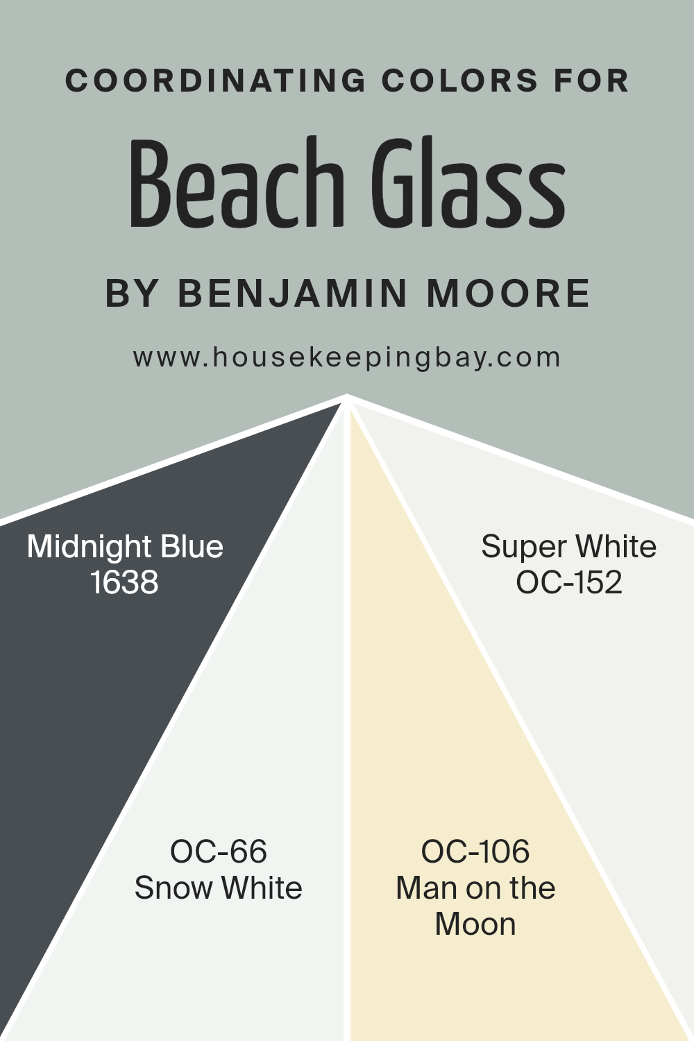
Coordinating Colors of Beach Glass 1564 by Benjamin Moore
Coordinating colors are hues that complement and enhance a primary color, creating a harmonious palette. When talking about Beach Glass 1564 by Benjamin Moore, it’s a sophisticated blend of blue and green with a gentle, relaxing vibe. To bring out its charm, certain other shades can be used alongside it.
Midnight Blue 1638, for instance, is a deep, rich navy that adds depth and drama. It contrasts nicely with the soft tones of Beach Glass, providing a luxurious and grounding effect.
Snow White OC-66 is a crisp, clean white with subtle warmth, making it perfect for offering balance and light. It meshes well with Beach Glass for a fresh and airy atmosphere. Man on the Moon OC-106 offers a hint of creaminess, introducing a soft glow that works seamlessly with Beach Glass’s muted tones for a cozy feel.
Lastly, Super White OC-152 is a bright white that reflects light beautifully, creating a sense of space. When paired with Beach Glass, it sharpens the appearance of every edge and corner, leaving a composed and polished finish.
These colors together provide a serene and sophisticated environment, perfect for any space that seeks stylish harmony.
You can see recommended paint colors below:
- 1638 Midnight Blue
- OC-66 Snow White
- OC-106 Man on the Moon
- OC-152 Super White
housekeepingbay.com
How Does Lighting Affect Beach Glass 1564 by Benjamin Moore?
Lighting plays a crucial role in how we see colors, affecting their hue, shade, and intensity. Different types of lighting can change the way colors appear in a space. Beach Glass 1564 by Benjamin Moore is a soft, muted blue-green that can look different depending on the light source.
In natural light, Beach Glass appears cooler and more vibrant. Sunlight can bring out its gentle blue tones, especially during midday when the light is direct and clear. However, artificial lighting can alter its appearance significantly.
Under warm incandescent bulbs, the color might take on a slightly warmer or grayer hue, whereas under cool LED lights, it can appear softer and maintain more of its blue character.
In north-facing rooms, which get softer, indirect light, Beach Glass might appear a bit more muted and gray. The cool natural light from the north enhances the color’s blue undertones, giving it a serene, calming effect. This can be perfect for a relaxed and understated look.
South-facing rooms, which receive abundant daylight throughout the day, enhance the warmth and brightness of colors. In such spaces, Beach Glass can look more vibrant and alive. The direct sunlight can bring out the green undertones, adding depth to the wall color.
East-facing rooms get bright but less intense light in the morning, making Beach Glass appear fresh and lively early in the day. As the day progresses and the light becomes softer, the color might seem more subdued, leaning towards its gray or blue aspects.
West-facing rooms receive warm light in the afternoon and evening. In these spaces, Beach Glass might pick up a warmer or slightly muted tone as the warm tones of the setting sun mix with the color, altering its appearance slightly.
Overall, Beach Glass is a versatile color that changes beautifully with the light, adding character to any room.
housekeepingbay.com
What is the LRV of Beach Glass 1564 by Benjamin Moore?
LRV stands for Light Reflectance Value. It’s a number used to describe how much light a color reflects or absorbs. The scale goes from 0, which means no light is reflected and the color is very dark, to 100, where all light is reflected and the color is very light.
So, a higher LRV means the color is lighter and reflects more light, while a lower LRV means the color is darker and absorbs more light. The LRV can really change how a paint color looks once it’s on the wall, affecting everything from how bright a room feels to how big or small it appears.
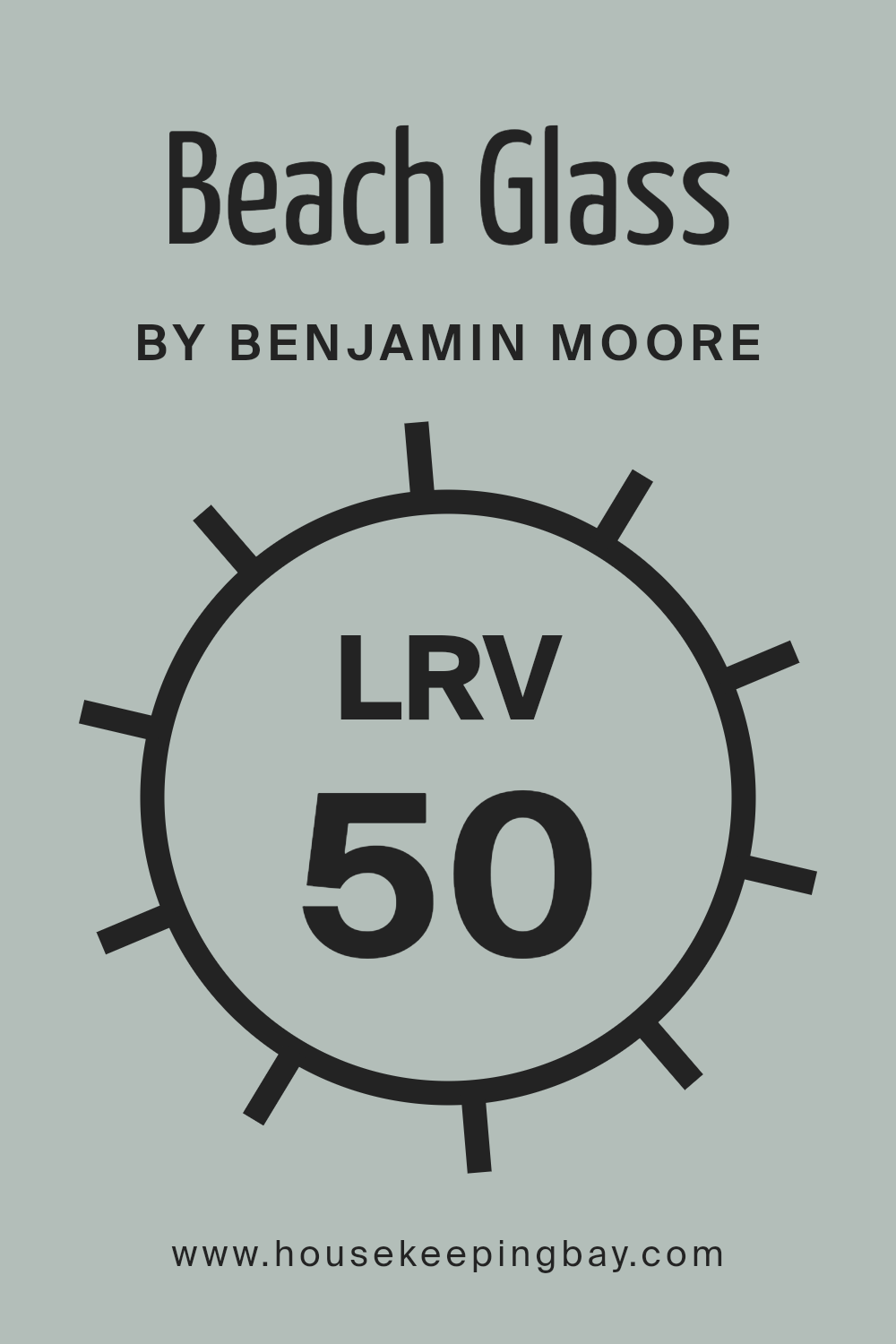
Beach Glass 1564 by Benjamin Moore has an LRV of 49.7, which sits right in the middle of the scale. This means it balances light and darkness well. Because of this moderate LRV, Beach Glass will reflect a reasonable amount of light without making a room feel too bright or too dark.
It’s a versatile color that can create a soft, calm atmosphere, making it appropriate for various spaces in a home.
Its middle-range LRV also means it can look different depending on lighting conditions, appearing more muted in less light and more vibrant in brighter light. This adaptability can help it work well with a wide range of other colors and styles.
housekeepingbay.com
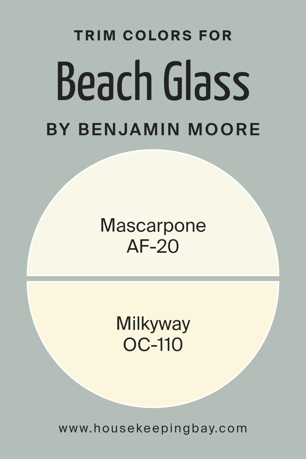
What are the Trim colors of Beach Glass 1564 by Benjamin Moore?
Trim colors refer to the paint colors used for moldings, baseboards, windows, and doors in a room. They serve as accents that enhance the overall look of the space by providing subtle contrast or harmony. For Beach Glass 1564 by Benjamin Moore, choosing the right trim colors is crucial because trim colors can improve the delicate balance and relaxed atmosphere this color aims to create.
Beach Glass is a soft, muted blue-green that evokes a coastal feel, and the right trim can help highlight its soothing quality while adding dimension and depth to a room.
Mascarpone AF-20 is a warm, creamy white that complements Beach Glass beautifully. It offers a gentle contrast that keeps the mood bright and airy without being harsh or stark. This color is perfect for creating a cozy, inviting space. On the other hand, Milkyway OC-110 is a soft, off-white with a hint of gray that provides an understated elegance.
It pairs seamlessly with Beach Glass by enhancing its soft tones and bringing a sophisticated touch to the room. These trim colors are important because they complete the look, making the space feel cohesive and thoughtfully designed.
You can see recommended paint colors below:
- AF-20 Mascarpone
- OC-110 Milkyway
housekeepingbay.com
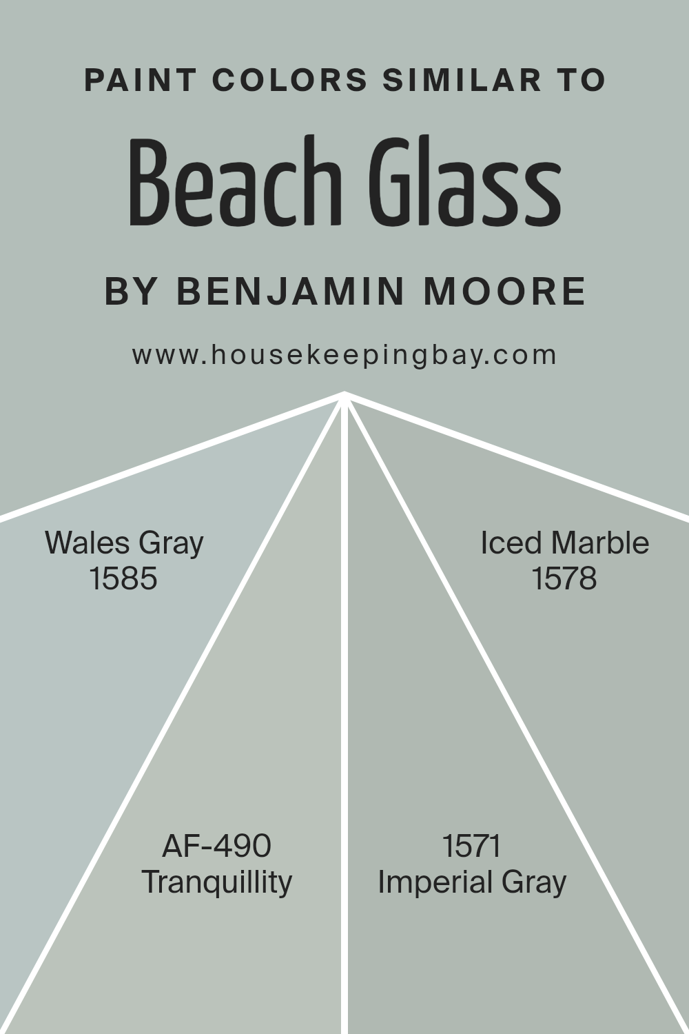
Colors Similar to Beach Glass 1564 by Benjamin Moore
Similar colors play a crucial role in design because they create harmony and balance within a space. When colors are closely related on the color wheel, they work together seamlessly, allowing for a visually pleasing effect. For example, Beach Glass by Benjamin Moore offers a calming, light blue-green hue reminiscent of the ocean.
When used alongside similar colors like Wales Gray, Tranquillity, Imperial Gray, and Iced Marble, a room can feel cohesive and inviting. This approach helps in achieving a serene atmosphere without overwhelming the senses, which is ideal for creating a relaxing environment.
These colors share undertones that work harmoniously, ensuring a smooth transition from one color to another, enhancing the overall aesthetic.
Wales Gray carries a cool, blue-gray tone that feels refreshing and grounding, perfect for calming spaces. Tranquillity brings a soft, muted blue with a hint of green, offering a gentle peace to any room. Imperial Gray combines depth with a light gray-blue shade, adding subtle sophistication.
Iced Marble, with its clean, light gray touch, offers crispness that brightens spaces while maintaining warmth. These colors, when paired with Beach Glass, complement each other effortlessly. Such harmony allows spaces to feel more open and thoughtfully designed, enhancing comfort and style in a subtle yet effective manner.
You can see recommended paint colors below:
- 1585 Wales Gray
- AF-490 Tranquillity
- 1571 Imperial Gray
- 1578 Iced Marble
housekeepingbay.com
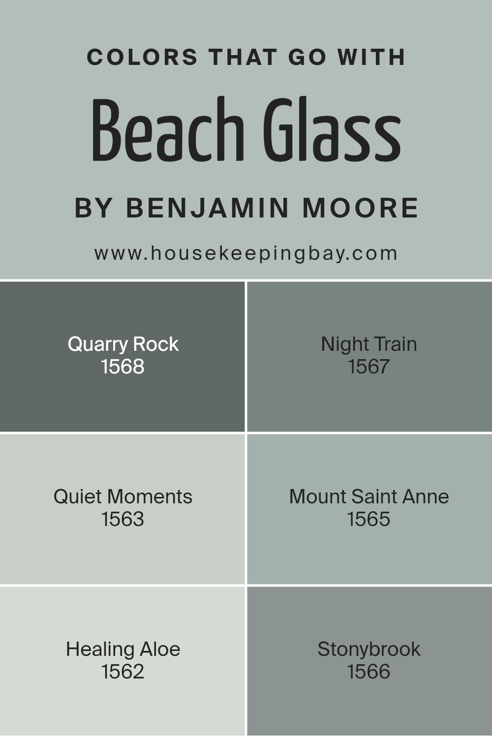
Colors that Go With Beach Glass 1564 by Benjamin Moore
Beach Glass 1564 by Benjamin Moore is a versatile and calming blue-green shade that evokes the essence of sea-washed glass. When paired with colors like Quarry Rock 1568, a deep and grounding gray, it creates a sophisticated contrast that adds depth and warmth to any space.
Night Train 1567, with its rich, mysterious undertones, complements Beach Glass by providing a darker and more dramatic background, perfect for accent walls or statement pieces. Quiet Moments 1563, a soft and gentle hue, enhances the serene and peaceful nature of Beach Glass, pairing well for creating soothing environments.
Mount Saint Anne 1565, a muted blue with gray undertones, blends seamlessly with Beach Glass, offering a subtle yet impactful combination that feels timeless and classic. Healing Aloe 1562 introduces a lighter, airy touch with its pale green tones, bringing in a fresh and lively feel that uplifts the overall palette.
Stonybrook 1566, a cool, dusty blue, harmonizes beautifully with Beach Glass, balancing the tones and creating a cohesive look. Each color serves a unique purpose, either adding contrast, enhancing tranquility, or bringing in warmth, making Beach Glass a favorite for designers seeking a harmonious and inviting atmosphere.
You can see recommended paint colors below:
- 1568 Quarry Rock
- 1567 Night Train
- 1563 Quiet Moments
- 1565 Mount Saint Anne
- 1562 Healing Aloe
- 1566 Stonybrook
housekeepingbay.com
How to Use Beach Glass 1564 by Benjamin Moore In Your Home?
Beach Glass 1564 by Benjamin Moore is a soft gray-green color that adds a sense of calm to any space. It’s versatile and blends well with many design styles. In a living room, it creates a soothing backdrop, making it easy to add colorful furniture or art.
In bedrooms, it promotes relaxation and helps create a peaceful atmosphere for rest. When used in a bathroom, it echoes the calmness of the sea, helping to turn the space into a spa-like retreat.
This color complements natural materials like wood and stone, adding an earthy feel. Pair it with white trim for a crisp, clean look, or with darker shades for a bit more drama. Beach Glass 1564 works well in kitchens, especially when paired with white cabinets and stainless steel appliances.
Its subtle tone makes it a great choice for large spaces, allowing other elements in the room to shine without overpowering the decor.
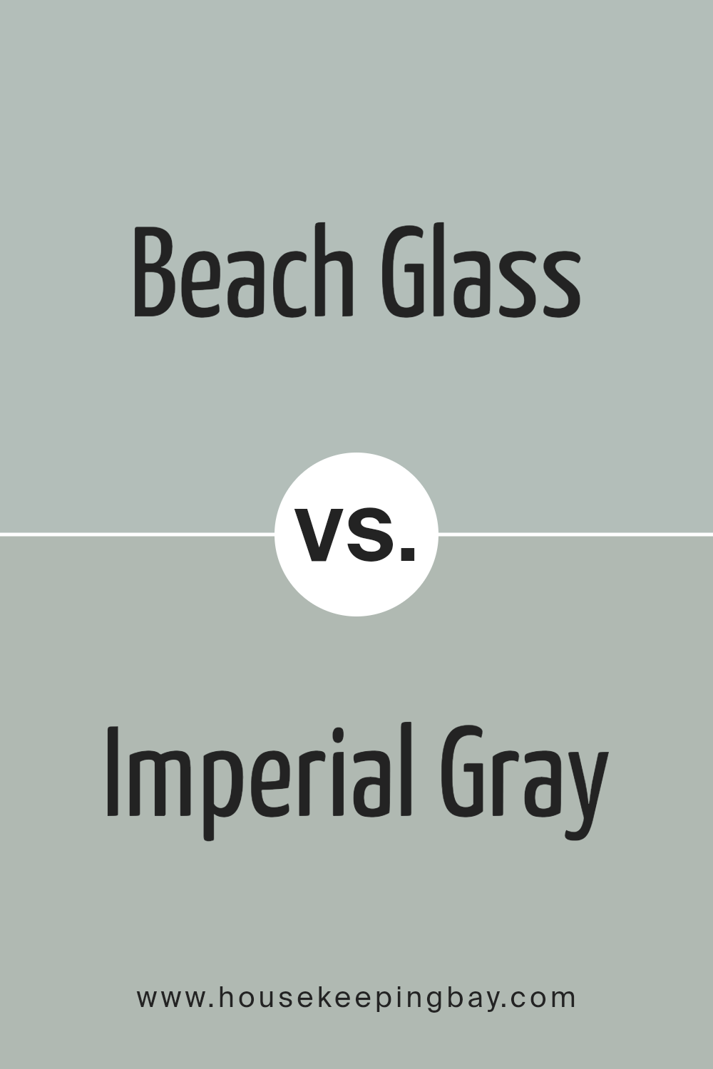
Beach Glass 1564 by Benjamin Moore vs Imperial Gray 1571 by Benjamin Moore
Beach Glass 1564 by Benjamin Moore is a soft, muted shade reminiscent of seafoam. It’s a mix of light blue and green with a gray undertone, evoking a sense of calmness and airiness. This color feels fresh and can bring a coastal vibe to any space. It works well in living rooms or bedrooms for a relaxed atmosphere.
In contrast, Imperial Gray 1571 by Benjamin Moore is a medium gray tone with subtle warmth. This gray provides a sense of balance and neutrality, fitting nicely in both modern and traditional spaces.
Imperial Gray can serve as a strong backdrop, allowing other colors or decor to pop. It’s versatile, great for an office, kitchen, or hallway.
While Beach Glass adds lightness and a hint of color, Imperial Gray offers depth and neutrality. Both colors hold their unique charm, suitable for different moods or styles within a home.
You can see recommended paint color below:
- 1571 Imperial Gray
housekeepingbay.com
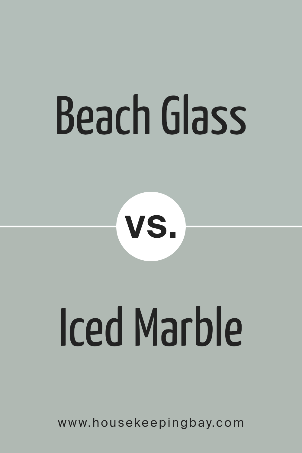
Beach Glass 1564 by Benjamin Moore vs Iced Marble 1578 by Benjamin Moore
Beach Glass 1564 by Benjamin Moore brings to mind the calm of a gentle shoreline. A soothing greenish-blue, it fits well in spaces meant for relaxation and reflection. It gives off a sense of peace, like the soft whisper of calm waves.
Iced Marble 1578, however, reflects a cool, soft gray with a touch of sophistication. Though both colors capture a serene vibe, Iced Marble leans toward a more understated feel. It has a modern edge, exuding class without overpowering a room.
While Beach Glass offers a coastline charm with its touch of color and warmth, Iced Marble presents a more neutral palette, ideal for minimalistic or contemporary spaces. Perfect for adding gentle elegance, both work excellently in a variety of interiors. Whether it’s the coastal appeal of Beach Glass or the understated grace of Iced Marble, both colors enhance spaces with a calming and refined quality.
You can see recommended paint color below:
- 1578 Iced Marble
housekeepingbay.com
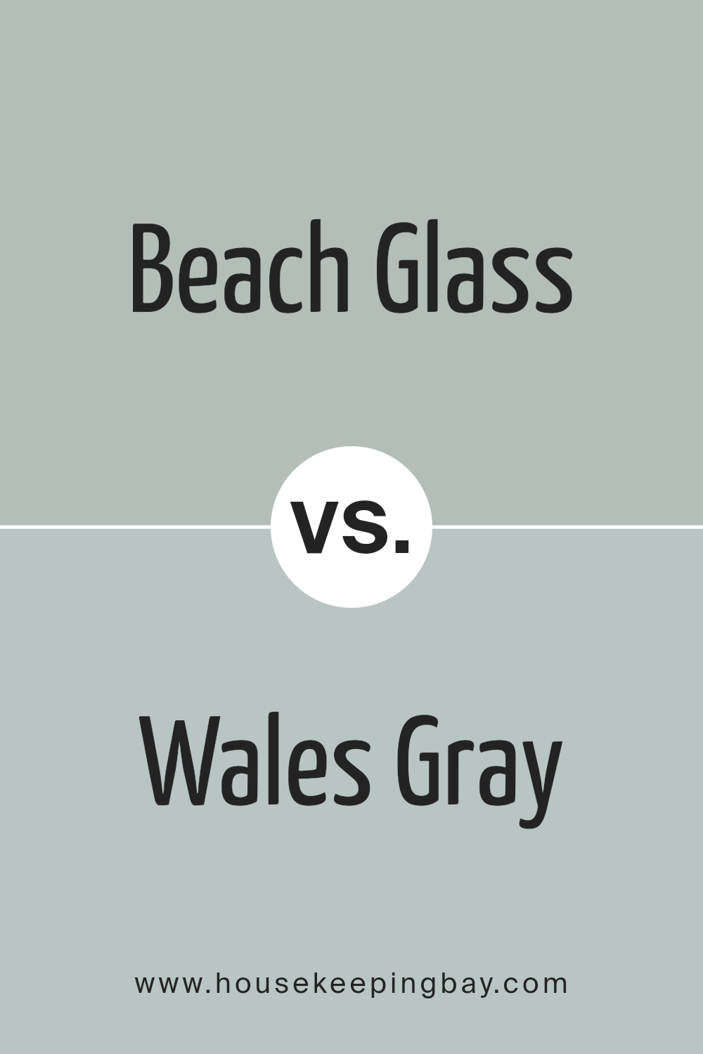
Beach Glass 1564 by Benjamin Moore vs Wales Gray 1585 by Benjamin Moore
Beach Glass 1564 by Benjamin Moore offers a soft, muted green with blue undertones, resembling the gentle colors of sea glass. It exudes a calm, peaceful vibe, making it perfect for creating a soothing atmosphere in any room. The color captures the essence of sand-washed glass, bringing a touch of the beach indoors.
Wales Gray 1585, also by Benjamin Moore, presents a more balanced blend of blue and gray. It leans towards a cooler tone, offering a sophisticated and serene feel. This versatile color works well in both modern and traditional spaces, providing a neutral backdrop that complements various decor styles.
Both colors bring a sense of calm and relaxation, but Beach Glass imparts a slightly warmer, more coastal feel due to its green hints, while Wales Gray maintains a refined, cooler edge. Each offers a unique way to create a gentle, inviting space, with Beach Glass feeling more earthy and Wales Gray leaning more elegant.
You can see recommended paint color below:
- 1585 Wales Gray
housekeepingbay.com
Beach Glass 1564 by Benjamin Moore vs Tranquillity AF-490 by Benjamin Moore
Beach Glass 1564 and Tranquillity AF-490, both by Benjamin Moore, offer distinct tones. Beach Glass 1564 presents a soft, muted blue-green shade reminiscent of weathered sea glass. It has subtle gray undertones, which give it a calming yet sophisticated look. This color works well in spaces like living rooms or bathrooms, where a serene environment is desired.
Tranquillity AF-490 also fits into the cool color family, offering a blend of sage green with gray undertones. Compared to Beach Glass, Tranquillity leans more toward a green hue. This makes it ideal for spaces needing a natural, restful vibe, such as bedrooms or home offices.
While both colors have gray bases, Beach Glass feels more coastal with its blend of blue and green. Tranquillity tends toward earthiness with its stronger green presence. Both colors can create a cozy and inviting atmosphere, making them versatile choices for various rooms.
You can see recommended paint color below:
- AF-490 Tranquillity
housekeepingbay.com
Conclusion
This shade blends green and gray in a way that feels both refreshing and calm, making it perfect for any space where you want relaxation. I’ve noticed it works beautifully in bedrooms or living rooms, creating an atmosphere of quiet comfort.
I appreciate how versatile Beach Glass is. It pairs well with both cool and warm tones, allowing for a range of design possibilities. Whether you have natural wood accents or modern, sleek furniture, this color harmonizes effortlessly with different styles.
What stands out to me is its ability to change with the light. It may appear more green under certain lighting, while at other times, the gray tones become more pronounced. This dynamic makes it an exciting choice for those who want their room to have a bit of personality while maintaining a sense of balance and peace.
Overall, Beach Glass feels like a breath of fresh air in any room. It brings a gentle sense of nature inside, and I find its muted color invites a calm atmosphere without overwhelming the senses.
If seeking a shade that offers both elegance and a touch of nature’s calm, Beach Glass is a wonderful choice.
housekeepingbay.com
Ever wished paint sampling was as easy as sticking a sticker? Guess what? Now it is! Discover Samplize's unique Peel & Stick samples. Get started now and say goodbye to the old messy way!
Get paint samples


