- Home
- Color Palettes
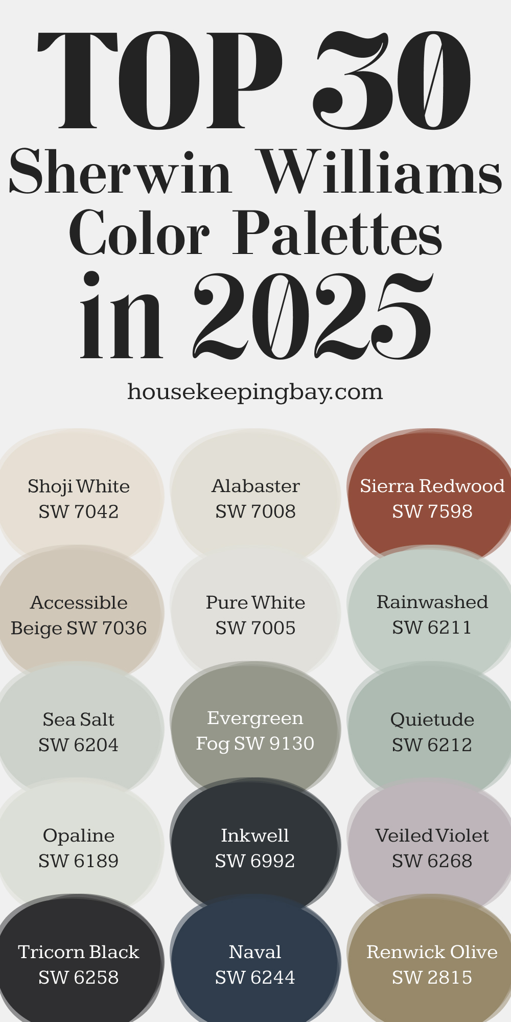
- Top 30 Sherwin Williams Color Palettes in 2025
Top 30 Sherwin Williams Color Palettes in 2025
Why 2025’s Color Trends Matter for Interiors
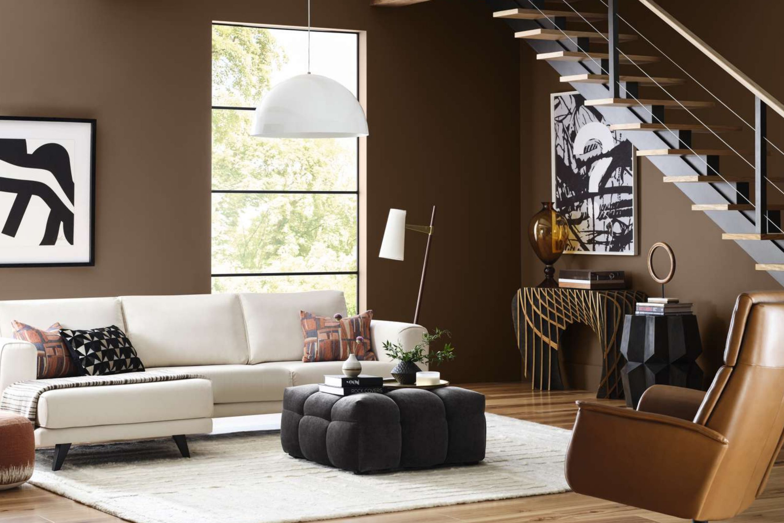
Colors influence how we feel and function in a space more than most people realize. They can set a mood, energize a room, or even make a small area feel more open. Every year, Sherwin Williams does a fantastic job of capturing the mood of the moment through their trending colors.
For 2025, the palette is a blend of soft, natural hues and bold accents, reflecting a desire for balance between calmness and expression.
Whether you’re repainting your living room or just refreshing a corner of your office, knowing which colors are trending can help you create a space that feels modern and comfortable.
via sherwin-williams.com
How Color Trends Are Set Each Year
You might wonder how these trending palettes are chosen. It’s not random! Sherwin Williams and other paint leaders base their decisions on social changes, economic shifts, and emerging design trends.
For example, when we all started spending more time at home, there was a shift toward cozy, grounding shades like warm neutrals and earth tones.
Designers, architects, and trend forecasters are often involved in this process. They study global trends, fashion, art, and even technology to predict which shades will resonate most with us.
According to color psychologist Angela Wright, “The colors we surround ourselves with can directly affect our emotions and behavior.” Source
Why 2025’s Color Trends Matter for Interiors?
Colors in 2025 reflect the current desire for comfort, creativity, and a deeper connection to nature. Warm neutrals remain a go-to for creating cozy spaces, while fresh greens and soft blues bring the outside in, perfect for creating a sense of calm. For those wanting a bolder statement, dark tones are stepping up this year, giving rooms a rich, layered look.
Here’s why it matters:
- Living Rooms: Warm neutrals and soft earth tones create a welcoming space.
- Kitchens: Fresh greens and blues keep things light and vibrant.
- Bedrooms: Softer tones help foster a restful environment.
- Home Offices: Deep blues and greens inspire focus and creativity.
Top 30 Sherwin Williams Colors for 2025
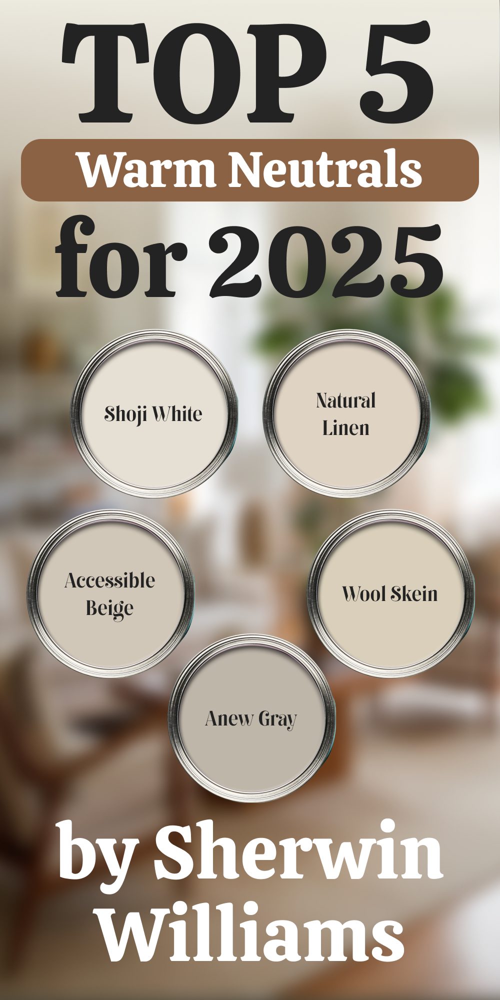
Warm Neutrals
Warm neutrals are timeless because they create a comforting foundation for any design style. In 2025, they remain a popular choice for spaces where people gather, relax, or work, thanks to their ability to enhance light and pair well with bold accents.
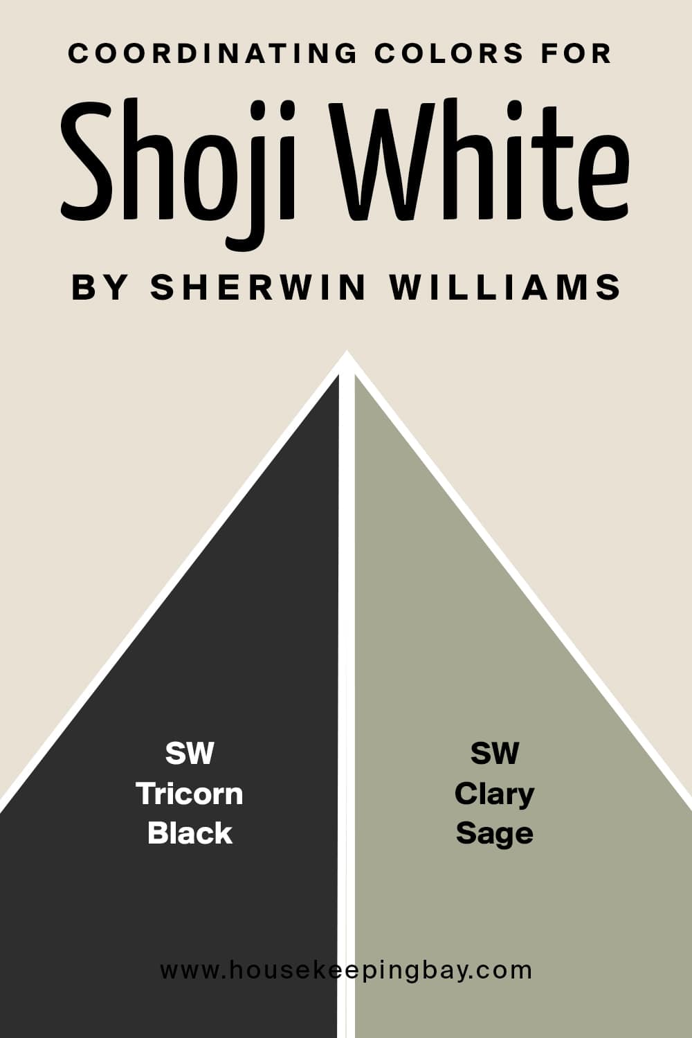
Shoji White (SW 7042)
Shoji White is a creamy off-white with just a touch of warmth. It works beautifully in both modern and traditional interiors. I love using it in rooms with plenty of natural light because it helps amplify brightness without feeling too stark or sterile.
Whether it’s on walls or trim, it blends well with soft wood tones and creates a fresh, airy atmosphere.
Where to use: Living rooms, hallways, or even kitchens that need a clean yet cozy feel.
👉Check the full Guide Here (Coordinating colors, Trim, Colors That Go With and More..)
housekeepingbay.com
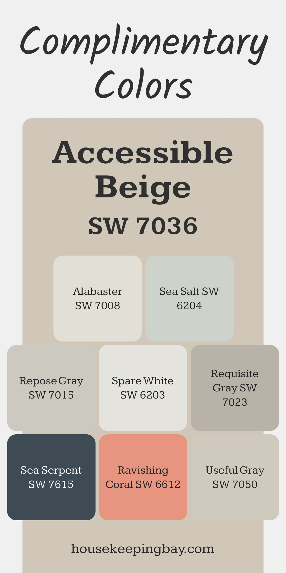
Accessible Beige (SW 7036)
Despite its name, Accessible Beige isn’t your typical beige. It leans more toward a greige (a mix of gray and beige), giving it a modern, sophisticated edge. This shade doesn’t feel yellow or overly warm, making it a great neutral backdrop for almost any color scheme.
I often recommend this for open-concept spaces where you want to keep things cohesive.
Where to use: Great for entire homes, especially in living rooms and dining areas.
👉Check the full Guide Here (Coordinating colors, Trim, Colors That Go With and More..)
housekeepingbay.com
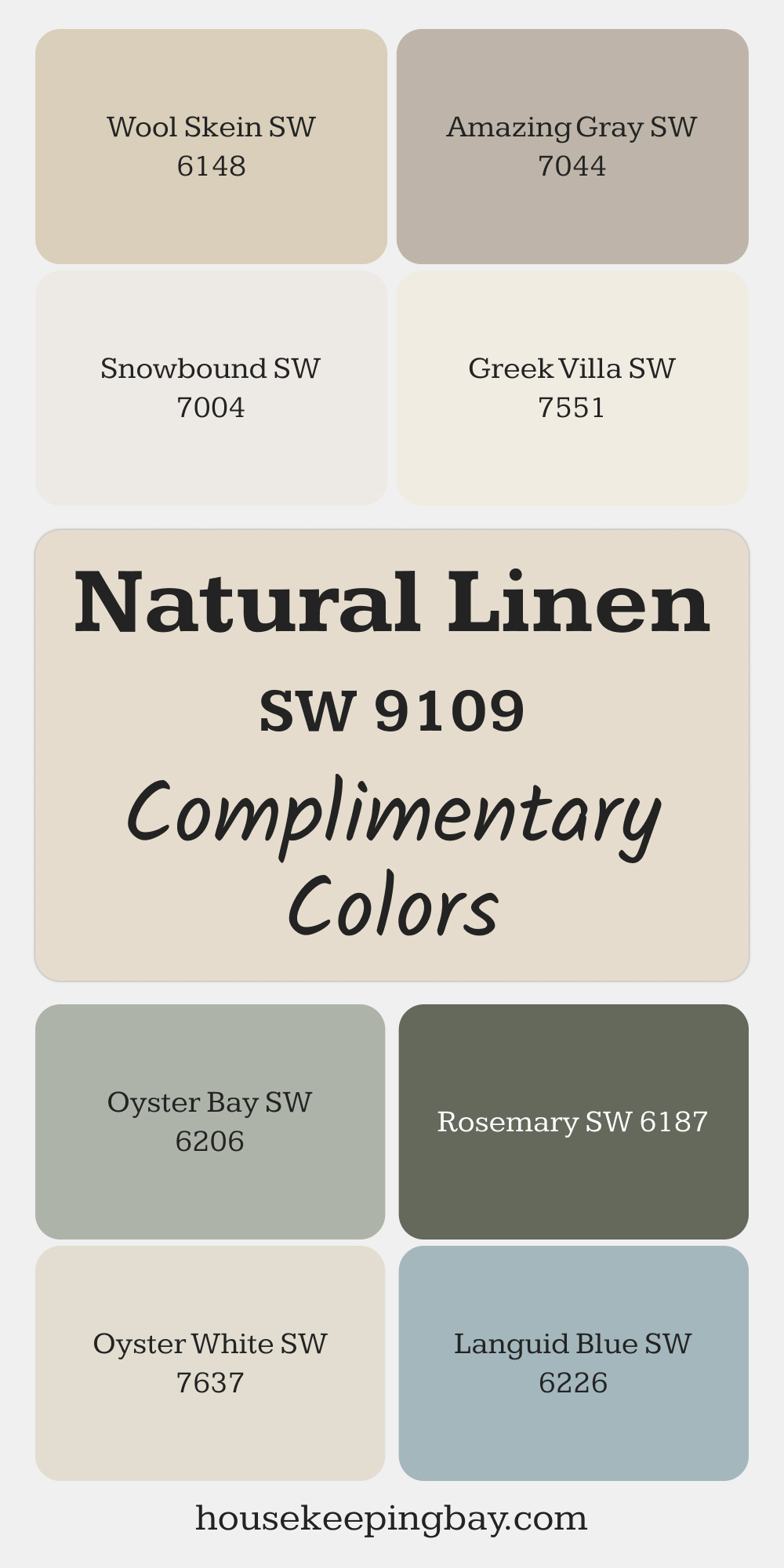
Natural Linen (SW 9109)
Natural Linen is a soft beige with a slightly pink undertone, giving it a delicate warmth. It has a way of making a space feel light and open while still offering a hint of color. This is perfect for bedrooms or family rooms where you want to create a calming, inviting vibe.
Paired with white trim, it can make a room feel elegant yet approachable.
Where to use: Bedrooms, family rooms, or any space that needs a touch of softness.
👉Check the full Guide Here (Coordinating colors, Trim, Colors That Go With and More..)
via housekeepingbay.com
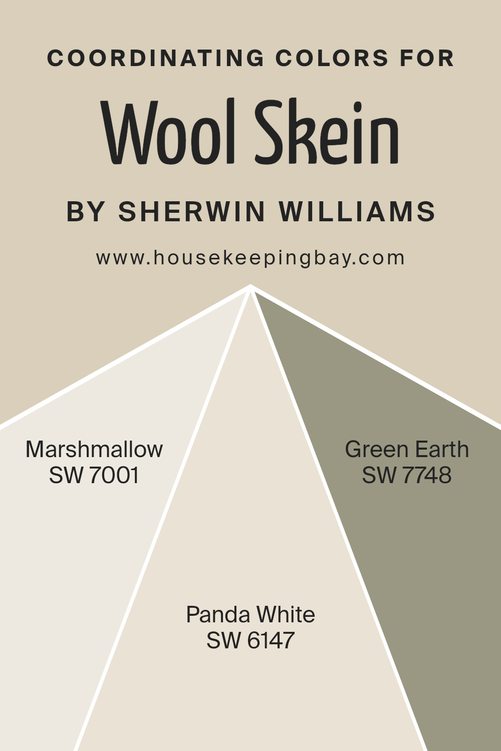
Wool Skein (SW 6148)
Wool Skein is a light taupe that bridges the gap between beige and gray. Its subtle earthy tone makes it a fantastic choice for rooms with lots of natural wood or stone elements.
I like using this color in rustic or modern farmhouse designs because it blends seamlessly with natural materials, adding warmth without overpowering the space.
Where to use: Kitchens, entryways, and rooms with wood flooring or cabinetry.
👉Check the full Guide Here (Coordinating colors, Trim, Colors That Go With and More..)
via housekeepingbay.com
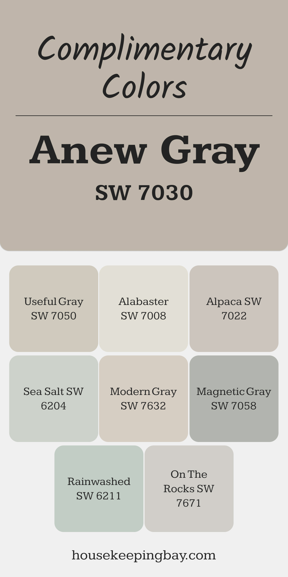
Anew Gray (SW 7030)
Anew Gray is a versatile greige that adapts beautifully to different lighting. In bright rooms, it looks more beige, while in dimmer spaces, it leans slightly gray. This makes it an ideal choice for homes with varied light exposure.
I appreciate how it complements a wide range of accent colors, from deep blues to soft greens.
Where to use: Offices, guest bedrooms, or any room that needs a neutral with a modern feel.
👉Check the full Guide Here (Coordinating colors, Trim, Colors That Go With and More..)
via housekeepingbay.com
housekeepingbay.com
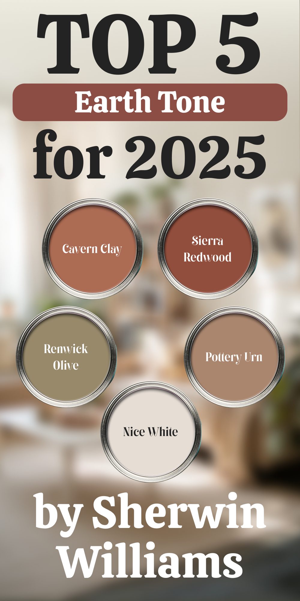
Earth Tones
These colors bring warmth and grounding to interiors. In 2025, earth tones continue to rise in popularity as homeowners seek a balance between cozy comfort and natural sophistication. They create a welcoming atmosphere while adding depth and richness to a room.
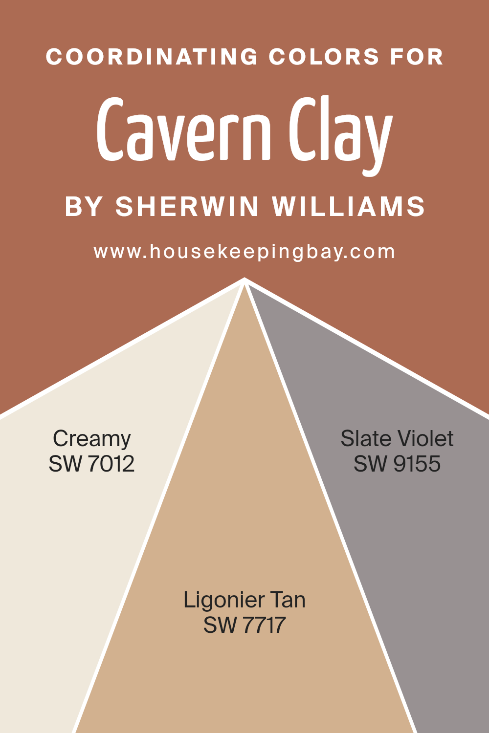
Cavern Clay (SW 7701)
Cavern Clay is a bold terracotta shade that instantly adds warmth and character to any space. Its rich, earthy tone evokes the feel of natural landscapes, making it an ideal choice for homes that want to bring a touch of the outdoors inside. I love pairing it with neutral furniture and soft whites to keep the look balanced.
Where to use: Accent walls, fireplaces, or even dining rooms for a warm, inviting setting.
👉Check the full Guide Here (Coordinating colors, Trim, Colors That Go With and More..)
housekeepingbay.com
Spicewood (SW 7715)
Spicewood is a muted orange-brown with a subtle modern edge. It’s a great alternative if you want something earthy but a bit more understated than traditional terracotta. The muted tone makes it easy to pair with both warm and cool neutrals, and it works well with natural textures like wood and leather.
Where to use: Living rooms, entryways, or any space that needs a cozy yet contemporary feel.
Sierra Redwood (SW 7598)
Sierra Redwood is a deep, earthy red that feels timeless and bold. It brings warmth and richness to any room, and its slightly brown undertone makes it versatile enough to work in both modern and traditional designs. I recommend using it in spaces where you want to make a statement.
Where to use: Dining rooms, library walls, or powder rooms for a dramatic effect.
Clay Ridge (SW 6063)
Clay Ridge is a soft brown with red undertones, offering a more neutral take on earth tones. It feels warm without being too dark, making it a perfect choice for creating a cozy atmosphere. It pairs beautifully with creams, beiges, and even muted greens.
Where to use: Bedrooms, living rooms, or spaces where you want a grounded yet light feel.
Renwick Olive (SW 2815)
Renwick Olive is a muted greenish-brown that adds a sophisticated touch to interiors. Its deep, earthy hue works wonderfully as an accent color, especially in rooms with lots of natural light. I find it pairs best with warm neutrals, brass accents, and wood elements for a rich, elegant look.
Where to use: Accent walls, built-in shelving, or even kitchen cabinetry for a dramatic but grounded effect.
housekeepingbay.com
Soft Greens and Blues
Soft greens and blues remain a popular choice in 2025 because they create calming environments. These shades are perfect for bedrooms, bathrooms, and any space meant for rest or reflection. Their connection to nature makes them feel peaceful and refreshing.
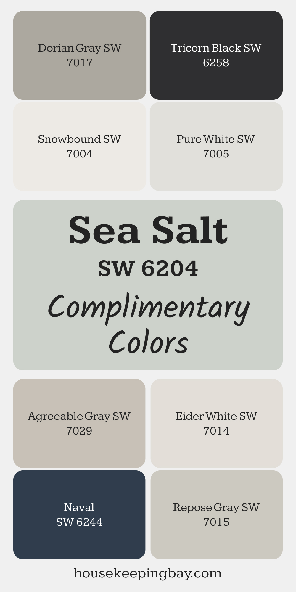
Sea Salt (SW 6204)
Sea Salt is a delicate blue-green that feels fresh without being overpowering. It’s one of those magical colors that changes depending on the light, sometimes appearing more green, other times more blue. I find it ideal for spaces where you want a serene, coastal-inspired vibe.
Where to use: Bathrooms, bedrooms, or even kitchens for a light, airy feel.
👉Check the full Guide Here (Coordinating colors, Trim, Colors That Go With and More..)
via housekeepingbay.com
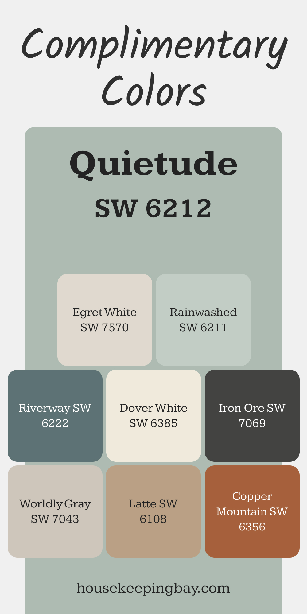
Quietude (SW 6212)
Quietude leans more green than blue, with a cool undertone that adds a tranquil feel to any room. It’s great for bedrooms because it fosters relaxation, but it can also be used in home offices to encourage focus and calm. Pairing it with warm wood tones can enhance its soothing effect.
Where to use: Bedrooms, home offices, or meditation spaces.
👉Check the full Guide Here (Coordinating colors, Trim, Colors That Go With and More..)
via housekeepingbay.com
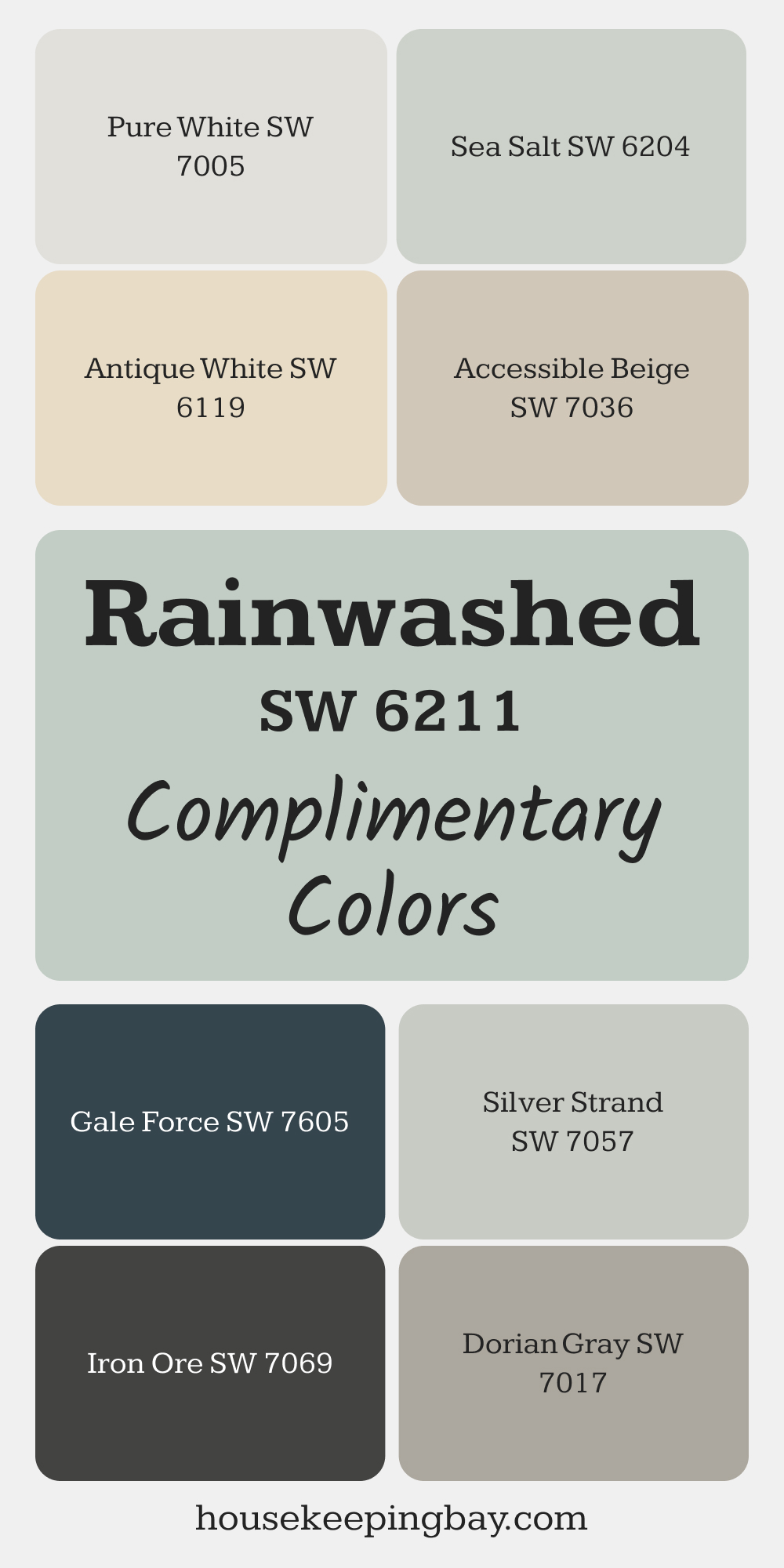
Rainwashed (SW 6211)
Rainwashed is a soft greenish-blue that instantly evokes a spa-like atmosphere. I’ve seen it work beautifully in bathrooms, especially when paired with white or gray tile. It’s also a great option for small rooms, as it helps reflect light and create the illusion of more space.
Where to use: Bathrooms, powder rooms, or laundry rooms for a fresh look.
👉Check the full Guide Here (Coordinating colors, Trim, Colors That Go With and More..)
via housekeepingbay.com
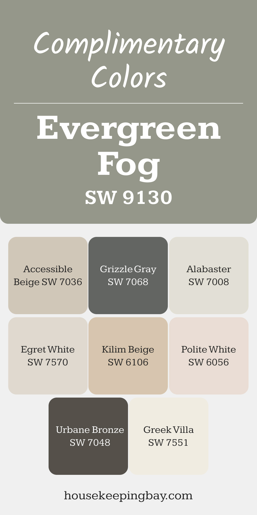
Evergreen Fog (SW 9130)
Evergreen Fog is a muted green-gray that’s been a designer favorite for a few years now. Even though it was Sherwin Williams’ Color of the Year in 2022, it’s still trending due to its versatility. It’s a great alternative to beige or gray when you want something neutral but a bit more interesting.
Where to use: Entryways, living rooms, or dining rooms for a sophisticated touch.
👉Check the full Guide Here (Coordinating colors, Trim, Colors That Go With and More..)
via housekeepingbay.com
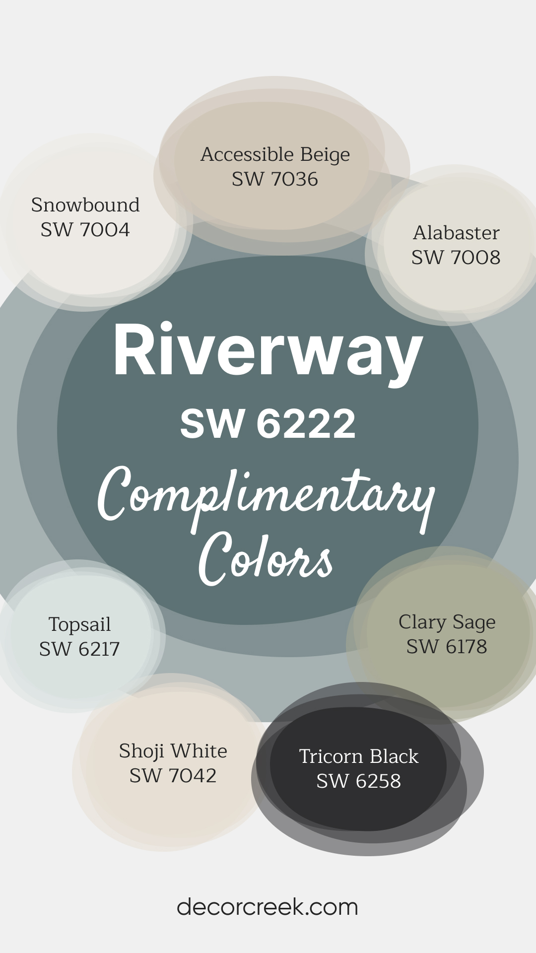
Riverway (SW 6222)
Riverway is a deeper teal that brings richness and depth to walls. It’s a bold color without being too dark, making it great for creating a cozy, cocoon-like space. I’ve used this color on accent walls or cabinetry for clients looking to add a bit of drama while keeping things elegant.
Where to use: Accent walls, kitchen islands, or built-in shelving.
👉Check the full Guide Here (Coordinating colors, Trim, Colors That Go With and More..)
via housekeepingbay.com
Bold and Dark Hues
If you’re ready to add drama and depth, bold and dark hues are the way to go. In 2025, they’re trending for accent walls, cabinetry, and even entire rooms. These colors can create a rich, moody atmosphere that feels cozy and sophisticated.
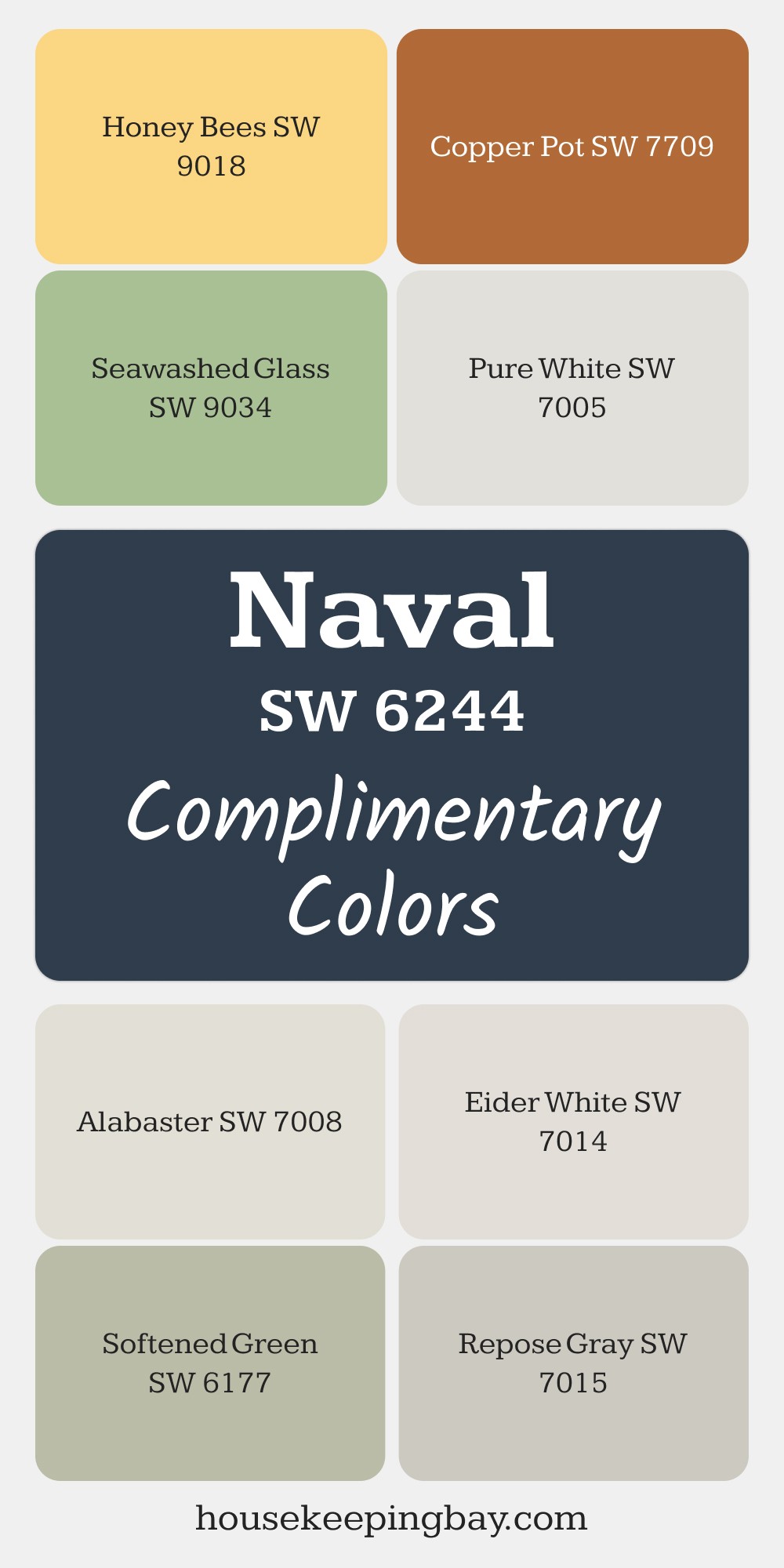
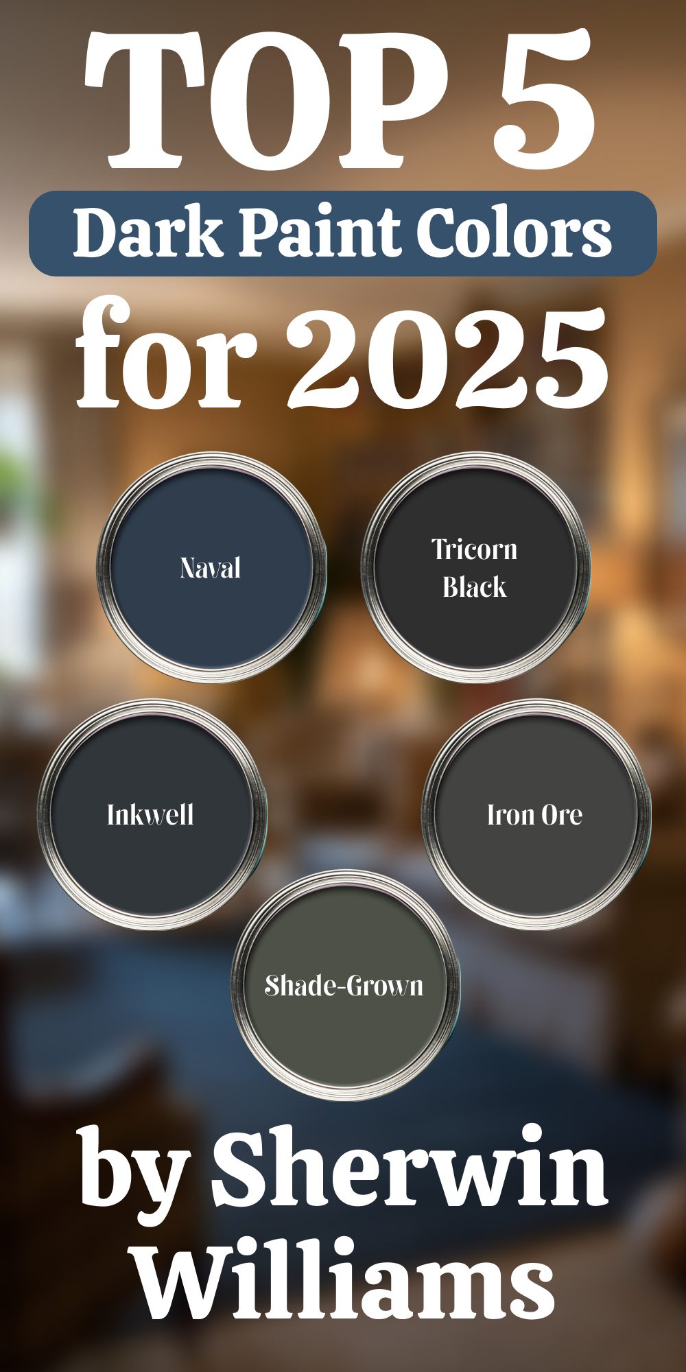
Naval (SW 6244)
Naval is a deep navy that brings a classic elegance to interiors. It’s a bold choice, but when balanced with lighter tones, it creates a timeless, high-contrast look. I often recommend it for cabinetry or accent walls in rooms where you want to create a focal point.
Where to use: Kitchen cabinets, feature walls, or home libraries.
👉Check the full Guide Here (Coordinating colors, Trim, Colors That Go With and More..)
via housekeepingbay.com
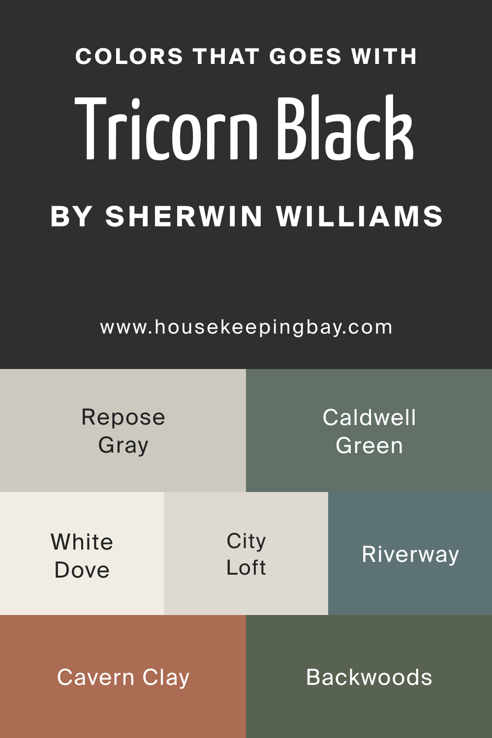
Tricorn Black (SW 6258)
Tricorn Black is a true black that adds instant drama. It’s perfect for those who want a bold, modern look. I like using it on doors, trim, or accent walls to make a statement without overwhelming the room. Paired with white walls, it gives a crisp, contemporary contrast.
Where to use: Interior doors, window trim, or accent walls in minimalist designs.
👉Check the full Guide Here (Coordinating colors, Trim, Colors That Go With and More..)
housekeepingbay.com
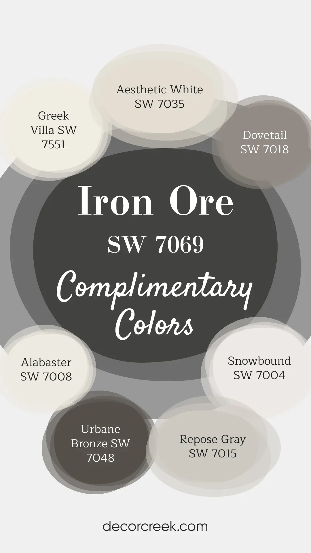
Iron Ore (SW 7069)
Iron Ore is a deep charcoal gray, softer than black but equally striking. It’s a great option if you want something bold but not as stark as true black. It works well in both modern and traditional spaces, especially when paired with warm wood tones or brass accents.
Where to use: Fireplace surrounds, kitchen islands, or exterior siding.
👉Check the full Guide Here (Coordinating colors, Trim, Colors That Go With and More..)
via housekeepingbay.com
Inkwell (SW 6992)
Inkwell is a near-black shade with blue undertones. It adds richness and depth without feeling too harsh. I love it for moody bedrooms or dining rooms where you want to create an intimate atmosphere. It also pairs beautifully with metallic finishes.
Where to use: Dining rooms, bedrooms, or statement walls.
Salamander (SW 6188)
Salamander is a deep green that feels rich and luxurious. It’s perfect for spaces where you want to create a dramatic, grounded look. I find it pairs beautifully with both warm neutrals and brass or gold accents, giving a sophisticated finish to any room.
Where to use: Built-in bookcases, kitchen cabinetry, or accent walls.
housekeepingbay.com
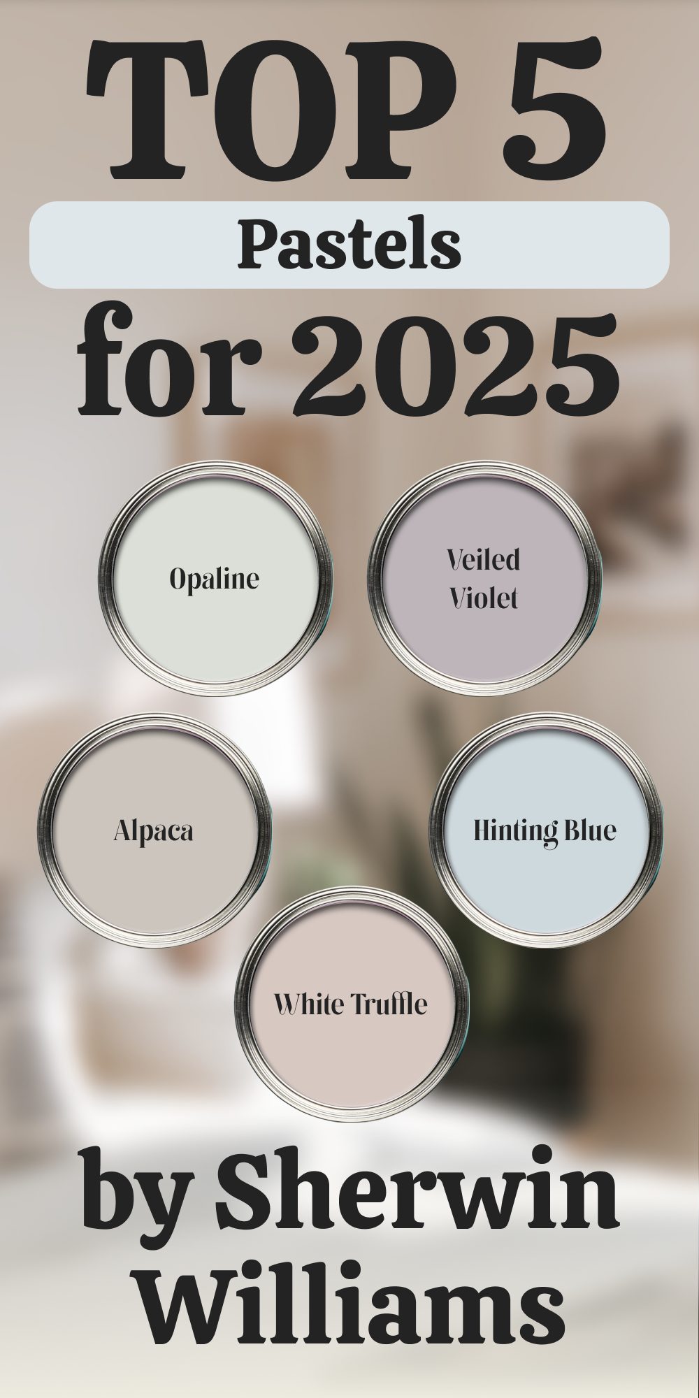
Muted Pastels
Muted pastels are a great way to add color without overwhelming a room. These shades are cheerful yet soft, making them ideal for bedrooms, nurseries, and light-filled spaces. In 2025, they’re being used in modern designs to add a gentle pop of color.
Opaline (SW 6189)
Opaline is a delicate pastel green that feels fresh and airy. It’s a great option for rooms with lots of natural light, as it reflects beautifully and creates a subtle sense of color. I’ve used it in bedrooms and sunrooms to create a light, refreshing vibe.
Where to use: Sunrooms, bedrooms, or small powder rooms.
Veiled Violet (SW 6268)
Veiled Violet is a soft lavender-gray, perfect for adding a touch of color to a room without making it feel too bright. It works wonderfully in nurseries or bedrooms where you want a calming atmosphere. Pair it with crisp white trim for a clean, fresh look.
Where to use: Bedrooms, nurseries, or reading nooks.
Hinting Blue (SW 6519)
Hinting Blue is a pale blue with a slight gray undertone, giving it a more subdued, sophisticated feel. It’s ideal for spaces where you want to keep things light but still add a bit of personality. I’ve seen it work well in both modern and coastal-style designs.
Where to use: Bathrooms, laundry rooms, or ceilings for a subtle touch of color.
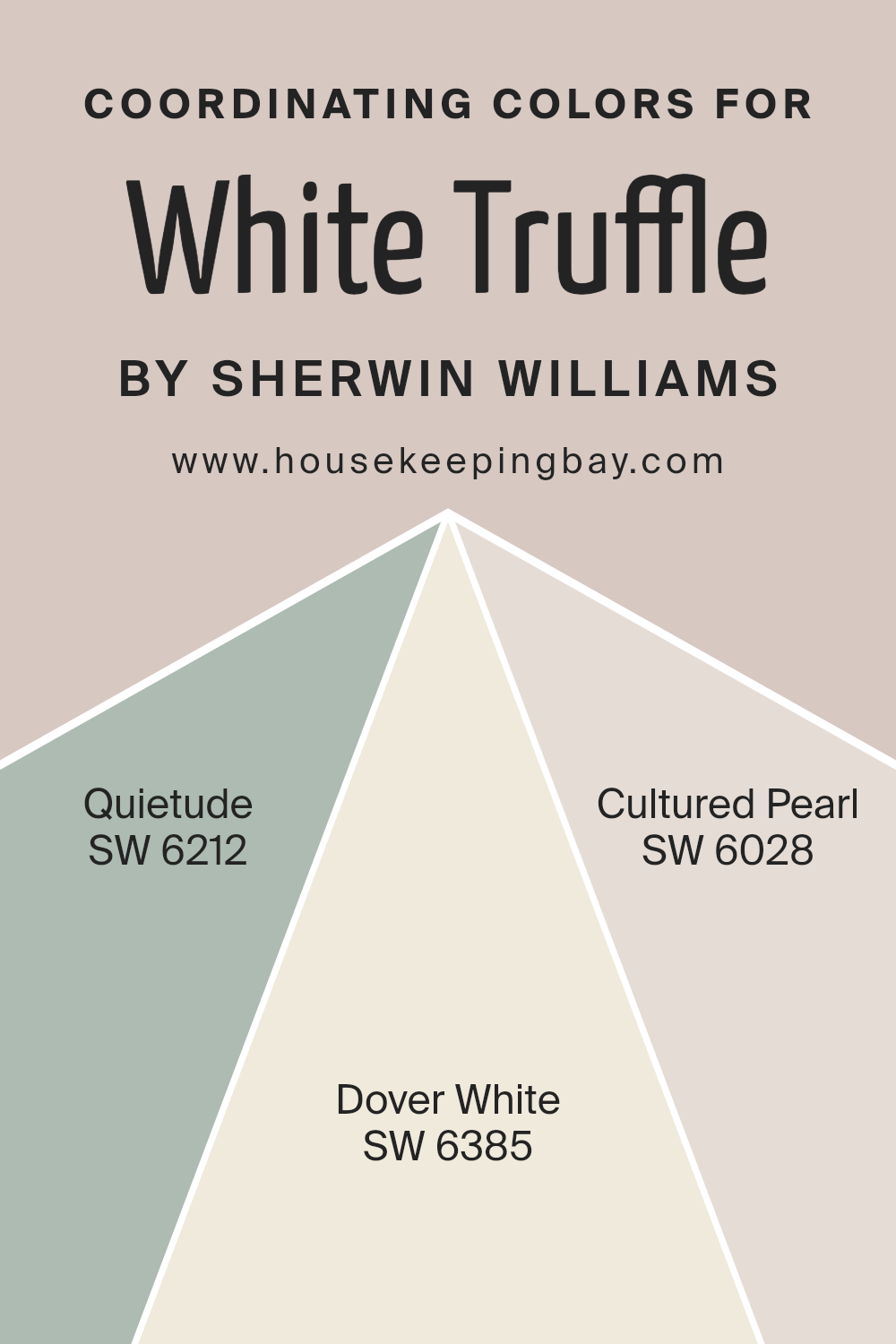
White Truffle (SW 6029)
White Truffle is a muted pinkish-beige that feels warm and inviting. It’s perfect for creating modern, airy spaces with a bit of softness. I like using it in rooms with lots of natural wood and light fabrics for a cozy, welcoming feel.
Where to use: Living rooms, bedrooms, or entryways for a warm, modern look.
👉Check the full Guide Here (Coordinating colors, Trim, Colors That Go With and More..)
housekeepingbay.com
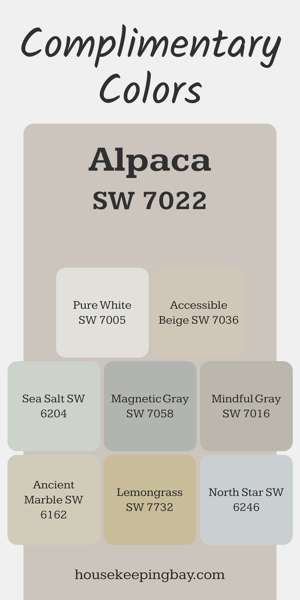
Alpaca (SW 7022)
Alpaca is a light taupe with a pink undertone. It’s subtle enough to act as a neutral but adds a hint of warmth that makes a room feel cozy. I often recommend it for clients who want a soft, warm base that isn’t too beige or gray.
Where to use: Bedrooms, hallways, or offices for a cozy, understated look.
👉Check the full Guide Here (Coordinating colors, Trim, Colors That Go With and More..)
via housekeepingbay.com
housekeepingbay.com
Crisp Whites and Off-Whites
Crisp whites and off-whites are essential in interior design because they provide a clean, fresh backdrop for other colors. In 2025, these shades are still a favorite for creating bright, modern spaces or soft, inviting rooms, depending on whether you opt for a cool or warm undertone.
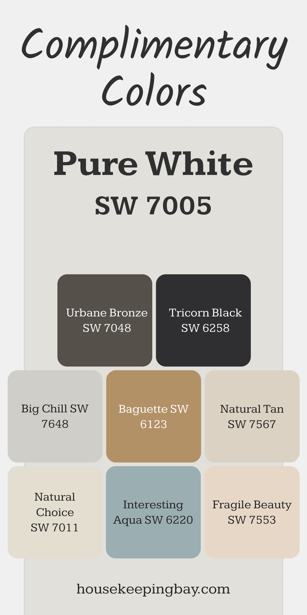
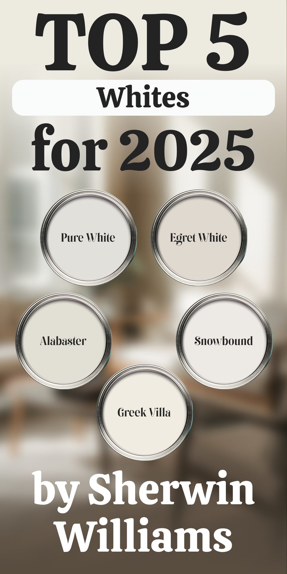
Pure White (SW 7005)
Pure White is exactly what it sounds like—a clean, neutral white that works beautifully in any setting. It doesn’t have strong undertones, which makes it incredibly versatile. I often use it when a client wants a minimalist look or needs a blank canvas for bold artwork or colorful furniture.
Where to use: Walls, trim, ceilings, or cabinetry for a crisp, clean look.
👉Check the full Guide Here (Coordinating colors, Trim, Colors That Go With and More..)
via housekeepingbay.com
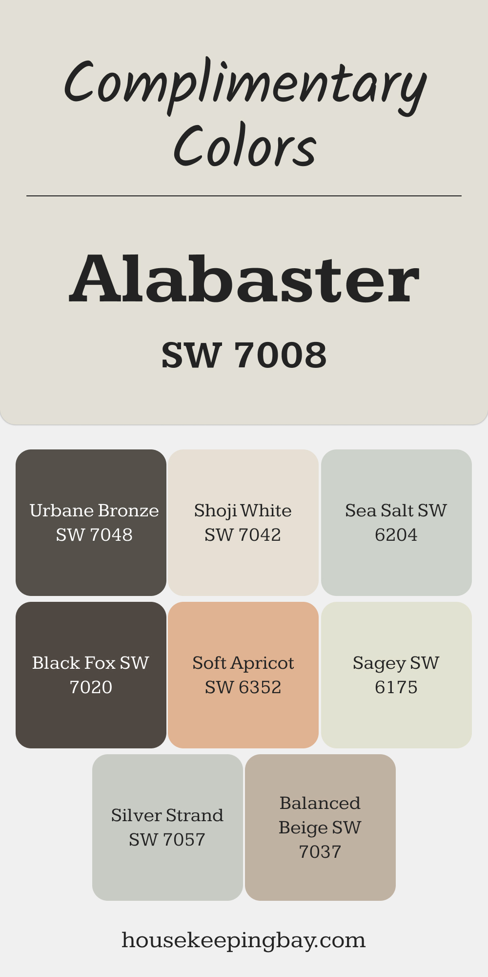
Alabaster (SW 7008)
Alabaster is a soft, warm white with a creamy undertone that gives it a cozy, welcoming feel. Unlike stark whites, it adds warmth to a room without feeling yellow. This makes it perfect for spaces where you want to balance light and comfort. In 2016, it was even named Sherwin Williams’ Color of the Year, and its popularity hasn’t faded since.
Where to use: Living rooms, bedrooms, or dining rooms where you want warmth with a clean aesthetic.
👉Check the full Guide Here (Coordinating colors, Trim, Colors That Go With and More..)
via housekeepingbay.com
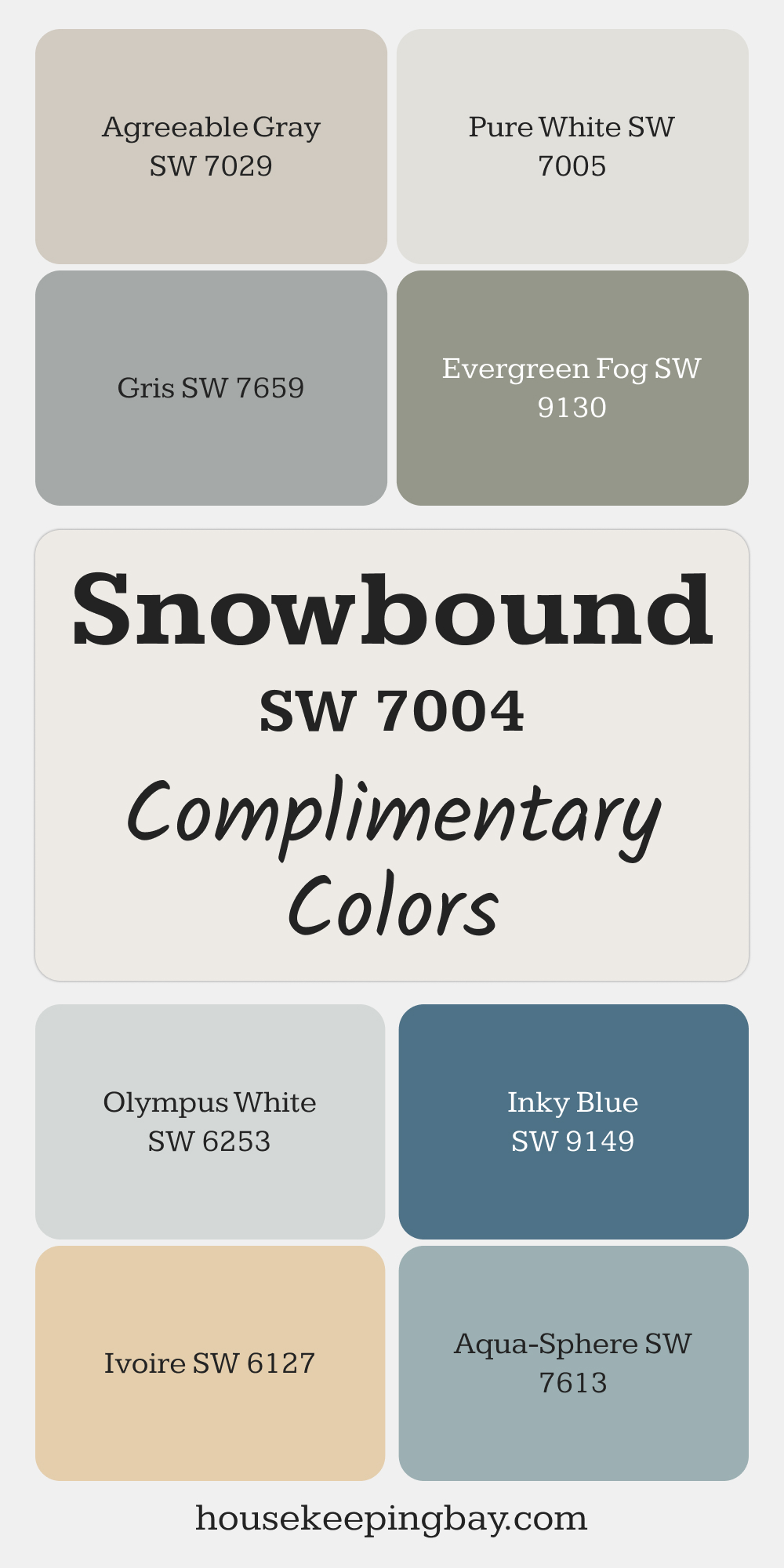
Snowbound (SW 7004)
Snowbound is a cool white with a subtle gray undertone, making it a perfect choice for modern or minimalist interiors. It offers a crisp, clean look while softening the harshness that some pure whites can bring. I recommend it for spaces with lots of natural light, as it doesn’t reflect too much glare.
Where to use: Walls, trim, and modern kitchens for a bright yet soft finish.
👉Check the full Guide Here (Coordinating colors, Trim, Colors That Go With and More..)
via housekeepingbay.com
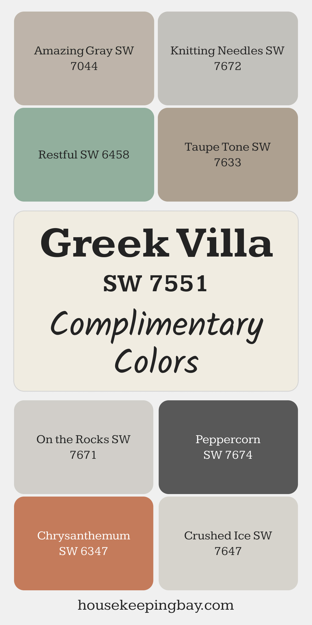
Greek Villa (SW 7551)
Greek Villa is a creamy white that adds warmth and softness to any room. It’s a fantastic option for homes with traditional or farmhouse designs, as it pairs beautifully with wood and stone elements. I like using this shade when I want to create a cozy, elegant atmosphere.
Where to use: Bedrooms, kitchens, or spaces with lots of wood accents.
👉Check the full Guide Here (Coordinating colors, Trim, Colors That Go With and More..)
via housekeepingbay.com
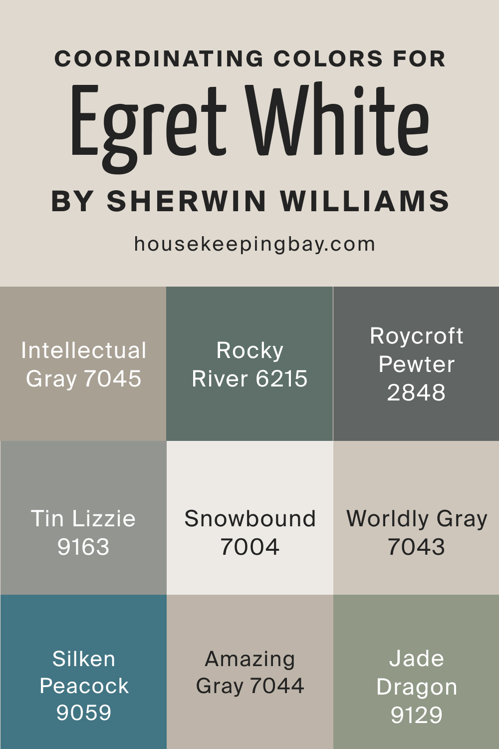
Egret White (SW 7570)
Egret White is a warm off-white with a hint of gray, giving it a modern edge. It works well in contemporary spaces where you want a neutral base that’s not too stark. It pairs nicely with bold or dark accent colors, making it a versatile option for those who want a bit of contrast.
Where to use: Living rooms, hallways, or open-concept spaces for a warm, sophisticated feel.
👉Check the full Guide Here (Coordinating colors, Trim, Colors That Go With and More..)
housekeepingbay.com
housekeepingbay.com
Expert Picks
While all 30 colors are worth considering, there are always a few that stand out for their versatility and impact. Here are my personal favorites for 2025 and where I like to use them:
1. Sea Salt (SW 6204)
This soft blue-green shade is one of my go-to colors for bathrooms and bedrooms. It feels calming but not cold, making it perfect for spaces where relaxation is key.
👉Check the full Guide Here (Coordinating colors, Trim, Colors That Go With and More..)

via housekeepingbay.com
2. Accessible Beige (SW 7036)
I love how this warm neutral adapts to different lighting. It looks modern in bright rooms but cozy in dim spaces, making it great for living rooms and hallways.
👉Check the full Guide Here (Coordinating colors, Trim, Colors That Go With and More..)

housekeepingbay.com
3. Naval (SW 6244)
When I want to create contrast, Naval is my top pick. It works beautifully for accent walls, built-ins, or even kitchen cabinets. It’s bold but timeless.
👉Check the full Guide Here (Coordinating colors, Trim, Colors That Go With and More..)

via housekeepingbay.com
4. Alabaster (SW 7008)
Alabaster has been popular for years, and I don’t see that changing anytime soon. It’s warm without being yellow and helps brighten up rooms without feeling stark.
👉Check the full Guide Here (Coordinating colors, Trim, Colors That Go With and More..)

via housekeepingbay.com
5. Evergreen Fog (SW 9130)
This muted green is ideal for adding subtle color. I often recommend it for offices and dining rooms, where it creates a sophisticated, restful vibe.
👉Check the full Guide Here (Coordinating colors, Trim, Colors That Go With and More..)

via housekeepingbay.com
6. A Look at Color Pairing Ideas
Choosing the right color is only part of the equation; pairing it well can completely transform a room. Here are a few ideas for 2025 color pairings:
- Neutral + Bold: Pair Accessible Beige (SW 7036) with Naval (SW 6244) for a modern, balanced look.
- Cool Tones + Warm Accents: Use Sea Salt (SW 6204) as a base and add warmth with Clay Ridge (SW 6063) accents.
- Light + Dark: Go for contrast by combining Pure White (SW 7005) with Iron Ore (SW 7069).
7. What Designers Are Saying About Sherwin Williams’ 2025 Palette
Designers are embracing the versatility of Sherwin Williams’ 2025 palette. Many are noting the continued rise of muted greens and earth tones, which reflect a broader movement toward sustainable living and nature-inspired interiors.
According to interior designer Amber Lewis, “Muted tones, especially greens and neutrals, are dominating because they bring calm and connection to the home.” Source
Sherwin Williams has also noted a growing preference for darker hues, as more homeowners experiment with moodier spaces. A study by Zillow found that homes with darker-toned rooms, like deep navy or black, can sell for up to $1,500 more than expected.
Trends in color don’t just come and go—they reflect how we live, what we value, and how we want our spaces to feel. In 2025, it’s clear that we’re looking for a mix of comfort, creativity, and connection to nature. Whether you choose a soft pastel, a grounding earth tone, or a bold accent, there’s something in this year’s palette for every style.
If you’re thinking of refreshing your home, I encourage you to try one of these trending shades. A simple change in color can completely change how a room feels—and sometimes, that’s exactly what we need.
housekeepingbay.com
