White Truffle SW 6029 by Sherwin Williams
Elevate Your Space with This Luxuriously Creamy Shade
Welcome to our spotlight on SW 6029 White Truffle by Sherwin Williams – a color that’s as tasty and appealing as it sounds! In this article, we’re going to explore the unique charm of White Truffle.
Known for its subtle beauty, this color has a way of transforming spaces into serene and inviting areas. Sherwin Williams’ White Truffle is not just any off-white; it’s a delicate balance of warmth and elegance, making rooms feel cozy and bright at the same time.
For those looking to update their home’s look, White Truffle offers a versatile solution. It pairs wonderfully with a wide range of décor styles, from modern minimalism to rustic charm.
Furthermore, its ability to complement other colors means you can use it as a base for various design schemes, adding depth and complexity to your interiors without overwhelming them.
Throughout this article, we will get to know more about how White Truffle stands out from other shades, its best uses in home décor, and tips on how to make the most of this enchanting color.
Whether you’re considering a major remodel or a simple refresh, White Truffle by Sherwin Williams might be the perfect choice for your next project. Let’s get started, and discover the potential of this beautiful color to transform your space into something truly special.
via Sherwin Williams
What Color Is White Truffle SW 6029 by Sherwin Williams?
White Truffle SW 6029 by Sherwin Williams presents a unique and versatile shade that bridges the gap between pure white and soft beige. This color reflects a soothing warmth, offering a cozy and inviting atmosphere to any room. Its subtle undertones make it an excellent choice for those looking to inject a hint of color into their spaces without overpowering them.
This specific shade is adaptable and works wonderfully with a variety of interior styles. It shines in minimalist designs, where its understated elegance can stand out, and also complements modern farmhouse and Scandinavian interiors, where warmth and simplicity are key.
White Truffle provides a perfect backdrop for these decor styles, enhancing the sense of openness and light while adding a touch of sophistication.
Pairing White Truffle with materials and textures is a breeze due to its versatile nature. It goes particularly well with natural wood, creating a balanced and harmonious look that’s both inviting and grounding. In spaces with metallic accents, such as brass or copper, White Truffle adds a soft contrast that highlights these elements without competing with them.
For textures, consider soft, plush fabrics like wool or cotton in furnishings to reinforce the comfort and warmth that this color inherently brings to spaces.
housekeepingbay.com
Is White Truffle SW 6029 by Sherwin Williams Warm or Cool color?
White Truffle SW 6029 by Sherwin Williams is a unique paint color that adds a cozy and elegant touch to any home. This color is like a warm hug, with a soft, creamy tone that can make a room feel more inviting and comfortable.
It’s not just plain white; it has depth, which means it can pair well with many different décor styles and other colors. Whether your home has a modern look or a more rustic vibe, White Truffle can fit right in.
Applying this color to walls can brighten up a space without making it feel cold or sterile, which is often a concern with pure whites. It’s perfect for living rooms, bedrooms, or even kitchens, adding a gentle warmth that encourages relaxation and peace.
Plus, it can help small spaces appear bigger and more open, while still maintaining a cozy atmosphere. Overall, White Truffle is a versatile option for those looking to refresh their home with a touch of soft elegance.
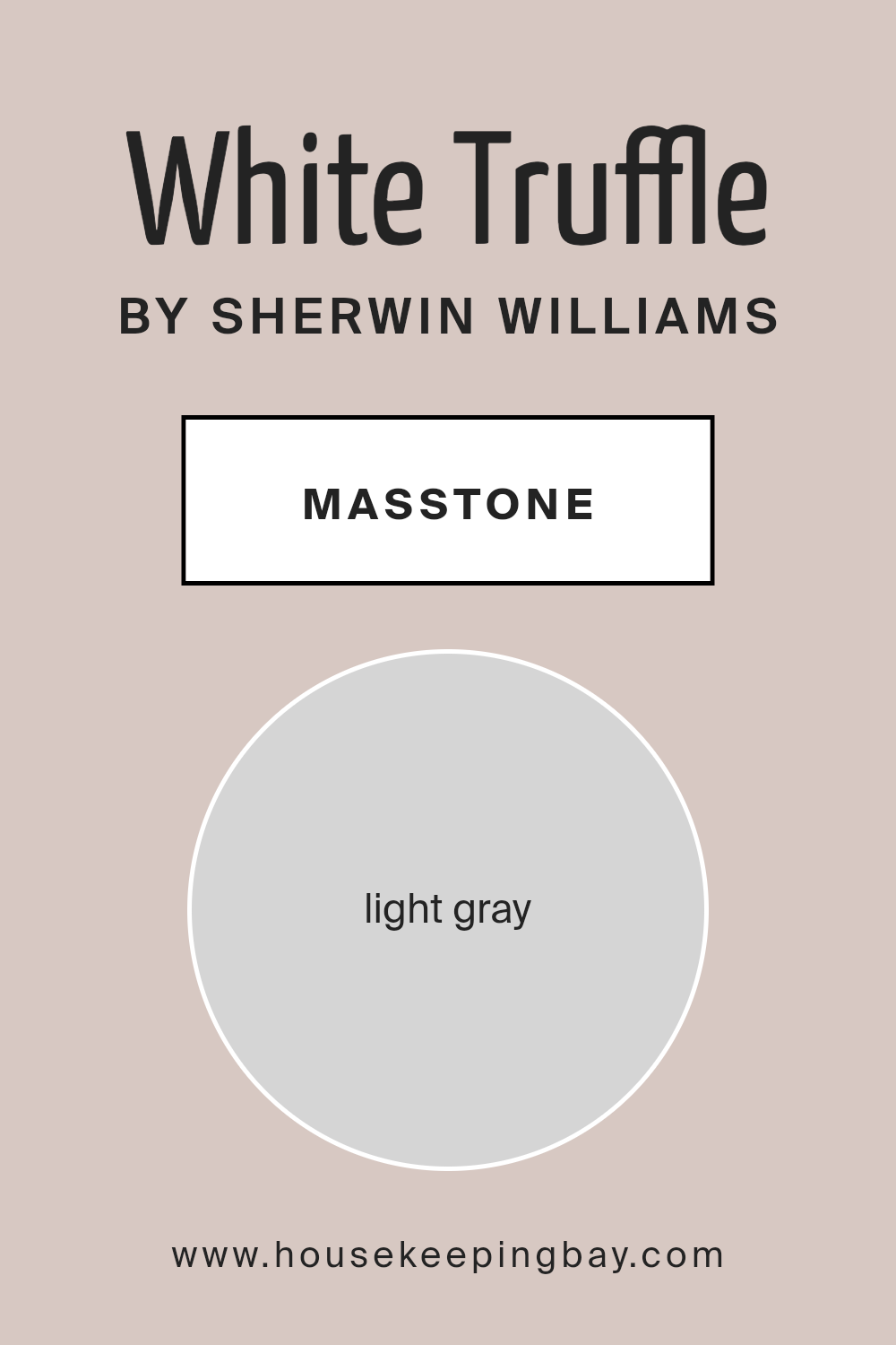
What is the Masstone of the White Truffle SW 6029 by Sherwin Williams?
White Truffle SW 6029 by Sherwin Williams is a unique color with a masstone, or main color, of light gray, looking a lot like the color code #D5D5D5. This gentle shade works wonderfully in homes because it provides a soft, calming backdrop for any room. Think of it as a quiet base, letting your furniture and decorations shine without the walls overpowering them.
It’s very versatile, meaning it practically goes well with everything, whether your home is filled with bright colors or more muted tones.
This light gray also helps make spaces feel bigger and brighter, as it reflects light nicely. It’s perfect for rooms that don’t get a lot of natural sunlight, helping to brighten them up.
Plus, it’s a timeless color, so you won’t feel the need to repaint anytime soon. Whether you’re updating the living room, bedroom, or bathroom, White Truffle can create a cozy, stylish atmosphere that feels like home.
housekeepingbay.com
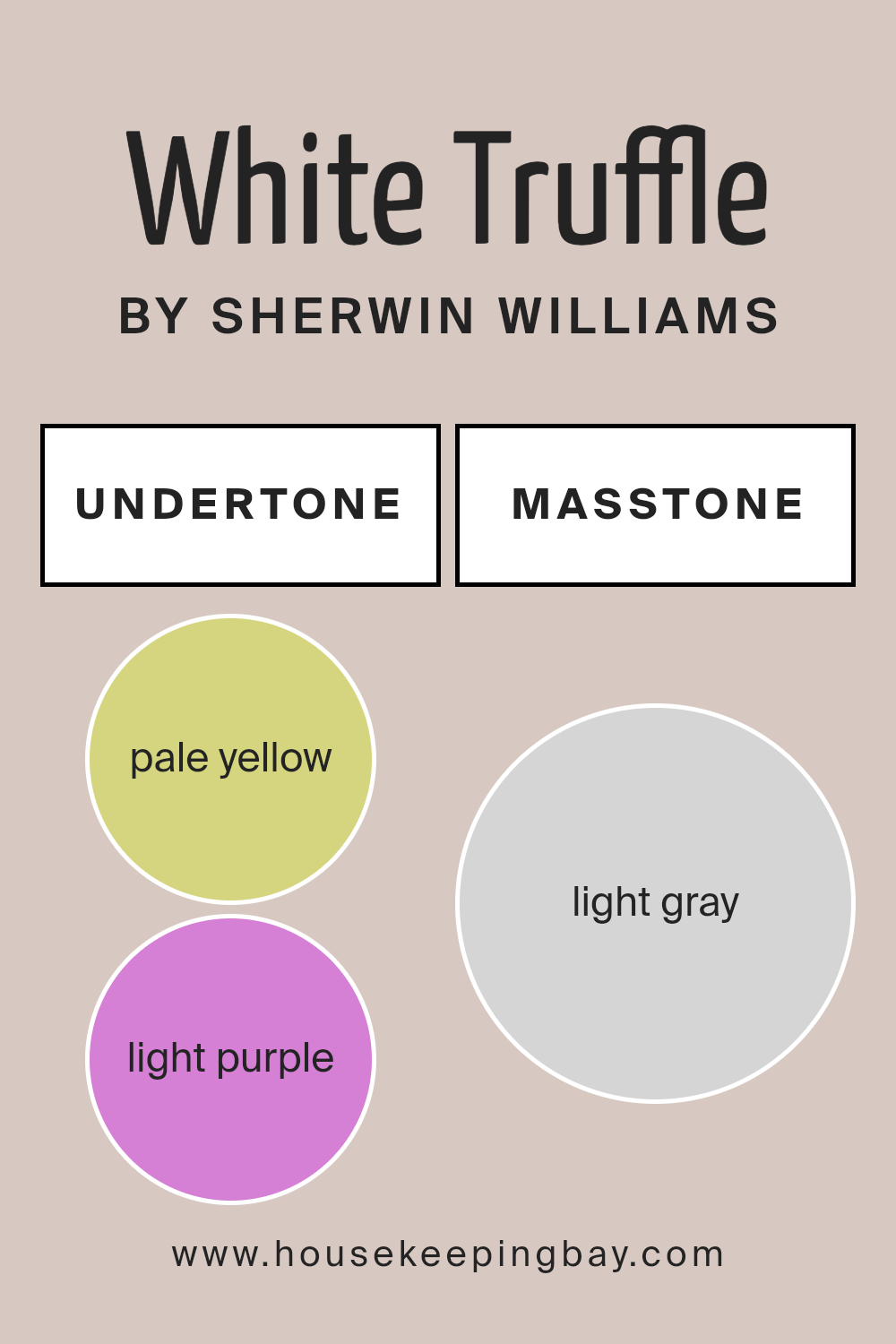
Undertones of White Truffle SW 6029 by Sherwin Williams
White Truffle SW 6029 by Sherwin Williams is a unique color that comes with a mix of subtle undertones, including pale yellow (#D5D580) and light purple (#D580D5). These undertones play a big role in how we perceive the color, giving it more depth and complexity than a simple white or off-white.
When we talk about undertones, we’re referring to the hints of color that can be seen beneath the surface of the primary color. They can affect how a color looks under different types of lighting or in various spaces.
For White Truffle, the pale yellow and light purple undertones mean that in certain lights, the color may lean slightly towards these hues, adding warmth or a soft hint of creativity to a room without overwhelming it with color.
For interior walls, White Truffle’s undertones can significantly impact the atmosphere of a space. In rooms with a lot of natural light, the pale yellow undertone might make the space feel warmer and more welcoming, while the light purple undertone could add a subtle touch of sophistication and uniqueness.
This makes White Truffle an excellent choice for creating a cozy yet elegant feel in living rooms, bedrooms, or any space where a soft, nuanced palette is desired. It’s a way to add interest to your walls without the commitment to a strong color, allowing for flexibility in decor and furniture choices.
housekeepingbay.com
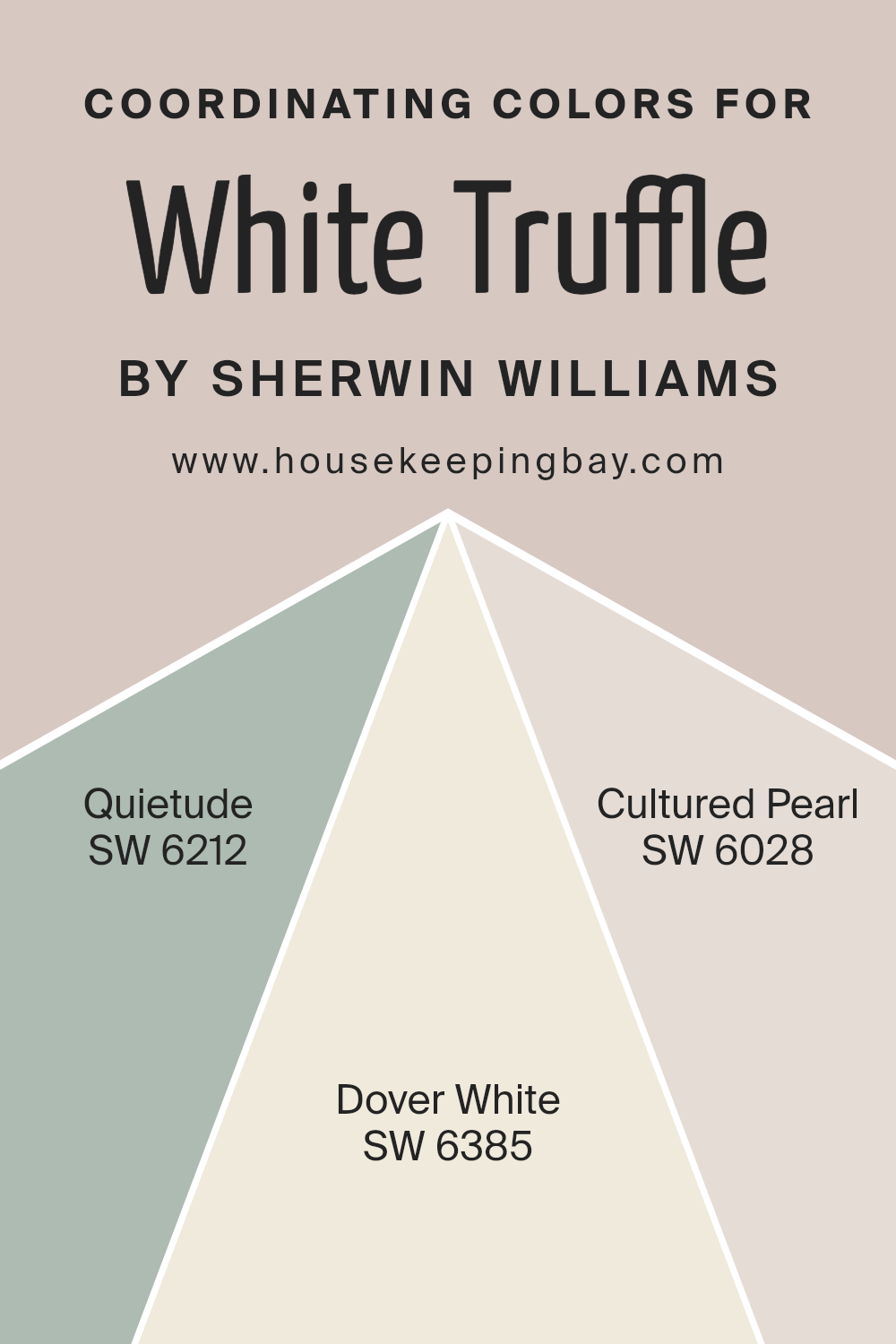
Coordinating Colors of White Truffle SW 6029 by Sherwin Williams
Coordinating colors are those that work well together in harmony to enhance the overall aesthetic of a space. They are selected based on their ability to complement each other while bringing balance and a sense of continuity to the design. When used thoughtfully, coordinating colors can create a cohesive look that enhances the main color’s qualities.
In the case of White Truffle SW 6029 by Sherwin Williams, a sophisticated and versatile hue, its coordinating colors have been carefully chosen to underline its warmth and elegance while adding depth and variation to the color scheme.
Quietude SW 6212 is a serene and calming blue-green that brings a breath of fresh air to any space, making it feel more tranquil and spacious. It contrasts subtly with White Truffle, providing just the right amount of color to invigorate the palette without overwhelming it.
Dover White SW 6385 is a creamy, soft white that offers a slight contrast to the deeper tones of White Truffle, softening the overall appearance and providing a smooth transition between more vivid colors.
Cultured Pearl SW 6028, on the other hand, is a sophisticated, muted beige with a touch of warmth, acting as a bridge between the light and dark tones in the palette, ensuring that the combination of colors feels both elegant and cohesive.
Together, these coordinating colors amplify the beauty of White Truffle, making it easier to create inviting and harmonious spaces.
You can see recommended paint colors below:
housekeepingbay.com
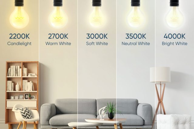
How Does Lighting Affect White Truffle SW 6029 by Sherwin Williams?
Lighting plays a big role in how we see colors. When you pick a paint color like White Truffle SW 6029 by Sherwin Williams, the light in your room can make it look different. This happens because light sources can change the color’s tone, making it cooler or warmer.
In artificial light, which is any light created by light bulbs or fixtures, White Truffle can look different based on the type of bulb used. Warm bulbs can make it look more creamy and welcoming, while cool bulbs might make it look more crisp and clean.
This means in the evenings or in rooms without windows, White Truffle will change based on the artificial light present.
In natural light, which comes from the sun, White Truffle also changes throughout the day and depends on which way your room faces. North-faced rooms get less direct sunlight, making them cooler and possibly making White Truffle look more muted and soft, giving the room a calm feeling.
- South-faced rooms get lots of direct light, which can make this color look brighter and warmer, adding energy to the space.
- East-faced rooms see the most change with White Truffle, as they get bright morning light that can make the color look very warm and welcoming. As the day goes on, it might look softer and cooler.
- West-faced rooms are the opposite, with softer light in the morning making White Truffle look gentle, and then as the sun sets, it might look warmer.
So, White Truffle SW 6029 can really transform depending on the light, making it versatile. Whether it’s a cozy glow in a lamp-lit corner or a bright splash in sunny windows, this color adapts, offering a range of looks from a single paint can.
housekeepingbay.com
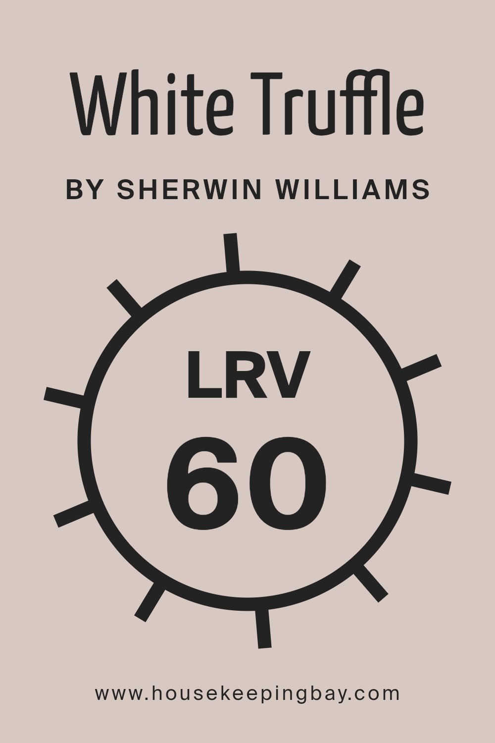
What is the LRV of White Truffle SW 6029 by Sherwin Williams?
LRV stands for Light Reflectance Value, and it’s a number that tells you how much light a color reflects or absorbs. This number ranges from 0 to 100, with 0 being completely black (absorbing all light) and 100 being pure white (reflecting all light).
LRV is important because it helps you understand how light or dark a color will look on your walls depending on the amount of natural or artificial light your room gets.
A higher LRV means the color will appear lighter and can make a space feel more open and airy, while a lower LRV means the color will look darker and can make a room feel cozier or smaller.
The LRV of White Truffle SW 6029 by Sherwin Williams is 59.514, which is slightly above the midpoint of the scale. This means it’s a color that reflects a moderate amount of light. In practical terms, this LRV value indicates that White Truffle will bring a warm, inviting feel to a room without making it feel too bright or stark.
It’s a versatile choice that can work well in spaces with different lighting conditions, making rooms feel welcoming while still providing enough reflectivity to keep spaces looking light and lively. Whether your room gets a lot of sunlight or relies more on lamps and overhead lights, White Truffle can maintain its pleasant, soothing appearance.
housekeepingbay.com
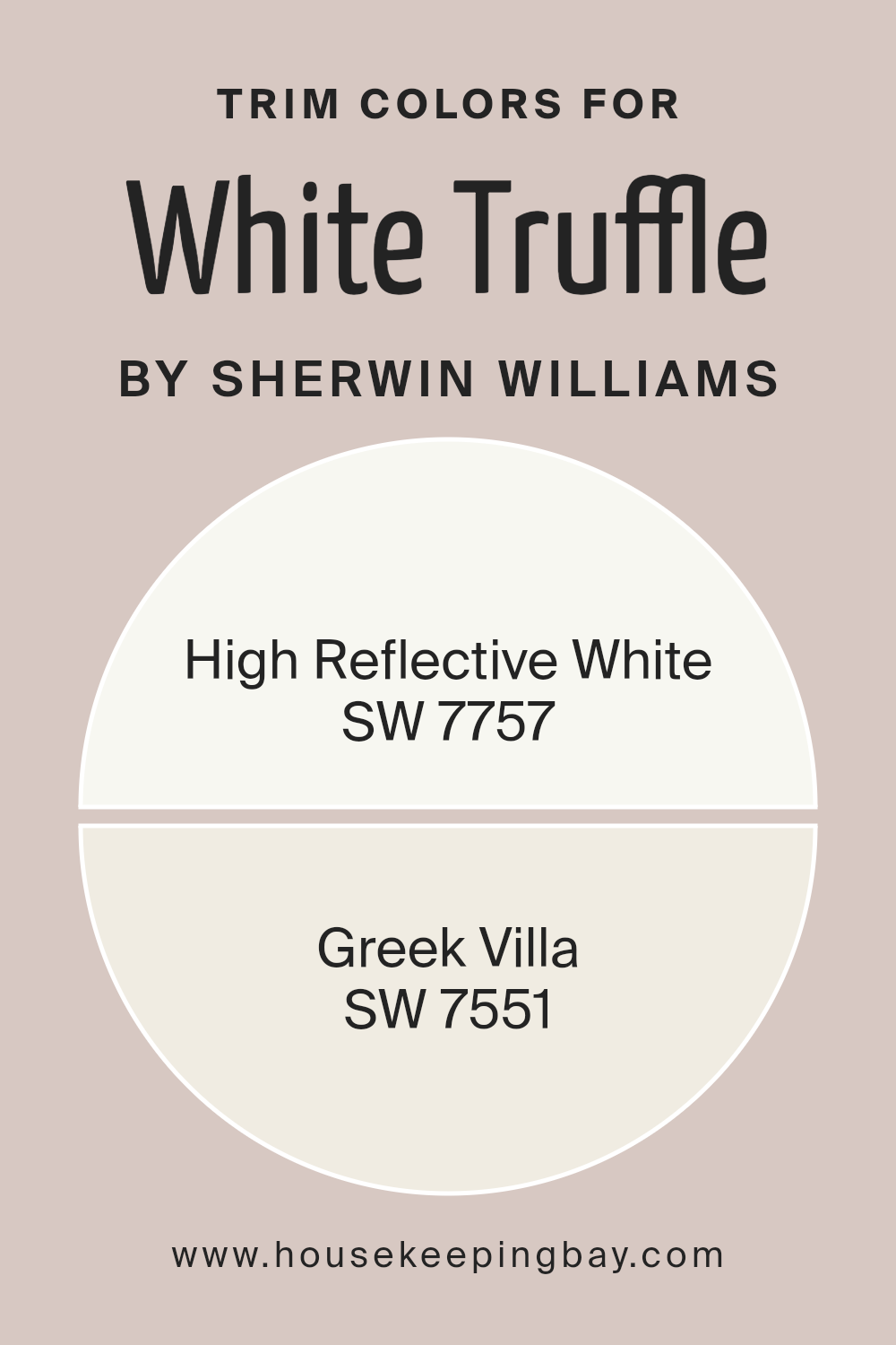
What are the Trim colors of White Truffle SW 6029 by Sherwin Williams?
Trim colors, in the context of interior or exterior design, refer to the hues selected for the finishing touches on surfaces such as door frames, window frames, skirtings, and moldings.
When we look at White Truffle SW 6029 by Sherwin Williams, choosing the right trim color is crucial because it frames the walls and highlights the architectural details of the space. A thoughtfully selected trim color can enhance the overall aesthetic of the room, providing contrast or cohesion with the wall color, depending on the desired effect.
In the case of White Truffle, which carries a warm and inviting tone, the matching of suitable trim colors not only accentuates its elegance but also subtly defines the spatial boundaries, creating a visually pleasing and harmonious ambiance.
The use of SW 7757 – High Reflective White as a trim color can brighten the edges and corners of a room painted with White Truffle, offering a crisp, clean finish that reflects light, thereby making the space appear larger and more vibrant.
This shade of white is especially effective in spaces that seek clarity and a fresh atmosphere, as its high reflectivity maximizes the natural light available in the room.
On the other hand, SW 7551 – Greek Villa, as a trim color, provides a softer contrast to White Truffle, promoting a cozy and seamless transition between the wall and the trim.
Greek Villa encompasses a slightly warmer undertone that complements the earthiness of White Truffle, enriching the space with depth and a sense of welcoming warmth.
Both choices in trim colors serve to highlight the beauty of White Truffle SW 6029, either by drawing the eye with a stark frame or by gently blending the boundaries for a more integrated look.
You can see recommended paint colors below:
housekeepingbay.com
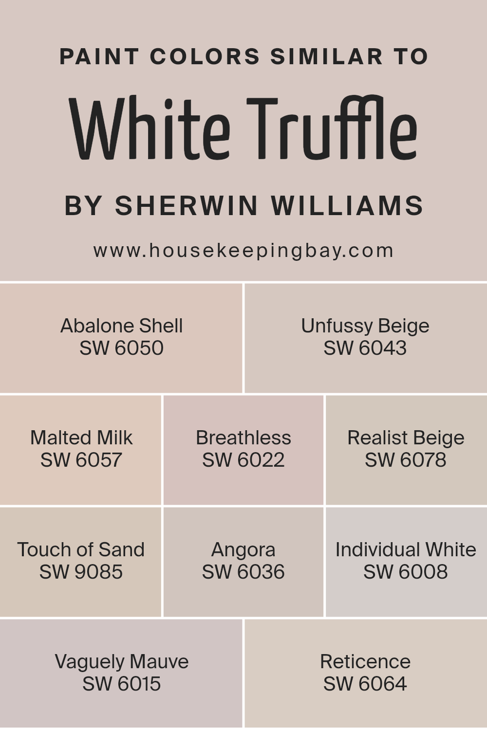
Colors Similar to White Truffle SW 6029 by Sherwin Williams
Selecting similar colors, such as those close to White Truffle SW 6029 by Sherwin Williams, can significantly impact the aesthetic and mood of a space. Colors like Abalone Shell, Unfussy Beige, Malted Milk, Breathless, Realist Beige, Touch of Sand, Angora, Individual White, Vaguely Mauve, and Reticence, share a harmonious palette that can create a seamless and cohesive look throughout a home.
These colors work together because they have similar undertones or intensities, allowing for a smooth transition from room to room, providing a sense of continuity and flow.This commonality in hue makes it easier to design spaces that feel well thought out and intentionally styled.
For instance, Abalone Shell and Unfussy Beige offer a subtle warmth that can make a room feel welcoming and cozy, perfect for living rooms or bedrooms looking for a soft touch.
Malted Milk and Breathless bring a lighter, airier feel, ideal for creating a serene and calming environment in spaces like bathrooms or small nooks. Realist Beige and Touch of Sand have a grounding effect, suitable for communal areas like the dining room or kitchen, where a sense of gathering is central. In contrast, Angora and Individual White add depth and dimension without overwhelming, fitting for creating bright, open spaces.
Lastly, Vaguely Mauve and Reticence introduce a soft hint of color, perfect for adding a touch of personality without deviating from a neutral palette.
These colors, while individually unique, collectively offer a versatile and harmonious range that can enhance the environment and mood of any space.
You can see recommended paint colors below:
- SW 6050 Abalone Shell
- SW 6043 Unfussy Beige
- SW 6057 Malted Milk
- SW 6022 Breathless
- SW 6078 Realist Beige
- SW 9085 Touch of Sand
- SW 6036 Angora
- SW 6008 Individual White
- SW 6015 Vaguely Mauve
- SW 6064 Reticence
housekeepingbay.com
How to Use White Truffle SW 6029 by Sherwin Williams In Your Home?
White Truffle SW 6029 by Sherwin Williams is a unique and versatile paint color that can bring warmth and elegance to any room in your home. With its soft, creamy hue, White Truffle creates a cozy and inviting atmosphere that’s perfect for living spaces where comfort is key. It pairs beautifully with a wide range of colors, from bold and vibrant tones to more subdued, earthy shades.
This makes it a great choice for walls, as it provides a neutral yet rich background that can complement various decor styles.
In the bedroom, using White Truffle can add a touch of serenity and sophistication, creating a peaceful retreat. In the kitchen or dining area, it can help to brighten the space and make it appear more spacious and welcoming.
Even in smaller rooms or those with limited natural light, White Truffle can help to reflect light and give the illusion of a bigger area. Whether you’re updating a single room or transforming your entire home, White Truffle SW 6029 offers a timeless appeal that can enhance the beauty and warmth of your living spaces.
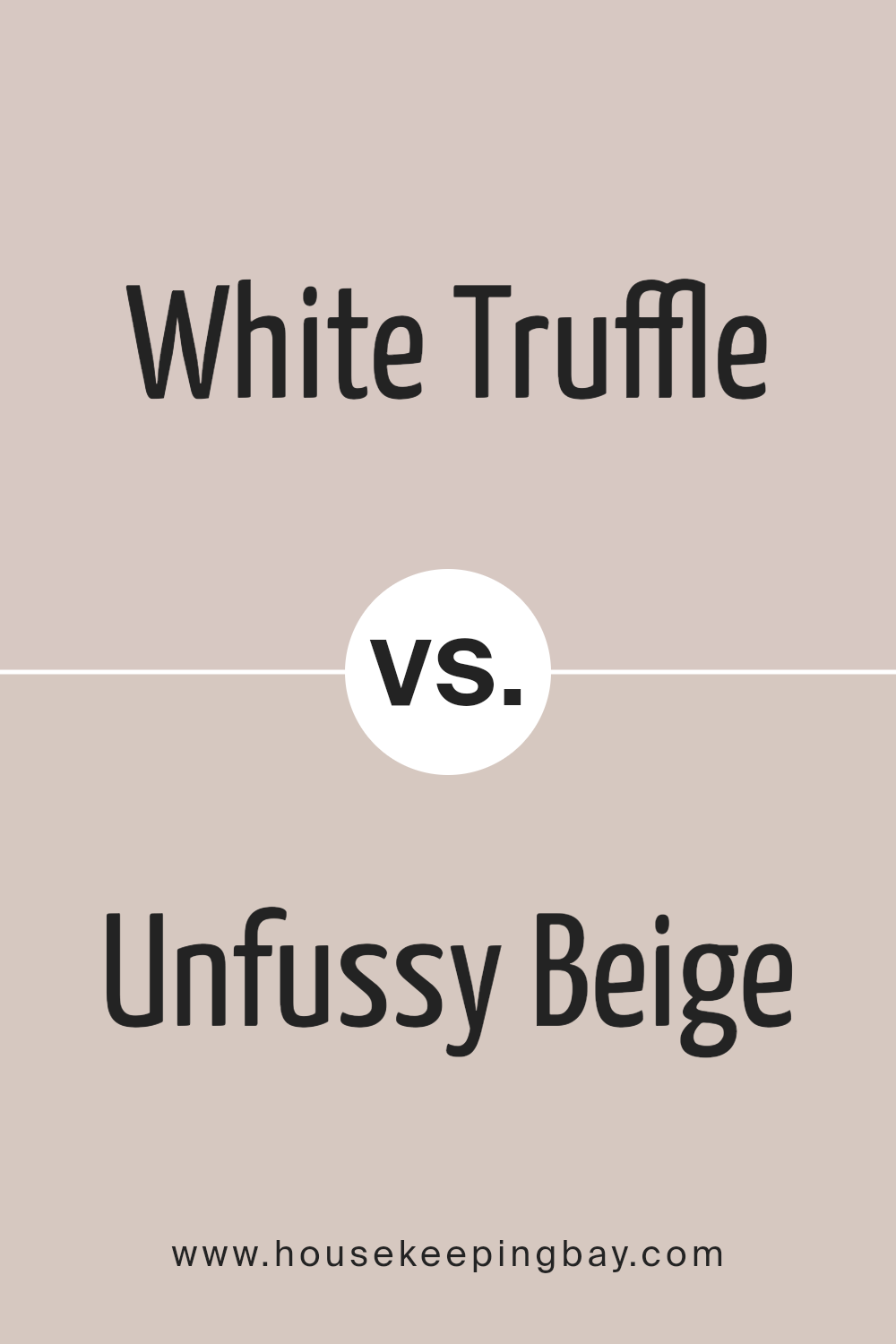
White Truffle SW 6029 by Sherwin Williams vs Unfussy Beige SW 6043 by Sherwin Williams
White Truffle SW 6029 by Sherwin Williams is a soothing shade that gives off a gentle, welcoming vibe. It carries a light, creamy essence which makes spaces feel airy and open. Perfect for those wanting to add a touch of warmth without overwhelming a room, White Truffle effortlessly complements various decor styles.
Unfussy Beige SW 6043, on the other hand, is a down-to-earth color that brings a cozy, comforting atmosphere to any space. It offers a more pronounced warmth compared to White Truffle, making it ideal for creating a snug, inviting environment.
This hue works well in rooms where you want to add depth and coziness without going too dark.
While both colors share a base of warmth and versatility, White Truffle leans towards a lighter, more neutral palette, offering subtlety and lightness. Unfussy Beige, meanwhile, provides a stronger sense of warmth, grounding a space with its more pronounced beige tone.
Each color serves different moods and spaces, from the airy and open to the cozy and snug.
You can see recommended paint color below:
- SW 6043 Unfussy Beige
housekeepingbay.com
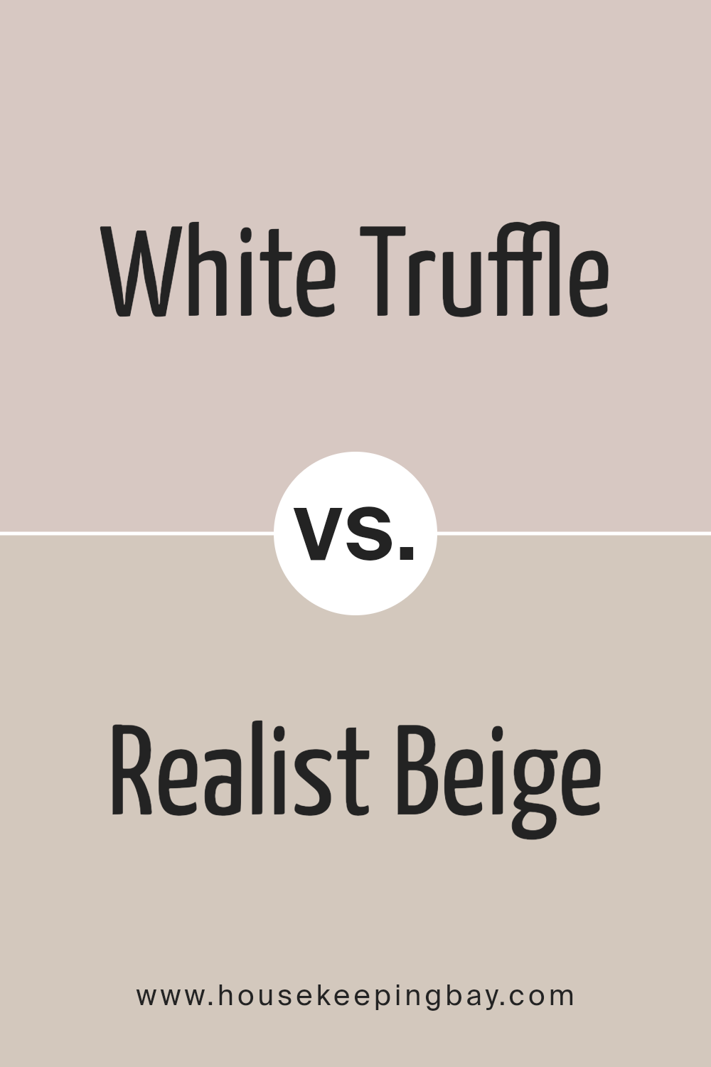
White Truffle SW 6029 by Sherwin Williams vs Realist Beige SW 6078 by Sherwin Williams
White Truffle SW 6029 by Sherwin Williams is a subtle, soft color that reminds you of a peaceful morning. It’s like a gentle whisper in a room, not too bold and carries a light, airy feel. It can make small spaces seem bigger and brighter, acting like a breath of fresh air in any home.
Realist Beige SW 6078, on the other hand, is a warm and cozy hue. It’s like a comfy sweater that makes you feel at home. This color adds a bit of warmth to spaces without overwhelming them. Realist Beige brings a comforting and soothing vibe, perfect for creating a welcoming atmosphere in any room.
When you compare White Truffle and Realist Beige, White Truffle appears more like a morning light, soft and refreshing, while Realist Beige feels like a warm hug, cozy and inviting. Both colors work beautifully to create calm and relaxing spaces, but they do so in slightly different ways. White Truffle brightens, while Realist Beige cozies up a space.
You can see recommended paint color below:
- SW 6078 Realist Beige
housekeepingbay.com
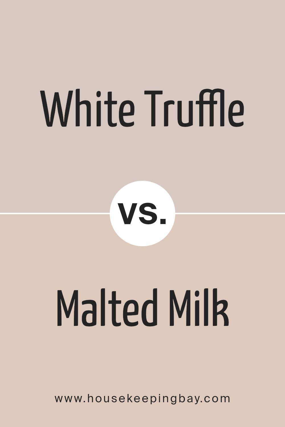
White Truffle SW 6029 by Sherwin Williams vs Malted Milk SW 6057 by Sherwin Williams
White Truffle SW 6029 and Malted Milk SW 6057, both by Sherwin Williams, have their own unique charm. White Truffle is a soft, gentle hue, very close to a light beige with a warm undertone. It brings a soothing and cozy feel to any room, making spaces feel inviting and comfortable. It’s a color that can brighten up a room while still keeping things relaxed.
On the other hand, Malted Milk SW 6057 leans towards a richer, creamier tone. It’s a bit deeper than White Truffle, offering a sense of warmth and elegance. Malted Milk is perfect for those looking to add a touch of sophistication without going too dark.
It’s versatile, working well in both modern and traditional spaces, and it pairs beautifully with a wide range of decor.
When comparing the two, White Truffle is lighter and can make a room feel more spacious and airy, while Malted Milk, with its slightly darker and warmer tone, adds a cozy and comforting vibe. Both colors offer a backdrop for a wide variety of decorating styles, from minimalist to rustic.
You can see recommended paint color below:
- SW 6057 Malted Milk
housekeepingbay.com
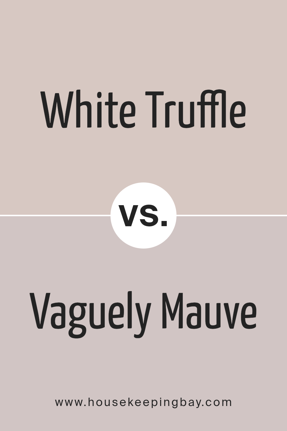
White Truffle SW 6029 by Sherwin Williams vs Vaguely Mauve SW 6015 by Sherwin Williams
White Truffle SW 6029 by Sherwin Williams and Vaguely Mauve SW 6015 by Sherwin Williams are two unique colors with distinct vibes. White Truffle is a soft, warm neutral with a creamy base, kind of like a very light beige that’s soothing and versatile. It’s the type of color that can make any space feel a bit cozier and more inviting without being too bold or overpowering.
On the other hand, Vaguely Mauve has a subtle hint of purple, offering a hint of color that’s understated yet distinctly present. It’s not your usual pink or purple but a soft blend that brings a gentle splash of color. This makes it perfect for rooms where you want a touch of uniqueness without going too bright or too bold.
Both colors are great for creating a calming atmosphere, but they serve different moods. White Truffle is excellent for those wanting a neutral, warm background that pairs well with almost anything.
Vaguely Mauve, however, adds a slight, soft color touch, making it ideal for spaces where you want a bit of personality without overwhelming the senses.
You can see recommended paint color below:
housekeepingbay.com
White Truffle SW 6029 by Sherwin Williams vs Abalone Shell SW 6050 by Sherwin Williams
White Truffle SW 6029 and Abalone Shell SW 6050 by Sherwin Williams are two elegant colors, each bringing its unique vibe to a space. White Truffle is a soft, subtle color, leaning towards a light, creamy beige.
It’s like a gentle hug for your walls, providing a warm, inviting feel without overwhelming the space. It acts as a perfect backdrop, allowing other colors and decor elements to stand out.
On the other hand, Abalone Shell is a bit moodier, with a deeper, richer tone that hints at gray with a touch of lavender. This color gives a room more depth and can make it feel cozy and secure.
It’s especially good for creating a focal point or adding a layer of sophistication to your interiors.
While both colors come from a similar neutral palette, White Truffle offers a light, airy feel, making spaces seem larger and more open. Abalone Shell brings an intimate, cozy atmosphere, perfect for spaces where you want to relax and settle in.
Choosing between them depends on the mood you want to create—White Truffle for a bright, uplifting space, and Abalone Shell for a snug, welcoming nook.
You can see recommended paint color below:
- SW 6050 Abalone Shell
housekeepingbay.com
White Truffle SW 6029 by Sherwin Williams vs Touch of Sand SW 9085 by Sherwin Williams
White Truffle SW 6029 and Touch of Sand SW 9085, both from Sherwin Williams, offer their own unique takes on neutral color spaces. White Truffle stands out with its creamy, light beige tone that brings a warm and inviting feel to any space. It’s perfect for creating a cozy, yet bright, atmosphere. Its subtlety makes it versatile for various settings, easily pairing with bold colors or serving as a gentle background for softer decor.
On the other hand, Touch of Sand leans towards a lighter, more muted approach.
This color is akin to the softness of a sandy beach at sunrise, providing a subtle hint of warmth, yet it’s understated enough to act as a neutral foundation. It’s great for spaces where you want to instill a calm and peaceful vibe, making rooms feel open and airy.
While both colors share a neutral territory, White Truffle offers a bit more richness and warmth, making spaces feel welcoming. Touch of Sand, with its lighter and softer approach, gives a sense of serenity and spaciousness.
Depending on the atmosphere you want to create, each has its appeal—White Truffle for a cozy warmth and Touch of Sand for a tranquil lightness.
You can see recommended paint color below:
- SW 9085 Touch of Sand
housekeepingbay.com
White Truffle SW 6029 by Sherwin Williams vs Individual White SW 6008 by Sherwin Williams
White Truffle SW 6029 by Sherwin Williams is a unique shade that balances between a warm gray and a light beige. This color has a cozy vibe to it, making rooms feel welcoming and snug. It’s great for spaces where you want soft warmth without the starkness often found in pure white.
On the other hand, Individual White SW 6008 from Sherwin Williams leans more towards a traditional white with a subtle hint of gray. This color feels cleaner and more straightforward, perfect for giving rooms a fresh and open look. It’s excellent for areas where you want to maximize light reflection and create a sense of more space.
While both colors are on the neutral spectrum, White Truffle brings in warmth and depth, making spaces feel more grounded. Individual White, however, offers clarity and simplicity, potentially making it a better choice for a modern and minimalistic design.
Choosing between them depends on whether you’re aiming for coziness or a crisp, clean atmosphere in your space.
You can see recommended paint color below:
- SW 6008 Individual White
housekeepingbay.com
White Truffle SW 6029 by Sherwin Williams vs Breathless SW 6022 by Sherwin Williams
White Truffle SW 6029 and Breathless SW 6022, both by Sherwin Williams, are beautiful colors that each bring a unique feel to a space. White Truffle is a soft, creamy color that leans towards a warm neutral. It’s like a cozy, light beige that feels welcoming and soothing. It’s versatile, working well in almost any room, making spaces feel open and airy yet cozy.
Breathless, on the other hand, is cooler and closer to a light, tranquil gray with a hint of blue. It gives off a fresh, calm vibe, perfect for creating a serene and peaceful atmosphere. This color can make a room feel more spacious and relaxing, great for bedrooms or bathrooms where calmness is key.
While both colors are light and can brighten up a room, White Truffle offers warmth and coziness, whereas Breathless leans towards coolness and calmness. Depending on the mood you want to set, each color has its strengths, with White Truffle making a space feel homey and inviting and Breathless giving it a clean, serene look.
You can see recommended paint color below:
- SW 6022 Breathless
housekeepingbay.com
White Truffle SW 6029 by Sherwin Williams vs Reticence SW 6064 by Sherwin Williams
White Truffle SW 6029 and Reticence SW 6064 are two colors by Sherwin Williams that offer distinct vibes for any space. White Truffle is a warm, soft hue that leans towards a very light, creamy beige. It’s perfect for creating a cozy and inviting atmosphere without being too stark or cold. It reflects light beautifully, making a room feel more open and airy.
On the other hand, Reticence is a cooler, muted gray with subtle green undertones. This color brings a sense of calm and sophistication to a space. It’s a go-to for those seeking a neutral backdrop that’s a bit deeper and more complex than a simple gray or beige.
When comparing the two, White Truffle brings warmth and a hint of coziness, making it ideal for living areas or bedrooms that aim for a soft, welcoming feel.
Reticence, with its cool, subdued appearance, suits spaces that aim for a modern, tranquil, and elegant look. Both colors offer versatility and can complement a wide range of decor styles, but your choice between them would depend on the mood you want to set for your room.
You can see recommended paint color below:
housekeepingbay.com
White Truffle SW 6029 by Sherwin Williams vs Angora SW 6036 by Sherwin Williams
White Truffle SW 6029 by Sherwin Williams and Angora SW 6036 by Sherwin Williams are two interesting colors to compare. White Truffle is a soft, warm neutral. It’s kind of like a light beige that has a cozy, inviting feel. It’s very versatile, making it easy to fit into many rooms and designs without taking over the space. It’s like the background color that lets other colors shine but still holds its own charm.
On the other hand, Angora is this lovely, muted pink with a hint of taupe. It’s a bit deeper and richer than White Truffle, giving off a more distinctive but still gentle and soothing vibe. Angora can add a subtle touch of sophistication to a space without feeling too bold or overpowering.
When you put them together, White Truffle could act as a calming base, while Angora could serve as an elegant accent, adding depth and interest to the décor without clashing.
Both colors share a soft, warm undertone, making them companions that work well together in creating a serene and welcoming atmosphere.
You can see recommended paint color below:
- SW 6036 Angora
housekeepingbay.com
Conclusion
In summary, White Truffle SW 6029 by Sherwin Williams is a unique and versatile paint color that stands out for its ability to bring warmth and sophistication into any space. It’s a perfect choice for those looking to add a cosy yet elegant touch to their interiors without overwhelming the room with too much intensity.
This color works well in various settings, from living rooms to bedrooms, offering a subtle charm that can easily complement different decor styles and color schemes.
Furthermore, White Truffle’s adaptability extends to its capacity to match well with a variety of textures and materials, making it a popular choice among homeowners and interior designers alike.
Whether you’re looking to create a serene and inviting atmosphere or aiming to achieve a modern and chic look, White Truffle SW 6029 proves to be an excellent option. Its gentle hue provides a solid foundation for experimenting with decorative elements, ensuring a harmonious and appealing outcome in any renovation or decorating project.
housekeepingbay.com
Ever wished paint sampling was as easy as sticking a sticker? Guess what? Now it is! Discover Samplize's unique Peel & Stick samples. Get started now and say goodbye to the old messy way!
Get paint samples