Adaptive Shade SW 7053 by Sherwin Williams
Versatility in a Hue and Embrace Every Space
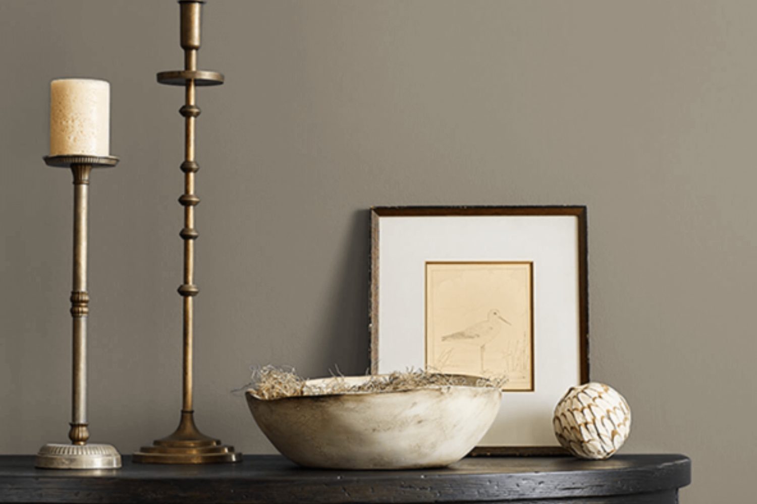
If you’re on the lookout for a fresh paint color that’s both versatile and stylish, Sherwin Williams’ SW 7053, also known as Adaptive Shade, could be the perfect pick for you. This unique color is a master of transformation, fitting seamlessly into a wide array of home styles and spaces. Whether you’re giving your living room a makeover, refreshing your bedroom, or updating your kitchen, Adaptive Shade brings a touch of elegance and adaptability to any environment.
What sets Adaptive Shade apart is its ability to blend with various decor elements and lighting conditions. This means the color can look slightly different yet stunning throughout the day, from the bright morning light to the softer, golden hues of the evening. It’s a neutral with a twist, possessing just enough depth to make a statement without overwhelming a space.
Think of Adaptive Shade as your go-to paint color for creating a cozy, welcoming atmosphere that feels both modern and timeless. Its chameleon-like quality makes it a fantastic choice if you’re keen on a color that can easily match with your existing furniture and accessories or if you’re starting from scratch. Plus, this shade is known for its calming effects, making any room feel more serene and inviting.
Choosing the right paint color is a big decision, but Adaptive Shade by Sherwin Williams could just be the effortlessly chic and adaptable option you’ve been searching for.
by sherwin williams
What Color Is Adaptive Shade SW 7053 by Sherwin Williams?
Adaptive Shade SW 7053 by Sherwin Williams is a versatile gray color that brings a balanced mix of warmth and coolness into any space. Think of it as the perfect middle ground between a cozy atmosphere and a modern vibe. This color has a unique ability to adapt to different lighting environments, appearing warmer or cooler based on the natural light in the room. It’s this chameleon-like quality that makes Adaptive Shade a go-to choice for those looking to achieve a sophisticated yet inviting feel in their home.
Adaptive Shade works wonders in a variety of interior styles, from minimalist and contemporary to rustic and industrial. It pairs exceptionally well with natural materials like wood and stone, enhancing their inherent beauty without overpowering them. When combined with metal accents, it creates a sleek, modern look, while pairing it with soft textiles and plush rugs adds a layer of warmth and comfort.
This color is particularly effective in spaces that aim to be calming and restful, such as bedrooms and living areas, but it’s also bold enough to make a statement in a kitchen or dining room. Whether you’re adding it as a primary color on the walls or as an accent through furniture and decor, Adaptive Shade SW 7053 brings a sense of refinement and flexibility to any interior design project.
housekeepingbay.com
Is Adaptive Shade SW 7053 by Sherwin Williams Warm or Cool color?
Adaptive Shade SW 7053 by Sherwin Williams is a unique color that can really change the feel of any room in your home. This paint color is like a chameleon because it can look different depending on the light and what’s around it. Sometimes, it might seem more gray, and other times, it could lean towards a beige or greige tone. This feature makes it super flexible for various spaces and styles. Whether you have a modern home or something more traditional, Adaptive Shade can fit right in. It’s also great because it can match with a lot of different colors. This means you won’t have a hard time finding furniture or decor that goes well with it. If you have a room that gets different amounts of light throughout the day, Adaptive Shade can really shine by subtly changing its look, keeping the space interesting and inviting. It’s a smart choice for those looking to give their rooms a stylish but understated background.
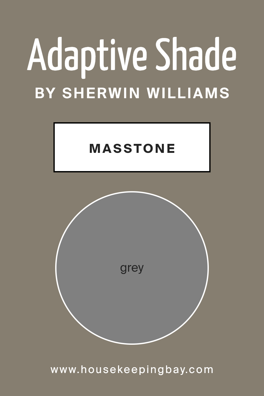
What is the Masstone of the Adaptive Shade SW 7053 by Sherwin Williams?
Adaptive Shade SW 7053 by Sherwin Williams is a unique grey color, with its masstone being a classic grey (#808080). This particular shade of grey serves as a versatile backdrop in any home. Because of its balanced properties, it easily complements various decor styles and colors. Whether your home is filled with bold colors or more subdued hues, Adaptive Shade can harmonize without clashing or overpowering other elements in the room.
This grey works well in spaces where you want to strike a balance between cozy and sophisticated. It’s perfect for living rooms, bedrooms, and even kitchens, providing a neutral canvas that allows your furnishings and art to stand out. The beauty of using Adaptive Shade in your home lies in its ability to adapt to different lighting conditions, looking slightly different yet beautiful at various times of the day. It’s this chameleon-like quality that makes Adaptive Shade a favored choice among homeowners looking for a color that is both stylish and practical.
housekeepingbay.com
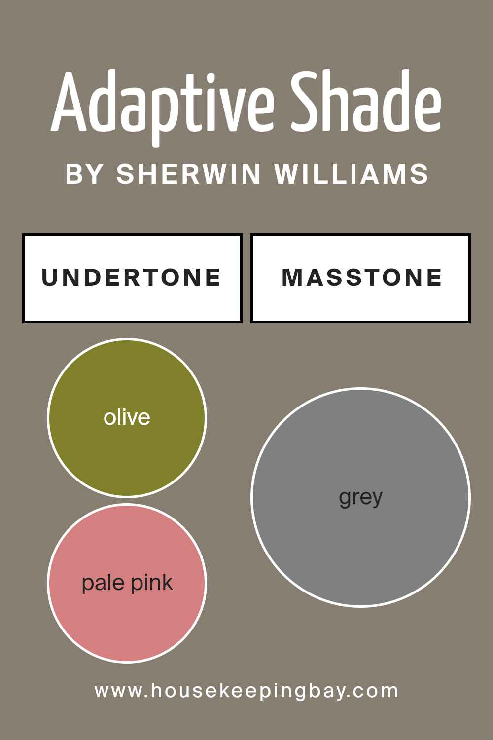
Undertones of Adaptive Shade SW 7053 by Sherwin Williams
Adaptive Shade SW 7053 by Sherwin Williams is a versatile color with a spectrum of undertones that can subtly influence the mood and appearance of a space. Undertones are like secret ingredients in a color recipe. They can change how we perceive the main color, adding depth and complexity. For Adaptive Shade, these undertones range from cool to warm, affecting the color’s vibe in different lighting or when paired with various furnishings.
For instance, olive, brown, and dark green contribute to a sense of earthiness, making a room feel grounded and cozy. Meanwhile, pale pink, lilac, and light purple add a soft, delicate touch, creating a more relaxed and serene atmosphere. Brighter undertones like orange, yellow, and fuchsia inject energy and vibrancy, perfect for spaces needing a lively lift.
In interior settings, the impact of Adaptive Shade SW 7053’s undertones means the color can adapt wonderfully. In natural light, cooler undertones like mint, dark turquoise, and navy might stand out, giving the walls a fresher, crisper look. On the other hand, in artificial lighting, warmer tones like orange, pink, and light green may become more pronounced, making the room feel warmer and more welcoming.
Mint, light turquoise, and light blue contribute to a calm, refreshing vibe, ideal for bathrooms or bedrooms seeking a tranquil mood. Darker tones like dark grey, dark blue, and violet can offer a touch of sophistication and depth, making them great for formal areas or studies.
Overall, the nuanced undertones of Adaptive Shade SW 7053 allow it to be a highly adaptive color choice for interior walls. It can harmonize with a wide range of decor styles and preferences, effectively complementing natural and artificial light conditions. This makes it a go-to paint color for those looking to achieve a specific mood or enhance the aesthetic appeal of their space without a drastic change in color palette.
housekeepingbay.com
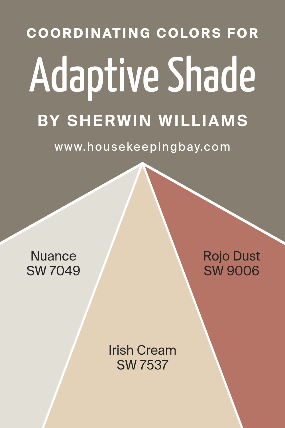
Coordinating Colors of Adaptive Shade SW 7053 by Sherwin Williams
Coordinating colors are hues that complement each other and work well together to enhance the aesthetics of a space. They can be used to create harmony and a sense of cohesiveness in decor, often selected to accentuate or contrast with a primary color for added visual interest. For instance, if you’re working with Adaptive Shade SW 7053 by Sherwin Williams, a versatile neutral, choosing the right coordinating colors can elevate your design scheme. These colors are strategically picked to balance, highlight, or subtly blend with the main color, depending on the desired ambiance.
Nuance SW 7049, for example, is a soft, understated grey that oozes tranquility. It’s the kind of color that works harmoniously with Adaptive Shade, providing a serene and balanced backdrop that’s soothing to the eyes.
On the other hand, Irish Cream SW 7537 adds a warm, creamy touch that brings a cozy and inviting feel to any space. It’s excellent for creating a sense of warmth and comfort, especially in areas where you want to relax. R
ojo Dust SW 9006 rounds out the selection with its gentle red hue, adding a dash of earthiness and subtle energy that can breathe life into a room without overwhelming it. Together, these coordinating colors offer a versatile palette that complements Adaptive Shade by bringing depth, warmth, and a harmonious balance to your decor.
You can see recommended paint colors below:
- SW 7049 Nuance
- SW 7537 Irish Cream
- SW 9006 Rojo Dust
housekeepingbay.com
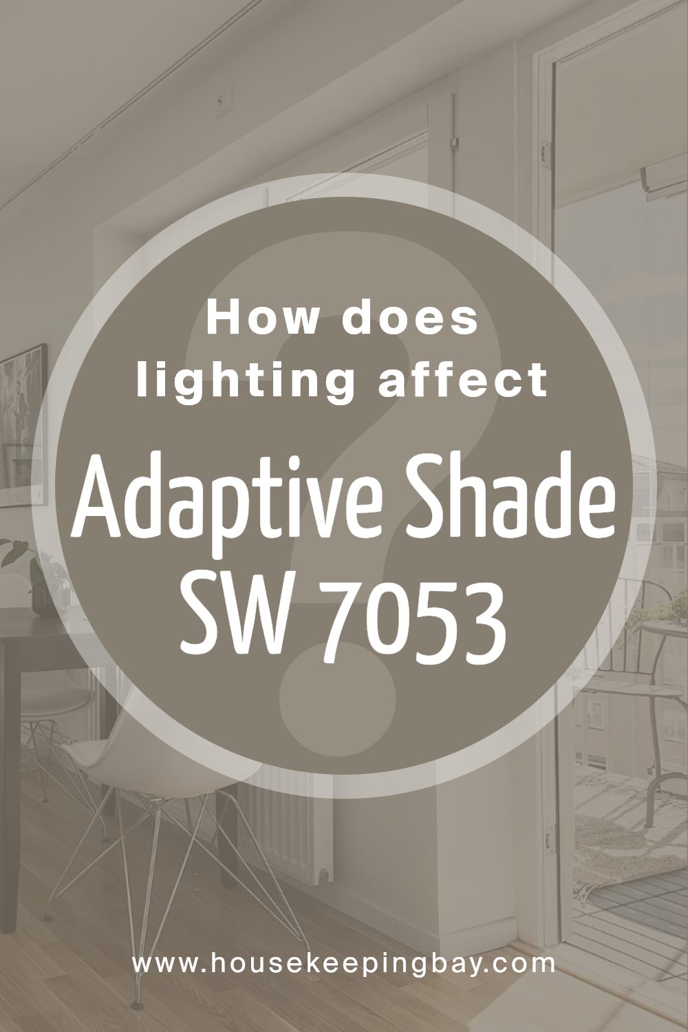
How Does Lighting Affect Adaptive Shade SW 7053 by Sherwin Williams?
Lighting plays a crucial role in how we perceive colors. The right light can make a color look vibrant and welcoming, while the wrong light might make the same color appear dull or off-putting. Adaptive Shade SW 7053 by Sherwin Williams is a unique color that can change its appearance under different lighting conditions.
- Under artificial light, Adaptive Shade tends to look warmer. The cozy glow from lamps or overhead lighting can bring out subtle undertones, making the walls feel inviting. In homes where natural light is less pronounced, this color can create a soft, snug atmosphere, making spaces like living rooms and bedrooms feel more comfortable.
- Natural light, on the other hand, can significantly impact how Adaptive Shade looks throughout the day. In rooms facing north, which typically receive cooler, indirect light, Adaptive Shade may appear more as a neutral grey. This cooler light doesn’t alter the color much, so it remains true to its calm, subdued nature, making spaces feel serene and balanced.
- South-facing rooms get a lot of bright, direct sunlight, which can make Adaptive Shade warm up and reveal its underlying tones more vividly. Here, the color can transform a room into a bright, cheerful space, perfect for areas where you spend a lot of time during the day.
- In east-facing rooms, the color reacts to the warm, yellow light of the morning sun, potentially making the color look softer and slightly warmer in the morning. As the day progresses and the natural light diminishes, Adaptive Shade will gradually return to its more neutral state, maintaining a steady look that’s neither too warm nor too cool.
- West-facing rooms present a unique scenario. In the afternoon and evening, as the sunlight becomes warmer and more golden, Adaptive Shade can pick up some of this warmth, making the room feel cozy and welcoming. This is ideal for living spaces used more frequently in the evenings.
In conclusion, Adaptive Shade SW 7053’s ability to look different under various lighting conditions makes it a versatile color choice. Whether in artificial or natural light, and regardless of room orientation, this color can adapt, creating environments that are comfortable, inviting, and perfectly balanced.
housekeepingbay.com
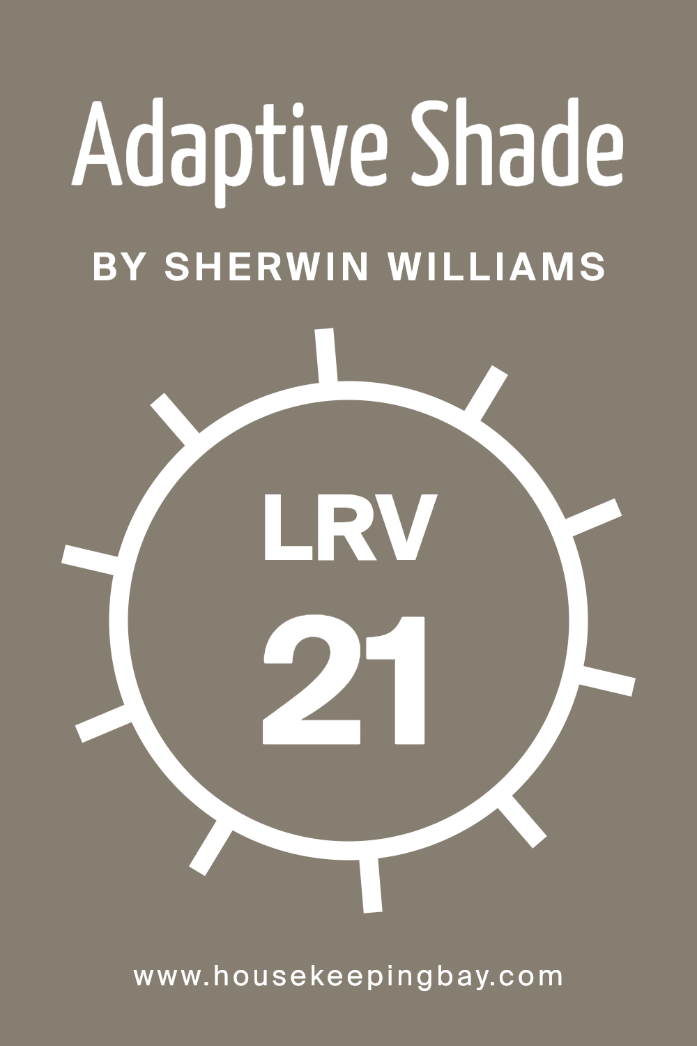
What is the LRV of Adaptive Shade SW 7053 by Sherwin Williams?
LRV stands for Light Reflectance Value, and it measures how much light a paint color reflects or absorbs. Think of it like this: On a scale from 0 to 100, 0 is pure black, absorbing all light, and 100 is pure white, reflecting all light back. Colors with a higher LRV make spaces feel brighter because they reflect more light around the room. On the other hand, colors with a lower LRV can make a room feel more cozy or intimate because they absorb more light.
For the color Adaptive Shade SW 7053 by Sherwin Williams, which has an LRV of 21.239, it’s on the darker side of the scale. This means it won’t reflect a lot of light back into the room. If you use this color on your walls, it can make the space feel smaller or more enclosed, which might be perfect for creating a cozy atmosphere. However, it’s important to ensure your room gets enough natural or artificial light so it doesn’t feel too dark. This specific LRV value suggests that the color will stand out in a room, especially if used on a large wall or in a room without a lot of natural light.
housekeepingbay.com
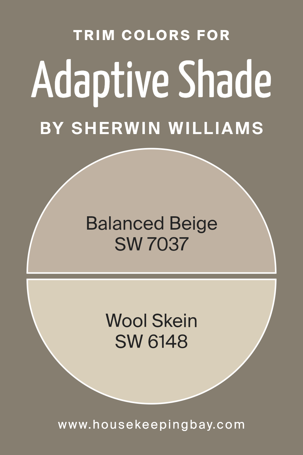
What are the Trim colors of Adaptive Shade SW 7053 by Sherwin Williams?
Trim colors are the shades used on the architectural elements like door frames, moldings, and window trims, offering a contrasting or complementary framework to the primary wall color. For instance, when using a sophisticated color like Adaptive Shade SW 7053 by Sherwin-Williams, choosing the right trim colors can significantly enhance the room’s aesthetic appeal. Trim colors highlight these architectural features, drawing attention to the details and craftsmanship of the space. By carefully selecting trim colors, homeowners can create a cohesive and polished look that accentuates the overall design of a room.
Balanced Beige SW 7037 serves as an excellent trim color, providing a warm, neutral backdrop that complements the complex undertones of Adaptive Shade. This beige is subtle and grounding, offering a soft contrast that enriches the room’s palette without overpowering it. Wool Skein SW 6148, on the other hand, is a lighter, airy color with a hint of yellow. It brings a gentle brightness to the trim, illuminating the space softly while pairing beautifully with the deeper tones of Adaptive Shade SW 7053. Together, these trim colors help create a visually appealing space that feels balanced and inviting.
You can see recommended paint colors below:
- SW 7037 Balanced Beige
- SW 6148 Wool Skein
housekeepingbay.com
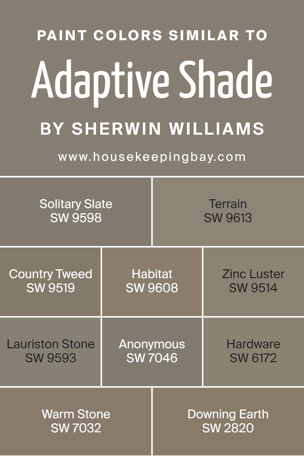
Colors Similar to Adaptive Shade SW 7053 by Sherwin Williams
Similar colors play a crucial role in design and decoration because they create harmony and bring a cohesive look to any space. When colors closely resemble each other, such as the variants of Adaptive Shade SW 7053 by Sherwin Williams, they can effortlessly blend together, producing a seamless transition from one tone to another.
This subtle shift in shades is what provides depth and complexity to interiors without overwhelming the senses. It’s like having a conversation where everything flows smoothly—each color supports and enhances the others, leading to a balanced and pleasing aesthetic.
- For instance, Solitary Slate and Terrain offer subdued and earthy vibes, perfect for grounding a space with a touch of sophistication and tranquility.
- Country Tweed and Habitat, on the other hand, introduce a slightly richer palette that draws inspiration from natural elements, bringing warmth and a sense of welcoming into rooms.
- Zinc Luster and Lauriston Stone inject a metallic and mineral-like quality, respectively, evoking elegance and an understated luxury.
- Anonymous, Hardware, and Warm Stone further enrich this palette by adding layers of neutral but impactful shades, versatile for any setting.
- Lastly, Downing Earth closes the circle with its robust and hearty character, anchoring the lighter tones and completing the sophisticated harmony that these colors together achieve.
This careful curation of similar shades proves that a well-thought-out color scheme can transform any space into a stylish and inviting haven.
You can see recommended paint colors below:
- SW 9598 Solitary Slate
- SW 9613 Terrain
- SW 9519 Country Tweed
- SW 9608 Habitat
- SW 9514 Zinc Luster
- SW 9593 Lauriston Stone
- SW 7046 Anonymous
- SW 6172 Hardware
- SW 7032 Warm Stone
- SW 2820 Downing Earth
housekeepingbay.com
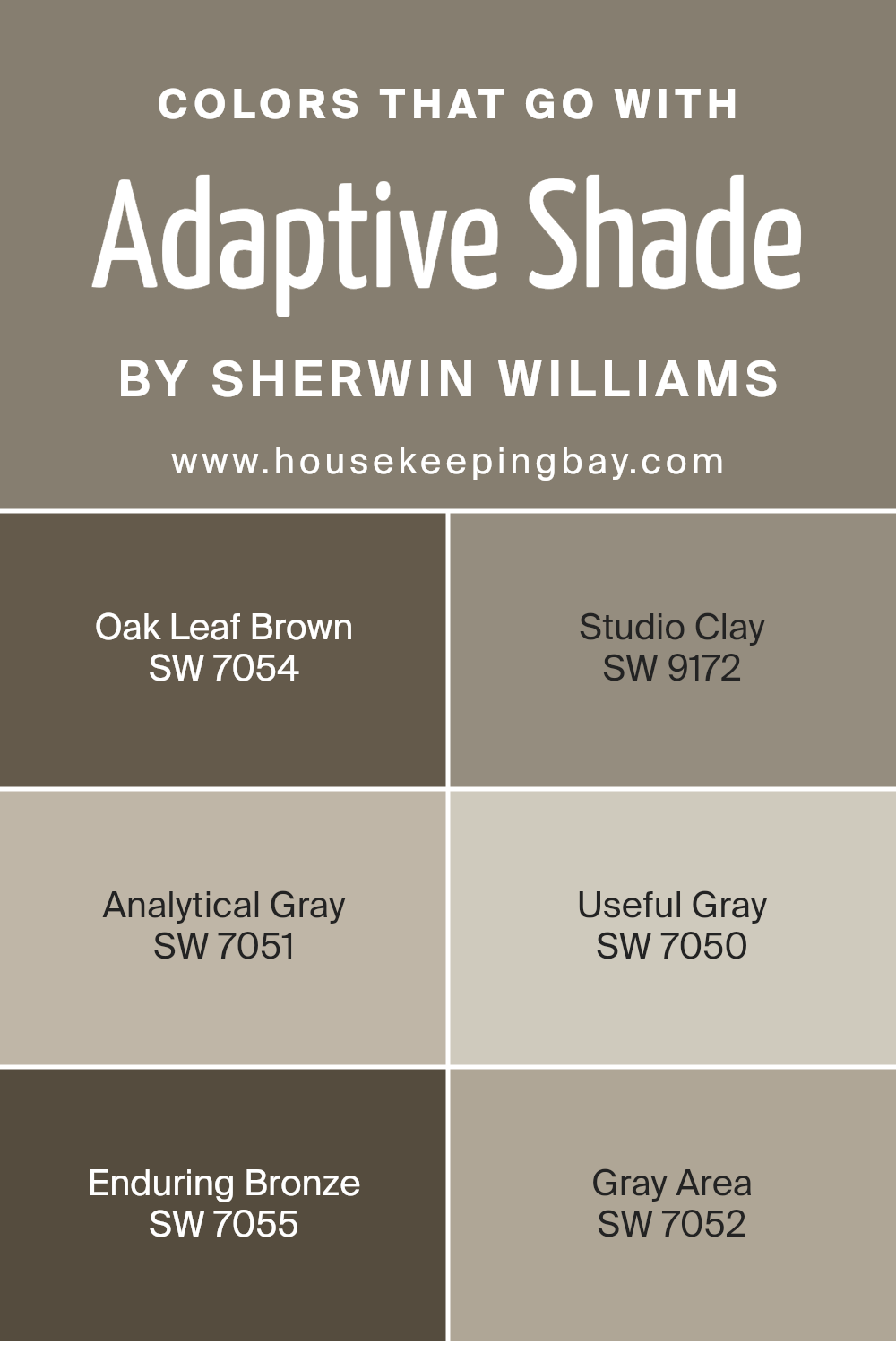
Colors that Go With Adaptive Shade SW 7053 by Sherwin Williams
When choosing colors to complement Adaptive Shade SW 7053 by Sherwin Williams, it’s essential because they can influence the mood and feel of a space. These coordinating colors work together to create a harmonious and appealing palette that can enhance the aesthetic appeal of any room. For instance, using colors like Oak Leaf Brown or Studio Clay adds a warm, earthy vibe that can make a room feel more inviting and cozy. On the other hand, opting for cooler tones such as Analytical Gray or Useful Gray introduces a more serene and calm atmosphere, ideal for spaces intended for relaxation or focus.
- Analytical Gray is a soft, muted gray with a subtle warmth that makes it incredibly versatile for combining with Adaptive Shade. It’s perfect for creating a seamless transition between spaces. Similarly, Useful Gray offers a light, minimalistic approach, providing a clean and understated background that allows other elements in the room to shine.
- Enduring Bronze adds depth and richness, giving a touch of elegance and sophistication to the setting.
- Meanwhile, Gray Area, a balanced gray, bridges the gap between warm and cool tones, offering flexibility in design choices.
- Together, these colors complement Adaptive Shade by providing a range of options from warm to cool tones, thus allowing for customization according to personal taste or design needs, ensuring the space not only looks beautiful but also feels right.
You can see recommended paint colors below:
- SW 7054 Oak Leaf Brown
- SW 9172 Studio Clay
- SW 7051 Analytical Gray
- SW 7050 Useful Gray
- SW 7055 Enduring Bronze
- SW 7052 Gray Area
housekeepingbay.com
How to Use Adaptive Shade SW 7053 by Sherwin Williams In Your Home?
Adaptive Shade SW 7053 by Sherwin Williams is a versatile paint color perfect for anyone looking to freshen up their home. This shade is a unique mix of grey with subtle undertones that can change based on the lighting in your room, making it a great choice for any space. Whether you want to paint your living room, bedroom, or even your kitchen cabinets, Adaptive Shade can add a modern and sophisticated touch.
Using Adaptive Shade in your home can easily make small rooms feel bigger and more inviting because of its light-reflecting qualities. It’s also an excellent backdrop for both vibrant and muted color schemes, allowing your furniture and decor to stand out. If you’re not ready to commit to painting an entire room, consider using it for an accent wall or pair it with white trim for a crisp, clean look.
Adaptive Shade is a foolproof choice for creating a cozy yet stylish atmosphere in your home. Its flexibility in matching different styles and preferences makes it a go-to paint color for updating any space.
Adaptive Shade SW 7053 by Sherwin Williams vs Hardware SW 6172 by Sherwin Williams
Adaptive Shade SW 7053 and Hardware SW 6172 are both colors by Sherwin Williams, but they offer distinct tones that can change the feel of a room. Adaptive Shade is a versatile gray that has an underlying softness, making it perfect for spaces where you want a gentle, calming atmosphere. It’s light enough to make a room feel airy but still adds enough color to avoid feeling stark.
On the other hand, Hardware SW 6172 is a deeper, more pronounced shade. It leans towards a darker gray, providing a strong, sophisticated look. This color is great for creating a statement or adding depth to a space, especially if you’re looking to make an area feel cozier or more grounded.
While Adaptive Shade brings a lighter, more relaxed vibe, Hardware offers depth and drama. Both colors work well in various settings, but your choice between them would depend on the mood you’re aiming to achieve – calm and serene with Adaptive Shade or bold and anchored with Hardware.
You can see recommended paint color below:
- SW 6172 Hardware
housekeepingbay.com
Adaptive Shade SW 7053 by Sherwin Williams vs Habitat SW 9608 by Sherwin Williams
Adaptive Shade SW 7053 by Sherwin Williams is a unique gray with a touch of warmth, making it versatile for many spaces. It’s like a cozy blanket on a rainy day, providing comfort without overwhelming the senses. On the other hand, Habitat SW 9608 leans into the earthy, nature-inspired side of the color palette. It’s a richer, deeper color, reminiscent of forest walks and natural wood.
While Adaptive Shade plays it safe with its subtle, almost understated elegance, Habitat brings a bolder statement into the room. It’s the difference between enjoying a calm, cloudy day indoors and exploring the great outdoors. Both colors offer their own charm, with Adaptive Shade being the perfect backdrop for a wide range of decor styles, and Habitat offering a more focused vibe, ideal for creating a specific mood or theme in a space.
You can see recommended paint color below:
- SW 9608 Habitat
housekeepingbay.com
Adaptive Shade SW 7053 by Sherwin Williams vs Country Tweed SW 9519 by Sherwin Williams
Adaptive Shade SW 7053 by Sherwin Williams is a versatile gray color with a cool undertone, making it perfect for a modern and sleek look. It’s a solid choice if you’re aiming for a neutral backdrop that can easily integrate with various decor styles and colors. This color can make your space look clean and spacious, offering a subtle elegance without overwhelming the room.
On the other hand, Country Tweed SW 9519 by Sherwin Williams leans towards a warmer, cozier vibe. It’s a rich, dark color that brings a sense of comfort and sophistication to any space. Country Tweed can create a cozy atmosphere, making it ideal for areas where you want to relax and feel snug, like bedrooms or living rooms. It’s great for adding depth and interest to your walls.
While Adaptive Shade is cool and calming, Country Tweed offers warmth and richness, making them suitable for different moods and styles. Whether you prefer the lighter, more open feel of Adaptive Shade or the enveloping warmth of Country Tweed, both colors offer unique possibilities for transforming your space.
You can see recommended paint color below:
- SW 9519 Country Tweed
housekeepingbay.com
Adaptive Shade SW 7053 by Sherwin Williams vs Zinc Luster SW 9514 by Sherwin Williams
Adaptive Shade SW 7053 by Sherwin Williams is a flexible, neutral color. It has a mix of gray and beige, often called “greige,” making it really versatile for various spaces. It can look slightly different depending on the light, sometimes more gray, other times more beige, fitting well with lots of decor styles and other colors.
On the other hand, Zinc Luster SW 9514 is also a neutral but leans more towards a soft, light gray. It’s a calm color, giving a relaxed and soothing vibe to rooms. While it’s neutral like Adaptive Shade, Zinc Luster has less warmth because it doesn’t have the beige undertones. This makes it better for creating a serene, airy feel.
Both are great options for someone looking for neutral paint colors. Choosing between them depends on whether you want the warmer, more flexible backdrop of Adaptive Shade or the cooler, calming effect of Zinc Luster.
You can see recommended paint color below:
- SW 9514 Zinc Luster
housekeepingbay.com
Adaptive Shade SW 7053 by Sherwin Williams vs Warm Stone SW 7032 by Sherwin Williams
Adaptive Shade SW 7053 by Sherwin Williams and Warm Stone SW 7032 from the same brand are both beautiful choices, but they bring different vibes to a space. Adaptive Shade is a cool gray that leans slightly towards blue, making it a great pick for a modern and tranquil look. It’s the kind of color that makes a room feel more spacious and airy, perfect for a contemporary home or office.
On the other hand, Warm Stone is a cozier and inviting color, thanks to its warmer, beige undertones. This shade is ideal for creating a snug and welcoming atmosphere, making rooms feel homey and comfortable. It’s like wrapping yourself in a warm blanket on a cool day.
When deciding between the two, consider the mood you want to create. Adaptive Shade gives off a fresh, modern vibe, while Warm Stone is all about warmth and comfort. Both are versatile, but they serve different purposes in interior design.
You can see recommended paint color below:
- SW 7032 Warm Stone
housekeepingbay.com
Adaptive Shade SW 7053 by Sherwin Williams vs Anonymous SW 7046 by Sherwin Williams
Adaptive Shade SW 7053 by Sherwin Williams is a unique shade that can really add some character to a space. It’s kind of like a chameleon, in the way it can look different based on the light and what it’s paired with. Picture a soft, cozy gray with a hint of green – it’s subtle, yet has enough depth to make a room interesting without being too bold.
On the other hand, Anonymous SW 7046 is a bit cooler and leans more towards the true gray side of things. It doesn’t have the same green undertone that Adaptive Shade does. Instead, it’s a straightforward, clean gray that can make any space look sleek and modern. It’s great for someone looking to achieve a more classic gray look that’s still warm and inviting.
When you compare the two, Adaptive Shade offers a bit more personality with its unique undertones, while Anonymous keeps things simple and straightforward. Both are great choices, but it really depends on the vibe you’re going for in your space.
You can see recommended paint color below:
- SW 7046 Anonymous
housekeepingbay.com
Adaptive Shade SW 7053 by Sherwin Williams vs Solitary Slate SW 9598 by Sherwin Williams
Adaptive Shade SW 7053 and Solitary State SW 9598 are two colors from Sherwin Williams. They’re quite unique when you stack them against each other. Adaptive Shade is a soft, cozy gray that feels warm and welcoming. It’s a kind of color that blends nicely in any room, giving off a calm and comforting vibe. On the flip side, Solitary State is a deeper, more pronounced gray. It’s stronger and more of a statement color.
It has this cool, sophisticated touch that can make a space look modern and chic. While both are grays, Adaptive Shade leans towards a lighter, airier feel, making rooms feel larger and more open. Solitary State, though, adds depth and drama, ideal for creating a focal point or adding character. In a nutshell, if you’re looking for something subtle and soothing, go for Adaptive Shade. But if you want something with more punch and presence, Solitary State is your go-to.
You can see recommended paint color below:
- SW 9598 Solitary Slate
housekeepingbay.com
Adaptive Shade SW 7053 by Sherwin Williams vs Downing Earth SW 2820 by Sherwin Williams
Adaptive Shade SW 7053 by Sherwin Williams is a unique color that sits somewhere between gray and green. It has a quiet, soft feel to it, making it perfect for creating a calm and inviting space. It’s the kind of color that works really well in many settings, adjusting to different lighting conditions and complementing a wide range of decor styles.
Downing Earth SW 2820 from Sherwin Williams takes a richer, warmer approach. It’s a deep brown with subtle hints of green, providing a cozy and earthy vibe. This color is ideal for adding warmth to a room, making it feel welcoming and snug. It pairs beautifully with natural materials like wood and stone, enhancing a space with a touch of rustic charm.
Comparing the two, Adaptive Shade leans towards a cooler, more understated elegance, perfect for modern and minimalist spaces. Downing Earth, on the other hand, offers warmth and richness, ideal for traditional or country-inspired interiors. Both colors offer versatility and depth, but their impact varies significantly based on your style and the atmosphere you want to create.
You can see recommended paint color below:
- SW 2820 Downing Earth
housekeepingbay.com
Adaptive Shade SW 7053 by Sherwin Williams vs Terrain SW 9613 by Sherwin Williams
Adaptive Shade SW 7053 by Sherwin Williams and Terrain SW 9613 are two different colors with their unique qualities. Adaptive Shade is a soft, elegant gray with a touch of warmth, making it versatile for various spaces. It’s the kind of color that can look great in a living room, bedroom, or even an office, adding a subtle touch of sophistication without being too bold or overpowering.
On the other hand, Terrain SW 9613 is a deeper, earthier tone. It brings to mind the natural beauty of clay or terracotta, offering a rich, comforting warmth. This color is perfect for creating a cozy atmosphere, ideal for spaces where you want to relax and feel grounded, like a den or a reading nook.
While Adaptive Shade is more neutral and can blend easily with different decor styles and colors, Terrain adds depth and a hint of nature-inspired warmth, making a strong statement in a room. Both colors offer unique possibilities, but your choice would depend on the mood and style you want to achieve in your space.
You can see recommended paint color below:
- SW 9613 Terrain
housekeepingbay.com
Adaptive Shade SW 7053 by Sherwin Williams vs Lauriston Stone SW 9593 by Sherwin Williams
Adaptive Shade SW 7053 by Sherwin Williams is a unique color that easily fits into many areas of a home or project. It’s like a soft, cozy gray with a hint of warmth, making spaces feel welcoming without being too bold. This color works well in rooms where you want a modern touch without going overboard. It’s versatile and can match with a lot of different themes and decorations.
On the other hand, Lauriston Stone SW 9593 by Sherwin Williams takes things in a slightly different direction. It’s also a gray, but it leans more towards a neutral, light stone color. It’s perfect for creating a calm, serene atmosphere in a room. Think of it as a gentle hug for your walls, providing a subtle backdrop that can make your furnishings and art stand out. Lauriston Stone is more about creating a peaceful and soft environment.
Both colors offer their unique take on gray, with Adaptive Shade adding warmth and versatility, and Lauriston Stone offering a quiet and calming presence. Depending on what vibe you’re going for in your space, either could be a great choice.
You can see recommended paint color below:
- SW 9593 Lauriston Stone
housekeepingbay.com
Conclusion
This paint color is like a chameleon, adapting beautifully to almost any space you’re looking to refresh or transform. Whether you’re aiming for a cozy, inviting atmosphere or a bold, modern look, Adaptive Shade has got you covered. Its versatility means you can use it in your living room, kitchen, or bedroom, and it will effortlessly fit right in, complementing your decor and setting the mood you’re aiming for.
What makes Adaptive Shade stand out is how it changes under different lighting conditions, presenting a spectrum of shades from a soft, subtle gray to richer, deeper tones. This quality ensures that your space remains dynamic and interesting, changing vibes from day to night. It’s fuss-free when it comes to matching with other colors, making your decorating process a breeze. Whether you’re pairing it with bright accents for a pop of color or keeping things minimalist with whites and blacks, you’re in for a treat.
So, if you’re thinking about giving your home a quick and effective makeover, giving Adaptive Shade a try might just be the perfect move. Its ability to fit so seamlessly into various settings and styles without demanding too much from you makes it a top choice for both first-time decorators and seasoned pros. Happy painting!
housekeepingbay.com
Ever wished paint sampling was as easy as sticking a sticker? Guess what? Now it is! Discover Samplize's unique Peel & Stick samples. Get started now and say goodbye to the old messy way!
Get paint samples


