Mortar SW 9584 by Sherwin Williams
Solidifying Style & The Enduring Appeal of Mortar
In the vast spectrum of colors and finishes that Sherwin-Williams offers, SW 9584 Mortar stands out as a testament to the brand’s dedication to delivering sophisticated and versatile paint options for both interior and exterior applications.
This shade, a rich and nuanced gray, embodies a timeless elegance that can elevate the aesthetic of any space. The purpose of this article is to explore the characteristics, applications, and design possibilities of SW 9584 Mortar, offering homeowners, designers, and architects a comprehensive understanding of this unique color offering.
As gray continues to be a favored choice among professionals and DIY enthusiasts alike for its ability to provide a neutral backdrop that complements a wide range of decor styles, Mortar offers a distinctive take on this popular hue. Its depth and warmth make it an ideal choice for creating cozy living spaces, sophisticated bedrooms, or dynamic office environments.
Beyond its aesthetic appeal, Sherwin-Williams’ commitment to quality ensures that SW 9584 Mortar delivers in terms of durability and coverage, making it a practical choice for various projects.
In the following sections, we will delve into the specific attributes of SW 9584 Mortar, including its color psychology, best use cases, and complementary colors, providing readers with the insights needed to make informed decisions for their design projects.
vis sherwin-williams.com
What Color Is Mortar SW 9584 by Sherwin Williams?
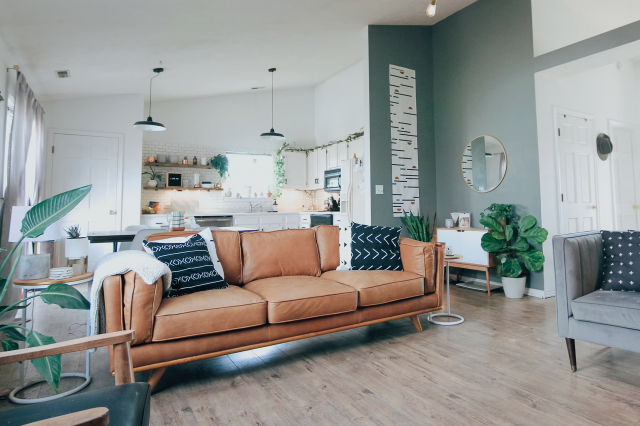
Mortar SW 9584 by Sherwin Williams is a captivating color that embodies an exquisite balance between strength and serenity. This color is a deep, muted shade of gray with subtle brown undertones, making it exceptionally versatile and brilliantly sophisticated. Its depth conveys a sense of stability and grounding, which can transform any interior into a haven of calm and refinement.
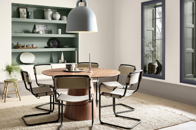
Mortar SW 9584 thrives in a variety of interior styles, including modern minimalist, industrial chic, and contemporary rustic. In minimalist environments, it sets a backdrop that highlights architectural features and modern furniture with clean lines.
For industrial aesthetics, Mortar complements raw materials like exposed brick, steel, and unfinished wood, enhancing the loft-like vibe. In a contemporary rustic setting, it pairs well with natural textures, bringing a cozy, yet refined atmosphere to the space.
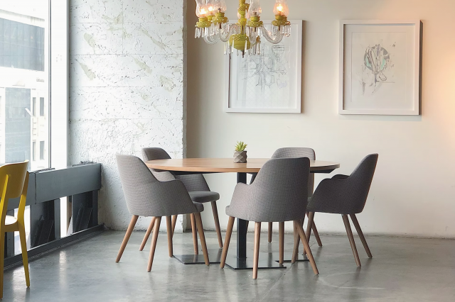
The color works miracles when paired with materials such as natural wood, leather, and metallic finishes like brass and copper, which add warmth and contrast. Textures play a significant role in its versatility; soft, plush fabrics like velvet or wool in lighter hues create a stunning visual balance, while rough textures such as jute or sisal rugs ground the space with an earthy touch.
Mortar SW 9584 manages to bridge the gap between various decor elements, offering an elegant and cohesive look that is both timeless and contemporary.
housekeepingbay.com
Table of Contents
Is Mortar SW 9584 by Sherwin Williams Warm or Cool color?
MortarSW 9584 by Sherwin Williams is a captivating paint color that brings a distinctive depth and sophistication to any interior space. With its rich, warm undertones, MortarSW 9584 exudes a sense of comfort and stability, making it an ideal choice for creating inviting home environments. This particular shade straddles the boundary between gray and beige, offering the perfect neutral backdrop for a wide range of decor styles, from contemporary to traditional.
The versatility of MortarSW 9584 lies in its ability to adapt to various lighting conditions, subtly shifting in appearance to complement natural light during the day and enhancing the cozy ambiance of interior lighting at night. This dynamic quality allows homeowners to experiment with different moods and atmospheres within their spaces.
Moreover, MortarSW 9584 facilitates a seamless flow between rooms, harmonizing with other colors and materials with ease. Its grounding effect encourages the use of bold accents and textures, providing a foundation that supports creative expression in home decoration.
Whether applied in living areas, bedrooms, or kitchens, MortarSW 9584 works magnificently to elevate the overall aesthetic of a home while maintaining a warm, welcoming environment.
What is the Masstone of the Mortar SW 9584 by Sherwin Williams?
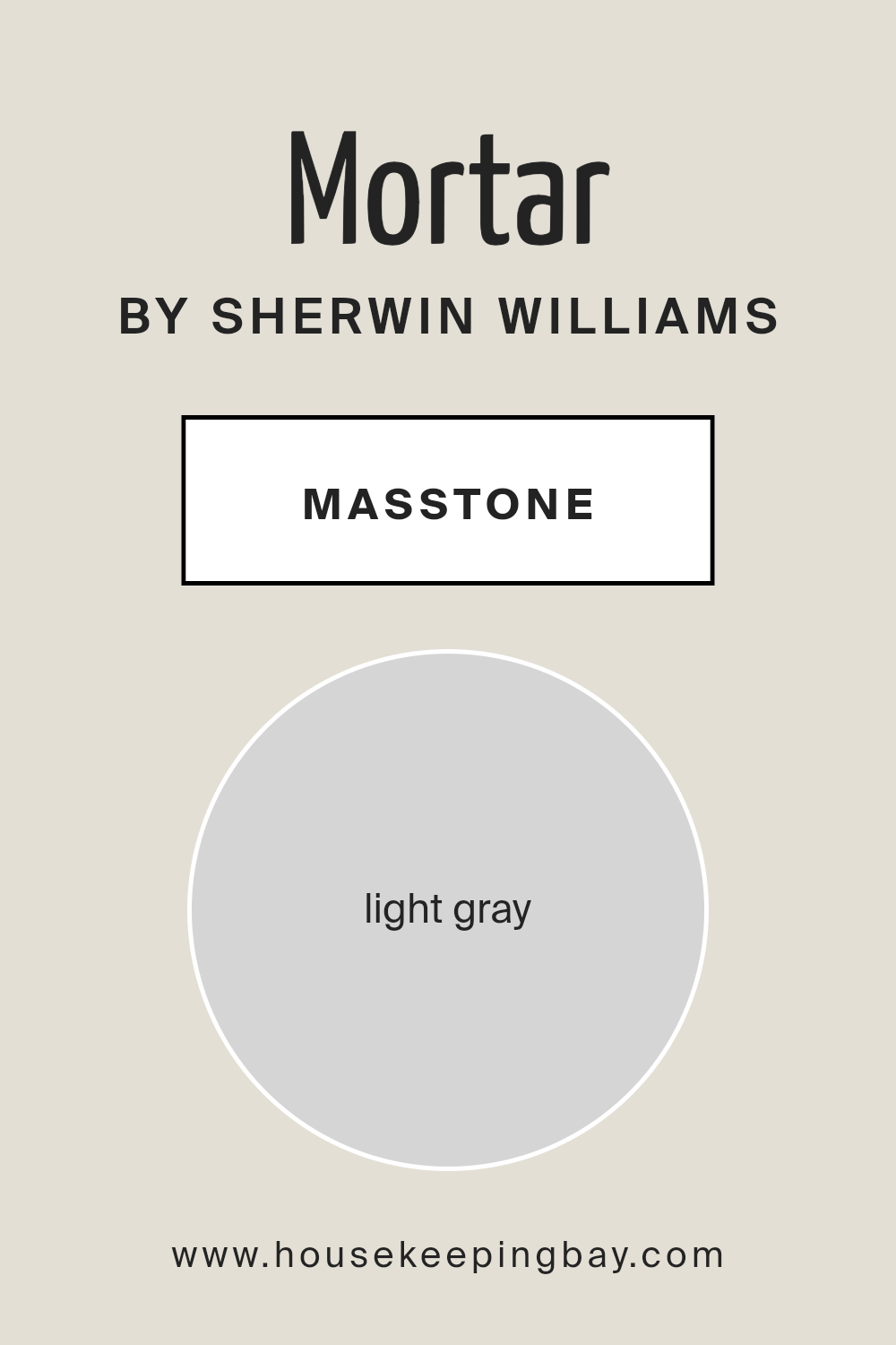
MortarSW 9584 by Sherwin Williams, with its masstone of Light Gray (#D5D5D5), stands as a versatile and refined hue that brings a contemporary and calming atmosphere to any home. This particular shade of gray works remarkably well in homes due to its neutral base, making it an excellent choice for those seeking a modern yet timeless look. The lightness of MortarSW 9584 allows it to reflect natural light beautifully, making spaces appear brighter and more spacious.
It serves as a subtle backdrop that can complement a wide range of decor styles, from minimalist to rustic, and is particularly effective in creating a serene and cohesive feel throughout a home.
Furthermore, MortarSW 9584’s light gray tone is highly adaptive; it pairs effortlessly with bold colors, acting as a grounding element that allows accent colors to pop, while also harmonizing with softer, pastel hues for a more understated aesthetic. Its ability to blend seamlessly with various textures and materials, from natural wood to metallic finishes, further amplifies its appeal.
This adaptability makes MortarSW 9584 a smart choice for homeowners looking to achieve a balanced and refined ambiance in their living spaces.
housekeepingbay.com
Undertones of Mortar SW 9584 by Sherwin Williams
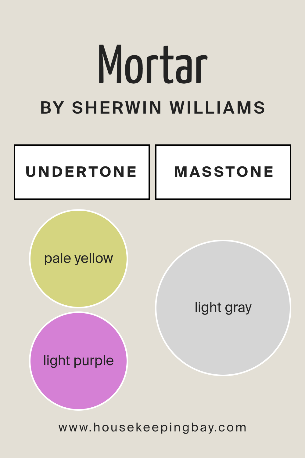
MortarSW 9584 by Sherwin Williams, at first glance, appears as a deep and robust hue that could easily anchor any room with its presence. However, the true beauty and complexity of this color lie in its undertones. The subtle yet discernible pale yellow (#D5D580) and light purple (#D580D5) undertones bring a unique dimension to the color, influencing the overall perception and ambiance of the spaces it envelops.
Undertones are paramount in the world of color, silently influencing the character and mood of paints despite being almost imperceptible when viewed in isolation. They can alter a color’s temperature, making it appear warmer or cooler, and affect how it interacts with natural and artificial light, as well as neighboring colors and materials.
Essentially, undertones are the unseen forces that shape our visual experience of color, guiding our sense of harmony and aesthetic enjoyment.
In interior spaces, the undertones of MortarSW 9584 add a layer of sophistication and depth. The pale yellow undertone injects a subtle warmth, making rooms feel more inviting and comfy, without the starkness that purely cool colors can sometimes convey.
On the other hand, the light purple undertone introduces a hint of whimsy and creativity, giving the space a nuanced personality that transcends mere visual appeal. Together, these undertones ensure that walls painted with MortarSW 9584 radiate a dynamic and versatile aura, capable of complementing a wide range of decor styles and elements.
Even as the daylight changes or under different lighting conditions, these undertones will shift in prominence, providing the room with an evolving palette that keeps the ambiance fresh and engaging.
housekeepingbay.com
How Does Lighting Affect Mortar SW 9584 by Sherwin Williams?
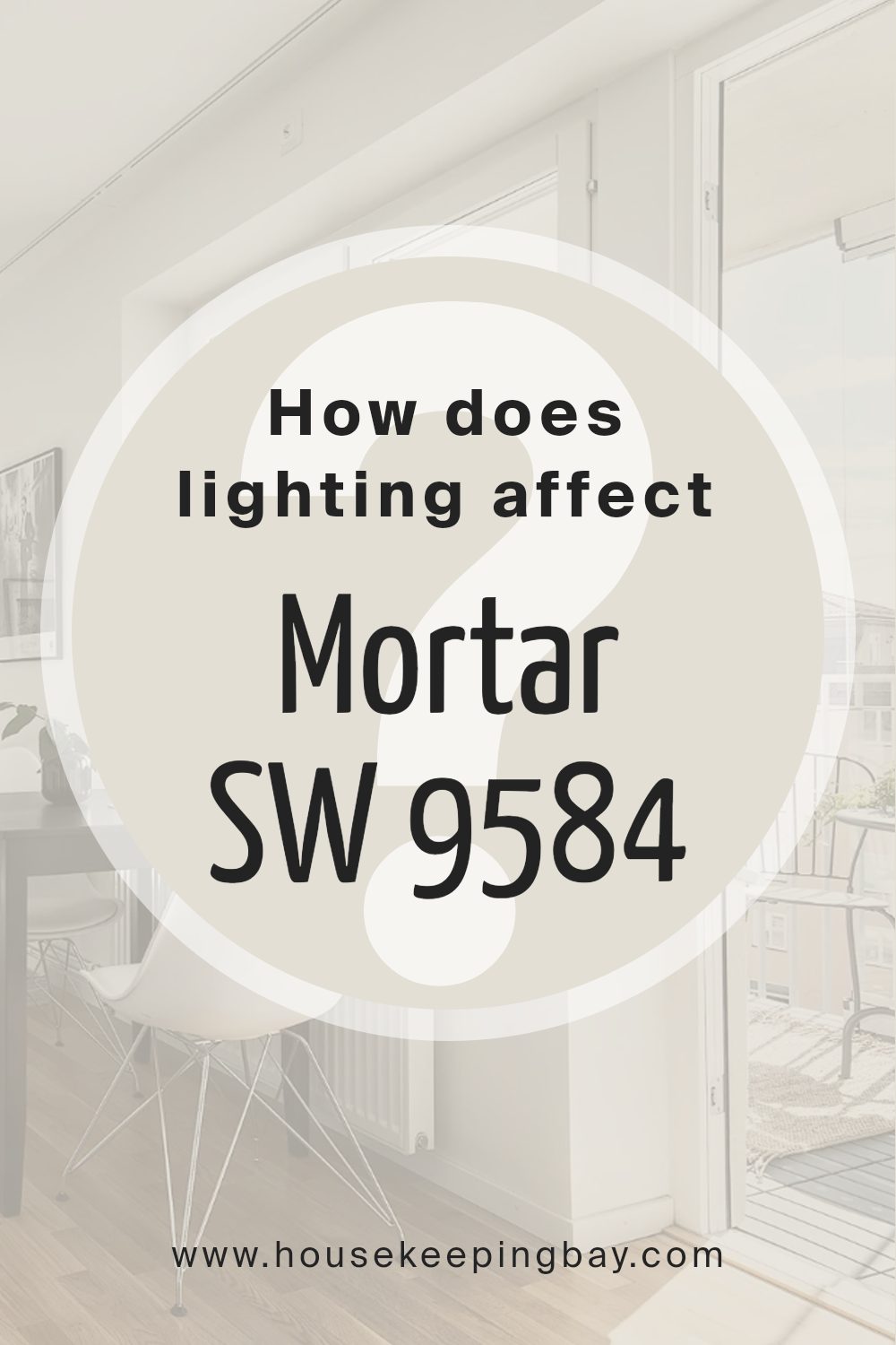
Lighting significantly influences how we perceive colors. The type of light under which a color is viewed can change its appearance, intensity, and mood. This phenomenon is easily observable with paint colors, like Sherwin Williams’ “MortarSW 9584,” a sophisticated and versatile shade.
In artificial lighting, “MortarSW 9584” can exhibit a range of personalities, depending on the light source. LED lights, which tend to have a cooler temperature, might make “MortarSW 9584” appear slightly sharper and more modern, potentially highlighting its underlying cool tones.
Conversely, incandescent lighting, known for its warm glow, can soften “MortarSW 9584,” bringing out any warmer undertones and creating a cozy, inviting space.
Natural light introduces another dimension to “MortarSW 9584,” showcasing its adaptability. The time of day and the direction the light comes from both play pivotal roles in how this color is perceived.
- North-faced rooms: These spaces receive less direct sunlight, meaning “MortarSW 9584” might appear more muted and consistent throughout the day, maintaining a true-to-sample look. The cooler, indirect light complements its subtlety, making it a serene and stable choice for north-facing rooms.
- South-faced rooms: Here, “MortarSW 9584” can truly come alive. The abundant direct sunlight south-facing rooms receive can warm up the color, highlighting any hidden depth and making the space feel vibrant and dynamic. The paint color might shift in brightness and intensity as the day progresses.
- East-faced rooms: Morning light is warm and yellow, meaning “MortarSW 9584” will start the day with a welcoming glow, gradually transitioning to a cooler, more balanced appearance as the sunlight moves. This makes east-facing rooms ideal for enjoying the color’s full spectrum.
- West-faced rooms: In the evening, as the light turns warm and golden, “MortarSW 9584” will likely cast a richer, more intense hue, fostering a relaxing and cozy ambiance perfect for unwinding.
Understanding how lighting affects colors, especially nuanced ones like “MortarSW 9584,” allows for strategic use in home decor, ensuring spaces are not just beautiful but also dynamically engaging.
housekeepingbay.com
What is the LRV of Mortar SW 9584 by Sherwin Williams?
Light Reflectance Value (LRV) is a measurement indicating the percentage of light a paint color reflects from or absorbs into a surface. LRV scale ranges from 0 to 100, with 0 being completely black, absorbing all light, and 100 being pure white, reflecting all light.
This measurement is crucial when selecting paint colors for interiors or exteriors, as it directly impacts the brightness and ambience of a space. A higher LRV means the color reflects more light, making a room feel more open and airy, while a lower LRV results in a color that absorbs more light, creating a cozier or more enclosed feel.
LRV helps professionals and homeowners make informed decisions about the visual temperature and the spatial perception of rooms, influencing mood, visual comfort, and even energy costs related to lighting.
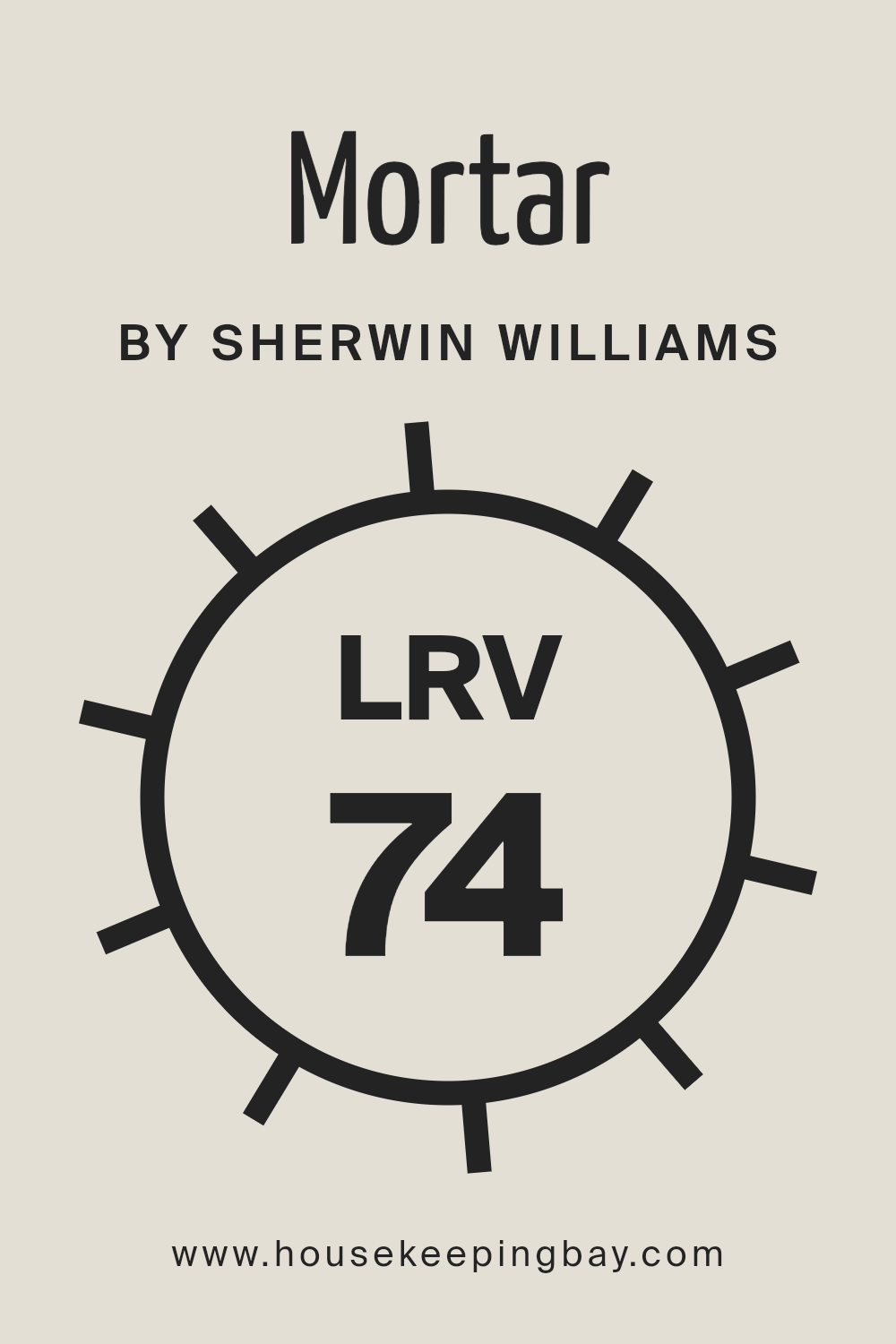
MortarSW 9584 by Sherwin Williams, with an LRV of 73.686, falls into the category of colors that reflect a significant amount of light. This relatively high LRV means that MortarSW 9584 is capable of making spaces feel more luminous and spacious.
In rooms with ample natural light, this color will appear even lighter and can help in creating a serene and inviting atmosphere. Conversely, in spaces with less natural light, it will still manage to reflect the available light efficiently, brightening the space more than darker hues would.
Given its LRV, MortarSW 9584 is versatile for various lighting conditions, providing a neutral backdrop that is both sophisticated and adaptable to a wide range of decorative styles. Its light-reflecting properties make it an excellent choice for making smaller rooms feel larger or for enhancing the airy feel of more expansive spaces.
housekeepingbay.com
What is LRV? Read It Before You Choose Your Ideal Paint Color
What are the Trim colors of Mortar SW 9584 by Sherwin Williams?
Trim colors serve as a critical component in the architectural and design schemes of homes and buildings, particularly when it comes to enhancing and complementing the main color palette. For MortarSW 9584 by Sherwin Williams, a sophisticated, earthy gray hue, selecting the right trim colors is paramount for creating contrast, adding dimension, and framing the architectural elements effectively.
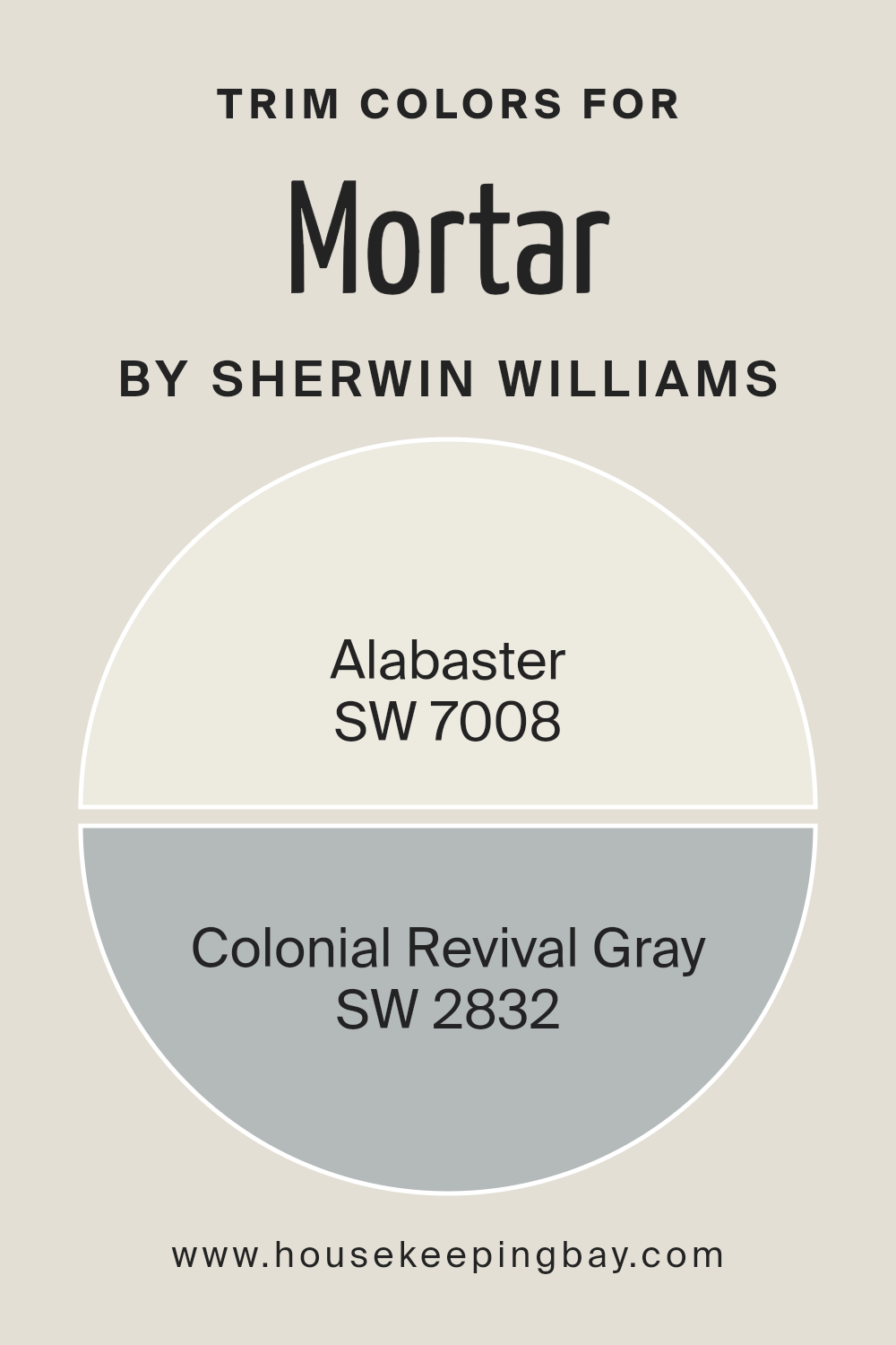
Trim colors like SW 7008 – Alabaster and SW 2832 – Colonial Revival Gray by Sherwin Williams have been chosen for their harmonizing qualities and their ability to subtly elevate the aesthetic appeal of MortarSW 9584, ensuring that the overall design remains cohesive yet elegantly distinguished.
Alabaster SW 7008, a warm and welcoming shade of white with a hint of softness, brings a light and airy feel when used as a trim color, offering a gentle contrast that highlights MortarSW 9584’s inherent richness without overwhelming it. Its subtle warmth works wonders in balancing the cooler undertones of MortarSW 9584, resulting in a serene and inviting ambiance.
On the other hand, Colonial Revival Gray SW 2832, with its deeper and more pronounced hue, provides a bolder frame for MortarSW 9584, enhancing its depth and complexity. This gray, bearing historic elegance, crafts a sophisticated border that both complements and contrasts with MortarSW 9584, underscoring the architectural details with a touch of classic charm.
Together, these trim colors enrich the overall color scheme, fostering an environment of balance and beauty.
You can see recommended paint colors below:
- SW 7008 Alabaster
- SW 2832 Colonial Revival Gray
housekeepingbay.com
Colors Similar to Mortar SW 9584 by Sherwin Williams
Similar colors play a crucial role in creating a harmonious and aesthetically pleasing space, as they allow for subtle variations within a single hue family. When considering similar colors to MortarSW 9584 by Sherwin Williams, one can explore shades that offer a diverse yet cohesive palette.
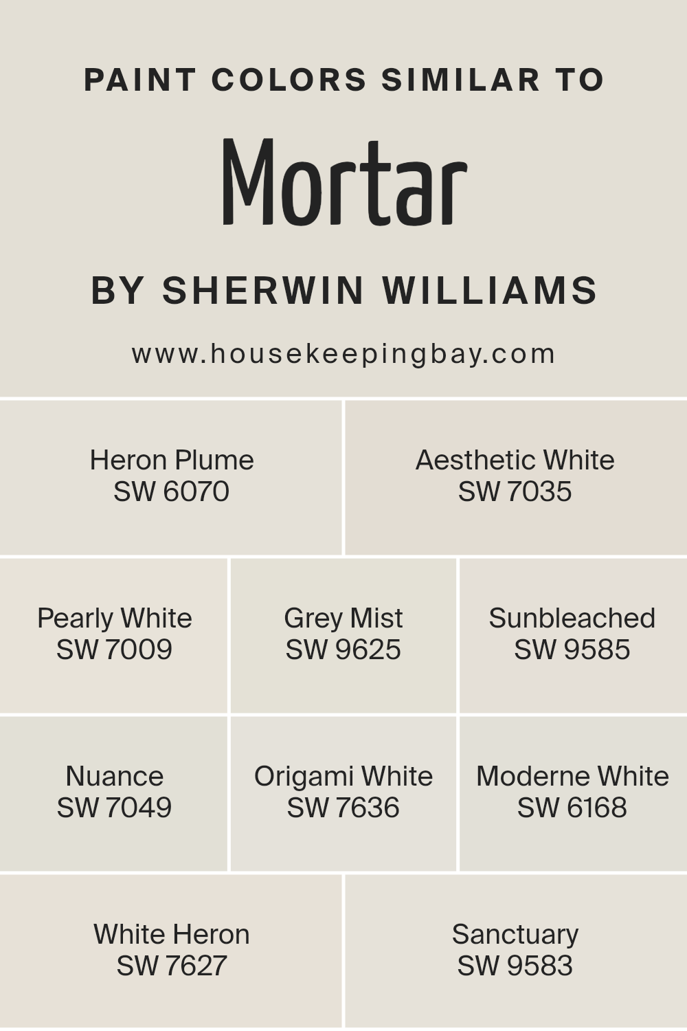
For instance, Heron Plume and Aesthetic White bring lightness with a soft touch, enveloping rooms in warmth without overpowering. Pearly White, with its hint of warmth, acts as a bridge between neutrals, offering flexibility in design.
Grey Mist and Sunbleached introduce a gentle contrast, reminiscent of early morning fog and sun-faded materials, respectively, providing a serene backdrop.
Nuance, Origami White, and Moderne White further extend the range, offering subtlety with their nuanced tones that capture the essence of natural elements. White Heron and Sanctuary echo the calm and purity of a secluded retreat, grounding the space in tranquility.
Each color, from the muted elegance of Nuance to the crisp brightness of White Heron, contributes to a layered effect, creating depth and interest. By carefully selecting similar colors such as these, one can achieve a cohesive look that is both complex and refined, proving that a palette centered around MortarSW 9584 can lead to beautiful and inviting spaces.
You can see recommended paint colors below:
- SW 6070 Heron Plume
- SW 7035 Aesthetic White
- SW 7009 Pearly White
- SW 9625 Grey Mist
- SW 9585 Sunbleached
- SW 7049 Nuance
- SW 7636 Origami White
- SW 6168 Moderne White
- SW 7627 White Heron
- SW 9583 Sanctuary
housekeepingbay.com
How to Use Mortar SW 9584 by Sherwin Williams In Your Home?
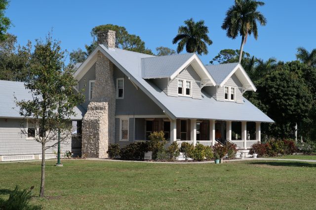
Mortar SW 9584 by Sherwin Williams is a captivating paint color that embodies the robustness and earthiness of natural mortar. This unique hue, part of Sherwin Williams’s collection, offers homeowners an exceptional choice for adding depth and character to their living spaces. With its versatile, warm gray tone, Mortar SW 9584 serves as an ideal backdrop for a wide range of home decor styles, from minimalist and industrial designs to more traditional and rustic themes.
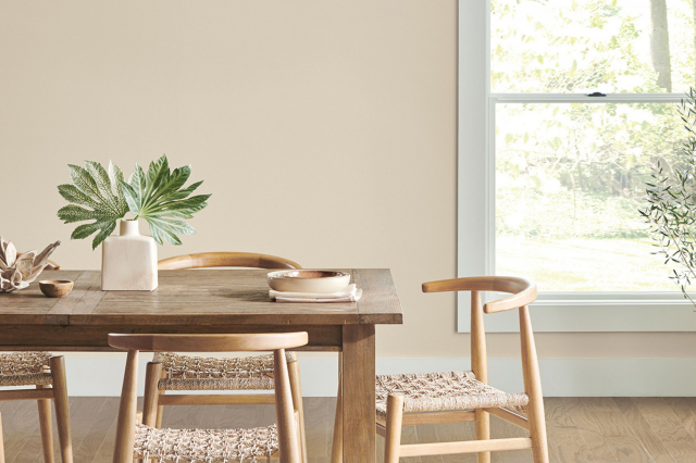
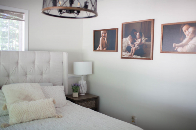
Homeowners looking to incorporate Mortar SW 9584 into their homes will find it particularly useful in creating cozy and welcoming environments. This color can be utilized in living rooms, bedrooms, or even kitchens to foster a sense of comfort and serenity.
Its neutral yet distinctive nature allows it to pair beautifully with a variety of accent colors, from bold and bright to soft and subdued, making it easy to integrate into existing color schemes.
For those seeking to add sophistication and a touch of modernity to their spaces, applying Mortar SW 9584 on walls, accent features, or cabinetry can achieve just that, transforming any room into a stylish and inviting area.
Mortar SW 9584 by Sherwin Williams vs Sanctuary SW 9583 by Sherwin Williams
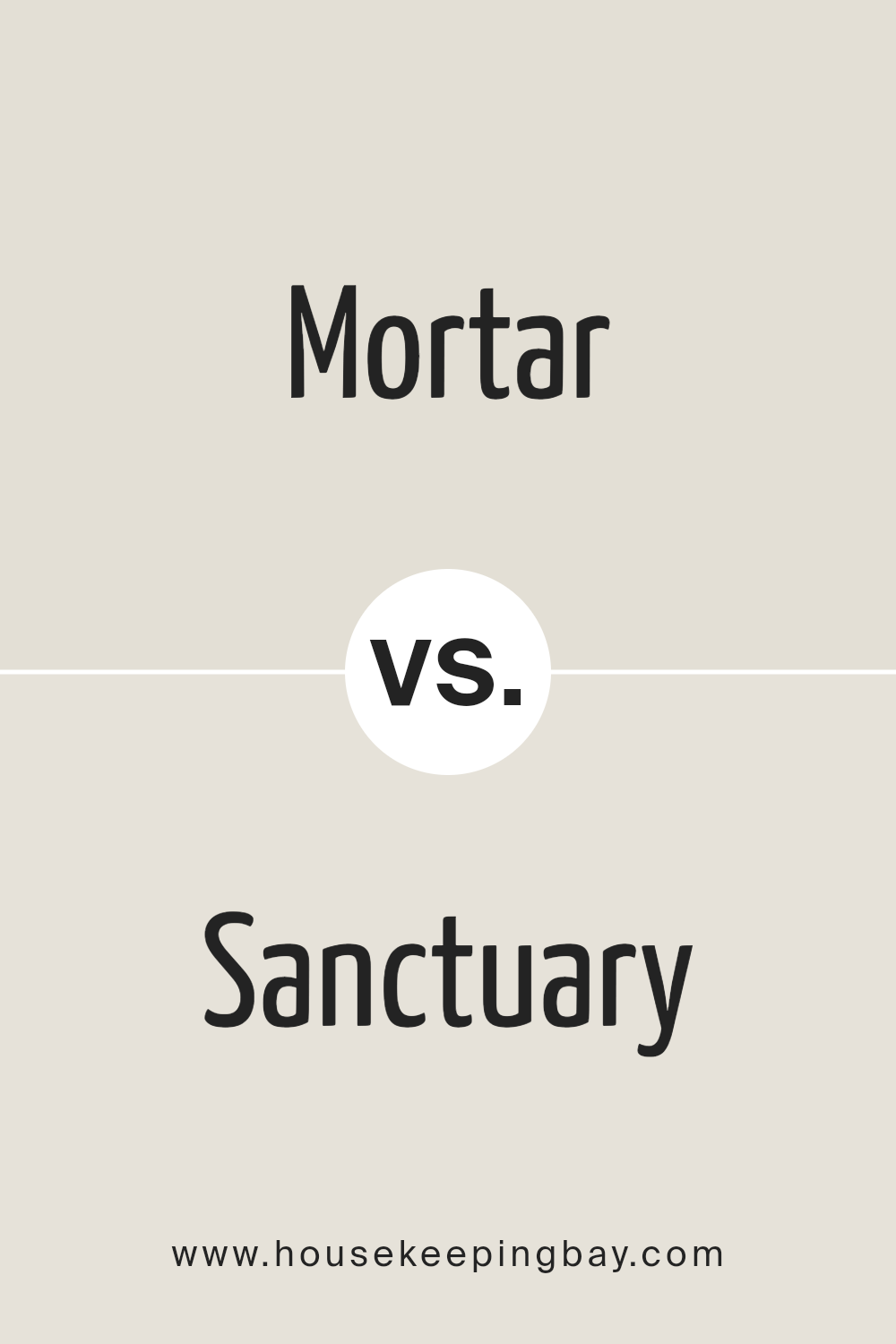
Mortar SW 9584 and Sanctuary SW 9583 by Sherwin Williams are two colors that embody the essence of serene sophistication and understated elegance. Mortar SW 9584 is a color that conveys depth and stability. It presents itself as a darker, more grounded hue, reminiscent of the natural earthiness found in stone and clay. This color can bring a sense of calmness and strength to any space, making it ideal for areas where focus and contemplation are desired.
Sanctuary SW 9583, on the other hand, is a lighter, airier tone. It invokes a sense of peace and tranquility, much like a serene retreat. It’s a softer, more nurturing color that delicately brightens a room, providing a soothing backdrop that encourages relaxation and reflection. This color can make spaces feel more open and rejuvenating, perfect for creating a peaceful haven in the home.
When comparing Mortar SW 9584 to Sanctuary SW 9583, the primary distinction lies in their intensity and mood. Mortar offers a deeper, more profound statement, while Sanctuary provides a gentle, calming effect, making them both unique and versatile choices depending on the ambience one wishes to achieve.
You can see recommended paint color below:
housekeepingbay.com
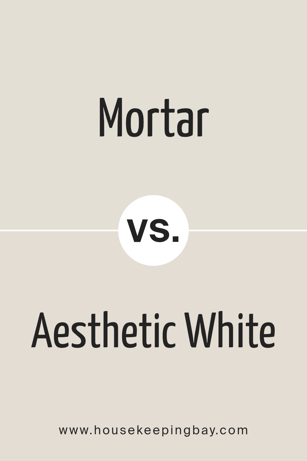
Mortar SW 9584 by Sherwin Williams vs Aesthetic White SW 7035 by Sherwin Williams
Mortar SW 9584 and Aesthetic White SW 7035 by Sherwin Williams represent two unique nuances on the color spectrum, embodying distinct atmospheres for interior and exterior application. Mortar, with its deep, rich, and warm undertones, evokes a sense of sophistication and boldness. This darker shade captures the essence of shadowed stone, providing depth and solidity to spaces. It’s a color that stands out, making a statement in any setting, ideal for accent walls or to create a cozy, enveloping environment.
In contrast, Aesthetic White SW 7035 is a light, airy hue that exudes tranquility and elegance. Far from being a stark white, it carries a nuanced blend of gray and beige, offering a soft, minimalistic charm that enhances spaciousness and light.
This versatile shade acts as a perfect backdrop for various design styles, from modern to classic, by promoting a serene and uplifting atmosphere.
While Mortar brings a bold and foundational strength, Aesthetic White offers a refreshing and clean canvas. Each color serves different aesthetic purposes but can complement each other beautifully in a balanced interior scheme, where Mortar’s intensity adds character and Aesthetic White introduces lightness and continuity.
You can see recommended paint color below:
housekeepingbay.com
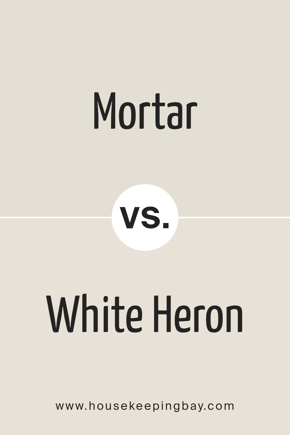
Mortar SW 9584 by Sherwin Williams vs White Heron SW 7627 by Sherwin Williams
Mortar SW 9584 and White Heron SW 7627 by Sherwin Williams present a study in contrast and harmony, perfect for those seeking a balanced and contemporary color palette. Mortar, with its deep, rich gray hue, embodies strength and sophistication.
This color tends to anchor spaces, providing a solid foundation that exudes modern elegance and a hint of mystery. Its versatility allows it to serve as a strong background color, capable of making lighter colors pop while also complementing darker shades.
On the other hand, White Heron SW 7627 is the epitome of cleanliness and tranquility. This color is a soft, bright white with a hint of warmth that prevents it from appearing stark or cold. As a neutral, White Heron offers a refreshing contrast to the depth of Mortar, bringing with it a sense of airiness and openness. It has the ability to illuminate spaces, making them appear larger and more inviting.
Together, Mortar and White Heron create a visually striking combination. The richness of Mortar provides depth and sophistication, while White Heron introduces brightness and a sense of expansion.
This pairing is ideal for those looking to create a dynamic yet harmonious space, balancing the weight of a darker hue with the levity of a light, warm white.
You can see recommended paint color below:
- SW 7627 White Heron
housekeepingbay.com
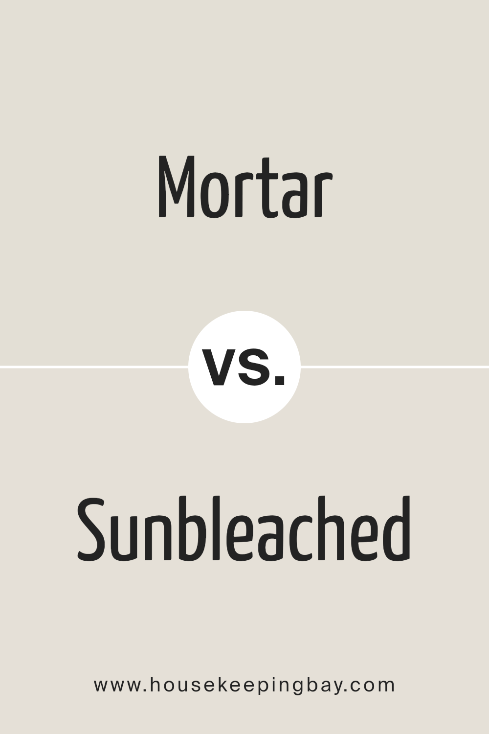
Mortar SW 9584 by Sherwin Williams vs Sunbleached SW 9585 by Sherwin Williams
Mortar SW 9584 and Sunbleached SW 9585 are both intriguing colors by Sherwin Williams, though they sit on distinctly different spectrums of the color palette, each bringing a unique ambiance and mood to a space. Mortar, as the name suggests, is a robust and earthy gray that embodies a sense of grounding and strength.
It’s a versatile shade that can serve as a bold statement or a muted backdrop, adapting seamlessly to various décor styles while maintaining a sophisticated, modern allure. Its deep and slightly warm undertones give it a welcoming feel, despite its solid appearance.
On the other hand, Sunbleached SW 9585 offers a lighter, more ethereal experience. This color is reminiscent of wood lightly faded by the sun, embodying a serene and airy quality. Its underlying warmth and subtle hints of beige make it an excellent choice for creating a soft, inviting, and restful environment. Unlike Mortar, Sunbleached brings an element of brightness and spaciousness, acting as a perfect canvas for both contemporary and rustic designs.
While Mortar leans towards a more defined and grounded aesthetic, Sunbleached evokes an open and luminous sensation, making them suitable for different purposes yet equally captivating in their right.
You can see recommended paint color below:
- SW 9585 Sunbleached
housekeepingbay.com
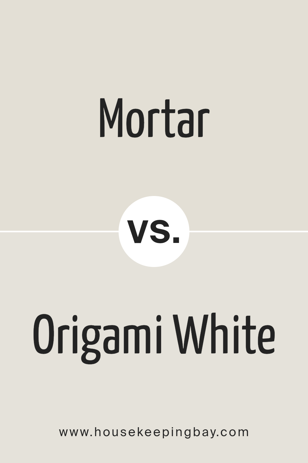
Mortar SW 9584 by Sherwin Williams vs Origami White SW 7636 by Sherwin Williams
Mortar SW 9584 and Origami White SW 7636, both from Sherwin Williams, present a thought-provoking comparison with their distinct tones that cater to different aesthetic preferences and design requirements.
Mortar SW 9584 is a deep, nuanced blend that echoes the natural color of its namesake, providing a strong, almost grounding effect. This color has a robust presence, making it an ideal choice for accent walls or spaces where a sense of depth and sophistication is desired.
On the other hand, Origami White SW 7636 is a much lighter shade, imbued with a soft, warm undertone that exudes a sense of calm and serenity. It acts as a versatile backdrop that can easily complement a wide range of colors and textures, making it perfect for creating a light, airy feel in any room. Its inherent warmth helps in crafting spaces that are inviting and comfortable.
Thus, while Mortar SW 9584 offers a bold, dramatic statement, Origami White SW 7636 serves up subtlety and versatility, making them both valuable in their own right within the palette of interior design.
You can see recommended paint color below:
housekeepingbay.com
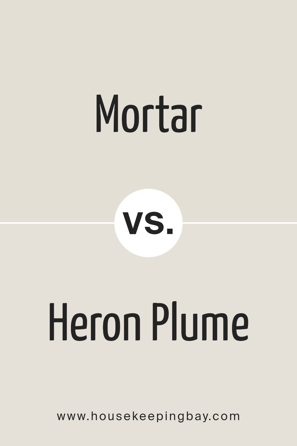
Mortar SW 9584 by Sherwin Williams vs Heron Plume SW 6070 by Sherwin Williams
“Mortar SW 9584” and “Heron Plume SW 6070” by Sherwin Williams are two sophisticated hues that cater to different aspects of the interior palette. Mortar is a dense, profound gray that lends a sense of solidity and grounding to spaces.
It can evoke the strength of stone architecture, making it ideal for creating focal points or accentuating details within a room. This shade is particularly well-suited for modern and industrial designs, where its depth can contrast beautifully with lighter colors and natural materials.
On the other hand, “Heron Plume” operates in a lighter, airier domain. This color is a soft, warm gray with subtle pink undertones, evoking the delicate beauty of a heron’s plumage. It is exceptionally versatile, functioning beautifully as both a main color and an accent. It offers a serene and inviting atmosphere, perfect for spaces intended to be calming and restful, such as bedrooms and living areas. The warmth of Heron Plume makes it conducive to pairing with a wide range of colors, from earthy tones to bolder hues.
When compared, the most striking difference between Mortar and Heron Plume is their intensity and warmth. Mortar brings depth and boldness, while Heron Plume offers softness and warmth, making them suitable for different applications or complementary uses in a cohesive color scheme.
You can see recommended paint color below:
housekeepingbay.com
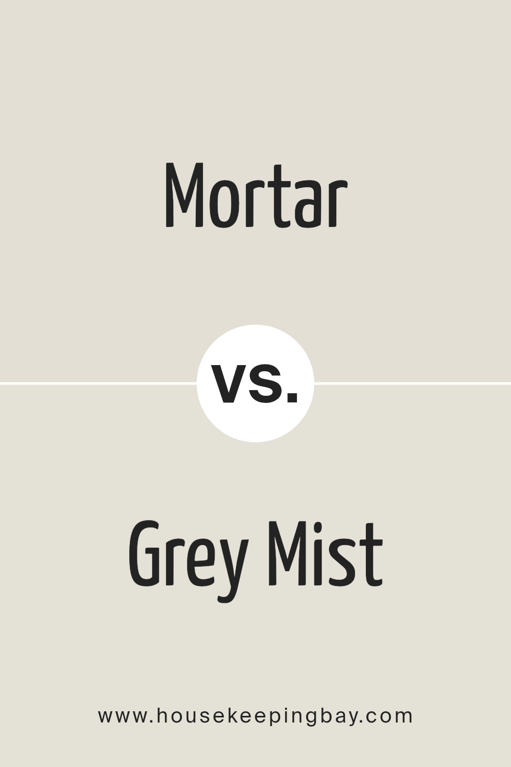
Mortar SW 9584 by Sherwin Williams vs Grey Mist SW 9625 by Sherwin Williams
Mortar SW 9584 and Grey Mist SW 9625 by Sherwin Williams are two distinctive hues that cater to different aesthetic preferences and design needs. Mortar is a robust, deep grey that draws inspiration from the natural color of wet concrete.
This color exudes strength and stability, making it an excellent choice for creating a bold statement or anchoring a space with its solid, grounding effect. Its depth allows for a striking contrast when paired with lighter tones, providing a sophisticated palette.
On the other hand, Grey Mist SW 9625 is a much lighter, softer grey with a subtle warmth to it. This hue whispers tranquility and offers a serene backdrop, perfect for spaces intended to be restful and calming. Its lighter tone reflects more light, making it ideal for smaller spaces or areas with limited natural light, as it can visually enlarge the room and evoke a sense of airiness.
While both colors share a grey base, Mortar leans towards a more pronounced, dramatic presence, whereas Grey Mist serves to soften and soothe. Each brings its unique character to interiors: Mortar establishes dominance and structure, and Grey Mist creates a gentle, inviting ambiance.
Choosing between them depends on the intended mood and functional application within the design space.
You can see recommended paint color below:
housekeepingbay.com
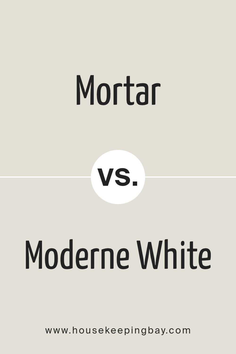
Mortar SW 9584 by Sherwin Williams vs Moderne White SW 6168 by Sherwin Williams
Mortar SW 9584 and Moderne White SW 6168 by Sherwin Williams embody distinct aesthetic vibes and functionalities within interior spaces. Mortar, a deep, muted grey with earthy undertones, offers a grounded, robust character.
This color can bring depth and sophistication to spaces, serving well as a statement wall or as a background hue that complements brighter colors and various textures. Its calming, yet pronounced nature, makes it versatile for both modern and traditional settings.
On the other hand, Moderne White SW 6168 is a soft, warm white with subtle beige undertones, exuding an airy, welcoming ambiance. It acts as an excellent base, providing a neutral backdrop that enhances natural light and makes spaces appear larger. Moderne White is ideal for creating a serene, minimalist aesthetic, capable of freshening up any room without overwhelming with color.
While Mortar offers depth and earthiness, contributing to a cozy, enveloping feel, Moderne White leans towards creating a bright, open, and inviting space. Both colors serve different design needs, with Mortar anchoring spaces through its solidity and Moderne White offering a gentle lift and expansiveness.
You can see recommended paint color below:
- SW 6168 Moderne White
housekeepingbay.com
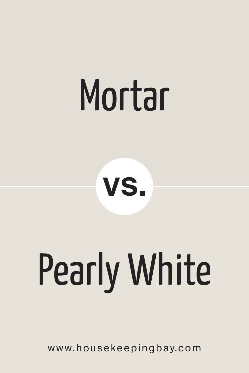
Mortar SW 9584 by Sherwin Williams vs Pearly White SW 7009 by Sherwin Williams
Mortar SW 9584 and Pearly White SW 7009, both by Sherwin Williams, exist in distinctly different spectrums of the color palette. Mortar SW 9584 dives deep into the realm of earthy tones, offering a solid, grounding presence in any space it adorns.
It’s a color that speaks of stability and strength, with a muted hue that evokes the image of its namesake, blending seamlessly into a variety of design aesthetics from modern to rustic. Its versatility is found in its subdued nature, making it an excellent choice for those seeking a sophisticated, yet understated backdrop.
In contrast, Pearly White SW 7009 sits at the lighter end of the spectrum, offering a breath of fresh air with its luminous, gentle touch. This color embodies serenity and softness, capable of making spaces feel more open and airy. It’s an ideal choice for creating a subtle, soothing ambiance, with a hint of warmth that avoids the starkness sometimes associated with pure whites. As a backdrop, Pearly White can enhance natural light and make rooms feel more expansive and welcoming.
Together, Mortar and Pearly White can complement each other beautifully, with the deep, grounding force of Mortar providing a striking contrast to the light, ethereal quality of Pearly White. This combination can bring balance and sophistication to a space, harmonizing well in designs that aim to blend strength with softness.
You can see recommended paint color below:
housekeepingbay.com
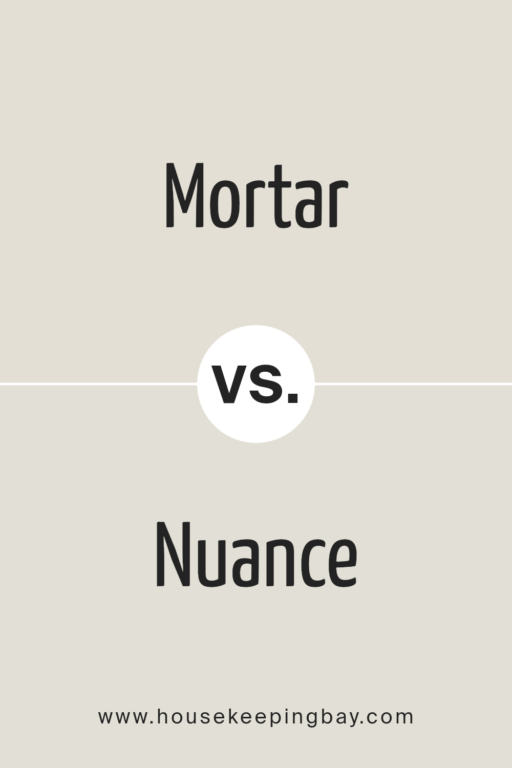
Mortar SW 9584 by Sherwin Williams vs Nuance SW 7049 by Sherwin Williams
Mortar SW 9584 and Nuance SW 7049, both from Sherwin Williams, are distinct hues that cater to diverse aesthetic preferences and design needs. Mortar SW 9584 is a deep, earthy gray with brown undertones, emitting warmth and solidity.
This hue stands out for its ability to anchor spaces, providing a strong foundation for interior designs that seek gravity and a touch of sophistication. It pairs well with a range of other colors, acting as a versatile backdrop that complements both vibrant and muted palettes.
On the other hand, Nuance SW 7049 veers towards a softer, lighter gray, imbued with subtle neutral undertones. This color excels in creating serene and airy environments, reflecting natural light beautifully to make spaces appear larger and more welcoming. Nuance’s versatility lies in its ability to adapt, offering a seamless transition between different decorative elements, from modern minimalism to classic charm.
While Mortar embodies depth and earthiness, Nuance offers a gentle, open-ended canvas. Both colors enrich spaces but cater to different moods: Mortar grounding and embracing, Nuance uplifting and expanding.
You can see recommended paint color below:
- SW 7049 Nuance
housekeepingbay.com
Conclusion
The color Mortar SW 9584 by Sherwin Williams is a testament to the depth and versatility that neutral shades can offer in the realm of interior and exterior design. This particular shade, a rich blend of grey with subtle earthy undertones, brings a sense of sophistication and warmth to spaces, making it an excellent choice for creating a tranquil and welcoming atmosphere.
Its adaptability allows it to seamlessly integrate into a variety of design aesthetics, from modern minimalism to rustic charm, demonstrating its capability to elevate any space without overwhelming it with color.
As homeowners and designers alike continue to lean towards neutral palettes for their timeless appeal, Mortar SW 9584 stands out as a quintessential choice that balances contemporary design trends with classic elegance. Its ability to act as a foundational or accent color provides endless possibilities for personalization and creativity in decorating.
Whether applied to walls, cabinetry, or exterior facades, Mortar SW 9584 by Sherwin Williams proves itself to be a versatile and enduring color choice that can harmonize with a wide range of decor elements, making it a go-to shade for those looking to create spaces that are both inviting and aesthetically pleasing.
housekeepingbay.com
Ever wished paint sampling was as easy as sticking a sticker? Guess what? Now it is! Discover Samplize's unique Peel & Stick samples. Get started now and say goodbye to the old messy way!
Get paint samples
