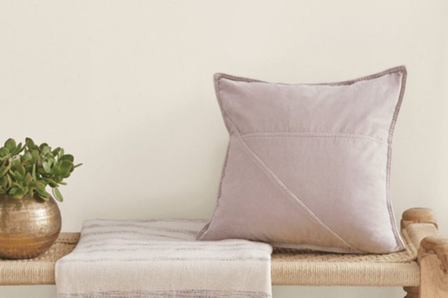
Sunbleached SW 9585 by Sherwin Williams
Bringing Warmth Home
As the world of interior design constantly evolves, paint color trends emerge to capture the essence of contemporary style. Among these trends, a hue that has gained notable appreciation for its warm, versatile, and calming qualities is SW 9585 Sunbleached by Sherwin Williams.
This particular shade stands out in the Sherwin Williams palette for its ability to transform spaces into tranquil sanctuaries, reflecting the beauty of sun-drenched landscapes and the serene aesthetic of aged wood.SW 9585 Sunbleached is more than just a paint color; it’s a testament to the the intersection of nature and design.
With its understated elegance and subtle charm, Sunbleached evokes a sense of comfort and nostalgia, making it a perfect choice for homeowners and designers looking to create spaces that feel both welcoming and stylish.
Its unique blend of softness with a hint of warmth offers fantastic versatility, making it suitable for a wide range of interior styles – from the rustic warmth of farmhouse chic to the minimalist appeal of Scandinavian design.
This article delves into the allure of SW 9585 Sunbleached by Sherwin Williams, exploring its characteristics, the moods it creates, and how it complements different spaces and design elements.
Whether you’re embarking on a renovation project or simply searching for inspiration to refresh your living space, understanding the impact of this captivating hue will open up a world of design possibilities.
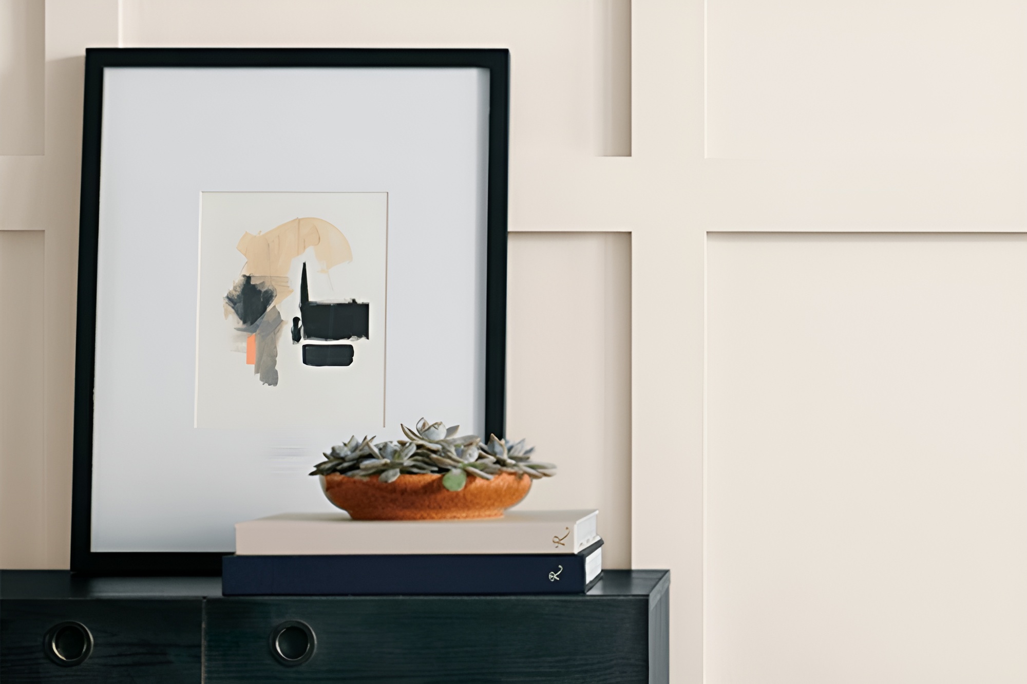
vis sherwin-williams.com
What Color Is Sunbleached SW 9585 by Sherwin Williams?
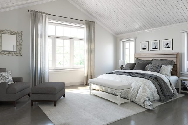
Sunbleached SW 9585 by Sherwin-Williams encapsulates a serene and restorative essence, drawing its inspirations from the gentle wear of materials exposed to the warm embrace of the sun.
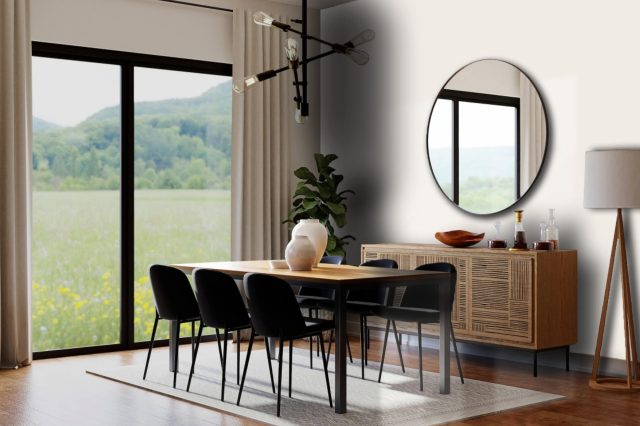
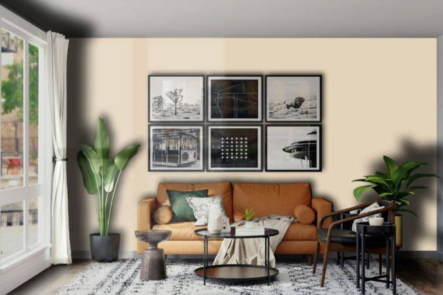
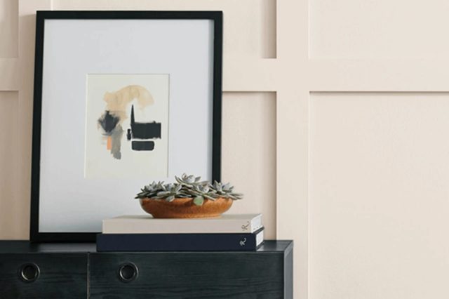
This color stands out as a muted, soft beige with subtle gray undertones, offering a contemporary take on the natural hues found in sun-dappled environments. Its remarkable versatility allows it to act as both a soothing neutral and a sophisticated background, making it exceptionally adaptive to various interior styles.
In the realm of interior design, Sunbleached finds its harmony within modern minimalist, Scandinavian, and coastal-inspired spaces. Its understated elegance complements the clean lines and uncluttered aesthetics of modern minimalist interiors, fostering a sense of calm and spaciousness.
Scandinavian designs, with their emphasis on light, simplicity, and natural elements, pair beautifully with Sunbleached, enhancing the style’s airy and bright character. The color also resonates with the effortless charm of coastal themes, echoing the textures and palette of natural landscapes, sandy shores, and driftwood.
Materials and textures that pair well with Sunbleached include natural wood, linen, and cotton, accentuating its organic feel. These combinations encourage a tactile experience, inviting touch and fostering a connection with natural elements.
The color also works splendidly with matte finishes and subtle metallics like brushed nickel or aged bronze, adding depth and a hint of refinement without overwhelming the senses. In textiles, think of blending wool throws or jute rugs into the space to enhance its warmth and texture, creating an inviting and cohesive look that’s both restorative and welcoming.
housekeepingbay.com
Table of Contents
Is Sunbleached SW 9585 by Sherwin Williams Warm or Cool color?
Sunbleached SW 9585 by Sherwin Williams is an alluring hue that exudes a sense of warmth and natural elegance. As its name suggests, this color captures the essence of wood lightened by the sun, presenting a gentle, muted tone that brings a serene and inviting atmosphere into any space.
Its understated beauty makes it incredibly versatile, allowing it to work harmoniously in a variety of home styles, from modern minimalist to rustic and coastal themes.
When applied to walls, Sunbleached SW 9585 acts as a soft backdrop that enhances the room’s natural light, creating an airy and spacious feel. Its neutral yet warm qualities enable it to blend seamlessly with a wide range of decor elements and color palettes, from bold and vibrant hues to more subdued and earthy tones.
This adaptability makes Sunbleached an excellent choice for creating a cohesive look throughout the home.
Furthermore, Sunbleached SW 9585 has the unique capability to add depth and character to a space without overwhelming it, making rooms feel cozy and lived-in.
Whether used as an all-over wall color or as an accent in select areas, it infuses spaces with a tranquil and welcoming vibe, encouraging relaxation and comfort.
Its timeless nature ensures that it will remain a tasteful and appealing choice for years to come, making it a smart and stylish selection for homeowners looking to create a peaceful and beautiful home environment.
What is the Masstone of the Sunbleached SW 9585 by Sherwin Williams?
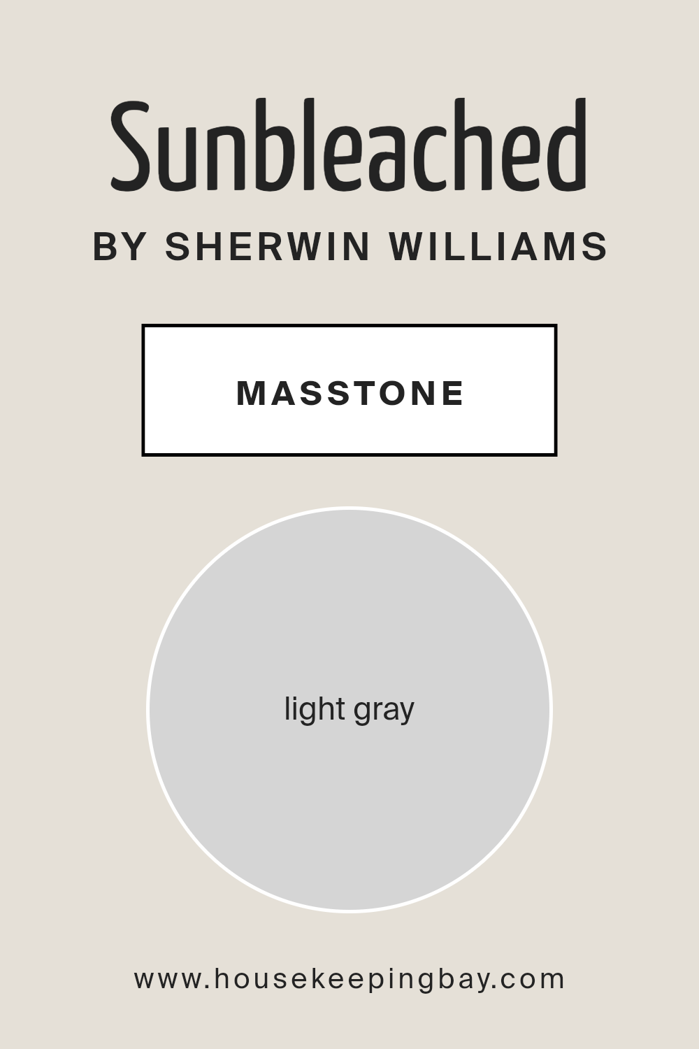
SunbleachedSW 9585 by Sherwin Williams, with its masstone classified as a Light Gray (#D5D5D5), occupies a unique position in home decor. This particular shade of gray serves as a versatile backdrop that can either stand modestly on its own or support a wide range of other hues and textures within a space.
The inherent neutrality of SunbleachedSW 9585’s light gray masstone ensures that it effortlessly complements both warm and cool tones, allowing for a seamless integration with various design themes, from modern minimalism to cozy farmhouse style.
In homes, this light gray shade has the exceptional ability to expand the perception of space, making rooms feel more open and airy, an advantage especially appreciated in smaller or dimly-lit areas.
Unlike darker tones that might absorb light, SunbleachedSW 9585 reflects it, enhancing the overall brightness of the room. Furthermore, the understated elegance of this light gray promotes a sense of calm and serenity, making it an ideal choice for bedrooms and living areas where comfort and tranquility are paramount.
Its adaptability and the gentle ambiance it provides underpin why SunbleachedSW 9585 is a favored choice among homeowners aiming to create a contemporary yet timeless space.
housekeepingbay.com
Undertones of Sunbleached SW 9585 by Sherwin Williams
Sunbleached SW 9585 by Sherwin Williams is a color that evokes the warmth and texture of sun-kissed wood, complemented by subtle undertones that add depth and complexity to its appearance.
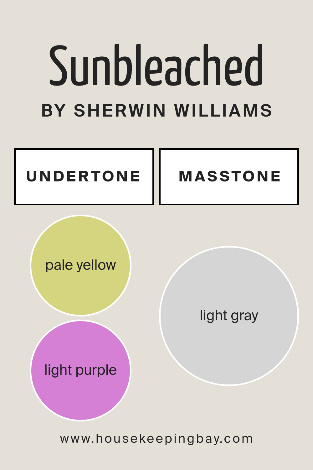
The undertones of pale yellow (#D5D580) and light purple (#D580D5) play key roles in influencing the perception and mood of spaces painted with Sunbleached.
The pale yellow undertone brings a soft, warm glow to the color, reminiscent of gentle sunlight filtering through a window. This quality makes Sunbleached particularly suited for creating cozy, welcoming spaces.
The warmth of the yellow undertones adds brightness to rooms, making them feel more inviting and comfortable. It can make spaces appear slightly brighter and more spacious, enhancing the natural light within a room.
Conversely, the light purple undertone introduces a subtle coolness that balances the warmth of the yellow, adding an intriguing depth. This complexity influences the color’s adaptability, enabling it to complement a wide range of decor styles and colors.
In different lighting conditions, the purple undertone may become more pronounced, lending a unique character to the walls it graces. This duality allows Sunbleached to work harmoniously in various settings, from modern and minimalistic to rustic and traditional.
The interaction of these undertones affects how we perceive the color Sunbleached, especially when applied to interior walls. Depending on the room’s lighting and the presence of natural light, Sunbleached can shift from a warm, welcoming hue to a more nuanced, sophisticated shade.
This chameleon-like quality makes it an excellent choice for those seeking versatility and depth in their color selections. The undertones ensure that Sunbleached is not just a simple beige or neutral but a dynamic, adaptable color that brings warmth and depth to interior spaces.
housekeepingbay.com
How Does Lighting Affect Sunbleached SW 9585 by Sherwin Williams?
The way we perceive color is significantly influenced by lighting, both artificial and natural. The hue, saturation, and brightness of colors can appear differently under various light sources.
This phenomenon is crucial to consider when evaluating paint colors for interiors, such as Sunbleached SW 9585 by Sherwin Williams, a soft, subtle hue that can transform under different lighting conditions.
In artificial light, the source and temperature of the light (measured in Kelvin) play key roles. Warm light bulbs can make Sunbleached SW 9585 appear more inviting and slightly warmer, enhancing its creamy undertones.
In contrast, cool LED lights may bring out its more neutral to slightly cool aspects, making the color appear crisper.
Under natural light, the time of day and the room’s orientation significantly affect how colors like Sunbleached SW 9585 are perceived. In rooms facing north, natural light tends to be cooler and more consistent throughout the day.
This cooler light can make Sunbleached SW 9585 appear more muted and subdued, emphasizing its soft, serene qualities without distorting its true hue.
South-facing rooms benefit from abundant, warm light for most of the day, which can make the color Sunbleached SW 9585 feel warmer and more vibrant. The color might pick up on subtle undertones, making it appear slightly richer and more dynamic in these settings.
East-facing rooms receive strong morning light, which can cast a warm yellow hue early in the day, making Sunbleached SW 9585 look softer and slightly warm. As the day progresses and the direct sunlight moves away, the color can appear more true to its neutral base by the afternoon.
West-facing rooms experience the opposite effect, with softer light in the morning allowing Sunbleached SW 9585 to display its calm, neutral attributes. In the evening, as the sun sets, the color can take on a warmer glow, enhancing its inviting qualities.
Understanding how lighting affects colors like Sunbleached SW 9585 by Sherwin Williams is crucial for creating the desired ambiance in any space. By considering the orientation of the room and the type of artificial lighting used, one can predict how this color will behave and ensure it meets the aesthetic and functional needs of the space.
housekeepingbay.com
What is the LRV of Sunbleached SW 9585 by Sherwin Williams?
Light Reflectance Value (LRV) is a measure that quantifies the percentage of visible and usable light that a paint color reflects within a space, ranging from 0% (absolute black, absorbing all light) to 100% (pure white, reflecting all light).
It provides an invaluable tool for designers and homeowners to understand how light or dark a color will look once applied to walls or surfaces. LRV plays a crucial role in both the aesthetics and functionality of a space.
Colors with high LRV make rooms feel more open and airy as they reflect more light, enhancing natural illumination. Conversely, colors with low LRV absorb more light, which can make a room feel cozier but smaller and darker, requiring more artificial lighting to maintain brightness.
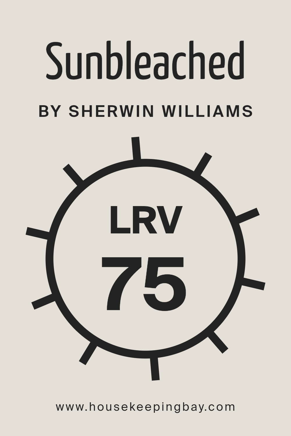
With an LRV of 74.752, Sunbleached SW 9585 by Sherwin Williams falls into the category of colors that reflect a substantial amount of light. This relatively high LRV means that Sunbleached will help create a light, uplifting space, making it particularly well-suited for rooms seeking a fresh, airy feel.
In spaces with ample natural light, this color will appear even lighter and can help in making the space seem more expansive and welcoming. Conversely, in less well-lit areas, its high LRV can help in counteracting the absence of natural light, ensuring the space doesn’t feel cramped or gloomy.
This makes Sunbleached SW 9585 a versatile choice that can adapt to varying lighting conditions, enhancing the perception of space and light regardless of the room’s orientation or light sources.
housekeepingbay.com
What is LRV? Read It Before You Choose Your Ideal Paint Color
What are the Trim colors of Sunbleached SW 9585 by Sherwin Williams?
Trim colors play a vital role in interior and exterior design by accentuating the architectural features of a space, creating depth, and enhancing the overall aesthetic appeal. In the context of Sunbleached SW 9585 by Sherwin Williams, a subtle yet captivating hue, the selection of trim colors is crucial to either complement or thoughtfully contrast with the wall color.
The purpose of choosing an appropriate trim color is not only to frame the architectural elements of the room, such as doorways, baseboards, and crown moldings, but also to create a cohesive look that enhances the primary color’s characteristics.
The right trim color can amplify the warmth, brightness, or coolness of the main color, depending on what atmosphere or theme one aims to achieve.
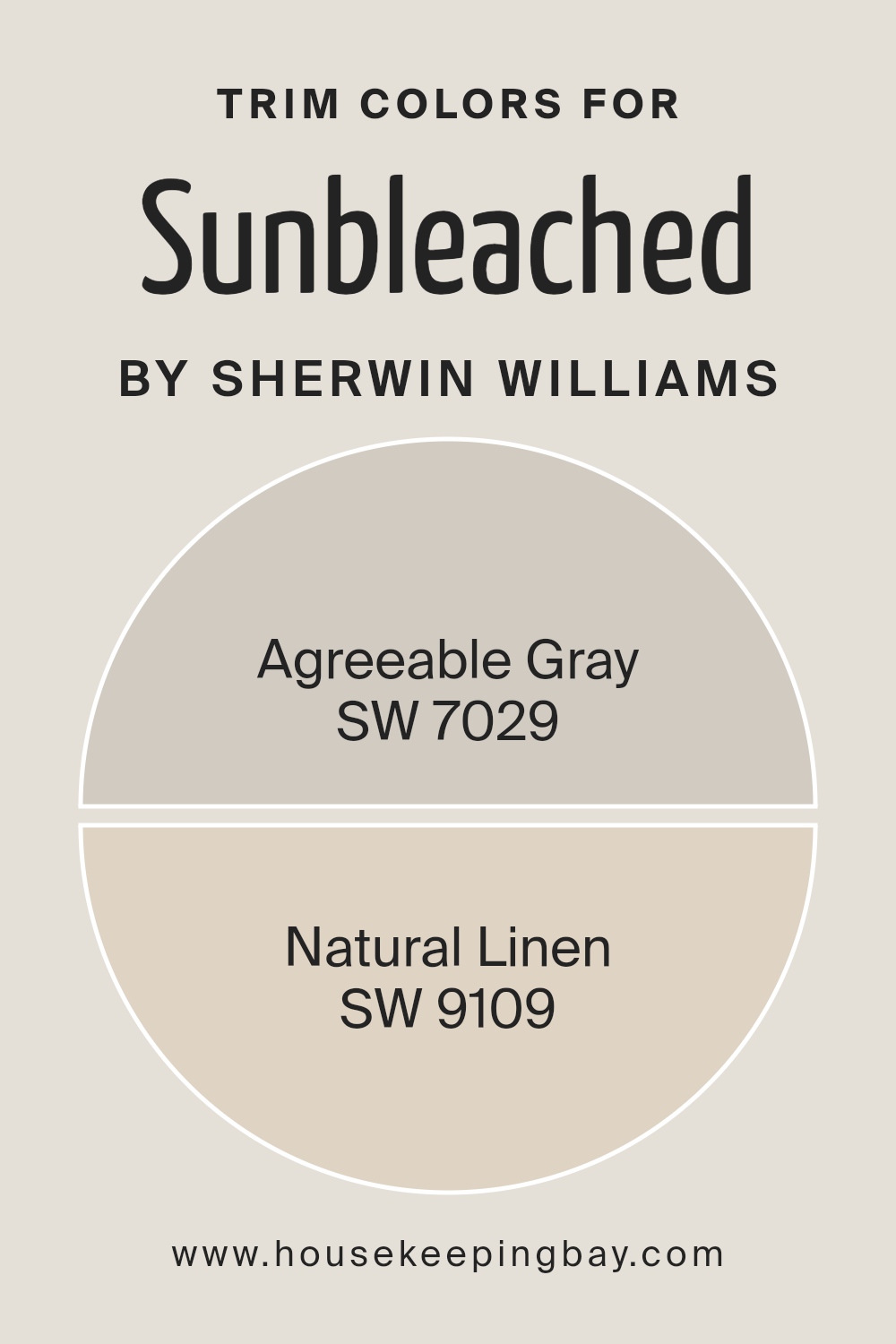
SW 7029, Agreeable Gray, is a versatile and warm gray with earthy undertones, making it an excellent choice for trim, offering a soft yet striking contrast to Sunbleached, highlighting its subtle nuances without overwhelming it.
On the other hand, SW 9109, Natural Linen, is a gentle beige that provides a seamless, natural transition to Sunbleached, softening the overall look and reinforcing a sense of calm and serenity.
Both Agreeable Gray and Natural Linen serve as complementary trim colors for Sunbleached SW 9585 by Sherwin Williams, ensuring the space retains a balanced and harmonious palette while articulating the architectural beauty of the environment.
You can see recommended paint colors below:
- SW 7029 Agreeable Gray
- SW 9109 Natural Linen
housekeepingbay.com
Colors Similar to Sunbleached SW 9585 by Sherwin Williams
In the realm of interior design, the significance of selecting harmoniously similar colors cannot be overstated, especially when it involves nuances akin to Sherwin Williams’ Sunbleached SW 9585.
This palette, comprising shades that whisper subtle variations, plays an integral role in creating spaces that are both cohesive and visually appealing. Similar colors, such as those suggested here, ensure a seamless transition from one area to another, allowing for a design that feels both expansive and unified.
These colors share an intrinsic connection, offering a delicate balance between warmth and light that enhances the overall ambiance without overwhelming the senses.
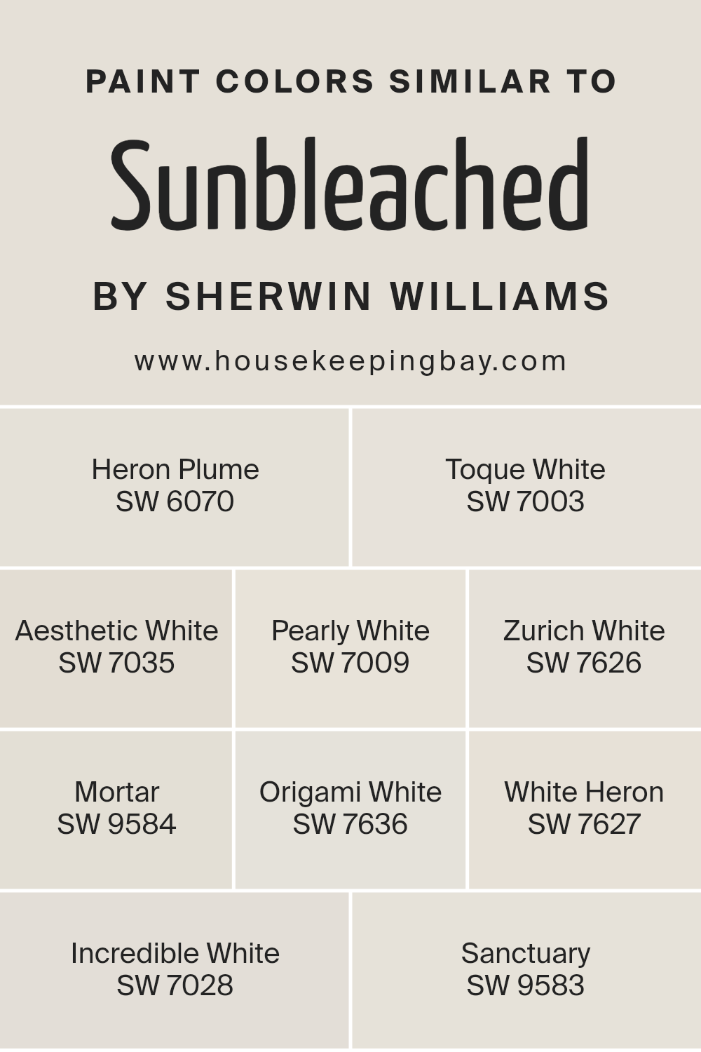
Starting with Heron Plume SW 6070, we find a soft, airy quality that brings a sense of calm to any space, akin to the quietude of a fog-laden morning. Toque White SW 7003, meanwhile, adds a touch of understated elegance, its creamy hue embodying the perfect backdrop for a variety of decor styles.
Aesthetic White SW 7035 offers a hint of warmth, making spaces feel inviting and homely, while Pearly White SW 7009 lends a subtle luster, reminiscent of a gentle dawn. Zurich White SW 7626 bridges classic and contemporary, providing a fresh canvas that illuminates the surroundings.
Mortar SW 9584 introduces a grounding effect, its solid presence offering a foundation that complements airier tones. Origami White SW 7636, with its clean and crisp essence, brings clarity and simplicity to the mix.
White Heron SW 7627 is like a fresh start, its brightness evoking a sense of new beginnings. Incredible White SW 7028 wraps a room in a cozy embrace, its depth adding dimension without drama. Lastly, Sanctuary SW 9583 envelops spaces in tranquility, its serene backdrop fostering a haven of peace.
Each shade, while capable of standing on its own, works together with the others to weave a tapestry of chromatic harmony, enhancing the aesthetic and emotional depth of interior spaces.
You can see recommended paint colors below:
- SW 6070 Heron Plume
- SW 7003 Toque White
- SW 7035 Aesthetic White
- SW 7009 Pearly White
- SW 7626 Zurich White
- SW 9584 Mortar
- SW 7636 Origami White
- SW 7627 White Heron
- SW 7028 Incredible White
- SW 9583 Sanctuary
housekeepingbay.com
How to Use Sunbleached SW 9585 by Sherwin Williams In Your Home?
Sunbleached SW 9585 by Sherwin-Williams is a serene and versatile paint color that evokes feelings of warmth and tranquility. Its hue is reminiscent of wood lightened by the sun, featuring a balanced blend of beige and gray, creating a soft, welcoming neutral.
This nuanced color can easily adapt to various interior design styles, from coastal to modern minimalist, making it an excellent choice for homeowners seeking a timeless backdrop for their living spaces.
One can incorporate Sunbleached SW 9585 into their home as a main wall color to create a light, airy feel in living rooms, bedrooms, or home offices. It pairs beautifully with white trim and moldings, accentuating its warmth and making the space feel more expansive.
For those looking to add depth, Sunbleached works well as a complementary neutral against darker tones like navy or rich browns in furniture or accessories.
It’s also ideal for creating a calming bathroom oasis or as a kitchen cabinet color, offering a subtle contrast to marble countertops or metallic finishes. With Sunbleached SW 9585, the possibilities are endless, allowing for personal creativity to shine through in home decor.
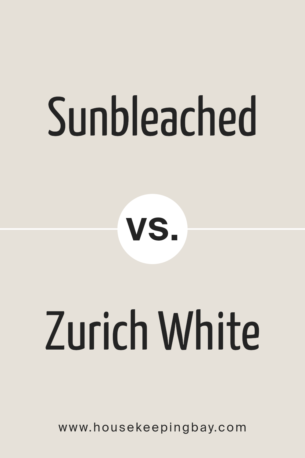
Sunbleached SW 9585 by Sherwin Williams vs Zurich White SW 7626 by Sherwin Williams
Sunbleached SW 9585 and Zurich White SW 7626, both from Sherwin Williams, offer distinct tones that cater to different aesthetic desires and design objectives. Sunbleached is a unique, warmly muted color, reminiscent of a well-worn, faded linen under the summer sun.
It stands out with its ability to bring a soft, soothing, and somewhat nostalgic atmosphere to spaces, promoting a sense of calm and relaxation. Its warmth makes it ideal for creating cozy, inviting rooms that welcome lingering.
On the other hand, Zurich White SW 7626 presents a more neutral backdrop, veering towards a classic, timeless white with a slight warm undertone.
This color is incredibly versatile, acting as a perfect canvas for various decor styles, from modern minimalist to richly layered traditional. It reflects light beautifully, making spaces feel more open and airy, and can seamlessly blend with other colors to create a harmonious environment.
Comparing the two, Sunbleached offers a distinct, warmth-infused character, ideal for those looking to create a space with a hint of nostalgic charm. Zurich White, in contrast, serves as a neutral foundation, promoting brightness and versatility in interior design applications.
You can see recommended paint color below:
housekeepingbay.com
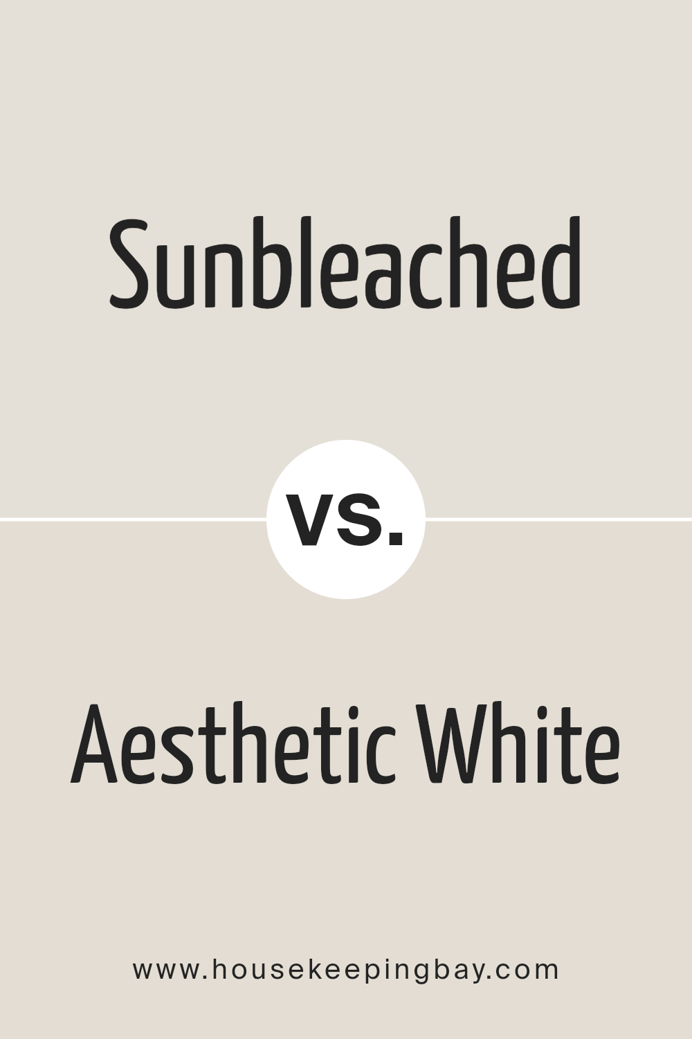
Sunbleached SW 9585 by Sherwin Williams vs Aesthetic White SW 7035 by Sherwin Williams
Sunbleached SW 9585 and Aesthetic White SW 7035, both by Sherwin Williams, offer distinctly different tones that cater to varied interior design preferences. Sunbleached is a warm, muted hue with underlying yellow tones, reminiscent of sun-kissed wood or a gentle dawn.
It has a soothing, natural appeal that lends itself to spaces seeking a light, airy feel, yet desires a touch of warmth without overwhelming brightness. On the other hand, Aesthetic White SW 7035 straddles the line between a warm and cool neutral, offering a versatile backdrop that can complement both modern and traditional settings.
Its understated elegance is accentuated by its slight greige (gray + beige) undertones, making it an excellent choice for rooms that aim for a subtle depth and a sophisticated palette.
While Sunbleached brings a soft, earthy energy into a room, Aesthetic White provides a clean, timeless base, adaptable to various decor styles and color schemes.
You can see recommended paint color below:
housekeepingbay.com
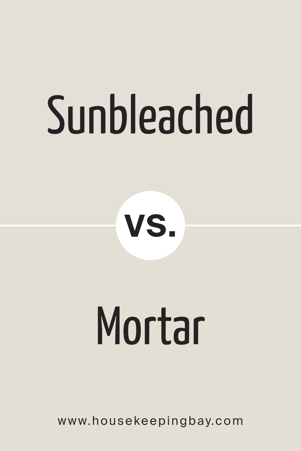
Sunbleached SW 9585 by Sherwin Williams vs Mortar SW 9584 by Sherwin Williams
Sunbleached SW 9585 and Mortar SW 9584, both by Sherwin Williams, paint a picture of subtle contrast and earthy warmth, perfect for creating elegant and soothing spaces. Sunbleached, as the name suggests, embodies the gentle hues of wood and fabric faded over time by the sun’s tender touch.
Its light, airy feel brings a sense of openness and calm to any space, making it ideal for rooms that aim for a bright and uplifting atmosphere. On the other side, Mortar leans into the strength and stability of stone and earth.
This color holds a deeper, more grounded presence, offering a solid foundation that balances perfectly with lighter, airier tones.
While Mortar provides depth and warmth, Sunbleached introduces luminosity and softness. Together, these colors create a harmonious balance, marrying the lightness of sun-faded tones with the earthy substance of stone, ideal for those seeking a natural, cohesive look with a touch of contrast.
ou can see recommended paint color below:
housekeepingbay.com
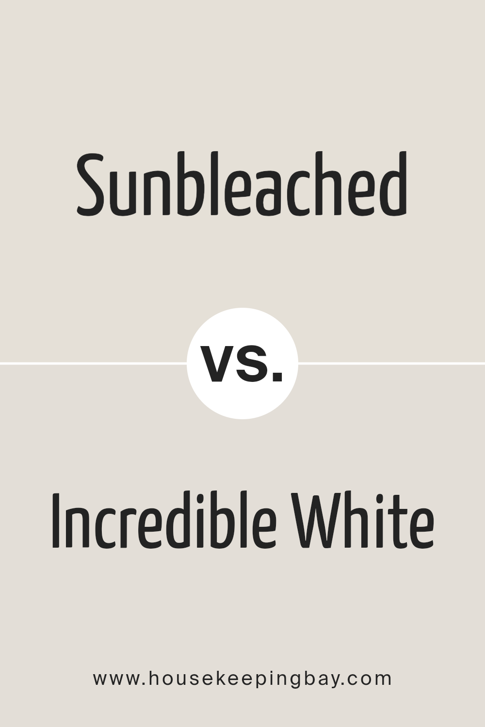
Sunbleached SW 9585 by Sherwin Williams vs Incredible White SW 7028 by Sherwin Williams
Sunbleached SW 9585 and Incredible White SW 7028, both by Sherwin-Williams, offer distinct yet harmonious options for those seeking to imbue their spaces with a sophisticated and tailored atmosphere.
Sunbleached steps away from the traditional palette, presenting a soft, muted hue that evokes the warmth and comfort of sun-kissed materials, gently faded by time and light. Its subtle undertones bring a calm, inviting quality to interiors, making it an ideal choice for creating a tranquil and serene backdrop.
In contrast, Incredible White SW 7028 leans towards the cooler spectrum of whites, offering a clean and crisp presence that acts as a versatile foundation for any room.
This color reflects and maximizes natural light, amplifying spaces with a bright and airy feel. Its neutral base is adaptable, seamlessly blending with both warm and cool accents, which allows for a wide range of decorating styles from modern minimalism to cozy traditional.
Together, Sunbleached and Incredible White can complement each other within a space, where Sunbleached adds depth and warmth, and Incredible White provides a refreshing contrast that enhances the overall aesthetic with a balanced, layered look.
You can see recommended paint color below:
housekeepingbay.com
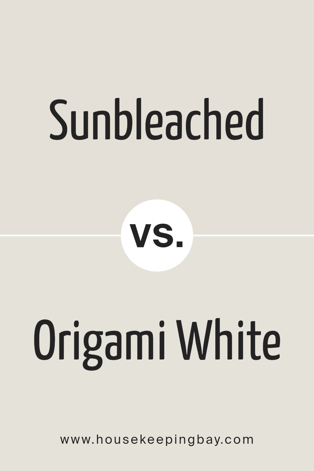
Sunbleached SW 9585 by Sherwin Williams vs Origami White SW 7636 by Sherwin Williams
Sunbleached SW 9585 and Origami White SW 7636, both by Sherwin Williams, present a calming palette though they cater to different aesthetic needs. Sunbleached is a warm, gentle neutral with a distinctly sun-kissed, slightly aged appearance, mimicking the soft, faded look of materials left out in the sun.
Its warm undertones create an inviting atmosphere, ideal for spaces intended to have a cozy, relaxed vibe with a hint of nostalgia. On the other hand, Origami White straddles the line between white and light beige, offering a cleaner, crisper backdrop that still avoids the starkness often associated with pure white.
Its neutral base is versatile, excellent for spaces that aim for a bright, airy feel without the coldness, lending itself well to modern and minimalist designs. While Sunbleached evokes warmth and comfort through its muted, earthy tones, Origami White provides a subtle, sophisticated canvas, ready to complement a wide range of colors and decor styles.
You can see recommended paint color below:
housekeepingbay.com
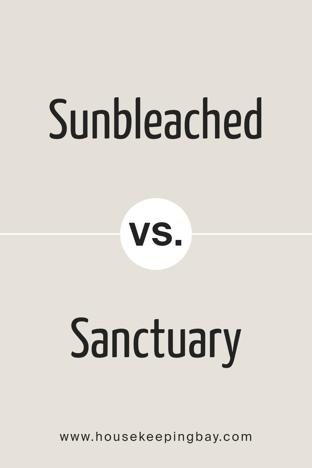
Sunbleached SW 9585 by Sherwin Williams vs Sanctuary SW 9583 by Sherwin Williams
Sunbleached SW 9585 and Sanctuary SW 9583 by Sherwin Williams are two captivating hues that embody a serene and natural aesthetic, though they cater to different ambiance preferences. Sunbleached, as its name implies, offers a light, airy quality reminiscent of wood and fabric gracefully aged by the sun.
It leans towards a softer, pastel palette, providing a subtle, warm backdrop that can easily complement a variety of decor styles, from coastal to rustic chic. Its lightness brings an expansive feel to spaces, making it ideal for creating a bright and inviting environment.
Sanctuary, on the other hand, delves deeper into the spectrum of tranquility. This color draws inspiration from the natural world, offering a richer, more grounded hue that suggests a connection to the earth and nature.
It acts as a dark, soothing backdrop, ideal for crafting spaces that feel secure and enveloping. Sanctuary’s depth adds dramatic flair while still maintaining a comforting, subdued tone, perfect for intimate settings or accent walls seeking to make a gentle, yet profound statement.
Together, Sunbleached and Sanctuary embody the versatility of neutral palettes, each offering unique pathways to creating serene and welcoming spaces, though they diverge in their approach to lightness and depth.
You can see recommended paint color below:
housekeepingbay.com
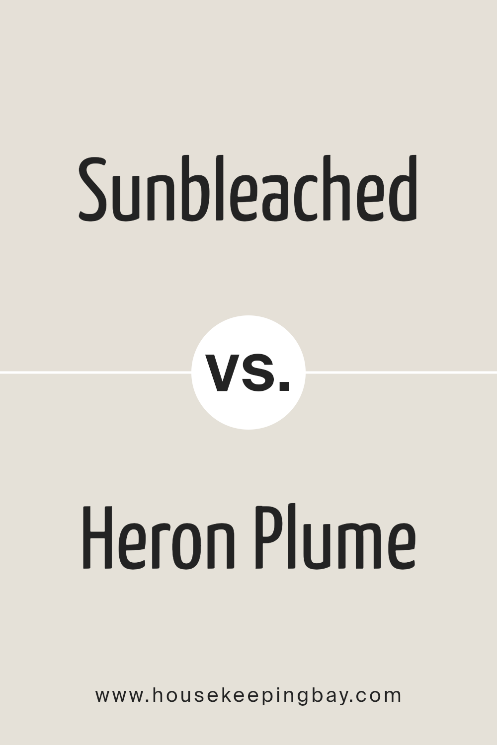
Sunbleached SW 9585 by Sherwin Williams vs Heron Plume SW 6070 by Sherwin Williams
Sunbleached SW 9585 and Heron Plume SW 6070 are two nuanced colors by Sherwin Williams, each evoking a unique feel and atmosphere for interior spaces. Sunbleached steps into the spectrum with a soft, gentle presence, reminiscent of wood and fibers lightly faded by the sun’s rays.
It carries a warmth that seems to whisper of serene, sunlit mornings and airy, comfortable spaces. Its subtlety makes it versatile, fitting well in environments seeking a touch of natural simplicity and calming neutrality.
In contrast, Heron Plume SW 6070 brings to the palette a lighter, more ethereal touch. It leans towards a soft, elegant gray with a hint of warmth, making it an exquisite backdrop that can either soothe or elevate a room’s ambiance.
Heron Plume’s magic lies in its ability to marry simplicity with sophistication, offering a clean canvas that can be accented with bold colors or paired with muted tones for a tranquil environment.
Despite their differences, both colors share an inherent softness and versatility, making them excellent choices for creating inviting, stylish spaces. Sunbleached offers a nod to natural elements and warmth, while Heron Plume provides a subtle, refined elegance with its graceful, understated hue.
You can see recommended paint color below:
housekeepingbay.com
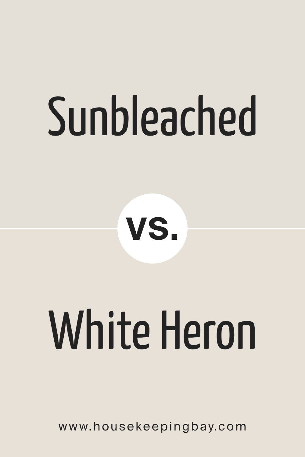
Sunbleached SW 9585 by Sherwin Williams vs White Heron SW 7627 by Sherwin Williams
Sunbleached SW 9585 and White Heron SW 7627 by Sherwin Williams are two distinct hues that cater to different aesthetic preferences and intents in color schematics. Sunbleached SW 9585 embodies a warmer, softly-muted ambiance with its earthy, almost pastel undertone.
This color resonates well with spaces aiming for a cozy, inviting feel, projecting a serene, sun-kissed vibe reminiscent of gentle, weathered wood or the soft light of dawn.
It brings a sense of calm and nostalgia, making it ideal for rooms seeking a subtle touch of warmth and character without overwhelming the senses.
In contrast, White Heron SW 7627 presents a crisp, clean aura. This color leans towards a pure, almost pristine brightness, making it perfect for spaces that aim to achieve an open, airy feel.
White Heron’s clarity and subtlety can make a room feel more expansive and luminous, providing a neutral backdrop that can easily accommodate various decor styles and color accents.
It embodies the essence of simplicity and modern elegance, offering a refreshing canvas that invigorates a space with a feel of renewal and purity.
Together, Sunbleached and White Heron can complement each other beautifully, blending warmth with lightness in a harmonious color palette that is versatile and balanced.
You can see recommended paint color below:
- SW 7627 White Heron
housekeepingbay.com
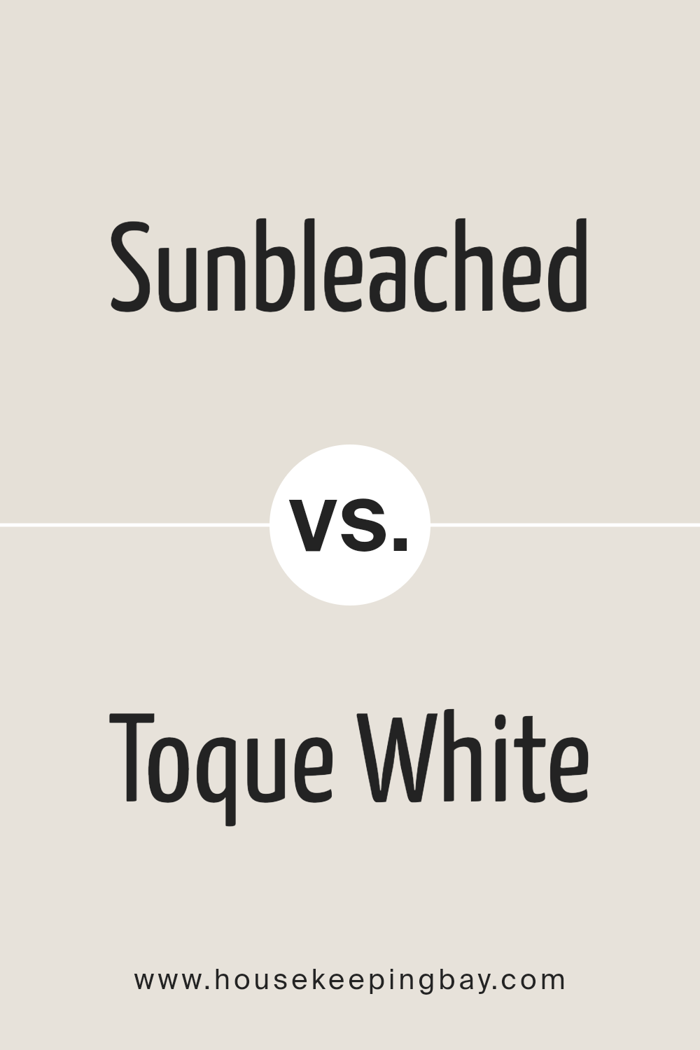
Sunbleached SW 9585 by Sherwin Williams vs Toque White SW 7003 by Sherwin Williams
“Sunbleached” SW 9585 by Sherwin Williams is a warm, muted hue that evokes images of wood lightly faded by the sun. This color has an earthy, organic feel, reminiscent of beaches and driftwood, making it ideal for creating serene and inviting spaces.
Its subtlety can add a touch of vintage charm to interiors or exteriors, blending well with natural elements and materials.
On the other hand, “Toque White” SW 7003 by Sherwin Williams is a soft, neutral white with undertones that prevent it from feeling cold or stark.
This versatility makes Toque White an excellent choice for a wide range of designs, offering a clean backdrop that enhances other colors or stands elegantly on its own. It reflects light beautifully, making spaces appear brighter and more spacious.
While both colors share a subtleness and warmth, their applications differ significantly. Sunbleached offers a more distinct, characterful option with its antique feel, whereas Toque White provides a timeless, fresh canvas suitable for any setting, from modern to classic.
You can see recommended paint color below:
housekeepingbay.com
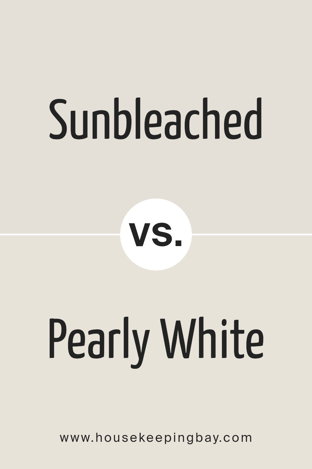
Sunbleached SW 9585 by Sherwin Williams vs Pearly White SW 7009 by Sherwin Williams
The colors Sunbleached SW 9585 and Pearly White SW 7009, both by Sherwin Williams, exhibit subtle yet significant distinctions that influence their application in interior design. Sunbleached presents itself as a warm, soft beige with an unmistakable coziness, reminiscent of sun-drenched linen.
It carries an earthy undertone that lends a serene, welcoming ambiance to spaces, making it well-suited for living rooms or bedrooms aiming for a comforting and grounded aesthetic.
Its warmth is versatile, allowing it to pair beautifully with both bold and muted color palettes, enhancing the depth and complexity of the surrounding hues.
On the other hand, Pearly White is a sophisticated, creamy off-white that radiates a delicate luminosity. This color leans towards a neutral palette, providing a crisp and clean appearance without veering into the starkness often associated with pure whites.
It’s perfect for creating an airy and open feel, making spaces appear larger and more tranquil. Pearly White serves as an excellent backdrop for minimalist and modern designs, where the goal is to achieve an elegant simplicity.
Its understated elegance allows for flexibility in decor, supporting both contemporary and traditional themes.
In essence, while Sunbleached introduces a warm, earthy base, ideal for creating cozy, enveloping spaces, Pearly White offers a light, refreshing touch, perfect for highlighting cleanliness and spaciousness. The choice between them hinges on the desired atmosphere and design aesthetic of the room.
You can see recommended paint color below:
housekeepingbay.com
Conclusion
The Sherwin Williams paint color Sunbleached SW 9585 emerges as a versatile and timeless selection for those seeking to infuse their spaces with a calm, welcoming ambiance. This color, with its subtle warmth and understated elegance, imbues any room with a sense of serenity and spaciousness.
It’s particularly suited for creating a tranquil retreat in bedrooms and living areas, where its ability to reflect natural light enhances the sense of openness and relaxation. As a neutral yet distinct hue, Sunbleached embodies the modern desire for minimalist aesthetics while maintaining a cozy, inviting atmosphere.
Moreover, Sunbleached SW 9585 showcases its adaptability by complementing a wide range of decor styles and color palettes. From contemporary to traditional settings, this color acts as a unifying backdrop that highlights furnishings and art, allowing personal style to take center stage.
Its gentle presence also offers a fresh perspective when used in kitchens and bathrooms, providing a clean, rejuvenating look. Whether aiming for a complete renovation or a subtle refresh, incorporating Sunbleached can effortlessly elevate the overall appeal of a home, proving its enduring relevance in interior design trends.
housekeepingbay.com
Ever wished paint sampling was as easy as sticking a sticker? Guess what? Now it is! Discover Samplize's unique Peel & Stick samples. Get started now and say goodbye to the old messy way!
Get paint samples
