Storm Cloud SW 6249 Paint Color by Sherwin Williams
When it comes to selecting colors, whether for an art project, a piece of clothing, or the walls of our home, we often find ourselves amidst a vast spectrum of shades, each radiating its unique aura.
When it comes to selecting colors, whether for an art project, a piece of clothing, or the walls of our home, we often find ourselves amidst a vast spectrum of shades, each radiating its unique aura. One such captivating shade is Sherwin-Williams’ SW 6249 Storm Cloud, a color that seamlessly blends versatility with aesthetic charm.
This article will embark on a journey to explore the essence of Storm Cloud, unraveling its warm or cool nature and dissecting its intricate undertones, to understand its appeal and applications.
via elegant painting
What Color is SW 6249 Storm Cloud?
SW 6249 Storm Cloud by Sherwin-Williams is a sophisticated color that seems to be a harmonious blend of grey and blue, manifesting the sublime beauty of overcast skies and the serene subtleness of a gentle breeze. This color is elusive and charming, able to invoke a myriad of emotions and create diverse atmospheres depending on its application, making it a preferred choice for various creative endeavors.
In residential spaces, the serene and balanced nature of Storm Cloud makes it a favorite for creating tranquil and harmonious environments. Whether it’s applied in bedrooms to promote restfulness, in living rooms to cultivate a relaxed atmosphere, or in bathrooms to create a spa-like retreat, Storm Cloud proves to be a versatile companion, complementing various design aesthetics and color schemes.
In commercial settings, Storm Cloud’s subdued elegance and adaptability make it a sought-after choice. It can be used in offices to foster focus and productivity, in restaurants to create a refined dining atmosphere, or in retail spaces to provide a sophisticated backdrop for products. Its ability to create a balanced and inviting ambiance makes it suitable for a plethora of commercial applications.
housekeepingbay.com
Table of Contents
Is it a Warm or a Cool Color?
In the vast continuum of colors, SW 6249 Storm Cloud is positioned on the cooler side of the spectrum. Cool colors are typically associated with calmness, relaxation, and tranquility, and Storm Cloud is no exception.
Its blue-grey undertone tends to evoke feelings of serene solitude and peaceful reflection, making it an ideal choice for creating soothing and refreshing environments, such as bedrooms and bathrooms, where a calming aura is often desired.
Undertones of SW 6249 Storm Cloud
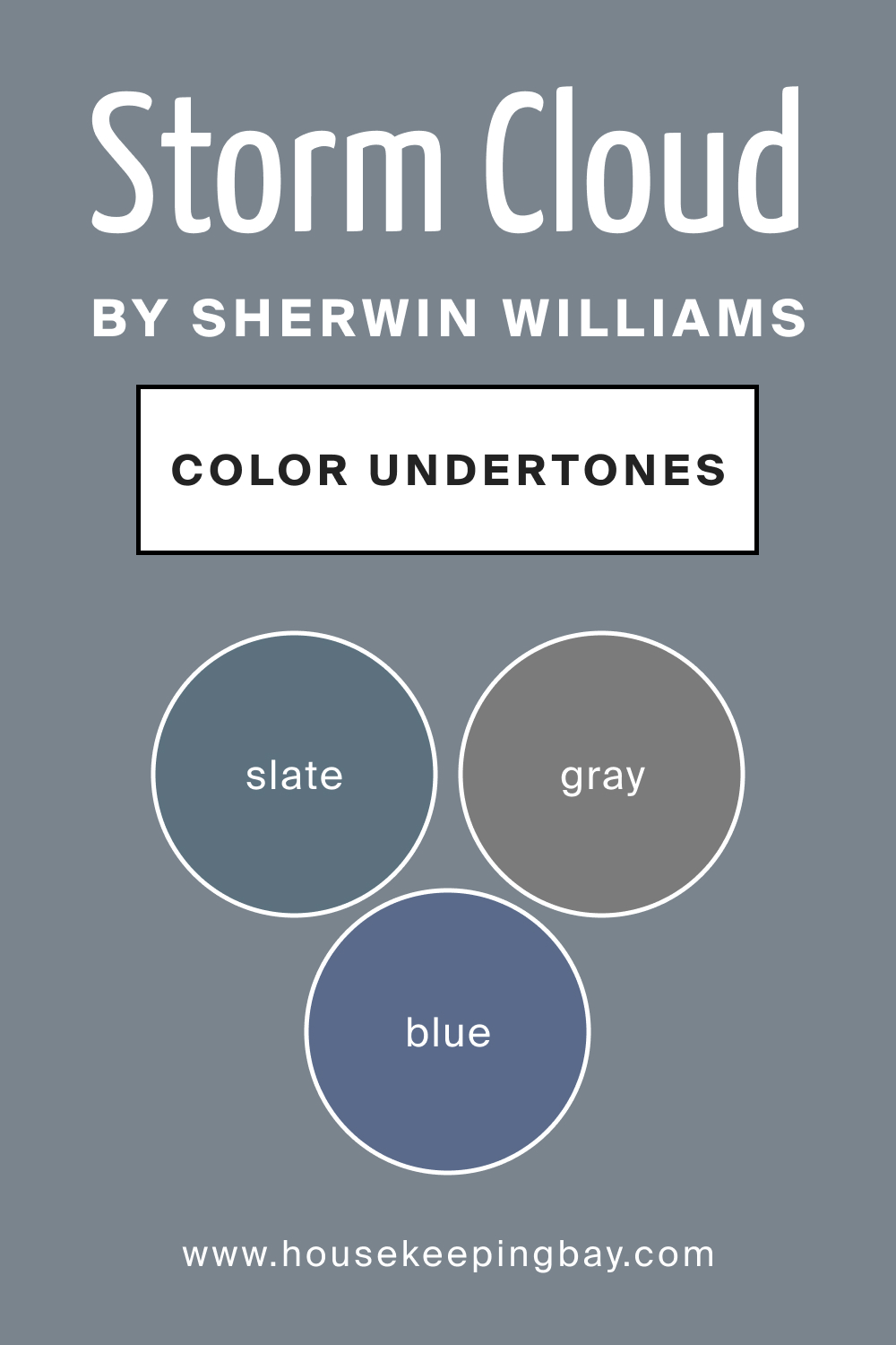
Understanding the undertones of a color is crucial as it affects how the color interacts with its surroundings, influences the mood of the space, and complements other colors. Here are the three prominent undertones of SW 6249 Storm Cloud:
Blue Undertone:
The blue undertone in Storm Cloud lends it a serene and calming vibe, reminiscent of the tranquil sea or a clear, expansive sky. This undertone makes the color a suitable choice for creating relaxed and peaceful spaces, harmonizing well with other cool shades and neutrals.
Grey Undertone:
The grey undertone imbues Storm Cloud with a neutral, balanced quality, allowing it to serve as a versatile backdrop that can be paired with a myriad of colors without overshadowing them. This undertone adds sophistication and subtlety, making it an apt selection for contemporary and minimalist designs.
Slate Undertone:
A subtle slate undertone imparts an added layer of depth and complexity to Storm Cloud, creating a sense of stability and grounding. This undertone enables the color to anchor bolder and brighter colors, providing a harmonious balance in diverse color schemes.
Given its cool and balanced nature, SW 6249 Storm Cloud emerges as a versatile hue, apt for various applications and settings. Whether it is employed to create a soothing ambiance in a bedroom, add elegance to a living room, or bring a touch of sophistication to a kitchen, SW Storm Cloud adapts beautifully, seamlessly blending with different styles and palettes.
housekeepingbay.com
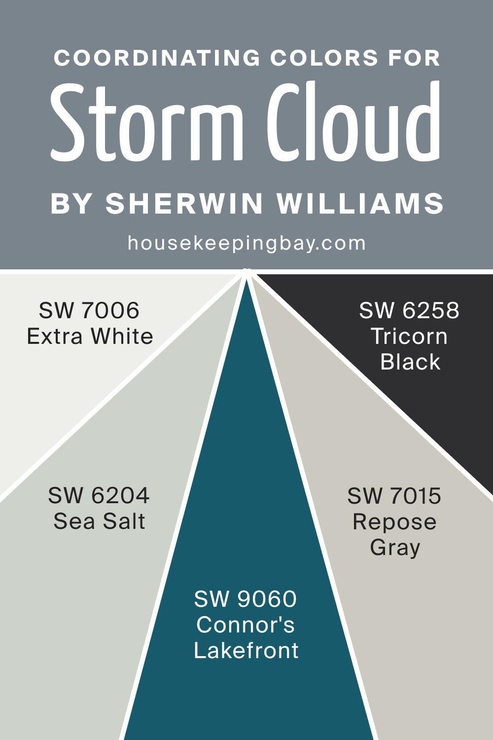
Coordinating Colors of SW 6249 Storm Cloud
Coordinating colors are strategically selected hues that harmonize with a primary color to create a visually appealing and balanced color scheme in a space or design. These colors can either contrast to make the primary color stand out or complement to create a cohesive and tranquil atmosphere.
The selection of coordinating colors is paramount, as it influences the ambiance, mood, and overall aesthetic appeal of the space, aiding in crafting environments that are not only visually pleasing but also evoke desired emotions and feelings.
Whether it’s enriching a room’s visual depth, highlighting architectural features, or creating a particular mood, coordinating colors play a crucial role in achieving cohesive and harmonious design outcomes. Below, you can find colors that coordinate SW Storm Cloud best.
- SW 7006 Extra White : This crisp, clean shade of white contrasts beautifully with Storm Cloud, adding brightness and airiness to spaces.
- SW 9060 Connor’s Lakefront : A deep, muted navy, it complements the coolness of Storm Cloud, fostering a sophisticated and harmonious ambiance.
- SW 6204 Sea Salt : This light, airy green with a hint of grey pairs wonderfully with Storm Cloud, promoting a serene and refreshing environment.
- SW 6258 Tricorn Black : This strong, true black creates a striking contrast with Storm Cloud, adding depth and drama to any design.
- SW 7015 Repose Gray : This light, neutral grey complements Storm Cloud by maintaining balance and subtlety in various design schemes.
housekeepingbay.com
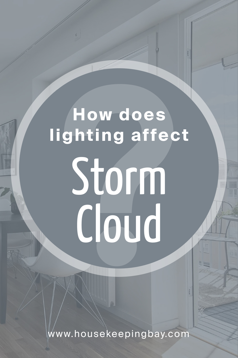
How Does Lighting Affect SW 6249 Storm Cloud?
Lighting has a significant impact on how we perceive SW 6249 Storm Cloud, accentuating or muting its unique characteristics. The interplay of light with this color can either highlight its cool and calming tones or bring out its more neutral, sophisticated side.
Natural light tends to enhance the blue undertones of Storm Cloud, making it appear fresher and more vibrant, while artificial light, depending on its temperature, can emphasize the grey undertones, rendering the color more subdued and balanced.
The intensity and direction of the light source also play critical roles; direct light can make Storm Cloud appear lighter and more vivid, while diffused light can create a more muted, tranquil effect.
housekeepingbay.com
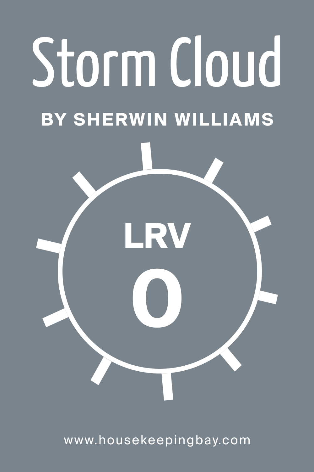
LRV of SW 6249 Storm Cloud
The Light Reflectance Value (LRV) of a color is a measure of the amount of light the color reflects. It is expressed on a scale from 0 (absolute black, absorbing all light) to 100 (pure white, reflecting all light). A color’s LRV is instrumental in understanding its visual impact and how it interacts with light, influencing its perceived brightness and the mood it creates within a space.
SW 6249 Storm Cloud, with its intricate blend of blue and grey undertones, has a specific LRV of 23 that affects how it is seen under different lighting conditions. The LRV will determine whether the color appears lighter or darker in a given space, with higher values indicating a lighter color that can make a space feel more open and airy, and lower values suggesting a darker shade that can add depth and coziness to a room.
Thus, recognizing the LRV of Storm Cloud is crucial when considering its application in different spaces and lighting conditions, ensuring the desired aesthetic and atmospheric effects are achieved.
housekeepingbay.com
What is LRV? Read It Before You Choose Your Ideal Paint Color
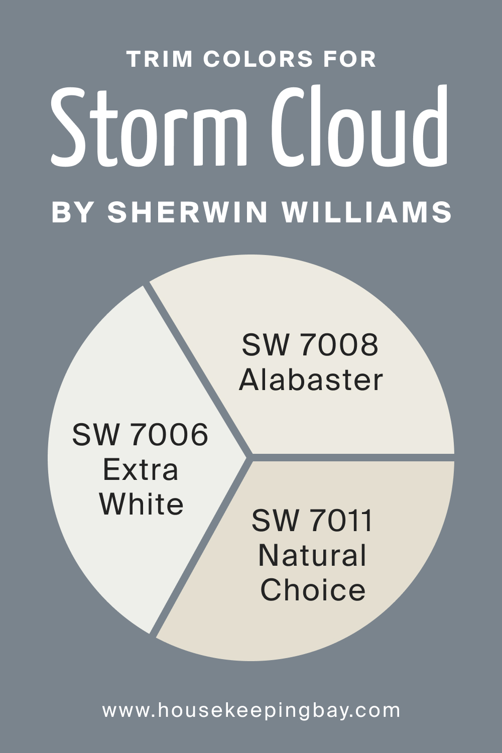
Trim Colors for SW 6249 Storm Cloud
Trim colors are the hues selected for the finishing touches on structures such as door frames, window sills, and baseboards within a space. They serve as the outlining shades that accentuate or complement the main wall color, contributing to the overall aesthetic and cohesion of a room’s design.
A well-chosen trim color can frame a space beautifully, emphasizing architectural details, adding depth, and creating a polished, well-rounded look. For SW Storm Cloud, opt for these colors.
- SW 7006 Extra White : This pristine white can accentuate the cool tones of Storm Cloud, framing spaces with a clean and bright border.
- SW 7008 Alabaster : Alabaster is a warm, creamy white that can soften the coolness of Storm Cloud, providing a delicate and harmonious contrast.
- SW 7011 Natural Choice : This neutral, warm white can complement Storm Cloud by maintaining a balanced and subtle trim color, enhancing the overall serene feel of the space.
housekeepingbay.com
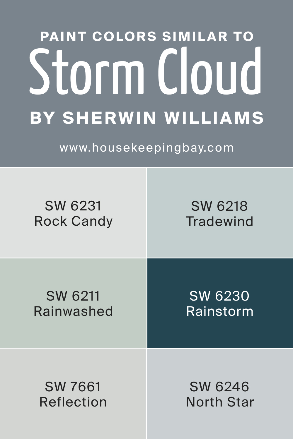
Colors Similar to SW 6249 Storm Cloud
Comparing colors before incorporating them into your home is crucial as it ensures the creation of a harmonious and balanced color scheme that aligns with your aesthetic preferences and the intended mood of the space.
Every color interacts with light and surrounding hues differently, influencing the perceived size, illumination, and ambiance of a room.
By comparing colors beforehand, potential clashes and imbalances can be avoided, facilitating a more informed decision-making process, and ultimately leading to more satisfying, cohesive, and visually pleasing design outcomes. Instead of SW Storm Cloud, you may want to use one of the following colors.
- SW 6231 Rock Candy : A lighter, softer grey with cool undertones, similar in its serene and balanced nature.
- SW 6211 Rainwashed : A soft, muted aqua with a tranquil presence, mirroring the calming essence of Storm Cloud.
- SW 7661 Reflection : A gentle and soothing grey, close to Storm Cloud in its cool, serene disposition.
- SW 6230 Rainstorm : A deeper, saturated blue-grey echoing the sophistication and tranquility of Storm Cloud.
- SW 6246 North Star : A lighter, cooler grey that shares the subtle, soothing character of Storm Cloud.
- SW 6218 Tradewind : A soft, subdued bluish-grey similar in its calming and refreshing qualities to Storm Cloud.
housekeepingbay.com
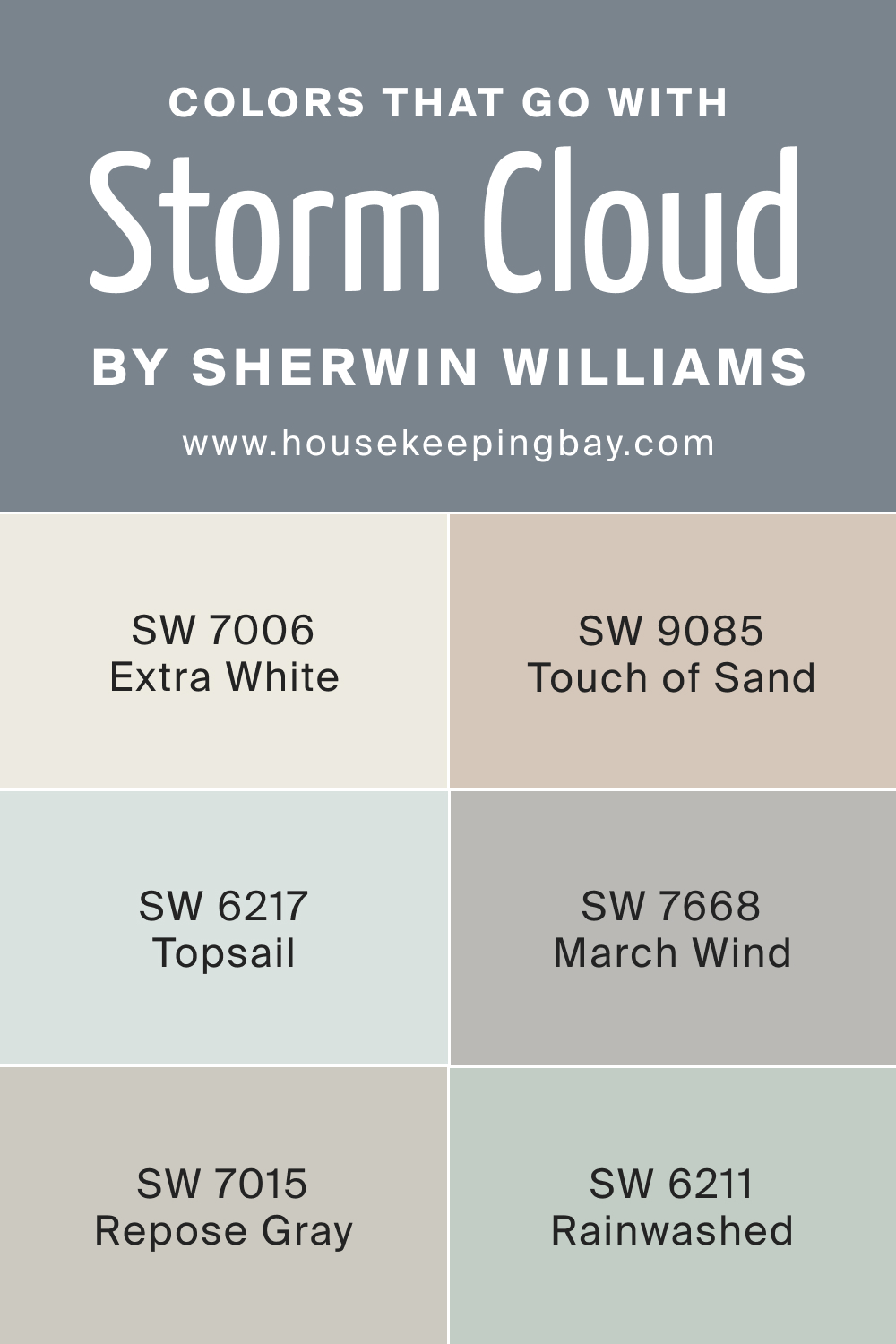
Colors That Go With SW Storm Cloud
The complementary potential of SW Storm Cloud is truly noteworthy. Its cool and neutral undertones allow it to harmonize well with a plethora of colors, from vibrant hues to subdued tones.
Whether paired with warm shades like coral or amber to create a dynamic contrast, or with cool shades like teal or lavender to establish a soothing palette, Storm Cloud maintains its balanced and elegant demeanor, enhancing the overall aesthetic coherence of the space.
- SW 7006 Extra White : This pure, clean white contrasts and highlights the sophisticated subtleness of Storm Cloud, adding a refreshing and brightening effect to spaces.
- SW 6217 Topsail : A soft, airy aqua that complements the coolness of Storm Cloud, introducing a gentle and soothing vibrancy to the environment.
- SW 7015 Repose Gray : This light, neutral gray harmonizes well with Storm Cloud, maintaining a balanced and understated elegance in various settings.
- SW 6211 Rainwashed : A muted, tranquil aqua that blends seamlessly with Storm Cloud, creating a calming and refreshing atmosphere.
- SW 7668 March Wind : A medium-toned, cool gray that pairs beautifully with Storm Cloud, contributing to a serene and composed ambiance.
- SW 9085 Touch of Sand : This subtle, warm beige contrasts delicately with Storm Cloud, adding a touch of warmth and softness to the surroundings.
housekeepingbay.com
How to Use SW 6249 Storm Cloud In Your Home?
Understanding the dynamics of color is pivotal when incorporating shades like SW 6249 Storm Cloud in your home, as it significantly impacts the ambiance, spatial perception, and overall aesthetic of the living space. Recognizing how colors interact with light, affect mood, and correlate with each other is crucial.
A well-thought-out color choice not only enhances the visual appeal of your home but also contributes to the functionality and emotional comfort of the space, creating environments that are harmonious, inviting, and reflective of your personal style.
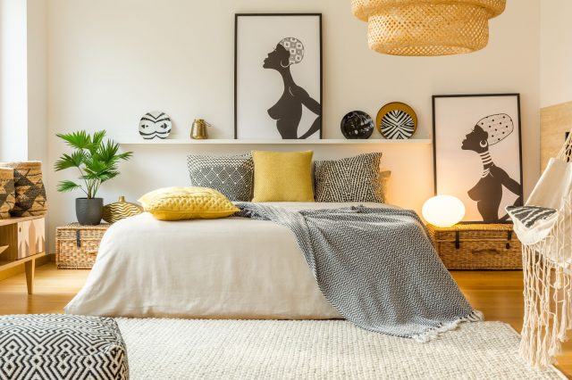
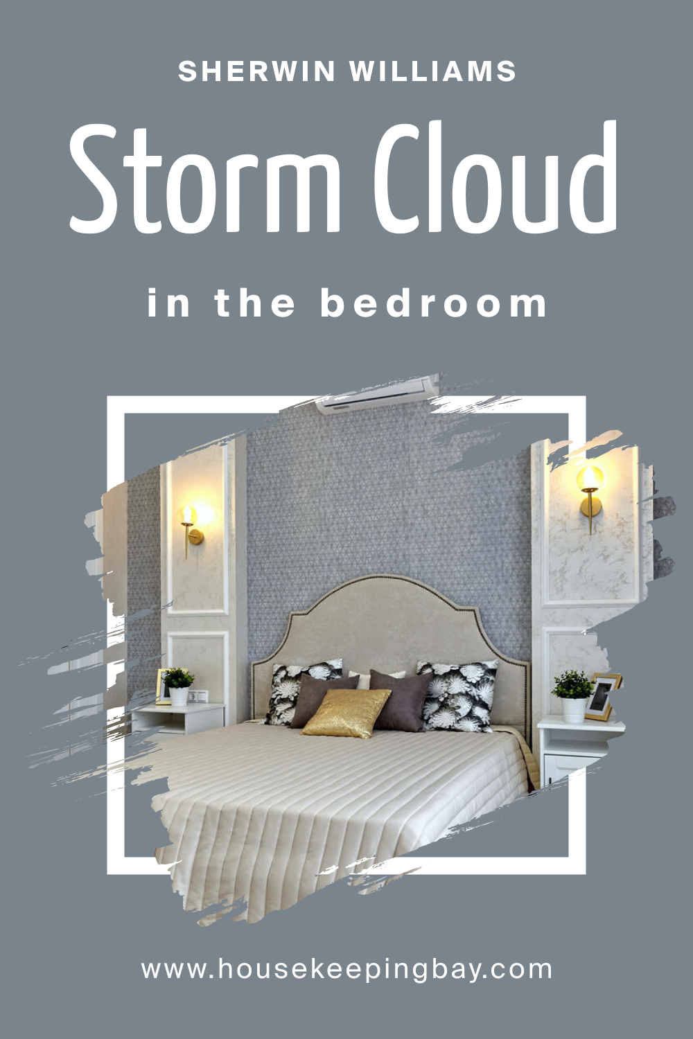
SW 6249 Storm Cloud In the Bedroom
SW 6249 Storm Cloud can transform a bedroom into a serene sanctuary, its cool and balanced tones creating a soothing backdrop conducive to relaxation and rest. The subtle blue and grey undertones can evoke a sense of tranquility and peaceful solitude, making it ideal for those looking to create a calming retreat from the outside world. Pairing it with soft, warm textiles and natural materials can enhance the comforting atmosphere, providing a harmonious balance within the space.
Incorporating accent colors like muted greens or soft lavenders can further complement the calming nature of Storm Cloud, adding subtle vibrancy and interest to the bedroom. Combining it with well-chosen lighting, whether ambient, task, or accent, can accentuate the color’s soothing properties, ensuring a peaceful and restorative environment conducive to relaxation and sleep.
housekeepingbay.com
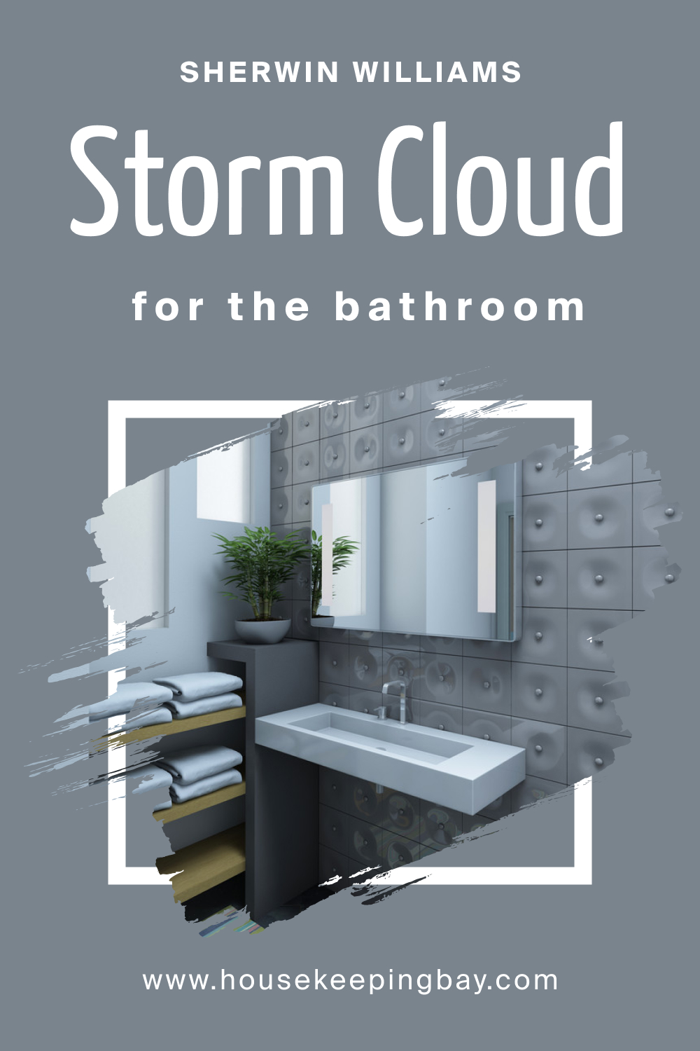
SW 6249 Storm Cloud In the Bathroom
Using SW 6249 Storm Cloud in the bathroom can evoke a spa-like ambiance, its cool and sophisticated tones reflecting cleanliness and refreshment. This color can complement various bathroom fixtures and finishes, creating a cohesive and polished look. Incorporating elements like brushed nickel or chrome fixtures and white or neutral textiles can enhance the refreshing and modern vibe of the space.
Additionally, contrasting Storm Cloud with accents of warm colors or rich textures can add depth and interest to the bathroom, preventing it from feeling too cold or sterile. Layering in elements like wooden accents or lush green plants can introduce warmth and life, creating a balanced and inviting atmosphere conducive to relaxation and rejuvenation.
housekeepingbay.com
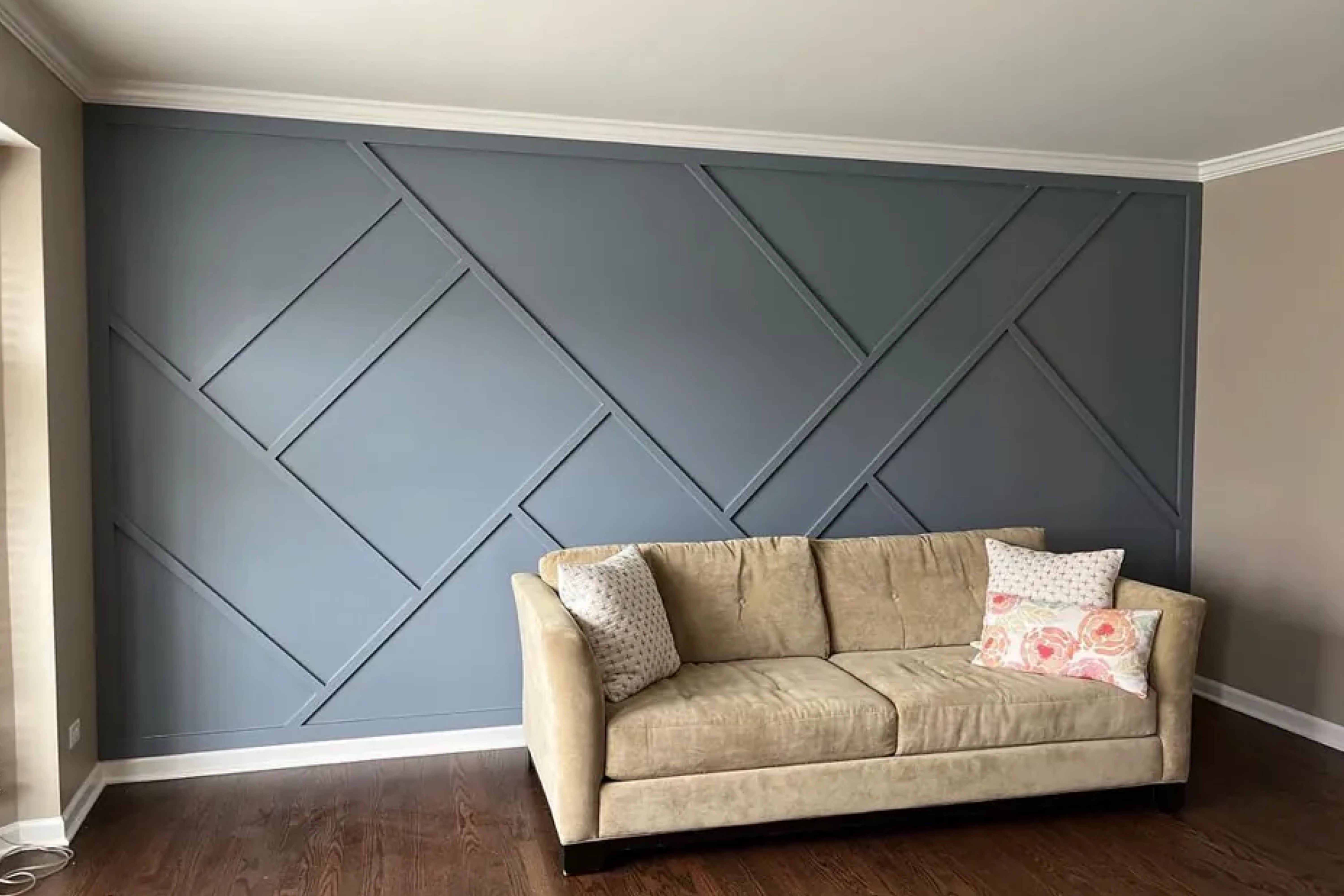
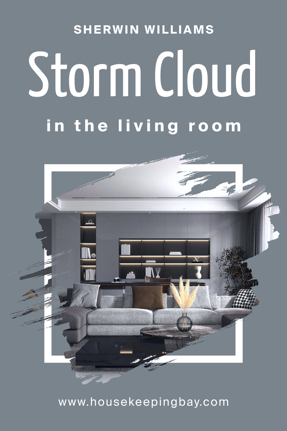
SW 6249 Storm Cloud In the Living Room
In a living room setting, SW 6249 Storm Cloud acts as a sophisticated and versatile backdrop, lending itself to a variety of decorative styles and color schemes. Its neutral yet cool tones can create a tranquil and refined ambiance, making it a suitable choice for spaces designed for relaxation and socialization. Pairing Storm Cloud with a mix of textures and warm, cozy fabrics can contribute to a welcoming and harmonious living environment.
To enhance the elegance of Storm Cloud in the living room, consider incorporating accents of rich, bold colors or metallic finishes. These elements can add a touch of luxury and dynamism to the space, making it feel more vibrant and engaging. Choosing furniture and decor that complement the color’s sophisticated subtleness can result in a living area that is both stylish and comfortable.
housekeepingbay.com
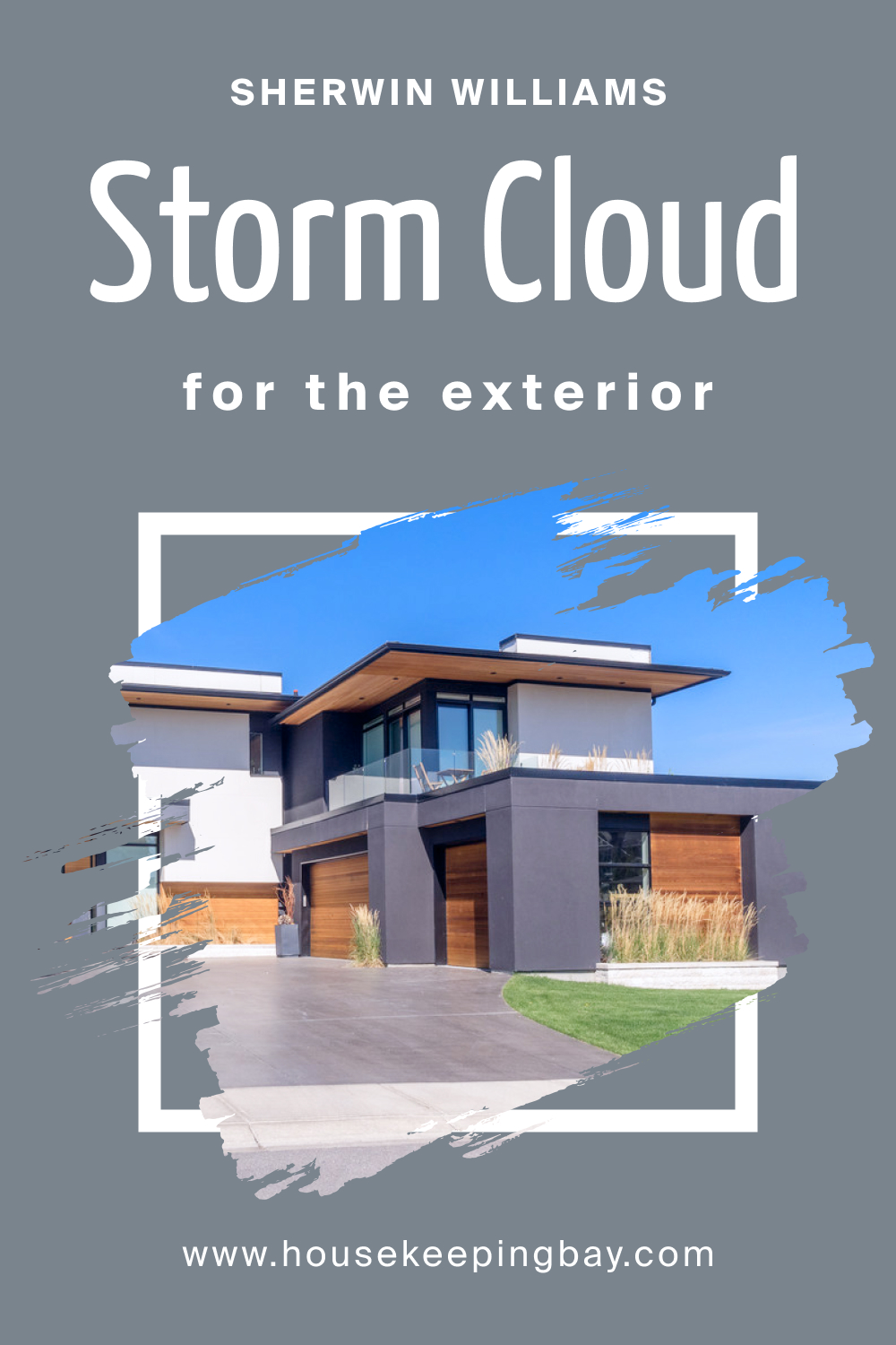
SW 6249 Storm Cloud For an Exterior
When applied to exteriors, SW 6249 Storm Cloud can bring a timeless and elegant appeal to a home, its cool, neutral tones resonating with the natural environment. This color is versatile and harmonizes well with various architectural styles, making it a popular choice for those looking to enhance curb appeal. Complementing Storm Cloud with crisp white trims or natural stone accents can accentuate its sophisticated charm, creating a visually pleasing and welcoming exterior.
Moreover, using Storm Cloud for the exterior allows for versatile landscaping and decorative choices. Whether juxtaposed with vibrant floral arrangements or muted, lush greenery, Storm Cloud maintains its balanced and elegant demeanor. Incorporating outdoor lighting that highlights the color’s serene and subtle qualities can ensure a graceful and inviting presentation, enhancing the home’s aesthetic allure.
housekeepingbay.com
Comparing SW 6249 Storm Cloud With Other Colors
Comparing colors, such as SW 6249 Storm Cloud, with other potential choices is a vital step in the selection process as it helps in visualizing the overall impact and harmony within a space. Every color has its unique characteristics and interactions with light, affecting the atmosphere and perceived dimensions of a room.
By analyzing and contrasting colors beforehand, you can prevent undesirable clashes and discrepancies in tones, ensuring a cohesive and balanced color palette. This preliminary comparison aids in achieving the intended aesthetic, mood, and spatial harmony, contributing to the creation of spaces that are not only visually appealing but also emotionally resonant and comfortable, reflecting the occupants’ personalities and lifestyles.
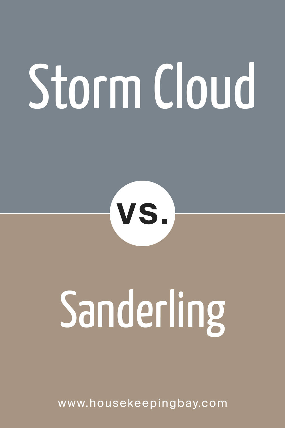
SW 6249 Storm Cloud vs. SW 7513 Sanderling
SW 6249 Storm Cloud by Sherwin-Williams is a muted, atmospheric shade of gray that embodies the calm and tranquility of an overcast sky, offering depth to any room it adorns. In contrast, SW 7513 Sanderling is lighter and warmer, a beige tone that resonates with an earthly, natural ambiance, providing a serene and cozy atmosphere.
While Storm Cloud can introduce a moody, introspective ambiance, ideal for modern and sophisticated interiors, Sanderling, with its warm undertones, is more suitable for spaces seeking a comforting and inviting aura, working well with traditional or rustic styles.
housekeepingbay.com
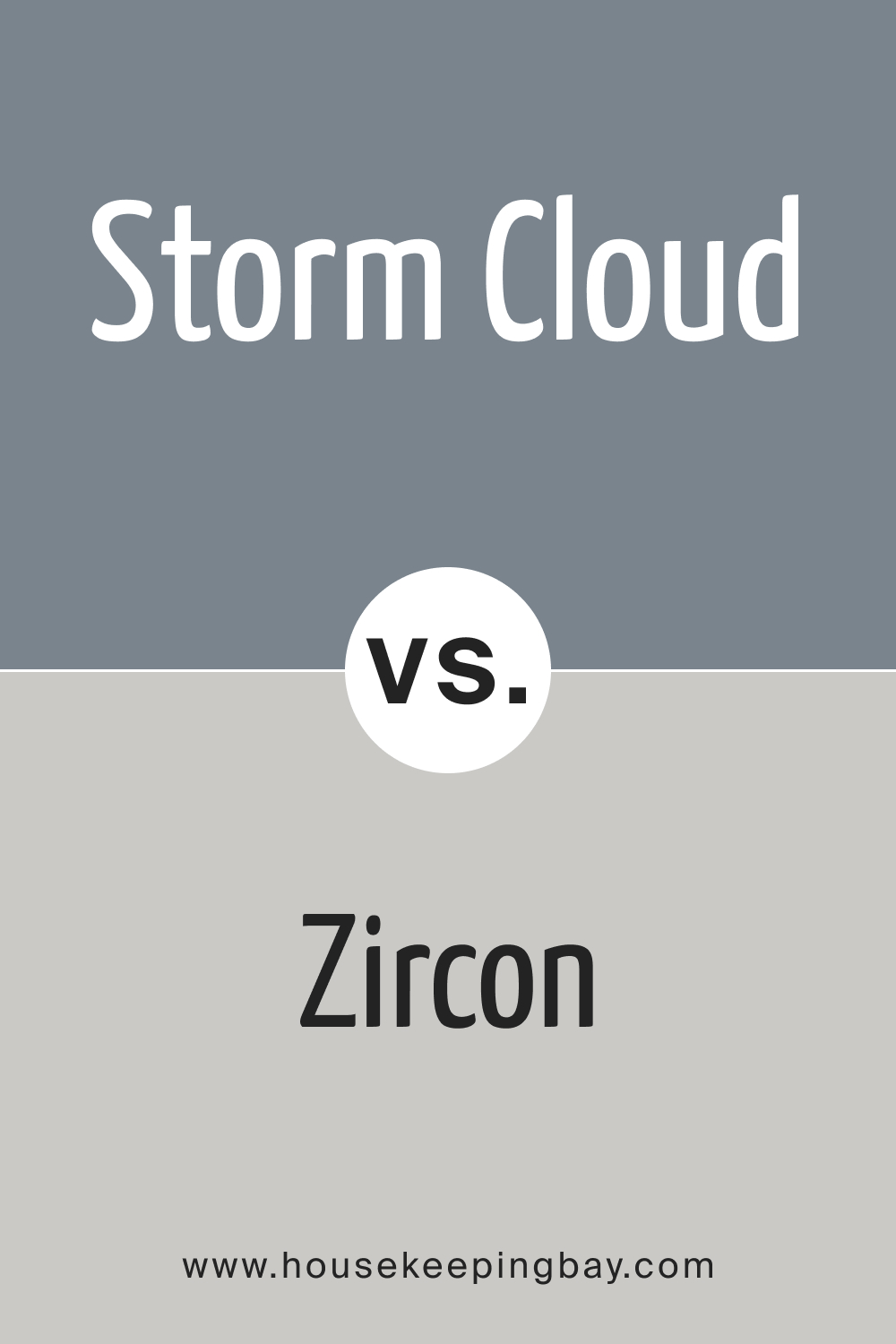
SW 6249 Storm Cloud vs. SW 7667 Zircon
SW 6249 Storm Cloud brings an enigmatic presence with its deep gray tones, generating a tranquil, yet profound mood. Oppositely, SW 7667 Zircon is a subtle, lighter gray, emanating a soft, delicate charm, excellent for creating a serene, soothing environment.
Storm Cloud, with its stronger, more assertive character, is apt for areas where a striking, contemplative atmosphere is desired. Zircon, on the other hand, with its gentle presence, is versatile and can be incorporated into any space, harmonizing well with various design elements and color schemes.
housekeepingbay.com
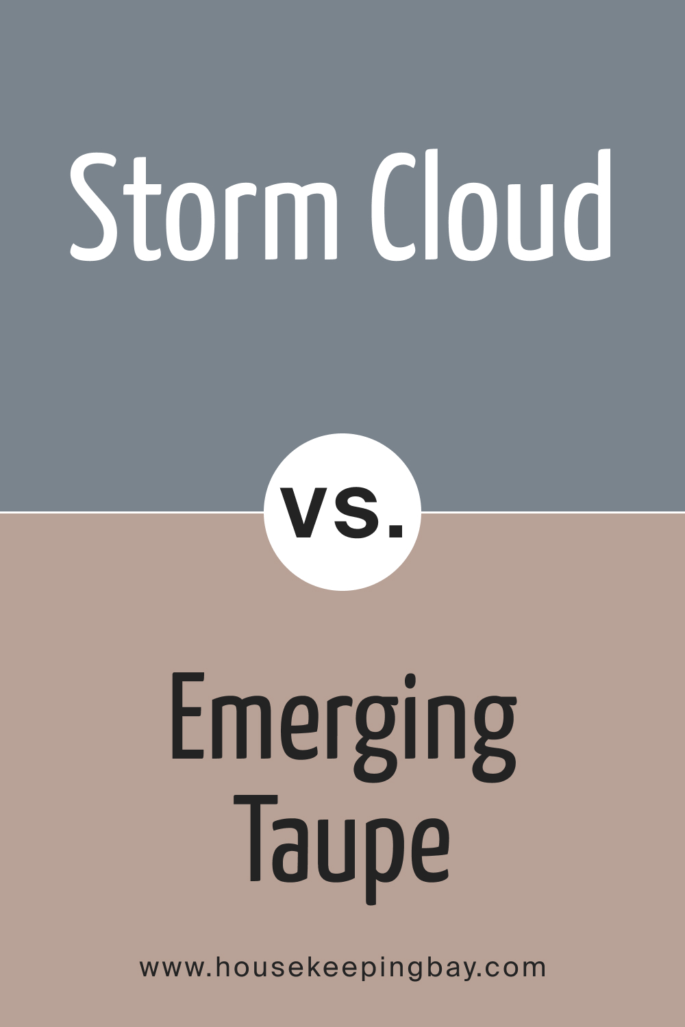
SW 6249 Storm Cloud vs. SW 6045 Emerging Taupe
SW 6249 Storm Cloud is a sophisticated, deep gray that speaks of elegance and introspection, creating a serene and thoughtful atmosphere. In contrast, SW 6045 Emerging Taupe is a soft, harmonious blend of brown and gray that echoes the warmth and richness of natural wood, fostering a welcoming and balanced environment.
Storm Cloud’s depth and richness make it suitable for formal, contemporary settings, while Emerging Taupe, with its neutral and warm demeanor, is adaptable, making it an excellent choice for spaces seeking a casual, relaxed vibe, complementing a range of decorative styles.
housekeepingbay.com
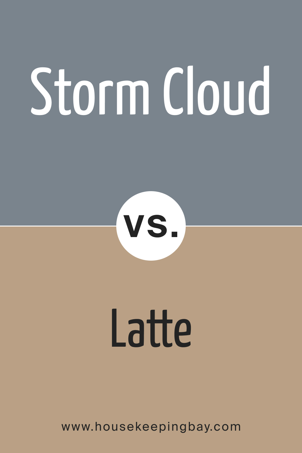
SW 6249 Storm Cloud vs. SW 6108 Latte
SW 6249 Storm Cloud, a profound, atmospheric gray, imparts a modern, refined ambiance, reflecting contemplation and sophistication. Conversely, SW 6108 Latte is a warm, creamy shade of beige, exuding a comforting, soothing presence, reminiscent of a cozy coffee shop.
While Storm Cloud is ideal for creating a bold, dramatic statement in contemporary interiors, Latte’s understated elegance and warmth make it suitable for more traditional, homely settings, enhancing the inviting appeal of living spaces.
housekeepingbay.com
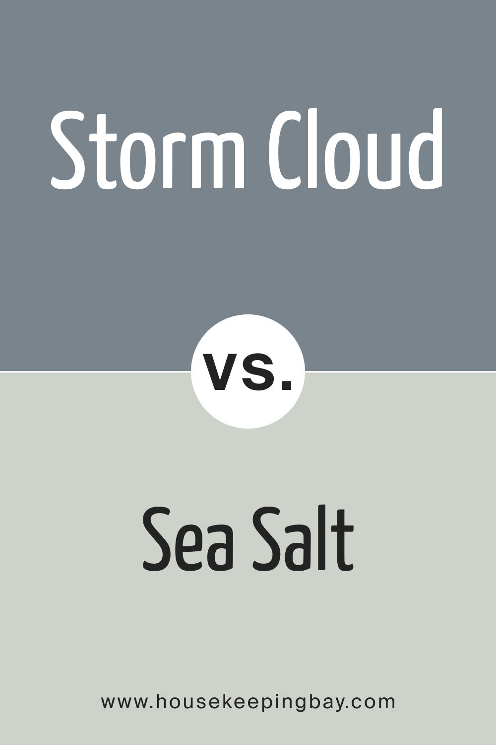
SW 6249 Storm Cloud vs. SW 6204 Sea Salt
SW 6249 Storm Cloud, with its cool, evocative gray tones, infuses spaces with a sense of calm and introspection, making it perfect for modern, minimalist designs. SW 6204 Sea Salt , however, is a refreshing, light blend of green and gray, invoking the crispness of ocean air and offering a relaxed, airy feel.
Storm Cloud’s deeper, more intense hue is optimal for areas seeking a contemplative, serene atmosphere, whereas Sea Salt, with its light, rejuvenating presence, is ideal for spaces intended to feel open, tranquil, and connected to nature.
housekeepingbay.com
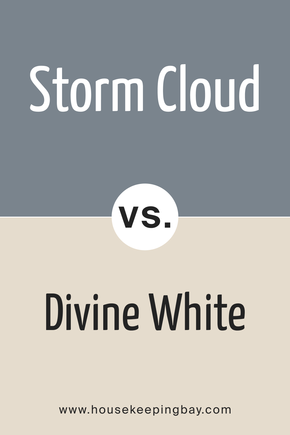
SW 6249 Storm Cloud vs. SW 6105 Divine White
SW 6249 Storm Cloud conveys a sense of depth and sophistication with its dark, soothing gray tones, ideal for areas requiring a sense of tranquility and reflection. In comparison, SW 6105 Divine White is a soft , delicate white with subtle warm undertones, creating a pure, luminous atmosphere that feels celestial and ethereal.
Storm Cloud, with its distinctive, thoughtful character, is suited to spaces that aim to stimulate introspection and focus. In contrast, Divine White’s immaculate and radiant nature makes it a versatile choice for any room, promoting a sense of purity and enlightenment.
housekeepingbay.com
Conclusion
SW 6249 Storm Cloud is more than just a color; it is a symphony of coolness, balance, and sophistication, bringing serene and reflective vibes to any space it graces. Its subtle blue, grey, and slate undertones make it a versatile and adaptable choice, suitable for a wide range of applications, from residential interiors to commercial spaces.
Whether you are looking to create a tranquil retreat, a sophisticated living space, or a balanced and productive work environment, Storm Cloud stands as a timeless and elegant option, ready to transform your visions into reality with its versatile charm and calming presence.
housekeepingbay.com
Ever wished paint sampling was as easy as sticking a sticker? Guess what? Now it is! Discover Samplize's unique Peel & Stick samples. Get started now and say goodbye to the old messy way!
Get paint samples


Frequently Asked Questions
⭐How would SW 6249 Storm Cloud affect the mood of a room?
SW 6249 Storm Cloud is a deep, atmospheric gray that can introduce a tranquil and introspective mood to a room. It's ideal for creating a serene and sophisticated atmosphere, suitable for spaces meant for relaxation and contemplation.
⭐Is SW 6249 Storm Cloud suitable for smaller spaces?
While Storm Cloud is a beautiful, rich shade, its depth may make smaller spaces feel more confined. In smaller or poorly lit rooms, consider pairing it with lighter colors or use it on accent walls to prevent the space from feeling too enclosed.
⭐Can SW 6249 Storm Cloud be used in rooms with little to no natural light?
Yes, it can be used in rooms with minimal natural light, but be mindful that its deep tones may make the space feel darker. Balancing it with well-planned artificial lighting and lighter furnishings and decor can help maintain a sense of openness and warmth in the room.
⭐Does SW 6249 Storm Cloud pair well with warm-toned furnishings and decorations?
Absolutely. The cool, balanced tones of Storm Cloud contrast beautifully with warm-toned furnishings, creating a harmonious and well-rounded aesthetic. The juxtaposition can bring depth and interest to the room, enhancing its overall appeal.
⭐Is SW 6249 Storm Cloud easy to match with other colors?
SW 6249 Storm Cloud is relatively versatile due to its neutral undertones, allowing it to pair well with a variety of colors. It complements both light and dark shades and can be matched with warm or cool tones, depending on the desired aesthetic.