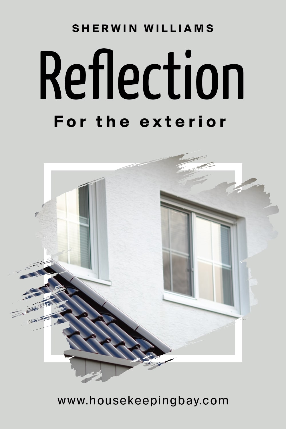
Reflection SW-7661 by Sherwin Williams
Undertones, coordinating colors, trim color, LRV, and lots of other useful information about this paint
When we are deciding what paint color is going to be used in our homes, most of us tend to stick to more neutral and universal colors, for instance, greiges, light beige hues, or other similar ones. And this choice is easy to explain! These colors are simpler to integrate into almost any interior design and color scheme, so people usually have no complications with them.
And one of such versatile paint colors is Reflection by Sherwin Williams. But even though this paint color is rather universal, you still need to learn more about it and its specifics in order to make full use of it in your home.
In the article you can find below, we will explain what type of color the Reflection is, what undertones it has, and how to use that when planning the way your interiors will look. In addition, you are going to learn in what rooms of your home this color will work to its fullest.
Moreover, from this article, you are going to find out more about this paint’s light reflectance value (also known as LRV) and what it means when using this color on your walls. Finally, we will share a list of colors with you that can be used instead of the SW Reflection paint.
housekeepingbay.com
What Type Of Color Is Sherwin Williams SW-7661 Reflection?
Table of Contents
Sherwin Williams brand has plenty of beautiful interior paint colors and color palettes, this is why people usually choose this brand for buying paint for their home renovation projects! The Reflection color is one of those that many of us truly admire.
If we try to describe the Sherwin Williams Reflection color, we will see in Encycolorpedia that it is a wonderful and cool-toned neutral. But unlike other cool neutrals, this particular tone possesses a slight spark that can make your space feel homey.
Definitely, some of you might think that such a color would be way too boring when used in a home interior since it is neutral. And neutrals are often considered boring.
But Reflection is surprisingly versatile! And in addition, you can play with it with the help of the lighting in a room. This color can be used in different interior styles and with various color schemes. Moreover, this neutral paint color is great for both indoor and outdoor applications.
housekeepingbay.com
Undertones of Reflection SW-7661
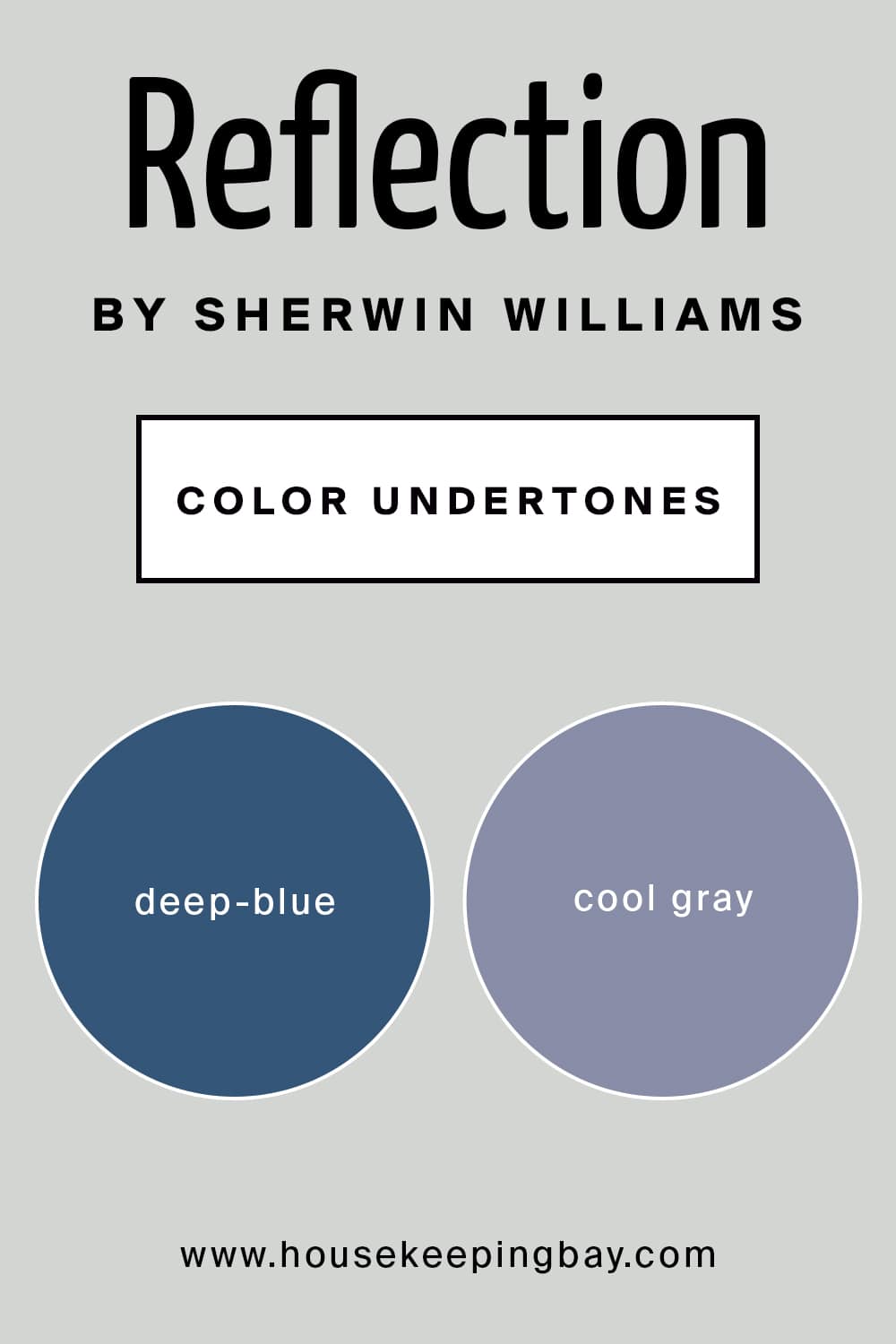
Unless you have a really sharp eye for the color shades and hues, you will hardly notice that SW Reflection has blue undertones. In fact, its undertones are deep-blue!
However, this is how things are with this paint color. At the first sight, this marvelous cool-toned neutral looks simply like an ordinary shade of pale gray, light enough, however, without that depth that creates a strong impression many darker grays have.
But if you take a closer look – and if you do it in certain types of lighting – this incredibly light color will reveal those bluish undertones, and sometimes, they may even show up quite significantly! Consider this when choosing this color for your home. This nuance becomes especially important if you don’t want to see the blue hue on your interior walls.
housekeepingbay.com
Coordinating Colors of Reflection SW-7661
Choosing the correct coordinating colors is a must if you want your interior to look harmonious in terms of color. This could be a fun task, but not if you are not very knowledgeable in paint colors and their shades. In this case, choosing the suitable coordinating colors would rather become your worst nightmare!
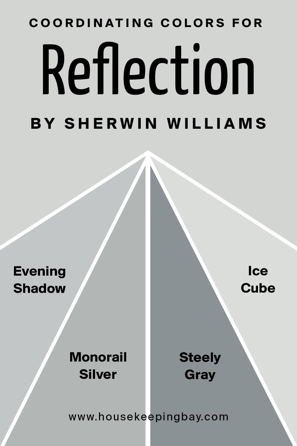
If you decide to use SW Reflection on your walls, and you are looking for the colors to coordinate it with, we would recommend you take the following options into consideration (if you strive for a monochrome palette):
- SW 7662 Evening Shadow
- SW 7663 Monorail Silver
- SW 7664 Steely Gray
- SW-6252 Ice Cube
Each of them will create a balanced and harmonious color combination and will be great for modern, minimalist, coastal, and contemporary setbacks.
If your goal is a contrasting color palette, we have a few color suggestions for this case as well:
- SW 9180 Aged White
- SW 9183 Dark Clove
- SW 0017 Calico
housekeepingbay.com
How does lighting affect Reflection?
Sherwin-Williams Reflection (SW 7661) is a cool, soft gray color with subtle blue undertones. Lighting may affect how this color reflects differently from room to room. Here’s how different lighting conditions may affect Reflection:
- Natural Light: In well-lit rooms, Reflection will appear brighter and will tend toward a light, airy gray with hints of blue. In south-facing rooms, which receive direct, warm sunlight, Reflection’s blue undertone will be well-balanced-looking soft and cool without feeling icy. In north-facing rooms, which receive cooler natural light, blue undertones could become more pronounced, leaving the paint looking slightly cooler, a blue-gray color.
- Warm Artificial Light-Incandescent or Warm LED: The warmth of the lighting smoothes out those blue undertones in Reflection and can make it read much more as a light, neutral gray and not cool. This creates such a nice, even feeling and works well in living rooms, bedrooms, or anywhere you want a cozy atmosphere without it being too warm.
- Cool Artificial Light-Cool LED or Fluorescent: By contrast, cool lighting provided by LED or fluorescent lights will pop the blue undertones in Reflection and give the color a cooler, crisper feel. This is great for a modern, clean look but may be a bit chilly for areas that don’t receive much light of their own.
- Low-Lighted/Shadowed Spaces: In low-lit or shadowed areas, Reflection can take on a somewhat darker and grayer appearance. A blue undertone may still be there, yet it often appears more neutral-looking. This can be great for subtle contrast in spaces that are generally low-lit-like hallways or small rooms-where you want a soft cool-tone gray.
Overall, Reflection is one versatile, cool-toned gray that works great across warm and cool light, yet somehow stays true to its blue-gray character. It’s a soft and airy gray that’s sure to show subtle shifts with the changes in lighting-a great choice if that is what you seek.
housekeepingbay.com
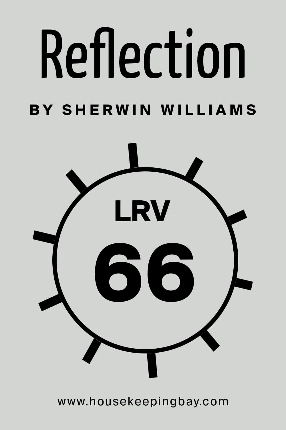
LRV of Reflection SW-7661
What we call LRV is the light reflectance value of paint color, and it shows how much light the paint is able to reflect. Like this, you can easily guess that, if the LRV is low, the paint is considered to be rather dark, and vice versa.
As for the SW Reflection paint color, its LRV is 66 which puts this neutral to the lighter to medium end of the color scale. But mostly, to the lighter end still.
In addition, since this color has deep and cool blue undertones, it will always tend to look lighter than it actually is. This is why SW Reflection is great for making a room look airier and more spacious.
housekeepingbay.com
What is LRV? Read It Before You Choose Your Ideal Paint Color
The Best Trim Color To Use With SW Rainstorm
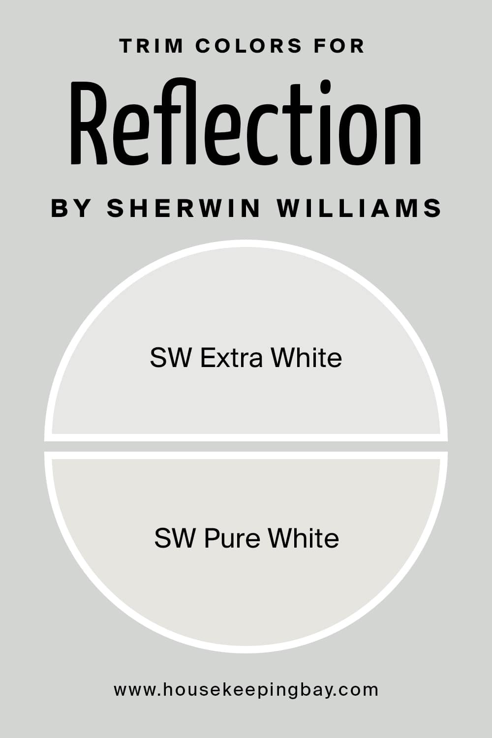
There is a rule of thumb you should know: if you are not sure what trim color to choose to match with your paint on the walls, stick to white. In any case, white is always going o be a win-win option. With SW Reflection, it works all the same way.
These whites will help you bring the true hue of the SW Reflection neutral paint color to life.
housekeepingbay.com
Paint Colors Similar to SW Rainstorm
It often happens that we can’t use exactly the paint color we initially chose in our homes for different reasons. No matter why it is so, it is good to know what other colors exist that can work as substitutes for the paint color you were going to apply first.
Of course, it is important to remember that you will not be able to find an ideal match since there are no two totally the same colors! Nevertheless, we can suggest you a couple of alternative paint colors that are the most similar to the SW Reflection:
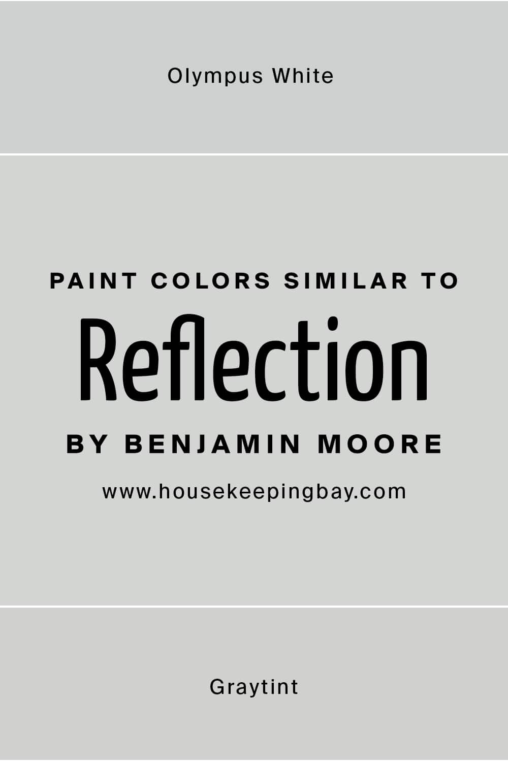
- SW-6253 Olympus White
- BM-1611 Graytint
As for the SW Olympus White, its LRV is 68 which means that this color is absolutely light. This is why it can be successfully used to make your home feel cool and calming. Blue undertones that relate it to the neutral and cool-toned Reflection only emphasize this color’s tranquil nature.
Speaking of Graytint color by Benjamin Moore, it has prominent gray undertones instead which make this color look and feel crisp and totally cool. And since its LRV is 70.29, this color is also very light.
Each of these alternative colors can be successfully paired with darker shades of gray, as well as with some shades of yellow (only not the brightest ones!).
housekeepingbay.com
Where This Color Can Be Used In Your Home?
The one great feature of SW Reflection paint color is that it is surprisingly easy to incorporate into your interior since this neutral is very versatile! It can be easily used in almost any room and on nearly any surface. This paint is even used as exterior paint to apply on houses’ facades!
Below, you can find out more about how this calming neutral paint with cool blue undertones will work in different rooms of your home.
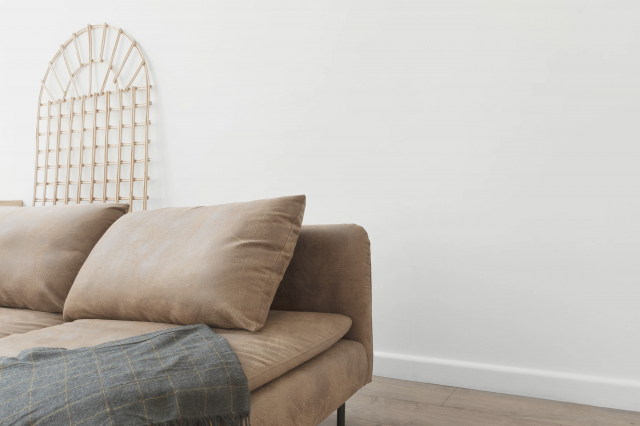
SW Reflection In a Living Room
This color is the one that can give your living room a very soothing and calming vibe. Especially if you combine this subtle neutral with whites, wood, and natural textures.
However, in this case, we would also suggest you make use of some patterned decor elements like curtains or cushions to make the entire space look more vivid and vibrant.
Also, it would be good to have items of vivid and warm colors (browns, warm yellows, oranges, greens, etc.) in your living room if its walls are pained with Reflection. This color is cool-toned, so it may add quite a “chilly” atmosphere to a room.

housekeepingbay.com
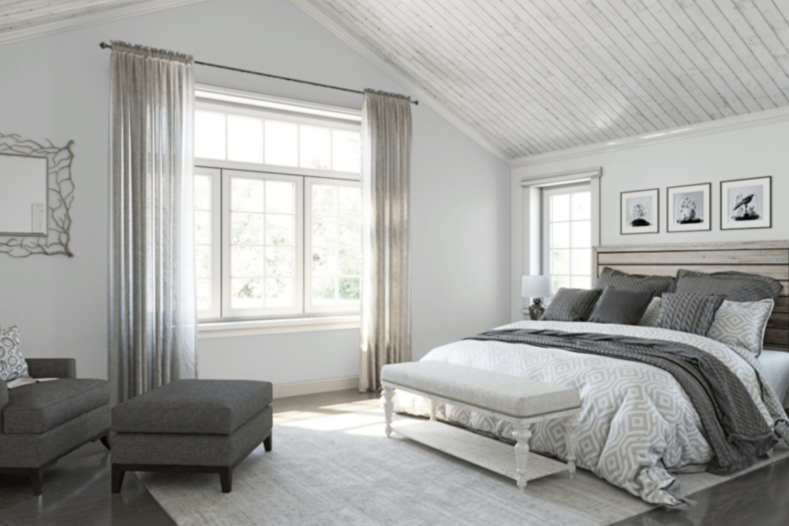
SW Reflection In a Bedroom
For a bedroom, this soothing and tranquil neutral would be one of the best options, especially if you are craving a cool effect. Depending on the size of the room, you might want to paint only an accent wall or use this color on all four walls.
Also, we would suggest you pair this color with browns, greiges, and blues, and even certain tones of warm grays on decorative elements and items in your bedroom. Fur rugs will add more of a cozy vibe and make the space look less cool.

housekeepingbay.com
SW Reflection In a Kitchen And On Kitchen Cabinets
In case you decide to paint your kitchen wall (or the walls) with this neutral color, you will get a perfectly clean and refined look. But for the best effect, consider using this color on your kitchen cabinets only, and paint the backdrop with a bolder shade of gray.
But of course, if you think that Reflection will work better on your backdrop, apply it there! This color will anyway look perfectly in place when paired with wooden furniture of darker colors, as well as brass or matte black handles, a white marble countertop, and glossy backsplash tiles.

housekeepingbay.com
SW Reflection in the Cabinets
SW Reflection can be a nice color option for your cabinets. But before you paint your cabinets with it, check out the entire color palette of the space. This neutral is rather cool-toned, so you need to make sure the room has warmer color accents.
Exterior Use of SW Reflection
You will be happy to know that this neutral paint color will work great on your exterior walls as well! Besides, it will fit almost any house style, especially the Craftsman, Mid-Century Modern, and Contemporary.
Note that SW Reflection will work well with black tiles and/or with the bold gray or black trims and moldings. And if you want more color and you’re not afraid of experiments, you can even paint your front door red!
With all these life hacks and tips in mind, you will be able to make use of this gorgeous paint and turn your home into a stylish and at the same time cozy masterpiece!
housekeepingbay.com
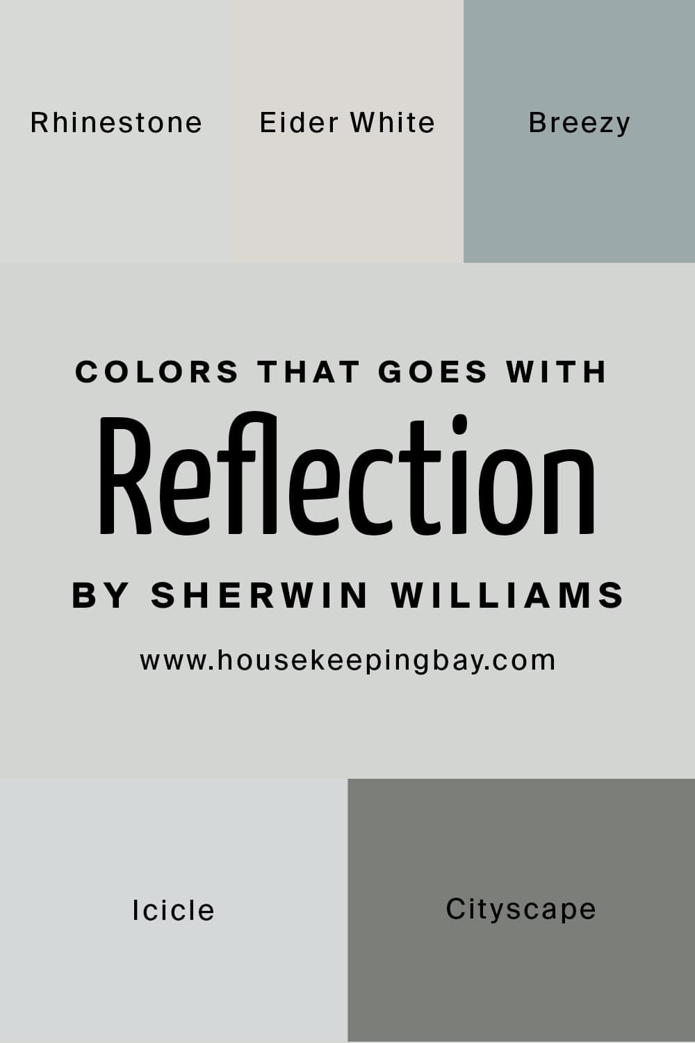
Paint Colors That SW Reflection Goes With
No matter what paint color you choose to apply as a wall color, considering what colors it will go with will help you to create a harmonious atmosphere and also make the entire space look pleasing to your eyes.
As for the SW Reflection, this cool-toned neutral can be paired with several colors. Below, you can check out which ones exactly will work better than others with it:
- SW-7656 Rhinestone
- SW-7014 Eider White
- SW-7616 Breezy
- SW-6238 Icicle
- SW-7067 Cityscape
But this list of colors is not all that we would like to share with you. Below, we are going to compare the Reflection paint color to the most similar paints to see whether there is any visible difference between them.
housekeepingbay.com
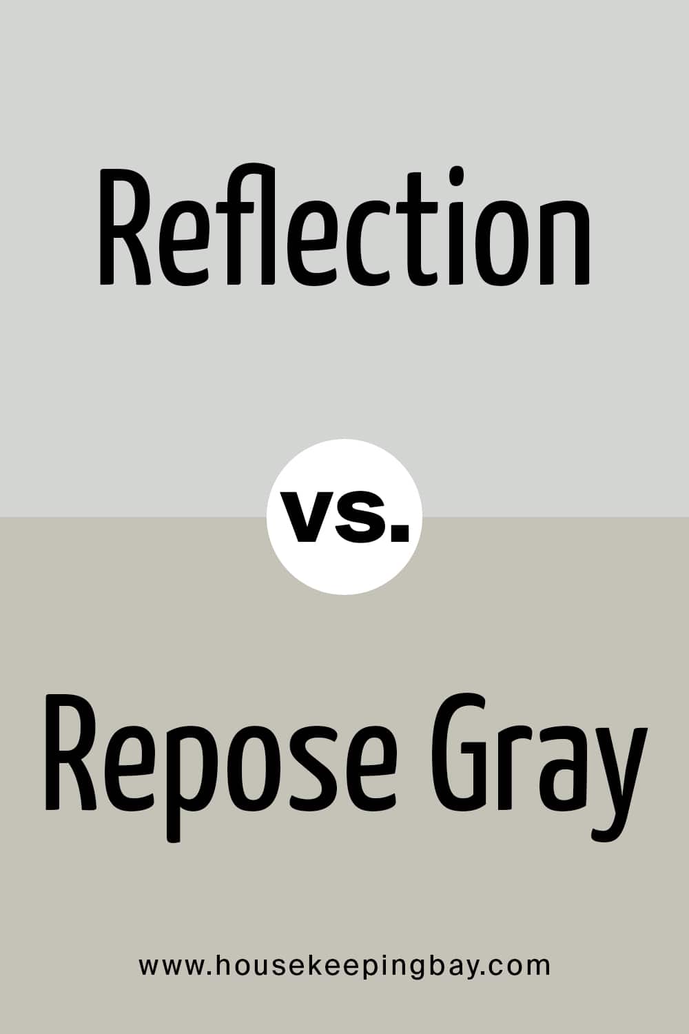
Reflection vs Repose Gray
If we compare these two, we will see that Reflection looks almost like cool gray beside the much warmer Repose Gray which reads nearly very light beige or greige. The colors don’t create a harmonious combination not only because one is cool-toned and another is warm-toned. They also have different undertones.
housekeepingbay.com
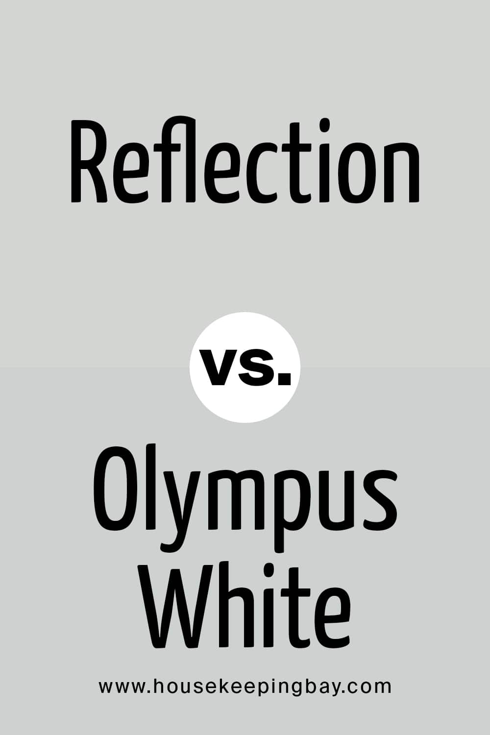
Reflection vs Olympus White
When comparing these two colors, we see that the SW Olympus White (which LRV is 68) is absolutely light. Perhaps, even a bit lighter than Reflection. This is why it can be successfully used to make your home feel cool and calming.
But it also has blue undertones that relate it to the neutral and cool-toned Reflection. So in general, these colors look so alike that you can successfully use one instead or another!
housekeepingbay.com
Reflection vs Alabaster
Compared to Alabaster , Reflection looks gray and much cooler as well. Alabaster is lighter and warmer, and it reads more like a light greige, revealing its subtle beige undertones whilst Reflection shows its blue side way more prominently.
housekeepingbay.com
Well, like this, you are now informed about all the specifics and nuances regarding the paint color by Sherwin Williams which is called Reflection. Unlike quite many neutrals, this cool-toned color can successfully match quite many interior designs and fit in many color schemes.
This feature makes it a versatile option if you are looking for something universal yet not boring.
In addition, this paint color can be used both indoors and outdoors. It allows you to find way more areas and options for its use in your home. Make sure that you take our recommendations into consideration, and this neutral will turn your home into a very attractive, stylish, and yet cozy place.
housekeepingbay.com
Ever wished paint sampling was as easy as sticking a sticker? Guess what? Now it is! Discover Samplize's unique Peel & Stick samples. Get started now and say goodbye to the old messy way!
Get paint samples


Frequently Asked Questions
⭐Is SW Reflection a gray or a blue color?
It’s neither gray nor blue. This color belongs to neutrals, but it does have deep blue undertones.
⭐Can Reflection paint color paint be used with very light beiges?
Yes, it can, but not with all of them. Before combining these two, use paint swatches and samples to compare and see which pair of colors you like more.
⭐Is it ok to combine Reflection color with black?
Well, black could be quite a good match if you also have other colors in a room to balance this combination.
One thought on “Reflection SW-7661 by Sherwin Williams”
Leave a Reply


I want to paint my kitchen with Rainstorm, but I haven’t decided yet whether I want all the walls being neutral, or I just want an accent wall. Which options would be better, what do you think?