Enduring Bronze SW 7055 by Sherwin Williams
Timeless Elegance in Earthy Tones
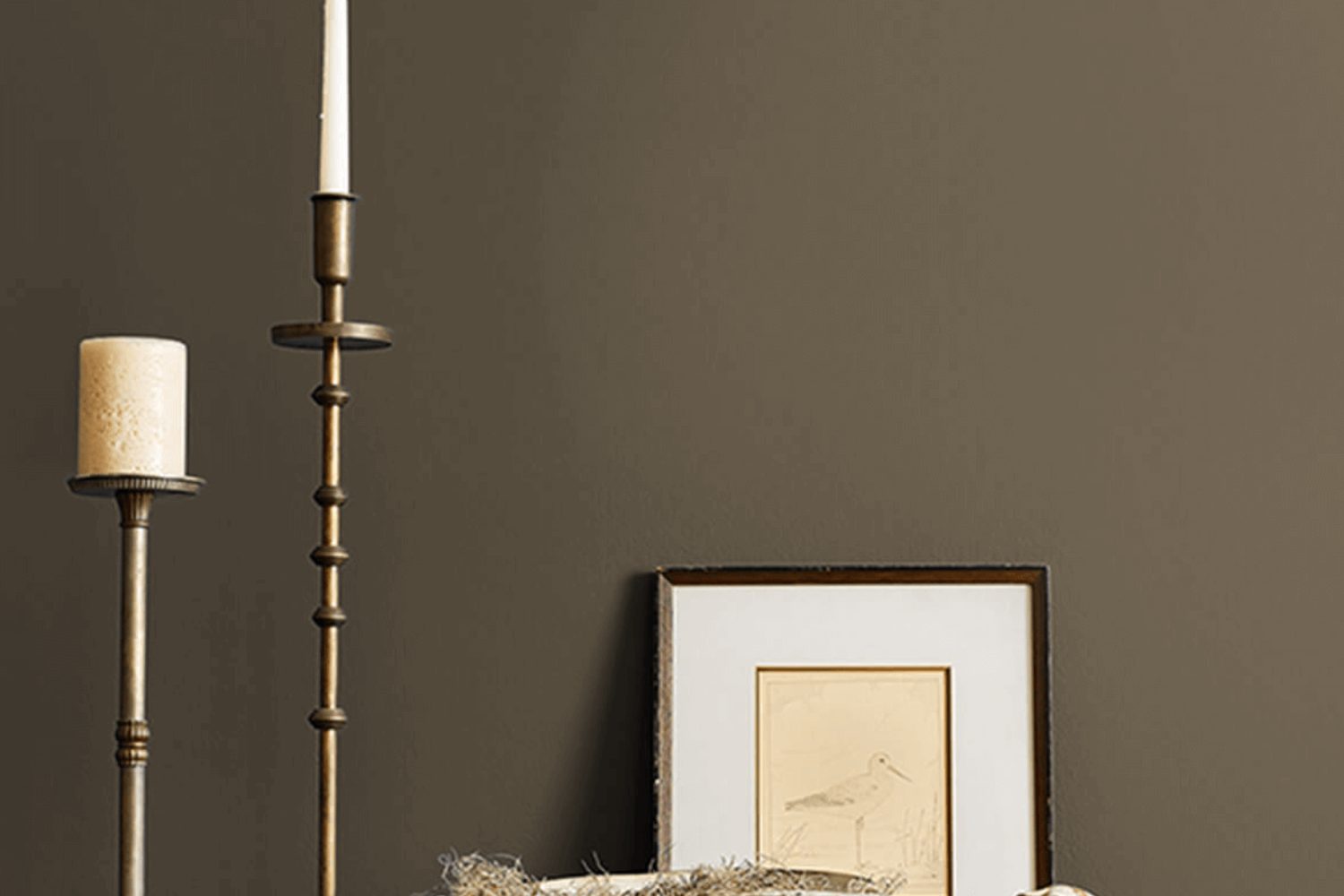
When you’re ready to give your space a fresh and stylish update, SW 7055 Enduring Bronze by Sherwin Williams is a choice you’ll want to consider. This sophisticated color brings a warm and inviting atmosphere to any room, making it perfect for those looking to add a touch of elegance and comfort to their home.
Enduring Bronze isn’t just any paint color; it’s a statement. Its rich, deep tones provide a perfect backdrop for both modern and classic decor, giving you the flexibility to use it in various settings. Whether you’re looking to transform your living room, bedroom, or even your exterior, this shade adapts beautifully, creating a look that feels both timeless and current.
What makes Enduring Bronze stand out is its ability to blend with a wide range of colors and materials. From soft neutrals to vibrant hues, it complements an array of palettes, making your decorating process seamless and enjoyable. Additionally, its compatibility with different textures brings out the best in your furniture and accessories, ensuring that everything in your space looks its best.
Choosing Enduring Bronze is more than just picking a paint color; it’s about creating a mood and enhancing the overall appeal of your home. With its warm undertones and versatile nature, it promises to transform your space into a cozy, stylish haven that you’ll love spending time in. So why not give your home the update it deserves with this beautiful shade?
by Sherwin Williams
What Color Is Enduring Bronze SW 7055 by Sherwin Williams?
Enduring Bronze SW 7055 by Sherwin Williams is a rich, sophisticated hue that beautifully balances between a warm brown and a muted bronze. This color has a timeless appeal, evoking a sense of stability and grounded elegance in any space. Its unique blend offers a perfect backdrop for a variety of interior styles, especially those leaning towards traditional, rustic, or even modern aesthetics.
The versatility of Enduring Bronze allows it to pair wonderfully with a broad range of materials and textures. It complements the natural grain and warmth of wooden furnishings and flooring, enhancing the cozy feel of a room. Leather accents or furniture in this setting can introduce a luxurious, yet comfortable vibe, making the space inviting. When matched with metal details such as brass or copper, Enduring Bronze brings out an elegant contrast that can elevate the sophistication of a room.
In terms of textures, this color works well with soft, plush fabrics like velvet or wool, adding a layer of depth and comfort to the interior. It also pairs nicely with natural fibers such as jute or sisal, creating an earthy and relaxed atmosphere. Whether you’re styling a living room, bedroom, or a study, Enduring Bronze SW 7055 offers a durable and stylish backdrop that complements a wide range of materials and enhances the overall aesthetic of the space.
housekeepingbay.com
Is Enduring Bronze SW 7055 by Sherwin Williams Warm or Cool color?
Enduring BronzeSW 7054 by Sherwin Williams is a rich and warm paint color that brings a cozy and inviting feel to any room in your home. Think of the cozy feeling you get during fall when you’re wrapped up in a soft blanket with a cup of hot cocoa. That’s the vibe this color brings into your space. It’s not just any brown; it’s like the beautiful shades you see in nature, such as in tree bark or the earth, which gives your home a grounded and calming effect. This color works really well in living rooms, bedrooms, or even on kitchen cabinets, adding a touch of elegance and warmth.
When you paint your walls with Enduring Bronze, it makes your furniture and decor pop. It’s a versatile color that goes well with lots of other colors, from creamy whites to bold teal or soft blush pink. It’s perfect for creating a cozy atmosphere, making your home a place where you love to spend time. Whether you have a modern or traditional style, Enduring Bronze can fit right in, making it a popular choice for people wanting to freshen up their homes.
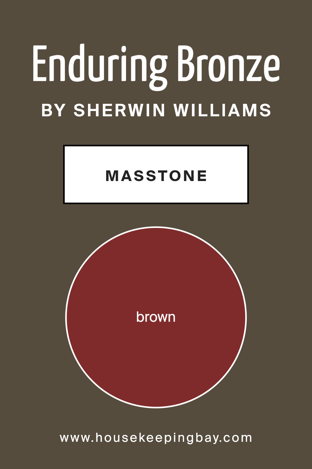
What is the Masstone of the Enduring Bronze SW 7055 by Sherwin Williams?
Enduring BronzeSW 7055 by Sherwin Williams is a beautiful paint color that has a masstone, or the pure color before it’s lightened or darkened, of brown (#802B2B). This color is a deep, warm hue that brings a cozy and inviting atmosphere to any room in the home. Since its masstone is brown, Enduring Bronze carries with it a sense of stability, comfort, and natural earthiness.
This characteristic makes it a versatile choice for homes; it can work well in living rooms, bedrooms, or even kitchens, adding depth and warmth wherever it’s applied. The color’s richness helps it pair beautifully with various decor styles, from rustic to modern, making it easy for homeowners to use in their existing spaces without needing a complete overhaul. Furniture and accessories in neutral colors like cream, beige, or light wood tones complement it nicely, ensuring that spaces feel grounded and well-coordinated.
Overall, the brown masstone of Enduring BronzeSW 7055 makes it a practical and stylish choice, creating a welcoming environment that feels like home.
housekeepingbay.com
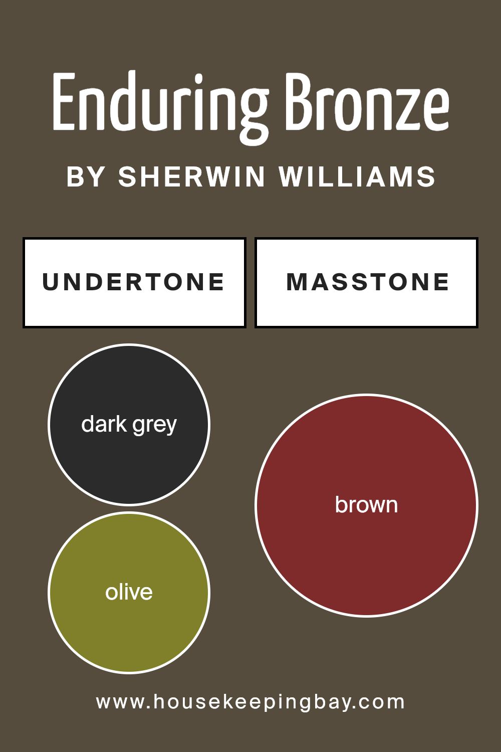
Undertones of Enduring Bronze SW 7055 by Sherwin Williams
Enduring Bronze SW 7055 by Sherwin Williams might seem straightforward at first glance, but it’s actually a complex color with various undertones that can significantly affect how it looks in different settings. Undertones are subtle colors hidden within the main color, and they can emerge based on lighting, surrounding colors, and even the time of day. For Enduring Bronze, these undertones range from dark grey and olive to more vibrant hues like red and orange.
Imagine putting a splash of Enduring Bronze on an interior wall. The dominant undertones you might notice could include dark grey, giving it a grounded, earthy feel. Olive and dark green undertones could pull it toward nature, making it feel calm and serene, whereas a hint of purple or navy might add a touch of mystery or depth.
In rooms with a lot of natural light, the orange or pink undertones of Enduring Bronze might warm up the space, creating a welcoming and cozy atmosphere. On the other hand, artificial lighting could highlight the cooler undertones, like dark turquoise or grey, making the room feel more sophisticated and contemporary.
The true beauty of Enduring Bronze and its undertones comes from this versatility. It can adapt and change, offering different experiences in a single space depending on the elements surrounding it. This ability makes it an interesting choice for interior walls, as it can complement a wide range of decor styles and personal tastes. Whether you’re aiming for a warm, inviting space or a cool, modern vibe, understanding and utilizing the undertones of Enduring Bronze can help you achieve the perfect look.
housekeepingbay.com
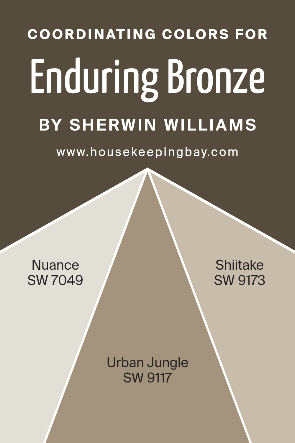
Coordinating Colors of Enduring Bronze SW 7055 by Sherwin Williams
Coordinating colors are selected hues that work well together to enhance the aesthetic appeal and create a harmonious atmosphere in any space. When it comes to combining them with Enduring Bronze SW 7055 by Sherwin Williams, a rich, warm color that brings a cozy and inviting feel to interiors, choosing the right coordinating colors can elevate the look of a room significantly. These specific coordinating colors have been chosen to complement Enduring Bronze in a way that each contributes to a balanced and cohesive palette.
Nuance SW 7049 is a subtle, light grey that balances the warmth of Enduring Bronze with its cool undertones, providing a serene backdrop that allows the richness of Enduring Bronze to stand out. It’s like a quiet morning mist, offering a calm, neutral canvas that’s versatile in numerous settings. Urban Jungle SW 9117, on the other hand, is a lush, earthy green that brings a sense of nature and vitality when paired with Enduring Bronze, creating a dynamic yet harmonious look. It’s akin to a dense foliage in a deep forest, enriching the palette with its natural, grounding presence. Meanwhile, Shiitake SW 9173 brings a unique, warm taupe that harmonizes beautifully with both the deep, cosy tones of Enduring Bronze and the cooler notes of Nuance. It’s reminiscent of the earthy color of mushrooms in the wild, offering a soft, welcoming embrace that complements the entire color scheme. Together, these colors work alongside Enduring Bronze to create spaces imbued with warmth, depth, and tranquility, highlighting the importance of a thoughtfully curated palette.
You can see recommended paint colors below:
- SW 7049 Nuance
- SW 9117 Urban Jungle
- SW 9173 Shiitake
housekeepingbay.com
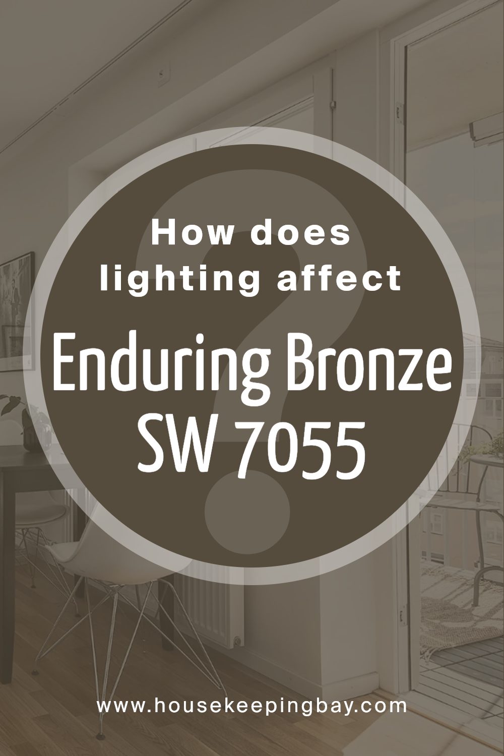
How Does Lighting Affect Enduring Bronze SW 7055 by Sherwin Williams?
Lighting plays a vital role in how we see and perceive colors. The same color can look different under various light sources because light affects color visibility and how we interpret those colors. When it comes to specific colors like Enduring Bronze SW 7055 by Sherwin Williams, lighting can significantly impact how this color presents itself in a room.
- Under artificial light, Enduring Bronze may appear warmer and more welcoming. Since artificial lighting can range from cool to warm tones, the type of bulb used will influence how Enduring Bronze is perceived. Warmer lights will enhance the cozy, earthy tones of Enduring Bronze, making it feel more inviting. In contrast, cooler lights might make it appear a bit more subdued, highlighting its more neutral, less warm undertones.
- In natural light, Enduring Bronze reveals its true character throughout the day. The quality of natural light changes, from the soft glow of dawn to the bright light of noon and the golden hues of sunset. Morning light may make Enduring Bronze look softer and more muted, while the intense midday sun can bring out its depth and richness. As the day ends, the color might appear more mellow and relaxed under the warm sunset light.
The orientation of the room also affects how Enduring Bronze looks. North-facing rooms get less direct sunlight, which can make Enduring Bronze appear cooler and slightly more grayish. It’ll feel sophisticated but might lose some of its warmth. South-facing rooms bathe in warm light most of the day, bringing out the vibrant, cozy qualities of the color, making it feel more alive and dynamic. East-facing rooms get bright morning light, which can make Enduring Bronze look very warm and welcoming in the morning but cooler and more subdued in the afternoon. West-facing rooms have the opposite effect; the color might look cooler in the morning light and then glow warmly in the late afternoon and evening sun.
Understanding how lighting affects a color like Enduring Bronze can help you decide how to use it in your space to achieve the desired effect, whether it’s creating a cozy retreat or adding sophistication to a room.
housekeepingbay.com
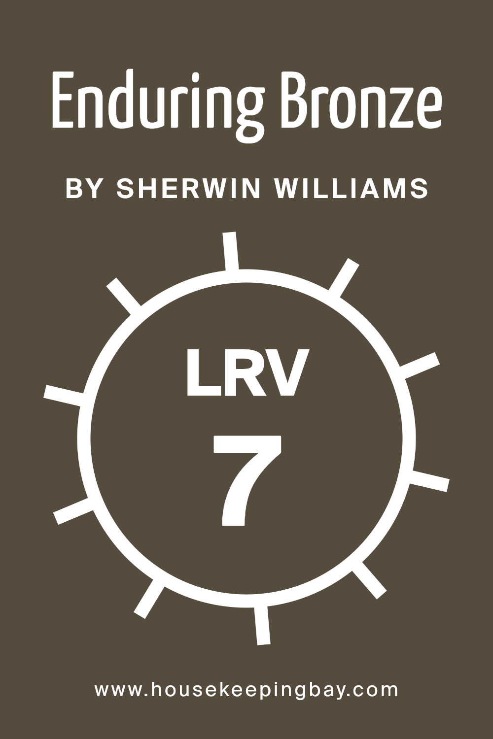
What is the LRV of Enduring Bronze SW 7055 by Sherwin Williams?
LRV stands for Light Reflectance Value, a measure that tells us how much light a color reflects or absorbs. It’s like a scale from 0 to 100, where 0 is absolute black, meaning it absorbs all the light, and 100 is pure white, reflecting back all the light it gets. Understanding LRV helps when choosing paint colors for rooms because it can affect how light or dark a space feels. If a room is painted in a color with a high LRV, it will appear brighter and more illuminated because it reflects more light around the room. Conversely, colors with lower LRVs absorb more light, making spaces feel cozier but also potentially darker.
Enduring Bronze SW 7055 by Sherwin Williams, with an LRV of 7.454, falls on the lower end of the scale. This means it’s a dark color that doesn’t reflect much light. In a practical sense, when used on walls, Enduring Bronze will give the space a richer, more intimate feel, absorbing most of the light rather than bouncing it back into the room. This characteristic makes it an ideal choice for creating a cozy, inviting atmosphere in a space. However, because of its low LRV, it’s important to consider the room’s natural light availability before painting it this color, as it might make the room appear darker than anticipated if not well-lit.
housekeepingbay.com
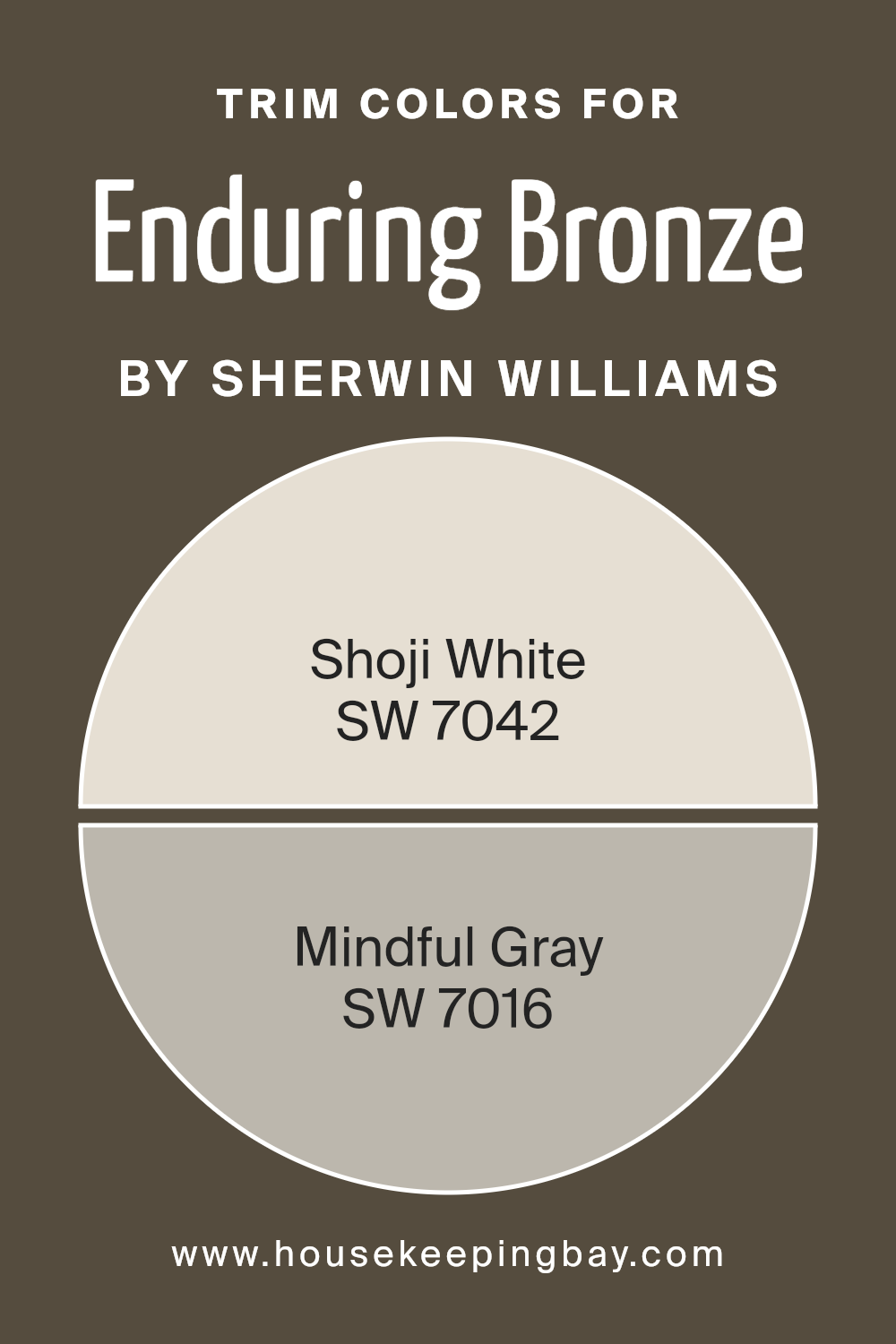
What are the Trim colors of Enduring Bronze SW 7055 by Sherwin Williams?
Trim colors, when it comes to painting and decorating, are essentially the colors chosen for the details of a room or exterior, such as door frames, window frames, skirting boards, and molding. For a color like Enduring Bronze SW 7055 by Sherwin-Williams, selecting the right trim color is crucial as it can either subtly complement the main hue, making the space feel cohesive, or offer a striking contrast that adds depth and interest to the overall design. Trim colors help in defining the architecture of a space, highlighting the craftsmanship, and can also influence the perceived size and brightness of the area.
Shoji White SW 7042 is a soft, warm white with a hint of beige, making it a versatile choice that brings a light and airy feel to any space. It’s particularly effective in enhancing the warm, rich tones of Enduring Bronze, providing a gentle contrast that’s neither too stark nor too bland. On the other hand, Mindful Gray SW 7016 is a neutral gray that straddles the line between gray and beige. Its subtle warmth complements the earthy quality of Enduring Bronze, offering a more anchored, sophisticated contrast that enriches the overall ambiance. Both colors work well with Enduring Bronze, depending on whether the aim is to create a soothing blend or a distinguished separation between walls and trims.
You can see recommended paint colors below:
housekeepingbay.com
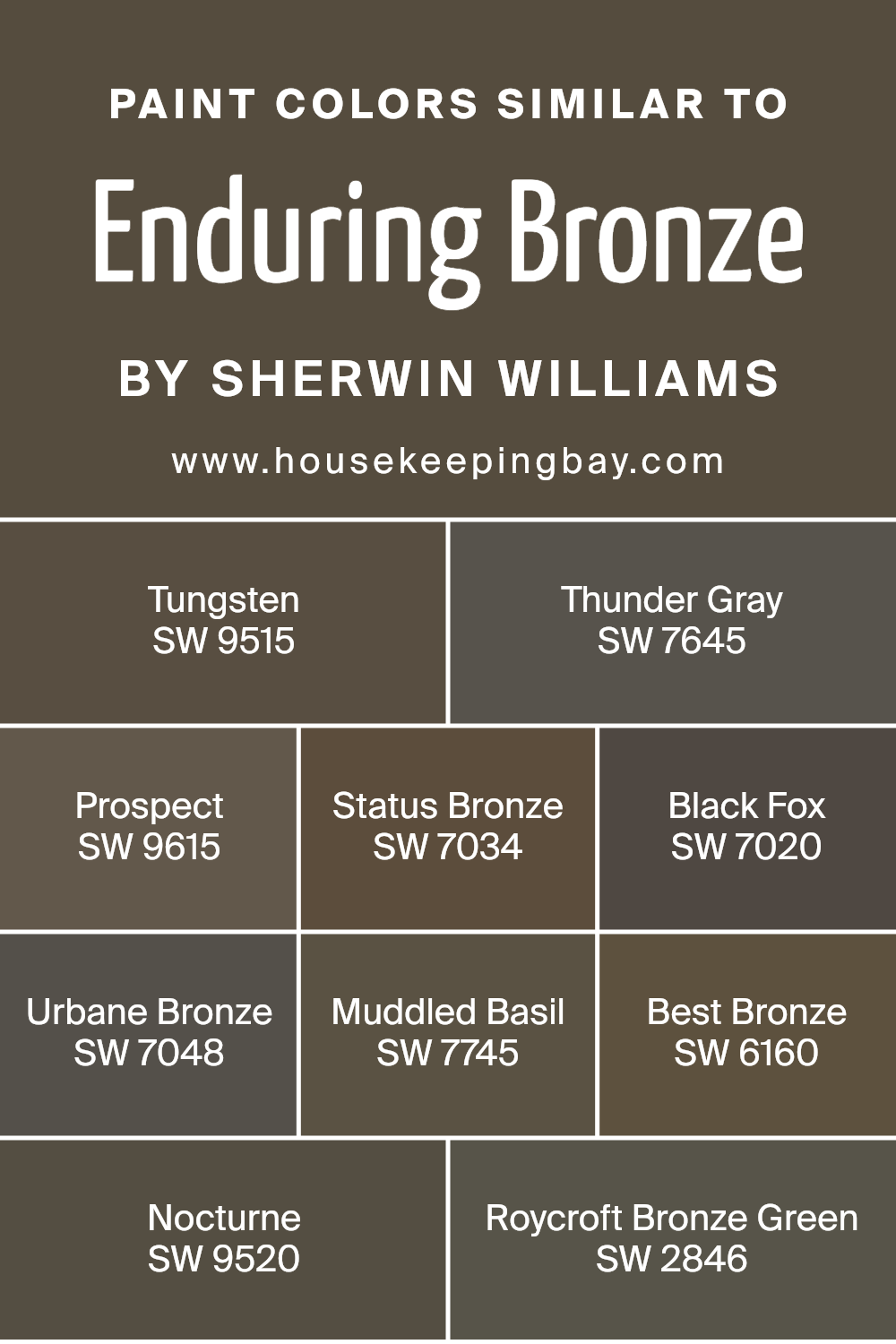
Colors Similar to Enduring Bronze SW 7055 by Sherwin Williams
Similar colors are crucial in design because they create a harmonious and visually cohesive look, making spaces feel more put-together and intentional. When colors like Enduring Bronze SW 7055 by Sherwin Williams are paired with shades like Tungsten SW 9515 or Thunder Gray SW 7645, they bring out each other’s warm or cool undertones, accentuating the depth and richness of the space.
Selecting shades within the same color family, such as Prospect SW 9615 or Status Bronze SW 7034, allows for subtle contrasts that add texture and interest without overwhelming the eye. Colors like Black Fox SW 7020 and Urbane Bronze SW 7048, for instance, can highlight architectural details or create a striking backdrop for decor, making the room’s features stand out.
Moreover, incorporating colors like Muddled Basil SW 7745 or Best Bronze SW 6160 can introduce a natural, earthy vibe, connecting the indoor environment to the outdoors. Nocturne SW 9520, with its darker tone, and Roycroft Bronze Green SW 2846, provide a sophisticated touch that can enhance the sense of luxury and depth in a room. These similarities in hues encourage a smooth visual flow from one space to another, making transitions less jarring and more pleasant. Ultimately, choosing colors that complement Enduring Bronze SW 7055 ensures a balanced and inviting atmosphere that feels both cohesive and distinctly layered.
You can see recommended paint colors below:
- SW 9515 Tungsten
- SW 7645 Thunder Gray
- SW 9615 Prospect
- SW 7034 Status Bronze
- SW 7020 Black Fox
- SW 7048 Urbane Bronze
- SW 7745 Muddled Basil
- SW 6160 Best Bronze
- SW 9520 Nocturne
- SW 2846 Roycroft Bronze Green
housekeepingbay.com
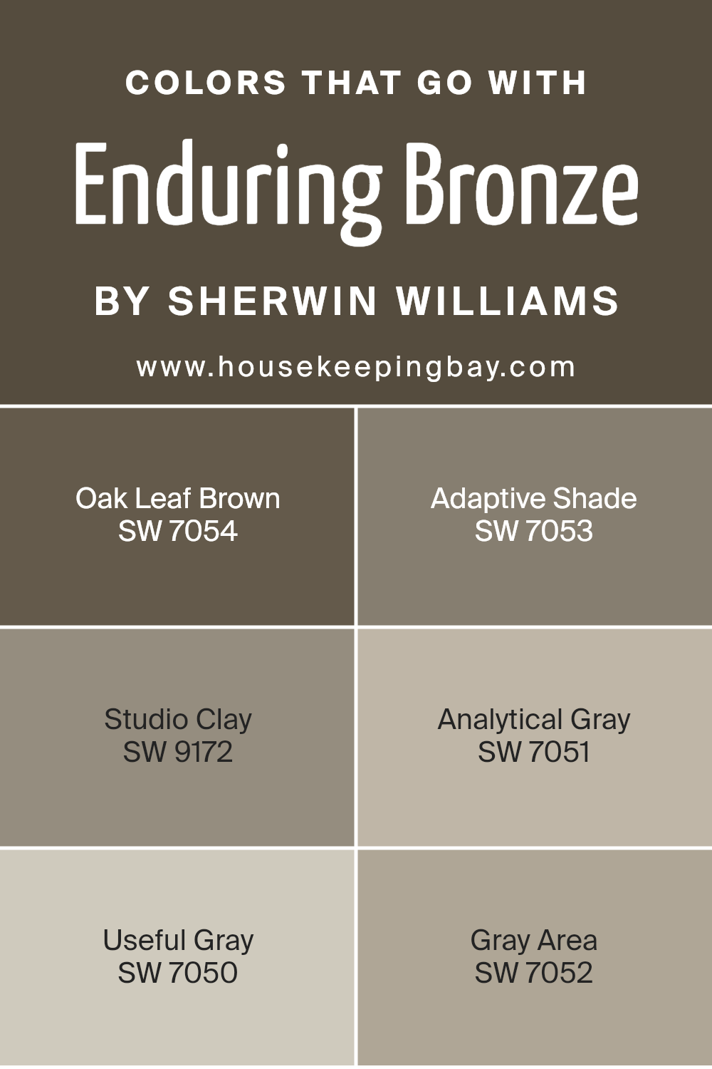
Colors that Go With Enduring Bronze SW 7055 by Sherwin Williams
Matching colors with Enduring Bronze SW 7055 by Sherwin Williams is key in creating a cohesive and appealing space. These particular colors harmonize well with Enduring Bronze, a rich and versatile hue, because they share similar undertones or complement its depth. Such combinations are crucial for designing a room that feels carefully curated and balanced. By integrating colors like Oak Leaf Brown, Adaptive Shade, Studio Clay, Analytical Gray, Useful Gray, and Gray Area, one can effortlessly achieve a dynamic yet unified look. These colors work together to enhance the warmth and complexity of Enduring Bronze, making it a perfect choice for a variety of spaces.
Oak Leaf Brown is a warm, earthy color that adds a sense of stability and grounding to the palette. Adaptive Shade, on the other hand, is a lighter, more versatile gray that brings a subtle contrast to the deeper tones. Studio Clay introduces a touch of sophistication with its muted, earthy presence. Analytical Gray offers a lighter, almost reflective quality that can help in softening the overall look. Useful Gray is just as its name suggests; it’s a practical and adaptable color that bridges the gap between the warmer and cooler tones. Lastly, Gray Area provides a deeper, more ambiguous gray that anchors the palette, lending depth and intrigue. Together, these colors support and enhance Enduring Bronze, offering a range of possibilities for creating spaces that are both inviting and interesting.
You can see recommended paint colors below:
- SW 7054 Oak Leaf Brown
- SW 7053 Adaptive Shade
- SW 9172 Studio Clay
- SW 7051 Analytical Gray
- SW 7050 Useful Gray
- SW 7052 Gray Area
housekeepingbay.com
How to Use Enduring Bronze SW 7055 by Sherwin Williams In Your Home?
Enduring Bronze SW 7055 by Sherwin Williams is a warm, rich paint color that can add a cozy and sophisticated touch to any home. This versatile shade is part of Sherwin Williams’s collection and can serve various purposes in your home decoration. Think of your living room or bedroom; Enduring Bronze can create a welcoming ambiance, making spaces feel more inviting and comfortable. It pairs beautifully with natural light and can complement both modern and traditional decor.
You could use it as a main wall color or as an accent to highlight specific areas, such as a fireplace or a reading nook. It works well with a range of other colors, from soft neutrals to bold hues, allowing for flexibility in your interior design. In kitchens or dining areas, Enduring Bronze can add a touch of warmth, encouraging a relaxed atmosphere for meals and gatherings. Whether you’re updating a single room or transforming your entire home, Enduring Bronze is a great choice for adding depth and character to your spaces.
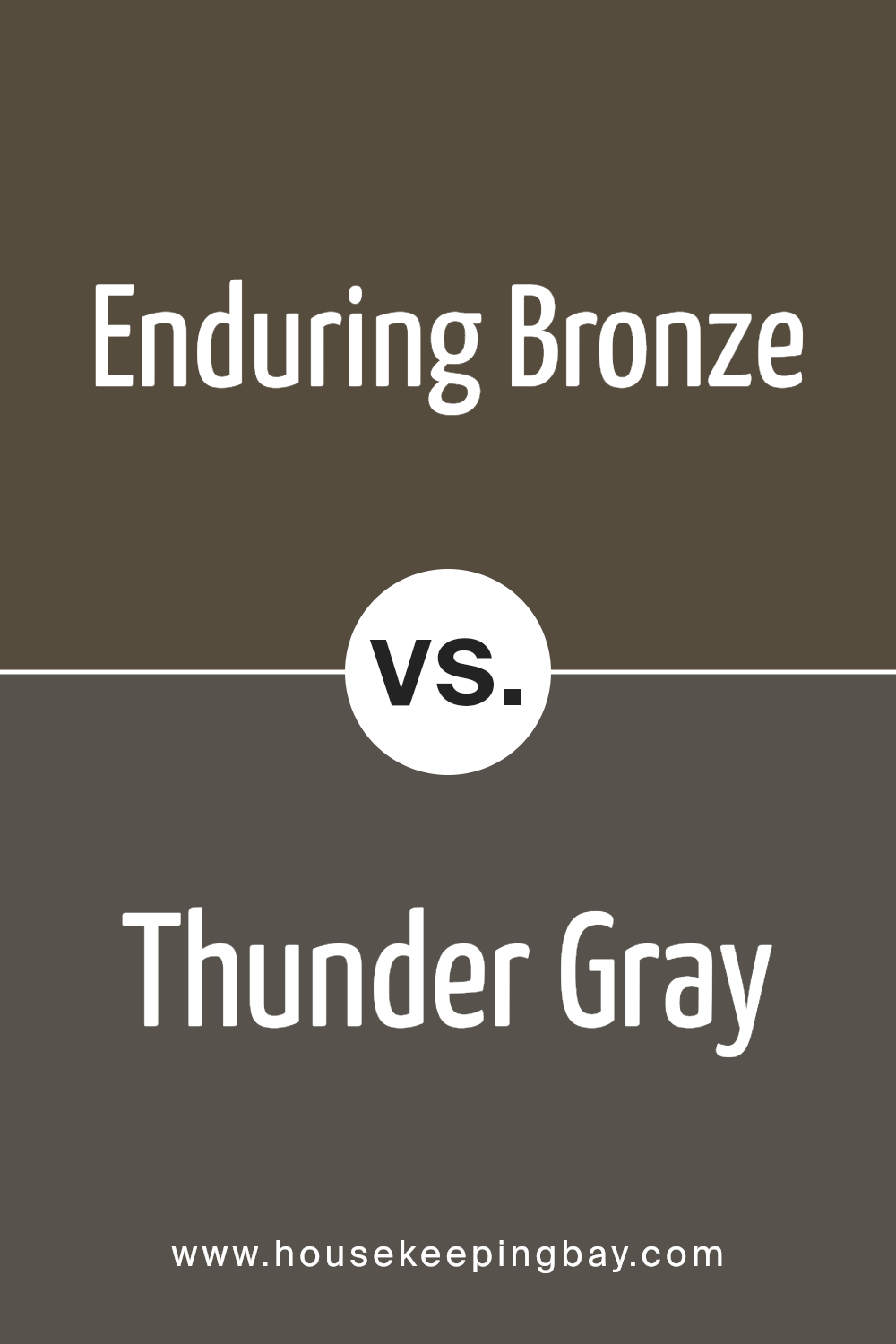
Enduring Bronze SW 7055 by Sherwin Williams vs Thunder Gray SW 7645 by Sherwin Williams
Enduring Bronze SW 7055 by Sherwin Williams is a unique and warm color that really brings a cozy feel to any space. It has a lovely depth that makes it stand out, almost like a warm cup of cocoa on a chilly day. It’s a kind of color that can make a room feel inviting and snug, perfect for creating a comforting atmosphere.
On the other hand, Thunder Gray SW 7645 by Sherwin Williams is a cooler, more muted shade. Think of it as the calm before the storm – it’s peaceful yet has a certain strength to it. This color can give a room a modern and sophisticated look. It’s the type of gray that works well in spaces that aim for a sleek and stylish vibe, adding a touch of elegance without being too overpowering.
Both colors are beautiful in their own right, with Enduring Bronze leaning towards warmth and coziness, and Thunder Gray bringing a chic and serene feel.
You can see recommended paint color below:
- SW 7645 Thunder Gray
housekeepingbay.com
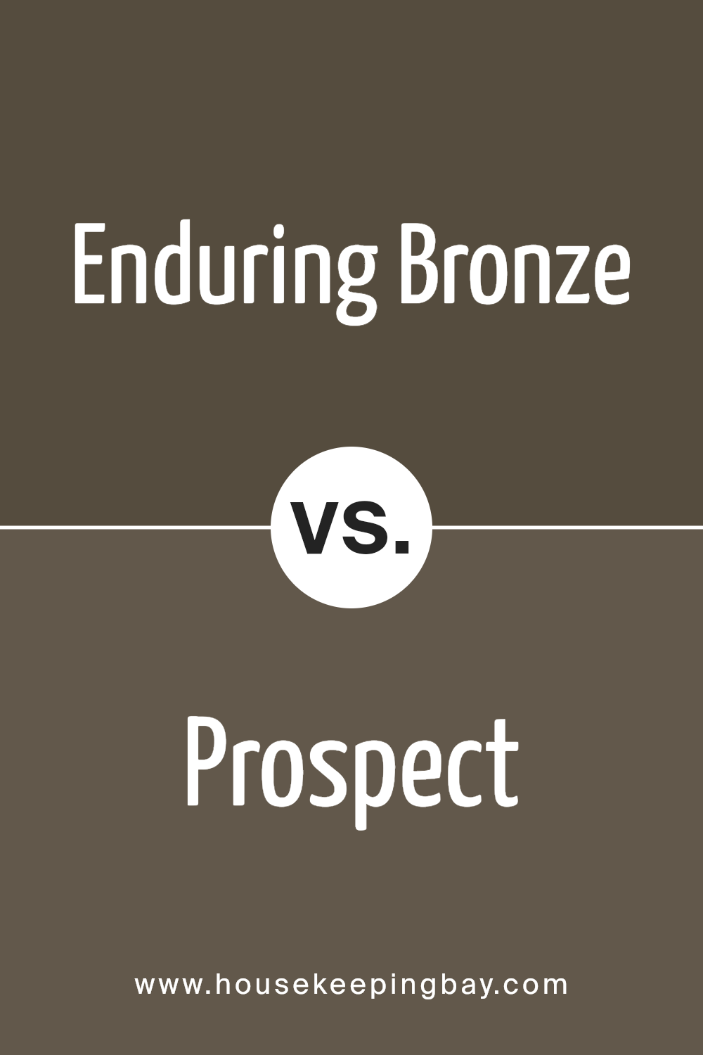
Enduring Bronze SW 7055 by Sherwin Williams vs Prospect SW 9615 by Sherwin Williams
Enduring Bronze SW 7055 by Sherwin Williams is a rich, deep color that feels like a warm hug in a room. It has a cozy vibe and brings a sense of comfort and stability wherever it’s used. Its earthy tones make it perfect for creating a snug and welcoming atmosphere in any space.
On the other hand, Prospect SW 9615 by Sherwin Williams is lighter and has a fresher appeal. It’s like the first day of spring in a paint can, offering a breath of fresh air and a clean, crisp background to any room. This color is more about renewal and lightness, with a subtle charm that makes the space feel open and airy.
In essence, while Enduring Bronze wraps a room in a warm embrace, making it feel like a safe, cozy haven, Prospect gives a room a fresh, clean slate, setting the stage for new beginnings. Both colors offer unique vibes – one is about comfort and rootedness, the other about freshness and light.
You can see recommended paint color below:
- SW 9615 Prospect
housekeepingbay.com
Enduring Bronze SW 7055 by Sherwin Williams vs Tungsten SW 9515 by Sherwin Williams
Enduring Bronze SW 7055 by Sherwin Williams is a rich, warm color with a deep, earthy vibe. It reminds you of a cozy, well-worn leather jacket or the subtle shades of the forest floor. It’s the kind of color that makes a room feel inviting and snug, giving off a natural, comforting feel.
On the other hand, Tungsten SW 9515 by Sherwin Williams has a cooler, more modern edge. It’s like the sleek, smooth surface of metal, offering a more refined and polished look. Tungsten carries a minimalistic charm, making it perfect for spaces that aim for a contemporary and clean design.
While both colors are beautiful, Enduring Bronze leans towards warmth and comfort, perfect for creating a cozy retreat. Tungsten, with its cooler tones, suits spaces that aim for a sharp, modern aesthetic. Each has its unique appeal, depending on the mood and style you want to achieve.
You can see recommended paint color below:
- SW 9515 Tungsten
housekeepingbay.com
Enduring Bronze SW 7055 by Sherwin Williams vs Status Bronze SW 7034 by Sherwin Williams
Enduring Bronze SW 7055 and Status Bronze SW 7034 by Sherwin Williams are two appealing shades, but they have their differences. Enduring Bronze leans more towards a warm, inviting tone. It’s a kind of color that feels cozy and comforting, perfect for creating a snug atmosphere in a room. It has a rich depth to it that makes spaces feel more welcoming and lived-in.
On the other hand, Status Bronze SW 7034 takes a slightly different path. It’s still in the bronze family but offers a lighter, more subtle approach. It doesn’t envelop a room as much as Enduring Bronze does; instead, it provides a gentle nudge of warmth and sophistication. This makes it a great choice for those wanting to add a hint of richness without overwhelming a space.
Both colors offer their unique charm and can beautifully transform a space whether you’re going for coziness with Enduring Bronze or a lighter, chic vibe with Status Bronze. Choosing between them depends on the mood and style you want to achieve in your room.
You can see recommended paint color below:
- SW 7034 Status Bronze
housekeepingbay.com
Enduring Bronze SW 7055 by Sherwin Williams vs Muddled Basil SW 7745 by Sherwin Williams
Enduring Bronze SW 7055 by Sherwin Williams is a rich, deep hue that hints at a blend of brown with subtle undertones of gray, creating a warm and cozy feel. This color is versatile, ideal for spaces where you want a touch of sophistication without overwhelming the area with darkness. It works well in both well-lit and dim rooms, adapting to the ambiance you want to create.
On the other hand, Muddled Basil SW 7745 is a unique green shade that brings a natural, earthy vibe to any space. It sits comfortably between the freshness of green and the depth of gray, offering a muted yet inviting color. Muddled Basil is great for adding a hint of nature to interiors, suitable for those looking to inject a serene and calming atmosphere into their home.
Comparing the two, Enduring Bronze offers a warm, inviting richness, perfect for creating a cozy, enveloping space, while Muddled Basil leans more towards a natural, refreshing, and calm aesthetic, ideal for spaces intended to relax and rejuvenate.
You can see recommended paint color below:
- SW 7745 Muddled Basil
housekeepingbay.com
Enduring Bronze SW 7055 by Sherwin Williams vs Nocturne SW 9520 by Sherwin Williams
Enduring Bronze SW 7055 by Sherwin Williams is a warm, rich tone that feels cozy and inviting. It’s like a hug from your favorite blanket, offering a sense of comfort and security. This color works well in living rooms, bedrooms, or any space where you want to create a welcoming vibe. It pairs nicely with natural elements like wood and leather, adding to its homey feel.
On the other hand, Nocturne SW 9520 by Sherwin Williams is cooler and more mysterious. Picture the sky just after sunset, that deep, reflective blue that’s calming and a bit intriguing. It’s a color that suits modern, sophisticated spaces, perfect for an accent wall or a room where you want a touch of drama without going over the top. It plays well with metallics and glass, bringing a touch of elegance and depth to the space.
Comparing the two, Enduring Bronze brings warmth and comfort, while Nocturne offers cool sophistication. Both have their unique charm, making them suitable for different moods and settings.
You can see recommended paint color below:
housekeepingbay.com
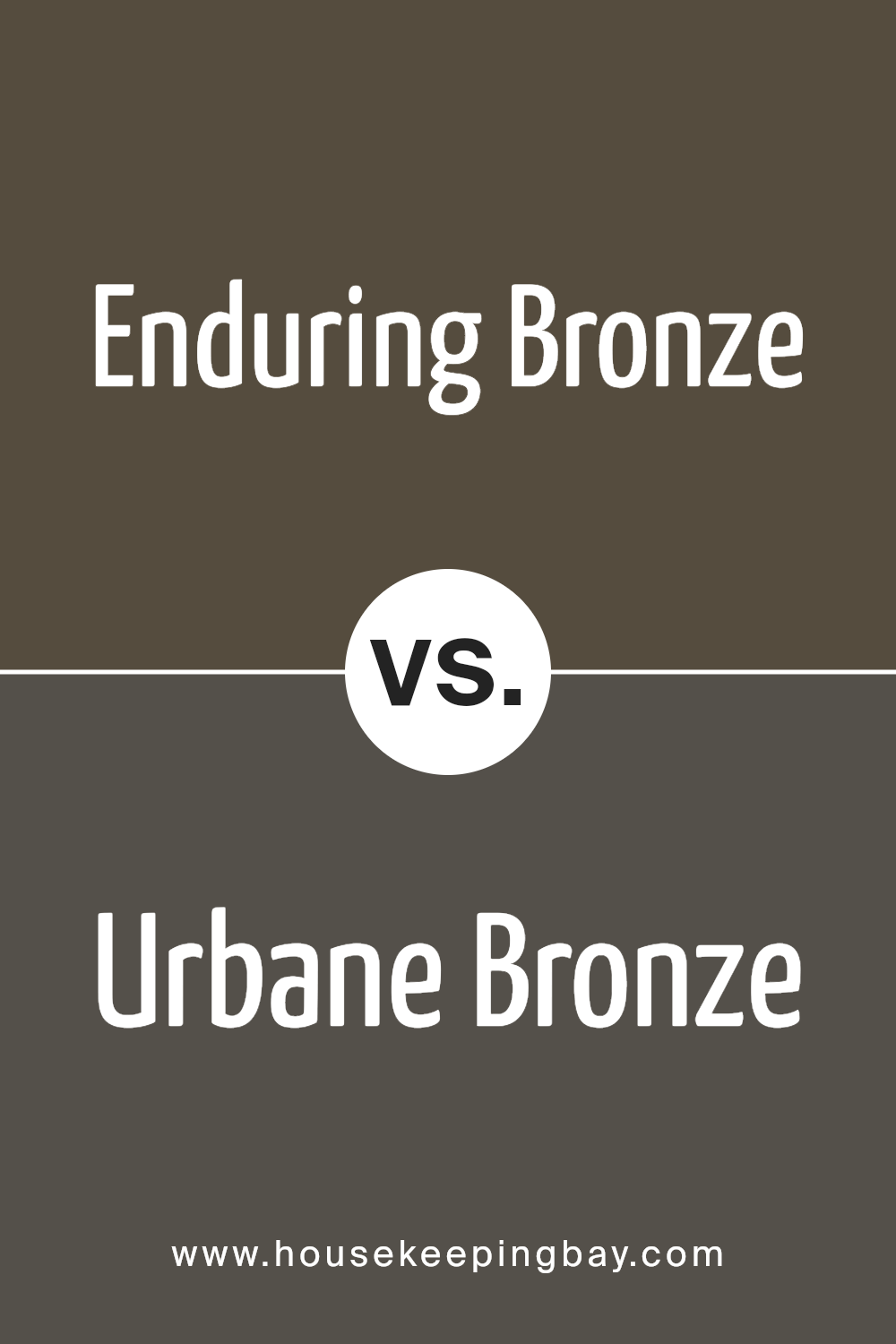
Enduring Bronze SW 7055 by Sherwin Williams vs Urbane Bronze SW 7048 by Sherwin Williams
Enduring Bronze SW 7055 by Sherwin Williams and Urbane Bronze SW 7048 from the same brand are two sophisticated and elegant shades. Enduring Bronze has a warmer, slightly lighter tone that feels cozy and inviting in a space. It’s a great choice if you want to add a soft, warm touch to your rooms, making them feel more comfortable and welcoming.
On the other hand, Urbane Bronze SW 7048 is darker and has more depth, giving it a stronger presence. This color is perfect for creating a bold statement in your space, providing a rich backdrop that can make decor elements pop. It’s a bit more intense and can bring a modern, chic look to a room.
Although both colors share a bronze foundation, the main difference lies in their brightness and warmth. Enduring Bronze offers a lighter, warmer approach, while Urbane Bronze leans towards a cooler, more dramatic flair. Choosing between them depends on the atmosphere you want to create – a cozy, inviting space with Enduring Bronze or a sophisticated, striking area with Urbane Bronze.
You can see recommended paint color below:
housekeepingbay.com
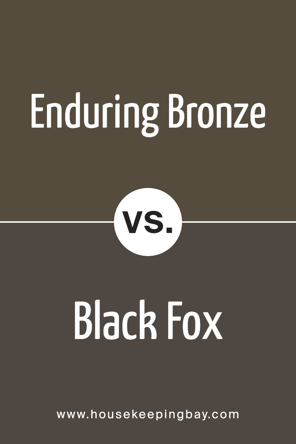
Enduring Bronze SW 7055 by Sherwin Williams vs Black Fox SW 7020 by Sherwin Williams
Enduring Bronze SW 7055 by Sherwin Williams is a unique color, offering a cozy and warm feel to any space. It’s like a gentle hug for your walls, providing a touch of elegance without being too overwhelming. This color leans towards a soft, muted brown with hints of gray, making it versatile for various decorating styles.
On the other hand, Black Fox SW 7020 by Sherwin Williams is a much darker shade. It’s a strong and rich color, almost like a dark chocolate mixed with a bit of charcoal. Black Fox brings a bold and sophisticated vibe, perfect for creating a statement. It works well in places you want to add depth and drama, acting as an excellent backdrop for brighter colors or metallic accents.
While both colors come from the same family, Enduring Bronze offers a lighter, more earthy feel, and Black Fox presents a deeper, more intense look. Each can set the mood in a room, from cozy and welcoming with Enduring Bronze to bold and dramatic with Black Fox.
You can see recommended paint color below:
- SW 7020 Black Fox
housekeepingbay.com
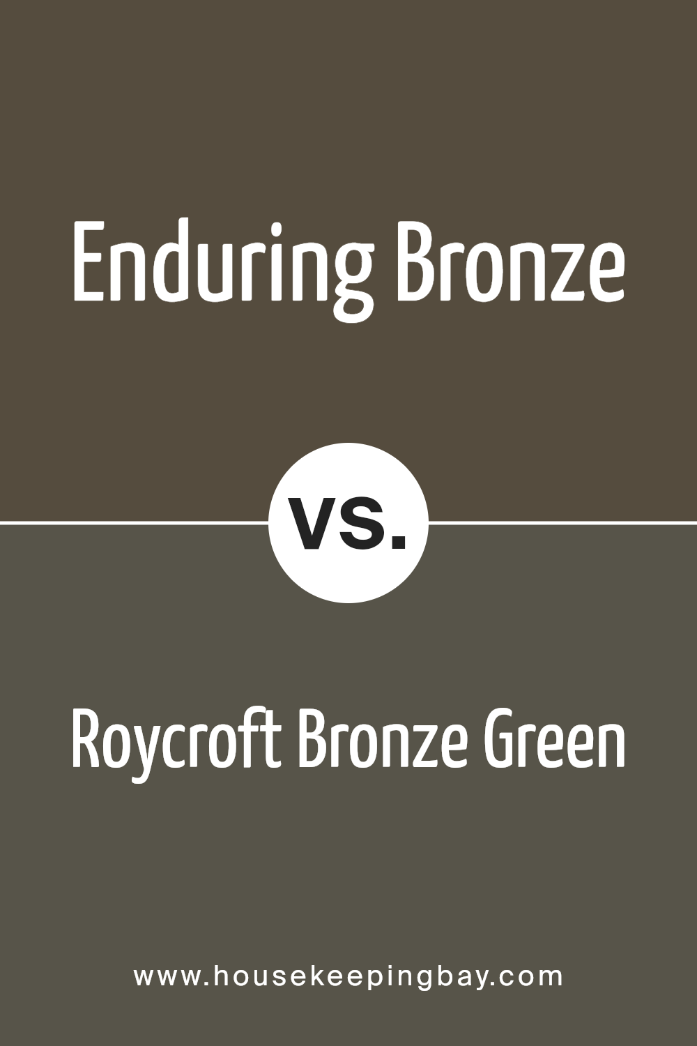
Enduring Bronze SW 7055 by Sherwin Williams vs Roycroft Bronze Green SW 2846 by Sherwin Williams
Enduring Bronze SW 7055 by Sherwin Williams is a rich, warm neutral shade. It strikes a balance between a deep tan and a soft, welcoming brown, offering a cozy and inviting atmosphere. This color is versatile, fitting well in spaces that aim for a grounded, earthy feel, or in rooms looking for a touch of sophistication without being too dark.
On the other hand, Roycroft Bronze Green SW 2846 from Sherwin Williams leans more towards an earthy, natural tone with a distinct green undertone. This shade is reminiscent of forest hues, providing a sense of calm and connection to nature. It’s ideal for spaces where you want to add depth and character with a nod to the outdoors.
Both colors share a natural warmth, but while Enduring Bronze brings a subtle sophistication with its brownish tones, Roycroft Bronze Green introduces a unique, green-infused earthiness that can transform a space into a more tranquil, organic retreat. These differences make each color well-suited for various décor styles and personal preferences, serving different moods and atmospheres in home or commercial settings.
You can see recommended paint color below:
housekeepingbay.com
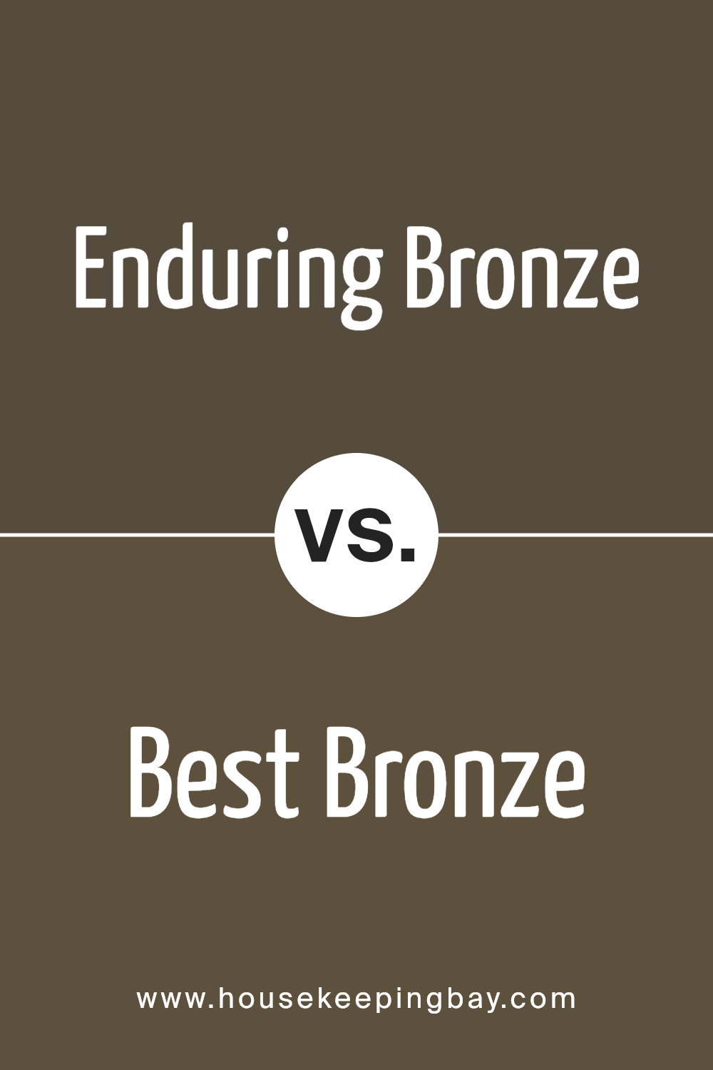
Enduring Bronze SW 7055 by Sherwin Williams vs Best Bronze SW 6160 by Sherwin Williams
Enduring Bronze is a versatile color. It gives off a warm, welcoming feeling, making it great for spaces where you hang out or relax, like living rooms or bedrooms. This color has a nice balance, not too dark or too light, just sitting comfortably in the middle. It creates a cozy atmosphere without making the room feel enclosed.
On the other hand, Best Bronze is a bit stronger and darker. It carries more weight in its color, making it perfect for adding a sense of richness and depth to a space. It’s great for accent walls or areas where you want to draw attention. Despite its boldness, Best Bronze manages to stay warm and inviting, adding character to any room.
In simple terms, if you want a color that’s light, cozy, and versatile, go with Enduring Bronze. If you’re looking for something with a bit more impact and depth, Best Bronze is your go-to. Both colors bring warmth but in their unique way, depending on how bold or subtle you want to go with your space.
You can see recommended paint color below:
- SW 6160 Best Bronze
housekeepingbay.com
Conclusion
In conclusion, SW 7055 Enduring Bronze by Sherwin Williams stands as a solid choice if you’re looking to infuse your space with a warm, welcoming atmosphere. This paint color has the exceptional ability to add depth and character to any room, making it feel both cozy and elegant at the same time. Its versatility is one of its strongest suits – whether you’re aiming for a classic look in your living room or seeking to bring a touch of sophistication to your bedroom, Enduring Bronze has got you covered. Moreover, its durability ensures that your walls will look fantastic for years to come, making it a smart investment for your home.
If you’re considering a change and want something that combines beauty with longevity, giving your space a rich and inviting feel, then SW 7055 Enduring Bronze is definitely worth your attention. It’s a choice that you won’t regret, adding not just color, but a sense of tranquility and style to your home.
housekeepingbay.com
Ever wished paint sampling was as easy as sticking a sticker? Guess what? Now it is! Discover Samplize's unique Peel & Stick samples. Get started now and say goodbye to the old messy way!
Get paint samples


