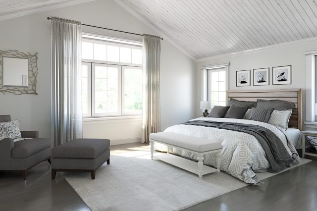
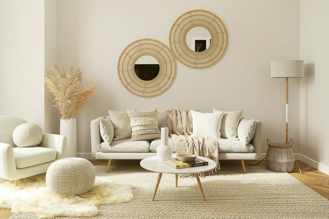
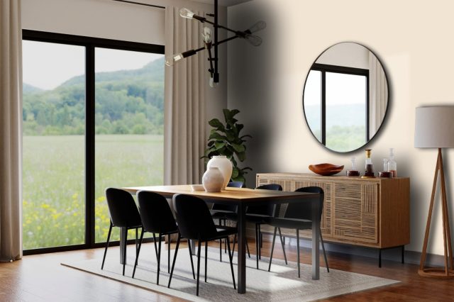
Dumpling SW 9616 by Sherwin Williams
Warmth in Every Brush Stroke
Embarking on a journey to freshen up your home can be thrilling, and picking out the perfect paint color is a crucial first step.
If you’re in search of a shade that brings warmth and comfort to any room, look no further than SW 9616 Dumpling by Sherwin Williams.
This beautiful color is a subtle, creamy hue that instantly makes spaces feel more inviting and cozy. It’s versatile enough to work in a variety of settings, from kitchens and living rooms to bedrooms and bathrooms.
Whether you’re aiming for a modern minimalist look or a more traditional ambiance, Dumpling can fit seamlessly into your vision.
Beyond its aesthetic appeal, Dumpling by Sherwin Williams also offers excellent coverage and durability, making it a practical choice for busy households.
It pairs wonderfully with a wide range of decor styles and other colors, allowing you to easily match it with furniture, fabrics, and accessories.
Choosing SW 9616 Dumpling for your next home improvement project is an easy way to add a touch of warmth and personality to your space.
Its inviting nature and adaptability make it a fantastic option for anyone looking to refresh their home’s look without overwhelming it.
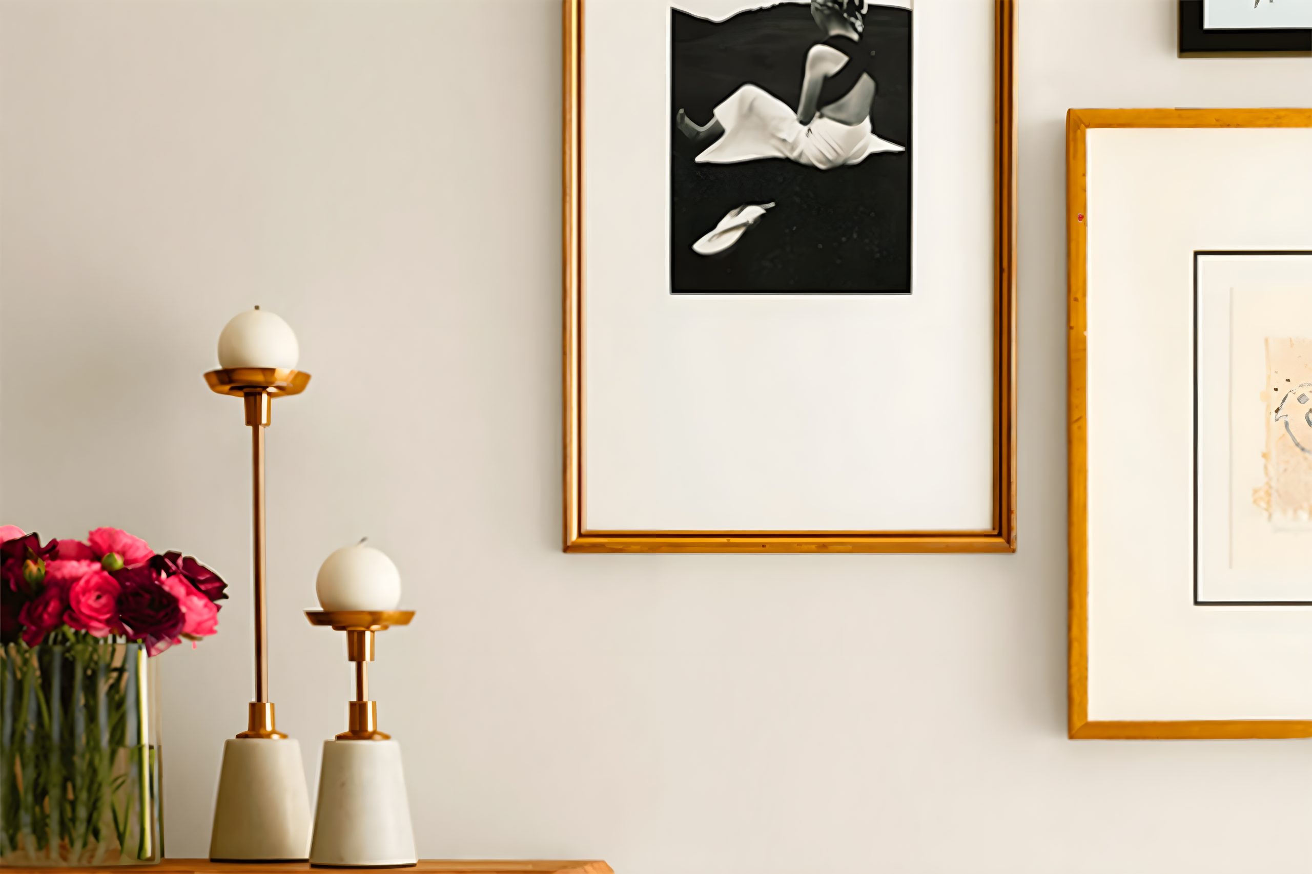
via sherwin-williams.com
What Color Is Dumpling SW 9616 by Sherwin Williams?
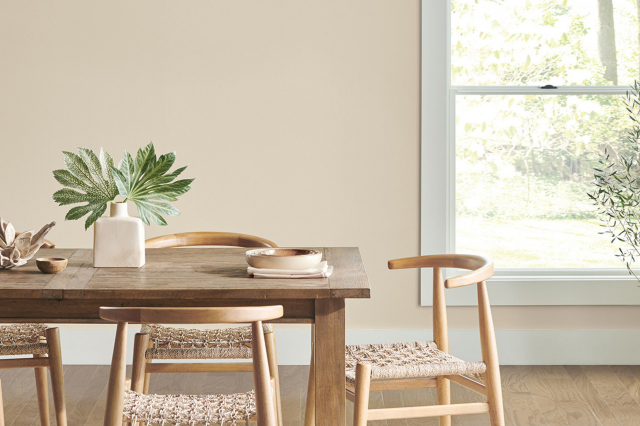
Dumpling SW 9616 by Sherwin Williams is a warm, inviting color that brings a sense of comfort and coziness to any space. This hue is a soft, creamy white with subtle yellow undertones that give it a plush, velvety feel.
It radiates a gentle, welcoming vibe, making spaces feel more homely and lived-in.
Dumpling is versatile and works exceptionally well in various interior styles. It shines in farmhouse and rustic settings, where its warmth compliments natural wood finishes, adding a layer of brightness without overpowering the room’s earthy charm.
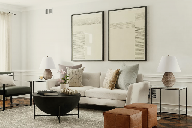
In modern and minimalist designs, Dumpling adds depth and warmth, preventing spaces from feeling too stark or cold.
It allows contemporary furniture and metal accents to stand out, providing a soft backdrop that enhances the overall look.
When it comes to materials and textures, Dumpling pairs wonderfully with a broad range. It looks stunning with natural elements like wood and stone, enhancing their natural beauty without competing for attention.
Textiles such as linen, wool, and cotton in neutral or earthy tones work beautifully against this backdrop, promoting a sense of calmness and comfort. Metal accents in brass or copper can introduce a touch of elegance, making the space feel more refined yet welcoming.
In conclusion, Dumpling SW 9616 is a superb choice for creating spaces that feel warm, inviting, and effortlessly stylish.
Its adaptability across different styles and materials makes it a go-to color for anyone looking to infuse their home with a cozy, yet sophisticated ambiance.
housekeepingbay.com
Table of Contents
Is Dumpling SW 9616 by Sherwin Williams Warm or Cool color?
Dumpling SW 9616 by Sherwin Williams is a unique paint color that brings a cozy and inviting atmosphere into any home. This color has a soft, nurturing quality that works well in many rooms, from living areas to bedrooms.
Dumpling is like a warm hug; it makes spaces feel more welcoming and comfortable. Its softness allows it to blend with different styles and decorations, making it very versatile.
Because Dumpling is a gentle color, it does a great job of making rooms look brighter and more spacious while still adding a touch of warmth. It’s a color that doesn’t demand attention but instead subtly enhances the beauty of any room.
Whether you’re looking to create a peaceful reading nook or a friendly living space, Dumpling can help achieve that serene and homey feel.
Furthermore, Dumpling pairs nicely with various colors, from crisp whites to bold hues, allowing homeowners to experiment with their decor.
This adaptability means that regardless of your home’s style, Dumpling can fit right in, making it easier to update your space without a complete overhaul. It’s perfect for those looking to freshen up their home with a color that offers both peace and versatility.
What is the Masstone of the Dumpling SW 9616 by Sherwin Williams?
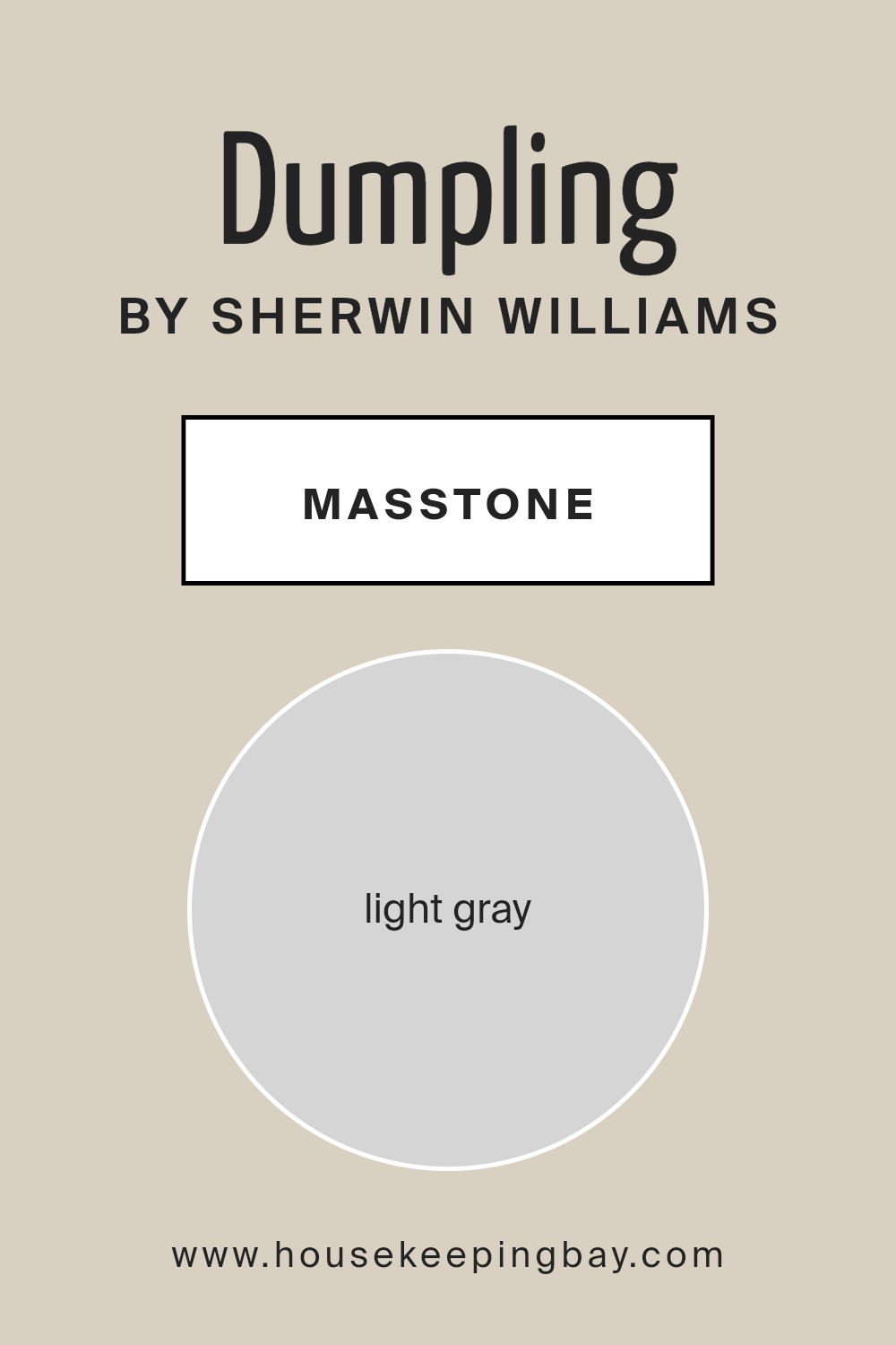
DumplingSW 9616 by Sherwin Williams has a masstone, or main color, of light gray, marked by the color code #D5D5D5. This soothing shade serves as a versatile choice for homes, fitting into a wide range of decorating styles.
Its light gray color brings a sense of calm and serenity, making rooms feel more spacious and open. Because it’s so understated, it works well in any room, from kitchens to bedrooms, acting as a quiet backdrop that lets your furniture and decor shine.
This color is especially good for creating a peaceful, restful environment, perfect for relaxing after a long day.
Light gray has the advantage of matching well with both bright and pastel colors, giving homeowners the freedom to add personal touches through colorful accessories or wall art.
Whether you prefer a modern, minimalistic look or something more cozy and traditional, DumplingSW 9616 can easily adapt, making it a smart choice for those looking to refresh their space without committing to a bold color scheme.
housekeepingbay.com
Undertones of Dumpling SW 9616 by Sherwin Williams
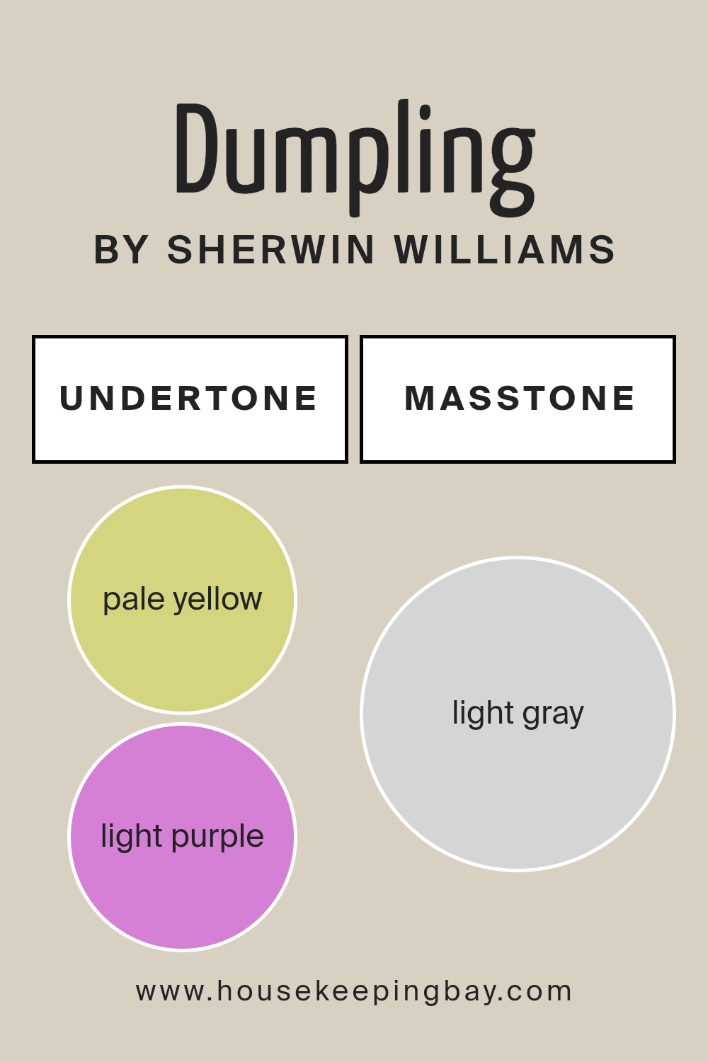
The color Dumpling SW 9616 from Sherwin Williams has undertones that can really change how you see it once it’s on your walls. Let’s talk about these undertones: pale yellow and light purple.
When we mention “undertones”, we’re talking about the hidden colors that aren’t immediately obvious when you look at the paint but can make a big difference in different lights or next to other colors.
Think of undertones like secret ingredients in your favorite dish. Just as a bit of spice can alter a recipe, undertones can subtly change the way a paint color looks.
For Dumpling SW 9616, the pale yellow undertone adds a warm, soft glow, making a room feel cozy and welcoming. On the other hand, the light purple undertone brings in a hint of cool sophistication that can make the space feel a bit more refined and elegant.
When you put Dumpling SW 9616 on your walls, these undertones work together to give the color depth and complexity.
In bright sunlight, the yellow may make the room feel sunny and cheerful. In the evening, under artificial light, the purple might come forward, giving the room a calm, serene vibe.
This means the paint can transition beautifully throughout the day and in different lighting conditions, making your space feel dynamic and multi-faceted.
Understanding these undertones helps in choosing decor and furnishings as well. Knowing Dumpling has these yellow and purple hints allows you to select items that either complement or contrast beautifully, depending on the look you’re going for.
It’s a versatile color that offers more than just a simple hue for your walls; it’s like a backdrop that changes and adapts, giving your room real personality.
housekeepingbay.com
How Does Lighting Affect Dumpling SW 9616 by Sherwin Williams?
Lighting plays a crucial role in how we perceive colors. A color might look one way under the sun’s bright rays but entirely different under the soft glow of a lamp.
Let’s talk about how Sherwin Williams’ DumplingSW 9616, a warm and cozy hue, changes its appearance under various lighting conditions.
In artificial light, the warmth of DumplingSW 9616 can either be enhanced or slightly muted, depending on the type of bulb used.
LED or fluorescent lights, which often have a cooler tone, might make DumplingSW 9616 appear more subdued, not fully displaying its warm undertones.
On the other hand, incandescent lighting, with its warmer glow, can enrich this color, making it feel more inviting and cozy.
Natural light brings its magic to colors, and DumplingSW 9616 is no exception. In a room with plenty of sunlight, this color lights up, showing off its warm and cheerful personality. However, the direction of the room plays a big part in this visual dance.
North-faced rooms receive less direct sunlight, making them cooler and more shadowy. Here, DumplingSW 9616 might look a bit more reserved, not fully showing its warmth, potentially leaning towards a more neutral appearance.
South-faced rooms bask in warm, direct sunlight for most of the day, making DumplingSW 9616 glow. Its warm undertones come alive, creating a space that feels welcoming and snug.
East-faced rooms get bright morning light, which can make DumplingSW 9616 look lively and vibrant in the morning, fading into a softer, more muted version in the afternoon as the natural light dims.
West-faced rooms catch the afternoon and evening light, which can bring out the warmth in DumplingSW 9616 even more. As the sun sets, the color can appear richer and more dynamic.
In all, lighting—whether artificial or natural—significantly influences how we see and feel about colors.
DumplingSW 9616’s warm charm can shift from being boldly cozy to softly inviting depending on the light, making it a versatile choice for any space.
housekeepingbay.com
What is the LRV of Dumpling SW 9616 by Sherwin Williams?
LRV stands for Light Reflectance Value, which is a measurement used to describe the amount of visible and usable light that gets reflected from a surface when light shines on it.
Think of LRV as a scale from 0 to 100, where 0 is completely black, absorbing all light, and 100 is pure white, reflecting all light back. This value helps you understand how light or dark a color will look on your walls and how much it can brighten up a space by reflecting light.
Colors with a higher LRV make rooms feel more open and airy because they reflect more light, while those on the lower end can make spaces feel cozier but smaller since they absorb more light.
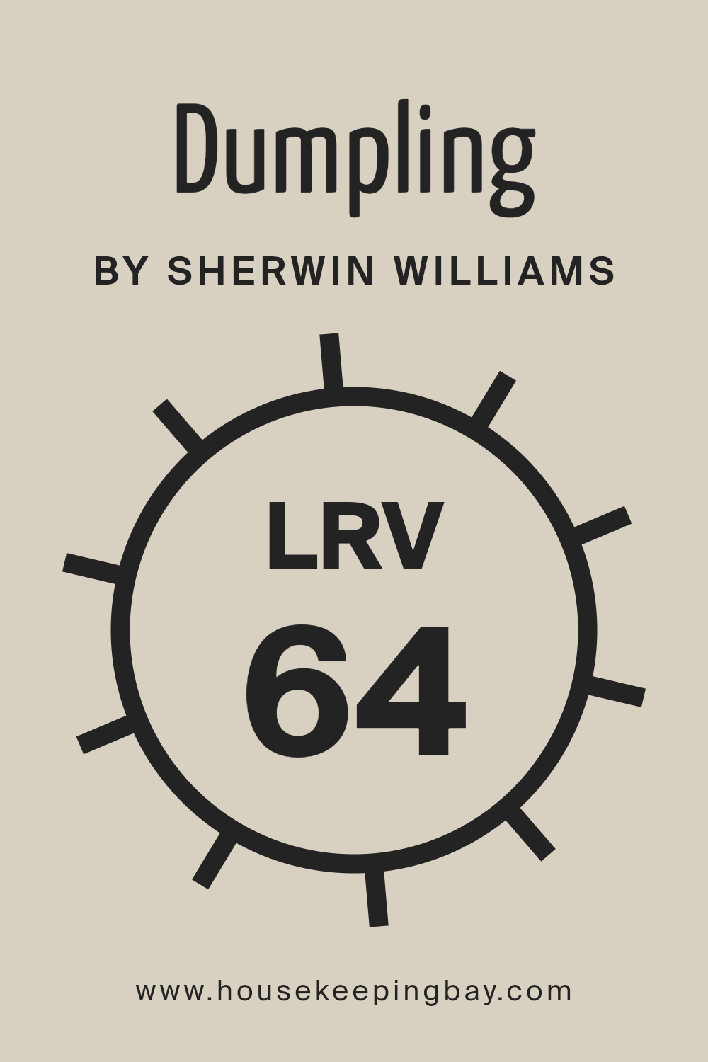
The LRV of DumplingSW 9616 by Sherwin Williams is 63.543, which means it has a moderately high ability to reflect light. This particular shade of paint will have a light and brightening effect on a room, making it feel more spacious and welcoming.
The color can significantly enhance the brightness of a space that receives a decent amount of natural light, making the most out of it and creating a pleasant, uplifting environment.
Since it’s not too close to the higher end of the LRV scale, it won’t feel stark or overly bright but will offer a warm and inviting quality to the interiors.
housekeepingbay.com
What is LRV? Read It Before You Choose Your Ideal Paint Color
What are the Trim colors of Dumpling SW 9616 by Sherwin Williams?
Trim colors are essentially the accent colors used on features like door frames, window frames, baseboards, and crown moldings. When it comes to painting a room or the exterior of a house, choosing the right trim color can significantly affect the overall look and feel of the space.
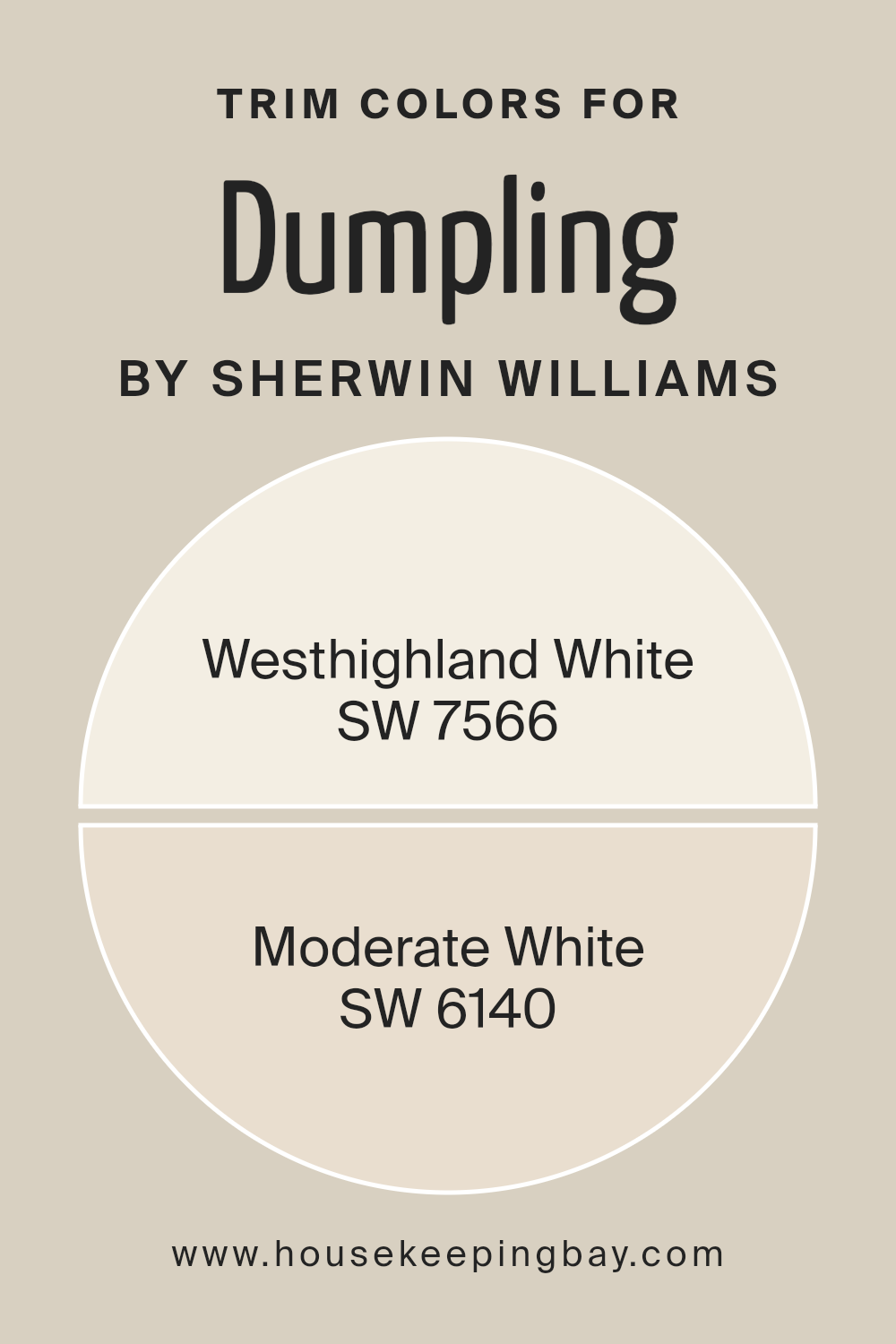
For DumplingSW 9616 by Sherwin Williams, a warm and inviting hue, picking the perfect trim colors like SW 7566 – Westhighland White and SW 6140 – Moderate White can help highlight and complement this main color, enhancing the overall aesthetic and creating a cohesive design scheme.
Westhighland White is a bright and creamy white that brings a clean, refreshing touch to any space when used as a trim color.
It has the power to make the main color, like DumplingSW 9616, pop and stand out, giving a room or exterior a more crisp and polished look.
On the other hand, Moderate White is a softer, more subdued shade of white with a slight warmth to it, offering a gentler transition between the wall color and the trim.
This color is excellent for creating a subtle yet impactful contrast that enriches the surroundings without overwhelming the senses.
Together, these trim colors provide versatility and can beautifully accentuate the charm and personality of DumplingSW 9616, making them an important aspect of the color scheme.
You can see recommended paint colors below:
housekeepingbay.com
Colors Similar to Dumpling SW 9616 by Sherwin Williams
Using similar colors, like the ones akin to Dumpling SW 9616 by Sherwin Williams, plays a crucial role in design for creating a harmonious and balanced look.
These colors, sharing similar undertones or intensities, help in crafting spaces that feel cohesive and thoughtfully put together.
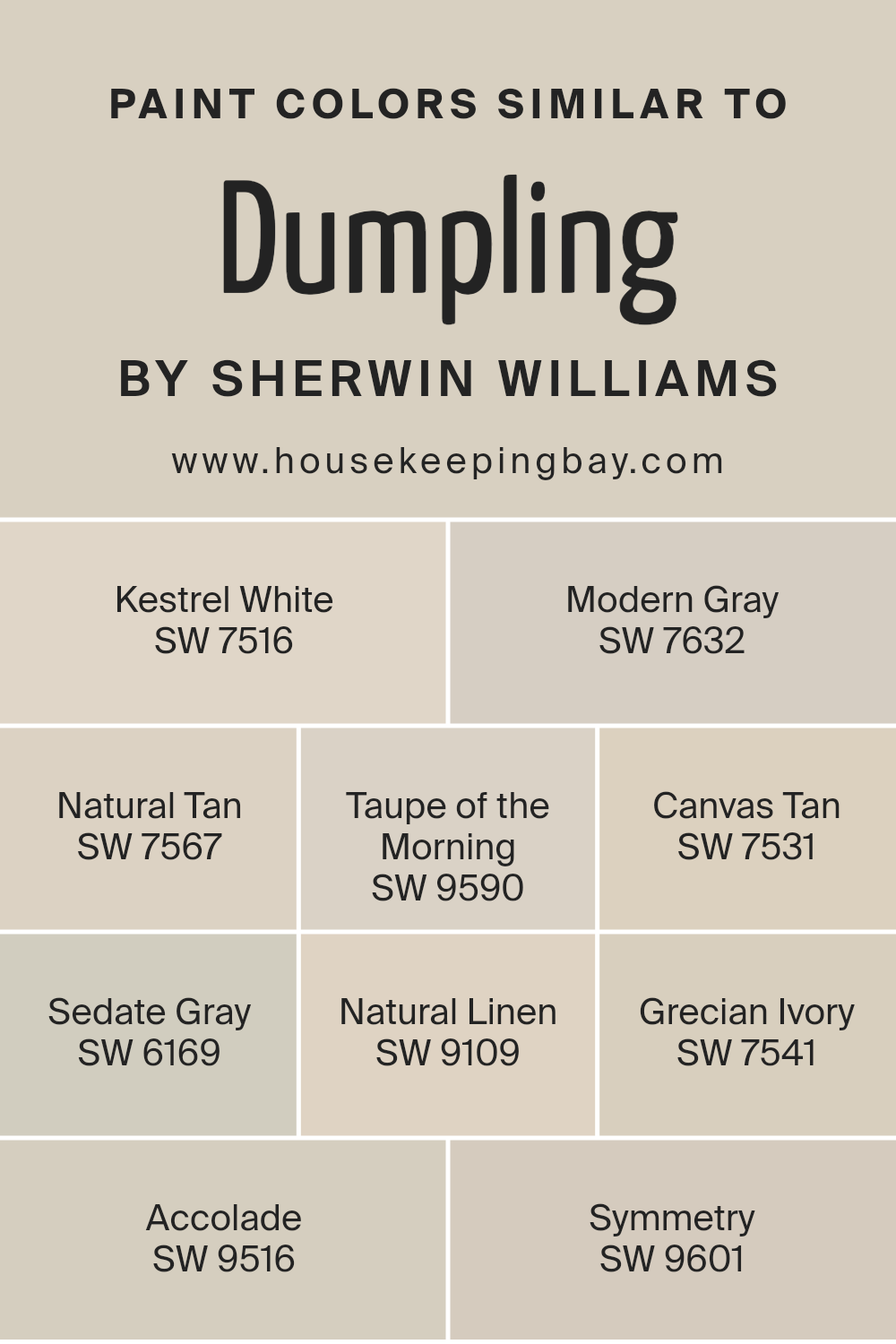
For example, SW 7516 – Kestrel White offers a soft, airy backdrop, making it a perfect canvas for any room, while SW 7632 – Modern Gray adds a sleek, contemporary touch with its subtle cool hues.
Natural Tan SW 7567 introduces a warm, inviting feel, reminiscent of earthy elements, and Taupe of the Morning SW 9590 extends a muted elegance that effortlessly blends with different decor styles.
Canvas Tan SW 7531 infuses spaces with a light, sun-kissed vibrancy that’s both refreshing and comforting. Sedate Gray SW 6169 is a versatile shade that bridges the gap between neutral and statement with its quiet sophistication.
Natural Linen SW 9109 weaves a delicate balance of warmth and neutrality, perfect for creating a serene retreat. Grecian Ivory SW 7541 exudes a classical beauty with its subtle, creamy tones.
Accolade SW 9516 brings a gentle depth to walls with its understated richness, and Symmetry SW 9601 showcases an impeccable balance of light and shadow, making it an ideal choice for a polished, refined look.
Each color, while unique, shares a commonality with Dumpling SW 9616, aiming to enrich spaces with their nuanced complexity and effortless compatibility.
You can see recommended paint colors below:
- SW 7516 Kestrel White
- SW 7632 Modern Gray
- SW 7567 Natural Tan
- SW 9590 Taupe of the Morning
- SW 7531 Canvas Tan
- SW 6169 Sedate Gray
- SW 9109 Natural Linen
- SW 7541 Grecian Ivory
- SW 9516 Accolade
- SW 9601 Symmetry
housekeepingbay.com
How to Use Dumpling SW 9616 by Sherwin Williams In Your Home?
Dumpling SW 9616 by Sherwin Williams is a warm, creamy paint color that can add a cozy touch to any room in your home. Whether you’re looking to freshen up your living room, bedroom, or kitchen, this versatile shade can do the trick.
Its softness makes it perfect for creating a relaxing atmosphere where you can unwind after a long day. In the living room, it pairs beautifully with natural elements like wooden furniture or green plants, bringing a sense of calm and comfort.
In the bedroom, using Dumpling on the walls can help make the space feel more inviting and snug, perfect for a good night’s sleep.
In the kitchen, it can help brighten the space and make it feel more open, especially when combined with white cabinets or countertops.
Overall, Dumpling SW 9616 is a great choice for anyone looking to add a gentle, warm touch to their home.
Dumpling SW 9616 by Sherwin Williams vs Natural Tan SW 7567 by Sherwin Williams
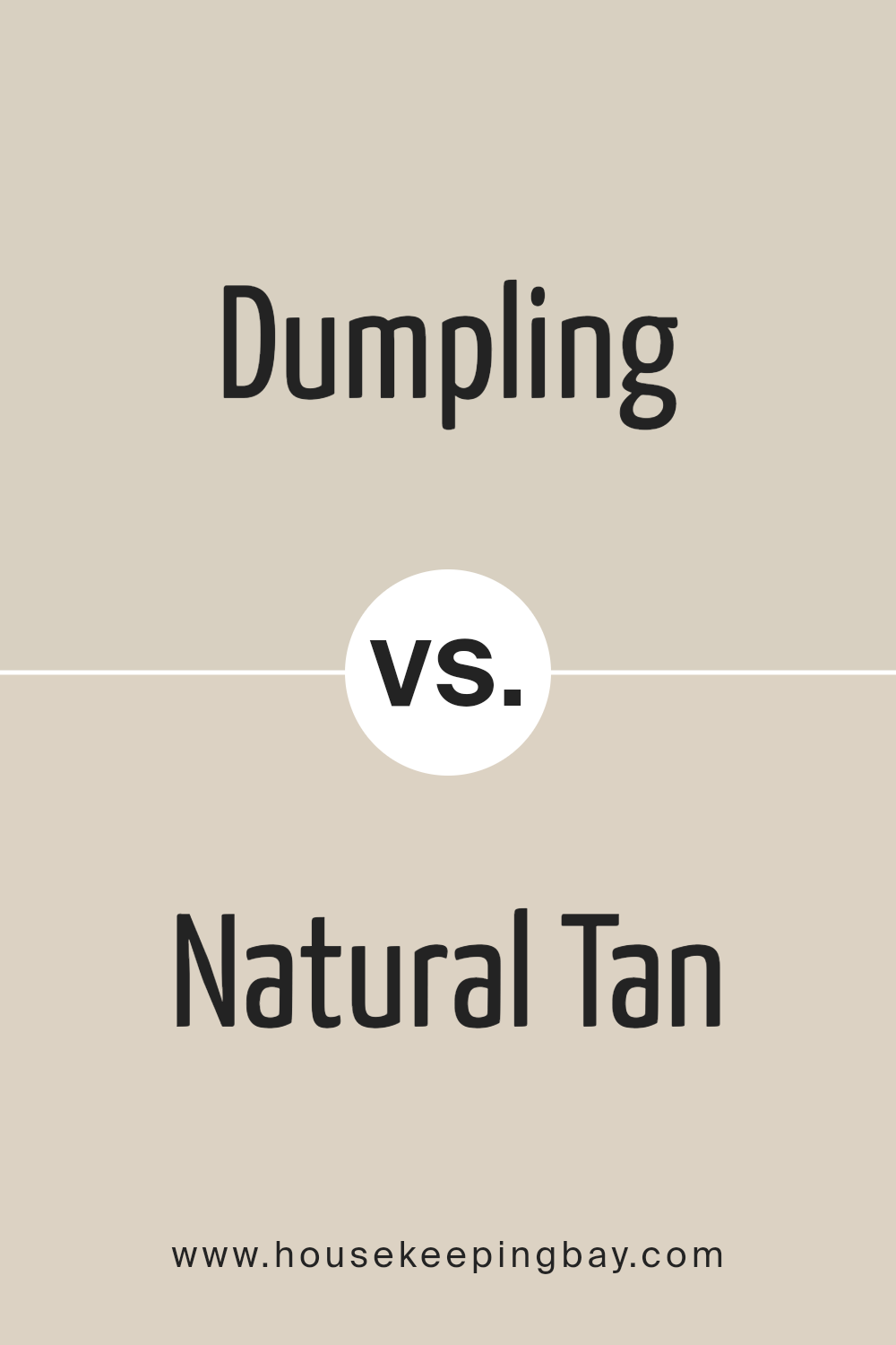
Dumpling SW 9616 by Sherwin Williams and Natural Tan SW 7567 share some similarities as they both belong to the warm, neutral family, yet they have distinct differences.
Dumpling has a creamy, almost buttery feel to it, offering a cozy and inviting warmth to any room. It leans towards a lighter, softer presence, making spaces feel calm and relaxed.
On the other hand, Natural Tan is a bit deeper and richer. It holds a stronger presence, bringing an earthy warmth that’s grounding and solid.
While Dumpling might brighten up a small room and give it an airy feel, Natural Tan provides a sense of stability and comfort, ideal for creating a welcoming space.
Both colors can beautifully complement each other, with Dumpling acting as a lighter accent to the more pronounced warmth of Natural Tan.
Together, they can create a harmonious balance, perfect for anyone looking to blend softness with a subtly robust character in their decor.
You can see recommended paint color below:
housekeepingbay.com
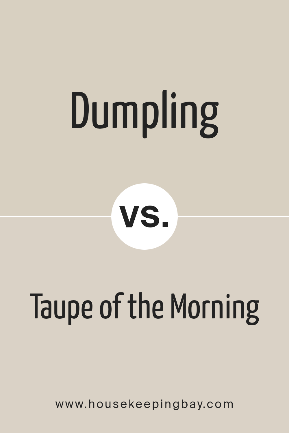
Dumpling SW 9616 by Sherwin Williams vs Taupe of the Morning SW 9590 by Sherwin Williams
Dumpling SW 9616 and Taupe of the Morning SW 9590 by Sherwin Williams are two unique colors that bring their own vibe to a space.
Dumpling has a cozy, warm feel, akin to being wrapped in a soft blanket. It’s a creamy shade, giving off a light and inviting aura perfect for making rooms feel welcoming.
On the other hand, Taupe of the Morning has a more grounded, earthy tone.
This color leans towards a subtle grey-brown, reminiscent of the peaceful moments at dawn. It’s excellent for creating a serene, calm atmosphere in any room.
While both colors share a common warmth, Dumpling feels lighter and more open, making spaces appear brighter. Taupe of the Morning, with its deeper tone, offers a sense of grounding and sophistication.
Their distinct qualities mean they can work well together, with Dumpling brightening a space and Taupe of the Morning adding depth and tranquility.
You can see recommended paint color below:
- SW 9590 Taupe of the Morning
housekeepingbay.com
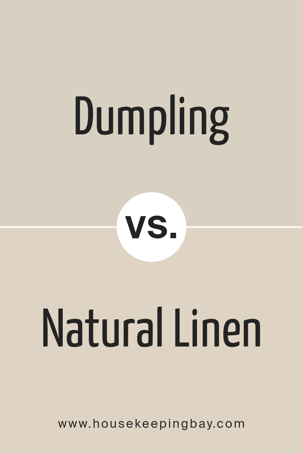
Dumpling SW 9616 by Sherwin Williams vs Natural Linen SW 9109 by Sherwin Williams
Dumpling SW 9616 by Sherwin Williams is a warm, creamy color that feels cozy and inviting. It has a softness to it, making it perfect for creating a comfortable and relaxing space.
It’s like the color of a light, fluffy biscuit or a warm, inviting vanilla custard. It brings a sense of calmness and warmth to any room, almost like being wrapped in a gentle hug.
On the other hand, Natural Linen SW 9109 by Sherwin Williams is a bit more grounded and earthy. It has a natural, soft beige tone that reminds you of linen fabric or a sandy beach.
This color is versatile and calming, offering a slightly more neutral and organic feel compared to Dumpling. It’s great for spaces where you want to add a touch of nature and simplicity, making the room feel open and airy.
Both colors are beautiful in their own way, with Dumpling providing a warmer, cozier vibe, and Natural Linen offering a cleaner, more natural atmosphere.
They’re perfect for creating inviting, comfortable spaces, but the choice between them depends on the mood and feel you’re aiming for in your space.
You can see recommended paint color below:
housekeepingbay.com
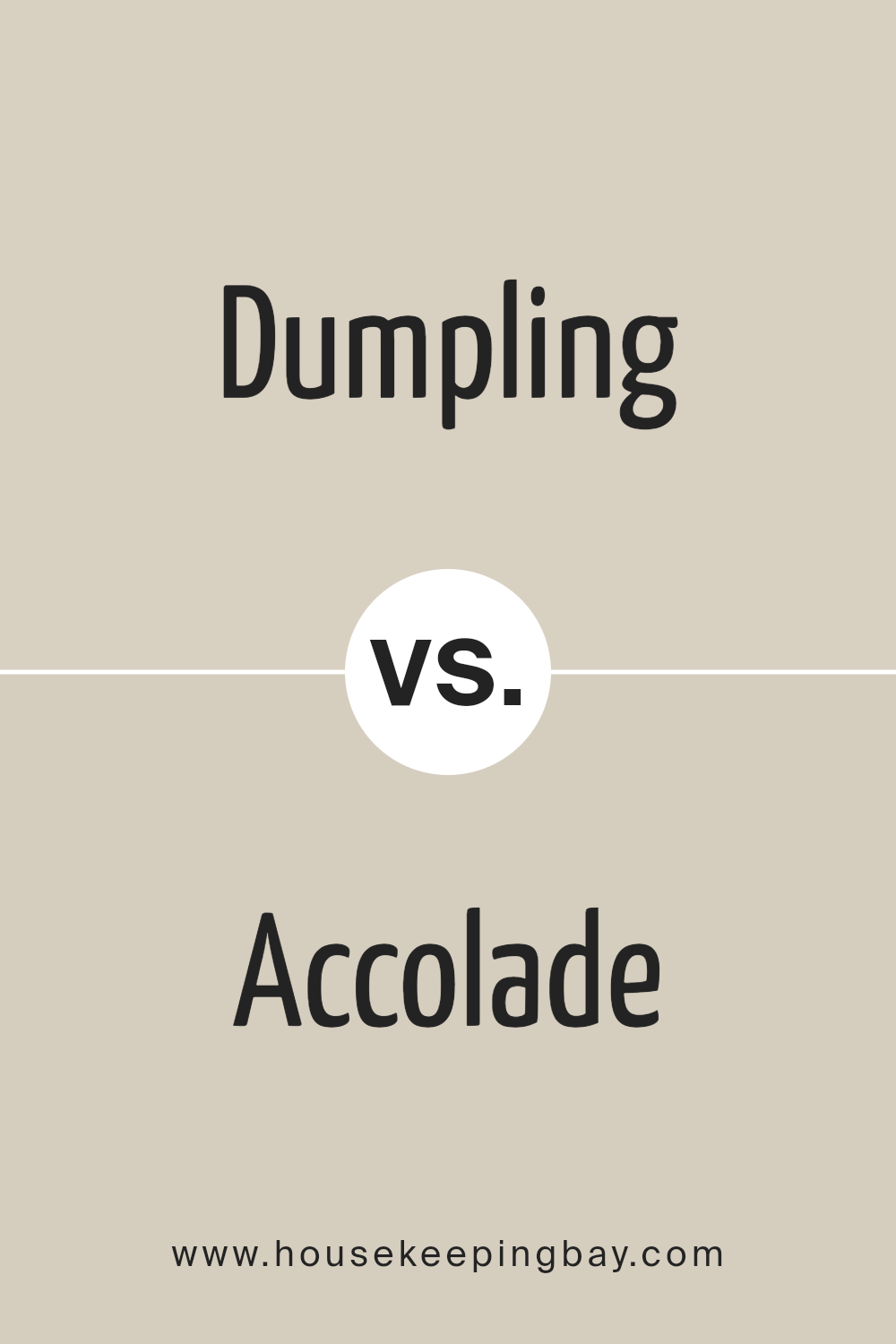
Dumpling SW 9616 by Sherwin Williams vs Accolade SW 9516 by Sherwin Williams
Dumpling SW 9616 and Accolade SW 9516, both by Sherwin Williams, are two interesting colors to compare. Dumpling is a warm, creamy hue that reminds you of soft, baked goods.
It has a comforting vibe, making it ideal for creating cozy, friendly spaces. Whether in a living room or a bedroom, Dumpling adds a touch of warmth and light, making the room feel inviting.
On the other hand, Accolade is a slightly cooler color, with a soft, sophisticated gray tone. It’s like a gentle mist on a calm morning, bringing a sense of refinement and elegance.
Accolade is perfect for areas where you want a touch of modernity without losing the feeling of home. It’s versatile, fitting well in many settings, from kitchens to bathrooms, adding a serene backdrop.
When placed side by side, Dumpling offers warmth and coziness, whereas Accolade provides a clean, modern elegance.
Both colors support different atmospheres: Dumpling encourages a welcoming, cheerful space, and Accolade promotes a sleek, contemporary look. Choosing between them depends on the mood you want to create in your space.
You can see recommended paint color below:
- SW 9516 Accolade
housekeepingbay.com
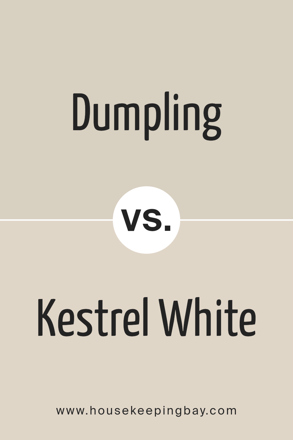
Dumpling SW 9616 by Sherwin Williams vs Kestrel White SW 7516 by Sherwin Williams
Dumpling SW 9616 and Kestrel White SW 7516, both from Sherwin Williams, are two unique shades that offer different vibes for your space. Dumpling is a cozy and warm hue that brings a soft and comforting feel to any room.
It’s like a gentle hug from a room, making spaces feel more inviting and snug. Imagine it in a room where you want to relax and feel at ease, like a living room or bedroom.
On the other hand, Kestrel White SW 7516 is a lot lighter, offering a clean and airy look. It’s perfect for making small spaces appear larger and brighter.
Kestrel White works like a breath of fresh air, creating a serene and calm atmosphere. It’s ideal for spaces you want to feel refreshed and peaceful, such as bathrooms and kitchens.
While Dumpling adds warmth and a sense of coziness, Kestrel White brings brightness and a feeling of openness. Choosing between them depends on what mood you want to create in your space.
You can see recommended paint color below:
housekeepingbay.com
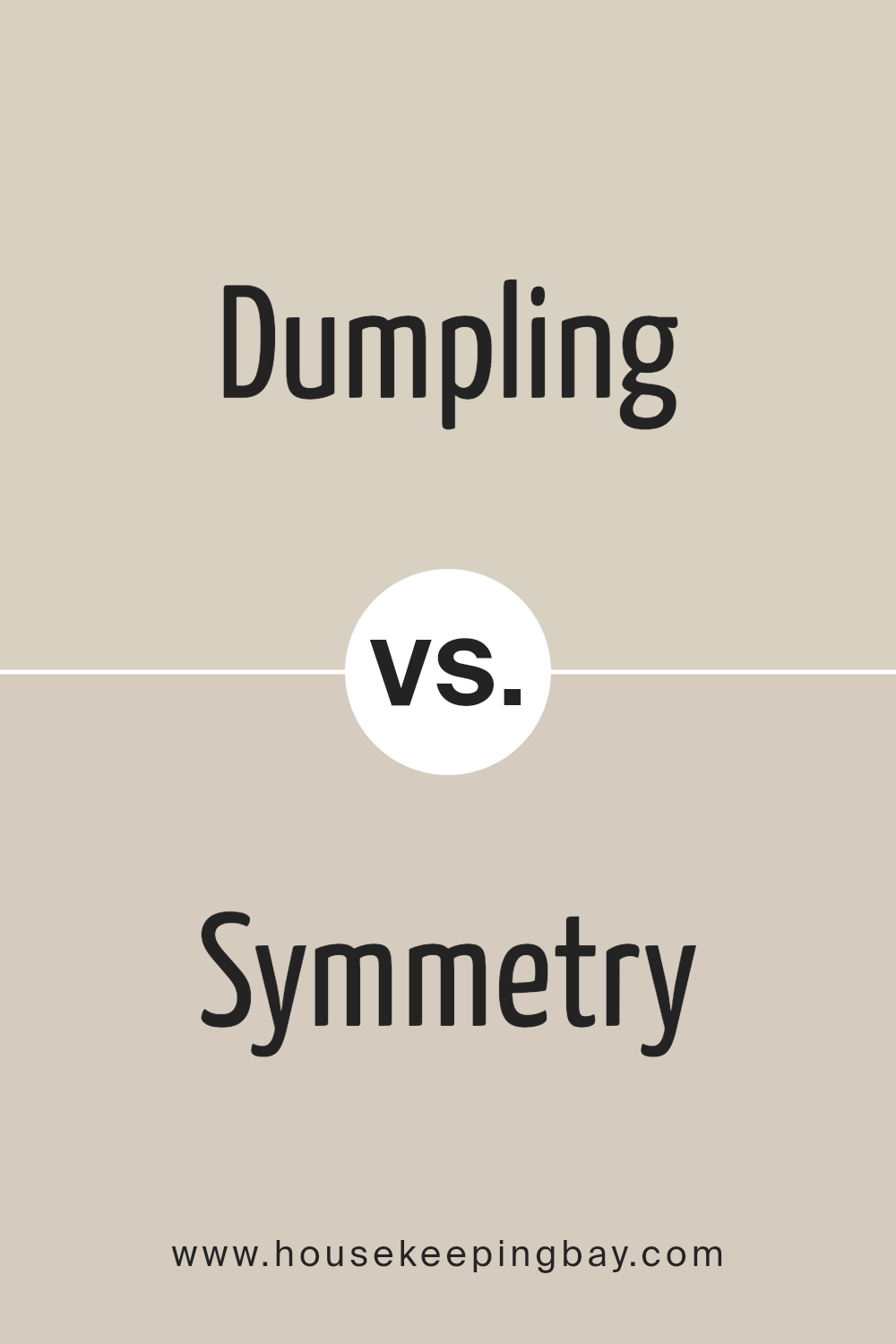
Dumpling SW 9616 by Sherwin Williams vs Symmetry SW 9601 by Sherwin Williams
The main color, Dumpling SW 9616 by Sherwin Williams, is a warm, creamy off-white. It’s like a soft blanket on a chilly evening, giving spaces a cozy and welcoming vibe.
This color shines best in areas where you want comfort and a touch of brightness without overwhelming the room. It pairs well with lots of other colors, making it super versatile for decorating.
On the other hand, Symmetry SW 9601 by Sherwin Williams steps a bit cooler and crisper in tone. Think of the light shade you see on a clear, sunny morning. It’s a clean and subtle gray that feels modern and sleek.
Perfect for spaces that you want to look fresh, open, and airy, Symmetry offers a minimalist charm that can easily match with both bold and subdued accents.
Both colors, though different in warmth and mood, provide a beautiful, understated backdrop for any room. Dumpling adds warmth and coziness, while Symmetry offers a crisp, modern feel.
You can see recommended paint color below:
- SW 9601 Symmetry
housekeepingbay.com
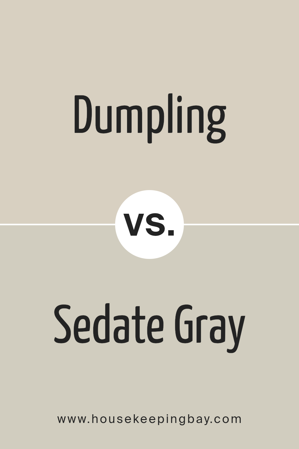
Dumpling SW 9616 by Sherwin Williams vs Sedate Gray SW 6169 by Sherwin Williams
Dumpling SW 9616 by Sherwin Williams and Sedate Gray SW 6169 also by Sherwin Williams are two distinct colors that offer different vibes for spaces.
Dumpling is a soft, creamy color that brings warmth to any room. Its light, buttery tone provides a cozy atmosphere, making it perfect for living spaces or bedrooms where you want to feel relaxed and comfortable.
On the other hand, Sedate Gray is a calm and sophisticated gray with a subtle hint of warmth. This color can make a room feel more spacious and tranquil, suitable for a modern look in offices, kitchens, or bathrooms.
While Dumpling adds a cheerful and inviting light to a space, Sedate Gray introduces a sleek and elegant mood.
Choosing between them depends on whether you want your room to feel homey and sunny with Dumpling or cool, refined, and spacious with Sedate Gray.
You can see recommended paint color below:
housekeepingbay.com
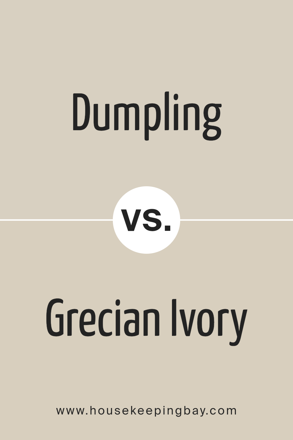
Dumpling SW 9616 by Sherwin Williams vs Grecian Ivory SW 7541 by Sherwin Williams
Dumpling SW 9616 by Sherwin Williams is a warm, comforting color that feels like a cozy blanket. It has a soft, creamy vibe that makes any room feel welcoming and homey.
This color can brighten up spaces with its gentle, soothing presence, making it perfect for living areas or bedrooms where you want to relax.
On the other hand, Grecian Ivory SW 7541 leans more towards a subtle, elegant look. It’s a bit lighter than Dumpling, offering a sophisticated touch that’s versatile enough to fit in anywhere, from kitchens to hallways.
Grecian Ivory brings a sense of calm and serenity, with a slightly more refined feel compared to the homier touch of Dumpling.
While both colors share a sense of warmth and comfort, Dumpling stands out with its richer, creamier tone, offering a sense of coziness and warmth.
Grecian Ivory, however, provides a cleaner, more airy ambiance with its lighter, more delicate touch.
Both are great choices, but your preference might depend on whether you want the cozy hug of Dumpling or the elegant whisper of Grecian Ivory in your space.
You can see recommended paint color below:
- SW 7541 Grecian Ivory
housekeepingbay.com
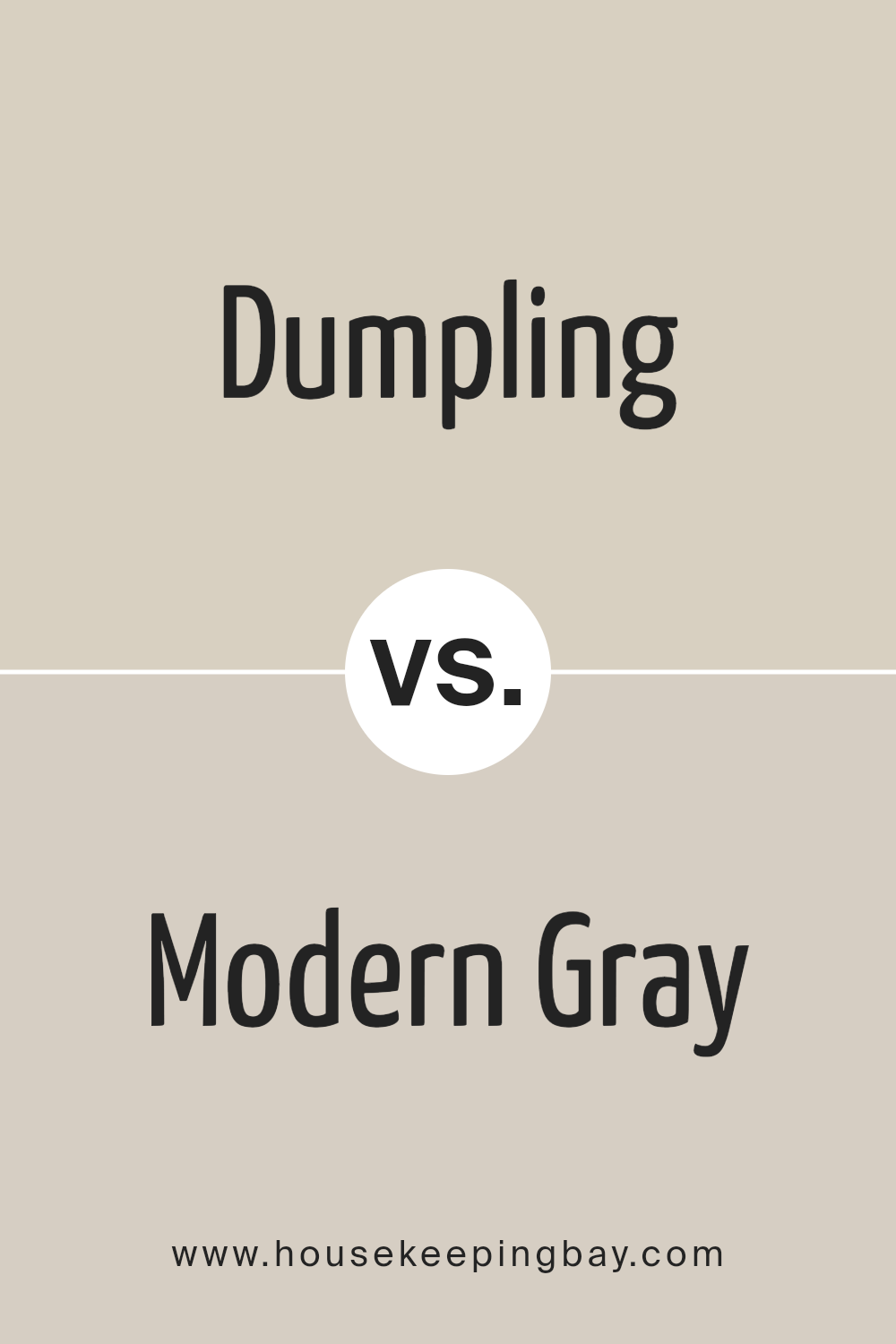
Dumpling SW 9616 by Sherwin Williams vs Modern Gray SW 7632 by Sherwin Williams
Dumpling SW 9616 and Modern Gray SW 7632, both from Sherwin Williams, offer unique vibes for any space. Dumpling is a soft, cozy beige that wraps a room in warmth, making it feel welcoming and snug.
It’s like a gentle hug for your walls, perfect for creating a serene and inviting atmosphere. On the other hand, Modern Gray is a sleek, subtle gray that brings a modern and sophisticated touch.
It’s incredibly versatile, working well in spaces that aim for a chic, timeless look. This shade embodies simplicity and elegance, making it ideal for those seeking a neutral backdrop that still offers depth and character.
While Dumpling leans towards creating a comfy, intimate setting, Modern Gray opens up a space to a more contemporary, stylish look.
Together, these colors can complement each other beautifully, with Dumpling adding warmth to spaces and Modern Gray introducing a refined, classy edge.
You can see recommended paint color below:
housekeepingbay.com
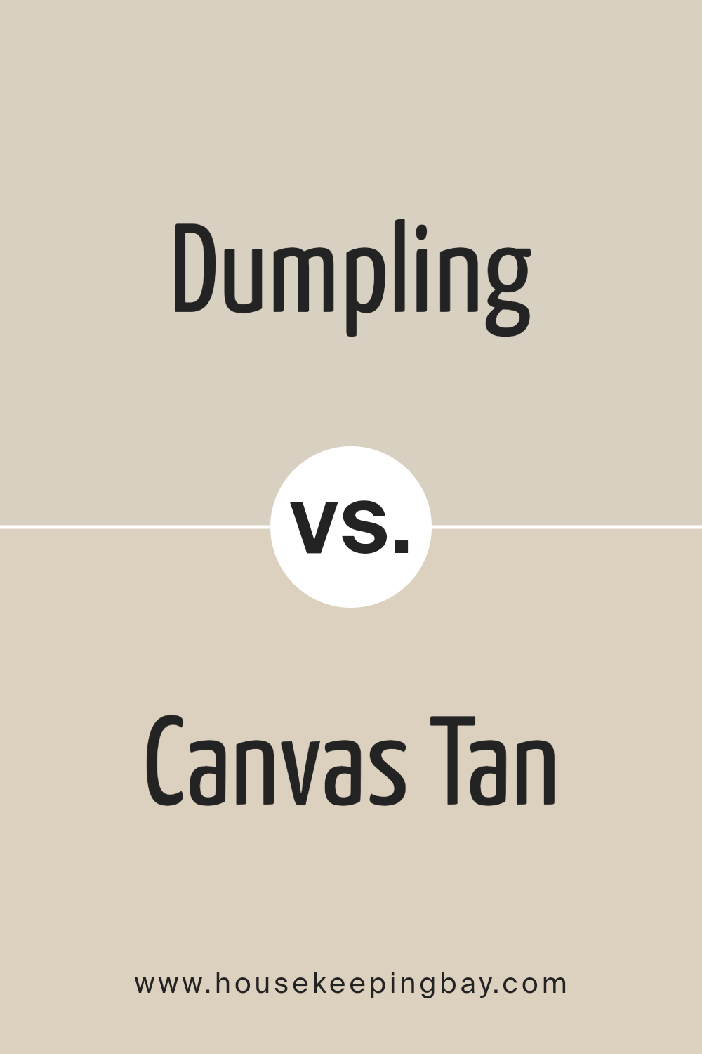
Dumpling SW 9616 by Sherwin Williams vs Canvas Tan SW 7531 by Sherwin Williams
Dumpling SW 9616 by Sherwin Williams and Canvas Tan SW 7531 are both warm and inviting colors, but they have some key differences. Dumpling is a pale, creamy beige.
It’s like a soft blanket of warmth that can make any room feel cozy and welcoming. It’s light enough to make small spaces appear a bit bigger and brighter, yet it has enough color to add a touch of coziness.
On the other hand, Canvas Tan SW 7531 is a true tan shade. It’s a bit darker than Dumpling, offering a stronger sense of warmth. Canvas Tan brings to mind the natural color of burlap or a well-used artist’s canvas.
It’s a versatile color that works well in many spaces, adding a bit of earthiness without overwhelming the room.
In summary, while both colors create a warm atmosphere, Dumpling is lighter and creamier, making it great for a soft, subtle look.
Canvas Tan is a bit more pronounced, perfect for adding a comforting, earthy touch to any space.
You can see recommended paint color below:
- SW 7531 Canvas Tan
housekeepingbay.com
Conclusion
Dumpling SW 9616 by Sherwin Williams is a color that has managed to create a significant impact in interior design spaces. It presents a soft, inviting aura that adds a touch of warmth and comfort to any room it graces.
The shade is versatile, making it an excellent choice for those looking to refresh their living spaces without overwhelming the existing decor.
Whether used for painting walls, accent pieces, or even furniture, Dumpling SW 9616 brings a cozy yet sophisticated vibe that’s hard to ignore.
In conclusion, Dumpling SW 9616 is more than just a paint color; it’s a transformative element that can elevate the overall aesthetic of a home.
Its subtle charm works well in various settings, from modern to traditional designs, proving its adaptability.
As people continue to look for ways to make their homes feel more welcoming and serene, Dumpling SW 9616 stands out as a go-to option for achieving such an atmosphere with ease.
Its popularity reflects its ability to blend seamlessly into different styles while maintaining a unique presence, making it a top choice for both designers and homeowners alike.
housekeepingbay.com
Ever wished paint sampling was as easy as sticking a sticker? Guess what? Now it is! Discover Samplize's unique Peel & Stick samples. Get started now and say goodbye to the old messy way!
Get paint samples
