Nuance SW 7049 by Sherwin Williams
Unveiling the Subtle Elegance of Modern Neutrals
Nestled within Sherwin Williams’ extensive palette of colors lies SW 7049, aptly named “Nuance.” This shade embodies a subtle and understated elegance that can transform any space into a haven of serenity and sophistication.
Unlike more assertive colors that demand attention, Nuance whispers, offering a delicate balance of warmth and coolness that can complement a wide range of decor styles. Its versatility is unmatched, making it a favorite among designers and homeowners alike who seek to create environments that feel both inviting and expansive.
The beauty of Nuance lies in its ability to adapt—its chameleon-like quality ensures it pairs beautifully with both natural light and artificial illumination, changing subtly to match the mood and atmosphere of a room throughout the day.
Whether used as a dominant color theme or as an accent to highlight architectural features, Nuance provides a backdrop that encourages creativity and personal expression.
In this article, we delve into the essence of SW 7049 Nuance by Sherwin Williams, exploring how its unique qualities make it a standout choice for anyone looking to infuse their spaces with a gentle touch of sophistication.
From color pairings and complementary shades to its psychological impacts and ideal uses, we offer insights into why Nuance has become a go-to color for creating harmonious and stylish interiors.
vis sherwin-williams.com
Table of Contents
What Color Is Nuance SW 7049 by Sherwin Williams?
Nuance SW 7049 by Sherwin Williams is a captivating color that exudes an aura of subtle sophistication and timeless elegance. This unique shade is a harmonious blend of gray with warm undertones, providing a versatile and welcoming atmosphere to any space.
Its balanced composition allows it to stand as both a neutral backdrop and a statement piece, depending on its application and the surrounding color palette.
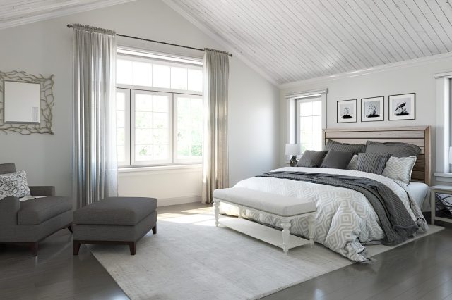
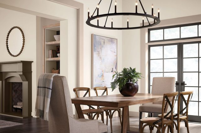
Nuance SW 7049 thrives in a myriad of interior styles, from modern minimalism and Scandinavian simplicity to traditional charm and coastal chic. Its inherent flexibility makes it an ideal choice for creating serene living spaces, tranquil bedrooms, and focused home offices.
The color offers a fresh canvas for contemporary interiors while still respecting the warmth and coziness often sought after in more classic environments.
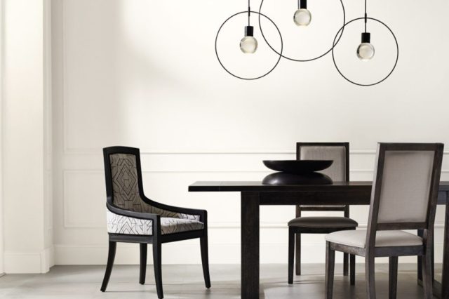
When it comes to pairing with materials and textures, Nuance SW 7049 shows an amazing adaptability. It complements natural wood finishes, from light oaks to deep walnuts, enhancing their warmth and character.
In addition, this color is a perfect match for metals like brushed nickel and antique brass, providing a sophisticated edge to the interior. Textural elements such as woolen throws, linen upholstery, and silk accents harmonize beautifully with its subtle warmth, creating layers of interest and depth.
Fabrics in muted tones or vibrant patterns alike stand out against its understated elegance, making Nuance SW 7049 a truly versatile and enduring choice for any design aesthetic.
housekeepingbay.com
Table of Contents
Is Nuance SW 7049 by Sherwin Williams Warm or Cool color?
NuanceSW 7049 by Sherwin Williams is a sophisticated, neutral paint color that brings a sense of calm and understated elegance to any interior space.
This color resides comfortably within the spectrum of gray-shades, offering a balance that is neither too warm nor too cool, making it incredibly versatile for a wide range of decorating styles and home environments.
Its subtlety makes it a perfect choice for walls in living areas, bedrooms, and even in more utilitarian spaces like kitchens and bathrooms, where it provides a serene backdrop to everyday life.
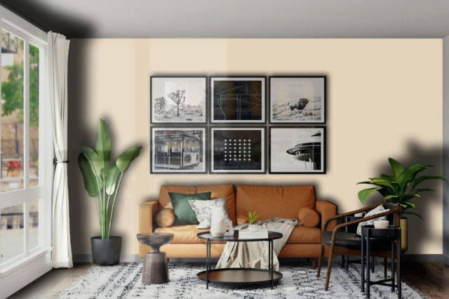
The true charm of Nuance lies in its ability to adapt to various lighting conditions, gently shifting its presence to match the mood from dawn till dusk. It pairs beautifully with a spectrum of colors, from bold and vibrant hues to soft and pastel tones, allowing for a dynamic design flexibility.
In homes, Nuance can make small spaces appear larger and welcoming, while in larger areas, it can create a cohesive look that enhances architectural details. Its ease of coordination with a wide range of textures and materials – from natural wood to metallic finishes – emphasizes its universal appeal.
NuanceSW 7049 encapsulates a timeless beauty that works harmoniously in homes, fostering a space that feels both refined and inviting.
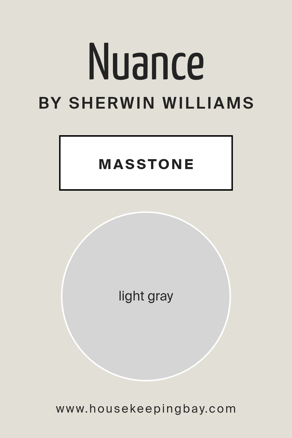
What is the Masstone of the Nuance SW 7049 by Sherwin Williams?
Nuance SW 7049 by Sherwin Williams, characterized by its masstone of light gray (#D5D5D5), is a subtle and versatile shade that exudes a sense of tranquility and sophistication.
This specific tonality of gray serves as an excellent backdrop in homes, offering a neutral palette that can seamlessly blend with a wide range of decor styles, from modern minimalism to cozy traditional.
Its light gray hue embodies a gentle neutrality that makes spaces feel more open and airy, fostering a serene atmosphere that encourages relaxation.
The lightness of Nuance promotes a feeling of spaciousness, making it an ideal choice for any room, whether it’s a compact bathroom or a spacious living area.
Its capacity to reflect light enhances the sense of brightness in interiors, contributing to a more uplifting and positive environment. Additionally, its neutral base allows for endless color pairing opportunities, enabling homeowners to easily introduce or change accent colors through accessories and furnishings without having to repaint the walls.
This adaptability makes Nuance SW 7049 by Sherwin Williams a timeless color choice that accommodates evolving tastes and trends in home decor.
housekeepingbay.com
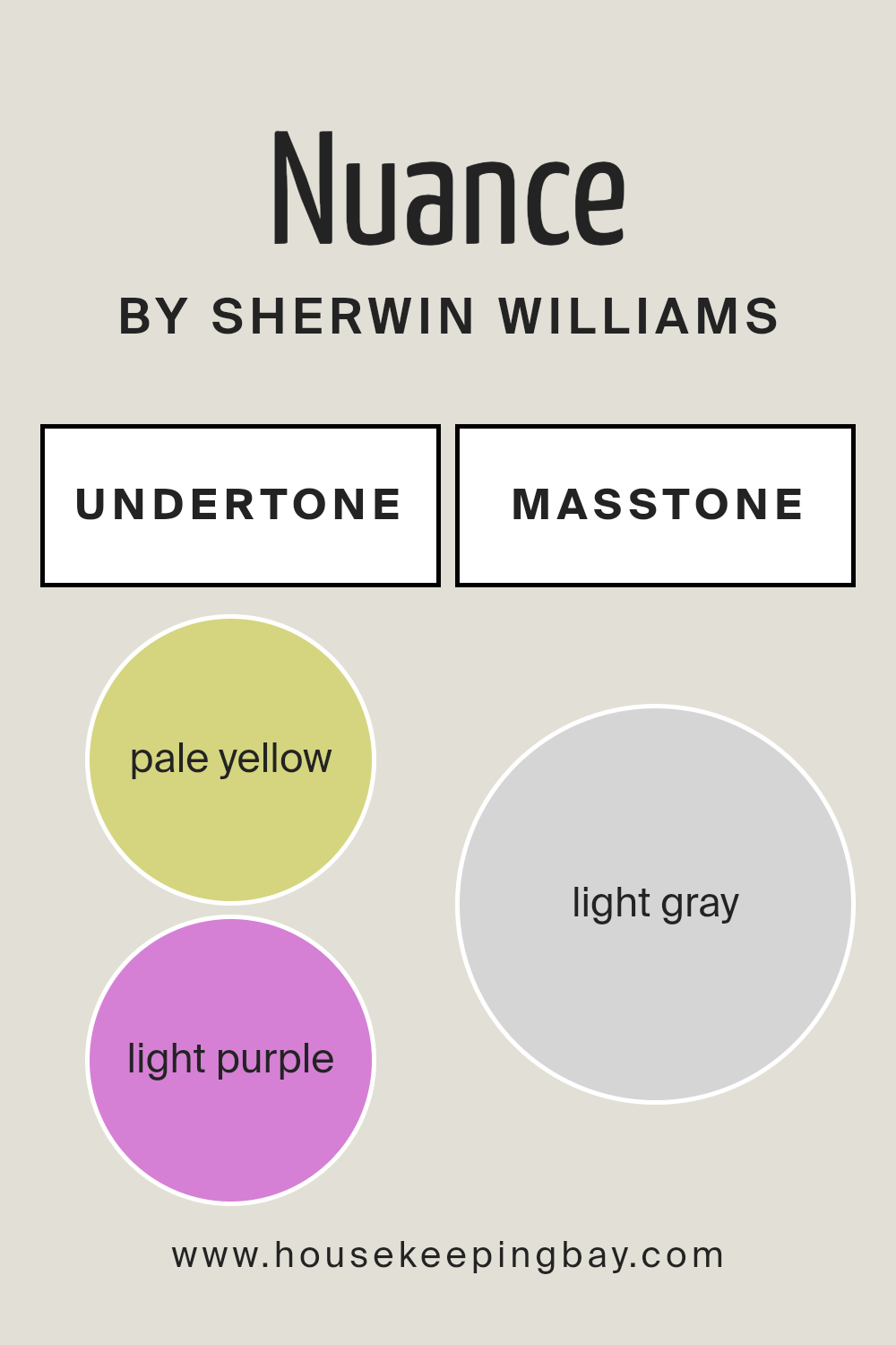
Undertones of Nuance SW 7049 by Sherwin Williams
Nuance SW 7049, a sophisticated shade by Sherwin Williams, delicately balances its primary hue with intriguing undertones of pale yellow (#D5D580) and light purple (#D580D5).
These subtle undertones play a crucial role in the color’s versatility and perception, subtly influencing its character and the ambiance it creates within a space.
The pale yellow undertone infuses Nuance SW 7049 with a touch of warmth, making spaces feel more inviting and cozy. This warmth encourages relaxation and comfort, making it an ideal choice for living rooms or bedrooms where a sense of tranquility is desired.
The light yellow hue subtly brightens the primary color, ensuring that spaces do not feel closed in or dark, even in areas that might not receive a lot of natural sunlight.
Conversely, the light purple undertone introduces a hint of cool sophistication, adding depth and complexity to the color. This undertone can transform under different lighting conditions, contributing to the color’s adaptability.
In well-lit areas or spaces with ample natural light, the purple undertone can provide a refreshing contrast to the warmth of yellow, creating a balanced and harmonious effect.
On interior walls, Nuance SW 7049 exhibits a chameleon-like quality, adapting and changing, reflecting the room’s mood and lighting conditions.
This makes it an exceptionally versatile paint choice, capable of complementing a wide range of décor styles and color palettes.
Whether aiming for a cozy, warm atmosphere or a brighter, more airy feel, the undertones of Nuance SW 7049 by Sherwin Williams enrich the primary color, enhancing the overall aesthetic of interior spaces and evoking different emotions and reactions from those who interact with the environment.
housekeepingbay.com
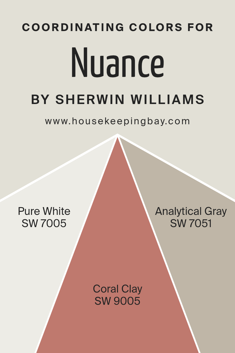
Coordinating Colors of Nuance SW 7049 by Sherwin Williams
Coordinating colors are a palette of colors that complement each other and work harmoniously within a design space, creating an aesthetically pleasing and cohesive look.
They can be used to accentuate architectural features, evoke specific moods, or simply to bring a sense of balance and unity to an environment. Nuance SW 7049 by Sherwin Williams, for example, serves as a fantastic neutral base that can be beautifully complemented by coordinating colors such as SW 7005 – Pure White, SW 9005 – Coral Clay, and SW 7051 – Analytical Gray.
These colors have been carefully selected to enhance the character and depth of Nuance SW 7049, making it easy to design a space that feels both cohesive and richly layered.
SW 7005 – Pure White is a crisp, clean shade that brings a fresh breath of air into any space, offering a stark yet harmonious contrast to the subtle tones of Nuance.
It has the remarkable ability to make other colors pop while providing a serene backdrop. On the other hand, SW 9005 – Coral Clay introduces a warm, earthy tone into the mix, adding a touch of sophistication and warmth.
This color is perfect for adding depth and interest, ensuring the space feels welcoming and lived-in. Lastly, SW 7051 – Analytical Gray is a neutral gray that bridges the gap between the warmer Coral Clay and the crisp Pure White.
It acts as a subtle, sophisticated backdrop that complements both the warmth of Coral Clay and the freshness of Pure White, seamlessly tying the palette together. Together, these coordinating colors enrich the base tone of Nuance SW 7049, allowing for a design that is both versatile and visually appealing.
You can see recommended paint colors below:
- SW 7005 Pure White
- SW 9005 Coral Clay
- SW 7051 Analytical Gray
housekeepingbay.com
How Does Lighting Affect Nuance SW 7049 by Sherwin Williams?
The impact of lighting on colors is both subtle and profound, profoundly influencing the perception and mood that colors evoke within a space. Every hue, including Nuance SW 7049 by Sherwin Williams, undergoes a transformative journey when exposed to different lighting conditions.
This neutral, sophisticated shade, with its unique ability to blend warm and cool undertones, serves as an excellent example to explore how lighting affects color perception.
In artificial light, the perception of Nuance can dramatically shift depending on the type of bulb used. Incandescent bulbs, with their warm yellowish glow, can enhance the warmer undertones of Nuance, making it appear softer and more inviting.
Conversely, fluorescent lighting, which often emits a stark, bluish tone, might highlight its cooler undertones, giving the color a crisper, more formal appearance.
LED lighting, which offers a range from warm to cool, provides flexibility in adjusting how Nuance looks within a space, making it possible to tailor the ambiance according to the desired mood.
When bathed in natural light, Nuance unfolds in time with the day. Its appearance varies significantly from the crisp, bright quality of the morning light, which will likely highlight its cooler, grey undertones, to the warm, golden glow of the late afternoon, which softens its appearance, enhancing its hidden warmth.
This dynamic interplay makes Nuance a versatile choice for any setting, adapting its character from dawn till dusk.
In north-facing rooms, which receive cooler, indirect light, Nuance may lean towards its cooler, more muted aspects, maintaining a steady, serene appearance throughout the day.
South-facing rooms, drenched in warm sunlight, can amplify its warmer, beige nuances, making the space feel cozy and welcoming.
In east-facing rooms, morning light can make Nuance feel brighter and warmer, ideal for spaces used primarily in the morning. As the light shifts away, the color can appear more neutral and true to its balanced mix of undertones by afternoon.
West-facing rooms experience the reverse; Nuance will appear more neutral or cooler in the morning and then warm up dramatically towards the evening when the setting sun casts a warm glow, highlighting the richer, cosier aspects of the color.
Through these variations, Nuance SW 7049 exemplifies how lighting, whether artificial or natural, can dramatically influence the perception of color, underlining the importance of considering light exposure in interior design decisions.
housekeepingbay.com
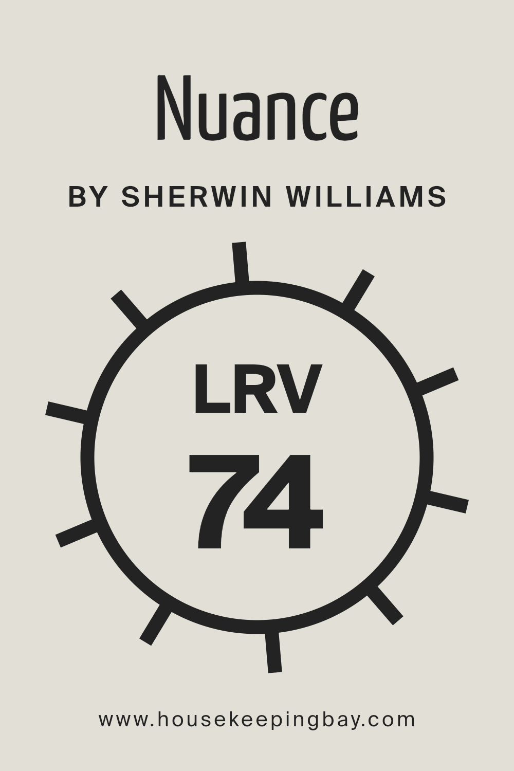
What is the LRV of Nuance SW 7049 by Sherwin Williams?
Light Reflectance Value (LRV) is a measure used to express the percentage of light a paint color reflects from or absorbs into a painted surface. It’s a scale that ranges from 0, which is pure black and absorbs all light, to 100, which is pure white and reflects all light.
LRV is crucial in interior and exterior design because it affects how light or dark a color appears once applied to walls, influencing the ambiance and perceived size of a room.
Colors with a high LRV make spaces appear larger and more open by reflecting more light, while colors with a low LRV absorb more light, making a room feel cozier but potentially smaller and darker.
Nuance SW 7049 by Sherwin Williams, with an LRV of 74.27, falls into the category of colors that reflect a substantial amount of light. This relatively high LRV means that it will help in making spaces appear brighter and more airy.
When applied to walls, Nuance will reflect most of the light, contributing to a feeling of openness and enlarging the perception of space. This characteristic makes it an excellent choice for smaller rooms or areas with limited natural light, as it can help compensate for the lack of spaciousness and brightness.
The effect of this particular LRV value is that it maintains a balance between being overwhelmingly bright and providing just enough light reflection to enhance the room’s aesthetic without diminishing the warmth and coziness of the space.
housekeepingbay.com
What is LRV? Read It Before You Choose Your Ideal Paint Color
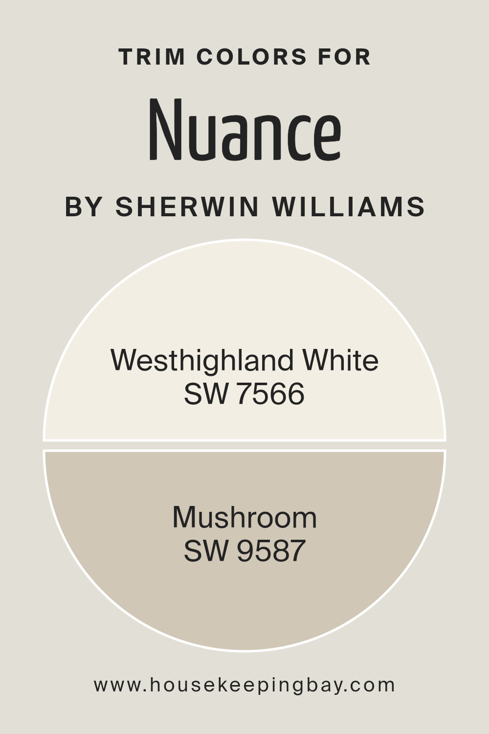
What are the Trim colors of Nuance SW 7049 by Sherwin Williams?
Trim colors play a pivotal role in the world of interior and exterior design, acting as the defining outlines that accentuate the main color palette of a space. In the case of Nuance SW 7049 by Sherwin Williams, selecting the right trim colors is essential for achieving a cohesive and refined look.
Trim colors like SW 7566 – Westhighland White and SW 9587 – Mushroom are especially significant. These shades act as complementary elements, framing and emphasizing the sophisticated, neutral base of Nuance, thus enhancing the overall aesthetic appeal.
Essentially, the trim acts as a visual guide, drawing the eye to architectural features and transitions, which is why the choice of trim color holds such importance.
Westhighland White offers a clean, bright contrast to the subtle complexity of Nuance, giving spaces a fresh and uplifting edge. It’s particularly effective in spaces seeking a crisp delineation without overwhelming the senses, perfect for creating a seamless flow when used on skirtings, door frames, and cornices.
On the other hand, Mushroom presents a warmer, earthier option that harmonizes beautifully with Nuance’s understated elegance. This color adds depth and a touch of organic charm to interiors or exteriors, providing a softer transition that enriches the room’s character.
Both choices underscore the importance of trim colors in enhancing the main hue’s attributes, demonstrating how strategic color pairings can elevate a design from pleasant to exquisite.
You can see recommended paint colors below:
housekeepingbay.com
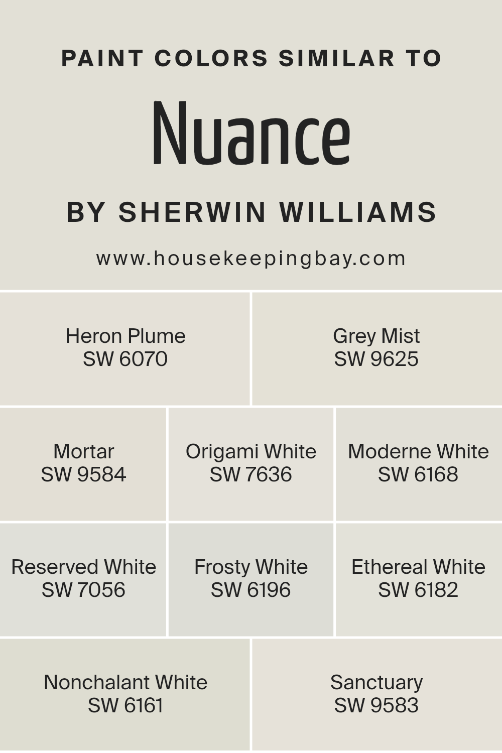
Colors Similar to Nuance SW 7049 by Sherwin Williams
Choosing similar colors to a primary hue, such as Nuance SW 7049 by Sherwin Williams, is essential for crafting spaces that exhibit a harmonious and balanced aesthetic.
These similar colors work together to create a subtle but effective variance that can enlarge a space’s perception, promote a cohesive look, or emphasize architectural details without overwhelming the senses.
For instance, Heron Plume SW 6070 is a soft, airy shade that can brighten spaces with a gentle warmth, while Grey Mist SW 9625 offers a hint of mystery and depth, perfect for creating a serene backdrop.
Moving towards a slightly denser hue, Mortar SW 9584 anchors spaces with its solid, understated elegance; conversely, Origami White SW 7636 provides a clean, crisp canvas, highlighting clean lines and simplicity.
On the other hand, colors like Moderne White SW 6168 and Reserved White SW 7056 straddle the line between offering warmth and maintaining a neutral, versatile base for any decorative aspirations.
Frosty White SW 6196, with its chilly undertone, captures the essence of dawn’s first light, whilst Ethereal White SW 6182 evokes a sense of peace and calm, perfect for retreat-like spaces. Nonchalant White SW 6161 embraces a laissez-faire attitude with its effortlessly cool vibe, and finally, Sanctuary SW 9583, as its name suggests, creates a space where one can genuinely feel at ease and sheltered.
Each color, with its unique undertone and depth, offers a myriad of possibilities for designers and homeowners alike to craft spaces that reflect personal style while ensuring a cohesive and nuanced interior ambiance.
You can see recommended paint colors below:
- SW 6070 Heron Plume
- SW 9625 Grey Mist
- SW 9584 Mortar
- SW 7636 Origami White
- SW 6168 Moderne White
- SW 7056 Reserved White
- SW 6196 Frosty White
- SW 6182 Ethereal White
- SW 6161 Nonchalant White
- SW 9583 Sanctuary
housekeepingbay.com
How to Use Nuance SW 7049 by Sherwin Williams In Your Home?
Nuance SW 7049 by Sherwin Williams is a sophisticated gray paint color that exudes tranquility and versatility. It’s a unique shade that masterfully balances between a warm and cool tone, making it a superb choice for a variety of spaces and styles within a home.
This particular gray has a soft, muted quality, making it perfect for creating a serene and inviting atmosphere in any room.
Homeowners can utilize Nuance SW 7049 in numerous ways to enhance their living spaces. Its understated elegance makes it ideal for living rooms and bedrooms, where a calm, restful ambiance is often desired.
It pairs beautifully with both modern and traditional decor, acting as a neutral backdrop that allows furniture and artwork to stand out. In bathrooms or kitchens, Nuance can contribute to a clean and fresh aesthetic, especially when combined with white cabinetry or tiles.
Additionally, its flexibility in syncing with other colors allows for creative color schemes, from pairing with bold, vibrant accents for a dynamic look, to soft pastels for a more subdued, harmonious space. Adopting Nuance SW 7049 into your home can thus effortlessly elevate the overall aesthetic, imbuing each room with a chic, timeless charm.
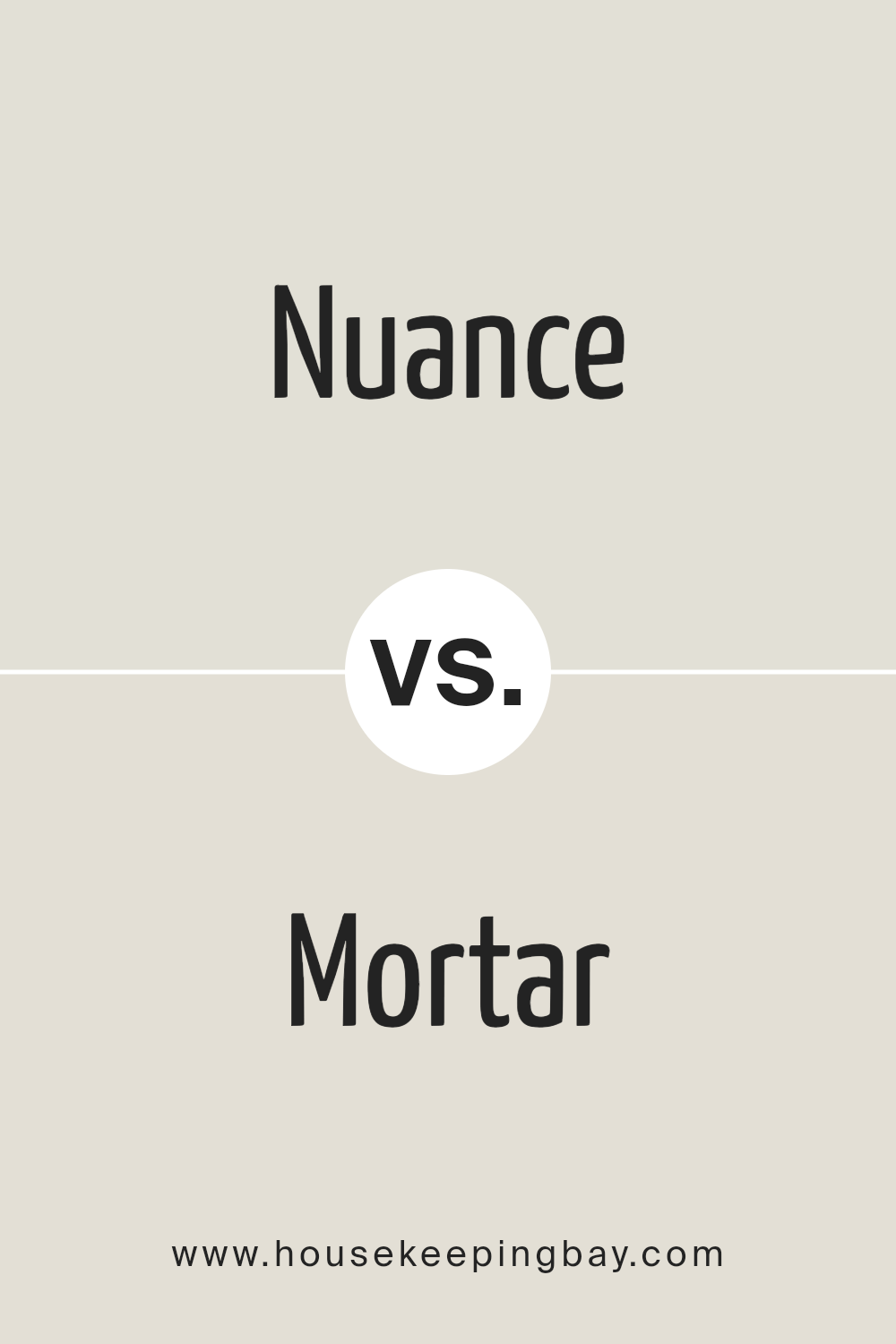
Nuance SW 7049 by Sherwin Williams vs Mortar SW 9584 by Sherwin Williams
Nuance SW 7049 and Mortar SW 9584 by Sherwin Williams are both intriguing shades that bring their unique appeal to interiors and exteriors. Nuance sits in the realm of sophisticated neutrals, embodying a light to medium grey with subtle warm undertones.
This color is versatile and acts as a soft backdrop that complements various decor styles and color palettes, making spaces appear open and serene.
Mortar SW 9584, on the other hand, is a deeper, more definite color. It leans towards a rich charcoal with cooler, almost slate-like undertones.
Mortar is bold and striking, offering a dramatic flair that can anchor a room or accentuate specific architectural features. It’s particularly stunning when used for exteriors or statement walls, providing depth and contrast against lighter hues.
While Nuance is perfect for creating a calm, cohesive space with its gentle warmth and adaptability, Mortar brings a robust character and definition.
Together, these colors could craft a sophisticated scheme, from the foundational lightness of Nuance to the captivating depth of Mortar, offering a layered, harmonious look.
You can see recommended paint color below:
housekeepingbay.com
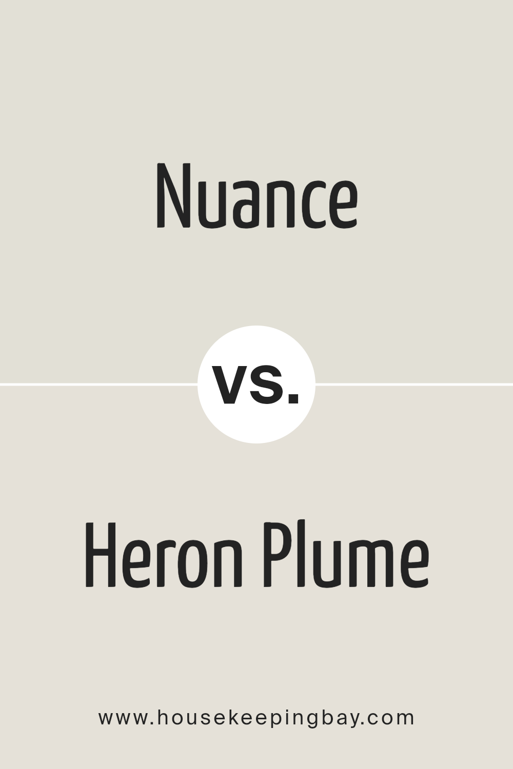
Nuance SW 7049 by Sherwin Williams vs Heron Plume SW 6070 by Sherwin Williams
Nuance SW 7049 and Heron Plume SW 6070, both from Sherwin Williams, are neutral shades that offer subtle elegance to any space. Nuance sits comfortably in the category of warm greys, presenting a cozy, soft backdrop that feels inviting and versatile.
Its earthy undertones make it a perfect selection for those seeking a color that bridges the gap between traditional warmth and contemporary neutrality. On the other hand, Heron Plume pushes slightly towards a lighter, airier feel, with its soft, almost ethereal presence.
This color has a delicate balance of warm and cool undertones, making it an exceptionally adaptable choice for various lighting conditions and design aesthetics. While Nuance provides a sense of grounding and stability with its deeper, more anchored appearance, Heron Plume offers a breath of fresh air, bringing a brighter, more expansive quality to rooms.
Together, these colors can harmonize beautifully, with Nuance laying a foundation of subtle warmth and Heron Plume offering gentle highlights and a sense of spaciousness.
You can see recommended paint color below:
housekeepingbay.com
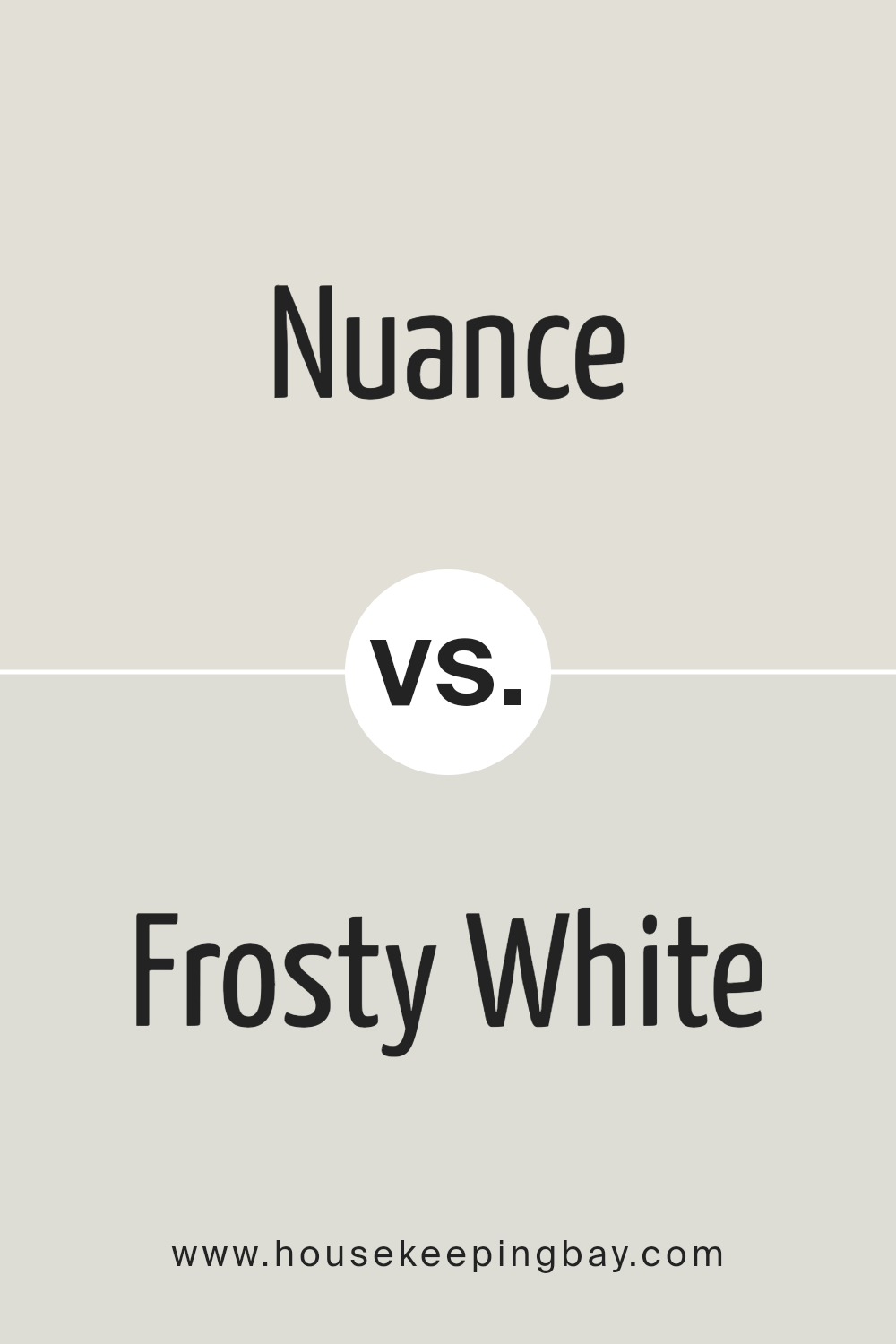
Nuance SW 7049 by Sherwin Williams vs Frosty White SW 6196 by Sherwin Williams
Nuance SW 7049 and Frosty White SW 6196, both from Sherwin Williams, offer distinct aesthetic appeals that cater to different design needs. Nuance stands as a subtly warm gray that evokes a sense of calm and understated elegance, making it ideal for creating serene and inviting spaces.
Its versatility allows it to blend seamlessly with a wide range of color palettes, enhancing both contemporary and traditional interiors. On the other hand, Frosty White offers a crisp, clean backdrop that can illuminate and enlarge any space.
As a light and airy color, it reflects maximum light, bringing a refreshing and energizing quality to interiors. While it’s particularly suited for minimalist or modern designs, its neutral character allows it to adapt well to various styles.
When comparing these two, Nuance delivers depth and warmth, creating a cozy ambiance, whereas Frosty White provides a bright and open feel, offering a sense of purity and simplicity.
You can see recommended paint color below:
- SW 6196 Frosty White
housekeepingbay.com
Nuance SW 7049 by Sherwin Williams vs Origami White SW 7636 by Sherwin Williams
Nuance SW 7049 and Origami White SW 7636 by Sherwin Williams are two colors that, despite sharing a common lineage within the Sherwin Williams palette, present unique characteristics that distinguish them from each other.
Nuance, as its name suggests, offers a subtle and sophisticated gray that leans towards a warm taupe. It’s a versatile shade capable of adding depth and warmth to spaces without overwhelming them. In contrast, Origami White veers towards a soft, warm white with hints of gray and beige.
This color illuminates spaces, creating a crisp but inviting atmosphere. It’s particularly effective in enhancing natural light, making it a go-to for creating an airy and open feel. While both colors thrive in contemporary and traditional settings, Nuance is more grounded and cozy, making it ideal for personal spaces like bedrooms and living rooms.
Origami White, however, excels in areas where the aim is to evoke openness and brightness, such as kitchens and bathrooms. Together, these shades can create a harmonious balance between warmth and light in interior design.
You can see recommended paint color below:
housekeepingbay.com
Nuance SW 7049 by Sherwin Williams vs Moderne White SW 6168 by Sherwin Williams
Nuance SW 7049 and Moderne White SW 6168 by Sherwin Williams stand as two sophisticated shades, each bringing its unique ambiance to interiors. Nuance, a part of the grey family, is a muted, soft hue that offers subtlety and a sense of calm.
Its gentle presence serves as a versatile backdrop, seamlessly blending with a wide range of colors and decor styles. Its understated elegance makes it particularly suitable for creating serene and sophisticated spaces.
On the other hand, Moderne White SW 6168 leans towards the spectrum’s lighter end, providing a clean, fresh look that can illuminate and enlarge any space. As a shade of white with a warm undertone, it is adept at creating a welcoming and airy atmosphere.
It acts as a canvas, offering endless possibilities for accent colors and decorations. Moderne White can brighten darker rooms and introduce a sense of openness, making it ideal for achieving a modern and minimalist aesthetic.
While Nuance offers depth and subtlety for a tranquil setting, Moderne White brings light and expansiveness, each contributing to creating distinctive atmospheres based on their inherent qualities.
You can see recommended paint color below:
housekeepingbay.com
Nuance SW 7049 by Sherwin Williams vs Ethereal White SW 6182 by Sherwin Williams
Nuance SW 7049 by Sherwin Williams and Ethereal White SW 6182 by Sherwin Williams present a study in subtle, stylish contrast within the realm of neutral tones. Nuance SW 7049 is a sophisticated and versatile taupe, a color that straddles the line between gray and brown with a muted, understated elegance.
This neutrality makes Nuance incredibly adaptable, able to bring warmth to spaces while still maintaining a contemporary edge. In contrast, Ethereal White SW 6182 leans towards the cooler end of the spectrum.
Despite its name, it is more of a very light gray than a pure white, offering a crisp, airy feel that can brighten and enlarge spaces. The ethereal quality of this color brings a sense of tranquility and serenity, making it an excellent choice for creating a relaxed atmosphere.
When comparing the two, Nuance offers a warm, grounded presence, while Ethereal White provides a light, refreshing touch, each creating distinct yet harmonious atmospheres.
You can see recommended paint color below:
housekeepingbay.com
Nuance SW 7049 by Sherwin Williams vs Sanctuary SW 9583 by Sherwin Williams
Nuance SW 7049 by Sherwin Williams and Sanctuary SW 9583 by Sherwin Williams are two distinctive hues that cater to different aesthetic preferences and spatial characteristics.
Nuance is a subtle, neutral gray that provides a versatile backdrop suitable for various decor themes and color palettes. It exudes calmness and simplicity, making it an excellent choice for creating serene and sophisticated spaces.
This color can seamlessly fit into modern, minimalistic, or even traditional interiors due to its understated elegance.
On the other hand, Sanctuary is a deeper, muted green with gray undertones that evokes a sense of tranquility and connection to nature. It’s a color that brings the outdoors inside, creating a soothing and restorative ambiance. Sanctuary can transform a space into a peaceful retreat, perfect for rooms where relaxation and contemplation are desired.
While both colors aim to create a calming environment, Nuance leans towards an urban, sleek look, whereas Sanctuary offers a more organic, earthy vibe, making them each uniquely appealing depending on the intended mood and style of the room.
You can see recommended paint color below:
housekeepingbay.com
Nuance SW 7049 by Sherwin Williams vs Reserved White SW 7056 by Sherwin Williams
Nuance SW 7049 and Reserved White SW 7056, both from Sherwin Williams, offer subtle yet distinct differences that can impact the ambiance of a space.
Nuance, as its name suggests, is a nuanced tone that brings a sophisticated blend of grey with a touch of warmth, making it versatile for a variety of settings. This color tends to add depth and character to spaces, striking a balance between being understated yet significant in presence.
Reserved White SW 7056, on the other hand, is a softer, lighter color with a clean and airy feel. It leans towards a pure, almost pristine white, but with just enough warmth to prevent it from feeling sterile or too stark.
This color is excellent for creating a sense of openness and brightness, making small rooms appear larger and more inviting.
When compared, Nuance offers depth and warmth suitable for creating cozy, refined spaces, while Reserved White provides a fresh, open canvas, ideal for a minimalist or modern aesthetic.
Each color serves different design needs, with Nuance leaning towards elegance and Reserved White towards simplicity and lightness.
You can see recommended paint color below:
housekeepingbay.com
Nuance SW 7049 by Sherwin Williams vs Grey Mist SW 9625 by Sherwin Williams
Nuance SW 7049 by Sherwin-Williams and Grey Mist SW 9625, also by Sherwin-Williams, present subtle yet distinct differences in their tone and appearance, catering to varying preferences in color schemes for interior spaces.
Nuance SW 7049 manifests as a warm, neutral greige, blending gray with soft hints of beige, creating a cozy and versatile backdrop suitable for a variety of decor styles. This color is particularly adept at offering warmth to spaces while maintaining the sleek, modern appeal of gray.
On the other hand, Grey Mist SW 9625 leans towards a cooler, more ethereal shade of gray. This color embodies the tranquility and misty essence of early mornings, bringing a serene, airy quality to rooms that may benefit from a light, refreshing touch.
The cooler undertones in Grey Mist make it an ideal choice for creating a calm, sophisticated space that feels open and inviting.
While both colors offer the sophistication and flexibility associated with gray tones, Nuance is warmer and more grounding, making it suitable for creating a cozy, inviting environment.
In contrast, Grey Mist provides a lighter, cooler, and more ethereal atmosphere, perfect for enhancing natural light and making spaces appear larger and more open. Choosing between them depends on the desired ambience and the specific lighting and spatial dynamics of the room.
You can see recommended paint color below:
housekeepingbay.com
Nuance SW 7049 by Sherwin Williams vs Nonchalant White SW 6161 by Sherwin Williams
Nuance SW 7049 by Sherwin Williams and Nonchalant White SW 6161 also by Sherwin Williams, present an intriguing comparison in the realm of neutral tones.
Nuance occupies a space within the gray family, flaunting a balanced, medium tone that exudes warmth yet retains a certain crispness, making it adaptable to various lighting conditions and interior design schemes.
Its depth offers a sophisticated backbone to spaces, fostering an atmosphere of subtle elegance and contemporary flair.
In contrast, Nonchalant White leans towards the softer, lighter end of the spectrum. Despite its name, it presents not as a stark white but as a gentle, muted hue with an undercurrent of warmth, making it an ideal choice for creating a serene and inviting ambiance.
Its lighter tone renders it perfect for spaces in need of a brightened feel or a backdrop that amplifies natural light, all while providing a subtle hint of color to avoid the starkness associated with pure white.
Together, Nuance and Nonchalant White complement each other beautifully, offering a harmonious blend of depth and lightness, perfect for layering and creating visually engaging spaces that feel both grounded and airy.
You can see recommended paint color below:
- SW 6161 Nonchalant White
housekeepingbay.com
Conclusion
Nuance SW 7049 by Sherwin Williams is a versatile and sophisticated paint color that seamlessly bridges the gap between a neutral backdrop and a statement piece.
Its subtle undertones offer a unique depth, making it an ideal choice for those looking to add a touch of elegance and tranquility to any space. Whether used in a minimalist design scheme or as a canvas for bolder accents, Nuance proves to be a remarkably adaptable shade.
It’s this balance of warmth and neutrality that makes Nuance SW 7049 a go-to color for homeowners and designers alike, offering a timeless quality that complements various decor styles and preferences.
The widespread appreciation for Nuance SW 7049 is a testament to Sherwin Williams’ commitment to creating colors that resonate with contemporary tastes while maintaining a classic appeal. As a paint color, Nuance embodies versatility, allowing for creative expression in a multitude of settings, from residential to commercial spaces.
Its popularity not only reflects current trends in interior design but also indicates a shift towards more nuanced and adaptable color choices that cater to personal aesthetics and functional needs.
Nuance SW 7049 exemplifies how a carefully selected paint color can transform an environment, highlighting Sherwin Williams’ expertise in blending quality with color innovation.
housekeepingbay.com
Ever wished paint sampling was as easy as sticking a sticker? Guess what? Now it is! Discover Samplize's unique Peel & Stick samples. Get started now and say goodbye to the old messy way!
Get paint samples