Top 25 Most Popular Sherwin Williams Paint Colors 2025
Refresh Your Home with Sherwin Williams’ Best Colors for 2025
When it comes to creating a home that feels welcoming and stylish, paint colors are the foundation. They set the tone for every room, impacting how we feel and how others perceive our space. For 2025, Sherwin Williams continues to lead the way with a palette that perfectly captures the mood of the moment.
These shades are not just trendy—they’re versatile and timeless choices that fit a wide range of styles.
Whether you’re refreshing your living room, updating a bedroom, or preparing your house for sale, these 25 shades are here to inspire.
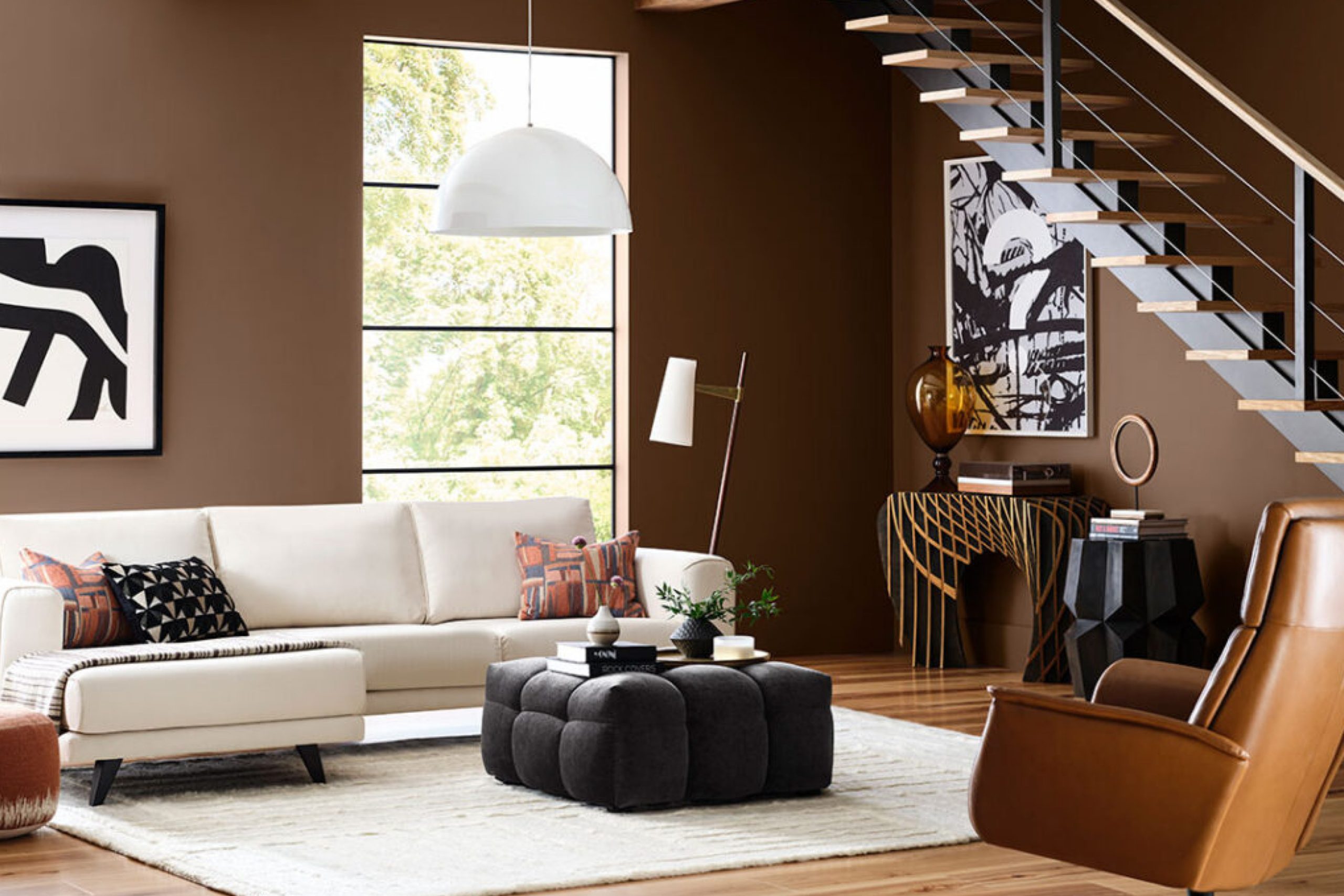
via blog.sherwin-williams.com
Why Color Choice Matters
The color of a room isn’t just about aesthetics; it’s about the feeling it creates. Studies show that different colors can influence mood, productivity, and even sleep quality.
For example:
- Blues and greens are calming, perfect for bedrooms.
- Yellows and reds bring energy, ideal for kitchens or dining areas.
- Neutrals like grays and beiges create balance and sophistication.
The Sherwin Williams 2025 palette reflects these principles, with options for every space and purpose.
Key Trends in 2025
This year’s popular colors align with major design themes:
- Earthy and Natural Tones: Shades inspired by nature, like soft greens and browns, reflect the ongoing trend toward sustainability.
- Bold Accents: Deep jewel tones are making a statement in small doses, like accent walls or cabinetry.
- Soft Neutrals: Grays and whites remain staples, providing a clean backdrop for personalized decor.
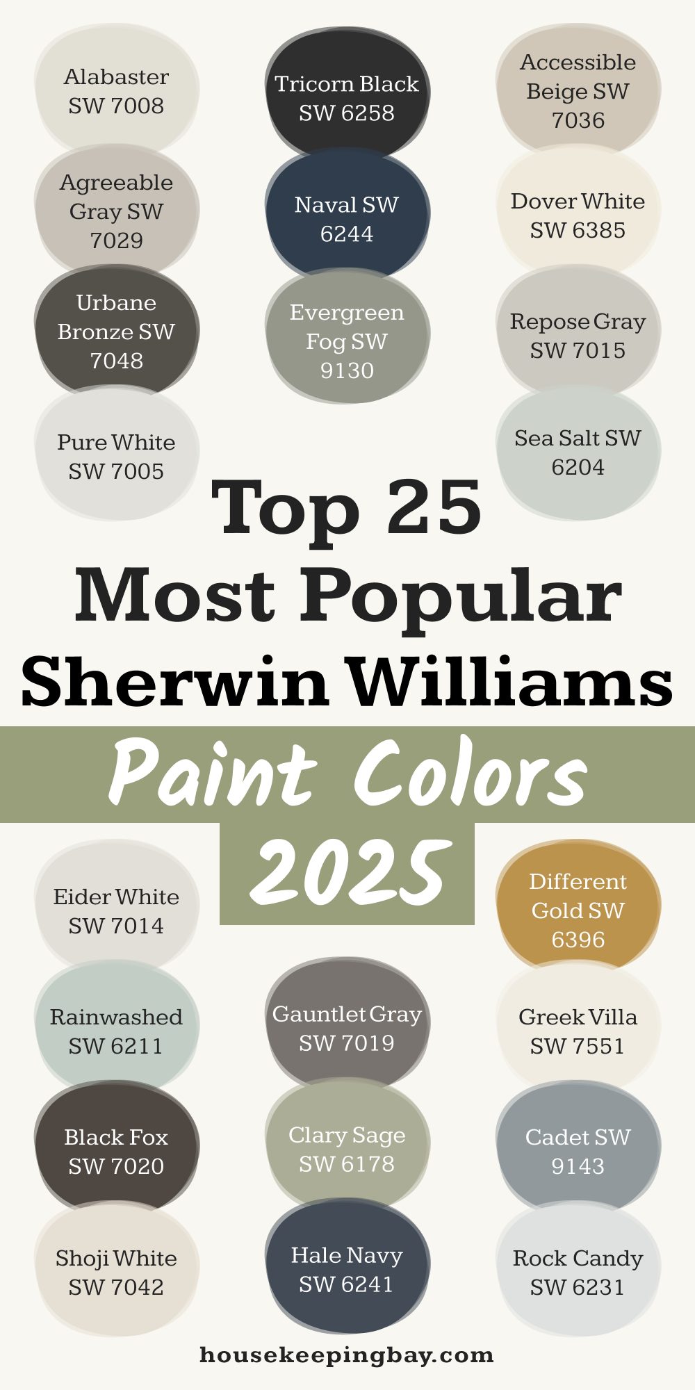
Top 25 Sherwin Williams Paint Colors for 2025
Here’s the list of Sherwin Williams’ most popular colors this year, with tips on how to use them:
-
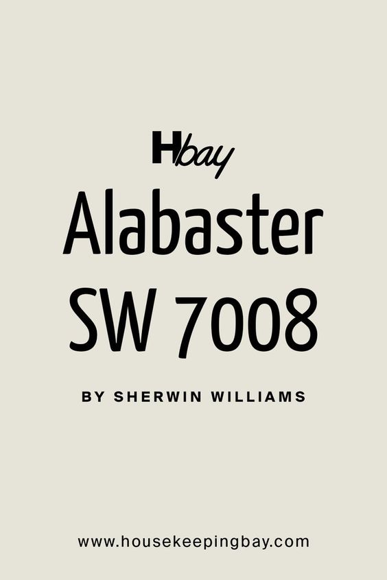
Alabaster (SW 7008)
- A warm, off-white that’s perfect for creating a light and airy feel.
- Works beautifully in living rooms and kitchens.
- Pair with: Natural wood tones or black accents.
-
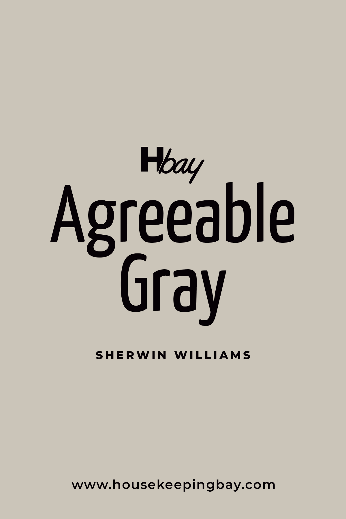
Agreeable Gray (SW 7029)
- A versatile greige that balances warm and cool tones.
- Ideal for open floor plans.
- Pair with: Soft blues or whites for contrast.
housekeepingbay
-
Urban Bronze (SW 7084)
- A deep, earthy bronze that feels grounding.
- Best used as an accent color or on cabinetry.
- Pair with: Warm whites or muted greens.

Housekeepingbay.com
-
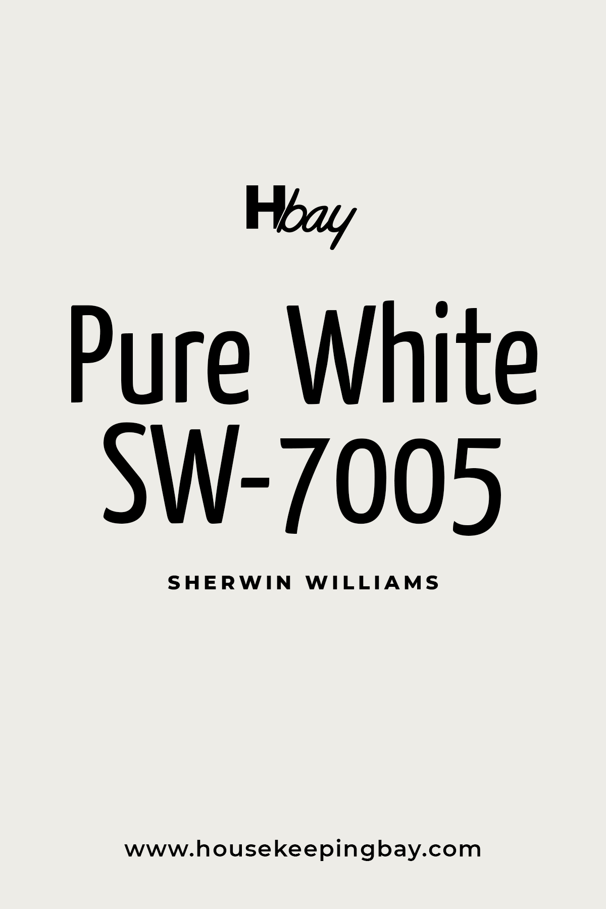
Pure White (SW 7005)
- A crisp white that complements any decor style.
- Great for trim, ceilings, or minimalist spaces.
- Pair with: Bold colors like navy or emerald.
Housekeepingbay.com
-
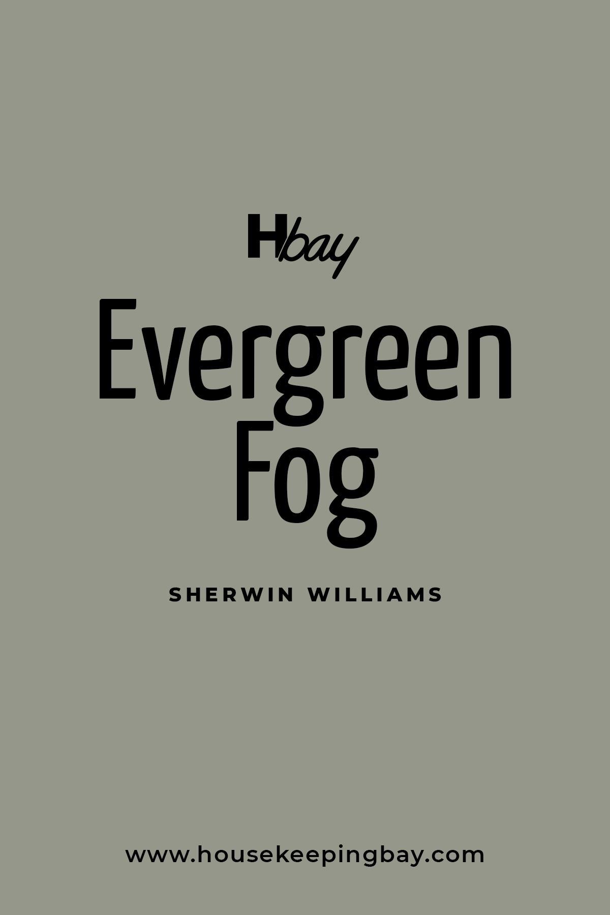
Evergreen Fog (SW 9130)
- A soft green-gray with a soothing vibe.
- Perfect for bedrooms or entryways.
- Pair with: Creamy whites and light woods.
Housekeepingbay.com
-
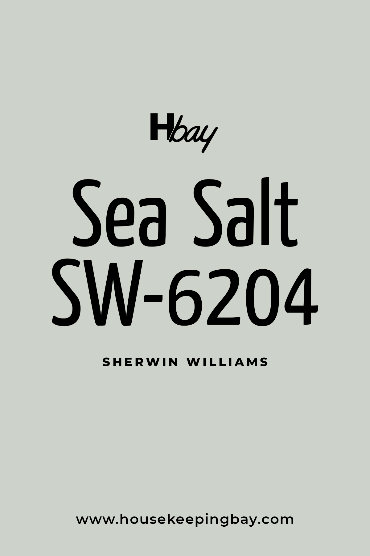
Sea Salt (SW 6204)
- A soft green-blue that’s reminiscent of a spa-like retreat.
- Perfect for bathrooms or laundry rooms.
- Pair with: White trim and brushed nickel finishes.
Housekeepingbay.com
-
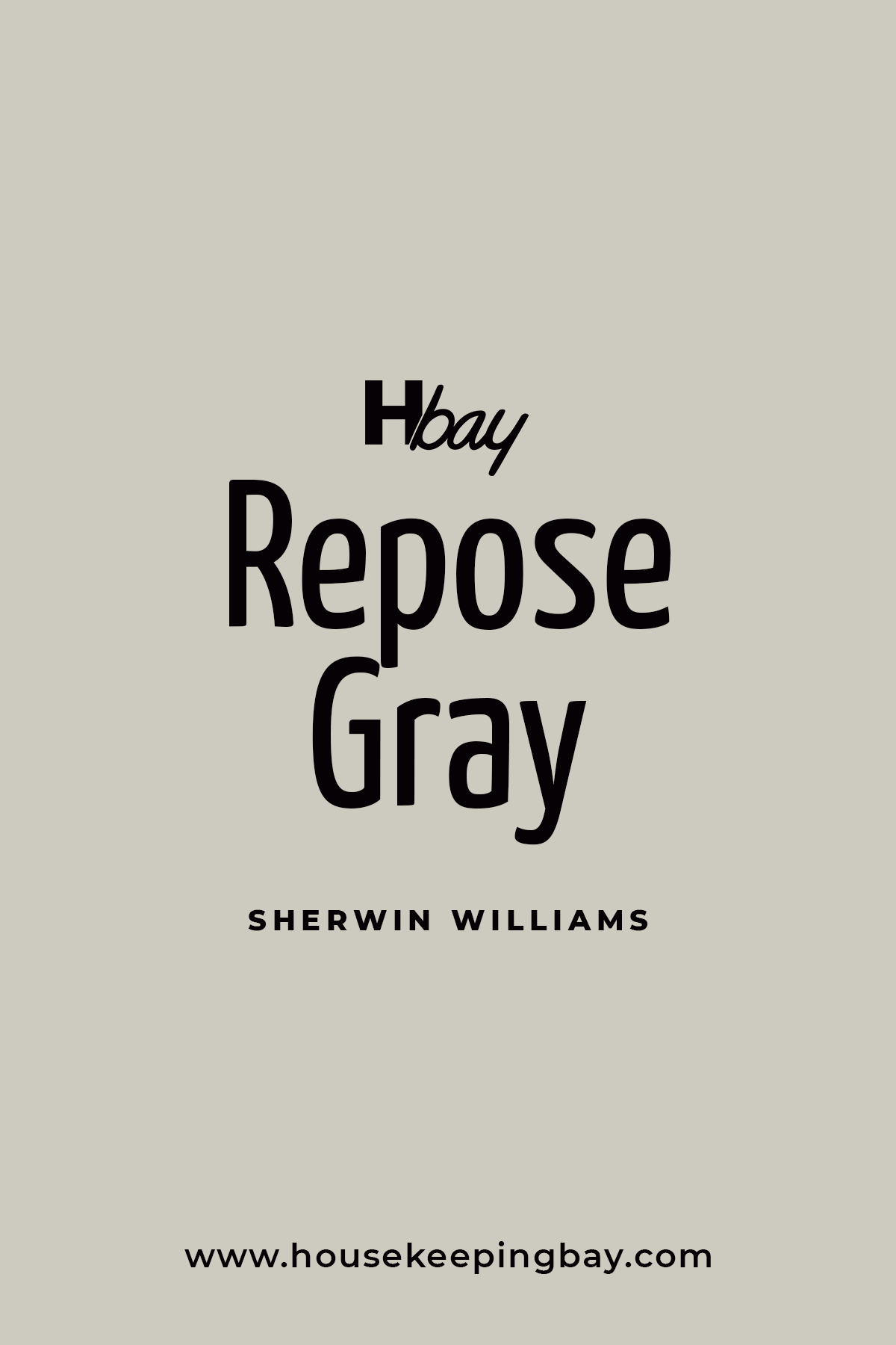
Repose Gray (SW 7015)
- A neutral gray with warm undertones that works in any room.
- A favorite for open living spaces.
- Pair with: Dark wood furniture or bold wall art.
housekeepingbay
-
Naval (SW 6244)
- A classic navy blue that feels sophisticated and rich.
- Stunning for dining rooms or as a front door color.
- Pair with: Crisp whites and gold hardware.

housekeepingbay.com
-
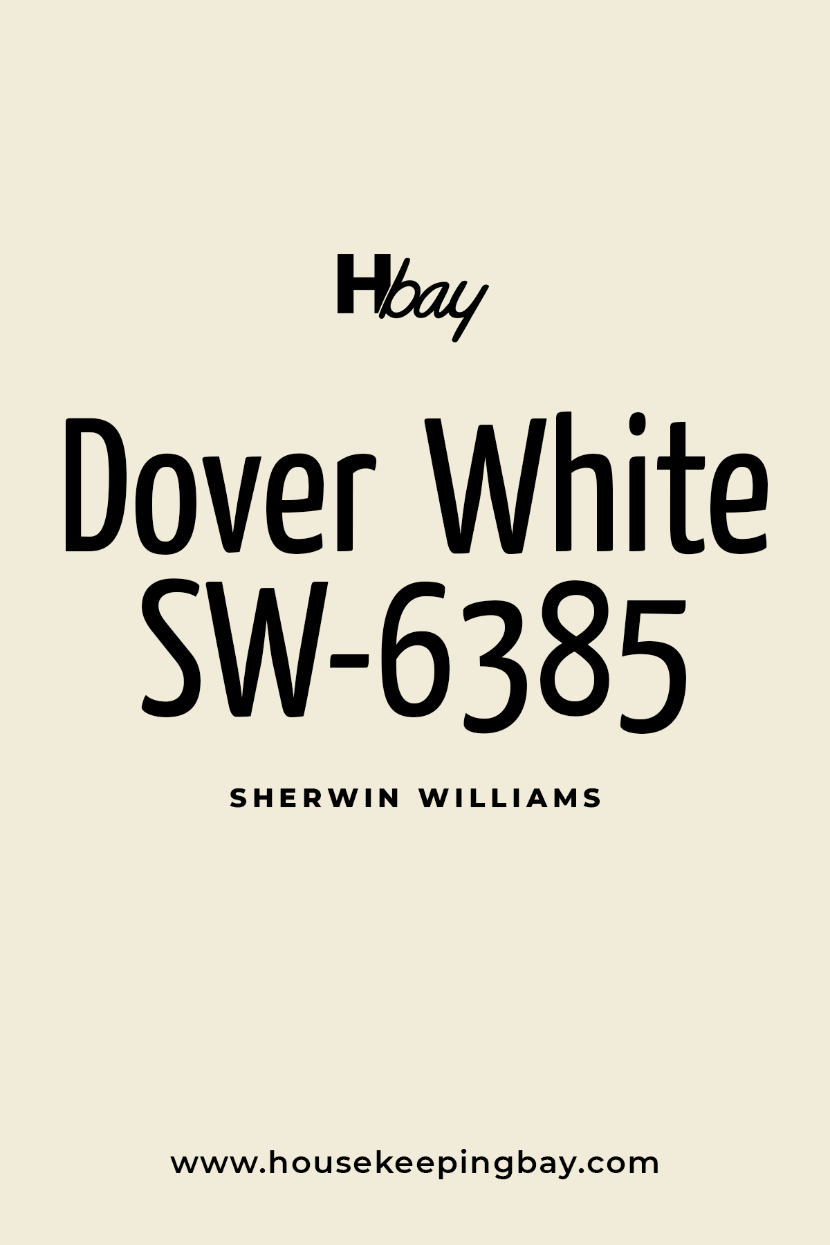
Dover White (SW 6385)
- A creamy white with soft yellow undertones.
- Creates a welcoming feel in entryways and kitchens.
- Pair with: Muted greens or pale grays.
Housekeepingbay.com
-
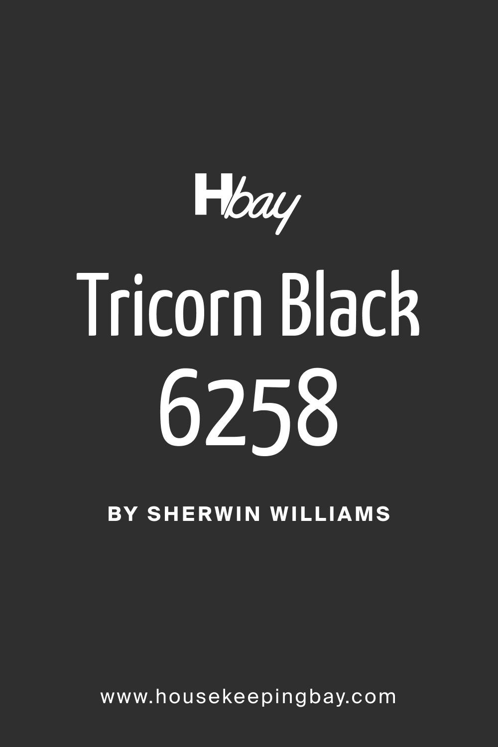
Tricorn Black (SW 6258)
- A true black that adds drama and elegance.
- Ideal for accent walls, trim, or doors.
- Pair with: Lighter neutrals for contrast.
housekeepingbay.com
-
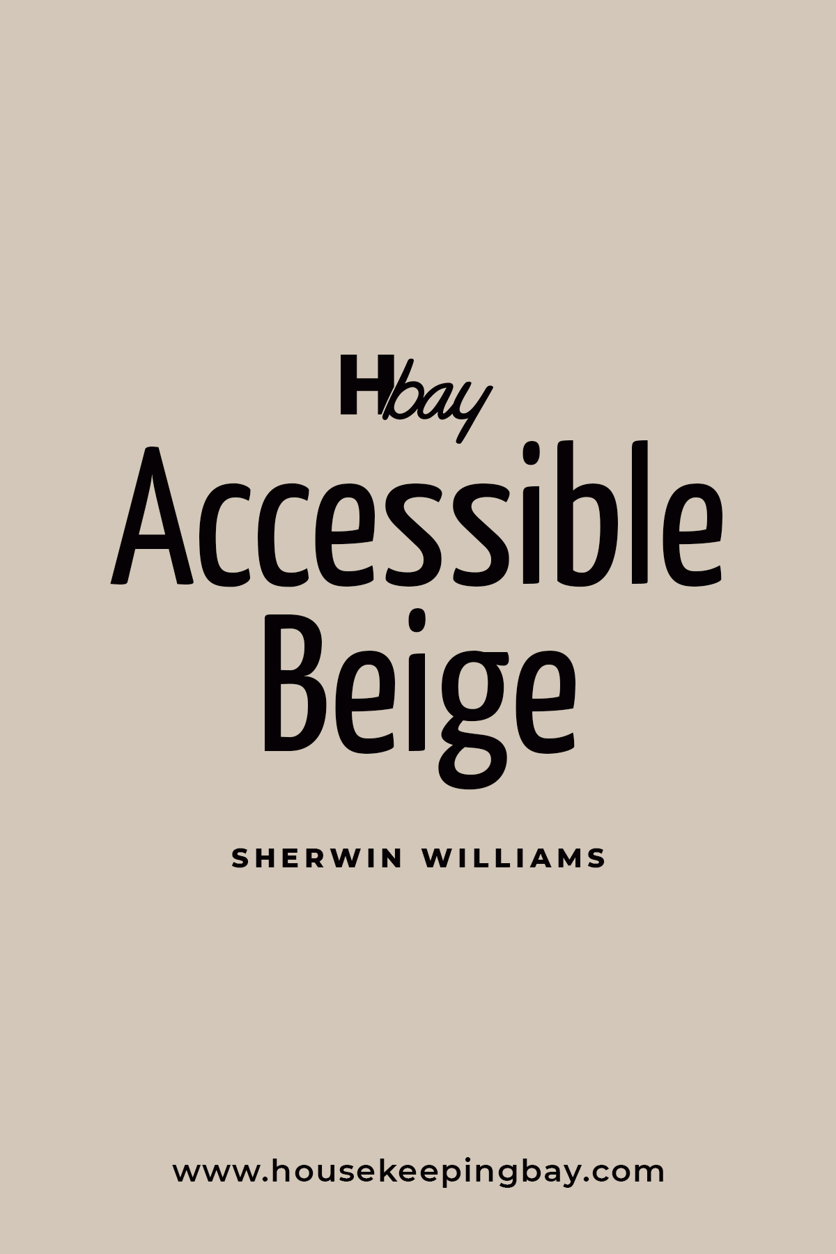
Accessible Beige (SW 7036)
- A warm beige with gray undertones, striking the perfect balance.
- Works beautifully in living rooms or bedrooms.
- Pair with: Light blues or greens for a calming palette
housekeepingbay
-
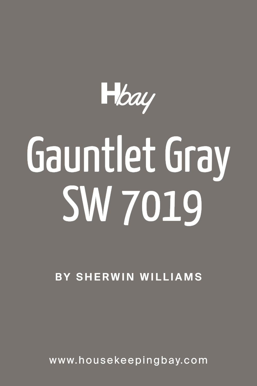
Gauntlet Gray (SW 7019)
- A deep, warm gray with a sophisticated feel.
- Great for accent walls or cabinetry.
- Pair with: Soft whites or muted yellows.
-
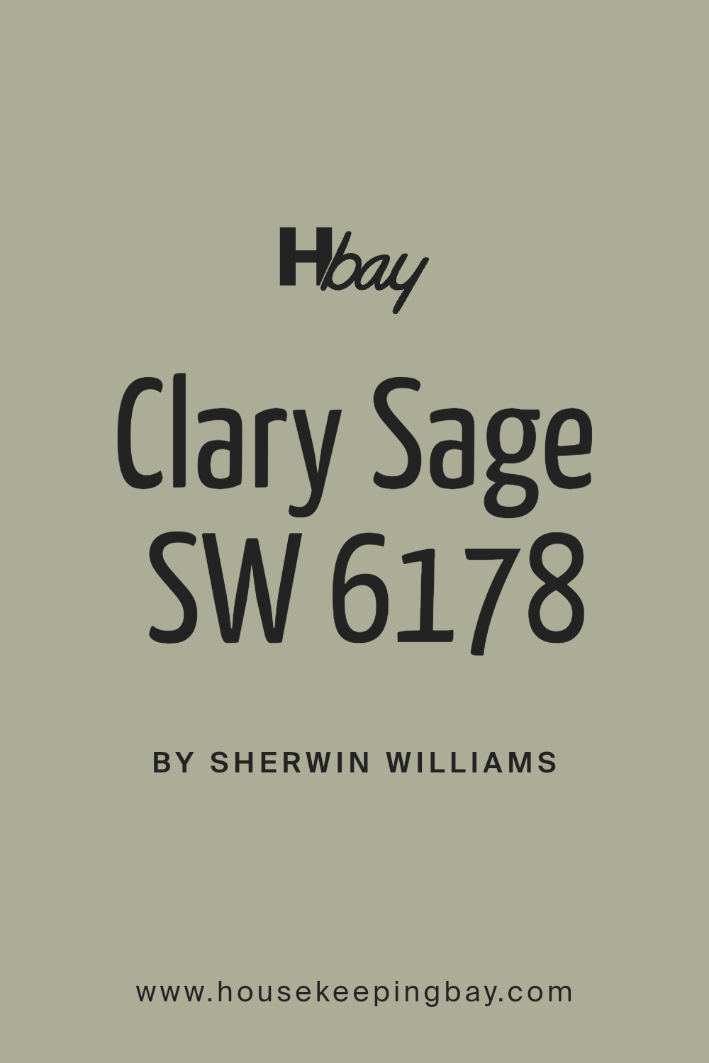
Clary Sage (SW 6178)
- A gentle sage green inspired by nature.
- Perfect for kitchens or mudrooms.
- Pair with: Light wood tones and brass finishes.
-
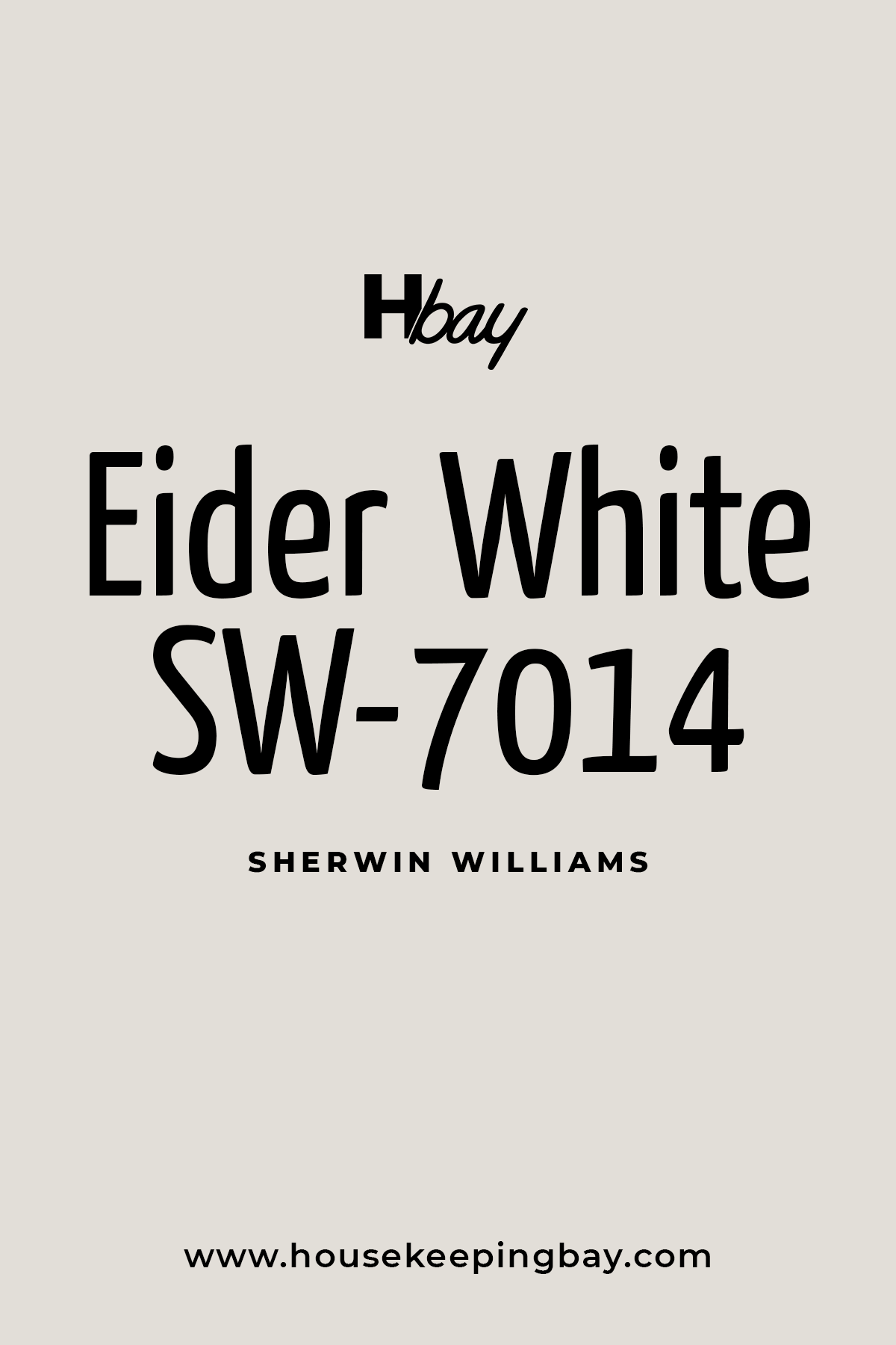
Eider White (SW 7014)
- A cool, off-white with subtle gray undertones.
- Works in modern or minimalist spaces.
- Pair with: Dark grays or blues.
Housekeepingbay.com
-
Hale Navy (SW 6241)
- A deeper, more muted navy that feels timeless.
- Perfect for home offices or bedrooms.
- Pair with: Warm metallic accents and white trim.
-
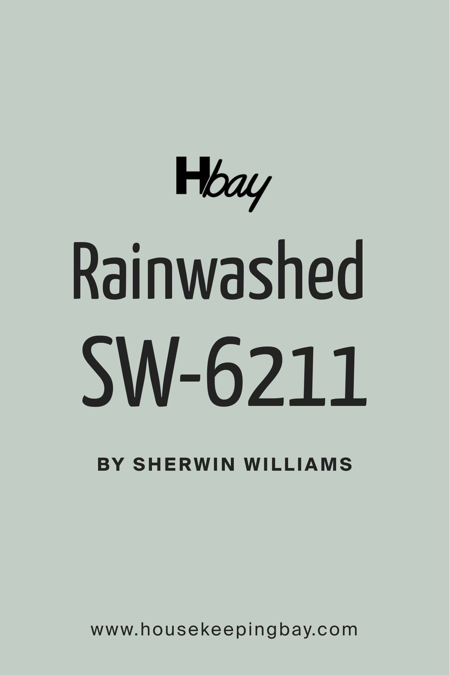
Rainwashed (SW 6211)
- A soft blue-green that feels fresh and uplifting.
- Ideal for bedrooms or bathrooms.
- Pair with: Light neutrals or sandy beige tones.
housekeepingbay.com
-
Shoji White (SW 7042)
- A warm off-white with a hint of beige.
- Great for creating a cohesive look in open spaces.
- Pair with: Soft greens or grays.

housekeepingbay.com
-
Muted Gold (SW 6691)
- A rich, golden hue that feels warm and inviting.
- Ideal for accent walls or statement furniture.
- Pair with: Deep blues or dark grays.
-
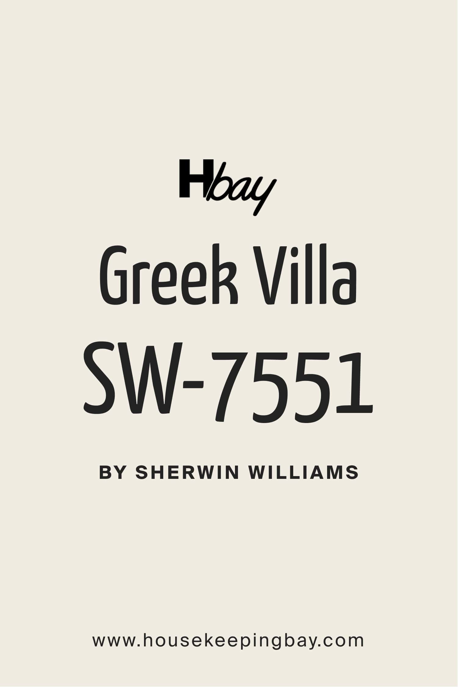
Greek Villa (SW 7551)
- A soft, creamy white that’s incredibly versatile.
- Works beautifully in traditional or modern designs.
- Pair with: Neutral beiges or bold blacks.
housekeepingbay.com
-
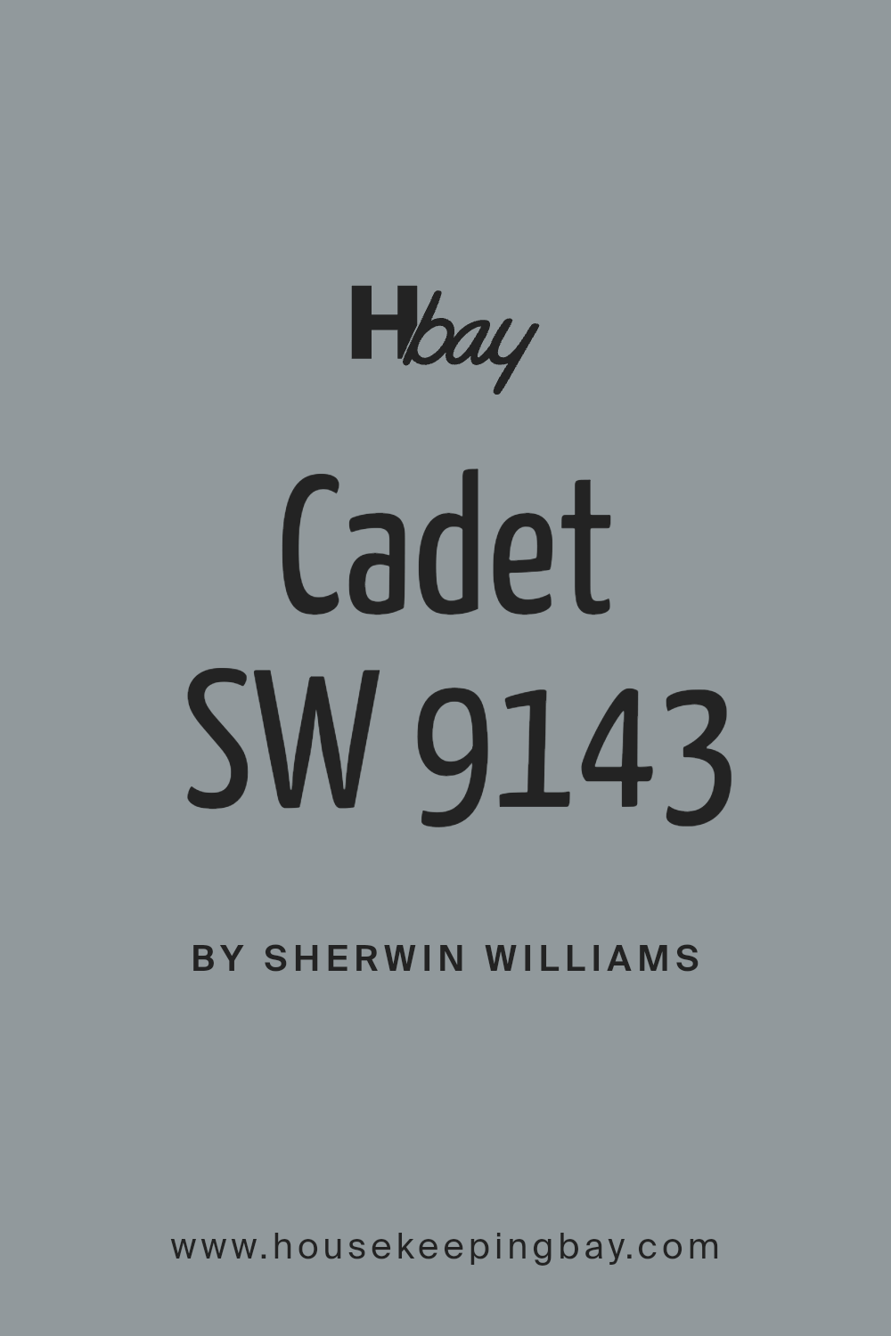
Cadet (SW 9143)
- A muted blue-gray with a serene feel.
- Ideal for bathrooms or reading nooks.
- Pair with: Light woods and off-white tones.
-
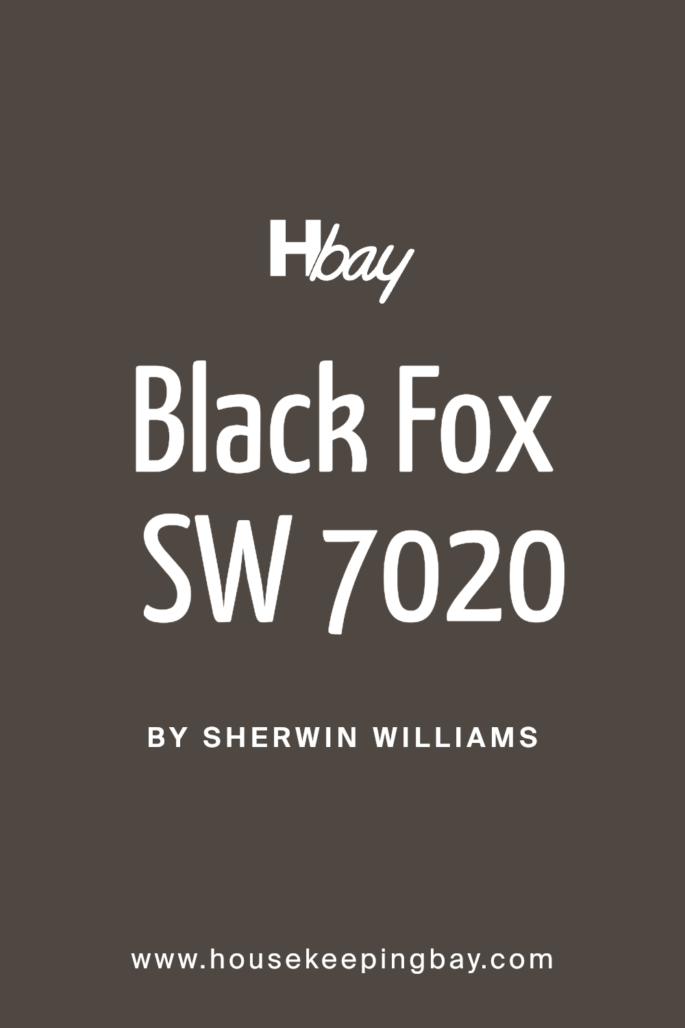
Black Fox (SW 7020)
- A dark brown-black that adds warmth and depth.
- Best used for exteriors, trim, or furniture.
- Pair with: Warm whites or muted greens.
-
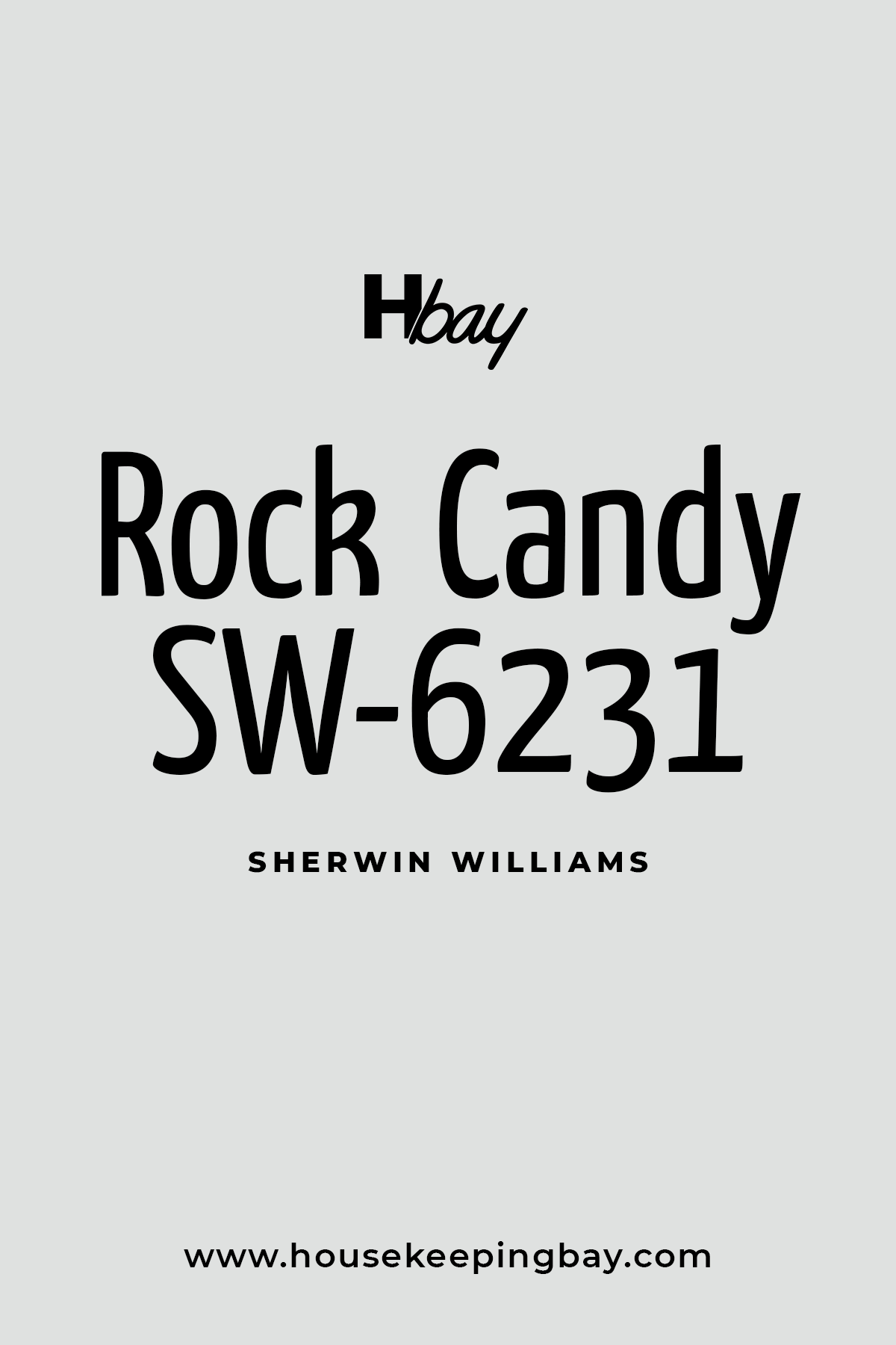
Rock Candy (SW 6231)
- A pale, cool gray with blue undertones.
- Perfect for modern kitchens or bathrooms.
- Pair with: Polished silver or stainless steel accents.
Housekeepingbay.com
-
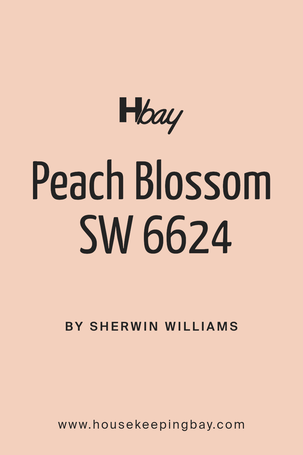
Peach Blossom (SW 6624)
- A soft, peachy pink that feels light and cheerful.
- Great for nurseries or accent walls.
- Pair with: Light grays or whites.
-
Caribbean Coral (SW 6617)
- A bright coral that’s full of personality.
- Best used in smaller spaces like powder rooms.
- Pair with: Soft creams or muted greens.
-
Caviar (SW 6990)
- A luxurious, deep black with a velvety finish.
- Perfect for creating drama in dining rooms or as an exterior color.
- Pair with: Whites or jewel tones for contrast.
Tips for Using These Colors
- Think About Lighting
- Colors can look different in natural vs. artificial light. Test samples in your space before committing.
- Pair Wisely
- Combine a neutral base with one or two accent shades for a balanced look.
- Start Small
- If you’re unsure, try painting a small area like a powder room or an accent wall first.
- Consult the Experts
- Many Sherwin Williams locations offer free or low-cost consultations to help you find the perfect match.
Real-Life Inspiration
One of my clients used Urbane Bronze for their kitchen island and paired it with Alabaster cabinets. The contrast was stunning, and they were thrilled with how it modernized their space.
According to Sherwin Williams’ color experts, Evergreen Fog was their most requested shade for bedrooms this year . Its calming presence makes it a favorite among homeowners and designers alike.
Color Insights Backed by Statistics
- 67% of homeowners say they feel happier in a home with lighter wall colors
- Neutral tones like Agreeable Gray are chosen by 56% of homebuyers for resale purposes.
Final Thoughts
Paint is one of the simplest ways to make a home feel refreshed and stylish. Sherwin Williams’ 2025 lineup offers something for everyone, from bold accents to soft neutrals.
Whether you’re redesigning for yourself or preparing a home for sale, choosing one of these shades can make a big difference.
Remember, the best color is the one that makes your space feel like home.
What’s your favorite Sherwin Williams color this year?
Let me know!
housekeepingbay.com
