Gauzy White SW 6035 by Sherwin Williams
Embracing the Elegance of Softness
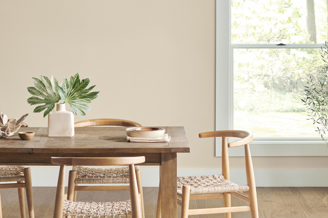
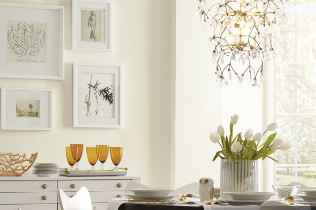
SW 6035 Gauzy White by Sherwin Williams is a nuanced paint color that embodies the subtle elegance of a soft, airy white with just a hint of warmth. Ideal for creating serene environments, Gauzy White offers a clean and timeless backdrop for any interior space.
This shade is versatile, effortlessly complementing an array of decor styles, from contemporary minimalist to cozy cottage. As part of Sherwin Williams’ extensive palette, Gauzy White stands out for its ability to bring a fresh and inviting atmosphere into any room.
The beauty of Gauzy White lies in its understated sophistication. It manages to capture the essence of tranquility without being stark or cold, making it a perfect choice for homeowners looking to achieve a peaceful and welcoming space.
Whether used on walls, trim, or ceilings, Gauzy White has a luminous quality that enhances natural light, making spaces appear larger and more open.
In addition, Gauzy White pairs wonderfully with a wide range of colors, from soft neutrals to bold accents, allowing for endless design possibilities. Its versatility extends to various materials and textures, highlighting wood grains, metals, and fabrics alike.
As a result, Gauzy White by Sherwin Williams is not just a paint color but a canvas for personal expression and style.
via sherwin-williams.com
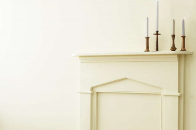
What Color Is Gauzy White SW 6035 by Sherwin Williams?
Gauzy White SW 6035 by Sherwin Williams is a beautifully nuanced shade of white that offers a soft, ethereal quality to any room it graces.
This color exudes a gentle warmth that fills a space with light, without the starkness often associated with pure white tones. Its subtle undertones ensure it complements a wide range of decor schemes, adding to its versatility.
Interior styles that benefit greatly from Gauzy White include minimalist, Scandinavian, and coastal, due to its ability to evoke a sense of calm and openness.
In minimalist interiors, it enhances the sense of spaciousness, while in Scandinavian designs, it underscores the clean, airy aesthetic that is characteristic of this style. For coastal themes, Gauzy White perfectly captures the light and breezy feel, reminiscent of sandy beaches and soft waves.
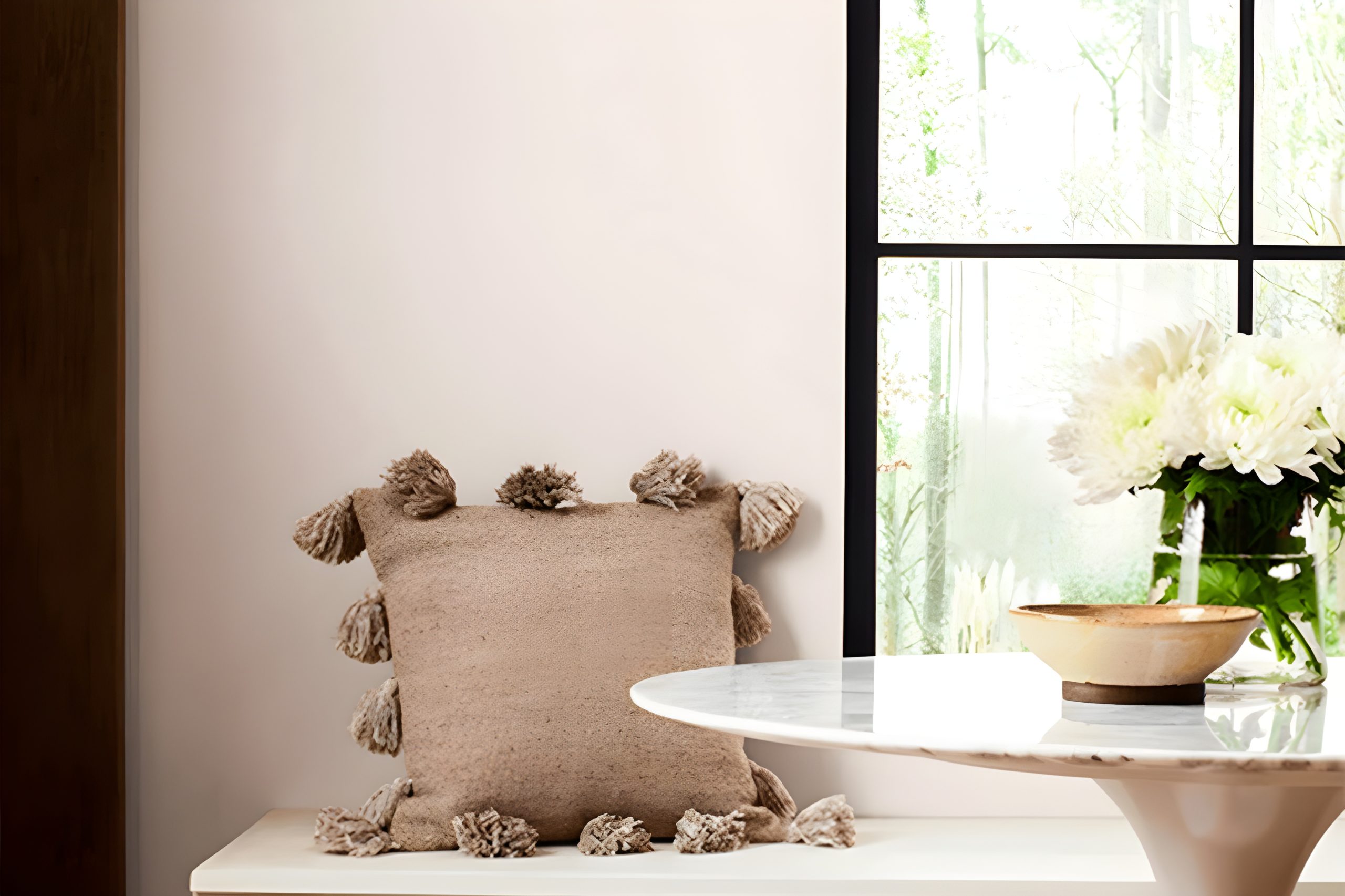
When it comes to pairing with materials and textures, Gauzy White is exceptionally accommodating. It pairs splendidly with natural wood, from pale birch to rich walnut, highlighting the organic beauty of the grain.
In terms of textures, it works well with soft, plush fabrics like cotton and linen, adding a layer of comfort to the visual serenity of the space. Metallic accents, whether gold, silver, or bronze, pop against this subtle backdrop, adding a touch of glamour without overwhelming.
Gauzy White thus proves to be a masterful choice for those seeking a color that supports a wide range of design elements, allowing for a harmonious blend of textures and materials in any interior space.
housekeepingbay.com
Table of Contents
Is Gauzy White SW 6035 by Sherwin Williams Warm or Cool color?
Gauzy White SW 6035 by Sherwin Williams is a hue that embodies the essence of understated elegance and brings a light, airy atmosphere to any space it graces. Its soft, gauzy quality creates a subtle backdrop that complements a wide range of décor styles, from minimalist modern to cozy cottage.
This color has the unique ability to make small rooms feel more spacious and inviting by reflecting natural light, thus enhancing the overall brightness of the space.
Additionally, its neutral but warm undertones provide a canvas that allows for versatility in decorating, enabling homeowners to easily refresh their space with new accent colors or accessories without having to repaint.
In homes, Gauzy White fosters a sense of calm and cleanliness. It works exceptionally well in living areas and bedrooms, where a serene ambiance is often desired. Moreover, in busier parts of the home like kitchens and bathrooms, it introduces a clean, crisp vibe that suggests tidiness and order.
The gentle nature of Gauzy White means it pairs beautifully with a broad spectrum of colors, from soft pastels to bold, rich shades, offering endless possibilities for creating inviting, personalized spaces.
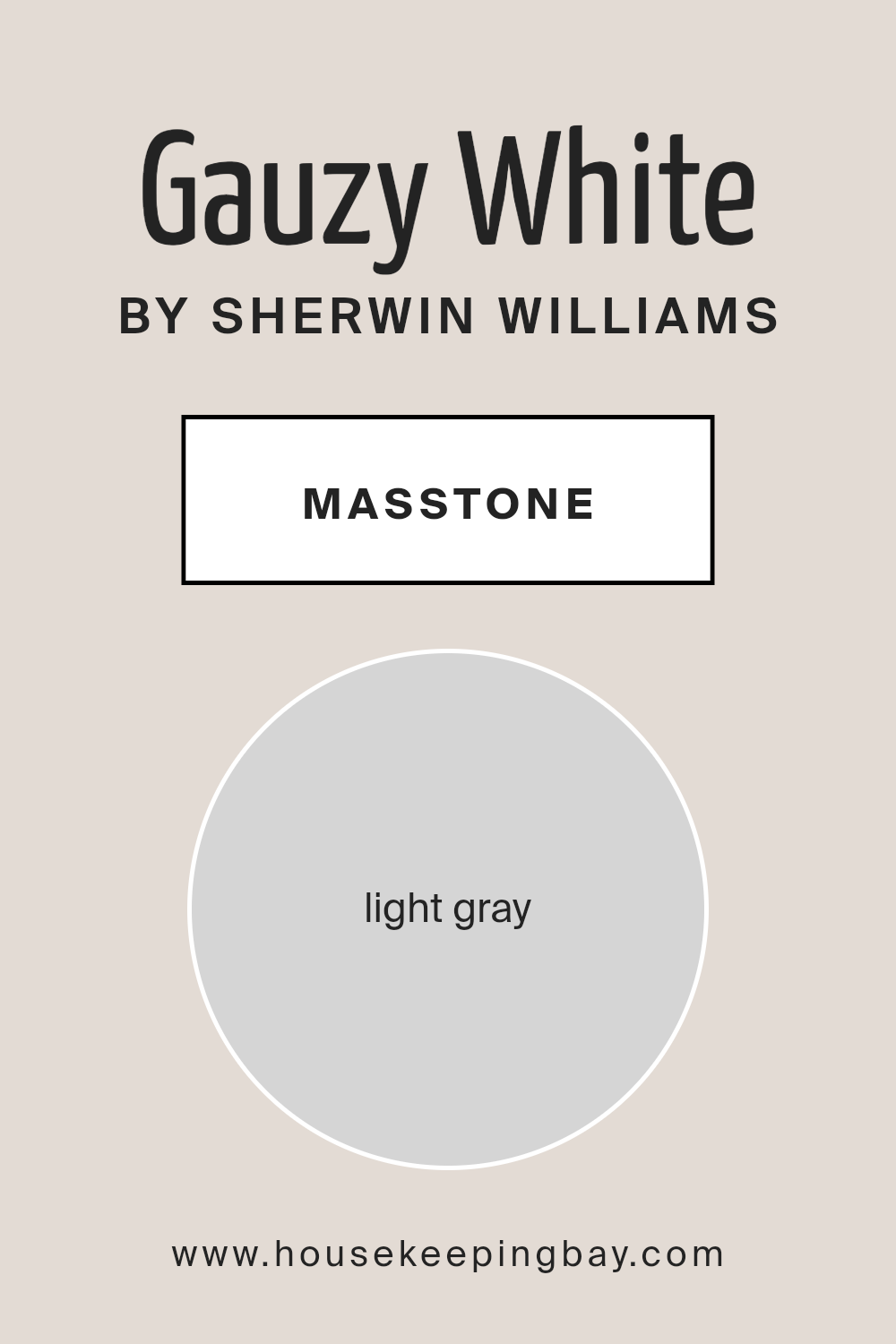
What is the Masstone of the Gauzy White SW 6035 by Sherwin Williams?
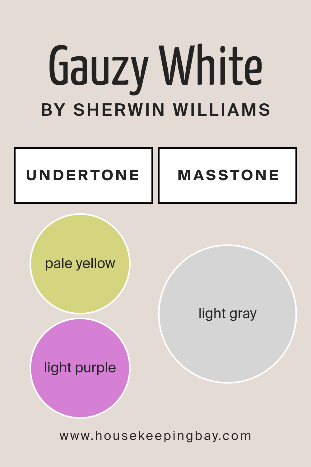
Gauzy White SW 6035 by Sherwin-Williams presents a masstone of light gray, coded as #D5D5D5. This particular hue offers a delicate balance, providing a neutral backdrop that complements a broad spectrum of design choices in homes.
Its light gray masstone brings an airy and open feel to spaces, making rooms appear more spacious and inviting.
Unlike more stark or bold colors, Gauzy White’s subtle gray underpinings ensure it integrates seamlessly with various textures and furnishings, enhancing the overall aesthetic without overwhelming it.
In the realm of home decor, this color works wonders by offering versatility. It acts as a serene foundation, allowing for creative freedom with accent colors and decor elements. In spaces that receive ample natural light, Gauzy White reflects and amplifies this light, contributing to a brighter, more energized environment.
Even in smaller or less illuminated areas, it can help to minimize the feeling of constraint, giving the illusion of a more expansive space. Therefore, Gauzy White SW 6035 stands as an excellent choice for those seeking a gentle yet sophisticated palette that supports a wide range of personal styles and preferences.
housekeepingbay.com
Undertones of Gauzy White SW 6035 by Sherwin Williams
Gauzy White SW 6035 by Sherwin Williams is a nuanced color that doesn’t merely present as a simple white. The interplay of its subtle undertones, pale yellow and light purple, significantly influences its overall appearance and perception.
These undertones add depth and complexity, enriching the color beyond a straightforward white palette.
Pale yellow brings a warmth and softness to Gauzy White, making spaces feel more inviting and cozy. It gently reflects natural light, enhancing brightness in a room without the starkness often associated with pure white.
This warmth allows the color to adapt seamlessly across various lighting conditions, always maintaining a sense of comfort and welcoming ambiance.
On the other hand, the light purple undertone introduces a hint of coolness, which balances the warmth of the pale yellow. This coolness adds a layer of sophistication and subtle vibrancy, making the color more dynamic and versatile.
It provides a tranquil backdrop that can complement a wide range of decor styles and color schemes.
In an interior setting, these undertones influence how Gauzy White behaves on walls. The pale yellow and light purple undertones interact with the room’s lighting, shifting subtly throughout the day.
The result is a living color that transitions from a soft, warm glow in sunlight to a more composed and serene presence under artificial lighting. This chameleon-like quality makes Gauzy White SW 6035 an excellent choice for creating a serene and adaptable space, offering a backdrop that supports both relaxation and focus.
housekeepingbay.com
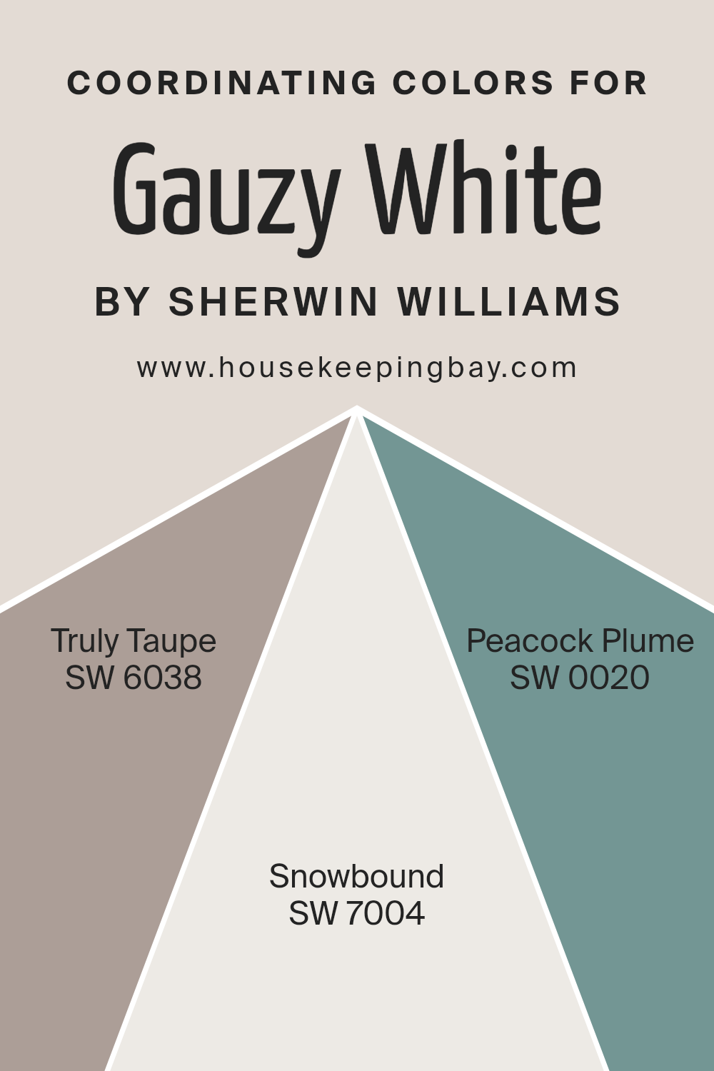
Coordinating Colors of Gauzy White SW 6035 by Sherwin Williams
Coordinating colors are hues that complement each other when used together in a design or palette, ensuring a balanced and harmonious look. They can enhance the primary color’s features, creating a more cohesive and appealing space.
In the context of Gauzy White SW 6035 by Sherwin Williams, a delicate and airy shade, the coordinating colors have been thoughtfully selected to complement its subtle tones, adding depth and versatility to the palette.
SW 6038 – Truly Taupe, SW 7004 – Snowbound, and SW 0020 – Peacock Plume are excellent examples of how diverse colors can work together to enrich the ambiance of a room.
Truly Taupe is a sophisticated blend of gray and brown that offers a grounding effect, perfect for adding warmth to the softness of Gauzy White. Its earthy tones provide a subtle contrast, making it an ideal choice for creating a serene and inviting space.
Snowbound stands out as a crisp, clean white with a hint of warmth, which can brighten rooms while maintaining a soft, unified look alongside Gauzy White. This pairing is perfect for those seeking a minimalist aesthetic with a cozy feel. Peacock Plume, a vibrant and deep shade of teal, adds a splash of color and personality.
It serves as a bold accent that can bring energy and depth to spaces, contrasting beautifully with the tranquility of Gauzy White to make design elements pop. Together, these coordinating colors form a versatile palette that can suit various design styles, from modern to traditional, enhancing the beauty and elegance of Gauzy White.
You can see recommended paint colors below:
- SW 6038 Truly Taupe
- SW 7004 Snowbound
- SW 0020 Peacock Plume
housekeepingbay.com
How Does Lighting Affect Gauzy White SW 6035 by Sherwin Williams?
Lighting plays a fundamental role in how we perceive colors, significantly influencing their appearance and the ambiance they create in a space. The color Gauzy White SW 6035 by Sherwin Williams is a versatile hue that exemplifies how lighting conditions can alter its perception.
This shade of white has subtle undertones that can either be highlighted or muted, depending on the type of light it is exposed to, making it an excellent choice for various settings and orientations.
In artificial lighting, Gauzy White can exhibit different qualities based on the temperature of the light. Under warm artificial light, its cozy undertones are enhanced, giving spaces a more inviting and snug feeling. Conversely, in cooler artificial light, Gauzy White appears crisper and more vibrant, creating a more refreshing atmosphere.
The flexibility of this color in artificial lighting allows it to adapt to different settings and moods effortlessly.
Natural light brings out the truest representation of Gauzy White, but its effect varies with the direction of the room’s windows.
In north-faced rooms, which receive less direct sunlight and tend to have a cooler light, Gauzy White may look more neutral and balanced, providing a steady and calming effect. It maintains its crispness without becoming too stark or cold.
South-faced rooms bask in abundant natural light for most of the day, which can warm up the appearance of Gauzy White, making it feel softer and more radiant. The color adapts well, offering brightness and warmth that makes the room feel welcoming and lively.
East-faced rooms enjoy the morning sunlight, which is softer and warmer. Here, Gauzy White can take on a gently luminous quality in the morning, transitioning to a cooler and more balanced tone as the day progresses. This dynamic change can make spaces feel alive and vibrant, yet serene.
In west-faced rooms, the intense afternoon and evening light can cast a golden hue, enriching Gauzy White with warm undertones and creating a cozy, soothing environment as the day ends.
In conclusion, Gauzy White SW 6035’s reaction to different lighting conditions — artificial, natural, and directional — highlights its flexibility and the importance of considering lighting when choosing colors for a space.
housekeepingbay.com
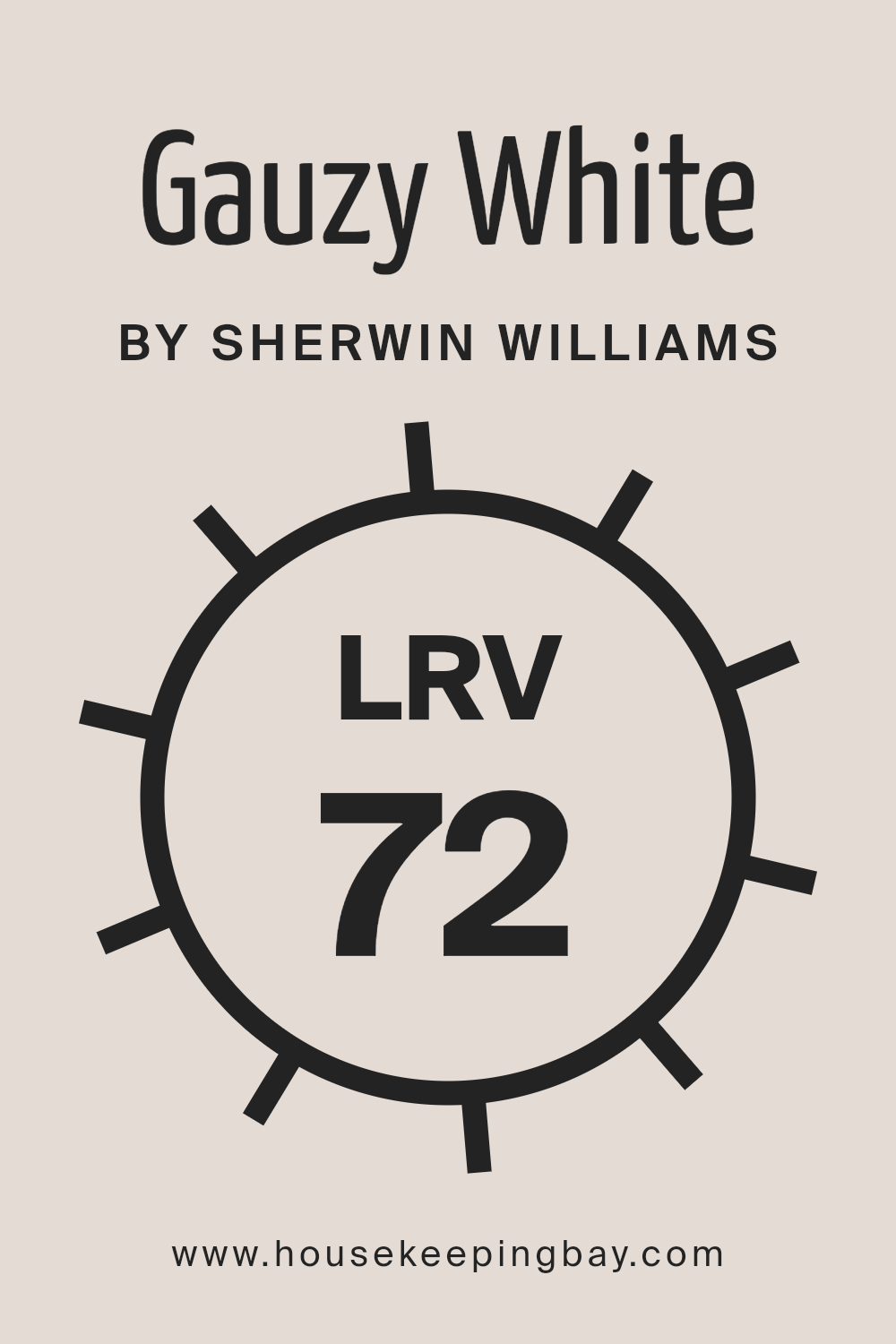
What is the LRV of Gauzy White SW 6035 by Sherwin Williams?
Light Reflectance Value (LRV) measures the amount of visible and usable light that a paint color reflects or absorbs once applied to a wall. This value is represented on a scale from 0 to 100, with 0 being perfectly black, absorbing all light, and 100 being perfectly white, reflecting all light back.
LRV is a crucial factor in choosing paint colors because it affects how light or dark a color appears once it’s on your walls and influences the overall mood and spaciousness of a room.
A higher LRV can make spaces feel more open and airy as more light is reflected, whereas colors with lower LRVs create a cozier or more enclosed feel by absorbing more light.
Regarding Gauzy White SW 6035 by Sherwin Williams, which has an LRV of 71.685, this places it on the lighter end of the spectrum, indicating it is a color that reflects a good amount of light.
This characteristic means that when applied to walls, Gauzy White can help create a feeling of openness and brightness, making it an excellent choice for rooms you want to appear larger or more inviting.
Its high LRV suggests it will significantly impact spaces lacking in natural light, as it can effectively utilize what light is available to create a more luminous environment. Thus, Gauzy White is not just a simple paint choice; its reflective qualities offer both aesthetic and functional benefits, enhancing the spatial dynamics and mood of any room it adorns.
housekeepingbay.com
What is LRV? Read It Before You Choose Your Ideal Paint Color
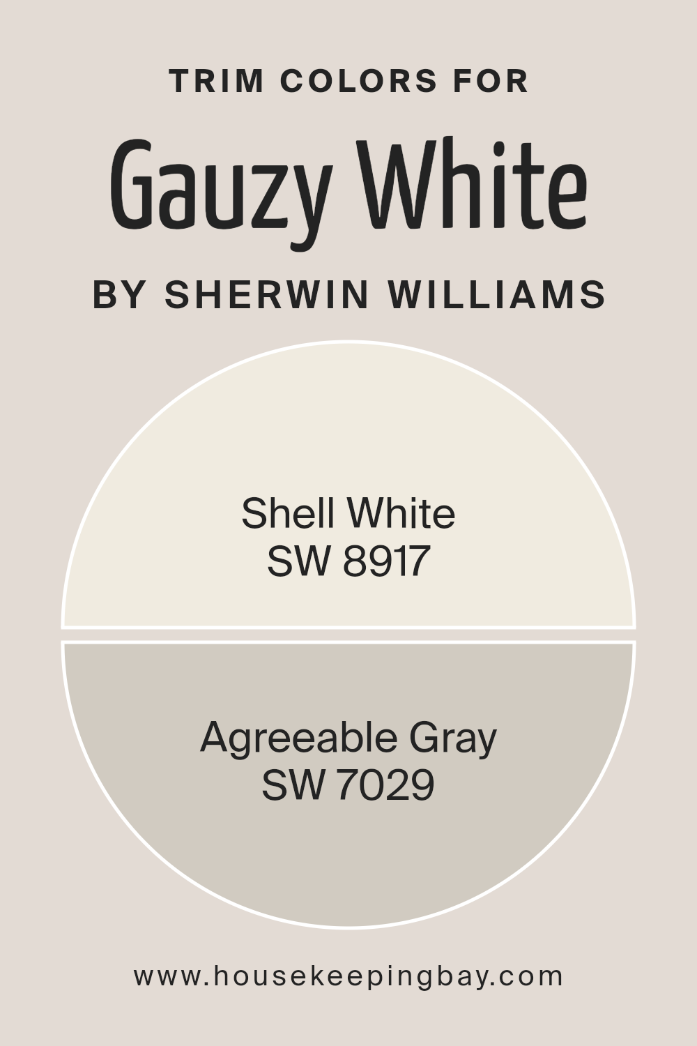
What are the Trim colors of Gauzy White SW 6035 by Sherwin Williams?
Trim colors serve a crucial role in defining and accentuating the unique architectural features of a home, such as door frames, windowsills, crown moldings, and baseboards. By carefully selecting trim colors, homeowners can enhance the overall appearance and cohesiveness of their spaces.
For a versatile and widely loved paint option like Gauzy White SW 6035 by Sherwin Williams, choosing the right trim colors is especially important.
Trim colors can either subtly complement the wall color to create a harmonious and seamless look or boldly contrast with it to make architectural details pop and add visual interest to the room.
For a soft and cohesive look, Shell White SW 8917 is an excellent choice as a trim color. It’s a warm white hue that provides a gentle contrast to the delicate tone of Gauzy White, allowing spaces to feel open and airy without creating too stark of a distinction.
On the other hand, Agreeable Gray SW 7029, with its warm gray tones, offers a slightly stronger contrast while still maintaining a harmonious feel with Gauzy White. This color can add a subtle depth and complexity to the space, enriching the overall palette without overwhelming it.
Both options serve to subtly highlight the architectural beauty of a room, adding layers and interest in a sophisticated manner.
You can see recommended paint colors below:
housekeepingbay.com
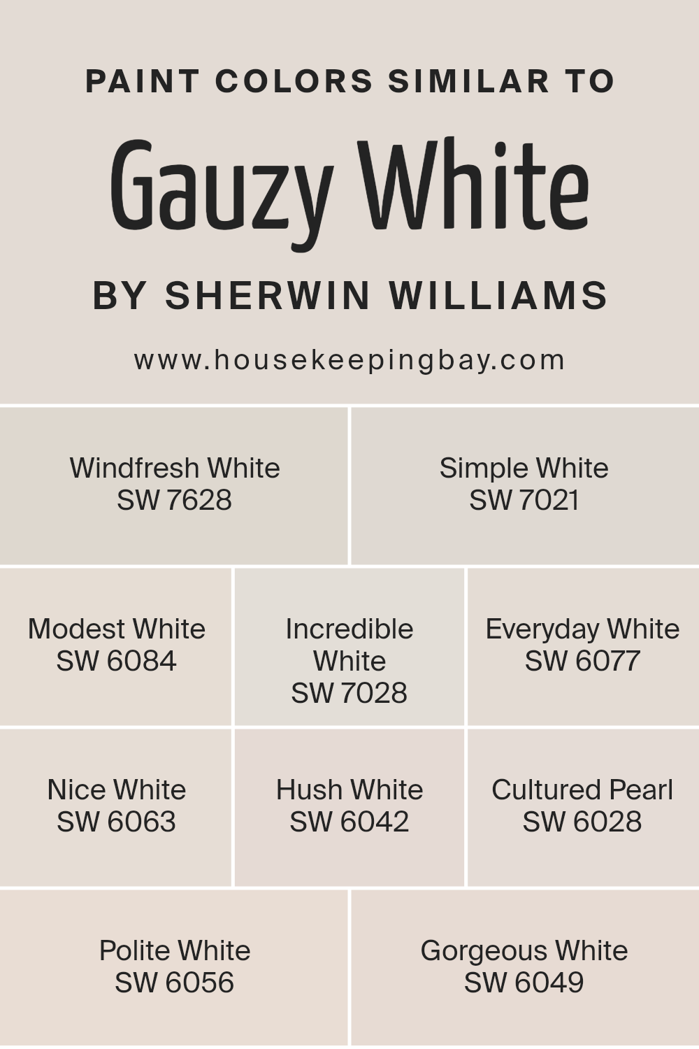
Colors Similar to Gauzy White SW 6035 by Sherwin Williams
Similar colors, like those close to Gauzy White by Sherwin Williams, play a crucial role in creating harmonious and cohesive spaces. They work by subtly varying in tone or shade yet maintaining a close relationship on the color spectrum, enabling designers and homeowners to add depth and complexity to a room without overwhelming it with contrast.
Similar colors can also help in achieving a specific aesthetic or mood, from serene and calming environments to bright and airy spaces, by offering a nuanced palette that softly transitions across different surfaces and elements.
Starting with Windfresh White, a breath of fresh air, it introduces a barely-there hint of gray, conjuring images of an early morning breeze. Simple White follows, offering a clean and unadulterated canvas, reminiscent of pure cotton.
Then, there’s Modest White, with its understated warmth, gently radiating comfort and subtle elegance. Incredible White shifts the mood slightly, incorporating a whisper of beige to evoke a welcoming, soft glow. Everyday White is the epitome of reliability, providing a steady and soft backdrop for daily life.
Nice White plays on the cooler end, bringing a hint of freshness without detachment. Hush White, as its name suggests, offers a quiet retreat, with a touch of soft gray for peaceful silences. Cultured Pearl, with its slight luster, hints at sophistication and grace.
Polite White strikes a balance, neither too warm nor too cool, making it versatile for various spaces. Finally, Gorgeous White rounds off the palette with its subtle, iridescent charm, reflecting light elegantly and completing the spectrum of similar colors that prove indispensable for creating inviting and cohesive spaces.
You can see recommended paint colors below:
- SW 7628 Windfresh White
- SW 7021 Simple White
- SW 6084 Modest White
- SW 7028 Incredible White
- SW 6077 Everyday White
- SW 6063 Nice White
- SW 6042 Hush White
- SW 6028 Cultured Pearl
- SW 6056 Polite White
- SW 6049 Gorgeous White
housekeepingbay.com
How to Use Gauzy White SW 6035 by Sherwin Williams In Your Home?
Gauzy White SW 6035 by Sherwin Williams is a beautiful, airy shade that brings a sense of openness and light to any space. Ideal for those looking to create a serene and inviting atmosphere in their home, this color is versatile enough to complement a wide range of decor styles.
Whether applied in a minimalist setting, where its subtlety can create a feeling of spaciousness and calm, or used as a backdrop in a more eclectic environment to balance busier elements, Gauzy White has the adaptability to fit your needs.
For homeowners considering a refresh of their living space or a complete redesign, Gauzy White offers a foundational hue that can elevate the look of walls, trim, or cabinets.
Its neutral tone ensures that it pairs beautifully with various color palettes, from pastels to bold shades, allowing for personalization of space. In rooms like the bedroom or living area, Gauzy White can help enhance natural light, making the space appear larger and more inviting.
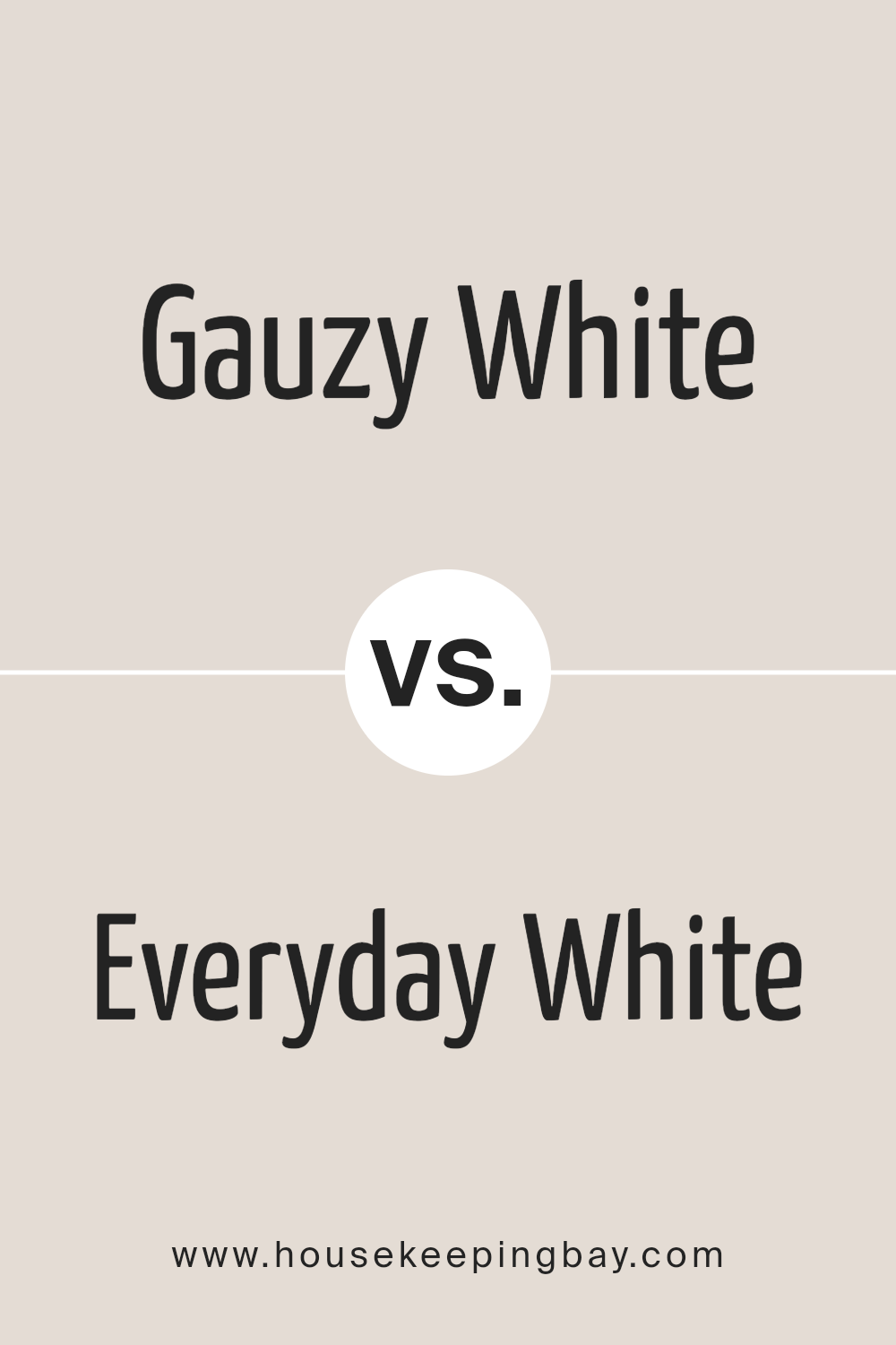
Gauzy White SW 6035 by Sherwin Williams vs Everyday White SW 6077 by Sherwin Williams
Gauzy White SW 6035 and Everyday White SW 6077, both from Sherwin Williams, present subtle but distinct differences that cater to varied design preferences. Gauzy White offers a light, airy feel that can illuminate spaces with a soft, diffuse brightness, subtly enhancing a room’s natural light.
Its ethereal quality makes it an excellent choice for creating a serene, tranquil atmosphere, suitable for minimalist or Scandinavian-inspired décor. On the other hand, Everyday White has a more grounded, warm undertone, providing a cozy, welcoming ambiance.
It’s a versatile hue that complements a wide range of color palettes, making it ideal for spaces intended to have a more inviting, lived-in feel. While both colors maintain a minimalist aesthetic, Gauzy White leans towards a cooler, more pristine finish, whereas Everyday White offers warmth and familiarity, demonstrating how slight variations in white paint can dramatically impact the mood and style of a room.
You can see recommended paint color below:
housekeepingbay.com
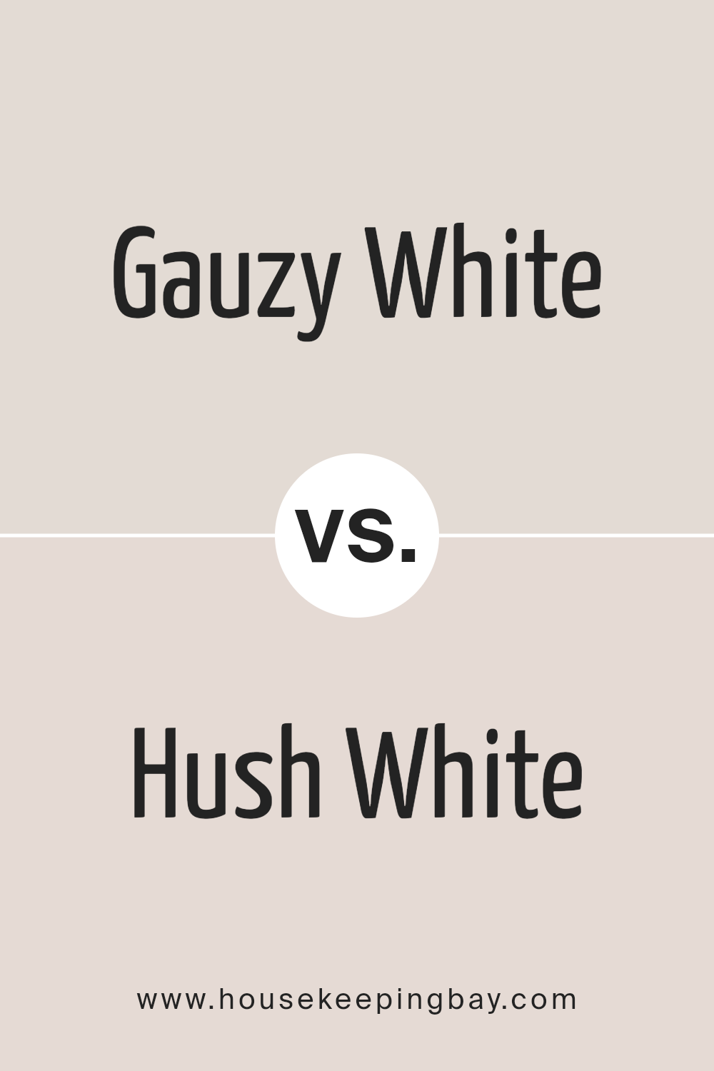
Gauzy White SW 6035 by Sherwin Williams vs Hush White SW 6042 by Sherwin Williams
Gauzy White SW 6035 by Sherwin Williams is a subtle, ethereal shade, embodying a light and airy character that can illuminate any space with a hint of freshness. It’s a color that reflects a tranquil atmosphere, bringing a sense of openness and serenity to interiors.
This color works beautifully in spaces seeking a minimalist aesthetic or looking to enhance natural light, making rooms appear more expansive and inviting.
On the other hand, Hush White SW 6042 is a slightly deeper hue, offering a warm and cozy ambiance without overwhelming a room’s existing decor. This shade leans towards a more grounded, comforting presence, providing a perfect backdrop for a range of interior styles, from the modern to the rustic.
Hush White has the unique ability to create a welcoming environment, encouraging relaxation and calm.
When comparing Gauzy White and Hush White, the primary distinction lies in their undertones and the mood they set.
Gauzy White offers a crisp, vibrant feel, while Hush White presents a softer, more enveloping warmth, making each ideal for different decorative aspirations and atmospheres within a home.
You can see recommended paint color below:
- SW 6042 Hush White
housekeepingbay.com
Gauzy White SW 6035 by Sherwin Williams vs Nice White SW 6063 by Sherwin Williams
Gauzy White SW 6035 and Nice White SW 6063 by Sherwin-Williams are both nuanced shades of white, each offering a unique ambience to interior spaces. Gauzy White presents itself with a soft, airy quality, evoking a sense of calm and openness.
It mimics the delicate nature of gauze fabric, providing a subtle backdrop that enhances natural light in a room. This color is perfect for creating a serene, uncluttered look.
On the other hand, Nice White leans towards a slightly warmer tone, offering a cozy and inviting atmosphere.
It has the ability to make spaces feel more grounded and intimate without overwhelming the senses. Nice White is versatile, working well in various lighting conditions and complementing different decor styles with ease.
While both colors maintain the simplicity and versatility associated with white, Gauzy White offers a cooler, more ethereal presence, whereas Nice White brings warmth and a sense of welcome.
Choosing between them depends on the desired mood and effect in the space, whether aiming for a crisp, open feel or a more comforting, snug ambiance.
You can see recommended paint color below:
housekeepingbay.com
Gauzy White SW 6035 by Sherwin Williams vs Windfresh White SW 7628 by Sherwin Williams
Gauzy White SW 6035 and Windfresh White SW 7628 by Sherwin Williams are two nuanced shades of white that offer subtle yet distinct differences. Gauzy White leans towards a soft, airy feel, bringing a sense of calm and serenity to spaces.
It has a delicate nature, making it an ideal backdrop for those seeking a light and unobtrusive canvas for their interior designs. This color is perfect for enhancing the openness and brightness of a room without overwhelming it with starkness.
On the other hand, Windfresh White possesses a slightly bolder presence. Its tone suggests a fresher, crisper feel, akin to a gentle breeze in a sleek, modern setting.
This shade suits environments where a clean, revitalized look is desired, offering a hint more definition than Gauzy White without sacrificing the purity of white.
While both colors maintain the classic simplicity of white, Gauzy White offers a whisper of softness, and Windfresh White brings a touch of crispness.
Choosing between them depends on the desired atmosphere; Gauzy White for a delicate, airy ambiance, and Windfresh White for a clearer, more defined environment.
You can see recommended paint color below:
housekeepingbay.com
Gauzy White SW 6035 by Sherwin Williams vs Simple White SW 7021 by Sherwin Williams
Gauzy White SW 6035 and Simple White SW 7021 by Sherwin Williams represent two nuanced takes on white paint, each offering a unique vibe to the spaces they adorn. Gauzy White stands out for its airy and light presence.
This shade leans toward a soft, delicate hue that suggests a sense of openness and breathability, making it a superb choice for creating a serene and subtly refined atmosphere. It has an understated elegance that can enhance the sense of space and light in a room, ideal for eliciting a calm and inviting ambiance.
On the other hand, Simple White SW 7021 offers a straightforward approach to white, providing a clean, crisp backdrop that is versatile across various settings.
This color integrates seamlessly into any decor style, from modern to traditional, bringing a sense of freshness and clarity. Its neutral tone makes it highly adaptable, capable of pairing with a wide range of colors and finishes.
While both colors share the purity and simplicity of white, Gauzy White leans towards a softer, more ethereal quality, whereas Simple White presents a clearer, more defined base, making each suitable for different aesthetic goals and moods.
You can see recommended paint color below:
housekeepingbay.com
Gauzy White SW 6035 by Sherwin Williams vs Incredible White SW 7028 by Sherwin Williams
Gauzy White SW 6035 by Sherwin-Williams offers a gentle, airy feel that can effortlessly brighten any room. Its subtle nuance carries the faintest hint of softness, making it an ideal choice for creating a serene and inviting atmosphere.
This color provides a delicate backdrop, perfect for spaces aiming for a light and breezy aesthetic.
In contrast, Incredible White SW 7028 by Sherwin-Williams leans towards a warmer tone, with a slightly richer presence on walls. It stands out with its ability to infuse spaces with warmth while maintaining a clean and sophisticated look.
Despite its name, Incredible White brings more depth to spaces than Gauzy White, ideal for those who seek a cozy yet refined ambiance.
Both colors offer unique qualities: Gauzy White is perfect for enhancing spaciousness and light, lending an almost ethereal touch to interiors. Incredible White, however, is more grounded, providing a comforting embrace without compromising on elegance.
Choosing between them depends on the desired mood and ambiance, from airy and uplifting to warm and welcoming.
You can see recommended paint color below:
housekeepingbay.com
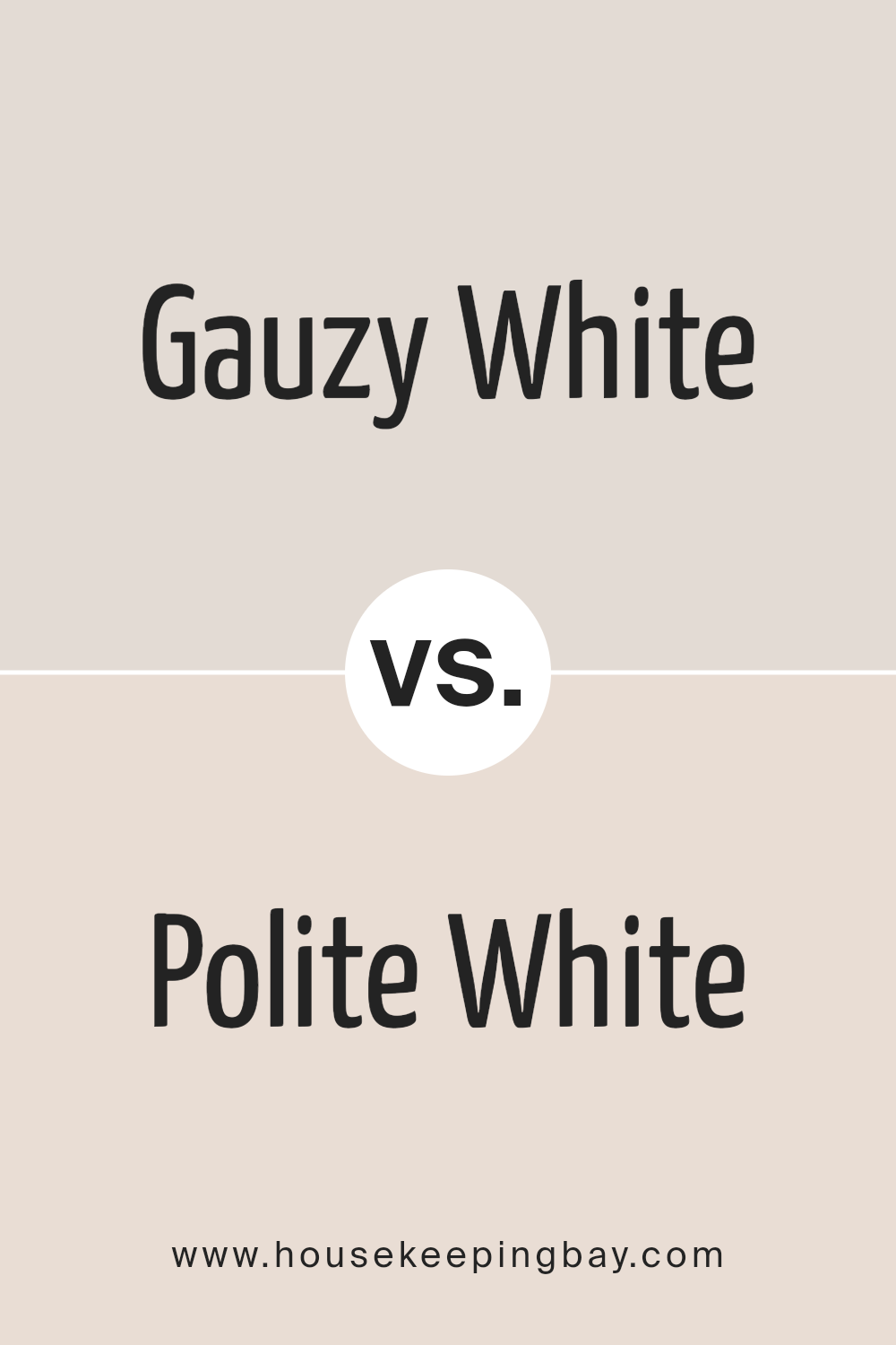
Gauzy White SW 6035 by Sherwin Williams vs Polite White SW 6056 by Sherwin Williams
Gauzy White SW 6035 by Sherwin Williams and Polite White SW 6056 by Sherwin Williams are two nuanced shades within the spectrum of whites that offer distinct undertones and atmospheres for interior spaces. Gauzy White stands out with its soft, airy quality, suggesting a lightness and an almost ethereal feel.
It embodies a sense of openness and purity, making spaces feel larger and more inviting. Its subtle undertones can complement a wide range of decor styles, enhancing natural light in a room.
On the other hand, Polite White takes a slightly different approach. This shade leans towards a warmer, more inviting palette. With its cozy and comforting essence, it brings an inviting warmth to interiors, creating spaces that feel welcoming and homely.
The richness of Polite White provides a perfect backdrop for both bold and muted colors, allowing for a versatile foundation that can adapt to various design aesthetics.
While both colors share the intrinsic simplicity and versatility of white, Gauzy White offers a crisp, clean backdrop reminiscent of a blank canvas, whereas Polite White adds a layer of warmth and sophistication, making spaces feel grounded yet spacious.
These subtle differences underscore the importance of undertones in selecting the perfect white for your space.
You can see recommended paint color below:
- SW 6056 Polite White
housekeepingbay.com
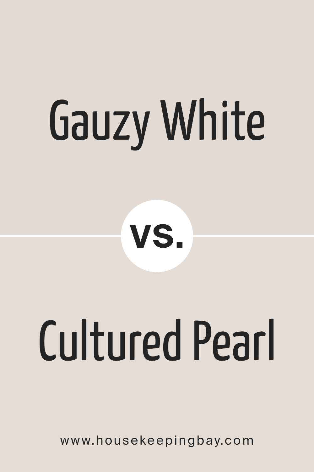
Gauzy White SW 6035 by Sherwin Williams vs Cultured Pearl SW 6028 by Sherwin Williams
Gauzy White SW 6035 by Sherwin Williams and Cultured Pearl SW 6028 by Sherwin Williams are two subtle colors that carry their unique essence while maintaining an inherent softness. Gauzy White is a serene and pure shade, reflecting a sense of calm and simplicity.
Its brightness offers a backdrop that is both refreshing and invigorating, ideal for spaces seeking a light and airy feel. Cultured Pearl, on the other hand, steps slightly into the realm of complexity with a warmer, more nuanced tone.
This color brings a cozy warmth to interiors, creating an inviting atmosphere with its understated elegance.
Although both shades are rooted in a palette of whites, Gauzy White presents itself with a crisp vibrancy, reminiscent of a clean, well-lit room basking in daylight. Cultured Pearl, conversely, suggests a softer, more intimate ambiance, akin to the gentle glow of morning light.
Together, these colors offer versatile options for those looking to infuse their spaces with a touch of sophistication and tranquility.
You can see recommended paint color below:
- SW 6028 Cultured Pearl
housekeepingbay.com
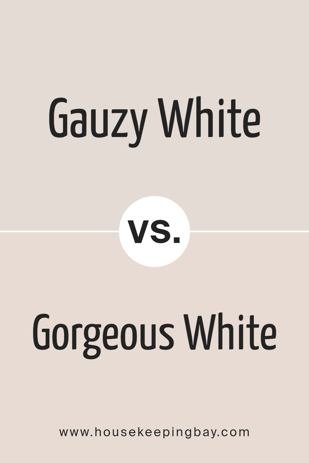
Gauzy White SW 6035 by Sherwin Williams vs Gorgeous White SW 6049 by Sherwin Williams
Gauzy White SW 6035 and Gorgeous White SW 6049 by Sherwin Williams are two distinct shades that both offer a unique take on white, which can subtly transform any space. Gauzy White leans towards a soft, airy feel, reminiscent of a light, delicate fabric softly diffusing sunlight.
Its understated elegance makes it an ideal backdrop for a serene and inviting atmosphere, perfect for creating a tranquil space. On the other hand, Gorgeous White carries a slightly more pronounced presence, suggesting a richer, more defined approach to white.
This shade is poised to add a touch of sophistication and brightness, making rooms feel more expansive and vibrant.
While both colors share the purity and simplicity inherent in white, they cater to different aesthetic desires and functionalities within interior design.
Gauzy White offers a whisper of calmness, ideal for minimalistic or Scandinavian-inspired themes, whereas Gorgeous White steps forward with a bit more confidence, aligning well with contemporary or chic décor preferences.
Deciding between them depends on the specific ambiance one aims to achieve, be it a soft, ethereal touch or a bold, statement-making base.
You can see recommended paint color below:
- SW 6049 Gorgeous White
housekeepingbay.com
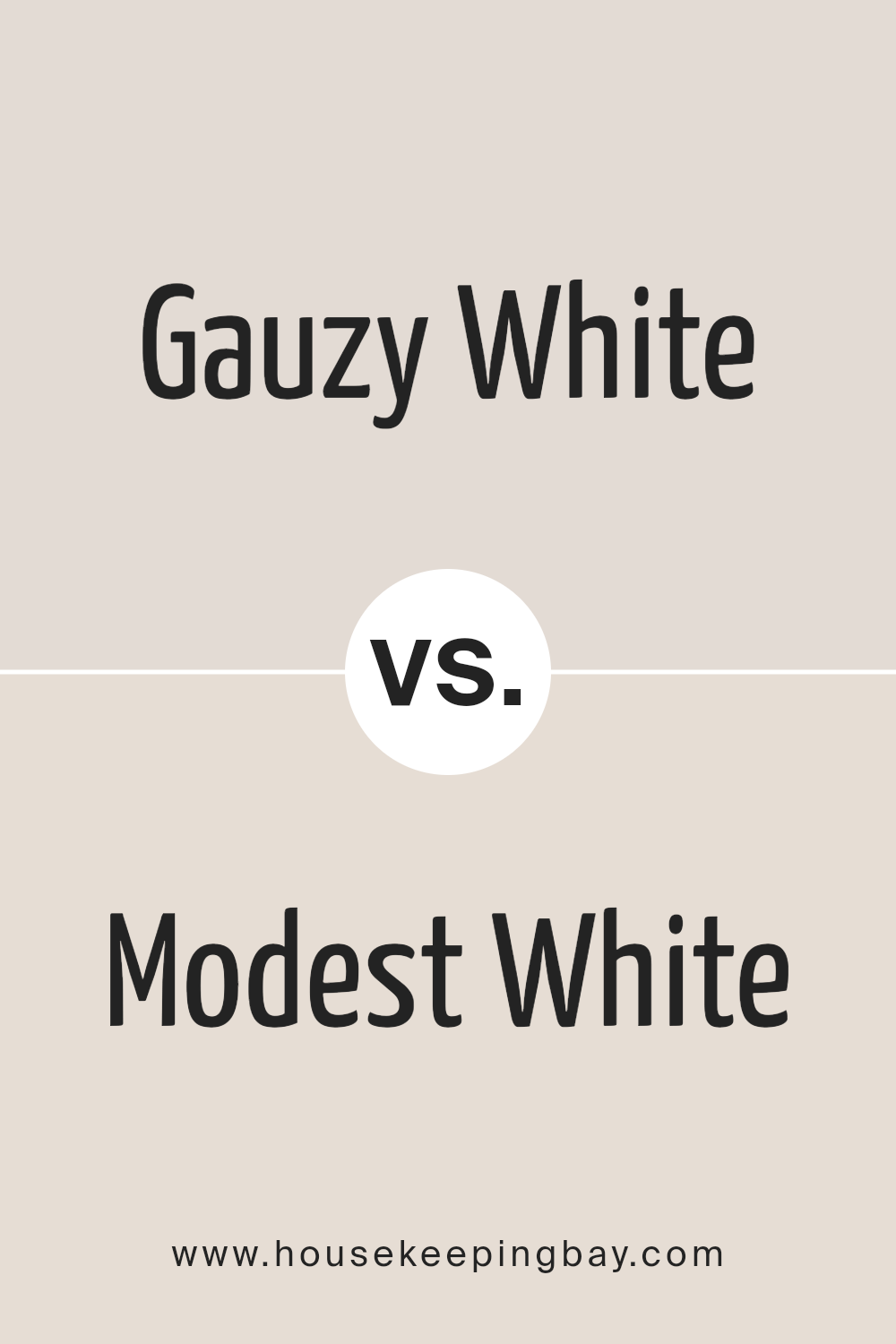
Gauzy White SW 6035 by Sherwin Williams vs Modest White SW 6084 by Sherwin Williams
Gauzy White SW 6035 and Modest White SW 6084 by Sherwin Williams are two nuanced shades of white that offer subtle distinctions to suit various preferences and design needs. Gauzy White presents itself as a soft, airy hue that brings a light and refreshing atmosphere to any space.
Its serene and gentle tones can illuminate a room, providing a sense of spaciousness and tranquility. On the other hand, Modest White leans towards a warmer, cozier white, inviting a feeling of comfort and understated elegance into a room.
This shade can add a layer of subtle sophistication, making it ideal for spaces that aim for a chic yet comfortable ambiance. While both colors maintain a minimalist aesthetic, the choice between Gauzy White and Modest White depends on the desired mood and warmth of the space.
Gauzy White suits those looking for a crisp, vibrant environment, whereas Modest White is perfect for creating a snug, welcoming area with a hint of warmth.
You can see recommended paint color below:
housekeepingbay.com
Conclusion
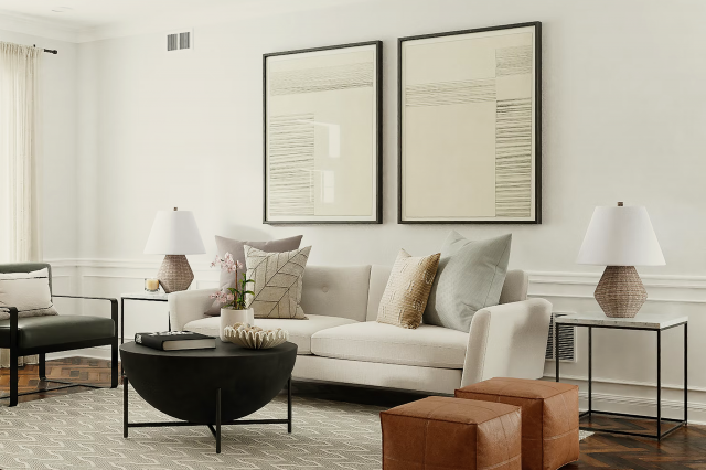
Gauzy White SW 6035 by Sherwin Williams is a versatile and elegant paint color that has garnered appreciation for its soft and subtle qualities. This hue offers a perfect balance between warmth and brightness, making it an excellent choice for creating serene and inviting spaces.
Its inherent versatility allows it to be used in various settings, from modern to traditional decor, seamlessly blending with different palettes and textures.
Gauzy White stands out as a timeless choice for homeowners and designers looking to infuse their spaces with a sense of calm and understated sophistication.
The appeal of Gauzy White SW 6035 extends beyond its aesthetic value, as it also demonstrates practical versatility in enhancing the perception of space and light within a room. Whether applied in small, intimate areas or larger, open spaces, this color tends to amplify natural light, making rooms feel more spacious and airy.
This characteristic makes it particularly well-suited for projects aiming to create a welcoming and refreshing environment. Consequently, Gauzy White by Sherwin Williams is not just a paint color, but a strategic design tool for achieving beautifully illuminated and harmonious interiors.

housekeepingbay.com
Ever wished paint sampling was as easy as sticking a sticker? Guess what? Now it is! Discover Samplize's unique Peel & Stick samples. Get started now and say goodbye to the old messy way!
Get paint samples