Everyday White SW 6077 by Sherwin Williams
Elevate Your Space with Timeless Elegance
In the ever-evolving world of interior design, finding the perfect shade of white can be an unexpectedly complex task. Among the multitude of options, SW 6077 Everyday White by Sherwin Williams emerges as a standout choice that resonates with designers and homeowners alike.
This color embodies a harmonious balance, offering a warm, inviting ambiance without veering too far into the starkness that some whites can convey. Everyday White is not just another shade; it’s a meticulously crafted hue that reflects the insight and quality Sherwin Williams is renowned for.
It strikes an exquisite balance, making it versatile enough to accentuate a variety of decor styles, from minimalist to eclectic.
The allure of Everyday White lies in its adaptability – it can serve as a serene backdrop to vibrant accents or play a leading role in creating a tranquil, cohesive space.
This article delves into the nuances of SW 6077 Everyday White by Sherwin Williams, exploring its characteristics, best uses, and why it might just be the impeccable white you’ve been searching for.
Whether you’re undertaking a full renovation or simply refreshing a room, understanding the potential of Everyday White can transform your space, infusing it with light, elegance, and a sense of openness that only the right white can achieve.
via sherwin-williams.com
What Color Is Everyday White SW 6077 by Sherwin Williams?
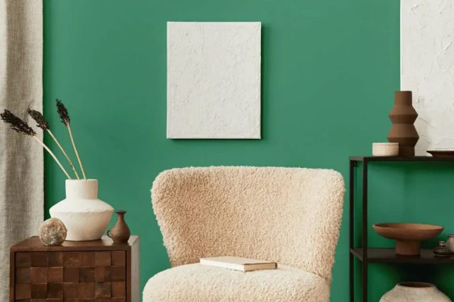
Everyday White SW 6077 by Sherwin Williams is a soothing, versatile hue that bridges the gap between pure white and soft, warm undertones. This nuanced shade has the unique ability to evoke a sense of tranquility and spaciousness, making it an excellent choice for creating a light, airy atmosphere in any space.
Its subtle warmth brings a cozy feel, avoiding the starkness that sometimes accompanies pure whites, making it an ideal backdrop for various interior styles and design aspirations.
This adaptable color works harmoniously within a wide range of interior styles, from minimalist and contemporary to rustic and shabby chic. In minimalist settings, Everyday White can help emphasize clean lines and architectural details without overpowering the senses, creating a serene and inviting space. In more traditional or rustic interiors, it serves as a perfect canvas that highlights natural materials and textures, adding to the charm and warmth of the space.
Everyday White pairs beautifully with a multitude of materials and textures, enhancing wood’s natural beauty, from polished oak to rugged barn wood, making it pop against the soft backdrop. It also complements metallic accents, whether brushed nickel, gold, or copper, bringing out their luster and adding a touch of elegance to the room.
Textiles in rich textures or serene tones work wonderfully with this color, allowing for a layered interior that invites comfort and relaxation. In essence, Everyday White SW 6077 by Sherwin Williams offers a versatile foundation that can evolve with changing tastes and trends, ensuring a timeless appeal.

housekeepingbay.com
Table of Contents
Is Everyday White SW 6077 by Sherwin Williams Warm or Cool color?
Everyday White SW 6077 by Sherwin Williams is a paint color that embodies the essence of simplicity and versatility, making it an excellent choice for a wide range of home decor styles. As a neutral shade, Everyday White carries a soft, warm undertone that distinguishes it from stark, cold whites.
This nuanced balance allows it to adapt seamlessly to various lighting conditions, casting a cozy, welcoming glow in natural light, while maintaining its clarity and freshness under artificial lighting.
In home interiors, Everyday White acts as a backdrop that elevates other elements in the space, whether it’s bold furniture pieces, vibrant textiles, or intricate architectural details. Its subtle warmth enhances the sense of comfort and spaciousness in a room, making spaces feel more open and airy.
This color promotes a tranquil and serene atmosphere, facilitating a versatile palette that can evolve with changing trends and personal tastes.
By choosing Everyday White SW 6077, homeowners can create a timeless backdrop that supports a wide array of decor styles, from minimalist and modern to rustic and eclectic, underscoring the color’s adaptability and enduring appeal in home environments.
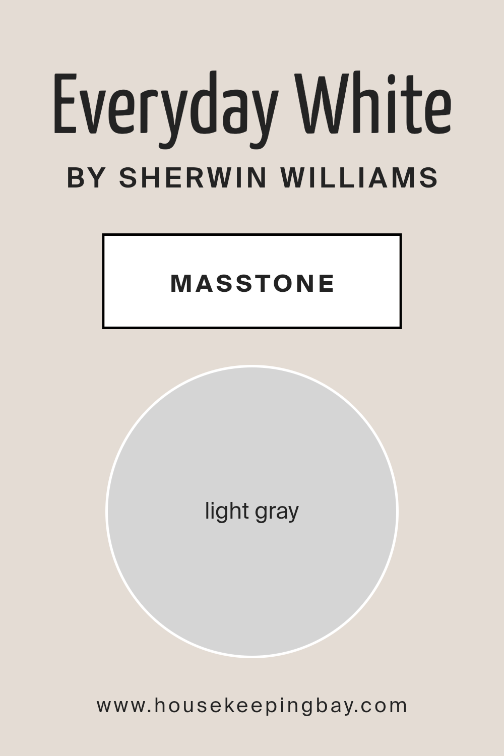
What is the Masstone of the Everyday White SW 6077 by Sherwin Williams?
Everyday White SW 6077 by Sherwin Williams, with its masstone cast as a light gray (#D5D5D5), distinguishes itself as a versatile and serene choice for home interiors. This particular shade of gray balances perfectly between warm and cool tones, making it a neutral backdrop suitable for a wide range of decorating styles, from minimalistic to eclectic. Its subtlety in masstone ensures that it can effortlessly accommodate various color palettes, serving as either a calming standalone hue or as a complementary base that allows for vibrant furnishings and decor to pop.
In natural light, Everyday White exudes a soft radiance, enhancing spaces with a bright, airy feel that makes rooms appear larger and more welcoming. Conversely, under artificial lighting, it retains its clarity and subtlety, without skewing too warm or cool, thus maintaining its intended ambiance.
This adaptability means it is equally effective in areas of high activity such as living rooms and kitchens, as it is in creating tranquil retreats in bedrooms and bathrooms. Its masstone provides a timeless canvas, facilitating a seamless transition as personal or seasonal styles evolve, making Everyday White SW 6077 a foundational element in crafting inviting, homely spaces.
housekeepingbay.com
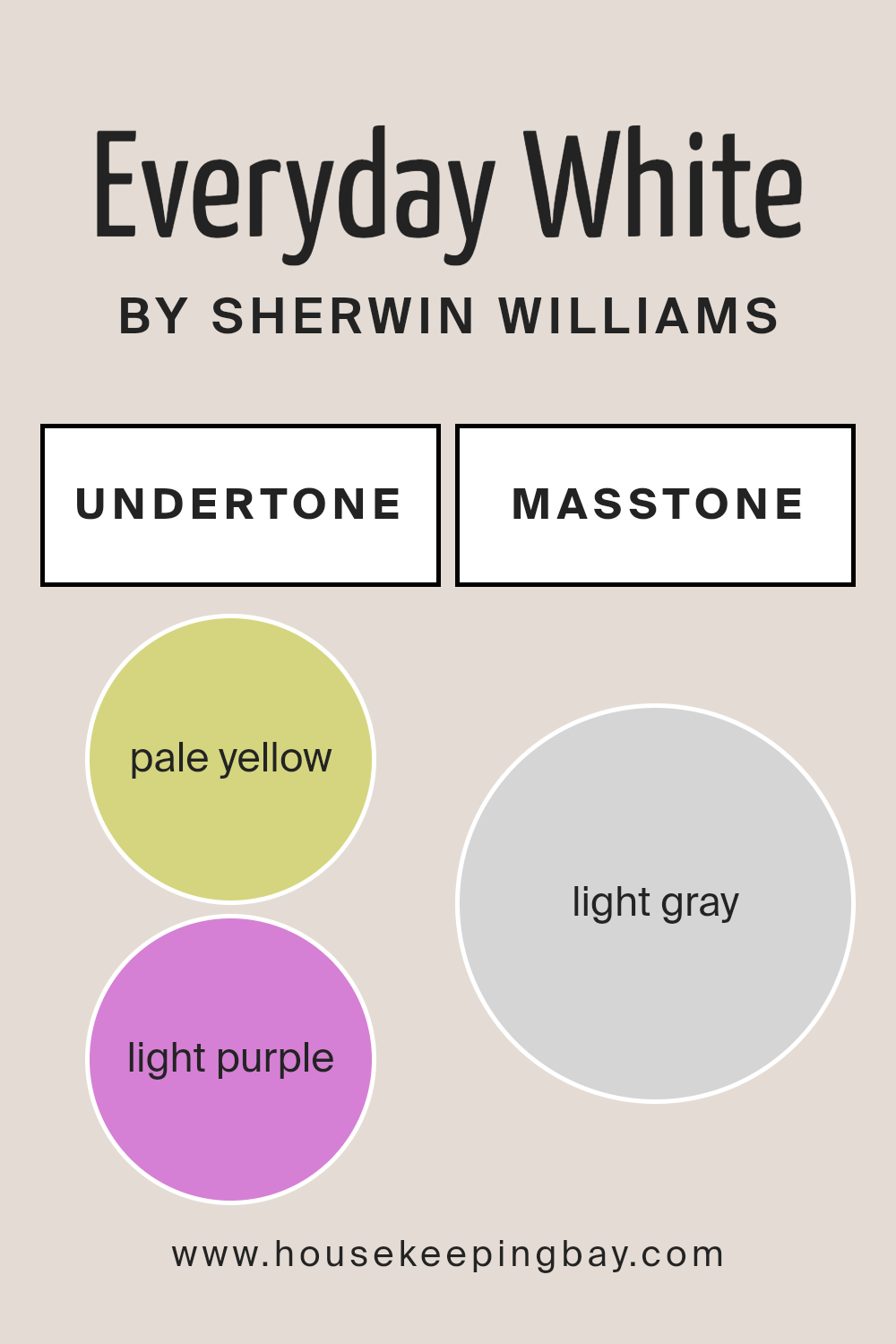
Undertones of Everyday White SW 6077 by Sherwin Williams
Everyday White (SW 6077) by Sherwin Williams is a nuanced paint color that, at first glance, appears as a straightforward, serene white. However, its unique character is revealed through its undertones of pale yellow (#D5D580) and light purple (#D580D5), which significantly influence its perception and application in interior spaces.
Undertones are subtle colors that lie beneath the surface of the primary paint color and play a crucial role in how we perceive the color under different lighting conditions and settings. For Everyday White, the pale yellow undertone adds a subtle warmth, imbuing spaces with a cozy, inviting glow that can make rooms feel more lived-in and welcoming.
This warmth is particularly beneficial in north-facing rooms or spaces with cooler natural light, as it can counteract shadows and bring a soft, diffusive brightness.
Conversely, the light purple undertone introduces a hint of cool sophistication, providing a balance to the warmth of the yellow. This duality allows Everyday White to adapt and morph throughout the day and in different lighting conditions, from natural sunlight to artificial lighting. In bright daylight, the yellow may stand out, offering vibrancy, while in the evening, under artificial lighting, the purple can emerge, lending a calm, soothing ambiance.
The interplay of these undertones in Everyday White (SW 6077) makes it a versatile choice for interior walls. It can harmonize with a wide range of decor styles and color palettes, from warm, earthy tones that highlight its yellow warmth, to cool hues that complement its subtle purple depth.
This adaptability and the mood-enhancing qualities of its undertones make Everyday White a sophisticated and dynamic choice for those seeking more than a simple white paint.
housekeepingbay.com
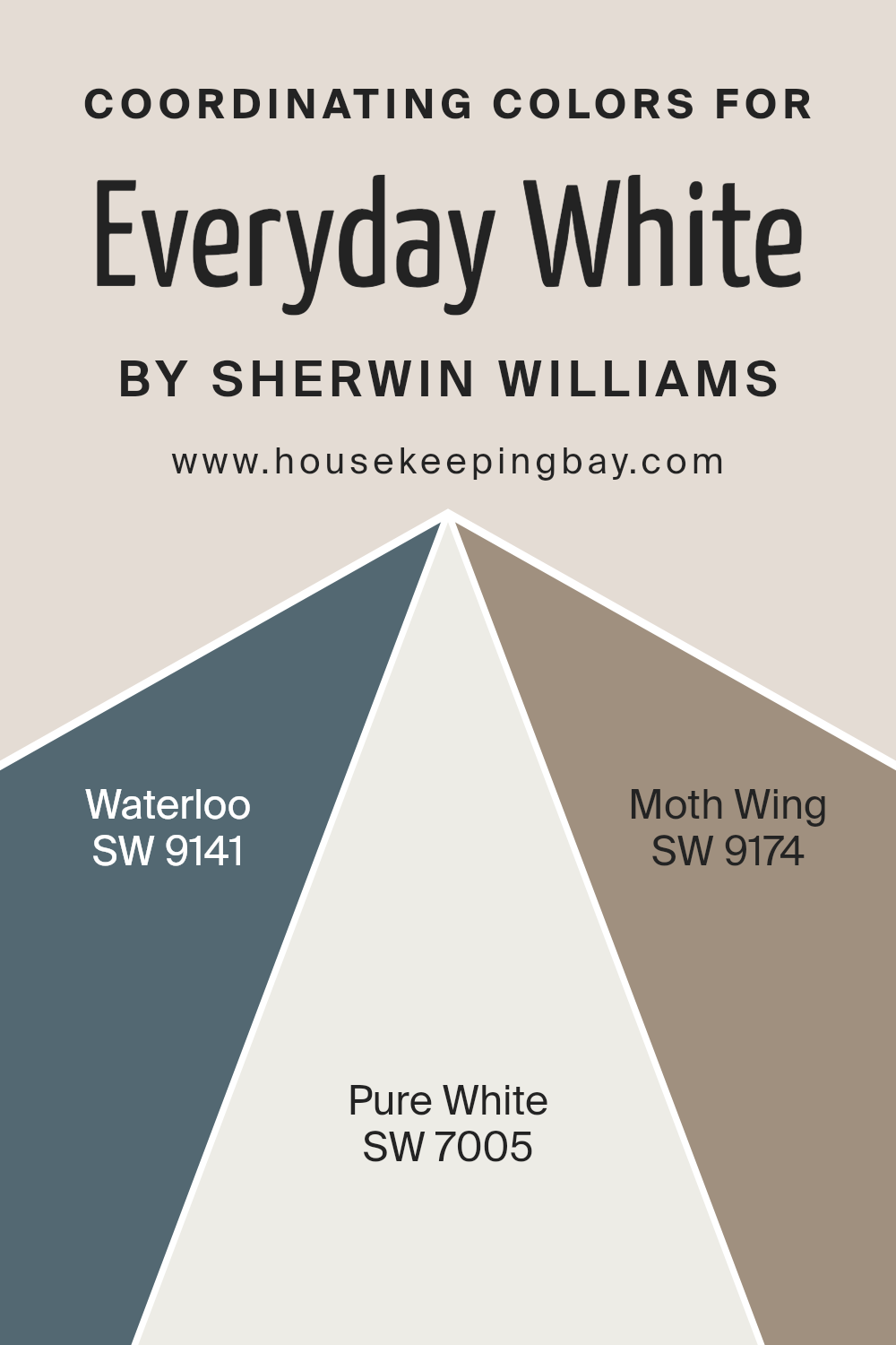
Coordinating Colors of Everyday White SW 6077 by Sherwin Williams
Coordinating colors are hues that work in harmony with a primary color to create a cohesive and visually appealing palette within a space. When we talk about coordinating colors, especially in the context of interior design or painting, we’re discussing shades that complement each other and bring out the best in the main color.
For Everyday White SW 6077 by Sherwin-Williams, a versatile and inviting off-white, finding the right coordinating colors means selecting shades that enhance its warmth and cleanliness without overwhelming its subtle beauty. The art of selecting coordinating colors involves balancing contrast and color temperature to achieve a desired mood or aesthetic effect.
For example, Waterloo SW 9141 serves as an intriguing coordinating color, lending a sophisticated navy blue that provides a deep contrast to the lightness of Everyday White, perfect for creating a bold yet balanced look. Pure White SW 7005, on the other hand, offers a crisp, snow-white hue that harmonizes with Everyday White by providing a slight contrast that is still within the white spectrum, which can help to create a seamless and airy look. Meanwhile, Moth Wing SW 9174 introduces a soothing mid-tone taupe that bridges the gap between the dark and light hues, adding a touch of earthiness that complements the overall palette with its subtle warmth and versatility.
These coordinating colors, when used thoughtfully, can bring about a dynamic yet unified interior space that highlights the beauty of Everyday White.
You can see recommended paint colors below:
- SW 9141 Waterloo
- SW 7005 Pure White
- SW 9174 Moth Wing
housekeepingbay.com
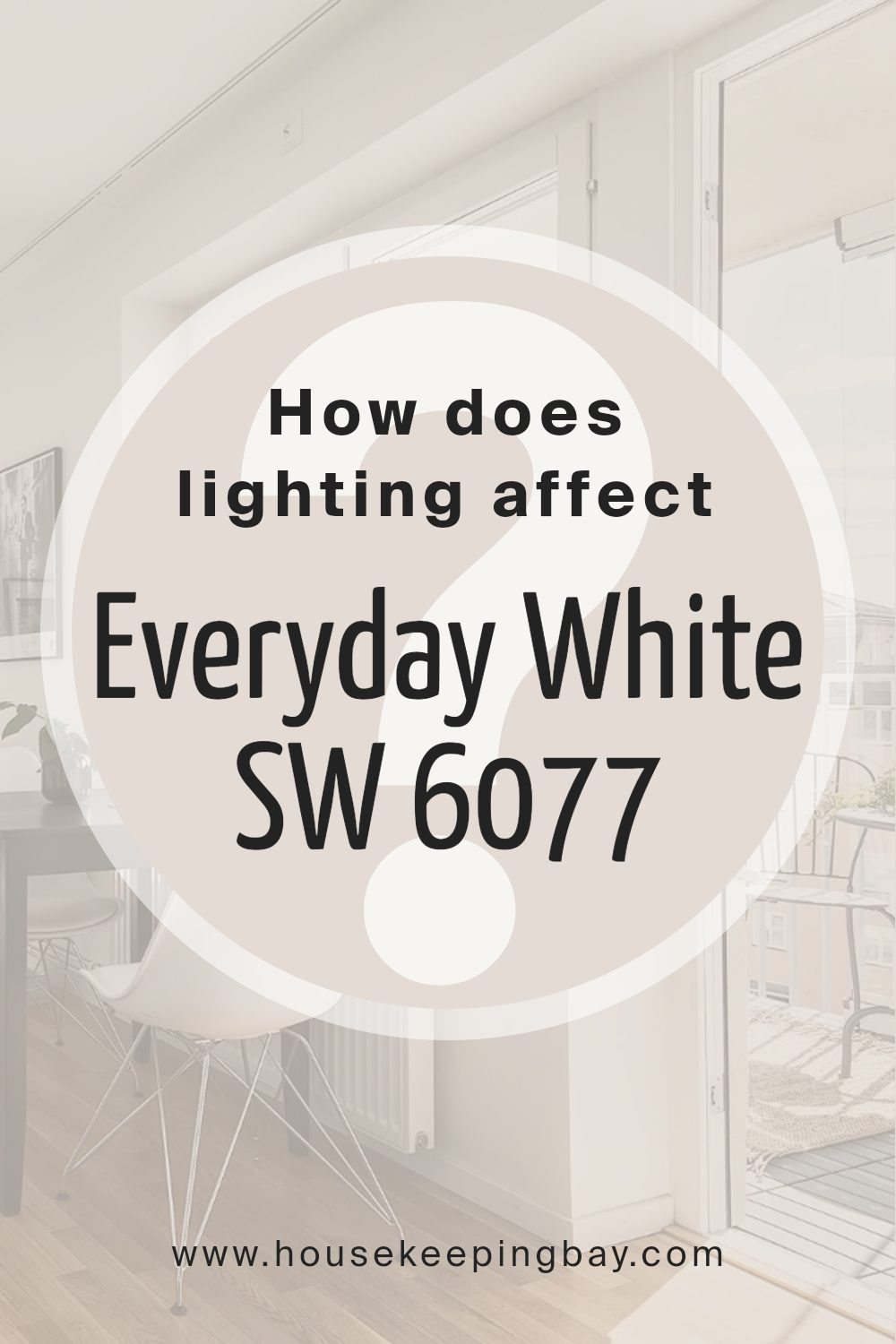
How Does Lighting Affect Everyday White SW 6077 by Sherwin Williams?
Lighting plays a crucial role in how colors are perceived, fundamentally affecting the appearance and ambiance of any space. Colors do not exist in isolation; they are seen through the light that illuminates them. This interplay between light and color can dramatically change how a hue appears, depending on the source and direction of light. A quintessential example of this phenomenon can be observed with the color Everyday White SW 6077 by Sherwin Williams, a versatile and popular paint color.
In artificial light, Everyday White takes on varying characteristics based on the type of bulbs used. Incandescent lighting can make it appear warmer, highlighting its subtle undertones and providing a cozy feel, while fluorescent lighting might bring out a sharper, cooler look, making the color appear more crisp and vibrant. LED lighting, depending on its color temperature, can either enhance the warm tones or give it a more neutral to cool cast.
Natural light brings a dynamic palette of changes to Everyday White, depending on the room’s orientation and the time of day. In north-faced rooms, where light tends to be cooler and more consistent, Everyday White may appear slightly more muted and cooler, maintaining a crisp and serene aesthetic. This can make north-facing rooms feel more spacious and open, despite the cooler light.
South-faced rooms bathe in warm, abundant sunlight for most of the day, which can make Everyday White radiate warmth and freshness, highlighting its breezy and light character. This orientation enhances the color’s natural vibrancy, infusing the space with an inviting and energizing atmosphere.
In east-faced rooms, the color experiences the warm glow of the morning sun, which can make it look soft and warm in the mornings, transitioning to a cooler, more neutral tone as the day progresses. This dynamic change can create a refreshing environment that evolves throughout the day.
West-faced rooms showcase Everyday White in a unique light, as the intense warm light of sunset casts a golden hue over the color. During the evening, it can appear exceptionally warm and welcoming, offering a cozy retreat that contrasts the cooler, more subdued tone seen in the morning light.
In conclusion, lighting dramatically influences the appearance of Everyday White SW 6077, proving that the direction of light and the type of light source can transform the perception of color, from creating a serene and airy ambiance to enhancing warmth and comfort in a space.
housekeepingbay.com
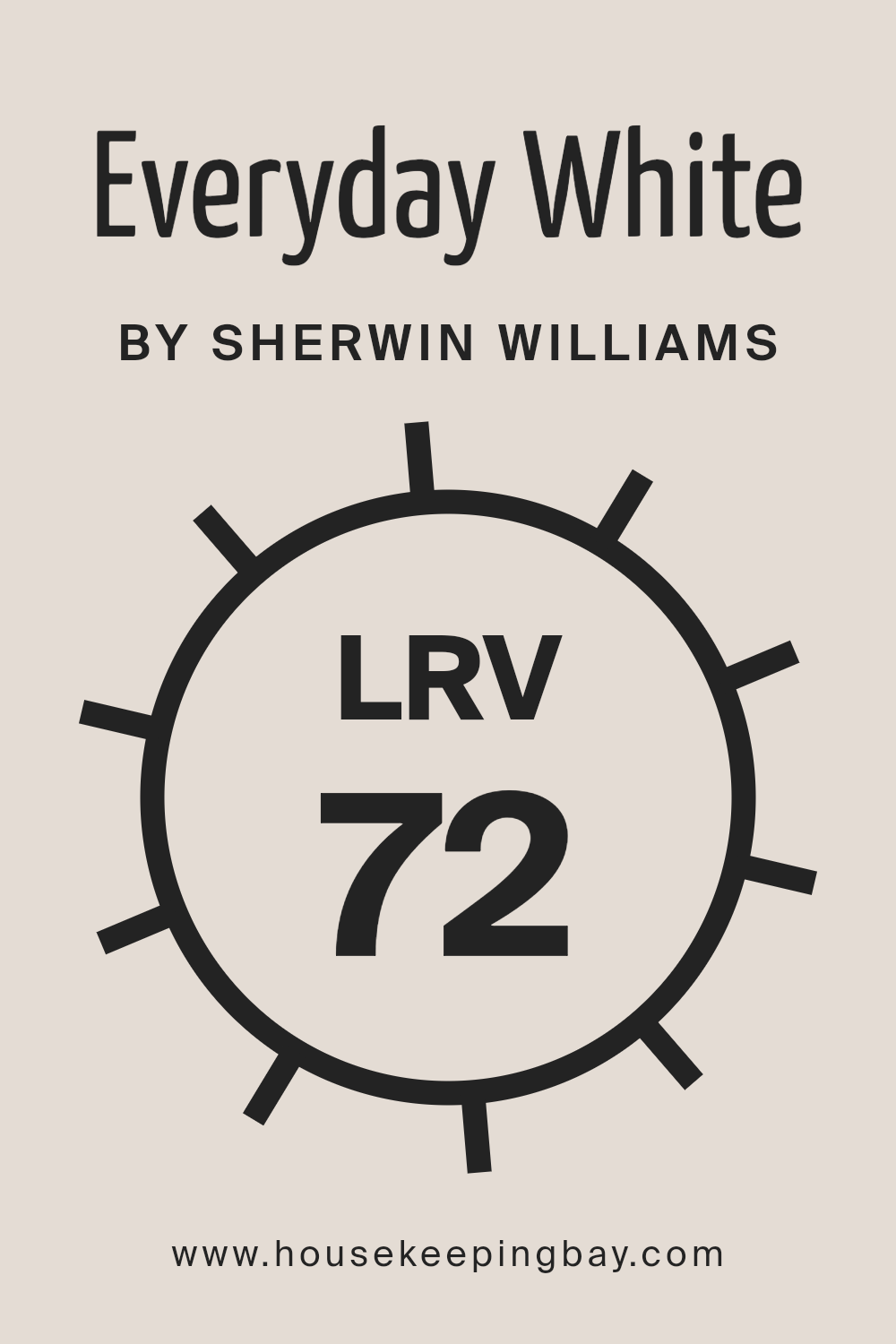
What is the LRV of Everyday White SW 6077 by Sherwin Williams?
Light Reflectance Value (LRV) is a measure used in design and architecture to quantify the percentage of visible and usable light that is reflected from a surface when illuminated by a light source. The LRV scale runs from 0 to 100, with 0 being perfectly black and absorbing all light, and 100 being perfectly white and reflecting all light.
This measure is critical in selecting colors for interiors as it affects the brightness of a space, the perception of a color’s hue and saturation, and how spacious or cozy a room feels. High LRV colors can make a small room feel larger and more open, as they reflect more light, while low LRV colors can create a sense of intimacy and warmth but may make a space feel smaller or darker.
The Everyday White SW 6077 by Sherwin Williams, with an LRV of 72.418, falls into the higher range of the LRV scale, meaning it is a color that will reflect a substantial amount of light. This characteristic makes it an excellent choice for creating bright, airy spaces that feel open and welcoming.
In rooms with plenty of natural daylight, Everyday White will enhance the light, making the space seem larger and more vibrant. In artificially lit or darker spaces, its high LRV will help in maximizing the available light, making the room appear brighter than it would if painted with a color of lower LRV.
This particular shade of white can therefore serve multiple purposes, from enlarging small spaces to revitalizing dark rooms, essentially making it a versatile choice for any interior.
housekeepingbay.com
What is LRV? Read It Before You Choose Your Ideal Paint Color
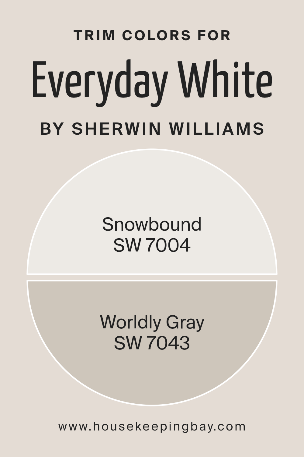
What are the Trim colors of Everyday White SW 6077 by Sherwin Williams?
Trim colors play a pivotal role in accentuating the architectural elements and enhancing the overall appeal of a space painted in Everyday White SW 6077 by Sherwin Williams. These colors, thoughtfully selected, can create a seamless transition or a striking contrast that highlights the contours and details of trim work.
The choice of trim color adds depth and dimension, making the primary color—such as Everyday White—pop and giving the room a polished and cohesive look. By choosing the right trim color, homeowners and designers can also influence the perceived size and brightness of a room, making it feel more spacious or cozy.
Snowbound SW 7004 is a serene and pure white that brings a subtle warmth to trim, complementing the clean, crisp nature of Everyday White without overwhelming it. This color has an almost ethereal quality, softly framing windows, doors, and baseboards, creating a gentle contrast that enhances spatial harmony.
On the other hand, Worldly Gray SW 7043, with its grounded, earthy undertones, offers a more defined delineation against Everyday White. It provides a statement of sophistication and depth, outlining architectural features with understated elegance.
Both trim colors, Snowbound and Worldly Gray, are adept at adding visual interest and a touch of complexity to a room, ensuring that the walls painted in Everyday White SW 6077 are anything but plain.
You can see recommended paint colors below:
housekeepingbay.com
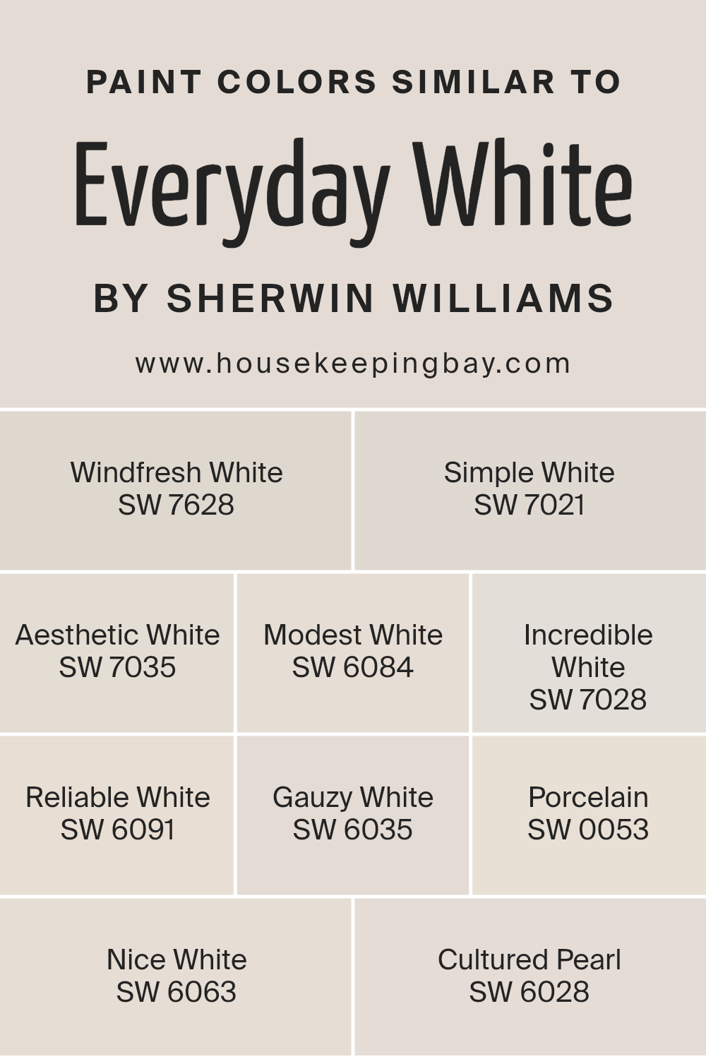
Colors Similar to Everyday White SW 6077 by Sherwin Williams
Similar colors play a crucial role in interior design and painting, especially when they are variations of a classic hue like Everyday White by Sherwin Williams. These nuances may seem subtle but have a significant impact on the atmosphere and aesthetics of a space.
When similar colors are chosen with intention, they create a harmonious palette that blends seamlessly, providing a cohesive look while allowing individual elements to stand out. This nuanced approach to color selection can accentuate architectural details, enhance natural light, and even influence the perceived size and mood of a room.
For example, Windfresh White brings a breath of fresh air into a space, offering a crisp, invigorating backdrop that’s both refreshing and serene. Simple White, on the other hand, serves as a versatile canvas, subtly enhancing other colors and decor elements without overwhelming. Aesthetic White adds a touch of warmth, making a room feel inviting and comfortable, while Modest White strikes a balance between brightness and coziness. Incredible White tends to illuminate spaces with its vibrant, yet understated elegance.
Reliable White, true to its name, provides a dependable, neutral background that complements any style. Gauzy White introduces a soft, ethereal quality to interiors, echoing the gentle play of light and shadow. Porcelain exudes a delicate, refined charm, reminiscent of the fine material itself.
Nice White offers a gentle hint of warmth, creating a welcoming, friendly ambiance. Lastly, Cultured Pearl, with its hints of sophistication and grace, beautifully rounds out the palette, ensuring a touch of elegance in every stroke.
You can see recommended paint colors below:
- SW 7628 Windfresh White
- SW 7021 Simple White
- SW 7035 Aesthetic White
- SW 6084 Modest White
- SW 7028 Incredible White
- SW 6091 Reliable White
- SW 6035 Gauzy White
- SW 0053 Porcelain
- SW 6063 Nice White
- SW 6028 Cultured Pearl
housekeepingbay.com
How to Use Everyday White SW 6077 by Sherwin Williams In Your Home?
Everyday White SW 6077 by Sherwin Williams is a classic, versatile paint color that embodies simplicity and tranquility, making it an ideal choice for creating serene and welcoming spaces within your home. Its understated elegance ensures that it pairs beautifully with a broad spectrum of decor styles, from minimalist and modern to rustic and traditional. The beauty of Everyday White lies in its balanced, neutral tone which acts as a perfect backdrop, bringing a sense of brightness and spaciousness to any room without overwhelming it with color.
Homeowners can use Everyday White in various ways to enhance their living environment. It works exceptionally well in living rooms and bedrooms, where its calming effect contributes to a relaxed ambiance, ideal for unwinding after a long day.
In smaller spaces, like bathrooms and hallways, it can make the areas appear larger and more inviting. This versatile shade can also serve as an excellent canvas for kitchens, highlighting cabinetry and allowing for pops of color through accessories and appliances.
Furthermore, Everyday White promotes continuity when used throughout the home, creating a cohesive and harmonious look. Whether used on walls, trim, or even ceilings, it provides a crisp, clean look that is both timeless and modern. Its adaptability means it complements various textures and materials, from soft fabrics to natural wood and metallic finishes, enabling a range of aesthetic directions.
So, whether you’re looking to create a serene retreat or a bright, energizing space, Everyday White SW 6077 offers endless possibilities to reflect your personal style while enhancing your home’s overall appeal.
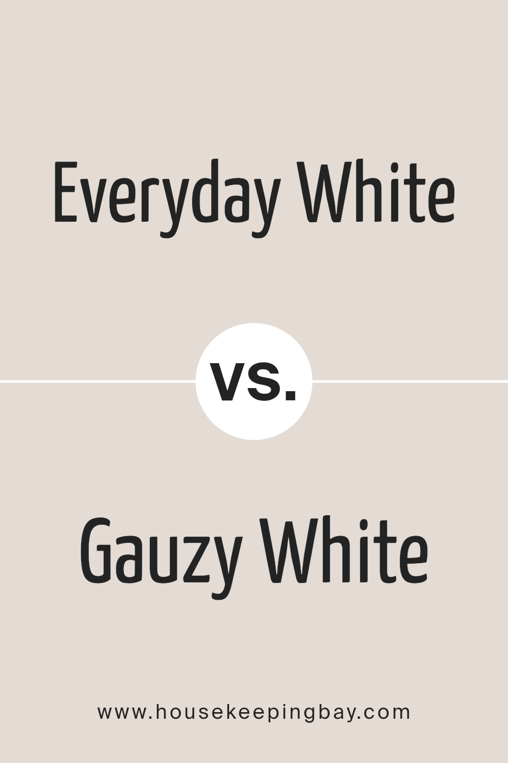
Everyday White SW 6077 by Sherwin Williams vs Gauzy White SW 6035 by Sherwin Williams
Everyday White SW 6077 and Gauzy White SW 6035 by Sherwin Williams are two nuanced shades that, while similar in their foundational palette, encapsulate distinct vibes and applications. Everyday White leans towards a warmer, more inviting tone, resembling a soft, creamy white that suggests a sense of welcoming and comfort. This hue is versatile, making it an excellent choice for spaces seeking a cozy yet bright feel, such as living rooms or kitchens where warmth is key.
On the other hand, Gauzy White takes a step towards subtlety and sophistication with its cooler undertones. It mirrors the ethereal quality of a morning mist, providing a clean, serene backdrop that can make spaces appear larger and more open. Gauzy White is well-suited for modern and minimalist designs where the aim is to create a tranquil, airy environment. This color works wonderfully in bathrooms, bedrooms, and even home offices where a calm and collected ambiance is desired.
While both Everyday White and Gauzy White are beautiful in their right, the choice between them depends on the desired aesthetic and mood. Everyday White offers warmth and coziness, whereas Gauzy White emphasizes subtlety and serenity.
You can see recommended paint color below:
housekeepingbay.com
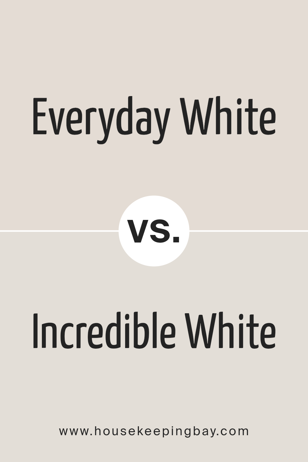
Everyday White SW 6077 by Sherwin Williams vs Incredible White SW 7028 by Sherwin Williams
Everyday White SW 6077 by Sherwin Williams and Incredible White SW 7028, while sharing the tranquil essence of white, exhibit subtle yet distinct differences. Everyday White has a warm, inviting undertone that imbues spaces with a cozy, serene ambiance. This color shines particularly well in spaces that aim for a relaxed, comforting atmosphere, making it an excellent choice for living rooms and bedrooms where warmth is key.
In contrast, Incredible White leans towards a soft, neutral palette, offering a slight coolness that brings an airy, more open feeling to interiors. Its capacity to reflect light beautifully makes it an ideal candidate for smaller or darker rooms, enhancing them with a perception of increased space and luminosity.
When comparing these two, the choice between Everyday White and Incredible White hinges on the desired mood and functional use of the space. Whether aiming for warmth and coziness or a fresh, expansive feel, both colors offer versatility, yet cater to slightly different aesthetic and emotional appeals within a space.
You can see recommended paint color below:
housekeepingbay.com
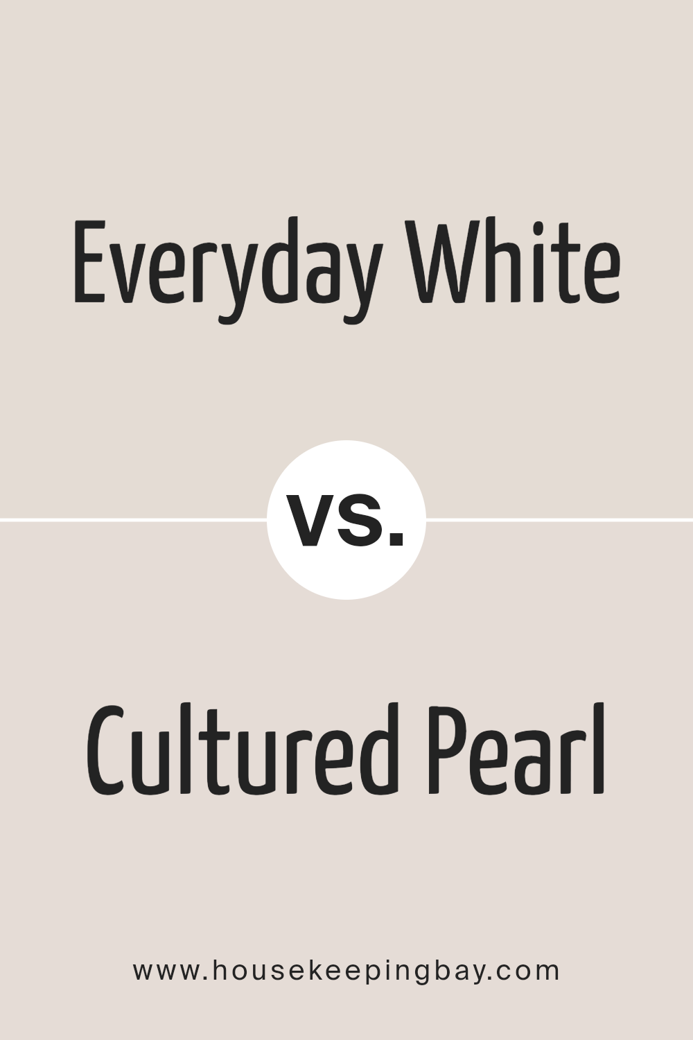
Everyday White SW 6077 by Sherwin Williams vs Cultured Pearl SW 6028 by Sherwin Williams
“Everyday White SW 6077” by Sherwin-Williams and “Cultured Pearl SW 6028” represent two nuanced shades in the company’s extensive color palette, embodying different aspects of neutral elegance. “Everyday White” is a warm and inviting shade, resonating with a subtle vibrancy that inspires a sense of comfort and familiarity.
It is a quintessential white that adapts flexibly to various lighting conditions, making spaces feel more open and airy while providing a serene and welcoming atmosphere. On the other hand, “Cultured Pearl” leans towards a more nuanced, sophisticated tone with its slight gray undertone.
This color reflects an essence of refined grace, delivering a subtle hint of depth that enhances spaces with a chic and modern elegance. Despite its name, “Cultured Pearl” shares a soothing neutrality but with a layer of complexity that enriches environments without overwhelming them. Together, these colors can harmonize beautifully, with “Everyday White” offering a bright, crisp foundation that accentuates the cooler, more contemplative beauty of “Cultured Pearl.”
You can see recommended paint color below:
housekeepingbay.com
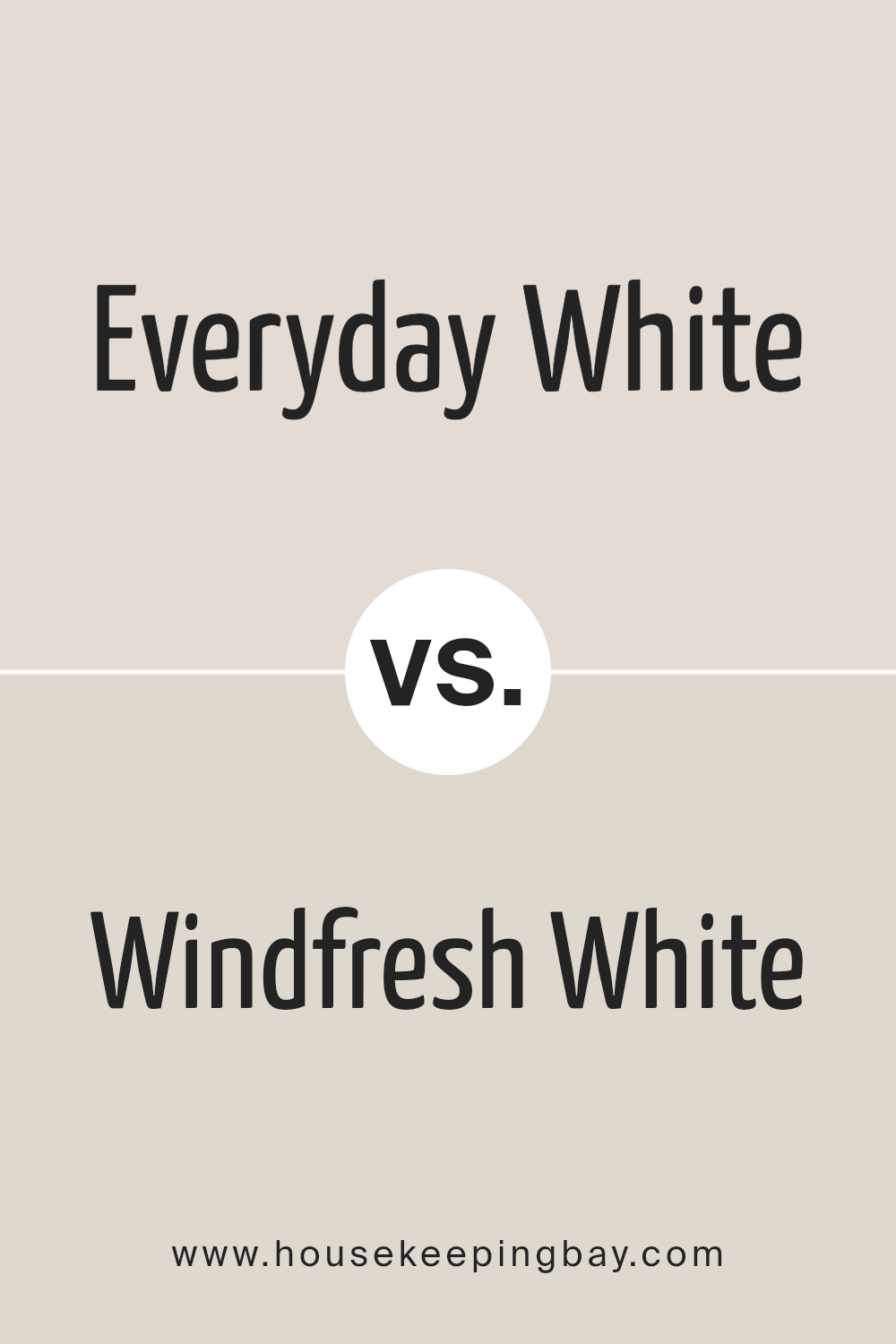
Everyday White SW 6077 by Sherwin Williams vs Windfresh White SW 7628 by Sherwin Williams
Everyday White SW 6077 by Sherwin-Williams presents itself as a warm, soft shade of white with a cozy undertone that leans slightly towards a creamy palette. This particular hue is perfectly suited for creating a welcoming atmosphere in a variety of spaces, offering a sense of comfort and understated elegance. Its versatility allows it to act as a standalone color or as a harmonious backdrop for broader color schemes, enhancing furnishings and decor with a gentle radiance.
In contrast, Windfresh White SW 7628, also by Sherwin-Williams, offers a distinctly cooler tone. This shade is characterized by its fresh, almost breezy quality, embodying a crisper and more defined white. Windfresh White leans towards a purer spectrum of white, making it ideal for spaces that aim to evoke a sense of clarity and modern sharpness.
Its neutral but stark crispness allows for a seamless integration into minimalist or contemporary aesthetics, where the purity of color accentuates clean lines and architectural details.
Together, Everyday White and Windfresh White illustrate the broad versatility of white as a color choice in design, each bringing its unique ambiance and stylistic opportunities to interior spaces.
You can see recommended paint color below:
housekeepingbay.com
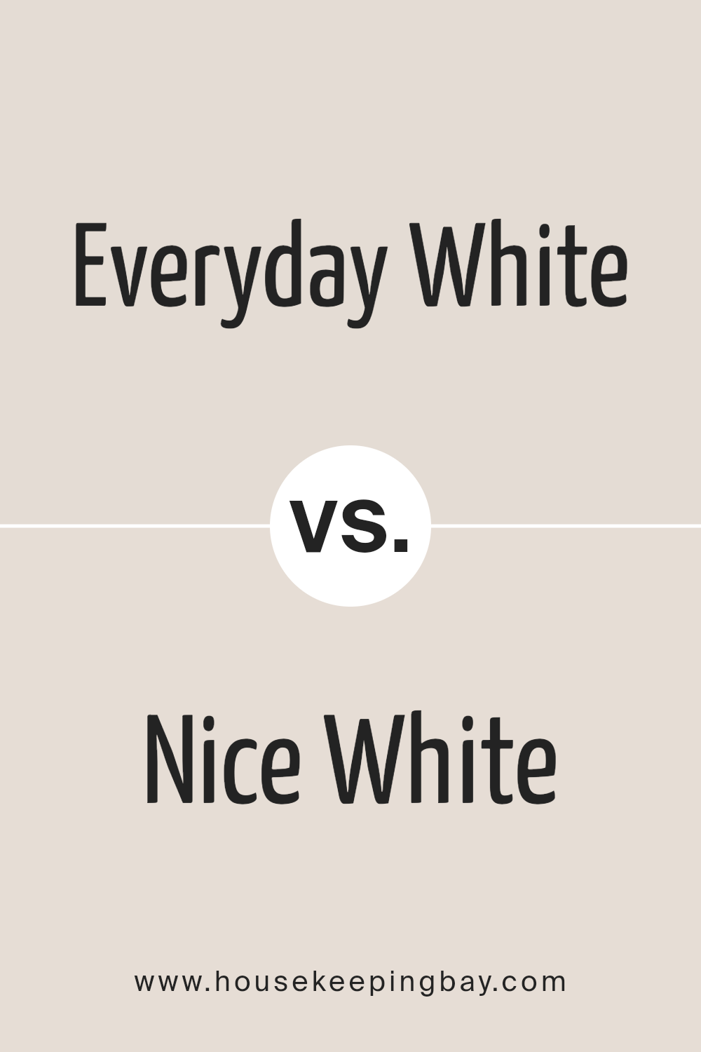
Everyday White SW 6077 by Sherwin Williams vs Nice White SW 6063 by Sherwin Williams
Everyday White SW 6077 and Nice White SW 6063 by Sherwin-Williams are both neutral shades that offer a fresh, clean palette. Everyday White leans slightly toward a warm, inviting tone that envelops a space in a cozy yet bright vibe, perfect for creating a serene, welcoming atmosphere. It’s a versatile color that can complement a variety of decor styles, from traditional to contemporary, making spaces feel more open and airy.
On the other hand, Nice White SW 6063 offers a cooler, more balanced approach to white. It has subtle gray undertones that deliver a sophisticated, crisp look, ideal for modern, minimalistic interiors. This shade is particularly suitable for spaces that aim to achieve a sharp, clean look with a contemporary edge.
While both colors share the simplicity and purity of white, Everyday White introduces warmth and comfort, making spaces feel homely, whereas Nice White provides a sleek, pristine backdrop that enhances a room’s modern aesthetics. Together, they underscore the diverse spectrum of white, catering to different tastes and styles in interior design.
You can see recommended paint color below:
housekeepingbay.com
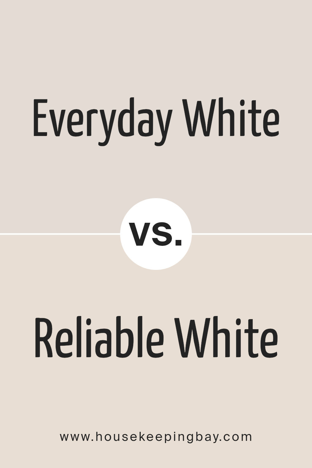
Everyday White SW 6077 by Sherwin Williams vs Reliable White SW 6091 by Sherwin Williams
Everyday White SW 6077 and Reliable White SW 6091, both by Sherwin Williams, present subtly distinctive palettes ideal for varied interior design schemes. Everyday White leans slightly towards a warm, inviting undertone, offering a cozy, almost creamy background that enriches spaces with a soft, enveloping glow. This color excels in rooms that aim for a comfortable, airy feel, providing a serene backdrop that complements a wide range of décor styles.
Reliable White, on the other hand, carries a crisper, more neutral tone that borders closely on true white without veering into starkness. It provides a clean, uncluttered look that enhances natural light, making it a superb choice for minimalist or contemporary spaces. This hue acts as a versatile canvas, allowing colors and textures in a room to stand out without competition.
In comparing the two, Everyday White’s subtle warmth makes it ideal for traditional or rustic interiors, offering coziness and charm. Reliable White, with its neutral clarity, suits modern or Scandinavian designs, offering freshness and a sense of spaciousness. Both shades offer their unique ambiance, making the selection between them a matter of personal preference and intended space usage.
You can see recommended paint color below:
housekeepingbay.com
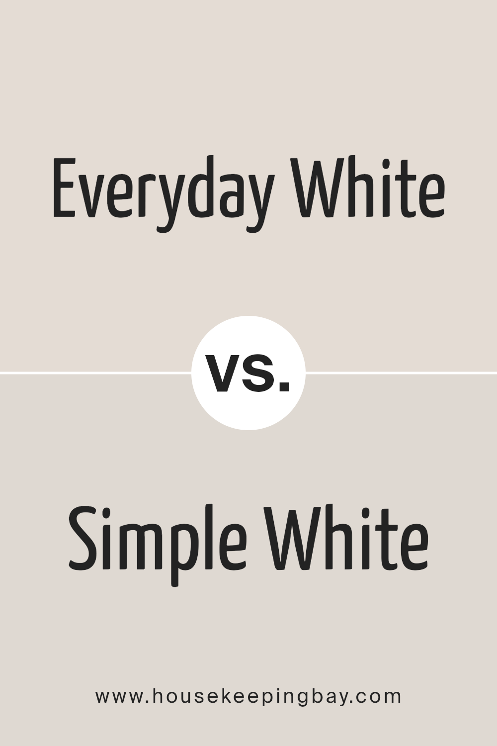
Everyday White SW 6077 by Sherwin Williams vs Simple White SW 7021 by Sherwin Williams
Everyday White SW 6077 and Simple White SW 7021 by Sherwin Williams represent two nuanced takes on the classic white palette, each bringing a unique atmosphere to interior spaces. Everyday White leans towards a warm, welcoming hue with subtle creamy undertones. This color exudes comfort and softness, making spaces feel inviting and homely. It’s particularly suited for areas where a cozy, serene vibe is desired, blending seamlessly with natural materials and soft textures.
In contrast, Simple White SW 7021 veers towards the cooler side of the spectrum. Although it’s dubbed “simple,” its elegance lies in its clean, crisp brightness, featuring slight gray undertones that provide a modern and sophisticated finish. This shade is perfect for spaces aiming for a fresh, contemporary look, enhancing sharp lines and vibrant colors used in decor.
Both colors, while similar in their base identity as whites, offer distinct emotional and aesthetic impacts. Everyday White warms and softens a room, inviting relaxation, whereas Simple White creates a sharp, refined aesthetic that can make a space feel more expansive and meticulously curated. Choosing between them depends on the desired ambiance and the interplay with the room’s lighting, furnishings, and accent colors.
You can see recommended paint color below:
housekeepingbay.com
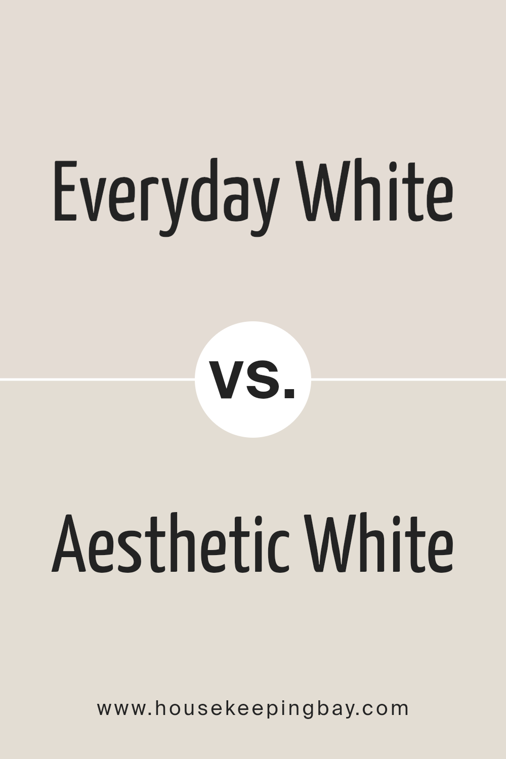
Everyday White SW 6077 by Sherwin Williams vs Aesthetic White SW 7035 by Sherwin Williams
Everyday White SW 6077 and Aesthetic White SW 7035 by Sherwin Williams are two nuanced shades that cater to distinct interior palettes while sharing a common white foundation. Everyday White veers towards a purer, brighter white, embodying simplicity and clarity. This color illuminates spaces with an unassuming vitality, making it an excellent choice for areas demanding a fresh, clean look without the austerity sometimes associated with stark whites. It reflects natural light beautifully, amplifying smaller spaces or serving as a crisp backdrop in any setting.
On the other hand, Aesthetic White SW 7035 introduces a touch of warmth, infused with subtle beige and gray undertones. This complexity enriches the color, allowing it to stand out against purer whites without overwhelming a space with color. Aesthetic White is remarkably versatile, graciously complementing a wide array of designs, from modern minimalist to cozy traditional.
It offers a softer, more nuanced alternative to stark whites, creating a cozy atmosphere that still feels open and airy.
Both shades speak to different aesthetics; Everyday White offers a bright, invigorating presence, while Aesthetic White provides a sophisticated, warm embrace. Choosing between them depends on the desired ambiance and the interplay with other elements in the space.
You can see recommended paint color below:
housekeepingbay.com
Everyday White SW 6077 by Sherwin Williams vs Porcelain SW 0053 by Sherwin Williams
Everyday White SW 6077 by Sherwin Williams and Porcelain SW 0053 by Sherwin Williams, though sharing similarities as part of the vast spectrum of whites offered by the brand, subtly stand apart in their undertones and uses. Everyday White leans towards a warm, inviting tone with a hint of beige that renders spaces cozy yet luminous, making it a versatile choice for living areas and bedrooms where a soft, welcoming ambiance is desired. It enlivens spaces with its subtle warmth, especially in natural light, complementing a wide range of decor styles.
On the other hand, Porcelain SW 0053 exhibits a crisper, slightly cooler hue reminiscent of its namesake. This color, while still maintaining the neutrality required to support various design elements, offers a clearer backdrop that can make spaces feel more spacious and serene.
Ideal for bathrooms and kitchens, Porcelain provides a clean, refined aesthetic that pairs well with both contemporary and traditional designs, offering a more pronounced neutrality compared to the comforting embrace of Everyday White.
Thus, while both colors provide a neutral base, the choice between them hinges on the desired warmth and mood of the room, reflecting how subtle variations in white can influence the overall feel of a space.You can see recommended paint color below:
- SW 0053 Porcelain
housekeepingbay.com
Everyday White SW 6077 by Sherwin Williams vs Modest White SW 6084 by Sherwin Williams
Everyday White SW 6077 by Sherwin Williams is a popular choice for those seeking a neutral yet warm white with a hint of coziness. This color emits a welcoming vibe, making spaces feel open and airy while still providing a sense of comfort and homeliness. Its subtle undertones allow it to blend seamlessly with a variety of decor styles and color palettes, making it a versatile option for any room.
In contrast, Modest White SW 6084 by Sherwin Williams steps into the realm of whites with a slightly different approach. This shade leans towards a cooler, more reserved white, with understated beige undertones that give it a sophisticated edge.
Modest White offers a clean and minimalistic look, making it ideal for modern and contemporary spaces. It provides a neutral backdrop that is less warm than Everyday White, yet equally adept at making spaces feel welcoming while adding an element of refined elegance.
Both colors, while similar in their base hue, offer distinct atmospheric and aesthetic effects, making the choice between them a matter of personal preference and the specific ambience one aims to achieve in a space.
You can see recommended paint color below:
housekeepingbay.com
Conclusion
In conclusion, Everyday White SW 6077 by Sherwin Williams stands out as a versatile and timeless hue that effortlessly enhances the aesthetic appeal of any space. Its warm undertones create an inviting atmosphere, making it an ideal choice for those seeking to achieve a cozy and serene environment. Whether applied in living areas, bedrooms, or even in smaller spaces like bathrooms and kitchens, Everyday White offers a seamless blend of sophistication and simplicity, proving to be a perfect backdrop for various design styles ranging from contemporary to classic.
Moreover, its adaptability in complementing a wide array of decor elements and other color palettes underscores its popularity among homeowners and interior designers alike. The ability of Everyday White to reflect natural light beautifully enhances the perceived size of a room, making it feel more open and airy.
As a tried and true color from Sherwin Williams, Everyday White SW 6077 emerges as a go-to choice for those looking to imbue their spaces with a fresh, clean look that maintains its allure over time.

housekeepingbay.com
Ever wished paint sampling was as easy as sticking a sticker? Guess what? Now it is! Discover Samplize's unique Peel & Stick samples. Get started now and say goodbye to the old messy way!
Get paint samples