Rhinestone SW 7656 by Sherwin Williams
Unveiling Subtle Elegance: The Ultimate Neutral Hue
This hue, with its subtle and sophisticated charm, has become a favorite among homeowners and interior designers alike who are looking for a fresh, neutral backdrop that can complement any decor style.Rhinestone is a light, almost ethereal shade of gray with just a hint of blue, giving it a serene and inviting quality.
It’s perfect for those who want to create a calm and peaceful atmosphere in their homes without sacrificing a sense of modernity and style. The article highlights the versatility of Rhinestone, showing how it can beautifully flow from room to room, enhancing spaces with its airy vibe.
Whether you’re refreshing your living room, bedroom, or even your kitchen, Rhinestone can offer a clean slate.Moreover, the article provides practical advice on pairing Rhinestone with other colors, both bold and subtle, to achieve different looks. From creating a cozy, monochromatic scheme to pairing it with vibrant accents for a pop of color, the possibilities are endless.
The goal of this piece is to give readers the confidence to use Rhinestone SW 7656 in their own homes, showing that this shade is not just paint but a step towards realizing their vision of a perfect space.

via sherwin-williams.com
What Color Is Rhinestone SW 7656 by Sherwin Williams?
Table of Contents
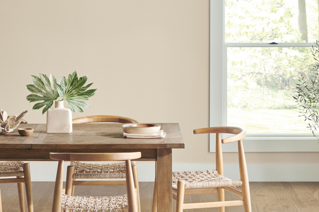
Rhinestone SW 7656 by Sherwin Williams is a fresh and airy shade of pale gray that almost touches the realm of whites. It is a color that breathes lightness and simplicity into any room, making spaces appear larger and more open. Its versatility is one of its strongest attributes, allowing it to blend seamlessly with a variety of decor styles, from the sleek lines of modern minimalist designs to the cozy nooks of Scandinavian themes. Rhinestone isn’t just a backdrop; it’s a subtle statement of elegance and calm.
This color works wonders in materials and textures that emphasize comfort and softness. Think about pairing it with natural wood tones, from light birches to rich walnuts, to add warmth without overpowering the gentle nature of Rhinestone.
Fabrics like cotton, linen, and soft wool in furniture and accessories complement its understated vibe, creating spaces that invite relaxation and serenity. For a bit of contrast, metallic finishes like brushed nickel, stainless steel, or matte black can add a refined touch without detracting from the room’s overall sense of peace.
Rhinestone SW 7656 is ideal for those looking to create a space that feels both open and cozy.
Its light-reflective quality makes it perfect for small rooms or spaces with limited natural light, offering a sense of airiness. Whether you’re decorating a bedroom, living room, or a study, this color harmonizes beautifully with a broad range of styles, materials, and textures, making it a go-to choice for anyone aiming to craft a harmonious and inviting interior.
housekeepingbay.com
Is Rhinestone SW 7656 by Sherwin Williams Warm or Cool color?
Rhinestone SW 7656 by Sherwin Williams is a light and airy color that can make any room in your home feel more spacious and welcoming. This shade is a part of the gray family, but it’s much softer, almost like a whisper of color on the walls. It’s perfect for anyone looking to create a calm and relaxing space.
Because it’s so light, Rhinestone does a fantastic job of bouncing natural light around a room, making darker spaces seem brighter without being overwhelming.
This color is incredibly versatile. It can easily fit into any style of decor, from modern to traditional, because it acts as a neutral backdrop. It’s like a clean canvas, allowing your furniture and decor pieces to stand out. In homes, Rhinestone works well in bedrooms, living rooms, and even bathrooms, offering a serene vibe that’s hard to beat.
Its subtle nature also means it won’t clash with other colors, making it an excellent choice for anyone wanting to update their space without having to rethink their existing furniture and accessories.
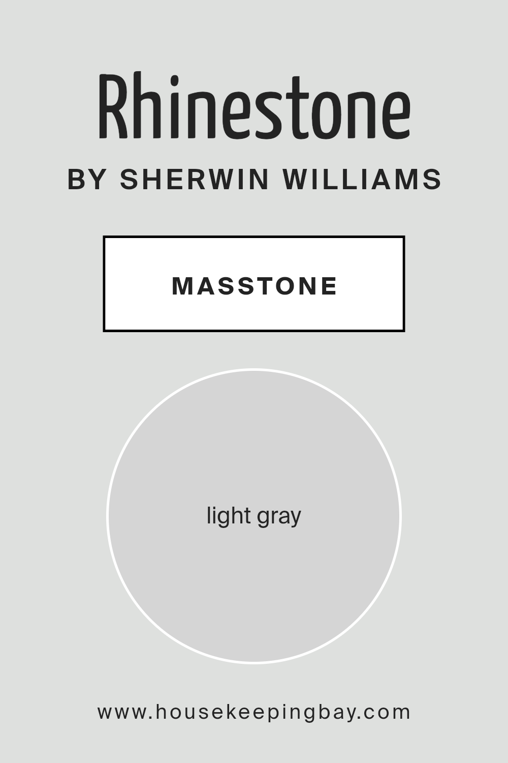
What is the Masstone of the Rhinestone SW 7656 by Sherwin Williams?
Rhinestone SW 7656 by Sherwin Williams is a beautiful light gray color with a masstone that appears as a gentle, soft shade of gray (#D5D5D5). This color is super versatile, making it a fantastic choice for homes. Its light gray tone brings a calm, soothing vibe to rooms, creating spaces that feel open and airy.
Because it’s such a neutral shade, it pairs well with almost any other color – brights become more vibrant against it, while darker tones get a bit of lift. This means you can use Rhinestone in various settings, from a cozy bedroom to a lively living area, and it will always look great. It’s especially helpful in smaller spaces, as the lightness of Rhinestone can make rooms appear bigger and more welcoming.
Applying Rhinestone SW 7656 on walls can also enhance natural light, making your home feel brighter and more inviting.
housekeepingbay.com
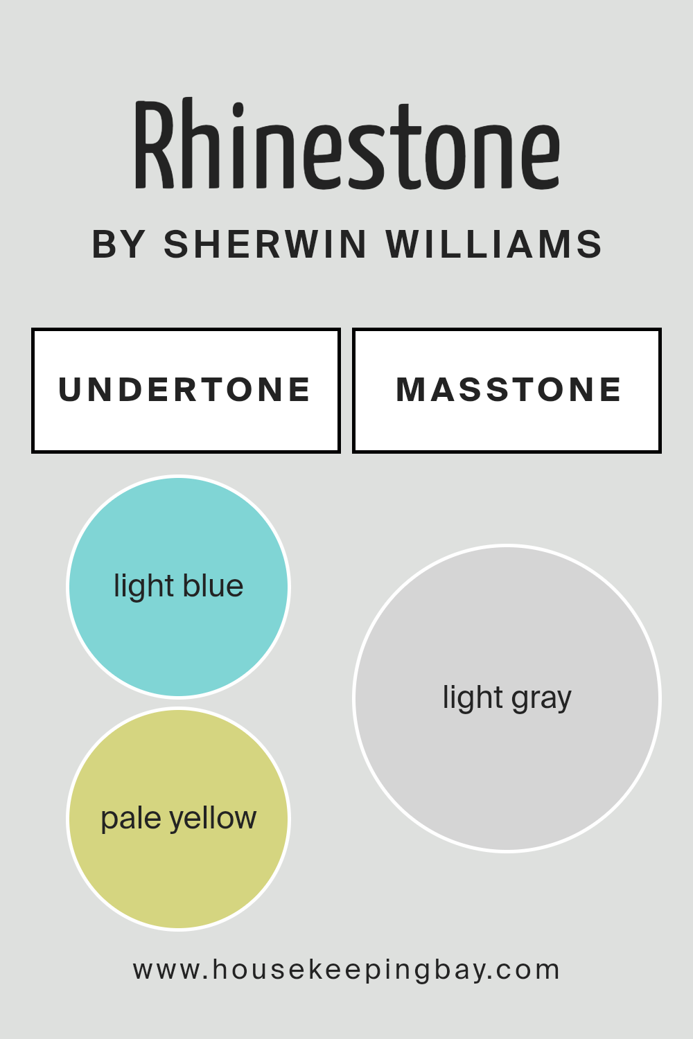
Undertones of Rhinestone SW 7656 by Sherwin Williams
Rhinestone SW 7656 by Sherwin Williams is a unique and lovely paint color that brings a fresh and airy vibe to any space. What makes Rhinestone stand out are its subtle undertones – light blue (#80D5D5) and pale yellow (#D5D580). These undertones play a big role in how we perceive the color, adding depth and complexity to what might otherwise be seen as a simple shade.
Undertones are like the color’s hidden personality; they can change how the main hue looks depending on the lighting and surrounding colors. For example, in a room with lots of natural light, the light blue undertone in Rhinestone might become more noticeable, giving the space a cool, calming feel.
On the other hand, in a room with less natural light or with warmer artificial lights, the pale yellow undertone might make the color seem softer and more inviting.
When applied to interior walls, Rhinestone SW 7656 brings a versatile and dynamic quality to the space. The light blue and pale yellow undertones allow it to complement a variety of decor styles and color schemes. Whether you’re aiming for a serene and calming atmosphere or a bright and cheerful vibe, Rhinestone can adapt, thanks to its special undertones.
This makes it a great choice for many rooms, from bedrooms and bathrooms to living spaces and kitchens, adding a touch of elegance and sophistication without overpowering the space.
housekeepingbay.com
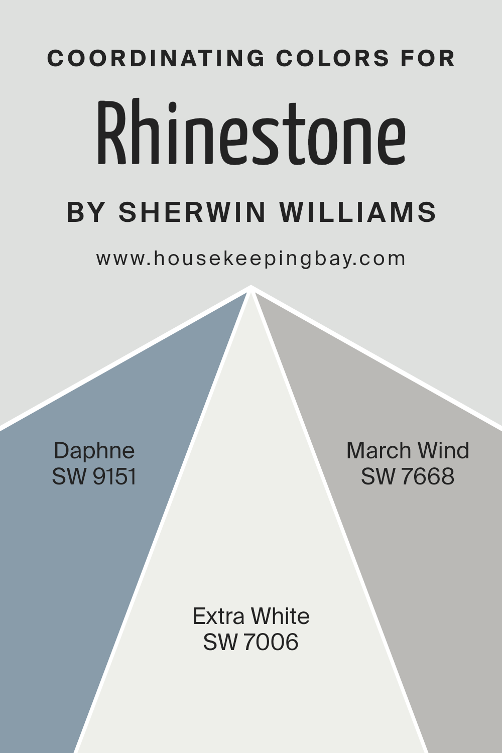
Coordinating Colors of Rhinestone SW 7656 by Sherwin Williams
Coordinating colors are hues that harmonize well with a primary color, enhancing the overall aesthetic of a space. These companions support the main color, offering a balanced and cohesive look. The coordination between colors can evoke various atmospheres and styles, depending on their temperature, intensity, and saturation. For Rhinestone SW 7656 by Sherwin Williams, a light and airy gray, the coordinating colors have been thoughtfully chosen to further accentuate its serene essence while providing contrast and depth when used together.
SW 9151 – Daphne, a rich, deep blue with hints of purple, brings a sense of sophistication and depth. It’s perfect for creating a striking feature wall or as an accent color that complements the cooler tones of Rhinestone.
On the lighter side, SW 7006 – Extra White, serves as a crisp, clean backdrop that can make any space feel more open and bright. It works beautifully with Rhinestone to create a fresh, invigorating environment. Lastly, SW 7668 – March Wind, a soft, cool gray, offers a subtle contrast to Rhinestone. This combination works seamlessly to create a peaceful and harmonious space, ideal for rooms seeking a balance between warmth and coolness.
Each of these coordinating colors uniquely contributes to a cohesive and stylish palette, enhancing the versatility and beauty of Rhinestone SW 7656.
You can see recommended paint colors below:
- SW 9151 Daphne
- SW 7006 Extra White
- SW 7668 March Wind
housekeepingbay.com
How Does Lighting Affect Rhinestone SW 7656 by Sherwin Williams?
Lighting plays a crucial role in how we perceive colors. The way a room is lit can significantly affect the appearance of paint colors on the walls. Let’s explore how RhinestoneSW 7656 by Sherwin Williams, a specific paint color, behaves under different lighting conditions and in various room orientations.
Firstly, artificial light can influence how RhinestoneSW 7656 looks. Depending on the type of bulb (LED, incandescent, fluorescent), the color may appear slightly different. LED lights, for instance, tend to give off a cooler tone, potentially making Rhinestone look more crisp and vibrant. In contrast, incandescent bulbs, which emit a warmer light, might make the color appear softer and slightly more muted.
Natural light, on the other hand, can significantly transform RhinestoneSW 7656 throughout the day. The quality of natural light varies depending on the time of day, weather, and the room’s orientation.
In north-faced rooms, light is cooler and more consistent throughout the day. Here, RhinestoneSW 7656 may seem a bit more subdued and cooler, emphasizing its gray undertones rather than its warmer tones. This creates a calming and serene ambiance.
South-faced rooms receive abundant, warmer light, especially during midday. In such rooms, RhinestoneSW 7656 can look lighter and more lively, with its subtle undertones being more pronounced, offering a bright and inviting feel.
East-faced rooms get bright morning light, which is warm and yellowish. As the day progresses, the intensity of the light decreases, making RhinestoneSW 7656 appear warmer in the morning but cooler and more neutral in the afternoon and evening.
West-faced rooms have the opposite effect. They get softer light in the morning but are bathed in intense, warm light during the afternoon and evening. In these conditions, RhinestoneSW 7656 can shift from appearing neutral and calm in the morning to vibrant and warm later in the day.
Understanding how lighting affects colors, especially a versatile color like RhinestoneSW 7656, can help in making informed decisions when painting rooms with different orientations and lighting sources. This ensures the chosen color compliments the space as intended, across varying conditions.
housekeepingbay.com
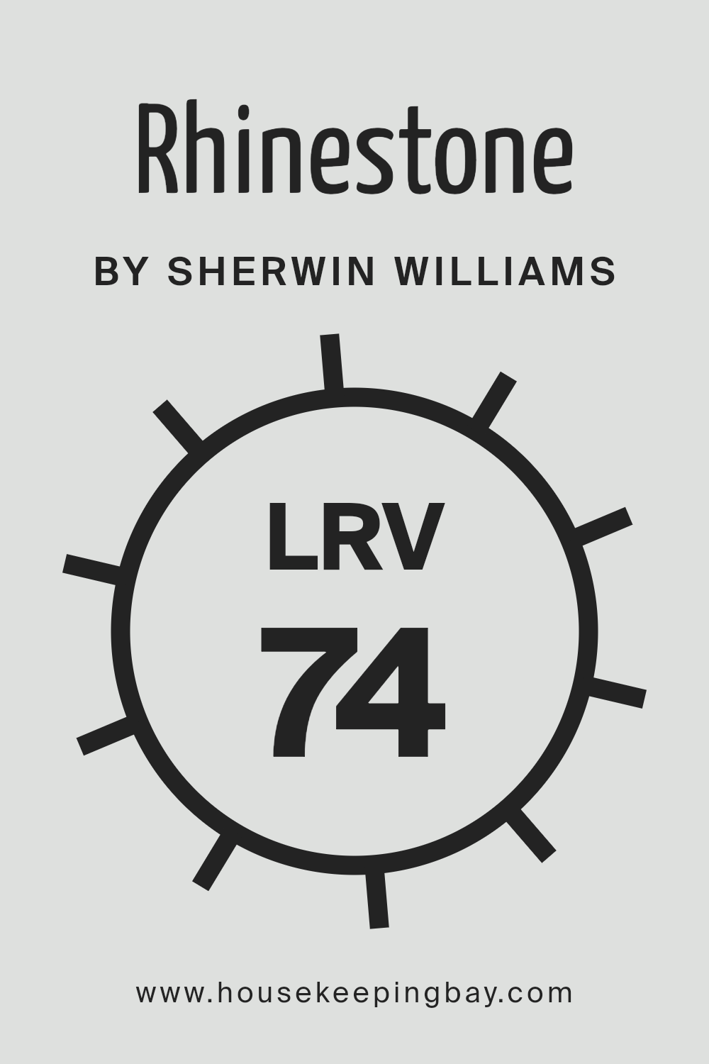
What is the LRV of Rhinestone SW 7656 by Sherwin Williams?
LRV stands for Light Reflectance Value, a measure that shows how much light a color reflects or absorbs. Think of it as a scale from 0 to 100, where 0 means the color is really dark and absorbs a lot of light, like a black chalkboard, and 100 means the color is super light, reflecting most of the light that hits it, like a bright white snow. This LRV thing helps a lot when choosing paint colors because it gives you a clue about how bright or moody a room might feel once the walls are painted. For example, a room with walls painted in a color with high LRV will be brighter and feel airier because it reflects more light around the room.
Now, looking at Rhinestone SW 7656 by Sherwin Williams, which has an LRV of 74.358, it’s pretty high up there on the scale. This means it’s a light color that’s going to reflect a lot of light, making rooms painted with it feel more open and bright. This particular shade of Rhinestone is great if you want a space to look lively and spacious.
Since it throws back a lot of light, it can make small or dimly lit rooms feel bigger and more welcoming. It’s also easy on the eyes, making it a good choice for just about any room looking to capture a bright and airy vibe.
housekeepingbay.com
What is LRV? Read It Before You Choose Your Ideal Paint Color
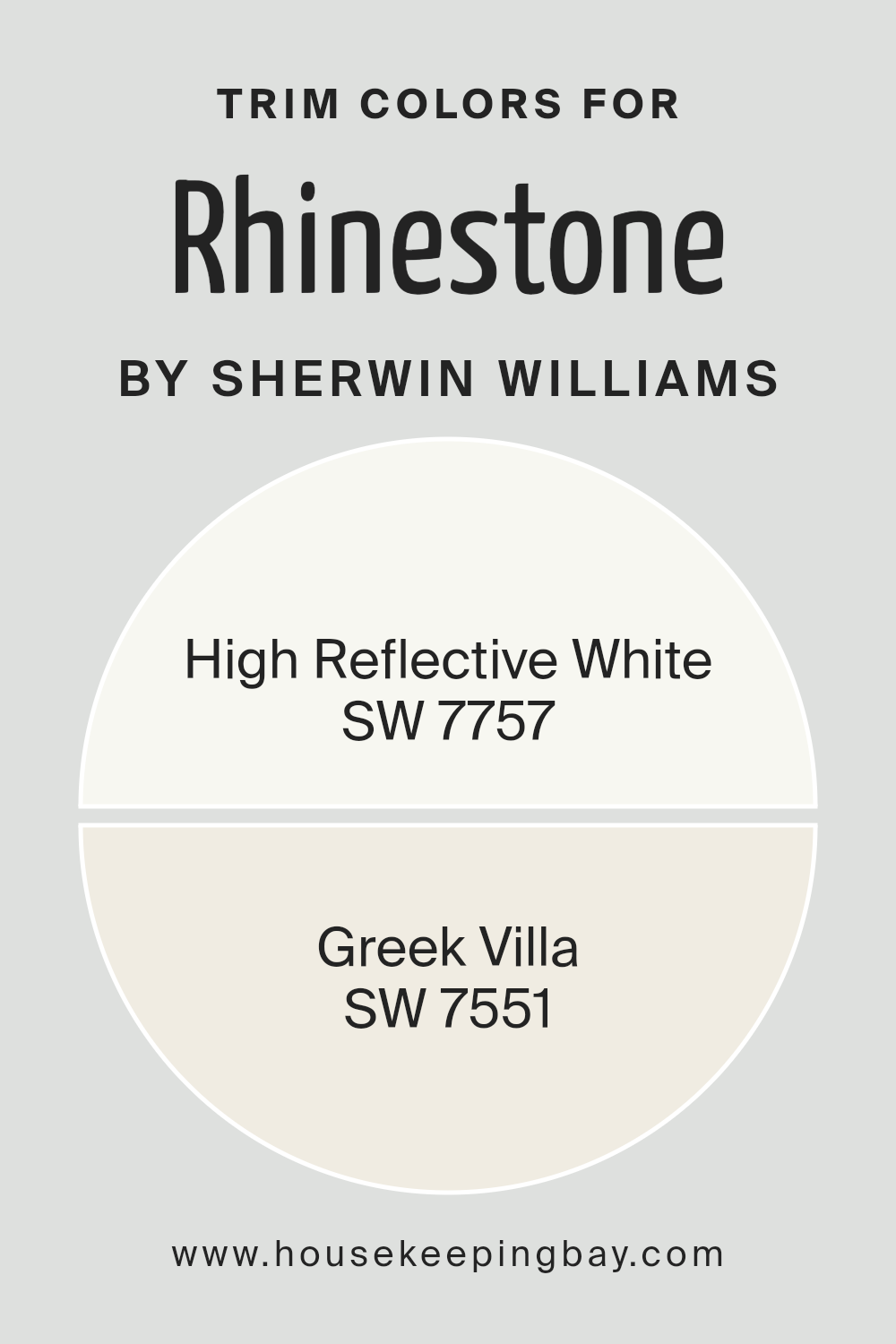
What are the Trim colors of Rhinestone SW 7656 by Sherwin Williams?
Trim colors, like SW 7757 – High Reflective White and SW 7551 – Greek Villa, play a crucial role in defining the style and enhancing the appearance of a space painted with Rhinestone SW 7656 by Sherwin Williams. These colors are used on the finishing touches of a room such as door frames, skirting boards, moldings, and even window trims, acting as a visual frame that accentuates the main color palette.
The choice of trim color can significantly influence the atmosphere and overall aesthetic of a room, either by creating a harmonious blend with the wall color or by adding a striking contrast that highlights architectural details.
SW 7757 – High Reflective White is a brilliant, pure white that brings a crisp and clean look, illuminating the areas where it is applied and providing a sharp contrast to Rhinestone SW 7656. This makes the space feel more open and bright, offering a refreshing lift to the surroundings.
On the other hand, SW 7551 – Greek Villa possesses a softer, warmer tone, somewhat reminiscent of an off-white with subtle beige undertones. This color introduces a cozy and inviting vibe to the space, ensuring that the transition between the wall color and the trim is smooth and aesthetically pleasing, without the stark contrasts that a brighter white might present.
By carefully selecting the right trim color, the overall design can achieve a cohesive and polished look that complements the main hue of Rhinestone SW 7656.
You can see recommended paint colors below:
housekeepingbay.com
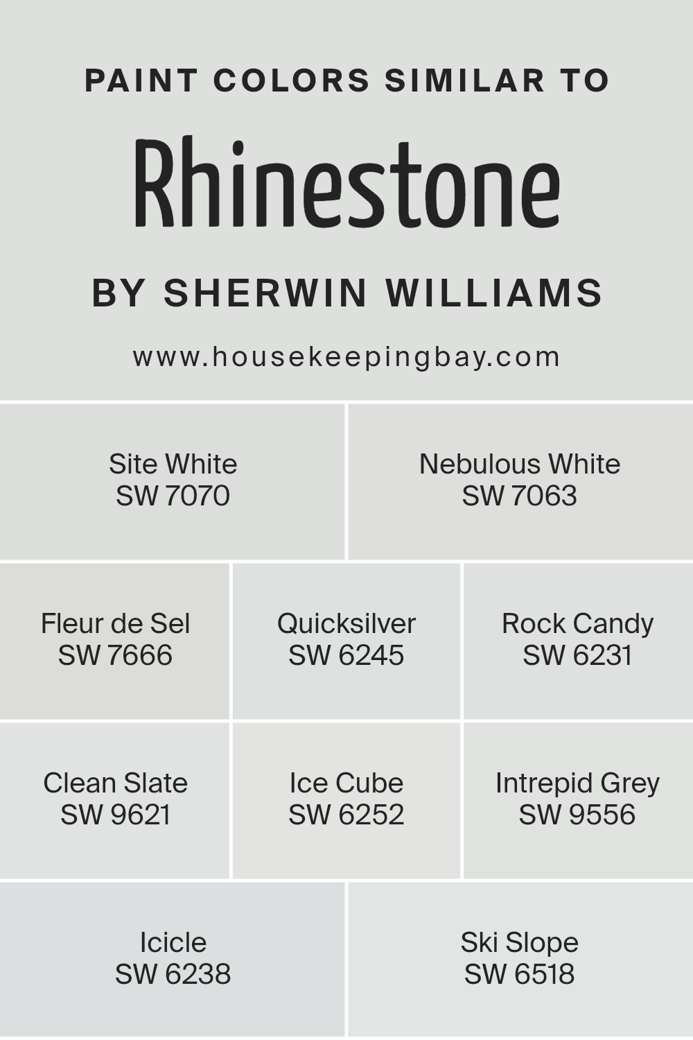
Colors Similar to Rhinestone SW 7656 by Sherwin Williams
When decorating a space, choosing the right palette of similar colors can dramatically influence the mood and continuity of the environment. Similar colors, such as those akin to Rhinestone SW 7656 by Sherwin Williams, play a pivotal role in achieving a harmonious and seamless look.
These shades share a subtle connection, making them easy to blend and layer within a room, allowing for a sophisticated and cohesive aesthetic. This group of colors provides a versatile foundation, enabling accents and decor to stand out or blend in, depending on the desired effect.
Starting with Site White SW 7070, a fresh and airy hue, it sets a serene and inviting backdrop, perfect for open spaces and well-lit rooms. Nebulous White SW 7063 gently shifts towards a slightly cooler tone, offering a crisp, clean canvas that reflects natural light beautifully. Fleur de Sel SW 7666 adds a touch of elegance with its understated sophistication, embodying the essence of tranquility.
For a modern twist, Quicksilver SW 6245 brings a dynamic silver undertone, creating a lively yet relaxed vibe. Rock Candy SW 6231 is your go-to for a minimalistic look, its subtle coolness promoting a sense of spaciousness. Clean Slate SW 9621, with its hint of softness, is perfect for designing a peaceful retreat.
Ice Cube SW 6252, with its faint blue undertone, evokes a refreshing crispness, like a breath of fresh air. Intrepid Grey SW 9556 straddles the line between cozy and contemporary, enriching spaces with its depth. Icicle SW 6238 offers a cooler palette, reminiscent of a winter morning, while Ski Slope SW 6518 warms things up just a touch, ideal for creating a snug and inviting corner.
Together, these colors weave a tapestry of visual comfort, proving that similar hues can indeed define the spirit of a space.
You can see recommended paint colors below:
- SW 7070 Site White
- SW 7063 Nebulous White
- SW 7666 Fleur de Sel
- SW 6245 Quicksilver
- SW 6231 Rock Candy
- SW 9621 Clean Slate
- SW 6252 Ice Cube
- SW 9556 Intrepid Grey
- SW 6238 Icicle
- SW 6518 Ski Slope
housekeepingbay.com
How to Use Rhinestone SW 7656 by Sherwin Williams In Your Home?
Rhinestone SW 7656 by Sherwin Williams is a unique paint color that can make a big difference in your home. It’s a very light shade of gray with a slight hint of blue, giving it a fresh and airy feel. This color works well if you’re looking to brighten up a room without the starkness of pure white. It’s perfect for living rooms, bedrooms, or any space where you want a calm and peaceful vibe.
Using Rhinestone can help small spaces seem larger and more open because of its light-reflective quality. It’s also versatile, pairing nicely with a wide range of decor styles and colors. Whether your furniture is bold and colorful or more understated, this paint can complement it beautifully.
For a cohesive look throughout your home, consider using Rhinestone in hallways or common areas. This creates a seamless transition between spaces, making your home feel more connected and harmonious. Plus, it’s a great backdrop for artwork or family photos, allowing them to stand out.
In sum, Rhinestone SW 7656 is an excellent choice for anyone looking to refresh their home with a light, neutral color that’s easy to work with and stylish.
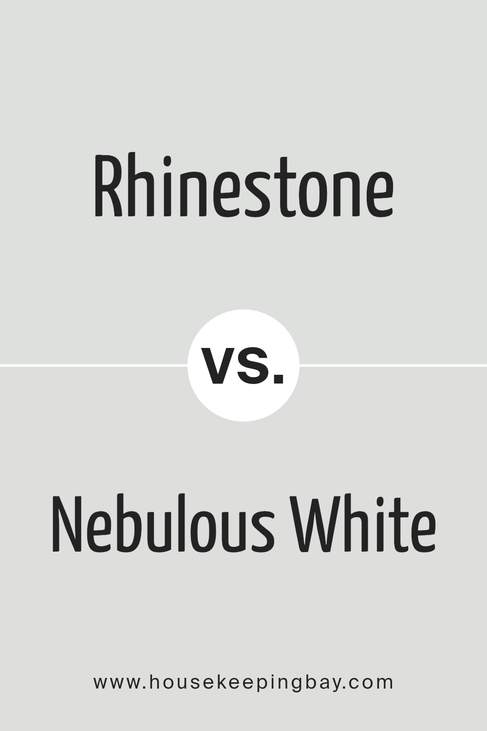
Rhinestone SW 7656 by Sherwin Williams vs Nebulous White SW 7063 by Sherwin Williams
Rhinestone SW 7656 by Sherwin Williams is a light gray color with cool undertones. It gives off a fresh and clean vibe, making it great for creating a bright and airy feel in any room. Its subtle hues can blend well with various decors, adding a touch of elegance without overwhelming the space.
Nebulous White SW 7063 by Sherwin Williams, on the other hand, is also a light shade but leans more towards white with gray undertones. It’s perfect for those looking to achieve a soft, serene ambiance. This color reflects light beautifully, making spaces appear larger and more open.
Both Rhinestone and Nebulous White are versatile and can complement a wide range of color palettes. However, Rhinestone’s cooler gray tone offers a slightly more modern and sophisticated look, whereas Nebulous White provides a classic, timeless feel. Choosing between them depends on the mood you want to set and the specific design aesthetic you’re aiming for.
You can see recommended paint color below:
housekeepingbay.com
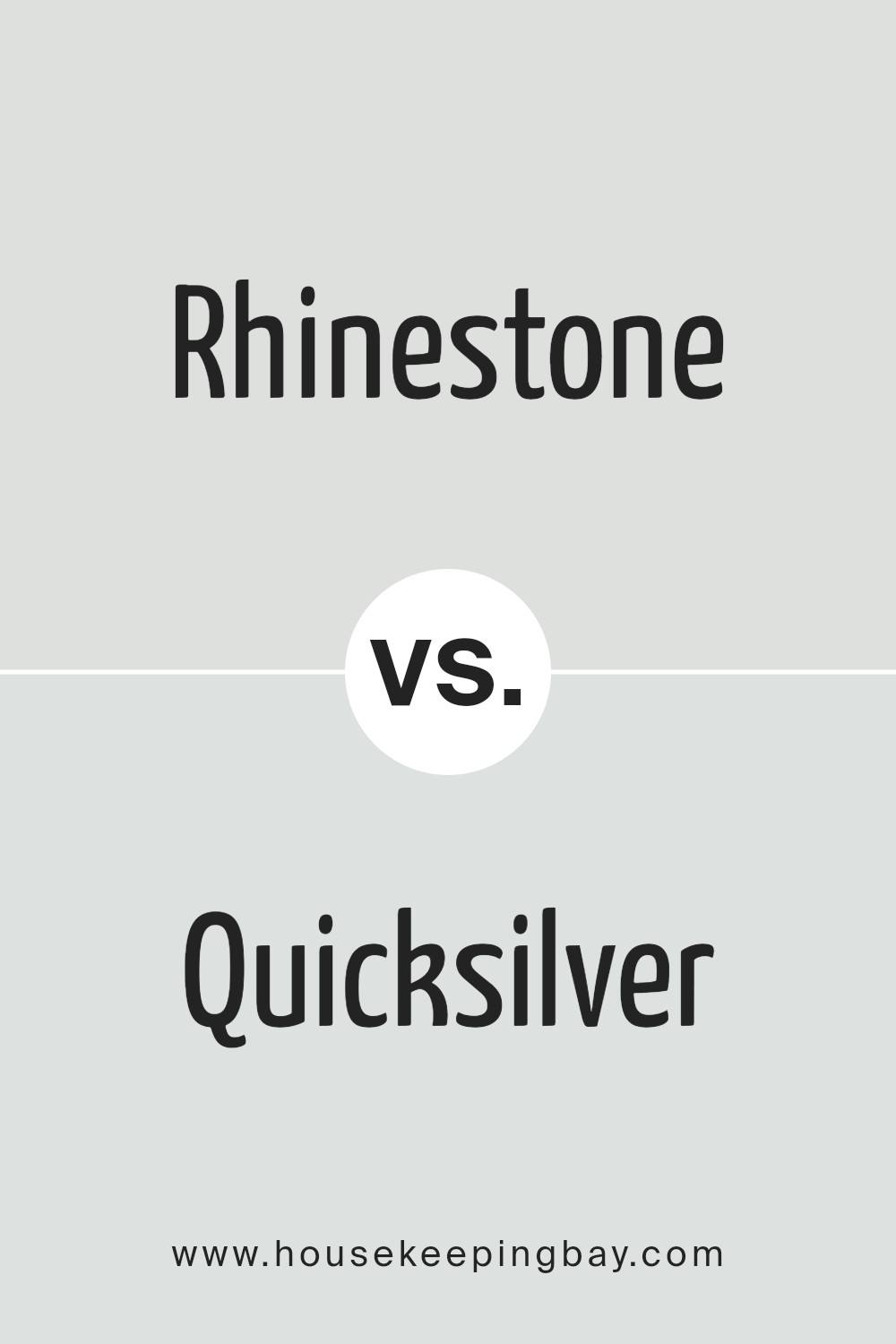
Rhinestone SW 7656 by Sherwin Williams vs Quicksilver SW 6245 by Sherwin Williams
The main color, Rhinestone SW 7656 by Sherwin Williams, is a soft, light gray with a hint of blue. This color has a fresh and airy quality to it, making spaces feel more open and serene. It’s subtle enough to work as a neutral backdrop in any room, adding just a touch of color without overwhelming the space.
On the other hand, Quicksilver SW 6245 by Sherwin Williams is also a gray shade, but it leans more towards a pure, cool gray. It’s a bit deeper than Rhinestone, offering a stronger presence of color while still maintaining a sense of calmness and sophistication. Quicksilver can give a room a more modern and sleek look, potentially making it an excellent choice for contemporary styles.
When comparing the two, Rhinestone appears warmer due to its slight blue undertone, making it ideal for creating a cozy and welcoming environment. Quicksilver, with its cooler tone, provides a crisp, clean look that might be better suited for a more modern or minimalistic setting. Both colors are versatile and can beautifully complement a wide range of decor, but the choice between them would largely depend on the desired mood and style of the room.
You can see recommended paint color below:
- SW 6245 Quicksilver
housekeepingbay.com
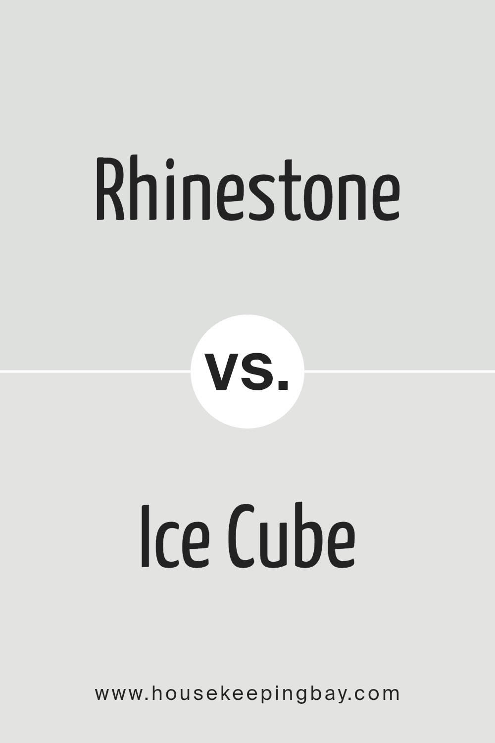
Rhinestone SW 7656 by Sherwin Williams vs Ice Cube SW 6252 by Sherwin Williams
Rhinestone SW 7656 by Sherwin Williams and Ice Cube SW 6252 by Sherwin Williams are both elegant colors, but they bring different vibes to a space. Rhinestone is a soft, light gray that has a hint of warmth, making it feel cozy and inviting. It’s a versatile color that works well in almost any room, adding a subtle touch of sophistication
. On the other hand, Ice Cube is a cooler, crisper gray with a hint of blue. This color feels more refreshing and modern, perfect for creating a serene and airy feel. Ice Cube might be the go-to for a more minimalist or contemporary space, offering a clean and crisp backdrop.
Both colors are great for creating a neutral foundation, but Rhinestone leans toward a warmer, cozier feel while Ice Cube offers a cooler, more refreshing atmosphere. Depending on the desired mood and aesthetic, one might choose Rhinestone for a soft, welcoming look or Ice Cube for a sleek, modern vibe.
You can see recommended paint color below:
housekeepingbay.com
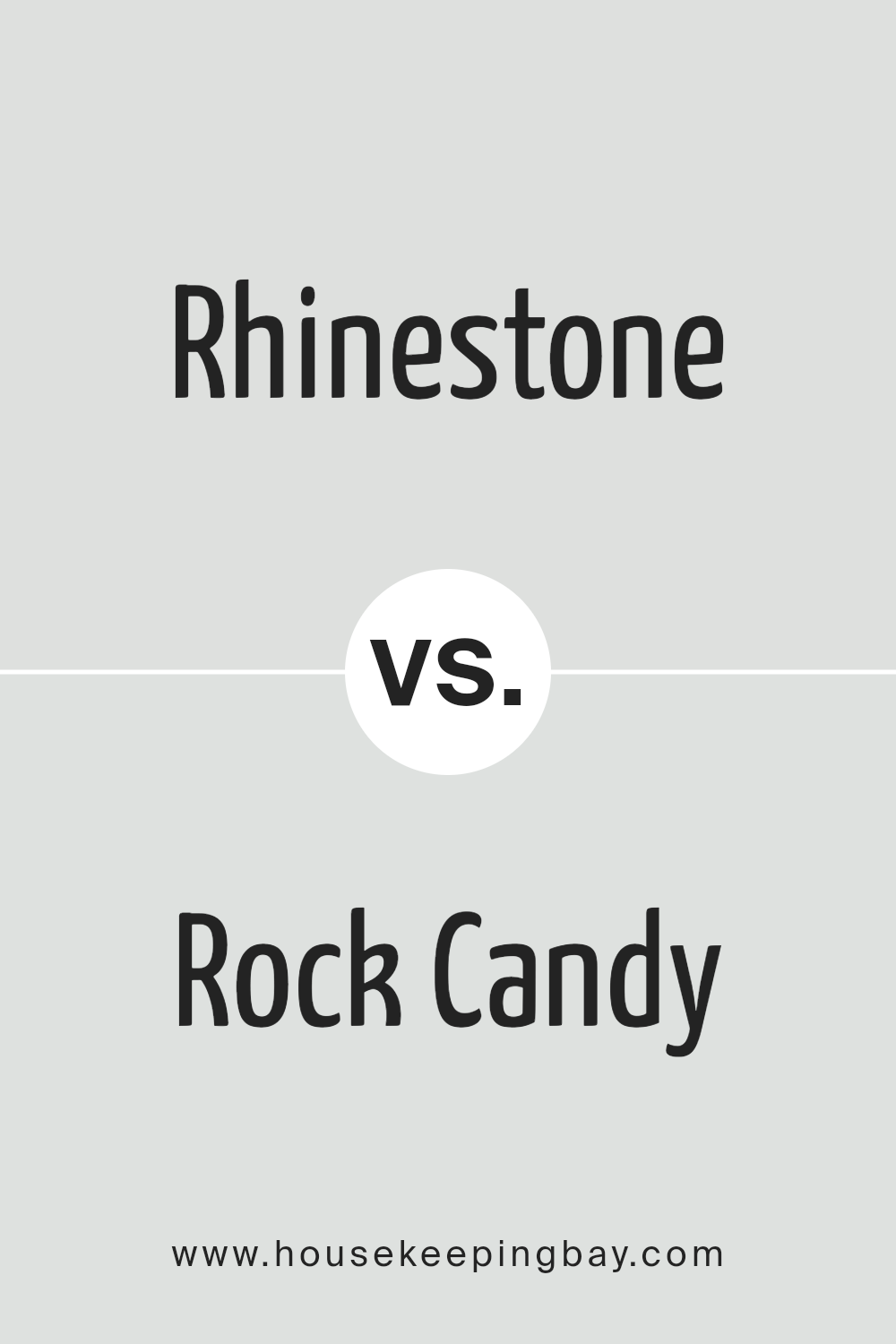
Rhinestone SW 7656 by Sherwin Williams vs Rock Candy SW 6231 by Sherwin Williams
Rhinestone SW 7656 and Rock Candy SW 6231 by Sherwin Williams are both light and airy colors, but they bring their own unique vibes to a space. Rhinestone has a bit of a gray touch. It’s like looking at soft morning mist, making it perfect for a calm and soothing atmosphere. It’s quite versatile, fitting nicely in areas where you want a clean, subtle backdrop.
On the other hand, Rock Candy is lighter, leaning towards a cool, almost frosty look. It reminds you of the crisp, fresh air of early spring. This color is great for making small rooms look bigger and brighter because of its very light tone.
When you compare them, Rhinestone brings in more warmth due to its slight gray hue, adding a cozy layer to spaces. Rock Candy, with its cooler, almost ice-like quality, feels more refreshing and minimalist. Both colors can freshen up a room, but the choice between warmth or cool crispness depends on the mood you’re aiming to create.
You can see recommended paint color below:
housekeepingbay.com
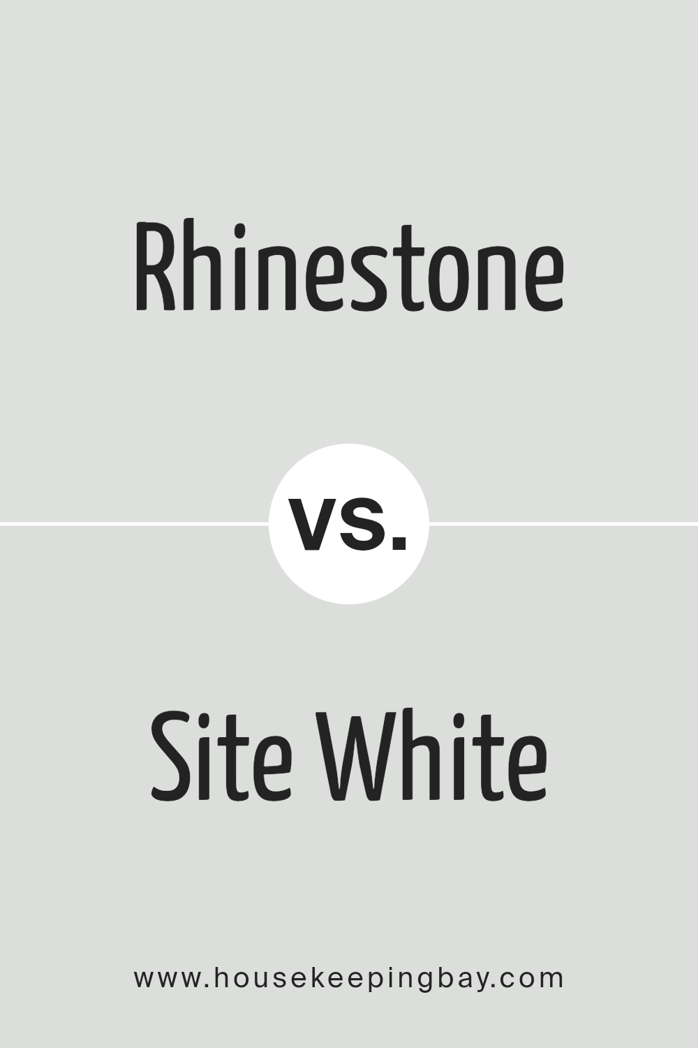
Rhinestone SW 7656 by Sherwin Williams vs Site White SW 7070 by Sherwin Williams
Rhinestone SW 7656 and Site White SW 7070 by Sherwin Williams are two distinct colors with unique vibes. Rhinestone is a cool, airy grey with a subtle blue undertone. It’s like a soft, light cloud on a sunny day, making spaces feel open and serene. This color works wonders in rooms where you want a touch of modern elegance without overpowering the senses. It’s gentle and soothing, perfect for creating a calm and inviting atmosphere.
On the other hand, Site White SW 7070 leans more towards a pure, crisp white with a slightly warm undertone. It’s the kind of white that brings brightness and a sense of cleanliness to any space. Site White can make rooms appear larger and more open, acting as a blank canvas for any décor. It’s incredibly versatile, working well in any room and complementing any style, from minimalist to eclectic.
While Rhinestone adds a subtle hint of color and depth, Site White offers a clean slate, setting the stage for other elements in the room to shine. Both colors are great choices, but their impact depends on the atmosphere you’re aiming to create.
You can see recommended paint color below:
housekeepingbay.com
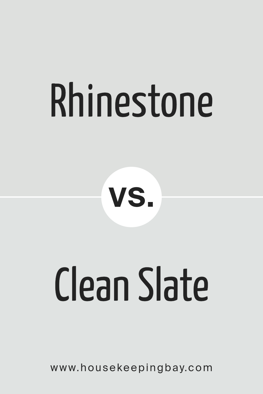
Rhinestone SW 7656 by Sherwin Williams vs Clean Slate SW 9621 by Sherwin Williams
Rhinestone SW 7656 by Sherwin Williams is a soft, light gray color that feels airy and peaceful. It’s the kind of color that makes a room look larger and brighter, providing a gentle backdrop that allows other colors to shine. It’s very versatile, fitting well in almost any room, whether you want a calming bedroom or a fresh-looking living room.
Clean Slate SW 9621, on the other hand, is a darker, moodier gray by Sherwin Williams. It has a stronger presence, creating a statement without being too bold. It’s perfect for adding a bit of sophistication and depth to a space. This color works well when you want to give a room a more grounded, mature feel.
When comparing the two, Rhinestone is lighter and brings a breezy, open feel, while Clean Slate is deeper, adding a layer of elegance and seriousness. Both colors offer different vibes – Rhinestone is for those who love a bright, optimistic space, and Clean Slate appeals to those who prefer a more refined, cozy environment.
You can see recommended paint color below:
housekeepingbay.com
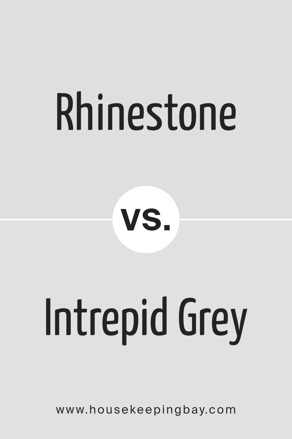
Rhinestone SW 7656 by Sherwin Williams vs Intrepid Grey SW 9556 by Sherwin Williams
Rhinestone SW 7656 by Sherwin Williams and Intrepid Grey SW 9556 by Sherwin Williams are two interesting colors to look at side by side. Rhinestone is a light, soft gray that feels fresh and airy. It’s a kind of color that can make a room feel more spacious and bright. It’s very subtle, so it works well in places where you want to feel relaxed and calm.
On the other hand, Intrepid Grey is deeper and has more presence. It’s a medium grey that carries a bit more weight. This color can make a statement in a room without being too bold or overwhelming. It’s great for adding a bit of sophistication and depth to a space.
When comparing them, it’s clear that Rhinestone is cooler and lighter, making it perfect for a serene and peaceful atmosphere. Intrepid Grey, while still in the grey family, adds more drama and is suited for creating a more grounded and refined look. Both colors would work beautifully in different parts of a home, depending on the mood you’re aiming for.
You can see recommended paint color below:
housekeepingbay.com
Rhinestone SW 7656 by Sherwin Williams vs Icicle SW 6238 by Sherwin Williams
Rhinestone SW 7656 and Icicle SW 6238 by Sherwin Williams are two shades that both offer a touch of calmness and subtlety to any space. Rhinestone is a soft, light gray with cool undertones. It’s a versatile color that can easily fit in various settings, offering a clean and open feeling without being too stark.
On the other hand, Icicle is a bit brighter, leaning towards a very light blue. This color brings a crisp, airy feel to a room, reminiscent of a clear, sunny winter day. While both colors share a sense of tranquility and lightness, Rhinestone stays true to the gray scale, providing a neutral backdrop.
Icicle, however, adds a whisper of color with its hint of blue, giving a slightly cooler vibe. Together, these colors could complement each other well in a space, with Rhinestone grounding the room and Icicle adding a subtle, uplifting energy.
You can see recommended paint color below:
- SW 6238 Icicle
housekeepingbay.com
Rhinestone SW 7656 by Sherwin Williams vs Fleur de Sel SW 7666 by Sherwin Williams
Both Rhinestone SW 7656 and Fleur de Sel SW 7666 are colors by Sherwin Williams, but they offer different vibes for your space. Rhinestone is like a soft, light gray that sometimes looks almost silver, making a room feel open and airy. It’s a very flexible color that can fit in with lots of styles and decorations without taking over the room. It’s great for creating a calm, relaxed atmosphere.
On the other hand, Fleur de Sel is a bit warmer. It’s still a light color but leans more towards a very pale, soft white with a hint of gray. This color is perfect if you want to brighten up a space while keeping it cozy and inviting. It’s like the gentle light of early morning, fresh and clean, making it a good choice for nearly any room.
While Rhinestone brings a cooler, slightly more modern touch, Fleur de Sel offers warmth and a welcoming feel. However, both are subtle and versatile, capable of blending well with different themes and decorations. Your choice might boil down to whether you prefer a cooler silver touch with Rhinestone or the warmer, soft glow of Fleur de Sel.
You can see recommended paint color below:
housekeepingbay.com
Rhinestone SW 7656 by Sherwin Williams vs Ski Slope SW 6518 by Sherwin Williams
Sure, let’s compare the two colors, Rhinestone SW 7656 and Ski Slope SW 6518 by Sherwin Williams, using simple language. Rhinestone is a subtle and soft gray color with a hint of coolness, making it versatile for various spaces. It has the power to create a serene and peaceful atmosphere, perfect for rooms where you want to relax. Its lightness brings in a sense of calm and can make small rooms appear larger and more open.
On the other hand, Ski Slope is a much lighter and gentler hue, leaning towards a very pale, soft green. It brings a fresh and airy feel to a space, reminiscent of a quiet, snowy day on the slopes. This color is ideal for creating a bright, uplifting environment. It reflects light beautifully, making it great for darker rooms or spaces that could use a sense of openness.
While both colors share a softness and an ability to widen and brighten spaces, Rhinestone leans towards a neutral, cool gray, offering a calm, collected feel. Ski Slope, with its hint of pale green, provides a unique, fresh, and slightly more lively atmosphere. Choosing between them depends on the mood you want to set: Rhinestone for a sleek, modern look, or Ski Slope for a light, refreshing vibe.
You can see recommended paint color below:
- SW 6518 Ski Slope
housekeepingbay.com
Conclusion
In summary, Rhinestone SW 7656 by Sherwin Williams is a color that brings a sense of freshness and brightness into any space. It’s a versatile hue that can make a room feel more open and airy, while also adding a subtle touch of sophistication. Whether it’s used on walls as the main color scheme or as an accent to complement other colors, Rhinestone has a way of elevating the overall aesthetic of any interior.
Moreover, its adaptability makes Rhinestone SW 7656 an excellent choice for various design styles, from modern minimalist to cozy cottage. Its soft, neutral undertones help create a serene and inviting atmosphere, making it ideal for bedrooms, living rooms, and even home offices.
It seamlessly blends with other colors and decor, proving itself as a timeless and elegant paint choice for those looking to refresh their space.
housekeepingbay.com
Ever wished paint sampling was as easy as sticking a sticker? Guess what? Now it is! Discover Samplize's unique Peel & Stick samples. Get started now and say goodbye to the old messy way!
Get paint samples