Illusive Green SW 9164 by Sherwin Williams
A Journey into Verdant Tranquility
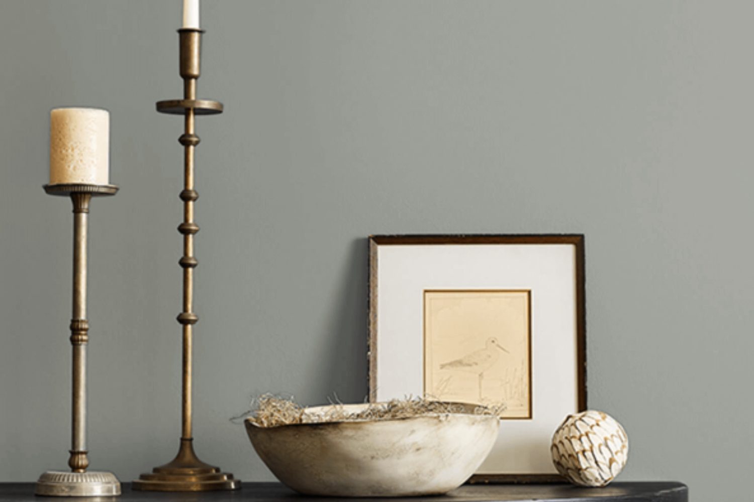
Introducing SW 9164 Illusive Green by Sherwin Williams, a unique and versatile hue that brings a fresh and tranquil vibe to any space. Picture this color as the perfect middle ground between the lushness of nature and the quiet calm of a serene retreat. Illusive Green has a magical way of transforming a room, making it feel both welcoming and stylish without trying too hard.
When you start planning your next decorating project, consider how Illusive Green could enhance your space. Whether you’re looking to give your living room a refreshing update, create a peaceful haven in your bedroom, or even add a touch of subtle color to your kitchen, this shade has the potential to uplift your home in the most unexpected ways.
The beauty of Illusive Green lies in its adaptability; it pairs wonderfully with a wide range of colors and decor styles, from the rustic charm of farmhouse chic to the sleek, clean lines of modern minimalism.
With its understated elegance, SW 9164 Illusive Green by Sherwin Williams invites you to refresh your surroundings in a way that feels both new and familiar. It’s a color that speaks to the heart, offering a canvas for your creativity and personal style to shine. So, as you ponder your next interior adventure, remember this enchanting shade that promises to transform your home into a space that feels just right.
by sherwin williams
What Color Is Illusive Green SW 9164 by Sherwin Williams?
Illusive Green SW 9164 by Sherwin Williams is a unique and versatile color that can significantly enhance various interior styles. This shade is a subtle mix of gray and green, creating a soft, soothing appearance that feels both fresh and cozy at the same time. It’s not too bright but has enough depth to add character and mood to a space.
This color works exceptionally well in modern and Scandinavian designs due to its understated elegance. It also fits beautifully in rustic and shabby chic interiors, adding a touch of nature-inspired tranquility. Illusive Green is great for creating a serene and inviting atmosphere in living rooms, bedrooms, and even bathrooms, making spaces feel more open and peaceful.
When it comes to pairing with materials and textures, Illusive Green is quite flexible. It pairs wonderfully with natural wood, from light oak to richer walnut, enhancing the warmth of the wood. White and beige fabrics look crisp against this shade, while adding leather elements can introduce a luxurious feel. Metals, especially brushed nickel or matte black, complement its green-gray tones for a more contemporary vibe. For those looking to add a bit of coziness, incorporating soft textures like wool or velvet in neutral colors can create a comfortable and stylish interior.
housekeepingbay.com
Is Illusive Green SW 9164 by Sherwin Williams Warm or Cool color?
Illusive Green SW 9164 by Sherwin Williams is a unique and versatile paint color that brings a fresh and cozy ambiance into any home. This color has a magical balance between green and gray, making it perfect for those who want to add a touch of nature to their space without going too bold. When you use Illusive Green in your home, it creates a feeling of tranquility and calmness, much like being in a serene, lush garden.
One of the great things about Illusive Green is how well it adapts to different lighting conditions. In rooms with a lot of natural light, the color appears more vibrant and lively, showcasing its green side. Meanwhile, in spaces with less light, it transforms into a subtler, more muted gray-green, maintaining its beauty and providing a sense of warmth and comfort.
Because of its balanced look, Illusive Green works wonderfully in many areas of the home. It can make living rooms feel more inviting, turn bedrooms into peaceful retreats, and even give bathrooms a spa-like vibe. This color pairs nicely with a wide range of decor styles and colors, from bright whites to rich woods, making it a practical choice for homeowners looking to create a harmonious and stylish interior.
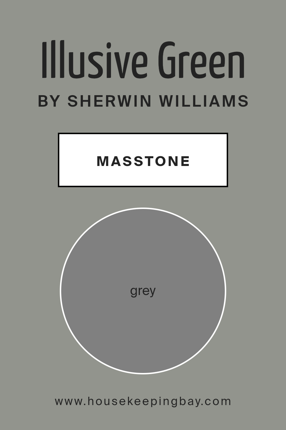
What is the Masstone of the Illusive Green SW 9164 by Sherwin Williams?
The color Illusive Green SW 9164 by Sherwin Williams looks tricky at first glance; it’s all about surprises. Imagine taking a color that seems like a regular grey, similar to the grey you see in pencil sketches, and discovering there’s more to it. That’s what happens with Illusive Green. Its main tone, or “masstone,” is grey, but don’t let that fool you. When you put this color on your walls, something special happens – it reveals hints of green that were hiding beneath that grey surface.
This cool feature makes Illusive Green a unique choice for homes. Since the base color is grey, it’s super versatile and can match with lots of different decor styles and colors. But that hidden green brings in a touch of nature and freshness, almost like bringing a little bit of the outdoors inside. It’s subtle, not shouting for attention, but it adds depth and interest to your rooms. This color can work wonders in spaces that need a calm and soothing vibe, but with a twist that keeps things interesting.
housekeepingbay.com
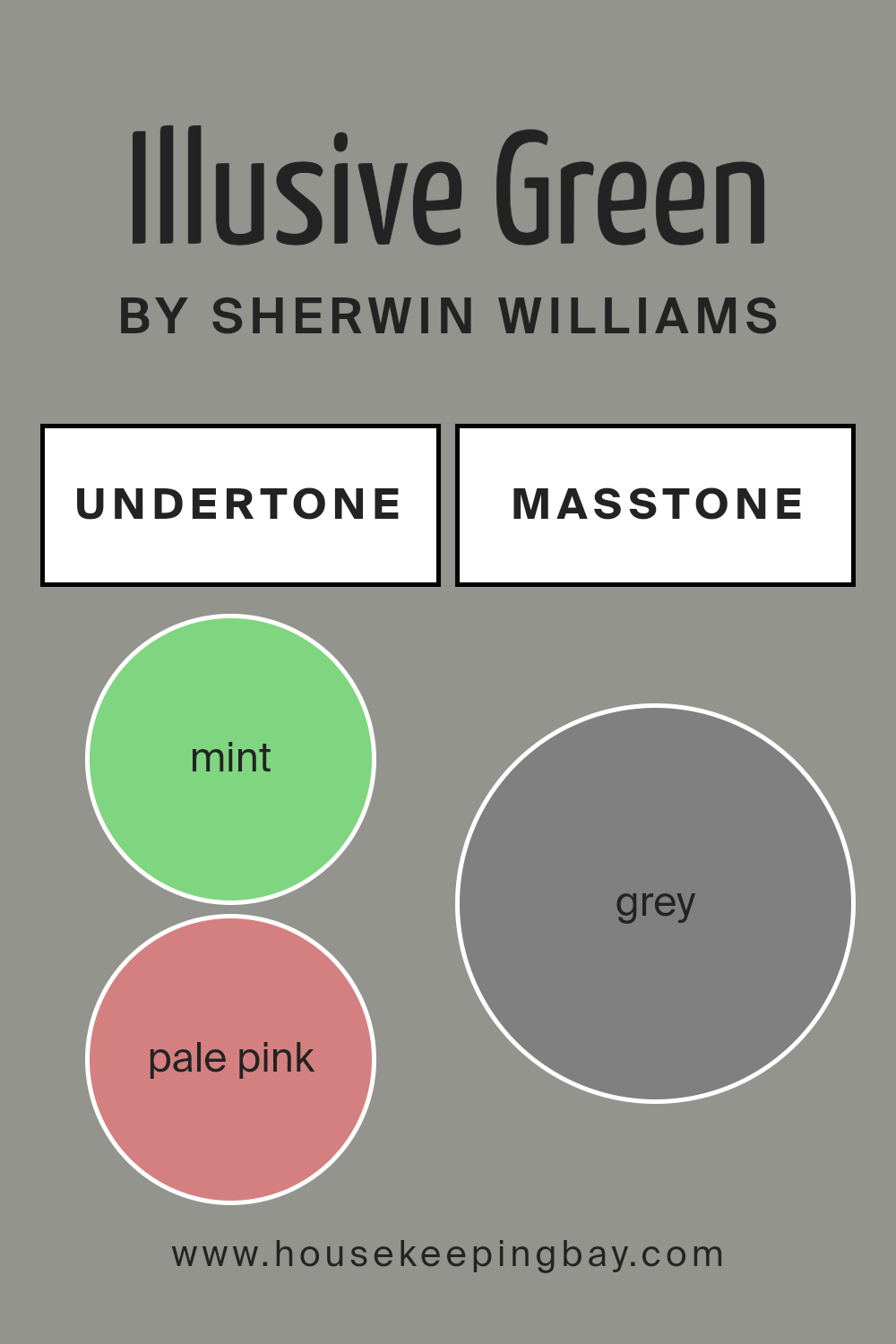
Undertones of Illusive Green SW 9164 by Sherwin Williams
Illusive Green SW 9164 by Sherwin Williams is a unique color that seems simple at first glance but is actually quite complex due to its many undertones. These undertones include a wide range of colors from soft mint and pale pink to vibrant turquoise and rich brown. Every undertone plays a role in how the main color is perceived, essentially shaping our understanding and feelings towards it.
In the case of Illusive Green, these undertones add depth and versatility to the color. For example, mint and light green undertones can make a room feel fresh and vibrant, perfect for creating a lively atmosphere. On the other hand, pale pink and lilac undertones introduce a soft, soothing feel, ideal for bedrooms or relaxation areas.
When applied to interior walls, these undertones can greatly influence the mood and overall aesthetic of a space. In natural light, colors like light blue and pale yellow can make Illusive Green appear brighter and more welcoming, while in artificial light, darker undertones such as olive or dark green may become more prominent, giving the color a more grounded and serene vibe.
The diverse range of undertones means Illusive Green can complement a variety of decor styles and palettes. For instance, pairing it with furniture or accents in light turquoise or pink can enhance its playful, softer side, while dark blue or violet pieces might draw out a more dramatic, sophisticated look.
Ultimately, the undertones of Illusive Green SW 9164 make it a very adaptable color, capable of creating many different looks and feelings in a space depending on its combinations and lighting conditions.
housekeepingbay.com
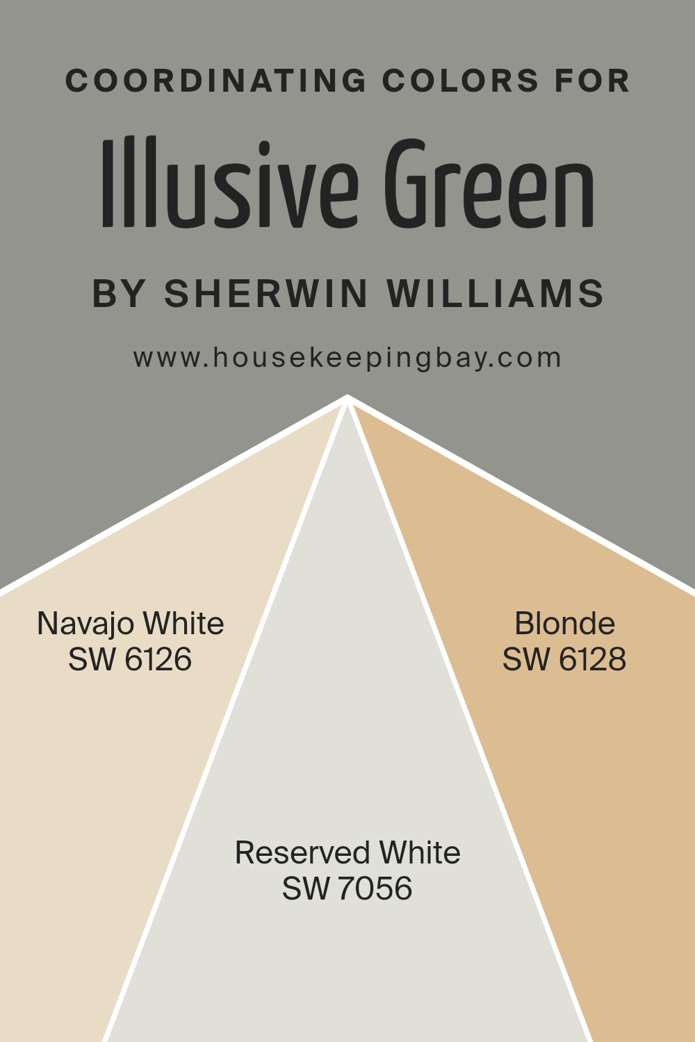
Coordinating Colors of Illusive Green SW 9164 by Sherwin Williams
Coordinating colors are hues that harmonize well with a base color, enhancing the overall aesthetic and creating a cohesive look in any space. When it comes to Illusive Green SW 9164 by Sherwin Williams, selecting the right coordinating colors is key to unlocking its potential in your decor. These colors complement Illusive Green by either providing a subtle contrast or by seamlessly blending with its unique tone, enabling you to craft spaces that feel thoughtfully designed and welcoming.
Navajo White SW 6126 is a warm, creamy white that brings a soft and inviting touch to the room when paired with Illusive Green, making spaces feel cozy and well-lit. Reserved White SW 7056, on the other hand, is a cooler, more neutral white that offers a crisp contrast to Illusive Green, giving a fresh and clean look to any space.
Blonde SW 6128 is a light, welcoming color that bridges the gap between warm and cool, injecting a sunny brightness that complements Illusive Green beautifully, making it ideal for creating a cheerful and inviting atmosphere. Each of these coordinating colors works in harmony with Illusive Green, allowing for versatile design options that cater to various tastes and styles.
You can see recommended paint colors below:
- SW 6126 Navajo White
- SW 7056 Reserved White
- SW 6128 Blonde
housekeepingbay.com
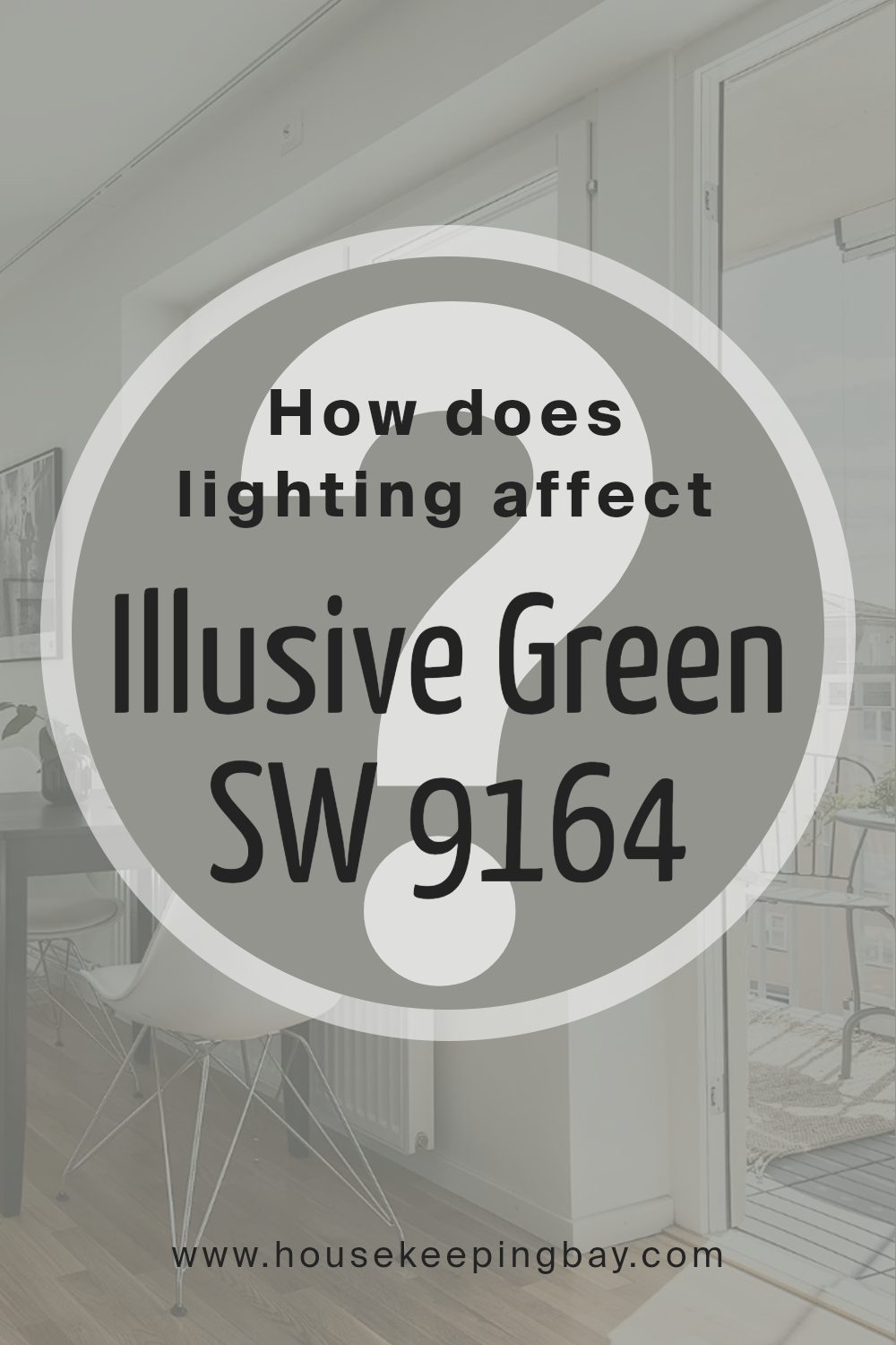
How Does Lighting Affect Illusive Green SW 9164 by Sherwin Williams?
Lighting plays a crucial role in how we perceive colors. The same color can appear different under various lighting conditions. This is very true for the color Illusive Green SW 9164 by Sherwin Williams, a unique shade that can change its appearance based on the light it’s under.
- In artificial light, Illusive Green can look warmer and more inviting. Artificial lighting, such as LED or incandescent bulbs, can bring out the cozy, yellow undertones in the color, making a room feel snug and welcoming. This makes Illusive Green a great choice for living spaces where you want to create a cozy atmosphere.
- In natural light, the color can show a different side. Depending on the time of day and the quality of the light, Illusive Green can shift from a soft, serene green to a more vibrant, lively color. This chameleon-like quality makes it a versatile choice for many spaces.
Let’s look at how Illusive Green behaves in rooms facing different directions:
- North-faced rooms receive less direct sunlight, so the cool, indirect light can make Illusive Green appear more muted and subdued. It might lean towards its green-gray undertones, giving a calm and tranquil vibe.
- South-faced rooms benefit from abundant direct sunlight, making Illusive Green look brighter and more vivid. In these rooms, the color can truly come alive, feeling fresh and lively throughout the day.
- East-faced rooms enjoy the morning light, which is warm and golden. Here, Illusive Green can appear softer and warmer in the morning, then transition to being more subdued as the day progresses and the light fades.
- West-faced rooms receive the evening light, which can be intensely warm. Illusive Green in these rooms can look very different as the day ends, turning into a richer, warmer version of itself in the sunset glow.
Understanding how Illusive Green reacts to different lighting conditions can help you make the best use of this color in your space, ensuring it always looks its best.
housekeepingbay.com
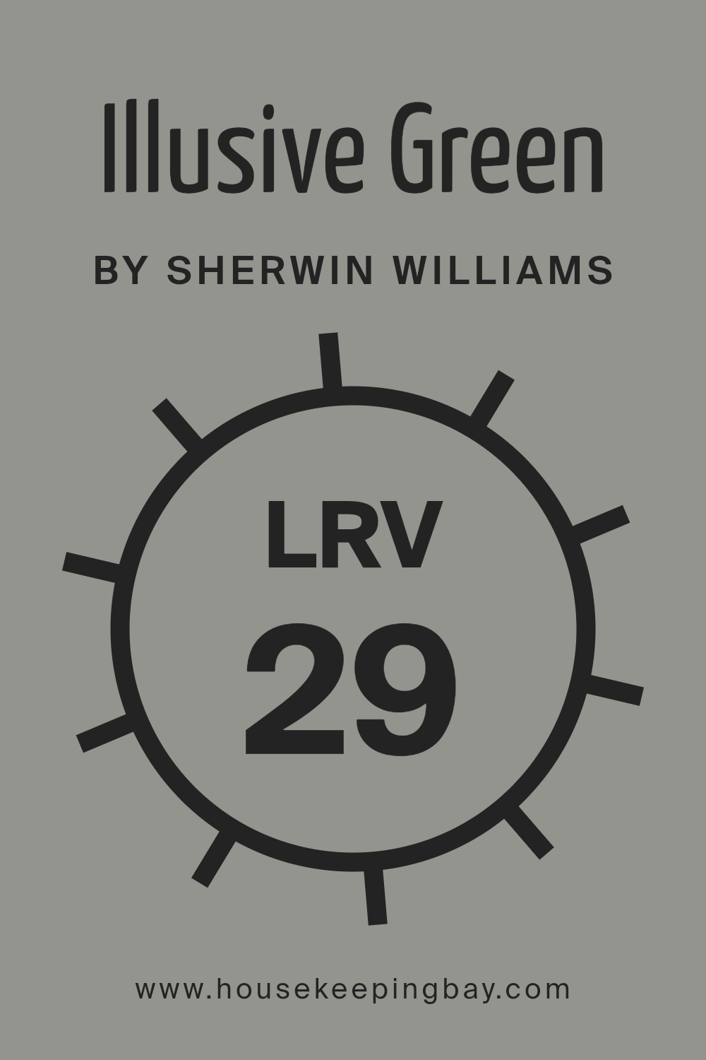
What is the LRV of Illusive Green SW 9164 by Sherwin Williams?
For Illusive Green SW 9164 by Sherwin Williams, with an LRV of 29.272, it’s on the darker side of the scale. This means it won’t reflect a lot of light back into the room. In practical terms, when you use this color on your walls, it can make the space feel more intimate and enclosed.
This particular shade of green can add depth and character to a room but might be best used in a space that gets plenty of natural light or paired with good interior lighting to ensure it doesn’t make the room feel too dark.
housekeepingbay.com
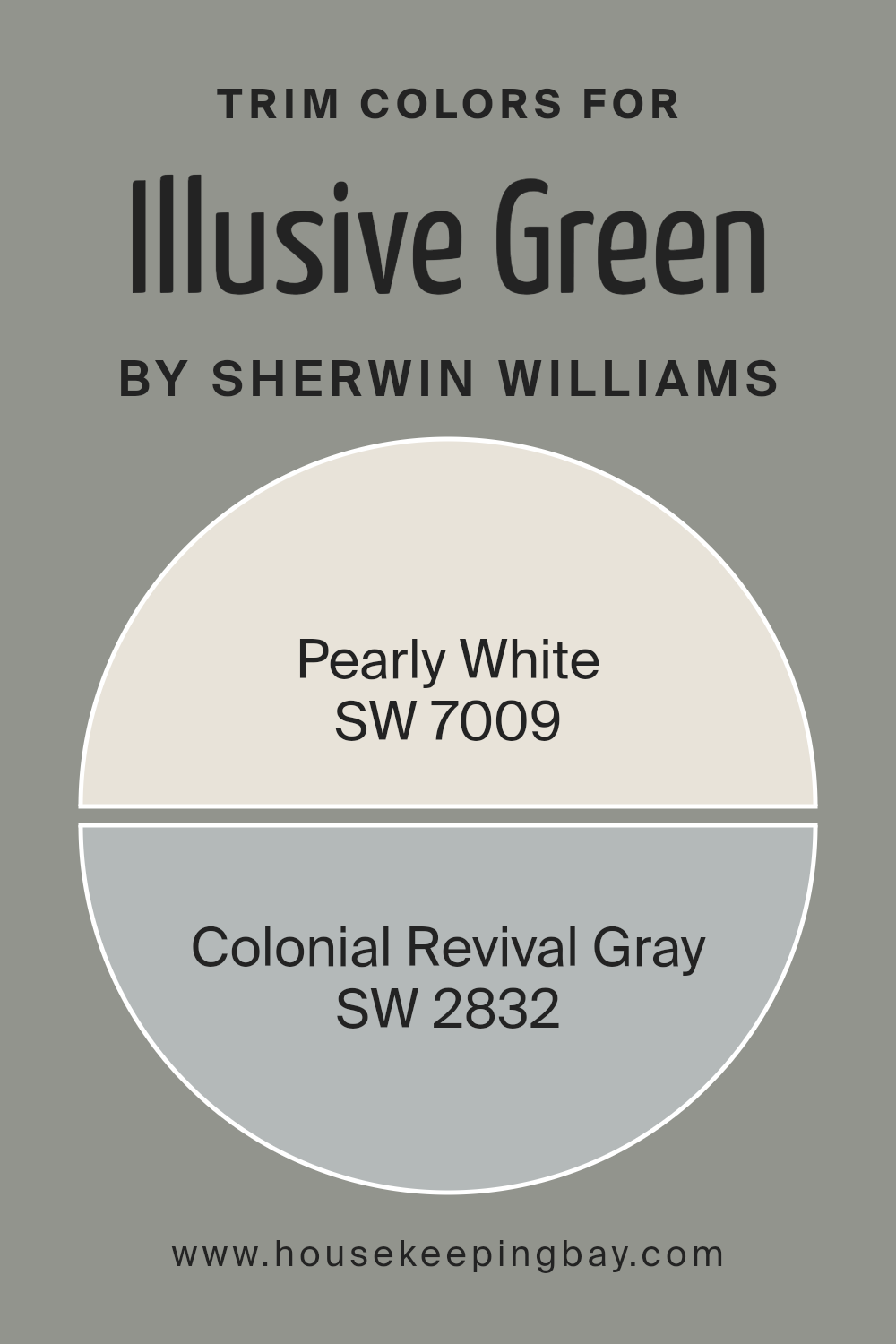
What are the Trim colors of Illusive Green SW 9164 by Sherwin Williams?
Trim colors are the shades used to accentuate or contrast details like door frames, window sills, and skirting boards in a room, highlighting architectural elements or creating visually appealing outlines against a primary wall color.
When paired with a unique color like Illusive Green SW 9164 by Sherwin Williams, trim colors can significantly enhance the appearance of a room, drawing attention to its features or adding a subtle layer of sophistication. For Illusive Green, a color that carries a tranquil and nature-inspired vibe, choosing the right trim colors is crucial to either softly complement or strikingly contrast its serene presence, thereby amplifying the room’s overall aesthetic appeal.
SW 7009 Pearly White is a gentle, creamy hue that brings a soft and airy quality to the trim, offering a subtle contrast to Illusive Green that enhances its natural appeal without overwhelming it. This particular shade can infuse spaces with a light, welcoming feel while maintaining a seamless flow throughout the room.
On the other hand, SW 2832 Colonial Revival Gray provides a stronger contrast against Illusive Green, delivering a classic and refined look. With its balanced gray tones, this color adds depth and definition to the space, creating a sophisticated framework that highlights the elegant character of Illusive Green SW 9164. Together, these trim color choices offer versatile options for elevating the beauty of Illusive Green, whether the desired effect is to softly complement or to provide a distinguished contrast.
You can see recommended paint colors below:
- SW 7009 Pearly White
- SW 2832 Colonial Revival Gray
housekeepingbay.com
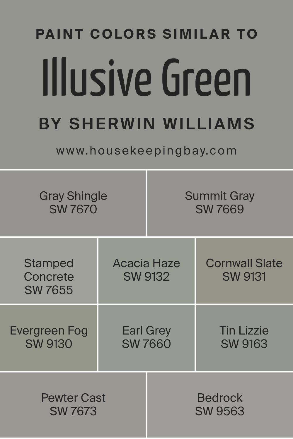
Colors Similar to Illusive Green SW 9164 by Sherwin Williams
Similar colors, like those related to Illusive Green SW 9164 by Sherwin Williams, are crucial in design because they create a seamless and cohesive look, making spaces appear more put together and harmonious. They work by sharing common undertones or being adjacent on the color wheel, which allows for subtle transitions between hues.
This approach can add depth and dimension without the stark contrasts that come from using highly differing colors.
- For instance, Gray Shingle SW 7670 is a muted, soft gray with a slight green undertone that offers a gentle transition from the more pronounced green of Illusive Green.
- Summit Gray SW 7669, on the other hand, is a deeper gray that hints at the complexity of green without overtly displaying it, adding sophistication.
- Stamped Concrete SW 7655 brings a sturdier, earthier gray into the mix, grounding the palette. Acacia Haze SW 9132, with its deep, smoky green-gray, wraps spaces in nature-inspired tranquility.
- Cornwall Slate SW 9131 darkens the mood slightly, offering richness and intensity.
- Evergreen Fog SW 9130, a blend of green, gray, and blue, mirrors the softness of morning mist.
- Earl Grey SW 7660, not just a favorite tea, lends an aristocratic, cool elegance.
- Tin Lizzie SW 9163 veers into the cleaner, steelier side of the spectrum, providing sleek modernity.
- Pewter Cast SW 7673 introduces a metallic edge without losing warmth.
- Finally, Bedrock SW 9563 anchors the palette with its solid, foundational gray, ensuring that regardless of the color chosen, the space remains balanced and inviting.
You can see recommended paint colors below:
- SW 7670 Gray Shingle
- SW 7669 Summit Gray
- SW 7655 Stamped Concrete
- SW 9132 Acacia Haze
- SW 9131 Cornwall Slate
- SW 9130 Evergreen Fog
- SW 7660 Earl Grey
- SW 9163 Tin Lizzie
- SW 7673 Pewter Cast
- SW 9563 Bedrock
housekeepingbay.com
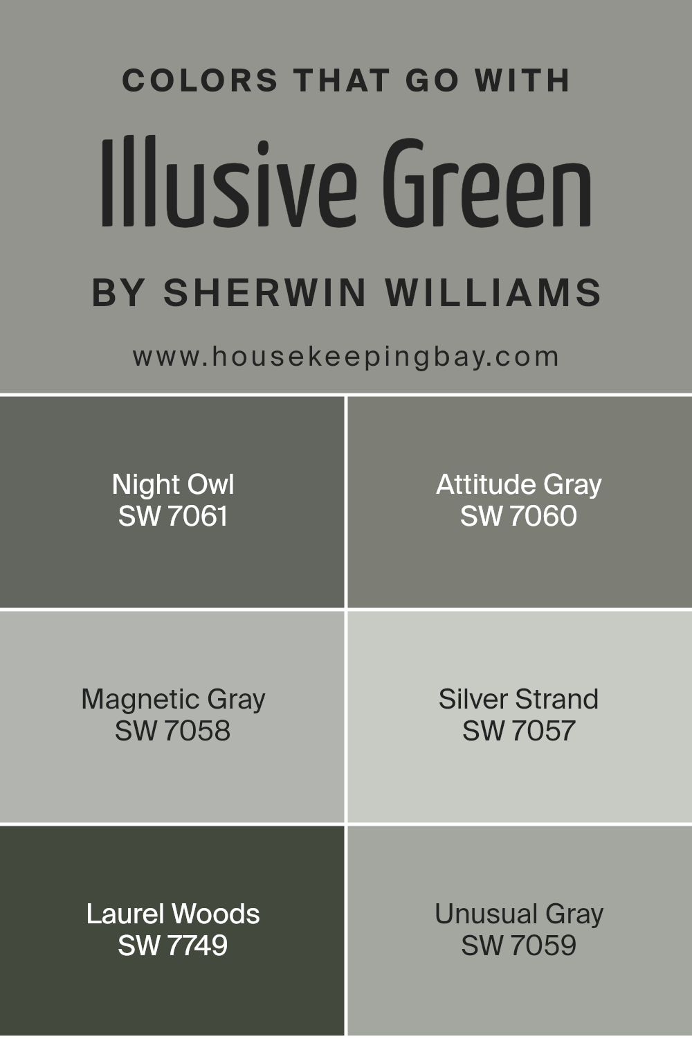
Colors that Go With Illusive Green SW 9164 by Sherwin Williams
Choosing the right colors to complement Illusive Green SW 9164 by Sherwin Williams is essential for creating a harmonious and appealing space. When paired thoughtfully, these colors enhance the room’s atmosphere, bringing out the best in Illusive Green. For instance, if you’re seeking a sophisticated and cohesive look, coordinating colors like Night Owl, Attitude Gray, and Magnetic Gray can play a pivotal role. These shades work together by offering a balanced contrast that amplifies the beauty of Illusive Green, providing depth and character to any room. On the other hand, colors like Silver Strand, Laurel Woods, and Unusual Gray add different dimensions and moods, from serene and calming effects to more dynamic and grounding vibes.
- Night Owl is a deep, rich gray that adds a touch of mystery and elegance, perfect for creating a cozy corner or an accent wall that needs depth.
- Attitude Gray brings a more assertive flair with its greenish undertones, complementing Illusive Green by reinforcing an earthy, nature-inspired theme.
- Magnetic Gray, lighter and softer, acts as a bridge between lighter and darker hues, ensuring the space feels unified.
- Silver Strand, with its whisper of green, gently illuminates and expands spaces, making it ideal for a fresh, airy feel.
- Laurel Woods offers a robust, earthy anchor that draws from nature’s darker tones, providing a solid foundation for rooms that aim for a stronger connection to the outdoors.
- Lastly, Unusual Gray, with its unique blend of green and gray, offers a subtle twist that intrigues and refreshes the eye, making it perfect for adding a touch of sophistication.
Together, these colors harmonize with Illusive Green to create spaces that are as inviting as they are stylish.
You can see recommended paint colors below:
- SW 7061 Night Owl
- SW 7060 Attitude Gray
- SW 7058 Magnetic Gray
- SW 7057 Silver Strand
- SW 7749 Laurel Woods
- SW 7059 Unusual Gray
housekeepingbay.com
How to Use Illusive Green SW 9164 by Sherwin Williams In Your Home?
Illusive Green SW 9164 by Sherwin Williams is a unique and versatile paint color that stands out for its soothing and natural vibe. Think of the color you see on leaves in a dense forest at the break of dawn – fresh and full of life. That’s what Illusive Green brings into your home. It has a magical way of blending with different settings while adding a layer of calm and serenity.
You can use Illusive Green in various rooms to create different effects. For a cozy and calming atmosphere, consider painting your bedroom walls with this color. It helps in creating a tranquil space, perfect for relaxing after a long day. In the living room or study, Illusive Green works wonderfully by providing a backdrop that’s both refreshing and sophisticated, making your furniture and decor pop in an inviting way.
For those who love the outdoors, using Illusive Green in your kitchen or dining area can bridge the gap between inside and outside, bringing a touch of nature into your home. It pairs well with natural materials like wood and stone, enhancing the organic feel of your space. Whether you want to transform a single room or your entire home, Illusive Green SW 9164 offers a beautiful and easy-going option that can uplift any space with its natural charm.
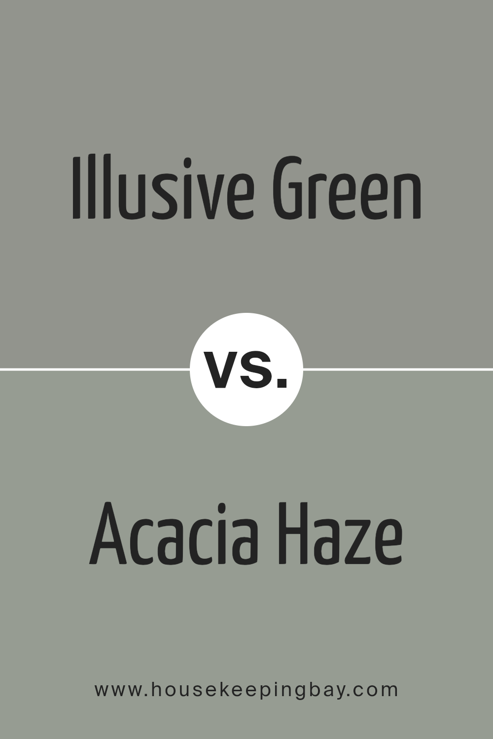
Illusive Green SW 9164 by Sherwin Williams vs Acacia Haze SW 9132 by Sherwin Williams
Illusive Green SW 9164 and Acacia Haze SW 9132, both by Sherwin Williams, are unique yet complementing shades of green. Illusive Green is a lighter, softer green that gives off a calm and inviting vibe. It’s perfect for creating a serene atmosphere in a room. On the other hand, Acacia Haze is a bit deeper and richer, adding a touch of sophistication and depth to spaces.
While Illusive Green has a more subtle, almost neutral, feel to it, making it extremely versatile for various settings, Acacia Haze stands out more dramatically, ideal for feature walls or spaces where you want to make a statement. Both colors work beautifully with natural light, but Acacia Haze, with its stronger presence, might seem more commanding in well-lit areas. Whether you prefer the gentle touch of Illusive Green or the boldness of Acacia Haze, both colors offer unique opportunities to beautify your space.
You can see recommended paint color below:
housekeepingbay.com
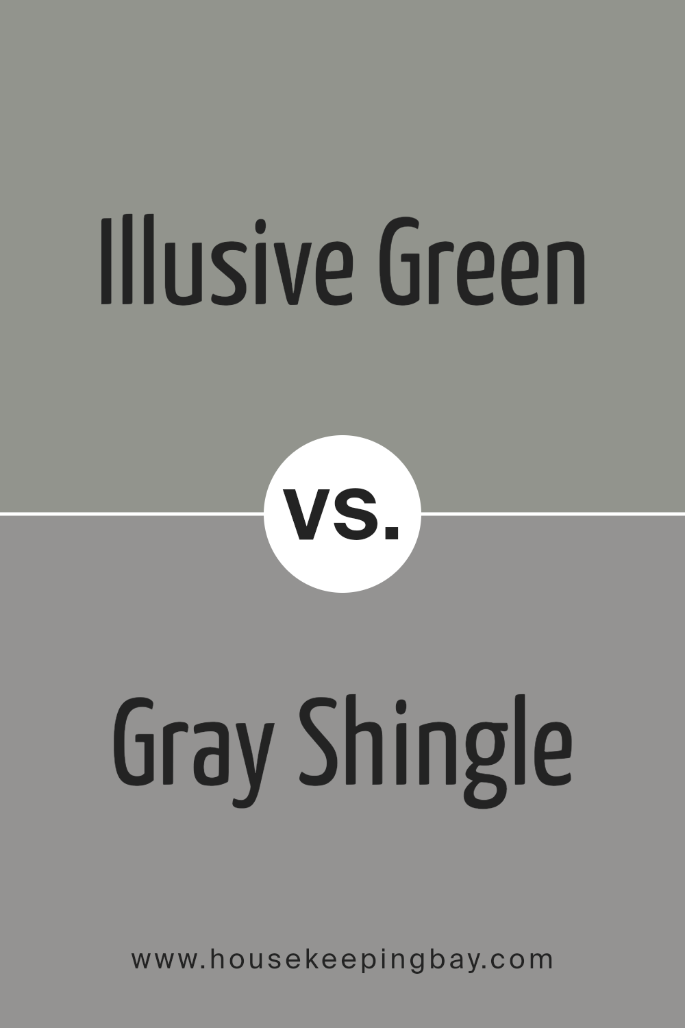
Illusive Green SW 9164 by Sherwin Williams vs Gray Shingle SW 7670 by Sherwin Williams
Illusive Green SW 9164 and Gray Shingle SW 7670 by Sherwin Williams are two unique paint colors that each have their own charm. Illusive Green is a soft, muted green with a hint of gray. It’s a versatile color that can give a room a calm and soothing feel, making it great for bedrooms or living spaces where you want to relax.
On the other hand, Gray Shingle is a true gray that leans slightly cool. It’s a fantastic choice for modern spaces or anywhere you want a sleek, contemporary look. While Illusive Green brings a touch of nature and freshness into a space, Gray Shingle offers a clean, minimalist vibe. Both colors work well in various lighting conditions, but the green undertones in Illusive Green can add warmth to a room, whereas Gray Shingle might make a space feel more spacious and open. Each color has its own personality, so your choice would depend on the atmosphere you’re aiming to create.
You can see recommended paint color below:
- SW 7670 Gray Shingle
housekeepingbay.com
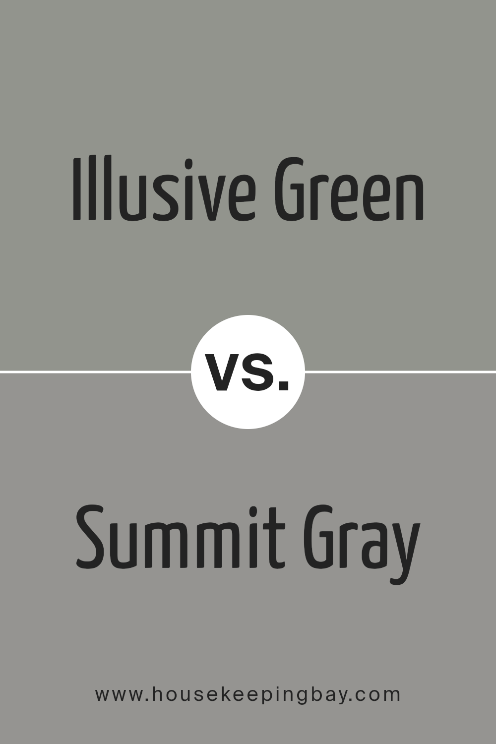
Illusive Green SW 9164 by Sherwin Williams vs Summit Gray SW 7669 by Sherwin Williams
Illusive Green SW 9164 and Summit Gray SW 7669, both by Sherwin Williams, are unique in their own ways. Illusive Green leans more towards a soft, muted green with a gentle touch of gray, making it soothing and perfect for creating a calm environment. It’s the kind of color that brings a subtle hint of nature indoors, giving rooms a fresh, lively feel without being too bold or overpowering.
On the other hand, Summit Gray is a true gray that strikes a balance between light and dark. This color is versatile, fitting well in many spaces, from modern kitchens to cozy bedrooms. Its strength lies in its neutrality, acting as a perfect backdrop for both bright accents and softer, muted tones, making it easy to coordinate with different decor styles.
Both colors share a similarity in their muted sophistication but cater to different tastes and atmospheres within a home. Illusive Green brings a touch of the outdoors inside, while Summit Gray offers a sleek, timeless base that works with everything.
You can see recommended paint color below:
- SW 7669 Summit Gray
housekeepingbay.com
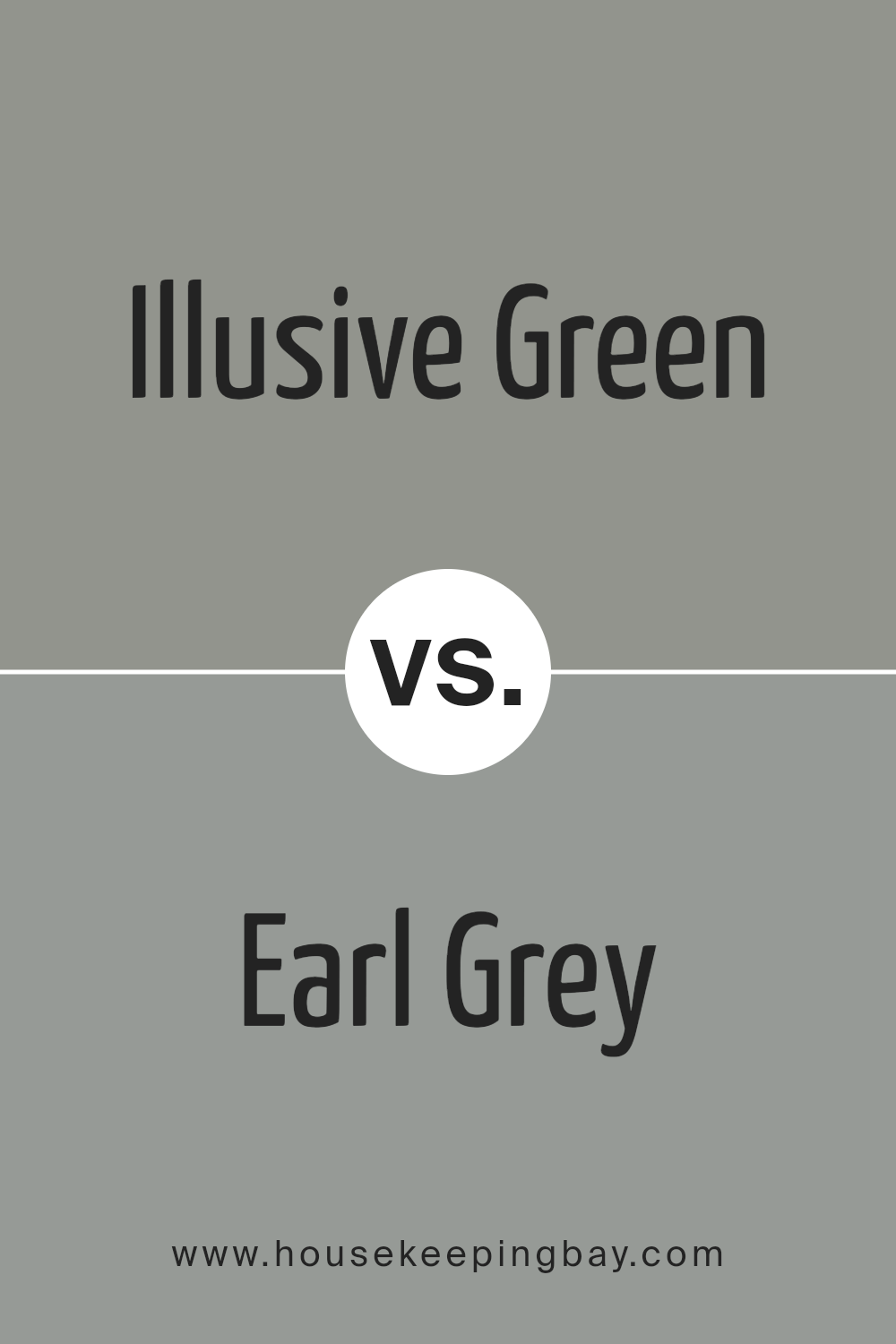
Illusive Green SW 9164 by Sherwin Williams vs Earl Grey SW 7660 by Sherwin Williams
Illusive Green SW 9164 and Earl Grey SW 7660, both from Sherwin Williams, are unique colors each with its own charm. Illusive Green lives up to its name by offering a subtle, soothing blend of green with a hint of gray, giving spaces a fresh, serene vibe. It’s light enough to make a room feel airy yet has enough depth to add character.
On the other hand, Earl Grey SW 7660 is a graceful gray with a touch of blue undertone, delivering an elegant, timeless look. Unlike the lively, nature-inspired feel of Illusive Green, Earl Grey brings a classic, sophisticated atmosphere that works well in both modern and traditional settings. While Illusive Green can inject a breath of fresh air into a space, Earl Grey offers a solid, grounded feel. Choosing between them depends on whether you’re aiming for a subtle connection to nature or a refined, calm backdrop.
You can see recommended paint color below:
- SW 7660 Earl Grey
housekeepingbay.com
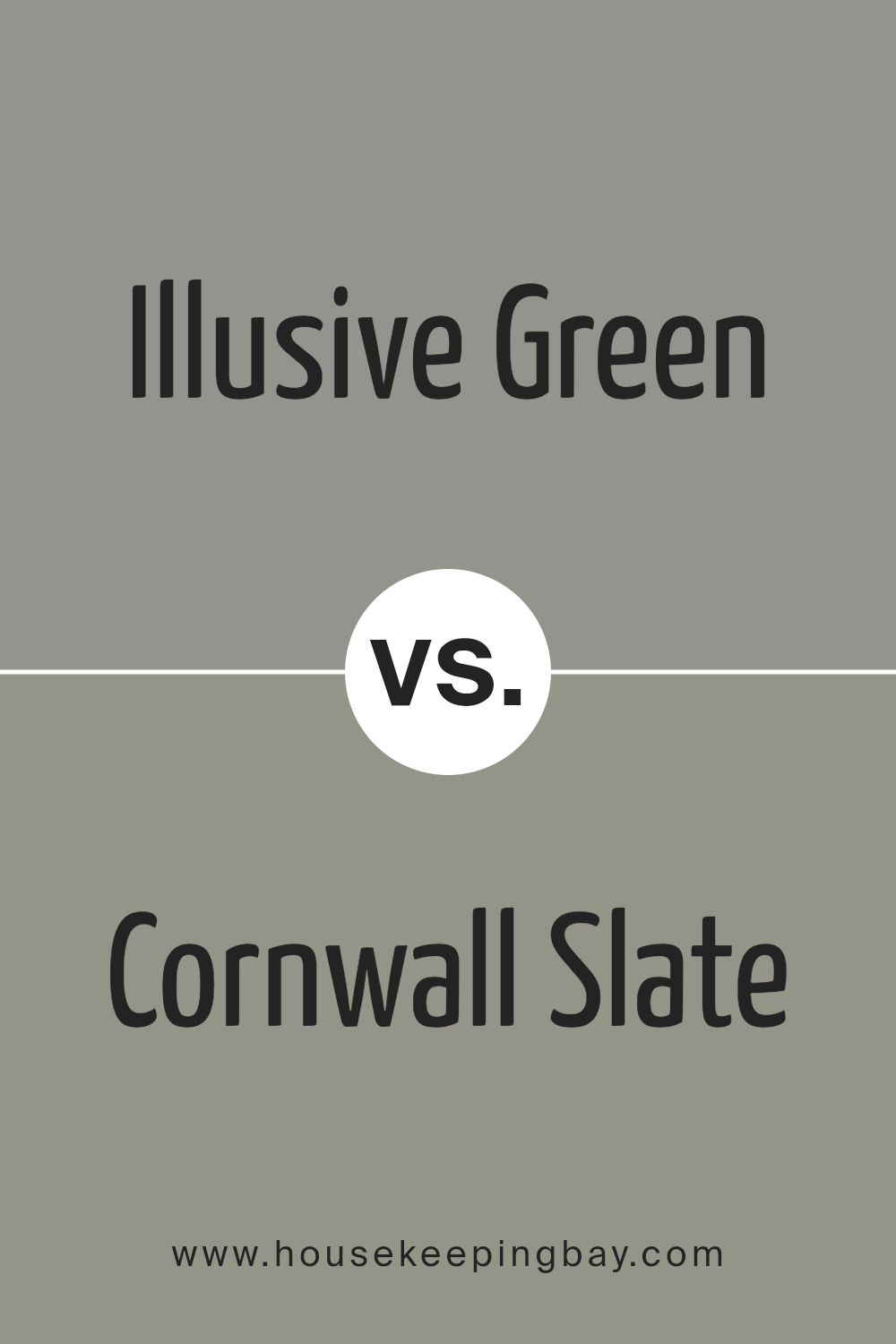
Illusive Green SW 9164 by Sherwin Williams vs Cornwall Slate SW 9131 by Sherwin Williams
Illusive Green SW 9164 and Cornwall Slate SW 9131 are both unique shades from Sherwin Williams, but they offer different vibes for any space. Illusive Green is a soft, muted green that feels fresh and calming. It’s like a whisper of nature brought inside, perfect for creating a serene and relaxing atmosphere in rooms like bedrooms or living rooms.
On the other hand, Cornwall Slate is a deeper, more intense color that blends gray with hints of blue and green. It’s a versatile choice that can add a touch of sophistication and depth to a space. This color works great in areas where you want to make a statement without overwhelming the room, such as on a feature wall or in a cozy reading nook.
While Illusive Green brings a light, airy feel, Cornwall Slate offers a more grounded and enveloping sensation. Choosing between them depends on the mood you want to set: calm and peaceful with Illusive Green, or rich and embracing with Cornwall Slate. Both colors stand out for their ability to transform a space, depending on the ambiance you’re aiming for.
You can see recommended paint color below:
- SW 9131 Cornwall Slate
housekeepingbay.com
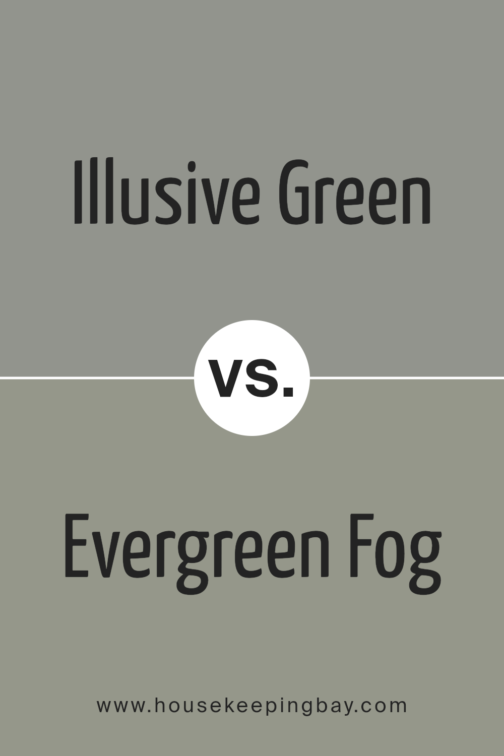
Illusive Green SW 9164 by Sherwin Williams vs Evergreen Fog SW 9130 by Sherwin Williams
Illusive Green SW 9164 and Evergreen Fog SW 9130, both from Sherwin Williams, are unique colors that bring their distinct appeal to spaces. Illusive Green has a lighter, more subtle vibe. It’s kind of like looking at a soft, muted green that brings a peaceful and gentle feel to a room. It’s great for creating a calm and soothing environment without being too bright or overpowering.
Evergreen Fog, on the other hand, leans towards a darker, richer shade. It feels a bit more robust and brings a sense of depth and sophistication to a space. Think of it as a deeper, more complex green that can make a room feel more grounded and mature. This color is perfect for adding a bold statement without going overboard.
When choosing between them, consider the mood you want to set. Illusive Green is ideal for a light and airy feel, while Evergreen Fog suits a bolder, more dramatic look. Both colors offer a beautiful way to bring nature’s tranquility inside.
You can see recommended paint color below:
- SW 9130 Evergreen Fog
housekeepingbay.com
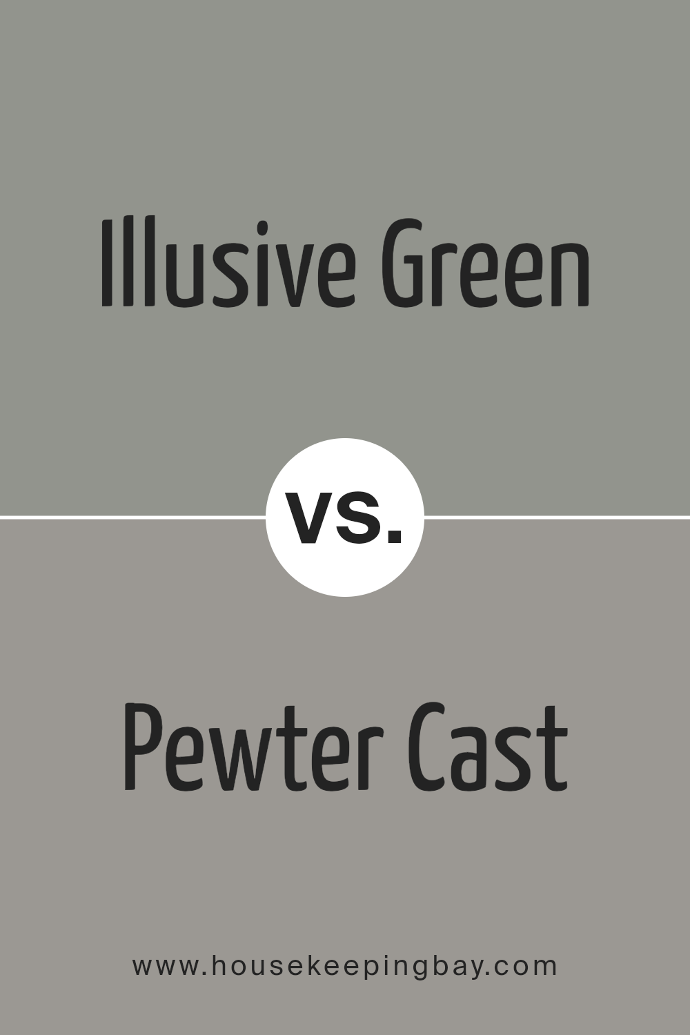
Illusive Green SW 9164 by Sherwin Williams vs Pewter Cast SW 7673 by Sherwin Williams
Illusive Green (SW 9164) and Pewter Cast (SW 7673) by Sherwin Williams are two distinct shades offering unique vibes for spaces. Illusive Green sits on the cooler side of the green spectrum, providing a subtle and soothing presence. It’s like a whisper of green that adds a touch of nature to a room without overwhelming it with color. This shade works well in spaces aiming for a calm and serene atmosphere.
On the other hand, Pewter Cast is a gray that leans towards the cooler side, with a hint of blue undertone that gives it a slightly steely look. This color is versatile and modern, making it perfect for creating a sleek and contemporary feel in any space. It’s great for rooms where you want a bit of sophistication without going too dark.
While Illusive Green brings a soft, natural touch, Pewter Cast offers a chic and refined backdrop. Both colors can beautifully transform a space, depending on the mood you’re aiming for – be it a calm retreat or a stylish, modern area.
You can see recommended paint color below:
- SW 7673 Pewter Cast
housekeepingbay.com
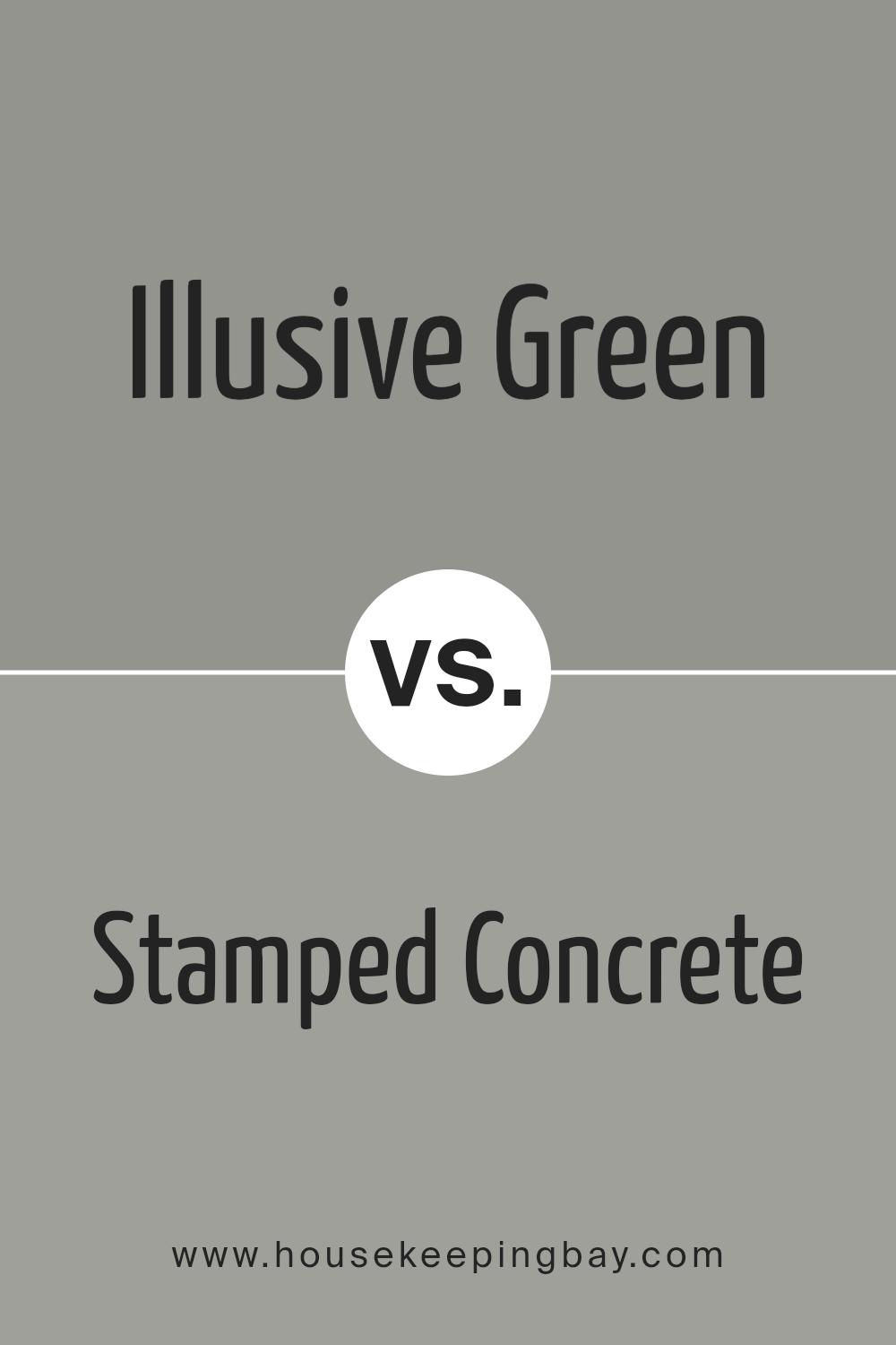
Illusive Green SW 9164 by Sherwin Williams vs Stamped Concrete SW 7655 by Sherwin Williams
Illusive Green SW 9164 by Sherwin Williams is a unique shade that blends the calming vibes of green with soft, gray undertones, giving it a serene and adaptable look. This color can make spaces feel more spacious and relaxing, perfect for rooms where peace and quiet are desired, like bedrooms and living rooms. Its light, muted quality means it pairs well with both bright accents for contrast or softer tones for a harmonious feel.
Stamped Concrete SW 7655, on the other hand, is a solid, mid-tone gray. This color has a strong presence and offers a modern, sophisticated feel. It’s excellent for creating a sleek, contemporary look in any space, from kitchens to offices. Stamped Concrete works well as a neutral backdrop, allowing furniture and decor to stand out, or it can be paired with bolder colors for a more dramatic effect.
While both colors offer versatility and the ability to create a variety of moods and styles, Illusive Green brings a touch of nature and softness into a room, and Stamped Concrete provides a more urban, chic foundation.
You can see recommended paint color below:
- SW 7655 Stamped Concrete
housekeepingbay.com
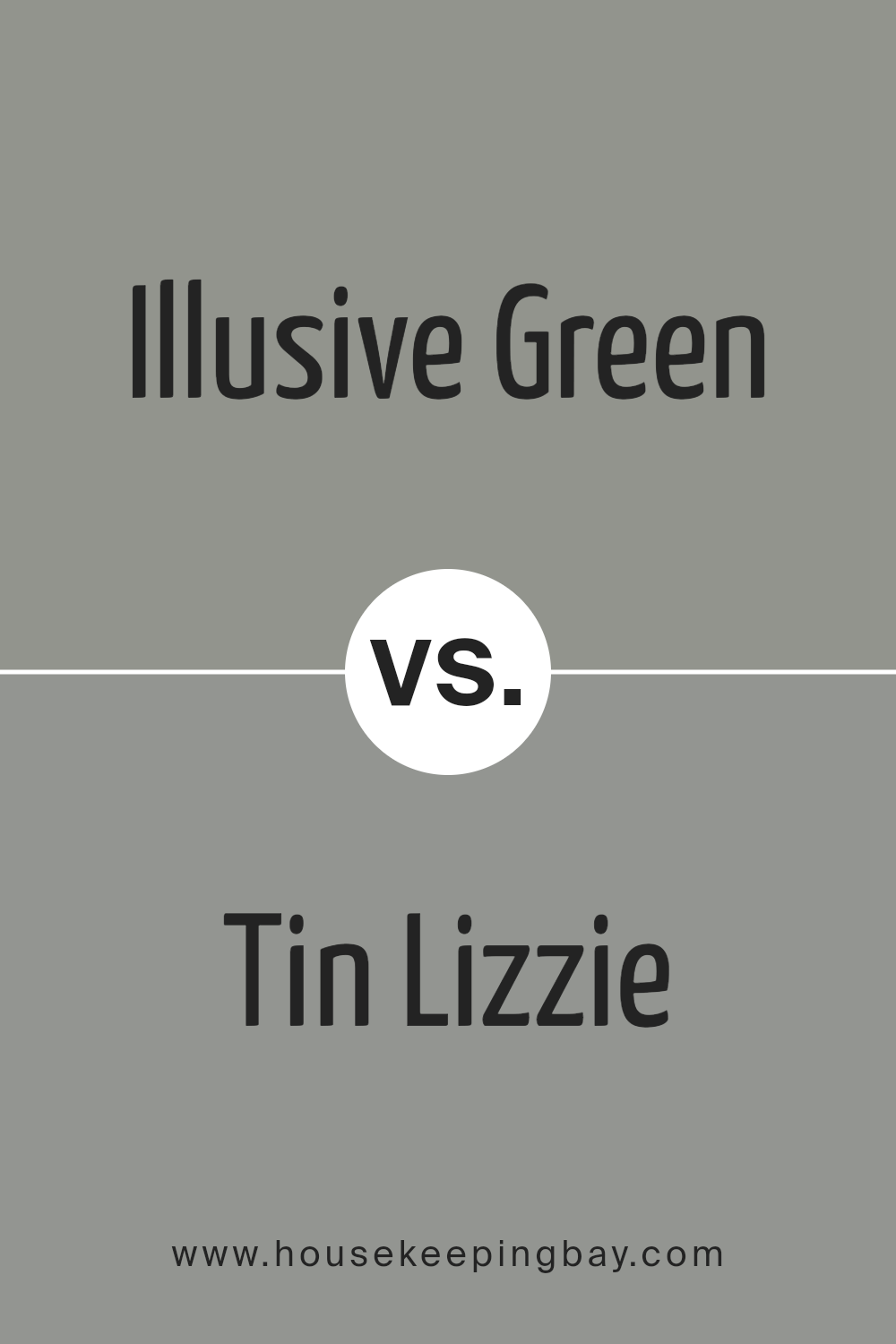
Illusive Green SW 9164 by Sherwin Williams vs Tin Lizzie SW 9163 by Sherwin Williams
Illusive Green SW 9164 by Sherwin Williams and Tin Lizzie SW 9163 by Sherwin Williams are two unique colors with their own characters. Illusive Green is a soft, calming color that combines hints of green and gray to create a soothing atmosphere. It’s perfect for spaces where relaxation and tranquility are desired, like bedrooms or living rooms. Its green undertone brings a touch of nature inside, making it feel fresh and inviting.
On the other hand, Tin Lizzie is a shade darker and leans more towards a pure, cool gray. This color is versatile and modern, making it great for creating a sleek, contemporary look. It works well in areas that need a neutral backdrop that isn’t too warm or too cold. Tin Lizzie’s understated elegance allows it to blend well with a wide range of décor styles and color schemes.
While both colors share similarities in their base gray tones, Illusive Green offers a hint of green for a natural vibe, whereas Tin Lizzie stays true to a classic gray, providing a more neutral and flexible option for interior spaces.
You can see recommended paint color below:
- SW 9163 Tin Lizzie
housekeepingbay.com
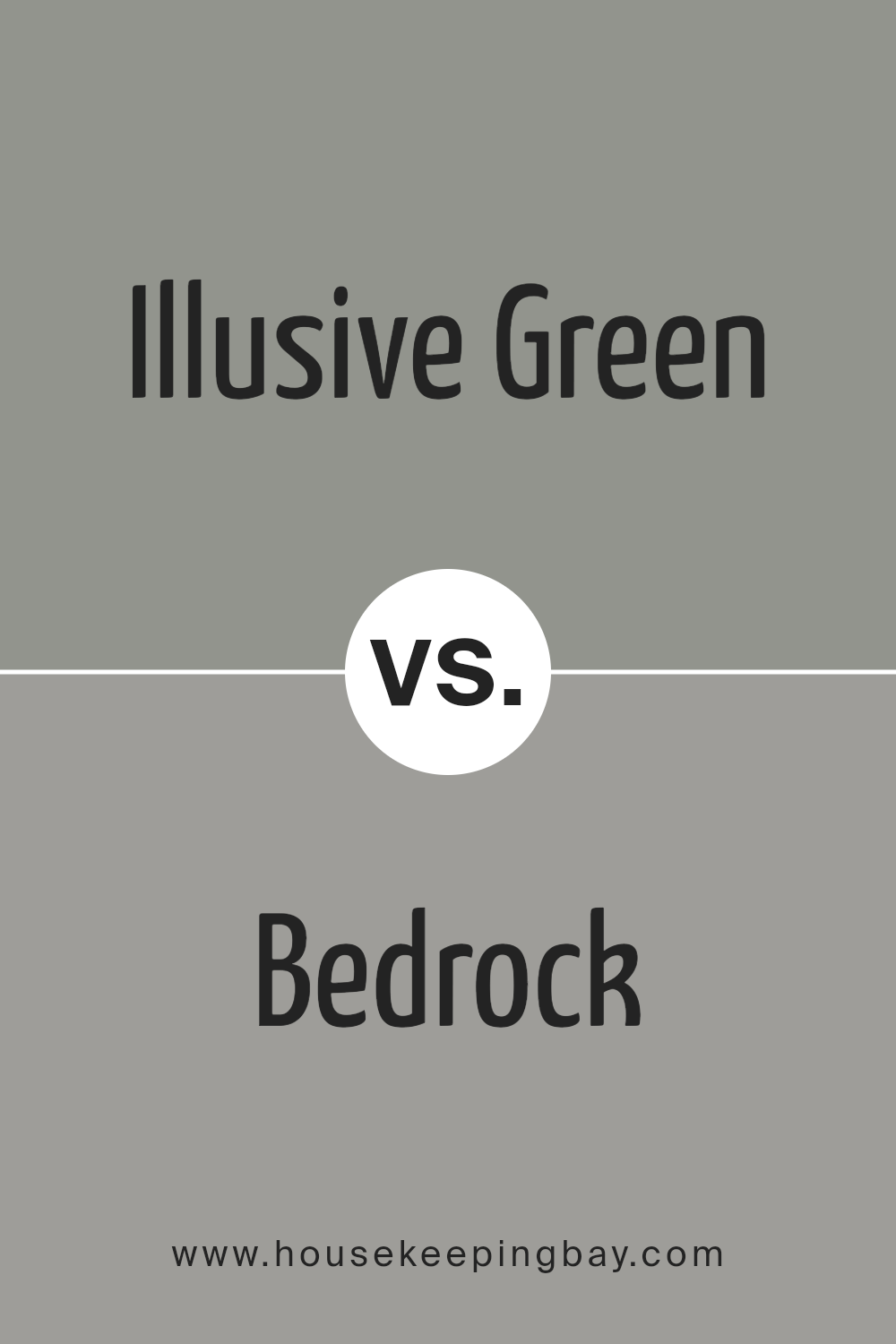
Illusive Green SW 9164 by Sherwin Williams vs Bedrock SW 9563 by Sherwin Williams
Illusive Green SW 9164 by Sherwin Williams and Bedrock SW 9563 by Sherwin Williams are two distinct colors that offer unique vibes for any space. Illusive Green gives off a soft, nature-inspired atmosphere, thanks to its gentle green hue. It’s light enough to make a room feel airy and spacious, yet it carries a touch of earthiness that adds warmth and coziness. This color works great in rooms where you want to relax and feel connected to the outdoors.
On the other hand, Bedrock SW 9563 has a stronger, more grounded presence. It’s a gray shade that leans towards taupe, bringing a sense of stability and sophistication to a space. Unlike Illusive Green, Bedrock provides a neutral background that’s versatile and easy to match with various decor styles, from modern to traditional. It’s perfect for creating a sleek, polished look in any room.
While Illusive Green brings a touch of the natural world indoors, Bedrock offers a chic, refined foundation that can make other colors stand out. Both are great choices, but your preference might depend on whether you’re aiming for a room that feels fresh and lively or one that’s more understated and elegant.
You can see recommended paint color below:
housekeepingbay.com
Conclusion
To sum up, SW 9164, also known as Illusive Green by Sherwin Williams, is a unique and versatile shade of green that brings a blend of tranquility and freshness to any space. If you’re looking to refresh your home with a touch of nature and serenity, Illusive Green is an excellent choice. Its subtle, soothing hue works beautifully in various settings, making it ideal for living rooms, bedrooms, and even kitchens.
Whether you aim for a minimalist look or want to create a cozy, welcoming atmosphere, Illusive Green can help you achieve your desired ambiance without overwhelming your space. Its adaptability with different decor styles and color palettes also means you’ll have an easier time incorporating it into your current design scheme.
Remember, lighting plays a crucial role in how paint colors look in your home, so consider testing Illusive Green in your space to see how it transforms throughout the day. Overall, giving your walls a coat of Illusive Green could be a simple yet impactful way to rejuvenate your home, adding a peaceful and natural vibe to your everyday living environment.
housekeepingbay.com
Ever wished paint sampling was as easy as sticking a sticker? Guess what? Now it is! Discover Samplize's unique Peel & Stick samples. Get started now and say goodbye to the old messy way!
Get paint samples


