Reserved White SW 7056 by Sherwin Williams
Subtle Elegance: A Dive into Serene Neutrals
Reserved White stands as a testament to understated elegance, offering a versatile backdrop that complements a wide array of interior designs and architectural styles. It’s a color that encapsulates the purity of white while embodying a subtle warmth, making spaces feel open, airy, and inviting.
This piece delves into the character and undertones of SW 7056 Reserved White, revealing why it’s more than just a simple shade of white. It’s a nuanced hue that, depending on the lighting and surrounding elements, can shift and morph, bringing a dynamic and adaptable quality to any space it adorns.
The article further explores the practical applications of Reserved White in various home settings, from contemporary spaces that prioritize minimalism to classic environments that seek a touch of modernity without overpowering the inherent character of the space.
Moreover, testimonials from interior designers and homeowners provide insight into how Reserved White has been successfully incorporated into real-life projects, highlighting its ability to create a sense of harmony and tranquility.
Through a blend of expert opinions, practical advice, and aesthetic showcases, this article aims to guide readers through the transformative power of SW 7056 Reserved White, making it a go-to palette for creating spaces that feel thoughtfully curated and endlessly welcoming.
via sherwin-williams.com
What Color Is Reserved White SW 7056 by Sherwin Williams?
Table of Contents
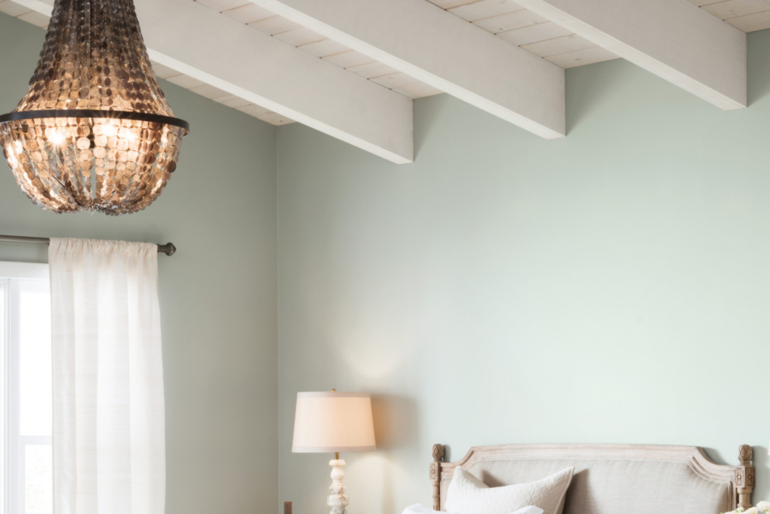
Reserved White SW 7056 by Sherwin Williams is a sophisticated, subtle shade that embodies tranquility and elegance in its light, airy presence. This delicate hue carries a hint of warmth, making it versatile and welcoming, unlike cooler whites that may feel stark or impersonal. Its nuanced undertones allow it to adapt seamlessly to various lighting conditions, glowing softly in well-lit spaces while maintaining a crisp clarity in areas with less natural light.
Perfect for creating serene and luminous interiors, Reserved White can be the foundational canvas for a myriad of design aesthetics. It excels in minimalist settings where its purity enhances a sense of spaciousness and calm. In modern farmhouse styles, it accentuates the rustic elements through contrast, allowing textures and materials like reclaimed wood and metals to stand out.
Scandinavian designs, known for their love of light and simplicity, find a perfect match in Reserved White, as it complements natural woods, soft textiles, and minimalist decor to create a cozy, understated elegance.
This color pairs beautifully with a wide range of materials and textures. In spaces featuring natural stone, like marble or granite, Reserved White highlights the depth and intricacy of these materials. With soft, plush fabrics, it adds a layer of sophistication, making the textures seem more luxurious.
When combined with metallic finishes—be it matte black for a modern edge, polished brass for warmth, or brushed nickel for a cool sophistication—Reserved White serves as a serene backdrop that allows these elements to truly shine. Its adaptability and timeless nature make Reserved White an exquisite choice for anyone looking to infuse their home with a feeling of gentle refinement and airy spaciousness.
housekeepingbay.com
Is Reserved White SW 7056 by Sherwin Williams Warm or Cool color?
Reserved White SW 7056 by Sherwin Williams is a nuanced shade that effortlessly brings sophistication and calm to any space. This delicate hue, part of the Sherwin Williams collection, stands out for its ability to blend seamlessly into a variety of design aesthetics, making it a versatile choice for homeowners. Its subtle undertones provide a warm, inviting atmosphere without overwhelming a room’s existing décor. Unlike stark whites, Reserved White offers a soft, muted palette that enhances natural light, making spaces appear brighter and more open.
The magic of Reserved White lies in its adaptability. It works wonders in small spaces by creating an illusion of expansiveness, yet remains cozy and grounding in larger areas. This color complements a wide range of textures and materials, from rustic wood grains to sleek modern metals, allowing for endless creativity in interior design.
In environments where relaxation and tranquility are paramount, such as bedrooms and living areas, Reserved White sets a serene backdrop. It’s equally effective in kitchens and bathrooms, where its clean, crisp vibe supports a hygienic, fresh feeling. Furthermore, its understated elegance makes it an ideal canvas for showcasing art, furniture, and accent pieces, allowing personal styles to shine. By choosing Reserved White SW 7056, homeowners embrace a color that not only elevates their space but also offers flexibility in decor and style transitions over time.
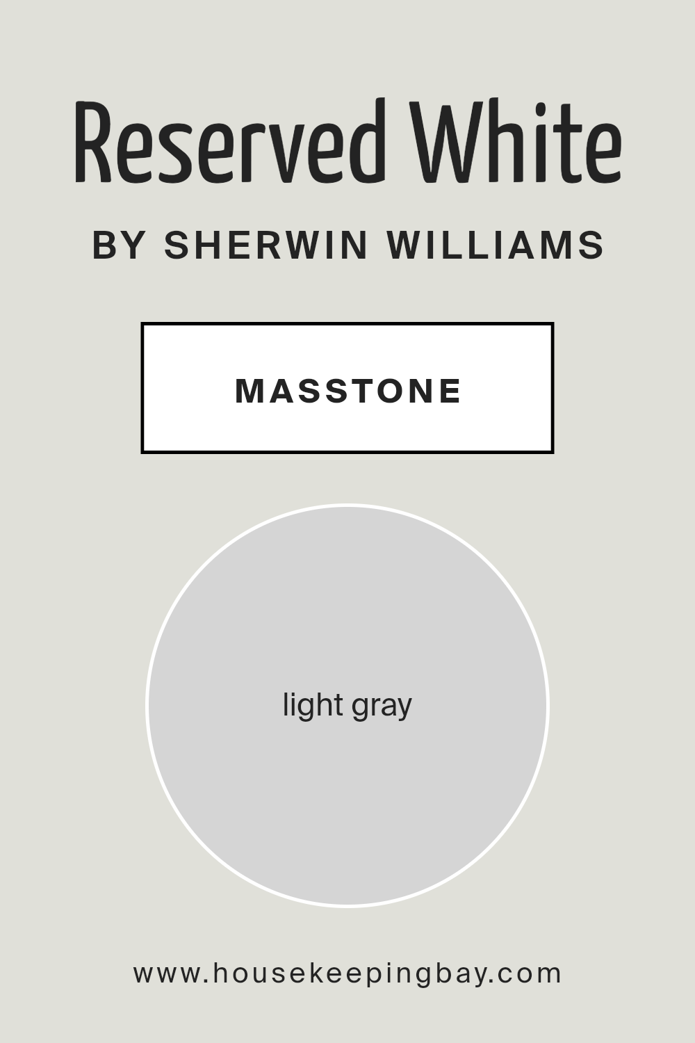
What is the Masstone of the Reserved White SW 7056 by Sherwin Williams?
Reserved White SW 7056 by Sherwin Williams, carrying a masstone of light gray (#D5D5D5), offers a subtle yet transformative aura for home interiors. This particular hue balances perfectly on the spectrum between white and gray, providing a neutral backdrop that can enhance any space without overwhelming it. Its light gray essence ensures versatility, making it an excellent choice for creating serene and airy environments. In homes, Reserved White SW 7056 acts as a chameleon, adapting effortlessly to various lighting conditions and playing well with both warm and cool accents. This quality allows homeowners and designers to experiment with bold colors or stick to a minimalist palette without the space feeling stark or cold. The color’s reflective property maximizes natural light, making rooms appear larger and more inviting. As a result, Reserved White SW 7056 is ideal for achieving a sophisticated yet understated atmosphere, lending itself to a range of design aesthetics from modern to traditional.
housekeepingbay.com
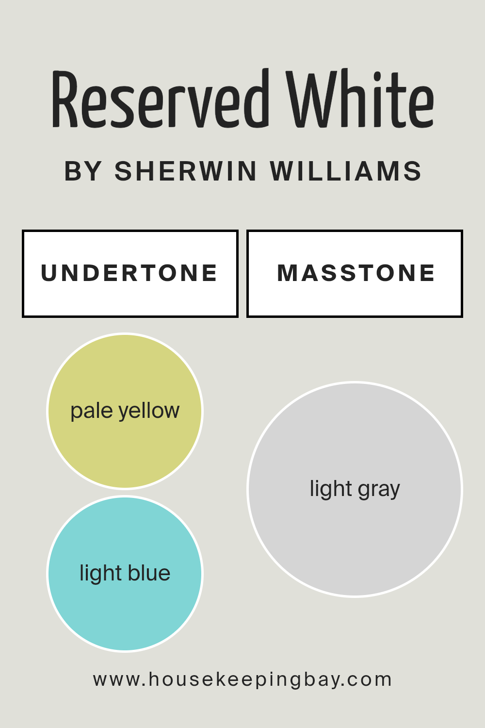
Undertones of Reserved White SW 7056 by Sherwin Williams
Reserved White SW 7056 by Sherwin-Williams is a nuanced and subtly complex hue that can dramatically influence the ambiance of any interior space. This paint color is not a stark white; rather, it exudes a soft, welcoming feel due to its unique undertones of pale yellow (#D5D580) and light blue (#80D5D5). Undertones play a critical role in the perception of color, adding depth and character that affect how colors are seen and felt within a space. They can cool down or warm up a color, shift it under different lighting conditions, and dramatically alter its impact on decor and mood.
The pale yellow undertone of Reserved White adds a hint of warmth, making spaces feel more inviting and cozy, a subtle nod to sunlight. On the other hand, the light blue undertone introduces a refreshing and tranquil quality, reminiscent of the serenity of the sky or a calm sea, contributing to a sense of calm and cleanliness.
When applied to interior walls, Reserved White SW 7056 transforms the space into a canvas of light and shadow. Its ability to reflect and interact with natural and artificial lighting means that the paint can appear more predominantly warm or cool depending on the time of day and the angle of light. In rooms with abundant natural sunlight, the yellow undertones may become more pronounced, creating a bright, airy feel. Conversely, in spaces with cooler, artificial lighting, the blue undertones might surface, promoting a crisp and serene atmosphere.
This duality makes Reserved White an incredibly versatile choice for designers and homeowners alike, capable of complementing a wide range of decor styles and color schemes.
Whether aiming for a cozy, warm aesthetic or a clean, modern look, the complex interplay of undertones in Reserved White SW 7056 provides a sophisticated backdrop that enhances the overall appeal of interior spaces, demonstrating the profound effect of undertones on our perception of color.
housekeepingbay.com
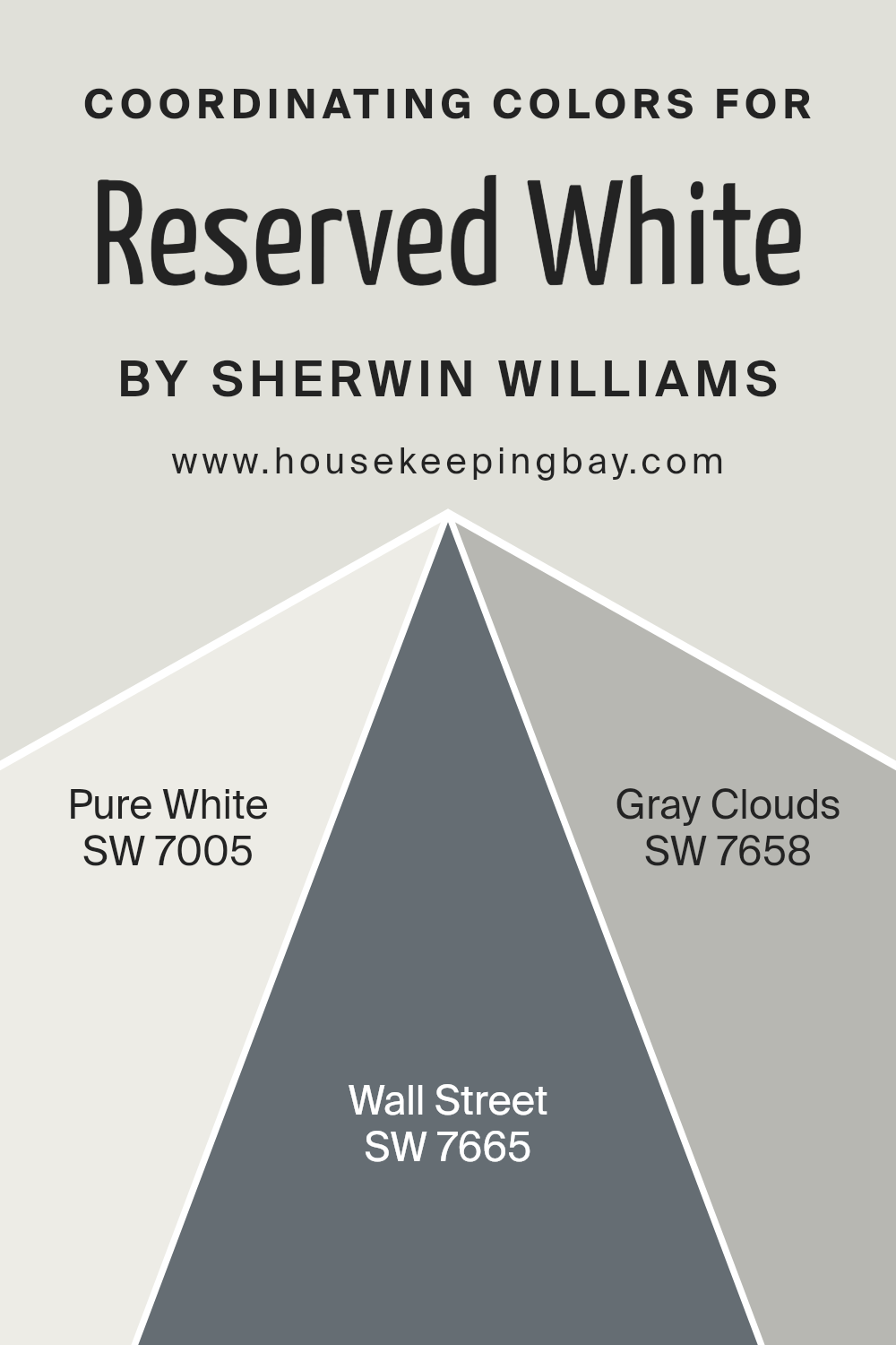
Coordinating Colors of Reserved White SW 7056 by Sherwin Williams
Coordinating colors are essentially hues that complement each other when used together in a space, creating a harmonious and visually appealing palette. These colors are chosen based on their ability to balance the atmosphere of a room, either by adding contrast, enhancing a theme, or seamlessly blending with the main color. For instance, Reserved White SW 7056 by Sherwin Williams is a versatile shade that serves as a fantastic canvas for a variety of coordinating hues. This nuance of white provides a perfect backdrop that allows coordinating colors to truly shine, creating an inviting and cohesive look.
In the palette that complements Reserved White, Pure White SW 7005 stands out as an exceptionally clean and crisp shade, offering a sense of freshness that can lighten and enhance the spacious feel of any room. It works seamlessly with Reserved White by providing subtle contrast that is neither overwhelming nor distracting.
On the other end of the spectrum, Wall Street SW 7665 brings depth and sophistication with its rich, dark gray hue, adding a touch of elegance and gravity to the space. This color is ideal for creating focal points or accentuating architectural features.
Meanwhile, Gray Clouds SW 7658 exists harmoniously between these two, offering a lighter gray option that bridges the gap between the stark purity of Pure White and the deep tones of Wall Street. Gray Clouds adds a layer of tranquility and softness to the palette, ensuring the color scheme remains balanced and refined.
You can see recommended paint colors below:
- SW 7005 Pure White
- SW 7665 Wall Street
- SW 7658 Gray Clouds
housekeepingbay.com
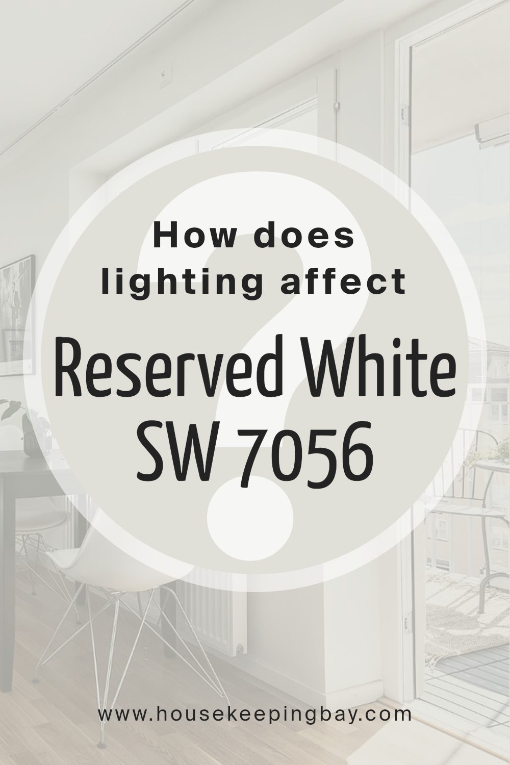
How Does Lighting Affect Reserved White SW 7056 by Sherwin Williams?
Lighting plays a crucial role in how we perceive color in our environments, affecting not only the intensity and hue but also the mood and atmosphere a color can create within a space. This interplay between light and color is essential in interior design and decoration, particularly when considering paint choices such as Sherwin Williams’ Reserved White SW 7056.
Reserved White SW 7056, a nuanced off-white with subtle gray undertones, offers a versatile palette that responds dynamically to different lighting conditions. In artificial light, the type of bulb (whether LED, fluorescent, or incandescent) can dramatically shift the appearance of Reserved White. LED lighting, which often has a cooler temperature, can accentuate the gray undertones, giving the color a more crisp and modern feel. Conversely, incandescent lighting, with its warmer glow, can soften the color, highlighting its inherent warmth and making the space more inviting.
In natural light, Reserved White’s perception is influenced by the room’s orientation. North-faced rooms receive less direct sunlight, which can emphasize the cooler aspects of the color, making it appear more serene and tranquil. This quality makes it an excellent choice for creating a calm and collected ambiance in bedrooms or offices.
South-faced rooms enjoy abundant light throughout the day, allowing Reserved White to show off its brightness and warmth. In these spaces, the color can help enhance the sense of space and light, making it ideal for living rooms and kitchens where a welcoming and airy atmosphere is desired.
East-faced rooms are bathed in warm morning light, which can make Reserved White appear softer and slightly warmer in the mornings, transitioning to a truer, balanced white as the day progresses. This natural shift makes it a good choice for spaces used primarily in the morning.
West-faced rooms, on the other hand, receive the intense evening light, which can cast a warmer glow and emphasize the cozy aspects of Reserved White, making spaces feel more intimate during sunset hours.
Understanding how Reserved White SW 7056 interacts with different lighting conditions allows for strategic use in interior spaces, ensuring the color complements the room’s purpose and enhances its overall aesthetic.
housekeepingbay.com
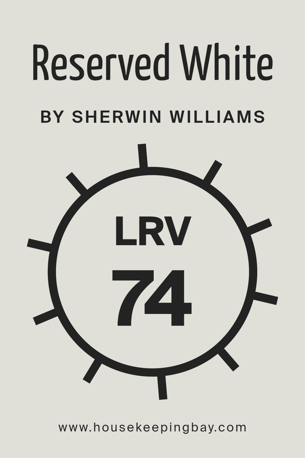
What is the LRV of Reserved White SW 7056 by Sherwin Williams?
Light Reflectance Value (LRV) is a measurable quantity that indicates the percentage of visible and usable light reflected from a surface when illuminated by a light source. This value ranges from 0 to 100, with 0 being perfectly black (absorbs all light) and 100 being perfectly white (reflects all light).
LRV is a critical factor in choosing paint colors for interiors and exteriors, as it greatly affects how light or dark a color appears in a specific environment. The concept of LRV comes into play in various aspects, including energy efficiency, visual ergonomics, and aesthetic appeal.
A higher LRV can make a room feel more open and airy by reflecting more light, while a lower LRV can make a space feel cozier and more intimate by absorbing light. Understanding the LRV of a color can assist in making informed decisions that align with the desired ambiance and functionality of a space.
For Reserved White SW 7056 by Sherwin Williams, with an LRV of 74.078, it falls into the lighter end of the spectrum, indicating that it is a light color that will reflect a significant amount of light. In practical terms, this high LRV suggests that Reserved White will help to brighten up spaces, making it an excellent choice for rooms that are naturally darker or for smaller spaces where the goal is to create a sense of expansiveness.
The light-reflective qualities of this particular shade can also contribute to a feeling of freshness and cleanliness, making it a versatile option for various settings like kitchens, bathrooms, living areas, and even exteriors.
However, the perceived color and brightness can still be influenced by the type and amount of light in a room (natural or artificial), as well as surrounding colors, so it’s always recommended to test the paint in the intended space to ensure it achieves the desired effect.
housekeepingbay.com
What is LRV? Read It Before You Choose Your Ideal Paint Color
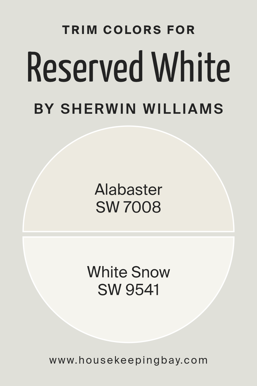
What are the Trim colors of Reserved White SW 7056 by Sherwin Williams?
Trim colors are specific shades used to highlight or complement the main color of a wall, serving as an essential finishing touch to an interior or exterior design. When it comes to a versatile and widely favored paint like Reserved White SW 7056 by Sherwin Williams, choosing the right trim color can significantly impact the overall aesthetics and cohesion of the space. Such trim colors, including SW 7008 – Alabaster and SW 9541 – White Snow, are selected for their ability to subtly enhance the primary wall color without overwhelming it. These carefully chosen hues can accent architectural details, create depth, and add a layer of sophistication or contrast to the design scheme, making them crucial for achieving a polished and harmonious look.
Alabaster SW 7008 brings a warm and soft ambiance to the room when used as a trim for Reserved White SW 7056, offering a subtle contrast that is both inviting and comforting. This color imbues spaces with a sense of calmness and elegance, making it ideal for creating a serene and welcoming environment.
White Snow SW 9541, on the other hand, is a brighter, crisper white that delivers a striking clarity and freshness when paired with Reserved White. Its clean and vibrant character can energize a space and accentuate the refined simplicity of Reserved White SW 7056, making it perfect for modern and minimalist designs that aim for a sharp and focused aesthetic.
Together, these trim colors provide versatile options that can either soften or define the edges and details of a space, tailoring the final look to the specific style and atmosphere desired.
You can see recommended paint colors below:
- SW 7008 Alabaster
- SW 9541 White Snow
housekeepingbay.com
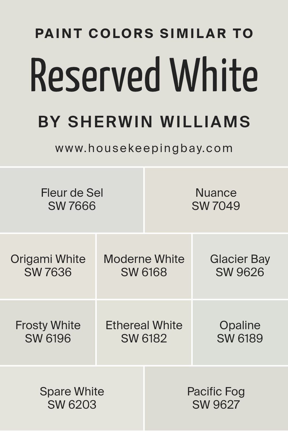
Colors Similar to Reserved White SW 7056 by Sherwin Williams
In the realm of color theory and interior design, the significance of similar colors, particularly those harmonizing with Reserved White SW 7056 by Sherwin Williams, cannot be overstated. These analogous shades, including SW 7666 – Fleur de Sel, SW 7049 – Nuance, and others like SW 7636 – Origami White, possess the unique ability to create a subtle yet cohesive aesthetic environment.
The beauty of these colors lies in their seamless integration, offering an array of soft, neutral backgrounds that can enhance any space without overwhelming it with saturation. For instance, Fleur de Sel presents a delicate, airy quality reminiscent of sea salt, bringing a lightness and purity to spaces, whereas Nuance draws on a slightly warmer tone, offering a hint of beige for a cozy, inviting atmosphere.
Moreover, Origami White has a crispness that mimics the cleanfold of paper, providing a fresh but subdued backdrop suitable for both contemporary and traditional settings. On the other end of the spectrum, colors like Glacier Bay and Pacific Fog introduce a cool, serene vibe, echoing the tranquil depths of sea ice and the misty seaside mornings, respectively.
Each color, while maintaining its individuality, beautifully complements Reserved White SW 7056, allowing for a harmonious blend of shades that can be layered to create depth or used singularly for a minimalist appeal. This orchestrated collection of hues provides endless versatility, demonstrating the importance of similar colors in achieving a balanced, sophisticated, and inviting space.
You can see recommended paint colors below:
- SW 7666 Fleur de Sel
- SW 7049 Nuance
- SW 7636 Origami White
- SW 6168 Moderne White
- SW 9626 Glacier Bay
- SW 6196 Frosty White
- SW 6182 Ethereal White
- SW 6189 Opaline
- SW 6203 Spare White
- SW 9627 Pacific Fog
housekeepingbay.com
How to Use Reserved White SW 7056 by Sherwin Williams In Your Home?
Reserved White SW 7056 by Sherwin Williams is an exquisite paint color that embodies elegance and simplicity. This off-white shade is a perfect choice for homeowners aiming to add a touch of sophistication while maintaining a warm and inviting atmosphere. Its understated elegance makes it versatile, allowing it to blend seamlessly with various decor styles, from modern minimalism to classic traditional.
Utilizing Reserved White in your home can dramatically transform spaces, creating a bright and airy feel. It’s ideal for living rooms and bedrooms, where a calm and serene ambiance is desired. In smaller spaces, like bathrooms and hallways, applying Reserved White can make the area appear more spacious and open. Its neutral base serves as an excellent backdrop for art and colorful accents, allowing personal tastes to shine without overwhelming the space.
Moreover, Reserved White can be used on trim, doors, and ceilings, providing a crisp, clean look that complements a broad spectrum of wall colors. Whether aiming for a monochromatic look or seeking contrast with darker hues, Reserved White provides a subtle, sophisticated palette that enhances natural light and contributes to a sense of well-being.
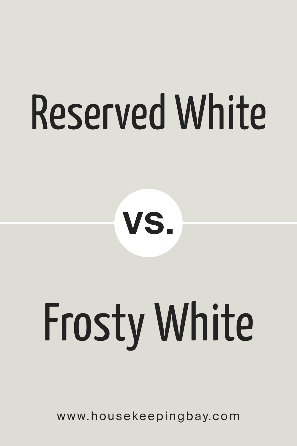
Reserved White SW 7056 by Sherwin Williams vs Frosty White SW 6196 by Sherwin Williams
Reserved White SW 7056 and Frosty White SW 6196 by Sherwin Williams both belong to the family of whites but exhibit subtle differences in tone and mood, making them suitable for various applications and preferences in interior design. Reserved White leans more towards a warm, soft tone that provides a cozy and inviting atmosphere to any space.
Its subtle undertones make it versatile, allowing it to complement a wide range of decor styles and color palettes seamlessly. On the other hand, Frosty White veers towards a cooler spectrum, suggesting a crisp and clean appearance that can help to brighten and refresh a space.
It echoes the chill of an early frost, providing a more neutral backdrop that pairs well with both bold and muted colors. The choice between Reserved White and Frosty White ultimately depends on the desired ambiance and the specific lighting conditions of a room, with Reserved White offering warmth and coziness, while Frosty White brings a brighter, more energized feel.
You can see recommended paint color below:
- SW 6196 Frosty White
housekeepingbay.com
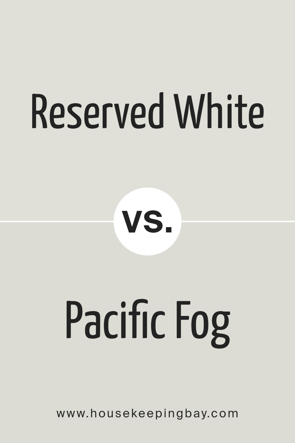
Reserved White SW 7056 by Sherwin Williams vs Pacific Fog SW 9627 by Sherwin Williams
“Reserved White SW 7056” and “Pacific Fog SW 9627,” both by Sherwin-Williams, present a refined palette with subtly distinct undertones and atmospheres. Reserved White is a soft, warm neutral that offers a serene and inviting ambiance. Its understated elegance makes it a perfect backdrop for various decor styles, enhancing spaces with a light and airy feel. It captures natural light beautifully, adding a subtle luminosity to rooms.
On the other hand, Pacific Fog embodies a cooler, more muted gray with a calming presence. This color evokes the serene quality of a misty seaside morning, bringing a tranquil, soothing feel to interiors. Pacific Fog’s understated depth lends sophistication and versatility, making it suitable for spaces seeking a serene, yet distinctly grounded character.
While both hues share a penchant for subtlety and versatility, Reserved White leans towards a warmer, welcoming undertone, whereas Pacific Fog offers a cooler, contemplative vibe. Together, they can create a harmonious balance, marrying warmth with cool elegance.
You can see recommended paint color below:
housekeepingbay.com
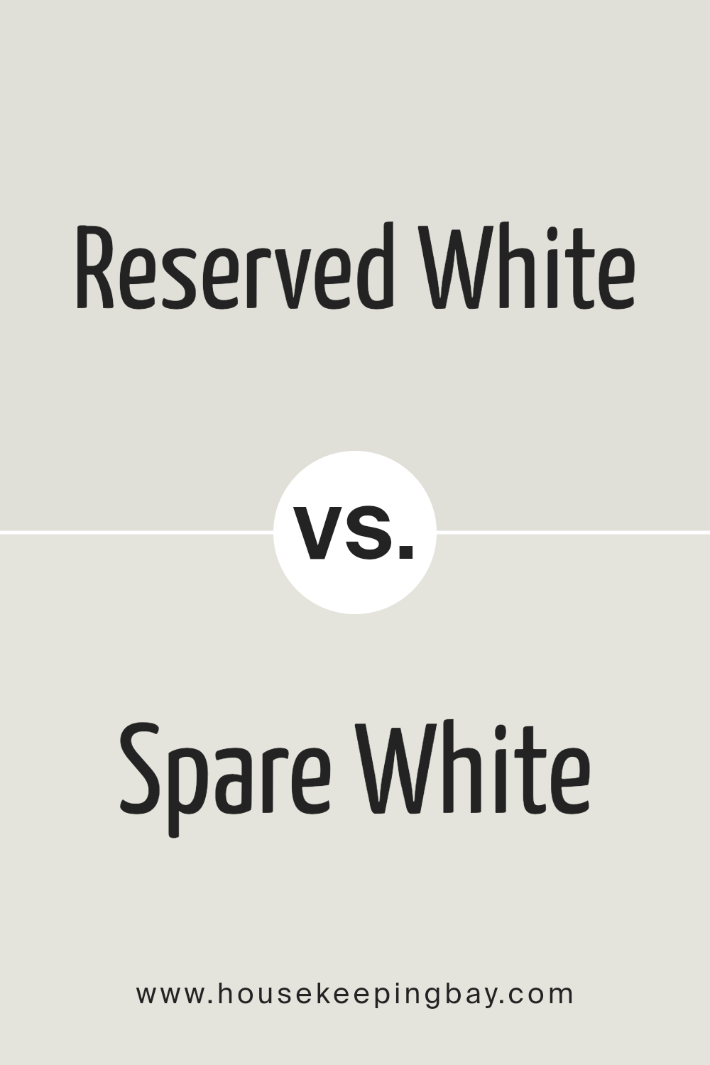
Reserved White SW 7056 by Sherwin Williams vs Spare White SW 6203 by Sherwin Williams
Reserved White SW 7056 and Spare White SW 6203, both from Sherwin Williams, present subtle yet distinct differences in their hues that cater to different aesthetic preferences and design requirements. Reserved White offers a warm, inviting undertone that adds a cozy feel to spaces, making it ideal for living areas and bedrooms where a soft, nurturing ambiance is desired.
Its warmth is subtle, promoting a serene and comfortable environment. On the other hand, Spare White leans towards a cooler, more neutral undertone, providing a crisp and clean look. This makes it an excellent choice for modern, minimalist, or Scandinavian-inspired spaces where the emphasis is on simplicity and openness.
Spare White’s cool undertone helps in creating a feeling of spaciousness and light, making it particularly suitable for smaller rooms or spaces with limited natural light. Choosing between these two colors depends on the desired mood, room function, and personal preference for warm or cool tones.
You can see recommended paint color below:
housekeepingbay.com
Reserved White SW 7056 by Sherwin Williams vs Opaline SW 6189 by Sherwin Williams
Reserved White SW 7056 and Opaline SW 6189 by Sherwin Williams sit on the softer, more subdued end of the color spectrum, yet each brings a unique ambiance to the spaces they inhabit. Reserved White is a gentle, warm-toned white with a hint of grey. It’s nearly ethereal in how it can lift and lighten a space without becoming stark or cold, embodying the perfect balance for those seeking a white that is neither too bright nor too dull.
Opaline, on the other hand, veers into the territory of pastels with a touch more color presence. It offers a whisper of green, imbued with a serene, almost tranquil quality. This color can introduce a subtle, refreshing vibe, making it ideal for creating a calm and inviting atmosphere without the starkness sometimes associated with more pronounced greens.
In essence, while Reserved White provides a clean, versatile backdrop that can adapt to a variety of decors, Opaline brings a delicate hint of nature and softness into the room. Both colors reflect Sherwin Williams’ expertise in creating hues that evoke tranquility and elegance, but the choice between them depends on the desire for neutrality versus a gentle infusion of color.
You can see recommended paint color below:
- SW 6189 Opaline
housekeepingbay.com
Reserved White SW 7056 by Sherwin Williams vs Nuance SW 7049 by Sherwin Williams
Reserved White SW 7056 by Sherwin Williams and Nuance SW 7049, also by Sherwin Williams, present subtle yet distinct differences that cater to varying aesthetic preferences and design applications. Reserved White is a soft, warm white with a slightly creamy undertone that exudes a welcoming and comfortable vibe, making it an ideal choice for creating a bright and airy space. It reflects a considerable amount of light, enhancing the sense of space in a room, and pairs beautifully with a wide range of colors, serving as a versatile backdrop for any interior design scheme.
Nuance SW 7049, on the other hand, leans towards a mid-tone greige, a sophisticated blend of gray with beige undertones, which grants it a unique neutrality. This color is deeply versatile, providing a subtle depth and warmth that complements contemporary and traditional settings alike.
It serves as a perfect neutral base that can easily transition between being a primary color for walls or acting as an accent color in a space dominated by lighter tones like Reserved White.
Both colors belong to the neutral palette, with Reserved White being a true neutral white that brings light and openness, while Nuance offers depth and versatility, making them excellent choices for those seeking elegance and a timeless appeal in their spaces.
You can see recommended paint color below:
housekeepingbay.com
Reserved White SW 7056 by Sherwin Williams vs Glacier Bay SW 9626 by Sherwin Williams
Reserved White SW 7056 by Sherwin Williams and Glacier Bay SW 9626, also by Sherwin Williams, present a nuanced contrast between subtlety and depth within the color spectrum. Reserved White is a sophisticated, warm white with soft notes that evoke a sense of calm and understated elegance.
Its gentle hue provides a versatile backdrop that enhances both contemporary and traditional spaces, reflecting light gracefully to create an airy and inviting atmosphere. On the other hand, Glacier Bay is a serene, pale blue with a crisp, refreshing presence. This color mimics the tranquil essence of its namesake, offering a soothing retreat and a hint of coolness to any room.
Its capacity to mimic the calmness of a glacial landscape gives it a distinctive charm, especially in settings aiming for a peaceful, rejuvenating vibe. While Reserved White brings a subtle warmth, Glacier Bay introduces a delicate coolness, together offering a balanced palette for those desiring a harmonious and tranquil environment.
You can see recommended paint color below:
housekeepingbay.com
Reserved White SW 7056 by Sherwin Williams vs Ethereal White SW 6182 by Sherwin Williams
Reserved White SW 7056 by Sherwin Williams and Ethereal White SW 6182 also by Sherwin Williams share a foundational palette of subtle, nuanced whites but diverge in their underlying tones and potential applications. Reserved White, true to its name, presents a serene, understated elegance with a slightly warm undertone that adds a cozy, inviting feel to spaces. It strikes a balance between being distinctly warm without veering into cream or beige, making it versatile for various settings and lighting conditions.
On the other hand, Ethereal White lifts spaces with a lighter, almost ethereal quality, as its name suggests. It harbors a cooler undertone compared to Reserved White, offering a hint of freshness and openness that can make small spaces appear larger and more luminous. This cooler tone renders Ethereal White an ideal choice for contemporary settings or areas where a sense of calm and clarity is desired.
Both colors, while similar in their base white nature, cater to different aesthetic appeals and functionalities. Reserved White is suited for those seeking warmth and coziness in their decor, while Ethereal White appeals to those aiming for a spacious, airy feel.
The choice between them hinges on the desired ambiance and the specific characteristics of the space they are intended to enhance.
You can see recommended paint color below:
housekeepingbay.com
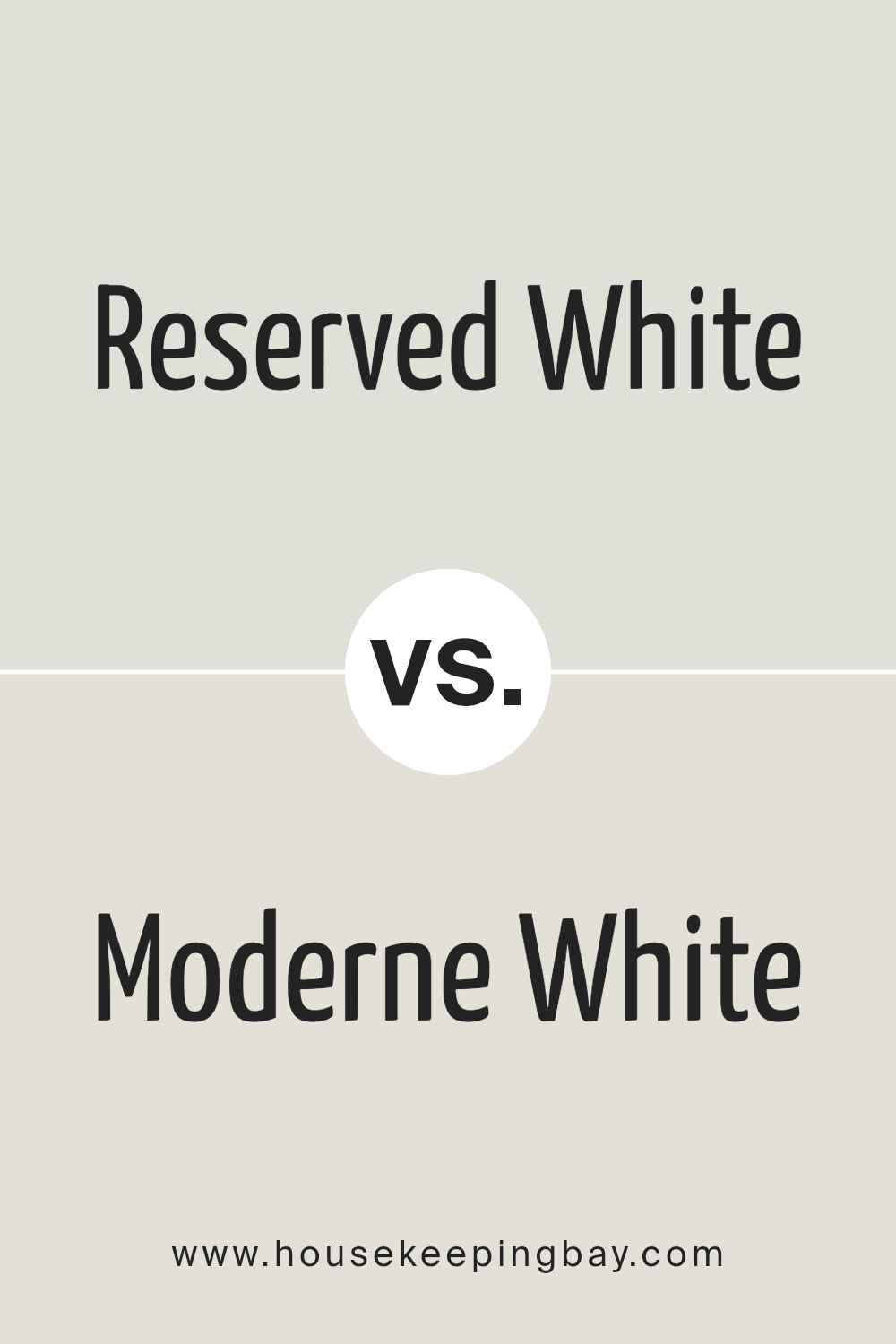
Reserved White SW 7056 by Sherwin Williams vs Moderne White SW 6168 by Sherwin Williams
Reserved White SW 7056 and Moderne White SW 6168, both by Sherwin Williams, stand as two nuanced shades within the white color spectrum, each offering a unique ambiance for interior spaces. Reserved White presents a subtle, muted quality, bearing a slight cool undertone that makes it a versatile option for a broad range of decorating styles. It projects a serene and calm atmosphere, making spaces feel open and airy while still providing a sense of warmth and invitingness.
On the other hand, Moderne White leans towards a warmer palette, imbued with a soft, creamy aspect that adds a cozy and welcoming vibe to any room. Its warmth enhances the feeling of comfort, making it ideal for spaces where a relaxed, homely atmosphere is desired. The slight creamy tone can also help in softening the harshness of bright lights, thus contributing to a softer overall look.
While both colors share the purity and simplicity associated with whites, Reserved White offers a cool, crisp backdrop, and Moderne White, a warmer, creamier embrace. This fundamental difference in undertone and warmth means they serve different aesthetic and emotional purposes in interior design, despite their seemingly similar appearance at first glance.
You can see recommended paint color below:
housekeepingbay.com
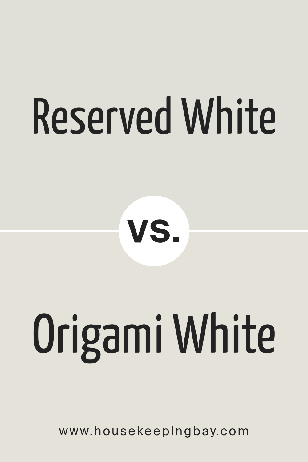
Reserved White SW 7056 by Sherwin Williams vs Origami White SW 7636 by Sherwin Williams
Reserved White SW 7056 and Origami White SW 7636 by Sherwin-Williams are two nuanced shades that, while similar at a glance, offer distinct atmospheres to a space. Reserved White is a warm, soft white with a subtle hint of gray. It casts a serene and welcoming tone, making it perfect for creating a calm, cohesive look in a variety of settings. Its slight gray undertone provides a modern touch while retaining a classic feel, ensuring versatility across design styles.
On the other hand, Origami White leans towards a slightly warmer palette, incorporating beige undertones that add warmth and depth. This color exudes an inviting, cozy vibe, making spaces feel more intimate and lived-in. Origami White is particularly effective in spaces where natural light is abundant, as it can enhance the room’s brightness while maintaining a soft, airy quality.
Choosing between these two depends on the desired effect: Reserved White offers a clean, contemporary backdrop, while Origami White creates a warmer, more enveloping feel. Both colors are sophisticated and understated, providing a neutral groundwork that complements a wide range of decor.
You can see recommended paint color below:
housekeepingbay.com
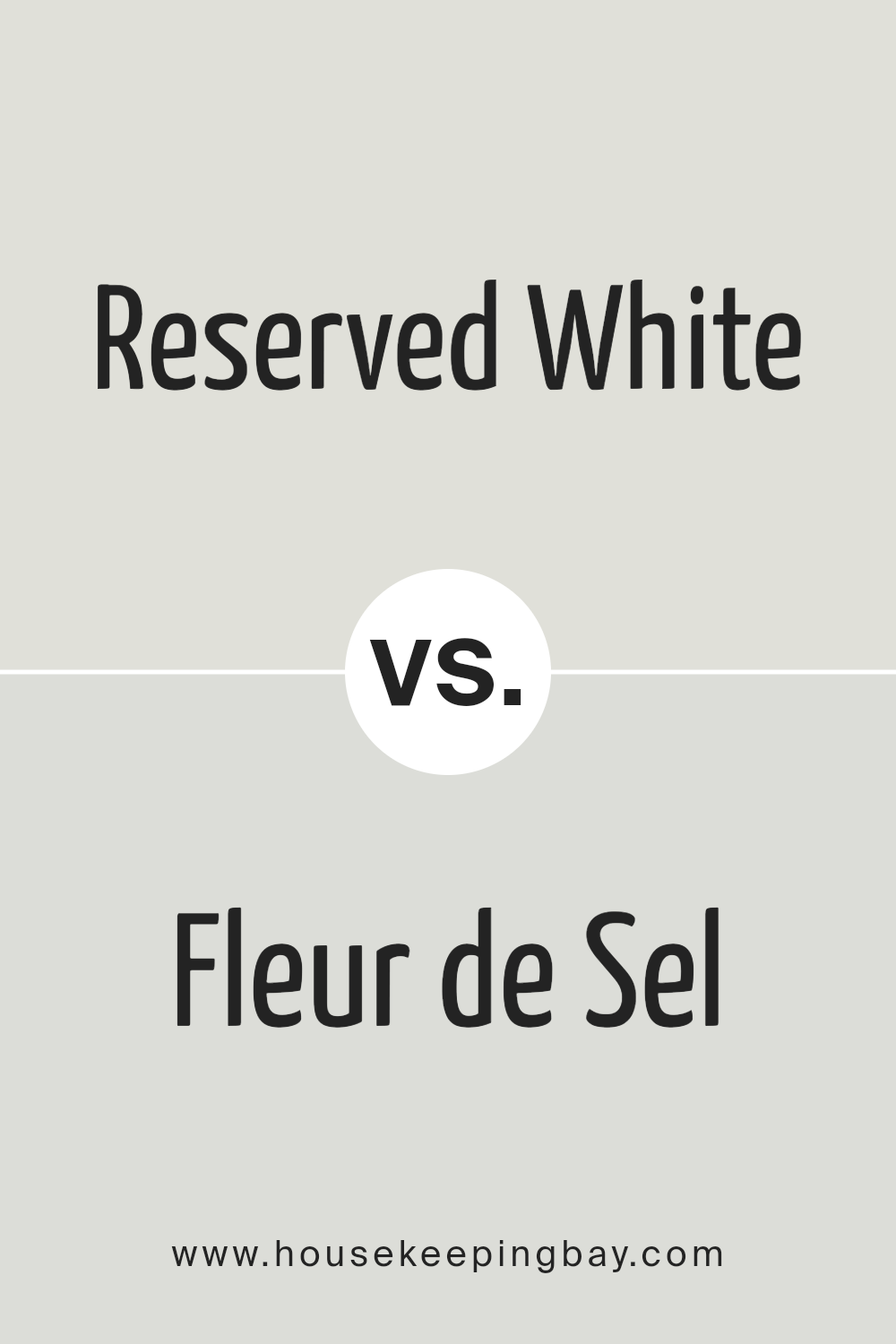
Reserved White SW 7056 by Sherwin Williams vs Fleur de Sel SW 7666 by Sherwin Williams
Reserved White SW 7056 by Sherwin Williams and Fleur de Sel SW 7666 by Sherwin Williams are two nuanced whites with distinct undertones and atmospheres. Reserved White is a warm, soft white, presenting a welcoming and cozy feel. Its subtle creamy undertones provide a depth that prevents it from feeling stark, making it ideal for creating a gentle, inviting space. It pairs beautifully with a wide range of colors, adding a calm and comforting presence to any room.
Fleur de Sel, on the other hand, leans towards a cooler palette, offering a crisp and airy vibe. This shade has a slightly more pronounced gray undertone, which brings a modern and sophisticated edge. It reflects light beautifully, enhancing the sense of space within a room. Fleur de Sel works wonderfully in spaces that seek to achieve a fresh, serene, and elegant atmosphere.
While both colors maintain the versatility and timeless appeal of white, Reserved White offers warmth and coziness, whereas Fleur de Sel provides a clean, tranquil backdrop. Choosing between them depends largely on the desired mood and the specific design aesthetics of the space.
You can see recommended paint color below:
housekeepingbay.com
Conclusion
In conclusion, Reserved White SW 7056 by Sherwin Williams stands out as a versatile and elegant paint color option for interior and exterior applications. Its subtle warmth and ability to act as both a primary palette and an accent color make it a favorite among homeowners and designers alike.
The color’s adaptability in various lighting conditions and its compatibility with a wide array of design styles—from modern minimalism to cozy traditional—further establish its popularity. Reserved White offers a sophisticated canvas that can evolve with changing decor and preferences, making it a timeless choice for creating serene and inviting spaces.
Moreover, its usage across different types of surfaces and materials highlights its flexibility and capability to bring cohesion to diverse elements within a space. Whether it’s enhancing architectural features, providing a backdrop for bold accents, or creating a tranquil and light atmosphere, Reserved White SW 7056 demonstrates its strength as a foundational hue in the Sherwin Williams collection. Its appeal lies not just in its aesthetic versatility but also in its ability to generate a sense of openness and purity, encapsulating a perfect balance between warmth and brightness that can transform any space into a harmonious and refined setting.
housekeepingbay.com
Ever wished paint sampling was as easy as sticking a sticker? Guess what? Now it is! Discover Samplize's unique Peel & Stick samples. Get started now and say goodbye to the old messy way!
Get paint samples


