Top 28 Warm Neutral Kitchen Paint Colors for 2025
Why Warm Neutrals Work So Well in Kitchens (Especially Now)
When I walk into a kitchen, I don’t just look at the cabinets or the appliances—I feel the color. And lately, the feeling people want most is comfort. Warm neutrals bring that in instantly.
In the kitchens I’ve worked on, these colors help people feel calmer, more at ease, and even more connected.
That matters when you’re gathering around the counter on a busy morning or having a slow dinner with family.In 2025, we’re seeing a bigger shift toward cozy and welcoming.
According to a recent Houzz survey, over 70% of homeowners say they want their kitchen to feel “warm and inviting”—not just modern or stylish.Warm neutrals are the shortcut to that feeling.
They’re not loud, not boring, and they work with nearly everything else in your kitchen.
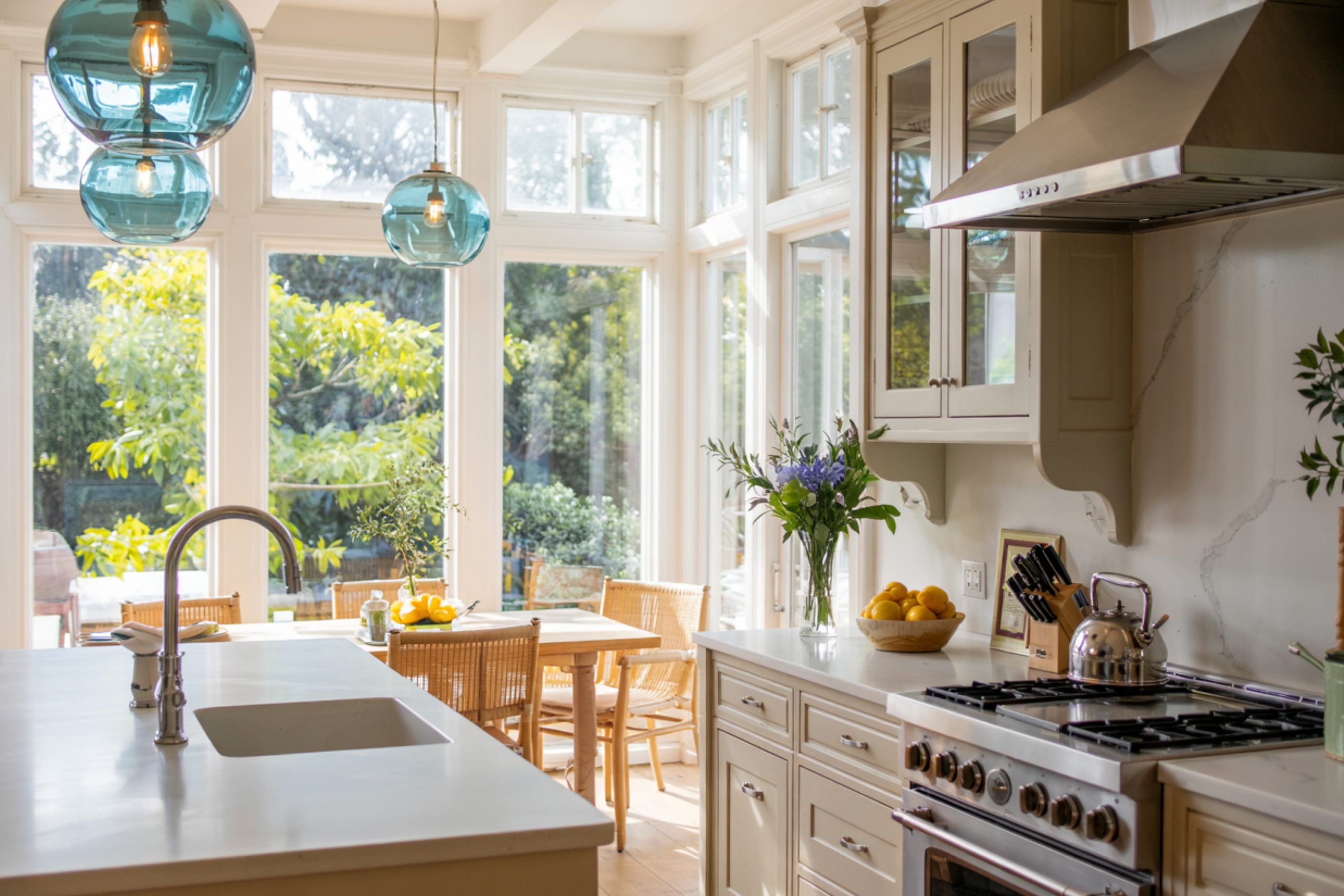
via housekeepingbay.com
What Makes a Paint Color “Warm Neutral”?
Table of Contents
When people hear “neutral,” they often think boring beige or plain white. But that’s not what I see when I’m choosing warm neutrals for a kitchen.
A neutral color is one that doesn’t scream for attention. It sits quietly in the background, letting your counters, lighting, and cabinets shine.
What makes it warm is the subtle presence of yellow, red, or even soft orange undertones. These tones make the kitchen feel more welcoming and less cold or sterile.
I always explain it to clients like this:
- Cool neutrals lean toward gray or blue. They can feel clean but sometimes too sharp or icy.
- Warm neutrals lean toward cream, tan, beige, or soft brown. They feel like home.
If your kitchen gets a lot of morning sun, a warm neutral will bounce that light in a soft, golden way. And even on cloudy days, it won’t feel flat or cold.
I remember a small kitchen I worked on last year with north-facing windows. The client had originally picked a gray, and it just made the whole room feel gloomy. We switched to Kilim Beige SW 6106, and it changed everything. It felt alive again.
Things to Know Before You Choose
Before you run out to the paint store—or click “order sample”—let’s pause. Picking a warm neutral might seem easy, but there are a few things that can totally change how that color looks in your kitchen.
1. Light Changes Everything
Natural light shifts all day long. Morning light is cooler, afternoon light is warmer, and artificial lighting can throw things off even more. A color that looks creamy and soft in the showroom might look yellow at home.
Tip: Always test your paint on a few walls and look at it morning, noon, and evening. I even tell clients to tape up a white paper next to it so they can really see the undertones.
2. Cabinet and Counter Colors Matter
A warm neutral has to work with what you already have. If your cabinets are bright white, a beige with too much yellow can make them look dingy. But if you have wood tones or cream cabinetry, warmer paints often bring out the richness in the wood.
Last year, I had a couple who loved Nomadic Desert SW 6107. But with their white quartz counters, it looked too heavy. We switched to Natural Linen SW 9109, and it balanced out perfectly.
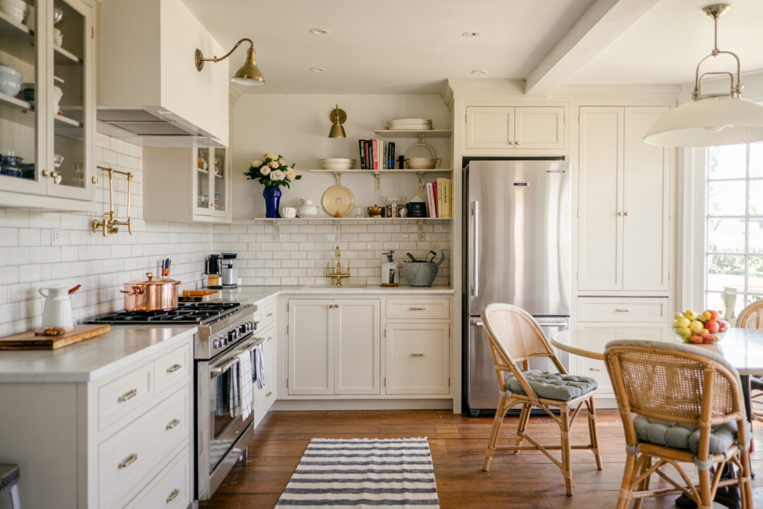
via housekeepingbay.com
3. Finishes Make a Big Difference
Even the sheen of your paint will affect the color. I usually suggest eggshell or satin for kitchens—easy to clean, not too shiny. Anything glossier can make the warmth feel too reflective.
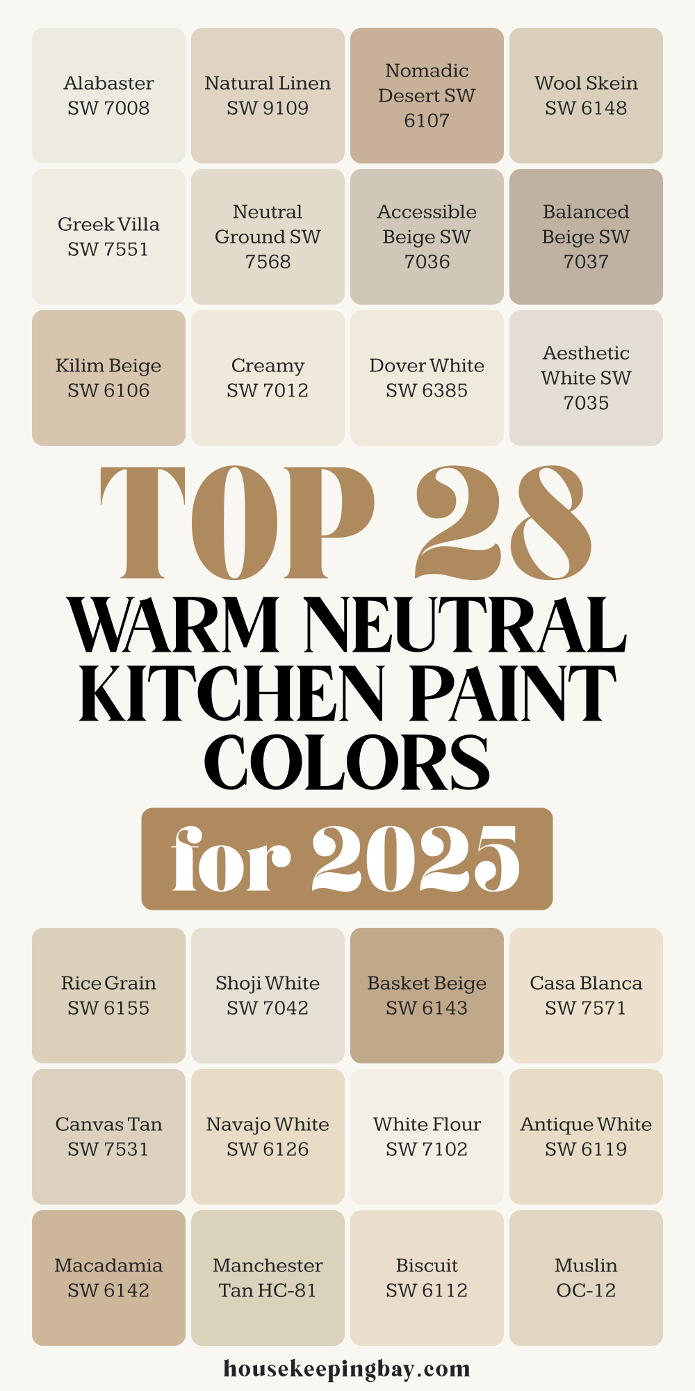
The 28 Warm Neutral Paint Colors for 2025
I’ve used these in so many kitchens over the years, and each one brings something special. To make it easier, I’ve grouped them by tone—because beige isn’t just beige. Some are creamier, some are deeper, and some have that perfect balance in between.
Soft Creamy Whites
These feel fresh but not cold. Perfect if you want your kitchen to feel bright without feeling sterile.
- Alabaster SW 7008 – I come back to this one again and again. It’s soft, creamy, and never too yellow. It was even Sherwin-Williams’ Color of the Year in 2016, and it’s still going strong.
- Greek Villa SW 7551 – A little warmer than Alabaster. I love using this one with natural wood cabinets.
- Shoji White SW 7042 – It has a hint of gray, which makes it really calming. Looks amazing with brushed gold hardware.
- Dover White SW 6385 – This one has more yellow in it. If your kitchen doesn’t get a lot of natural light, it can help brighten things up.
- Creamy SW 7012 – The name says it all. It’s rich and smooth, but still light.
- White Flour SW 7102 – A quiet white with just the right warmth. I like it with open shelving and light oak accents.
- Casa Blanca SW 7571 – Slightly deeper than the others, but still feels airy.
- Antique White SW 6119 – This one leans more beige. It reminds me of old farmhouse kitchens in the best way.
Beige & Linen Tones
These colors bring depth without heaviness. They work well with both light and dark elements in a kitchen.
- Natural Linen SW 9109 – Probably the most balanced tone on this list. It works in almost any kitchen, period.
- Canvas Tan SW 7531 – A soft, gentle beige with a slightly cooler base. Great with marble.
- Neutral Ground SW 7568 – If you want something subtle but not flat, this is the one.
- Kilim Beige SW 6106 – A little stronger in tone, but still cozy. It’s perfect with walnut or darker woods.
- Nomadic Desert SW 6107 – I only use this when the space can handle a richer beige. It’s bold in a good way.
- Wool Skein SW 6148 – This has a touch of green in it. Sounds strange, but it helps neutralize yellow tones in wood cabinets.
- Basket Beige SW 6143 – One of those dependable mid-range beiges. It works great in open-concept spaces.
- Macadamia SW 6142 – A creamy, nutty color that adds a little warmth without going too dark.
- Biscuit SW 6112 – It’s soft and traditional. I used this in a cottage-style kitchen and it was just right.
Classic Beige with a Modern Feel
These have just enough gray or softness to feel a bit more current without going full “greige.”
- Accessible Beige SW 7036 – I probably use this more than any other. It works everywhere. It’s warm, but not yellow.
- Balanced Beige SW 7037 – Slightly deeper than Accessible Beige. It gives a more grounded feel.
- Aesthetic White SW 7035 – A subtle choice for people who don’t want beige to look too beige.
- Rice Grain SW 6155 – Light, calm, and great for tying together white cabinets with beige counters.
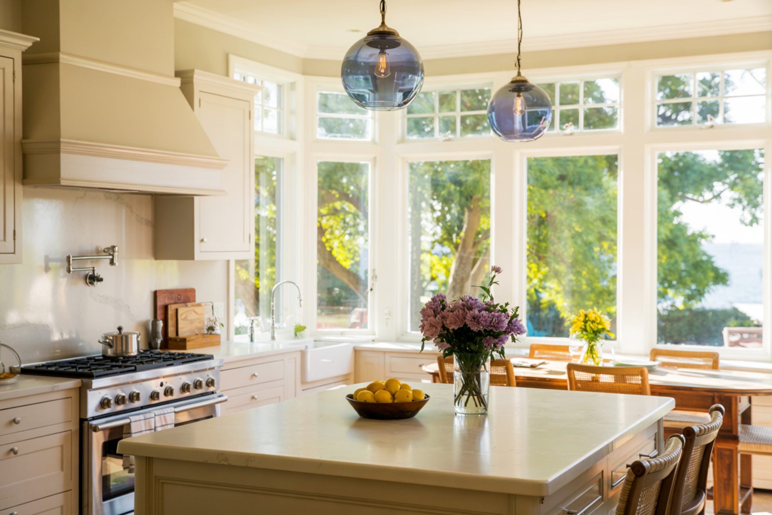
via housekeepingbay.com
Benjamin Moore Favorites
For clients who prefer Benjamin Moore, these have the same warmth and ease.
- Muslin OC-12 – A beautiful off-white that doesn’t turn yellow in different light.
- Manchester Tan HC-81 – It has some green undertone, which helps it feel very settled.
- Edgecomb Gray HC-173 – If you’re scared of beige but don’t want gray, this is the sweet spot.
- Maritime White OC-5 – I used this in a beach house kitchen with rattan stools. It felt so clean and calm.
- Navajo White OC-95 – A true creamy neutral. Old-school, but still totally works.
- Indian White OC-88 – Warmer than Maritime White, a bit earthier.
- Navajo White SW 6126 – Yes, Sherwin-Williams also has their version. It’s a little stronger than the Benjamin Moore one.
My Go-To Combos for Kitchens
Some colors just play well together. After years of working with kitchens, I’ve found a few combos that never disappoint.
- Alabaster SW 7008 + Warm Wood Cabinets
This pairing always feels clean and classic, not too cold.
- Accessible Beige SW 7036 + Matte Black Hardware
Perfect for clients who want modern, but not harsh.
- Kilim Beige SW 6106 + Creamy White Trim
Gives a soft contrast that feels cozy and inviting.
- Muslin OC-12 + Marble Countertops
I’ve used this in both big kitchens and small apartments—it always feels fresh.
- Edgecomb Gray HC-173 + Natural Linen SW 9109 (walls + island)
This mix adds subtle depth without going dark. Great in open layouts.
I always test on real walls, though—what works in one home might shift slightly in another.
Mistakes I’ve Seen and How to Avoid Them
I’ve been called in more than once to fix a color that just didn’t work. Most of the time, it’s not the paint’s fault—it’s how it was chosen. Here are the top mistakes I see:
1. Choosing From a Tiny Paint Chip
That little square is not enough. The color always looks different on a full wall. Always sample at least a 2×2 foot patch on the wall and check it in morning and evening light.
2. Ignoring the Undertones
Beige isn’t just beige. Some lean yellow, others lean pink, or even green. Put your sample near your cabinets and counters before deciding.
3. Forgetting the Finish
Glossy paint in a kitchen can make warm tones look shiny or strange. I usually go for eggshell or satin—easy to wipe, but still soft-looking.
4. Picking a Trend Instead of What You Love
Just because something’s popular doesn’t mean it’ll feel right in your home. If it feels too cool or too dark, trust your gut and keep looking.
I always tell clients: you’re the one standing in that kitchen every day. It has to feel good to you.
My Favorite Picks for 2025 (And Why)
These are the five colors I keep reaching for this year. They just work.
1. Accessible Beige SW 7036
If I had to pick one color for every kitchen, this would be it. It has just enough warmth without looking dated. Works with white, wood, metal—everything.
2. Shoji White SW 7042
It’s soft, easy on the eyes, and gives just the right hint of contrast if your cabinets are white. Feels modern but gentle.
3. Natural Linen SW 9109
This one always surprises people. It looks quiet on the swatch but comes alive on the walls. It’s the most “livable” beige I know.
4. Muslin OC-12
A go-to for lighter kitchens. It brings in warmth without making things feel heavy. I’ve used it in small kitchens and it always opens up the room.
5. Kilim Beige SW 6106
I save this for when I want more depth. It’s perfect with wood beams or darker floors. Warm but grounded.
These five show the range that warm neutrals can have—from light and airy to deep and comforting. There’s no “one right color.” It’s all about what feels right in your home.
via housekeepingbay.com
One Last Thing Before You Paint
Choosing paint can feel like a lot. But here’s what I tell every client before we commit:
Don’t rush. Paint is emotional. It sets the tone—literally—for how your kitchen feels every single day.
Take your time, put the samples on your wall, and look at them when the sun is up, when the lights are on, and when the kitchen is quiet.
And remember—warm doesn’t mean boring. It means inviting. It means comforting. And that’s exactly what a kitchen should be.
If you’re stuck between two shades, go with the one that feels like home. You’ll know it when you see it.
via housekeepingbay.com
