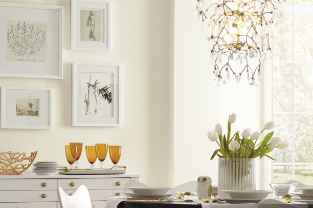
Biscuit SW 6112 by Sherwin Williams
Warmth and Comfort in Every Brushstroke
In the vast palette of colors offered by Sherwin Williams, SW 6112 Biscuit stands out as a uniquely warm and inviting hue. Located amidst the nuanced spectrum of neutrals, Biscuit embodies a cozy, understated elegance that brings a sense of calm and comfort to any space it graces.
This particular shade, reminiscent of the soft, golden tones found in its namesake, offers a versatile backdrop suitable for a wide array of decorative styles and themes. Known for its adaptability, SW 6112 Biscuit harmonizes with a range of furnishings and finishes, from classic wood grains to contemporary metals and fabrics.
Whether you’re a homeowner seeking to infuse your living space with a gentle warmth or a professional designer aiming to create an inviting atmosphere in a client’s project, SW 6112 Biscuit provides a solid foundation upon which to build your aesthetic vision.
In the following article, we delve deeper into the qualities that make Biscuit by Sherwin Williams a favored choice among various users, including its compatibility with different lighting conditions, pairing possibilities with contrasting colors, and practical applications in residential and commercial environments.
Join us as we explore the versatile charm and potential of SW 6112 Biscuit, a color that transcends mere trends to offer timeless appeal.
via sherwin-williams.com
What Color Is Biscuit SW 6112 by Sherwin Williams?
Biscuit SW 6112 by Sherwin Williams is a warm and inviting neutral shade that floats gracefully between beige and soft yellow, embodying the coziness of sunlit mornings and the tranquility of ancient parchment. It’s a color that whispers comfort and simplicity, making any room feel like a peaceful sanctuary. Its subtlety is its strength, offering a versatile backdrop for a myriad of design choices without overwhelming the senses.
This color thrives in a variety of interior styles, particularly excelling in classic, farmhouse, and rustic motifs. It brings a sense of warmth to traditional decor, enhances the homespun charm of farmhouse aesthetics, and complements the natural materials commonly found in rustic designs.
Biscuit SW 6112 also works wonderfully in modern and contemporary spaces as a soft counterbalance to sleek lines and minimalistic designs, adding depth and warmth to prevent these spaces from feeling too sterile.
When it comes to materials and textures, Biscuit SW 6112 pairs exceptionally well with natural wood, from rich mahoganies to pale oaks, enhancing its warmth and adding a layer of organic beauty. It also harmonizes nicely with soft, plush textures like wool, cashmere, and cotton in both upholstered furniture and decorative accents, inviting touch and comfort.
For a touch of elegance, metallic accents in gold or brass can illuminate this color’s understated warmth, creating a sophisticated balance between coziness and refinement.
housekeepingbay.com
Table of Contents
Is Biscuit SW 6112 by Sherwin Williams Warm or Cool color?
Biscuit SW 6112 by Sherwin Williams is a nuanced shade that belongs to the soft, warm spectrum of neutrals, offering a cozy yet sophisticated ambiance to any room it graces. Its creamy, comforting hue has the unique ability to act as a serene backdrop or a subtle statement, depending on its application and the colors with which it is paired. This versatility is what makes Biscuit exceptionally effective in homes, as it can adapt to a wide array of interior styles, from rustic charm to modern minimalism.
In natural light, Biscuit SW 6112 reveals a gentle warmth that can make spaces feel more inviting and spacious. It has a remarkable capacity to reflect light, enhancing the perceived size and brightness of a room. When used in smaller spaces or rooms with limited natural light, Biscuit can combat feelings of claustrophobia by visually opening up the area.
Moreover, its understated elegance allows homeowners to experiment with bold accents and furnishings without the risk of overwhelming the space. Whether paired with soft pastels for a calming effect or contrasted against deep, rich colors for a dynamic aesthetic, Biscuit SW 6112 remains a harmonious foundation. This color is not merely a choice; it’s an investment in creating a timeless, adaptable space that feels both personal and welcoming.
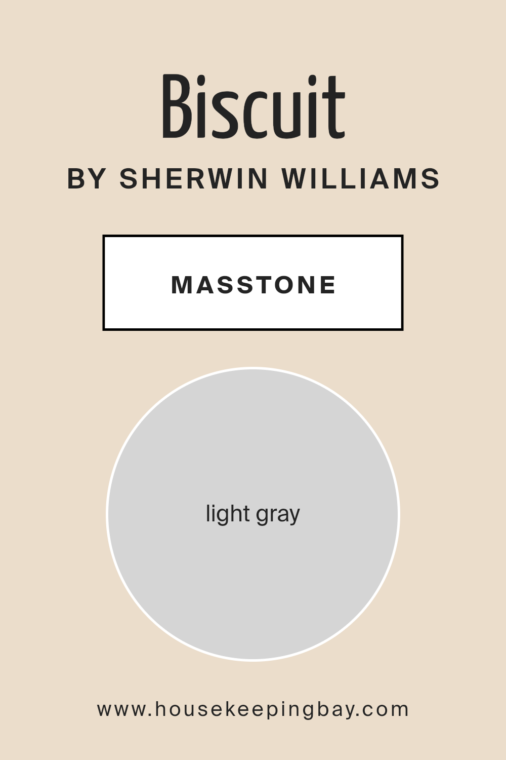
What is the Masstone of the Biscuit SW 6112 by Sherwin Williams?
Biscuit SW 6112 by Sherwin Williams, with its masstone of Light Gray (#D5D5D5), introduces a versatile and serene backdrop to any home interior. This particular shade possesses the unique ability to blend seamlessly with a wide array of design styles and color palettes, making it an ideal choice for homeowners seeking flexibility and timelessness in their decorating schemes. As the masstone of Light Gray provides a neutral yet warm base, Biscuit SW 6112 exudes a welcoming ambiance without overwhelming the senses.
The way this color works in homes is quite remarkable—its light gray hue can amplify natural light, making spaces appear larger and more open, a beneficial trait especially for smaller rooms or those with limited light sources.
Moreover, Biscuit SW 6112 can serve as a sophisticated backdrop, enabling furniture and decor to stand out without the competition that more saturated colors might present. This attribute allows for an exciting range of design possibilities, from bold and contemporary to soft and traditional. Its adaptability and the soothing quality of its masstone ensure that Biscuit SW 6112 can create a tranquil and harmonious environment in any home setting.
housekeepingbay.com
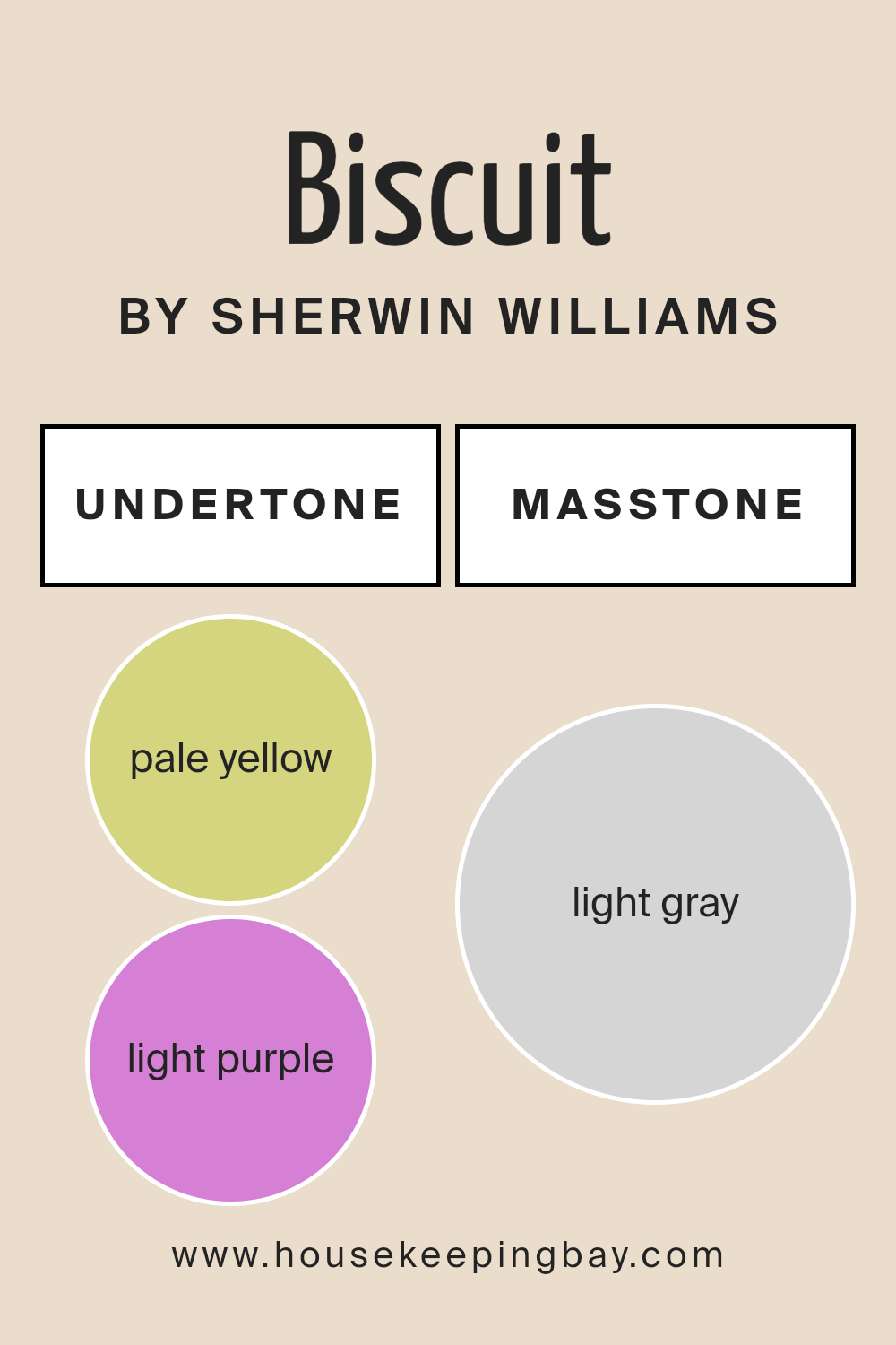
Undertones of Biscuit SW 6112 by Sherwin Williams
Biscuit SW 6112 by Sherwin Williams is a warm and inviting hue that encapsulates the essence of comfort and homeliness. What makes this color particularly unique are its subtle undertones of pale yellow (#D5D580) and light purple (#D580D5). These undertones significantly influence the way we perceive the color, adding a layer of complexity and versatility.
Undertones play a critical role in color perception. They can alter the mood of a color, affect how it complements other hues, and even influence its visibility under different lighting conditions. Pale yellow undertones bring a sense of brightness and warmth, making a space feel more open and welcoming.
On the other hand, the light purple undertones introduce a hint of coolness and sophistication, which can balance the warmth of the yellow to create a more nuanced and inviting ambiance.
When applied to interior walls, Biscuit SW 6112 transforms spaces with its rich depth and warmth. The pale yellow undertones enhance natural light, making rooms look larger and more inviting, while the light purple undertones provide a subtle contrast that enriches the color’s complexity.
This duality ensures that Biscuit SW 6112 adapts gracefully to various styles and lighting conditions, making it an excellent choice for creating cozy, engaging spaces. Whether in a sunny kitchen or a softly lit bedroom, Biscuit SW 6112, with its charming undertones, offers a timeless backdrop that complements a wide range of decor styles and palettes.
housekeepingbay.com
Coordinating Colors of Biscuit SW 6112 by Sherwin Williams
Coordinating colors are hues that harmonize well with a primary color, enhancing overall aesthetic appeal and creating a balanced look. Whether for interior design, fashion, or art, selecting coordinating colors ensures a seamless transition between shades, adding depth and dimension to the visual experience. These complementary counterparts often share similar undertones or are positioned close to each other on the color wheel, making the combined palette pleasing to the eye.
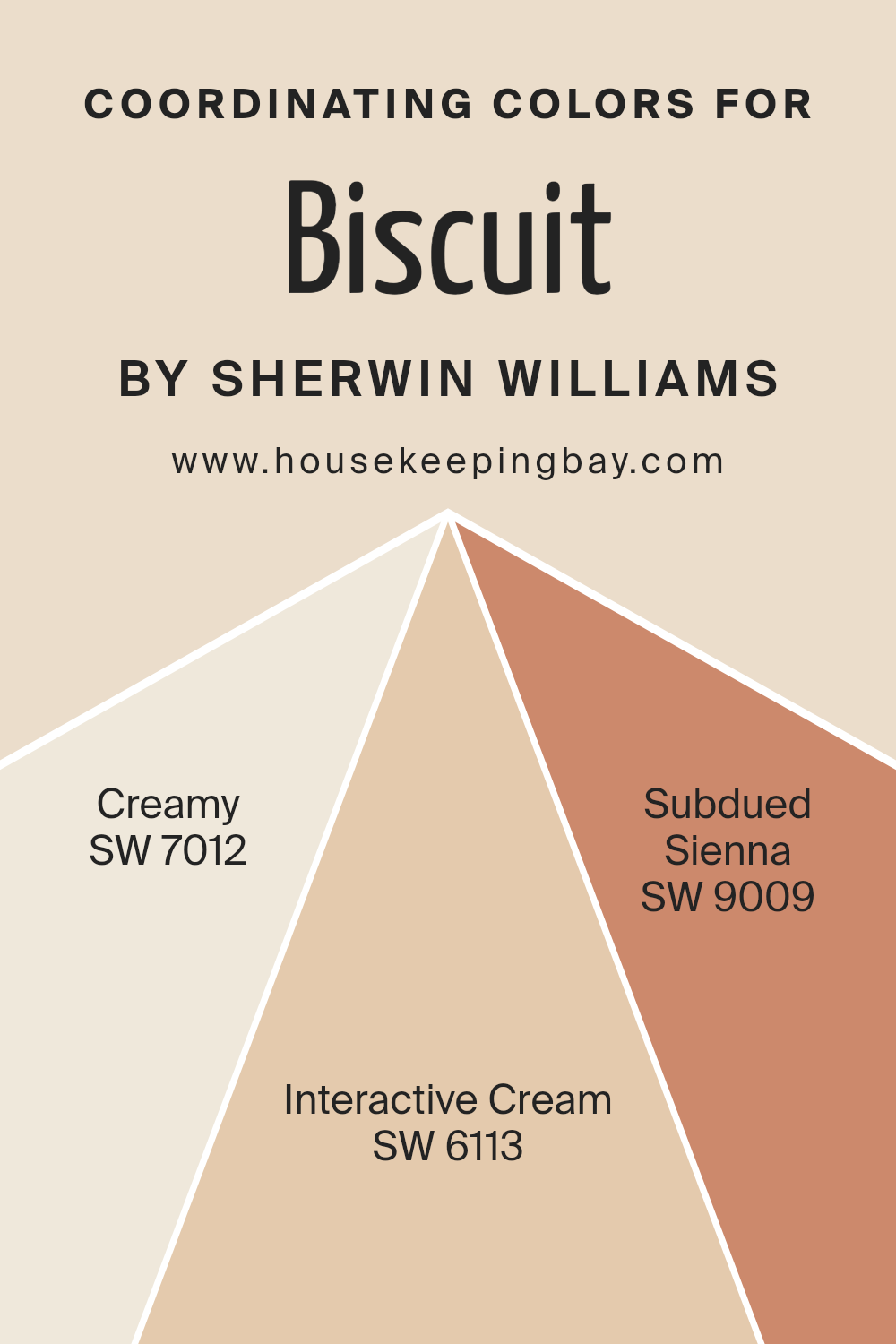
For BiscuitSW 6112 by Sherwin-Williams, a warm, inviting neutral, the coordinating colors have been thoughtfully selected to enrich its earthy base. Creamy SW 7012 offers a soft, delicate contrast, its rich buttery tone providing a smooth transition that brightens spaces with a subtle, luminous glow.
Interactive Cream SW 6113, slightly deeper, bridges the gap between warmth and coziness, its golden undertones mirror the comforting essence of Biscuit, ensuring a cohesive yet diverse scheme. Subdued Sienna SW 9009, on the other hand, introduces a gentle hint of rustic redness, reminiscent of terracotta, adding an element of organic sophistication.
This color enriches the palette, creating an inviting ambiance that’s both grounded and elegantly aged. Together, these coordinating colors weave a tapestry of harmonious shades around BiscuitSW 6112, celebrating its versatility and charm.
You can see recommended paint colors below:
- SW 7012 Creamy
- SW 6113 Interactive Cream
- SW 9009 Subdued Sienna
housekeepingbay.com
How Does Lighting Affect Biscuit SW 6112 by Sherwin Williams?
Lighting has a profound effect on how we perceive colors, significantly impacting their appearance and the ambience they create in a space. Often unnoticed, this interplay between light and color is crucial in interior design and can transform the mood of a room. A prime example of color affected by lighting is “Biscuit SW 6112” by Sherwin-Williams, a warm, soft neutral that can fluctuate in hue and intensity under different lighting conditions.
Under artificial light, Biscuit tends to exude warmth, making spaces feel cozy and inviting. The type of artificial light, whether it be LED, incandescent, or fluorescent, can influence its appearance. Incandescent bulbs, which emit yellow-toned light, can enhance Biscuit’s warm undertones, making it appear richer. In contrast, fluorescent lighting, often emitting a blue-toned light, might make Biscuit look more subdued and slightly cooler.
In natural light, the appearance of Biscuit varies significantly depending on the direction of the room and the time of day. In north-faced rooms, which receive indirect, cooler light throughout the day, Biscuit might appear slightly muted and cooler, yet maintaining its inviting quality. This makes it ideal for creating a serene and balanced aesthetic.
South-faced rooms bask in warm, direct sunlight for most of the day, causing Biscuit to appear brighter and more vivid. Its warm undertones are emphasized, enhancing the color’s welcoming and cozy feel, making spaces feel airy and vibrant.
In east-faced rooms, Biscuit is illuminated with soft, warm light in the morning, which transitions to cooler, indirect light as the day progresses. This results in a dynamic color experience that shifts from a gentle, sunny hue in the morning to a more neutral, soft tone by afternoon.
West-facing rooms offer the inverse experience, with Biscuit starting the day in a cooler tone under indirect light and warming up dramatically towards the evening as it catches the sunset’s golden hues. This transition can make the color appear more dynamic and adaptable, providing a comforting warmth in the evening.
Understanding how lighting—both artificial and natural—affects colors like Biscuit SW 6112 is key to utilizing them effectively in decor, ensuring that spaces not only look beautiful but feel harmonious and inviting at any time of day.
housekeepingbay.com
What is the LRV of Biscuit SW 6112 by Sherwin Williams?
Light Reflectance Value (LRV) is a measure used to describe the amount of visible and usable light that a color reflects or absorbs. Ranging from 0 (absolute black, absorbing all light and heat) to 100 (pure white, reflecting all light and heat), LRV plays a crucial role in understanding how a paint color will behave under different lighting conditions.
This measurement is particularly important for architects, interior designers, and homeowners when selecting paint colors for various spaces. Higher LRVs indicate colors that reflect more light, making a room feel more open and airy, whereas lower LRVs suggest colors that absorb more light, creating a cozier, more intimate atmosphere.
Additionally, understanding a color’s LRV can help in enhancing energy efficiency by influencing the amount of artificial lighting needed in a space and can also affect heating and cooling loads.
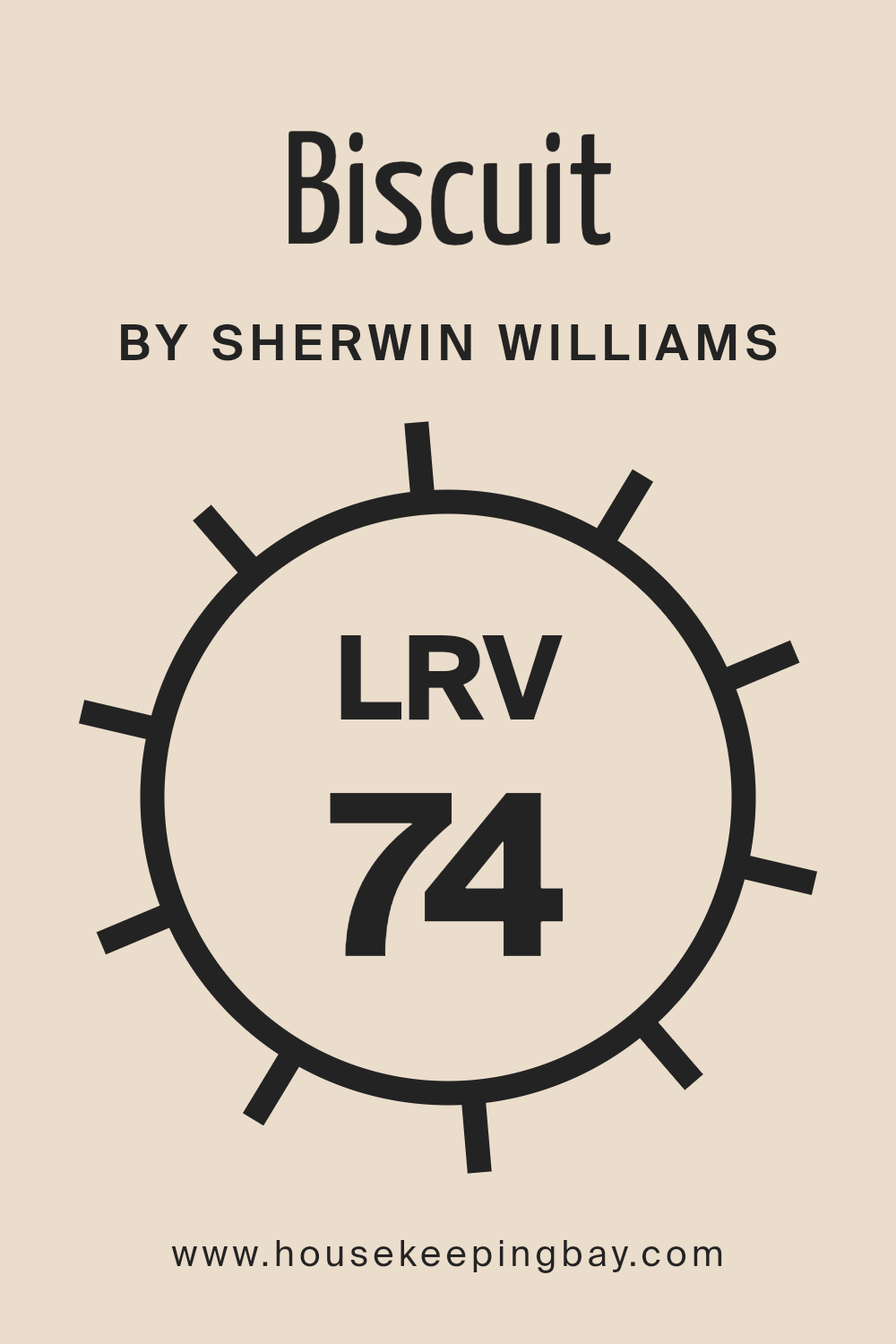
With an LRV of 73.67, the color Biscuit SW 6112 by Sherwin Williams is on the lighter end of the spectrum, indicating it has a high reflectivity. This characteristic means it will brightly reflect most of the natural and artificial light it receives, making spaces appear more luminous and spacious.
For rooms with limited natural light or smaller spaces, the Biscuit color can help in making the area seem larger and more inviting.
Depending on the orientation of the room and the quality of light (whether it is north-facing with cooler light or south-facing with warmer light), this LRV can also subtly affect the warmth and tone of the color on the walls, possibly making it appear slightly different at various times of the day.
Being a color with a relatively high LRV, Biscuit SW 6112 is versatile, working well in many settings and complementing a wide range of décor and furniture styles while adding a soft, welcoming atmosphere.
housekeepingbay.com
What is LRV? Read It Before You Choose Your Ideal Paint Color
What are the Trim colors of Biscuit SW 6112 by Sherwin Williams?
Trim colors play a crucial role in interior and exterior design by defining and accentuating the architectural details of a space or structure. When it comes to choosing a trim color for Biscuit SW 6112 by Sherwin Williams, a warm and inviting neutral, the choice of trim color can significantly impact the overall aesthetic and mood of the room.
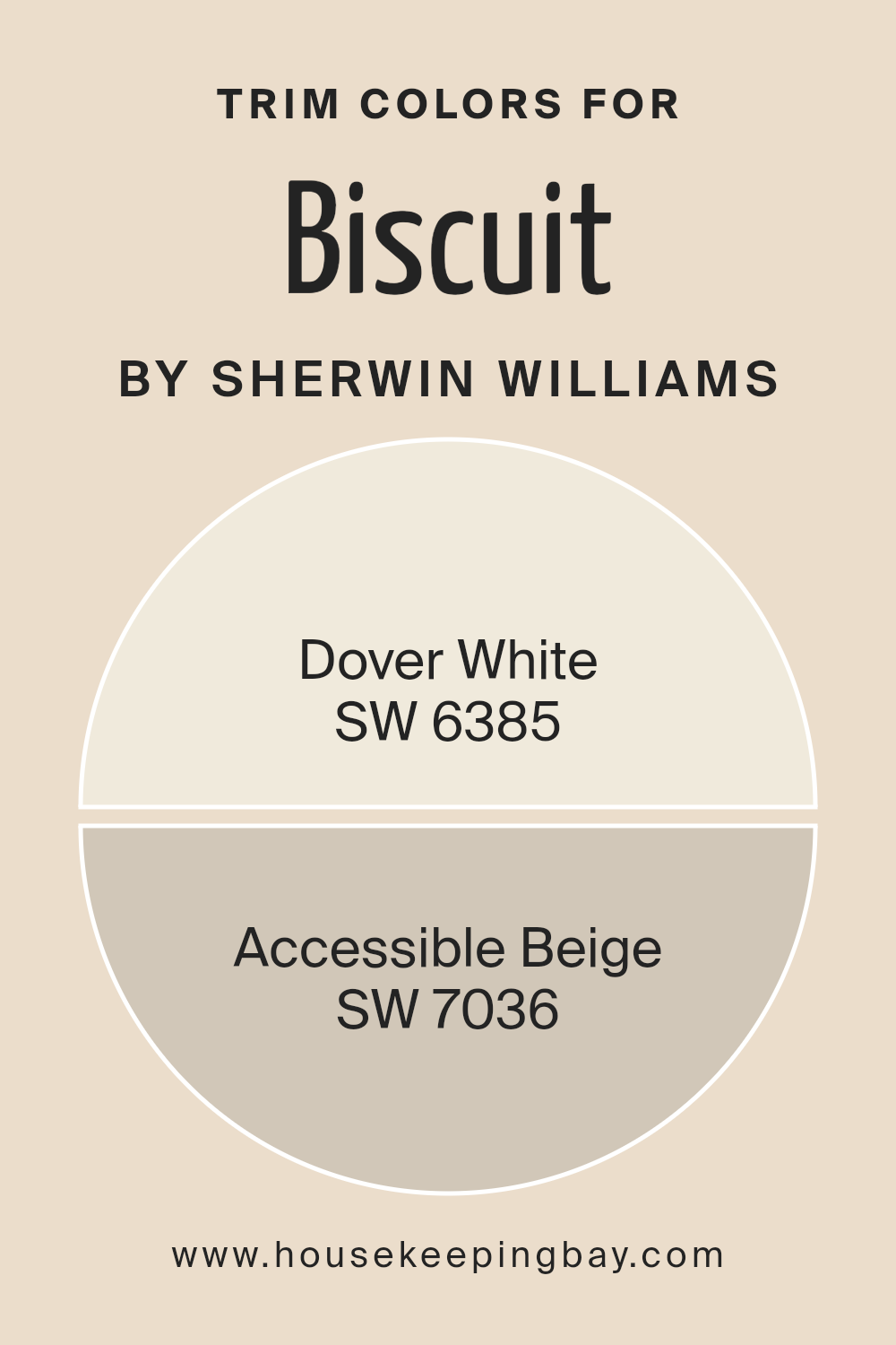
Trim colors such as Dover White SW 6385 and Accessible Beige SW 7036 are excellent choices for complementing Biscuit SW 6112. These colors enhance Biscuit’s warmth while providing a subtle contrast that highlights baseboards, moldings, window, and door frames, ensuring these features do not disappear into the background.
The strategic use of trim colors can also create a sense of cohesion and flow throughout a space, making it feel more put-together and intentional.
Dover White SW 6385 is a soft, creamy white that brings a gentle brightness to a room without overwhelming the senses. It pairs beautifully with Biscuit SW 6112 by offering a subtle contrast that is both refreshing and comforting, making spaces feel more open and airy.
On the other hand, Accessible Beige SW 7036 is a light greige that straddles the line between beige and gray, providing a neutral backdrop that is both versatile and sophisticated. When used as a trim color alongside Biscuit SW 6112, it adds depth and complexity to the room, enhancing the warm undertones of Biscuit and creating an inviting, cohesive look.
Together, these trim colors complement Biscuit SW 6112 and are key to achieving an aesthetically pleasing balance between the walls and trim in any space.
You can see recommended paint colors below:
housekeepingbay.com
Colors Similar to Biscuit SW 6112 by Sherwin Williams
Choosing similar colors, like the shades harmonizing with Biscuit SW 6112 by Sherwin Williams, plays a pivotal role in interior design by creating a cohesive and refined aesthetic. These colors, ranging from warm creams to subtle ivories, share a common warmth that bridges traditional and contemporary styles, imbuing spaces with a sense of calm and elegance. The significance of these similar tones lies in their ability to support a range of complementary colors, providing a versatile backdrop for various decor elements, from bold furniture pieces to intricate art, thus allowing for a layered and nuanced interior design.
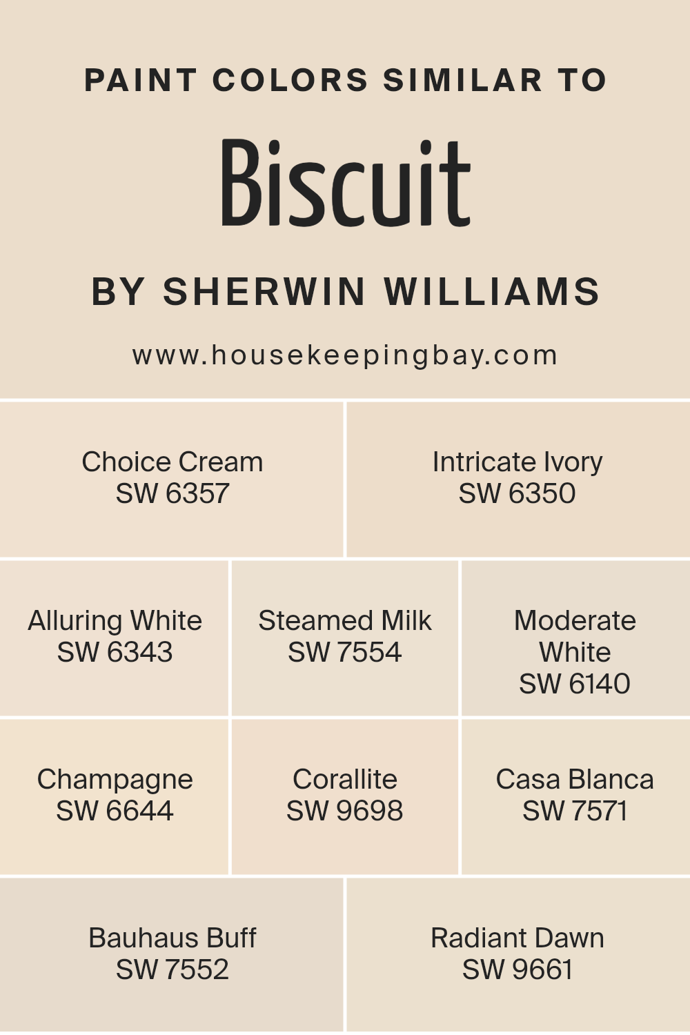
For instance, Choice Cream SW 6357 bathes rooms in a soft, creamy glow, inviting a serene ambiance that is both comforting and stylish, while Intricate Ivory SW 6350 offers a lighter, almost ethereal touch that captures the essence of minimalist chic. Alluring White SW 6343, with its whisper of warmth, is perfect for spaces that crave a hint of coziness without sacrificing brightness.
Steamed Milk SW 7554, evoking the richness of its namesake, lends a velvety texture to walls, engaging the senses in a subtle play of light and shadow. Moderate White SW 6140, Champagne SW 6644, Corallite SW 9698, Casa Blanca SW 7571, Bauhaus Buff SW 7552, and Radiant Dawn SW 9661, each contribute unique nuances, from the effervescent sparkle of champagne to the depth of dawn, creating environments that are not only visually appealing but also emotionally resonant, showcasing the pivotal role of color in transforming spaces.
You can see recommended paint colors below:
- SW 6357 Choice Cream
- SW 6350 Intricate Ivory
- SW 6343 Alluring White
- SW 7554 Steamed Milk
- SW 6140 Moderate White
- SW 6644 Champagne
- SW 9698 Corallite
- SW 7571 Casa Blanca
- SW 7552 Bauhaus Buff
- SW 9661 Radiant Dawn
housekeepingbay.com
How to Use Biscuit SW 6112 by Sherwin Williams In Your Home?
Biscuit SW 6112 by Sherwin Williams is a subtle, inviting hue that walks a fine line between a light, warm beige and a soft, welcoming yellow. Striking a perfect balance between cozy and inviting, this versatile color brings a sense of calm and comfort to any space it graces. Ideal for those looking to create a serene, yet pleasant atmosphere, Biscuit SW 6112 is an excellent choice for virtually any room in the home.
One of the most appealing aspects of Biscuit is its remarkable adaptability. It can serve as a neutral backdrop in living rooms and bedrooms, enhancing furnishings and décor without overwhelming them. In spaces like the kitchen or dining room, it introduces a subtle warmth, making the spaces feel more inviting and homey.
For bathrooms, its gentle hue can help in creating a spa-like environment that’s both tranquil and elegant.
Moreover, its compatibility with a wide range of color palettes is unparalleled. Whether you’re pairing it with rich, deep tones for contrast or aligning it with pastels for a softer look, Biscuit SW 6112 seamlessly brings cohesion to diverse design elements.
Incorporating this color through paint, accessories, or textiles can thus effortlessly elevate the aesthetic of any home, making it a timeless choice for homeowners aiming for both style and warmth.
Biscuit SW 6112 by Sherwin Williams vs Steamed Milk SW 7554 by Sherwin Williams
Biscuit SW 6112 and Steamed Milk SW 7554 by Sherwin Williams are two hues that offer a serene and welcoming atmosphere to any space, yet they stand apart in their unique characteristics. Biscuit presents a richer, deeper tone, encapsulating a warm, inviting ambiance with a subtle, earthy undertone, reminiscent of a freshly baked, golden-brown biscuit. This color has a cozy depth to it, making it perfect for creating a snug and comfortable environment in living rooms or bedrooms where warmth is key.
In contrast, Steamed Milk embodies a softer, lighter approach. It provides a delicate, creamy backdrop that exudes tranquility and a sense of openness. Steamed Milk, with its gentle whisper of warmth, leans towards a more neutral, versatile palette, offering a clean and airy feel. This hue is ideal for spaces aiming for a subtle uplift, enhancing brightness without overwhelming the senses.
While both colors share a warm base, Biscuit’s deeper, more pronounced tone offers a sense of richness and comfort, whereas Steamed Milk’s lighter, almost ethereal quality, introduces a calming, clean aesthetic. Choosing between them depends on the desired mood and space functionality, whether aiming for cozy depth or serene spaciousness.
You can see recommended paint color below:
housekeepingbay.com
Biscuit SW 6112 by Sherwin Williams vs Champagne SW 6644 by Sherwin Williams
“Biscuit SW 6112” by Sherwin Williams, in essence, embodies warmth and natural earthiness. It’s a subtly creamy hue that aligns closely with soft, sandy shores, offering a sense of calm and understated elegance to any space.
This color can be leveraged to create a cozy and inviting atmosphere, making it ideal for living rooms, bedrooms, and even kitchens where warmth is paramount.
On the other hand, “Champagne SW 6644” leans towards the lighter, more effervescent end of the palette. As its name suggests, it carries the delicate elegance of champagne, sparkling with a light, almost reflective quality. This color brings an air of sophistication and lightness, making it perfect for spaces that aim to be chic, airy, and subtly luxurious. It tends to make smaller spaces appear larger and more open, ideal for bathrooms, small offices, or entryways where a welcoming yet refined vibe is desired.
When comparing the two, Biscuit offers depth and warmth, grounding a space with its earthy tones, whereas Champagne introduces an element of airy sophistication, elevating a space with its light reflectiveness. Both colors provide unique atmospheres – Biscuit being more enveloping and Champagne more uplifting.
You can see recommended paint color below:
- SW 6644 Champagne
housekeepingbay.com
Biscuit SW 6112 by Sherwin Williams vs Moderate White SW 6140 by Sherwin Williams
Biscuit SW 6112 by Sherwin Williams is a warm, creamy color that exudes a soft and inviting atmosphere. It carries a certain depth, making it ideal for spaces where a cozy yet sophisticated tone is desired. This hue typically resonates with those looking for a neutral with a bit more warmth and character than a stark white. It pairs beautifully with a wide range of colors, offering versatility in design choices.
On the other hand, Moderate White SW 6140 by Sherwin Williams leans towards a softer, lighter side of the neutral palette. This color has a subtle warmth but is closer to white, giving off a serene and clean vibe.
It’s perfect for creating a bright and airy space, reflecting more light and making rooms appear larger. Its understated elegance allows it to serve as an excellent backdrop for both vibrant and muted color schemes.
While both Biscuit SW 6112 and Moderate White SW 6140 dwell in the neutral territory, Biscuit offers a richer, more enveloping feel, whereas Moderate White presents a crisp, luminous ambiance. Each brings its unique flair to interiors, catering to different aesthetic preferences and functionalities within a space.
You can see recommended paint color below:
housekeepingbay.com
Biscuit SW 6112 by Sherwin Williams vs Casa Blanca SW 7571 by Sherwin Williams
Comparing Biscuit SW 6112 and Casa Blanca SW 7571 from Sherwin Williams reveals a subtle yet distinct difference in their warmth and ambiance. Biscuit SW 6112 is a warm, inviting hue that embodies a sense of comfort and earthiness. It brings a soft, cozy feel to spaces, making it ideal for living rooms or bedrooms that aim for a snug, welcoming atmosphere. Its richness offers depth and a more pronounced presence, easily complementing a variety of decor styles from rustic to contemporary.
In contrast, Casa Blanca SW 7571 leans towards a softer, more neutral palette. This color is reminiscent of the gentle hues of a vintage parchment or an antique lace, providing a light, airy quality to any room. It is perfect for spaces that seek to enhance natural light, offering a serene, calming background that pairs effortlessly with both bold and subdued accents.
Though both colors share a warm base, Biscuit SW 6112 offers a deeper, earthier tone, while Casa Blanca SW 7571 presents a lighter, more neutral option. Each brings its unique charm to interiors, catering to different aesthetics and preferences.
You can see recommended paint color below:
housekeepingbay.com
Biscuit SW 6112 by Sherwin Williams vs Bauhaus Buff SW 7552 by Sherwin Williams
Biscuit SW 6112 and Bauhaus Buff SW 7552 by Sherwin Williams are two neutral colors that softly define spaces with their warmth and subtlety. Biscuit, a richer, slightly more golden tone, evokes a sense of comfort and coziness, ideal for creating inviting living spaces. Its depth imparts a welcoming feel, making it particularly suitable for common areas like living rooms and kitchens where warmth is desired.
On the other hand, Bauhaus Buff has a lighter, more understated appearance. It leans towards a classic, timeless aesthetic, ensuring spaces feel open and airy. Bauhaus Buff’s subtlety makes it versatile, easily blending with various decor elements and color palettes. Due to its lighter tone, it is excellent for smaller rooms or spaces that aim to maximize natural light, enhancing a sense of spaciousness.
Though both hues share a neutral palette, Biscuit’s warmth and depth offer a traditional coziness, while Bauhaus Buff’s lighter, more neutral tone provides a modern, clean backdrop. Each color, embodying its unique qualities, offers distinct possibilities for crafting inviting, personalized spaces.
You can see recommended paint color below:
housekeepingbay.com
Biscuit SW 6112 by Sherwin Williams vs Alluring White SW 6343 by Sherwin Williams
Biscuit SW 6112 by Sherwin Williams is a warm, welcoming hue that rests comfortably within the neutral family. Its tone is reminiscent of soft, unbleached linen or the subtle warmth of early morning sunlight filtering through a sheer curtain. This color tends to inject a cozy, inviting atmosphere into any space, making it a popular choice for living areas, bedrooms, and any space where a serene, comforting ambiance is desired.
On the other hand, Alluring White SW 6343 by Sherwin Williams leans towards the cooler end of the spectrum. Despite its name, it is not a stark, pure white. Instead, it carries a faint whisper of warmth, enough to make it versatile and harmonious in various lighting conditions without becoming too stark or clinical.
It is excellent for spaces that demand brightness and an air of crispness, such as kitchens, bathrooms, or smaller spaces that could benefit from a perception of expanded space.
Together, Biscuit and Alluring White create a balanced, harmonious palette. Biscuit’s earthy warmth paired with the subtle, creamy brightness of Alluring White can produce environments that feel both inviting and expansive, elegant yet casual. They work together to strike a beautiful balance between coziness and freshness, making them a fantastic duo for creating nuanced, inviting interiors.
You can see recommended paint color below:
housekeepingbay.com
Biscuit SW 6112 by Sherwin Williams vs Choice Cream SW 6357 by Sherwin Williams
Biscuit SW 6112 and Choice Cream SW 6357, both by Sherwin Williams, present a calming, warm palette rooted in the neutrals spectrum, yet they hold distinct individual characteristics. Biscuit stands out with its deeper, richer undertone of a soft beige, imbuing spaces with a welcoming depth. Its warmth leans towards a cozy, almost earthy ambiance, making it exceptional for areas where a subtle embrace of comfort is desired.
On the other hand, Choice Cream lifts environments with its lighter, airier presence. It’s a shade that closely resembles the freshness of a creamy tone, introducing a brighter, more uplifting energy into any room. This color is remarkably versatile, brilliantly enhancing natural light in spaces while maintaining a serene, comforting atmosphere.
When comparing the two, Biscuit offers a hint more groundedness and warmth, making spaces feel snug and secure, whereas Choice Cream is the go-to for a luminous, expansive feel, perfect for creating an illusion of more space and light.
You can see recommended paint color below:
housekeepingbay.com
Biscuit SW 6112 by Sherwin Williams vs Corallite SW 9698 by Sherwin Williams
Biscuit SW 6112 and Corallite SW 9698, both from Sherwin-Williams, present a fascinating contrast in color dynamics, illustrating the diversity within the brand’s palette. Biscuit is a warm, inviting neutral with a soft, creamy undertone that exudes a sense of calm and comfort.
Its versatility in interior design is unmatched, capable of creating a cozy, welcoming environment in any space. Its gentle hue is reminiscent of light sandy beaches or the soft color of a well-loved parchment, making it a favorite for those seeking a serene and understated elegance.
In stark contrast, Corallite SW 9698 introduces a vibrant, energetic splash of color. This hue is a bold, lively coral that balances between pink and orange tones, infusing spaces with a cheerful and inviting vibe. Corallite is emblematic of tropical coral reefs, radiating warmth and positivity, making it an ideal choice for accent walls, decorative accessories, or any area within a home or office that could benefit from a burst of lively color.
Together, Biscuit and Corallite showcase Sherwin-Williams’ capability to cater to a broad spectrum of design preferences, from the understated and neutral to the vivid and dynamic. Their juxtaposition highlights the power of color in transforming spaces, moods, and even emotional responses, reinforcing the importance of choosing the right color to achieve the desired effect.You can see recommended paint color below:
- SW 9698 Corallite
housekeepingbay.com
Biscuit SW 6112 by Sherwin Williams vs Radiant Dawn SW 9661 by Sherwin Williams
Biscuit SW 6112 by Sherwin Williams and Radiant Dawn SW 9661 from the same brand offer a delightful palette contrast, embodying subtle warmth and a fresh sense of awakening, respectively. Biscuit, as suggested by its name, is a soft, warm, and inviting hue that closely mimics the comforting color of a freshly baked biscuit. It occupies a space in the neutral spectrum, making it incredibly versatile for various applications, from creating a cozy backdrop in living spaces to offering a calm and collected ambiance in bedrooms. It exudes an earthy, understated elegance that promises a timeless appeal.
On the other hand, Radiant Dawn SW 9661, conjures an entirely different mood. This color captures the freshness of a morning sky, with a light, airy quality that feels refreshing and invigorating. As a cooler shade, it echoes the early moments of daylight with a subtle luminosity, making spaces appear brighter and more spacious.
Radiant Dawn’s capacity to simulate the serene qualities of dawn makes it ideal for areas requiring an essence of clarity and rejuvenation.
Together, these colors could complement each other well, with Biscuit grounding a space through its warmth and stability, while Radiant Dawn can inject a vibrant, uplifting energy, reminiscent of the optimism brought by a new day.
You can see recommended paint color below:
- SW 9661 Radiant Dawn
housekeepingbay.com
Biscuit SW 6112 by Sherwin Williams vs Intricate Ivory SW 6350 by Sherwin Williams
Biscuit SW 6112 by Sherwin Williams and Intricate Ivory SW 6350, both from Sherwin Williams, present subtle yet distinct hues that contribute profoundly to their surroundings. Biscuit resonates with a warm, welcoming depth, embodying a neutral beige with an understated yellow undertone that enriches spaces with an inviting, cozy atmosphere.
This color works well in rooms seeking a soft, serene backdrop, promoting a comfortable and grounded aesthetic.
In comparison, Intricate Ivory veers towards a much lighter, almost ethereal palette. This shade is characterized by its creamy, almost luminescent quality, offering a brighter, more open feel. With its slightly cooler undertone, Intricate Ivory captures natural light beautifully, making spaces appear larger and more airy. This color is ideal for areas where a fresh, clean, and tranquil environment is desired.
Although both colors share a neutral base, Biscuit delivers warmth and earthiness, ideal for creating a snug environment, while Intricate Ivory offers a lighter, refreshing touch, perfect for enhancing spaciousness and light. Each brings its unique vibe, catering to different aesthetic preferences and functional needs within interior spaces.
You can see recommended paint color below:
housekeepingbay.com
Conclusion
In conclusion, Biscuit SW 6112 by Sherwin Williams emerges as a highly versatile and warm paint color that effortlessly brings a cozy and welcoming ambiance to any space. Its subtle warmth and neutral hue make it an excellent choice for those looking to create a serene and inviting environment.
Whether applied in living areas, bedrooms, or even kitchens, Biscuit SW 6112 stands out for its ability to blend harmoniously with a wide range of decors, furniture selections, and architectural styles.
Its popularity among homeowners and interior designers alike underscores its appeal and functionality in various settings, making it a go-to option for anyone seeking a timeless and adaptable paint color.
Furthermore, the adaptability of Biscuit SW 6112 extends beyond its aesthetic appeal, showcasing its practical benefits in terms of maintenance and versatility. This paint color not only enhances the appearance of spaces but also works well with natural light, creating an illusion of spaciousness and brightness in smaller or dimly lit rooms.
As a part of Sherwin Williams’ extensive color palette, Biscuit SW 6112 stands out for its ability to evoke a sense of comfort and elegance, proving itself as a valuable choice for interior decoration projects. Its enduring popularity is a testament to its unique charm and functionality, cementing its status as a distinguished and beloved option in the world of interior design.
housekeepingbay.com
Ever wished paint sampling was as easy as sticking a sticker? Guess what? Now it is! Discover Samplize's unique Peel & Stick samples. Get started now and say goodbye to the old messy way!
Get paint samples