Ibis White SW 7000 by Sherwin Williams
Elevating Elegance: The Ultimate White for Timeless Spaces
Sherwin Williams SW 7000, known as Ibis White, is a captivating paint color that has garnered attention for its remarkable versatility and subtle elegance. Positioned within Sherwin Williams’ vast palette, Ibis White embodies a sense of serenity and simplicity, making it a sought-after choice for interior designers and homeowners alike.
This hue stands out for its warm undertones, which differentiate it from the starkness often associated with pure white. Its ability to reflect light beautifully makes it an excellent candidate for spaces intended to feel spacious and airy, without the coldness that can sometimes accompany brighter whites.
SW 7000 Ibis White serves as a cornerstone for countless color schemes, providing a neutral backdrop that can either soothe or energize a space depending on the accompanying accents and furnishings.
Its adaptability extends across various design aesthetics, from minimalist and modern to cozy and traditional, highlighting its broad appeal. Whether applied on walls, trim, or cabinetry, Ibis White brings a cohesive look to interiors, enhancing architectural details and complementing both bold and subdued color palettes.
As part of Sherwin Williams’ color offerings, Ibis White is supported by the brand’s commitment to quality and sustainability, ensuring that choosing this shade is not only a stylistic decision but also a practical one. With its blend of warmth and brightness, SW 7000 Ibis White is more than just a color—it’s a step toward creating inviting and beautifully light-filled spaces.
vis sherwin-williams
What Color Is Ibis White SW 7000 by Sherwin Williams?
Table of Contents
Ibis White SW 7000 by Sherwin Williams projects an essence of pristine serenity, embodying a pure and inviting aura. This color, reminiscent of the first light of dawn, carries a delicate balance of warmth that makes spaces feel both open and cozy. It’s not just white; it’s a softly radiant hue that whispers elegance and simplicity in the most understated manner.
This makes it incredibly versatile and adaptable to various interior styles, functioning beautifully in minimalist spaces where its purity can be the star, in modern farmhouses where warmth and comfort are key, and in Scandinavian designs that prioritize light and freshness.
Ibis White pairs wonderfully with a range of materials and textures. Imagine it with the rich grain of natural wood, which grounds its ethereal quality and adds a touch of earthiness to the space. It also works magically with metals; brushed nickel or copper details can create a sophisticated contrast, bringing a layer of modernity and luxe.
In terms of textures, fabrics like linen or soft, plush velvets can introduce depth and interest, proving that Ibis White serves as the perfect backdrop for both tactile and visual comfort. Its chameleon-like quality allows it to adapt to and enhance the inherent beauty of various materials, making it a go-to choice for a serene and harmonious interior.
housekeepingbay.com
Is Ibis White SW 7000 by Sherwin Williams Warm or Cool color?
Ibis White SW 7000 by Sherwin Williams is a captivating and versatile hue that brings a sense of tranquility and sophisticated simplicity into any home. This soft, warm white is not stark, making it an excellent choice for creating inviting spaces. Its subtle underlying tones ensure that it works harmoniously with a wide range of color palettes and design styles, from contemporary to traditional. The beauty of Ibis White lies in its adaptability; it can brighten dark rooms or create a serene backdrop in well-lit spaces, emphasizing natural light and making spaces appear larger and more open.
Ibis White’s gentle warmth provides a canvas that complements wood tones, metals, and vibrant colors, allowing for a seamless integration of decor and furnishings. It’s particularly effective in living areas, kitchens, and bedrooms, where its restful quality supports relaxation and comfort. This color also excels in enhancing architectural features, mouldings, and trim, lending a refined touch to interiors.
In homes, Ibis White fosters a peaceful and cohesive environment. Its timeless nature ensures longevity in design choices, making it an ideal selection for those looking to achieve a classic and elegant look that stands the test of time. Whether aiming to create a minimalist aesthetic or a layered, texture-rich space, Ibis White by Sherwin Williams offers a foundation that supports a range of decorative ambitions, making it a favorite among homeowners and designers alike.
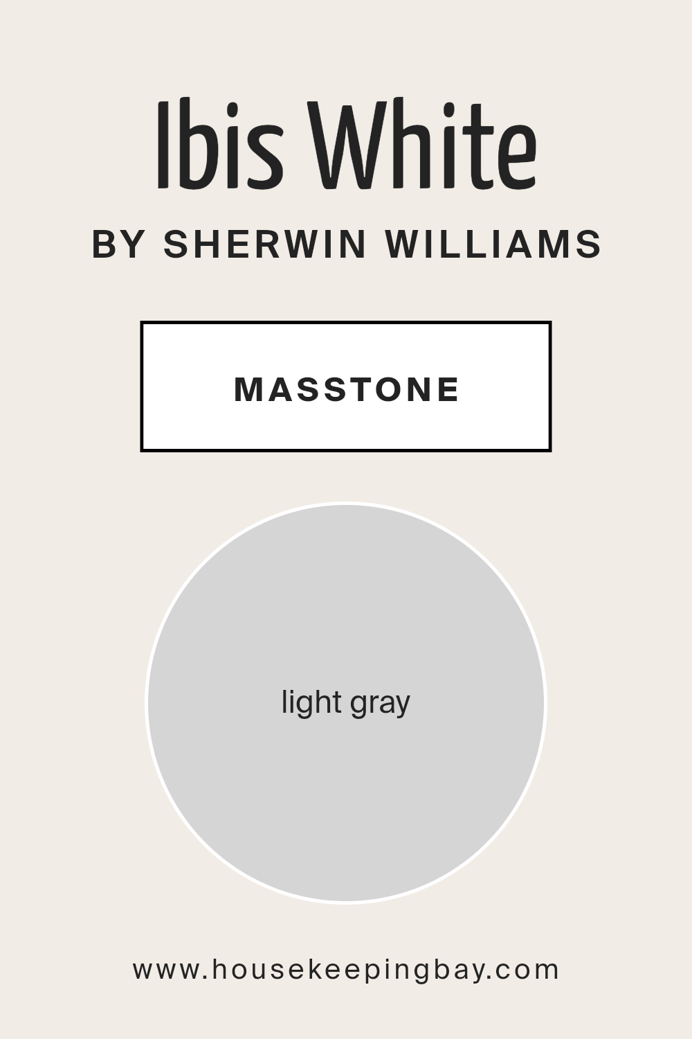
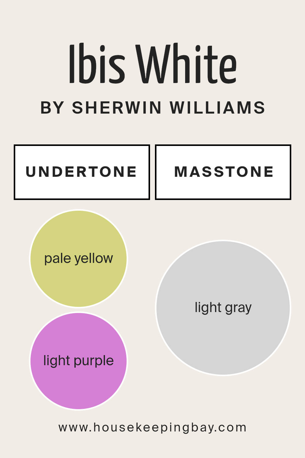
What is the Masstone of the Ibis White SW 7000 by Sherwin Williams?
Ibis White SW 7000 by Sherwin Williams, with its masstone of light gray (#D5D5D5), embodies a serene and sophisticated shade that transcends traditional white. This nuanced color strikes a delicate balance, harmonizing both cool and warm elements, making it an incredibly versatile choice for homes.
Its light gray masstone offers a subtle depth that can enhance spaces with a fresh, airy feel without the starkness sometimes associated with pure white. This quality allows Ibis White to work beautifully in a variety of lighting conditions, reflecting natural light to brighten rooms while maintaining a cozy, inviting atmosphere during the evening.
This color’s adaptability makes it an excellent backdrop for various design styles, from minimalist and contemporary to rustic and traditional. It serves as a gentle canvas that can either stand alone, exuding simplicity and elegance, or act as a foundation for layering textures and colors, highlighting architectural features without overwhelming the space.
Additionally, Ibis White’s understated hue complements various materials, such as wood, metal, and stone, offering endless possibilities for creating harmonious, balanced interiors. By choosing Ibis White SW 7000, homeowners can achieve a timeless aesthetic that gracefully accommodates evolving tastes and trends.
housekeepingbay.com
Undertones of Ibis White SW 7000 by Sherwin Williams
Ibis White SW 7000 by Sherwin Williams is a captivating color that, at first glance, presents itself as a pristine, neutral white. However, upon closer examination, its true complexity is revealed through subtle undertones of pale yellow (#D5D580) and light purple (#D580D5). These undertones are not overtly visible but quietly influence the character and perception of Ibis White, adding depth and an unexpected warmth to its primarily neutral palette.
The concept of undertones is crucial in the world of color and design, as they significantly affect how a color appears under different lighting conditions and in various contexts. Undertones can make a color appear cooler or warmer and can even shift the mood of a room.
For Ibis White, the pale yellow undertone injects a soft, sunny warmth into spaces, making them feel more inviting and cozy. On the other hand, the light purple undertone introduces a hint of cool sophistication, providing a balancing effect that ensures the color maintains a neutral stance, adaptable to a multitude of decorative styles.
When applied to interior walls, Ibis White SW 7000 transforms spaces in a nuanced manner. In rooms with abundant natural light, the pale yellow undertones might become more pronounced, creating a bright and airy ambiance. Conversely, in spaces with limited natural light or during the evening hours under artificial lighting, the light purple undertones could emerge, lending a subtle, elegant coolness.
This interplay of undertones allows Ibis White to adapt seamlessly to different settings and decor, making it an exceptionally versatile choice for creating nuanced and sophisticated interior spaces.
housekeepingbay.com
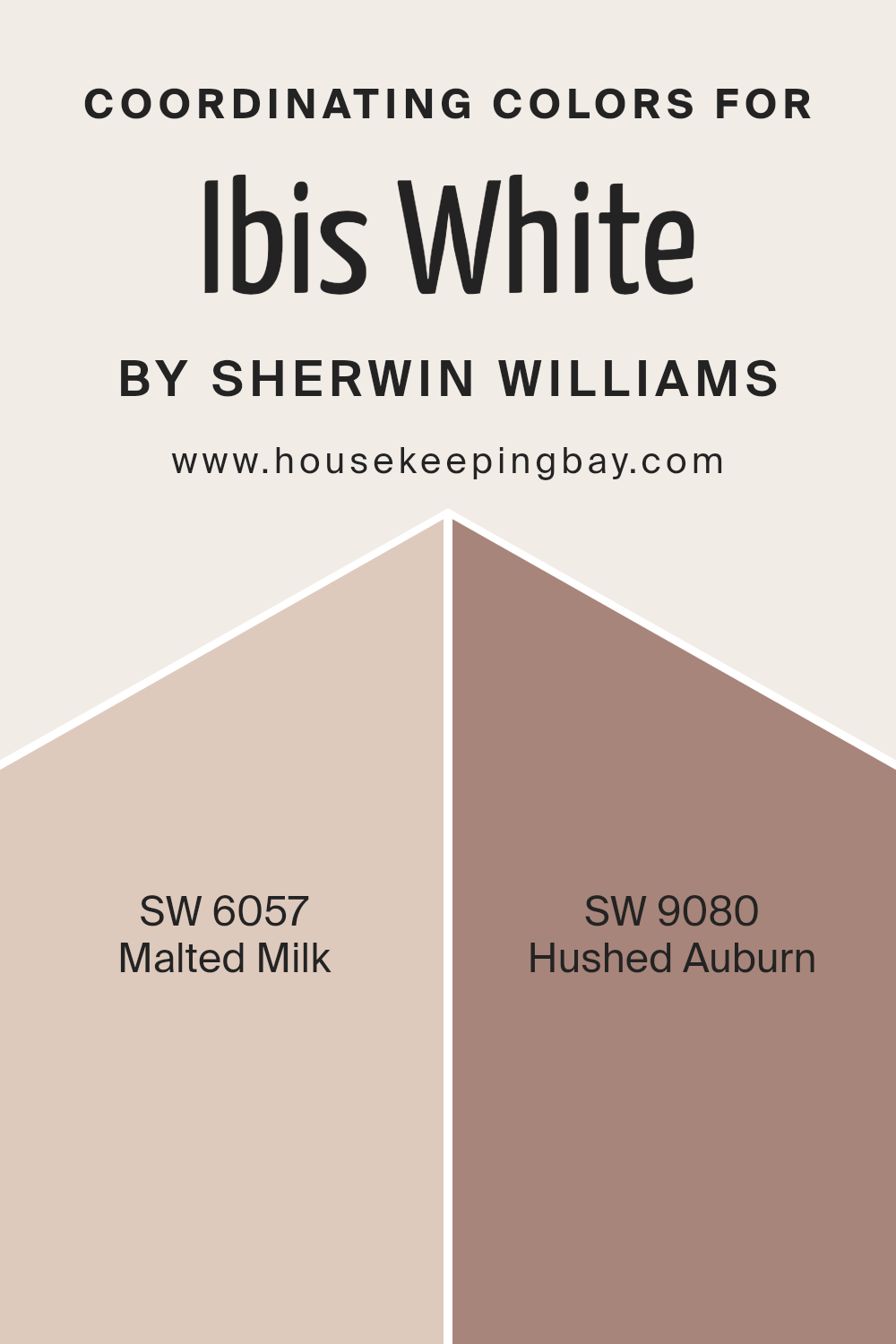
Coordinating Colors of Ibis White SW 7000 by Sherwin Williams
Coordinating colors are hues that complement each other when used together in interior design or art, creating a cohesive and visually appealing palette. These colors are selected based on their positions on the color wheel, their levels of saturation, and their values, aiming to enhance the beauty and balance of a space.
When dealing with a base color like Ibis White (SW 7000) by Sherwin Williams, a pristine and versatile shade, finding the right coordinating colors can significantly impact the overall aesthetic. Ibis White serves as an excellent backdrop, offering a neutral canvas that pairs wonderfully with a variety of shades due to its clean and understated elegance.
In this context, SW 6057 – Malted Milk and SW 9080 – Hushed Auburn are superb choices as coordinating colors for Ibis White. Malted Milk is a soft, warm hue that resembles the comforting, creamy consistency of its namesake. This color brings a gentle depth to rooms, avoiding stark contrasts against the serene backdrop of Ibis White, and infusing spaces with a cozy ambiance. On the other hand, Hushed Auburn is a deeper, more saturated shade that offers a bold but harmonious contrast.
This color draws inspiration from the rich, muted reds found in nature, providing a sophisticated punch that complements the neutrality of Ibis White. Together, these coordinating colors create a refined and inviting palette that pairs well with the softness of Ibis White, enabling a variety of design styles from understated elegance to more dynamic and contrasting interiors.
You can see recommended paint colors below:
- SW 6057 Malted Milk
- SW 9080 Hushed Auburn
housekeepingbay.com
How Does Lighting Affect Ibis White SW 7000 by Sherwin Williams?
Lighting plays a crucial role in how we perceive color, altering both its intensity and hue. The characteristics of light, whether natural or artificial, can dramatically transform our perception of color in any given space.
For a specific shade like Ibis White SW 7000 by Sherwin-Williams, these transformations can be particularly noticeable, given its light and versatile nature.
- In Natural Light: Ibis White, under the spectrum of natural light, can exhibit subtle changes throughout the day. In the soft morning light coming from an east-facing room, this color will appear warm and inviting, leaning towards its creamy undertones. As the day progresses, the intensity of the natural light will directly affect the vibrancy and purity of Ibis White, showcasing its true color in midday. In a west-facing room, the late afternoon light brings a golden glow, making Ibis White appear warmer and cozier, enhancing its welcoming nature.
- In Artificial Light: Under artificial lighting, the type of bulb used (LED, incandescent, fluorescent) significantly impacts how Ibis White is displayed. LED lights, which can range from warm to cool, may maintain the color’s true essence or push it towards cooler undertones. Incandescent bulbs will highlight the warmth in Ibis White, making it appear more buttery. Fluorescent lighting, generally cooler, can cast a slightly bluish tone over the color, pulling out its cooler undertones and making it appear starker.
- North-Faced Rooms: These rooms receive less direct sunlight, often resulting in a cooler, somewhat shadowy light. Ibis White might appear slightly more subdued and cooler in these spaces, emphasizing its pure, crisp qualities without becoming too stark.
- South-Faced Rooms: Benefiting from plentiful daylight, south-faced rooms illuminate Ibis White, making it appear brighter and more radiant. The color can reflect the natural sunlight, maintaining its true characteristics or slightly amplifying its warmth.
- East-Faced Rooms: With the gentle warmth of the morning sun, east-faced rooms bring out the creamy, welcoming aspects of Ibis White, especially in the morning. As the natural light fades, the color may appear more neutral and true to its base in the evening.
- West-Faced Rooms: The intense afternoon and evening light in west-facing rooms can make Ibis White glow warmly, emphasizing its softer side and creating a cozy, inviting atmosphere.
Altogether, the interplay between lighting and the color Ibis White demonstrates how crucial it is to consider both natural and artificial light sources when choosing colors for a space. This understanding ensures the chosen hues perform beautifully under all conditions, harmonizing with the room’s orientation and the type of light it receives.
housekeepingbay.com
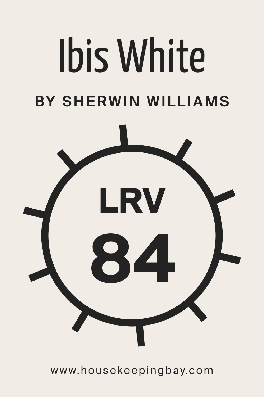
What is the LRV of Ibis White SW 7000 by Sherwin Williams?
Light Reflectance Value (LRV) is a measure used to quantify the percentage of visible and usable light that a paint color reflects in a space. Ranging from 0%, which means no light is reflected and corresponds to absolute black, to 100%, indicating total reflection almost like a perfect mirror, LRV plays a crucial role in understanding how a color will look and feel in a given area.
The LRV affects not only the brightness of the color but also the atmosphere it creates; lighter colors can make spaces appear larger and more open, while darker shades create a feeling of coziness but may make a room seem smaller.
Additionally, the LRV can have practical implications in terms of energy efficiency, with higher LRV colors potentially reducing the need for artificial lighting and contributing to cooler indoor temperatures.
With an LRV of 84.425, Ibis White SW 7000 by Sherwin Williams is on the higher end of the reflectance scale. This means the color is capable of reflecting a significant amount of light, making it an excellent choice for creating a bright and airy feel in a room.
In spaces with plenty of natural light, Ibis White will look exceptionally vibrant, enhancing the feeling of openness and making the room appear more spacious. However, in artificially lit or naturally darker spaces, this high LRV may cause the color to appear differently, possibly cooler or slightly more subdued than in bright sunlight.
Therefore, when using Ibis White, considering the room’s lighting conditions and exposure is crucial to achieving the desired effect, as the high LRV significantly influences the color’s appearance and the overall ambiance of the space.
housekeepingbay.com
What is LRV? Read It Before You Choose Your Ideal Paint Color
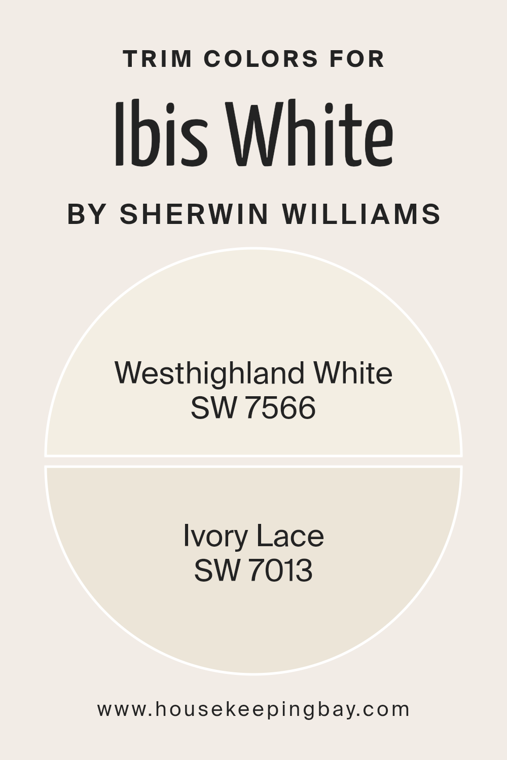
What are the Trim colors of Ibis White SW 7000 by Sherwin Williams?
Trim colors, such as SW 7566 – Westhighland White and SW 7013 – Ivory Lace, play a pivotal role in defining the aesthetic and architectural qualities of a space, especially when used alongside a primary color like Ibis White SW 7000 by Sherwin Williams.
These colors are strategically chosen to complement or subtly contrast with the wall color, thereby enhancing architectural details, creating depth, and framing the spatial elements effectively. The use of these specific trim colors can elevate the overall ambiance of a room, making it appear more cohesive, polished, and thoughtfully designed.
Westhighland White is a warm, inviting shade that provides a soft, subtle contrast to the crispness of Ibis White, making it ideal for creating a cozy and harmonious space. Its creamy undertones ensure a smooth transition between the wall color and the trim, adding a layer of sophistication without overshadowing the primary color.
On the other hand, Ivory Lace offers a slightly richer, more defined contrast to Ibis White, encapsulating elegance and a hint of vintage charm. This color is perfect for those looking to introduce a touch of classic aesthetics into their space, offering depth and character while maintaining a seamless visual flow.
You can see recommended paint colors below:
housekeepingbay.com
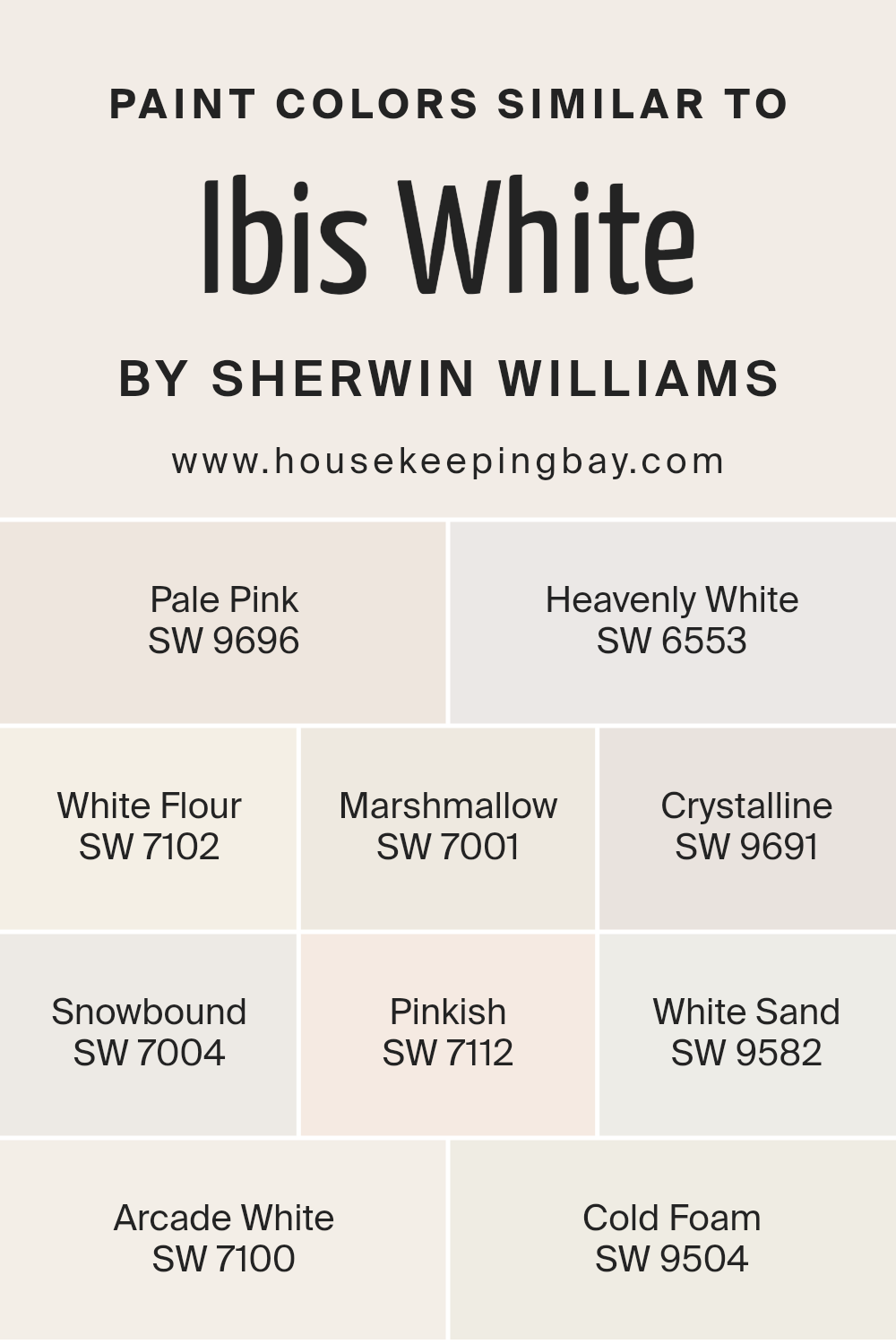
Colors Similar to Ibis White SW 7000 by Sherwin Williams
Selecting similar colors to Ibis White SW 7000 by Sherwin Williams can profoundly impact the aesthetic and emotional atmosphere of a space. These tones, which include shades like Pale Pink SW 9696 and Heavenly White SW 6553, work together to create a seamless transition in a color scheme, offering subtle shifts that can make a room feel more cohesive and harmoniously designed.
Utilizing colors like White Flour SW 7102 and Marshmallow SW 7001 alongside Ibis White, for example, can add depth and texture to a space without the stark contrasts that come with more divergent color choices.
By including shades such as Crystalline SW 9691 and Snowbound SW 7004, designers and homeowners can infuse a room with a gentle flow of light and shadow, enhancing its overall feel and mood without overwhelming it with color.
Similar colors such as Pinkish SW 7112 and White Sand SW 9582 provide soft, almost imperceptible accents that enrich the space with layers of visual interest. Arcade White SW 7100 and Cold Foam SW 9504, meanwhile, offer the possibility of introducing a nuanced contrast, ensuring that the overall design remains refreshing and lively.
Integrating these colors creates an environment that feels thoughtfully curated and exquisitely balanced. Each hue, despite its subtle distinctions, contributes to a collective aesthetic that enhances the sense of space and light within a room, making it appear more open, airy, and inviting.
You can see recommended paint colors below:
- SW 9696 Pale Pink
- SW 6553 Heavenly White
- SW 7102 White Flour
- SW 7001 Marshmallow
- SW 9691 Crystalline
- SW 7004 Snowbound
- SW 7112 Pinkish
- SW 9582 White Sand
- SW 7100 Arcade White
- SW 9504 Cold Foam
housekeepingbay.com
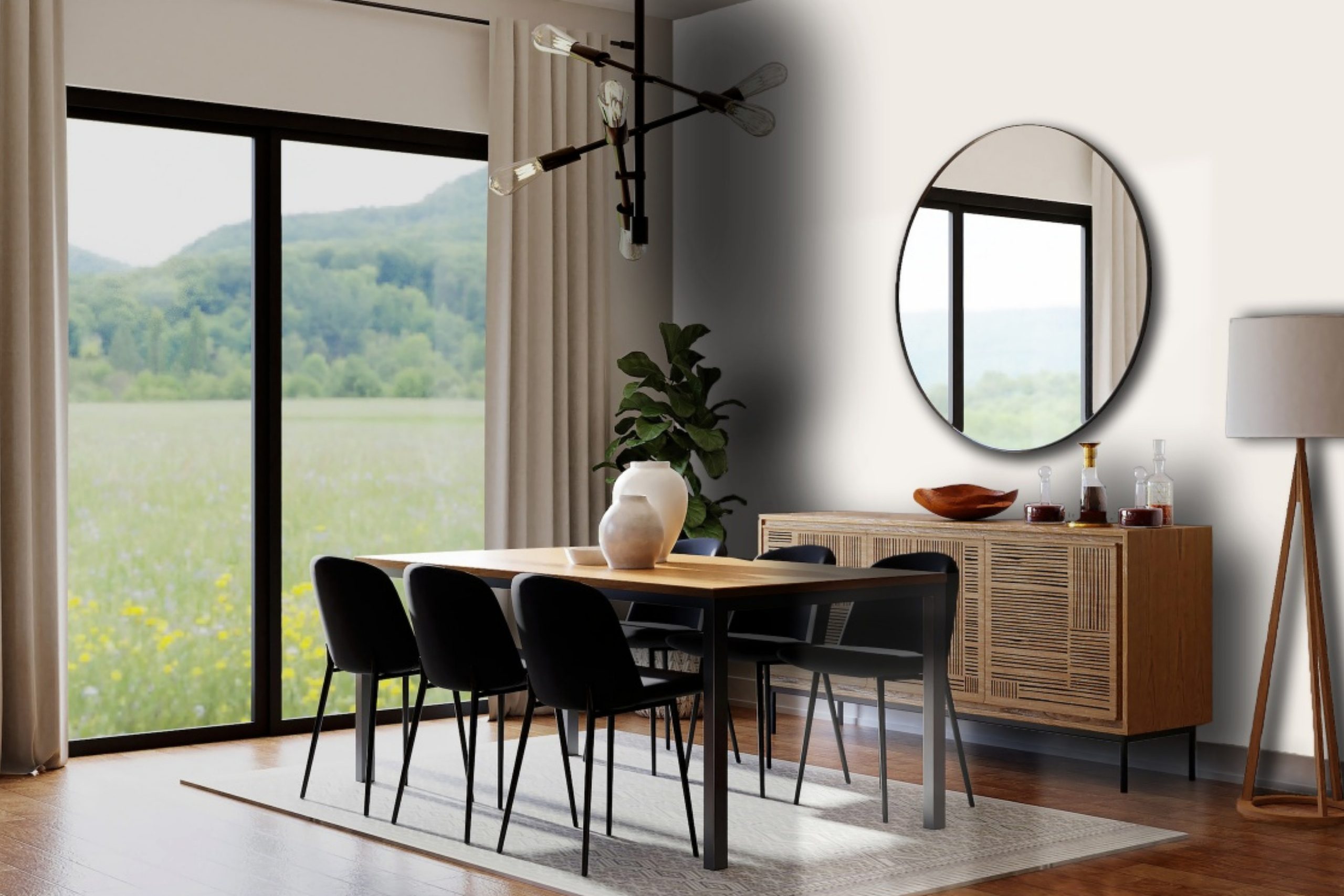
How to Use Ibis White SW 7000 by Sherwin Williams In Your Home?
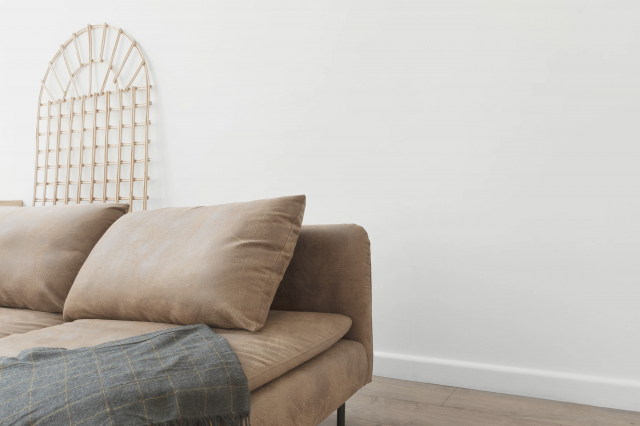
Ibis White SW 7000 by Sherwin Williams is a classic and versatile shade that brings a subtle, sophisticated brightness to any space it adorns. As a paint color, it embodies purity and simplicity, making it an ideal choice for homeowners looking to infuse their interiors with a serene and airy feel.
Its soft, warm undertones allow it to complement a wide range of decor styles, from minimalist modern to cozy farmhouse, ensuring it can seamlessly integrate into any home.
Using Ibis White in your home can revitalize and enlarge spaces, making rooms appear more open and bright. It’s perfect for walls in living areas where natural light can enhance its warm undertones, creating a welcoming and comfortable ambiance. In smaller, less illuminated spaces like bathrooms or corridors, Ibis White can help reflect light, making these areas appear more spacious.
For a cohesive look, pair it with contrasting or tonal hues in furnishings and textiles. Additionally, it serves as an excellent backdrop for art, providing a subtle contrast that makes colors pop without overwhelming the space. Whether used as a main color theme or accent, Ibis White SW 7000 offers a timeless elegance that can elevate any home’s aesthetic.
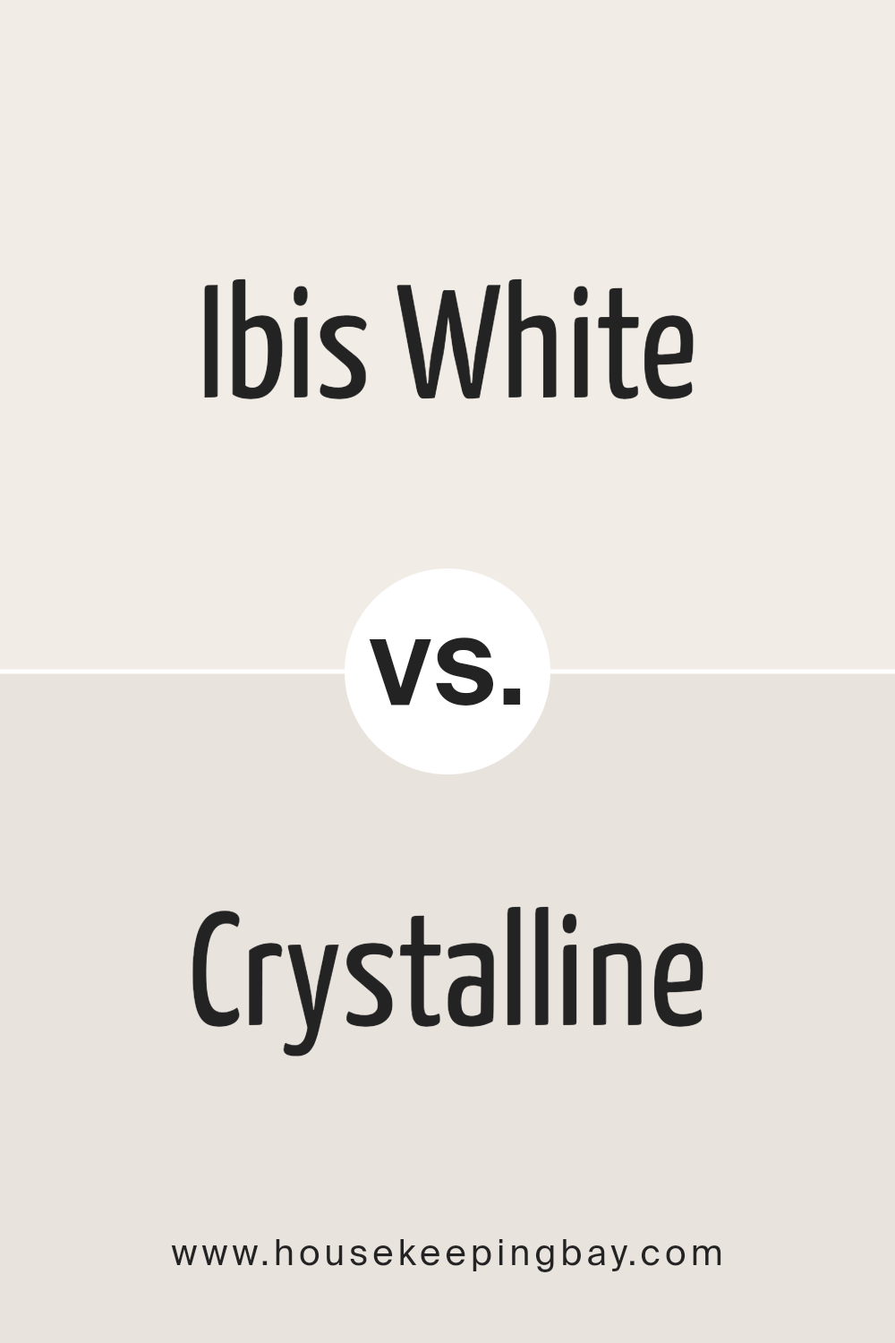
Ibis White SW 7000 by Sherwin Williams vs Crystalline SW 9691 by Sherwin Williams
Ibis White SW 7000 and Crystalline SW 9691, both from Sherwin Williams, present two unique takes on white hues, each with its own distinctive character.
Ibis White is a warm, soft white that imbues spaces with a subtle, inviting glow. It leans towards a creamy side, making it ideal for creating a cozy and welcoming ambiance. This color works well in spaces that aim for a classic, timeless look, providing a neutral backdrop that pairs effortlessly with a wide range of decor styles and colors.
Crystalline, on the other hand, is a cooler, crisp white with a slight blue undertone. This hue lends a fresh, clean look to any space, echoing the clarity of natural light. It’s perfect for achieving a modern, airy feel, especially in areas that benefit from a sense of openness and serenity. Crystalline’s slight blue tint helps it stand out, giving it a more vibrant, energizing quality compared to the softer, more muted presence of Ibis White.
Despite both being white, Ibis White’s warmth and Crystalline’s cool crispness offer distinct options for decorating: one for those seeking comfort and tradition, and the other for a more contemporary, minimalist approach.
You can see recommended paint color below:
- SW 9691 Crystalline
housekeepingbay.com
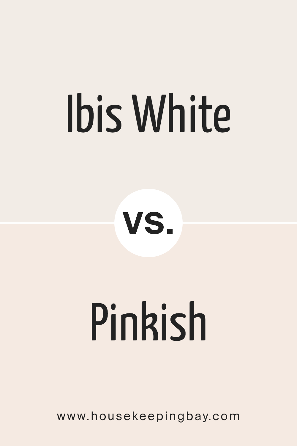
Ibis White SW 7000 by Sherwin Williams vs Pinkish SW 7112 by Sherwin Williams
Ibis White SW 7000 and Pinkish SW 7112 by Sherwin Williams, though they share a subtle warmth, possess distinct characteristics that cater to varied aesthetic preferences. Ibis White, with its serene and pure appearance, embodies a classic sophistication.
This hue provides a crisp, clean backdrop that enhances natural light in a space, making it feel more open and airy. Its versatility allows it to seamlessly integrate into a wide range of color schemes, making it an excellent choice for creating a timeless interior.
On the other hand, Pinkish SW 7112 offers a gentle nudge towards color, introducing a soft, romantic warmth that subtly enriches a room without overwhelming it. This hue leans towards a more nuanced expression, perfect for spaces that aim to evoke comfort and a touch of whimsy.
The color’s understated vibrancy brings a cozy, inviting atmosphere to interiors, making it ideal for bedrooms or living areas where a sense of tranquility is desired.
In essence, while Ibis White exudes an elegant simplicity ideal for creating bright, airy spaces, Pinkish delves into a tender, more expressive warmth, offering a comforting embrace through its subtle coloration.
You can see recommended paint color below:
- SW 7112 Pinkish
housekeepingbay.com
Ibis White SW 7000 by Sherwin Williams vs White Sand SW 9582 by Sherwin Williams
Ibis White SW 7000 and White Sand SW 9582 by Sherwin-Williams are two shades that at first glance may seem quite similar, both residing within the territory of off-whites, yet they bear distinct characteristics upon closer inspection. Ibis White is a soft, warm white with a subtle, creamy undertone that exudes a sense of calm and elegance, ideal for creating a welcoming and serene space.
It reflects light beautifully, making it a perfect choice for rooms that aim for a bright and airy feel. On the other hand, White Sand SW 9582 leans towards a slightly cooler palette, embodying a more neutral tone with hints of gray.
This color presents a contemporary vibe, offering a clean and minimalistic look without feeling stark or cold. It can serve as a versatile backdrop for various design styles, enhancing both modern and traditional spaces.
When comparing these two, the choice between Ibis White and White Sand hinges on the desired atmosphere and lighting conditions of a room, with Ibis White offering warmth and White Sand offering neutrality.
You can see recommended paint color below:
housekeepingbay.com
Ibis White SW 7000 by Sherwin Williams vs Arcade White SW 7100 by Sherwin Williams
Ibis White SW 7000 and Arcade White SW 7100 by Sherwin Williams are both elegant white hues, yet they offer subtly distinct undertones and atmospheres when applied to interior spaces. Ibis White can be described as a soft, warm white with a gentle, almost imperceptible beige undertone.
This hue exudes a welcoming and serene vibe, making it ideal for creating a cozy and inviting atmosphere in living rooms, bedrooms, or entryways. It pairs beautifully with a wide range of colors, from soft pastels to rich, dark tones, thanks to its versatile, warm base.
On the other hand, Arcade White leans towards a crisper, brighter white with a slight cool undertone. This makes it exceptionally suitable for modern, minimalist spaces where the aim is to achieve a sharp, clean aesthetic. Arcade White reflects natural light beautifully, enhancing the sense of space and openness in a room. It is perfect for kitchens, bathrooms, or any space that benefits from a fresh, vibrant feel.
In summary, Ibis White offers warmth and coziness with its beige undertones, ideal for inviting, softer spaces, while Arcade White delivers clarity and freshness, suitable for crisp, modern designs. Each brings its unique character to interiors, influenced largely by their subtle yet distinct undertones.
You can see recommended paint color below:
- SW 7100 Arcade White
housekeepingbay.com
Ibis White SW 7000 by Sherwin Williams vs Snowbound SW 7004 by Sherwin Williams
Ibis White SW 7000 and Snowbound SW 7004 by Sherwin Williams are two captivating neutrals that both reflect an airy and sophisticated feel within a space. Ibis White stands out as a soft, warm white with subtle hints of beige, creating a welcoming and cozy atmosphere. This color emanates a gentle calmness and is versatile in complementing various decor styles, highlighting the warmth in natural light and adding a serene touch to interiors.
In contrast, Snowbound SW 7004 leans towards a cooler spectrum compared to Ibis White. It is a light gray with slight undertones of beige, ensuring it maintains warmth while offering a crisp, clean appearance. Snowbound serves as an excellent backdrop for a minimalist or contemporary space, providing a modern touch without feeling stark or cold. It enhances the feeling of openness and purity in a room.
Though both colors share a base of being neutral, the key distinction lies in their undertones and the warmth they bring to a space. Ibis White, with its warm beige influences, offers coziness and comfort, while Snowbound, with its cooler, subtle gray tones, introduces a sleek and fresh dynamic.
Choosing between them depends on the desired mood and temperature for the room. You can see recommended paint color below:
housekeepingbay.com
Ibis White SW 7000 by Sherwin Williams vs Pale Pink SW 9696 by Sherwin Williams
Ibis White SW 7000 and Pale Pink SW 9696 by Sherwin Williams present a subtle and sophisticated contrast in hues that both share a rooted elegance yet express their uniqueness in a serene manner. Ibis White, despite its name, is not a stark white; rather, it has a warm undertone that makes it versatile and inviting, perfect for creating a bright and airy feel in any space. It acts as a neutral backdrop, adaptable to various décor styles and color schemes, emphasizing natural light and space.
On the other hand, Pale Pink SW 9696 offers a gentle whisper of color. This shade exudes softness and warmth, bringing a touch of femininity and comfort without overwhelming a space. It is incredibly subtle, almost acting as a neutral itself, which allows it to complement a wide range of palettes while introducing a hint of color.
Together, Ibis White and Pale Pink create a harmonious blend, perfect for spaces aiming for a soft, minimalist aesthetic. Their combination provides a backdrop of warmth and tranquility, with Pale Pink adding depth and interest against the crispness of Ibis White, making them an ideal pair for achieving a nuanced and inviting interior.
You can see recommended paint color below:
- SW 9696 Pale Pink
housekeepingbay.com
Ibis White SW 7000 by Sherwin Williams vs Marshmallow SW 7001 by Sherwin Williams
Ibis White SW 7000 and Marshmallow SW 7001, both by Sherwin Williams, are two nuanced shades that share a common palette but differentiate subtly in tone and warmth. Ibis White is a crisp, bright white with a cool undertone that reflects light beautifully, making spaces feel open and airy.
Its purity can act as a versatile backdrop, offering a clean slate for any interior or exterior application. On the other hand, Marshmallow SW 7001 leans slightly towards a warmer spectrum with a soft, creamy undertone, imparting a sense of coziness and comfort.
This inviting hue can enhance spaces with a more intimate, welcoming ambiance, ideal for living areas or bedrooms seeking a gentle touch of warmth. While both colors are remarkably similar, their slight tonal differences dictate their best use cases: Ibis White for a sharp, contemporary feel, and Marshmallow for a subtle, homely vibe.
Choosing between them depends on the desired mood and lighting of the space, with each offering its unique charm and character.
You can see recommended paint color below:
housekeepingbay.com
Ibis White SW 7000 by Sherwin Williams vs Cold Foam SW 9504 by Sherwin Williams
Ibis White SW 7000 and Cold Foam SW 9504 by Sherwin Williams are two distinct shades that cater to different aesthetic preferences within neutral palettes. Ibis White stands out as a warm, inviting hue that carries a soft touch of creaminess, making it a perfect choice for spaces intended to exude comfort and serenity. It has a gentle luminosity that reflects natural light beautifully, enhancing spaces with a cozy, yet bright ambiance. This versatility allows it to be used in a multitude of settings, ranging from modern to classic interior designs.
On the other hand, Cold Foam SW 9504 leans towards a cooler spectrum, offering a crisp and clean appearance. This color embodies a minimalist elegance, with a subtle sophistication that makes it ideal for contemporary, sleek spaces. It has the unique ability to make rooms feel more spacious and refreshed, owing to its slight blue undertones that evoke a feeling of calm and tranquility.
The choice between Ibis White and Cold Foam ultimately depends on the desired atmosphere of a room. While Ibis White brings warmth and a soft, welcoming feel, Cold Foam delivers a modern, chic look with a crisp, airy vibe. Both colors showcase the versatility of neutrals but cater to different emotional and aesthetic outcomes within interior spaces.
You can see recommended paint color below:
housekeepingbay.com
Ibis White SW 7000 by Sherwin Williams vs Heavenly White SW 6553 by Sherwin Williams
Ibis White SW 7000 and Heavenly White SW 6553, both by Sherwin Williams, offer subtle yet distinctive takes on white, shaping the atmosphere of a space with their unique undertones and character. Ibis White leans towards a soft, neutral white that doesn’t veer too cold or warm. Its balanced undertone makes it remarkably versatile, enabling it to complement a wide range of color palettes and design styles. This quality allows Ibis White to act as a seamless backdrop in a myriad of settings, from modern to traditional, without overpowering the elements it accompanies.
Heavenly White, on the other hand, carries a slightly warmer undertone, imbuing spaces with a cozy, welcoming vibe. This warmth makes it particularly well-suited for living areas and bedrooms, where a sense of comfort is paramount.
Despite its inviting warmth, Heavenly White maintains a level of subtlety that prevents it from skewing too yellow, ensuring it remains a refined choice for those seeking a hint of coziness in their whites.
While both colors share a family resemblance, their distinct undertones offer nuanced options for designers and homeowners aiming to capture the perfect white for their space. Ibis White is the choice for a crisp, clean look that adapts flexibly, while Heavenly White is ideal for creating a warmer, more enveloping atmosphere.
You can see recommended paint color below:
- SW 6553 Heavenly White
housekeepingbay.com
Ibis White SW 7000 by Sherwin Williams vs White Flour SW 7102 by Sherwin Williams
Ibis White SW 7000 and White Flour SW 7102, both by Sherwin Williams, share a common palette foundation but differ subtly in tone and warmth, making them suitable for various design preferences and lighting conditions. Ibis White is reminiscent of the delicate hues of an Ibis’s plumage, providing a clean, pure backdrop with a slight coolness that implies a minimalist chic or a sleek modernity. It thrives in spaces abundant with natural light, enhancing a crisp, radiant ambience.
Conversely, White Flour SW 7102 leans towards a softer, warmer direction, evoking the comforting, creamy shade of white found in its namesake. This color is exceptionally versatile, capable of adding a cozy, inviting feel to rooms with less natural light or complementing spaces aiming for a traditional, serene aesthetic.
The warmth of White Flour makes it an ideal choice for living areas, bedrooms, or any space where a gentle, nurturing atmosphere is desired.
When choosing between Ibis White and White Flour, consider the room’s lighting, intended mood, and accompanying decor. Ibis White suits those seeking a modern, crisp edge, while White Flour is perfect for creating a soft, welcoming retreat.
You can see recommended paint color below:
housekeepingbay.com
Conclusion
Ibis White SW 7000 by Sherwin-Williams is a sophisticated and versatile paint color that brings a fresh, airy feel to any space. This shade of white stands out for its subtle warmth, making it a popular choice for those looking to create a welcoming and serene ambiance in their homes or offices.
Unlike stark whites, Ibis White has a soft undertone that enhances natural light, thus brightening rooms without the harshness sometimes associated with pure white paints. Its ability to act as a neutral backdrop also means it can effortlessly complement a wide range of decor styles and color schemes, from minimalist aesthetics to more vibrant, eclectic looks.
The flexibility and timeless nature of Ibis White SW 7000 make it a go-to option for designers and homeowners aiming for a chic, cohesive look throughout their spaces. Whether used on walls, trim, cabinetry, or exterior siding, this color adds a layer of subtle elegance and opens up a multitude of decorating possibilities.
Its compatibility with both cool and warm tones allows for endless creativity in design, ensuring that spaces not only feel bigger and brighter but also exude a sense of calm and comfort. In summary, Ibis White by Sherwin-Williams proves to be more than just a simple paint color; it’s a transformative tool that offers durability and style, ensuring spaces remain timeless and inviting for years to come.
housekeepingbay.com
Ever wished paint sampling was as easy as sticking a sticker? Guess what? Now it is! Discover Samplize's unique Peel & Stick samples. Get started now and say goodbye to the old messy way!
Get paint samples