Clean Slate SW 9621 by Sherwin Williams
Revitalize Your Space with a Fresh Hue
In the world of paint and coatings, Sherwin Williams has continually set the bar high with its innovative and high-quality products. Among its impressive lineup, SW 9621 Clean Slate emerges as a standout choice for both professionals and DIY enthusiasts seeking a fresh, versatile shade that can transform any space.
This article delves into the nuances of Clean Slate, exploring its color palette, applications, and the inspiration behind its creation.With its soothing and neutral tone, SW 9621 Clean Slate offers a modern and minimalistic approach that complements a wide array of design aesthetics.
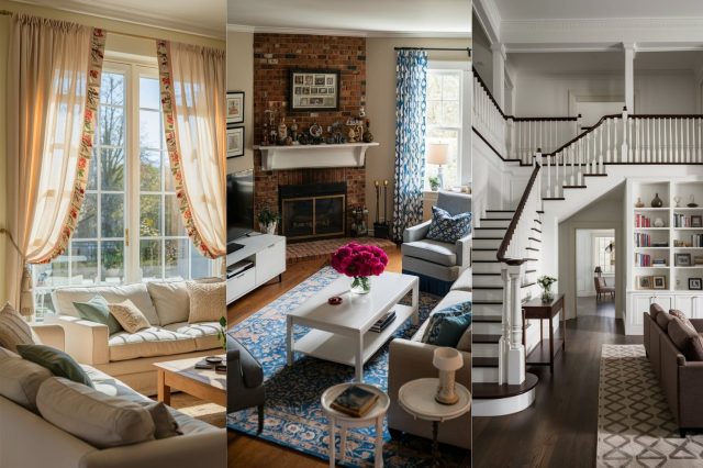
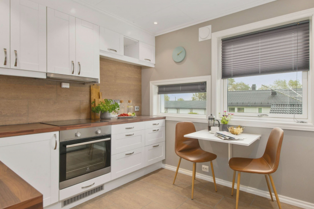
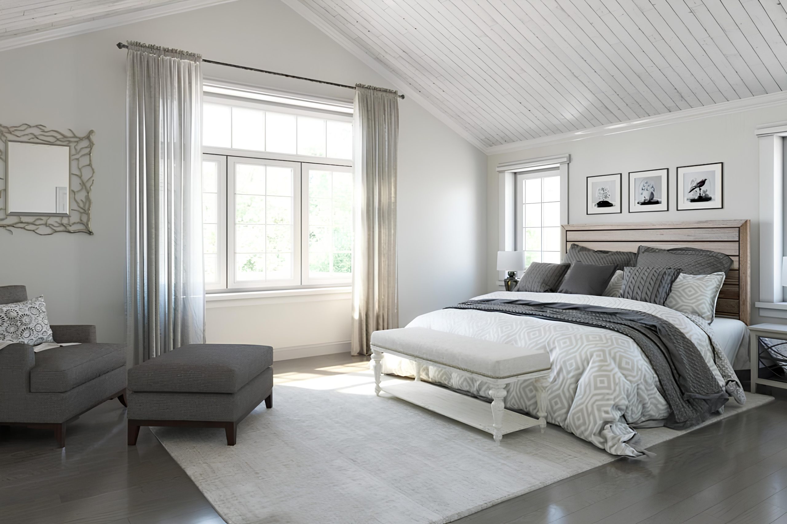
Whether you’re looking to revamp a cozy bedroom, a bustling kitchen, or an elegant living space, this color provides a sophisticated backdrop that enhances other design elements rather than overpowering them.
The article further discusses how Clean Slate performs in different lighting conditions, providing tips for achieving the desired ambiance in various settings.Moreover, the piece highlights Sherwin Williams’ commitment to sustainability and environmental responsibility, noting any eco-friendly attributes of the Clean Slate line.
By blending aesthetic appeal with practicality and ecological consciousness, SW 9621 Clean Slate is presented not just as a paint color but as a thoughtful choice for modern homeowners and designers alike.
vis sherwin-williams
What Color Is Clean Slate SW 9621 by Sherwin Williams?
Table of Contents
Clean Slate SW 9621 by Sherwin Williams emanates an essence of serene sophistication on any surface it graces. This color embodies a perfect blend of smoky charcoal and deep blue hues, making it reminiscent of the early evening sky just moments before dusk settles. Its balanced saturation ensures versatility, allowing it to act as either a compelling statement or a subtle backdrop in a variety of settings.
Ideal for creating an atmosphere of contemporary elegance, Clean Slate SW 9621 adapts flawlessly to modern, minimalist, industrial, and even Scandinavian interior styles. Its unique ability to pair with a wide array of materials and textures amplifies its appeal.
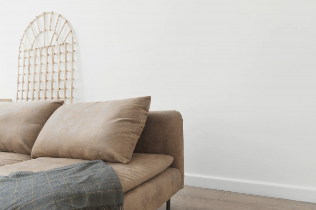
For a striking contrast, it can be paired with polished metals like stainless steel or chrome, bringing out a luxurious vibe in modern kitchens or bathrooms. When matched with natural wood tones, from light oak to rich walnut, Clean Slate evokes a warm, inviting ambiance suitable for living rooms or bedrooms. For textures, it harmonizes beautifully with soft linens, plush velvets, and the raw edges of leather, adding layers of depth and interest to the space.
Whether used as an accent wall to anchor a room or as a base for showcasing art and decorative pieces, Clean Slate SW 9621 is a versatile choice that supports a range of aesthetic visions, making it a premium pick for anyone looking to infuse their space with a touch of tranquil yet powerful sophistication.
housekeepingbay.com
Is Clean Slate SW 9621 by Sherwin Williams Warm or Cool color?
Clean Slate SW 9621 by Sherwin Williams is a captivating and versatile color that brings a fresh, modern, yet timeless appeal to any space within a home. As its name suggests, Clean Slate offers a foundational hue that can either stand alone with a sophisticated elegance or serve as a neutral backdrop for a myriad of design aesthetics, from minimalist to eclectic.
This color embodies a balanced blend of gray and blue tones, creating a serene and inviting atmosphere. In natural light, Clean Slate exudes a subtle vibrancy that makes living spaces feel more open and airy, while under artificial lighting, it can add depth and warmth, enhancing the coziness of a room.
The adaptability of Clean Slate SW 9621 lends itself to various home applications, from striking accent walls that demand attention to calming full-room tones that promote relaxation. Its compatibility with warm woods and metallic finishes allows homeowners and designers to experiment with different textures and materials, making Clean Slate a go-to choice for those looking to revitalize their space.
Regardless of the architectural style of the home, Clean Slate SW 9621 from Sherwin Williams is an excellent choice for creating a welcoming environment that feels both refreshed and enduring.
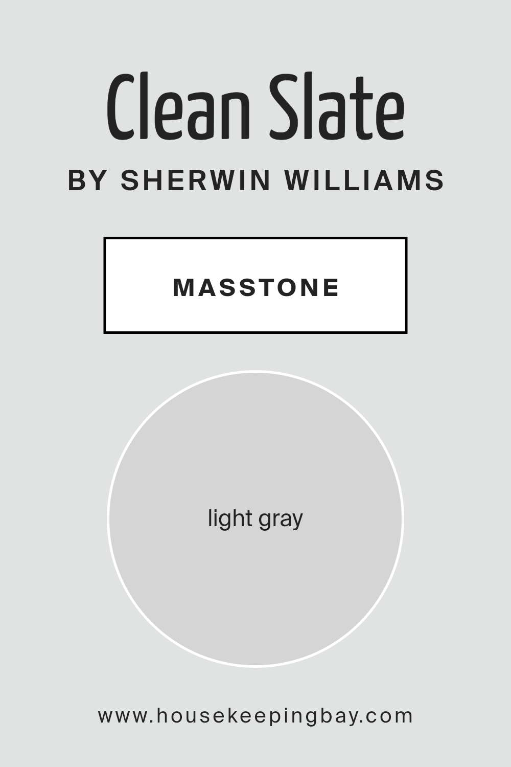
What is the Masstone of the Clean Slate SW 9621 by Sherwin Williams?
Clean Slate SW 9621 by Sherwin Williams, with its masstone of light gray (#D5D5D5), offers an incredibly versatile palette for home interiors. This particular shade of light gray serves as a perfect foundational color, blending seamlessly with a wide range of decor styles and color schemes.
Its neutrality ensures it can act as a backdrop to vibrant accessories and artwork, allowing them to stand out, or work in harmony with a minimalist aesthetic, promoting a sense of calm and spaciousness. In rooms with ample natural light, Clean Slate can appear almost ethereal, enhancing the brightness and giving the illusion of more space.
Conversely, in spaces with limited light, its inherent lightness helps avoid the heaviness that darker colors might introduce, still keeping the area feeling open and airy.
Due to its balanced undertones, it does not skew too warm or too cool, making it an ideal choice for creating a chic, cohesive look throughout the home.
housekeepingbay.com
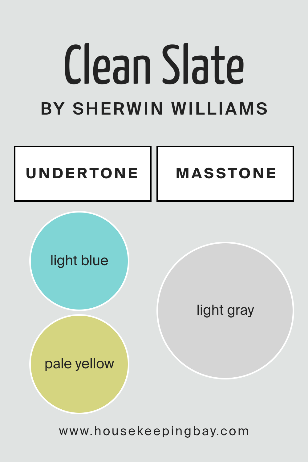
Undertones of Clean Slate SW 9621 by Sherwin Williams
Clean Slate SW 9621 by Sherwin-Williams is a captivating hue that, at first glance, presents itself as a sophisticated, muted base color. Yet, its complexity is revealed through its subtle undertones, which play a crucial role in its overall perception and application. The light blue and pale yellow undertones enrich this color, bringing a unique depth and versatility to its character.
Undertones fundamentally affect how we perceive color, acting almost like a silent language that nuances the primary hue. They can influence a color to appear cooler or warmer and shift dramatically under different lighting conditions.
The light blue undertone in Clean Slate adds a serene, calming effect, reminiscent of a clear sky on a crisp morning, promoting a sense of tranquility and openness. Conversely, the pale yellow undertone injects a gentle warmth, suggesting sunlight softly filtering through a window, adding coziness and brightness.
When applied to interior walls, Clean Slate SW 9621 transforms spaces with its dynamic interplay of undertones. In rooms with ample natural light, the pale yellow undertone becomes more pronounced, creating a welcoming atmosphere that invigorates the space. In cooler, less lit areas, the light blue undertone prevails, offering a soothing retreat that enlarges the perception of the room.
This duality makes Clean Slate an extremely adaptable color, capable of harmonizing with a wide range of decors and themes, from modern minimalist to rustic charm. The ability of these undertones to shift in dominance, based on lighting and surrounding elements, lends an ever-evolving beauty to interiors, ensuring that spaces remain engaging and fresh over time.
housekeepingbay.com
How Does Lighting Affect Clean Slate SW 9621 by Sherwin Williams?
Light plays a crucial role in how we perceive colors, significantly influencing their appearance in any given space. The perception of color is subject to the type and direction of light, altering its hue, brightness, and saturation. When considering a specific color like Clean SlateSW 9621 by Sherwin Williams, understanding how it interacts with various lighting conditions is essential for achieving the desired ambiance in a room.
In artificial light, the appearance of Clean SlateSW 9621 can vary greatly depending on the color temperature of the light source. Warm artificial lighting can imbue it with a softer, more inviting tone, enhancing its gray characteristics and making the space feel cozy.
Conversely, cooler artificial light can highlight blue undertones, presenting a crisper, more vibrant appearance. This duality makes Clean SlateSW 9621 a versatile color for interiors, capable of adapting to a range of lighting scenarios and design intentions.
Under natural light, Clean SlateSW 9621 transforms throughout the day. Morning light, which is softer and warmer, will reveal a gentle, muted version of the color. In contrast, the midday sun, known for its intensity and cooler quality, will accentuate its depth and complexity, potentially bringing out subtle undertones that are less visible at other times.
The orientation of a room further affects how Clean SlateSW 9621 is perceived:
- North-faced rooms receive less direct sunlight, emphasizing the cooler aspects of the color, making it appear more profound and saturated.
- South-faced rooms benefit from plentiful, warmer light, highlighting the warmer, softer side of the color, making it appear more vibrant and dynamic.
- East-faced rooms enjoy the morning light, which can make Clean SlateSW 9621 look softer and slightly warmer in the mornings but cooler and more shadowed as the day progresses.
- West-faced rooms are bathed in the warm, intense light of the afternoon sun, potentially casting a golden glow on Clean SlateSW 9621, thus accentuating its warmer characteristics and creating a cozy atmosphere by the end of the day.
In summary, Clean SlateSW 9621’s appearance is highly dependent on the lighting condition, with its perceived color shifting with the type of light (artificial or natural) and the room’s orientation, making it a highly adaptable color that can achieve various effects in interior spaces.
housekeepingbay.com
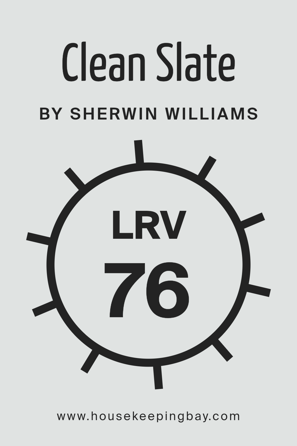
What is the LRV of Clean Slate SW 9621 by Sherwin Williams?
Light Reflectance Value (LRV) measures the percentage of light a paint color reflects from or absorbs into a surface. LRV is on a scale from 0 to 100, with 0 being absolutely black, absorbing all light, and 100 being pure white, reflecting all light.
This value is not just a mere number but a crucial factor in design, significantly influencing how colors appear in a given space. The LRV affects the atmosphere of a room, the appearance of its size, and the color’s visibility. High LRV colors are excellent for making spaces appear larger and brighter as they reflect more light.
Conversely, low LRV colors create a cozier, more intimate feel by absorbing light, making them ideal for large, well-lit areas where a more contained ambiance is desired.
The LRV of Clean Slate SW 9621 by Sherwin Williams, which stands at 76.354, indicates that it is a relatively light color, reflecting a significant amount of light. As such, when applied to walls, this color can make a room feel more spacious and airy.
The high LRV also means that Clean Slate SW 9621 will be highly influenced by natural and artificial lighting conditions, showing a range of nuances throughout the day. In brightly lit environments, it might appear almost white or very light gray, enhancing the room’s brightness and openness.
In areas with less light, the color will still help to maximize the available light, making it an excellent choice for spaces without ample natural light. This particular shade, with its high LRV, offers versatility and a refreshing backdrop, adapting well to various decorating styles and preferences.
housekeepingbay.com
What is LRV? Read It Before You Choose Your Ideal Paint Color
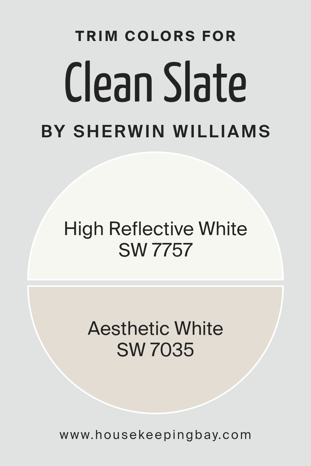
What are the Trim colors of Clean Slate SW 9621 by Sherwin Williams?
Trim colors, particularly in the context of a wall color like Clean Slate SW 9621 by Sherwin-Williams, play a crucial role in defining the visual aesthetic of a room. These colors, applied to elements such as door frames, window frames, skirting boards, and crown moldings, act as a visual frame for the wall color, enhancing its appearance and the overall ambiance of the space.
The right trim color can accentuate the depth and character of Clean Slate SW 9621, a sophisticated and serene shade, by providing contrast or harmony, depending on the desired effect. It serves not just a functional purpose of marking transitions and edges in a space but also adds to the decorative quality, bringing a polished look to the overall design.
Choosing High Reflective White SW 7757 or Aesthetic White SW 7035 as trim colors for Clean Slate SW 9621 brings their own unique benefits. High Reflective White is a brilliant, crisp white with high light reflectivity, making it an excellent choice to contrast with the deep, engaging tone of Clean Slate, thereby making the walls pop and giving the space a vibrant, dynamic edge.
On the other hand, Aesthetic White is a soft, warm white with a subtle beige undertone that offers a more harmonious transition from the walls to the trim. This color complements the serene and sophisticated nature of Clean Slate, creating a cohesive and inviting atmosphere.
Both choices underscore how the right trim color not only completes the look but also significantly enhances the aesthetic appeal and mood set by the base wall color.
You can see recommended paint colors below:
housekeepingbay.com
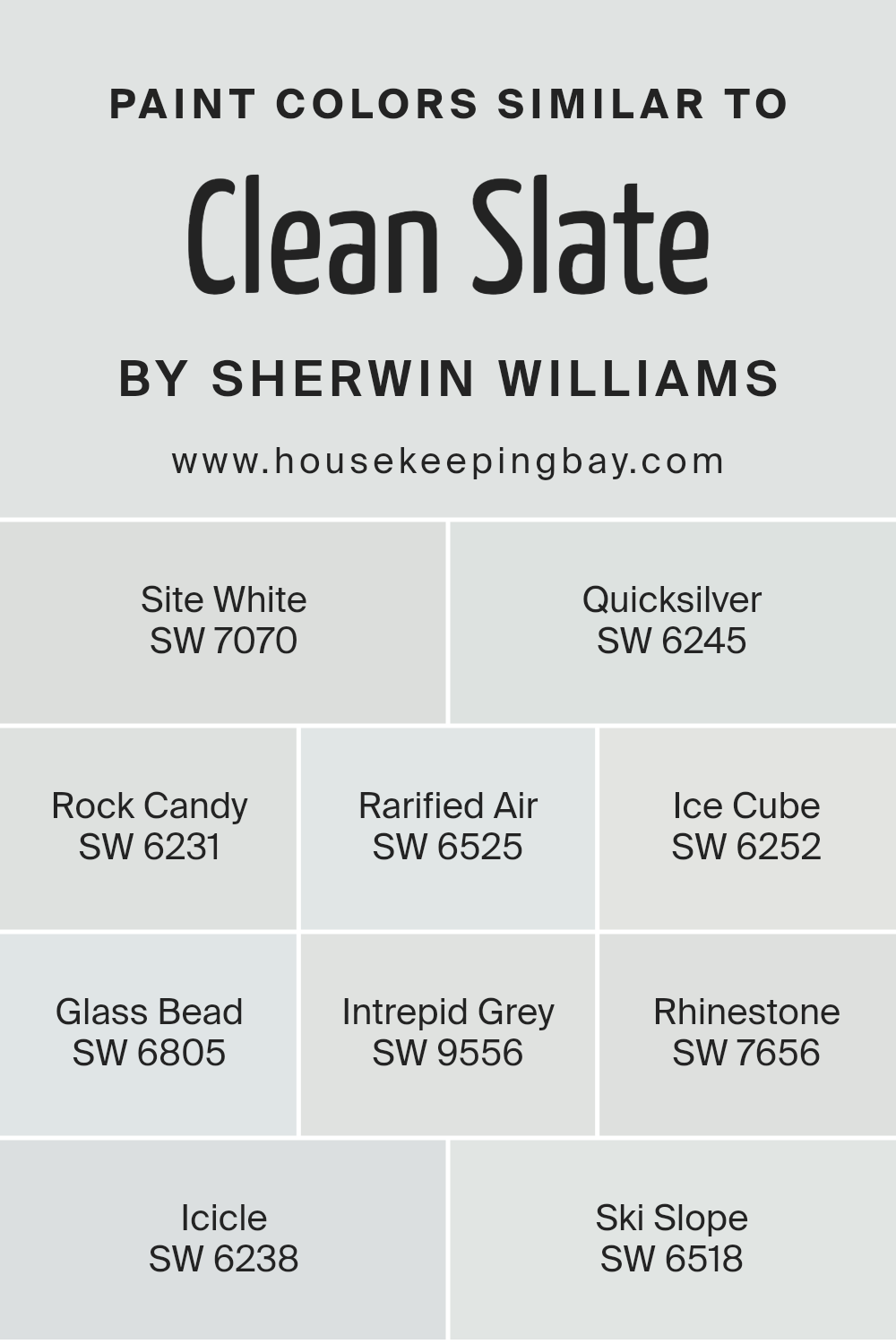
Colors Similar to Clean Slate SW 9621 by Sherwin Williams
When considering the intricate process of selecting paint colors for an area, understanding the importance of similar hues is crucial, especially when working with a base color like Clean Slate SW 9621 by Sherwin Williams. Similar colors, such as Site White SW 7070, Quicksilver SW 6245, Rock Candy SW 6231, Rarified Air SW 6525, Ice Cube SW 6252, Glass Bead SW 6805, Intrepid Grey SW 9556, Rhinestone SW 7656, Icicle SW 6238, and Ski Slope SW 6518, play a vital role in creating a cohesive and visually appealing space.
These colors work by providing subtle variations that can add depth, interest, and personality to a room without straying too far from the original color scheme, ensuring a harmonious blend that is pleasing to the eye.
For example, Site White offers a clean, airy backdrop that can make a room feel more spacious, while Quicksilver adds a slightly more dynamic, yet still soft, touch with its cooler undertones. Rock Candy provides a gentle wash of color, acting as a subtle nod to the original hue, whereas Rarified Air brings a breath of freshness with its light and soothing presence.
Ice Cube steps in with a hint of cool crispness, reflecting a serene and tranquil environment. Glass Bead dazzles with a delicate shimmer, suggesting a touch of elegance and openness. Intrepid Grey introduces a stronger character with its deeper tones, offering a grounding effect.
Rhinestone sparkles with its understated sophistication, making it a versatile companion. Icicle, with its frosty demeanor, echoes the lightness of Clean Slate, ensuring a seamless transition between shades. Lastly, Ski Slope caps off the collection with its wintry charm, adding a final layer of nuanced distinction to the palette. Each of these colors, while similar, brings its unique voice to the table, allowing for creative expression within a defined color family.
You can see recommended paint colors below:
- SW 7070 Site White
- SW 6245 Quicksilver
- SW 6231 Rock Candy
- SW 6525 Rarified Air
- SW 6252 Ice Cube
- SW 6805 Glass Bead
- SW 9556 Intrepid Grey
- SW 7656 Rhinestone
- SW 6238 Icicle
- SW 6518 Ski Slope
housekeepingbay.com
How to Use Clean Slate SW 9621 by Sherwin Williams In Your Home?
Clean Slate SW 9621 by Sherwin Williams is a captivating color that embodies the balance of sophistication and versatility, making it an excellent choice for those looking to infuse their living space with a sense of calm and elegance. This particular shade is a part of the Sherwin Williams Living Well™ collection, designed not only to beautify spaces but also to enhance well-being and comfort within the home.
Clean Slate’s subtle, neutral undertones provide a splendid backdrop for a range of interior designs, from minimalistic and modern to cozy and traditional. Its understated elegance encourages a sense of serenity and spaciousness, making it perfect for bedrooms, living rooms, and home offices where a peaceful atmosphere is desired.
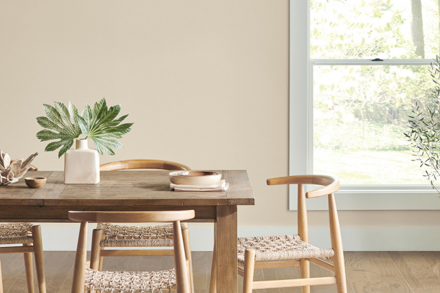
Homeowners can use Clean Slate SW 9621 to create an accent wall that adds depth and character to a room without overpowering it. Alternatively, applying it to all walls can transform a space into a tranquil retreat, ideal for relaxation and reflection. Complementing this shade with natural materials such as wood, stone, or woven textiles, along with plants, can enhance its organic feel.
Whether aiming for a sleek and contemporary look or a warm and inviting ambiance, Clean Slate provides a versatile foundation that can be tailored to reflect any personality or style, making any home feel more personalized and inviting.
Clean Slate SW 9621 by Sherwin Williams vs Ski Slope SW 6518 by Sherwin Williams
Clean Slate SW 9621 and Ski Slope SW 6518, both from Sherwin Williams, present an intriguing juxtaposition in the realm of color palettes. Clean Slate is a deep, nuanced blend that evokes the feeling of a serene, shadowed stone, offering a sense of grounded stability and subtle sophistication.
Its rich undertones can contribute to an ambiance of refined elegance in a space, making it an ideal choice for areas that aim to express a contemporary yet timeless aesthetic. On the other hand, Ski Slope embodies a softer, more delicate vibe, reminiscent of the frosted peaks of a winter landscape.
This lighter, almost ethereal shade provides a fresh, airy feel to interiors, promoting a sense of openness and light. When contrasted, these two shades highlight a dance between the profound depth of Clean Slate’s near-charcoal essence and the uplifting brightness of Ski Slope’s gentle hue, offering diverse options for creating depth and interest in interior design schemes.
You can see recommended paint color below:
- SW 6518 Ski Slope
housekeepingbay.com
Clean Slate SW 9621 by Sherwin Williams vs Intrepid Grey SW 9556 by Sherwin Williams
Clean Slate SW 9621 and Intrepid Grey SW 9556, both by Sherwin Williams, present two beautifully nuanced options within the realm of contemporary grays. Clean Slate is a deeper, more profound gray that evokes a sense of sophistication and strength.
Its rich tone can create an impactful presence in a space, offering a backdrop that both stands out and seamlessly integrates with a variety of decor styles. In contrast, Intrepid Grey leans towards a lighter, softer gray with an inherent versatility that embodies tranquility and an airy spaciousness.
Its gentler hue attracts natural light, making it ideal for smaller spaces or rooms aiming for a relaxed, open atmosphere. While Clean Slate offers depth and drama, Intrepid Grey provides a serene and inviting calm. Both colors showcase the diversity and adaptability of gray, though they each serve best in environments that align with their unique characteristics; Clean Slate thriving in bold, dynamic settings and Intrepid Grey in those seeking a light, peaceful ambiance.
You can see recommended paint color below:
housekeepingbay.com
Clean Slate SW 9621 by Sherwin Williams vs Rhinestone SW 7656 by Sherwin Williams
Clean Slate SW 9621 and Rhinestone SW 7656 by Sherwin Williams are two distinct shades that cater to different aesthetic preferences and design needs. Clean Slate presents as a deep, rich gray with cool undertones, offering a sense of sophistication and depth.
This color is potent enough to make a statement on its own, making it ideal for accent walls or rooms seeking a moody, immersive feel. In contrast, Rhinestone operates at the other end of the spectrum. It is a light, airy gray with subtle cool undertones, exuding an almost ethereal vibe.
This lighter shade can help to brighten a room, making it feel more spacious and open. Rhinestone is well-suited for spaces aiming to achieve a minimalist and serene atmosphere. While both colors share a gray base, Clean Slate’s deeper, cooler tone provides a striking backdrop that can anchor a room, whereas Rhinestone offers a gentle lift, enhancing the space’s natural light and sense of openness.
Together, they could complement each other in a space that seeks balance between dramatic depth and light, refreshing tones.You can see recommended paint color below:
- SW 7656 Rhinestone
housekeepingbay.com
Clean Slate SW 9621 by Sherwin Williams vs Icicle SW 6238 by Sherwin Williams
Clean Slate SW 9621 and Icicle SW 6238 by Sherwin Williams are two contrasting yet complementary colors that offer distinct aesthetic potentials for interior spaces. Clean Slate exudes a deep, sophisticated essence with its rich, moody character. This color, embodying the cool depth of a stormy sky, anchors spaces with a sense of grounding and elegance. It is ideal for creating dramatic focal points or cozy, enveloping environments, serving well in studies, bedrooms, or living areas where a touch of formality is desired.
In contrast, Icicle SW 6238 offers a breath of freshness with its light, airy quality.
This color captures the crispness of an early morning frost, providing an uplifting and serene atmosphere. Icicle’s subtle cool undertones make it exceptionally versatile, perfect for creating a sense of spaciousness and light in smaller or dimly lit rooms. It works beautifully in bathrooms, kitchens, and living spaces where a tranquil, clean aesthetic is aimed for.
When used together, Clean Slate and Icicle balance each other perfectly, with Clean Slate providing depth and drama, while Icicle introduces lightness and openness. This combination can create a sophisticated palette that is both inviting and visually striking.
You can see recommended paint color below:
- SW 6238 Icicle
housekeepingbay.com
Clean Slate SW 9621 by Sherwin Williams vs Rarified Air SW 6525 by Sherwin Williams
Clean Slate SW 9621 by Sherwin Williams and Rarified Air SW 6525, both from Sherwin Williams, present distinct moods and atmospheres for interior spaces due to their divergent hues and undertones.
Clean Slate, as its name suggests, is a deep, nuanced hue that evokes the sense of a fresh start or a blank canvas. It’s a sophisticated color with a complex mix that might embody a strong, grounding presence in a room. Its depth suggests it would be excellent for creating focal points or accent walls, providing a backdrop that makes lighter colors or decor elements stand out.
Rarified Air, in contrast, is light and ethereal, offering a breath of fresh air to any space. It’s a pale shade that leans towards a serene, calming effect, promoting a sense of openness and tranquility. This color is perfect for creating a light, airy feel, making spaces appear larger and more inviting.
Together, Clean Slate and Rarified Air could complement each other beautifully in a design scheme, with Clean Slate providing depth and character, and Rarified Air introducing lightness and space, balancing each other in harmony and contrast.
You can see recommended paint color below:
- SW 6525 Rarified Air
housekeepingbay.com
Clean Slate SW 9621 by Sherwin Williams vs Glass Bead SW 6805 by Sherwin Williams
Clean Slate SW 9621 and Glass Bead SW 6805, both from Sherwin Williams, present a contrast that showcases the versatility and breadth of the palette that Sherwin Williams offers. Clean Slate is a deep, muted color, reflecting a sophisticated and serene atmosphere. It’s a color that resonates with quiet confidence, making it perfect for creating a calming and focused environment. Its subdued nuance can serve as a strong foundational color in interior design, lending itself to a variety of complementary colors for a harmonious palette.
On the other hand, Glass Bead SW 6805 is a vibrant, light hue that breathes life and energy into a space. It has a playful brightness to it, suggesting openness and an airy quality. This color can beautifully illuminate a room, providing a feeling of expansiveness and creativity. It’s ideal for spaces intended to inspire and invigorate.
When comparing the two, Clean Slate embodies depth and stability, offering a grounding presence, while Glass Bead imparts levity and vibrance, suggesting a more dynamic and spirited ambiance. Together, they could create a balanced environment, where the energy and vivacity of Glass Bead are elegantly anchored by the serene and sturdy nature of Clean Slate.
You can see recommended paint color below:
- SW 6805 Glass Bead
housekeepingbay.com
Clean Slate SW 9621 by Sherwin Williams vs Rock Candy SW 6231 by Sherwin Williams
“Clean Slate” SW 9621 and “Rock Candy” SW 6231 by Sherwin Williams present a captivating study in contrast, where depth meets delicacy in the realm of colors. “Clean Slate” is a profound and versatile shade, suggestive of the gray found in natural stone, offering a solid foundation that anchors spaces with its stately presence. It conveys a sense of stability and strength, making it an ideal backdrop for both bold and muted color palettes, enhancing textures and shapes within a designed space.
On the other hand, “Rock Candy” embodies a softer, more ethereal quality. This pale, almost translucent gray whispers lightness and simplicity, providing a fresh, airy feel to any room. It acts as a breath of fresh air in design, capable of opening up smaller spaces or serving as a subtle complement to more vibrant hues.
Together, “Clean Slate” and “Rock Candy” span the spectrum of gray, offering designers a versatile palette from which to draw. While “Clean Slate” lends depth and sophistication, “Rock Candy” introduces a light, uplifting vibe, demonstrating the diverse emotional responses color can evoke within our environments.
You can see recommended paint color below:
housekeepingbay.com
Clean Slate SW 9621 by Sherwin Williams vs Quicksilver SW 6245 by Sherwin Williams
Clean Slate SW 9621 and Quicksilver SW 6245 by Sherwin Williams are two distinctive colors with their unique charm and applications. Clean Slate is a deep, serene gray with a subtle blue undertone that evokes the feeling of stability and tranquility. Its depth makes it perfect for an accent wall or a sophisticated space seeking a touch of modernity without overwhelming darkness. It pairs well with lighter grays, crisp whites, or even vibrant colors for a striking contrast.
In contrast, Quicksilver is a lighter, airy gray with a noticeable silvery sheen and cool undertones. This color reflects light beautifully, making spaces feel more open and expansive. It’s an excellent choice for small rooms or areas with limited natural light. Quicksilver works well in contemporary settings, providing a clean, subtle backdrop that complements white trim and modern decor beautifully.
While both colors share a gray base, Clean Slate’s depth and slight blue undertone offer a more anchored and sophisticated feel, whereas Quicksilver’s lighter, silvery quality brings a brighter, more refreshing energy into a space. Choosing between them depends on the desired atmosphere and the specific characteristics of the space being painted.
You can see recommended paint color below:
- SW 6245 Quicksilver
housekeepingbay.com
Clean Slate SW 9621 by Sherwin Williams vs Ice Cube SW 6252 by Sherwin Williams
Clean Slate SW 9621 and Ice Cube SW 6252 by Sherwin Williams serve contrasting purposes in the palette, each evoking different moods and styles. Clean Slate is a deep, sophisticated gray with subtle blue undertones that impart a serene yet striking effect. This color has a solidity to it, making spaces feel grounded and refined. It acts wonderfully as a bold statement on walls or as an accent color that adds depth and character to interiors.
In stark contrast, Ice Cube SW 6252 is a light, airy gray that brings freshness and an open, expansive feeling to spaces. With its subtle blue undertones, Ice Cube reflects a large amount of light, making it perfect for creating a cool, crisp ambiance. This color is ideal for those seeking to achieve a minimalist aesthetic or to brighten and visually enlarge a small room.
While Clean Slate presents as a confident, anchoring shade, Ice Cube offers a breath of fresh air, proving the versatility and range within Sherwin Williams’ gray offerings. Together, they can create a sophisticated palette, but individually, they cater to very different design needs and aesthetics.You can see recommended paint color below:
housekeepingbay.com
Clean Slate SW 9621 by Sherwin Williams vs Site White SW 7070 by Sherwin Williams
Clean Slate SW 9621 and Site White SW 7070 by Sherwin Williams present a refined and complementary palette for interior and exterior design schemes. Clean Slate is a deep, nuanced gray that evokes a sense of stability and sophistication. This color, with its solid and earthy tones, provides a strong foundation for a variety of design elements, making it a popular choice for those seeking a modern yet timeless look.
On the other hand, Site White SW 7070 offers a much lighter, softer contrast. As a gentle and airy hue, Site White embodies simplicity and brightness, contributing to a sense of openness and space. This color can effortlessly uplift a room’s aesthetics, making it appear more expansive and welcoming.
While Clean Slate anchors a space with its depth and gravitas, Site White introduces a refreshing and uplifting counterbalance. Together, these colors can create a visually stunning and harmonious environment. They perfectly illustrate how contrasting tones can be paired to design spaces that are both inviting and chic, appealing to a wide range of tastes and styles.
You can see recommended paint color below:
housekeepingbay.com
Conclusion
Clean Slate SW 9621 by Sherwin Williams is a captivating hue that embodies a sense of freshness and new beginnings. Its unique blend strikes a fine balance between understated elegance and a bold statement of renewal, making it an ideal choice for those looking to revitalize their space.
The color’s versatility is its standout feature, allowing it to adapt seamlessly across various design styles, from modern minimalism to rustic charm. Its ability to act as both a grounding neutral and a subtle pop of color offers designers and homeowners alike the creative flexibility to integrate it into interiors as a main color scheme or as an accent to complement existing decor.
In conclusion, Clean Slate SW 9621 signifies more than just a paint choice; it represents a resetting of one’s environment, offering a blank canvas that invites imaginative possibilities. Its warm, inviting tone fosters a welcoming atmosphere in any room, while simultaneously providing a sophisticated backdrop that enhances the aesthetics of a space.
As a testament to its adaptability and aesthetic appeal, Clean Slate SW 9621 by Sherwin Williams stands out as a noteworthy choice for those looking to impart their homes with a serene and rejuvenating ambiance. Its popularity underscores the shifting preferences towards colors that offer both comfort and versatility, making it a go-to option for contemporary interior design projects.
housekeepingbay.com
Ever wished paint sampling was as easy as sticking a sticker? Guess what? Now it is! Discover Samplize's unique Peel & Stick samples. Get started now and say goodbye to the old messy way!
Get paint samples