Cotton White SW 7104 by Sherwin Williams
Embrace Pure Serenity in Your Space
Cotton White is not just any white; it’s a meticulously crafted hue designed to bring warmth and brightness to any space. Differentiating itself from stark, cold whites, SW 7104 offers a delicate balance, striking an inviting tone that can transform interiors into serene and welcoming environments.
This piece explores the characteristics that make Cotton White a favorite among homeowners and interior decorators alike. From its versatility in complementing a wide range of decor styles to its application in various spaces, the article provides insights into why this shade stands out in Sherwin Williams’ extensive catalog.
Readers will find detailed analysis on the best uses of Cotton White, from creating an illusion of spaciousness in small rooms to enhancing natural light in darker areas.
Furthermore, the article offers practical advice on color combinations and design strategies that work harmoniously with SW 7104, ensuring that enthusiasts and professionals can make informed decisions when integrating this color into their projects.
Through expert analysis and real-world applications, this introduction to Cotton White sets the stage for a deep dive into one of the most captivating colors in the interior design landscape, promising to enlighten and inspire.
vis sherwin-williams
What Color Is Cotton White SW 7104 by Sherwin Williams?
Table of Contents
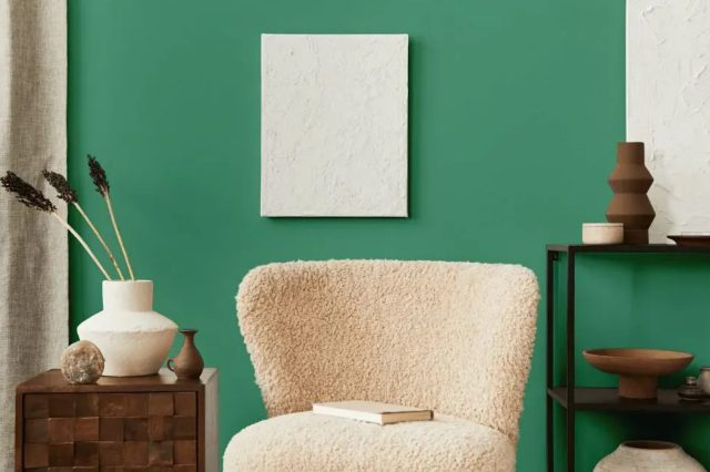
Cotton White SW 7104 by Sherwin-Williams stands out as an exquisitely serene and refreshingly pure shade of white. This hue embodies the soft, airy quality of cotton, suggesting a sense of comfort and simplicity that is both timeless and versatile. Its inherent brightness brings an expansive feel to spaces, illuminating interiors with a gentle glow that can make rooms appear larger and more inviting. Cotton White is not stark or clinical; rather, it has a subtle warmth that enables it to adapt effortlessly to a wide range of decorating styles and preferences.
This elegant shade of white is particularly well-suited for interior styles that emphasize clarity, softness, and understated sophistication. It works beautifully in minimalist designs, where its purity can create a sense of calm and order.
In Scandinavian-inspired spaces, Cotton White can enhance the light, airy feel that is characteristic of this style, while in modern farmhouse interiors, it adds a fresh, clean backdrop that complements natural materials and textures.
Cotton White pairs wonderfully with a variety of materials and textures, reinforcing its versatility. It looks stunning when matched with natural wood, from pale birch to rich walnut, accentuating the warmth and grain of the wood. In spaces featuring stone, metal, or ceramics, this shade of white acts as a serene counterbalance, allowing the textures and colors of these materials to stand out.
Fabrics in linen, wool, or velvet also pair well with Cotton White, adding layers of texture and comfort to the clean, crisp backdrop it provides. This color is adept at creating harmony in a space, bringing together diverse materials and finishes into a cohesive whole.
housekeepingbay.com
Is Cotton White SW 7104 by Sherwin Williams Warm or Cool color?
Cotton White SW 7104 by Sherwin Williams is a pristine, comforting shade that belongs to the nuances of the off-white spectrum. It carries a soft, almost imperceptible hint of cream which lends it a warm, welcoming touch, unlike the starkness that pure whites often bring. This subtlety makes Cotton White exceptionally versatile, allowing it to harmonize with a wide range of home styles, from contemporary to traditional, and complement various color palettes with ease.
In homes, Cotton White plays a transformative role by brightening spaces, making them appear larger and more airy. Its warming undertone creates a cozy atmosphere, making rooms feel inviting and lived-in, which is crucial for creating a sense of home. Moreover, its neutral character acts as a perfect backdrop, highlighting furnishings, art, and architectural details without competing with them.
Its ability to adapt to both natural and artificial light further enhances its appeal, ensuring that spaces retain their charm and warmth under different lighting conditions. Whether it’s applied on walls, trim, or cabinets, Cotton White SW 7104 brings a subtle elegance and timeless simplicity, making homes feel more open, serene, and seamlessly cohesive.
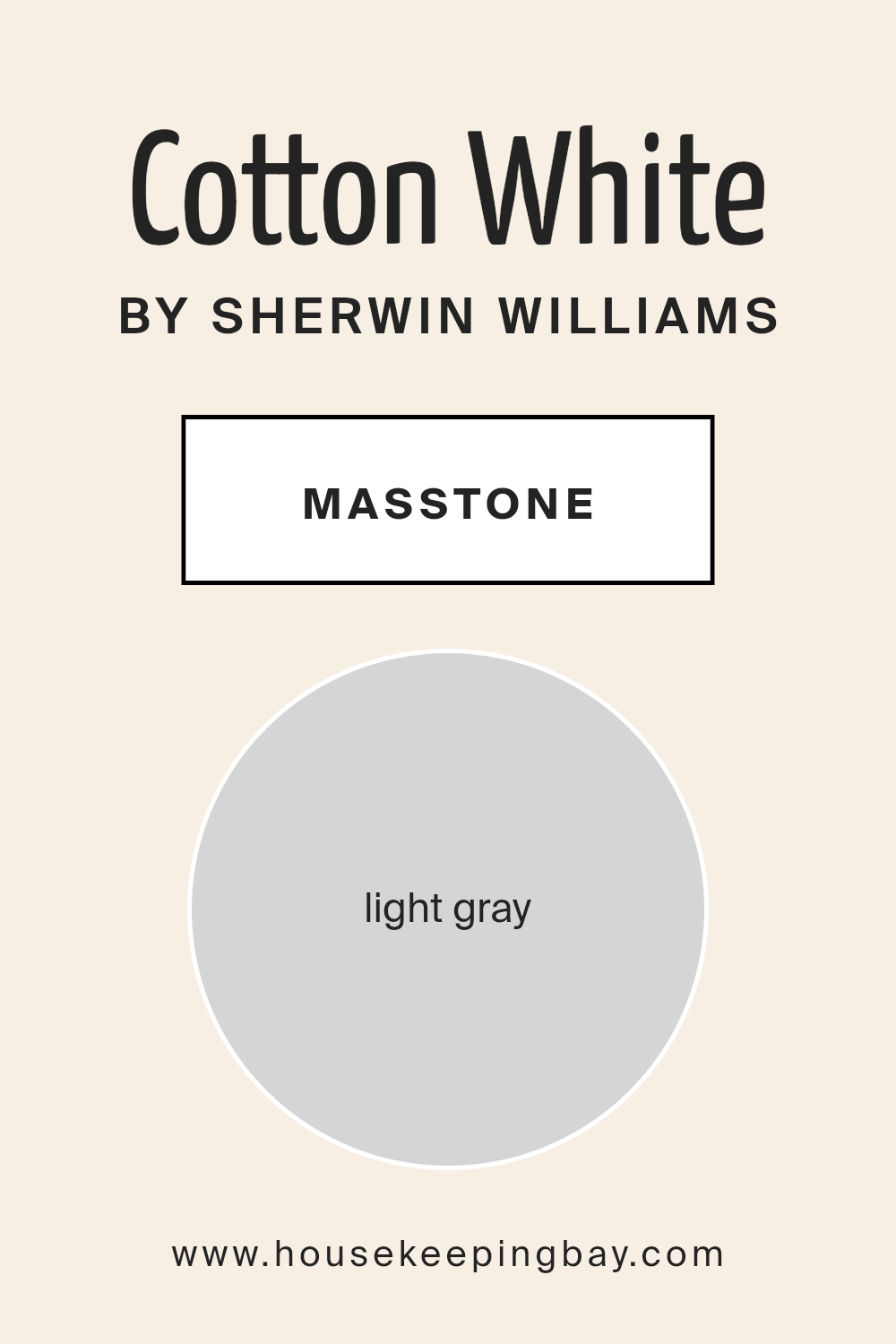
What is the Masstone of the Cotton White SW 7104 by Sherwin Williams?
Cotton White SW 7104 by Sherwin Williams, with its masstone appearing as light gray (#D5D5D5), is an exquisite paint choice that brings a unique blend of warmth and modernity to any space. Unlike the starkness often associated with pure white, the subtle gray undertone in Cotton White softens the ambiance, making it more inviting and conducive to a variety of decor styles. This nuanced hue ensures that rooms are bathed in light without being overwhelmed by brightness, enabling a peaceful and serene environment.
In homes, the versatile nature of Cotton White allows it to act as both a harmonious background and a standalone shade. It excellently reflects natural light, enhancing the sense of space in smaller rooms, and becomes a cohesive element in larger, open-plan areas.
Its light gray undertone also provides a gentle contrast against bold colors and textures, making it a perfect companion for accent walls, furnishings, and art pieces. Whether aiming for a minimalist aesthetic or a layered, eclectic look, Cotton White SW 7104 offers a sophisticated canvas that adapts fluidly to changing trends and personal tastes.
housekeepingbay.com
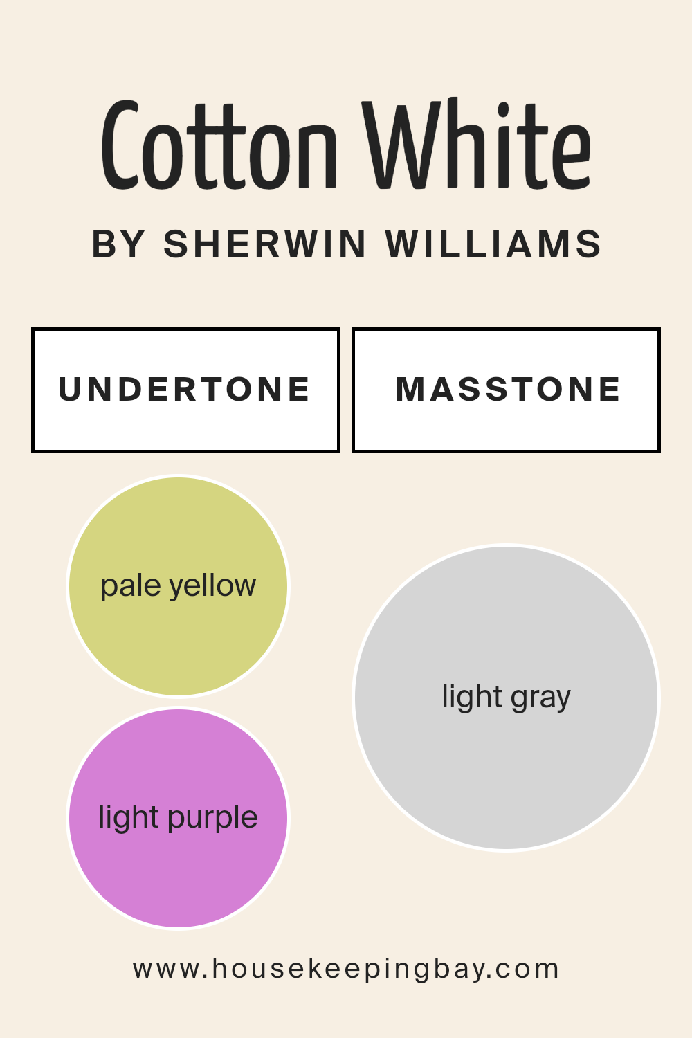
Undertones of Cotton White SW 7104 by Sherwin Williams
Cotton White SW 7104 by Sherwin Williams is a captivating shade that appears ostensibly simple yet reveals a complex spectrum of undertones upon closer inspection. This paint color is not just white; it is enlivened by subtle hints of pale yellow and light purple undertones. These undertones add a nuanced dimension to the color, influencing both its perception and application in interior spaces.
Pale yellow undertones infuse Cotton White with a warmth and softness that can make spaces feel more welcoming and cozy. This warmth counteracts the starkness often associated with pure white, bringing a hint of sunniness that can brighten rooms without overwhelming them with color.
On the other hand, the light purple undertones introduce a touch of cool sophistication, adding depth and a slight air of mystery to the paint. This balance between warmth and coolness makes Cotton White incredibly versatile, allowing it to adapt to various lighting conditions and design aesthetics.
In interior walls, these undertones play a crucial role in affecting how Cotton White is perceived. Under natural daylight, the pale yellow undertones may become more pronounced, creating a cheerful ambiance. Conversely, in artificial lighting, the light purple undertones might emerge more, imparting a tranquil and serene vibe.
The interplay of these undertones can dramatically influence the mood and visual temperature of a room, making Cotton White SW 7104 by Sherwin Williams an exquisite choice for those seeking a paint color that offers both complexity and adaptability.
housekeepingbay.com
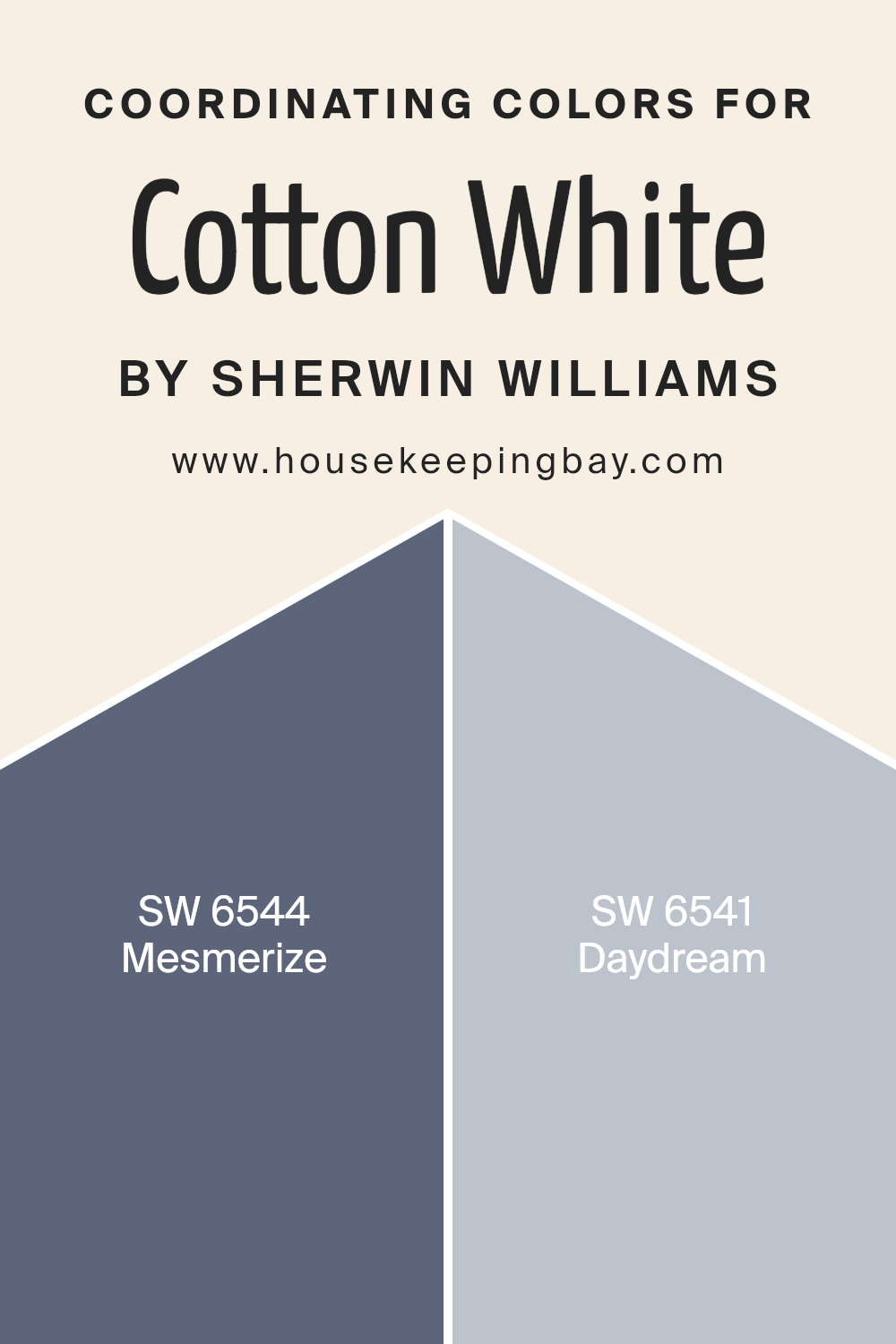
Coordinating Colors of Cotton White SW 7104 by Sherwin Williams
Coordinating colors play an essential role in design, serving as hues that complement each other to create a visually cohesive scheme. When applied adeptly, these colors enhance the primary color’s attributes, offering depth, contrast, and balance to an environment.
For Cotton White SW 7104 by Sherwin Williams, a pristine and airy shade, the coordinating colors are selected to both complement and subtly contrast its clean, straightforward appeal. These coordinating hues are chosen for their ability to work harmoniously with Cotton White, ensuring that the space feels designed with intentionality and thoughtfulness.
Whether for walls, trims, accents, or furniture, coordinating colors add layers of sophistication and depth to the design palette.
Mesmerize SW 6544 and Daydream SW 6541 serve as the perfect complements to Cotton White SW 7104. Mesmerize is a captivating deep blue with a hint of mystique, offering a dramatic contrast that makes Cotton White pop, providing depth and focus to any space.
On the other hand, Daydream is a gentle, airy hue, closer to Cotton White on the spectrum. It offers a subtle contrast, promoting a serene and tranquil atmosphere that supports the primary color’s purity without overwhelming it. These hues, with their distinct characteristics, work in concert to create a balanced and beautiful palette, enhancing the overall aesthetic of a space when used alongside Cotton White.
You can see recommended paint colors below:
- SW 6544 Mesmerize
- SW 6541 Daydream
housekeepingbay.com
How Does Lighting Affect Cotton White SW 7104 by Sherwin Williams?
Lighting significantly affects the appearance and perception of colors, altering their intensity, hue, and overall feel within a space. The interplay of light and color is crucial in interior design and painting, shaping the ambiance and mood of a room. Understanding this dynamic is essential when considering a specific paint color, such as Cotton White SW 7104 by Sherwin Williams.
Cotton White, a soft, serene shade, can transform under different lighting conditions. In artificial light, the type of bulb (LED, incandescent, fluorescent) plays a vital role in how Cotton White is perceived. LED lights, which come in a range of color temperatures, can either cool down or warm up this hue, affecting its purity and warmth.
Incandescent bulbs bring out the warmth in Cotton White, making it appear cozier, while fluorescent lighting can cast a slightly bluish tone, leaning the color towards a cooler presentation.
Natural light, with its changing characteristics throughout the day, also greatly influences how Cotton White looks. In north-faced rooms, light is cooler and more consistent, making Cotton White appear as a true, crisp white without casting many shadows. This makes north-facing rooms feel airy and open.
In south-faced rooms, abundant in warm, direct sunlight throughout the day, Cotton White can take on a slightly warmer tone, enhancing its welcoming and soft characteristics. This makes it ideal for creating a bright, cheerful space that feels inviting.
East-faced rooms see the most change with Cotton White, as the warm morning light can make it seem softer and slightly warm, transitioning to a cooler, true white by the afternoon as the sunlight fades. This dynamic shift can bring a lively yet calming effect to the space.
West-faced rooms, flooded with intense evening light, can make Cotton White glow, amplifying its warmth and making the room feel cozy and serene in the late afternoon and evening.
In summary, the effect of lighting on Cotton White SW 7104 by Sherwin Williams is profound, with artificial light and the room’s orientation significantly altering its appearance and the ambiance it creates.
Whether used in a room with natural light or artificial, understanding the impact of light can help harness the full potential of this versatile color, ensuring it aligns with the desired aesthetic and mood of any space.
housekeepingbay.com
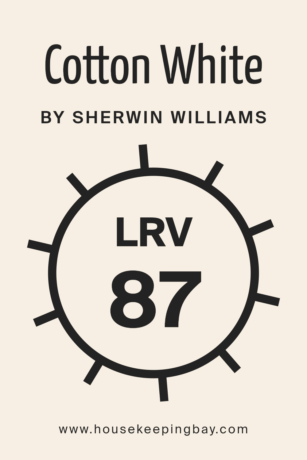
What is the LRV of Cotton White SW 7104 by Sherwin Williams?
Light Reflectance Value (LRV) measures the percentage of light a paint color reflects back into the room compared to the light that falls on it, on a scale from 0% to 100%. A higher LRV means the color reflects more light, making it appear brighter and more vibrant, while a lower LRV indicates that the color absorbs more light, making it look darker and more subdued.
LRV plays a crucial role in how colors impact the overall feel of a space, influencing perceptions of size and brightness. For instance, colors with a high LRV can make a room feel larger and more open, as they reflect more light around the space. On the other hand, colors with a low LRV can create a more intimate and cozy atmosphere but may make a small room feel even smaller.
Cotton White SW 7104 by Sherwin Williams, with an LRV of 87.056, is a light and airy color that reflects a substantial amount of light, falling into the higher end of the LRV spectrum. This means it can significantly brighten a room, making it feel more spacious and lively. Its high LRV ensures that it will maintain its intended hue under most lighting conditions, without dramatically changing appearance.
This can be particularly beneficial in spaces that are naturally darker or have limited natural light, as Cotton White will help maximize the light available, creating a warmer, welcoming environment. However, it’s important to consider how much natural and artificial light your space receives, as this could affect the color’s perception, especially in brightly lit environments where it might appear even lighter.
housekeepingbay.com
What is LRV? Read It Before You Choose Your Ideal Paint Color
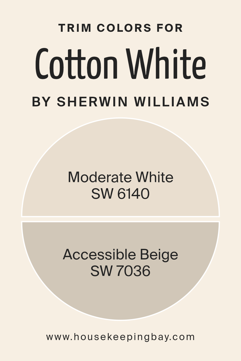
What are the Trim colors of Cotton White SW 7104 by Sherwin Williams?
Trim colors play a crucial role in the overall appearance of a room when paired with a primary paint color like Cotton White SW 7104 by Sherwin Williams. They are used on elements such as door frames, moldings, and baseboards to create visual contrasts that can subtly highlight these architectural details or tie the room’s color palette together cohesively.
Choosing the right trim color can significantly impact the aesthetic and feel of a space, either by complementing the main wall color to create a harmonious look or by offering a striking contrast that adds depth and character to a room.
When considering Cotton White SW 7104 by Sherwin Williams for walls, two exquisite options for trim colors are SW 6140 – Moderate White and SW 7036 – Accessible Beige. Moderate White, a soft and warm hue, seamlessly blends with Cotton White, offering a slight contrast that is refined and understated, perfect for creating a serene and welcoming atmosphere.
On the other hand, Accessible Beige brings a richer, earthy contrast to the crispness of Cotton White, grounding the space and adding a layer of sophisticated warmth. Both choices enrich the room’s palette, enhancing the beauty of Cotton White and ensuring a polished and cohesive look.
You can see recommended paint colors below:
- SW 6140 Moderate White
- SW 7036 Accessible Beige
housekeepingbay.com
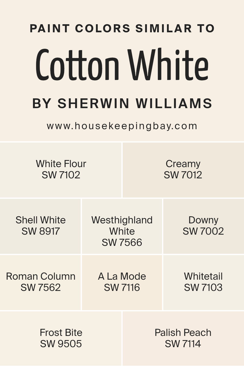
Colors Similar to Cotton White SW 7104 by Sherwin Williams
Choosing similar colors can significantly enhance the aesthetic and mood of a space, establishing a cohesive and harmonious visual flow. Similar colors, such as those akin to Cotton White SW 7104 by Sherwin Williams, work together by creating a subtle yet impactful variation that adds depth and interest without overwhelming the senses.
This spectrum of colors, ranging from warm whites to gentle peaches, offers a palette that can make spaces feel more welcoming, larger, and brighter. The use of these colors supports a seamless transition between rooms or areas, promoting an overarching sense of unity throughout the interior.
For example, White Flour SW 7102 provides a touch of warmth, making it ideal for living spaces that aim for a cozy yet refined look. Creamy SW 7012 offers a rich, buttery tone that envelopes rooms in a soft, inviting glow, perfect for creating a restful environment.
Shell White SW 8917 leans towards a neutral stance, making it versatile for various settings, further enhancing flexibility in decor choices. Westhighland White SW 7566 captures the essence of classic elegance with its crisp undertones, while Downy SW 7002 introduces a whisper-soft hint of gray, ideal for modern minimalist themes.
Roman Column SW 7562, with its slight infusion of warmth, works wonderfully in spaces that seek a touch of sophistication without straying too far from a neutral base. A La Mode SW 7116, on the lighter end, radiates a fresh, airy feel, excellent for amplifying natural light in a room.
Whitetail SW 7103 is the essence of understated chic, providing a clean backdrop for any interior. Frost Bite SW 9505 offers a cooler tone, bringing in a refreshing contrast to the warmer whites, while Palish Peach SW 7114 introduces a gentle nudge of color, perfect for spaces aiming for a hint of playfulness amidst a predominantly white palette.
Each of these colors, while maintaining their unique identities, collectively contributes to a design that feels both cohesive and visually stimulating.
You can see recommended paint colors below:
- SW 7102 White Flour
- SW 7012 Creamy
- SW 8917 Shell White
- SW 7566 Westhighland White
- SW 7002 Downy
- SW 7562 Roman Column
- SW 7116 A La Mode
- SW 7103 Whitetail
- SW 9505 Frost Bite
- SW 7114 Palish Peach
housekeepingbay.com
How to Use Cotton White SW 7104 by Sherwin Williams In Your Home?
Cotton White SW 7104 by Sherwin Williams is a pristine and airy shade that embodies the simplicity and purity of cotton. This soft white with subtle warm undertones promises to infuse any space with a tranquil and welcoming atmosphere. Ideal for creating a serene backdrop, Cotton White offers versatility unmatched by more stark whites. Its inherent warmth makes it perfect for living areas, providing a cozy yet bright ambiance that enhances natural light and makes spaces appear more expansive.
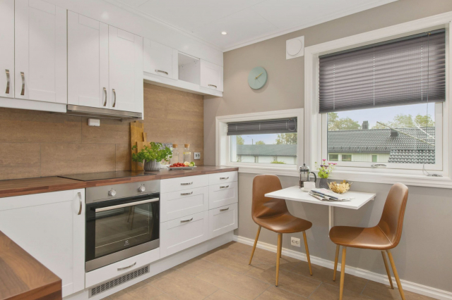
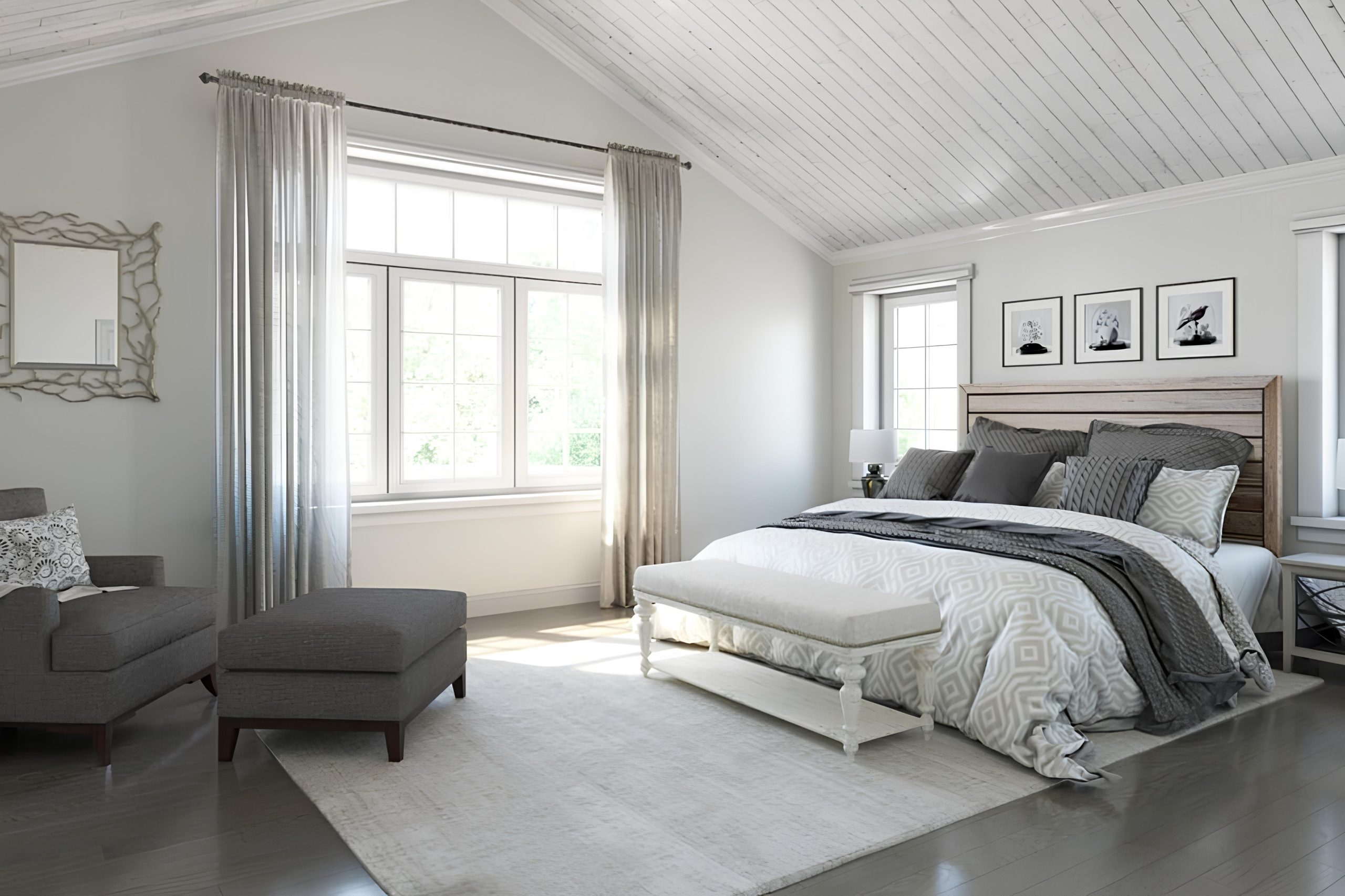
Homeowners can leverage Cotton White in numerous ways, from refreshing the kitchen cabinets to infusing a peaceful aura into bedrooms. Its gentle presence works beautifully in modern and traditional settings, bridging the gap between contemporary minimalism and classic charm. Applying it on walls paired with crisp white trim can elevate the sense of height and space in a room, making it feel open and airy.
Additionally, it serves as an excellent canvas for accent colors, allowing furniture and decor to stand out without overwhelming the room’s aesthetic. Whether aiming for a refined interior or a casual, comfortable space, Cotton White SW 7104 offers a harmonious foundation that can be tailored to individual style preferences.
Cotton White SW 7104 by Sherwin Williams vs Whitetail SW 7103 by Sherwin Williams
Cotton White SW 7104 and Whitetail SW 7103 by Sherwin Williams are two nuanced shades of white that subtly distinguish themselves through their undertones and warmth. Cotton White leans towards a crisp, clean appearance, invoking a sense of freshness and serenity. Its slightly cool undertone makes it an excellent choice for spaces aiming for a bright and airy feel, yet it retains enough warmth to ensure the space doesn’t feel stark or clinical.
On the other hand, Whitetail takes a step towards the warmer side of the white spectrum. Its undertones are more pronounced, imbuing spaces with a cozy, welcoming ambiance. This warmth makes Whitetail particularly well-suited for living areas or bedrooms, where a softer, more inviting atmosphere is preferred.
Both colors offer a neutral palette, but the choice between them hinges on the desired balance between coolness and warmth, and the specific lighting conditions of the room. While Cotton White can enhance modern, minimalist spaces with its subtle coolness, Whitetail’s gentle warmth lends itself to a traditional or rustic aesthetic, promoting a sense of homeliness and comfort.
You can see recommended paint color below:
housekeepingbay.com
Cotton White SW 7104 by Sherwin Williams vs Roman Column SW 7562 by Sherwin Williams
Cotton White SW 7104 and Roman Column SW 7562 by Sherwin Williams are two sophisticated neutrals, each exuding a unique charm and offering distinct atmospheres to interior spaces. Cotton White is a crisp, clean shade of white with a slightly warm undertone that brings a radiant and welcoming energy to a room. Its brightness makes it a perfect choice for creating a sense of openness and luminosity in any space, making rooms appear larger and more inviting.
On the other hand, Roman Column dwells in a subtler niche, presenting itself as a soft, creamy off-white with beige undertones. This hue offers a warmer, more enveloping feel compared to the crisp freshness of Cotton White. Roman Column’s gentle warmth adds a layer of sophistication and coziness, making it ideal for spaces where a more intimate and comforting atmosphere is desired.
While both colors maintain a neutral palette, their unique undertones and levels of warmth set them apart. Cotton White is better suited for those seeking a bright, airy aesthetic, whereas Roman Column is the go-to for a nuanced, cozy ambiance that still retains a light and neutral base.
You can see recommended paint color below:
housekeepingbay.com
Cotton White SW 7104 by Sherwin Williams vs A La Mode SW 7116 by Sherwin Williams
Cotton White SW 7104 and A La Mode SW 7116 by Sherwin Williams are two nuanced choices for those seeking to create calm and elegant spaces. Cotton White veers towards a pure, pristine aesthetic, embodying the simplicity and cleanliness associated with white tones. It offers a crisp backdrop that can either soothe or energize a room depending on the accompanying decor. Its brightness allows for a room to appear more spacious and airy, perfect for a minimalist approach or to accentuate natural light.
A La Mode, on the other hand, presents a subtly warmer hue. This color still maintains a sense of serenity and simplicity, yet its slightly creamy undertone provides a cozy warmth, making it an excellent choice for creating inviting spaces.
Compared to Cotton White, A La Mode might be seen as offering more depth, making it an ideal candidate for spaces where a touch of soft sophistication is desired without veering too far from the classic appeal of near-whites.
Though similar at a glance, the choice between Cotton White and A La Mode ultimately comes down to the desired ambiance – crisp and airy with Cotton White or softly inviting with A La Mode.
You can see recommended paint color below:
- SW 7116 A La Mode
housekeepingbay.com
Cotton White SW 7104 by Sherwin Williams vs Westhighland White SW 7566 by Sherwin Williams
Cotton White SW 7104 and Westhighland White SW 7566, both by Sherwin Williams, present subtle yet distinct variations in the white color palette, essential for designers and homeowners aiming for specific nuances in their spaces. Cotton White leans towards a crisp, clean shade with a slightly cool undertone, offering a refreshing and luminous feel. This color is excellent for creating a bright and airy ambiance, making spaces feel more open and expansive. Its minimalistic tone serves as a perfect backdrop for bold colors and patterns, allowing them to stand out.
On the other hand, Westhighland White SW 7566 shifts towards a warmer spectrum, embodying a creamy, soft hue that brings a cozy and inviting atmosphere to interiors. Its richness in tone adds a layer of sophistication and depth, making it ideal for spaces where a subtle, comforting presence is desired.
This color works well in settings that aim for a more traditional or classic look, providing a gentle warmth that complements wood finishes and natural materials beautifully.
Despite their similarities as whites, Cotton White and Westhighland White cater to different aesthetic and emotional impacts, from the clear, vibrant feel of Cotton White to the warm, embracing essence of Westhighland White, making each suitable for unique design objectives.
You can see recommended paint color below:
housekeepingbay.com
Cotton White SW 7104 by Sherwin Williams vs Downy SW 7002 by Sherwin Williams
Cotton White SW 7104 and Downy SW 7002, both by Sherwin Williams, are subtle, nuanced whites that offer gentle distinctions suitable for a variety of spaces. Cotton White leans towards a clean, pure white with a slightly warm undertone that makes spaces feel inviting yet spacious. It’s excellent for creating a crisp, bright look, ideal in rooms that benefit from a fresh, airy atmosphere.
Downy, on the other hand, presents a softer, more muted approach to white. With its hint of gray, Downy offers a slightly cooler, more serene vibe, making it perfect for creating calm, restful environments. This color works well in spaces that aim for a cozy, understated elegance, adding depth without overwhelming.
Both colors maintain a minimalist charm but cater to different aesthetic tones—Cotton White, with its warmth, makes spaces feel sunlit and lively, while Downy, with its cooler, understated elegance, fosters tranquility. These subtle differences make them versatile for combining or choosing between based on the mood one wishes to create.
You can see recommended paint color below:
housekeepingbay.com
Cotton White SW 7104 by Sherwin Williams vs Creamy SW 7012 by Sherwin Williams
Cotton White SW 7104 and Creamy SW 7012, both from Sherwin Williams, present subtle yet distinct differences that cater to various aesthetic preferences. Cotton White is a crisp, clean shade that embodies the essence of pure white with a slightly warm undertone. This color is ideal for creating a bright, airy feel in a space, offering a sense of expansiveness and freshness. It’s perfect for minimalist or modern interiors, providing a sharp, uncluttered backdrop that enhances natural light.
In contrast, Creamy SW 7012 offers a richer, more nuanced hue. As its name suggests, it possesses a soft, creamy quality that exudes warmth and coziness. This color has a deeper, more yellow-toned base compared to the near-pristine quality of Cotton White. Creamy is excellent for spaces where a comforting, inviting atmosphere is desired, adding a layer of sophistication and depth that is both subtle and engaging.
While both colors serve as excellent choices for those seeking a neutral palette, the choice between Cotton White and Creamy ultimately depends on the desired ambiance—whether it be the sharp, clear freshness of Cotton White or the warm, embracing quality of Creamy.
You can see recommended paint color below:
housekeepingbay.com
Cotton White SW 7104 by Sherwin Williams vs Palish Peach SW 7114 by Sherwin Williams
Cotton White SW 7104 and Palish Peach SW 7114, both by Sherwin Williams, embody a soft and serene palette, yet each offers distinct nuances that set a different mood and ambiance. Cotton White, true to its namesake, carries an essence of pure, crisp freshness. It is a classic, bright white with a slight cool undertone, making it an excellent choice for spaces that aim to evoke cleanliness, simplicity, and an open, airy feel. It reflects light beautifully, thereby enhancing the sense of space and purity in a room.
In contrast, Palish Peach SW 7114 introduces a gentle warmth, leaning towards a light, muted peach hue that infuses spaces with a subtle coziness and inviting softness. Unlike the stark simplicity of Cotton White, Palish Peach offers a hint of color that can create a comforting atmosphere without overwhelming a space with intensity.
This color tends to add character and warmth, perfect for creating a more intimate and welcoming environment.
While Cotton White is ideal for those seeking a minimalist or contemporary space with a clean and uncomplicated aesthetic, Palish Peach is suited for rooms where a touch of warmth and nurturing are desired, making each space feel more personal and lived-in. Both colors stand out for their versatility, yet cater to different design aspirations.
You can see recommended paint color below:
- SW 7114 Palish Peach
housekeepingbay.com
Cotton White SW 7104 by Sherwin Williams vs White Flour SW 7102 by Sherwin Williams
Cotton White SW 7104 and White Flour SW 7102 by Sherwin Williams are subtle variants in the vast spectrum of whites that Sherwin Williams offers. Cotton White leans towards a slightly warm undertone, evoking a sense of comfort and softness.
It’s a hue that can illuminate spaces, making them feel more expansive and welcoming, without becoming overbearing. This color tends to bring a cozy warmth to interiors, making it ideal for living areas and bedrooms where a softer ambiance is desired.
In contrast, White Flour SW 7102 is a pristine, almost ethereal white, with a slightly cooler bias compared to Cotton White. Its purity and clarity make it an excellent choice for spaces that aim for a crisp, clean look. White Flour is versatile, serving well in both modern and traditional settings, and it enhances natural light, making spaces appear brighter.
While both colors share the simplicity and versatility of white, Cotton White offers a hint of warmth for a cozy atmosphere, and White Flour presents a clean, almost neutral palette, ideal for creating a bright, airy space. Choosing between them would depend on the desired mood and lighting of the room, with Cotton White adding warmth and softness, and White Flour ensuring a crisp, clean backdrop.
You can see recommended paint color below:
housekeepingbay.com
Cotton White SW 7104 by Sherwin Williams vs Shell White SW 8917 by Sherwin Williams
Cotton White SW 7104 and Shell White SW 8917 by Sherwin-Williams are both variations of white paint that evoke a sense of cleanliness and simplicity, yet they bear subtle differences. Cotton White leans towards a pure, almost stark white, with a hint of warmth that prevents it from being overly crisp or sterile. This color is versatile, making it an excellent choice for creating a bright, airy feel in any space, whether it be a modern living area or a traditional kitchen.
Shell White, on the other hand, has a softer tone, incorporating a slightly creamier base that affords it a more inviting, cozy feel compared to the cooler, more neutral vibe of Cotton White. The warmth of Shell White is more pronounced, making it ideal for spaces where a gentle, nurturing ambiance is desired. It pairs beautifully with natural materials and earthy colors, promoting a harmonious and welcoming environment.
In sum, while both colors offer a backdrop of simplicity and calm, Cotton White is the choice for those seeking a crisp, clean look, whereas Shell White suits spaces that aim for a softer, more enveloping warmth.
You can see recommended paint color below:
housekeepingbay.com
Cotton White SW 7104 by Sherwin Williams vs Frost Bite SW 9505 by Sherwin Williams
“Cotton White” SW 7104 and “Frost Bite” SW 9505 by Sherwin Williams are both nuanced shades, yet their atmospheres differ significantly. “Cotton White” is a warm, inviting white with soft cream undertones that make spaces feel cozy and light-filled. It’s versatile, working well in various settings to create a soothing backdrop that exudes quiet sophistication. This color is particularly effective in enhancing the sense of space and light in a room, making it an excellent choice for living areas, bedrooms, and kitchens where a serene, welcoming ambience is desired.
On the other hand, “Frost Bite” is cooler, reflecting a crisp, modern edge. Its icy undertones lend a fresh, contemporary feel, making it suitable for spaces that aim for a sharp, clean aesthetic. “Frost Bite” is adept at offering a bright but cool luminosity, ideal for bathrooms, modern kitchens, and minimalist living spaces.
While still maintaining the categorization of white, it brings a more pronounced cool character compared to “Cotton White’s” warm and creamy disposition.
The choice between these two depends on the desired mood and temperature of the space. “Cotton White” envelops a room in warmth, making it feel homely and welcoming, whereas “Frost Bite” introduces a modern, energizing atmosphere with its cooler, sharper tone.
You can see recommended paint color below:
housekeepingbay.com
Conclusion
Cotton White SW 7104 by Sherwin Williams emerges as an impactful color option for those seeking a balance between warmth and the crisp, clean foundation that white paints offer. As a versatile shade, it is meticulously designed to serve a wide array of aesthetic preferences and spaces, embodying a balance that enhances both contemporary and traditional designs.
Its ability to adapt and compliment a multitude of decor elements and architectural styles without overwhelming makes it a compelling choice for designers and homeowners alike. The color’s innate warmth enriches spaces, promoting a sense of calm and comfort that is essential for creating inviting environments.
The practicality and aesthetic appeal of Cotton White SW 7104 cannot be overstated. Its seamless integration into various design themes—from minimalist to eclectic—alongside its capacity to amplify natural light, makes it a universally appealing option. Moreover, its role in design extends beyond mere surface application; it acts as a foundational hue that supports a wide range of color palettes, enabling a cohesive look throughout any space.
Ultimately, Cotton White SW 7104 stands out as a timeless selection from Sherwin Williams, promising to transform interiors with its subtle elegance and understated sophistication, reaffirming its place as a go-to choice for those aiming to instill a serene and welcoming atmosphere in their homes or projects.
housekeepingbay.com
Ever wished paint sampling was as easy as sticking a sticker? Guess what? Now it is! Discover Samplize's unique Peel & Stick samples. Get started now and say goodbye to the old messy way!
Get paint samples