Gypsum SW 9543 by Sherwin Williams
Effortlessly Elegant: The Ultimate Neutral
As an iconic representation of tranquility and serenity, SW 9543 Gypsum by Sherwin Williams stands out as a remarkable shade in the world of interior design. This particular color, a part of the Sherwin Williams collection, encapsulates a sense of calmness and purity, mirroring the mineral it’s named after.
In the realm of paints, where every hue carries its own story and ambiance, Gypsum offers a subtle, soothing experience, making it a versatile choice for a wide range of spaces.This article delves into the nuances of SW 9543 Gypsum, exploring its characteristics, applications, and the psychological effects it can impart within an interior space.
The color Gypsum, with its soft, warm undertones, provides a perfect backdrop for both contemporary and traditional designs, enabling a seamless integration with various decor elements. It’s a color that reflects light beautifully, enhancing the sense of space and openness in a room.As we dissect the role of Gypsum in home aesthetics, it becomes evident that this color is not just about its visual appeal but also about creating a harmonious atmosphere.
Whether you’re aiming to achieve a minimalist look or a cozy, inviting environment, SW 9543 Gypsum offers a canvas that invites creativity and personal expression. Through discussions with design professionals and insights into current trends, this article aims to uncover the essence of this captivating shade and how it can transform any space into a haven of peace and elegance.
vis sherwin-williams
What Color Is Gypsum SW 9543 by Sherwin Williams?
Table of Contents
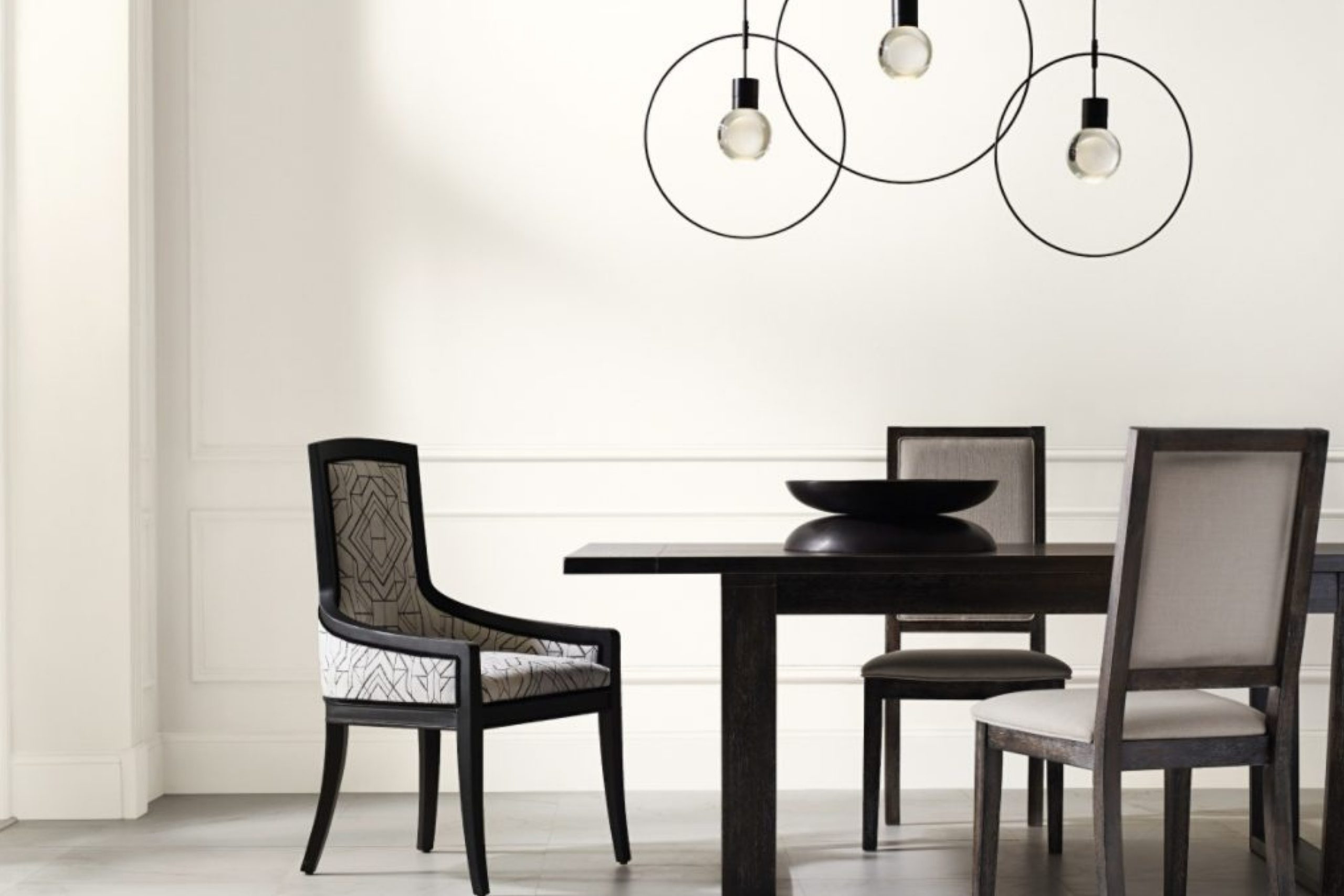
Gypsum SW 9543 by Sherwin Williams is a serene and subtle off-white paint color that exudes tranquility and sophistication. This color boasts a warm undertone, making it inviting and versatile for a variety of spaces and design schemes. It harbors a hint of creaminess, enough to add depth and character to walls without overwhelming the senses. The beauty of Gypsum lies in its ability to act as both a standalone color and a complementary backdrop for other design elements.
In terms of interior styles, Gypsum SW 9543 shines in environments that seek to create a calm and collected atmosphere. It is particularly well-suited for modern and contemporary settings, where its clean and minimalistic vibe can be fully appreciated
. However, its warm undertones also make it a perfect match for farmhouse and Scandinavian designs, where comfort and simplicity are key. This color can bring out the rustic textures and natural materials characteristic of these styles, such as reclaimed wood, natural stone, and soft textiles.
Gypsum pairs exceptionally well with a wide array of materials and textures, enhancing the overall aesthetic of a room. When matched with natural wood, it highlights the warmth and organic beauty of the material. For a more refined look, pairing it with metallic accents like brass or copper can add a touch of elegance.
Textiles in rich textures, such as velvet or linen, against a Gypsum backdrop create a cozy and inviting space. Its versatile nature makes it an ideal canvas for both bold and subdued color palettes, enabling designers to experiment with various decor elements to achieve the desired ambiance.
housekeepingbay.com
Is Gypsum SW 9543 by Sherwin Williams Warm or Cool color?
GypsumSW 9543 by Sherwin Williams is a captivating neutral paint color that brings a serene and sophisticated atmosphere to any home. As part of the Sherwin-Williams paint collection, Gypsum embodies a delicate balance between warm and cool tones, making it incredibly versatile and easy to incorporate into various interior design schemes. This soft, almost ethereal shade mimics the mineral for which it’s named, providing a subtle backdrop that enhances the natural light of a space while offering enough depth to add character and warmth.
The beauty of GypsumSW 9543 lies in its adaptability. It pairs flawlessly with a wide range of colors, from vibrant hues to muted tones, allowing for endless design possibilities. Whether used in a living room, bedroom, or kitchen, Gypsum creates a calming and inviting environment. Its understated elegance encourages relaxation and contemplation, making it an ideal choice for areas of rest and rejuvenation.
In homes, GypsumSW 9543 works wonderfully to unify spaces and create a cohesive look throughout. Its light-reflective quality can make small rooms appear larger and more open, while its warmth adds coziness to expansive areas. This color’s ability to adapt to both contemporary and traditional styles, along with its compatibility with natural materials like wood and stone, makes Gypsum an excellent choice for homeowners looking to create a timeless and harmonious interior.
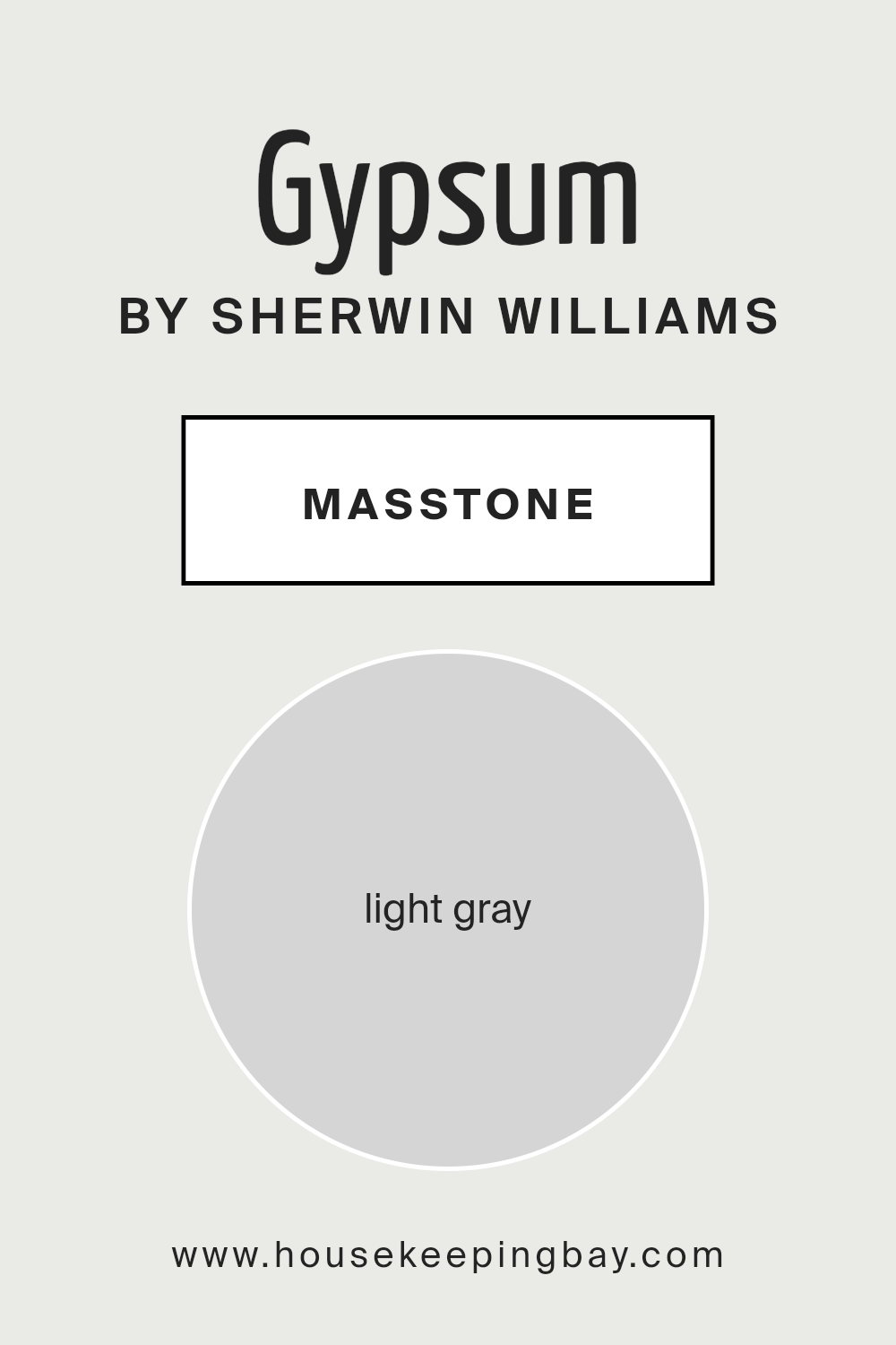
What is the Masstone of the Gypsum SW 9543 by Sherwin Williams?
GypsumSW 9544 by Sherwin Williams, with its masstone of Light Gray (#D5D5D5), embodies a versatile and timeless elegance that effortlessly enhances the aesthetics of home interiors. This particular shade of gray operates as a neutral backdrop, making it an excellent choice for various design schemes, from the minimalistic and modern to the cozy and traditional. Its light gray masstone serves to brighten spaces, creating an illusion of spaciousness and infusing a sense of calm and serenity into the ambiance.
The neutrality of GypsumSW 9543 facilitates seamless pairing with both bold and subtle color palettes, allowing for creative freedom in decorating with accessories, textiles, and furnishing. It can soften the contrast in rooms with ample natural light while providing a subtle depth in dimmer spaces.
This adaptability makes it a favored choice for living areas, bedrooms, and even bathrooms, offering a clean, sophisticated canvas that uplifts and transforms a home’s atmosphere.
housekeepingbay.com
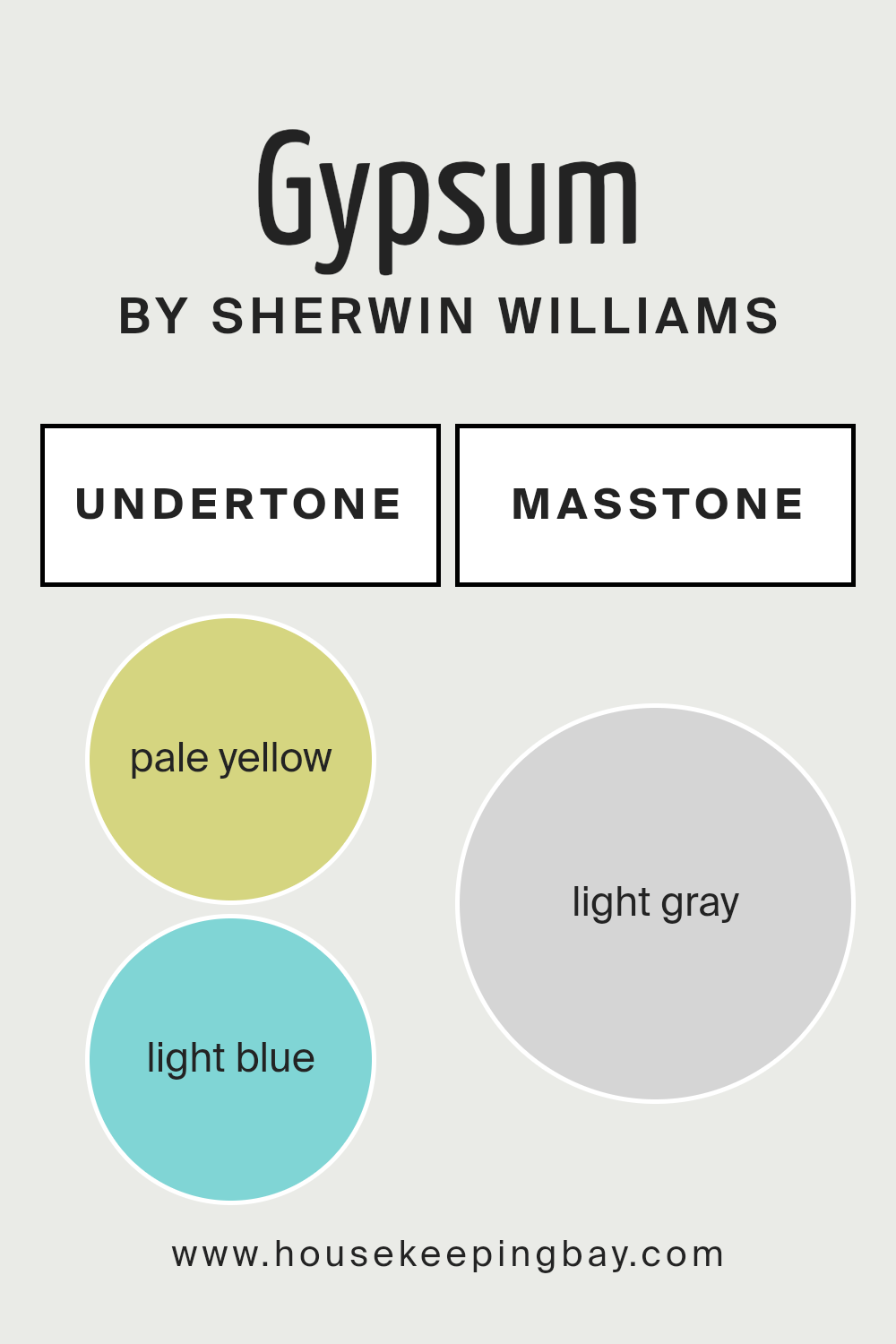
Undertones of Gypsum SW 9543 by Sherwin Williams
Gypsum SW 9543 by Sherwin Williams is a captivating paint color renowned for its ability to create serene and welcoming spaces. At first glance, Gypsum may appear as a straightforward light neutral, yet its charm is significantly enhanced by its subtle undertones of pale yellow and light blue. Undertones in paint colors are underlying hues that, although not always immediately apparent, profoundly influence the character and mood of the color. These nuanced hues can shift the perception of the color based on varying lighting conditions and surrounding elements.
The pale yellow undertone of Gypsum imbues a space with a gentle warmth, making it feel cozy and inviting. This effect is particularly valued in rooms that receive less natural light, where Gypsum can counteract the lack of sunlight to create a softly lit environment that feels naturally warm and welcoming.
On the other hand, the light blue undertone introduces a hint of coolness, suggesting an airy and calm atmosphere. This balance between warmth and coolness makes Gypsum incredibly versatile and harmonious.
When applied to interior walls, Gypsum SW 9543 takes on a chameleon-like quality, adapting its appearance throughout the day and in different lighting situations. In sunlight, the pale yellow undertone might become more pronounced, exuding a soft glow, whereas in artificial light, the light blue may emerge, lending a tranquil and soothing vibe.
This interplay of undertones allows Gypsum to harmonize with a wide range of decor styles and palettes, making it a favored choice for creating a nuanced and sophisticated backdrop that’s both comforting and elegant.
housekeepingbay.com
How Does Lighting Affect Gypsum SW 9543 by Sherwin Williams?
Lighting plays a pivotal role in the perception of colors, influencing not only the hue but also the mood and ambiance a color can create within a space. Natural light and artificial light can alter the appearance of colors significantly. For instance, a paint color like Gypsum SW 9543 by Sherwin Williams may appear differently depending on the light source and the direction of the room.
Gypsum SW 9543 is a soft, neutral, off-white with a warm undertone that can be versatile in various lighting conditions. In natural light, the color tends to reveal its truest form. In spaces with ample sunlight, Gypsum becomes a warm, inviting backdrop, enhancing the room’s natural brightness.
Under artificial light, the type of bulb can affect its appearance; warm LED or incandescent bulbs will accentuate its warm undertones, making it feel cozier, while fluorescent lighting might make it appear slightly cooler and more sterile.
The orientation of the room further influences how Gypsum is perceived:
- North-Faced Rooms: These rooms receive less direct sunlight, which can make colors appear cooler and slightly more shadowed. Gypsum in north-facing rooms may look more muted and slightly cooler than in other spaces, yet its warm undertones can help counteract the cool light, creating a soft and welcoming atmosphere.
- South-Faced Rooms: South-facing rooms enjoy abundant natural light throughout the day. Here, Gypsum will show its warmest and brightest, reflecting the natural sunlight and creating a light, airy feel. Its warm undertones are enhanced, making the space feel cozy yet vibrant.
- East-Faced Rooms: Morning light in east-facing rooms is warm and golden, making Gypsum appear softer and warmer early in the day. As the day progresses and the natural light becomes cooler and less direct, the color may present a more neutral appearance, maintaining a balanced and calm environment throughout the day.
- West-Faced Rooms: West-facing rooms receive the intense evening light, which can make colors look warmer and more pronounced. Gypsum will bask in the golden hues of the setting sun, creating a warm and inviting space in the afternoon and evening.
Understanding how lighting affects colors like Gypsum SW 9543 enables designers and homeowners to use this knowledge to create the desired mood in each room, emphasizing the importance of considering light sources in design decisions.
housekeepingbay.com
What is the LRV of Gypsum SW 9543 by Sherwin Williams?
LRV stands for Light Reflectance Value, a measurement that represents the percentage of light a paint color reflects back into a room as compared to the light originally shone on it. This value is on a scale from 0 to 100, with 0 being the most absorbent color (which would be pure black, absorbing all light) and 100 being the most reflective (pure white, reflecting all light back).
The LRV is crucial in determining how light or dark a color will appear once applied to walls and how it will influence the ambiance of a space. It affects not only the brightness and spaciousness of a room but also can alter the perception of the room’s size and shape. For instance, colors with higher LRV make spaces appear larger and more open by reflecting more light, while lower LRV colors create a cozier, more enclosed feel by absorbing more light.
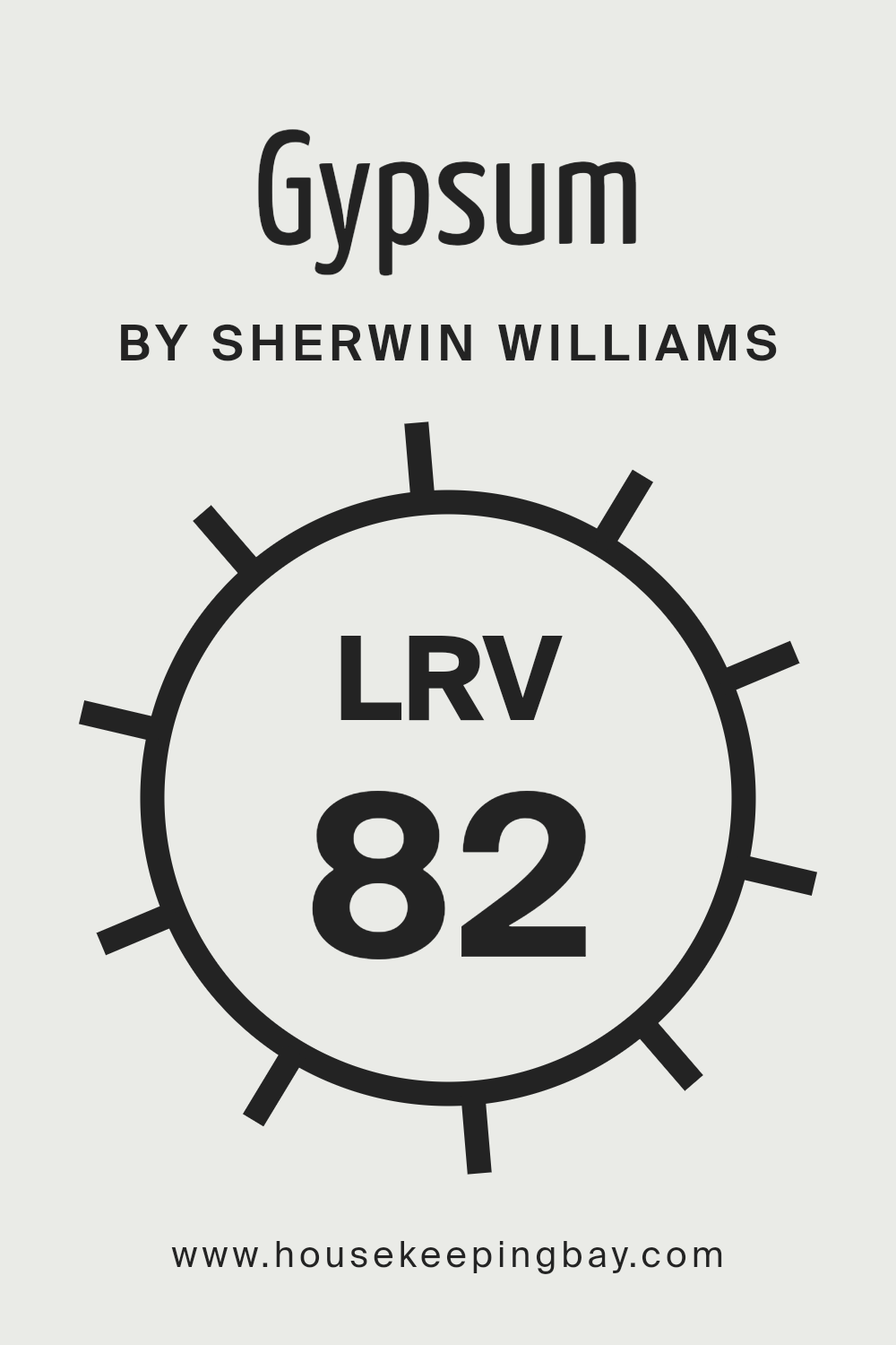
In the case of Gypsum (SW 9543) by Sherwin Williams, with an LRV of 82.35, this color is on the higher end of the LRV scale, meaning it is a very light color that will reflect a substantial amount of light. This particular shade, being a light neutral, can significantly enhance the brightness of a space, making it appear airy and more expansive.
It is an excellent choice for rooms that receive less natural light or smaller rooms that one wishes to appear larger. The high LRV suggests that Gypsum will have a subtle, soothing presence on the walls, not overwhelming the senses but gently uplifting the ambiance.
This effect makes it highly versatile, suitable for various settings and styles, enhancing natural light during the day and maintaining a sense of openness and freshness under artificial lighting at night.
housekeepingbay.com
What is LRV? Read It Before You Choose Your Ideal Paint Color
What are the Trim colors of Gypsum SW 9543 by Sherwin Williams?
Trim colors, when chosen thoughtfully, can significantly enhance the aesthetic appeal and architectural features of a space. In the case of Gypsum SW 9543 by Sherwin Williams, a soft, warm neutral that exudes elegance and simplicity, selecting the right trim color is crucial for creating a cohesive and visually pleasing look.
Trim, which includes elements like baseboards, moldings, and window and door frames, outlines and defines the architecture of a room, providing crisp lines that can either subtly blend in or strikingly contrast with the wall color.
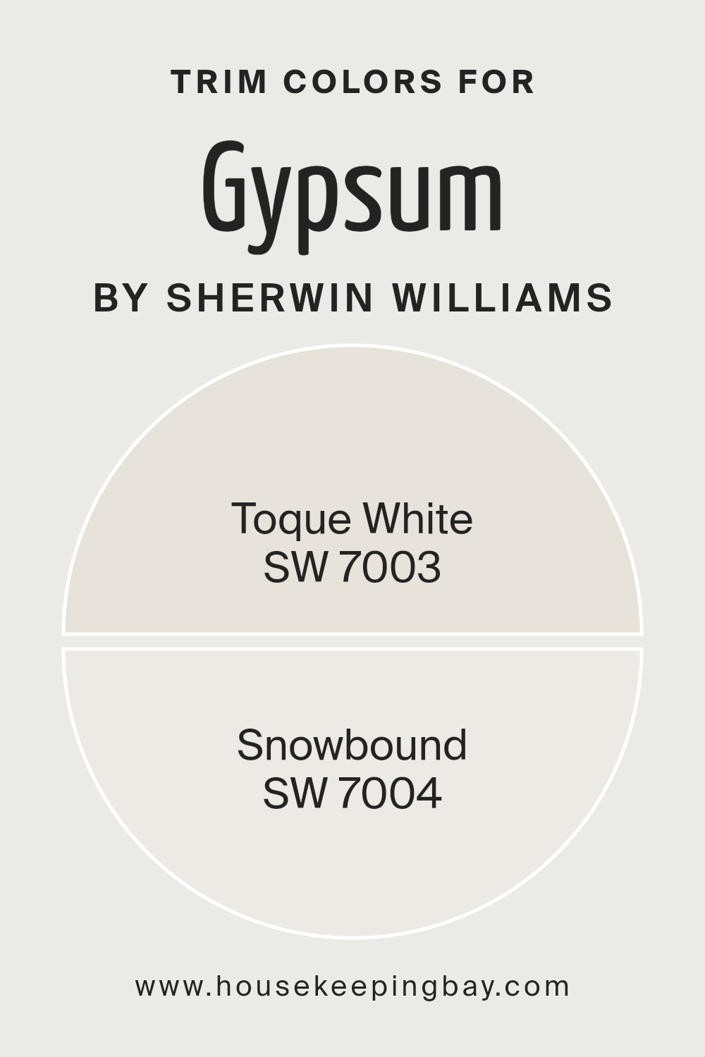
When paired with Gypsum SW 9543, trim colors like Toque White SW 7003 and Snowbound SW 7004 from Sherwin Williams are excellent choices that play up the serene and sophisticated vibe of the walls, elevating the overall ambiance of the interior space.
Toque White SW 7003, a gentle off-white with warm undertones, brings a soft, inviting contrast when used as a trim color with Gypsum SW 9543. Its warmth complements the cozy appeal of Gypsum, ensuring that spaces feel welcoming and harmoniously balanced.
On the other hand, Snowbound SW 7004, a cooler, brighter white with subtle gray undertones, offers a crisper edge and more pronounced contrast.
This makes architectural details pop against the calming backdrop of Gypsum SW 9543, creating a more defined and contemporary look. Both Toque White and Snowbound, with their unique qualities, open up endless possibilities to elevate the style and character of a space when used thoughtfully as trim colors alongside Gypsum SW 9543.
You can see recommended paint colors below:
housekeepingbay.com
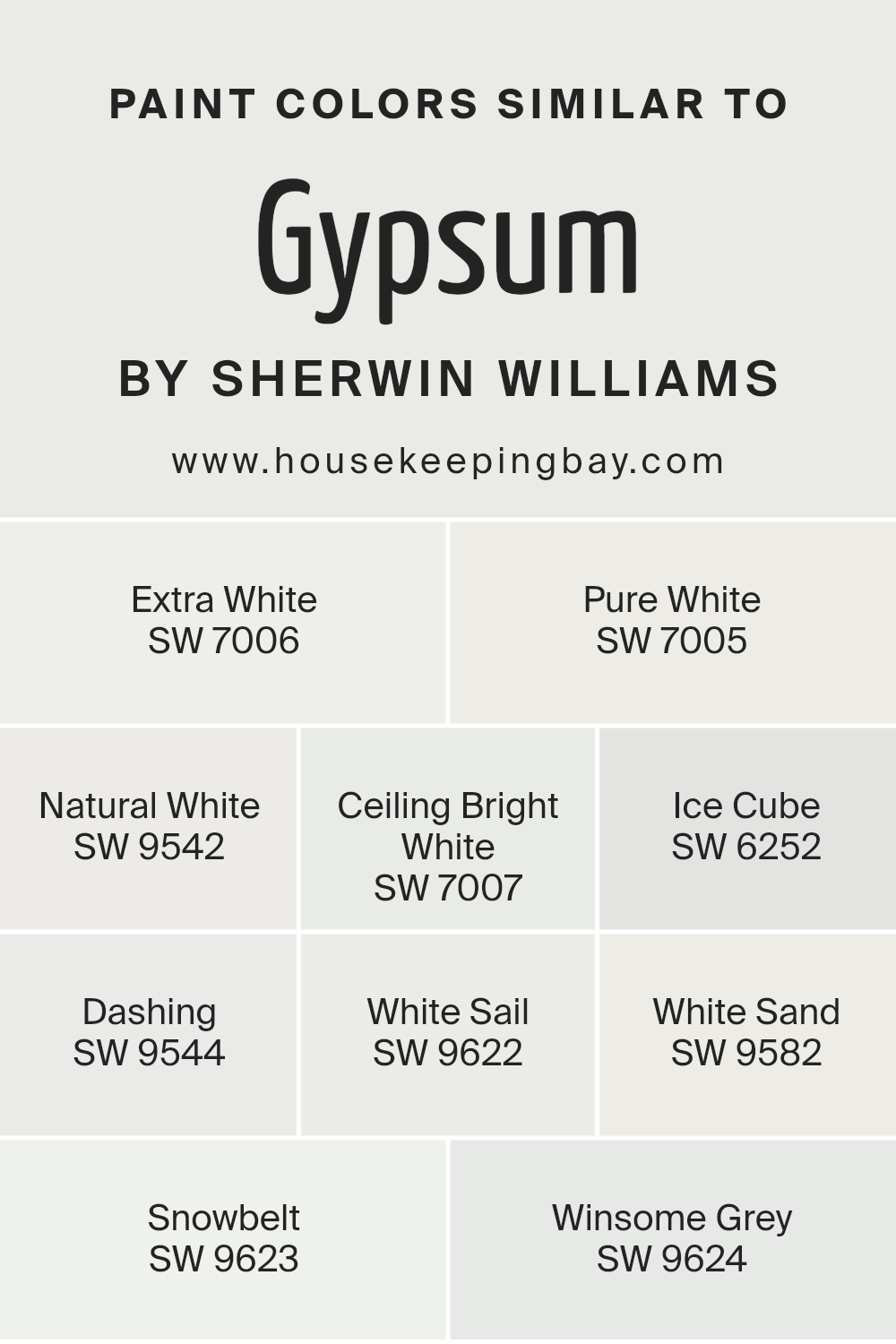
Colors Similar to Gypsum SW 9543 by Sherwin Williams
Choosing colors that closely resemble each other, such as those related to Gypsum SW 9543 by Sherwin Williams, allows for a nuanced yet consistent color palette that can enhance the aesthetic coherence of any space. The importance of selecting similar colors, like SW 7006 – Extra White or SW 7005 – Pure White, revolves around creating a seamless blend and transition within environments, whether for achieving a minimalist look or for laying a subtle foundation that highlights decor and furniture. These shades, including the soft hue of SW 9542 – Natural White, ensure that spaces feel brighter and more expansive, by reflecting light gently, thus contributing to a sense of well-being and calm.
Moreover, the inclusion of colors such as SW 7007 – Ceiling Bright White and SW 6252 – Ice Cube adds to the palette’s versatility, allowing for slight contrasts that can delineate spaces without the harshness of broader color differences.
The serene touch of SW 9544 – Dashing, alongside the refreshing feel of SW 9622 – White Sail, offers an option for those looking to introduce a subtle character within a dominantly white space. Warmer tones, like SW 9582 – White Sand, bring coziness into the mix, while cooler shades such as SW 9623 – Snowbelt and SW 9624 – Winsome Grey, complement the warm whites by adding depth and definition, making the entire color scheme work harmoniously together.
You can see recommended paint colors below:
- SW 7006 Extra White
- SW 7005 Pure White
- SW 9542 Natural White
- SW 7007 Ceiling Bright White
- SW 6252 Ice Cube
- SW 9544 Dashing
- SW 9622 White Sail
- SW 9582 White Sand
- SW 9623 Snowbelt
- SW 9624 Winsome Grey
housekeepingbay.com
How to Use Gypsum SW 9543 by Sherwin Williams In Your Home?
Gypsum SW 9543 by Sherwin Williams is a timeless and versatile paint color that embodies a blend of warmth and subtlety, making it perfect for any space in your home. Its neutral tone, a soft gray with warm undertones, bridges the gap between contemporary and traditional, offering a serene backdrop that complements various decor styles and architectural elements. Gypsum works wonders in spaces that require a touch of brightness without overwhelming the senses, making it ideal for living rooms, bedrooms, and even kitchens, where it can create a sense of openness and calm.
Incorporating Gypsum into your home can be as straightforward as applying it to the walls for a clean, refined look. It pairs beautifully with crisp whites or deeper grays for a layered monochromatic scheme, or it can serve as a neutral canvas against which vibrant accessories and furnishings can pop.
For a cohesive aesthetic, consider extending Gypsum onto the ceiling or trim, providing a subtle contrast that elevates the overall sophistication of your space. Whether aiming for a minimalist charm or a cozy, welcoming atmosphere, Gypsum SW 9543 offers a foundation that adapts to your evolving tastes and style preferences.
Gypsum SW 9543 by Sherwin Williams vs White Sand SW 9582 by Sherwin Williams
Gypsum (SW 9543) and White Sand (SW 9582) by Sherwin Williams are two subtly distinct shades that contribute to creating serene and welcoming spaces. Gypsum is a soft, warm neutral with a slightly beige undertone that offers a comforting and sophisticated backdrop. It’s a versatile color that can seamlessly blend with various decor styles, from modern to traditional, lending a gentle warmth to the walls without overwhelming the space.
On the other hand, White Sand (SW 9582) leans more towards a light, airy feel with a touch of warmth. This color encompasses a brighter tone compared to Gypsum, making it ideal for spaces that aim to achieve a crisp, yet cozy atmosphere. It reflects more natural light, enhancing the room’s openness and spaciousness.
Both colors are excellent choices for creating a tranquil and inviting environment. The choice between them depends on the desired warmth and brightness of the space. Gypsum might be preferred for a more grounded, warm aesthetic, while White Sand could be chosen to bring a brighter, more open feel.
You can see recommended paint color below:
housekeepingbay.com
Gypsum SW 9543 by Sherwin Williams vs Extra White SW 7006 by Sherwin Williams
Gypsum SW 9543 by Sherwin Williams and Extra White SW 7006 by Sherwin Williams present a subtle yet distinct difference in tone, reflecting their unique positions in interior design palettes. Gypsum, with its warm, soft, and subtle beige undertones, offers a comforting and inviting ambiance. It’s an ideal choice for creating a cozy and serene space, adding depth and warmth without overwhelming a room with color. Its versatility bridges traditional and contemporary styles, making it a go-to for a wide range of decor schemes.
In contrast, Extra White SW 7006 is a crisp, clean, and vibrant white. It stands out for its ability to bring a fresh and airy feel to any space, making rooms appear larger and more luminous. Extra White serves as an excellent backdrop for art and bold colors, providing contrast without competition. Its starkness can invigorate a space, offering a modern and minimalist aesthetic that complements a wide range of design elements.
Together, Gypsum and Extra White illustrate the spectrum of neutral choices available, from the warm, embracing tones of Gypsum to the bright, refreshing clarity of Extra White. Each color holds its unique appeal, catering to different tastes and design objectives.
You can see recommended paint color below:
housekeepingbay.com
Gypsum SW 9543 by Sherwin Williams vs Pure White SW 7005 by Sherwin Williams
Gypsum SW 9543 and Pure White SW 7005, both by Sherwin Williams, cater to distinct aspects of neutral palettes, yet each possesses unique characteristics that set them apart. Gypsum SW 9543 is a warm, soft neutral with a hint of beige, offering a cozy and inviting atmosphere.
This color is particularly suited for spaces where a comforting and subtle backdrop is desired, as it emanates a sense of calm and serenity. On the other hand, Pure White SW 7005 is a crisp, clean white with a neutral base that prevents it from veering too cold or warm.
This makes it incredibly versatile and ideal for a wide range of applications, from trim and ceilings to creating a bright, airy feel in any space. While Gypsum provides a gentle warmth, Pure White delivers a classic purity and simplicity, making each color suited to specific design intents—Gypsum for enveloping warmth and Pure White for stark clarity.
You can see recommended paint color below:
housekeepingbay.com
Gypsum SW 9543 by Sherwin Williams vs Snowbelt SW 9623 by Sherwin Williams
Gypsum SW 9543 and Snowbelt SW 9623, both by Sherwin Williams, present subtle yet distinct moods for interior spaces, reflecting their nuanced differences within the white and off-white color palette. Gypsum offers a warm, inviting tone, akin to the soft warmth of natural light at dawn.
Its creamy undertone provides a cozy, comforting backdrop, suitable for creating a serene and welcoming environment. This color works well in spaces aimed at relaxation and calmness, such as living rooms and bedrooms, where its soft glow adds depth without overwhelming the senses.
In contrast, Snowbelt leans toward a cooler, brighter white, reminiscent of the crisp, refreshing light of a clear winter morning. Its cleaner, more neutral base makes it an excellent choice for modern spaces that prioritize clarity, openness, and a sense of airiness. Snowbelt’s subtle blue undertones enhance natural light, making it ideal for smaller rooms or spaces with limited sunlight, as it visually expands the area and reflects light more efficiently than warmer whites.
While both colors share a basis in light hues, Gypsum’s warmth contrasts with Snowbelt’s crisp coolness, making them suitable for different aesthetic goals and atmospheres within a home or project.
You can see recommended paint color below:
- SW 9623 Snowbelt
housekeepingbay.com
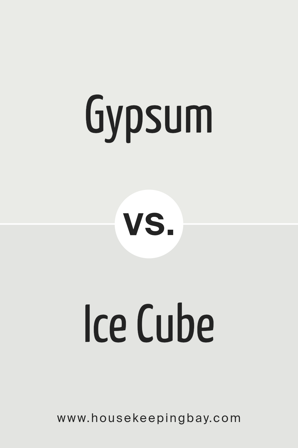
Gypsum SW 9543 by Sherwin Williams vs Ice Cube SW 6252 by Sherwin Williams
Gypsum SW 9543 and Ice Cube SW 6252, both by Sherwin Williams, present a subtle yet distinct variance in hues that cater to different aspects of interior design. Gypsum SW 9543 is a soft, neutral off-white with warm undertones, offering a cozy and inviting ambiance. This shade is ideal for creating a serene and calming environment, acting as a perfect backdrop for bold accents or a minimalist aesthetic in living spaces.
Ice Cube SW 6252, on the other hand, is a cooler, crisp white with blue undertones, imparting a fresh and clean look. It mirrors the brightness of daylight, making it excellent for spaces that aim for a sharp, modern feel. This color can make smaller spaces appear larger and more open, promoting a sense of clarity and refreshment.
While both colors share a palette that leans towards neutrality, Gypsum’s warmth contrasts with the cool, pristine vibe of Ice Cube. The choice between them depends on the desired mood: Gypsum for a soft, warm touch, and Ice Cube for a clear, invigorating atmosphere.
You can see recommended paint color below:
housekeepingbay.com
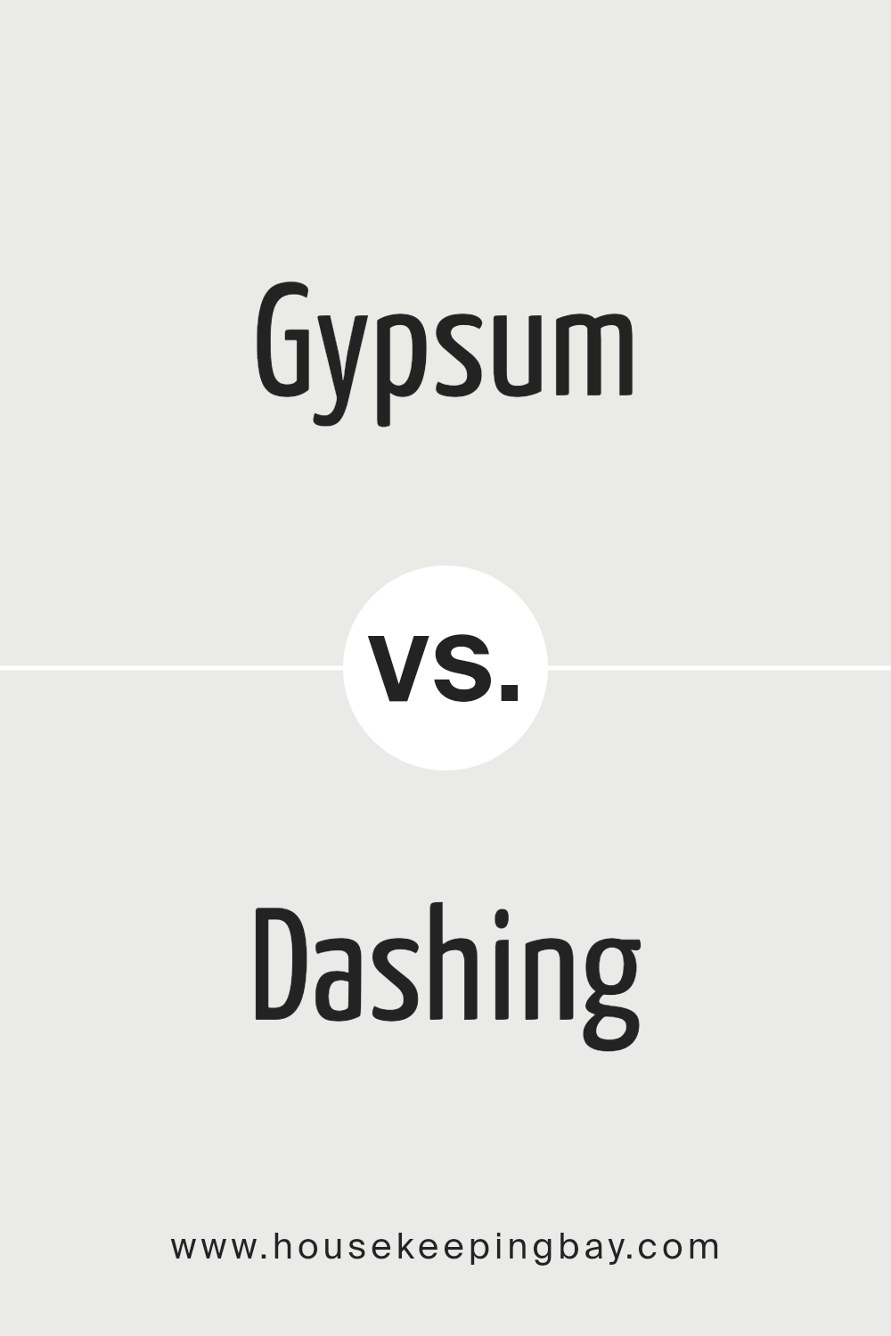
Gypsum SW 9543 by Sherwin Williams vs Dashing SW 9544 by Sherwin Williams
Gypsum SW 9543 and Dashing SW 9544, both by Sherwin Williams, are colors that embody subtlety and sophistication in the realm of interior design. Gypsum, with its warm, soft beige undertones, offers a serene and inviting ambiance. It’s an extremely versatile color that complements a wide range of decor styles, from contemporary to traditional, acting as a perfect neutral backdrop for vibrant accents or a calm foundation for a more muted palette.
On the other hand, Dashing SW 9544 takes a slightly bolder step into the domain of color. While it maintains a sense of neutrality, Dashing introduces a deeper, more pronounced hue that leans towards a richer, taupe-like shade. This color brings warmth and depth to spaces, providing a cozy yet sophisticated vibe. It stands out a bit more on walls compared to the softer presence of Gypsum, making it a great choice for those looking to make a subtle, yet impactful, statement.
Together, Gypsum and Dashing exemplify the elegance of understated colors, each offering a unique take on neutrality and warmth in the home, with Gypsum illuminating spaces with its light touch and Dashing enveloping rooms in deeper warmth.
You can see recommended paint color below:
housekeepingbay.com
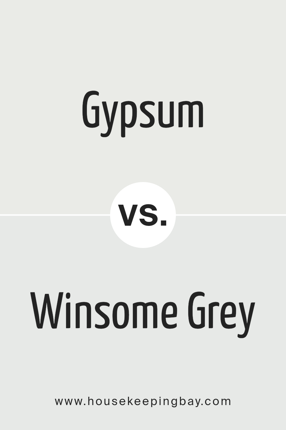
Gypsum SW 9543 by Sherwin Williams vs Winsome Grey SW 9624 by Sherwin Williams
Gypsum SW 9543 and Winsome Grey SW 9624, by Sherwin Williams, present subtle yet discernible differences in their tones and atmospheres. Gypsum, a soft, soothing neutral, carries a gentle warmth, emitting a chalky, almost ethereal quality. Its understated elegance makes it versatile, ideal for creating a calm and inviting space that feels both open and cozy.
Winsome Grey, on the other hand, leans slightly cooler, with a graceful balance between grey and beige. This color, while still neutral, offers a hint more depth than Gypsum, providing a serene backdrop that’s sophisticated yet welcoming. Winsome Grey’s ability to play with light adds a dynamic quality, making spaces feel more grounded and contemporary.
Both colors exhibit the power of neutrals in shaping interior spaces, but while Gypsum offers a soft, luminous base that amplifies natural light, Winsome Grey brings a touch of modernity, anchoring spaces with its subtle strength. Choosing between them depends on the desired mood and style: airy and ethereal with Gypsum or composed and contemporary with Winsome Grey.
You can see recommended paint color below:
- SW 9624 Winsome Grey
housekeepingbay.com
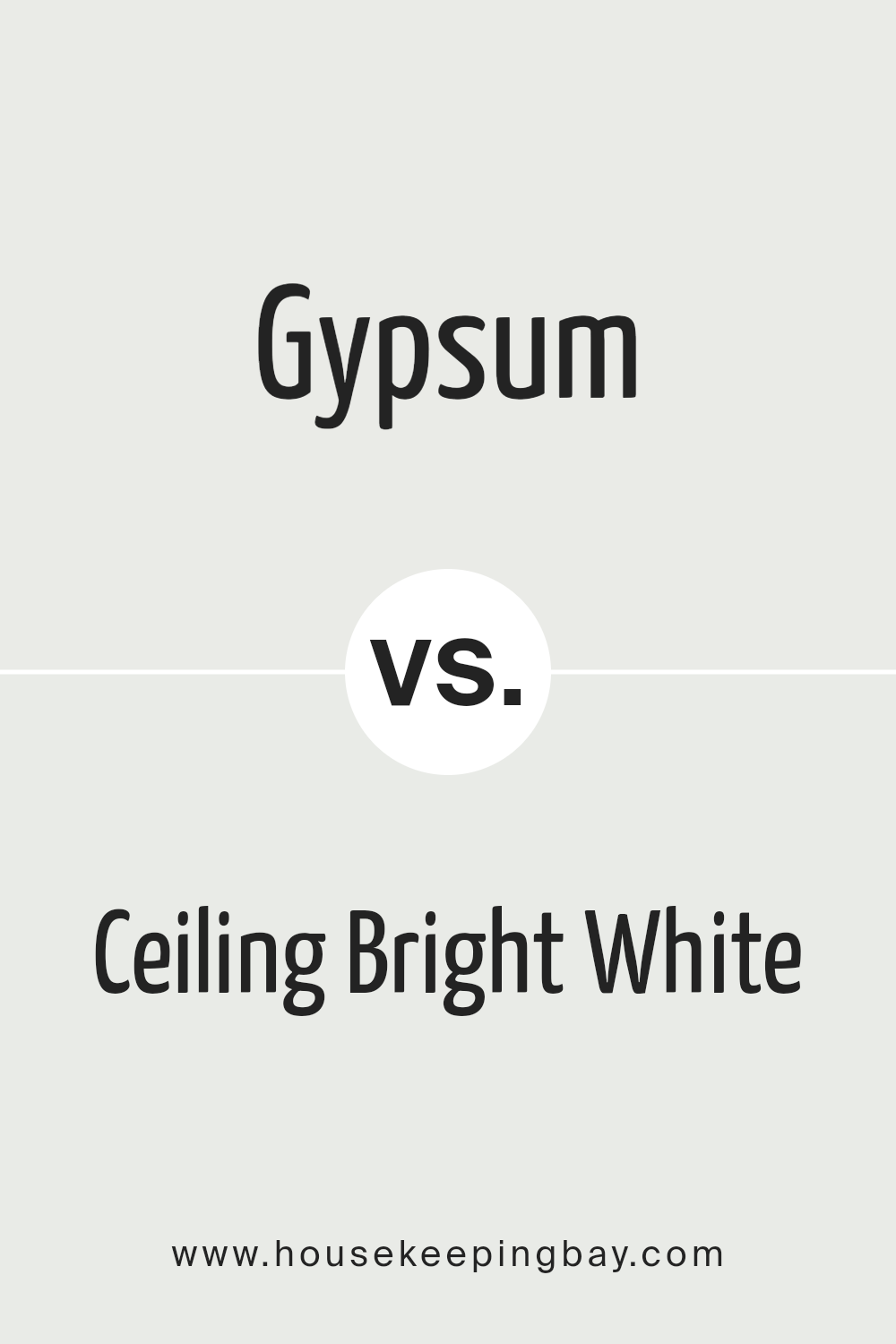
Gypsum SW 9543 by Sherwin Williams vs Ceiling Bright White SW 7007 by Sherwin Williams
Gypsum SW 9543 and Ceiling Bright White SW 7007 by Sherwin Williams present a fascinating contrast in the white and near-white spectrum, ideal for those looking to create nuanced aesthetic differences in their space.
Gypsum SW 9543 is a subtle, warm neutral with a soft, inviting tone that evokes a sense of calm and comfort, making it perfect for living areas and bedrooms where a cozy atmosphere is desired. Its warmth adds depth to walls without overpowering the room, making it versatile for combining with various decor styles and colors.
On the other hand, Ceiling Bright White SW 7007 is a crisp, pure white that maximizes light reflection, creating an illusion of more space and offering a clean backdrop for any room. Its brightness is especially favored for ceilings and trim, as it provides a sharp contrast to other wall colors, accentuating architectural details and making spaces feel more open and airy.
Choosing between Gypsum SW 9543 and Ceiling Bright White SW 7007 depends on the desired ambiance and functional aspects of the space, with Gypsum offering warmth and softness, and Ceiling Bright White providing a fresh, expansive feel.
You can see recommended paint color below:
housekeepingbay.com
Gypsum SW 9543 by Sherwin Williams vs Natural White SW 9542 by Sherwin Williams
Gypsum SW 9543 and Natural White SW 9542 by Sherwin-Williams are two subtle hues that evoke a sense of calm and simplicity but differ distinctively upon closer inspection. Gypsum leans towards a soft, almost ethereal pale gray that captures the likeness of its namesake mineral, offering a cool undertone that brings a serene, peaceful ambiance to spaces. It works beautifully in environments where the aim is to create a tranquil, airy feel, making rooms appear more spacious and open.
Contrastingly, Natural White SW 9542 nudges towards a warmer spectrum, embodying a creamy, inviting quality without veering into the territory of starkness or coldness. This shade is adept at creating a cozy, welcoming environment, drawing on its subtle, almost imperceptible pinkish undertone to infuse spaces with warmth, making it ideal for areas where comfort and relaxation are key.
Both colors, while close in their light and neutral essence, serve unique purposes. Gypsum, with its cooler undertone, suits minimalist or contemporary designs that require a crisp, clean backdrop. Natural White, on the other hand, is perfect for traditional or rustic settings where a softer, warmer ambiance is desired. Their subtle distinctions allow them to cater to different aesthetic preferences and design requirements, making them versatile choices for various interior spaces.
You can see recommended paint color below:
housekeepingbay.com
Gypsum SW 9543 by Sherwin Williams vs White Sail SW 9622 by Sherwin Williams
Gypsum SW 9543 and White Sail SW 9622, both by Sherwin Williams, present a subtle yet distinct variance in hue and mood that can significantly impact interior spaces. Gypsum is a soft, warm neutral with a hint of beige, lending a cozy and inviting atmosphere to any room. It offers a sense of calm and serenity, making it ideal for spaces that aim for a relaxed and soothing ambiance. Its warm undertones make it versatile for combining with both bright and muted color palettes, enhancing the flexibility in design choices.
On the other hand, White Sail SW 9622 steps in with a cleaner, brighter presence. This color is closer to pure white but with a soft touch that avoids the starkness often associated with true whites. White Sail brings an airy and luminous quality to spaces, promoting a sense of openness and purity. It is particularly well-suited for creating a fresh and vibrant environment, making rooms appear larger and more illuminated.
The choice between Gypsum and White Sail hinges on the desired atmosphere; Gypsum leans towards warmth and comfort, while White Sail skews towards brightness and expansiveness. Both colors offer a beautiful backdrop for various decor styles, yet their individual characteristics can uniquely influence the mood and perception of a space.
You can see recommended paint color below:
- SW 9622 White Sail
housekeepingbay.com
Conclusion
Concluding, Gypsum SW 9543 by Sherwin Williams encapsulates a sense of peace and serenity, making it an exceptional choice for those seeking to create a calm and welcoming atmosphere in their spaces. Its versatility enables it to be used in a variety of settings, from living rooms and bedrooms to kitchens and bathrooms, blending seamlessly with different styles and decor.
The color has a unique ability to reflect light, adding a subtle brightness to rooms without overwhelming them, making spaces appear more spacious and airy.
Moreover, Gypsum SW 9543’s soft, neutral hue serves as the perfect backdrop for both bold and muted color palettes, allowing homeowners and designers to experiment with different textures and accent colors. Its timeless elegance ensures that it remains in vogue, transcending fleeting design trends.
Whether aiming for a minimalist chic, a rustic charm, or a contemporary edge, Gypsum SW 9543 by Sherwin Williams offers a solid foundation to build upon, proving to be a versatile and enduring choice for any interior design project.
housekeepingbay.com
Ever wished paint sampling was as easy as sticking a sticker? Guess what? Now it is! Discover Samplize's unique Peel & Stick samples. Get started now and say goodbye to the old messy way!
Get paint samples


