47 Modern Farmhouse Paint Colors by Sherwin Williams
The Power of the Right Paint Color in a Modern Farmhouse
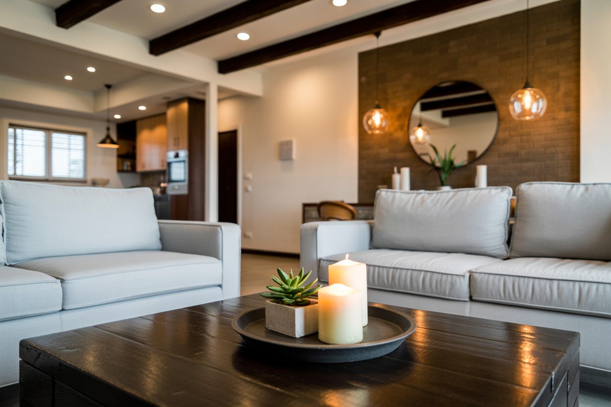
When I walk into a house, the first thing I notice isn’t the furniture or the layout — it’s the feeling. And that feeling often comes down to the paint color. In modern farmhouse design, paint isn’t just paint. It sets the entire mood.
A good color can make a room feel warm and lived-in without being too busy. It can make an open-concept home feel connected. And it can take a plain wall and turn it into something that feels honest and calming — like a home that’s always been there, even if it was just built last year.
That’s why I always come back to Sherwin-Williams. Their paints give me the right range for this style — warm whites, soft grays, and earthy greens that never feel too cold or too trendy.
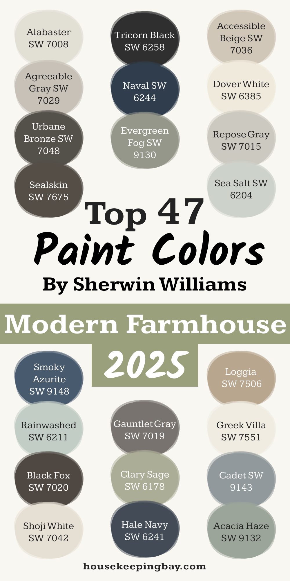
Whether you’re painting one wall or planning your whole house, I’ve pulled together 47 of my favorite Sherwin-Williams colors that work perfectly for a modern farmhouse look.
Some are well-known (for a reason). Others are a little more surprising. All of them are tried and tested — by me, in real homes, with real families.
housekeepingbay.com
What Makes a Paint Color ‘Modern Farmhouse’?
To get the modern farmhouse look right, the paint color has to walk a very fine line. It needs to feel fresh but not sterile. Cozy but not cluttered. I think of it as finding a color that could work in both a brand-new build and a 100-year-old barn that’s been lovingly restored.
The Common Traits I Look For
Here’s what I keep in mind when picking paint colors for this style:
- Soft, muted tones – no harsh or flashy colors
- Warm undertones – even in grays or whites, I look for a touch of warmth
- Natural feel – colors that you could imagine in a cotton field or a pine forest
You’ll notice most modern farmhouse palettes lean into:
- Warm whites (like Sherwin-Williams Alabaster)
- Greige tones (that’s gray + beige — super popular right now)
- Earthy greens and deep charcoals
Even bold colors, like navy or black, can work — as long as they’re used sparingly and balanced out with lighter shades.
What the Experts Say
Sue Wadden, Director of Color Marketing at Sherwin-Williams, once said:
“A modern farmhouse palette is all about a curated mix of soft neutrals that reflect natural light and feel calm.”
This kind of palette works especially well in open-concept homes, which are common in modern farmhouse layouts. You want a flow, not a patchwork.
How I Choose Paint Colors for a Modern Farmhouse Look
Picking paint colors isn’t just about what looks good in a photo. It’s about what feels right in real life. When I’m helping a client — or even painting my own home — I always start with the same 3 steps.
1. Think in Neutrals First
A lot of people jump straight to accent colors, but I always start with a neutral foundation. That’s your walls, ceilings, trim — even your kitchen cabinets. These are the colors that give your home its “background feeling.”
I usually go with a soft white (like Snowbound SW 7004) or a warm greige (Agreeable Gray SW 7029 is a favorite) for these bigger areas. Then I layer in deeper or richer colors for accents.
2. Plan Room by Room, But Stay Cohesive
Every room has its own light and mood, so I don’t believe in one single paint color for the whole house. That said, the flow matters. In modern farmhouse homes, especially with open layouts, you want each room to feel slightly different but still part of the same story.
For example:
- Living Room: Warm beige or soft taupe — cozy but clean.
- Kitchen: White walls with green-gray cabinets.
- Bedrooms: Muted tones with soft contrast — maybe a clay tone or dusty olive.
3. Trust the Light
Natural light can change everything. A color that looks beige in the store might turn yellow in your room. That’s why I always test swatches in a room for at least two days — morning and evening.
A 2023 study from Zillow found that homes with light blue or soft gray kitchens sold for an average of $1,809 more than expected
This tells me people are drawn to soft, calming colors that feel fresh but grounded — exactly what the modern farmhouse look is about.
Favorite Farmhouse Whites by Sherwin-Williams
In modern farmhouse design, white isn’t just white. The right shade can bring in warmth, soften hard lines, or brighten dark corners. These are my most-used white paints — not too cold, not too creamy.
1. Alabaster (SW 7008)
If I had to choose one paint for every farmhouse wall I’ve ever painted, this would be it. It’s warm without being yellow. Soft but still bright. Joanna Gaines used it in her own home — and honestly, it just works.
“Alabaster creates an atmosphere of soft comfort and ease.”
2. Pure White (SW 7005)
Don’t let the name fool you — this isn’t a stark, blinding white. It has a hint of warmth that makes it ideal for trim, ceilings, and walls that need a clean contrast without feeling cold.
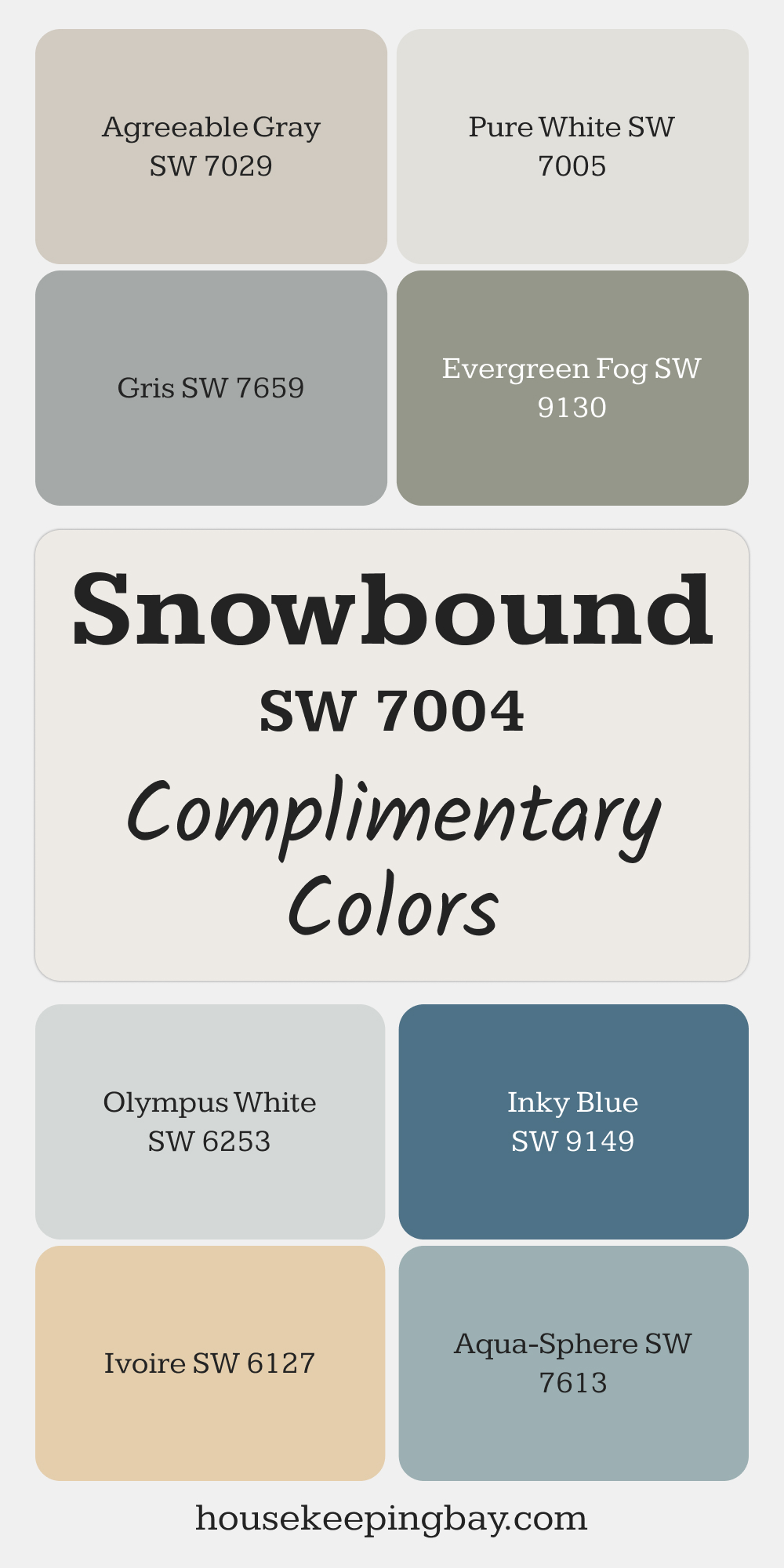
3. Snowbound SW-7004 (SW 7004)
This is my go-to for homes with northern light. It has a slightly cool undertone that balances out warm wood floors or natural textures.
via housekeepingbay.com
4. Greek Villa (SW 7551)
A cozy, creamy white that works beautifully on walls or even cabinetry. I love this one for homes that lean more traditional in their farmhouse style.
5. White Duck (SW 7010)
Sounds funny — works beautifully. This off-white has just enough beige to feel warm, but still light enough to be used across a whole house.
6. Shoji White (SW 7042)
Great for when you want an aged, farmhouse feel. It’s a soft neutral with a smidge of gray, perfect against reclaimed wood.

housekeepingbay.com
7. Westhighland White (SW 7566)
One of the more “pure” whites, but still not sharp or cold. Great for baseboards and door trims when paired with warmer walls.
8. Marshmallow (SW 7001)
Yes, it’s a little sweet — but I like it for nurseries or guest rooms where you want a bit of softness and comfort.
9. Oyster White (SW 7637)
This leans slightly gray, and I find it perfect for older homes that have lots of wood grain or exposed beams.
10. Dover White (SW 6385)
Very creamy and soft. Be careful though — this one can read yellow in bright sun. I usually use it in shaded rooms or hallways.
Warm Neutrals & Greiges
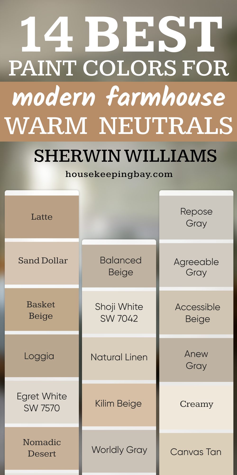
These are the colors that make a modern farmhouse feel lived-in and grounded. They go on walls, cabinets, even exterior siding. I turn to these again and again when I want a space to feel calm but not bland.
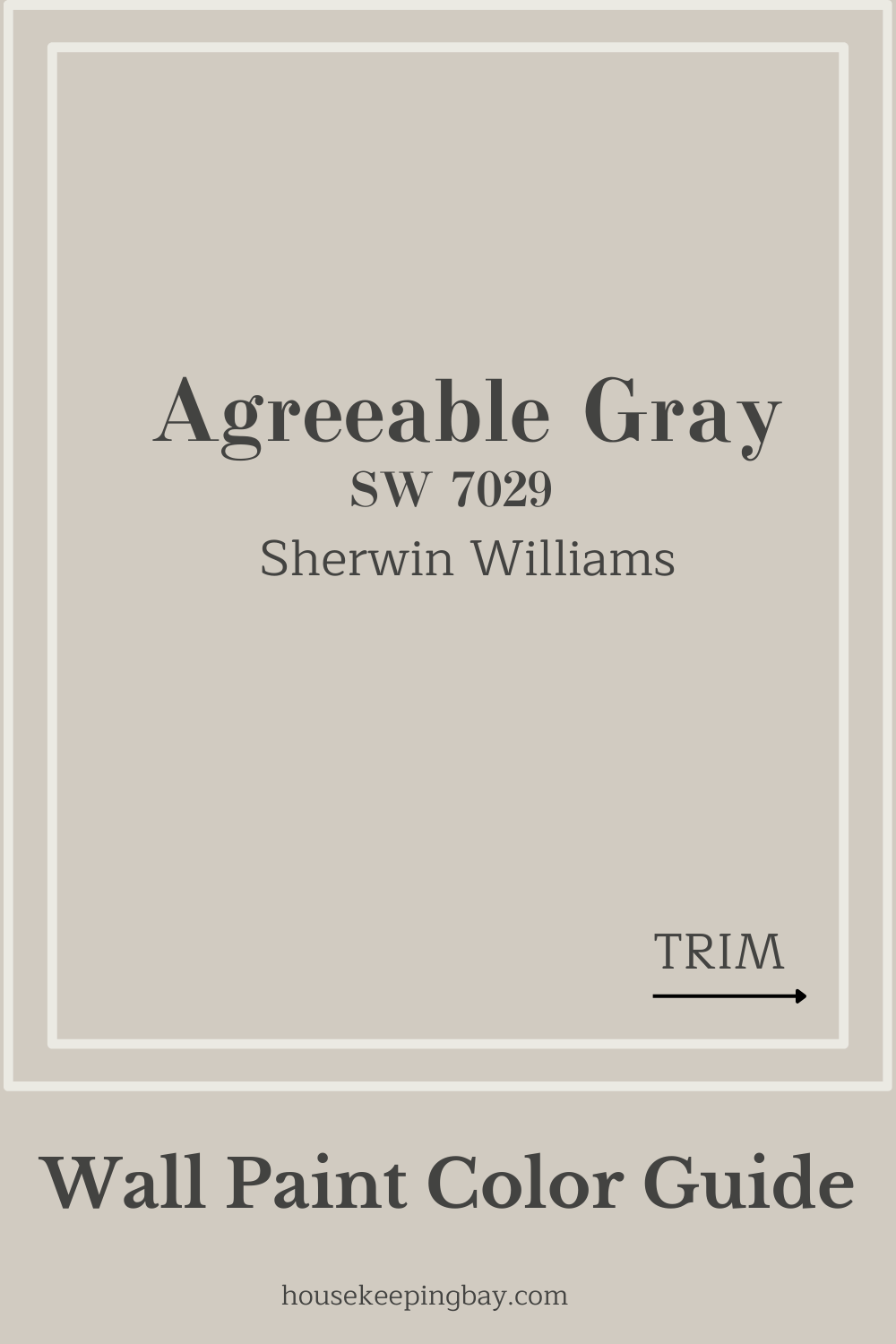
11. Agreeable Gray (SW 7029)
Probably the most popular greige in the country — and for good reason. It balances gray and beige perfectly. I’ve used it in living rooms, entryways, and even bathrooms.
Fun fact: According to a 2023 HomeLight report, homes painted in light greige sold faster than homes with plain gray or beige.
housekeepingbay.com
12. Accessible Beige (SW 7036)
This is one of my safest picks. It’s beige, but not old-school yellow beige. It leans a little gray — perfect for homes with a lot of natural wood or brick.
13. Repose Gray (SW 7015)
Softer than Agreeable Gray, with cooler undertones. I use this one in bedrooms or offices where you want a bit more serenity (without being too blue or icy).
14. Balanced Beige (SW 7037)
This is what I go for when I want a slightly darker neutral that still feels safe. Think cozy reading nook or moody hallway.
15. Natural Linen (SW 9109)
It feels like its name. Clean, relaxed, warm — just like a linen throw over a slipcovered sofa.
16. Anew Gray (SW 7030)
A little deeper than Agreeable Gray, and I actually prefer this one in homes with darker floors. It feels anchored.
17. Worldly Gray (SW 7043)
This one is interesting. Sometimes it looks beige, sometimes gray, depending on the light. Great for large open spaces where rooms blend together.
18. Kilim Beige (SW 6106)
I use this when I want a richer feel without going full brown. Perfect for older homes or houses with rustic finishes.
19. Canvas Tan (SW 7531)
Such a smooth, soft tan. Doesn’t pull orange or pink. I like this one for farmhouse kitchens with white cabinetry.
20. Loggia (SW 7506)
A deeper taupe that looks beautiful with black hardware or wrought iron lighting. I’ve even used this on porch ceilings for a cozy outdoor vibe.
housekeepingbay.com
Earthy Greens & Soft Sages
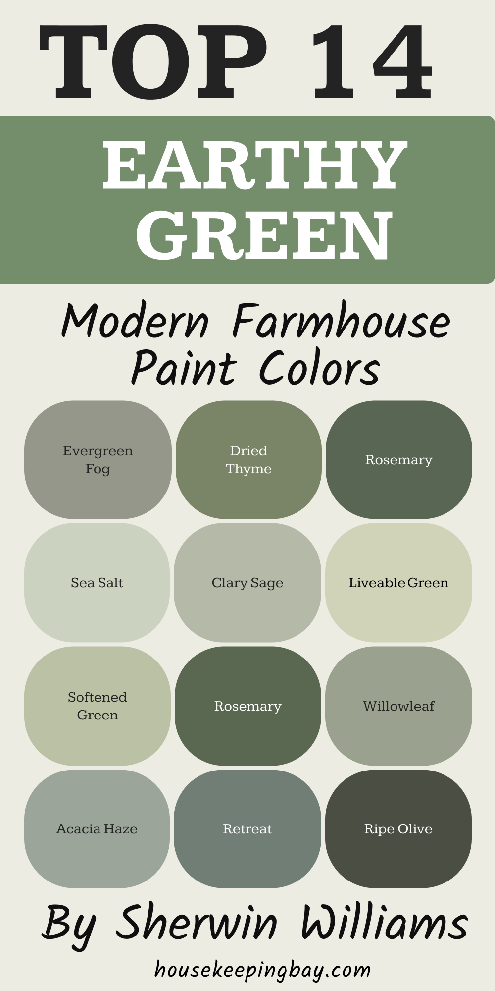
Green is where the farmhouse feel really comes to life. It reminds me of old wooden doors, garden views, and cabinets that look like they’ve been there forever. I use these shades when I want something natural and comforting but still interesting.
21. Evergreen Fog (SW 9130)
Sherwin-Williams’ 2022 Color of the Year — and I’m still not over it. It’s a misty, earthy green with a touch of gray. Gorgeous on cabinetry or mudroom walls.
“Evergreen Fog is a sophisticated wash of color for spaces that crave a subtle yet stunning statement.”
22. Clary Sage (SW 6178)
Soft, warm, and herbal. I’ve used this in laundry rooms and powder rooms — it feels clean, but with heart.
23. Svelte Sage (SW 6164)
This one feels a little more muted and “grown up.” It pairs beautifully with creamy whites and matte black finishes.
24. Retreat (SW 6207)
A medium-depth green-gray that’s bold but not loud. I’ve seen this on accent walls in bedrooms or back-of-bookshelf details.

housekeepingbay.com
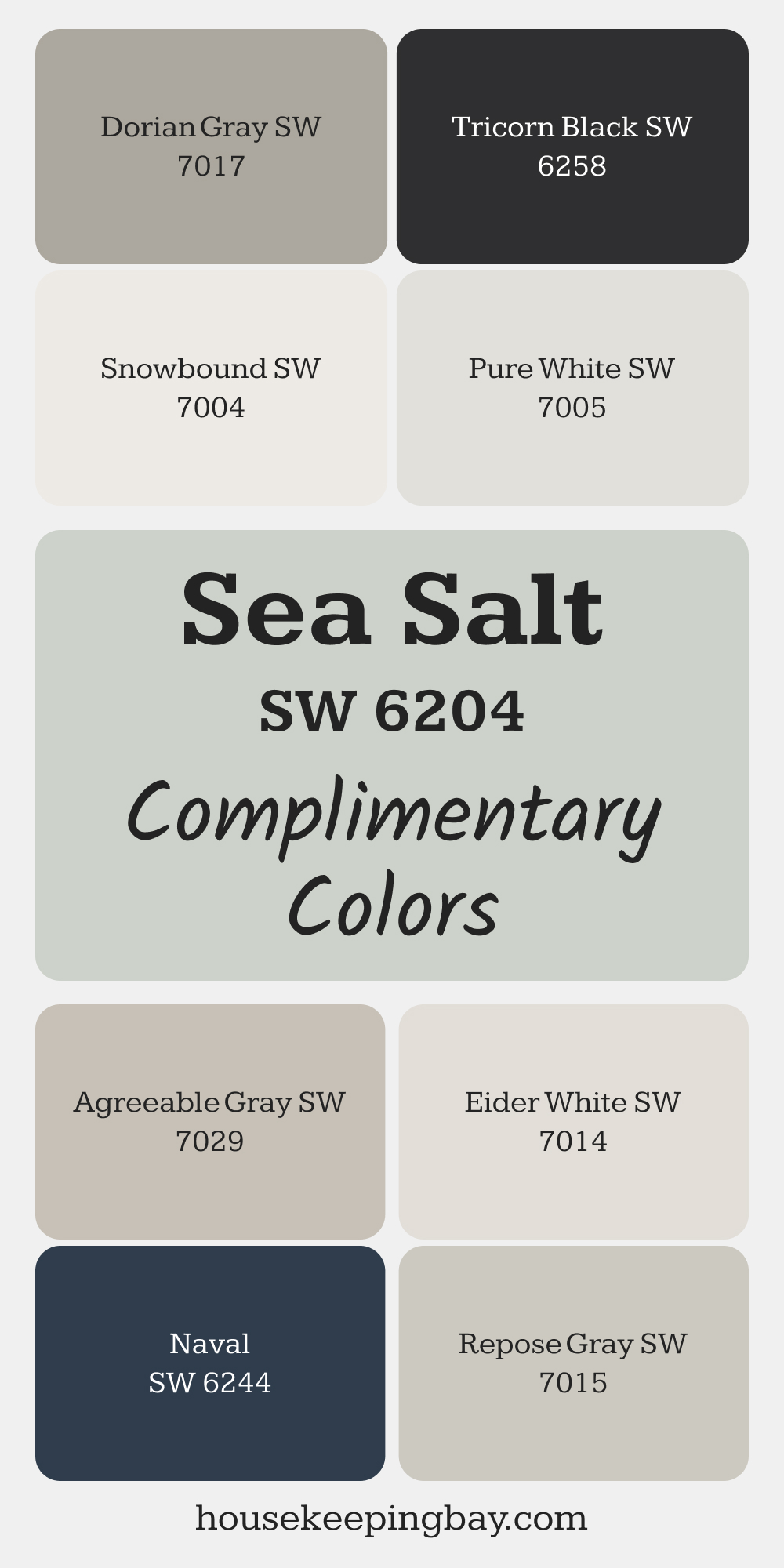
25. Sea Salt (SW 6204)
Technically a green-blue, but it’s so soft it almost reads neutral. Great in bathrooms and entryways — it freshens up a space instantly.
via housekeepingbay.com
26. Softened Green (SW 6177)
Like a garden in the early morning. I like using this in offices or kitchen islands, especially when paired with warm brass hardware.
27. Liveable Green (SW 6176)
A little more yellow in this one — it’s fresh and full of life without being distracting.
28. Acacia Haze (SW 9132)
Moody and muted, this one looks amazing in older homes with original floors or dark trim.

housekeepingbay.com
29. Ripe Olive (SW 6209)
This is a bold, deep green. I save it for front doors, window trim, or moody accent walls. Looks amazing with warm white.
30. Rosemary (SW 6187)
One of the most elegant greens I know. Rich but not overpowering. It gives kitchen cabinets or bathroom vanities a calm, classic feel.
housekeepingbay.com
Cool Charcoals & Dramatic Darks
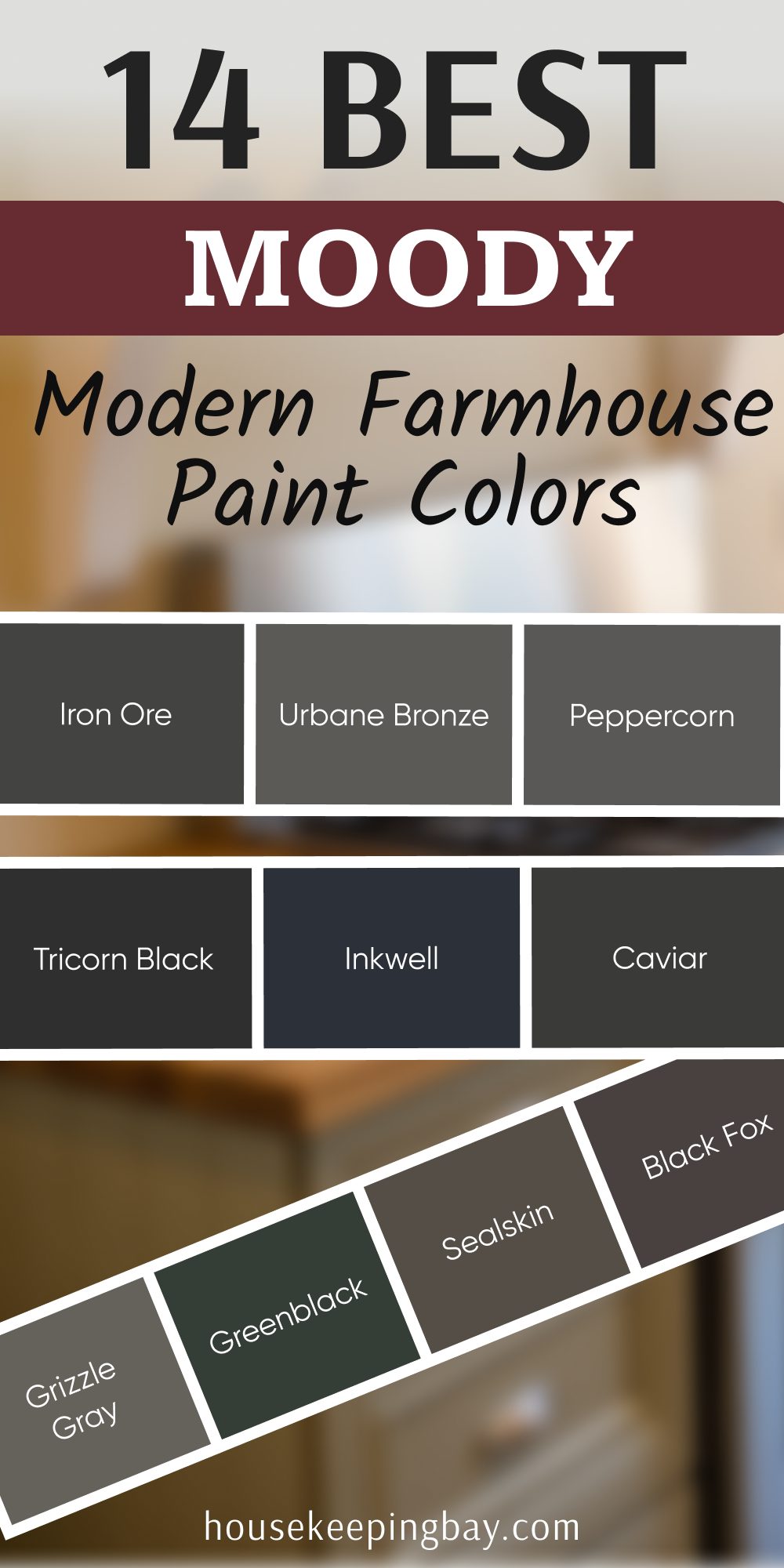
These colors are bold, but in the right places, they can be absolutely stunning. Think: black window trim, a deep island, or even an accent wall in a dining room. Used with restraint, they add the kind of drama that still feels cozy.
31. Iron Ore (SW 7069)
My #1 dark paint for farmhouse exteriors and doors. It’s deep, soft black — not harsh at all. Looks amazing with wood and white.
“Iron Ore is a dark charcoal that adds boldness and depth without stark contrast.”
32. Urbane Bronze (SW 7048)
Sherwin-Williams’ 2021 Color of the Year. It’s brown meets gray meets a touch of olive. I love this in a moody home office or on lower cabinets.
33. Peppercorn (SW 7674)
A deep gray that doesn’t turn blue. I’ve used this in bedrooms for a modern but calming backdrop. Works especially well with brass.
34. Tricorn Black (SW 6258)
This is your true black — no undertones. It’s sharp, clean, and classic. Perfect for front doors, interior windows, or stair railings.
35. Inkwell (SW 6992)
A black with strong navy undertones. I like this one in dining rooms or even small powder rooms with gold accents.
36. Caviar (SW 6990)
Slightly softer than Tricorn Black, with a bit of warmth. Beautiful on interior doors if you want something bold but not industrial.
37. Grizzle Gray (SW 7068)
This one leans green in certain light, which makes it perfect for outdoor spaces or homes with lots of natural wood.
38. Greenblack (SW 6994)
Yes, it’s black — but with deep forest green undertones. You might not notice it until it’s on the wall. Looks incredible with natural stone.
39. Sealskin (SW 7675)
Deep, chocolatey brown with just enough gray. I like using this in cozy living rooms with rustic beams and warm lighting.
40. Black Fox (SW 7020)
One of the warmest “dark” colors out there. This is perfect if you’re scared of true black but still want something bold.
housekeepingbay.com
Unexpected but Beautiful Accents
These colors don’t always show up on the typical farmhouse Pinterest board — and that’s exactly why I love them. When you want something a little different, a little more you, these shades can add that perfect touch of personality.
41. Moody Blue (SW 6221)
A rich blue-gray that feels calm but still interesting. I’ve used this in guest bedrooms and on backs of built-in shelves. Works well with warm whites and matte black.
42. Blushing (SW 6617)
A very soft, barely-there pink. It’s gentle and warm — perfect for nurseries or powder rooms, especially paired with aged brass or creamy whites.
43. French Moire (SW 9056)
Somewhere between dusty lavender and gray, this one surprises people. I used it in a master closet once, and it felt like a little secret escape.
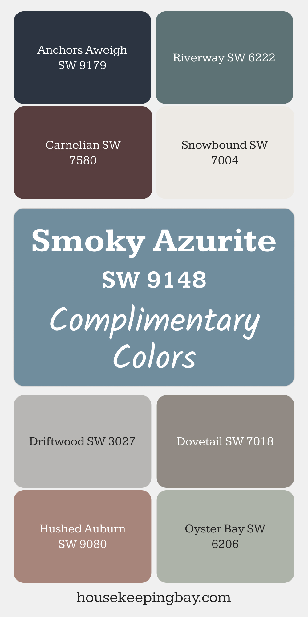
44. Smoky Azurite (SW 9148)
Deep, dusty navy — not too sharp. I love this for doors, small bathrooms, or laundry room cabinets. It adds depth without being too moody.
via housekeepingbay.com
45. Veiled Violet (SW 6268)
Very muted and soft. When paired with warm woods, it can add just the right whisper of color. I like it for vintage-style homes.
46. Redend Point (SW 9081)
This was Sherwin-Williams’ Color of the Year for 2023. A soft, earthy clay — not too pink, not too brown. Beautiful for accent walls, and it actually plays well with farmhouse neutrals.

housekeepingbay.com
47. Naval (SW 6244)
A classic navy, but with just enough warmth to avoid feeling stiff. I’ve used this on kitchen islands, barn doors, and even exteriors.
How I Test Paint Colors Before Making a Final Choice
You can’t just pick a color from a tiny paper card at the store and hope it works. Believe me, I’ve seen too many “oops” moments from folks who didn’t test first. The way a color looks in a showroom is never how it looks in your home.
Here’s exactly how I make sure a color will work before committing:
1. Always Test in Natural Light
Natural light changes everything — especially in farmhouse homes with big windows and open spaces.
What I do:
I paint sample boards (foam core or poster board works great) and move them around the room throughout the day. Morning light, afternoon light, and evening light can all shift a color’s tone.
North-facing rooms tend to bring out cool tones. South-facing ones make colors look warmer.
2. Use Sherwin-Williams Color Samples
Sherwin-Williams offers small sample sizes (around $5), and it’s worth every penny.
🖌️ Pro tip: Don’t paint samples directly on the wall. The wall color underneath can mess with how the sample looks. Always use two coats on a neutral board instead.
3. Don’t Forget About Light Bulbs
Most farmhouse homes mix natural light with soft warm bulbs — but if you use daylight LED lighting, that can drastically change how a color looks.
Try this:
Look at your painted sample board under every light you actually use in the room — lamps, overheads, etc.
4. Look at the Finish
Flat, eggshell, satin, semi-gloss — they all reflect light differently. I use satin for walls (easy to clean), semi-gloss for trim, and matte for ceilings.
Satin finishes tend to make colors appear a tiny bit deeper or richer.
5. Trust How It Feels
I always tell my clients this: If you keep staring at a color and trying to like it… it’s not the right color. The right one feels easy and natural. You shouldn’t have to convince yourself.
Let Me Leave You with This
Choosing paint colors for your home shouldn’t feel like pressure. It should feel like possibility.
When I help someone design their home — or stage one for sale — I always remind them that paint is one of the simplest but most powerful tools we have. It’s a coat of color, yes. But it’s also a feeling. A memory waiting to be made. A backdrop for dinner conversations, rainy days on the couch, and coffee on the porch.
The 47 colors I shared here? They’re not just trendy. They’ve worked in real homes with real families — some calm and quiet, some full of joyful chaos. What they all have in common is a sense of comfort, warmth, and quiet confidence. That’s what modern farmhouse is really about.
So trust your gut. Try your samples. And if one of these shades makes you feel something — that’s probably the one.
And if you’re still unsure, go with Alabaster. It’s never let me down.
housekeepingbay.com
