Hazel Gaze SW 9652 Paint Color by Sherwin-Williams
A Color Analysis to Help You Use It Correctly
Color is an intrinsic part of our daily life and an essential component of home design. From creating specific moods to complimenting different styles, colors play a multifaceted role. Sherwin-Williams, a renowned name in the world of paints, offers a vast palette of shades, each with its unique charm. Among them, SW 9652 Hazel Gaze stands out.
This article delves into the specifics of this color, its undertones, coordinating hues, and much more.
via sherwin-williams.com
What Color Is SW 9652 Hazel Gaze?
Table of Contents
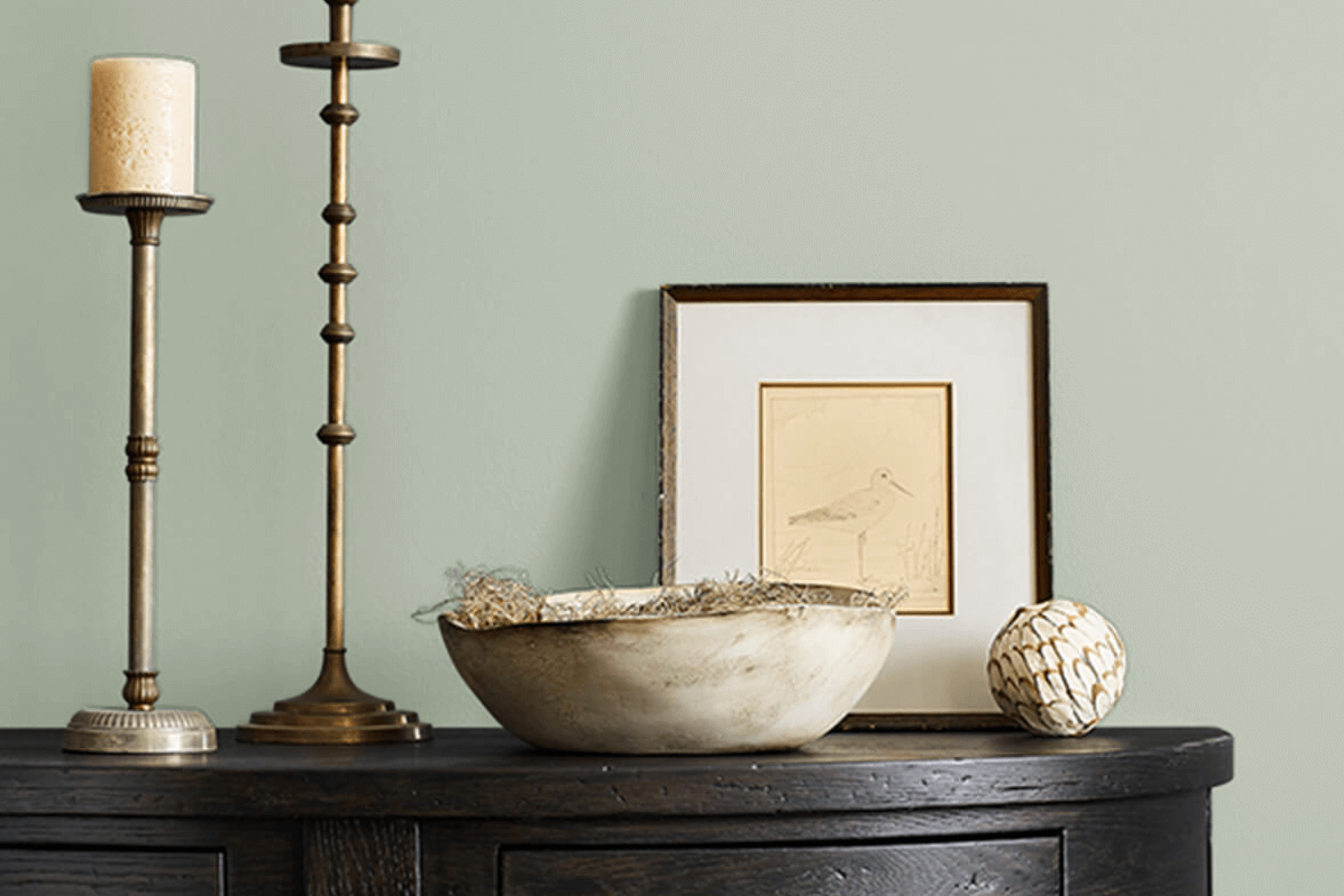
Residing somewhere between a soft brown and muted green, SW 9652 Hazel Gaze exudes a sense of warmth and comfort. It brings to mind the earthy tones of a serene forest or the sophisticated patina of aged bronze. Perfect for interiors leaning toward traditional, rustic, or even bohemian styles, this color is versatile. It pairs excellently with natural textures like wood, stone, and linen.
housekeepingbay.com
Is It a Warm Or Cool Color?
SW 9652 Hazel Gaze leans towards being a warm color. Its earthy undertones evoke feelings of coziness and welcome. In homes, warm colors are known to make large spaces feel more intimate and rooms more inviting. This warmth in Hazel Gaze aids in creating snug sanctuaries, especially in living or sleeping areas.
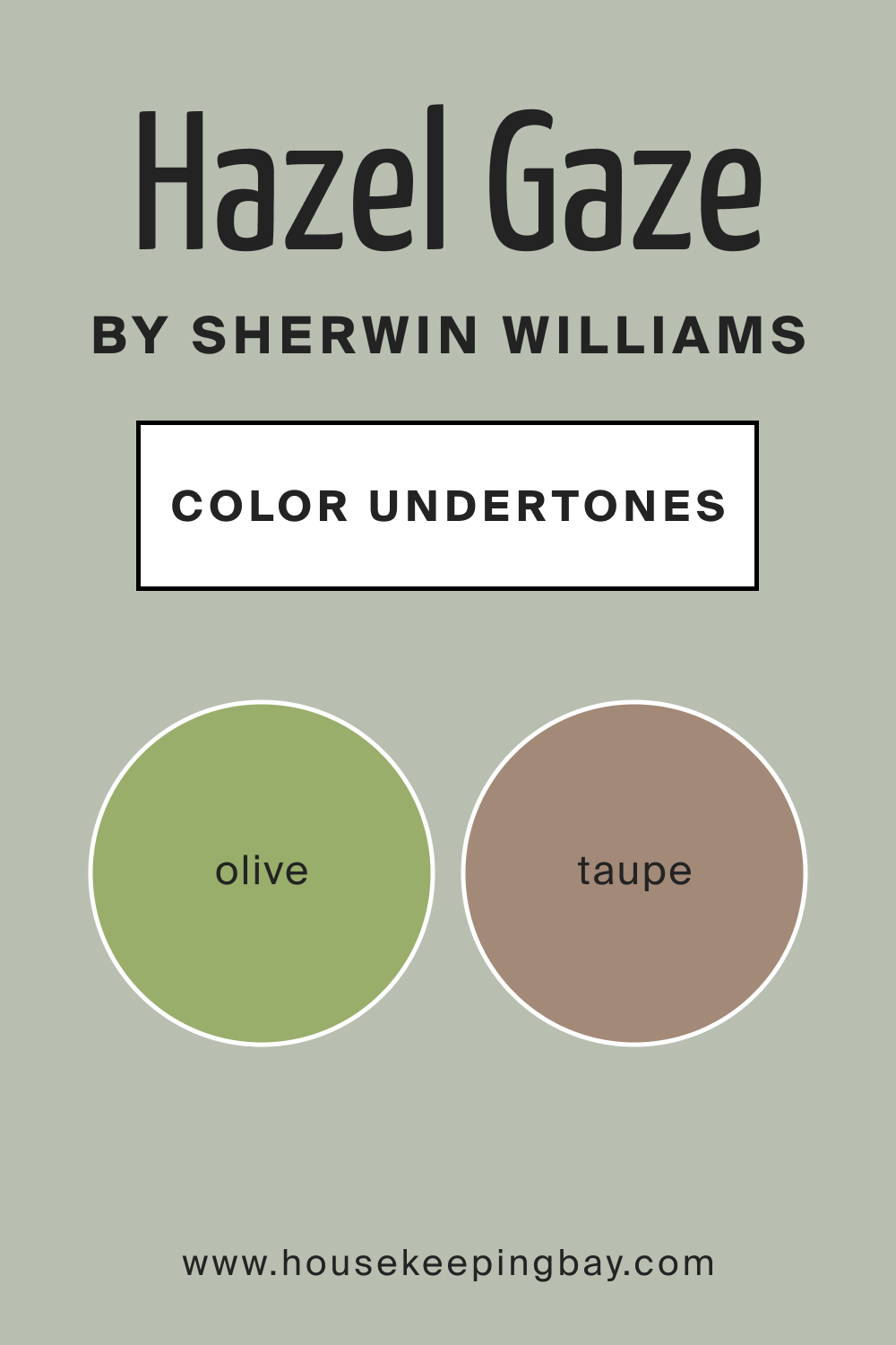
Undertones of SW 9652 Hazel Gaze
The magic of any paint color lies in its undertones. For Hazel Gaze, subtle undertones of olive and taupe give it a complex, multidimensional feel. Undertones influence how a color is perceived and how it interacts with other colors and elements in a room. In the case of Hazel Gaze, its undertones allow it to oscillate between an organic green and a sophisticated taupe, depending on its surroundings.
housekeepingbay.com
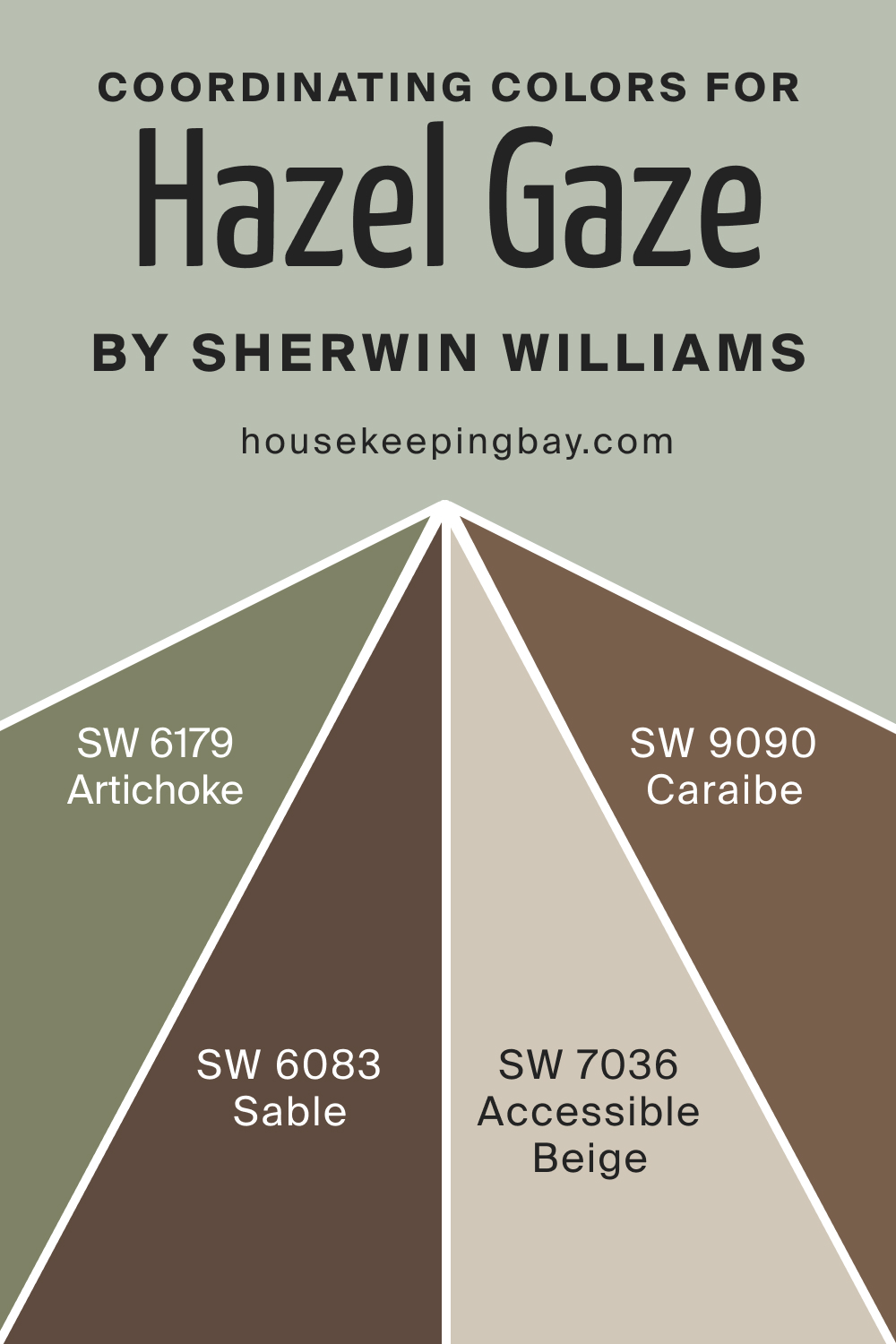
Coordinating Colors of SW 9652 Hazel Gaze
Coordinating colors harmonize with the primary shade to create a cohesive look. For SW Hazel Gaze, its coordinating colors lean towards soft neutrals and muted earth tones. Some suggestions include:
- Soft beige (SW 7036 Accessible Beige ) : A soft, sandy hue reminiscent of a tranquil desert.
- Muted olive (SW 6179 Artichoke ): A subdued green with hints of earthiness.
- Deep brown (SW 6083 Sable , SW 9090 Caraibe ): A rich, aged brown, like vintage leather.
housekeepingbay.com
How Does Lighting Affect SW 9652 Hazel Gaze?
Lighting is a crucial element in the world of colors. In artificial light, Hazel Gaze adopts a more muted, subdued tone, exuding a cozy ambiance. Natural light, especially during golden hours, amplifies its warm undertones, making it more vibrant. For rooms facing north, it tends to appear slightly cooler. In contrast, south-facing rooms will accentuate its warmth.
East-facing rooms will see Hazel Gaze illuminated with a soft, warm glow in the mornings, while west-facing spaces will bask in its coziness during the evening.
housekeepingbay.com
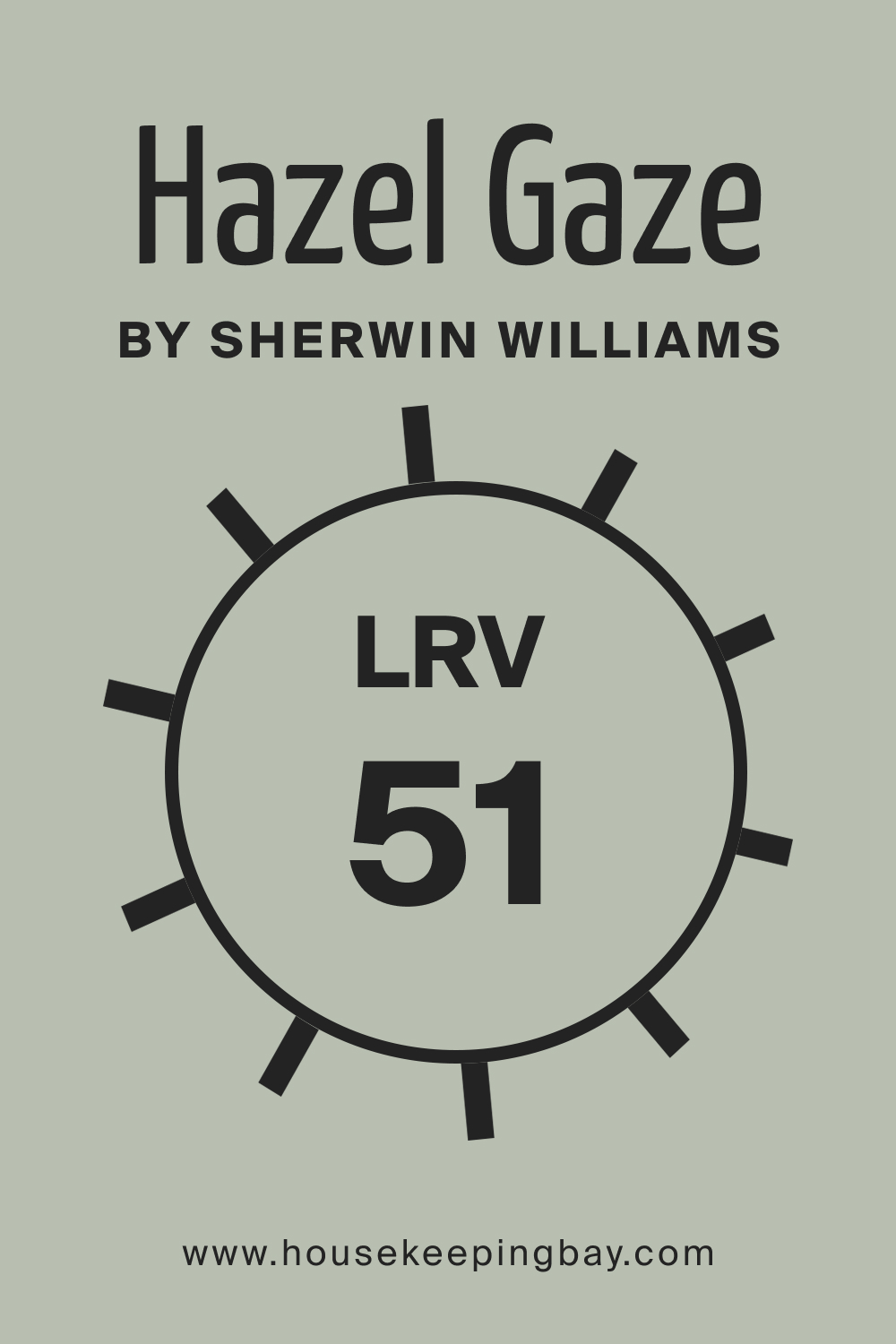
LRV of SW 9652 Hazel Gaze
Light Reflectance Value (LRV) indicates how much light a color will reflect. At 51, Hazel Gaze sits at the midpoint, meaning it neither absorbs nor reflects excessive light. Such a balanced LRV makes this color adaptable. In practical terms, Hazel Gaze will not make a room feel overwhelmingly dark or excessively bright, striking an elegant balance.
housekeepingbay.com
What is LRV? Read it Before You Choose Your Ideal Paint Color
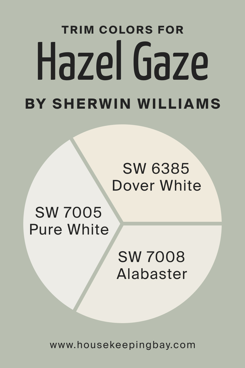
Trim Colors of SW 9652 Hazel Gaze
Trim colors, typically used for moldings, doors, and windows, enhance the primary wall color. For SW Hazel Gaze, shades of white from Sherwin-Williams, such as:
- SW 7005 Pure White : A crisp, clean white.
- SW 7008 Alabaster : A creamy, slightly off-white.
- SW 6385 Dover White : A warm, milky hue.
These whites will accentuate the depth and richness of Hazel Gaze, creating a harmonious interior
housekeepingbay.com
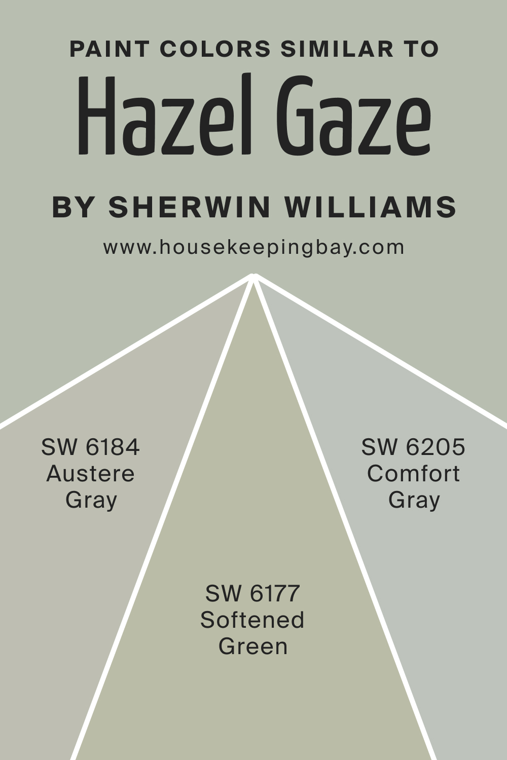
Colors Similar to SW 9652 Hazel Gaze
Recognizing colors similar to your primary choice facilitates comparisons and decisions. For SW Hazel Gaze, use the following alternative hues:
- SW 6184 Austere Gray is a muted, sophisticated hue
- SW 6205 Comfort Gray offers a calming aura with its gentle green undertones
- SW 6177 Softened Green , as the name suggests, provides a tender, organic vibe.
housekeepingbay.com
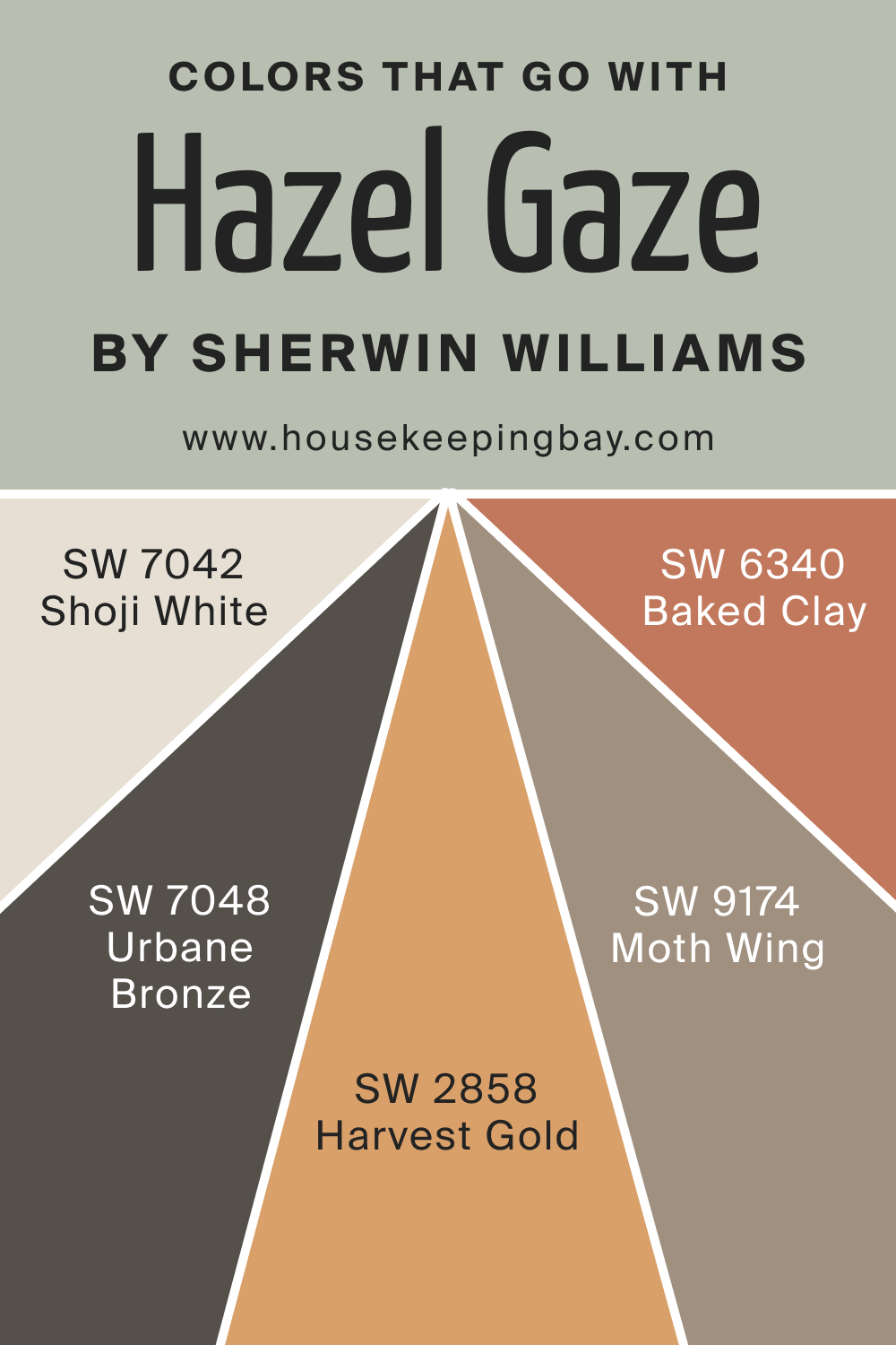
Colors That Go With SW 9652 Hazel Gaze
Creating a harmonious palette involves selecting colors that complement each other. Alongside SW Hazel Gaze, consider:
- SW 7042 Shoji White : A pristine off-white.
- SW 7048 Urbane Bronze : A sophisticated, deep gray-brown.
- SW 9174 Moth Wing : A muted taupe.
- SW 6340 Baked Clay : A warm terracotta.
- SW 2858 Harvest Gold : A sunny, earthy yellow.
Each of these shades, with Hazel Gaze, will create an exquisite, cohesive space.
housekeepingbay.com
How to Use SW 9652 Hazel Gaze In Your Home?
SW 9652 Hazel Gaze, with its sophisticated mix of brown and muted green, is versatile enough for nearly any room. It shines in traditional, bohemian, and even rustic interiors. The tranquility it exudes makes it suitable for personal spaces like bedrooms, while its sophistication is apt for common areas like living rooms.
Even bathrooms can benefit from its soothing palette, and its earthy undertones make it a front-runner for exterior facades. When aiming for a contemporary kitchen, Hazel Gaze on cabinets is a top choice.
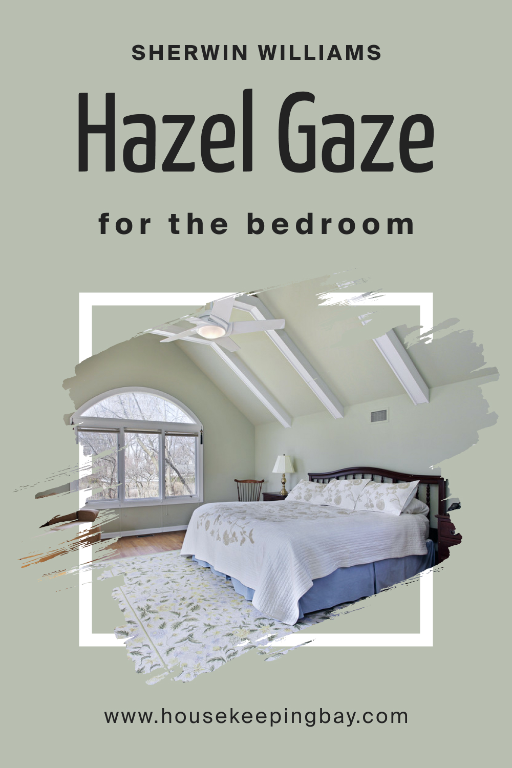
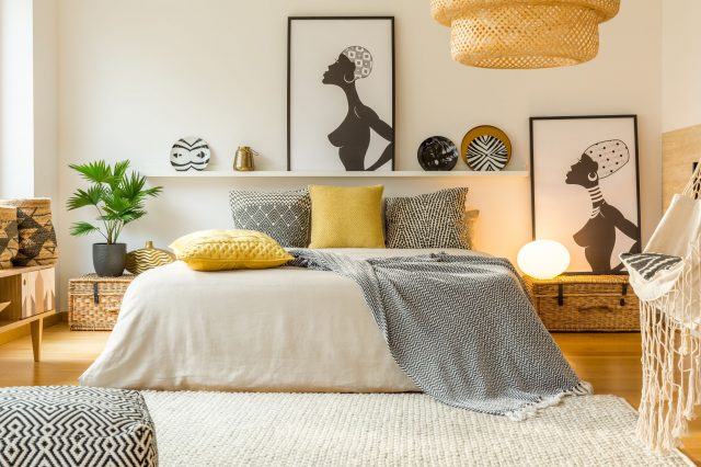
SW 9652 Hazel Gaze In the Bedroom
Hazel Gaze’s calming aura is perfect for bedrooms, creating a peaceful retreat. Its earthy undertones encourage relaxation and pair well with natural linens, wood furnishings, and soft lighting, making your bedroom feel like a serene sanctuary.
housekeepingbay.com
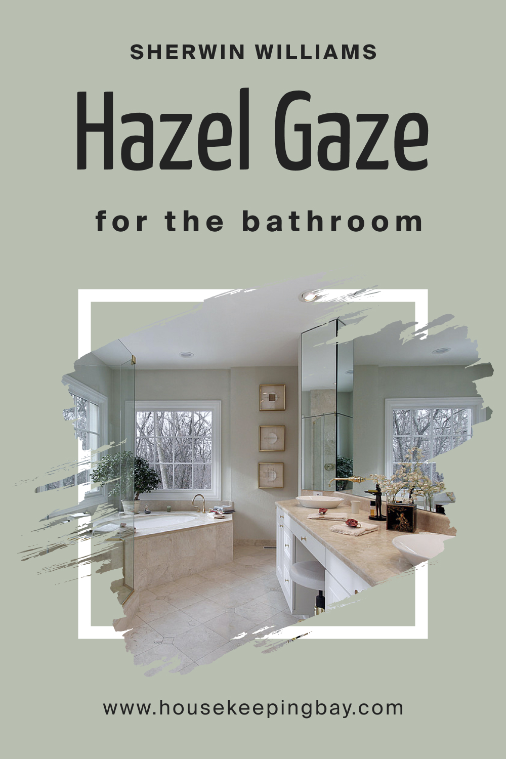
SW 9652 Hazel Gaze In the Bathroom
Transform your bathroom into a spa-like oasis with Hazel Gaze. Its muted green undertones complement white fixtures, while its warmth balances cool tiles and metals. Accessorize with bamboo mats and plants for a complete rejuvenating ambiance.
housekeepingbay.com
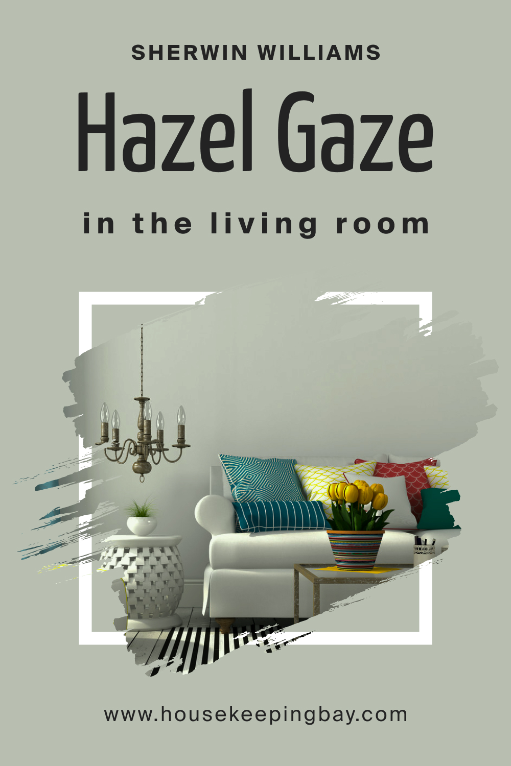
SW 9652 Hazel Gaze In the Living Room
For a living room that’s both elegant and welcoming, opt for Hazel Gaze. Its depth adds character to large spaces, while its warmth creates an inviting atmosphere. Paired with gold accents, plush fabrics, and wooden decor, it sets a sophisticated yet cozy tone.
housekeepingbay.com
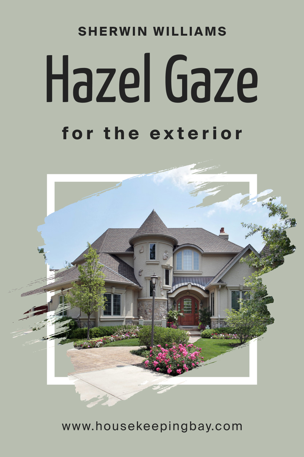
SW 9652 Hazel Gaze For an Exterior
Hazel Gaze’s durability and adaptability make it an excellent choice for exteriors. It evokes the feel of timeless brick homes, blending with natural surroundings. Pair it with deep browns or off-whites for trim to achieve a harmonious outdoor facade.
housekeepingbay.com
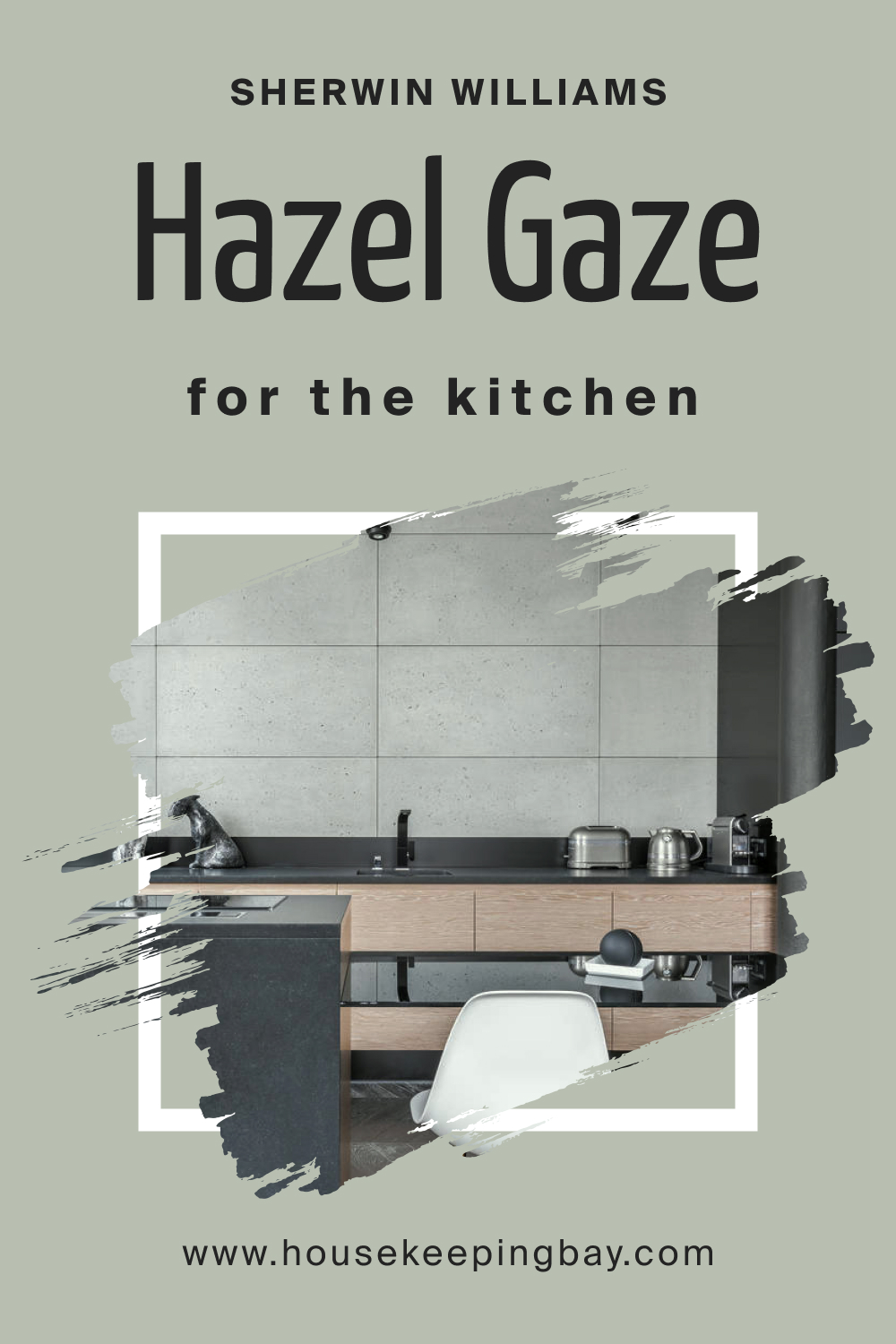
SW 9652 Hazel Gaze In the Kitchen
Kitchens in Hazel Gaze are both modern and homely. The shade complements wooden countertops and open shelving, while stainless steel appliances create a chic contrast. With white tiles as backsplash, Hazel Gaze transforms your kitchen into a stylish culinary hub.
housekeepingbay.com
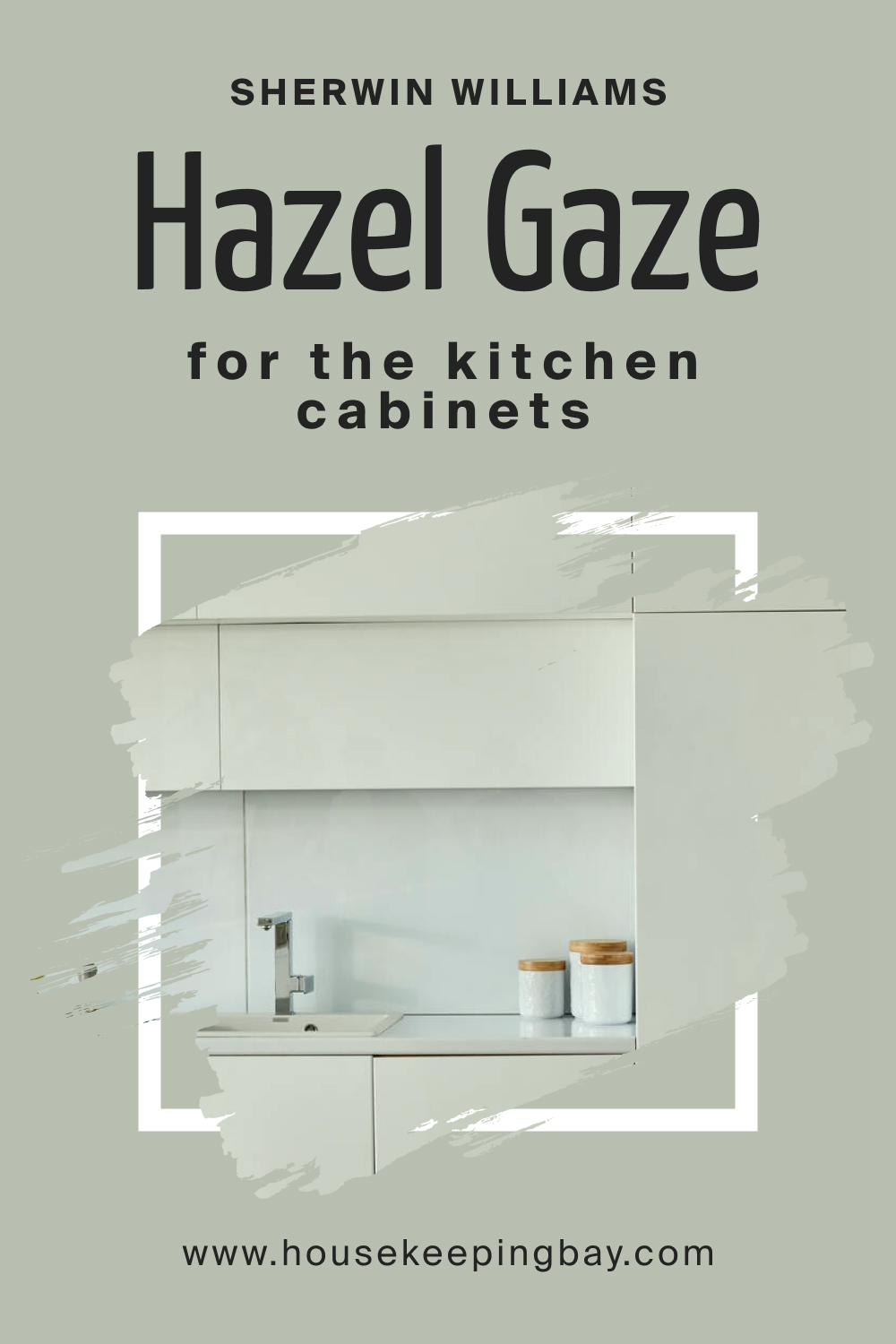
SW 9652 Hazel Gaze For the Kitchen Cabinets
Choosing Hazel Gaze for kitchen cabinets adds an earthy sophistication. Its subdued hue is an alternative to common neutrals, bringing depth without overpowering. Paired with brushed gold or silver hardware, Hazel Gaze cabinets become the room’s star, creating a contemporary yet warm kitchen aura.
housekeepingbay.com
Comparing SW 9652 Hazel Gaze With Other Colors
Color selection for a space is crucial, as it sets the tone, mood, and overall ambiance. Comparing different shades helps in visualizing the impact of each hue within a room, understanding undertones, and determining harmony or contrast with existing décor. It’s especially vital when colors are from the same family, as subtle differences can result in a vastly different feel.
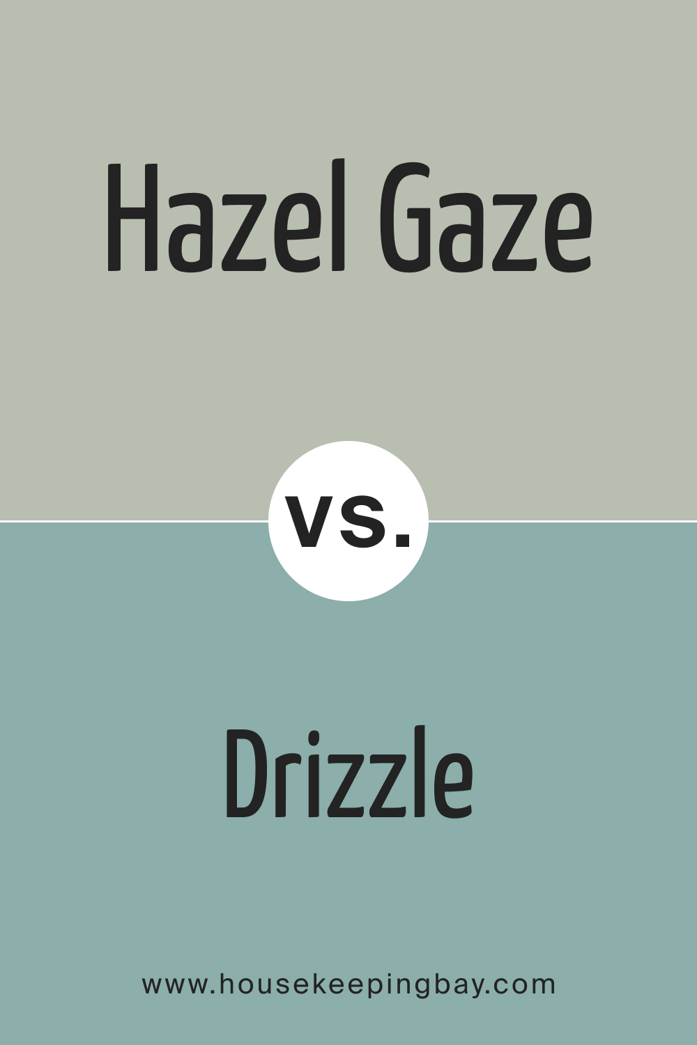
SW 9652 Hazel Gaze vs. SW 6479 Drizzle
SW Drizzle is known as a cool, muted, medium gray-blue, possibly reflecting tranquil and serene undertones, suitable for creating a calming atmosphere. It’s a versatile color that often works well in various settings such as bedrooms and bathrooms, pairing well with neutral tones.
SW Hazel Gaze, suggested by its name, might possess hazel or brownish tones, potentially creating a warmer, cozier feeling. It might suit living areas or dining rooms where a warmer atmosphere is preferred. The comparison of the two would likely involve contrasting the serene, cool tones of Drizzle against the presumable warm, welcoming essence of Hazel Gaze.
housekeepingbay.com
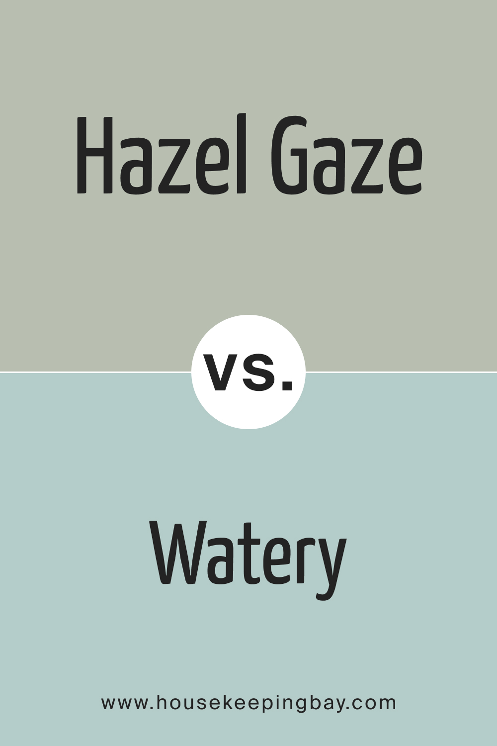
SW 9652 Hazel Gaze vs. SW 6478 Watery
SW Watery is a soft, muted light blue or aqua, reminiscent of gentle waters and open skies, evoking a refreshing and soothing aura. It can brighten and open up spaces, making it suitable for smaller rooms or areas lacking natural light. Comparatively, SW Hazel Gaze might emanate warmer, possibly earthier tones.
The distinction between them would likely revolve around the cool, refreshing nature of Watery in contrast to the presumably warm, grounding presence of Hazel Gaze, providing different atmospheric sensations, each suited to different spaces and preferences.
housekeepingbay.com
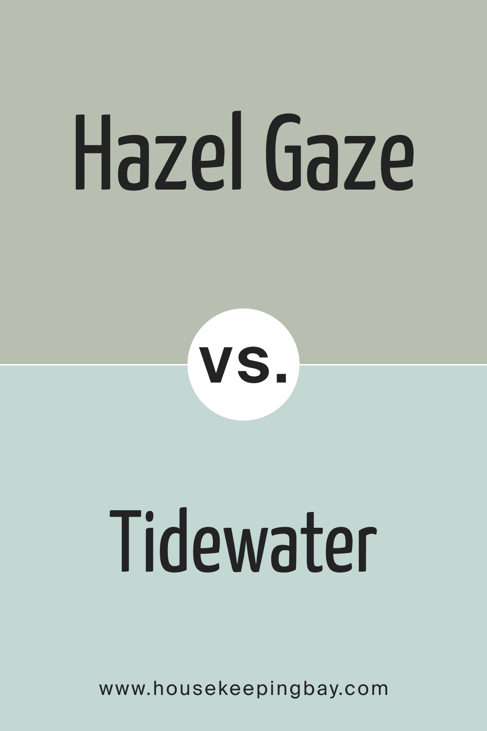
SW 9652 Hazel Gaze vs. SW 6477 Tidewater
SW Tidewater is generally characterized as a soft, muted greenish-blue, suggesting a harmonious balance of tranquility and renewal, suitable for spaces aimed at relaxation and rejuvenation. It may evoke feelings of being near serene waters.
In contrast, SW Hazel Gaze might lean towards warmer, browner tones, possibly offering a cozy, enveloping ambiance. The comparison would possibly highlight Tidewater’s calming and balanced nature against the assumably comforting, embracing warmth of Hazel Gaze, each creating unique mood landscapes.
housekeepingbay.com
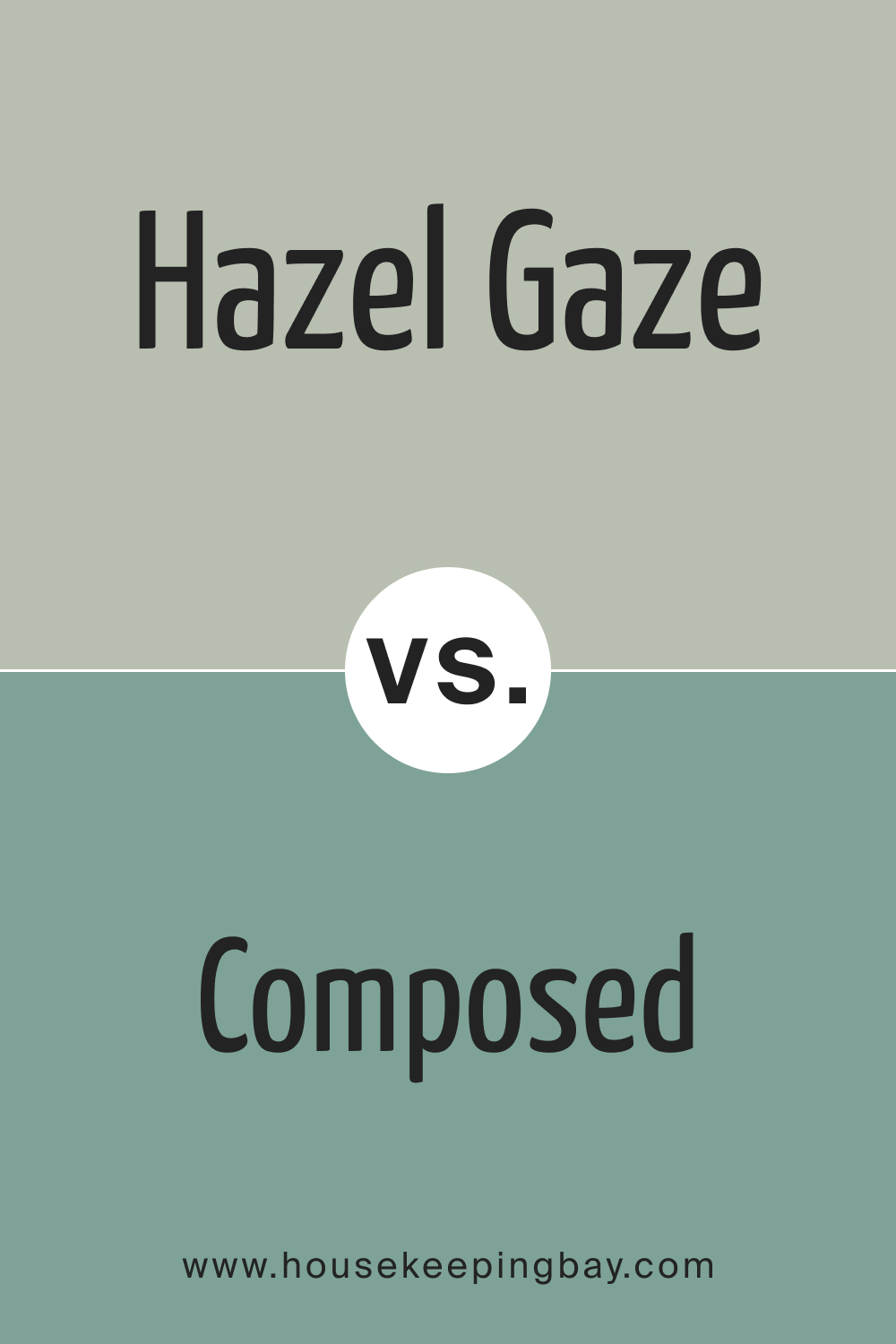
SW 9652 Hazel Gaze vs. SW 6472 Composed
SW Composed is a medium to dark, muted green color, often associated with harmony, nature, and balance, and could instill a sense of peace and stability in a space. Against this, SW Hazel Gaze might be warmer and more neutral, potentially providing a versatile backdrop to a variety of decor styles.
The contrast between these two may emphasize the serene, grounding green tones of Composed against the potentially versatile, warmer essence of Hazel Gaze, yielding different aesthetic and emotional impacts.
housekeepingbay.com
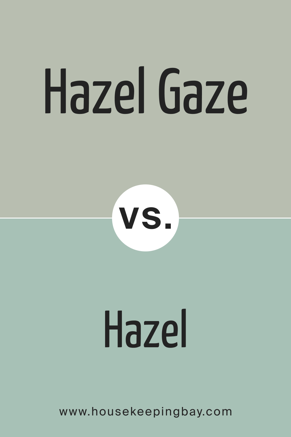
SW 9652 Hazel Gaze vs. SW 6471 Hazel
SW 6471 Hazel is a light to medium muted greenish color, akin to sage green, lending a subtle, soothing touch to spaces. It might evoke a sense of nature and tranquility. In contrast, SW Hazel Gaze, while potentially sharing a hazel undertone with SW 6471 Hazel, might encompass warmer, browner tones, providing a different, possibly more enveloping warmth and coziness to spaces.
Their comparison would likely involve contrasting the subtle, soothing green undertones of SW 6471 Hazel against the possible warm, embracing undertones of Hazel Gaze.
housekeepingbay.com
SW 9652 Hazel Gaze vs. SW 9050 Vintage Vessel
Without precise descriptions for either SW Hazel Gaze or Vintage Vessel , it is presumed that their comparison might involve contrasting possible earthy, warm tones of Hazel Gaze against what might be the antiqued, potentially deep, and rich tones of Vintage Vessel.
Each color may evoke different atmospheres and feelings, with one possibly conveying warmth and neutrality, and the other possibly suggesting depth and richness, contributing distinctively to the aesthetics and ambiance of spaces.
housekeepingbay.com
Conclusion
The subtleties and depth of each color can dramatically influence the ambiance of a space. While SW 9652 Hazel Gaze is an adaptable hue with earthy undertones, its comparison with other shades, such as Clary Sage or Svelte Sage, underscores the importance of analyzing each shade’s unique properties before making a final selection. The right color choice is paramount in achieving the desired mood and design outcome.
housekeepingbay.com
Ever wished paint sampling was as easy as sticking a sticker? Guess what? Now it is! Discover Samplize's unique Peel & Stick samples. Get started now and say goodbye to the old messy way!
Get paint samples


Frequently Asked Questions
⭐What undertones does SW 9652 Hazel Gaze have?
SW 9652 Hazel Gaze boasts a complex mix of brown and muted green undertones, giving it a rich, earthy feel.
⭐Is SW 9652 Hazel Gaze a warm or cool color?
Hazel Gaze leans more towards the warm spectrum due to its brown undertones, making it cozy and inviting.
⭐How does SW 9652 Hazel Gaze appear under different lighting conditions?
The appearance of Hazel Gaze can shift based on lighting. Under natural light, its green undertones might be more pronounced, while artificial light can enhance its warm, brownish qualities.
⭐Which trim colors complement SW 9652 Hazel Gaze?
Shades of off-white, such as SW 7004 Snowbound or SW 7008 Alabaster, complement Hazel Gaze, enhancing its depth and richness.
⭐Is SW 9652 Hazel Gaze suitable for exteriors?
Yes, Hazel Gaze is versatile enough for both interiors and exteriors. Its earthy undertones resonate well with natural surroundings, making it an excellent choice for home facades.
4 thoughts on “Hazel Gaze SW 9652 Paint Color by Sherwin-Williams”
Leave a Reply


Can I use this color in a small bathroom?
Hazel Gaze can make a small bathroom feel cozy and sophisticated. Its earthy tone can create a serene, spa-like ambiance, especially when paired with white fixtures.
How would this color look in a room with lots of natural light?
In spaces with abundant natural light, the green undertones of Hazel Gaze tend to be more visible, giving the room a fresh, natural feel while still retaining its warmth.