Fragile Beauty SW 7553 by Sherwin Williams
Embracing Subtlety in Home Decor
In the ever-evolving world of interior design, certain colors stand out not just for their aesthetic appeal but for the emotions they evoke and the spaces they transform. This unique hue embodies a delicate equilibrium between understated elegance and profound depth, making it a versatile choice for any space looking to marry modern sophistication with a touch of timeless charm.
As part of Sherwin-Williams’ expansive palette, Fragile Beauty offers a nuanced option for designers, homeowners, and creatives seeking to infuse their projects with a sense of serenity and refined beauty.This article takes a closer look at SW 7553 Fragile Beauty, exploring its color specifics, including its undertones, compatibility with other colors, and its psychological impacts. W
e delve into how this soft, yet compelling, color can transform spaces—ranging from intimate personal rooms to expansive commercial areas—into havens of calm and beauty. As we navigate through various applications and design styles that best complement Fragile Beauty, readers will gain insight into the potential this color holds in crafting visually appealing and emotionally resonant environments.
Whether you’re a seasoned interior designer or a homeowner looking to embark on a renovation journey, understanding the depth and versatility of Fragile Beauty is essential for anyone looking to make a profound statement with their space.
via sherwin-williams.com
What Color Is Fragile Beauty SW 7553 by Sherwin Williams?
Table of Contents
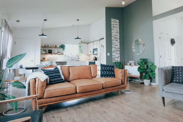
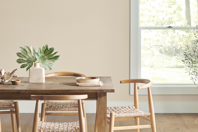
Fragile Beauty SW 7553 by Sherwin Williams is a refined, understated shade that beautifully captures the essence of elegance and subtlety in a color palette. It is a gentle, warm hue that seems to float between a soft beige and a light taupe, offering an adaptable backdrop for a variety of design aesthetics. This color exudes a serene, calming effect, making it an ideal choice for spaces intended for relaxation and contemplation.
Fragile Beauty shines in interior styles that favor a gentle, sophisticated backdrop. It is perfectly at home in minimalist designs where its subtle warmth adds depth without overpowering the space. Similarly, in modern farmhouse and Scandinavian-inspired interiors, its earthy undertones provide a natural feel that complements organic materials beautifully.
This color also thrives in traditional and transitional spaces, where its versatility serves as a timeless foundation that can be dressed up or down.
Pairing magnificently with a wide range of materials and textures, Fragile Beauty finds harmony with natural wood grains, from light oak to richer walnuts, enhancing their innate warmth. It also pairs elegantly with soft, matte metals like brushed brass or aged bronze, adding a touch of sophistication. In terms of textures, it works well with linen, wool, and other natural fabrics, creating a layered, inviting space.
Whether used as a main color scheme or as an accent, Fragile Beauty SW 7553 by Sherwin Williams brings a soft, delicate elegance to any interior.
housekeepingbay.com
Is Fragile Beauty SW 7553 by Sherwin Williams Warm or Cool color?
Fragile Beauty SW 7553 by Sherwin Williams is more than just a paint color; it’s an essence, a quiet whisper in the realm of home design. This nuanced shade belongs to the white and off-white family, offering a serene, soft backdrop that complements any space with its understated elegance. The true magic of Fragile Beauty lies in its versatility and subtlety. It has the unique ability to transform a room into a tranquil haven, reflecting natural light in a way that makes spaces feel larger and more inviting.
In homes, Fragile Beauty works harmoniously to create a sense of calm and relaxed sophistication. It’s not just a color but an atmosphere. Whether applied to a cozy bedroom, a spacious living room, or a peaceful bathroom, it serves as the perfect canvas, encouraging layers of texture and color to stand out.
Its understated demeanor supports a wide range of décor styles, from contemporary minimalism to rustic charm, making it a popular choice among designers and homeowners alike.
By fostering a light and airy ambiance, Fragile Beauty can subtly elevate the mood of a home, making it feel more open, clean, and peaceful. Its ability to adapt and enhance aesthetic elements makes it more than a color choice but a design strategy, creating spaces that offer solace and beauty in their simplicity.
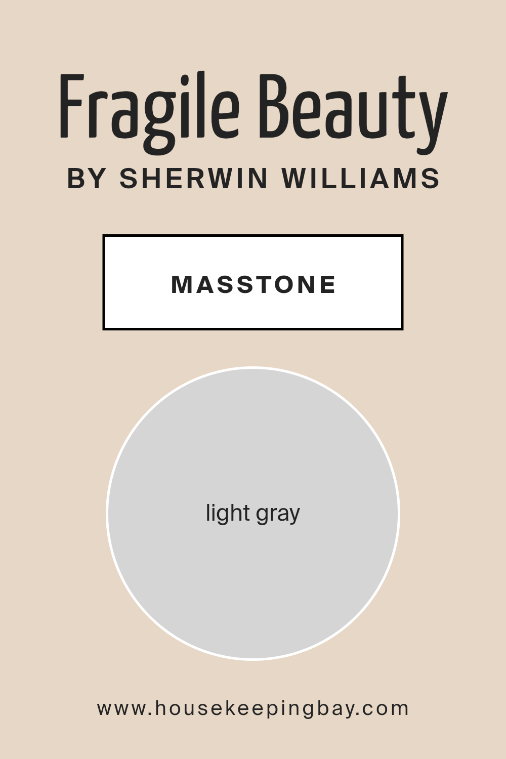
What is the Masstone of the Fragile Beauty SW 7553 by Sherwin Williams?
Fragile Beauty SW 7553 by Sherwin Williams, with its masstone of Light Gray (#D5D5D5), embodies a subtle elegance that has a profound effect on home interiors. This color strikes a delicate balance between warmth and coolness, making it exceptionally versatile for various spaces and lighting conditions.
Its inherent lightness reflects natural light beautifully, amplifying spaces to appear more open, airy, and welcoming. This capability to interact dynamically with both natural and artificial light means that Fragile Beauty can shift in tone and warmth throughout the day, adding a layer of visual interest and soothing ambience to the environment.
In homes, Fragile Beauty acts as a serene backdrop for a wide range of decor themes, from minimalist and modern to traditional and cozy. It anchors spaces without overpowering them, allowing for creative freedom in choosing accent colors, textures, and furnishings.
This color’s subtlety promotes a sense of calm and tranquility, making it ideal for bedrooms, living areas, and even bathrooms, where the goal is often to create a retreat from the bustle of daily life. Overall, Fragile Beauty SW 7553 exemplifies how a carefully chosen wall color can transform the essence of a home, crafting spaces that are both beautiful and effortlessly harmonious.
housekeepingbay.com
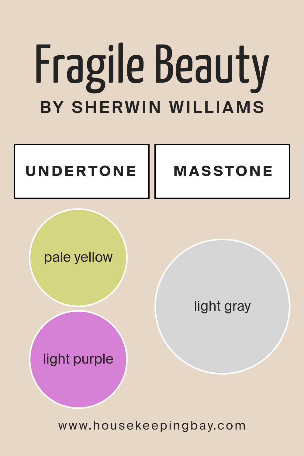
Undertones of Fragile Beauty SW 7553 by Sherwin Williams
Fragile Beauty SW 7553 by Sherwin Williams is a subtle and sophisticated paint color that whispers elegance and tranquility into any space it adorns. It is the epitome of understated grace, with an almost ethereal presence. Yet, the true depth of Fragile Beauty lies in its undertones, a delicate blend of pale yellow and light purple. These undertones are not immediately apparent but play a critical role in how the color is perceived and how it influences the mood of a room.
Undertones are essentially the color lurking beneath the surface of the paint. They can shift the main color towards warmth or coolness and can significantly affect how a color looks under different lighting conditions.
Pale yellow undertones imbue Fragile Beauty with a soft warmth, making it feel cozy and inviting. On the other hand, the light purple undertones introduce a touch of cool sophistication, adding depth and complexity to the hue.
When applied to interior walls, Fragile Beauty transcends simple aesthetics. The interplay between its pale yellow and light purple undertones creates a dynamic ambiance that adapts to the changing natural light throughout the day. In the bright daylight, the walls may exude a gentle luminosity, welcoming and soothing.
As the sun sets, the cooler undertones might emerge, enveloping the room in a serene and mystic aura. This chameleon-like capacity makes Fragile Beauty an excellent choice for creating a space that feels alive, continually morphing yet always enveloping its inhabitants in a calming embrace.
Its ability to blend warmth and coolness, thanks to its intricate undertones, allows for unparalleled versatility, making it suitable for various rooms and design aesthetics.
housekeepingbay.com
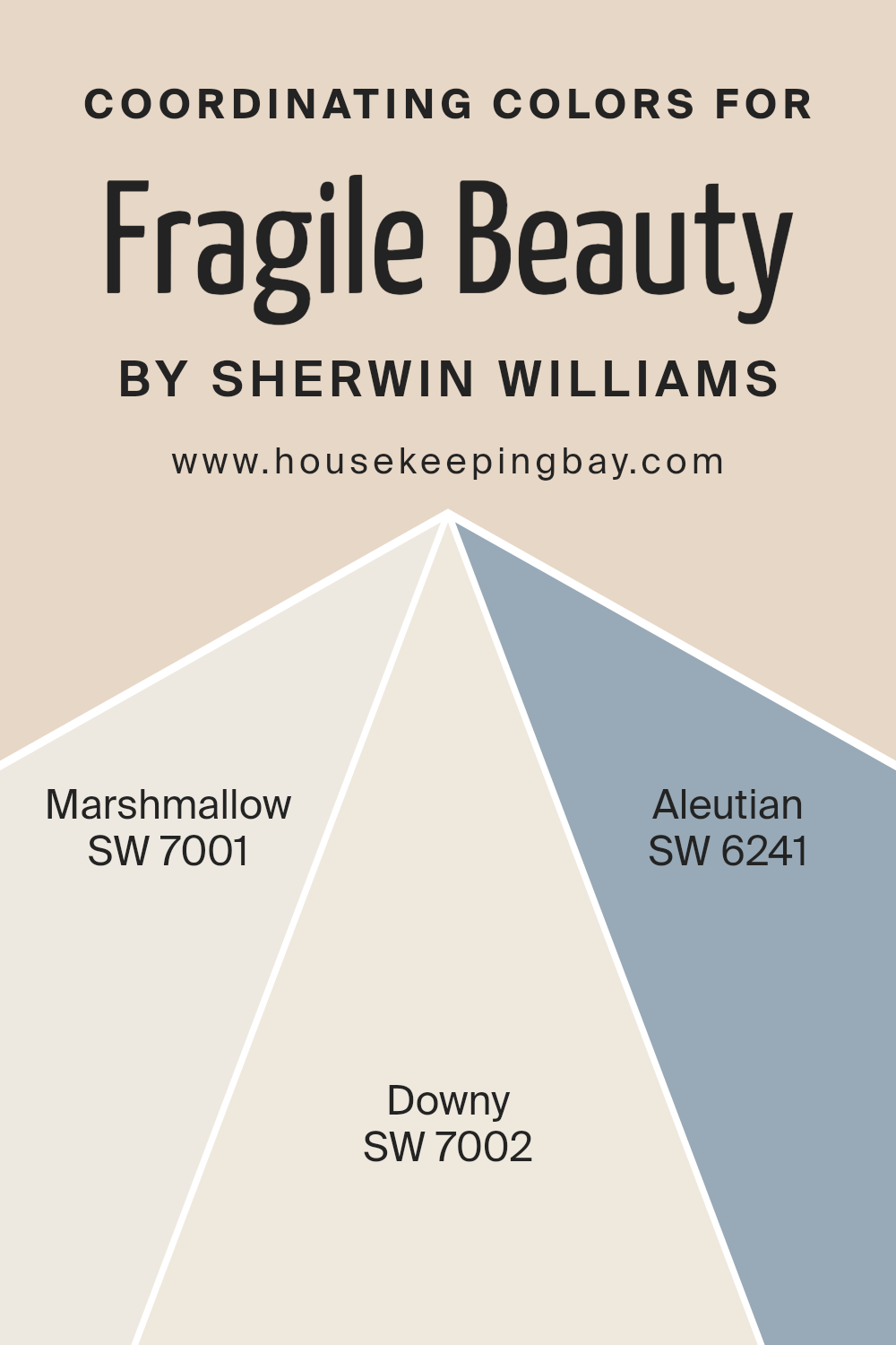
Coordinating Colors of Fragile Beauty SW 7553 by Sherwin Williams
Coordinating colors are an essential aspect of design that enables the creation of a harmonious and aesthetically pleasing palette within a space. These colors are selected based on their compatibility with a primary color, enhancing its appeal without overwhelming it.
In the context of Fragile Beauty SW 7553 by Sherwin Williams, a nuanced and understated hue, the art of selecting coordinating colors involves finding shades that complement its unique character while contributing to a cohesive look.
Coordinating colors like SW 7001 – Marshmallow, SW 7002 – Downy, and SW 6241 – Aleutian, work seamlessly alongside Fragile Beauty, each adding a layer of depth and complexity to the overall design.
Marshmallow SW 7001, with its soft, creamy presence, serves as an ideal backdrop that allows the subtle sophistication of Fragile Beauty to stand out. This nearly white shade brings light and airiness, creating a sense of spaciousness.
Downy SW 7002 offers a whisper of warmth, its gentle, almost ethereal gray adding a layer of serenity that complements the peacefulness of Fragile Beauty. Aleutian SW 6241, on the other hand, brings a deeper, yet equally harmonious, blue-gray tone to the palette, introducing a stronger contrast that highlights the delicacy and refined beauty of the primary shade. Through these coordinated colors, a balanced and inviting palette is achieved, demonstrating the power of thoughtful color selection in interior design.
You can see recommended paint colors below:
- SW 7001 Marshmallow
- SW 7002 Downy
- SW 6241 Aleutian
housekeepingbay.com
How Does Lighting Affect Fragile Beauty SW 7553 by Sherwin Williams?
Lighting plays a crucial role in the perception of colors, as it can significantly alter how they appear to the human eye. The effect of lighting on colors stems from the color temperature of the light source and the angle at which light enters a space, directly influencing the appearance of colors on walls, furniture, and decor. This principle is perfectly illustrated with the color Fragile Beauty SW 7553 by Sherwin Williams, a nuanced hue that can exhibit a range of appearances under different lighting conditions.
In artificial light, the characteristics of Fragile Beauty can vary depending on the type of bulbs used. Warm artificial light tends to enhance the cozy, nurturing aspects of this hue, making it appear softer and more inviting. On the other hand, cool artificial light may highlight its fresher, crisper undertones, giving rooms a more spacious and airy feel.
Natural light brings its own dynamics to the perception of Fragile Beauty. In north-facing rooms, which receive indirect, cooler light throughout the day, this color may appear more subdued and slightly cooler in tone, emphasizing its serene and tranquil qualities. It creates a peaceful retreat, perfect for creating a calming and focused space.
South-facing rooms bathe Fragile Beauty in warm, abundant light, accentuating its warmth and making it appear more vibrant and lively. This exposure brings out the color’s welcoming and cheery aspects, making spaces feel more inviting and comfortable, especially in spaces meant for relaxation and gatherings.
In east-facing rooms, this color benefits from the warm, golden tones of morning light, making it appear softer and warmer in the morning, then transitioning to a cooler, more balanced tone as the day progresses. This dynamic change highlights the versatile nature of Fragile Beauty, making it suitable for spaces used at different times of the day.
West-facing rooms expose Fragile Beauty to the intense, warm light of the afternoon and evening, deepening its warmth and richness. This lighting condition enhances the cozy, comforting aspects of the color, making it ideal for living rooms or dining areas where the warm glow can create a snug and hospitable atmosphere.
In conclusion, lighting conditions have a profound impact on the appearance and mood evoked by Fragile Beauty SW 7553. Whether under artificial light or the varying conditions of natural light, this color’s adaptive nature can complement and enrich a variety of spaces and design aesthetics.
housekeepingbay.com
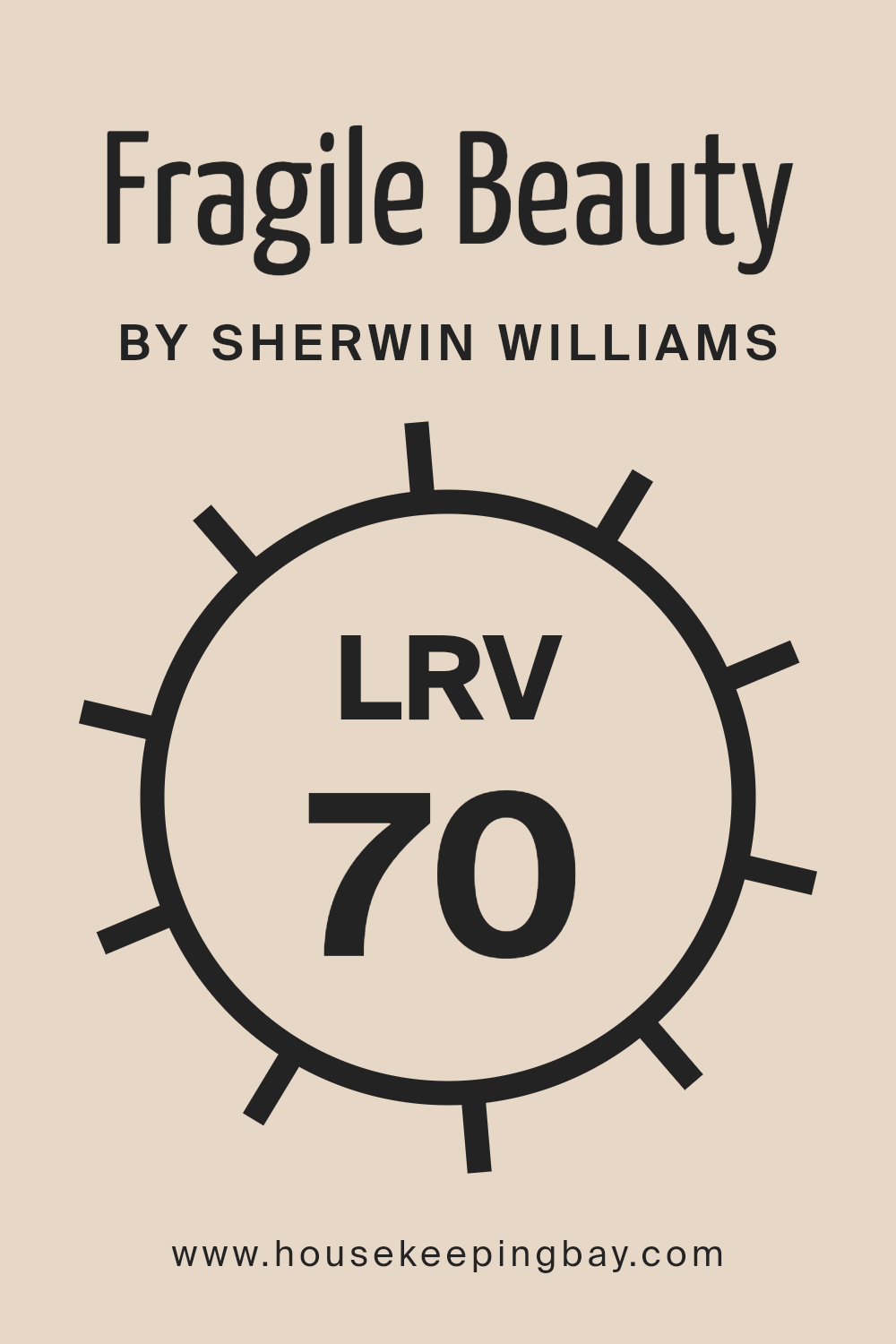
What is the LRV of Fragile Beauty SW 7553 by Sherwin Williams?
Light Reflectance Value (LRV) is a measure of the percentage of visible and usable light that gets reflected from a surface when illuminated by a light source. The LRV scale ranges from 0, which is pure black, absorbing all light, to 100, representing pure white, reflecting all light. This value is crucial in design and painting as it helps determine how light or dark a color will appear once applied to a surface, impacting the ambiance and mood of a space.
The LRV plays a significant role in energy efficiency too, as lighter colors reflect more light, reducing the need for artificial lighting. Additionally, understanding LRV helps in choosing paint colors that can either warm up a space with lower natural light or cool down a very bright room.
With an LRV of 69.95, the color “Fragile Beauty” (SW 7553) by Sherwin Williams sits on the lighter end of the spectrum. This means it has a high ability to reflect light, making it an excellent choice for creating a bright, airy feel in a room. In spaces with ample natural light, “Fragile Beauty” will appear luminous and vibrant, enhancing the sense of openness and size. Conversely, in a dimly lit room, its high LRV can help to maximize the available light, making the space feel more welcoming and less closed in.
The lightness of this color can also influence perception, potentially making walls painted with “Fragile Beauty” recede visually, thereby expanding the perception of space within the room.
housekeepingbay.com
What is LRV? Read It Before You Choose Your Ideal Paint Color
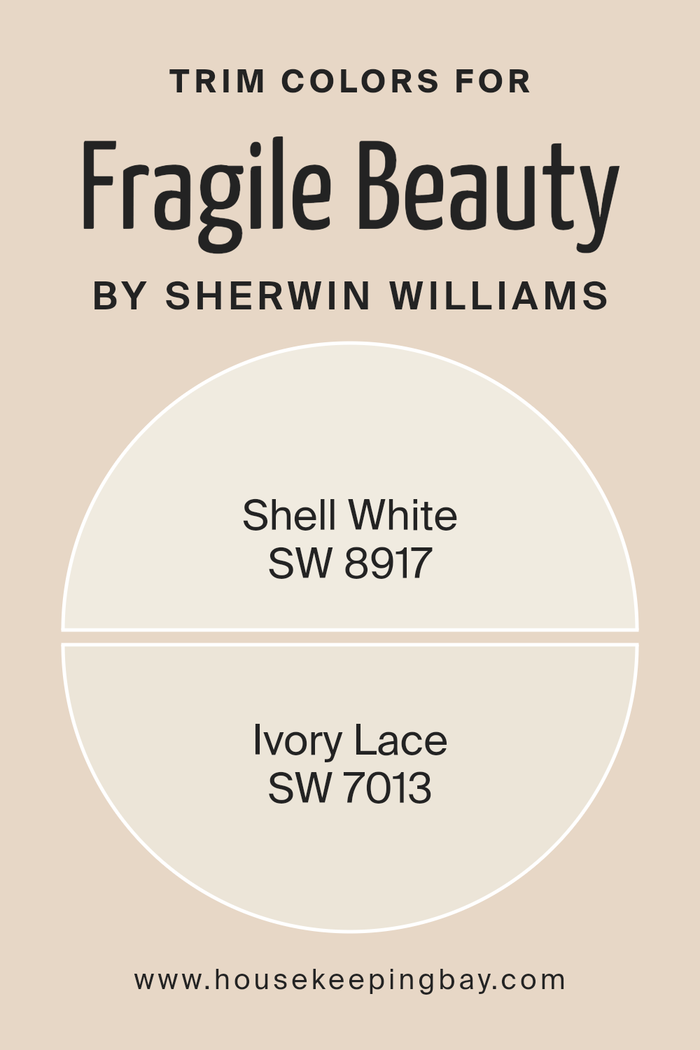
What are the Trim colors of Fragile Beauty SW 7553 by Sherwin Williams?
Trim colors are carefully selected shades that complement the primary color of a space to enhance architectural details, create depth, and bring a cohesive look to the environment. In the case of Fragile Beauty SW 7553 by Sherwin-Williams, choosing the right trim colors is crucial to accentuate its subtle and serene qualities without overwhelming it.
Trim colors act like the frame for a painting—they should enhance the beauty of the wall color, not compete with it. By selecting harmonious trim colors, one not only highlights the architectural features of a room but also elevates the overall aesthetic, making the space feel more polished and thoughtfully designed.
Shell White SW 8917 and Ivory Lace SW 7013 are excellent choices for trim colors to complement Fragile Beauty SW 7553. Shell White offers a soft, barely-there contrast that can enhance the delicate nature of Fragile Beauty without creating a stark transition.
This gentle hue provides a smooth, almost seamless look that can make spaces feel larger and more open, while still offering a slight delineation from wall color to trim. On the other hand, Ivory Lace carries a slightly warmer tone, offering a subtle, creamy contrast that enriches the room’s ambiance. It softly frames the walls, adding depth and warmth to the space, making it feel inviting and cozy. Together, these trim colors work harmoniously with Fragile Beauty to achieve an elegant and refined look that feels both timeless and modern.
You can see recommended paint colors below:
housekeepingbay.com
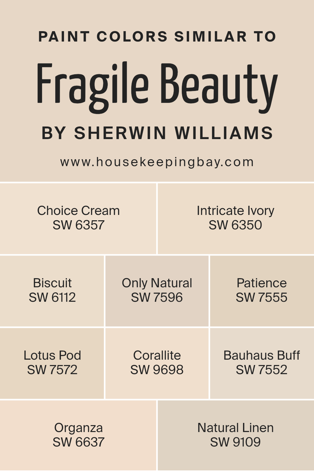
Colors Similar to Fragile Beauty SW 7553 by Sherwin Williams
Choosing similar shades and tones, like the ones that complement Fragile Beauty SW 7553 by Sherwin Williams, plays a pivotal role in creating a harmoniously balanced interior. These colors contribute to a subtle and cohesive aesthetic because their close relation on the color spectrum enables them to blend seamlessly, offering a soothing transition from one shade to another.
Whether used for walls, trim, or accent pieces, utilizing colors such as Choice Cream SW 6357 or Intricate Ivory SW 6350 brings a warmth that is versatile, making spaces feel inviting and lived-in. Biscuit SW 6112 adds a hint of earthiness, grounding the more ethereal tones, while Only Natural SW 7596 reminds one of undisturbed, natural landscapes, providing a serene backdrop.
Patience SW 7555 and Lotus Pod SW 7572 introduce a subtle depth, enriching the palette with their understated elegance.
Colors like Corallite SW 9698 infuse a soft hint of color, reminiscent of the gentle play of sunlight at dawn, offering an airy lightness to the mix. Bauhaus Buff SW 7552 and Organza SW 6637 further emphasize the calm and clarity that similar colors can bring to a space, each contributing to a collective sense of peace and purity.
Natural Linen SW 9109, with its suggestion of texture and comfort, encapsulates the essence of a relaxed, welcoming home environment. Together, these shades exemplify how closely related colors can create an environment that is cohesive, comforting, and visually appealing, enhancing the feeling of unity within the space while allowing for personal expression through subtle variations of hue and brightness.
You can see recommended paint colors below:
- SW 6357 Choice Cream
- SW 6350 Intricate Ivory
- SW 6112 Biscuit
- SW 7596 Only Natural
- SW 7555 Patience
- SW 7572 Lotus Pod
- SW 9698 Corallite
- SW 7552 Bauhaus Buff
- SW 6637 Organza
- SW 9109 Natural Linen
housekeepingbay.com
How to Use Fragile Beauty SW 7553 by Sherwin Williams In Your Home?
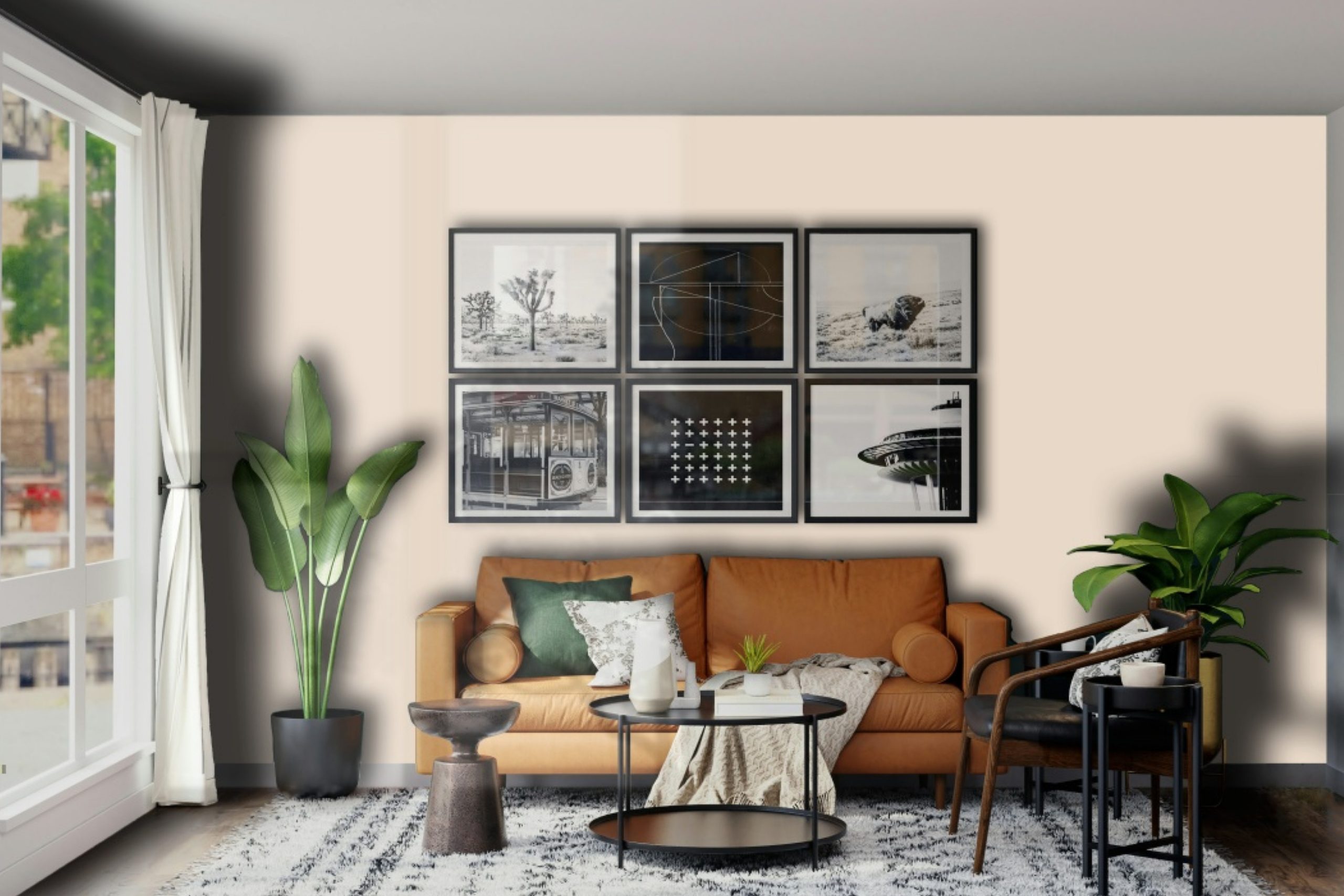
Fragile Beauty SW 7553 by Sherwin Williams is a captivating paint color that brings a subtle warmth and understated elegance to any space in your home. This hue belongs to the off-white family, offering a creamy, soft backdrop that complements a wide range of decor styles, from traditional to contemporary. Fragile Beauty serves as a perfect neutral base, allowing for flexibility in your home styling. It illuminates dark corners and makes small rooms appear more spacious, thanks to its light-reflecting qualities.
Incorporating Fragile Beauty into your home offers a serene and calming ambiance, making it ideal for bedrooms and living areas where relaxation is key. Its versatility also extends to kitchens and bathrooms, where it partners beautifully with natural wood, stone finishes, and metallic accents, adding a touch of sophistication.
For those looking to create a cohesive look throughout their home, Fragile Beauty can bridge different color palettes, ensuring a smooth transition between spaces. By choosing Fragile Beauty SW 7553, you’re investing in a timeless color that will sustain its appeal for years to come, offering a canvas that invites a personal touch through furniture, textiles, and artwork.
Fragile Beauty SW 7553 by Sherwin Williams vs Bauhaus Buff SW 7552 by Sherwin Williams
Fragile Beauty SW 7553 and Bauhaus Buff SW 7552 by Sherwin Williams are two colors that complement each other beautifully, each presenting a unique atmosphere to interior spaces. Fragile Beauty is a soft, muted hue that offers a tranquil and serene vibe. It leans toward a pale, neutral beige with subtle undertones that give it a gentle warmth, making it versatile for various settings—an ideal choice for creating a calming retreat in bedrooms or living areas.
In contrast, Bauhaus Buff represents a step towards a slightly more pronounced color presence. It is a shade deeper than Fragile Beauty, embodying a classic, timeless beige with a hint of warmth. This color projects stability and grounding, providing a perfect backdrop for decor elements to stand out. It excels in spaces where a bit more depth and character are desired without overwhelming the senses.
Together, these colors create a harmonious balance. Fragile Beauty brings a soft, delicate ambiance, while Bauhaus Buff adds depth and solidity. They can effortlessly be used in tandem to craft spaces that are both inviting and cohesive, showcasing a subtle gradation in neutral tones that can appeal to various design aesthetics.
You can see recommended paint color below:
- SW 7552 Bauhaus Buff
housekeepingbay.com
Fragile Beauty SW 7553 by Sherwin Williams vs Natural Linen SW 9109 by Sherwin Williams
Fragile Beauty SW 7553 by Sherwin-Williams and Natural Linen SW 9109, also by Sherwin-Williams, present a serene and organic palette, but they offer distinctly different vibes due to their unique undertones and saturation levels. Fragile Beauty stands out as a delicate, soft hue with a whisper of pink, casting a warm, comforting glow that suggests an understated elegance. It is a color that seems to capture the ephemeral nature of light at dawn, offering a subtle femininity and a touch of romance to any space.
In contrast, Natural Linen leans towards a warmer, richer tone, reminiscent of the natural, unbleached fabric it’s named after. It carries a more pronounced beige undertone, suggesting a sense of sturdiness and resilience while remaining in the realm of neutrality.
This color offers a solid foundation for a variety of design aesthetics, promoting a sense of calm and groundedness. Together, these colors complement each other, with Fragile Beauty adding a soft, almost ethereal quality, while Natural Linen provides depth and warmth, anchoring the space in comfort and simplicity.
You can see recommended paint color below:
- SW 9109 Natural Linen
housekeepingbay.com
Fragile Beauty SW 7553 by Sherwin Williams vs Intricate Ivory SW 6350 by Sherwin Williams
“Fragile Beauty” SW 7553 by Sherwin Williams and “Intricate Ivory” SW 6350 both embody elegance and sophistication, yet they present subtly distinct atmospheres. Fragile Beauty aligns more closely with a muted, understated palette, offering a soothing, almost ethereal presence that can make spaces feel open and serene.
Its softness is reminiscent of an early morning mist, providing a canvas that enhances both contemporary and traditional interiors without overwhelming them. On the other hand, Intricate Ivory leans towards a warmer, richer tone. This color has the ability to introduce a comforting, inviting warmth into a room, akin to the gentle touch of sunlight through sheer curtains.
Despite its warmth, Intricate Ivory maintains a level of restraint, ensuring spaces feel cozy but not crowded. When comparing the two, it’s clear that while Fragile Beauty speaks to a cooler, more subdued aesthetic, Intricate Ivory offers a cozy, welcoming embrace, making both colors versatile yet distinct in their appeal.
You can see recommended paint color below:
housekeepingbay.com
Fragile Beauty SW 7553 by Sherwin Williams vs Organza SW 6637 by Sherwin Williams
“Fragile Beauty” SW 7553 and “Organza” SW 6637 by Sherwin Williams, though both part of the extensive Sherwin Williams palette, offer distinct experiences in color dynamics suitable for various design preferences and spaces. “Fragile Beauty” presents a serene, soft, and almost ethereal quality, akin to a delicate, light beige with a whisper of pink underlying its composition. It emanates warmth and subtlety, making it a perfect selection for creating a soothing and inviting atmosphere in spaces meant for relaxation and calm.
Contrastingly, “Organza” steps into the light with a brighter, more spirited character. This color, radiating a gentle, creamy yellow, offers a freshness and vivacity that can energize and illuminate a room. It is excellent for spaces that aim to stimulate positivity, happiness, and creativity, such as kitchens, living areas, or children’s rooms.
Both colors, while divergent in their emotional impacts, share a softness and versatility, allowing them to blend seamlessly with a variety of decor styles and palettes. Whether one is looking for the muted elegance and tranquility of “Fragile Beauty” or the cheerful and invigorating ambiance that “Organza” provides, both colors stand as testaments to the compelling and diverse language of color Sherwin Williams offers to designers and homeowners alike.
You can see recommended paint color below:
- SW 6637 Organza
housekeepingbay.com
Fragile Beauty SW 7553 by Sherwin Williams vs Biscuit SW 6112 by Sherwin Williams
Fragile Beauty SW 7553 and Biscuit SW 6112 by Sherwin Williams offer unique qualities for interior spaces, articulating elegance and warmth in subtle ways. Fragile Beauty stands out as a sophisticated, soft neutral with a pink undertone, imbuing spaces with a serene, airy quality. Its light reflectance brings a delicate luminescence to rooms, enhancing a sense of space and light. This hue works beautifully in spaces aiming for a refined, tranquil aesthetic, offering a backdrop that both soothes and elevates.
Biscuit SW 6112, on the other hand, leans into the warmth of sun-touched sand, with its creamy, beige presence adding a cozy, welcoming vibe to any room. It anchors spaces with its earthier base compared to Fragile Beauty, promoting a sense of comfort and stability. Ideal for creating inviting, lived-in atmospheres, Biscuit supports styles that appreciate a touch of rustic charm or the understated elegance of classic design.
Despite their nuanced differences, both colors share a gentle versatility, easily pairing with a broad range of decor styles and color palettes. Whether aiming for the ethereal charm of Fragile Beauty or the grounded warmth of Biscuit, both colors offer a canvas for personal style to shine through.
You can see recommended paint color below:
housekeepingbay.com
Fragile Beauty SW 7553 by Sherwin Williams vs Choice Cream SW 6357 by Sherwin Williams
“Fragile Beauty SW 7553” and “Choice Cream SW 6357” by Sherwin-Williams are two hues that present a subtle yet distinctive difference in tone, offering unique applications in interior design. Fragile Beauty leans towards a serene, understated elegance with its light, soft, almost ethereal quality, making it an excellent choice for creating a tranquil and soothing ambiance. Its understated nature allows it to blend harmoniously with a range of decor styles, adding a touch of sophistication without overwhelming the senses.
On the other hand, Choice Cream exudes a warmer, more inviting quality with its creamy, slightly more saturated tone. It brings a cozy warmth to spaces, perfect for making rooms feel more intimate and welcoming. This color thrives in areas where a sense of comfort and conviviality is desired, such as living rooms and kitchens.
While both colors share a base of softness and neutrality, Fragile Beauty offers a cooler, more refined palette, suggesting a quiet place of solace. Contrastingly, Choice Cream leans towards a homier, more enveloping feel, ideal for spaces meant for gathering and warmth. This subtle contrast can be leveraged to complement a variety of textures and furnishings, making each color versatile in its right, yet distinctly suited to different emotional and aesthetic goals.
You can see recommended paint color below:
housekeepingbay.com
Fragile Beauty SW 7553 by Sherwin Williams vs Corallite SW 9698 by Sherwin Williams
Fragile Beauty SW 7553 and Corallite SW 9698, both by Sherwin Williams, present a captivating palette that explores the subtle nuances of warmth and tranquility in interior spaces. Fragile Beauty SW 7553 exudes a soft, understated elegance with its light, creamy beige tone. This color has the remarkable ability to illuminate rooms with a serene, inviting glow, making spaces feel larger and more open. Its versatility allows it to act as a neutral backdrop, easily complementing a wide range of decor styles and colors.
In contrast, Corallite SW 9698 introduces a gentle, more pronounced warmth to interiors. With its delicate pink undertones, this color leans towards a more defined expression of coziness and comfort. The hue suggests a nurturing ambiance, creating spaces that feel more intimate and personal. Corallite is ideal for those looking to infuse their room with a subtle touch of color while maintaining an air of sophistication and softness.
Together, Fragile Beauty and Corallite showcase a spectrum of softness and warmth, offering unique perspectives on creating inviting, comfortable spaces. Whether opting for the light, airy feel of Fragile Beauty or the cozy, embracing warmth of Corallite, these colors invite creativity in design with their understated elegance and charm.
You can see recommended paint color below:
- SW 9698 Corallite
housekeepingbay.com
Fragile Beauty SW 7553 by Sherwin Williams vs Patience SW 7555 by Sherwin Williams
“Fragile Beauty SW 7553” and “Patience SW 7555” by Sherwin Williams both evoke a sense of calm and subtlety, yet they encapsulate distinct atmospheres. “Fragile Beauty,” as its name suggests, offers a delicate and light feel with its soft, airy hue. This color leans towards a gentle off-white with just a whisper of warmth, making it perfect for creating a serene and inviting space. It captures the fleeting grace of early morning light, offering a backdrop that both soothes and elevates a room without overwhelming it with color.
On the other hand, “Patience SW 7555” delves deeper into the palette of neutrality with a rich, creamy base. This color embodies a more pronounced warmth, bringing to mind the cozy ambiance of late afternoon. Patience has a comforting presence, lending any room a sense of stability and calmness. Its slightly more saturated appearance than “Fragile Beauty” makes it an excellent choice for spaces that seek to balance neutrality with a hint of warmth.
Together, both colors complement each other beautifully, with “Fragile Beauty” bringing a light, ethereal quality, and “Patience” grounding spaces with its deeper, soothing warmth. While distinct, they share a common ability to create serene environments, echoing the timeless allure of understated elegance.
You can see recommended paint color below:
housekeepingbay.com
Fragile Beauty SW 7553 by Sherwin Williams vs Only Natural SW 7596 by Sherwin Williams
“Fragile Beauty” SW 7553 and “Only Natural” SW 7596, both from Sherwin Williams, offer distinctive tones that can significantly influence the ambiance of a room. “Fragile Beauty” is a soft, subtle shade that leans towards a warm, delicate off-white with hints of beige, creating a serene and inviting atmosphere. Its understated elegance makes it a perfect choice for creating a light, airy feel in spaces intended for relaxation and tranquility.
On the other hand, “Only Natural” SW 7596 is a deeper, more grounded color. This shade is a warm, inviting beige with undertones that can range from a rich, creamy taupe to a light, earthy brown, depending on the lighting. It exudes a sense of warmth and coziness, making it ideal for living areas or bedrooms where a comforting and embracing environment is desired.
While both colors are rooted in nature’s palette, offering a sense of calm and relaxation, “Fragile Beauty” presents a more ethereal, lightweight charm, whereas “Only Natural” provides a stronger, more robust warmth. The choice between them depends on the desired effect: a breath of light, airy elegance or a solid, comforting embrace.
You can see recommended paint color below:
housekeepingbay.com
Fragile Beauty SW 7553 by Sherwin Williams vs Lotus Pod SW 7572 by Sherwin Williams
Fragile Beauty SW 7553 and Lotus Pod SW 7572 by Sherwin Williams are two colors that offer a subtle, yet distinct, palette for interior spaces. Fragile Beauty embodies a softer, lighter hue, akin to the delicate nature its name suggests. It presents an almost ethereal quality, making it perfect for creating a serene and calming environment. Its lightness contributes to a sense of spaciousness and openness, often associated with a minimalist aesthetic or spaces intended for relaxation and reflection.
Lotus Pod, on the other hand, carries a slightly deeper, warmer tone. It retains some of the softness found in Fragile Beauty but adds a touch of earthiness to the mix. This color evokes a sense of warmth and coziness, making it ideal for rooms where comfort and familiarity are desired. It has the power to make large spaces feel more intimate and welcoming without overwhelming the senses.
Despite their differences, both colors share an underlying softness that can harmonize beautifully within a singular color scheme. Fragile Beauty offers a breath of fresh air and spaciousness, while Lotus Pod grounds the space with warmth and subtle richness. When used together, they can create a balanced and inviting atmosphere that caters to a variety of aesthetic preferences and design needs.
You can see recommended paint color below:
housekeepingbay.com
Conclusion
In conclusion, Fragile Beauty SW 7553 by Sherwin Williams stands out as a color that exudes a soft, understated elegance perfect for creating serene and inviting spaces. Its unique hue, a delicate blend that can be both comforting and sophisticated, makes it a versatile choice for any room. Whether aiming to achieve a peaceful retreat in a bedroom or a light, airy feel in a living area, Fragile Beauty offers a timeless appeal that enhances the aesthetic of a home without overwhelming it with color. This particular shade reflects Sherwin Williams’ ability to capture the essence of tranquility in a paint color, proving it to be an ideal selection for homeowners and designers seeking to create spaces that convey a sense of calm and beauty.
Moreover, the adaptability of Fragile Beauty SW 7553 to various decor styles and its harmonious pairing with a wide range of materials and textures underscore its popularity. From contemporary to traditional settings, it brings a layer of sophistication, proving that subtle colors can make a strong impact on the overall design of a space.
Its capability to act as both a stand-alone color and a complement to other hues allows for creative freedom in design schemes. The color’s soft nature encourages a lighter, brighter atmosphere, contributing significantly to the psychological well-being of inhabitants by offering a visual retreat from the busyness of daily life.
Fragile Beauty by Sherwin Williams, therefore, is not just a paint choice but a design statement that highlights the power of color in creating beautiful, restful, and emotionally uplifting spaces.
housekeepingbay.com
Ever wished paint sampling was as easy as sticking a sticker? Guess what? Now it is! Discover Samplize's unique Peel & Stick samples. Get started now and say goodbye to the old messy way!
Get paint samples